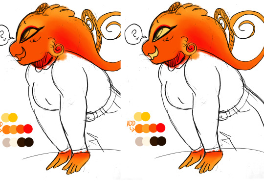
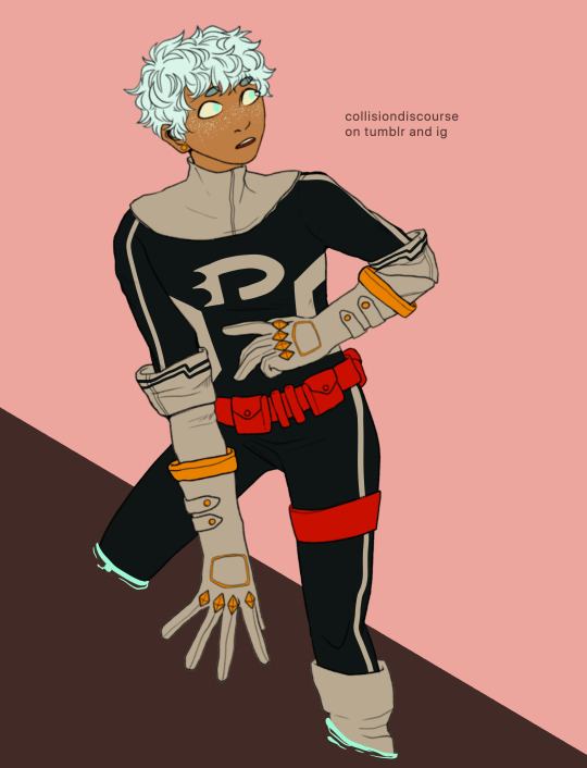
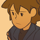
#doing his lineart in orange makes it look like hes glowing
Photo
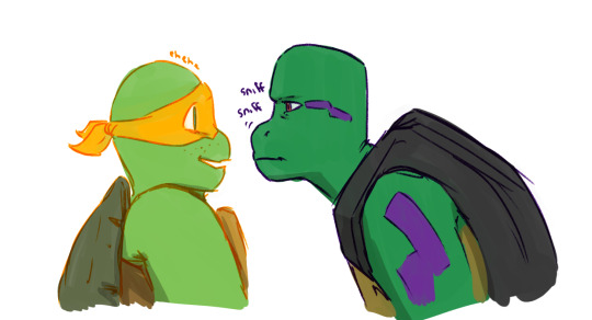


@nicoforlifetrue‘s Rotten Relfections fic has carved out a space in my brain and just lives there now.
#tmnt#rottmnt#rise of the teenage mutant ninja turtles#fanart#aus#tmnt 2012#id never drawn 2012 mikey before he is so Shaped#doing his lineart in orange makes it look like hes glowing#a sherbet cup of a boy#donnie like 'ah yes this ones mine now excellent'#and 'a temporary boi? that's fine im a dope fisher watch this'#donnie you could make a harpoon for that 'yeah but the crunch tho'#this fic is like#donnies a softshell turtle and softshell turtles will FIGHT YOU#cant heckign WAIT to see where they go with Raph#and what Mikeys mystic stuff might look like when he's in full Instincts Mode#anyway thank you author for my regular bedtime story#kineticallyart#i would tag this for my friend to not look at but shes already seen the sketches so#let these spoilers catch you up
2K notes
·
View notes
Note
also: if you have the time, could you demonstrate for me how you color and render the reapers? I wanna make Rory and Carolina all ✨️Sparkly✨️
OKAY I got WAY too into this lol so sorry if it’s. A lot lmao that’s just how I roll
SO! First you wanna slap a base color on that bitch (1), then add any other colors that are on their skin. For Rory that’s his light orange (2) and then his red-orange (3) and then red (4) (the brush I use is the watercolor point on ibis paint, that’s why it’s textured like that) 👇👇👇

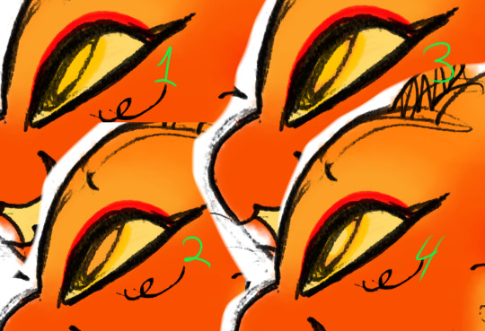
I went back to make his light orange stand out more as well as adding the red on his eyes (1) and then I put the yellow base for his eye & mouth (2) 👇👇👇
And then I painted on his eye colors :3 the yellow (top left) light orange (bottom left) the yellow again (top right) and the the pale yellow for his pupil (bottom right) 👇👇👇 yes, I know that’s a lot of layers but I just think it’s fun lol
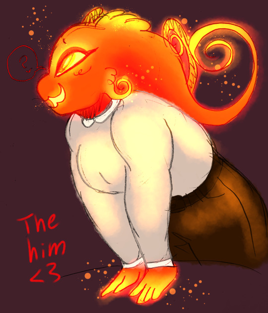
THEN I just colored his clothes cus he looked naked (1) and then darkened the background so it’s easier to see the glow stuffs. So rn I have 2 layers, the one with his colors and then his lines. I add another layer between the two (above the colors, below the lines) and set it to add. I use his base color to add the glow stuffs (2) 👇👇👇

Then I make another add layer above the lines it’s probably not necessary but it’s what I do lol (1) now if you’re trying to make em EXTRA glowy and bright, add another glow layer and take a darker color (I used the red) and just go over any exposed skin (make sure it’s above the lineart but below the 2nd glow layer) (2) 👇👇👇

Finally I added some sparklies (I use the splatter pen) as well as some light on his clothes, just makes the whole thing fuller (1) and sometimes I make another lineart layer on top of everything and then color it, I like to fuck around with effects and colors but I just simply colored it here lol (2) 👇👇👇

And then I’m done! 👇👇👇
I fuck around with layer effects and colors a lot and literally none of my drawings have the same shit but so far Rory has been simple lol
Here’s a peek at the inner chaotic workings of my reaper drawings, take a gander!
Also, no. That’s not all the layers 😎
What can I say. I’m adhd and I like fucking around
#ask#oc Rory#reference#eyestrain tw#tw eyestrain#tw eye strain#eye strain tw#uh hmm what to tag#me tag ∠( ᐛ 」 ) |/#fun fact! this drawing of Rory has the least amount of layers! I only used 6! (not including his ref lol)
7 notes
·
View notes
Text
my art process: a simple(ish) guide to how i (kinda) do things
okay!! so, i said i was gonna post my art process after i finished doing the danny phantom piece so... here it is! the drawing i used for a step by step process explanation is actually... simpler? less clunky than how i usually do things. i must preface this entire post by saying that i am fully self-taught for anything to do with art so if there are some things here that are exceeding no-nos... very sorry OOPS
The drawing took an estimated 4 hours total and for software I used FireAlpaca. My tablet is One by Wacom (aka the tiny ass red one). Without further ado... here’s my narrated guide on how i kind of do art!
1. Sketch Layers
sketches, are ofc, one of the fundamental steps in art. Some artists do them differently, whether they do color blocking/splotches first or silhouettes or your standard messy-lineart-before-the-actual-lineart
i personally do 2-3 different lineart/sketch layers, each layer specializing in different aspects. i took this technique from julia lepetit, a host from the drawfee show--a channel that i really recommend watching if youre an artist, like art, or just generally like having fun background noise while you work on something because... untreated adhd lol
this is the first sketch layer! i color coded them for reference and i use the yellow sketch layer to figure out poses. i use this gesture sketch layer to figure out where i want limbs to go and how i want the body to twist.

after i figure out the posing, i move on to my second sketch layer. the green layer is my refined sketch layer where i figure out the form and anatomy of the sketch. this is also where i start planning how expressions, special costume bits, and hands work!!
the red layer is my last and final sketch layer. technically, the red layer sometimes also doubles as my final lineart! the reason why i do this final step instead of doing the final lineart simply is so i can work on details of the costume. i end up refining certain portions, or even stretching/free transforming the whole body.
The red helps with the refinement of the drawing bc the ink being a color that isnt black kinda,,,, tricks my brain into not believing that its all permanent. its easier for me to go back and erase/change some parts when my brain doesnt think that everythings final. when im finished, i simply go back and change the color of the lineart to black with the protect alpha function.
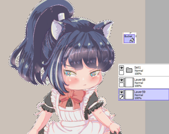
this is how the final lineart looks! be sure to close the lineart (aka make sure that everythings connected) so that the bucket tool can work and make your life 2000% easier.
2. Coloring
my coloring process is kind of... a mess LMAO its super dependent on how i feel like coloring on that day, but this is the usual method i use when im not thinking too much about it.
first are the flats! i use the magic wand tool to select all the areas around the lineart and reverse the selection so that all the areas inside your lineart is selected. color it with a base color, turn on protect alpha, and begin chunking in all the colors.
all of the flats excluding the pupils, background, ectoplasm rings, and danny phantom logo are on one layer. once that is done, we move on to shading!

for shading, i use a combination of the normal pen tool and the airbrush tool to smooth out the edges of the cell shading. since all the flats are on one layer, i simply set this one to clipping mask so that i dont have to worry about coloring within the lines. I only use one color really for shading (here, i used purple) and then protect alpha and add splotches of other colors (pink, orange) in relevant areas.
once i finish doing that, i set the layer to multiply and adjust the opacity so that it looks softer and more attuned to the colors of the actual piece
its at this point that i fiddle with the hue/saturation/brightness settings on the flat color layers to my taste, seeing what works and what doesnt.
i then lightly go over the piece with a bright color (very very very light cyan) and put focus on the areas i think should glow like his freckles, eyes, and ectoplasm rings from where he’s coming out of a wall.
i rlly rlly love layer effects, so i set that one to add and again adjust the opacity to how i want it to look.
3. Finishing Touches
...yeah i know it looks like a hot mess but hear me out.
on a new layer, make a CRAP TON OF GEOMETRIC SHAPES. ALL OF THEM IN NEON OR PASTEL. i get comments about my coloring methods sometimes and honestly im pretty sure its all due to this step. i make all these goddamn weird shapes, colored according to levels of lighting (yellow in lighter areas, turquoise in areas affected by the glow, purple in shaded areas etc. etc.) and also clip this layer.
i then set the layer effect to either hue, overlay, or add and set its opacity really low to make it unobvious and cleaner to look at. this is a method that i learned from tumblr user zephyrine-gale who is... exceedingly talented and pulls this off way better than i can WKSDJSKKS
after that... ur basically done!! i add a few more layers like the noise layer for extra texture and sometimes some very light gradients (usually yellow to purple bc of something something color theory)--but after that, the piece is basically finished!
thanks for sticking around and reading this monstrous thing!! i might do more posts like this in the future, so who knows?
if you enjoyed this tutorial, want to support me and my art, or just wish for a way to pay for me to shut up... you can tip me 3 dollars or commission me here at ko-fi
(also reblogs are much appreciated. thanks <3)
35 notes
·
View notes
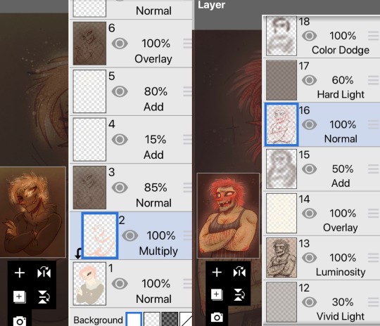
Note
What is your step by step drawing process like, if you don't mind my asking?
I'll just use Sunstealer as an example since he's the most recent thing I did. Under the cut because this is horridly long. You wanted step by step, I’ll give you step by step.
That is a threat.
And every step of the way I use a sharp pen with high pressure sensitivity and a sharp eraser with high pressure sensitivity, unless stated otherwise.
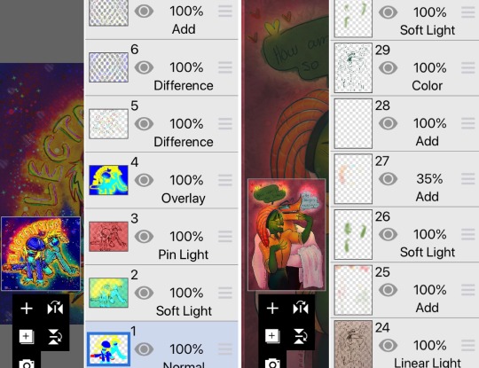
1. Alright, sketch first of all. I pick a whatever color, set a folder to multiply, and add layers in it. I start with the face/helm and take moderate care with making it look decent.
2. From there I sketch the rest of the the pic, preferably very loosely. I aim to not lift the stylus from the pad very much and instead just SCRIBBLE lines into the vague shape I'm after.
3. Set the sketch folder’s opacity real damn low, like somewhere under 10%, create a new folder, set it to multiply, and this is where the horrid amount of layers and layer folders I use comes in. But, you can see I actually did a second sketch of the arms (and legs, though that isn’t visible here) ‘cause I couldn’t make them look right based on my initial sketch.
4. On top of my second sketch I draw the rest of the clean lines. The lines were drawn with this purplish color, btw. I use something akin to it pretty often in my lineart.

5. After all that I use the Auto Select tool to select everything outside my lineart, e.g. everything I don’t want to have color. I then invert the selection and lay down my flats. At this point I used the gold as my base color, but then added separate folders for each following color, clipping them to the gold base layer below. In the case of black, its folder has a whole bunch of layers while I tried to figure out what parts to color black. With layers for the different parts, I can just click them on and off to see what things look like with or without them.
6. Okay, now to the meat of things. I use a correction layer (hue/saturation/luminosity in this case) to change the base gold to a far darker color that I can easily edit later without losing my initial color choice, and create a new layer on top of all my colors, set it on multiply, and in this case used a sort of peachy color to add my first shadows on top of the whole entire picture. At this point the exact colors in use don’t matter one bit, though, as long as you see what you’re doing.
7. I create a second multiply layer on top of the last one, and go over the whole thing again, adding deeper shadows, this time using bright red. But again, color doesn’t matter yet. I like contrast too, so you can see some areas turn almost black.
8. Shinies! We add our first Add (Glow) layer (that can be named differently in other programs, in SAI it was just “Luminosity”). Once again, color doesn’t matter, just as long as you see what you’re doing, but I was working with about the same peach I used on my first multiply layer. And how I add the shines is basically just color the glow over the whole area, then use the eraser in sweeping and circling motions to remove parts of it. I don’t treat each plate/portion separated by lines individually, because then you’ll just end up with mismatched areas that don’t communicate with each other at all and just fight. (Remember to erase the shine from over your shadows too. Auto Selecting the shadows and erasing the glow from the selected area is a good trick.)
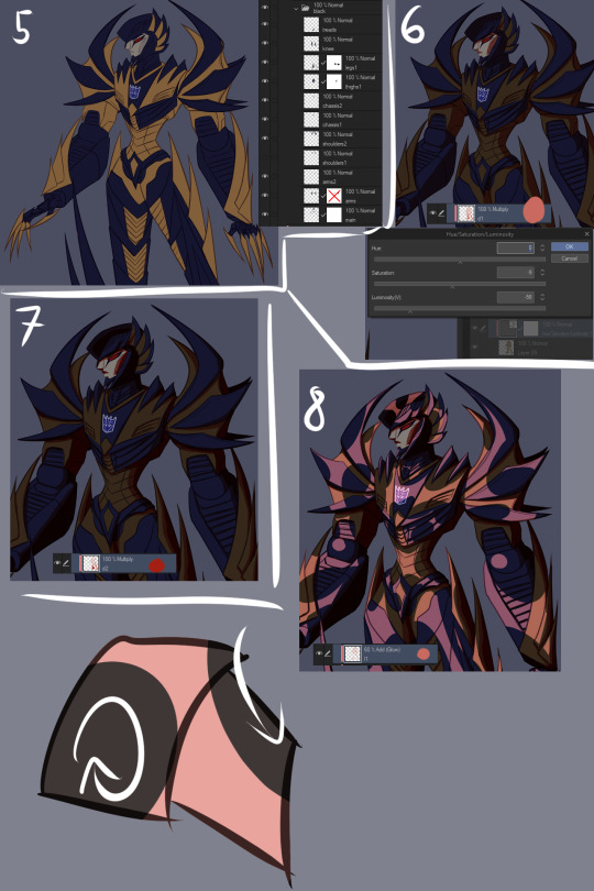
9. More shinies! This time we want it to show up as a bit lighter/brighter than our previous shiny. Using a brighter color or higher opacity does the trick. I do the same thing of coloring large areas and erasing shapes out of them afterwards, but this time I make it argue with my first glow layer a bit. Some overlap is good, but I also want them to live their own lives. (I included a view of the second glow layer alone, but I worked with both glow layers visible.)
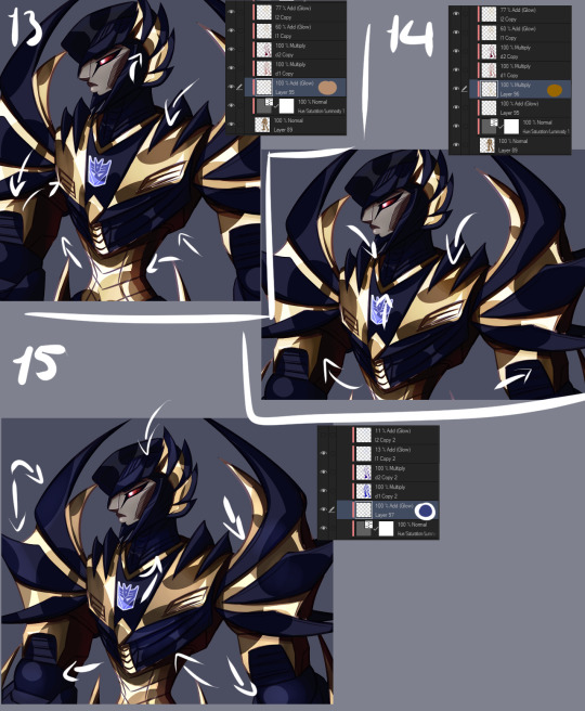
10. We now have two multiply layers and two glow layers. What we also have, is a base color (gold) and separate folders for every subsequent color (black, face, insignia in this case. And optic, but let’s not touch that yet). We now copy our two multiply layers and two glow layers, and move copies of them into each folder (sans optic) and clip them to the base layer in that folder. We move copies of the multiply and glow layers right over our base layer too, below our other color folders. (I deleted the glow layers from the “face” folder because I don’t want the face to be as shiny, and the multiply layers from the “insignia” folder because there’s actually no shadow over the insignia.) We can make our original multiply and glow layers invisible so they’re not messing things up, and what we should have is... The same exact thing as in step 9. Wow.
11. Now we actually make it look good! Though let’s just color the optic while we’re at it so it’s not all empty. Anyway, this is the stage where we really start to think about color and opacity. I want a neutral lighting to showcase his colors best, so let’s see how we get that. The thing we’ll just do is use Tonal Correction > Hue/Saturation/Luminosity to change our multiply and glow layers one by one, starting from our first multiply layer. I turn the other multiply and glow layers off so I can see what I’m doing and and tweak the colors until I get something that doesn’t scream “interesting lighting”, because I want neutral lighting.

12. Then I go through all of the layers one by one and do the same thing to each of them. The reason I have them each on separate layers is exactly this, that I can affect all of the drawing’s colors individually and make them look just as I want to and always have the option of just going back and easily editing things. I also add a glow layer to the face, but with a brush rather than a pen so I get a softer look, buuut then add a second glow layer with a low opacity to add just a little bit of sharp light in there. And now we have a thing! But it looks pretty flat, doesn’t it? We don’t want that.

13. First of all, let’s add some soft glow to the gold. New glow layer below our multiply and other glow layers, choosing a soft color to accentuate the gold, and then using either a brush or airbrush we add just a bit of color in there. Arrows point to the spots where I added it, because we want the effect to be subtle and easy to miss.
14. We can do better than that, though. Let’s add a multiply layer and do the same thing, adding juuuust hints of darker color here and there. It adds a touch more depth, but again, we want it to be easy to miss.
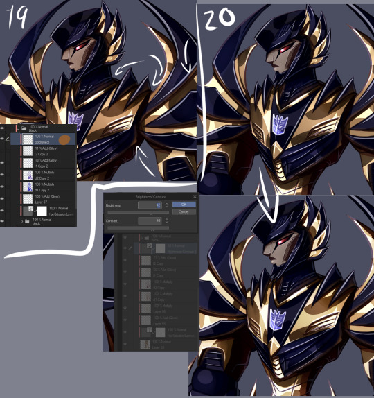
15. Let’s have a look at the black, next. You may have noticed I turned off the second glow layer on it entirely, and that’s because it was decided that the black shouldn’t be as shiny as the gold. We still want to add some life to it though, and because Sunstealer’s black tints towards blue, let’s make some blue happen by adding a glow layer, and again, very softly with a brush or airbrush, add just hints of color in there.
16. It still doesn’t really good though, does it? It’s pretty boring and lifeless despite our efforts. More layers, then! Some fucking edges, this time. A glow layer above all of our existing layers and folders to affect all of them (except optic, ‘cause optic doesn’t need it), take good ol’ bright white, turn the opacity down a bit, and add sharp light to the edges. Like, all the edges that are touched by light. Seams, everything. We want this motherfucker to shine.
17. Okay, now do the same, except this time on the shadows. The layer is on lower opacity and I didn’t use white but desaturated blue instead. Just add a bit of reflected light in there.
18. Slowly getting there, but let’s do a couple more things. First of all, warm color. Basically, I just like to slap a random color on top of the whole damn thing when I’m finishing a drawing, using either a color, a glow, or a normal layer, depending which one gets me the best results that time. Or, all three, if that’s what I feel like. This time I used a color layer with briiiiiight neon orange. I switched the layer to normal and opacity to 100% so you can see where it’s actually applied, which is, again, on top of all the layers. A pretty large area, but even on 100% opacity with a normal layer you can see it’s pretty transparent. If I had wanted to do a more interesting lighting, I would’ve left it more visible and maybe added another similar layer in a different color, but I wanted neutral lighting so we leave it as just a tiny, tiny hint in there.

19. Still not done. Colors reflect other colors, so let’s make that happen on the black and have it reflect our gold some.
20. Almost there. What are we missing? Color correction, that’s what. I didn’t do much of it for this piece, but with some I really play around with correction layers and layers set to overlay and whatnot. But let’s see what we have here. First of all, there’s one brightness/contrast correction layer affecting the gold only, increasing the contrast so things look a bit brighter.
21. There’s also a second brightness/contrast correction layer, this one simply increasing the brightness a bit. It’s mostly for the sake of the black, because I wanted to make it look a bit more blue by making it lighter, but it worked to make the whole image a little brighter along with it. Aside from the optic, that’s still on top of everything else. But like said, how many corrective layers I have going on depends entirely on what I’m doing. In some cases I can have around a dozen in effect, not all of them always affecting the entire image, but split around to do their thing on different layers.
22. But speaking of the optic! It glows, so let’s make it glow with two layers on top of both of the “color” and “lines” folders. One layer is for the blurred red glow, the second is for the sharply reflected light.
23. And for things like these I like a simple background, which I generally do by just using a couple of gradients and altering their color to whatever looks decent. I also often add an outline to the entire character in pieces like this to make the character pop a bit more, by just copying my base color layer and performing gaussian blur on it.
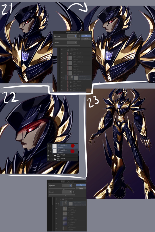
WHEEZE. That’s that, though. Finished product can be viewed here.
Oh, and ctrl+shift and tap will jump you straight to the layer you tapped on. Makes moving between layers and finding the damn layer you wanted to edit a hell of a lot easier.
Annnnnd obsessively naming layers and layer folders so you can tell what the heck they actually are when you have way, way many layers to work with.
*thumbs up*
#asks#anonymous#is that step by step enough#i might've forgotten to mention some layers because there is A Bunch even just for the colors#but i tried to be thorough#but yeah non destructive editing and editability#that's how we get to some overachieving layer counts but make sure we can always go back and always have control
9 notes
·
View notes
Photo

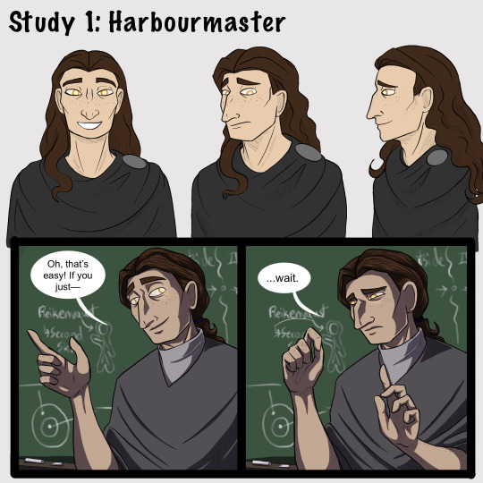


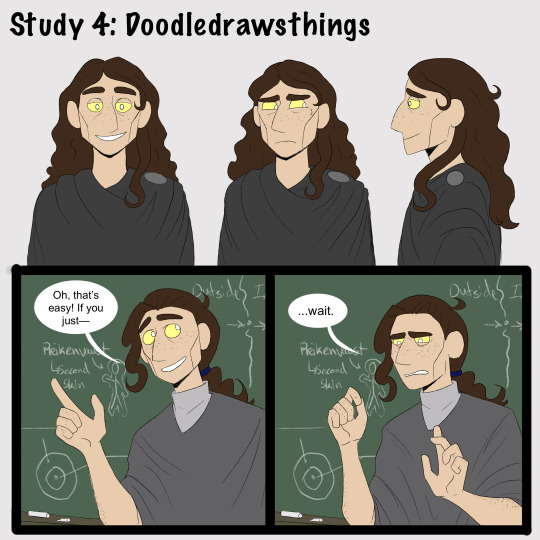

[Brief image description: A series of illustrations of Gerou teaching in front of a blackboard. The illustrations repeat, each in a different art style; at the end is a collection of doodles mixing the art styles and a few notes reflecting on the exercise. Full description and transcript starting at the heading below the cut. End ID.]
Part one of some recent style studies I’ve been doing, featuring Gerou struggling with student teaching!
I wanted to explore how different artists that I like handle stylization and simplification in comics, and when I asked around several people gave me permission to post the results. I recommend checking them out!
1) Harbourmaster is by @waywardmartian.
2) Never Satisfied is by @ohcorny.
3) Broken is by @yubriamakesart.
4) @doodledrawsthings makes a lot of content that is posted to tumblr, most recently a fair amount of A Hat in Time fanart.
Thank you all for the permission to post! ^_^ I'm having a lot of fun with this.
.
Side notes:
I genuinely thought that the Harbourmaster style would be easiest for me, since it contains roughly the same amount of detail as my own style and since I’m like 75% sure that reading it as a younger teen informed a lot of my own style and character designs. Turns out it was actually the hardest! Perhaps because, since there aren’t as many blatantly fundamental differences, I had to pay more careful attention to proportions and specific forms?
.
Never Satisfied was interesting! Alongside the work of Doodledrawsthings it’s definitely the furthest from my own style, and choosing Gerou for this honestly doesn’t do that difference full justice. I looked a lot at Fidelia, Sylas’s mom, and Thierry in trying to figure out how Gerou’s facial features would translate. Part two of my plans is to explore different character designs that might make fuller use of the difference in style, heh. (In other news: Colored lineart looks very neat and studying how it’s handled in NS is the first time I’ve been able to carry it off in a reasonable time frame, hah.)
.
Broken is just... very pretty, y’all. xD I don’t think it really saved me any time or much ease of drawing over my own style, but it’s very nice to look at. And I think the style differences and specific simplifications do lend themselves very well towards creating more consistency than I ever manage in my own art. Noticing the patterned way of drawing ear details was a fun moment for me, I’d never really thought of codifying anything that way before!
.
I did the first drawing in Doodledrawsthings’s style (the 3/4ths view in the turnaround) and thought “Oh goodness this is lovely and quick and feels nice.” It’s very nearly the first time drawing something in a cartoony style has ever come easily for me. But... I struggled much more with every other drawing in that style, ahah. Still, it was comparatively quick and I do love the expressiveness of the stylized eyes. :D This is another style where I think I’ll need to explore a wider range of character designs, though. I think it’s also worth thinking about how character design is fundamentally changed in some ways by the change in style; some of what I would think about designing a character specifically for that style is very different from the details I would normally think about when designing a character.
.
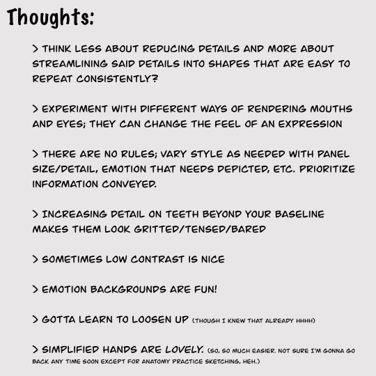
[Detailed image description:
A series of images repeating the same content in different art styles, followed up by a page of sketches and a page with text notes.
The repeated content is a turnaround of the character Gerou as well as a short two-panel comic showing Gerou as a student teacher in front of a blackboard. Gerou is a thin white man with sallow freckled skin, a large hooked nose, long wavy brown hair, and glowing orange-yellow eyes. In the comic, in the first panel he gestures animatedly with a wide smile and says, “Oh, that’s easy! If you just--” then breaks off. In the second panel he holds up a hand as if asking for a pause, and says, “...wait,” with visible consternation.
The sketches feature continued style experimentation with Gerou making a number of expressions and gestures, including: absolutely failing to maintain a good pokerface; looking stressed; various smiles, from tired to nervous to wide and happy; sighing tiredly; sticking out his tongue with arms crossed huffily; arguing with someone; drinking tea; and fighting off a dizzy spell.
The text image is headlined Thoughts and reads as follows:
Think less about reducing details and more about streamlining said details into shapes that are easy to repeat consistently?
Experiment with different ways of rendering mouths and eyes; they can change the feel of an expression
There are no rules; vary style as needed with panel size/detail, emotion that needs depicted, etc. Prioritize information conveyed.
Increasing detail on teeth beyond your baseline makes them look gritted/tensed/bared
Sometimes low contrast is nice
Emotion backgrounds are fun!
Gotta learn to loosen up (though I knew that already hhhh)
Simplified hands are lovely. (So, so much easier. Not sure I’m gonna go back anytime soon except for anatomy practice sketching, heh.)
End image description.]
#I have been hyperfocused on this for a week straight whoops#art#style study#artists on tumblr#style experiment#comics#my art#my stuff#sketches#Gerou#Imperfect Science#image described
35 notes
·
View notes
Note
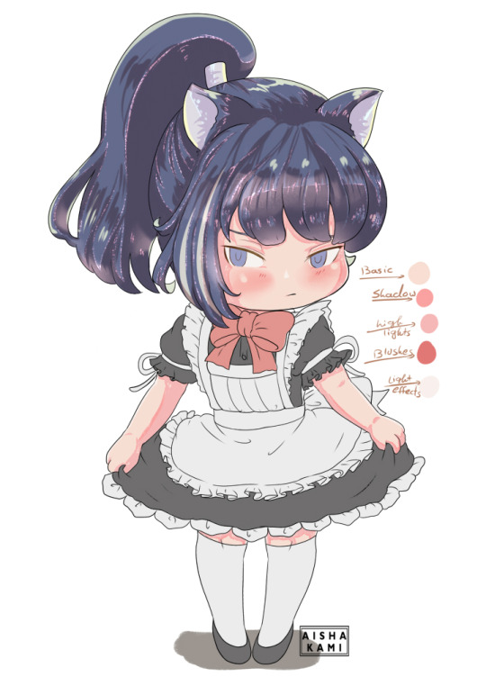
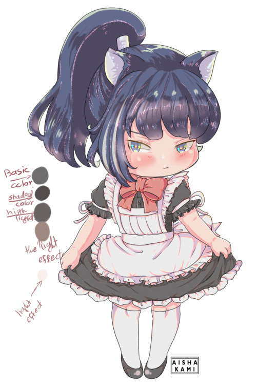
Aishi!! Can you talk about your inspirations for color/ how you learned to color the way you do? How do you pick colors? Does the way you color traditionally have an effect on the way you color digitally? PLEASE TELL ME YOUR SECRETS ;;
ahhh this is going to be long post i think !!!
I don’t really know how to color yet !! i follow my sense of what could look better !! i am not so sure how i will explain !!! but !!!!!!!!!
when i color i prefer to not go with dark-near black colors, i usually use colors that match and complete each other like i use purple/blue/orange/brown/pink to shade anything i colored in yellow, also i use high lights a lot !!! light blue/green/yellow and pink !!! i go with these colors so much !!
anyway here’s some tips i use when i color i hope it will be more helpful for you
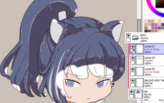
first of all i make sure i made new folder and add all the layers to it !!
i do one big folder for everything including the lineart layers (note i keep the eyes and eyebrows in different layer)


now make new folder inside the previous folder and make sure to color all the basic colors !! I already have all the basic colors in one folder so when i am done i go change the colors for the whole group at once
color as canon colors then go to
Filter
and play with settings however you like !! i usually make it a little lighter

there is not so much different

(before and after lighting the colors)
Coloring hair !!
now that he has two colors for his hair !!!
here what i do

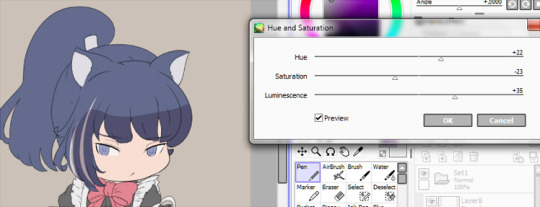
for the shading layer i make the mode multiply and if the color i picked is not matching i go to Hue and Saturation and change the sittings till i find a color that go with both hair colors
now make the shadow in any place or direction you want !! after you are done add new layer under the shadow layer (this usually above the shadow layer but since it is multiplity i prefer under tho it don’t make any huge different !! just a preference)
pick a light color like light red or blue or purple i chose red because the hair is dark and i want something light !!
make the layer mode (Lumi&Shade)
then go to the brushes sitting and change this sittings
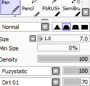
I usually make this brush small because with this settings it is better to be smallest !! it make it like a thread of lights or something ;w;

Here when you are done !! if you think it is dark or need more like you know where to go and change the colors
Filter
change till you get a good result as you want

now add new layer change the mode to Lumi&shade select the skin color and color the nearest parts to the face and play you want to be glowing !!
Go to the blur tool and change the setting then blur the color

if you think that too much you can clean the some parts using soft eraser
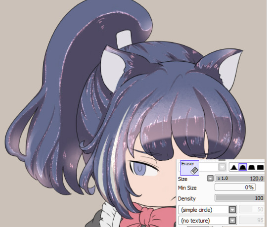
now go back to the blur tool and make smaller size and soften the edges

you can keep it this way or go and erase some parts to make some light effects like this

you can erase the way you want to make it like light reflects or something this step is pretty much depending on you
till here we are pretty much done coloring the hair you can add more light and colors if you want using the old settings
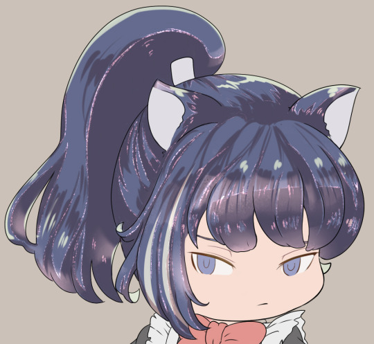
add to smallest places like those hair rolls or corners anywhere you think will fit !! use light colors like i mentioned before
a palette of colors i used for the hair

Can you read my handwriting? ?? NO
sorry it is your problem lol
Skin colors !!
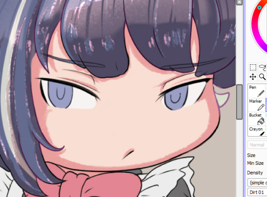
I used the same setting (for both pen and eraser) now shade places you want to be shaded
use the eraser to make small circles on the edge of the shade
like this !!

Add new layer and lighter color to add the highlights on the shadow part
I don’t have specific way to color or pick the colors !! sometimes i go with reds for the skin or change the Hue and Saturation

make a small arrow or ball to draw yourself an imaginary line of light source !! once you know where the light is coming you will know where to shade !! for me i picked very simple direcation for this drawing
-note: this is not necessary but add blushes and lighter color to the skin !!
-the more you select from canon photo the better, keep selecting colors and play with the Hue and Saturation setting till someday (not so far) you will get better understanding of how to pick your colors !! i still pick my colors but i also create my own palette and with time my palette just grow up !!
now add blushes and some light effects “you are not obligated to do this tho lol
Eyes colors’
pretty much i used the same ways to color skin !!
but here
make middle line with the shadow color and had high light color in under there !! Yellow or green are fitting so well with blue/gray or any cold colors !! I usually go with Yellows

-add new layer and color using the basic color of the eye and make it pale
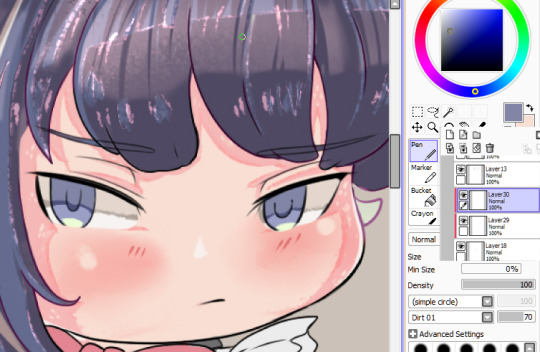
now go in a new layer with mode “Lumi&shade” and make small circles in the middle (pick orange or red or what you like the most !!”

-blur the top part only

-now i add light with soft brush
now go to the line art layer and pick white or very light purple and set the brush on this settings and add small circles to give you more eyes effects !!

now we are done with the eyes
i color the clothes the same way i do with pretty much everything else but here the palette

now as you can see or already knew from someone else i colored the lineart to match the colors i picked

now we are finished coloring !! yaaay
for extra tips i learned is you see when i added everything to one group? (i don’t know if you know about this but i will add it just in case you want it)
now click Right+Ctlr to make a selection

got to the selection> press on Increment to expand your selection click many times like 3-5 times
add new layer under the group and fill it with white or any color !!
now we are done ;w; I hope i helped !! if anything needs to be clear please let me know i never did tutorials before

#this style usually take like three days from me to finish#so it is okay to take your time#long post#i am not very good with explaining but i really hope this is helpful !!#okuwho#sorry for mistakes of any kind#i am not pro#i still learning#and finding new stuff#;;;
12 notes
·
View notes
Last Seen Blogs
the-deep-ones
The Deep Ones
bamagalforever
bamagalforever
i-cannot-recall
Kill Me

yyuurikatsuki
moved
theodorereinel
The Road Not Taken