#fmp pics
Text


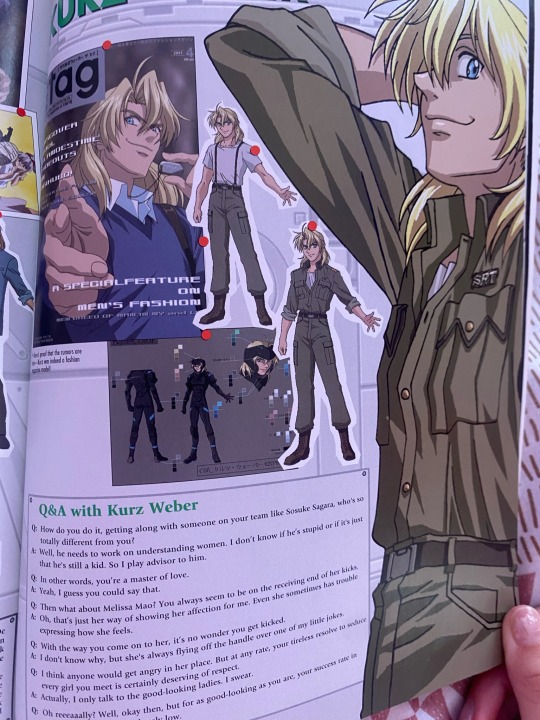
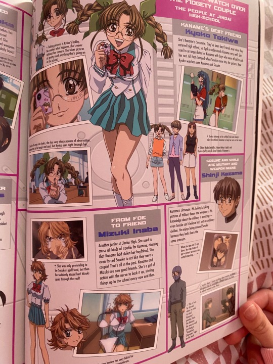
I recently got the full metal panic mission book for the s1 anime, here are the character pages, definetly a must for full metal panic lovers
11 notes
·
View notes
Text

I had clumsily making these multi-panel memes with my minimal editing skills but the concept. It’s hilarious.
12 notes
·
View notes
Text
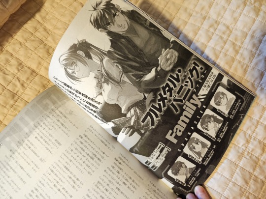
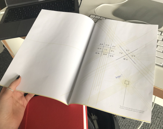
FMP!Family and the FMP! furoku (goodies) from the newest issue of Dragon Magazine!
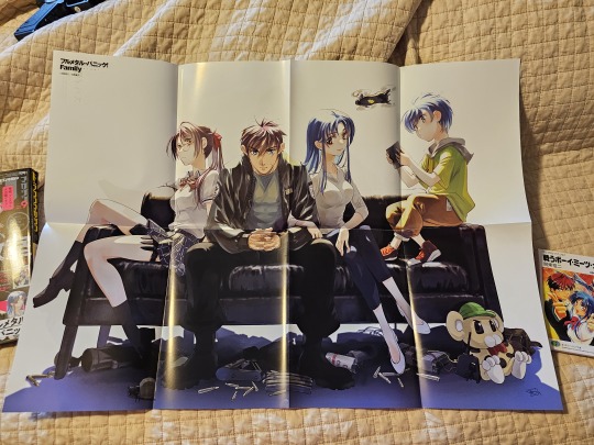
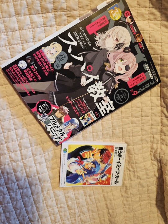
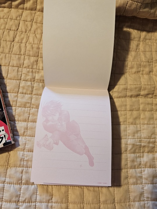
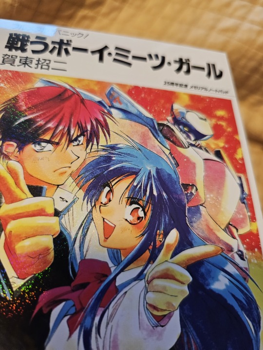

When they said "big size poster" they weren't joking.
The notepad with the OG cover of the first novel, but ✨️sparkly✨️is so cute! :3
#full metal panic#sousuke sagara#kaname chidori#fmp!family#nami sagara#yasuto sagara#kaname sagara#I just realized you can see the grip of a TOY!!! gun in one of these pics#Just... just letting y'all know it's not a real gun lmao#It is. However. A model of a glock. Sousuke's normal choice of handgun is glock. So it's kinda appropriate
43 notes
·
View notes
Text

hashtag anonimity
#trying to make a page for my 1st fmp cuz i really enjoyed that one#thinking about the responses people gave on my questionnaire still makes me feel warm :)#this specific pic is just showing the size of it but tbh idk if i will include it#btext
2 notes
·
View notes
Text
what. what do i even do with a computer. it's been so long. ive spent most of the day just staring at the same stuff i do on my phone.
#misha rambles#there's a few things i'll do as i settle in more#but good god.... i don't have my massive collection of fmp pics... i can get a good chunk back but....#i have no idea how much i'll be missing....#and then there's all the stuff to ADD that has come out since....#before i can even begin to think about working on the site...#and school starts on wednesday so it's not like i feel free to get involved in anything#since kiddo does online school
1 note
·
View note
Text


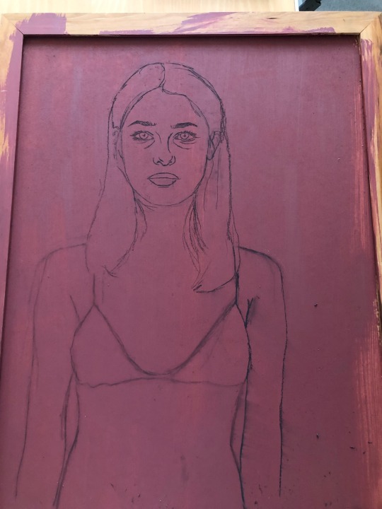
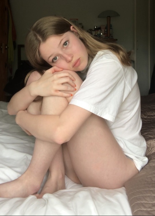

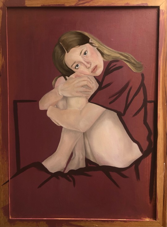
As this piece will be the biggest in my display and therefore will inevitably capture most viewers attention first, I want to make sure it shows emotion and can be interpreted in a way that represents loneliness. I chose a deep plum colour for the background and as I painted it my tutor Clare and I discussed how the colour made us feel. This colour drew no emotion from Clare but for me, it reminded me of my Mum’s lipstick colour which therefore brings some sort of comfort to me as a familiar colour. I painted this background at the start of my FMP and initially I drew a different portrait of myself (my torso and face). I had planned to paint it but during my Crit, a couple of my peers and tutor suggested I leave it as the liner portrait (pic above). I kept this painting aside for a few weeks, unsure whether I was happy with it or not however I knew I wanted each portrait to be an oil painting, and to leave this one as a charcoal sketch would mean it would stand out more than it already would, being the biggest painting. I was also unhappy with the picture I chose to use as I found my pose boring and I knew I could do more with the space of the frame in a way that would express loneliness better. I took a series of photos and I liked this picture the most because of how I am curled into a ball, with my head on my knees. Making my body as small as I can gives the impression of fear and timidness, as if I were to hide (from how I feel). My body being folded over and curled up also reminds me of claustrophobia which is a fear that can cause anxiety and a fear that you can experience when feeling lonely as you metaphorically feel trapped and unable to escape. I think I have been able to clearly convey the emotion loneliness through my painting due to the empty expression on my face and the cramped pose. I kept the material in this image (my top and bedsheets) as a linear paint line as I want the focus to be on the figure. I was unsure on what colour to use for the lines as a brighter colour than the background would have taken away from the skin as the skin tone is very bright. I chose to use the same colour as the background in a darker shade so it is more subtle than contrasting but still visible in order to present the outlines and folds of the sheet and top.
0 notes

Photo


FMP: Road to 3D Illustration
Four stylised renders! And the pic below shows all the matcaps used for each render + my watercolour painting of the bunny with the camera :)
1st render: following my watercolour painting style
2nd render: moebius style, toon shader-ish (https://www.moebius.fr/)
3rd render: gradients
4th render: abstract/loose shapes
This was fun to do! The only struggles was that the matcaps don’t show up well on hard surface things like my camera... I know why it doesn’t work but its still a shame :/
5 notes
·
View notes
Photo
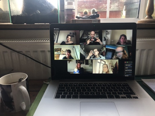
Covid-19 Isolation. 3 weeks in....
Missing teaching and time working with the students and lecturing friends in our college workshops - as we make our way towards the FMP deadlines in May. Interactions now limited to emails and comments and likes on everyones’s instagram and tumblr blog posts. Have now started to use Zoom (* here a pic of one of the first test meetings last week) and once we’re into the start of the new term after Easter we are now planning weekly zoom tutorials with both FAD groups and small zoom group progress tutorials, its something at least and it will be great to actually see and hear everyone. Some great progress work being posted online.
#zoom#tutorials#fad#isolation#teaching#artschool#artcollege#artfoundation#strodecollege#somerset#FE#lecturing#FMP#artists
3 notes
·
View notes
Photo

FMP - Specimen test print 1
I wanted to see if the size was right for the type specimen now that it has content on- it ended up feeling a bit too big (pic one) so I resized it to the size in the second picture; 165 x 235mm. This also allowed me to figure out the envelope size which is written there under ‘env’ - 255 x 185mm which allows for 10mm around the specimen and other contents. I think this is a much nicer, approachable size.
0 notes
Text

Apparently the designs were rushed and HAD to look like the original characters for sponsoring so here’s my rendition:
#full metal panic#sousuke sagara#fmp#kaname chidori#fmp pics#fanart#fanartist#redesign#artists on twitter
10 notes
·
View notes
Text


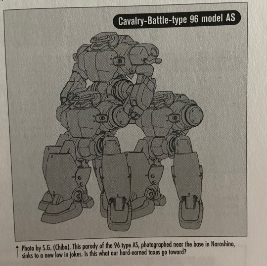

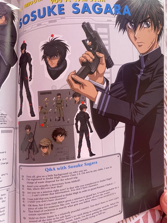
From the anime guidebook (which came out in English!) that covers the first season: the end had a few pages of an in-series AS magazine. This last page had some photos supposedly taken by characters (of possible staff of the studio? I think “SG” might be “Shouji Gatoh”).
The one by “SK” is probably “Shinji Kazama” and the pic of the Hind happens to be a submission from Gauron lol… not sure who the last two are from.
None from Sousuke but he doesn’t seem like the type to take photos of anything himself. He does, however, have two pages detailing weapons used in the series as “Sousky Segal.” Includes his preferred Glock 26 (which is a 19 in the novel). Fun fact—Glocks don’t have a safety switch for the trigger like most guns do. Hope he keeps that thing unchambered when he has it on his waistband!
Edit per reply: okay they DO have a safety feature, just not the same one other handguns do. Still, keeping it unchambered is probably a good idea if you’re an amateur and not a specialist.
12 notes
·
View notes
Text


FMP DAY 1: Suggestions! Screenshots of comments under research on Padlet ^
I’d definitely like to borrow from these points, they definitely gave some really great insights and suggestions towards my project
Primary research:
- take pics of areas/things in my home that have issues of breakage or damage and examples of repair
- gather pics from outside my home of damage and/or examples of attempted repair (there’s a lot because my council is neglectful)


0 notes
Text
FMP

https://pin.it/1XY8iyr - (General Pinterest) On this Pinterest I gathered a bunch of images that link to some of the topics that I have written down and would help me pic out the topic that I would like to go with.
https://pin.it/2zoExcy - (Specialist area) I wanted to look into doing concept art as my main focus, but I also wanted to look into making plushies (or a plush) and models/ sculptures.
Looking at this list the main theme that is jumping out to me and I want to do is dreams and nightmares as I have many ideas for it and I can fit in a lot of other themes into it as well.
0 notes
Text
Polish
The three things I really focussed on improving have been:
Realistic Characters
Improving the intro cutscene
reforming the codebase w/ what i’ve learnt since
Realistic Characters
One thing I put a lot of heart and pain into have been developing realistic characters. This only recently became possible and as such has some hard edges attached.
I was really pleased with how they turned out after a lot of research and youtube videos (where 15mins in it turns out i’m on the wrong video).

( my character from last year, no mesh deformation)
When I started the first iteraction of this game last year for my FMP I tried to make realistic characters but roblox was just not ready (and neither were my modelling skills - pic attached).

Since then roblox has really been dedicating time and resources to developing more realistic and technically advanced features; And since seeing how well it could work in games such as World // Zero which may not use mesh deformation but shows that non default rigs can work well and add to the experience.
Improving the intro cutscene
Another area I wanted to focus my energy on was improving not just the code behind the scenes, but the players experience. Taking the skills and tricks i’ve learnt since my FMP and improving on my old work.
One area I was pretty proud of the first time around was my intro area, I felt it really came together well but never got to finish it. As such I wanted to:
Complete it, players avatar spawns in the menu
Add a little visual flair to it
The first of these two was pretty simple, Roblox has an API I could use to switch out the characters pretty effortlessly but as i’m trying to make this compatable for mobile I had to keep the MB low which made it a little more tricky as I had to give the client assets on the go rather than loading them onto the client straight away.
The second was a little more tricky and at times I thought wasn’t possible, my idea came in two parts: Fill up the logo with colour and pan the camera down to the menu, keeping the logo in place.
Fill up the logo:
This idea came from a good friend of mine and co founder of Topple Studios. They have a running tradition of using this effect in all their releases and i’ve long wanted to recreate it in some way.
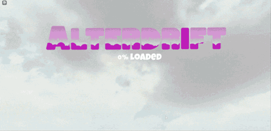
Instead of going from black & White to colour as they do I wanted to see how I could create something with the magical and colour pallete I use for the game. (Above is Topple Games loading screen, below my logo - u may need to open it in a new tab)

As you can see, we already had this purple undertone so I wanted to play with this and see If I could use this to create a cool effect. This is covered in more detail here: ______
Camera Pan with c3d logo:
This was a bit of a pain to get together but super fun and required some creative twists and turns. Having completed the above effect I wanted to move onto the pan but was presented with a problem which I cover in more detail here: _____
The Result - See it in better detail here: https://jmp.sh/2SATKZ1
0 notes

Last Seen Blogs
kaeyasupremacy
kaeya/qiqi Main
smelmo
you stink!
russellius
YOU BEAUTY!
mazetail
Maze Tail

90sbee
mikasa