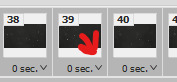
#hopefully if you click on the photos and zoom in the details will look better
Text

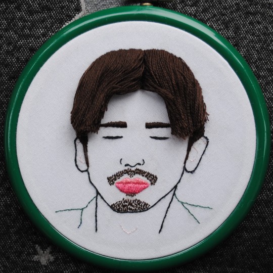
My first fill for @guardianbingo! For the prompt 'hair'.
Thank you to @blackswan-wildgeese, as always, for the help in studying Bai Yu's face far more closely than any normal people ever have. <3 And your constant encouragement. <3
#guardianbingofest#zhao yunlan#guardian#fan art#the second hair style is not spot on and it's driving me up the wall but if I don't call it a day now i never will#and then i'll never complete any fills#hopefully if you click on the photos and zoom in the details will look better#I got way too giddy and excited about this fill because I've seen this type of embroidery a lot but never tried it#or even wanted to try#until now!#hand embroidery#i enjoy looking at Bai Yu's face as much as anyone but i truly felt unhinged during the course of this#it's an excellent face#just difficult to do justice through sewing#i MIGHT upload a video when i have better internet but don't hold me to that#zhen hun#zhenhun#guardian cdrama
95 notes
·
View notes
Note
hiolo! Dearest legendary author, could you possibly do a crime scene investigation au? Like the reader and mdzs characters are crime scene investigators and while at a scene, they're flirting back and forth while trying to help solve the case? Idk, is that too specific? hopefully not lol. ily you're an amazing author!!!!!!!!!
hi there!
i really quite like this idea; i’m not very well versed in this au but it sounds super interesting, i will do my best to deliver
cheers~
»—————————–✄
Wei Ying
“thoughts?”
sat on your desk chair, you turn over to the side, catching the tall, lean figure of your superior
“i should be asking you that, no?” you quib back to your team leader, Wei Ying,
the mouse that you use clicks quietly as you press on the screen to go forward on the pictures that you’ve taken at the crime scene
as a photographic log recorder, you were responsible for taking various shots of the crime scene in the build up of evidence
your most recent case that you are working on now,
could potentially be linked to a serial murder going on in your small town
although you hope that this death was not part of some deranged plan
the possibility of anything other than that,
doesn’t seem to be too likely
“well, you’re the one with the keen eye, aren’t you, y/n? taking pictures of the crime scene and me all the time,”
it must be because you both have been in the field for so long, that the blood splatters and the shadowy textures of your pictures leave you both unfazed
and even put you both in a flirtatious mood
you simply huff a small sound, feign annoyance when you really don’t want to admit that sometimes your hands itch to point your camera to Wei Ying’s profile when he’s directing the rest of the of the team on the field
“team leader, don’t be too distracted from the case,” you remind him, tease him as you do whenever he veers off with a compliment to you
Wei Ying only smiles, a wane sort of thing with you and leans close into your space to get a better look at the pictures
(even though you could easily just zoom in on your computer screen, but i guess we won’t talk about that)
the two of you fall into a pensive silence as you immerse yourself into the different shots, staring at the close-ups of the cement where the blood splattered with intensity
you’re always wholly, entirely, focused whenever you’re working
so you don’t realize that Wei Ying had turned away from the photo to watch you instead
even though your face is tainted with a slight red and grey from the colors on the screen
Wei Ying still finds you beautiful,
and continues to be charmed by your attention to detail
Xue Yang
it’s quite gruesome, but not the worse that you’ve seen
between the rolls of caution tape hanging as a warning
and the broken corner of the brick building
where someone’s head was bashed in
you’ve always found your nearly (practically) photographic memory problematic, as it always left you with too many unwanted details of events and settings
but now, working as a sketch preparer on the team, your memory serves your work well
it also serves your affections well too, when you can remember, recount, almost every minuscule expression that passes by Xue Yang’s face
as the crime scene investigator, he is at the center of everything
and he is almost always, the center of your attention
his wide, almost amused eyes when he discusses the injury of the victim to the forensics team
the lifting edge of his lips, as he peers at the recovered bagged evidence in each of the containers,
the sparkle in his eyes when you lock with him, accidentally, mid-sketch
you remember everything about him, and the scene
which is why, you don’t forget the small bits of blood on his fraying coat sleeves
or the way that the top of his fingers has been slightly cut up, hiding in his coat pocket
can work out in your brain the right-handedness of the killer
and see the parallels of it to Xue Yang
but you know him well,
too welll
so when you had in your sketch as part of the evidence
you don’t take anything else into account
#mdzs#mdzs headcanons#mdzs character headcanons#mdzs imagine request#mdzs reaction request#mdzs scenario request#mdzs x reader#mdzs x y/n#mdzs self insert#mdzs reader#mdzs reader insert#mdzs wei ying x reader#mdzs wei wuxian x reader#mdzs xue yang x reader#mdzs wei wuxian#mdzs wei ying#mdzs xue yang#wei wuxian x reader#wei ying x reader#mdzs wwx#xue yang x reader#xue yang#mdzs modern au#mdzs au#mdzs investigation au#the untamed x reader#cql#tangledwriting
80 notes
·
View notes
Text
Valentine’s Day Surprise - Harry Styles Mini Series (Part 1)

*Companion to This Christmas
**
You sat in front of your computer bundled up in your favorite hoodie and blanket combination. You made yourself some hot chocolate that you sipped on as you went over the changes you needed to make in your book. Your latest draft was back from your beta readers and now it was time to write yet another draft.
It was in the dead of winter in London and it was currently snowing outside of your window. You would be much warmer if you were sitting away from the window, but you had to have a window view when you were writing. Plus, the snow was so pretty. You would always be a lot warmer if you weren’t lonely in the house, knowing your boyfriend was thousands of miles away in sunny California.
Yep, that’s right, you and Harry were still together. Not that you doubted you would be, but it still felt weird to say. You weren’t living together yet, you still had your flat, while he had his massive home. But you did spend a lot of your time at his house or vice versa. Except the last few weeks since he’s been gone for work.
You missed him, a lot, and it’s really been the first time you two have been away from the other since you got back into each other’s lives last Christmas. But he had a movie to shoot, along with various other things he had to do and you had a book to work on.
Speaking of said book, you had spent nearly the entire day typing away and making the changes that were suggested. Even though the book was still not the best yet, it was without a doubt going to be your favorite book you’ve written thus far. And that had everything to do with the meaning behind it.
It was about two friends falling in love during the holiday season, which is exactly what happened with you and Harry. Granted, you two were already in love, but it took some reconnection to finally get you two to express your feelings to the other. You knew when the book would be released and you were being interviewed about it, someone would ask you where you got the idea or inspiration for it and you would have to tell them.
You wouldn’t tell them details or anything, not that anyone even knew you and Harry were together. Not really anyway. The two of you hadn’t really been spotted out together and even if you have, everyone knows your history of being friends, so the whole dating rumors haven’t really been sparked quite yet.
You were fine with that for the time being. You knew how things got, at least from an outside view, whenever he was dating someone, so the longer you could avoid that the better. But you knew one day, it would come out and hopefully knowing the history you have with Harry will make it not as bad.
Your neck was starting to hurt and your head was throbbing from looking at the screen all day. So, you decided to call it day and resume again tomorrow. You were halfway through with the revisions, which wasn’t normal for you, knowing you had just finished a draft not too long ago. But that’s what happens when you’re really passionate and don’t have distractions around.
You shut your computer and headed over to the couch in the living area, plopping down right onto the cushions. You stretched out and closed your eyes for a bit, trying to give them a rest. In that moment, you wished Harry was there because you needed a serious massage of your neck and shoulders.
After laying there for a few moments, you slowly started to drift off asleep, when your phone rang. You groaned, debating on letting it go to voicemail or answering it. However, when you glanced over and saw Harry’s photo, you decided on the latter.
You clicked on the green button and soon Harry’s face was looking back at you.
“Hey, baby,” he smiled.
“Hi,” you yawned, sitting up at a better angle.
“Were you sleeping? Is this a bad time?” He asked, eyebrows furrowing.
“No, I was just resting my eyes,” you said. “Too much screen time today.”
“Remember, you’re supposed to look 20 feet away every twenty minutes for twenty seconds,” he said.
You rolled your eyes, “I don’t have time for that.”
“You do,” he laughed. “Just set a timer on your phone or something.”
“Easier said than done,” you said. “You know if I’m in the zone, it’s hard to stop until I’m at a stopping point.”
“Well, then don’t complain if you’re not going to do it,” he smirked.
You rolled your eyes again, “I wouldn’t have to worry about it, if I had someone here to rub my shoulders.”
“You better be talking about me and not just any someone,” he raised an eyebrow.
“Of course, I don’t want random people touching me,” you shuddered.
He laughed.
“But seriously, how much longer till your back?” You asked.
He sighed, running his hand through his hair, “A few more weeks, at the least... another month or so, at the most.”
“I thought you were almost finished,” you said.
“We are, but then there’s some reshoots and some stuff we’re doing for promo,” he said. “Plus, I’ve got some meetings out here for the next album.”
“So, then I guess this means we won’t be together for Valentine’s Day,” you whispered.
“Not in person, no,” he sighed. “I’m sorry, love.”
“No, it’s fine,” you sighed. “I mean... it’s not that big of a deal. Its not really genuine holiday and I’ve never really cared about celebrating it before... but like I don’t know, I just thought maybe it would be fun. Plus, I miss you.”
“I miss you, too,” he said. “I promise we’ll figure it out, okay? We can facetime or zoom. Watch some romcoms and eat chocolates.... maybe have some fun on camera,” he smirked.
“You wish,” you scoffed. “I don’t trust technology that much. I don’t need someone hacking in and starting an Only Fans with my pictures!”
“Have you been watching Catfish again?” He asked.
“Yes, but I’m using it for research for another novel idea I have,” you defended.
“Yeah, I’m sure,” he joked.
“Anyway,” you said. “I guess us having a little virtual date wouldn’t be a horrible option. It would be better than not doing anything at all.”
“Then it’s settled,” he smiled. “We’ll come up with something fun to do and pick a time that works with the time zones and it’ll be as perfect as it can be, okay?”
“Okay,” you nodded.
“Great, I just wanted to check in and tell you I love and miss you,” he said. “So, I’ll let you get back to resting your eyes and watching Catfish.”
“Ha, ha,” you said. “But I love and miss you, too.”
“Good,” he smiled. “I’ll talk to you later.”
“Okay, see you later,” you smiled, blowing him a kiss before hanging up the phone.
You sighed, placing the phone down as the realization of Harry not being coming home for another few weeks hit you. You knew this would happened. It’s what has happened throughout your entire friendship, but you thought you had grown and it wouldn’t hurt as much.
But you were wrong. It did hurt knowing you two wouldn’t be together for Valentine’s Day. Even though you never cared about the holiday before, this year felt different. You wanted it to be this amazing and special day spent with the man you loved. The man you had waited years to finally be with, but now it was going to happen through a screen and him miles away.
**
Harry felt bad the second he ended the FaceTime call with you. Even though you had put on a smile, he knew you well enough that you were disappointed. Him not being around was part of the reason why your friendship ended the first go around and he made it his mission to never let your relationship end because of that.
He loved you. You are his person and he just got you back into his life. He didn’t want the possibility of you leaving it to ever cross your mind. He had to come up with something to make sure he was there with you. Valentine’s Day was in a little over a week, surely that would give him enough time to figure out a plan.
“Harold, hello,” a voice called out from behind him.
“Oh, what?” He asked turning around to see his manager waving his hands around.
“What’s got you out of it?” Jeff asked.
“I uh... I just finished talking with Y/N,” he sighed. “I told her I wasn’t sure when I’ll be back... and she mentioned missing out on Valentine’s Day...”
“Well, I mean it is just Valentine’s Day,” he pointed out. “Many people don’t do anything on the actual day anymore anyway.”
“That’s easy for you to say,” Harry shook his head. “You’ve been in a relationship for years. This is our first one and Y/N... she’s not normally someone who falls into the whole Valentine’s Day thing... but I could tell she ws looking forward to doing something.”
“Why can’t she just come here, then?” Jeff suggested. “Her schedule is a little easier to move around right now.”
“What’s that supposed to mean?” Harry asked.
“I didn’t mean it to come out like it sounded,” he said. “I just meant that what you’re working on has to be done here in LA... she’s working on something that she just needs wifi and a laptop... that can be done anywhere.”
“Yeah, but I’m the one gone... I shouldn’t have to make her uproot her work,” Harry said.
“Look, do what you want to do, but I’m telling you there’s hardly anytime to travel to London and back with your schedule the way it is,” he said.
“Gee, you’re a wonderful help,” Harry rolled his eyes.
“I’m sorry,” Jeff responded, holding his up.
“I told her I’m going to figure something out and I will,” he said. “If I have to move or postpone things around, I will. Y/N’s important to me and being with her will always be my priority over a meeting that can be an email or postponed to a later date.”
“I get that, Harry,” he said. “But you can’t always be the one who does that or else you’re going to end up being resentful.”
“You know, I thought you were happy Y/N and I were together, but now it seems a lot like you wish I was single,” Harry snapped.
“I didn’t say that,” Jeff said. “I just know how you are, H. At the beginning of a relationship, you’re doing everything to make it work, and eventually you get tried of it and things go south. I know how much you love, Y/N and I don’t want to see it end because I don’t know if you could come back from that.”
“I’m so confused right now,” Harry said. “You don’t want me to change my schedule around to go see my girlfriend because you’re afraid I’ll be doing too much and eventually I’ll break it off?”
“Just think about it,” Jeff said. “If you do this for Valentine’s Day, then what if she expects it any other time. Will she ever be the person who changes her schedule around for you, or will it always be you because you have the most on your plate.”
“Y/N isn’t like that,” he said. “She’s not even asking me to do this.”
“No yet, at least,” he said. “But once she realizes that you can...”
“No, I done listening to this,” Harry said. “You know one day, I’m going to get married, right? And I’m going to have kids, right? So eventually, yeah, I’m going to have to change my scheduled or not do things because I need to be with my family.”
“Exactly, so why waste opportunities now?” Jeff asked.
“Because opportunities will always be there to take, Y/N may not be,” Harry said before grabbing his things and walking out the door.
**
Sooo... what do you think? It’s been a while since I’ve felt like writing... so hopefully it isn’t too bad.
35 notes
·
View notes
Text
I, a campaign manager
so in addition to being a CTO, a CS major, and a dorm vice president, i was also a campaign manager for 2 weeks (the exact campaign that I was managing is not entirely difficult to figure out if you really want to know, especially if you click on the links BUT i will be trying to not mention it specifically here lol). You might be wondering - (1) why and (2) how did you end up becoming a campaign manager..... you're not even a poli sci/gov/humanities/literally anything vaguely related to this major??
You're correct, yes, how did this happen? Well that's a great place to start this story:
How in the world this happened
Friends drag you into stuff. This happens to be the same friend that dragged me to New York, and then was 20% of the reason I got dragged into the negotiation class, and then was maybe 15% of the reason i got dragged into nonprofit activities? In terms of providing unique opportunities in my life, she definitely takes the cake. So one day, she says "I'm running for this position," and me and the squad says "we gotchu." What does that mean? Clearly wasn't sure in the beginning, but we were texting campaign strategies and slogans and tiktok ideas in the chat for fun. None of us had any real responsibilities, especially since the actual candidates were still weighing the playing field and figuring out their platform.
I also was a course 6, so I guess there was some expectation that I would make the website, even though I didn't actually code the website from scratch.
but anyways, it was actual campaign time.
CAMPAIGN SZN
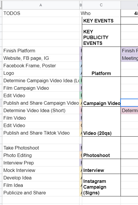
After they figured out the campaign platform, it was game on for the campaign materials. We spent a lot of time on artwork, we photoshopped pictures from a photo shoot, we came up with campaign motto ideas, we brainstormed strategies for officially announcing the campaign. We had an actual campaign meeting to talk over things in mid-April where I met like six different people, friends from both candidates on this ticket, who were supporting this effort. We had a google drive AND a Dropbox. Look at this:
Despite this seemingly organized effort, it was not that organized because this publicity team didn't actually actively do anything for like a week. Many reasons for this: one being it was actually the semester, and it was also CPW weekend. Unfortunately for me, that weekend was literally hell for me, because I was managing this site for our nonprofit, CPW events (so like five zoom calls on a Saturday), classes (because those are still happening), and then the campaign thing finally started, about a week before voting opened. In the form, of a website.
So the tl;dr is I developed an entire Squarespace website in one night. Yes, one night. I had to model it from I think the website from a Harvard campaign site, which took me like three or four hours on a Saturday night, which is a very fast time in my opinion to learn how to use Squarespace. I also bought a domain and figured out how to connect it to Squarespace at like 1 in the morning, which was the first domain I ever bought in my life!

(It expires in a month. I am absolutely going to let it die.)
Also, if anyone from squarespace is reading this for some reason, yall made a really solid product. I actually was very happy with my experience. You all should use it, I am 100% not sponsored by them at all, but honestly it was a very good experience. If you need to develop a website in four hours and don't have a lot of webdev experience, definitely consider it. You can even see website clicks and user analytics, it's actually really put together.
The next day we spend a lot of time going through website changes and artwork changes. It's bad. We had so many discussions about color palettes and the advantages of a 3 column vs 4 column layout. Yes. I'm serious. I'm starting to go crazy.
If anyone's interested, I would say that our website definitely was better than the other campaign's website. Like objectively. Like both campaigns were great, but the website? well. Here's the link (archived because I only paid for 1 month of squarespace :D) The amount of detail that went into it is actually incredible, the amount of spacing, i even had to custom CSS the header image so that mobile headers would show up correctly.
THE CAMPAIGN VIDEO
so sometime during this week, I had this thought about making a really good campaign video. I was very inspired by some of these Google ads that started with a Google search bar. (Yes, I am aware that I am that much of a Google simp.) To be honest, rewatching this ad, I really definitely just copied this entire ad lol, it's ok we don't have to talk about that.
That Wednesday, we coincidentally talked about what makes campaign videos successful. We talked about how Trump's incendiary imagery helped stoke the flames and how it was really effective in getting people to vote, and eventually helped him beat Clinton in the presidential election. So I went and took that and grabbed news clips and campus videos and overlayed that in the video, and it went from like a solid 6 to an 8 immediately, in my honest, unbiased opinion. You can see what I mean in the video itself: [link].
We also had to put together quite a few interviews about what they wanted from the school and were looking for in their candidates, which took a million years of coordination, but we somehow got it done in three days, and everything was put together in a flurry of a weekend, unending changes and small fixes for sixteen hours straight. I could not even tell you how much I learned about premiere pro and how to use layer masks and everything. I even composed the music for the first fifteen seconds of it. Literally, composed, it.
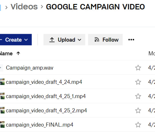
And so on a Sunday afternoon FINALLY right before voting, the video drops. I'm sitting in my backyard absorbing the sun because I hadn't left my computer for 48 hours straight.
It gets like 1000 views or impressions or something in like two days, which is incredible for me, since I'm not a professional by any standards, but I am considering being a professional campaign manager at this point. By the way, we're also managing an Instagram page, a Facebook page, a tiktok page, a website, our individual social media pages, and we're trying to synchronize this video drop and all of our publicity efforts across every single one of these channels. It's chaotic at best.
VOTING SZN
So it's voting week, where we give everyone an entire week to vote. Across the week, it's mostly a waiting game, we make a few more tiktoks and funny videos that we publicize to get out the vote more. The last day, we're thinking about it, and we know the final vote's gonna be close, so we message every. single. person. in our Facebook friends list. I think I singlehandedly convinced like twenty people to vote (and hopefully vote for our ticket).
There's a lot of drama about different stuff. I won't really talk about it because I think it got really messy, but this week and entire couple weeks was a lot to get through honestly. As a reminder, I'm also working on my senior thesis and my nonprofit website work is peaking at this point, so everything is very, very bad and none of us have slept in a while. Also it's the pandemic.
Finally, the results come out. We lost by like 20 votes or something, out of 1500 or so total votes casted or something like that. It's one of the highest voter turnouts in school history or something, I don't quite remember. After that, we're so emotionally drained from this whole thing that we just don't talk about it for a while and that's that.
If the ticket won, I wonder how it would've turned out. I feel like things would've continued to be busy, and maybe that's not a great thing. So maybe everything happened for a reason. I don't know, but those three weeks were quite interesting, quite fun, quite odd. I'm putting those videos in my personal portfolio and am putting Adobe Premiere Pro and Squarespace on my resume and moving on.
Anyways, thought I'd just share! i haven't posted in a while, and this was definitely one of my #weird #odd stories from my time at MIT, which is quite reminiscent of #weird #odd at MIT in general.
1 note
·
View note
Note
hi! how did you make you banner i love it!! :)
thank you! i’ll give a detailed rundown under the cut! i was actually in the middle of making a new header when you sent this, so good timing!
a quick explanation is that i cut out an image, paste it onto a fresh canvas, edit to my desire, and then use a gif overlay on top to give that snow effect!
so i’m going to explain this in as much detail as possible to try and make it as clear as possible, so hopefully this will be useful no matter how much PS experience one has! i used photoshop cc 2017 to make this! i’ve learned ps pretty much through just trial and error so if i do things weird, im sorry sdklfjdslk
start:
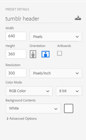
the first thing i do is open a blank document in PS sized to the tumblr header size which is 640x360 on mobile, you can size up if you want, but just keep the ratio the same!
player image:
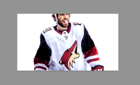
so first i grabbed a picture, and for this i prefer pictures where the player(s) is(/are) isolated, and it’s even better when there’s not much going on behind them because it makes it much easier to cut out the part you want!
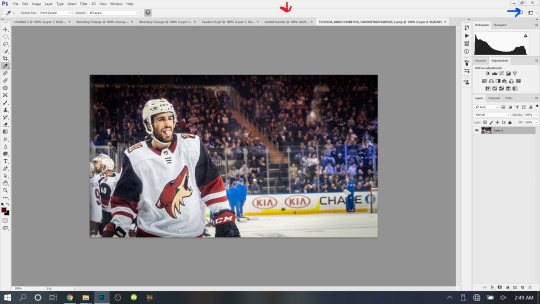
the picture i used for this is from this post on the yotes instagram!

next, i open this up into PS, so i have both the photo and the blank canvas (red arrow) open. the blue arrow points to where you can change workspace presets to allow different tools onto your workspace. i’m currently using the photography preset, but will eventually switch to motion later on.
now i begin cutting out my player. there’s multiple methods to do this and each once has it’s pros and cons. the quickest way for me is not necessarily the best way, but it does what i need it to do, especially when the item to be cut out is isolated in front of a quiet background. i use the quick selection tool to quickly select the area i want with a larger brush, and then i go in with a smaller brush size to clean up the edges and details.

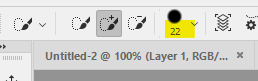
when the option with the plus is selected you are grabbing more area, and when the option with the minus is selected you are are deselecting area. the 22 highlighted above references the brush size, the appropriate brush size, or what is “big” or “small” will depend on the size of picture you’re working on so just play around with what you’re comfortable with!
nick is selected, as you can see below, with the line around his body. this is not quite as careful as i would be if i was actually making this for someone to use, but for demonstration purposes it works. you can zoom in further and use the smallest brush size possible and really be careful cutting things out. you can zoom in but uping the number at the bottom left handside of the screen!

once you have everything selected, right click and choose layer from copy which will create a new layer with just the area you have selected.

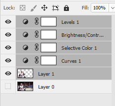
now i turn off the layer with the full picture, leaving only the layer i just created. to do this, click the little eye next to the bottom layer on the right hand of the screen, as seen below.

now you’re left with a transparent player to work with! this is where i do any coloring i want to do as well, so i will quickly do that. i am not great at this part so i will just recommend looking up coloring tutorials if you want more specific help here, or just mess around with different adjustment layers which is what i do lol. once it’s colored to my liking, i merge the layers together, making them into one layer, which means the coloring won’t impact any layers below it once i move it to the canvas where we’re actually going to create the header. you do this by selecting all the layers (ctrl + click all the layers or shift + click the top and bottom layers to select them all), and then right clicking and selecting merge layers from the options.
assembling the image:
now im going to work on the base of the header, or basically the rest of it except for the moving bits! what i want to do here is move the player image over the header canvas, resize the image, decide on the color of the background, whether i’ll use any other images or textures, etc.
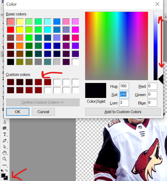
first i’ll think about my background color of choice. a lot of people use the color that they use for their mobile blog on here, or something complimentary or matching their accent color, etc. i really like a simple clean look so i used a white background for this header because i think it makes the image itself pop and allows the accent colors on my blog to also pop because i use white as my main color on my blog.
if i wanted to use another color, i normally pull from some part of the image i’ll be bringing over. for this i’d use the color dropper tool (see below), clicking on color on my image i want to use.

then i’ll pull up the color boxes in order to create a custom color from that color (click define custom colors), and then you can mess around with by clicking different boxes on the color scale along the right side of the panel below, or if you want an unrelated color, click on parts of the entire rainbow scale thing. once you have a color you like, selected add to custom colors and you can work with it. i create a new blank layer and then use the paint bucket tool to color it in. this is where you could also use gradients to jazz up the background a little too.
now i’ll drag my player over into the header canvas. i do this by click + dragging the layer from the right side over to the tab of the header canvas until the screen changes over to that workspace and then i drop the layer onto the canvas.

and
now nick is over on the blank canvas but as you can see, he needs to be resized. so i ctrl + t, which allows me to transform his layer (make sure you only have the layer w the image selected on the right hand side layers panel). i hold down the shift key (this keeps the ratio true) and begin to make him small by dragging the arrows. make sure you do not let go of the shift key too early or it will fuck up the image and make him too long or too wide, etc. then i hit enter, and it completes the transformation. i then drag him to wherever i want him.
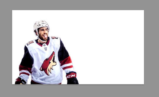
now that he’s resized and where i want him, i mess with the blending options to blend him into the background more pleasingly. now this really isn’t gonna look good since i was so sloppy cutting him out earlier, but just mess around with it until you get something you like. you do this by right clicking on the layer you want to blend and then selecting blending options. i normally do a drop shadow and maybe some other stuff, but i find this changes depending on the image, background, colors, etc.

there’s a lot of stuff you can do here, with the different options and the different settings for each one!
gif overlays:
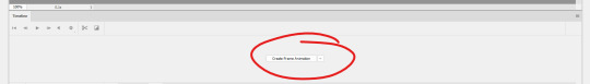
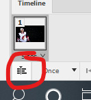
now it’s time to add a gif overlay which i how get the snow falling effect. there’s multiple posts with these kinds of gifs out there, i’ll be using one from this post (method one) and one from this post (method two). neither are the one i used when i first made this header but i cannot find the one i used then; the principles still apply. now is the time to either add the timeline to your workspace, or change it to the motion preset.
on the timeline section at the bottom of the page, there should be a create timeline animation button, click that.
as with gifs from videos, there’s multiple ways of making these gifs. i’ll run through two here.
method 1: this is the method i used when i first made this header!
if you use a gif overlay, and it comes with frames, create as many frames as that gif comes with to then copy those frames onto. open your gif and see how many frames/layers. this one has 29 as you can see below.
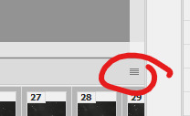
now click the little button with lines at the top right corner of the timeline. it looks like this.
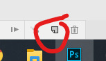
next click select all frames from the menu that pops up, and then select that menu again and click copy frames. now go back to your header and create the frames i talked about earlier, you need 29 (or whatever it may be for your gif). do this by selecting the button below, located along the bottom of the timeline. do this as many times as needed until you have enough frames.
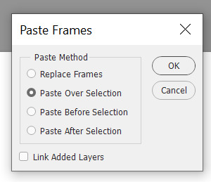
now select all the header frames once again and go back to the menu where you copied the frames and select paste frames this time. a menu will pop up, and choose paste over selection. this will match up the frames/layers so frame one of your header will match with frame one of the gif. adjust the gif size if you need to, once again using ctrl + t, and make sure you still have all the layers selected and that you are still on frame 1. also make sure you move these layers under nick in the layer order.
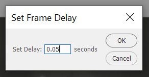
now adjust the frame rate. this will depend on your tastes entirely so test it out. my go to frame rate is 0.05 for everything i do pretty much, as a baseline, and then i adjust from there. to do this, once again select all your frames. next, click on one of these little carots, select other, and input your frame rate in the box that pops up.
method two:
this method is when your overlay comes in timeline form (idr what it’s called) instead of frames, looking like this.

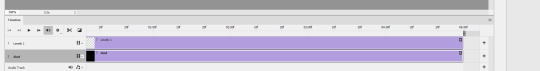
drag the layer from the layer panel onto the header canvas, just like we did with nick earlier. make sure it goes under nick in the layer order. adjust the size if necessary, still using ctrl + f to keep the shape. make sure to click this button at the bottom left corner of the timeline to convert the frame into a timeline.
now, make sure to drag each layer to the same length, aka whatever length the gif layer is. make them match!
changing the color of the overlay:
this works with either method above! create a new layer and fill it with the color you want the snow to be. place it below everything except the background layer. add a gradient layer on top of the gif layer. right click on this layer and click create clipping mask. this is what my layers look like, i don’t normally label them but hopefully this is clear.
open the properties panel for the gradient map and make sure this gradient is selected and is black and white.
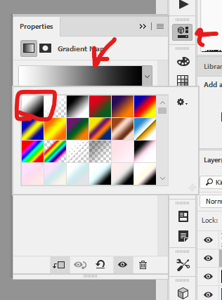
finally, change the blending to lighten on the gif layer! this should do the trick!

final touches:
i like to kind of have my header melt into my blog color, so i like to kind of transition the bottom of my header into whatever color my blog is. to do this, i use a multitude of methods. for this header in particular i used the eraser tool + a textured kind of fan brush to swipe back and forth creating the half erased look at the bottom. the setting seen below are probably similar to what i did when i originally did this header!

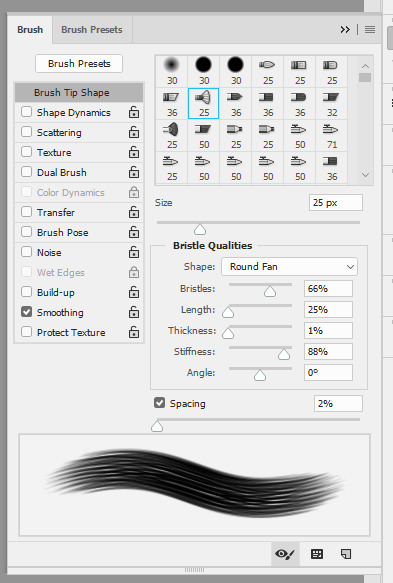
again, this is something that you can play with a lot yourself, especially by downloading brush packs and seeing what cool textures you can create.
saving:
to save, file > export > save for web
make sure you select “forever” and not “once” so that the gif loops!
original:

gif method 1:

gif method 2:

(ignore how this is also different i had to remake it once again bc i didn’t save it lmaoooooo)
5 notes
·
View notes
Photo

Welcome to this half-assed guide on how to start up a writing blog! Hopefully, it will manage to provide some important and/or useful information for all of you aspiring fic writing bloggers out there.
Please note that many visual examples have been linked to certain steps. If my explanation is not clear, click on the link provided for a visual example of what I am saying. The whole album of examples is right here.
Without further ado, let’s get to it!
1. THE BLOG
The very first step of our journey, and perhaps, the most important. Your blog is the face of your writing, and the face of you, the writer. And by blog, I mean your desktop theme, your mobile theme, and your master list. This section here will be dedicated to formatting all of those things.
The desktop theme.
Your desktop theme is the layout of your blog as displayed on a computer screen. As a generality, you want your blog to be as readable as possible because that is the main thing people will be doing on your blog. Reading your stories. My main tips for your desktop theme are:
The bigger the font size, the better! Try to avoid anything under 10px, and attempt to go for any theme that has a font customisation of 11-12px. Despite that you can zoom on a desktop page when reading a fic to make the text bigger (ctrl and + on PC, ⌘ and + on Mac), not everyone knows this. The bigger the font size, the more readable your blog is.
Minimalist, single column themes are ideal! Readers can be deterred by cluttered themes, where they go onto your blog to find that it has three columns, the sidebar is so long that half of your links are cut off, etc. You want to keep it simple and easy. Having a sidebar and header is completely fine because it can add some flare to your theme, but a single column is something I stress. It allows the reader to take in one post at a time, and it generally allows for a larger font size, too. Multiple columns can make your blog seem cluttered, especially if your more recent posts are all text-based, which can literally appear like a massive, confronting wall of words. Keep it simple, keep it single.
Visible, easy to access links! Links are super important, as the first thing your reader is likely to do on your blog is search for your master list link. Most themes will have some kind of coding for links, so they are very simple for you to set up. But the more visible your main links (master list, faq, messages) are on your desktop blog, the better. As you can see in this image, my links are one of the first things you see on my blog.
That is pretty much the basics of your desktop theme. Now, for some quality theme makers that I recommend sourcing your themes from: @shythemes / @sorrism / @odeysseus / @acuite / @pohroro / @neonbikethemes / @felinum / @neothm / @theme-hunter (which is a blog that sources loads of themes!)
The mobile theme.
Your mobile theme is the layout of your blog as displayed on the mobile app. The main elements that you can customise here are your header and description. The most important aspect of the mobile theme is your links, so I am going to show you how to make a link for your master list. Please note that you cannot make links on the mobile app, it must all be done in the Edit Appearance section of your desktop blog.
Go onto your blog and click on Edit Appearance.
Under Appearance Options, go to the Description. This is where we will be entering the code for your link.
Copy and paste this code: <a href=“Insert Link Here”>Link Name</a> and alter the bolded sections to be the link to your master list, and whatever you wish for the link name to appear as. ‘Master List’ and ‘m. list’ are the most common, but feel completely free to think out the box! This is what it should look like.
Save the theme. When you go onto your mobile theme, the link should be activated and looking something like this. Test it out by clicking on it, and if it redirects you to your master list, then you have successfully created a link!
This process can be done for all of your links on your mobile theme, such as your FAQ and fic recs. All you have to do is copy and paste that code into the description and alter it as desired. If you wish for the links or any other text in your description to be on a new line, just add <br> to the start of each line of text that you want on a separate line, as seen here.
Important note: If you are wanting to change the header of your mobile theme, make sure you are doing it on desktop, with your desktop theme customisation page open in a different tab. This is because whenever you alter your mobile theme header and save it, all of your link coding will be erased (this is what it will look like on your desktop theme customisation after you save the new header – see how all of your coding is gone?) and your mobile description layout screws up, like this. Having your theme customisation page open in a different tab before you edit your mobile theme allows you to highlight and copy your description code. So, after you save the new mobile theme adjustments, you can refresh (remember to do this, but only after you have saved the mobile theme) your desktop theme customisation page and re-paste that code into the description section and save it so it all looks normal again without having to rewrite it all.
The master list.
The final part of the blog section is setting up your master list. There are many, fancier ways to create a master list, such as a coded page that arranges your stories by filter, etc. But this is going to be the simple, mobile-friendly master list that I use.
Create a new post. If you want to have a header for your master list, make it a photo post. If you do not want to have a header for your master list, make it a text post. For example, mine is a photo post, as I wanted to have a header for my master list.
The layout of your master list depends upon you. Some writers like to section their master list by series, oneshots, and drabbles (like me). Other writers like to section their master list by the members. Some writers like to add a small description of the fic in the master list (like me). Other writers only add the genre of the fic, eg. fluff, angst, a specific AU. Decide how you would like to present yours, but for the sake of this mini tutorial, I am going to section it by member, and only add the genre of the fic.
On your new post, title your master list however you please. Then, begin setting up your preferred layout.
Now, to add the links to your stories. What you will want to do is highlight the title of your story (or whatever text you are wanting to be the link to your story, eg. on my blog, it is the chapter number, or ‘read here’ for my oneshots). When you do that, a row of eight circular icons will appear above the highlighted text. Click the infinity symbol.
The infinity symbol will open up into a bar where you can enter a link. Copy and paste the link to your story here, and then click done.
Now, your story will be hyperlinked to that text! Rinse and repeat this process for all of your stories in your master list. Save and post, and your master list is complete! The end result will look like this in the post, and will look something like this on your blog.
With every new story that you post, all you have to do is go back and edit your master list post to add in the new story. You can do this by opening up your master list post and then clicking the edit symbol in the top right corner, which will take you to the post editing screen.
Note: The link that is created when you post your master list is the one that you will copy and paste into the coding for the master list link we created back in the mobile theme section!
2. THE POSTS
Our second step gets down to the marrow of all this. Posting your stories. The layout/format of your story post depends upon you, though there are a few general guidelines that I recommend following, as all of us fic writers do it too.
The story post.
Make sure your layout is readable! A good, clear format is what draws a reader in; it encourages them to give your story a chance. One that is vague, or extremely cluttered and nonsensical will deter a reader. You know those general guidelines I just mentioned? They are including the pairing involved, the genre of the story, the word count, and a brief, yet intriguing description the details what the story is about (like a blurb). Warnings are also important to list, if there are any that you think may heavily affect certain readers (eg. character death, or dealing with tough topics like suicide). If it is a series, it is recommended to link your already posted chapters to every chapter post, too. It saves the reader from having to constantly go back to your master list to find the next chapter.
Create a header (optional)! It has become common over the past year to add a header/banner to your story. Doing so adds a bit of colour to your story post, and somewhat acts in the same way a book cover does. Here is a tutorial on how to make a header with Photoshop. If you decide to do headers, then I suggest making it unique to you! Creative, original headers are what catch the eye of the reader.
Tag your story appropriately! The process of tagging your story is what makes your story appear in the search results whenever someone looks up that particular tag. It is really important to tag your story appropriately, as in, do not tag your story with ‘bts smut’ if there is literally no smut at all in the story. Here is where you tag your stories and what the tags look like after you have entered them (separate each tag by using the comma button).
Use ‘keep reading’ links! This is mainly for stories that are over 450 words. The ‘keep reading’ or ‘read more’ separator makes it so that the reader has to click on the link to open up the rest of your story post in order to read it. The purpose of this is so that your entire story does not clutter up the dashboard, and make your followers have to scroll past thousands of words just to get to the next post. They keep everything tidy! Place this separator anywhere after your genre/pairing/word count/warnings format, as those details will still need to be visible for your reader on the dashboard.
Licensing your stories.
After many incidents of plagiarism, it has become common to clearly copyright your stories. Since everything you post online is technically copyrighted to you (as long as what you are posting is your own original content), all you need to do is state: All Rights Reserved © [Your Blog Name]. For example, mine is: All Rights Reserved © Vankoya. I copy and paste this license after the author’s note at the bottom of all my story posts.
3. EXTRA NOTES
Now that all of the technical stuff is out of the way, I am going to mention a few things here that all new fic bloggers should keep in mind when starting out.
Be patient when it comes to receiving feedback, followers, and notes! It is very rare for a new writer to receive plentiful of the above straight off the bat. Yes, there are certainly a few who manage to dive into the fic writing community and have their stories receive loads of notes and messages within their first month of blogging, but as I said, that is a very rare case. To put it in perspective, on my first fic writing blog, I had nearly twenty oneshots posted by the time I breached my first thousand followers, and started getting more than 50-100 notes on my stories. It can take time. Just remember that everyone started with nothing. Even those that receive daily messages, who have 500+ notes on their stories, and thousands of followers. Besides, how popular your stories are within the community does not define whether your writing is good or not. Trust me!
On that note, try not to channel all of your focus on popularity! Do not let the reason why you started writing and posting your stories in the first place get away from you. This has been a pretty big thing within the fic writing community lately, where an unnecessary divide has been created between writers who receive more recognition, and those who receive less. Please, do not let popularity define the reason why you write, because it will only eat at you until your passion/hobby becomes something that you resent. Please, do not play in this current game of blaming more recognised writers for ‘stealing’ the spotlight from everyone else, because that is not true. As a reader myself, it takes a lot for me to stray from a writer that I am familiar with (especially when I barely have enough time to read their writing as it is), so I recommend keeping that in mind if you are ever wondering why you may not have tons of readers. It just takes the right reader to stray out of their limits one day and discover you!
Taking requests for your first month or two can help a lot! Readers love requesting ideas, and that is something that I did a lot in my first two or three months of writing on my first blog. It draws in an audience who can take part in what you are creating, and you will be able to get an idea for what it is that the readers are desiring to read. My main points with requesting are you do not have to write every single request you receive, and you do not have to write a request that does not inspire you, or involves a topic that makes you uncomfortable. These requests do not have to be full-blown oneshots (unless you wish for them to be), they can be simple drabble requests for some fun, and can act as a break in-between you writing your own original stories. From my own experience, most of my audience was gained this way on my first blog. Though it is not necessary for you to do, especially if you are mainly writing for your own enjoyment, and not for consistent feedback.
Well, that’s about it! I hope this guide can help you out in some way. If there is anything further you feel like I can add to this, please send me a message and I will look into it.
Good luck with your new endeavour. Enjoy writing!
283 notes
·
View notes
Text
Macbook Pro Software Update Not Working

System cleanup in one click

Which audio driver is used by MacBook Pro 7.1??? I'm running BootCamp (Windows7 Ultimate x64) and I'm having a problem with audio input, so I'm looking for anything taht will make it work. In Device Manager I had 'Cirrus CS4206A (AB13)' and three devices of 'NVIDIA High Definition Audio'.
Make your Mac fast and secure with CleanMyMac X.
The trackpad is a vital component for any desktop. It allows you to interact with the graphical user interface in ways keyboard shortcuts simply don’t allow.
With a trackpad not working Mac and PC devices may feel downright useless. As we’ve become accustomed to interacting with our computers using a trackpad or mouse, a Mac trackpad not clicking or responding to gestures is troubling.
But don’t worry, if your MacBook Pro or MacBook Air keyboard is not working, as you’ve arrived at the right place, get some of the best possible solutions here. Why Is MacBook Keyboard Not Working? Macs are usually smooth-running machines. However, software and hardware related issues can arrive during use. The documentation indicated that the update: 'Fixes a stability issue that could occur during heavy CPU load on 16in MacBook Pro (2019 and 2020) and 13in MacBook Pro (2020)'. Hopefully we won't. The 16-inch MacBook Pro brings a whole new class of performance to the notebook. Thanks to a more advanced thermal design, the Intel Core i9 processor with up to 8 cores and 16 threads of processing power sustains higher performance for longer periods of time — and delivers up to 2.1 times the performance of a quad-core MacBook Pro. Testing conducted by Apple in October 2020 using preproduction 13-inch MacBook Pro systems with Apple M1 chip, as well as production 1.7GHz quad-core Intel Core i7-based 13-inch MacBook Pro systems with Intel Iris Plus Graphics 645, all configured with 16GB RAM and 2TB SSD. Tested with prerelease Shapr3D 3.45.0 using a 288.2MB model.
We’ll discuss how MacBook trackpad problems can be solved, what to do when your trackpad fails, how to fix trackpad on MacBook, and the apps that keep any Mac running smooth so you can avoid issues with your trackpad in the future.
Why isn’t my trackpad working?
If a MacBook Pro trackpad not working is ruining your day, there could be a simple fix. First, let’s explore why your trackpad may be spontaneously unresponsive.
If the MacBook trackpad not working is an issue for you, the easiest fix is to plug in an external trackpad or mouse to your Mac.
The first thing to do is check if your version of macOS needs an update. To do so, click the Apple logo in the Mac’s menu bar, select ‘about this Mac,’ then ‘software update.’ If the Mac you’re using has new firmware available, download it.
The reasons for a MacBook trackpad not clicking are varied. It could be the macOS version it’s running, or an app that’s causing issues behind the scenes. It may even be that your system is overworked, and the trackpad is unable to keep up with your clicks and commands.
Finally, your settings may be to blame, especially if an app changed them without notifying you.
How to fix trackpad on your MacBook
There are six key ways to diagnose and fix an unresponsive trackpad on your Mac. Keep in mind an external mouse or trackpad plugged into a Mac is the simplest way to navigate these issues, as a plugged-in peripheral device has no connectivity issues.
Check system preferences
The aforementioned steps for updating Mac also apply, but you can do the same in system preferences. Here’s how:
Select the Apple logo at the top left corner of the Mac menu bar
Select “System Preferences”
Select “Software Update”
If prompted, download and update your version of macOS or OS X
Disable force click
The trackpad on your MacBook has two main interactivity types: force click, and tap to click. The difference between the two is how firmly you need to press your trackpad to get a response. Tapping allows you to simply tap the trackpad to select items, while force clicking demands you press firmly enough on your trackpad to hear (and feel) a click.
Macbook Pro Software Update Not Working Windows 8.1
If you’re tapping and not clicking, it may be the cause of your issues. Here’s how to toggle the setting:
Select the Apple logo at the top left corner of the Mac menu bar
Select “System Preferences”
Select “Trackpad”
Under the “Point & Click” heading, toggle the “Force Click and haptic feedback” off
In this heading, you can also tweak how forcefully you need to tap or click your trackpad to elicit a response. Simply select the “Click” slider, and change the setting to suit your needs.
Reset trackpad
A MacBook pro trackpad reset is not as daunting as it seems. All you’re really doing is toggling your MacBook’s trackpad back to the factory settings in System Preferences.
Most of us altered the settings of our trackpad to better suit our individual needs, and it may have caused issues in the background that causes a trackpad to become unresponsive. To toggle settings back to their original positions, follow the first three steps above to get into the “Trackpad” section in System Preferences.
Make sure “Tap to click” is unselected. In the “Scroll & Zoom” header, ensure “Scroll direction: Natural” is selected. These two setting should return your trackpad to its default state.
Reset NVRAM or PRAM
A lot of niggling issues can be solved with a simple NVRAM or PRAM reset. It’s a simple fix you can do any time, too. Here’s how:
Shut down the MacBook completely
Wait 30-60 seconds
Open MacBook and press the power button
Once the MacBook screen illuminates, immediately press and hold the option, command, P, and R keys
Hold the keys down for 20 seconds, or until you hear a startup sound
Release the keys and let your MacBook boot up normally
Reset the SMC
The SMC reset protocol depends on which MacBook you have. For those MacBooks introduced in 2017 or earlier, follow these steps:
Power down MacBook completely
With the MacBook off, press and hold the shift, control, and option keys
While holding those keys, press and hold the power button
Hold all four keys for ten seconds, then release
Press the power button to boot the MacBook
For MacBooks 2018 or later (with a T2 security chip) follow these steps:
Shut down your MacBook, and make sure it’s unplugged from any power supply
Wait 15 seconds, and plug the MacBook in
Wait five seconds, then power MacBook on by pressing the power button
Run Apple diagnostics
Your MacBook can run a simple diagnostics check from startup. Here’s how it’s done:
Disconnect the MacBook from all external devices except a power supply (if necessary)
Shut down your Mac completely
Power the Mac back on while holding down the D key
When you see a screen asking your language preference, release the D key and select your preferred language
Allow the diagnostics to complete its check
All of these diagnostic and repair steps may be avoidable, too. If you have CleanMyMac X on your MacBook, a routine checkup performed on a schedule of your choosing can help keep any Mac running in peak condition and your settings appropriately stable.
CleanMyMac X’s Smart Scan feature quickly checks the Mac for unnecessary files, privacy issues, and ensures its optimized for speed. There are also unique modules for speed optimization and privacy checks, which perform a deeper scan of a MacBook. CleanMyMac X is also the best way to update and remove apps from your MacBook, helping you feel confident the apps you love aren’t surreptitiously disabling your trackpad.
Bonus tips for your Mac
Repairing and maintaining a Mac is always important, but so is diagnosing it. iStat Menus helps you know exactly what’s going on with your Mac in real time, and lives in the background to keep you focused.
iStat Menus only appears in the Mac’s menu bar, with rich icons that provide a glimpse into your Mac’s performance. If you’re curious about what a Mac is doing, simply click the iStat Menus icon to bring up a full menu of the Mac’s CPU, memory, disk, network, and sensors.
Hovering over any of those categories brings up a sub menu with even more detail – and hovering over sections in the sub menu will surface a chart detailing Mac’s performance statistics in real time. There’s simply no better way to know what a Mac is doing behind the scenes than iStat Menus.
After you’ve diagnosed your MacBook with iStat Menus and maintained it with CleanMyMac X, your next step is backing your system up. That’s where Get Backup Pro comes into play!
Get Backup Pro allows you full control over what you backup, and when. You have the ability to run routine, scheduled backups of particular folders, or your entire system. It’s great for those who want to keep daily backups of their documents or photos, but only want to backup an entire system on occasion.
Get Backup Pro even provides the ability to create bootable backups of your entire system; it’s the perfect app for creating clean, thin, bootable backups in the event you need to restart from scratch.
A wonky trackpad is never fun to deal with, but it can be avoided. Often, trackpad woes are little more than an overtaxed system that can’t respond in time to your trackpad clicks and gestures. iStat Menus helps you understand if that’s the case.
CleanMyMac X allows you to keep Mac running smooth better than anything else, even Apple’s own built-in tools. And when you’re confident your Mac is in peak condition, creating a backup is always a smart idea.
All three of these wonderful apps are available for free during a seven day trial of Setapp, a robust suite of productivity apps for Mac.
In addition to these three apps, you’ll gain immediate and unlimited access to the entire catalog of nearly 200 other impressive apps for any Mac in Setapp. When your free trial is over, retaining unlimited access to all of those amazing apps is only $9.99 per month, so why wait? Give Setapp a try today!
Setapp lives on Mac and iOS. Please come back from another device.
Meantime, prepare for all the awesome things you can do with Setapp.
Read on
Sign Up
Setapp uses cookies to personalize your experience on our website. By continuing to use this site, you agree to our cookie policy.
Country / RegionModifying this control will reload this page
Apple has determined that a very small percentage of 13-inch MacBook Pro displays may exhibit one or more of the following behaviors:
Display backlight continuously or intermittently shows vertical bright areas along the entire bottom of the screen
Display backlight stops working completely
Affected devices were sold between October 2016 and February 2018. Apple or an Apple Authorized Service Provider will service affected MacBook Pro units, free of charge.
To identify your computer's model and to see if it is eligible for this program, choose Apple () menu > About This Mac. Eligible models are listed below.
MacBook Pro (13-inch, 2016, Four Thunderbolt 3 Ports)
MacBook Pro (13-inch, 2016, Two Thunderbolt 3 Ports)
Note: No other Mac notebook models are part of this program.
Please choose one of the options below for service. Your MacBook Pro will be examined prior to any service to verify that it is eligible for this program.
Find an Apple Authorized Service Provider.
Make an appointment at an Apple Retail Store.
Contact Apple Support to arrange mail-in service via the Apple Repair Center.
To prepare your unit for service, please backup your data.
Note: If your MacBook Pro has any damage which impairs the service, that issue will need to be repaired first. In some cases, there may be a cost associated with the repair.
Macbook Pro Software Update Not Working Windows 10
This worldwide Apple program does not extend the standard warranty coverage of your MacBook Pro.
If you believe your MacBook Pro was affected by this issue, and you paid to have your display repaired, you can contact Apple about a refund.
Why Won't My Mac Do A Software Update
The program covers eligible MacBook Pro models for 5 years after the first retail sale of the unit or 3 years from the start date of this program, whichever is longer.
0 notes
Photo

HTC U12 Plus announced: Snapdragon 845, better Edge Sense, haptic buttons HTC might not be the king of mobile that it once was, but it’s far from down for the count. Last year HTC brought a much needed design overhaul to its flagship series, swapping metal for glass. In 2018, HTC is all about refinement. Today HTC unveiled its latest flagship, bringing with it much of what we loved about the HTC U11 Plus but with a few obvious upgrades. Here’s everything you need to know about the HTC U12 Plus. Same design, just a bit more refinement Anyone who has used the HTC U11 or U11 Plus will find the latest flagship very familiar. HTC continues its minimalist Liquid Surface design language, giving us a beautiful glass design with IP68 water resistance. While some might have liked to see a few more changes, the HTC U12 Plus is still a gorgeous device. We also have to applaud HTC for resisting the notch, something many other 2018 flagships are now rocking. So what’s new here? The most notable design change can be found in the buttons. Instead of physical keys, they are now pressure-sensitive. While these buttons may not provide a physical click, they do provide haptic feedback to let you know they’ve been triggered. An enhanced camera experience The rear camera configuration has 12 and 16MP cameras with f/1.75 and f/2.6 apertures, respectively. The main camera also now includes optical image stabilization (OIS), which should make for smoother video and more stable photos. You’ll even find phase detection and laser autofocus on board. The 12MP UltraPixel 4 camera should provide a much better low-light experience than found in the U11 Plus, thanks to its 1.4µm pixel size. Meanwhile, the secondary shooter is a telephoto lens, capable of 2X optical zoom and 10X digital zoom. Selfie lovers should find the new front-facing camera a real treat. There are actually two wide-angle 8MP sensors on the front, which offer extras like auto and manual Bokeh modes. The new front cameras also add face unlock for quickly unlocking your phone. While face unlock isn’t as secure as a fingerprint scanner, it’s still a nice extra. HTC is also adding a little fun to the mix with AR stickers that you can place into photos and videos. It’s far from a killer feature, but not a surprising addition considering we’ve seen somewhat similar features from Samsung and other OEMs. It’s too early to give our judgment on the camera experience, but it is worth mentioning the HTC U12 Plus has been awarded a DxOMark score of 103. That’s impressive, but keep in mind that DXOMark scores aren’t everything. Edge Sense 2 can now truly “sense” you HTC has been rocking squeezable sides — dubbed Edge Sense — for a while now. The HTC U12 adds a twist to this formula, giving the Edge Sense panel the ability to actually sense where your hands are. With your hand on one side, you can tap twice with your thumb to shrink the display. This new change makes one-handed use much easier. That’s not the only way hand-sensing helps make your life a bit easier. If you’re holding your phone in a way that makes it obvious you are trying to use portrait mode, moving the phone slightly will no longer trigger auto-rotate, which is a pretty common annoyance for those who use their phones in bed. All the squeezable features return as well, including Edge Launcher, which lets you access favorite apps, contacts, and quick settings by squeezing the phone’s frame. HTC U12 Plus packs top-of-the-line specs The HTC U12 Plus offers the latest Qualcomm processor, the Snapdragon 845. The handset offers 6GB RAM and either 64 or 128GB of internal storage. Unlike some flagships, there’s also microSD expansion. At least on paper, the display remains the same as ever with a 6-inch Super LCD 6 panel with a resolution of 2,880 x 1,140. The battery on the HTC U12 Plus has unfortunately shrunk a bit this time, going down from 3,930mAh to 3,500mAh. The good news is the Snapdragon 845 is more power efficient and so hopefully the actual battery life won’t be too different from that of the U11 Plus. There’s also Quick Charge 3.0, once again, for topping off the battery if you do find yourself low on juice. Read more about the specs here. Great sound, but no headphone jack BoomSound returns with the U12 Plus and looks to offer the same great sound quality we’ve come to expect from HTC. HTC claims that the new design is louder and better than ever, though it’s too early to judge. Unfortunately the headphone jack is still missing. Of course those who prefer wired headphones can always use an adapter, though this is a compromise many of us wish we didn’t have to make. HTC is rocking Android 8.0 Oreo, Android P to come The HTC U12 Plus runs on Android 8.0 Oreo, not the slightly newer Android 8.1. HTC promises Android P is coming eventually, but the company gave no details on exactly when we can expect it. Considering companies like OnePlus 6 fully support the beta already, it’s a bit disappointing we aren’t seeing something similar from HTC. It’s unclear exactly when Android P will come to the handset, but hopefully by the end of the year. HTC U12 Plus pricing and availability Unfortunately we don’t have an exact launch date for the HTC U12 Plus just yet. However, we do know how much it will cost. The HTC U12 Plus will launch in translucent blue and ceramic black for $799. This base model comes with 64GB of storage. The beefier 128GB model will come in just translucent blue, priced at $849. For those who want something different, HTC also plans to release a flame red color sometime later, though no real details have been revealed on it for now. Pricing and availability details for other regions can be found here. More HTC U12 Plus coverage Expect hands-on reviews, device versus device coverage, and other great HTC U12 Plus content in the hours and days to come. We’ll be sure to update this section with links to more content as it hits. In the meantime, check out our related HTC U12 Plus coverage below: HTC U12 Plus hands-on HTC U12 Plus color comparison Our top 5 HTC U12 Plus top features , via Android Authority http://bit.ly/2FEeNhH
0 notes
Photo

New Post has been published on https://jimmycrow.com/things-people-hate-about-your-website/
Things People Hate About Your Website

Re-post from the blog
You love your website. We get it. And why wouldn’t you? After all, you have put in hours and hours and sometimes quite a bit of money into bringing it into the world.
As a consequence, any insult hurled into its general direction is taken personally (and the perpetrator called a doo doo head – or worse). How dare they say bad things about your baby!?
However, I hate to break it to you, they might have a point. And in your heart of hearts, you know it, too. For weeks your bounce rate has been climbing, conversions are falling and your reputation dwindling. All the signs point to the need for a change.
Consider this an intervention. To open your eyes to the truth, in this article we will list all the things people hate about your website and that makes it hard to use, confusing, badly designed or simply out of date.
Ready to take of the rose-colored glasses and get to work on your website’s flaws? Then let’s go.
Here’s What Your Visitors Probably Hate About Your Site
Still here? Alright, now it’s too late to turn back. Let’s see if you recognize your site in the points below.
1. Your Site is Too Slow
People have never been as impatient as they are today. We want everything and we want it now. Especially on the web. I know you think that once people know how fantastic your site is, they will gladly wait for it to load. But that’s just not true.
47% of customers expect a site to load within two seconds. 40% will leave after three. Yes, one friggin’ second makes that much of a difference. In fact, Amazon found that one second delay in page loading would cost them $1.6 billion per year. That’s right, one second!
As a consequence, slow page loading times are one of the best ways to annoy the heck out of people (especially on mobile). It’s one of the things people most hate about websites. So much so that it will keep them from coming back.
Luckily, there is plenty of things you can do, from changing hosting providers and reducing the code to optimizing images and more. Even luckier, we have detailed article on this very topic.
2. It Doesn’t Look Good on Mobile Devices
Having a mobile optimized site is mandatory in today’s Internet. Nobody likes to use the old zoom-and-pan technique to consume your content. Neither do they like hitting the wrong menu items because your buttons are just too darn small.
Is there a quicker way to get people to rage quit your site? Probably not.
However, it’s not just human visitors. Search engines are just as annoyed of websites that fail to deliver an adequate mobile experience. In fact, Google goes so far as not even show websites in their mobile search results that they deem unfit to use with phones and tablet.
So, your existing users will quit your site while Google will stop sending you new ones. Sounds like a lose-lose situation to me. Time to stop being annoying and fix it already. This article will help you do so.
(By the way, a good step in the right direction is to use a mobile-optimized theme. Divi is one such example.)
3. It’s Littered With Popups
Popups can be a very effective tool for building an email list if used the right way. However, if not, they also have the potential to be the bane of your user’s existence and send your bounce rate soaring.
Nobody wants to close a welcome mat, normal popup and a slide-in form just to get to the content. If that is you, no wonder people are disgruntled with your site.
Keep in mind that there are other websites out there that don’t do the equivalent of yelling at their visitors. Plus, the back button is just a click away in every browser.
I’m not saying don’t use any pop-ups (you want to build an email list after all), I’m just saying be smart about it.
Take advantage of technology to stop showing returning visitors the same ads (especially if they have opted out before). Use exit intent to have to serve pop-ups only when they are about to leave or at least give them a time delay.
Or run A/B tests to find out which of your calls to action are actually effective and double down on that. Your visitors will thank you.
4. Your Website is Stuck in The 90s to Early 2000s
Look at the image below and tell me what’s wrong with it:
Hopefully, you can see it right away. The site looks like the person who built it learned web design on MySpace in 2004. Nice blast from the Internet archive, right?
However, don’t be the fooled. That is a website advertising an actual company and its services today! Of course, that is an extreme example and I don’t think your site looks like this. However, if it contains some of the design hallmarks of that same era, it’s time to rethink if you are not sending visitors away screaming.
Blinking GIFs, elaborate animations, flashing ads and other eyesores – just say no. They are distracting, annoying and in most cases not furthering your goal. If your site fits this description, you have found the explanation for the hate mail your receive.
5. Two Words: Stock Photos
Do you know this woman?
Image by Ariwasabi / shutterstock.com.
I see her literally everywhere. My wife and I actually have a running gag to point her out whenever we spot her. I have noticed her advertising everything from gyms to dentists to opticians.
That’s what happens when everyone uses the same stock images. Businesses (and websites) become indistinguishable from one another. A death sentence in marketing.
Plus, many of these images are cheesy, generic, non-genuine-looking and other unflattering adjectives.
Yeah, none of us actually work here. Image by Pressmaster / shutterstock.com.
Of course, you should use images in your content. And there are are exceptions (for example these).
However, stay away from stuff like above. It makes your company or website look as generic as the images.
A much better idea is to use unique images or stuff people can’t find elsewhere. For example, the Art of Manliness blog uses old vintage photos. Custom illustrations are another option. If that is not your thing, at least try to use real photos of your employees or clients.
6. Bad, Overly Optimized or Too Much Copy
Depending on how old you are, you might still remember the bad old times of SEO. Back in the day, when the motto was “the more keywords, the better”.
You would find pages with the same key phrases squeezed into every possible nook and cranny. Or copy that sounded as repetitive as the jokes in bad sitcoms.
Thankfully, search engines have caught on and punish people for said behavior. Yet, unfortunately, not everyone else has.
If you are one of those who still engage in keyword stuffing, it’s time to cut it out and get with the times. Read up some SEO copywriting tips, learn how to write in a way that is engaging and creates a connection instead of using marketing speak. And exchange your long prose with some multimedia! People only read 28% of your text anyway.
7. A Bland “About” Page
Especially if you are running a personal blog, the about page is usually one of the most frequented pages of a website. Visitors care about the person behind the writing and want to learn more about them.
However, this also contains the chance for failure. An impersonal about page filled with industry drivel that says nothing with a lot of words makes no emotional impact and puts people’s brains to sleep can quickly become one of the things people hate about your website.
To avoid this scenario, focus on language that people actually use, tell a story, connect. Also, make sure everything is up to date, including your contact information.
8. Your Site Structure is Non-existent
Little is as annoying as a badly structured website. People come to your website to accomplish a goal, not wander around like a labyrinth (unless they are minotaurs, who are pretty Internet averse).
Two of the most important factors for site structure is site navigation and internal linking. Get one of them or both of them wrong and your visitor’s annoyance level will show a sudden spike.
Consequently, when it comes to navigation, make sure you first map out the route you want your visitors to take. Only then can you create a proper way for them. After that, give them directions via headlines, copywriting, calls to action and a clearly labeled (and not overstuffed) navigation.
As for internal links, make sure to link between pages on your site that are topically related. The point is always to enhance the experience of the visitor, not run a smart SEO scheme. In the same vein, don’t overdo the anchor text!
And for heaven’s sake, check your site for broken links!
9. Your Titles and Headlines Suck
Titles, especially blog titles are an important part of copywriting. They are usually the thing that pulls people in – or pushes them away.
Page titles also create expectations. That’s a good thing if you can fulfill them, however, an equally bad one if you don’t.
Imagine you had read the headline of this post, expecting for the author to tear you into you about your website flaws and all I’d end up doing is mollycoddle you. That would be a shame, wouldn’t it?
The point is, don’t do the old bait-and-switch and stay away from click bait practices. It will only annoy people and send them the other way.
For tips on how to craft compelling titles and headlines, check this article.
10. Multimedia on Autoplay? You Gotta Be Kidding!
Who hasn’t had the experience of opening a bunch of tabs and suddenly having one of them play an unsolicited video or sound file in the background? And who here thought that was a good thing? Nobody. Especially in the office environment without headphones.
If your site does that, keep in mind that closing a tab is much faster than looking for the mute or stop button on your video. Whoops, there goes another visitor, never to return.
If you do have videos on your site (and there are good reasons to do so), make sure they are voluntary to play, not mandatory. Or, at least take a page out of Facebook’s playbook and play them on mute.
11. Two-site Syndrome
Even if you don’t know the term, chances are you have experienced two-site syndrome before. It’s when a company’s information website and e-commerce area are built with two different platforms.
For example, when you find yourself on a shop built with Shopify that takes you to a WordPress.com site when clicking on the blog button. It totally disrupts user experience and looks plain unprofessional. Say goodbye to your conversion rates!
The good thing is, with WordPress there is absolutely no reason for the divide. WooCommerce and other e-commerce plugins integrate seamlessly into the platform so you can have everything in one place.
What Things Do You Hate on Websites?
As parents of our web presences, we idealize them. We think they can do no wrong and there’s never been a better website out there.
For that reason, it’s often hard to fathom that others have a different opinion. Yet, your analytics might indicate just that.
The points above are frequent things people hate about your website and websites in general. If you recognize yourself in those points, for the sake of all of us, take some remedial action.
You will find that, even if your site changes a bit, you will still love it. Only this time others will share the sentiment.
Source: Nick Schäferhoff for Elegant Themes Blog
#improvements#SEO#things people hate#website#Hosting &amp; Domains#jimmycrow blog#SEO tips#Technology#websites
0 notes
Last Seen Blogs

theamodernmyth
A Modern Myth

toastycrabbed
ToastyCrab
axiomhome
Untitled


artis-malaysia-hot
artis malaysia