#including for my writing program
Text
.
#im still here btw im just depressed#LOL#its not that im not making dsmp content im just not making any content at all#including for my writing program#which i REALLY need to be making progress on#im so far behind on everything#if i can get myself to focus on anything ill make simething soon#sorry for not participating in dreamza week like i promised
22 notes
·
View notes
Text
i feel like the planets are aligning and i'm so happy to be writing this and so grateful for everything everything !!
#dear diary.#sudden emotional post but i am in fact a very emotional human being and thats more than ok <3#i have so many things i'd love to share !! omg !!#for instance i did a weekly schedule including my classes and study times and i set alarms and i had never done that before !!#i have this trip planned for july and im so excited and ik juggling uni with this trip (uni program abroad !!)#will be complicated BUT !! ik i can do it and i just im so happy rn and so at peace and it may be the minecraft music but i gen feel like i#can breathe once again#and i know my profile now says semi-hiatus and ofc that doesn't mean ill stop writing it just means ill be online less but make it more#“official” i suppose#but im still writing and i have so many things in store planned and everything and ik this is an update post only a few people will read#but i still wanna share the good feeling that is currently washing over me idk idk lmfao#if i do come back im thinking about doing hcs for some characters#maybe open hc requests??? i dont know !!#but the idea is there and i like it so... <3#i will get ready for bed now !! sweet dreams everyone and good morning/afternoon depending on where u are !!
8 notes
·
View notes
Text
i think next semester is finally going to be the one that gives me a heart attack and kills me 💞
#vent#let's see#i am:#-doing my normal job stuff at the theater plus some additional grant work#-helping with a children's book that the theater is making which includes not only writing some of it but marketing it#-doing my first big boy serious puppet show that we might submit to the national slam if it's actually good#-writing and acting for a live sci-fi audio drama that has shows every month#-taking on a second job as a part time grader for fms 100 which includes attending one class per week and grading assignments for 100+ ppl#-taking 15 credit hours that are all upper division semester long classes and have me on campus from 9am-4:15pm tues and thurs#-finishing two (2) portfolios to apply for both concentrations in my major program (because i'm insane. i guess)#-probably should start worrying about my lgbtq certificate capstone oh yeah btw i think i have to do two capstones my senior year isnt that#something#-also im moving out of my parents' house next month so it'll be my first time living on my own#(so my winter break isn't even a break really bc i have to pack everything and move)#can someone just like. idk#give me a really long hug or something#i don't know what to do like. genuinely#barely even surviving school right now bc it's finals
3 notes
·
View notes
Text
Trying to sign up to this freelance website as a ghostwriter/essay writer/etc & realising that truly the only thing I don’t like writing is bios
#especially of myself. like if you give me your info i could probably make a good bio out of it#but talking about MYSELF?? i’ll vomit#maybe i should just try to have an out of body experience & talk about myself in the third person#or i could just make a list of the stuff i want to include and write it as a paragraph (to show i can write)#and then bulletpoint the skills they need to be able to scan through quickly#so like. 10 years experience writing high quality essays. pretty much lifelong passion for creative writing. high level of education#(master’s degree i have not used even once); plus i’m a qualified english & efl teacher so i know the english language like the back#of my hand; i.e. i can and will proofread for you & can almost guarantee that any final draft i send will be mistake free#types 92wpm. indecisive about writing programs so is proficient with microsoft office; ios office; google docs etc; scrivener; libreoffice..#please send in research/resources for essay writing otherwise i will just use the first 5 articles i see on jstor no matter how well or how#badly they suit the hypothesis#also please don’t make me do referencing in any style other than chicago#like.. i’ll do it but i’ll be crying the whole time#married to the oxford comma & the semicolon. will not write wiki articles due to a bad experience#but will write pretty much anything else#oh also not bios apparently#literally hire me. like. i’m great#personal
3 notes
·
View notes
Text
We need a fanfic where Jet and Sam, after years of having fallen out of talking to each other, collaborate so Jet can complete the world's first speedrun from inside a gaming PC at GDQ. Complete with all the nasty logistics of transporting, powering, and operating the laser equipment in a conference hall. (Or would the Maker Faire be a more appropriate venue? If they can handle Tesla coils they can handle the laser... #RIPMakerFaire)
#i will write this#i had to stop writing my doom/tron crossover because it became an AU where i can do whatever i want with the laser operations where doomguy#was inside the computer instead of canon tron programs#like i invented a whole army of OCs to operate the laser#this au also has to include how angry alan is about the entire project because they a) do not tell him and b) excavate the laser from the#arcade for this because the one that actually has the professional correction algorithms on it is like bolted into the ground at encom#i think we could excuse all the computers to run the thing by having the laser running on jet's absolutely caked up gaming PC#the game itself is running on another computer probably. you get either rtx OR laser
2 notes
·
View notes
Text
something fun happened
#so. a few weeks ago i sent an email to a previous professor of mine (who i'm very scared of) cause i needed a recommendation letter#he accepted and was very chill about it#but hasn't written the recommendation letter yet (it's for next thursday <3)#on tuesday i contacted him again cause i found this program in the university of galway that could fit into what i wanted#i contacted a professor and he said yes#he wanted me to send him a research proposal so i wrote one in half a day and also kickstarted the process to apply for funding#cause the application process closes tomorrow#i spedrun everything including emailing two professors to once again write recommendation letter#one of them was this professor#anyways yesterday the professor from galway that had said he wanted to be my thesis director said he couldn't do it after reading my thesis#proposal#he was very nice about it but yeah#by then one of the professors had already wrote and sent the first recommendation letter#i didn't have the heart to notice them that those recommendation letters didn't matter anymore#and right now the scary professor sent me an email telling me he had written it#the galway one. not the one i actually need#and now i'm stressing cause i don't want to write him again scolding him for not writing the other letter#but there's only one week left and i want to die actually#cause if i can't apply to that funding it's game over for me#so lol.#also you know what's fun?#if the galway professor hadn't pulled back right now i would be finishing my application form and applying for that funding#in galway#isn't that incredibly fun??
2 notes
·
View notes
Text
I hate meetings I hate formal greetings I hate “bring me a portfolio” I hate scheduling meetings online I already sent an email what more do you want from me
#i have a meeting with my old professor/academic advisor#bc I emailed her and asked for a letter of rec for smth and she was like ‘omg I would love to write that for you’#And then asked to speak with me in person to discuss my goals for the program and told me to bring like 800 things including a resume????#i hate!!!#I’m nervy though cause what if she’s like actually u suck I’m not writing that shit for u#:/#personal
5 notes
·
View notes
Text
My uni program has the drinking song books that you pass around so others can destroy doodle and decorate them
So there is now a singificant amount of this years books that have my autograph written in vorin womens script, because drunk me thought it would be hilarious
#I tried writing the name of our program first#but that’s long and includes letters not in the english alphabet#I made up versions of my own but they don’t fit as well for obvious reasons
3 notes
·
View notes
Text
Finally i present to you a lot of random shit from brain
#basically a lot of little ideas i had in my head for a while but thoyht huh ill post it once o have enough little ideas to make a compilati#compilation and it did it and drew every thing i had ever thight about and it was quite enjoyable#art created by me#ocs#yes its mainly ocs but special fuyu and dogam appearances#i learnt the type of persimmon i get is called fuyu persimmon and i think thats kind of cool#oh it means winter but still#bro i tried writing a fuyu doagma fanfic and man can i NOT write anymore like i cannot even write crackfics like goddamn but i had an idea#one day fuyu finds that ohoh a unnamed hospital has a program that ALSO includes like going into the patients memories in a way#could this be what he always needed to do???????? thne he does a test run of hapoy dream and it bases off of like the neutral ending when r#russl doesnt get guilt so the program just was cancelled i think thats what happened rigjt#so he reuses the one that failed on russel but since its crossiver shit like combines code withzenno and its partially his dream partially#russls#then he meets dogma and i think there would be a lot of rabbits in his world#the end#i think the two of them would be in more of a special platonic relationship#adn also thw dream has reminants of russels people and stuff but its a case where russel was never part of it and just a random blue man#becomes a resident and theres some new different distorted bosses to fight based on his past experiences#ok thanks for reaidng my fanfic i hope you liked it
3 notes
·
View notes
Text
I'm queueing this for the last moment because I don't want this statement to influence the votes but as of my writing this (Monday) it's unbearably funny to have watched my final poll morph into a stereotype
I read a post a week or so ago (that I obviously can't find again, since. tumblr.) that pointed out how polls in character tournaments will inevitably end up with the most popular character winning. One point they made is happening exactly in my Sebastian Debeste VS Korekiyo Shinguuji poll: all the tags on this poll are basically begging people to vote for Korekiyo, explaining how much Korekiyo means to them and how he saved their life and they will postpone their suicide if he wins, but meanwhile Sebastian continues to win while literally no one mentions him
#cw: suicide mention#programmed post#my blorbos tournament#as of writing this sebastian is winning but like. the fact that people have been reblogging to their fellow fans with those tags#has finally made the tournament worthwhile!! shinguuji is actually standing a chance!#regardless of who wins i'll be way more satisfied that it was a fair enough fight#and people felt some hype and played along!#i should have never included sebastian lol too many of my blorbos are rare#and TECHNICALLY he is from an untranslated spinoff. but he has a cult following. probably especially on tumblr#and shinguuji is ~problematic~. and people might even just vote for which series they know most#in which case ace attorney always wins. again especially here#so yeah i admit even though i included him because i . love him and wanted him in . it's not been very fun to watch him crush the#competition#especially since until now no one had really tried to get hyped for a character or anything :(
1 note
·
View note
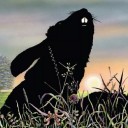
Text
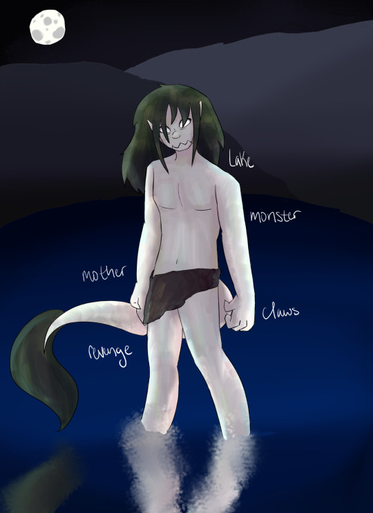
the monster
it's an interpretation of grendel's mother, with pale skin and green hair, standing in a lake under the moonlight
#my art#LOOK AT HER#anyway the words are bc everyone in my class was using a/i art for the project (teacher's permission) and she said to include the words use#for the prompt but i didnt use a prompt so she said to just write what i was going for#anyway very glad this turned out nice#i ended up adding a loincloth bc i didn't want to get in trouble :/#hopefully it isn't too short or anything#hopefully we get a good grade#now to draw the other two drawings wish me luck :D#OH and nobody interact with this so my teacher doesnt look this up and find it and think i plagiarized#i dont think i could handle that actually#maybe i shouldve written my real name on the art piece#i'll just take a picture of it in the art program and hope for the best
1 note
·
View note
Text
Spent like four hours this morning creating a "guess the random number" game from scratch in C#.
It argued with me basically the entire way (this is the first program I've really created, so not very surprising), but the worst part was trying to track down a way to get a "random number", because everything I looked into either didn't work or did something different.
Finally managed to modify one idea and create a method (1 random number, between 1-100), which I'm recording here for future (emergency) reference:
class MyClass
{
public int GenerateRandom ()
{
Random randomNumber = new Random();
for (int ctr = 0; ctr <= 0; ctr++);
return randomNumber.Next(101);
}
}
Is it the best way? No idea. But it's the only way that worked, and it works pretty okay? So, I'm pretty happy with it.
#personal stuff#school#also. this class that's started? gives me the feeling that it's a ''self-study'' type of class. aka ''we don't teach you fuck all''.#that might change. but that was my motivation for deciding to create ''something complicated'' in code.#just as a sort of self-reference of proving to myself that it's possible.#the program includes: random number generation + input from player + bigger/smaller comparisons between numbers +#debugging from player writing ''hello'' instead of numbers + victory-condition + a score for how many times you guessed +#a way to restart the game after winning (without having to restart the entire program) + a tiny bit of ascii-art#i feel like i'm pretty proud of it? all told? it definitely works the way i want it to. and i'm pretty happy with that.
1 note
·
View note
Text
Im ngl I love having "useless" creative hobbies. Like I love getting to spend a few hours trying to craft together some clips from a movie into a 15 second edit, spending days building a house in the sims just for me to build another once the next generation comes along, etc. Idk!! It's fun to do stuff that lowkey doesn't matter
#.txt#i dont include fic here solely bc I'm in a weird spot with it#where I'm suddenly super insecure abt my writing but also my free trial for the program I was using is abt to run out so that also makes me#uncomfortable to even think abt so I'm just. not. 😭#shout out to the people who want an update to my fic you'll get one someday bbg i swear
0 notes
Text
//
#praying 2 god that my professor doenst include questions abt daca in the final cause I fr do not understand that shit#like ive had to read all these academic articles and have all these discussions and it fr does not stick in my brain#like ok i know the basis of it or wtv but like. to write a short essay abt it? for my final?#bbg i am not getting that credit i nkwo that#like ok yes ask me to write abt Mexican repatriation or the bracero program or the page act or fucking the johnson reed act and ill write#pagesss and pages abt it i already have man like I can do it#cannot write more than 2 or 3 sentences abt daca to save my life tho#pls dr [redacted] do not include anything abt daca in there pls ill sign up for ur borderlands class even ill do that just please#woah wait thats so cool you can edit tags now?? that's sick as hell what#i googled my professors name just in case and his whole ass university page came up I'm not risking that I had to redact it sorry💀
1 note
·
View note
Text
My Favorite Cheap Art Trick: Gradient Maps and Blending Modes
i get questions on occasion regarding my coloring process, so i thought i would do a bit of a write up on my "secret technique." i don't think it really is that much of a secret, but i hope it can be helpful to someone. to that end:

this is one of my favorite tags ive ever gotten on my art. i think of it often. the pieces in question are all monochrome - sort of.

the left version is the final version, the right version is technically the original. in the final version, to me, the blues are pretty stark, while the greens and magentas are less so. there is some color theory thing going on here that i dont have a good cerebral understanding of and i wont pretend otherwise. i think i watched a youtube video on it once but it went in one ear and out the other. i just pick whatever colors look nicest based on whatever vibe im going for.

this one is more subtle, i think. can you tell the difference? there's nothing wrong with 100% greyscale art, but i like the depth that adding just a hint of color can bring.
i'll note that the examples i'll be using in this post all began as purely greyscale, but this is a process i use for just about every piece of art i make, including the full color ones. i'll use the recent mithrun art i made to demonstrate. additionally, i use clip studio paint, but the general concept should be transferable to other art programs.


for fun let's just start with Making The Picture. i've been thinking of making this writeup for a while and had it in mind while drawing this piece. beyond that, i didn't really have much of a plan for this outside of "mithrun looks down and hair goes woosh." i also really like all of the vertical lines in the canary uniform so i wanted to include those too but like. gone a little hog wild. that is the extent of my "concept." i do not remember why i had the thought of integrating a shattered mirror type of theme. i think i wanted to distract a bit from the awkward pose and cover it up some LOL but anyway. this lack of planning or thought will come into play later.
note 1: the textured marker brush i specifically use is the "bordered light marker" from daub. it is one of my favorite brushes in the history of forever and the daub mega brush pack is one of the best purchases ive ever made. highly recommend!!!
note 2: "what do you mean by exclusion and difference?" they are layer blending modes and not important to the overall lesson of this post but for transparency i wanted to say how i got these "effects." anyway!
with the background figured out, this is the point at which i generally merge all of my layers, duplicate said merged layer, and Then i begin experimenting with gradient maps. what are gradient maps?
the basic gist is that gradient maps replace the colors of an image based on their value.

so, with this particular gradient map, black will be replaced with that orangey red tone, white will be replaced with the seafoamy green tone, etc. this particular gradient map i'm using as an example is very bright and saturated, but the colors can be literally anything.

these two sets are the ones i use most. they can be downloaded for free here and here if you have csp. there are many gradient map sets out there. and you can make your own!
you can apply a gradient map directly onto a specific layer in csp by going to edit>tonal correction>gradient map. to apply one indirectly, you can use a correction layer through layer>new correction layer>gradient map. honestly, correction layers are probably the better way to go, because you can adjust your gradient map whenever you want after creating the layer, whereas if you directly apply a gradient map to a layer thats like. it. it's done. if you want to make changes to the applied gradient map, you have to undo it and then reapply it. i don't use correction layers because i am old and stuck in my ways, but it's good to know what your options are.

this is what a correction layer looks like. it sits on top and applies the gradient map to the layers underneath it, so you can also change the layers beneath however and whenever you want. you can adjust the gradient map by double clicking the layer. there are also correction layers for tone curves, brightness/contrast, etc. many such useful things in this program.
let's see how mithrun looks when we apply that first gradient map we looked at.

gadzooks. apologies for eyestrain. we have turned mithrun into a neon hellscape, which might work for some pieces, but not this one. we can fix that by changing the layer blending mode, aka this laundry list of words:

some of them are self explanatory, like darken and lighten, while some of them i genuinely don't understand how they are meant to work and couldn't explain them to you, even if i do use them. i'm sure someone out there has written out an explanation for each and every one of them, but i've learned primarily by clicking on them to see what they do.
for the topic of this post, the blending mode of interest is soft light. so let's take hotline miamithrun and change the layer blending mode to soft light.

here it is at 100% opacity. this is the point at which i'd like to explain why i like using textured brushes so much - it makes it very easy to get subtle color variation when i use this Secret Technique. look at the striation in the upper right background! so tasty. however, to me, these colors are still a bit "much." so let's lower the opacity.

i think thats a lot nicer to look at, personally, but i dont really like these colors together. how about we try some other ones?

i like both of these a lot more. the palettes give the piece different vibes, at which point i have to ask myself: What Are The Vibes, Actually? well, to be honest i didn't really have a great answer because again, i didn't plan this out very much at all. however. i knew in my heart that there was too much color contrast going on and it was detracting from the two other contrasts in here: the light and dark values and the sharp and soft shapes. i wanted mithrun's head to be the main focal point. for a different illustration, colors like this might work great, but this is not that hypothetical illustration, so let's bring the opacity down again.

yippee!! that's getting closer to what my heart wants. for fun, let's see what this looks like if we change the blending mode to color.

i do like how these look but in the end they do not align with my heart. oh well. fun to experiment with though! good to keep in mind for a different piece, maybe! i often change blending modes just to see what happens, and sometimes it works, sometimes it doesn't. i very much cannot stress enough that much of my artistic process is clicking buttons i only sort of understand. for fun.
i ended up choosing the gradient map on the right because i liked that it was close to the actual canary uniform colors (sorta). it's at an even lower opacity though because there was Still too much color for my dear heart.

the actual process for this looks like me setting my merged layer to soft light at around 20% opacity and then clicking every single gradient map in my collection and seeing which one Works. sometimes i will do this multiple times and have multiple soft light and/or color layers combined.
typically at this point i merge everything again and do minor contrast adjustments using tone curves, which is another tool i find very fun to play around with. then for this piece in particular i did some finishing touches and decided that the white border was distracting so i cropped it. and then it's done!!! yay!!!!!
this process is a very simple and "fast" way to add more depth and visual interest to a piece without being overbearing. well, it's fast if you aren't indecisive like me, or if you are better at planning.

let's do another comparison. personally i feel that the hint of color on the left version makes mithrun look just a bit more unwell (this is a positive thing) and it makes the contrast on his arm a lot more pleasing to look at. someone who understands color theory better than i do might have more to say on the specifics, but that's honestly all i got.

just dont look at my layers too hard. ok?
2K notes
·
View notes
Text
poetry outlets that support a free palestine
after finding out that the poetry foundation/POETRY magazine pulled a piece that discussed anti-zionism because they "don't want to pick a side" during the current genocide, i decided to put together a list of online outlets who are explicitly in solidarity with palestine where you can read (english-language) poetry, including, except where otherwise stated, by palestinian poets!
my criteria for this is not simply that they have published palestinian poets or pro-palestine statements in the past; i only chose outlets that, since october 7, 2023, have done one of the following:
published a solidarity statement against israeli occupation & genocide
signed onto the open letter for writers against the war on gaza and/or the open letter boycotting the poetry foundation
published content that is explicitly pro-palestine or anti-zionist, including poetry that explicitly deals with israeli occupation & genocide
shared posts that are pro-palestine on their social media accounts
fyi this is undoubtedly a very small sample. also some of these sites primarily feature nonfiction or short stories, but they do all publish poetry.
outlets that focus entirely on palestinian or SWANA (southwest asia and north africa) literature
we are not numbers, a palestinian youth-led project to write about palestinian lives
arab lit, a magazine for arabic literature in translation that is run by a crowd-funded collective
sumuo, an arab magazine, platform, and community (they appear to have a forthcoming palestine special print issue edited by leena aboutaleb and zaina alsous)
mizna, a platform for contemporary SWANA (southwest asian & north africa) lit, film, and art
the markaz review, a literary arts publication and cultural institution that curates content and programs on the greater middle east and communities in diaspora
online magazines who have published special issues of all palestinian writers (and all of them publish palestinian poets in their regular issues too)
fiyah literary magazine in december 2021, edited by nadia shammas and summer farah (if you have $6 usd to spare, proceeds from the e-book go to medical aid for palestinians)
strange horizons in march 2021, edited by rasha abdulhadi
the baffler in june 2021, curated by poet/translators fady joudah & lena khalaf tuffaha
the markaz review has two palestine-specific issues, on gaza and on palestinians in israel, currently free to download
literary hub featured palestinian poets in 2018 for the anniversary of the 1948 nakba
adi magazine, who have shifted their current (october 2023) issue to be all palestinian writers
outlets that generally seem to be pro-palestine/publish pro-palestine pieces and palestinian poetry
protean magazine (here's their solidarity statement)
poetry online (offering no-fee submissions to palestinian writers)
sundog lit (offering no-fee submissions to palestinian writers through december 1, 2023)
guernica magazine (here's a twitter thread of palestinian poetry they've published) guernica ended up publishing a zionist piece so fuck them too
split this rock (here's their solidarity statement)
the margins by the asian-american writers' workshop
the offing magazine
rusted radishes
voicemail poems
jewish currents
the drift magazine
asymptote
the poetry project
ctrl + v journal
the funambulist magazine
n+1 magazine (signed onto the open letter and they have many pro-palestine articles, but i'm not sure if they have published palestinian poets specifically)
hammer & hope (signed onto the letter but they are a new magazine only on their second issue and don't appear to have published any palestinian poets yet)
if you know others, please add them on!
4K notes
·
View notes
Last Seen Blogs

nothinglikeasongbird
Cicada
heavenboy09
General Of Heaven's army

uzmansogutma
İsimsiz
almondteeth
Max ᡣ𐭩ྀིྀི
jinkx-monsoon-season
Une cassette omelette. Celluloid sandwich.