#link click layouts
Text


F.R.E.S & H ༺☆༻ 'til death
#link click#link click layouts#link click icons#anime layouts#anime header#anime icons#Lu Guang icons#Lu Guang layouts#Lu Guang#Cheng Xiaoshi icons#Cheng Xiaoshi layouts#Cheng Xiaoshi#Qiao ling icons#Qiao ling layouts#Qiao ling#messy anime icons#messy anime layouts#shiguang dailiren#sgdlr#time agent
305 notes
·
View notes
Text


if you close your eyes, that's where you'll find me.
#i miss them#boyfriends#lu guang#lu guang icons#lu guang layouts#cheng xiaoshi#cheng xiaoshi icons#cheng xiaoshi layouts#link click#link click icons#link click layouts#matching layouts#anime messy layouts#messy layouts#manga messy layouts#donghua#donghua icons#donghua layouts#yoimita
332 notes
·
View notes
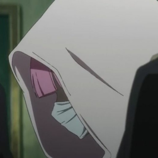
Text


•̩̩͙*˚⁺‧͙ ུ ̲𝒯 ill 𝒟eath 𝒟o𝒰s 𝒫art❀ •̩̩͙*˚⁺ ུ ̲
#°ཐི♡̵̼͓̥͒̾͘ཋྀ°#messy anime icons#messy anime layouts#link click#link click icons#link click layouts#cheng xiaoshi#lu guang#cheng xiaoshi icons#cheng xiaoshi layouts#lu guang icons#lu guang layouts#matching anime icons#matching anime layouts
22 notes
·
View notes
Text


⌕ li tianchen disguised as li tianxi.
like or reblog if you save/use.
#linkclick#link click#link click icons#link click anime#donghua#link click donghua#li tianchen#li tianchen icons#li tianxi#li tianxi icons#anime#manga#donghua icons#李天希#時光代理人#李天辰#anime layouts#anime icons#manga icons#animes layouts#twitter layouts#manga layouts#anime packs#anime icon
190 notes
·
View notes
Text


Perth Nakhun as Kev in Ships In The Night
#the tiktok linked in source!!#it look me a minute to work out how i wanted to gif this but here he is. looking extremely babygirl#they're 540px bc i changed my mind on layout at the last second so click for better quailty hehe#perth nakhun#kinnporsche cast#ships in the night#gif
192 notes
·
View notes
Text


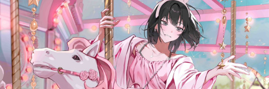


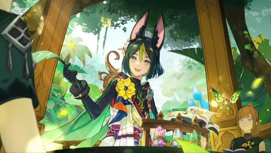
⤿✦. LINK CLICK ! 🎠
#icons#soft layouts#link click#donghua#cheng xiaoshi#cheng xiaoshi icons#lu guang#lu guang icons#qiao ling#qiao ling icons#时光代理人#shi guang daili ren
77 notes
·
View notes
Text

🌼 Tighnari in the new Genshin web event 🍃
#click for higher quality#genshin impact#tighnari#tighnari genshin#genshin tighnari#tighnari gi#aerinposting#genshins1mpact#genshinimpact#aerin.jpg#aerin.jpeg#one of the two looks better bc my phone only wanted to remaster one of em rn sorry 😔#but it looks so pretty it's taking everything in me not to go batshit and change my layout and everything rn ggrrrhfhfg#the music in this web event page tho??? man i am in LOVE... its so nice and serene... <333333#sumeru music alr sounds like nothing but bangers mmhh. looking forward to it all sm!#inazuma was nice but most of it looks pretty dark and sounds scary (imo) so liiikeee 🤧 ye gimme lush green vibes again pls 🙏🏻#I'll add the link later if it lets me but it should be accessible thru the in game portion (i got it off their fb/twt pg tho lol)#ended up deletingthe other one bc it looked so lq sorry fjfjf hope the dividers still look cute lol;;;
65 notes
·
View notes
Text
I want to apologize to anyone who has actually viewed my desktop-layout blog
#the design is from like 2015 and i have not updated anything on it in years#most of the links lead to things AT LEAST 5 years old#the wallpaper is incredibly cringe-worthy superwholock#just.....stick to the mobile layout and never click any other links on my blog lmao#this brought to you by the fact that someone professional in my field somehow found my blog and contacted me about it!#and now I want to perish#this has been a PSA
8 notes
·
View notes
Text
omg navigating getting my prescriptions filled through CVS is the absolute WORST for my undiagnosed ass.
#it is in the most inconvenient location with regards to where my house is#my anxiety doesn't like driving all the way across town just for a prescription#it has a drive through but obviously my anxiety prevents me from using it#so I have to walk inside and their store layout sucks and continues to somehow make me uncomfortable 3 years later#because I just never got used to it I guess#but I am forced to use CVS by my insurance company if I want to pay the minimum and get 90 day refills#I am finally trying to switch my prescriptions over to be mailed to me because driving there is so horrendous#but I am bamboozled by the instructions#:/#I have to do it through text??? and I can't do it online#I think I finally figured it out#I found the link hidden in the text they sent me#I've literally never noticed the link before because it's been shortened along with the word Delivery#which now just says DLVY before the link like I'm supposed to automatically know I can click that to set up delivery#like ????#am I just stupid?!#is it really that difficult to have clearly spelled out instructions??!#HOW DOES EVERYONE ELSE JUST FUNCTION IN THIS WORLD LIKE THIS IS NORMAL?#NONE OF IT MAKES SENSE#T_T#I'm pms-ing this week too okay#you guys I can't handle this level of adulting#send me back to the grade school level please
4 notes
·
View notes
Text
Quick updates for the blog:
-I have updated the pinned post to be the masterlist because I feel like it makes more sense for that to be pinned rather than my rules post. I have also updated it so you can easily access my series that I write.
- The blog should be ok to run off the queue for the next couple of days but I may be slow to get to new requests for a few days because I have gotten pretty busy at work and I am preparing to move so I will proooobably be a bit low on energy. Apologies in advance if I don't get anything new out for a few days though!
- My rules post is now linked in the masterlist of writing for ease of access.
- As I said before, I have a drabble queued to come out Thursday. I may do more in the future but they are considerably more time consuming than my other posts so they may not be happening as often!
#not writing;;#updates;;#as always I appreciate feedback on blog layout if you all have any#I want this blog to be easy to sort through#I was debating having 'multiple' masterposts so you can click a link to sort by series character or topic#so if yall think that would flow better please let me know#and as always thank you all so much for the support!!
2 notes
·
View notes
Text


★☆ 𐔌 𝐌𝐈𝐃𝐍𝐈𝐆𝐇𝐓𝟐𝟎𝟕𝟕˚̣̣̣͙୨୧ ♡₊
#link click#link click layouts#link click icons#link click moodboard#anime layouts#anime icons#anime headers#messy headers#Lu Guang#Lu Guang icons#Lu Guang layouts#Cheng Xiaoshi#Cheng Xiaoshi layouts#Cheng Xiaoshi icons#Qiao ling#Qiao ling layouts#Qiao ling icons#messy anime icons#messy anime layouts#colorful anime layouts#colorful anime icons#Shiguang Dailiren#Shiguang Dailiren icons#Shiguang Dailiren layouts#sgdlr#time agent
70 notes
·
View notes
Text
New Mature Content Warning Overlay (And How to Get Rid of It)
More fun community label "features"! Unlike the new mandatory label for #NSFW, this one is a bigger deal to me because it affects my entire blog and it can't be avoided by just using a different tag.
Apparently on custom blog layouts, if you happen to post or reblog even a SINGLE post that's been flagged with the mature content community label, a full-page warning overlay will appear blurring out your entire blog that must be manually clicked through every single time the page is refreshed. At first I thought this was just a bug due to my older layout but I've come to realize it's not. It's a feature (as confirmed by this recent changes post) that affects all custom themes. The formatting will vary based on your own theme but here's what it looks like on my blog:

I don't know about you but I find this is stupid and annoying. If it could be dismissed once and never seen again that might be one thing, but that's not the case. The vast majority of my blog is not "mature" enough to warrant such an aggressive and invasive warning. I also think pop-ups are obnoxious in general and I'll be damned if tumblr's going to force me to have one on MY blog.
After some desperate googling for a known workaround and being unable to find even a single mention of it, I decided to take on the challenge myself. I'm not a theme coder, so apologies if there's a better way to do this, but luckily it only took me like 10 minutes to figure out a simple fix, which I'm now sharing with anyone else who may want it:
.community-label-cover__wrapper {display: none}
Just copypaste that somewhere in your CSS and goodbye pop-up!
If you're not sure how to access your theme code, check out this help article. You can also add the code via the Advanced Options menu, which is actually even better (if you can get it to work, it depends on how your theme was coded), because it will then automatically be reapplied to a lot of themes without having to remember to manually add it every time if you change your theme in the future.
Obviously this will only remove it from your own blog for anyone who may visit it. If you never want to see this warning again on other people's blogs you can also add this custom filter to your ad block:
tumblr.com##.community-label-cover__wrapper
Unfortunately I do not have an easy tutorial on hand for this one as the method will depend on your specific ad block app or extension.
Some additional notes:
After adding the theme code and saving the changes, give it a minute to update as it sometimes takes a little while for the page to refresh.
The warning overlay only seems to appear if a "mature" post is on the FIRST page of your blog, which is still annoying and makes the whole thing even more pointless and stupid because what if someone visits any other page of your blog, and oh no, happens to see "mature" content they weren't warned about?!
The warning also appears on direct links to "mature" posts.
This hack has NOTHING to do with entire blogs that have been flagged as NSFW. It only works for non-flagged blogs with custom themes that happen to have individual "mature" posts.
#I'm not letting my entire blog be penalized for a couple rare singular posts that may or may not even be 'mature' enough to warrant it#tumblr may force us to use community labels#and they may have full control over the new blogview#but MY custom blog layout has always been and always will be MINE to format and present however I want#that's the whole point#tumblr#psa#tutorial#my words#tumblr themes#wendy's help desk
17K notes
·
View notes
Text
Dashboard Unfucker v3.3.0!
As I first discovered today from the massive surge of people reblogging my previous update posts, the shitty new layout is now universal despite widespread protest, since us existing users are now apparently backseat to a Tumblr's hypothetical endless stream of high-revenue new users who are allergic to using social media sites that don't look like every other site. Well, thankfully at least for the time being, reverting the update via userscript is still as easy as ever!
Version 3.3.0 even fixes the new server-side bug where avatars next to posts disappear, because apparently I spend more time reviewing my commits than a multimillion dollar social media platform.
Installation Guide:
A userscript extension is required to run the script. Currently, the only tested extensions are Tampermonkey and Violentmonkey, but you might have still have luck with a different extension if you already use it.
Once you have the userscript extension installed, simply click this link to open the install page. This also works for updating, but make sure the version listed near the top is up to date, since it only fetches the script from GitHub every so often.
And of course, it's all open-source! Contributions, bug reports, and general insights are all appreciated.
Common troubleshooting info under cut:
Script not working
I can't offer specific help without knowing exact details, but two common issues are caching (try clearing your browser cache) and conflicts with New XKit (the script works fine with XKit Rewritten, which I would recommend anyways). If neither of those solve it, you can open an issue on the repository with more details.
Content takes up the full width of the page
This is an XKit feature, Panorama.

6K notes
·
View notes
Note
As you've asked for asks!:
Do you have any quick-and-dirty book/fic binding methods a terrified-of-failure novice could use to bang something out to get over the first collywobbling step of Actually Doing The Thing? (this may be something I've been meaning to ask for ages)
yes! I absolutely do! in my opinion the best quick-and-dirty bookbinding method is a no-glue pamphlet: you don't have to mess with glue or measuring or cutting anything, all you need is your text, some paper, a needle and thread. you can use the same needle to punch holes if you don't have an awl.
this is going to be a little long but that's because I'm going to write out some fairly detailed instructions for an A5 sized pamphlet. If you don't want detailed instructions and think you can glean the necessary info from photos, just skip to the photos! I've also linked tutorials.
for preparing the text to printing, in whatever software you use (word, libreoffice, gdocs, whatever) make sure your document is set to page size A5. make it look readable. then save as/export that document as a straight-paged PDF. now go to the bookbinder JS tool (https://momijizukamori.github.io/bookbinder-js/), and upload the PDF.
source manipulation: none
printer
paper size: A4
display unit (you can ignore, or choose cm if it gives you anxiety that it automatically displays points)
printer type: select single-sided or duplex accordingly*
rotate paper: ignore
flip on long side: check if you are printing duplex and if your duplex printer flips the paper on the long side
page layout:
tick folio
page scaling: original
page positioning: centered
ignore the rest
flyfleaf: ignore
signature format
tick: standard signatures. in the length drop down, this depends on the type of pamphlet you are doing. for folio i generally find 4-5 pages per signature a comfortable thickness. if you have 6 whole A4 pages you can still do that as a single signature or you can split it into two signatures 3 pages each.
wacky small layouts: ignore this
signature info
click the generate preview button to see what your PDF looks like imposed! I love this step especially when I'm doing quarto (A6) or octavo (A7) sized books
generate output - click this to generate an imposed PDF
for A6 and A7 sized books the instructions are much the same, except for these you make sure the page size is A6 or A7 in your software, and then you choose quarto or octavo instead of folio. for signature length drop down I keep signature length to 1 for octavos typically and 2 for quartos, as this still refers to sheets of paper, and for octavo 1 sheet of A4 paper will turn into 4 smaller sheets in one signature once folded and cut.
*if you don't have a duplex printer you will have to manually turn the paper to print on the other side. I cannot be arsed with this so I bought a printer capable of duplex printing (I didn't have a printer anyway). if you already have a printer check what it can do as you might be surprised and go from there.
now to the pamphlets! you don't need a cover - I have one for the long stitch pamphlet but for the saddle stitch one I didn't bother and just made sure the first page had a title on it. you can always take a different piece of paper and print a cover on or or just use coloured cardstock and create a simple cover, but a cover is not necessary unless you're doing a long stitch pamphlet. all you need to do is to punch holes and start sewing. there are a few different stitch types below, I wouldn't say any of them are more difficult or easier than others, but they do look different so...pick one you like the look of and go from there?
pamphlet stitch (uneven number of holes)
I haven't ever done a pamphlet stitch but here's a tutorial for how to do it: https://www.starpointestudio.com/simple-pamphlet-stitch-book-step-by-step/
saddle stitch (uneven number of holes)
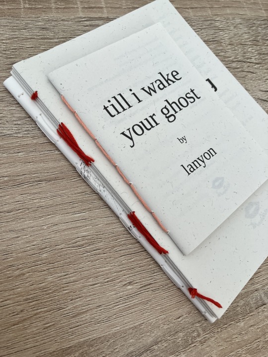
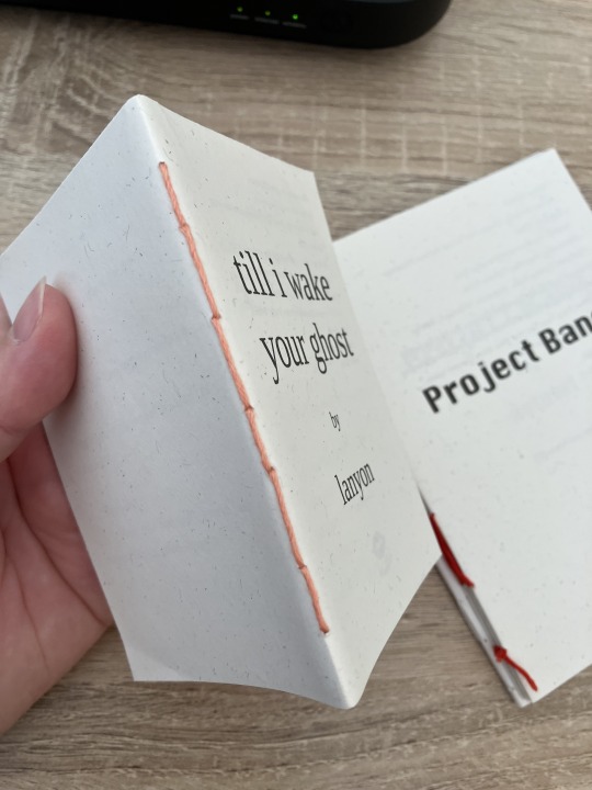
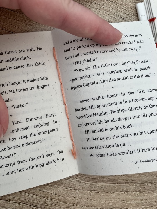
I realised that what I was thinking of as a pamphlet stitch is actually saddle stitch, as in this A7 pamphlet:
here's a tutorial for how to sew saddle stitch: https://www.bookbindingworkshopsg.com/saddle-stitch-bookbinding-tutorial/
here's a video tutorial: https://www.youtube.com/watch?v=aWHkY5jOoqM (sealemon has a lot of bookbinding tutorials and I know many people who like her videos, I used her tutorial for coptic binding way back when I first made a book but I can't otherwise vouch for the quality as I haven't used her videos)
french link stitch (even number of holes)
in this one I used french link stitch which I typically use for thicker textblocks that i'm not planning to use tapes with as the french link gives it some robustness, I used it here because I had never done it before and wanted to try it out. I am planning to take these stitches out and re-sew this pamphlet with a cover now that I've found a suitable piece of transformer fanart to use as a cover:
french link tutorial. it's quite long but it has a colour coded bit towards the end that shows how the thread is supposed to link which i find very helpful to visualise: https://www.handmadebooksandjournals.com/bindings/french-link-stitch-binding/
here's a video tutoral from DAS bookbinding (he is my go to for techniques and he has the most soothing Australian accent as well, though fair warning not all of his videos are for beginners): https://www.youtube.com/watch?v=O4ZPdbaM-Ws
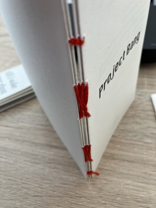
long stitch (even number of holes)
for this one I used long stitch and I had a cover. this one is my favourite variation because I can make these pretty and simple covers and the stitch looks nice on the outside as well, so this one scratches the 'i want to make a book' itch for me.
here's a tutorial that also includes a how to on a cover that is different from my cover: https://lccprintmaking.myblog.arts.ac.uk/files/2020/06/Long-Stitch-Tutorial-A4.pdf
DAS also has a video tutorial for long stitch but it's like three videos long, maybe watch it later :'D
here's one I haven't watched but seems decent: https://www.youtube.com/watch?v=XnignTL_wDQ
you can use saddle stitch for this kind of pamphlet as well, that's what I did for dozens of ships and hundreds of souls (https://ashmouthbooks.tumblr.com/post/681587080267202560).
I hope this helped!!
1K notes
·
View notes
Text
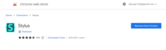
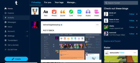
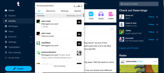
HOW TO SWITCH BACK TO OLD TUMBLR LAYOUT.
YES, theres a fix, and sadly no, it isnt xkit. its a google extension called 'stylus' with this specific code
tutorial:
step 1 - install the stylus extension
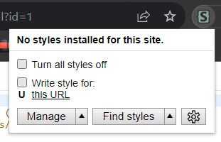
step 2 - go to "Old Tumblr Dashboard (July 2023) by Pixiel" (already linked) and hit install on that. you will be met with a page that looks like this
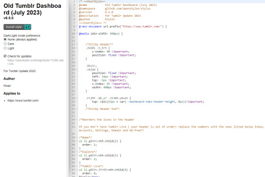
copy and paste ALL OF IT, even the part that says "/*Dont touch this its needed*/ }}" (seems obvious but some people miss it! no judgement here!)
step 3 - in your extensions bar, click on stylus. you'll be met with these options
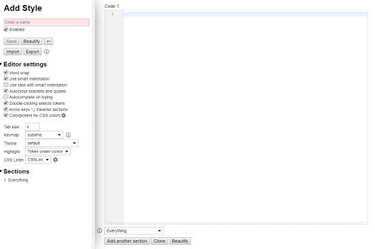
step 4 - select "manage"
then, you will meet a page like this.

from here, you're going to want to click on "write new styles". you'll be met with a box that looks like this.
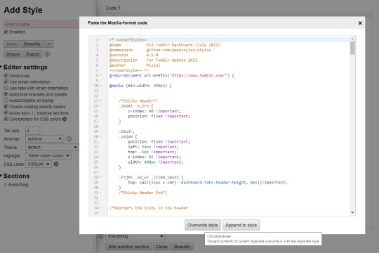
go ahead an copy and paste the code into that box. when doing so, you'll be met with these options. go ahead and click "overwrite style"
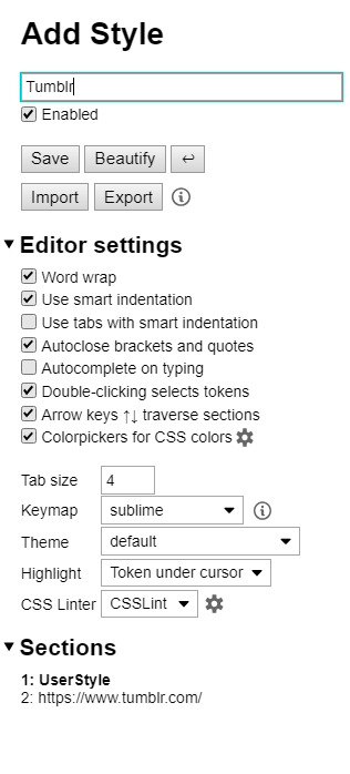
in the top left hand corner where the red box is, go ahead and type "Tumblr" and hit "save"
and with these simple steps, you can turn this
into this!
happy blogging!
2K notes
·
View notes
Text
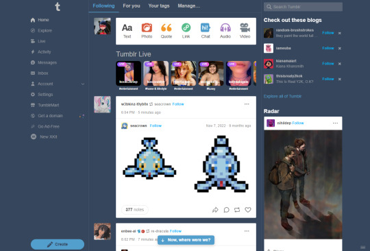
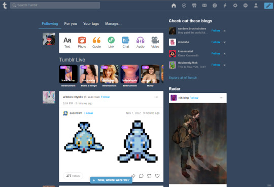
New Desktop Dash, No Bueno
Okay so, new dash layout on desktop.
As seems to be a common reaction: not a fan.
Let's talk about some of the issues:
1. Really visually cluttered
The new sidebar crowds out the dashboard content and the bright blue popup notifications (now at the side AND top) and create-post bar pull your eyes in different directions. There is no space for the eye to rest on anymore - it's all noise. The end result is that everything flattens - there's no focal point anymore.
It's also pretty overwhelming - even for someone like me - so I can't imagine it would be very user-friendly to someone who was photosensitive or struggled with visual overload (especially when paired with the high-contrast 'true blue' default site palette and animated icons for the changes-on-tumblr/staff-picks/trending buttons).
2. The activity pop-up now covers dashboard content
This is really bad from a usability standpoint. In the old layout the activity pop-up used to drop down over the recommended blogs sidebar. Now it actively gets in the way of looking at core content. The dash is why we are here, burying it like this is baffling.
The search bar now drops down over the recommended blogs banner instead, but where the old design had non-critical space on each side of the dashboard to visually allow both features to pop in, this new layout is way worse for efficiency. And for what? Having a rarely-used former drop-down menu now permanently active? The old banner with quick-links for the key use-features (notes, messages, askbox) made much more design sense.
It also means that the activity pop-up gets now completely covered by the blog pop-up that opens when you click the notification, so double demerit there. 0/10.
3. It's harder to navigate to the activity page, and the new page-stretch means you can't see new notes without scrolling down
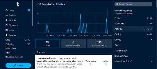
That first bit is kind of a nitpick but cramming the 'See everything' link down at the bottom of a browser window isn't a great navigation choice. (Again, the visual signifiers and eye-direction in this new design are incredibly poor.)
That the main activity page now requires you to scroll to even see the top note due to the new display ratio is really egregious. It makes another key site feature just slightly less convenient and accessible in a very irritating way. Bad choice.
4. The new ratio pushes the Radar and Main Sponsored slot completely off-screen
This one is directed the tumblr staff: that's also a bad choice, guys. That's your main ad-slot for people loading into Tumblr so hiding it is going to hurt both your ad-impressions and your ability to promote the ad-free option. The new layout ratio also means that the in-dash ads are going to be a lot more invasively screen-filling - and let's be real most users will either add-block or leave before purchasing ad-free. I have no idea what the new layout is trying to achieve but if ad optimisation is the goal then this ain't it, chief.
To be honest I cannot comprehend the rationale for this change. I guess it's visually a bit more like Twitter... but that site is currently being demolished from the inside by poor management decisions so maybe it's not the best aesthetic to be aping.
Well then, what do?
Okay so, new dash bad. And so, in true Tumblr spirit: we complain. However, to get results we must deploy the art of kvetching productively.
If you want the old dash back (or at least, a better new-dash design that corrects some of these big weaknesses) what you should do is head over to https://www.tumblr.com/support and lodge a feedback ticket pointing out the problems. The more users who do that, the more likely you are to see an effective response.
Remember, tagging @staff and @support in posts won't fix this. There's no guarantee they'll see it among the notes barrage.
Also: please don't be rude or abusive when you lodge tickets. Whoever is manning those blogs and inboxes probably isn't the person who forced through this change. Save an intern, be polite.
Go forth in disgruntlement to keep this hellhole a hellhome.
#tumblr#tumblr problems#new dashboard#yes it's bad#but there is a way#I've already lodged tickets about it
1K notes
·
View notes
Last Seen Blogs

tdcloud
T. D. Cloud

fivefatweeb
fat anime™


trucktrailerrepair
We manufacture, refurbish, modify & repair metal sheet bodies, f

youtechusa
Untitled