#premierpro
Text
Premier pro
Harry Potter Outcome Link!

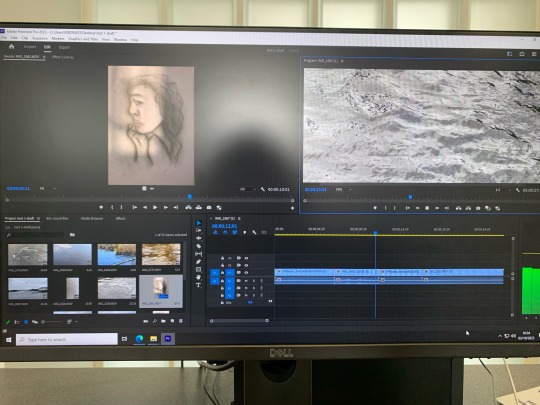
In todays session we created a storyboard in a group of 4 based on a movie. We used this to plan out which shots would be included into the short itself. If we were to do this again I would make sure that we took more footage without being too precious of the lines and acting so that we had more to play around with and edit after. I would also better use the storyboard we created rather than spending a lot of our time re-watching every scene whilst trying to shoot, improvising scenes as we went. Overall, I felt this session helped me to understand how to navigate Premier Pro successfully and will be beneficial moving forward.
0 notes
Text
Best Video Editing Software! Take a Look! Comment Your Thought.
#videoediting #videoproduction #videoeditor #videography #videomaker #video #graphicdesign #graphicdesigner #premierepro #powerdirector #finalcutpro #technicalinfluencer #ti
https://www.updatesinsider.com/graphics/the-best-video-editing-software/
0 notes
Text
As an aspiring graphic artist, you understand the importance of creating visually stunning designs. But did you know that there are certain principles of design that can guide you in creating effective visuals that communicate your message clearly? In this blog post, we'll explore the principles of design and how you can use them to take your design skills to the next level.
Balance :
Balance refers to the distribution of visual weight in a design. Achieving balance can make your design feel more cohesive and visually appealing. There are two types of balance: symmetrical and asymmetrical. Symmetrical balance occurs when elements on both sides of a design are mirrored or identical, while asymmetrical balance is achieved through the use of different elements that balance each other out.
Contrast :
Contrast is the juxtaposition of different elements in a design. This can be achieved through the use of color, shape, size, and texture. Contrast can add visual interest and make certain elements stand out. However, it's important to use contrast thoughtfully, as too much can overwhelm the viewer.
Repetition :
Repetition refers to the use of the same visual elements throughout a design. This can create a sense of unity and consistency, which can be especially important in branding and marketing materials. However, too much repetition can make a design feel monotonous, so it's important to balance it with other design elements.
Hierarchy :
Hierarchy refers to the organization of elements in a design, with more important elements given more visual weight. This can be achieved through the use of size, color, placement, and typography. Hierarchy can help guide the viewer's eye through the design and communicate important information effectively.
Alignment :
Alignment refers to the placement of elements in a design. Aligning elements can create a sense of order and balance, making the design feel more cohesive. However, it's important to be consistent with alignment throughout the design, as even small deviations can be jarring to the viewer.
Proximity :
Proximity refers to the placement of elements in relation to each other. Grouping related elements together can create a sense of unity and organization in a design. However, it's important to balance proximity with contrast, as too much grouping can make a design feel cluttered.
Now that you have an understanding of the principles of design, how can you apply them to your work? Here are a few tips:
1. Start with a strong concept : Before you begin designing, think about what message you want to communicate and who your audience is. This will help guide your design choices and ensure that your work is effective.
2. Use a grid system : A grid system can help you achieve balance and alignment in your designs. Many design software programs offer grid tools that you can use to guide your placement of elements.
3. Experiment with color, shape, and typography : These elements can be used to create contrast and hierarchy in your designs. Don't be afraid to try different combinations and see what works best.
4. Get feedback : Show your work to others and ask for constructive criticism. This can help you identify areas for improvement and refine your design skills.
By understanding and applying the principles of design, you can create visually stunning work that communicates your message effectively. Whether you're creating branding materials for a business, designing a website, or simply creating art, these principles can guide you in creating work that stands out and captures your audience's attention.
The principles of design are an essential part of any graphic artist's toolkit. By mastering these principles, you can create work that is visually appealing, communicates effectively, and stands out in a crowded marketplace. So take some time to experiment with these principles in your own work, and see how they can help you take your design skills to the next level.
1 note
·
View note
Photo

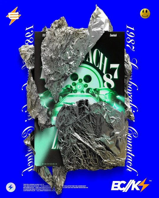
1987 Lamborghini Countach Poster (Design 3) Swipe >> to see the full Poster . . . . . . . . . . . . . #instagramstory #instagramfeed #instagramexplore #instagramsearch #instagramgrid # #instagramlive #instagramreel #instagrampost #ecks #designer #official #graphicdesign #illustration #motiongraphics #photoshop #2023 #aftereffects #premierpro #illustrator #1987 #lamborghini #countach #posterdesign #speedart https://www.instagram.com/p/CnBXAwijaHQ/?igshid=NGJjMDIxMWI=
#instagramstory#instagramfeed#instagramexplore#instagramsearch#instagramgrid#instagramlive#instagramreel#instagrampost#ecks#designer#official#graphicdesign#illustration#motiongraphics#photoshop#2023#aftereffects#premierpro#illustrator#1987#lamborghini#countach#posterdesign#speedart
0 notes
Video
#Repost @filmedbymaze • • • • • • New York City, N.Y. OUT NOW ‼️ TUNE IN ‼️ #cokeboys #cokeboys6 #cheezedior #frenchmontana #filmedbymaze #hiphop #rapmusic @bigqueensmedia_nyc @djspinking @djself @djenuff @sodrewski @djkayslay @djakademiks @frenchmontana @cheeze_dior @therealcokeboytmunna @cokeboys #newvideo #musicvideo #premierpro #music #trending #newtrend #plugstudiosnyc @plugstudiosnyc https://www.instagram.com/p/CkrIKqnDHKK/?igshid=NGJjMDIxMWI=
#repost#cokeboys#cokeboys6#cheezedior#frenchmontana#filmedbymaze#hiphop#rapmusic#newvideo#musicvideo#premierpro#music#trending#newtrend#plugstudiosnyc
1 note
·
View note
Video
ミテラのイチバン簡単剣菊キット。 動画のご提供をしていなかったのですが、リクエストがありましたのでお作りいたしました♥ . おばーちゃんですが、プレミアプロを猛勉強中です💦 . アメブロに長編アップしておきます! . つまみ細工 #つまみ細工髪飾り#前撮り #asakusa #結婚式 #着物 #着物ヘア #和装ヘア #振袖ヘア #premierpro #成人式 #結納 #振り袖 #振袖 #簪 #かんざし #つまみ細工キット #髪飾り #プレ花嫁 #神前式 #tsumamizaiku #ブーケ #入園式 #白無垢 #女の子ママ #ヘッドドレス #japan #髪飾り #卒園式 #保育園ママ https://www.instagram.com/p/CgJIEMXlzrF/?igshid=NGJjMDIxMWI=
#つまみ細工髪飾り#前撮り#asakusa#結婚式#着物#着物ヘア#和装ヘア#振袖ヘア#premierpro#成人式#結納#振り袖#振袖#簪#かんざし#つまみ細工キット#髪飾り#プレ花嫁#神前式#tsumamizaiku#ブーケ#入園式#白無垢#女の子ママ#ヘッドドレス#japan#卒園式#保育園ママ
0 notes
Link
Logo animation (Live project work) for pixel Curves
0 notes
Text
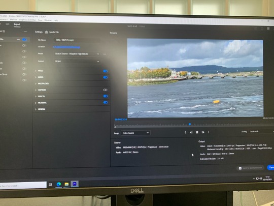
After gathering all the videos and recordings I needed, I thin began to work in PremierPro (which I’d never used before, so it was an experience!) With the guidance of a tutor, I put my files into the program and began to edit them and applied transitions between each video so that they would flow into one another.
I did not manage to complete the piece, but I’d really like to keep exploring and using this method of creating.
3 notes
·
View notes
Text
Brief 3: Figma app prototype v3
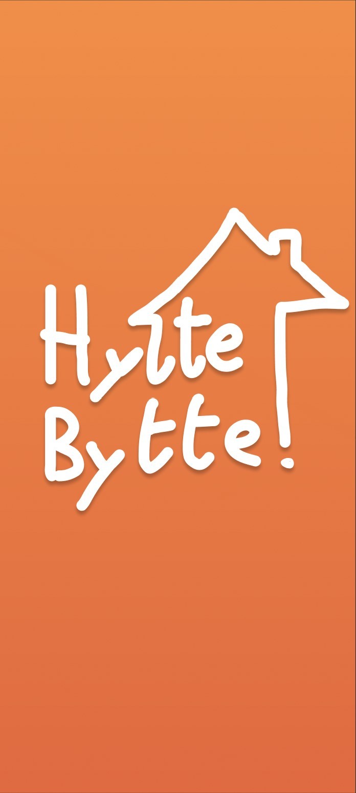
Demo av HytteBytte appen; Dette er en app som tilbyr en platform hvor man kan dele hyttene sine. Med denne appen slipper man å kjøpe to eller flere hytter. Her kan man bytte sin hytte på fjellet med en annen hytte ved vannet.
Scope:
Hvem: Dette er en app spesefikt for folk som eier hytter.
Hva: En app for hyttedeling
Hvorfor: Nettopp fordi man kan få være på hytta hele året; om sommeren og våren ved vannet, om vinteren og høsten på fjellet. Uten å måtte kjøpe to hytter.
Når: Når som helst, men vi ser for oss at det blir mest brukt om sommeren og vinteren.
‘’Elsker konseptet, har selv en hytte på fjellet’’ -Kari (34), hytteeier
“Oi det var kult! Mye mer oversiktlig!” -Milla
Hva vi lærte og forbedret etter tilbakemeldingen og brukertestingen i uke 2:
Vi har testet underveis ved å brukerteste i klasserommet først, før vi gikk ut og testet på andre venner og folk i gaten. I klasserommet fikk vi for det meste tilbakemelding om estetikken og hvordan appen føles. Mens ute prøvde vi å finne ulike demografier som som eier hytter. Her fikk vi høre om appen var realistisk eller ikke; mange likte ideen og var åpne for å bytte hyttene sine, mens andre var litt skeptiske.
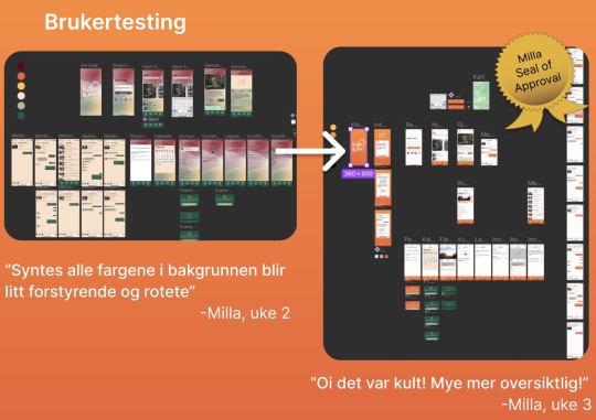
I uke 3 fokuserte vi på en total rebranding av appen, siden vi fikk høre at alle fargene i v1 var litt forstyrende. Da endte vi opp med strippe alt og gå for et oransje motiv med hvit bakgrunn. Vi hadde en gradient på oransje fargen for ta med litt av motivet fra v1 til v2.
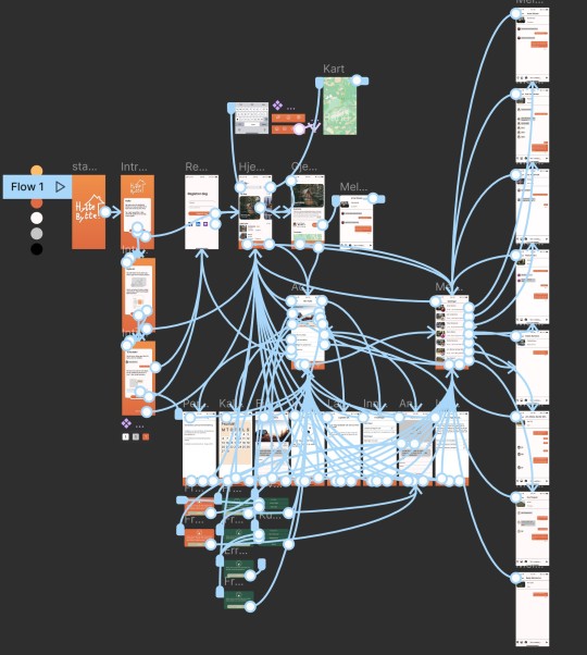
Her kan du se et fint spindelvev som representerer alle mulige veier man kan gå i appen. Vi endte med å lage en vei til nærmest alle knapper på appen.
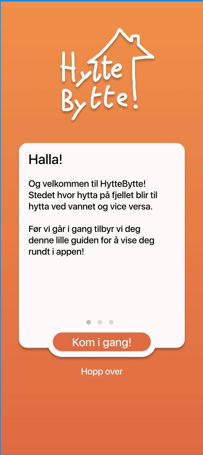
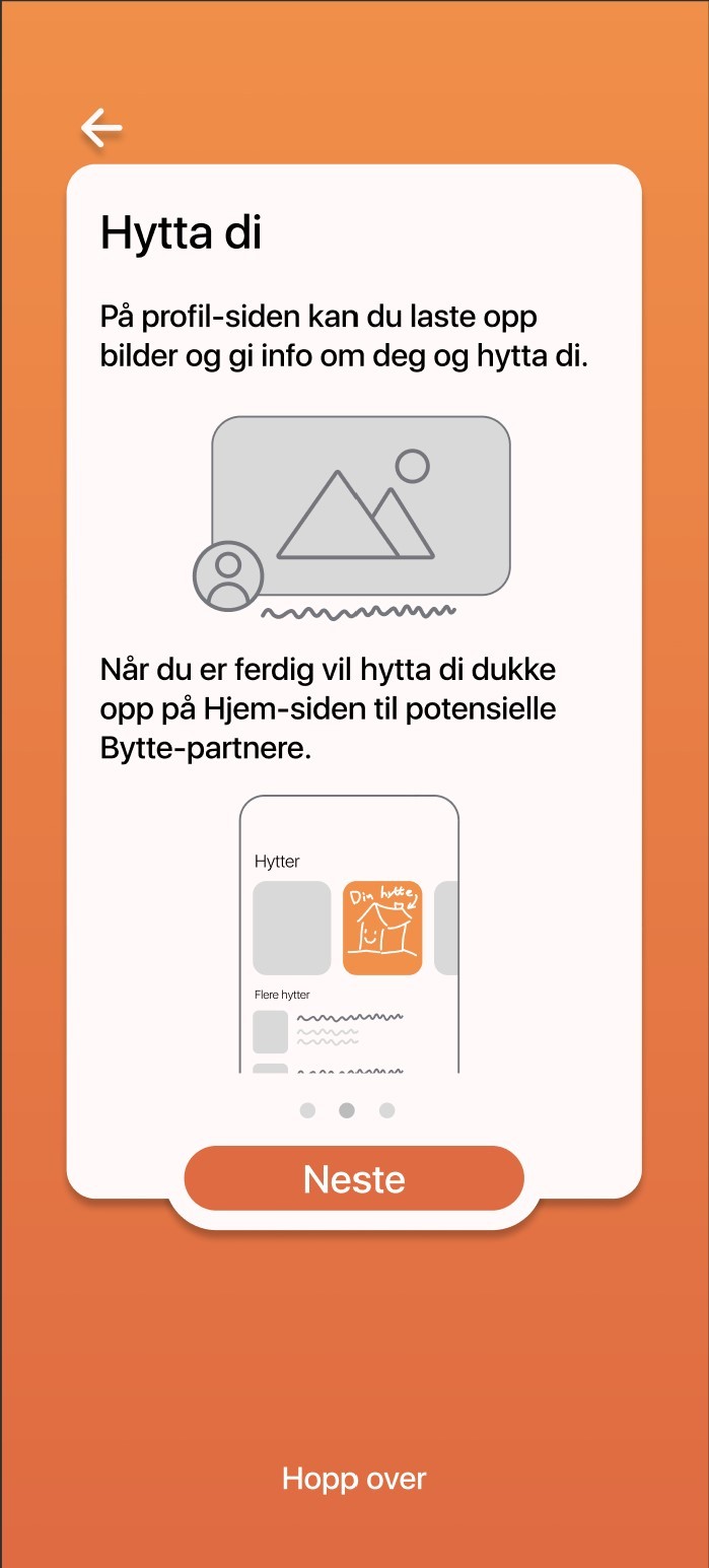
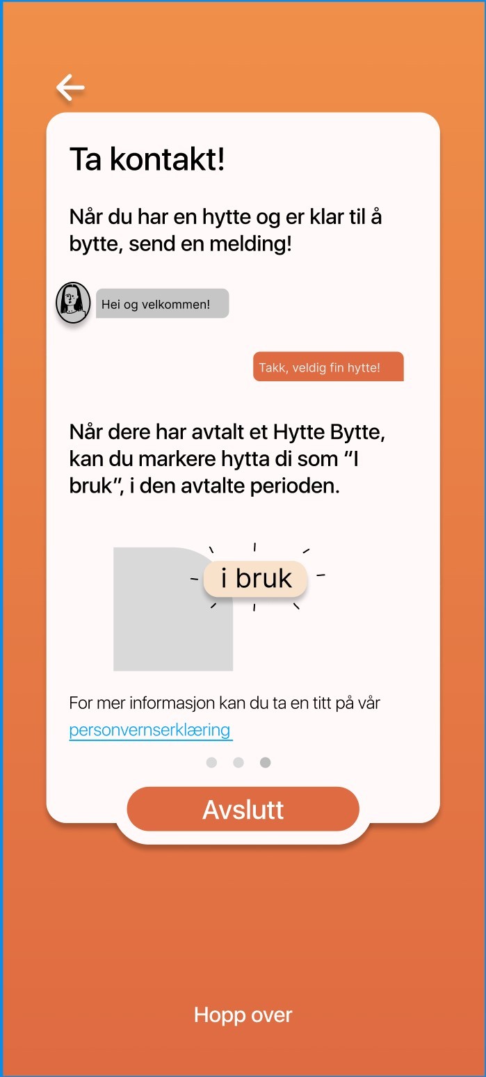
Den største tilbake meldingen vi fikk fra uke 2 var at det var uklart om det var en betalt tjeneste, som f.eks. airBnB, eller ikke. Det løste vi ved å gi en liten introduksjons guide etter log-in.
Link til siste versjon av Hyttebytte (det ser ut som versjon 1 på bilde, men er altså versjon 2 når man klikker inn på den)
Og til slutt lagde vi en reklamefilm for appen.
Prosjektet som helhet:
Dette var et morsomt og interessant prosjekt. Jeg hadde aldri jobbet med Figma før dette, og ble positivt overasket hvor lett og intuitivt programmet var. Jeg lærte mye av denne modulen, om estetikk, grensesnitt og brukertesting. Og Julian og jeg hadde et godt samarbeid gjennom de tre ukene.
2 notes
·
View notes
Photo
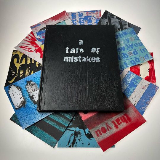
This story details a quote from the great Paula Scher (of @pentagramdesign ). It started out as a road back into analogue making (that’s how designers have renamed ‘cutting and sticking’), and, suitably, it was just a cacophony of errors. I was able to compile the very best misdoings into 12 panels that show a progression of the text from bad to good. #graphicdesign #graphicdesigner #illustrator #typography #stencil #creative#design #designinspiration #mistakes #paulascher #cogc #art #spraypaint #graffiti #instaart #filmmaking #posterdesign #posterart #typeposter #adobe #collageart #collage #premierpro https://www.instagram.com/p/Cjp8a4NKCdY/?igshid=NGJjMDIxMWI=
#graphicdesign#graphicdesigner#illustrator#typography#stencil#creative#design#designinspiration#mistakes#paulascher#cogc#art#spraypaint#graffiti#instaart#filmmaking#posterdesign#posterart#typeposter#adobe#collageart#collage#premierpro
4 notes
·
View notes
Text
Final animation with audio
I've added a small amount of audio to the final animation. I kept it simple, with a few gasps and splat sounds when the pancake hits the ground. I think this helps emphasis his frustration when he misses but also his joy when he gets it right.
I revisited some of the research i did early on for some inspiration for the sound. I found a few good sounds from Freesounds which worked well for what i wanted. I edited this on PremierPro.
Now i've added the sound i feel that my performance animation is complete. I'm pleased with my completed animation.
0 notes
Text
Week 13
This week I tried to edit my scream sound. It was tough to remove the wind noise in the background. Also, I look so small in the footage which feels like it breaks the unity of the video. I might use the sound, without the video.
I have finished naming and separating all of my sounds. Next week I will place them in my PremierPro file.
the remaining work:
-credits
-sound check(loudness&peak)
-captions
-Submission for screenings
0 notes
Photo
1987 Lamborghini Countach Poster "Speed Art" (Design 1) . . . . . . . . . . . . . #instagramstory #instagramfeed #instagramexplore #instagramsearch #instagramgrid # #instagramlive #instagramreel #instagrampost #ecks #designer #official #graphicdesign #illustration #motiongraphics #photoshop #2023 #aftereffects #premierpro #illustrator #1987 #lamborghini #countach #posterdesign #speedart https://www.instagram.com/p/Cm4HyK4t1lq/?igshid=NGJjMDIxMWI=
#instagramstory#instagramfeed#instagramexplore#instagramsearch#instagramgrid#instagramlive#instagramreel#instagrampost#ecks#designer#official#graphicdesign#illustration#motiongraphics#photoshop#2023#aftereffects#premierpro#illustrator#1987#lamborghini#countach#posterdesign#speedart
1 note
·
View note
Photo
Again i got a lot of footage, but these are my favourites and the ones i am going to be working with in PremierPro
0 notes
Last Seen Blogs

trend47
Trend-47

lumerett29
just me

pjartama
PJ Artama

dark-pokemon-appreciator
ZIGGYYY!!!

voodoochili
Voodoo Chili