
the-grendel-khan
grendel-khan
A Paracompact Space of Cautionary Examples. Similar names used elsewhere.
115 posts
Don't wanna be here? Send us removal request.
Last Seen Blogs

mariladyblog
LADYBLOG BUT ALSO KPOP!!!!

captainsatspeed
bbc ghosts enjoyer

golaunche
Golaunche.com

punkdemons
And Love...

islandofrelevancy
bow down.. all hail the queen.
Text
Murder, Abuse, and Citogenesis
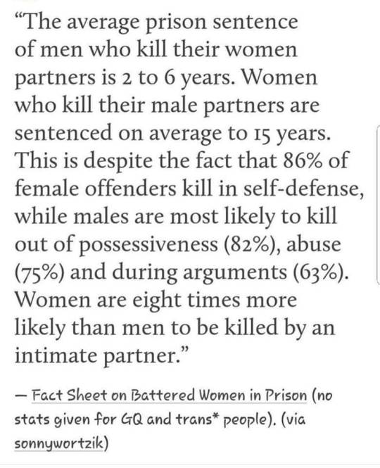
I’ve seen this going around on Facebook. It dates back to at least 2014. Let’s dig in and see where the idea came from.
The immediate citation goes to this “Purple Berets Fact Sheet”, which in turn cites "(National Coalition Against Domestic Violence, 1989)" for the first claim, and nothing at all for the second. (The FBI's UCR doesn't distinguish between "an argument" and "self-defense" as motives, anyway; these aren't mutually exclusive categories.)
The National Coalition Against Domestic Violence's current fact sheet has no such claims in it, and I haven't been able to find a former one which did (though The Guardian dates it to 1989). The claim shows up in plenty of books, though, dating back through the nineties. I'm curious if VAWA changed anything, or indeed, if anything in the intervening thirty-four years did.
First, I did find a BJS report, "Spouse Murder Defendants in Large Urban Counties", covering similar but not identical subjects (spouses, not partners, and in cities, not everywhere) at a similar time (data from 1988) to the original claim. It found that wives who killed their husbands, on average, were less likely to be charged, far more likely to be acquitted, and received sentences averaging ten years shorter than husbands who killed their wives. And indeed, self-defense ("provocation", as they put it) is noted as a likely explanation:
In certain circumstances, extreme victim provocation may justify taking a life in self-defense. Provocation was more often present in wife defendant cases, and wife defendants were less likely than husband defendants to be convicted, suggesting that the relatively high rate of victim provocation characteristic of wife defendant cases was one of the reasons wife defendants had a lower conviction rate than husband defendants. Consistent with that, of the provoked wife defendants, 56% were convicted, significantly lower than either the 86% conviction rate for unprovoked wife defendants or the 88% conviction rate for unprovoked husbands.
Furthermore, this still didn't explain the shorter sentences.
Wives received shorter prison sentences than husbands (a 10-year difference, on average) even when the comparison is restricted to defendants who were alike in terms of whether or not they were provoked: The average prison sentence for unprovoked wife defendants was 7 years, or 10 years shorter than the average 17 years for unprovoked husband defendants.
So, where did the opposite idea come from? This 1993 TIME article by Nancy Gibbs (who started her career as a fact checker, ironically) cites "Michael Dowd, director of the Pace University Battered Women's Justice Center".
At this point, it looks like this was straightforward citogenesis; a claim is made unreliably, then laundered into a reliable source and becomes accepted as fact.
I directly contacted the current director of the Pace University Battered Women's Justice Center (now the Pace Women's Justice Center) as well as Michael Dowd's law firm (I don't know if he's still practicing), and sent a follow-up to both over a period of two weeks. I received no reply in either case.
I've done my diligence on this one. I believe that the frequently-cited statistic that men who murder their wives are sentenced more leniently than women who murder their husbands was wrong when it was first published over three decades ago, and there's no particular reason to believe it's not still wrong now.
4 notes
·
View notes
Note
Anyone interested in carbon taxation should familiarize themselves with the policy's history in Washington state in the form of ballot initiatives. (Links go to past discussions.)
In 2016, I-732 was a neoliberal-approved simple carbon tax swap; it was moderately progressive, in that the sales tax it replaced was more regressive. The left either stayed home or campaigned against it; the right was uniformly opposed. The measure failed, 59-41.
In 2018, I-1631 was a progressive-approved carbon tax policy; it took the revenue and directed it to a complex bureaucracy intended to send most of the funds to poor people to help their communities adapt. The centrists were cold on the idea; the right was uniformly opposed. The measure failed, 56-44.
I don't know what to do about that, but anyone who thinks that carbon taxation is a simple and obvious policy should at least engage with that history of failure. Washington is a deeply blue state with a strongly environmentalist governor, and they still couldn't manage it.
But will Sanders be able to put aside his politics and govern from the center and cooperate with Senate republicans? We've had 12 years of division and partisan feuding. The country needs consensus. We need to restore the confidence of our international allies and show the private sector that the US is ready and able to protect their freedom domestically and abroad. We need to promote equality through market based solutions not government overreach and taxation.
Everyone else go home this is the funniest anon I’ve ever recieved
354 notes
·
View notes
Text
A sequence of words I said to my cat this morning as he sat upon my lap
Hello my ultra-special boober boy who likes to be thumped upon his bottom. Droolmaster 5,000. I play you like the bongos.
121 notes
·
View notes
Text
Boomers and Trigger Warnings
So my stepmother just posted this super stupid article in a fit of Boomer spirit, and it had to do with the subject du 2015: trigger warnings. The conclusion of the study was basically this: that sitting subjects down and either showing them a trigger warning or not showing them a trigger warning did nothing to affect their distress levels at watching the subsequent media. Some academics went on to posit that avoiding trigger situations is actually detrimental to the PTSD sufferer, and slows their recovery by giving them the means to avoid mentions of their trauma.
Let’s use a heavy-handed and doubtlessly leaky analogy. This same stepmother eats gluten-free; she tells me that she has an allergy. I’ve watched her choose to eat products which clearly contain gluten within the last few years, and she didn’t show any of the signs of distress which I see in my friend with Celiac. However, I take her at her word for it, in that she probably has a milder allergy, and she must feel better physically when she doesn’t eat it.
Do without them nutrition labels then, snowflake.
Her choices are then:
- Avoid foods she knows to contain gluten, like bread. The downside to this approach is that gluten comes in many forms, her diet will be super restricted, the social aspect of eating will be hindered because she won’t be able to know for sure at restaurants, and she still might run into gluten from hidden sources, such as if her food was processed on equipment which also processed gluten.
- The analog to this in media is to avoid shows which you know will probably contain your trigger. However, you might encounter it any one of a number of places, including commercials on so-called ‘safe’ shows.
- Try to desensitize herself to gluten by exposing herself to it a bit at a time. The drawback here is that it could be physically super uncomfortable, it might not even help, and unless she’s got people slipping her gluten randomly without her knowledge, she’ll subconsciously avoid more and more foods until she’s subsisting on soy she grew herself. If done at all, it should be done under the supervision of a doctor and in a clinical environment.
- The analog to this in media is desensitizing yourself to it by accepting the random onslaught, and the result would be pretty similar: you’ll suffer, self-directed exposure therapy can backfire spectacularly, and you’ll probably end up avoiding media altogether. The key word in exposure therapy is THERAPY - every knowledgeable expert on the subject agrees that it should be done with the help of someone who has training in its administration.
- Put up with it every time some random shmuck calls her weak for checking a nutrition label.
- Doesn’t feel great, does it.
My dad suffered PTSD when he was hit by a truck some years back; I suffer PTSD as well. I’m sure Dad would back my stepmother up if asked, because he’s internalized the Boomer mentality that if you complain, you’re weak. Truly ironic from the generation which protested the Vietnam War. My partner, who not only has zero personal experience with PTSD, but is also on the autism spectrum and struggles with empathy, demonstrated a better grasp of the issue than my stepmother. He said “just because someone’s afraid of spiders doesn’t mean that yelling 'hey, spiders!’ makes it any less upsetting when you throw spiders in their face.” He clearly understood that unless what’s being said is 'would you like spiders in your face?’ and the answer can be 'no,’ it ain’t helping.
Trigger warnings are benign for non-sufferers, and helpful for sufferers. Trying to back up your biases with badly-structured research and wild speculation is going out of your way to hurt people who are asking super freaking little. At its core, it’s wanting the world to be more like you, not wanting to adapt to being in the world, and taking the concept of 'you can’t please everyone’ to pathological extremes. Sure, you can’t cater to absolutely everyone, but you start with those most in need of help, and work your way up from there. It’s simple fucking courtesy, and if you can’t deal with it, well, what makes you any better?
10 notes
·
View notes
Text
The thing about being with a partner long term is that on the one hand, you know their story inside and out. But on the other hand, I still love hearing the tale, because it's important, and it's meaningful.
This one's worth reading.
Why I Left Music
To understand why I left music, you’ve got to start with why and how I got into music.
Keep reading
8 notes
·
View notes
Text
Thesis, antithesis, synthesis.

lol @brazenautomaton
123 notes
·
View notes
Text
The solstice, and the city.
It's the shortest, darkest day of the year again--a time for quiet, for reflection, for community, for artificial light.
I've done a lot of reading and writing this year about cities. Edward Glaeser's Triumph of the City, Steven Johnson's The Ghost Map, a whole series of posts and commentary on more local issues, and what seemed like a Special Interest turned out to be perhaps the most important thing. I don't know if I'm seeing the whole in a single part, or if cities really do matter that much.
As humans, we cooperate. A human in isolation is a feral child, barely able to survive. Through network effects, the larger the gathering, the mightier we are--in economic productivity, in sheer force of arms, in the density and rapidity with which we generate ideas. Our power is in the communities we build.
From the beginning, we could only gather in groups of not much more than a hundred. Then we started farming, and gathered in permanent dwellings, where some of us didn't have to find or make our own food. The size of these cities grew, depending on how much food you could grow and carry in from the surrounding countryside, how fast.
This placed a hard limit of about a million people (usually much less in practice) on how big cities could be. Famine and, to a certain extent, plague, would stop cities from growing further. When we discovered coal and steel and chemical fertilizer, this number went up, and up, until it reached another limit, enforced by the rate at which we could process and remove our own waste--beyond a certain density, plague would keep us in line. We solved that one, too.
In the living memory of most Americans, cities are dirty and dangerous, and the suburbs are the future. This is a historical fluke: the introduction of the automobile made suburbs practical, and lead poisoning made cities violent. The natural end point here is the three-hour "supercommute" through endlessly-widened highways. The return to urbanization is a regression to the mean.
Cities are the expression of our advanced technology, both social and physical. It's civilization, made of glass and concrete and flesh. To quote Glaeser:
The strength that comes from human collaboration is the central truth behind civilization’s success and the primary reason why cities exist. To understand our cities and what to do about them, we must hold on to those truths and dispatch harmful myths. We must discard the view that environmentalism means living around trees and that urbanites should always fight to preserve a city’s physical past. We must stop idolizing home ownership, which favors suburban tract homes over high-rise apartments, and stop romanticizing rural villages. We should eschew the simplistic view that better long-distance communication will reduce our desire and need to be near one another. Above all, we must free ourselves from our tendency to see cities as their buildings, and remember that the real city is made of flesh, not concrete.
So when I have the good fortune to go to a new city, and to stand somewhere high up, I'm not just enjoying the engineering. I'm looking out upon a marvel of cooperation, the paragon of civilization.

(Above Shinjuku station, in Tokyo.)
2 notes
·
View notes
Text
Man: Why can’t you get a better paying job?
Me: It’s the vagina, mostly.
Man: But this isn’t the 1930’s anymore.
Me: Then explain how I was turned down a job washing and doing minor repairs on tractors and his exact words were “I don’t think a woman can do this job.” How about when I worked at a body shop making really good money but was sexually harassed by the man paying me. Or what about when I was flipping houses and stopped getting paid so I had to track down the man paying me at his house.
Man: Why are you so interested in jobs that men do? Do you want to be a man?
Me, breathing heavily: I THOUGHT YOU SAID THIS WASN’T THE 1930’s ANYMORE DID I READ SOMETHING WRONG
36K notes
·
View notes
Quote
Spooky scary socialists /
Fight bosses, cops and scabs /
The workers' might /
When they unite /
Will drive the owners mad
Spooky scary socialists /
Expropriate the means /
The people should /
For greater good /
Eat only rice and beans
It's seasonally appropriate!
0 notes
Text
This attitude toward horses is Objectively Correct.
is saying “horses” when you pass a field of horses a midwesterner thing or a whole ass national thing bc ive never been in a car when we passed a field and somebody has to just say Horses in a monotone voice and we all look and nodd and keep drivin
126K notes
·
View notes
Text
This is precisely how comment sections function; when I read Zero HP Lovecraft's The Gig Economy, I was surprised at where it ended, at an essentially random fraction of the total page length.
Thought prompted by having watched way too much television at work this week:
what we need are variable length television episodes. The entire problem with Law and Order is that, if they’ve found the bad guy and we’re only at minute 20, he’s not the bad guy. Even if it’s four minutes from the ending there’s probably still a twist coming, so someone is going to pull out a gun and/or jump out a window. You know everything you need to know about how an episode is going to play out just by looking at the clock.
Movies have this problem too. No, the protagonist isn’t going to die, we’re only 45 minutes in. No, their grand plan to crush the villain isn’t going to work, we’ve still got another hour that they’re going to have to fill somehow. Okay, this grand plan is going to work, because we’re down to eight minutes.
Reading a detective story or law story is pretty much the exact same problem - setup, obvious misdirection, apparent resolution that we know is a lie because we’re only halfway though the page count. I knew Harry Potter wasn’t dead because I could feel seventy more pages in my hand.
And that’s print, so we can’t fix it, but now that lots of people read on ebooks I’m astonished there’s not an app that lets authors set false endings and false lengths to their stories. And has no one recut Law and Order to be a thousand times less predictable just by virtue of not always lasting exactly 43 minutes plus commercial breaks? I would pay a lot of money for a Netflix-of-lies full of television episodes and movies of varying length and thus, for once, genuinely unpredictable.
443 notes
·
View notes
Photo
It's a (bad) edit of this Pia Guerra cartoon; you may remember her (@hkstudio) as the primary artist behind Y: The Last Man; she now makes leftish political cartoons for The Nib.
I guess it was originally sarcastic, and now it's a different kind of sarcastic?

1K notes
·
View notes
Text
More Census data and density.
Continuing to dive into the Census data, I've extended the dataset to go back to 1990, and I've gotten two reasonably good visualizations.
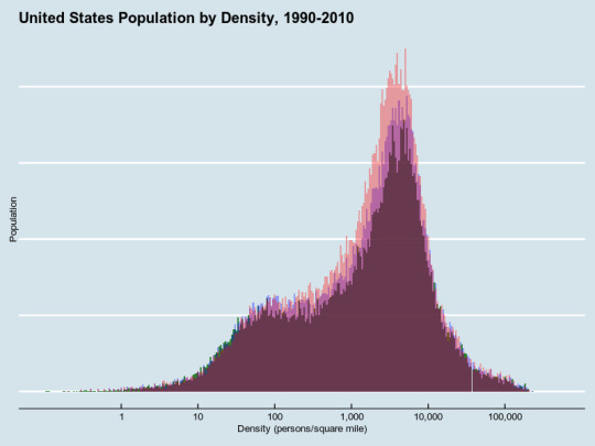
This is a histogram of population. Think of the shaded mass as the actual people; there will be more shaded area as there are more people; they're arranged at different parts of the chart. It's very clear that very dense (over ten thousand a square mile) places didn't grow at all in those twenty years, nor did the countryside empty out. Rather, new people all went to the same moderately-dense set of places. (The purple parts grew from 1990-2000; the red ones grew from 2000-2010.)
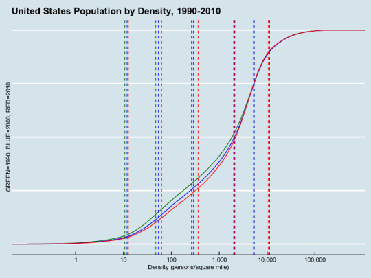
This is an empirical cumulative distribution function, essentially the integral of the histogram. (You can get the derivative of this, essentially an empirical density function, substituting geom_density for stat_ecdf.) 1990 is green, 2000 blue, 2010 red, as noted. The vertical lines are, respectively, the second, tenth, twenty-fifth, fiftieth, seventy-fifth and ninetieth percentiles for density, reproduced in awful ASCII table form here because Tumblr's Markdown support is apparently awful:
. | 2% | 10% | 25% | 50% | 75% | 90% -----|------|------|-----|------|------|------- 1990 | 10.6 | 46.9 | 262 | 1998 | 5344 | 11239 2000 | 11.9 | 53.6 | 289 | 2060 | 5368 | 11199 2010 | 12.6 | 62.4 | 364 | 2120 | 5182 | 10591
The result: there's been a move toward the middle. We're much less rural, and we're slightly less super-urban as well. Note that the demand for dense walkability is quite strong, especially as reflected in housing prices.
Following the cut: as much information as I'd need to reconstruct this from scratch myself.
Getting the 2000 and 2010 data in comparable form was pretty straightforward. The 2010 data is in a file called DEC_10_SF1_GCTPH1.CY07.csv, available here.
Luckily, it's possible to attach multiple datasets to a single plot; ggplot2 is very flexible in that way. The field names are a bit different, too. So, here's the two-census plot:
ggplot(NULL) + geom_histogram( data = populated, aes(HC08, weight = HC01), fill = 'blue', binwidth = 0.02, alpha = 0.5 ) + geom_histogram( data = populated10, aes(SUBHD0401, weight = HD01), fill = "red", binwidth = 0.02, alpha = 0.5 ) + scale_x_log10( "Density (persons/square mile)", labels = scales::comma, breaks = c(1, 10, 100, 1000, 10000, 100000) ) + scale_y_continuous(name = "Population") + theme_economist() + theme(axis.text.y = element_blank()) + ggtitle("United States Population by Density, 2000-2010")
Is it possible to get the 1990 data? The complete partitioning of the United States into Census tracts was only completed in 2000; in 1990, all counties were partitioned into tracts or "block numbering areas" which seem comparable; before that, breaking down data below the city level was pretty much ad-hoc.
The selected data page for the 1990 census includes, as its last item, "State by state files from Tables 1 and 19 of the 1990 Census of Population and Housing: Population and Housing Characteristics for Census Tracts and Block Numbering Areas (CPH-3) report." The link is dead, but the Wayback Machine points to the right place! There are fifty-three PDF files, each of which looks like a simple table, printed out. (Luckily, no OCR is necessary here. Whew!) poppler-utils has a simple utility to convert PDF to text.
All lines with actual data in them have a five-digit county code somewhere in the line. Note that there are spaces in some county names, but it looks like the fields are all delimited by at least two spaces. So...
$ pdftotext -layout AL.pdf - |grep "[[:digit:]]\{5\}"|sed 's/\s\{2,\}/,/g'|head -1 01001,Autauga,201,1773,3.78,184,9.9
We also need to add one more row at the top, for the headers (tract numbers look like 123.02; BNA IDs look to be four-digit codes above nine thousand):
StCou,CountyName,TractBNA,Population,Area,PovertyCount,PovertyPercent
(I'm not looking for data about poverty, but this is what I could find.) Note that because of space-parsing issues, I had to collapse spaces between numbers, between letters and numbers, but not between letters, hence the Perl. (Not sure why the repeat of the last bit is required.)
$ echo 'StCou,CountyName,TractBNA,Population,Area,PovertyCount,PovertyPercent' > Census1990.csv $ for x in *.pdf; do pdftotext -layout $x - \ | grep "[[:digit:]]\{5\}" \ | perl -pe 's/([a-z.])\s+([0-9])/\1,\2/g; s/([0-9])\s+([A-Za-z])/\1,\2/g; s/([0-9])\s+([0-9])/\1,\2/g; s/([0-9])\s+([0-9])/\1,\2/g' >> Census1990.csv; done
At this point, there are twenty-four unparseable rows, which I guess I'm going to have to deal with. And note that the numbers don't quite add up; the total population is 252M, when it should be 249M; the area is 3.6M square miles, where it should be 3.8M.
> sum(census90$Population, na.rm=T) [1] 252191384 > sum(census90$Area, na.rm=T) [1] 3564912
Tidy the data:
census90[census90$Area == 0,]$Area = 0.01 populated90 <- na.omit(census90[census90$Population > 0,]) populated90$Density = populated90$Population / populated90$Area
And here's the full code for the histogram:
ggplot(NULL) + geom_histogram( data = populated90, aes(Density, weight = Population), fill = 'dark green', binwidth = 0.02, alpha = 0.8 ) + geom_histogram( data = populated, aes(HC08, weight = HC01), fill = 'blue', binwidth = 0.02, alpha = 0.33 ) + geom_histogram( data = populated10, aes(SUBHD0401, weight = HD01), fill = "red", binwidth = 0.02, alpha = 0.33 ) + scale_x_log10( "Density (persons/square mile)", labels = scales::comma, limits = c(0.1, NA), breaks = c(1, 10, 100, 1000, 10000, 100000) ) + scale_y_continuous(name = "Population") + theme_economist() + theme(axis.text.y = element_blank()) + ggtitle("United States Population by Density, 1990-2010")
For the empirical CDFs, replace geom_histogram with stat_ecdf, which is easy enough. But seeing how the percentiles move is less simple. The quantile function does the right thing for plain data, but this is weighted--not all census blocks contain the same number of people. (We'd just get the nth percentile of census blocks, not of people.) Luckily, there's a wtd.quantile function in the reldist package that does the right thing. Sanity-checked:
> library(reldist) > wtd.quantile(populated90$Density, weight=populated90$Population, q=0.5) 50% 1998.271 > sum(populated90[populated90$Density < 1998,]$Population) / sum(populated90$Population) [1] 0.499948
Compare to the naive approach, biased low because of a large number of low-population rural tracts:
> quantile(populated90$Density, probs=0.5) 50% 1854.299 > sum(populated90[populated90$Density < 1854,]$Population) / sum(populated90$Population) [1] 0.4851802
I could not get a key to show up on the graph itself, likely because the main ggplot call is empty, but even adding a year variable to each of the tables didn't quite seem to work.
probs = c(0.02, 0.10,0.25,0.5,0.75,0.9) ggplot(NULL) + stat_ecdf( data = populated90, aes(Density, weight = Population), color = 'dark green', ) + stat_ecdf( data = populated, aes(HC08, weight = HC01), color = 'blue', ) + stat_ecdf( data = populated10, aes(SUBHD0401, weight = HD01), color = "red", ) + geom_vline( aes(xintercept=wtd.quantile( populated90$Density, weight=populated90$Population, q=probs)), color="dark green", linetype="dashed", ) + geom_vline( aes(xintercept=wtd.quantile( populated$HC08, weight=populated$HC01, q=probs)), color="blue", linetype="dashed", ) + geom_vline( aes(xintercept=wtd.quantile( populated10$SUBHD0401, weight=populated10$HD01, q=probs)), color="red", linetype="dashed", ) + scale_x_log10( "Density (persons/square mile)", labels = scales::comma, limits = c(0.1, NA), breaks = c(1, 10, 100, 1000, 10000, 100000) ) + scale_y_continuous(name = "GREEN=1990, BLUE=2000, RED=2010") + theme_economist() + theme(axis.text.y = element_blank()) + ggtitle("United States Population by Density, 1990-2010")
For more thorough information, the National Historic Geographic Information System contains tract-level data going back as far as tracts existed, but so far as I can tell, you have to do some magic with shapefiles to get the area of each tract. It might be worth trying to dive into at some point.
For similar work done elsewhere, see here; this compares the per-state density with per-county density. (Fun quote: "It would be even better to do this for smaller areas, such as census tracts, but we were too lazy to chase down the data." Ha. This seems analogous to the coastline paradox, though at least humans are discrete rather than continuous.) Possible future work: examine how density varies at the state, county and tract levels, for each state.
5 notes
·
View notes
Text
Aggregating Census data about housing density.
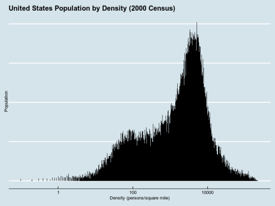
As a follow-up to this Culture War post about density, I noticed that the traditional urban/rural divide doesn't exactly capture the difference between suburban, small-town and truly dense living arrangements--formally, "urban" means you live in a development of 2,500 or more people. Read on to see how I got the above histogram.
We have a Census; the Census divides the whole country into various-sized pieces, down to tracts, block groups, and blocks; we know how many people live in each of them, and we have... somewhere... geographic definitions for all of these, so we must be able to determine how densely people live on a much finer level, and end up with a histogram of how many people live in each density-bucket.
Getting data from the Census is... nontrivial when you want to do something "clever" like this. There are plenty of very in-depth writeups using packages like acs and tigris, or using plain ggplot2. It is... not friendly to amateurs, and I get the sense that it's not as simple as it could be. I had the idea of using ZIP code maps, but the Census doesn't use ZIP codes exactly; it uses ZIP Code Tabulation Areas.
Luckily, after poking around considerably, I found table GCT-PH1, which includes population, area, and even density (a derived quantity, of course) down to the Census tract level in some cases, the block level in some others, but only in the "100% data" file. Start here; this shows per-Census tract information for every county in the United States. Download the whole dataset, and you'll (blessedly) get a CSV file with exactly the right data in it.
Note that this will have county-level data as well as tract-level data in it. Filter out the tract-level data by checking for the GEO.id2 field being equal to the GCT_STUB.target-geo-id2 field. According to the metadata, field HC01 is the population, HC06 the total land area in square miles, and HC08 the population density per square mile of land area. Let's fire up R and see what we can do!
library(readr) census.full <- read_csv("DEC_00_SF1_GCTPH1.CY07.csv") census <- census.full[census.table$GEO.id2 != census.full$`GCT_STUB.target-geo-id2`,]
This appears to properly cover the entire US population as of 2000, divided across 65,543 tracts covering all 3.8 million square miles of the nation.
> sum(census$HC01) [1] 281421906 > sum(census$HC04) [1] 3794083
And (making sure to set na.rm to TRUE) we see that about a quarter-million Americans live in extremely rural census tracts.
> sum(census.table.short[census.table.short$HC08 < 1,]$HC01, na.rm=TRUE) [1] 269136
The full range of density goes from zero to over two hundred thousand people per square mile, which I thought was an artifact of very small tracts, but then I remembered that all tracts should contain at most several thousand people (there are a few outliers); there are simply some very small, very dense tracts.
> range(census.table.short$HC08, na.rm=TRUE) [1] 0 229783
To see a list of the most-populous tracts:
na.omit(census.table.short[census.table.short$HC08 > 150000,])
This contains fifty-four tracts, fifty-two of which are in New York City; the remaining two are in "Baltimore city - Census Tract 1003", containing the Maryland Reception Diagnostic and Classification Center (a prison), and "Marin County - Census Tract 1220", containing San Quentin Prison.
At this point, I'm considering trying to put together a cumulative distribution function of population by density, or maybe a histogram, though I'm unsure where to put the buckets. So I look up documentation for geom_histogram over here, and I find this Stackoverflow question, and it seems there's a weight aesthetic that does what I want. With a little extra tidying...
populated <- na.omit( census.table.short[census.table.short$HC01 > 0 & census.table.short$HC08 > 0,]) ggplot(populated, aes(HC08, weight=HC01)) + geom_histogram(binwidth = 0.01) + scale_y_log10() + scale_x_log10()
And with some fancy aesthetic advice...
ggplot(populated, aes(HC08, weight = HC01)) + geom_histogram(fill="black", binwidth = 0.1) + scale_y_continuous(name = "Population") + scale_x_log10("Density (persons/square mile)") + ggtitle("United States Population by Density (2000 Census)") + theme_economist() + theme(axis.text.y = element_blank())
(I wanted to try the xkcd theme, but getting the new font to work was nontrivial.) So, there it is! Possible follow-up idea: I could overlay the 1990, 2000 and 2010 data on the same chart, and see where everyone's been moving to, or try to make a cumulative-distribution view. Or bucket things more coarsely, and try to get those buckets to correspond with floor-area ratios or some other intuitive measure of density.
6 notes
·
View notes
Text
I do enjoy me some good explainers.
For Real Conservatives, PragerU, though they're high on cartoony production values and short on jokes. (Topics include how the Democratic Party is the party of the Klan, for example. Not very NYTish.)
Adam Ruins Everything, of course. Plenty of clips on YouTube.
Drunk History, which is surprisingly informative. (Episodes are generally made of three segments adding up to twenty minutes; very bite-sized.)
Practical Engineering's YouTube clips. (Putting googly eyes on a tuned mass damper makes it festive!)
Vox is remarkably good at this kind of thing, and it's considerably less than thirty minutes per video. Try the high cost of free parking.
PBS Infinite Series explains medium-difficulty math in a pretty chill style.
And it's not full of jokes, but wow, is it ever relaxing to watch 3Blue1Brown solve problems.
I have discovered I still have the ability to watch TV in the genre “nerdy person explains things to me, with jokes, episode no longer than 30 minutes.” Unfortunately the only example of this genre I know is John Oliver, which is about politics and therefore unvirtuous. Suggestions for apolitical shows or youtube channels in this vein?
88 notes
·
View notes
Text
La la la, everything is normalll ...
Occasionally I’ll grab a set of controls while everything’s highlighted or delete something accidentally, and while CTRL+Z is my friend, I’ve learned to stop panicking when I do this and start taking screenshots. Behold:
My touching love scene starring Scrote-Face

Co-starring with the glamorous Miss Berp Flerp

With a cameo by everyone’s friend, Floating Teeth.

3 notes
·
View notes
Text
If anyone knows this, it's Guillermo del Toro. The Shape of Water moves between those stories, from tragedy to triumph. I don't remember the last time I cried at a movie simply because it was so damned beautiful.
When I read Carrie and watched each of the adaptations, I wanted so badly for Professor X to knock at her door. I got that catharsis, that turn, here. Someone, finally, wrote a happy ending for the monster. It's so beautiful, so kind, so wonderful.
Here’s a thought: Beauty and the Beast is actually about the importance of having friends and who your friends are. Belle and her dad suffer a lot through social isolation, and can rely only on each other. But more interesting I think, is how friendship affects Gaston and The Beast. Gaston and the Beast are very similar: Hyper-masculine, hyper-competent within their domains, and extremely self-centered. But over the course of the movie, Beast’s friends encourage him to tone it down, to be aware of his flaws and learn to interact well with other people. LeFou, on the other hand, totally worships Gaston and reinforces all his flaws in the process! By the middle of the movie, Gaston, rejected for the first time in his life, is devastated. He’s miserable, and it’s not hard to imagine him rethinking some of his behavior in light of this enormous surprise. But instead, LeFou comes in and tells him: No! “You’re great the way you are! You’re so good I’m going to sing a song about how EVERYONE wants to be you!” This ego reinforcement leads Gaston down a path of actual villainy (he was just a normal douchebag before this point), and to his eventual downfall.
316 notes
·
View notes