
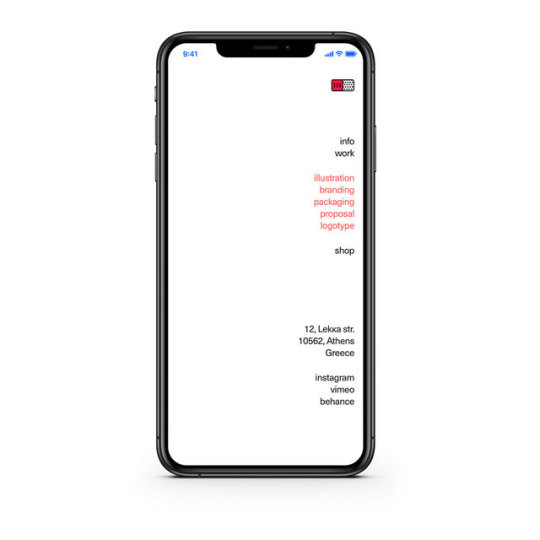
undburo
Und Buro.
We are Und ➝ a design & creative Buro.
Und is a project focusing on visual communication. It is located in Athens and specialises in print and web design.
We elaborate information architecture and corporate identity and we are envolving in the process of initiating or relaunching branding strategies.
Und designs and develops webpages and multimedia applications, creates typographic and publication design.
27 posts
Don't wanna be here? Send us removal request.
Last Seen Blogs
caloresarcheon
Red Queen
natrakcha
Premium Shit

marjellyween
MarJelly
nicepits
Armpit Fetish

fahniyunita
Memetik Hikmah
Photo


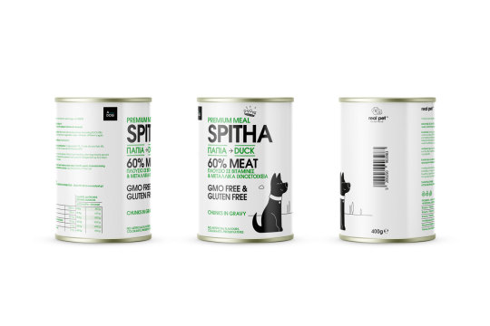
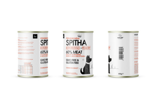

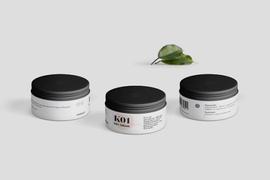
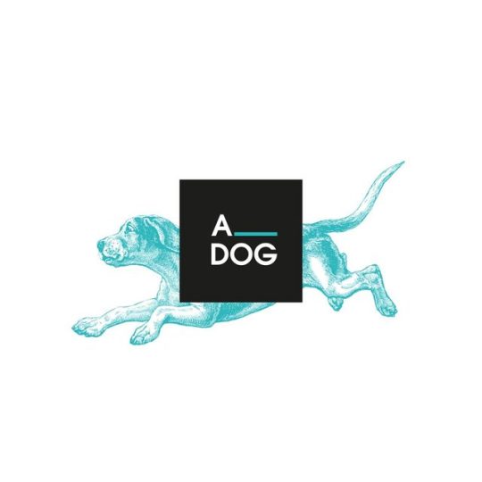
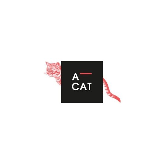
real pet - premium meal series
Real pet ™ is a pet wholesale company.
From the beginning of its establishment, the company strategically produces and distributes its own selected products, enriching on the one hand its product range, on the other hand giving added quality value to the whole of its commercial activity.
The market investigation found a lack of a structured approach to the majority of pet food products, especially direct wholesale competition.
This finding led to specific decisions, aiming at a well-designed design proposal against the existing competition:
a. Organization of typography. Homogeneity and recognition among the quality product families of real pet, emphasis on typographic design, systematic arrangement of information.
b. Pictorial markings (crown), dog – king and cat – queen.
c. Creating a specific, characteristic, color palette. Design prerequisite, the differentiation of the individual product titles, maintaining the same intensity. Differentiation from the competition.
d. Preservation of the white – black color in the titles, constant reference in the color variations. Homogeneity and recognizability among existing product families, flexibility, the use of silver or gold in selected locations, including titles, will cover the creation of two additional price category levels in the future.
e. Illustration – abstract, in a modern aesthetic with clean, bold lines, serves the typography, makes the product distinct, allows color changes.
Illustration: Giorgos Tsitras
➝ What we did:
#art direction#branding#identity#illustration#information architecture#logotype#packaging#typography#und#buro#undburo
0 notes
Photo
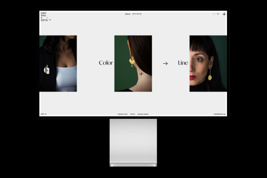
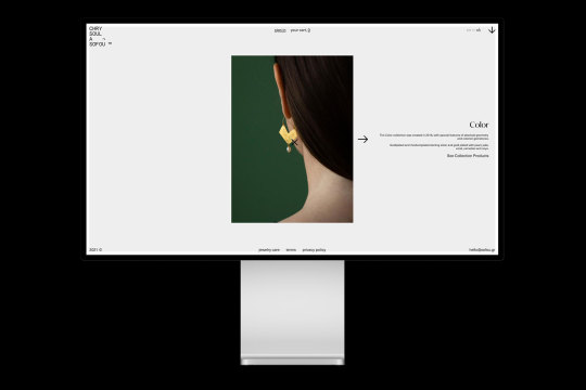
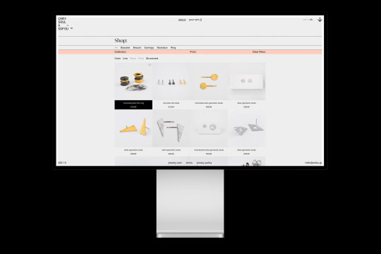


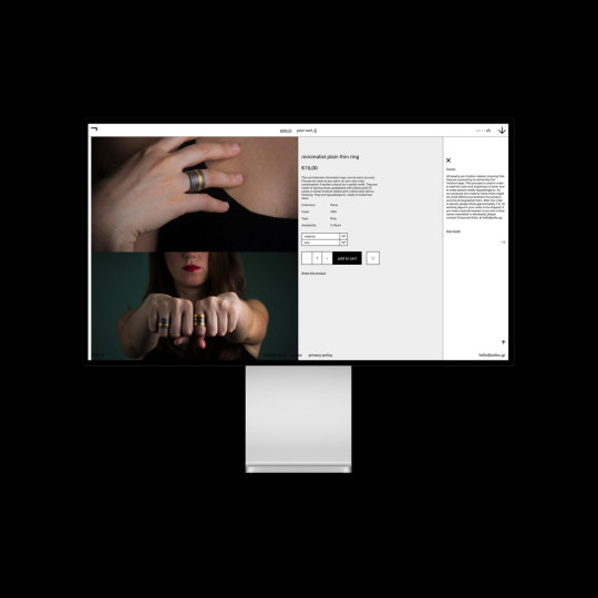
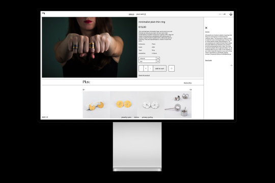
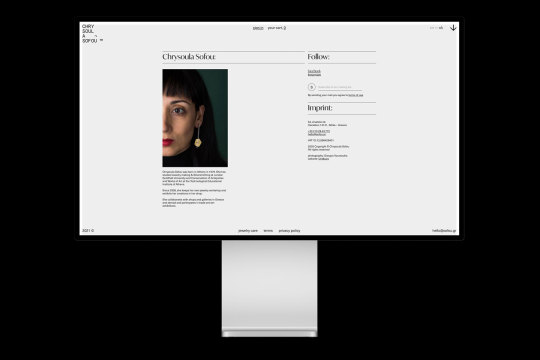
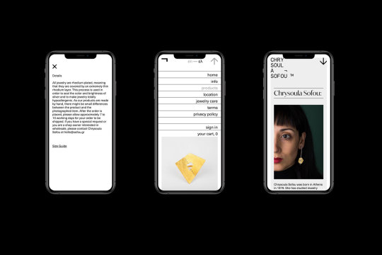
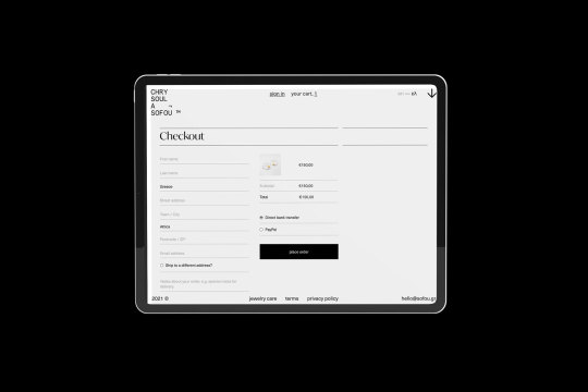
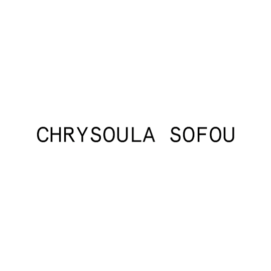
sofou.gr
Crysoula Sofou e-shop ➝ visit website
Chrysoula Sofou designs and manufactures jewelry. The resulting shapes as a whole do not want to illustrate, but to convey the sense of ‘rhythm’.
The online store of Chrysoula Sofou is strictly organized and free from any unnecessary decorative mood. Intense, distinctive signage, simplified visual rules, dictate navigation in a clear and specific way.
The color is delimited between black and two defined halftones. A single, minimal, color change is displayed, which immediately makes the environment distinct, in relation to the other presentation pages.
This small differentiation acquires a functional role, indicating to the user those applications that facilitate product search.
The arrangement of the individual elements, structured in a strict rule, is emphasized by the existence of horizontal and vertical straight lines, which reveal the delimited, as the case may be, spaces.
➝ What we did:
0 notes
Photo

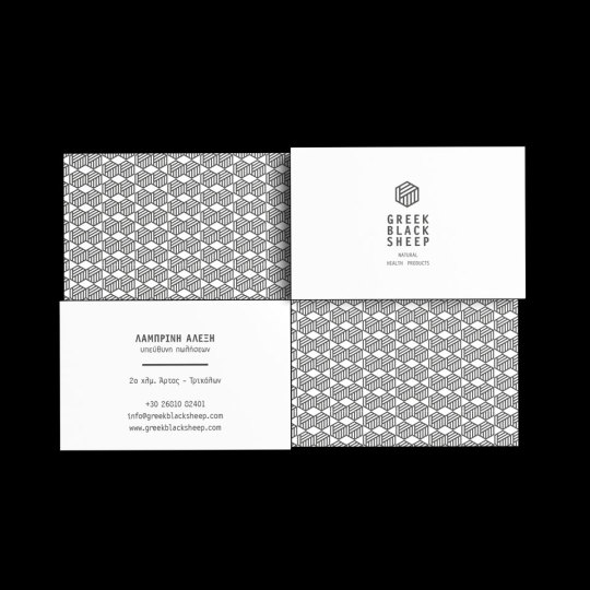
Greek blacksheep corporate identity.
The idea of the logo begins with the depiction of a common wool bucket, a reference to pure and natural raw material conceptually associated with the company’s name, but with unconventional features.
The company greek blacksheep specializes in homeopathic prοducts with 100% natural origin.
The idea of the logo begins with the depiction of a common wool bucket, a reference to pure and natural raw material conceptually associated with the company’s name, but with unconventional features. The usual round shape is modified into a polygon, thus indicating the company’s different, anti-conformist approach to the method of production and methodology of the drug.
1 note
·
View note
Photo
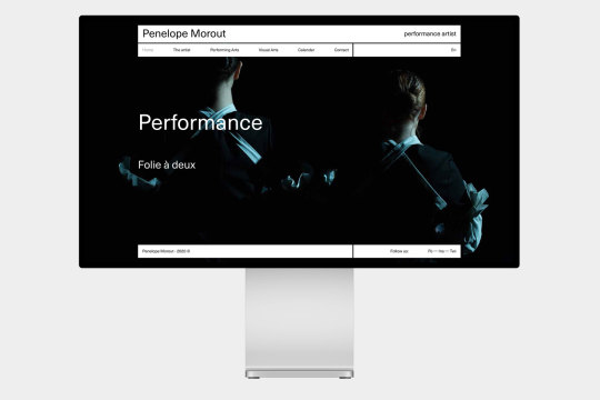
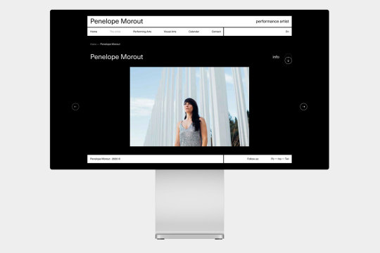
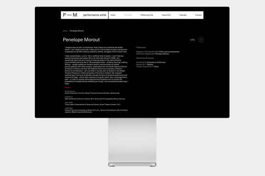
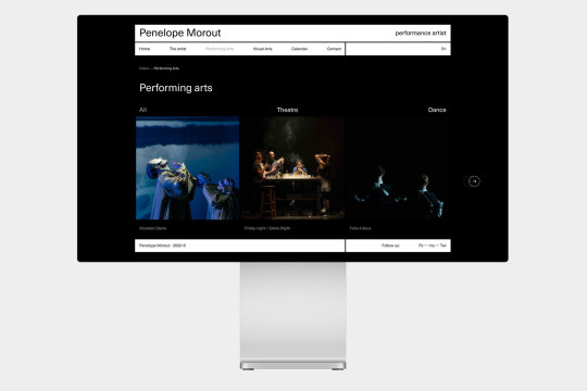

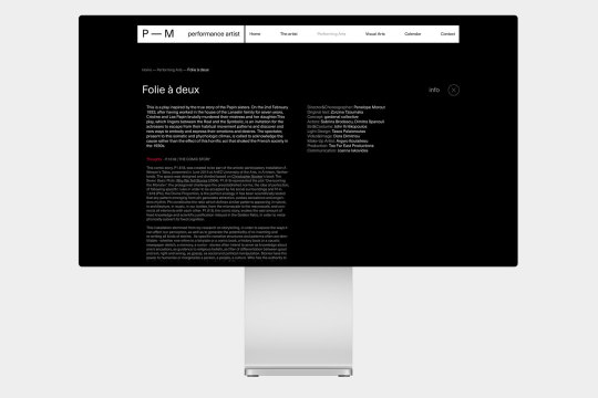
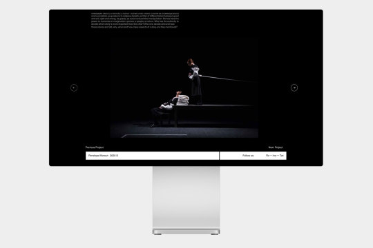
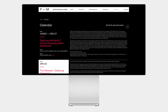
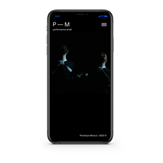
Penelope Morut (showcase)
The aim was to portray the multidimensional activity of the artist in a simple and understandable way.
Functionality displays the image clearly, without using any unnecessary decorative elements, which distracts. The color gamut is limited to the minimum that will ensure functionality.
Font selection is associated with modernism (Unica). Sturdy and simple, with an emphasis on intensely typographic design.
The information is organized into a strict grid, which is divided as a percentage (reference to architecture). The white color offers maximum flexibility, as it makes the functions visible, regardless of the display. Instead of separating information, there are visible gaps between spaces, thus assimilating design into content.
0 notes
Photo
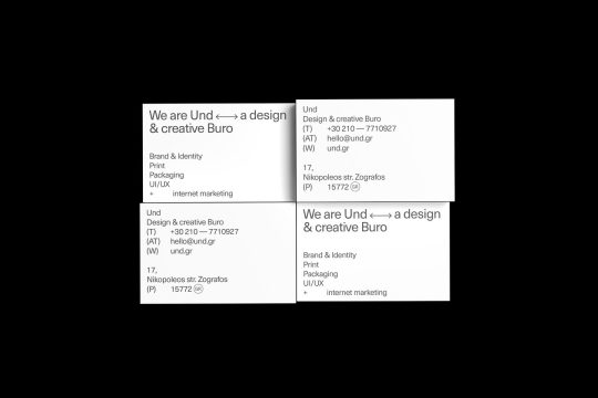
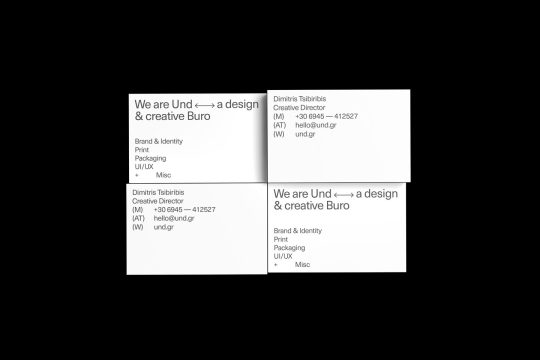

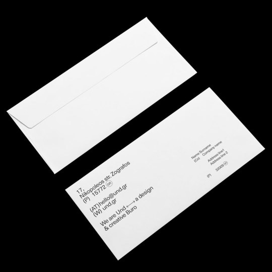

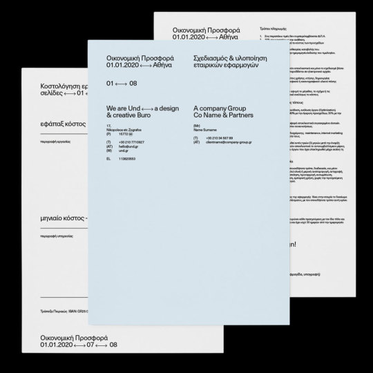


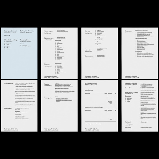
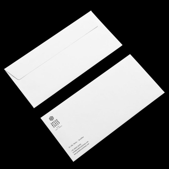
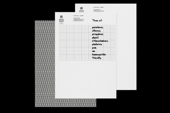
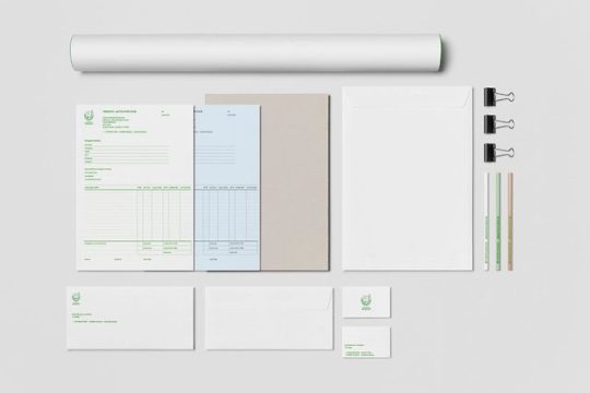
Undburo stationery.
business cards A — B — B — A (photo 01)
business cards C — D — D — C (photo 02)
business cards E — F — F — E (photo 03)
envelopes A — B (photo 05)
invoice triplet, envelope A (photo 06, 08)
financial offer form ➝ pages 01 — 08 (photo 07, 09)
#und#buro#undburo#art direction#information architecture#Creative Direction#branding#naming#print#typography#stationery#black and white#identity#nonprofit
1 note
·
View note
Photo
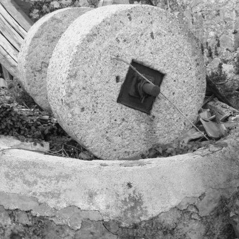

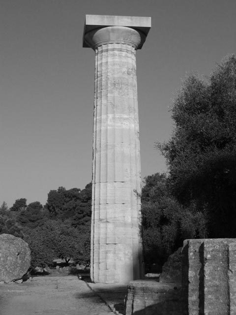
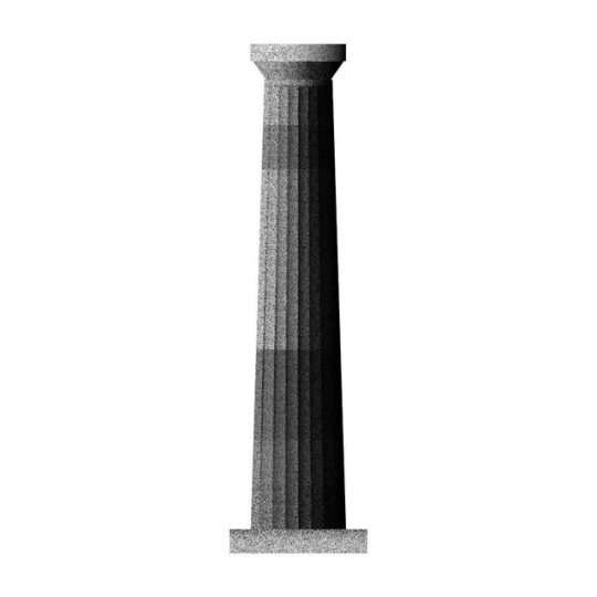
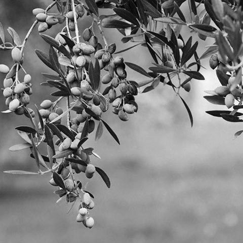

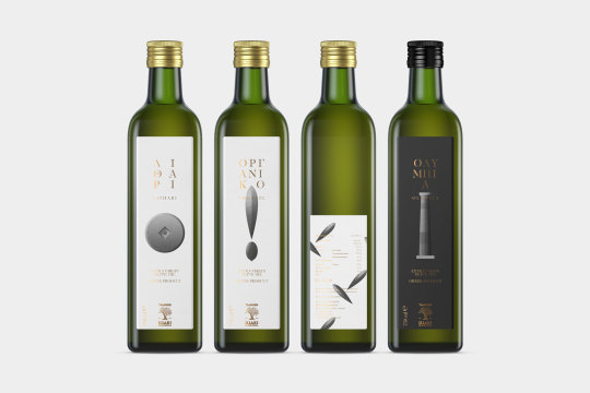
iliaki elaiourgia series
Iliaki Olive Oil is a company active in the field of olive oil based in Epitalio, a small town in the prefecture of Ilia. Its history began in 1910 when Efthimios Tsaoussis built the first olive mill in Makrisia Olympia, where the stone was turned by horses. Today the family tradition has passed into the hands of the third generation, with the same love for the marketing and standardization of fine olive oil, but following the standards set by the competent authorities and always aiming for quality and high nutritional value products.
Olive groves are located in the wider area of Olympia as well as in the semi-mountainous western Peloponnese. Its olive oil stands out because of the climate of the area, because the olive groves are not irrigated and of course due to the distinctive Koronean variety, one of the oldest varieties in Greece.
The USA, Panama, Russia, Germany, Switzerland, Serbia, Hong Kong, Romania, the Netherlands are some of the countries where Extra Virgin Olive Oil is exported.
#art direction#branding#identity#illustration#naming#packaging#print#undburo#olive oil#millstone#und#buro
0 notes
Photo


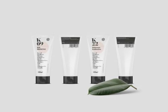
Blacksheep series
Blacksheep specializes in homeopathic prοducts of 100% natural origin.
In 2019 the company launches its own range of products that includes therapeutic preparations, flower oils, herbal teas, tinctures, vitamins, elixirs, creams while extending to cosmetics, hair care, facial, body, sun protection.
Over 160 product codes were categorized and designed for the new series visual identity.
➝ What we did:
#branding#identity#information architecture#packaging#print#undburo#art direction#und#buro#cosmetics#homeopathic
0 notes
Photo


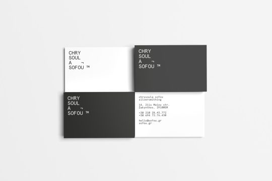
Chrysoula Sofou
Chrysoula Sofou designs and manufactures jewelry with strong references to supremacy, constructivism, and Russian avant-garde. The resulting shapes as a whole do not want to illustrate, but to convey the sense of ‘rhythm’.
In logo design, typography using monospace fonts with visual corrections is perpendicular to a strict grid and imposes a rhythm. The logical denial symbol is used conceptually, while it completes the design of the form with reference to the silverware tools.
➝ Photography: Giorgos Voursoukis
#art direction#fashion#print#branding#identity#typography#monospace#logotype#jewelry#silversmithing#avantgarde#jewerly#silversmith#und#buro#undburo
0 notes
Photo


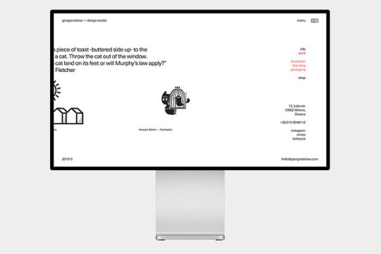


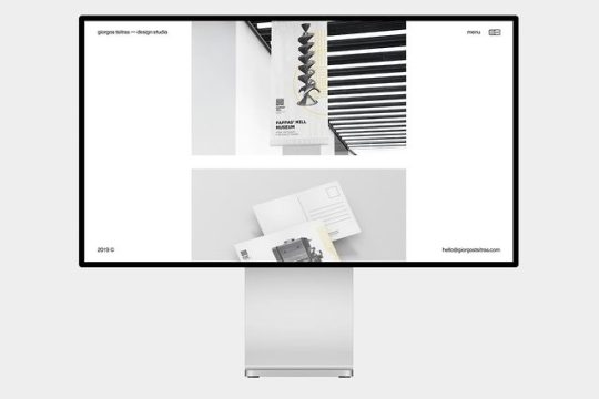
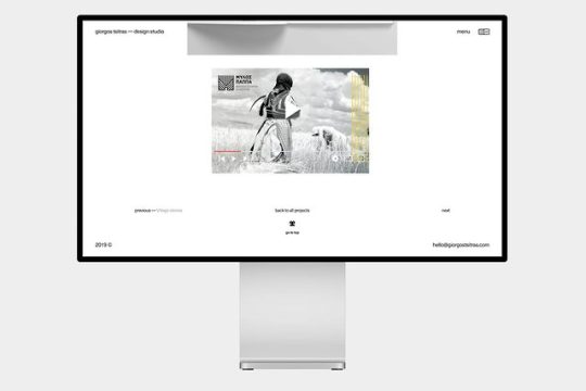

giorgostsitras.com
Giorgos Tsitras is an illustrator, designer, teacher and associate. His works are distinguished on a national and international level.
The concept for his website was to create a synthesis of all of his multidimensional work.
The site is developed in a rigid grid, with bold typography. Color is only embedded on functional elements. The appearance of picture sizes is governed by a random sequence to the extent that it gives the impression of a sketchbook.
➝ visit website
#digital#e-shop#information architecture#ui#ux#website#art direction#undburo#und#buro#digitale-shopinformation architectureuiuxwebsiteart directionundburoundburo
0 notes
Photo


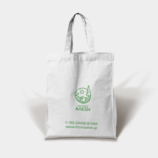

Alexi nursery
Alexis's family business was founded in 1986, when his grandfather started cultivating citrus and olive trees in Arta. In 2001, the nursery entered the field of ornamental plants. In 2014, a new shop was added to the 9th km of Lefkada - Vonitsa, which is active in addition to traditional farming in landscape architecture.
The logo marks the three main activities of the business -planting, cultivating, beautifying- in a holistic approach integrated into the natural landscape.
#art direction#branding#corporate identity#logotype#print#landscape architecture#ornamental#und#buro#undburo
0 notes
Photo
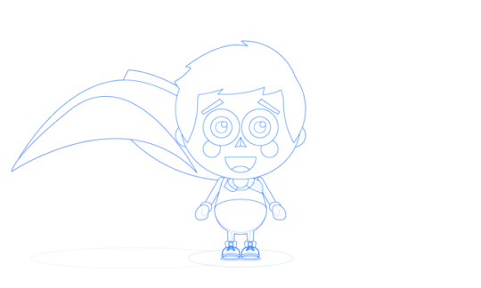

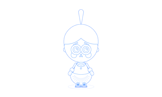


Piou Piou - D • P •
The task assigned us was to suggest the name and design the corporate identity for a playground. In addition, we had to create a character that would be the mascot.
We treated the project as a whole and not as individual tasks. The design concept was formatted by an observation: The children have easy use of repetition in their vocabulary, both in syllables and in words, even to form phrases e.g. ma - ma, pa- pa, miam - miam. The words piou - piou were used, a repetition that children often make when imitating the sound of a fantastic laser gun!
The development of this basic idea led to the creation of two characters instead of one, piou and piou. These are two kids who, in their imagination, transform everyday objects into their own super hero equipment!
One more detail. The special feature of this playground is the "disco", a black room, where words, shapes, illustrations by favorite children's heroes are projected with laser technology and background music.
#branding#creative direction#identity#illustration#logotype#misc#naming#poster#print#undburo#art direction#playground#superhero#und#buro
0 notes
Photo


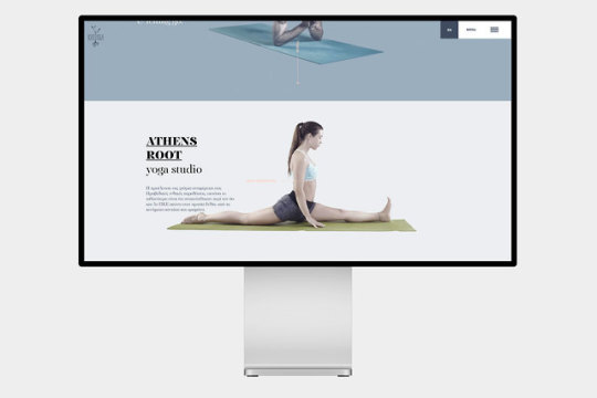

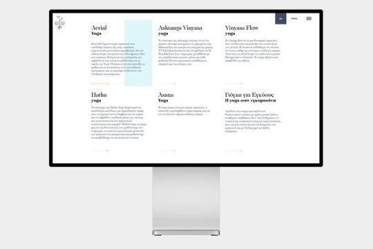
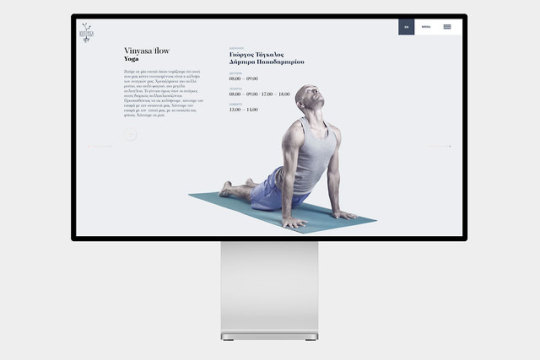


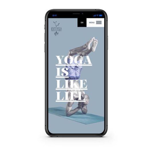
rootyoga.gr
Root Yoga is a cosy, positive studio, having as a goal to create a community where, all those that love yoga or want to discover it, can gather, communicate and exchange opinions in a friendly environment.
The concept design was to give both a sense of flexibility with the use of discreet motion animation and a structured balance achieved by the use of rectangular spaces.
➝ visit website
➝ Photographer: Haris Sfakianakis
➝ Image retouching: Dimitra Papadimitriou
0 notes
Photo


e-metron - iconography
eMetron Analytics is a company with significant experience in the field of energy and in particular energy management, energy efficiency and energy trading.
In addition, the IT department ensures flawless implementation of projects and continuous software support.
As part of the design of corporate audit software, a series of icons were created to mark and highlight areas of activity that can be used in both digital and print applications.
#digital#illustration#information architecture#misc#ui#ux#website#undburo#art direction#iconography#application#und#buro
0 notes
Photo
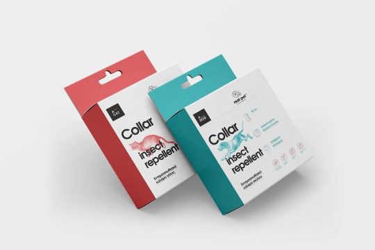
real pet - collar series
Real pet ™ is a wholesale pet products company. Its insect repellent collars contain the active herbal ingredient geraniol, are waterproof, non-toxic and do not affect the animal’s physiology.
The company is the first to implement braille writing in its product line, just like other human-made pharmaceuticals.
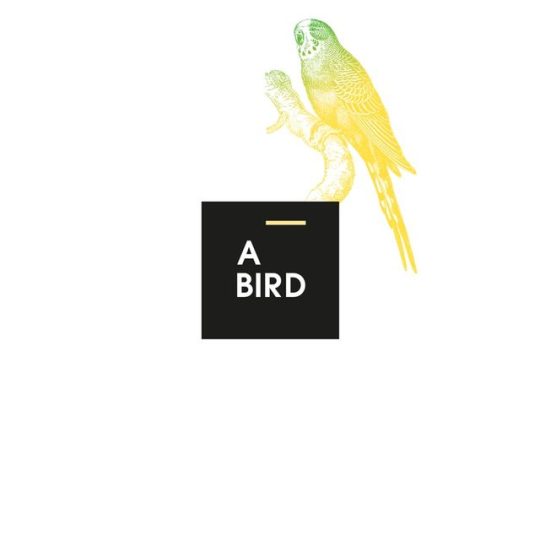
In addition to the packaging, a logo system is also designed which depicts, alongside the company logo, key areas - dog, cat, bird - of product application.
The packaging is displayed as a design template at the production plant in France.
0 notes
Photo
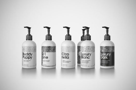


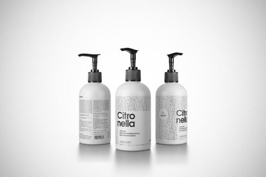
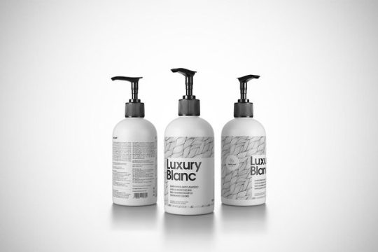
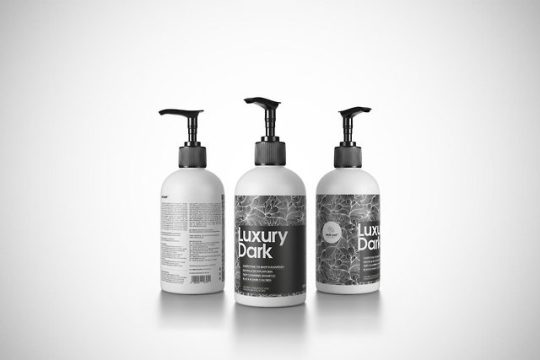
real pet - shampoo series
Real pet ™ is a wholesale pet products company.
Its specialized shampoos contain fats and special wetting agents, that contribute to the proper hygiene of the skin and coat. They are safe, non-toxic with neutral pH, such as the animal's skin.The products of the series are manufactured and standardized exclusively by real pet ™ and constitute the flagship and the chief ambassador of the company in Greece and abroad.
Product names were formed as part of the broader marketing strategy - Buddy Puppy, 2 / 1one, Citronella, Luxury Blanc, Luxury Dark and represent, as well as the illustration, the particular features and properties of the products in the series.
0 notes
Photo


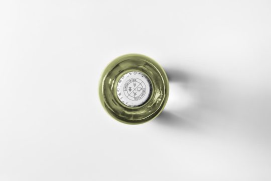
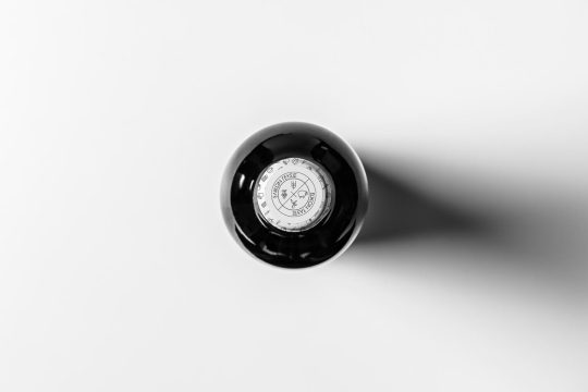
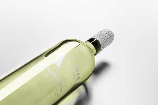
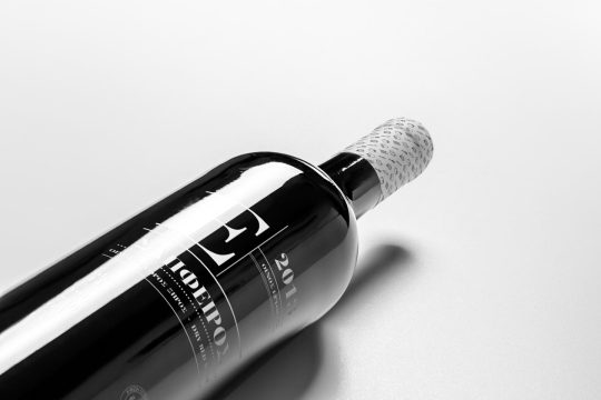
@undburo — www.und.gr — https://und.gr/portfolio/iliaki-elaiourgia-series/
prosilion
The light-filled location where the sun’s rays shine for a long time.
sápfeiros
Also known as the “stone of the rich”, the ruby’s qualities and the rumors surrounding it date back to ancient times, when it was called “sapphire (sápfeiros) porphyry“, in Greece, and later called “Ruber” by Latinos.
The wrapping paper, as well as the bottleneck foil, are decorated with the pattern created to characterize elikon taste products and depict everyday materials and tools of the cooking process.
➝ What we did:
Art direction, Branding, Identity, Naming, Packaging, Print,
0 notes
Photo
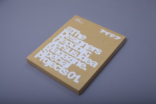
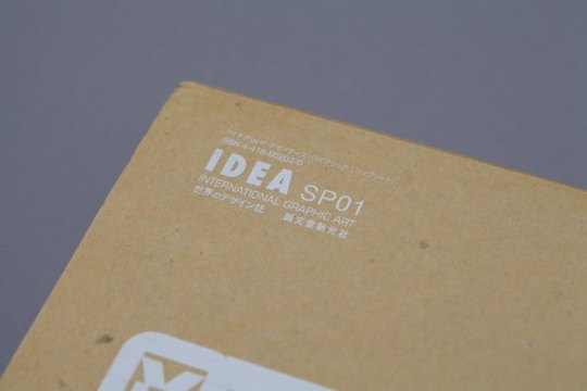
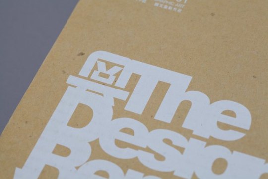
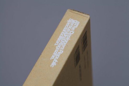
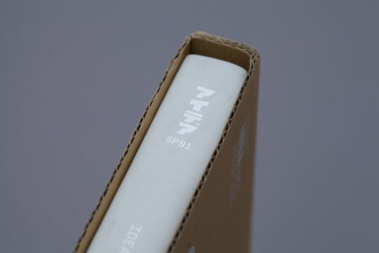
The greatest IDEA
The Designers Republic Versus Idea Magazine. Special Edition. by DAMS Library
0 notes