#the pick-up artist
Text
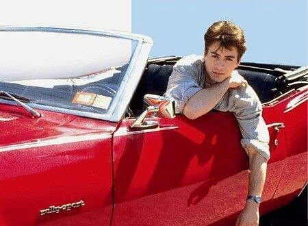

Robert Downey Jr The Pick-Up Artist
93 notes
·
View notes
Text
35 notes
·
View notes
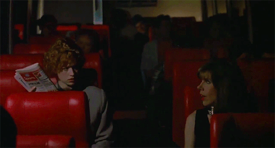
Text
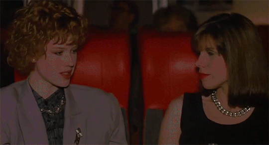

The Pick-Up Artist: Christine Baranski & Molly Ringwald
3/3
4 notes
·
View notes
Text

Welcome home
#artists on tumblr#cw blood#i really like drawing wings if it wasn't obvious#drawing has been rough lately though#all the A-I trash going around is so depressing to see#please pick up literally any tool in your hand and create#shape something with your own hands#breathe life into something#it doesn't need to look perfect and polished and photorealistic#literally anything any person has ever drawn with their own hands#has more value than every algorithm generated garbage put together#a vent doodle drawn in the math notebook of a 13 yo girl has infinitely more value#than any stolen blendered together soulless algorithm “creation”#we're humans we create#so just#create#with your own hands and your own ideas
7K notes
·
View notes
Text
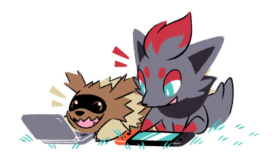
Zigzagoon and Zorua ko-fi doodle for PastelPunk!
I’m accepting pokemon ko-fi doodle requests here! ✨
#artists on tumblr#pokemon#zigzagoon#zorua#ko-fi doodle#gotchibam arts#thank you sm for requesting!! ;w; <3#sorry for not posting much lately @_@#haven't been feeling too well last week#no horrible period cramps this time thankfully but I did feel fatigued most of the time 😞#anyways!!#i'll try to pick up the pace soon!#will try to answer msgs & update queue soon as well#as always tysm for being patient w/ me!!
2K notes
·
View notes
Text
I think 90% of my gripes with how modern anime looks comes down to flat color design/palettes.
Non-cohesive, washed-out color palettes can destroy lineart quality. I see this all the time when comparing an anime's lineart/layout to its colored/post-processed final product and it's heartbreaking. Compare this pre-color vs. final frame from Dungeon Meshi's OP.


So much sharpness and detail and weight gets washed out and flattened by 'meh' color design. I LOVE the flow and thickness and shadows in the fabrics on the left. The white against pastel really brings it out. Check out all the detail in their hair, the highlights in Rin's, the different hues to denote hair color, the blue tint in the clothes' shadows, and how all of that just gets... lost. It works, but it's not particularly good and does a disservice to the line-artist.
I'm using Dungeon Meshi as an example not because it's bad, I'm just especially disappointed because this is Studio Trigger we're talking about. The character animation is fantastic, but the color design is usually much more exciting. We're not seeing Trigger at their full potential, so I'm focusing on them.
Here's a very quick and messy color correct. Not meant to be taken seriously, just to provide comparison to see why colors can feel "washed out." Top is edit, bottom is original.
You can really see how desaturated and "white fluorescent lighting" the original color palettes are.
[Remember: the easiest way to make your colors more lively is to choose a warm or cool tint. From there, you can play around with bringing out complementary colors for a cohesive palette (I warmed Marcille's skintone and hair but made sure to bring out her deep blue clothes). Avoid using too many blend mode layers; hand-picking colors will really help you build your innate color sense and find a color style. Try using saturated colors in unexpected places! If you're coloring a night scene, try using deep blues or greens or magentas. You see these deep colors used all the time in older anime because they couldn't rely on a lightness scale to make colors darker, they had to use darker paints with specific hues. Don't overthink it, simpler is better!]
#not art#dungeon meshi#rant#i'm someone who can get obsessive over colors in my own art#will stare at the screen adjusting hues/saturation for hours#luckily i've gotten faster at color picking#but yeah modern anime's color design is saddening to me. the general trend leans towards white/grey desaturated palettes#simply because they're easier to pick digitally#this is not the colorists fault mind you. the anime industry's problems are also labor problems. artists are severely underpaid#and overworked. colorists literally aren't paid enough to do their best#there isn't a “creative drought” in the anime industry. this trend is widespread across studios purely BECAUSE it's not up to individuals#until work conditions improve anime will unfortunately continue to miss its fullest potential visually#don't even GET ME STARTED ON THE USE OF POST-PROCESSING FILTERS AND LIGHTING IN ANIME THOUGH#SOMEONE HOLD ME BACK. I HATE LENS FLARES I HATE GRADIENT SHADING I HATE CHROMATIC ABBERATION AND BLUR
2K notes
·
View notes
Photo
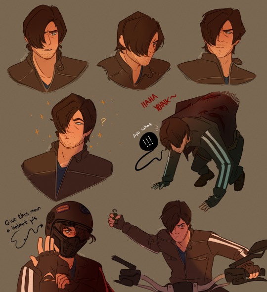
alexa, add ‘i bet on losing dogs’ by mitski to the queue
#leon kennedy#resident evil vendetta#vendetta leon#re vendetta#resident evil#re#resident evil fanart#art#digital art#artists on tumblr#i drew this and went absolutely feral#my baby my baby~#aaaaaaahhhhh#leon kennedy fanart#also the way the final boss guy picked up leon like a bad cat was very funny#he just like scooped him up#also make him wear a helmet for his safety!!!#safety is cool
5K notes
·
View notes
Text

character design commission for Red on ko-fi!
#highlandkall#digital art#cute#furry#fursona#cow#cowsona#closing the the design comms for a bit as work picks up#they’ll be open again next month hopefully#artists on tumblr#art commissions
2K notes
·
View notes
Text

Day 13: Secret
Available here!
I like to think Link can still understand animals even out of Wolf form ☺️💞
#link#cat#twilight princess#tp link#my art#fan art#illustration#digital art#procreate#mochiwei#artists on tumblr#zelda#tloz#the legend of zelda#digital illustration#pls enjoy#tp link is just so#he can pick up all the animals#animal whisperer#enjoy!#linktober 2022#linktober#drawtober 2022#drawtober
8K notes
·
View notes
Text
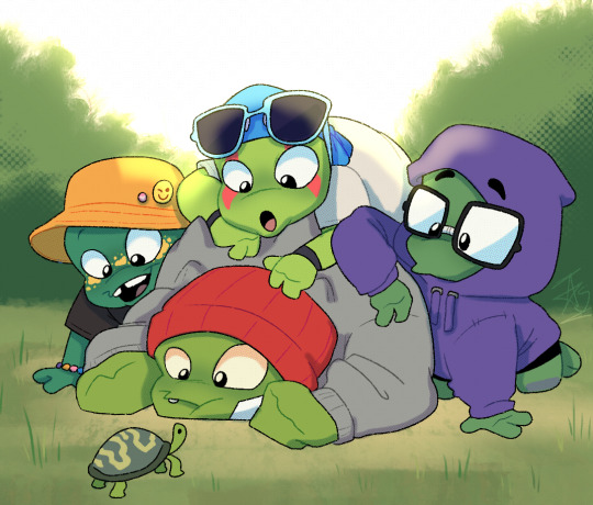
Curious!
#I told ya I was gonna draw something like this#adding halftone to your procreate drawings is something that can be so gender…#anyway KEEP RISE TRENDING!! STREAM NONSTOP SO THAT NETFLIX PICKS IT BACK UP#rottmnt#rise of the teenage mutant ninja turtles#save rise of the tmnt#tmnt#turtle tots#leonardo#donatello#raphael#michaelangelo#fanart#artists on tumblr#comic#my art
12K notes
·
View notes
Text
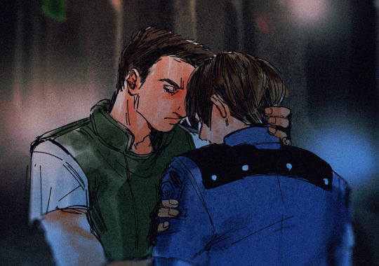
you got this rookie
#artists on tumblr#chris redfield#leon kennedy#chreon#resident evil#fanart#doodle#I sat down to paint Joe bc of FF trailer but it looked so...#anyway so i went and thought of chreon instead#i finally FINISHED ALL THE MATHS SUBJECTS#i need to study some geometry though im thinking of not studying on everything#tbh idk#N E WAY....#ill keep posting stuff like this if i pick up the digital tablet#osmanlı duraklama dönemi yaşıyorum şu an#gerçekten bir daha anladım çizime ara vermemin haklılığını çünkü 💩 gibi oldu#benim işim değilmiş yani olmayınca olmuyor arkadaş
738 notes
·
View notes
Text

Toshi catching up 16 years of dad-ing - not that Izuku cares.
#dadmight#midoriya izuku#all might#yagi toshinori#deku#toshinori yagi#izuku midoriya#mha fanart#traditional art#my art#mon aaaaart#ballpen#watercolour#watercolour pencils#don’t look to closely at all the ballpen lines I don’t know how to pick up a pencil to do a sketch#dedicated to all the dadmight writers and artists out there#so much incredible content
1K notes
·
View notes
Video
youtube
FULL EPISODE: Filter - 20 Things to Do Before You Turn 30
If there was a countdown show for countdown shows, it’d be #1.
#The Pile#G4#Filter#The Apprentice#The Real World#Survivor#America's Next Top Model#The Matrix Revolutions#Hitch#The Pick-Up Artist#The Bachelor#Harold and Kumar Go to White Castle
0 notes
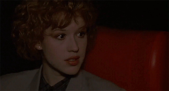
Text
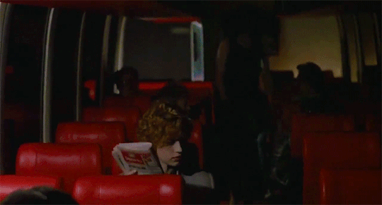

The Pick-Up Artist: Christine Baranski & Molly Ringwald
1/3
0 notes
Text
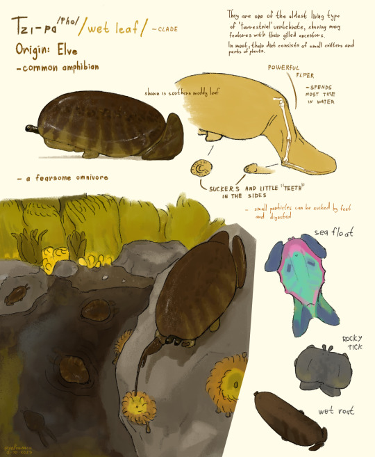
Once again a creature from the continent of Slomen. A very primitive but also very specilised critter. 6 to 30 cm long, wet roots up to 45cm.
They live in many aquatic environments but most often you will find them in forest rivers and lakes. Some species have even adapted for life in the sea and could be considered fully aquatic while still air breathing.
Majority of the clade feeds on small animals like invertebrates sometimes parts of plants they can digest. Their hunting strategy is either burst swimming, jumping or just sliding on top of some slow prey.
There were two important species that started life on land, with the leaf ancestor being a smaller, less land specilised of the two. Leafs are one of their earliest evolutionary branches as land vertebrates and have retained many acient features like paw suckers and teeth instead of claws. In bigger vertebrates most of these little teeth were lost and became true claws or fingers (even present on the other land climber ancestor).
They can actually eat with their feet that are still closely connected to their stomach. But it applies only to very small food particles.
The wets are not very culturally significant but some regions do eat them. But the thick mantle isn't very tasty. In some places they symbolise good harvest season.
These little guys are also related to the 'birds' of Elve and I'm sure you can see why.
#art#speculative biology#artists on tumblr#digital art#artwork#worldbuilding#speculative evolution#spec bio#fantasy#original creature#creature design#spec evo#alien life#frog#slug#elve#pick up and run#speculative fantasy
694 notes
·
View notes
Text
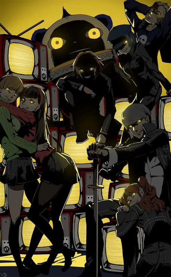
#persona 4 golden#mom come pick me up i'm scared#persona 4#yu narukami#yukiko amagi#yosuke hanamura#chie satonaka#kanji tatsumi#naoto shirogane#rise kujikawa#teddie#artist: @club3#shadows#roblox horror music#no you’re not me#*I’ll face myself battle plays*#biden’s america#where’s god when i’m scared#nightmare fuel#this is what happens if adachi wins#i am a shadow the true self#*thriller laugh sound effect*#rise stop simping yu for 5 minutes#I AM NOT YOUR SENPAI RISE#sorry for that rant#the gang on the loose nothin’ you can do you can try but why you know you’re gonna lose#haha i’m in danger#tvtropes.org/creepy-awesome#bugs when you lift up a rock#we are going to beat you to death
413 notes
·
View notes
Last Seen Blogs
higgssupremacy
madness and scars

manusweetmadness
Lₒₛₜ...My Iₙfₑᵣₙₐₗ Dₑₗᵢᵣᵢᵤₘ
ask-slender-and-gray
Memories of the gray forest

redsunsetxiii
SNSD JPN TRANS

lipeng19
Untitled