
boom-bust-sustainability-process
Collaborative Laboratory to Boom, Bust, & Sustain
141 posts
Don't wanna be here? Send us removal request.
Last Seen Blogs

latelyanobsession
latelyanobsession

lovelybrooke
~Hello There~

hyde-draws
Hyde's Draws

bookmarkingblog
Untitled

ashapurna-buildcon-limited
Ashapurna Buildcon Limited
Text
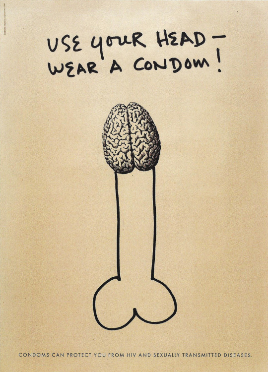
Graphic Intervention: 25 years of international aids awareness posters 1985—2010
by the Massachusetts College of Art and Design

The book was published in conjunction with an exhibition, the exhibit ran from 2010 to 2012. All of the posters from the exhibition are represented on the cover, organized chronologically in each column. The exhibition and book deftly champions pertinent socio political issues. The book has a foreword and an introduction by the curators and from the collector.
The posters in the book are organized by continent and a color system for each chapter. Beginning with Africa (green), the continent most affected by hiv/aids. Then Asia (yellow), Oceania (orange), North America (dark blue), South America (light blue), Europe (purple). Within each region, rather than simply representing the posters by country alphabetically and chronologically, the curators decided to find visual and thematic threads pairing posters that would inspire dialogue. It depicts a stunning depiction of aids awareness posters from thousand of posters in the collection to only 153 posters to publish.
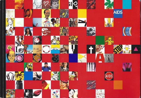
They showcase an insightful overview of diverse visual strategies employed by many within their own distinctive cultural perspective in response to the subject of aids as a public health emergency. The rampant spread of the virus over the past 30 years has created the most significant global public health crisis in modern history. Despite the complexity and scale of the epidemic, there is still a lack of worldwide strategies to lead aids education.
In many countries, the poster as a medium of information was unknown before the emergence and identification of the virus. With aids ease involving sexuality and sexual behavior and therefore social and moral issues deeply rooted in culture and tradition, messages to raise awareness and encourage preventative behavior have varied significantly to best serve the intended audience. The poster has played a special role in promoting aids awareness and safe sexual education across cultures different aims messages visual metaphors and strategies have strongly influenced the content and design of aids posters. These messages can successfully reach specific targeted groups because the posters as a medium is cheap and easy to produce.
Production Credits:
Book sponsor by the international poster gallery and aiga boston. Designed by korn deisgn, from the collection of James Lapides, International poster gallery on view at the Stephen D Paine gallery in 2010. Catalog Art Director, curators and text by Javier Cortes and Elizabeth Resnick
0 notes
Text
Design and the Modern Magazine
From a European Modernist perspective, magazines like the Companion and the Journal would never be celebrated for their design in contrast to their contemporaries, Vouge and Vanity Fair. Both journals developed strategies that were highly consumer-led. They reflected a tasteful industry of consumer products and editorial writing to millions of American women. In this respect, such magazines (Companion and the Journal) are as worth of attention as their more avant-garde counterparts. The Companion, established in 1883, communicated an interesting story about contemporary experience, the construction of economic ideology and the representation of modern life.

The separation of fashion and typography stems from a conflict between word and image which is evident in many branches of western culture. In many respects, the word as printed traditionally requires a sequential, logical and abstract kind of comprehension, while the image depends on a integrated and concrete appreciation. Type is also an aesthetic form and not simply functional. Here lies the threat of contamination through decoration so strongly felt by Modernists. During the 1920s, Bernhard’s Fashion and Cassandre’s Bifur are just two examples of typefaces from this period which offer new perspectives on the relationship between fashion and typography. Maximilien Vox, director of Le Service Typographique, wrote ‘We live in wonderful times when advertising is just awakening to the startling discovery that it is not the picture which counts but the WORD. This is typography’s coming of age.’

My preferred chapter in this book is a discussion, in the format of an interview, between Gillian Naylor and Ken Garland. They were graphic designers for the Design magazine and they speak about experiences as employees. Ken attended Central School of Arts and Crafts and had two professors with a very distinctive and complementary teaching style. One was very affirmative with an interest in design process while the other was more laid back and quiet. During his time at Central, Garland first heard about the Bauhaus while attending an evening photography class. The curriculum was heavily influence by Swiss graphics and they were seen as a model for the graphic design program.

Ken’s interview with Design magazine is fascinating because he was asked to rationalize good design. This irritated him because he had to explain the functional reasons for design and sometimes those reasons did not exist. The magazine was redesigned in 1962 where he used a two-story g with a capital sans-serif font because it was more friendly and less intimidating.

On occasion people would ask if the logo should be redesigned. Ken responded, ‘Well, of course, it should - just for the hell of it if nothing else! How are graphic designers going to have any fun if you won’t let them redesign things?’. I commend Garland because he never conformed to Swiss design. He designed for the subject matter and opposed the standardization of having a grid for each concept. This encourages me to look away from Swiss Design to develop my own taste for good design. If you change your thoughts then you will change the world.
1 note
·
View note
Text
Color Graphics: The Power of Color in Graphic Design


#ASU#mvcd#Valerie Skorpion#color#graphic design#graphics#karen triedman#cheryl dangel cullen#leatrice eiseman#Color Graphics: The Power of Color in Graphic Design
0 notes
Text
Memory: Documents of Contemporary Art


0 notes
Text
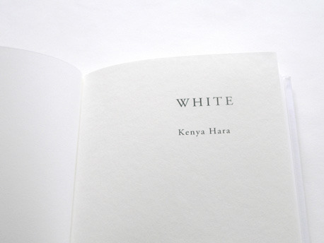
White
White
by Kenya Hara
GUANGXI NORMAL UNIVERSITY PRESS, China (2008)


"White" is not a book about colors. It is rather Kenya Haras attempt to explore the essence of “White”. This is the first thing he said in this book, which can make people curious but hard to understand what he mean.
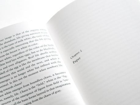
White is such a thing does not exist, in fact, exists only in our white cognitive sense, so we do not try to look for white, but to find a way to feel white. Hara here have a fundamental thinking of white, and what is it white, white is often a background to set off other colors exist, white is the color of the rest of the dead after the bones of the dead, but also human milk just born to be that color, white is more important is actually a way of feeling his presence, what he feels the presence of the way, which is seems too abstract.
He said he used to be very addicted to people of color, but he found that today's technology, tools making our lives more and more colorful, he instead began to focus on subtle differences in the emotional and aesthetic design of work’s inside , for example, white, paper, such as the design of this book is that he has done, there are many kinds of white paper, some smooth as a mirror, and some look like shark skin like rough, some have plaster-like flat surface, and some have a shell-like mechanism, some covered with shiny as talc, some white as snow, White feels like we might find as blurred cloudy, looks like blanket-like soft and thick, tough or easy-going, or you can continue to find it, and he finally he found that only the most white paper but not actually be able to give the strong impression of a white, a white paper use The book gives the impression will be weak, on the contrary, how do you put a semi-transparent cellophane on eggshells when there is a mechanism of soap on white paper, white depth will be awakened, emerged, and this is a white opaque white, you would think he is more of holiness witnessed.
So in other words, white the color of our perception of any color, not just the color itself, not just a scientific stuff, but also take into account the weight of his feeling, his texture, our feelings to it even inside a cultural memory of it, from the inside Hara entered the Japanese aesthetic culture inside a lot of very important things, such as his analysis that, of course, is a small book which just a few words. Like Hasegawa Tōhaku to pine map, which is a national treasure in the history of Japanese painting, talked about this painting, with our Song of Zen painting literati painting relations, especially relations between Liang Tao with them, and then also talked about the famous Japanese Ise Shrine of the construction process of speaking with the inside air, the air this concept with Japanese aesthetics why so important, he believes is actually a kind of white or deformation associated with the white stuff.
But for us who love books in general terms, there is the most interesting thing he talked about books of paper with the design, because as a designer Kenya Hara, in fact, like many designers design book is a challenge to them, they will go back to ask a lot of fundamental issues, and Hara do a lot of book design are also very beautiful, it’s like some Japanese books, although I cannot understand it, but I still like.
1 note
·
View note
Text
The Complete Persepolis: Marjane Satrapi (2007)
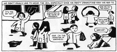
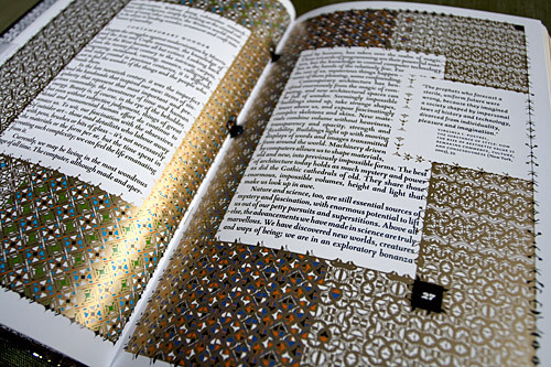
At the innocent age of ten, Marjane Satrapi did not understand what the Islamic Revolution was about. As she learns, so does the reader, and a bond is formed. This is strengthened by the conversational tone of a child, and the images of Marji looking out at the reader from the panels of the novel.
“I wanted to be a prophet…because our maid did not eat with us, because my father had a Cadillac, and, above all, because my grandmother’s knees always ached.”
Marji’s parents, Taji and Ebi, were well-educated, middle class and left-wing. They routinely demonstrated against the Shah, while Marjane was allowed to enjoy a childhood that would soon be disrupted by the turmoil in the country. Marjane’s uncle Anoosh made a brief and impactful appearance in her life only to be taken prisoner again a little while later. The family then went on a brief vacation, only to come back to war. Young boys were given plastic gold keys and sent war with the promise that they would go to heaven if they died at war.
When the situation worsened, Marjane’s parents felt the need to send her to Vienna to continue her education, where she struggled through her teenage years on her own. She had her first experiences with love and heartbreak, she ended up living on the streets for a while, and finally returned to Iran. She didn’t feel at home there for a long time. Once she settled back in, she decided to go to art school. She got married and divorced. She then decided to leave Iran for good.

The style in which the novel is illustrated and written makes it easier for the reader to imagine what it might have been like growing up in Iran in those years. The graphics are simple and integrate well with the text. They enhance understanding, and do not interfere with the flow of the story. Despite the simplicity, the story is rich with detail and paints a very real picture of the life that Marjane lived. We are given a glimpse of a world that is otherwise unseen from the outside.
The use of humor in dealing with issues that are usually portrayed more seriously (or not at all) helps in making the novel more palatable and even appealing to a younger audience. For me the intrigue started with the name itself – Persepolis - and never ran out.
3 notes
·
View notes
Text
The Laws of Simplicity
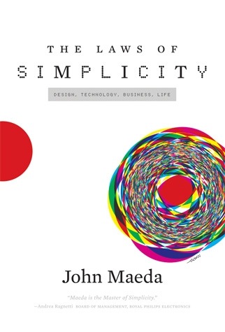
The Laws of Simplicity
by John Maeda
MIT Press (2008)
The book The Laws of Simplicity is short and concise, just as the concept it is talking about. The essence of the content is embedded in the refined language. The meaning is profound not only for design, but also applicable to our view of this world.
The book is structured into 10 laws and 3 keys. Law 1 - 3 are the basics of being simple. The principles such as reduce, organize and time are the most obvious ways to make our life simpler and lighter. But things are not always that easy, therefore law 4 - 6 continues to talk about some intermediate principles of simplicity. By learning, things feel simpler to us. By comparing with complexity, simplicity seems even more important. By knowing the context, the value of simplicity become higher. Law 7 - 9 step even further and discuss some deep concepts related to simplicity. Trust the authority makes things much simpler than it actually is. But it is also necessary to know that sometimes some extent of complexity is inevitable. The last law is called “THE ONE” and indicates that simplicity is actually about subtracting the obvious and adding the meaningful. It is a new law but also an excellent summary as well as integration of all the laws mentioned earlier.
The three keys mentioned in the end of the book is like three side notes that worth noticing for this topic. Key 1 discusses the art of keeping things away, which might be an annotation of the law of differentiation. Key 2 shares the value of openness and seems relevant to the law of emotion and context. Key 3 talks a little about the relationship between simplicity and sustainability, which could be regarded as supplementary readings for the law of reduce and organize.
From my perspective, this book is a great reading not only because of its wise and comprehensive coverage of the topic, but also because it is a collection of John Maeda’s stories, reflections, and philosophies. The readers can easily notice between the lines that he is a keen observer of everyday life. He is constantly reading, listening, and reflecting from every detail of his design, technology, and personal life experiences.
The book also seems to me have a strong internal connection with eastern cultures. The concept of animism comes from traditional Japanese culture and explains the power of emotion perfectly. Besides, the appreciation of concepts like small, fragile, light, empty, and humble goes with the eastern philosophy as well. This mix of eastern and western perspective brings a different angle to the topic and makes the book apart from a simple checklist of dos and donts.
Some people might argue that the book is not very applicable for design practice; however, from my point of view, it is all relevant to design, design thinkings particularly. The concepts of balance, emptiness, and contrast are consistent discussions in design. The laws of simplicity is actually a way of thinking with priorities and hierarchies; and it is also a methodology of making things simpler in both our designs and lives.

1 note
·
View note
Text
Print Culture and the Medieval Author
Author: Alexandra Gillespie
Publisher: Oxford University Press
First Published: 2006
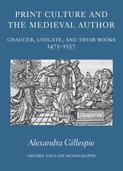
The book Print Culture and the Medieval Author Alexandra Gillespie offers a captivating bibliographical exploration of historical reference and reception to the works of Geoffrey Chaucer and his disciple John Lydgate. Gillespie’s thesis is especially elaborate, requiring analysis of theory and material context, concentrated within a particularly difficult period. She transcends her self-imposed constraints by challenging interdisciplinary boundaries in a study that is wonderfully conceived, dependably argued and painstakingly supported.

The book focuses on the politics and through explores the Medieval makings and Renaissance re-making of these texts. It demonstrates how authors were exploited in fifteenth and sixteenth-century book production. Gillespie begins by introducing Foucault: ‘The author is the principle of thrift in the proliferation of meaning…one impedes the free circulation, the free manipulation, the free composition, decomposition, and recomposition of fiction’. She expands this interpretation to literary culture of early modern England by investigating the ways in which authors mediate power for the act of producing or reproducing a literature. Supported by detailed reference to the additions and alterations of early printed books and their late medieval analogues, Gillespie argues for the importance of authors to the arrangement and promotion of texts in the organized, professional, and newly productive book trade.
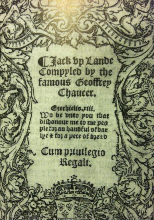
Gillespie’s focus on Chaucer and Lydgate is intelligent because of the wide range of topics and issues she addresses. These two poets were crucial in medieval texts and early literature. Exploration of the conversion of writing of Chaucer and Lydgate from manuscript production into print proceeds chronologically. She further explains how contemporary innovation in textual technologies invoke and exploit unstable traditions.
Gillespie’s central speculation is that in early modern book production, ‘the figure of the medieval writer organizes and markets textual material, assigns it value, licenses it, sanctions it, or marks it out as illicit’ (p. 5). She comprehensively demonstrates how the medieval authors were utilized to limit, mediate, and profit from the commercialism of contemporary book trade. Furthermore, she illustrates how the arrival of print culture caused insecurity to the ideas of concurrent authors. Gillespie’s detailed scholarship investigates the disorder in literary culture, exploring the transitional stages of print in the fifteenth and sixteenth-centuries.
The book is is further renowned by the energetic and enthusiastic approach towards medieval literature. Gillespie productively the complicated framework of interrelations between textual production and social devisions. There were multiple tensions between publication and authority based on complex regulation. Within this fragmented community, Gillespie argues that authors ‘lent a kind of dignity, all the value of the past, to books produced at moments when for various reasons – in the context of a large number of new printed books and amid political, religious and intellectual change – it was especially important to define the value of texts’ (p. 232). This emphasizes that flexibility is necessary in literature production during times when strategies for integration were necessary for commercial success.
Gillespie succeeds in providing an impressive exploration of Renaissance book producers’ and the exploitation of Medieval and traditional theories of authorship. The admirable quality of her thesis and breadth of her literary perspective make this book a must-read to print scholars and literary historians.
#creative#maker#vcd#design#mvcd#book#review#writing#medieval#renaissance#print#phoenixdesigner#moder#production#theory
2 notes
·
View notes
Text
Book Review for Invisible city
Title: Invisible city.
Author: Calvino, Italo
Publishers: Harcourt Brace Jovanovich Publishers.
By Shangning Wang
Invisible city is a book that all designers need to read. For me, it is like a mind map which notes the imaginary and impressive conversations between Marco Polo and Kubai Khan.

Invisible city describe Marco Polo’s travel log which more like a spiritual visiting. Readers can feel what Kubai Khan felt that feel as if I were visiting with Marco Polo. Invisible city has a interesting framework which I think fit well in graphic design. It is the first time I find so much relationship between literature and design. The author Italo Calvino has a wonderful thinking system which always applied in modern movies and design. That is what make this book so much like a poem, a opera, poster and architecture. There are fifty five cities described in this book. Every chapter begins with conversations between Marco Polo and his host, the Chinese ruler Kublai Khan, and end up with their conversations. With this character, the author Italo Calvino like a movie director shows the book as a whole. To me, it is not a single book, but two separate books. The first one is a poster book. There are many posters reflect human behavior and cultures. The second one is a book of information graphic design. There are a lot of connections between these stories and cities.
Think about treat this book as a poster. The author must be a rational designer. What kind of layout design he choose for this poster? Which typeface he use for designing and expressing his idea? It is an interesting question for me. In my opinion, he would like use elements as grid to design this poster. All these story lines and memories Marco Polo mentioned in their conversations depict a complicate picture which I can not get the big picture at my first time reading. Even like this I still feel my body facing its territory when I reading it. I can feel each eye seeing the same city differently, dependent on the audiences’ angle of observation. Like an old saying: “There are a hundred Hamlets in a hundred personal cores.” There should be a hundred cities in Italo Calvino’s mind. Hence, one poster can not depict the whole picture of the author’s ideas. As a designer, he may designed a hundred posters. Italo Calvino designed a world, a world more real than reality, a world depicted by all these imagined plots he gave.
In some cities, people can not understand Marco Polo’s language. As a result, he had to use symbols and images to communicate with them. This part of story interest me a lot. This book has many characteristics which visual communication design also has them.When I read this book, many posters came into my mind. All these cities depicted by Marco Polo is like a poster, a poster composed by many symbols and rhythm. It seems like I can start reading this book from any chapter. They rely on each other. But at the same time, they against each other as well.
-----------------------------------------------------------------------Other artist's works of Italo Calvino's Invisible Cities
The city of Zora.

The city of Zirma.

The stilt city of Zenobia.

The city of Zaira.

The city of Dorothy.
The pipe city of Armilla.
4 notes
·
View notes
Text
Wim Crouwel Alphabets
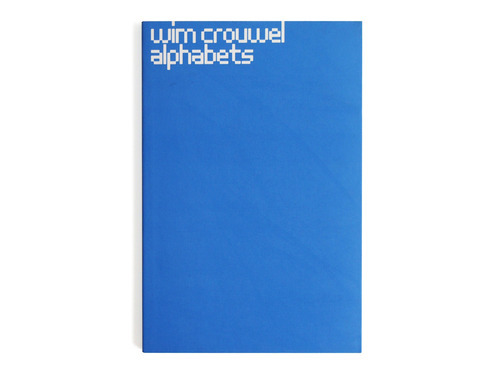
Wim Crouwel Alphabets
by Kees Broos (2003)
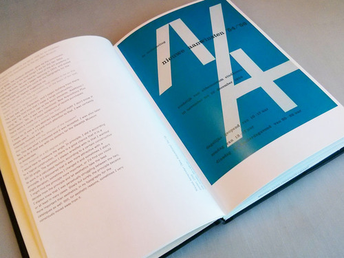
Being deeply inspired and influenced by the Swiss Style, I always wanted to read a book about Wim Crouwel, one of the most outstanding designers during that time. This book by Kees Broos not only contains almost the whole collection of Crouwel’s work but also is introduced in an interview format which is perfect to complete my to-read list.
The book is titled Wim Crouwel Alphabets.This strongly indicates the emphasis of typography and enthusiasm for forms in Crouwel’s design works. The designs included ranges from Crouwel’s early times in the career to his most memorable pieces. For each design, no introduction is provided like the other collection books usually do. The author Kees Broos interviewed Wim Crouwel for each design and that particular part of the interview becomes the introduction of the work. All the conversation is about a specific design work. This brings dynamic to the contents and also brings readers a lot of behind the scenes stories. Personally, from these interviews I get the chances to look into and learn from the processes, the thinkings and also the strugglings of his designs.
The interviews and the final design always juxtapose on each spread so that readers can compare and observe the works with the words. Some of the answers even respond to my long-lasting questions about design. For instance, when talking about the poster Crouwel designed in the fall of 1956 for an exhibition of two years’ new acquisitions by the Van Abbe Museum, he mentioned the relationship of principles and deviations in his design. This is the question I often struggle myself and Crouwel answered it with wisdom and honesty. He said that sometimes we tend to stick to a structure once we figured that out. But in the meanwhile, it seems slight deviation makes the work look even attractive. It is always tricky to decide when to follow the construction and when to follow the aesthetics.
Crouwel also talked a lot about analysis, reduction and rhythm in his works. As he mentioned himself, he has obsessive neurosis for letters and forms. He would really look into details like the diagonal endings, letter spacings and circular forms in letterform like ‘a’ and ‘R’. The rigorous grid and obsession about the mathematical analysis are the features and keys to Crouwel’s work. However, by focus on reduction and rhythm, his work also reveals an emotion rather than industrialized coldness. In his well-known ‘cut-up’ calendar for the Van der Geer printing company, Crouwel integrated the rhythm of seven days in a week with the letterforms of Akzidenz Grotesk. He used words as images and created beautiful forms from just cutting and recombining the letterforms.
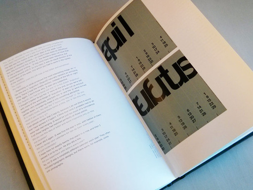
In the end of this book, there are also type specimens for all the typefaces Crouwel designed. In that part, it is obvious to see how rigorous yet elegant all these forms are, especially after reading all the interviews. The typefaces resonant with Crouwel’s words and speak loud for him as a designer that impacted numerous designers including myself.
1 note
·
View note
Text
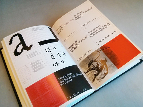
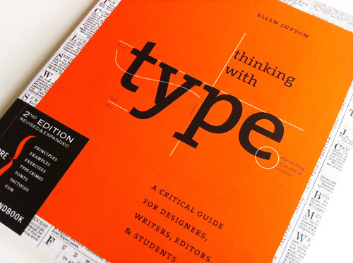
Book Review 2, Thinking with type
Title: Thinking with type
Author: Ellen Lupton
Press: PRINCETON ARCHITECTURAL PRESS. NEW YOURK
This book has been recommended by teacher and classmate, so I hold a very High expectations, after I read this book, it’s absolutely worth for every graphic design students to have one.
The subtitle under the Thinking with type is “A Critical Guide for Designers, Writers, Editors, & Students”. I find numerous manuals about how to use fonts and how to layout, which is so attracted for me, cause there is not many books can systematically talks about the relationships, meaning and historical evolution of Letter, Text, and Grid. So this book is not to be limited to a certain style or a certain age, the authors discuss the her own idea, in addition gives us a comprehensive view that cited many other designers, scholars in graphic or historical design. For example, being a good designer may not need to know the deconstructionist philosopher Jacques Derrida views on the kerning or spacing, because to do the design thing, you just need to know how to use it. But if you want to make a point and different things, you probably need to know “why”, then this book will help you a lot. On this basis, the use and practice to become a natural thing.
I think this book is hard to translate to Chinese or other eastern language, which is not too difficult about the words, but this book should perform itself. This book is about an English font and layout, and content of the book itself is its best evidence. Some parts of the example is actually the body, or directly with the text. If translate into Chinese after such a high degree of unity of form and content will inevitably be damaged. For example, when the author talks about the space in the text, she even present a sentence without space, initially, I thought is a very long word that I don’t know, but actually it’s a sentence combined with several easy words, but without space, it cannot be understood easily. She does what she said.
There’s also a brief but excellent Appendix that deals with punctuation, editing and proofreading. Moreover, there’s a Thinking With Type website that provide readers to explore.


1 note
·
View note
Text
Things I have Learned in my Life so Far
There is no doubt that this book has one of the most attention-getting covers ever seen. The collection box includes eighteen books all with separately designed covers. The front of the box has organic shapes cut into Sagmeister’s face. Each book put behind the façade makes him look different. Some of the covers have shapes that coincide with the shapes in the box, while others disregard the openings altogether.
Each booklet tells a story about one or two projects. Sagmeister explains the story with pictures, journal entries, and dialog. The first booklet I read had a black and white bullseye on the front, the kind that is used to create optical illusions. There are two projects in here: Worrying Solves Nothing and Over Time I get Used to Everything and Start Taking it for Granted. The first project was done with Austria school kids, 25,000 black coat hangers, and 35,000 white coat hangers. The children and Sagmeister built cubes out of the hangers. They used 4 for each side and then built the cube shape. Each cube became a pixel and each pixel became part of the message: “Worry Solves Nothing.” The words ended up being over 10 feet high and a city block long.
The second project, Over Time I get Used to Everything and Start Taking it for Granted, is a series of photos taken throughout New York City in places Sagmeister had never been to before. Because of these unique stops, he could not take them for granted. Among various other things, Sagmeister swam in the Hudson River at 6:00 a.m. with letters painted on his chest, marking a word on a dirty cop car and hanging out the window of a thirtieth floor window holding a sign until the police and fire trucks arrive. At this point in the story, he narrowly misses being arrested.
After reading several other booklets, I realized that Sagmeister tells a story through type, photography and video (accessed online). At times he will share the story or journal entry to explain what the project was. This part comes at different times in these small booklets. Sometimes they are at the end and other times they are in the middle. Never does he tell the story before the viewer can see part of the project. This seems to help pull you through the images. Some of the images that are not as interesting end up having the explanation in the middle. This makes the reader want to see what happens after.
Sagmeister plans things for his work and does not worry about repercussions. This is probably why we see his work as so cutting edge. People are scared to do what he does. He seems to live like a 20-year-old boy still with ideas that are surprising. The most interesting part of his stories is how he gets to the idea. All of his ideas seem to come from his journals or things that keep him up at night. As a designer that keeps trying to write a daily journal, which seems like a great source to get encouragement.

2 notes
·
View notes
Text
Design Studies Theory and Research in Graphic Design


0 notes
Text
Designing Universal Knowledge
Gerlinde Schuller
Lars Muller Publishers 2008

The book seeks to answer the following questions….
Who is collecting the world’s knowledge? How are knowledge archives structured and designed? Who determines the access to this knowledge? What knowledge entails power?
The development of communication and information technologies like the Internet and globalization have not only reshaped access and spread of available knowledge but also the rate of collecting. Gerlinde examines the accumulation of archives, data, encyclopedias, and libraries that make knowledge accessible worldwide. The classification and design of complex data collections have exerted an enormous influence on how knowledge is communicated. This enables the transfer of knowledge, but it also increases the risk of manipulation. The book also explores the possibilities of a universal design and unveils new approaches to visualizing complex information. It demonstrates information graphics on a variety of subjects. Schuller investigated universal design in interviews with Richard Saul Wurman, John Maeda, Nigel Holmes, Will Crouwel, Paul Kahn, Marion Winkenbach.

The interview with Richard Saul Wurman demonstrates his honesty on this subject:
“My passion is driven by my interest. I don’t care about universal knowledge. I case about selective things that I don’t understand.” This is an interesting perspective because I am ambitious to learn new design techniques and skills. Exercising this ideology helps me progress as a designer and maker. By focusing on single-tasking then you will master any given medium.
If you gather a compilation of universal knowledge in the world then you have infinite control. Global collections of knowledge have already fascinated mankind thousands of years ago. Modern communication and information technologies offer quick and prompt gathering, huge memory capacities and wide-range accessibility. In addition, globalization and the Internet leading a mentality which moves away from the local and regional tendencies. It is now progressing towards the international and universal communication. Collections of knowledge, such as archives, encyclopedias, databases and libraries are following this trend. They are committed to a race against time in both the technological and creative areas.

The other essays and interviews are much less engaging and often highlight the most astronomically immense paradox and quandary for this book. A book that is critiquing the accumulation, curating and organization information in cognation to power suffers the reproval of how the author and editors are deciding what information they exhibit. It is not clear at all why some of the people have been culled to indite essays or respond to interview questions. There are obvious choices like Saul Wurman, but others seem to just be in the author’s social or professional circle. The essays and longer interviews are worth the read, but the rest of the book is regaled by the factoids and visuals.
Designing Universal Knowledge is a sensational book that investigates an encyclopedia of information technology and design. Schuller plans to orchestrate two more books: Designing Breaking News and Designing World Projections. My speculations is that they will be much more convincing than Designing Universal Knowledge.
#maker#visualcommunicationdesign#design#Schuller#infographic#information#universal#knowledge#informationdesign#type
0 notes
Text
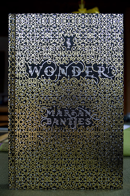
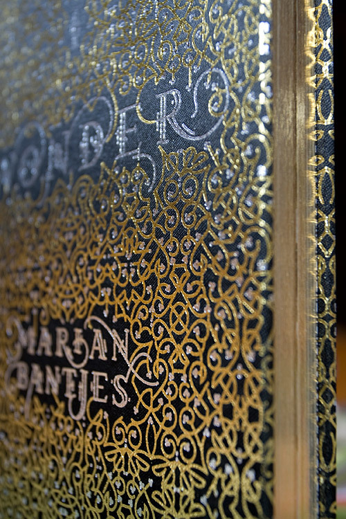
Book review for I wonder
Name of book:
I wonder
Author:
Marian Bantjes
Year of publication:
October 1, 2010
Publisher:
Thames & Hudson
Early in the process of researching and book reading, I found myself focus too much on the design elements’ functions. If I continue reading like that, I may never find my way out. Although there are two kinds of designer in the graphic field, formalism graphic designer and functionalism graphic designer, I should deeply analyze them individually. Since my research interest is layout design in different mediums. I should read widely so that I can include more.
The book I choose for this review is called I wonder written by Marian Bantjes. She is a typographic illustrator, graphic designer, artist and writer based on Bowen Island. I firstly knew her when I watched her TED talk. Her works are really impressive. The reason why I choose this book is that the author is a artist designer. For artist designers, their clients may not influence them as much as they influence normal designers. They may given more space to them so that designers can play with their talent. According to my observations, there are only two kinds of designers in the graphic field. One is normal graphic designers who always controlled by their clients, another is artist designers who always can make art-level posters design, books design and others. In this book, Marian says:”My typography treatment will no doubt cause a certain amount of pain to some of my more rigorously trained colleagues in my profession of graphic design.” Which means, her poster works are much more powerful and creative than other designers. In another word, she does some design which other designers may not allowed to touch. Another reason is that, Marian does not has a graphic design background so that her work always very creative and strange aesthetic. Each part of her posters, no matter layout and color, are personal style designed. She maintain what she like and what she want, in fact, make her an exact fashion typographer. Honestly speaking, she has her own typeface design style which she put into every poster. Those posters he made can truly can catch people’s eyes in the first time. To reinforce her point, she says:” None of that is likely to concern the average reader, however, nor should it.” Like what she says, her posters and book are prepared for specific people. She always tying to show people a new way of seeing the world and turn potential artistic things to visualize. These artistic things are depend on each other and convey a stronger impact on readers. Then readers can get more complicate information by reading the texts in her works. Her design style makes her totally different from designers who surround her.
Another character of Marian’s work is her works’ grids. Marian’s works’ types always can formed as grids. She combines elements with grids which let her works have a strong esthetic sense. In her works, she does not need to set eye-stop point carefully. All these content showed as a whole image which give readers an atmosphere. By Her works are thoughtful, interesting, luxurious and gorgeous. She is really good at playing with these grids. She arranges and organizes these information and shows a beautiful rhythm in her design.


0 notes
Text
79 Short Essays on Design – Michael Bierut (2007)
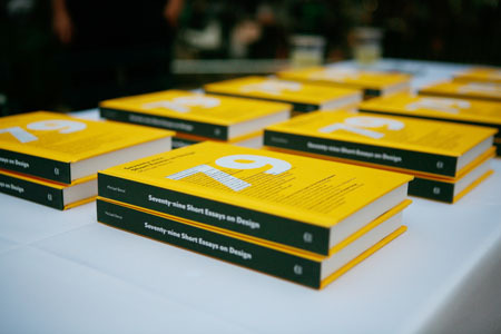
A telegram is meant to be short. As short as possible. George Kennan however, sent an eight thousand word telegram in response to the routine question of why the Russians seemed unwilling to join the World Bank. Kennan had observed the changing post World War II landscape and tried to get the word out. Nobody paid attention, so when he got the chance, he told his story. The whole story. In less than two weeks, the Cold War officially began. In this, and various other situations, Kennan showed great tact and diplomacy, choosing the right strategy to get his message across.
With seventy-nine examples like this one – except they are all different – Michael Bierut delivers lessons to designers. Lessons that need to be learnt. Some of them are direct and harsh, some self-deprecating and humorous, and some conversational, but all of them are clear, and no one is spared from Bierut’s thorough analysis.
The First Things First Manifesto of 2000 was signed by 33 designers including Milton Glaser, Tibor Kalman, Steven Heller and others that are well-known, at least in the design circles. Paul Rand wrote the book Design, Form and Chaos. Bierut takes them apart, pointing out the flaws in their logic with brutal honesty.
The same honesty drives him to admit his own mistakes. While working for Vignelli Associates, Bierut was tasked with hiring a photographer for a corporate brochure. Arnold Newman’s name was mentioned. Not knowing who he was, Bierut called him, effectively asked him if he was any good, and asked to be sent his portfolio. Newman’s response taught Bierut a lesson in humility, patience and elegance that we can all learn from.
Where he highlights the mistakes, Bierut also directs attention to good decisions. In 2006, when five communication designers declined their invitations to the celebratory breakfast hosted at the White House for nominees and winners of the National Design Awards, Chip Kidd refused to sign the letter. Though he shared their concerns, he did not believe a symbolic protest to a symbolic event was going to do anyone any good. What does, is recognizing a problem and finding a way to solve it.
Andrew Blauvelt saw that traditional portrayals of graphic design history were only pieces of the whole picture. Authors and lecturers only represented the convenient parts. Topics like the social sciences, linguistics, and semiotics were ignored. Blauvelt published a three part series called New Perspectives to address this lack. The publications are hard to follow, says Bierut, but they are a start and will be looked back upon as a landmark.
Michael Bierut has a lot to say about a lot of things. In Seventy-nine Short Essays on Design, he talks about a multitude of topics, all connected to design in some way. The shortness of individual essays makes it easy to read a few essays at a time, aided by the fact that each essay is set in a different typeface. This does not dissuade from reading the whole book in a go either. In my opinion, the essays can be extremely useful, and not just to designers.
Book review by Soumya Kasuganti
2 notes
·
View notes
Text
Design, writing, research:writing on graphic design
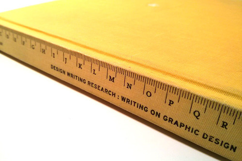
Design, writing, research:writing on graphic design
by Ellen Lupton, J. Abbott Miller
Published by Kiosk 1996
As a designer, we make cool stuff, share ideas with our peers and present to our clients. But only a few designers write about their work, experience and insights. Undoubtedly, design, writing and research are three main aspects of Ellen Lupton and Abbott Miller’s work and are almost equally important. They even founded a studio called Design/Writing/Research in 1985 as their after-hours scenario. This book Design Writing Research, first published in 1996, is a collection of their studies and thinkings, a reflection of the community and an experiment, according to themselves, of writing, design, and publishing.
The book contains three parts: theory, media and history. The articles come from different phases of their design careers for over 10 years. In the theory section, the topics range from modern typography to culture impacts and even punctuations. The media section uses quite a lot graphics to support contents mainly in the mass communication field. The last section is organized by a timeline of American graphic design history and provides several case studies throughout the past.
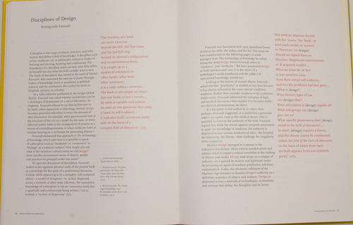
The topic of theory, media and history all sound quite big and serious, however, the reading is in fact full of joy. It is probably because of the unique perspective and historical insight. The interpretation of the interrelations between graphic design, mass media, psychology and philosophy seems to me the most engaging element of this book. In the essay, Language of Dreams, Lupton and Miller start with the dream theory from Freud and develop into the concept of rebus. This concept is then connected to the logographic writing systems like Japanese and Chinese as well as the symbol systems in various levels. In another chapter, Discipline of Design, multiple ideas from Michel Foucault are interacted with different insights regarding design discipline positions in general. These interconnections allow reader to easily associate the context and even recollect the thinkings later.
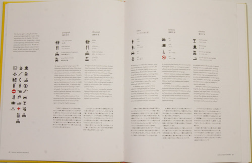
Besides the content, the design of the book also looks very effective to me. The three sections are separated not only by chapters but also by different paper types. The theory section uses regular white matte paper while the media section uses glossy paper probably to support all the color images as well as the impression of commercialization. In the last section, off white paper is used most likely to serve the context of historical cases. In terms of page layout design, some essays also stand out because of the arrangements of texts and images. In the essay Low and High, the idea that there should have no lines between low and high cultures is realized by using the whole sentence as the divider and has it separate the spread in various ways on all the pages of this essay. Not to mention the well-known article Modern Hieroglyphs which literally do the things they are talking about by replacing some of the words with icons.
Overall, from a designer perspective, this is a great book to look into some underpinnings of the discipline and discover other connotations of the design practice. Furthermore, I think it also reminds designers that we should do more writing and research besides the design work. These essays from Ellen Lupton and Abbott Miller has already set a strong example and standard. This book is not only valuable for design insiders, it is also a stimulating resource for anyone who is interested in this area. The words are powerful and by writing, thoughts, ideas and innovations could get interchanged to the design community and even the rest of the world.
1 note
·
View note