gracexharrisx
Grace
Fashion Promotion at UCA2100013
218 posts
Don't wanna be here? Send us removal request.
Last Seen Blogs

revolutionsoftheheart
revolutions of the heart;

clapbackqueensandkings
Untitled

electruhn
o r d i n a r y

youhairything
YOU HAIRY THING!


Text
Art steps gallery
0 notes

Text


0 notes
Text


0 notes


Text
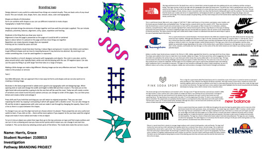
Evaluation of Final Major Project
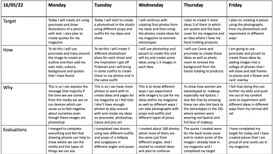
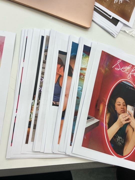
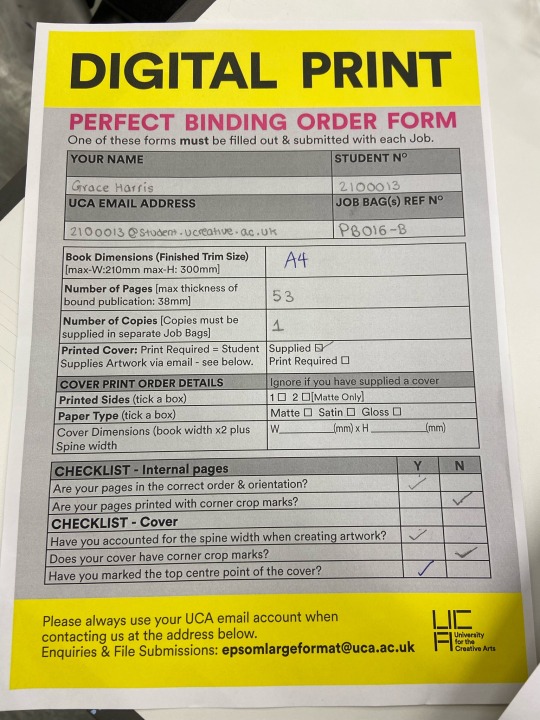
For this project I am pleased with the outcome as I was able to make a magazine that was 53 pages double sided and not including the front and back cover and the inserts. I learnt a variety of new techniques and experimented with different ways to manipulate photos to get beautiful outcomes that show how stereotypes are portrayed within the media especially stereotyped within women. overall I created over 100 photos and I also created 10 pieces that were quotes formatted in different ways. although I didn't use all of them in my magazine I still uploaded them to the blog and in my virtual gallery on art steps.
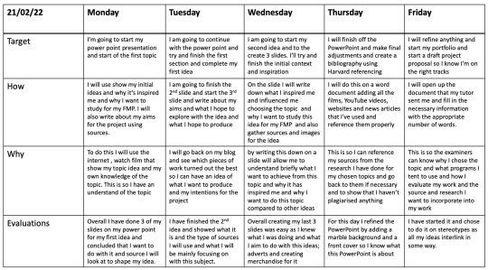
In this project I started off wanting to create advert but I then though that i could make posters and format them into a magazine to show my chosen topic off better. in this project I used some secondary sources but mainly primary sources from photoshoots I taken over easter, and within the last 5 weeks using different face gestures, makeup ideas, poses and lights to create content to for my magazine using different elements and imagery that is all different to each other.
As I said it my rationale that I wanted to break my topic into section I thought about the type of stereotypes we see in the media and from my research I decided to show stereotypes using technology like TV and phones as many of the content we see and look at is on our TV from films and programmes and on our phones for music video, social media apps and models on shopping apps.
By looking at these stereotypes can affect people opinion on what they should look like as women are sexualised and objectified in the media to wear makeup and look beautiful and stereotypes them to be ugly if they have acne or a stomach or even a different body type but in fact that we are all unique and it a part of life to be different and many things we see in the media is generally airbrushed and photoshop to manipulate our perception.
Because of this I decided to make an arrange of ideas that each show a different interpretation of how stereotypes can be perceived though the use of showing how images can be airbrushed showing to negative impacts to help gain a positive outcome. I created pieces using puzzle pieces, a gradient, cracking on the face, stroke path, pop art drawings, collages, photography and editing skills, blending images, using the warp tool and song lyrics.
Although I love this process and creating ideas I felt that towards the end I was having art block and running out of things to come up with which meant that I had to stop and create a Photoshoot to continue further and add images to some of the pages. I also then edited it a couple of times and changed the layout before I finally printed it and even though I printed it I still edited it and look about 8 pages out and reprinted some in a different format.
After that I trimmed everything down and made sure it all fit and that I was pleased and proud and happy with the result of my work so i can send it off to be binded. trimming it down was a long process this is because I had 53 pages and could trim about 3-4 pages each time which meant that I had to be patient and not rush it as I wanted that pages to be the same size and not feel wonky or uneven
0 notes
Text
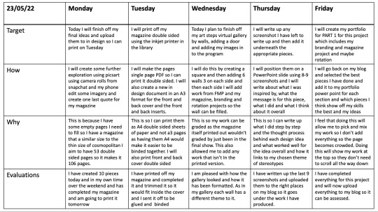
Evaluation week 10
For this week I finalised my ideas and create my final ideas for my magazine to make up the pages. on Monday I spent the day creating some final ideas and changing the layout so I can add to indesign so I can change finalise the pages and later print the magazine out. To do this I created 10 more ideas some that I already did the week before but didn't post them.
To start this week off airbrushed the skin off the model so it covers up any bruises and makes the skin flawless to show how photos can be distorted and feel like they have filters on them. I then proceeded to add a screenshot of my snapchat and then change the blend mode to screen so it removes the lack screen from the camera so I can make it appear as if its taking the photo of the model.
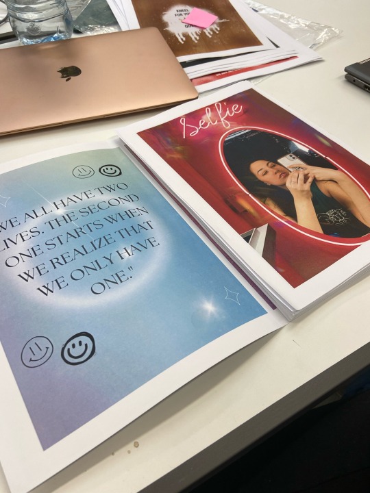
I then moved onto making the a page which uses stereotypical colours of pink as I found a pink selfie frame which I placed over a photo and added rainbow lights to show the reflection of the light within the mirror and camera to make it look more realistic. For this I also added filters of an ICY to make it more lighter and blue to contrast the pink. I loved how this piece turned out and I feel that I would go perfectly next to the front inside cover.
After that I then proceeded to continue with the theme of using the camera to show media and decided to take a photo of my iPhone camera and using the same method I decided to blend it to remove the black background but instead of adding a outer border to the screenshot I decided to add a colour insert in the shade of green to make it more effect and show how stereotypes can come from photos being filtered and distorted into something we aspire to be and not the real representation of ourselves
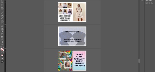
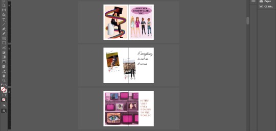
Another idea I had was to create a image that shows social media icons scattered around a portrait. I decided to think about the style and colour of the poster and felt that I could use a black and white portrait that uses a butterfly filter and then add the social media icons of TikTok, snapchat, instagram, Facebook and twitter in colour to emphasise them and make them standout. with this I also added coloured hearts above them to show how we like thing on different apps because of how fake they are and its the life we want to have and who we want to be
I then created another photo using black and white but this time I used a dual tone with half the photo in black and white and half the photo in colour so it seems that
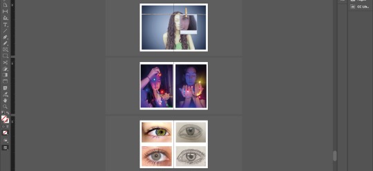
the last couple of photos I created involved using the likes notification from instagram aswell as the followers and comments notification. for one of the pieces I was inspired by Alice in wonderland with the clocks and use that as a background with a rainbow overlay with the subject and smoke over the whole idea to give it a mysterious effect and make it effective. Another one I did along the same lines was taking a photo from my photoshoot and then added the likes, hearts and followers button to the side of the model with glowing lights to make it seem simple but effective.
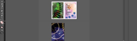
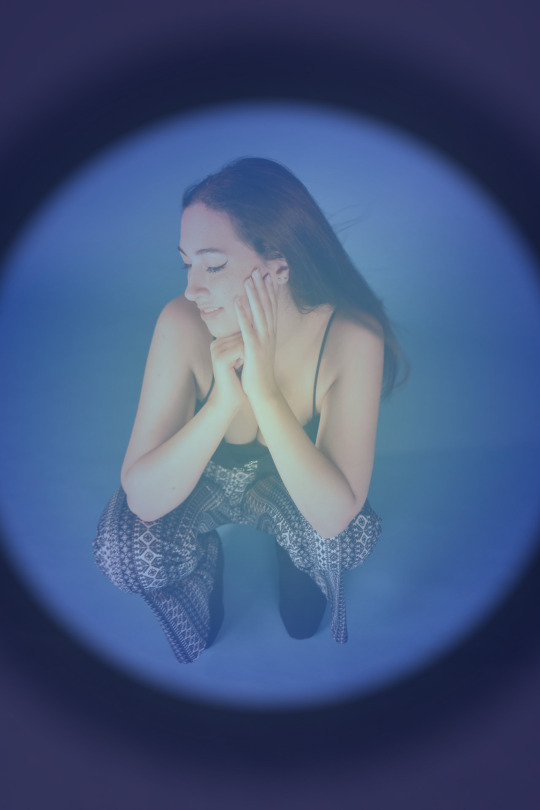
I then moved on to using photoshop with using a photo from my Photoshoot and using a gradient in the colour blue and chasing the opacity to make it lighter and see though so the image can still appear I then added another layer where I used another gradient in which I had the area on the outside in the colour black to make it darker and I added extra black areas to make the blue stand out and become vibrant. After that I then proceed to make the back page before the back inside page in which I used a green filter and added rainbow lights to make it stand out and to show how women are sexualised and objectified in the media.
Finally once that was done I edited some of the images out the magazine and edited some of the pages so in total I have 106 pages in a 53 double side single pages not including the front and back cover and the inserts. After I was satisfied with it I then printed it out and trimmed it down so I can send it off to be binded
0 notes
Text
This is my final magazine outcome for final major project. I decided to create it into a video to show how the pages look and so I can see what it looks like digitalised and how the pages will look all together. Overall I am pleased and proud of the magazine I have created as I feel that it has shows the progress I have made using different digital platforms and softwares I wasn’t aware of or that I wasn’t confident with.
0 notes
Text

This is the final outcome of my magazine. Overall I’m am proud of how it look but before I was done I had to reduce some of the pages as I feel that some of the ideas I had wasn’t as creative as my other ideas which meant that it didn’t show off my skills to the best of my ability. But before I sent it off to be binded and glued together I had to trim it slightly so it would fit inside the cover and so it wouldn’t overlap and fit perfect so the over wouldn’t be too big or too small.
#digital print#binding#magazine#ideas#final piece#final major project#representation#art#photo edits#magazine format
0 notes
Text

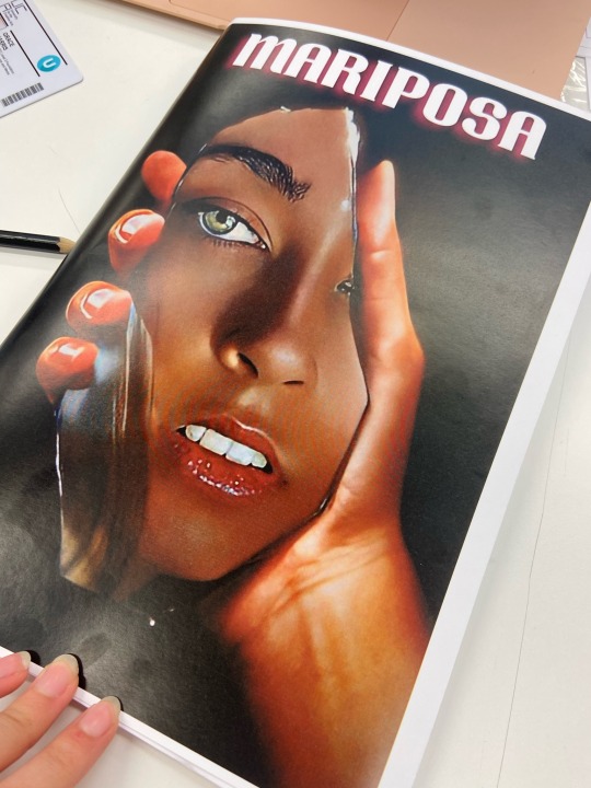
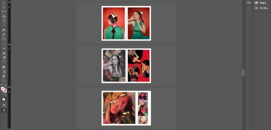
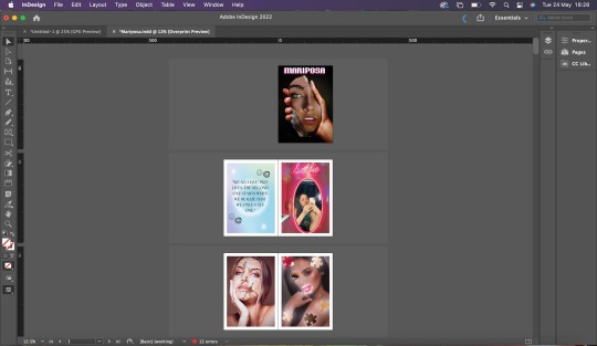
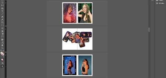
#magzine#double page#ideas#inside front cover#inside back cover#front cover#mariposa#back cover#chains
0 notes
Text


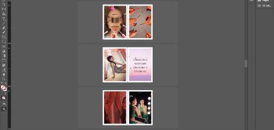
#magazine layout#layout#magazine#adobe indesign#ideas#representation#photo edits#screengrab#screenshot
1 note
·
View note
Text


3 notes
·
View notes
Text

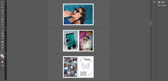
#green filter#rainbow#sexualised#objectified#women stereotypes#stereotypes#ideas#representation#photography
0 notes
Text

2 notes
·
View notes