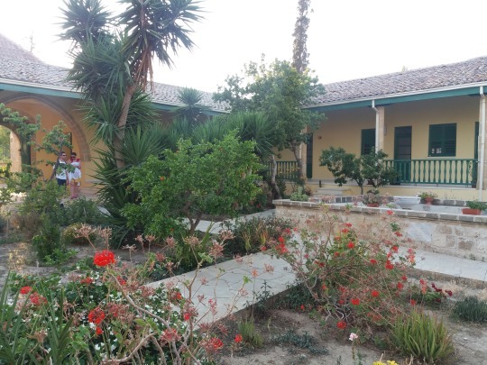
#1920's-30's era architecture
Note
i saw your tag about how in 500 years we WON'T be calling britney spears' "toxic" classical music, and i am willing and able to hear this rant if you so wish to expand upon it :3c
You know what, it's been over six months, so sure, why not, let's pick today to have this rant/lesson!
To establish my credentials for those unfamiliar Hi my name's Taylor I was a music teacher up until last year when the crushing realities of the American Education SystemTM led me to quit classroom work and become a library clerk instead. But said music teaching means that I have 4+ years of professional classical training in performance and education, and while I'm by no means a historian, I know my way around the history of (european) music.
So, now that you know that I'm not just some rando, but a musical rando, let me tell you why we won't be calling Britney Spears or [insert modern musician(s) that'd be especially humorous to today's audience to call classical] "classical music."
The simple answer is that "Old music =/= Classical music," which is usually the joke being made when you see this joke in the first place.
youtube
As funny as this joke can be when executed well (this is one of my favorite versions of said joke, especially since this is a future world where there's very little accurate surviving info about the culture from the 21st century), there is VERY little likely of this actually being how music from today is referred to in the future, because, again, music being OLD does not automatically make music CLASSICAL.
If you'd indulge me a moment, have a look at these three pieces from the early 1900s, which is now over 100 years ago. That's pretty old! You don't have to listen to the whole of all of them if you don't want to, but give each around 30 seconds or so of listening.
youtube
youtube
youtube
All three pieces are over 100 years old, but would you call "In the Shade of the Old Apple Tree" classical? Or "The Entertainer?" Most likely not. You'd probably call these songs "old timey" and you may even be savvy enough to call "The Entertainer" by it's actual genre name, ragtime. But if either of these songs came on the radio, you wouldn't really call them classical, would you? They're just old.
Whereas Mahler's Symphony No. 5, now that sounds like classical music to you, doesn't it? It's got trumpets, violins, a conductor, it's being played by a philharmonic! That's a classical musicy word!
The short answer of why we in the real, nonfictional world won't be calling Britney Spears's "Toxic" classical music in 100 years is it simply doesn't sound like classical music.
.....and the long answer is that Mahler's Symphony No. 5 isn't actually classical either.

See, music, just like everything in culture from dress to art to architecture changed with the times, and therefore 'classical music' is technically (although not colloquially) only one of about four to five musical periods/styles you're likely to hear on one of those "classical music tunes to study to" playlists.
Our dear friend Mahler up there was not a classical composer, he was a composer of the late romantic era.
So now, because I have you hostage in my post (just kidding please don't scroll away I had a lot of fun writing this but it took me nearly 3 hours) I'm going to show you the difference between Classical music and the other musical eras.
These are the movements we'll be dealing with, along with the general dates that define them (remembering of course that history is complicated and the Baroque Period didn't magically begin on January 1st, 1600, or end the moment Bach died) :
The Baroque Period (1600-1750)
The Classical Period (1750-1820)
The Romantic Period (1820-1910)
The Impressionist Movement (1890-1920)
You'll notice that as time goes on, the periods themselves grow shorter, and there starts to become some overlap in the late 19th to early 20th century. The world was moving faster, changing faster, and music and art began changing faster as well. Around the beginning of the 20th century music historians quit assigning One Major style to an entire era of history and just started studying those movements themselves, especially since around the 20th century we were getting much more experimentation and unique ideas being explored in the mainstream.
Even the end of the classical to the beginning of the romantic period can get kind of fuzzy, with Beethoven, arguably one of the most famous classical (and yes he was actually classical) composers in history toeing the line between classical and romantic in his later years. The final movement of his 9th symphony, known as Ode to Joy, far more resembles a romantic work than a classical one.
But, I'm getting ahead of myself.
To oversimplify somewhat, here are the main characteristics of said movements:
The Baroque Period (1600-1750)
Music was very technical and heavily ornamented. This coincided with a very "fancy" style of dress and decoration (the rococo style became popular towards the latter half of this period). The orchestras were far smaller than we are used to seeing in concert halls today, and many instruments we consider essential would not have been present, such as the french horn, a substantial percussion section, or even the piano*. Notable composers include Vivaldi (of the Four Seasons fame), Handel (of the Messiah fame) and Bach:
youtube
*the piano as we know it today, initially called the pianoforte due to its ability to play both softly (piano) and loudly (forte) in contrast to the harpsichord, which could only play at one dynamic level, was actually invented around 1700, but didn't initially gain popularity until much later. This Bach Concerto would have traditionally been played on a harpsichord rather than a piano, but the piano really does have such a far greater expressive ability that unless a group is going for Historical Accuracy, you'll usually see a piano used in performances of baroque work today.
The Classical Period (1750-1820)
In the classical period, music became more "ordered," not just metaphorically but literally. The music was carefully structured, phrases balanced evenly in a sort of call and response manner. Think of twinkle twinkle little star's extremely balanced phrasing, itself a tune that Mozart took and applied 12 classical variations to, cementing it in popularity.
And speaking of twinkle twinkle, memorable melody became more important to the composition than ornamentation, and many of our most universally known melodies in the west come from this period. The orchestra also grew bigger, adding more players of all kinds as now we didn't have to worry about overpowering the single-volume harpsichord, and additional instruments like more brass and woodwinds were added. Notable composers include Haydn (of The Surprise Symphony fame) Beethoven (of, well, Fame), and Mozart:
youtube
Pay attention to the size of the orchestra here, then go back to the Bach concerto. Notice how in that very typical Baroque setting, the orchestra sits at maybe 20 people, and that here in a Classical setting, there's nearly two times that!
The Romantic Period (1820-1910)
In the romantic period, it was all about BIG FEELINGS, MAN. It was about the DRAMA. Orchestras got even bigger than before, the music focused less on balance and became more dramatic, and there was a big focus on emotions, individualism, and nationalism. Discerning listeners will notice a lot of similarities between romantic symphonies and modern film scores; John Williams in particular is very clearly influenced by this era, any time I'd play the famous Ride of the Valkyries by Wagner in a class, the kids would remark that it sounds like it should be in Star Wars.
A lot of romantic composers were German, including Beethoven, if you want to call his later works romantic (which I and many others argue you can, again, compare Ode to Joy to one of his earlier works and you can hear and see the difference), but you also have the Hungarian Liszt (of the Hungarian Rhapsodies fame), the Russian Tchaikovsky (of the Nutcracker and 1812 Overture fame), and the Czech Dvořák:
youtube
See how this orchestra is even bigger still? Modern orchestras tend to vary in size depending on what pieces they are playing, but the standard is much closer to this large, romantic size, and it's far less typical to see a small, intimate Baroque setting unless specifically attending a Baroque focused concert.
Also I know I embedded Dvořák because Symphony From a New World slaps but please also listen to Liszt's Hungarian Rhapsody No.2 it's one of my all time favorite pieces and NOT just because of the Tom and Jerry cartoon, alright? Alright.
The Impressionist Movement (1890-1920)
A bit after it began but definitely still during the romantic period, a counter movement began in France that turned away from the emotional excess of romanticism and focused less on standard chord progression and explored more unconventional scales. This music was less worried about how it 'should' sound and was more concerned with evoking a certain emotion or image, giving you an "impression" of an idea. Debussy is by far the most well known name in this movement, even though he personally hated the term 'impressionism,' lol.
youtube
Notice the way the periods build on each other naturally, literally, physically builds on the orchestras that came before, evolving in style and structure until you get to the late 19th and early 20th century when things were built up so big that a response to that excess started to develop, first in the impressionist movement, and then into 20th century music in general, which got much more experimental and, as we say, "weird." (frickin 12 tone scales, man)*
*i do not actually dislike the sound of 12 tone, it's interesting and unique, but it is HELL to analyze in music theory, which is unfortunately when a lot of us classical musicians are first introduced to it, therefore tarnishing our relationship to the genre as we cannot separate it from our own undergrad anguish
Even if you're not a super active listener and you have a harder time discerning the difference between, say, late baroque and early classical, you cannot deny that the first piece I've linked by Bach and the last piece I've linked by Debussy sound completely different. They're both orchestral pieces (I intentionally chose all orchestral pieces as my examples here, getting into solo works, opera, and chamber ensembles would take too long), but other than that, they couldn't be more different.
Wait, so what are we talking about again?
Classical Music is first a period of music, a specific artistic movement with music typically written in Europe between 1750 and 1820 with a specific sound that is distinct from these other styles I've outlined here.
And Classical Music is second a genre. Because while academically and historically Baroque music is not classical, and Romantic music is not classical...colloquially it is. They sound similar enough that it makes sense to put them on the same playlists, the same radio stations, the same 'beats to study to' youtube compilation videos. While individuals may have favorites and preferences, it's not far fetched to say that if you like listening to one of these styles, you'll at least like one of the others.
But whether you're being broad and referring to our modern idea of the classical genre, or you're being pedantic like me and referring to a specific period of musical history (or modern compositions emulating that style, because yeah, modern compositions of all of theses styles do exist), I think we can all agree that, as much as it slaps, "Toxic" by Britney Spears is not classical music, and 500 years is unlikely to change our perspective of that.
A Traditional Ballad though?
Yeah, I can see us calling it that in 5 billion years.
youtube
(the full version of this scene is age restricted for some reason, but you can watch it here)
Anyway, thanks for reading y'all, have a good one!
#music#music theory#music history#classical music#baroque music#romantic music#impressionist music#music teacher#music teaching#taylor teaches#asks and answers#long post
181 notes
·
View notes
Text
Picking up the Postwar Pieces
Timeline of Japan's History from 1900s - current

In the early 1900s Japan was involved in a variety of battles from defeat against European powers. This led to Japan becoming a leading power in the world and by the 1920s, extreme nationalism was prominent throughout the country. Around this time Japan’s population quadrupled according to a Britannica article (Hijino, Latz, Hurst, Sakamoto, Watanabe, Masamoto, Notehelfer, Jansen, Toyoda, & Masai. (2023, June 30).
By 1936, Japan was signing an alliance with Nazi Germany. World War II broke out and shortly after, Pear Harbor happened. More war followed. Eventually, the emperor of Japan, Hirohito surrendered after the United States bombed Hiroshima and Nagasaki. The army of Japan was disbanded and still is to this day. In the 50’s Japan, the U.S., and nations other than Russia signed a peace treaty together.
Post war, in the 20th century, Japan became recognized worldwide their importance to the world as regions were being divided due to social and economic changes. While many of Japan’s rural villages remain preserved to this day. Japan can be described as a puzzle of new and old agriculture and architecture. Industrial growth led to Japan becoming to second largest economic power in the world next to the U.S. This led to its own series of issues: fewer people entering the workforce due to the 90’s baby boom, manufacturing vehicles and goods cause pollution, there’s a housing a shortage, use of
automobiles increases the pollution, public transit is overcrowded, as well as the ongoing fear of mother nature’s earthquakes and floods.
I found a documentary on Amazon Prime Video called “A portrait of Postwar Japan.” The documentary is two episodes long, the first episode leading with the outcome of revolutionary financial substance in Postwar Japan. Salt was high in demand after the
Korean war. Some say the Korean War caused Japan to come back to life. The country began manufacturing what are big automobile companies now, Nissan, Mazda, as well as electronics like Sony and Hitachi. The documentary covered similar details as other
articles I read. The similarities touching on the capital investment leading to labor disputes in the postwar era. In addition, creating environmental issues.
It's impressive to me that Japan has undergone such trauma and changes and continues to thrive in many areas of their economy. I think it’s even more impressive that ancient pieces of the country remain in agriculture, art, food, and forms of culture. Some of my
favorite art, food and entertainment come out of Japan and inspire me as I am an artist as well as a student.
References:
Amazon.com: A Portrait Of Postwar Japan : Film Ideas, Inc.: Prime Video. (n.d.).
https://www.amazon.com/The-Bubble-and-Lost-
Decades/dp/B0717668ZJ/ref=sr_1_1?crid=21N9QYFDV916V&keywords=japanese+documentary&qid=1688191327&s=instant-
video&sprefix=japanese+documentary%2Cinstant-video%2C132&sr=1-1
BBC News. (2019, April 26). Japan profile - Timeline. BBC News.
https://www.bbc.com/news/world-asia-pacific-15219730
Hijino, S., Latz, G., Hurst, G. C., Sakamoto, T., Watanabe, A., Masamoto, K., Notehelfer,
F. G., Jansen, M. B., Toyoda, T., & Masai, Y. (2023, June 30). Japan | History,
Flag, Map, Population, & Facts. Encyclopedia Britannica.
https://www.britannica.com/place/Japan
0 notes
Text
The Art Deco Vibe
The work for the first ship, designed by Max, ended up taking great inspiration from art deco architecture. The yellows, the great detail found in the glass and metal work of the era. Art Deco became incredibly popular in the 1920-30's, the style left its mark across the world with its art and architecture.

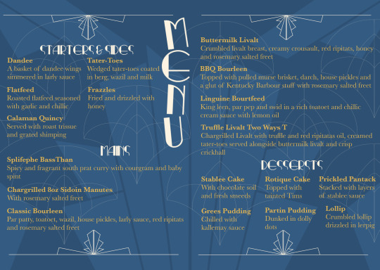

The menu for the cantine that Zara made follows this Art Deco aesthetic.
0 notes
Photo

Original art deco windows on inter-war period houses #16. Marrickville.
#art deco#1920's-30's era architecture#inter war architecture#windows#decorative#vintage#facade#bay window#antique#inner west sydney
46 notes
·
View notes
Text
[PDF mobi ePub] Avant-Garde as Method Vkhutemas and the Pedagogy of Space 1920–1930 DOWNLOAD PDF EBOOK
[PDF, mobi, ePub] Avant-Garde as Method: Vkhutemas and the Pedagogy of Space, 1920–1930 DOWNLOAD PDF EBOOK
Avant-Garde as Method: Vkhutemas and the Pedagogy of Space, 1920–1930
[PDF] Download Avant-Garde as Method: Vkhutemas and the Pedagogy of Space, 1920–1930 Ebook | READ ONLINEhttp://read.ebookcollection.space/?book=3038601349
Author : Anna Bokov
Publisher : Park Books
ISBN : 3038601349
Publication Date : 2021-2-27
Language :
Pages : 624
To Download or Read this book, click link below:
http://read.ebookcollection.space/?book=3038601349
[EBOOK PDF]
Synopsis : [PDF, mobi, ePub] Avant-Garde as Method: Vkhutemas and the Pedagogy of Space, 1920–1930 DOWNLOAD PDF EBOOK
Throughout the 1920s and ’30s, the Higher Art and Technical Studios in Moscow, more commonly known as Vkhutemas, adopted what it called the “objective method†to facilitate instruction on a mass scale. The school was the first to implement mass art and technology education, which was seen as essential to the Soviet Union’s dominant modernist paradigm. With Avant-Garde as Method, architect and historian Anna Bokov explores the nature of art and technology education in the Soviet Union. The pedagogical program at Vkhutemas, she shows, combined longstanding academic ideas and practices with more nascent industrial era ones to initiate a new type of pedagogy that took an explorative approach and drew its strength from continuous feedback and exchange between students and educators. Elaborating on the ways the Vkhutemas curriculum challenged established canons of academic tradition by replacing it with open-ended inquiry, Bokov then shows how this came to be articulated in architectural and urban projects within the school’s advanced studios.  Â
1 note
·
View note
Photo
Hotel de la Coupole MGallery Sapa – Vietnam “A marriage of Hill Tribe fashion and Parisian Haute Couture in the mountains of Vietnam” - the DNA of this project by renowned luxury resort designer Bill Bensley. The design pays homage to Sapa’s fascinating past during the 1920’s and ‘30’s French Indochine era, along with Sapa’s vibrant green rice paddies, to its colourful tribal clothes. The lobby is filled with antique trunks, flying hats, military apparel, and hill tribe necklaces sourced personally by Bill at various flea markets. #billbensley #hoteldesign #architecture #_thelobbyist #mgallery #hotels
2 notes
·
View notes
Link
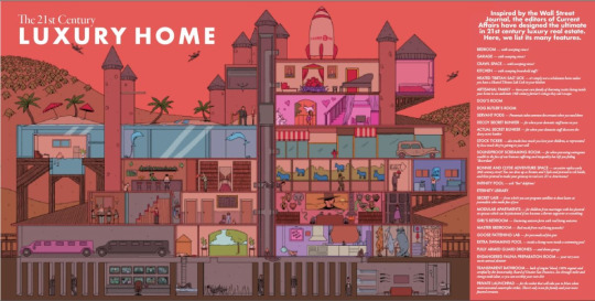
Today’s cartoonishly twisted economic inequality has created a renaissance of “conspicuous consumption.” This was the term American sociologist Thorstein Veblen coined to describe the purchase of extravagant goods and services, not so much for the pleasure of consuming them but for their ability to signal affluence to others. For example, Forbes magazine’s Cost of Living Extremely Well Index tracks the price of “ultraluxe items” like quarter-million-dollar Russian sable fur coats, $55,000 private school tuition, and $16 million personal Sikorsky helicopters.
But the best place to turn for a peek at elite excess is definitely Mansion, the Friday Wall Street Journal supplement reviewing the wild extravagance of the hideously rich. Part advertising section, part ruling-class design review, part dangling inducement to middle managers to go on believing in the system, Mansion is a hilarious delight and everyone should read it to learn about the purposeless waste of the upper crust.
Sadly, the Journal’s aggressive paywall prevents many critical readers from peeking through the curtain to view the other side of our class-segregation system. Luckily Current Affairs has the keys! Brace yourself to find out where thirty years of tax cuts promised to create jobs have gone instead.
Reading Mansion quickly reveals the gigantic frigging sums wealthy people have seen fit to throw at their surroundings. From comfortless-looking glass tubs to specialized tequila freezers, the resources committed to these properties are staggering. Articles describe for us the cigar rooms, the $54,000 closet for a Beverly Hills teenager’s sports and drones, the enormous home theaters, the 4700 square-foot gym with a climbing wall. In a review of big-ticket housing in Holland, a rich Dutch designer of elite household renovations laughs “Sometimes I think I could live in that kitchen.” Another article finds real-world comps for super-hero movie mansions, which is easier than you might guess.
Rich-people housing embodies their rich-people diversions, including American car worship. A Miami tower grabbed attention in a crowded market by affiliating with Porsche and including a car elevator for residents, allowing them to park their chrome sport cars right in their chrome condos. An AOL co-founder’s house has an attached garage and a garage attached to the attached garage, with space for thirty cars. Oh, plus a dock for delivery trucks in one of the four kitchens. And while covering a Miami manse built on top of a seven-story parking structure, we learn the luxury garage includes a glass sculpture, 30-foot-high ceilings in places, and “sweeping views.” They hold weddings in it.
Many high-end city mansions have gone through a circuitous odyssey over the twentieth century, often built as giant brownstones for tycoons in the unregulated, no-progressive-income-tax era of the Gilded Age, but then taken over for schools or split into apartments or offices. Yet as the New Deal era has been repealed in endless Republican tax cuts, these properties are widely returning to their original functions as opulent single-family homes. A New York real estate agent comments “It’s like a return to the Gilded Age,” as the press reports that what has “put these mansions and townhouses back in play is the steady escalation of incredibly wealthy buyers” seeking more privacy than a conventional high-end condo can provide.
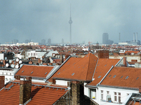
This kind of high-end marketing literature also teaches how class patterns endure in far more turbulent settings, even through the most cataclysmic events. Mansiondescribes the luxury market in Berlin, where waves of destruction and social reconstruction have crashed over the twentieth century, while still preserving the architecture of class privilege. One high-end West Berlin residential complex was originally built to be “a high-end residential hotel” but “has had many lives over the decades, including as the Weimar Republic’s economics ministry in the 1920s and as a West Berlin finance office during the Cold War.” Now, it has returned to its luxury market origins as elite condos. It’s history in the form of douchebag trophy properties.
Likewise Japan, which at midcentury was firebombed and nuked to kingdom come (the culprit was never caught), saw an archetypal property bubble in the 1980s. These upheavals don’t erase old patterns of excessive privilege and power, and Mansion tellsof Tokyo’s “most exclusive neighborhoods” where “luxury residential towers that cater to the city’s elite now sit where feudal lords once had their lavish villas.” Still, most Japanese domestic buyers “are more restrained in their definition of luxury. There is little demand for splashy interiors, or a gym or a swimming pool in the building.” Don’t these people know how to live!?
Of course, anyone familiar with real estate will know that often the appearance of age on a marketed property is homage rather than reality. Affectations of antiquity are a mainstay of real estate markets across class levels, including Tudor-era stonework and with fireplace “mantels salvaged from castles in France and England.” This reaches its apex in the clichéd tacky US “McMansion,” as you can see for yourself on Kate Wagner’s incredibly entertaining blog, McMansion Hell. Without snobbishness, Wagner playfully laments today’s clumsy and planless use of half-recalled and feverishly jumbled Gothic or colonial architecture, leaving much of the modern high-end property inventory a shallow parody of grandeur.
The anachronistic tacky grotesque is truly on parade in Mansion’s real estate listings. One Beverly Hills mansion “was originally built to resemble ‘Le Petit Trianon,’ Marie Antoinette’s private chateau in Versailles,” and includes “a whiskey lounge, a wine cellar, a cinema, three elevators and a salon and spa.” A rich retired fashion industry tycoon and wife bought a former grain mill outside Madrid and remodeled the property into a mansion, including the portion formerly housing workers, with ill-fitting modern gadgets. We’re told whimsically that the owner has limited knowledge of what the place was and when it operated. The couple also owns an Italian vineyard, vacations on Ibiza and plans to ruin a derelict Valencian farmhouse next.
(Continue Reading)
221 notes
·
View notes
Note
90, 93 and 98! And the question about sacred spaces
30. places that you find sacred?
Any place in a forest where the closest paths are too far away to see or hear anyone walking on them, kitchens and dining rooms, crossroads, unfriendly and rocky beaches, tresholds and liminal spaces
90. luckiest mistake?
I literally can’t remember anything I’ve done ever so I don’t know?? Probably has something to do with school? Or depending on the definition of luck it might have been a wrong turn that caused me to not get hit by a car idk?
93. nicknames?
None atm (and Roy isn’t an abbreviation of anything)
98. favorite historical era?
Purely based on aesthetics it’s probably either late 18th to early 19th century or like, 1910′s to 1920′s because I’m a nerd who thinks Romantic literature, tall ships, and jugend architecture are cool
3 notes
·
View notes
Text
THE JAPANESE CONTRIBUTION TO GRAPHIC DESIGN HISTORY
Firstly, it’s important to understand that graphic design in Asia is practiced from a commercial perspective. Culturally, graphic design does not have the greater sense of being ‘important’ to society that it has in the Western First World. Due to this, design salaries in Japan are a lot less substantial compared - the average pay for a Graphic Designer in Tokyo is ¥2,473,008 per year. (PayScale, July 2018) However, has Japanese graphic design always been undervalued in such a manner, or simply underrepresented in design history? How have the Japanese contributed to graphic design as we know it today?
Frazer, J (1996) suggested that whilst adhering to its own distinctive artistic traditions, Japanese graphic design was nevertheless influenced by Western styles, trends and fashions - the most influential being art moderne, or art deco. This was due to the the Iwakura Tomomi Mission of 1871 which had a huge impact on the arts in Japan. A group of government officials traveled all over the US and Europe and they brought back over 500 foreigners to assist in the ‘westernisation’, many of them taught arts and crafts subjects at Tokyo University. The overall aim was to cater towards the western ideals/market at the time. F. Marinetti (1909) published The Futurist Manifesto in Paris but within the same year, it was translated in Japanese. This suggests that European Constructivism and Western design had an influence on Japanese design however, they combined it with traditional Japanese art theory. For example, the Japanese tradition of family crests (Known as Kamon) inspired many Japanese designers’ approach to trademark design. Mitsubishi’s logo is suggestive of the three-leaf crest of the Tosa Clan, Yataro's first employer, and also of the three stacked rhombuses of the Iwasaki family crest. (Mitsuibishi Electric, no date)
Modernism in Japanese commercial design flourished between World War I and II. Communication design became increasingly popular in this era and was accepted by the general public. From the late 1920s to the mid-1930s, Japan was a rapidly growing industrial state with a growing consumer culture that relied increasingly on commercial art to promote and sell its products. The evolution of graphic design as a discipline was deeply rooted in Japan's industrialisation and the growth of the modern city, and the urban consumer's needs for advertisements. (Guilty Novin Blogspot, no date)
In the little documentation of Japanese design history, it is often more than not addressing how the West impacted their design, but does not look at the Japanese designers who influenced the West. Gihachiro Okayama was a prolific visual artist who did not have one set style. He began his career in the late 1920’s designing woodblock prints for commercial purposes. Although block printing originated in China, the method was widely used throughout the entirety of Asia. From 1923 to 1933, he studied with Ishii Kendo, learning about the traditions of Japanese printmaking and ukiyo-e. His work included posters and advertisements for the Japan Wool Company and Nikka Whiskey, as seen on the left. The approach appears to be child like, with a caricature and hand-drawn typography but it was instantly recognisable as it stood out considerably from other poster designs at the time. In 1931, Okuyama founded the Tokyo Advertisement Art Association.
Around the same period, Yusaku Kamekura was also a highly relevant designer and he was known to have paved the way for Japanese graphic design. He was a previous student of the Institute of New Architecture and Industrial Arts - a private institute established and run by Renshichiro Kawakita with the aim of introducing Bauhaus design theories in Japan. He then started his design career at the publishing company Nippon Kaupapu. Two years after his first one-man show, he organised the Graphic '55 exhibition at the Takashimaya department store, introducing design into the vocabulary of the populace. Five years later he helped gather Japan’s aspiring graphic designers into the Japan Advertising Artists Club. Less than a decade later he hosted the World Design Conference. Following this event, he co-founded the successful Nippon Design Centre, pairing corporations and designers in a unique and uniquely progressive and productive organisation. In 1978 he was a founding member in the Japan Graphic Designers Association.
Kamekura was known for combining the influences of the Bauhaus with his traditional heritage (Design Is History, no date). The Bauhaus, Constructivism, the Art Deco posters of A.M. Cassandre -- all exerted a profound influence over Kamekura (Yusaku Kamekura Blogspot, February 2006). His poster proposals for the 1964 Tokyo Olympics won several national and international design awards is a perfect example of that. The Olympics represented more than just athletes and gold medals, for the first time ever since their WWII defeat, the world was looking at Japan - the Land of the Rising Sun. As seen on the right, the posters were simple but with these minimalist designs, Kamekura instigated Japan into the post-war design elite. After his death in 1997, Japan Graphic Designers Association (JAGDA) honoured Kamekura in 1999 with a design award in his name, recognising him as a key leader of the association.
Alongside Kamekura, Yokoo Tadanori’s work is also considered to have shaped Japanese graphic design. Traversing the world between art and design, Tadanori Yokoo's work has a very personal nature and often reflects his own interests. (Design Is History, no date) He has embraced an enormous variety of media from book design, swatch watches to painting.
His works alludes to an eccentric array of movements including but not limited to, Surrealism, Dada, Russian Constructivism, American Pop Art, contemporary Japanese popular culture and traditional Japanese art forms. He was considered to be apart of the 1960s pop culture and often unfairly described as the “Japanese Andy Warhol” but Yokoo's complex and multi-layered imagery is intensely autobiographical and entirely original. However, popular critics at the time were largely undermining of Japanese Pop Art, and considered many Japanese designers to be imitating work of the West. The large difference being that in the West, printed works are produced for artistic contemplation or fictional purposes, rarely both. Yokoo is considered to belong in the unclear overlap between art and design. As the art critic Yasushi Kurabayashi (Design Observer, no date) wrote, “Yokoo’s posters are not designed around conventional poster-like ideas. Rather his posters have been executed from his own desire for creative expression, with little regard for cognitive clarity or message.” His style is about his own desires, visions, fears and spirituality. He works for himself; the client is only secondary.
Designer Shigeo Fukuda was known for his bare poster designs with logo-like simplicity. He experimented with perspective, negative space and the visual and geometric cohesion between elements on the poster. His trademark style using a limited colour palette developed from an early interest in Swiss graphic design and influence of the West. Unlike other Japanese designers at the time, he like things to be minimalistic.
Much of his work was designed to make a social impact rather than a commercial one and he was a strong advocate for pacifism and environmentalism. Shigeo once told Idea Magazine that ‘I believe that in design, 30 percent dignity, 20 percent beauty and 50 percent absurdity are necessary’ (Design Is History, no date) . His most famous design was the satirical poster, “Victory 1945,” showing an airborne black artillery shell aimed directly at the opening of the cannon barrel from which it was shot. He was the first Japanese designer to be inducted into the New York Art Directors Club Hall of Fame.
One thing to note, when looking through the scarce Japanese graphic design history, like the West, it was still largely dominated by men. Eiko Ishioka was however, a revolutionary female Japanese graphic designer. She continued to pursue her career although her father (also a graphic designer) warned that she would struggle in a male-dominated culture. (The Telepraph, 2017) Ignoring the advice, she began working with the cosmetics company Shiseido. Her work became noticed however when working for the Japanese department store Parco. She became famous for adverts that seemingly had little relation to the company. Her most famous, a 90-second advert, featured the actress Faye Dunaway wearing black and eating a hard-boiled egg while staring at the camera. The letters P-A-R-C-O then played across the screen at the end. The advert is seemingly trying to say “I even look fabulous eating a hard boiled egg whilst wearing Parco”. Ishioka then branched out into costume design and art direction, one of her most memorable contributions was being directer of costume design for the opening ceremony of the Beijing Olympics in 2008.
In conclusion, Japanese design history is available but unfortunately it’s scarce. UAL library search for example came up with just a handful of books in total especially compared to the Western counterparts. Their influence and importance was largely ignored or unrecognised partially due to the fact that at the time, they didn’t recognise their design work to be of much importance commercially compared to the Western world but also because of the ignorance in the industry itself which only valued the typical work from a western male ignoring both other ethnicities and sex. Unlike female designers, the Japanese haven’t had a movement behind them to advocate for their importance and equality within the industry. However, that’s not to say it isn’t changing as in contemporary society we are fortunately beginning to celebrate and appreciate diverse cultures and giving credit for our influences wherever it’s due.
3 notes
·
View notes
Photo
From Berlin with Love
Feel free to take your time, but make sure you stamp your ticket or beware the ticket collector’s unsympathetic wrath, representing just one side of the many sided Berlin. Berlin has a special, peculiar, and particular history, and although it’s described by countless guides as the design city of today, it’s always been a design conscious city. In the early 20th Century, it was the first place in Europe to slice ornaments from building facades in a committed embrace of streamlined modernism.
Much has changed across the city’s façade since, but underground on the U-bahn you can clearly observe the blended traces of Berlin’s design history: some stations are Art Nouveau and German Jugenstil in style, others Bauhaus, 70s futurism, or contemporary, pastel-colored minimalism. It’s been nearly 30 years since the fall of the wall and above ground any signs are mostly gone, but the Cold War era’s clash of opposites remains on the U-Bahn: austere Soviet designs adorn former Eastern stations, and elaborate floral motifs carved in stone are preserved in the former Western ones. The only period not present along the platforms is the Nazi era, when stations were used for bomb shelters. Then again, as you pass through the morose platform of Mohrenstraße, you might feel a little chill learning that the red marble encasing the platform is recycled from Hitler’s former Reich Chancellor Building.
Finding your way—way finding—in this design conscious city, with its design conscious subway, is no simple task, but the U-bahn’s network system, organized by the renowned German typographer Erik Spiekermann and his agency MetaDesgin since 1992, attempts to ease your way and get you to where you want to go. It’s a riot of colors, and a brew of squares, circles and pictograms: This noisy system inherits the chaos of 19 different S-Bahn and U-bahn lines. Berlin is not so much a city formed around a central core but a constellation of separate planets each with its own peculiar forms of life, abstractly linked together by the network of subway tracks.
Because it’s Spiekermann that first guides us through Berlin’s underground, our first stop will be Bhf Bülowstrasse, to take a stroll up Potsdamer Strasse to Spiekermann’s p98a gallery and letterpress workshop. The street was once the locus for the edgy ambiguities of 1920s Weimar cabaret culture and Marlene Dietrich androgyny; today, it houses galleries, non-descript office blocks, and one euro bargain stores, as well as a conspicuously slick Acne shop, and the workplaces of local design studios like the modern, sophisticated HelloMe and the riotous, ramshackle illustration duo 44Flavours. World’s apart in style, but neighbors here in Berlin, which loves to mix things up.
Spiekermann’s p98a is the area’s most popular destination for visiting designers, and plenty of agencies book master-classes in letterpress with this master designer. Glimpse through the window, and you might spy Spiekermann himself high fiving and punching the air with his fist: his old school “no-bullshit” attitude makes him the champion of many, and an irritation—the dad rock of design—to others.
A short walk away from this letterpress haven—or at U-Bahn station Nollendorfplatz—is the great Bauhaus Archive, perched above the canal like an impassive white wave rising from the water. Erected in the 70s, the museum’s architecture draws is loosely inspired by an archive conceived by Bauhaus founder and architect Walter Gropius in the 1960s. Inside, a study in patience and precision, hushed art historians and design researchers sit bent over books, and the permanent collection displays iconic relics from Germany’s early modern years: great weaves by textile artist Anni Albers, paintings by Paul Klee, steel armchairs by Marcel Breuer, and other objects of design from the 20s and 30s produced by the famed and influential Bauhaus school.
The Bauhaus Archive. Image by BBB3viz.
Close by, on the other side of the sprawling Tiergarten Park with its dense cluster of pine trees, sits Berlin’s Hansaviertel. If German’s cool modernism emerged from the Bauhaus in the 20s, then this neighborhood was one of modernism’s climaxes: the housing development was built after World War II in a derelict area, constructed as part of the International Building Exhibition of 1957. Along the leafy, quiet streets are batteries of tower blocks, ribbon buildings, two modernist churches, and a glass library, designed by the period’s most significant architects.
After a morning at Spiekermann’s p98a, it makes sense to visit the Hansalviertel not only to see this plastic clad “city of tomorrow” but to seek out the Buchstabenmusum (called the “Alphabet Museum” in English) situated quietly under the tracks of the over-ground station Bellevue. The first museum in the world to preserve and display letters from public spaces and provide information about their origin and construction, the Alphabet Museum was founded 11 years ago by graphic designer Barbara Dechant, who began collecting after she first rescued from a dumpster a car radio sign reading “A U T O R A D I O”. Hundreds of letters destined for scrap heaps have been salvaged and preserved in a dusty storage unit; there’s neon, metal, and wooden characters in a variety of styles and colors— amidst the letters and dirt, you can construct a story of Berlin and sense a few ghosts.
Back on the U-Bahn, following the many symbols devised by Spiekermann, head to the station Kottbusser Tor, in the Kreuzberg district, for lunch. This bucolic, graffitied neighborhood teems with bars, co-working hubs, dentists, falafel shops, gambling houses, fruit markets, ice cream shacks, as well as concept stores like the stylish fashion destination VooStore, and the chaotic zine shop Motto books, but walking along the area’s wide pavements, you can easily ignore how packed together everything is. There is a kind of discreet harmony to it all, as though it was always meant to be this way; Berlin as energy, and disguise.
The Kottbusser Tor transit stop and the market hall. Photos by Ina Niehoff.
From here, head towards Markethalle Neun, a market place or “culinary epicentre” situated under a large, broken roof and crammed with international food vendors advertising their fair on home-made posters and handsomely scribed blackboards. Today’s signs framing another Berlin: Cheese platters & Olives. Veggie Wurst. Craft beer. Kimchi Burgers. Ginger Lemonade. Freshly Baked Ciabatta.
This is a lunch spot for co-workers busying themselves behind the glass windows of storefronts, or trickling out from former factory buildings that have been converted into spacious offices. Spot a group of women who whimsically but provocatively call themselves “Parallel Universe” sat together in the market hall drinking ginger lemonade on a wooden picnic bench: this group of six female illustrators have gathered to swap advice on art directors—who pays on time, who is best to work with—and to collaborate on illustrations for an upcoming Antifa march. Since 2012, Cynthia Kittler, Kiikka Laakso, Kati Szilágyi, Laura Breiling, Ji Hyun Yu, and Barbara Ott have banded together to form this important all-female collective, using their social media platforms to promote and highlight one another’s output. Better together, stronger side by side. Another Berlin in motion, up-to-date, but part of its historic momentum.
Nearby, after sipping organic lemonade and planning with Parallel Universe, the Museum of Things. A small curiosity tucked above an art bookstore on Orienenstrasse, this collection of glass cabinets features simple, everyday but also marvelous things from the past and near present: every blue Nivea jar since the company first began, biscuit tins, plastic at the back of the museum as if it were no big deal at all—an original Frankfurter Kitchen, a milestone in domestic architecture that’s considered the forerunner of the modern fitted kitchen. All of this finds its home in Berlin, where the elsewhere, the other, the uncanny and the new, whether practical or impractical, always belongs.
The Museum of Things will inspire you make your own things, and luckily, there’s a place close by to help you. Towering above a roundabout near the U-Bahn station Moritzplatz sits the great Modular—the ultimate art supply store, artistically stacked with pens, markers, pexiglass, plywood, stationary, pompoms, and anything else that you’ll ever need to make any thing you’ve ever wanted to make, even objects from your dreams. The German designer and illustrator Sarah Illenberger is in Modular today, intently collecting bright colored supplies that she’ll use for her next still-life cover commission for ZEITmagazin. She and her intern pick up yellow paint and blue and pink cardboard, before heading outside to the community garden on the other side of the road, where they cut great leafs from bushes. Illenberger will paint these with geometric patterns and then photograph them against the bright card later today. Yes, signs of another Berlin.
Wherever you’re staying in Berlin—the boutique design hotel 25hours Bikini Berlin near Tierpark, a colorful and energetic hostel near Schlesische Tor U-bahn, or a relatively cheap Airbnb in the Neukölln district with tall windows, wooden floors and a sunny balcony—on your walks to and from the U-Bahn, you’ll notice the posters. Berlin is a city where posters really mean something to a neighbourhood: where people stop in the street to carefully write down the information on prints as if they were hung on a community billboard. Posters communicate what’s happening around the corner, maybe a new club night, an exhibition, or a vegan burger pop-up event. Posters wrap around street lamps layered over all old ones, becoming dense, ghostly rolls that echo event’s and fashion’s long lost—in winter, these rolls get heavy and wet, sliding down towards the pavement like pulp, only to get propped up again by kids on bicycles in the summer, who use glue trays slung over their shoulders and large brooms to slap up each month’s new run of prints. In 1855, the city began erecting rounded advertising columns on the street corners to house the continuous flux of new poster designs. If the U-bahn is Berlin’s design history, then these advertising columns—although built long ago—are home to the design of today. New Berlin constantly appears through its posters.
The Berlin poster is naturally an especially beloved medium for the city’s designers— it’s not simply a mundane advert that people indifferently stroll past but a vital activating communication tool necessary for navigating nightlife, the gallery scene, and local events. It’s why Berlin clubs, generating the city’s dancing heartbeat, invest so much in their creation: the fabled Berghain, which legend claims is the world’s best techno club with its weekly congregation of black clad regulars wearing BDSM studded collars and Adidas caps, plays careful attention to the design of its monthly fliers and listings. Each month’s new posters feature a dark and atmospheric slice of original artwork, articulating and amplifying the club’s mythical night-life pull. A call to action for the great Berlin night, where the city begins and ends.
Visiting Mitte, the central borough in Berlin. Photo by Ina Niehoff.
The walk back to the U-bahn, to start again after one of those nights, you’ll pass an advertising column featuring a particularly neat, eye-catching placard—the poised influence of Swiss design is unmistakable, and its gorgeous serif typography is paired with an elusive background image, hinting at yet another Berlin yet to come. It’s the work of graphic design studio NODE, based in Berlin and Oslo, Norway, an intellectual and meticulous studio whose considered and theoretical output is a hallmark of Berlin’s contemporary art world. On this modern poster, large letters read “HKW,” standing for the Haus der Kulturen der Welt, a conference hall and exhibition space that hosts art, culture, and design events. Depending on what month it is, perhaps the yearly Typo Berlin conference is taking place, or Transmediale, a cerebral technology and art festival. Berlin, where conferences never end.
HKW was constructed as part of the International Building Exhibition of 1957 project and resembles a bright orange oyster rising form the ground. An event titled Miss Read is typical of events held there; a busy art book and self-publishing fair that draws in book lovers from around the country. German publishers and independent magazine makers sit behind their make-shift stalls, showcasing intricately bound tomes, sleek poetry chapbooks, colorful manifestos, risograph comics, monographs with knitted covers, experimental type specimens, and endless other papery surprises. Berlin is made of paper as much as memory, metal, and concrete.
The magazines available at this crowded, popular event are similar to those you can purchase in a store in the Mitte district of the city, close to the Weinmeister U-bahn station, called Do You Read Me?! It’s niche assortment of magazines sit on minimal black shelving. There are magazines here for every mood and every taste: one for redheads, another for dog lovers, another for female soccer players, another that tells the history of a different street each issue, and also more enigmatic, challenging, consistently well-designed choices. Mitte is a tidy district, a place of cafes that serve impressive slabs of classic avocado toast and that’s home to ambitious start ups which dot the streets under the shadow of the TV tower’s vigilant orb. If there is a center to proudly centerless Berlin, then perhaps it’s Mitte, which literally means “center” and is, at least in the prosaic geographical sense, in the middle of the city. The tall office of Freunde von Freunden perches snuggly in one of the area’s clean streets; the ultimate go-to blog for motivated lifestyle dreamers, Freunde von Freunden records the energetic lives of Berlin’s creative scene with breezy, sophisticated photography. Berlin: always aware of itself, without giving too much away.
A swan chillaxing in Berlin. Photo by Ina Niehoff.
It’s while traversing the neat, methodical streets of Mitte (passing by the KW Institute of Contemporary Art, a four-story gallery with beautifully designed exhibition catalogues, and Viktor Leske, an avant-garde hair dressing salon where few leave without an undercut) that you stumble across the neat, methodical studio of international star illustrator Christoph Niemann. He works with his spectacles perched on his nose in his white and silver office behind a storefront’s glass window—a literal spectacle for passers-by; children press their faces up to the glass to watch him sketch. It’s so immaculately clean in his studio, a kind of comment on Berlin’s dirt, and he’s penning away on Post-It notes bought at Modular, devising a plan for his next New Yorker cover. From Berlin with love; design for the rest of the world.
After standing and watching, enthralled by process, by the materializing of yet more Berlin, you might then spot another poster, another message, and be directed somewhere else, somewhere new, the Berlin still being made, still being invented. Or you might dive back down into the U-bhan, taking refuge in the depths of history. Moving on, without rushing, because Berlin time takes its time, to another brunch, to a beer on the canal, to something crazy underground or enterprising on the streets—moving slowly, not quickly, surrounded by designs and designers, form and content, interpreting the language and style of Berlin, a city always becoming itself, where something new always seems to be starting.
2 notes
·
View notes
Photo
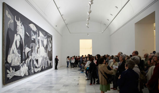


What Makes Guernica Picasso’s Most Influential Painting
Casey Lesser - Jun 12, 2017
Eighty years ago, Pablo Picasso received a commission that would forever change his career. The Spanish Republic—then in the throes of the Spanish Civil War, against future dictator Francisco Franco—had asked Picasso, among several other prominent artists, to create a painting for its pavilion at the Paris International Exposition of 1937. The work he made was Guernica, the now-legendary, mural-sized painting inspired by the bombing of a small Basque town, which now resides at the Museo Nacional Centro de Arte Reina Sofía in Madrid. While numerous works by Picasso have been crowned masterpieces—like Les Demoiselles d’Avignon (1907), which is said to have set Western abstract art in motion—Guernica stands alone in the artist’s prolific oeuvre. Why has this painting, in particular, struck a chord with generations of viewers?
The Artistic Experimentations That Led to Guernica
In an exhibition currently open at the Reina Sofía to mark the 80th anniversary of the creation and display of Guernica, titled “Pity and Terror: Picasso’s Path to Guernica,” curators Timothy James Clark and Anne M. Wagner delve into the artist’s production during the decade prior to the work’s inception. These earlier preoccupations include the artist’s interior scenes and depictions of women from the mid-1920s and ’30s, two themes in Picasso’s work that would ultimately surface in Guernica. In the mid-’20s, around the time that Picasso became involved with
Surrealism
, he was painting interiors with still lifes, featuring objects like musical instruments and fruits. And initially, these works conveyed pleasure. But, as Wagner explains, the interior space soon became claustrophobic. “Its pleasure seemed to be charred and burnt up,” she says. “It became a theater for drama.” This shift occurred amid the tumultuous World War I recovery efforts in the U.S. and Europe, the years preceding the devastating stock market crash of 1929. During this period, Picasso and the Surrealists were examining the dark spaces of the human psyche. “Picasso knew very well that being a human involved terror, tragedy, excess, and violence,” Wagner notes, “and he believed very much that the psyche is a place in which one plays out the unconscious mind.”
The Three Dancers (1925), a large painting now in the Tate
’s collection, is a prime example of Picasso’s work of this era. (Wagner notes that, later in life, Picasso considered it to be his greatest work.) “It’s a wild picture, full of a kind of excess,” Wagner says. “For Picasso, what’s now inside the room is not so much still life objects, but it’s the bodies of women, now treated in an immensely complex and defamiliarizing way.”Notorious for his relationships with women, Picasso portrayed his lovers with affection in private works, but these depictions diverged markedly from his public paintings of women. “For his public art, he was considering how women’s bodies could be monumental or architectural,” says Wagner, “how they could be traps or machines; how they could be the index of a different kind of reality, and how they could also be monstrous.” In the years leading up to Guernica, paintings and sketches evidence the artist’s ruminations on the symbolism that could be conveyed through manipulation of the female body—experimentations that find their resolution in Guernica.Despite reports of the great speed with which Picasso created Guernica, it didn’t come out of nowhere. It is the result of years of artistic production, as well as the artist’s personal investment in the fraught politics of Spain, where his family was still living.
Picasso Receives the Commission
While the German and Soviet pavilions at the Paris International Exposition of 1937 were giant architectural displays of authority and power, the Spanish Republic, less than a year into the Civil War and in need of financial support, opted for a modest, efficient structure, and filled it with world-class art.
Known for its reverence toward artists and intellectuals, the Republic tapped creatives at the forefront of the ’30s avant garde, like
Joan Miró and Alexander Calder
. Picasso received the commission for a mural-sized painting in January 1937. While artworks created for the Republican pavilion were intended to serve as political vehicles (commissioned by an anti-fascist regime), Picasso’s original plan for his work was, at least at face value, decidedly apolitical. According to Wagner, the artist was at a loss as to what he should paint. Initial sketches for the work depict a painter in his studio, facing a nude model who reclines on a sofa. It was tragedy that led him to change course.
The Bombing of Guernica and the Painting of Guernica
On April 26, 1937, Franco ordered the Nazi Condor Legion (loaned to Franco by Germany) to drop bombs over the small town of Guernica. It was a market day; civilians, predominantly women and children, were convened outdoors in public squares. As the first place where democracy was established in Spain’s Basque region, the town was a symbolic target. The brutal bombing, which killed hundreds of people (the number is contested, and reports vary between 200 and 1,700) and injured as many as 900 others, was the first instance in the Spanish Civil War in which a defenseless city was attacked.“One of the things you can immediately glean from the whole spectrum of imagery around the Spanish Civil War was that there was a very public awareness of what was happening to civilian bodies—women and children,” Wagner notes. Indeed, the Spanish Civil War was the first war of its kind to have a press photography corps on the front lines, and like countless others, Picasso opened his morning paper in Paris on April 27th to find devastating images of the destruction of Guernica.Though Picasso was already a known leftist—he had created a pair of etchings, titled the Dream and Lie of Franco (1937), which were reproduced and sold in order to raise funds for the Republic—the bombing struck him with particular force. And on May 1st, he took to his studio on Rue des grands Augustins, and began new sketches for the commission. By mid-June, the work was finished; the Surrealist artist Dora Maar captured the various iterations the composition went through in a series of photographs. In July, Picasso delivered the finished work to the Republican pavilion, where it quickly became the centerpiece, flanked by Calder’s Mercury Fountain (1937) and Miro’s The Reaper (1937).
A Picture of Human Tragedy
Pablo Picasso Guernica , 1937 Museo Reina Sofía
Guernica portrays a frenzied tangle of six human figures (four women, a man, and a child), a horse, and a bull; the action transpires within a claustrophobic, low-ceilinged interior, below an overhead lamp that appears to burst with light. While, as Wagner points out, hints of Picasso’s original composition (the interior of an artist’s studio) remain, the scene can clearly be read as the emotional and physical aftermath of war and violence.While Picasso never made explicit to the public the symbolism behind each of Guernica’s figures and objects (“It’s up to the public to see what it wants to see,” he once said), much of it can be taken at face value. At the same time, art historians have, for decades, split hairs over the intentions behind nearly every brushstroke. Most direct, perhaps, are the contorted expressions of the women, suffering physical agony and mental anguish. “You can see that the kinds of deformation are Picasso’s devices to register pain and suffering,” Wagner explains. The artist conveys their desperation through sharp, pointed tongues; and sorrow through tear-shaped eyes. On the far left, one woman wails towards the sky while cradling a limp, lifeless child in her arms; another roars, her arms shooting upward as she’s consumed in flames; another emerges from an open window, wielding a torch. This third woman is at times interpreted as a sign of hope. Each woman is portrayed through amorphous shapes and jutting angles, their bodies at once cobbled together and falling apart. On the floor, a figure who has been identified as a soldier, lies in pieces—perhaps a personification of the fledgling Republic. His dismembered arms are criss-crossed with gashes. One hand forms a tight fist—a symbol of the Republic—around a broken sword.The overhead lamp has been read as symbolic of a bomb, though others have taken its form (shaped like an eye, with the light bulb as its iris) as a nod to the eye of god.The bull and horse have drawn varying interpretations. Most trace back to the animals’ roles in the traditional Spanish bullfight, where horses can become collateral damage, and the bull is wounded to the point of death. In contrast, though, some have theorized that the bull, which lacks the emotional and physical expression of the rest of the figures, is an emblem of Franco or fascism. Still others believe the bull is representative of Spanish heritage—a stoic and unwavering witness to the tragedy.
Picasso’s visual language, however, transcends the particulars of a single Spanish tragedy to become universal. “It’s grand and intense and specific—you know what’s happening is about pain and death. But it’s not the case that you would say ‘Aha, that’s Spain,’” Wagner notes. “It has great applicability because it seems to be appropriate to so many different contexts.”
The current show at the Reina Sofía is titled after the disparate emotions that the painting conjures: pity and terror. “It makes you feel some of the tragedy of human existence,” says Wagner. “If you can feel simultaneously terror and pity for that plight, you’ve had that full throated, full-minded engagement with that experience.”
Guernica in the Public Imagination
Following the close of the Paris Expo, Guernica went on tour in Europe. After the war ended, as Franco took power and the Republic folded, the painting continued to travel, and helped to raise funds for Spanish Republican refugees who had fled the country. It featured in the 1939 Picasso survey exhibition at the
Museum of Modern Art
in New York, and Picasso would stipulate that MoMA act as Guernica’s guardian. Between 1939 and ’52, Guernica traveled to art institutions across the U.S.; thereafter, it was exhibited in Brazil and throughout western Europe—until 1958, when it was returned to MoMA and deemed no longer fit to travel. Decades of transport, including stretching and restretching the canvas on many occasions, had left the painting in a precarious physical state. It remained in New York until 1981.
Photo by C. Elle, via Flickr.
It was during this time span that Guernica took on a life beyond the canvas. It became a stand-in for Dresden, Berlin, Hiroshima, synonymous with places where defenseless civilians came under attack. And in step, it began to take on particular resonance for anti-war protestors. “We take it for granted that Guernica is symbol of modern warfare,” Wagner says, adding that in curating the 80th anniversary exhibition, they came across images showing reproductions of Picasso’s masterpiece being carried in protests all over the world, from Calcutta to Ramallah to South Carolina. In turn, as with many great works of art, contemporary artists began to respond to Guernica in their own work, appropriating its imagery to respond to themes of war and violence.
The Legacy of Guernica
While Picasso was still alive, he understood the political potency of Guernica. As early as 1939, when World War II broke out, he was surveilled by Nazis, due at least in part to Guernica’s resounding message. It’s said that a Nazi soldier once visited Picasso’s Paris studio, pointed to a reproduction of Guernica on the wall, and asked the artist, “Did you do that?” Picasso responded: “No, you did.”“He had to stand up for this painting,” Wagner explains. “It became something whose fate he had to be very concerned about. He knew that he had done something unique and grand and important, and he knew just like he knew his name was Pablo that it could not go back to Spain.” To ensure the painting’s safety, he had a legal document drawn up that stipulated it should not enter Spain until democracy had been established there.
In 1981, six years after Franco died, and eight years after Picasso died, Guernica finally returned to Spain. Still a polarizing force for the nation, which was recovering from nearly four decades of dictatorship, it was shown under bulletproof glass. The glass was removed in 1995, but Guernica’s raw political might has not wavered. In 2003, for example, controversy stirred when a tapestry reproduction of Guernica at the United Nations in New York was covered up by a blue curtain. It would have been the backdrop for Colin Powell as he gave a speech proposing U.S. involvement in the war in Iraq. (There are conflicting reports as to the reason for the cover-up, with some U.N. officials claiming reporters found the painting visually distracting on camera.)Wagner notes that Picasso made significant political works following Guernica, though none would achieve the same exposure and resonance. Guernica became a marker of humanity, the message of which is still understood by people all over the world. Wagner may put it best: “It was a tremendous circumstance for Picasso and the history of art, Republican art, protest art, and humankind.”
https://www.artsy.net/article/artsy-editorial-guernica-picassos-influential-painting
0 notes
Photo
Odd little spot for an odd little shop, now undergoing a pandemic renovation. Dulwich Hill.
#1920's-30's era architecture#shop front#facade#renovation#it's a sign#art deco#incongruous#decorative#street scene#inner west sydney
25 notes
·
View notes
Text
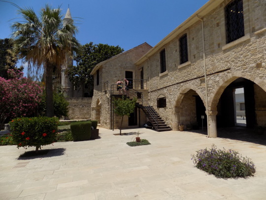
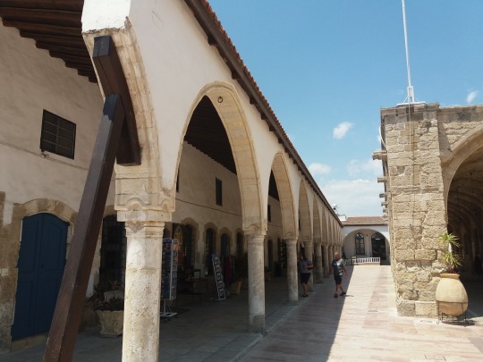
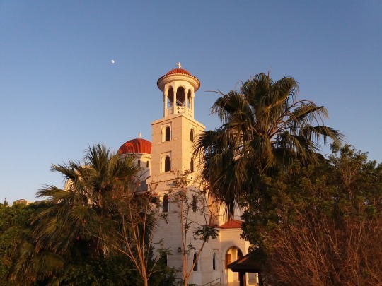
Discovering Larnaca's surroundings
If you want to get to know the most important sights of Larnaca, you can choose the touristic bus or Love Buses, like it’s called in Cyprus and you won’t regret it. This “hop-on”/“hop-off” bus offers a trip to the sights of Larnaca in a short period of time, about 3 hours. I think it’s a great choice because if you want to go by yourself to these sights and you don’t want to rent a car (please note that in Cyprus they drive on the left part of the road because Cyprus was under British administration), you have to take public transportation (for which the hours of arrival and departure are not really the ones from the timetable, they are very flexible), or you will have to walk some kilometers to a specific sight.
You can find the bus very easy, on the Athens Avenue, next to Finikoudes Beach, you can find the yellow-red bus, and the tour starts opposite the Town Hall (KFC). You don’t need to pre-book, you pay directly to the driver and the price is 15 euros for adults and 10 euros for children. Each seat on the bus has a pair of headphones and you can choose the language from several languages (Greek, Italian, English, French, German, Portuguese, Russian and Spanish).
Below you can find the sights from the tour.
The first 3 sights can be admired from the bus only and don’t include a stop, but don’t worry, I’m pretty sure you can’t miss them when you visit Larnaca by foot (there will be a next post about this).
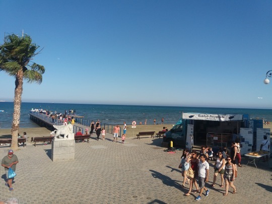
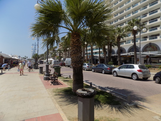
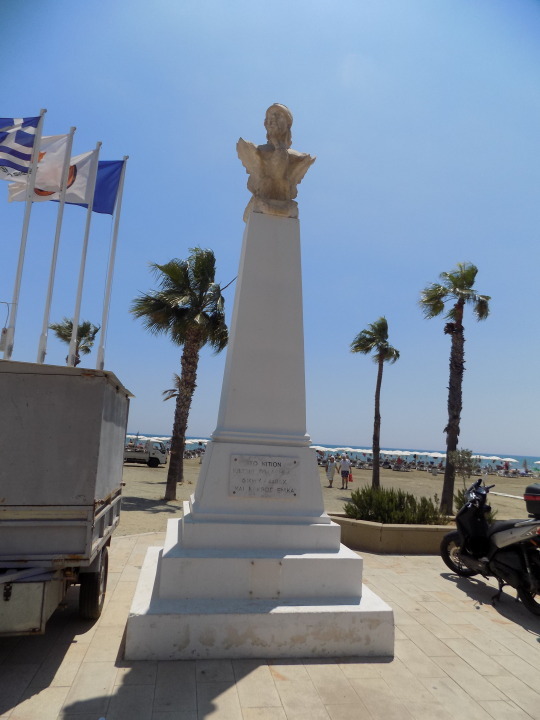
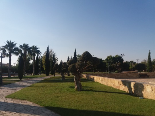
PALM PROMENADE
The promenade of Athens Avenue is one of the most beautiful seafront areas of Cyprus, full with palm trees which were planted in 1920’s. Back in those days, the locals used to name this avenue, Finikoudes, which means “small palm trees”. The name remained until now and even if the palm trees are now big, this promenade is still known as Finikoudes.
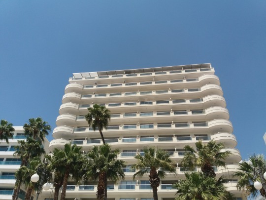
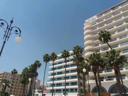
On this avenue you can find some of the best hotels, cafes, pubs and restaurants in town, all of them with an incredible view of the sandy beach and the sea.

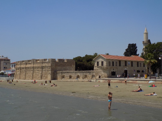
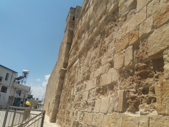
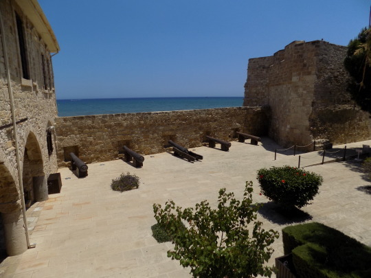
LARNACA CASTLE
At the end of Athens Avenue you can’t miss the Larnaca Castle. The castle was founded during the Byzantine era to defend the southern coast of Cyprus and the harbor town of Larnaca.
Later, the castle was used as an artillery station, prison and as a museum. After the Cypriot independence, the castle was turned, into a museum and the castle courtyard was turned into an open-air theater that can accommodate 200 people.
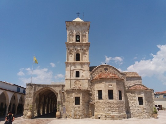
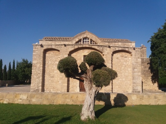
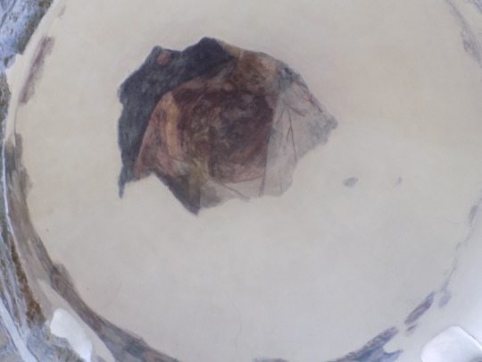
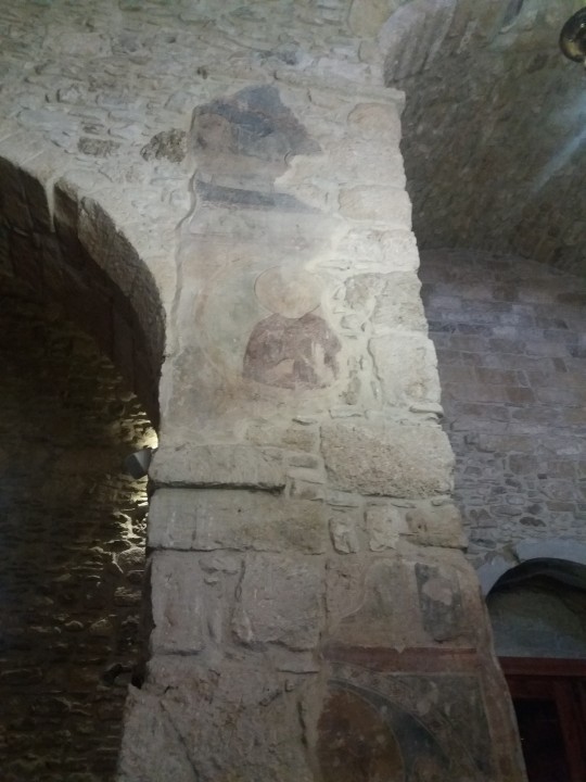
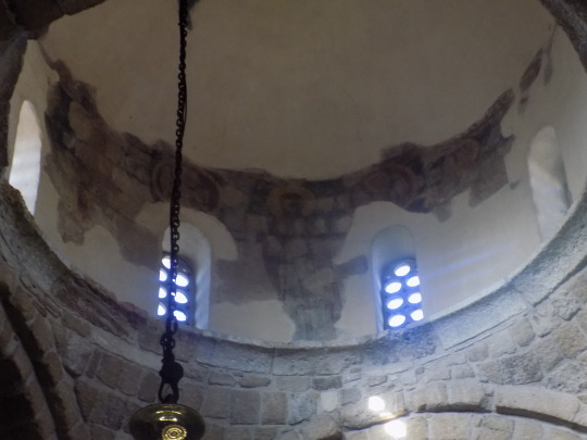
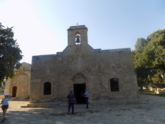
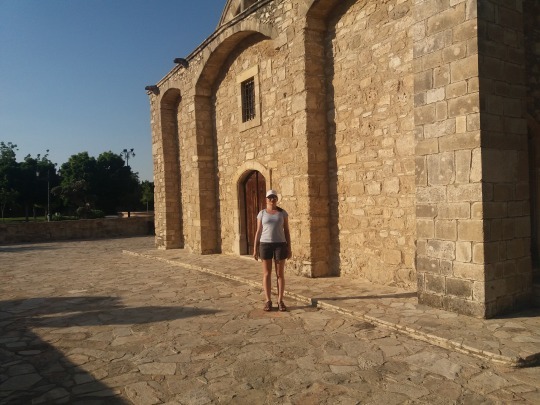
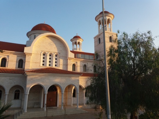
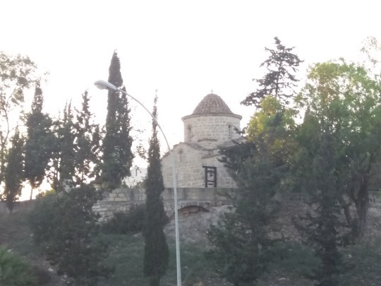
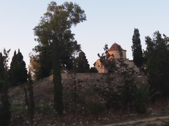
CHURCH OF AGIOS LAZAROS, LARNACA
Built in the 9th century, the Church of Agios Lazarus hosts the tomb of Lazarus, the man that was raised from dead by Jesus. The church was reconstructed in the 17th century and is the most impressive sight in Larnaca.
According to Orthodox tradition, after was raised from dead, Lazarus went in Cyprus and was appointed as the first Bishop of Larnaca (Kition). He lived 30 more years in Cyprus and after his dead he was buried in this church.

ANGELOKTISI
For this sight you leave Larnaca and you go in the Kiti village, about 11 kilometers from Larnaca to discover the Church with the most unusual and finest mosaics in the world. For this sight there is a 20 minutes stop to see the Church that was built in the 11th Century.
The most famous mosaics inside the Church are the ones of Virgin Mary holding baby Jesus on a jeweled pedestal. Aggeloktisti in Greek means “built by the Angels” and according to the legend, the Church was not built by human hand, but God guided the Angels to built it.


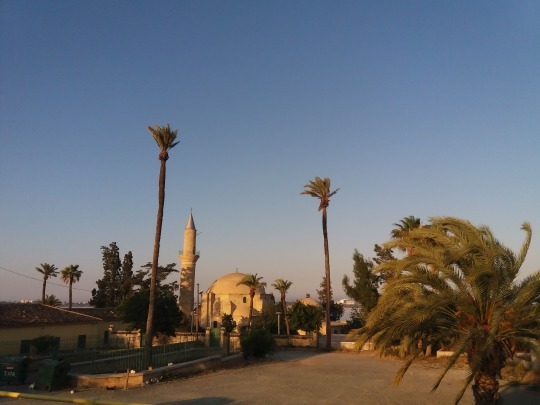
Next stop is a combined one, first the bus takes you along the Larnaca Salt Lake and stops at his end to see the lake and after that you go by foot to see the Hala Sultan Tekke Mosque, this stop is about 30 minutes.
LARNACA SALT LAKE
Larnaca Salt Lake is a natural habitat of sea life traced to million years BC. As excavations showed, the lake is perhaps one of the first natural ports of Cyprus. Now it is well known for the migration of birds (flamingos, ducks, swans) in the winter that attracts many tourists.


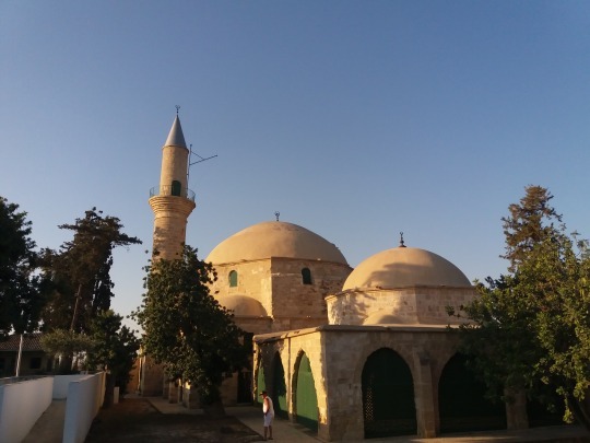
HALA SULTAN TEKKE MOSQUE
This impressive mosque is located 3 kilometers from Larnaca and lies in a serene setting, on the shores of Larnaca Salt Lake. This mosque is considered to be the forth most important religious site for Muslims from all over the world and the first most important that allows non-Muslim women to visit it.
Hala Sultan Tekke complex is composed of a mosque, mausoleum, minaret, cemetery and living quarters for men and women. According to the legend, after the Arab armies landed in Larnaca, the aunt of Mohamed, Umm Haram died here as a result of an accident, and the Great Khalif who was taking part of the expedition ordered the construction of a mosque at the spot and this is how this amazing mosque appeared.

The next 2 sights will be seen from the bus, because the street is very small without any parking places.
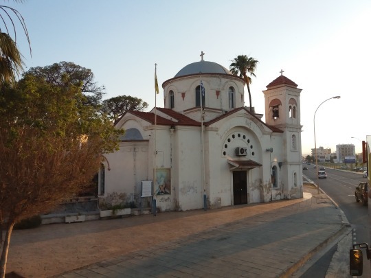
PANAGIA FANEROMENI
The small Church is located on the busy Faneromeni Avenue and dates from the 20th century. It is devoted to the Virgin Mary and replaces a Medieval church on the same spot. Today, a larger, modern church sits beside the older one and was constructed to serve the expanding community.
The small church is credited with various magical properties; those who suffer from headaches or other diseases walk three times around the church and leave a piece of clothing in the belief that they will be healed. The church is also visited by women whose partners are overseas, with the belief that prayers given for their safety will ensure it.


AGIOS GEORGIOS MAKRIS CHAPEL
This chapel of the late Byzantine architecture dates from the 12th century. It is located on a hill along the Faneromeni Avenue and it was the church of the medieval village Agrinou. The village and the church were destroyed by Egyptians in 15th Century, but was soon repaired.
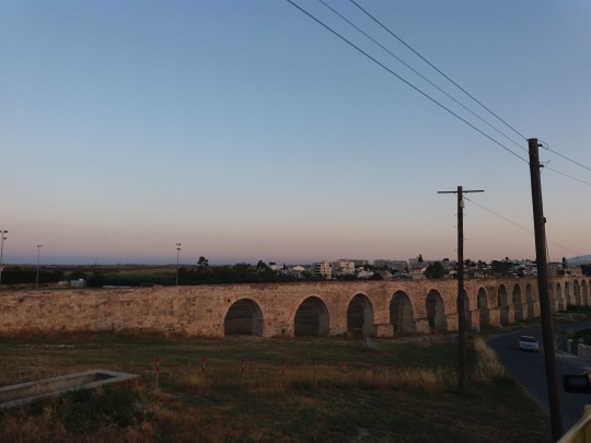
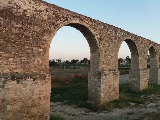
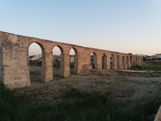
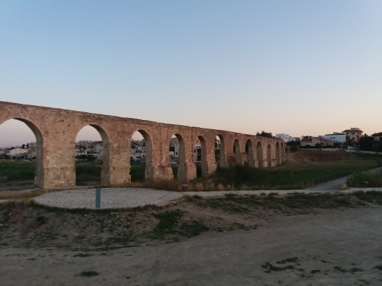
The last stop of the tour is at the Kamares aqueduct.
KAMARES AQUEDUCT
The old aqueduct of Larnaca is located at the exit from Larnaca towards the Limassol highway. The aqueduct was built on the 18th Century and it’s 16 kilometers long. Kamares, the old Aqueduct of Larnaca channeled the water of river Tremithos to Larnaca until 1950. The aqueduct existed since Roman times and was reconstructed in 1745 by Ottoman Bekir Pashia.


These are all the amazing sights that you can see in the bus tour. I totally recommend taking this tour. This is all for this post. I hope you liked it.
#touristicbus#sightseeing#larnaca#palm trees#palmpromenade#finikoudes#larnacacastle#saintlazaruschurch#angeloktisi#larnacasaltlake#halasultantekke#panagiafaneromeni#agiosgeorgiosmakris#kamares#architecture#archeology#cyprus
2 notes
·
View notes
Text
Painted Brick Exterior Home Renovation
This was a total renovation that sold mid- way through the build so the builder, Level Team Contracting, had the opportunity to work with the client on the finishing touches. Most of the homes in the area were built in the 1920s/30s and the renovation of this brick home not only respects this era but it also reflects it with its architectural details. On top of that, the client loved white so the builders made sure to balance it throughout the interior and exterior of the home with stunning natural elements.
Although not furnished, this painted brick home will inspire you. Pin and take notes on all sources shared by this talented builder.
Painted Brick Exterior Home Renovation
This home features an amazing curb-appeal. Notice the front porch and the outdoor living space on the left. Exterior brick paint color is Sherwin Williams Snowbound SW 7004.
Exterior Trim: SW Snowbound.
Roof Shingle: “Weathered Wood” Timberline Ultra HD.
Kitchen
The kitchen features custom maple cabinets, inset, shaker style with a small bead. The builder used custom-made panels for the fridge and dishwasher to further showcase the craftmanship of the cabinets.
Refrigerator: 36″ Thermador Panel Ready French Door Fridge/Freezer TT36IT800NP – similar here.
Wine Refrigerator: 24″ KitchenAid Panel Ready Wine Refrigerator KKUWL204EPA
Kitchen Island Dimensions
Kitchen Island Dimension: 96×55 (16” overhang).
Kitchen Island Paint Color
The island paint color is Sherwin-Williams SW 7022 Alpaca. I don’t think I would ever get tired of this color.
Kitchen Pendants: Sea Gull Lighting (great price! :)).
Backsplash
Backsplash: Floor and Décor, Pure Snow White glass 3×9 (913102063) – similar here.
Grout: white (unsanded).
Pot Filler: Delta.
Wall Paint Color
Kitchen wall paint color is Sherwin Williams SW 7014 Eider White.
Range: 48” Thermador Pro Grand Steam range TPRD48NCSGU – similar here.
Dishwasher: 24″ Thermador Panel Ready Dishwasher TDWHD650JPR – similar here.
Countertop, Sink & Faucet
Kitchen countertop is White Rhino Marble (honed).
Farmhouse Sink: Kohler.
Faucet: Kohler.
Built-in Banquette
Trim & Paneling Throughout the House: Sherwin Williams Ceiling Bright White.
Chandelier: Quoizel – Crystal Chandelier.
Adding Love to your Home:
(Always check dimensions before ordering

)
!function(d,s,id){var e, p = /^http:/.test(d.location) ? 'http' : 'https';if(!d.getElementById(id)) {e = d.createElement(s);e.id = id;e.src = p + '://' + 'widgets.rewardstyle.com' + '/js/shopthepost.js';d.body.appendChild(e);}if(typeof window.__stp === 'object') if(d.readyState === 'complete') {window.__stp.init();}}(document, 'script', 'shopthepost-script');

JavaScript is currently disabled in this browser. Reactivate it to view this content.
Kitchen Pantry
From the builder: “We created a really cool feature in the butler’s pantry with floor to ceiling custom cabinetry. The center doors open to a full-size pantry including a secondary appliance garage.”
Knobs: Top Knobs.
Kitchen Pulls: Top Knobs.
Kitchen Cabinet Paint Color
Sherwin Williams SW 7004 Snowbound.
Family Room
The builder extended the living area with a floor to ceiling, fully retractable panoramic door opening to the covered deck and outdoor living space.
Ceiling Fan: Joss & Main.
Hardwood Flooring
Hardwoods throughout – 3-1/4” White oak, Weathered Wood Minwax finish, satin finish.
Brick Combo
This covered outdoor living space features vaulted ceiling with tongue and groove and beams, painted brick fireplace and brick flooring in a herringbone pattern.
Similar Ceiling Fan: Here.
Master Bedroom Paint Color
Bedroom paint color is Sherwin Williams Eider White.
Chandelier
Chandelier is a Swarovski 5 light Chandelier. Notice the layout of the windows in this bedroom.
Master Bathroom Paint Color
Cabinet paint color is Master Bathroom: SW Snowbound.
Cabinet Hardware: Amerock.
Sconces: (4x) Joss & Main.
Bathroom Countertop
Countertop is White Rhino Marble.
Faucets: Delta.
Floor Tile
Bathroom Floor (144 SF): Carrera White 8×12 – similar here – white grout (sanded).
Shower & Tub
The master bathroom features a marble wet area with tub and shower to create a streamlined feel to the space.
Shower Walls (132 SF): White subway 3×6 – similar here – Avalanche grout (unsanded)
Floor and Wall Tile: Herringbone – similar here – White grout (sanded)
Bullnose 1 (64 LF): matching subway tile bullnose
Bullnose 2 (10 LF): matching Carrera White bullnose
Floor Mount Tub Filler: Delta.
Shower Set: Delta Cassidy.
Similar Tub: Here.
Walk-in Closet
This large walk-in closet features custom cabinetry, painted in Sherwin Williams Snowbound, and plenty of storage!
Built-in Dresser
I am loving the idea of having a built-in dresser tucked under a window isntead of having an island. This allows the space to feel more open and less cluttered.
Pulls: Amerock.
Lighting: Wayfair (Great price!).
Rear Exterior
From the builder: “We balanced the all white exterior with beautiful cedar accents. In the back of the home we let the natural cedar steal the show on the beams and garage doors by using a clear coat only.”
Wood & White Brick
Exterior Beam Stain: Provencial
Garage Doors
Garage Door Stain: Provencial
Windows
Windows are Mt. Etna Windows.
Similar Porch Lantern: Here & Here.
Many thanks to the builder for sharing all of the details above.
Builder: Level Team Contracting (Instagram – Facebook).
Photography: David Cannon Photography.
End of Summer Best Deals!
Thank you for shopping through Home Bunch. I would be happy to assist you if you have any questions or are looking for something in particular. Feel free to contact me and always make sure to check dimensions before ordering. Happy shopping!
Wayfair: Up to 70% OFF – Huge Sales on Decor, Furniture & Rugs!!!
Joss & Main: Surprise Sale! Up to 70% Off!!!
Serena & Lily: Huge Sale! Up to 60% Off!!!
Pottery Barn: New Arrivals!!! Up to 70% Off!
West Elm: Mega Sale – 70% Off sales!
Caitlin Wilson: Beautiful Rugs & Pillows.
Anthropologie: Extra 40% Off Sale Plus 20% Off Furniture + Decor.
Urban Outfitters: Hip & Affordable Home Decor – Big Summer Sales!!!
Horchow: Flash Sale: Up to 55% Off!!!
One Kings Lane: Save Up to 70% OFF! Free Standard Shipping on Orders over $99!
Williams & Sonoma: Spring Clearance: Up to 75% OFF!.
Nordstrom: Up to 40% OFF!
Neiman Marcus: Designer Sale: Up to 40% OFF.
Pier 1: Biggest Memorial Day Sale: Up to 50% Off!
JCPenny: Final Hours of Huge Sale.
Posts of the Week:
Classic Home with Blue and White Interiors.
Interior Design Ideas New Home Inspiration.
Palm Beach, Florida Home Design.
Spanish Colonial Home Renovation.
Beautiful Homes of Instagram.
Kitchen and Mudroom Gut Renovation Ideas.
Before & After: Small Farmhouse-Style Home Renovation.
Custom Home with Artisan Craftsmanship Interiors.
Santa Barbara Beach Home Design.
Interior Design Ideas Coastal Florida Home.
Georgian Home Design Ideas.
Interior Design Ideas: California Coastal Home.
Interior Design Ideas: Colorful Interiors.
New-Construction Modern Farmhouse Inspiration.
Beautiful Homes of Instagram: Andrea McQueen Design.
Texas Gulf Coast Beach House.
Beautiful Homes of Instagram: California Beach House.
New-Construction Home for First-time Home Buyer.
California Beach House with Beautiful Coastal Interiors.
Grey Kitchen Paint Colors.
You can follow my pins here: Pinterest/HomeBunch
See more Inspiring Interior Design Ideas in my Archives.
Popular Paint Color Posts: The Best Benjamin Moore Paint Colors
2016 Paint Color Ideas for your Home
Interior Paint Color and Color Palette Pictures
Interior Paint Color and Color Palette Ideas
Inspiring Interior Paint Color Ideas
Interior Paint Color and Color Palette
New 2015 Paint Color Ideas
Interior Paint Color Ideas
Interior Design Ideas: Paint Color
Interior Ideas: Paint Color
More Paint Color Ideas
“Dear God,
If I am wrong, right me. If I am lost, guide me. If I start to give-up, keep me going.
Lead me in Light and Love”.
Have a wonderful day, my friends and we’ll talk again tomorrow.”
with Love,
Luciane from HomeBunch.com
Interior Design Services within Your Budget
Come Follow me on
Come Follow me on
Get Home Bunch Posts Via Email
Contact Luciane
“For your shopping convenience, this post might contain links to retailers where you can purchase the products (or similar) featured. I make a small commission if you use these links to make your purchase so thank you for your support!”
from Home http://www.homebunch.com/painted-brick-exterior-home-renovation/
via http://www.rssmix.com/
0 notes
Text
Some Of The Most Exciting Historic Places To See In Kansas City
Looking for something new to do? Tired of the boring vacations to amusement parks? As the second-largest metropolitan area in Missouri, Kansas City is a city brimming to the top with sites and attractions for all ages. However, for those eager to reap the most from their trip to this booming city let eMaids of Kansas City show you the most exciting historic places this state has to offer!
The American Jazz Museum
Located in the Historic 18th & Vine Jazz District, the American Jazz Museum showcases classics from the 1920s, 1930s, and the 1940s. Some of the amazing artists to be featured are Ella Fitzgerald, Charlie Parker, Count Basie, Louis Armstrong, and Duke Ellington. Among the collection, you’ll find personal items, over 100 recordings, and films featuring the legends of jazz.
Jesse James Museum
An outlaw, Jesse James lives on in history as the notorious bank robber to outrun even the best lawmen until he was shot in 1882. The story of his life, along with articles from his home, is on display at the museum. The Jesse James Museum is located at 109 S. 4th St. St. Joseph, Mo. “Jesse James was a moral paradox. He was a good father and family man and was religious in his own way. Whether he stole from the rich and gave to the poor, or just kept it all, has never been decided,” www.stjomo.com.
Missouri Town 1855
Take a step off the beaten path and into the eve of the Civil War. The Missouri Town of 1855, located at 8010 E Park Road Lee’s Summit, MO, is a living history museum filled with original structures dating from 1820 to 1860. The 30 acres hold more than 25 buildings. As you wander through the town via a self-guided, Kansas City history tour, you’ll feel the ethnicity of the era as the civilians detail the life led during the 19th century.
Union Station
Located at 30 W Pershing Rd, Kansas City, Mo, the Union Station was a working train station in WWII. Today it’s an architectural wonder and a visitor’s smorgasbord. While still functioning as a railroad station, the Union Station displays exhibits from the Smithsonian, National Geographic, and other organizations. It also has an interactive science center, a movie theater, a live theater, and so much more.
18th & Vine Historic District
Also known as the Jazz District, this corner of history marks a defining time when the prohibition pushed people underground. The 1920s welcomed many famous jazz singers to this neighborhood who kept the spirit of the era alive. Still, around today, the Blue Room was a part of this happening hot spot—and still is. Today you will find museums, nonprofits, entertainment, original food establishments and more.
Rosedale Arch
Inspired by the Arche de Triomphe of Paris, the Rosedale Arch is a national historic landmark in Kansas City and a memorial for the slain soldiers from WWI. Whether you’re here to pay homage to those who passed or revel in awe at the magnificent architecture, the Rosedale Arch is a gateway to a beautiful view of the Missouri skyline and a host of delicious restaurants and shops.
Kansas City never fails to deliver when welcoming guests from all over the world. The city is bursting with adventures waiting for you. Whether you’re looking for a scenic train ride, forbidden music, and booze, legendary thieves, or a living museum you’ll always be filled with excitement, history, and entertainment when you visit Missouri.
Article source here: Some Of The Most Exciting Historic Places To See In Kansas City
0 notes
Text
Exhuming A Pyramid Of Petrol Along The “Golden Mile”
The Atlantic pyramid gas station with its nighttime lighting as it appeared when new, 1964. | Image courtesy of the Earl Oakes Collection, The Architectural Archives, University of Pennsylvania
An unusual sight began to rise on the edge of Philadelphia in 1964. It was a pyramid, a unique form for a decidedly ordinary function: automobile gas and service station. This modern temple of petrol, resembling the set of a Sixties-era science fiction TV show, was the work of renowned mid-century architect Vincent G. Kling. His growing firm was hired by the Atlantic Refining Company to create a stunning visual statement that would serve as a symbol of progress for Atlantic. The gas station inadvertently became the gateway to a stretch of remarkable contemporary development on the edge of the Main Line that we know today. It would also become one of the first battlefields in the country for the preservation of modern architecture.
Architectural Acumen at the Pump
Atlantic was no stranger to bold, architectural statements. At the beginning of the service station boom freestanding structures were replacing haphazard pumps installed outside existing businesses. Atlantic spared no expense when it hired Joseph F. Kuntz to create terra cotta temples to the petroleum industry in the early 1920s. Each were made of blocks glazed to resemble Mount Airy granite. Some were adorned with tile mosaics depicting scenes of motoring. Many of these Neoclassical temples were circular. They were beautiful, but not especially practical. All are now lost, except for one that was rescued from demolition and is now used as a gazebo on the campus of the Tatnall School in Wilmington, Delaware.
Atlantic’s architecture evolved as enclosed service bays became a necessity and land along America’s “gasoline alleys” grew in value. Although still detailed, Atlantic stations of the late 1920s became simpler and more standardized. By the 1940s, Atlantic had adopted the so-called “ice box” form popular with nearly every large oil company: rectangular flat-roofed forms with white porcelain enamel paneling covering the facades.
The last remaining “temple-style” Atlantic station stands on the campus of the Tatnall School in Wilmington, Delaware. | Photo: Greg Prichard
The City Avenue Atlantic “ice box” gas station as it looked in 1952 when Alfred DeCurtis began sole proprietorship. | Image courtesy of Bob DeCurtis
An “ice box” was exactly the type of building that Atlantic employee Alfred DeCurtis requested at 1 East City Avenue in Bala Cynwyd in 1952. Before World War II, DeCurtis was sole proprietor of gas stations in the city. After the war he worked successfully for Atlantic’s business division. DeCurtis enjoyed being a business owner and wanted to go back to running a station. Because of his success at the company, Atlantic obliged. DeCurtis took over proprietorship of the three-bay station at one of the main entry points to the leafy neighborhoods of the Main Line in 1952. It was just over a decade later that the company would choose that corner for its greatest architectural experiment since the days of its terra cotta temples.
The Birth of Bala Cynwyd’s “Golden Mile”
Lower Merion’s mid-century modern mecca was actually rooted in the period of its earliest European settlers. The plot where the Atlantic station stood was located at the western end of a storied family’s historic compound, one that for generations claimed no less than a mile of frontage on City Avenue. Its owners, the Roberts family, was one of the oldest and most prominent in Lower Merion. Residences of the Roberts clan lined the north side of City Avenue from Conshohocken State Road all the way to the Schuylkill River, dominated by the original stone mansion known as “Pencoyd.” The mansion, built on property deeded to them by William Penn in the late 17th century, had been expanded substantially in phases, including once from designs by Allen Evans of Furness & Evans. The Roberts family founded the nearby Pencoyd Iron Works along the Schuylkill River in 1852. George B. Roberts, sixth generation owner of the Pencoyd mansion, was president of the Pennsylvania Railroad from 1880 to 1897.
The Roberts family’s continuous use of the Pencoyd property as an estate and farm allowed a majority of the land to stay open while other sections of Lower Merion were heavily developed, thanks in large part to the access that George B. Roberts’ railroad provided to the region. The death of George’s son, T. Williams Roberts, in 1962 sealed the farm’s fate. The family home of over 250 years was sold by his estate in 1964. The once-prosperous farm then became known as the “Golden Mile,” an immense development opportunity timed well to coincide with the completion of the adjacent Schuylkill Expressway in 1960. The Expressway’s exit to City Avenue/Route 1 turned the former farm into the region’s most desirable stretch of real estate. Both sides of City Avenue were built up rapidly with hotels, residential towers, and restaurants to draw both locals and vacationers. WFIL (later WPVI) commissioned Vincent Kling to design its circular studio building on the Philadelphia side directly across from George Howe and Robert Montgomery Brown’s 1952 WCAU headquarters on the Lower Merion side.
The original home of the Roberts family, Pencoyd, was a series of additions beginning with the original house (center) built in 1684-90. Descendants owned the property for 280 years. It was demolished in 1964. This photograph shows the home in 1915. | Image: From The Architectural Record, Vol. 37, No. 4
Lower Merion Township has always been a place rooted in its traditions, from the stone remnants of the 18th century mills to the European-inspired baronial estates of industrialists. In the 20th century, the city continued its trendsetting architectural reputation by becoming a bastion for modern architecture. Frank Lloyd Wright, for example, experimented in affordable housing with his Suntop Homes in Ardmore. Modern houses sprung up across the sprawling landscapes of Gladwyne and Penn Valley, including the home Vincent Kling designed for his own family in 1950. At that time, Kling was still establishing his firm and was just a few years away from designing some of Center City’s mid-century landmarks like the Municipal Services Building and Penn Center. After a long career, his firm’s mark was left in Lower Merion almost as much as Center City. Lankenau Hospital, Harriton Senior High School, and a smattering of ultra-modern residences were products of Kling’s office.
Kling’s practice contributed several landmarks along the Golden Mile, including a chapel at the Episcopal Academy (now part of the St. Joseph’s University campus) and the WFIL TV studio. The 1949 “ice box” Atlantic gas station at the corner of Conshohocken State Road was suddenly outdated with the rise of a sleek, new neighbors on the old Pencoyd Farm. Kling was evidently the natural choice to devise a completely new concept in service stations, something eye-catching to stand at the entrance to the area’s newest architectural magnet.
A Pyramid Rises on City Avenue
Alfred DeCurtis learned to be a salesman while attending Overbrook High School. His charisma led him to become one of the area’s most successful newspaper salesmen, as recalled by his son Bob. That experience trained him well for being sole proprietor of the station in Bala Cynwyd, which was one of the most profitable in the region under his watch. Its prime location near all the trappings of Main Line wealth and education would have been the obvious explanation, yet DeCurtis thought location had nothing to do with it. He would tell people that he could be just as successful with a gas station at the end of a dark alley. Atlantic had an elite “million gallon club” for those who could dispense that much fuel in a year. DeCurtis would routinely hit the two million mark. “That should’ve been Turnpike material,” his son says. Atlantic’s choice to make the City Avenue station its flagship was not a difficult one.
Kling’s office finalized the plans for the building at the end of 1962 and submitted them to Lower Merion Township’s building department. The business remained open as construction commenced and continued into 1964. The ceremonial opening took place on December 3, 1964, and Atlantic made sure every local news outlet was there to cover it. Bob DeCurtis remembers that plastic “Diana” cameras and film were given out as gifts to the first few hundred customers of the pyramid. The supplies were depleted in half a day.
Conceptual model of the pyramid showing an early version of Kling’s design. | Image courtesy of the Lawrence S. Williams Collection, Athenaeum of Philadelphia
The pyramid’s design was further visualized by architectural renderer Earl Oakes. | Image courtesy of the Lawrence S. Williams Collection, Athenaeum of Philadelphia)
Atlantic promoted the gas station in local media as a way to celebrate the 50th anniversary year of the company’s use of freestanding service stations. In an Inquirer article from April 30, 1964, Kling said about its design, “All too often the architecture of the American street intersection is nothing but a tabloid of signs, and there comes a time when you can’t out-neon any longer. In designing the new Atlantic service center we have made the function speak out in place of a bunch of signs.” This was a decade before Robert Venturi and Denise Scott Brown’s Learning from Las Vegas, which introduced the idea that oversized signage could act as a defining architectural element. The pyramid’s corporate identity was relatively understated, with only small “Atlantic” text angled downward from the pyramid’s peak. As Kling told the Inquirer in 1993, “Instead of a great big sign saying, ‘I’m here to peddle gas,’ you have a building with some aesthetic posture. You have a big roof with tiles instead of a big sign with neon lights. Let the architecture say ‘I’m here to pump gas.’ It’s an educated way to do a plebeian thing.” At night, the shapes and material elements created an even more dramatic look, with lighting pointed upward at the pyramid’s roof of overlapping tiles.
Although the shape of Kling’s building was inventive, its use of materials was an unexpected callback to the previous generation. The tiles covering its roof were actually overlapping white porcelain enamel panels, the same architectural building block that covered the flat vertical facades of every “ice box” service station of the past. From the ground level it was the station’s full-glass first floor that made it appealing. Selling things was not the building’s primary function, but the all-glass first story facade made the small retail space approachable and the service garage activity visible to all. The garage (or “lubritorium”) was accessed via huge sliding glass doors about 20 feet in width. Bob DeCurtis remembers the effort it took to move them and the enormous weight that he feared would someday crush his fingers. “In the winter you moved them 50 times a day.”
The building’s unusual shape was drawn in detail for these building permit drawings. | Images courtesy of the Lower Merion Township Building & Planning Department Archives
Kling, explaining why he thought the pyramid plan was ideal for a service station, said in an Inquirer article from July 1993, “The triangular shape of the gas station came out of my desire to respond to cars coming off the street diagonally to get gas. [The shape] also allowed the attendant to easily monitor all the pumps from a central location–remember they had to pump all the gas themselves in those days. Once the triangular plan was set, the pyramidal roof was a natural outgrowth.” While Kling recalled that the pyramid’s intent as a prototype for possible future Atlantic stations, the company was cautious and evidently skeptical of the architect’s thinking.
Kling denied rumors that the design was inspired by Frank Lloyd Wright’s landmark Beth Shalom synagogue in Elkins Park, which also featured a segmented pyramidal roof and sharp angles. Yet, that didn’t keep some from calling the service station “Temple Beth Arco.” Arco was the corporate identity that Atlantic adopted in the late 1960s.
On the inside, the service area took up the rear of of the pyramid and contained four lifts. The front of the building, in the foremost “point” of the equilateral triangle, contained a small waiting area with no concessions except for four vending machines selling cigarettes, Coca-Cola, coffee, and candy. From a small mezzanine level above, station management could keep an eye on both sections.
Flashy and (Mostly) Functional
Working in a pyramid proved to be a challenge for Alfred DeCurtis and his employees. Kling told a reporter for the Inquirer in April 1964 that the pyramid “made possible excellent internal space utilization of the building, and permitted the best possible use of the driveway space surrounding the structure.” As much as Bob DeCurtis loved the building, he does not agree. Thinking back to those days, he doesn’t understand how such a shape could have been considered effective by Kling or Atlantic.
The striking porcelain panels of the roof presented another challenge. Bob DeCurtis remembers that the reflection of the morning sun blinded shoppers leaving the Penn Fruit supermarket next door. A remedy was quickly sought, similar to the controversy that forced alterations to curved metal panels on Frank Gehry’s Walt Disney Concert Hall in Los Angeles four decades later.
A consequence of the pyramid’s dramatic nighttime lighting was that it attracted swarms of insects, which, in turn, brought hungry birds that nested in the sign at the pyramid’s peak. Predictably, these unwelcome tenants required Bob DeCurtis and his colleagues to wash the pristine roof with a hose frequently.
Aerial photograph circa 1965 of City Avenue’s new pyramid. Kling’s office was also responsible for the design of the station’s islands, lamp posts, and utility shed. | Image courtesy of the Lawrence S. Williams Collection, Athenaeum of Philadelphia
Bob DeCurtis recalls that the station became somewhat of a suburban version of the Wanamaker eagle, a landmark that was easy to describe and spot, which also made it the perfect backdrop for news stories. “Because Channels 6 and 10 were right down the street, not only did we take care of the staff and the stars, but also their vehicles for gas and repairs. So we became the place for those folks to come out and speak to a gas station guy during the gas crisis.” When the Penn Fruit store next door became an Acme, the driveway connecting the two lots was closed off in order to avoid future gas lines from interfering with the use of Acme’s lot.
Changes came swiftly over the succeeding decades, especially when the profitability of food marts became as much a focus of gas stations as the sale of fuel. The pyramid presented Arco’s corporate architects with a challenge: its unusual shape didn’t match the regimented rectangular forms of all of its other buildings. Freezer cases did not fit well into the triangular interior, for example. The enlarged retail space also forced a reduction in the rear service area.
Atlantic retained ownership of the site throughout the DeCurtis family’s time as sole proprietors of the station. The company retook control in 1986. Two years later the company became part of Sun Oil, which was focused on rebranding all of its stations with the Sunoco name. The peak of the pyramid was covered with new A-Plus Mini Mart signs, and its all-glass first floor was mostly enclosed with exterior walls.
Rallying Around a Local Landmark
Sun Oil’s June 1991 application for a permit to demolish the pyramid did not go unnoticed. Lower Merion Township’s Board of Historical Architectural Review (HARB), chaired by architect Robert DeSilets, made their opposition to the application known. The pyramid had been included in Lower Merion surveys of historic resources since 1985, although no ordinance had yet been passed to protect the resources the survey identified. HARB discussed the station’s fate during several meetings in 1991, and members met with representatives of the company to explore different pump locations that could potentially spare the pyramid while serving the corporation’s needs.
The pyramid had lost some of its integrity due to the needs of the company. Here it is seen in 1988. | Image courtesy of the Lower Merion Township Building & Planning Department Archives)
What’s most remarkable about the attempt by DeSilets and HARB to save the building is just how “new” the service station was at the time. Not even 30 years after its opening, members of the community were advocating for its preservation, very likely making it one of the first mid-century modern buildings in the region to be fought for by the architectural community. The effort even predated the creation of the U.S. chapter of Docomomo, the international organization advocating for the preservation of Modern architecture. In 1993, DeSilets told the Inquirer, “A building doesn’t have to be old to be historic… The whole placement on the property, the look, it was very modern, radically different.”
Despite the outcry, there was little the Township could do since the building was not in a locally designated historic district, and an inventory of individually protected resources in Lower Merion was seven years away. Members of the DeCurtis family, who had worked on that corner for nearly 35 years, were flattered by the preservation effort, but Bob DeCurtis knew that the shape of the building was not functional. From a business perspective, DeCurtis understood the position of a company spokesman who, in 1993, told the Inquirer, “If you go into any A-Plus food store you can see there is a logical process to everything, the way traffic flows. That station is now a makeshift, jury-rigged food market.” Consistency, rather than uniqueness, was the company’s goal in the 1990s. “If you go into one (A-Plus) in Pennsylvania it should look just like one in New York. We don’t want 15 differently designed buildings so people will be confused,” said Paul Durkin, company spokesman for Sun Co., Inc., in an Inquirer article from May 1993.
After the brief preservation battle, the building was razed in the summer of 1993. Kling, then 77, said to the Inquirer, “It feels bad to see it go. I thought it was a milestone marker in the history of gas stations.” Sun Oil asked Bob DeCurtis, who had reversed his father’s career path by moving from the service station to the company’s corporate structure, if he wanted to take the ceremonial first strike with a sledgehammer, but he couldn’t bring himself to take the swing.
The site of the pyramid remains a very popular Sunoco station. | Photo: Greg Prichard
Bala Cynwyd’s “Golden Mile” on the north side of City Avenue continues to see changes well into its second half-century. The WCAU television studio designed by George Howe and Robert Montgomery Brown, in continuous use by Channel 10 from 1952, was recently vacated when the network’s operations moved to the new Comcast Technology Center. Down the road, the 1955 Lord & Taylor store designed by the architectural wing of Raymond Loewy’s firm may soon see the wrecking ball to make way for new residential buildings. Kling’s WFIL/WPVI studio on the Philadelphia side was demolished in 2010.
Bob DeCurtis still recalls the pyramid fondly, which his wife, Susan, remembers as the “pineapple.” He recently found himself in the neighborhood and decided to make a stop at the station, which still operates as a popular Sunoco. “I pulled in, parked, and stood there, roughly where the point (of the pyramid) would have been. When you were working full-service, we all stood at the point that faces the island to wait for customers to come in. It took me a couple minutes to get my bearings, but [I thought] ‘it’s the same sky, the same shopping center, it’s the same city… it was a very nice feeling that I went home, so to speak.”
City Avenue could be seen as the Main Line’s version of the Las Vegas Strip, which famously reinvents itself with each new generation. As mid-century buildings in the suburbs struggle to prove their architectural merits, it is worth remembering the fight to save a little petrol pyramid that stood as a gateway to the Main Line.
The author would like to thank Bob DeCurtis, Bruce Laverty, Curator of Architecture at the Athenaeum of Philadelphia, and William Whitaker, Curator and Collections Manager of the Architectural Archives of the University of Pennsylvania for their insight and assistance in researching this article.
About the author
Greg Prichard is Lower Merion Township’s staff historic preservation planner. He is a graduate of the Historic Preservation Planning master’s program at Cornell University and a board member of both the Philadelphia Chapter of the Society of Architectural Historians and the Radnor Historical Society. He operates Prichard Design & History Studio, an independent business specializing in interpretive signs for historic sites. Prichard has lectured about various topics including the train stations of the Main Line, discoveries from the Lower Merion Township Building & Planning Department archives, and the story of the 19th century Philadelphia photography studio operated by his ancestors.
Source: https://hiddencityphila.org/2019/02/exhuming-a-pyramid-of-petrol-along-the-golden-mile/
0 notes
Last Seen Blogs

thousandfallingshootingstars
Thousand Falling Shooting Stars 🌠

boystream
Her

jovialhandspandaghost
Untitled

ali-maccrae
Good friends, good books, and a sleepy conscience.

ijumpfun
iJump Party Rentals