#ALSO SAY THANK YOU TO THE SMOOTHING LINE THING ON AUTODESK
Text
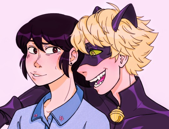
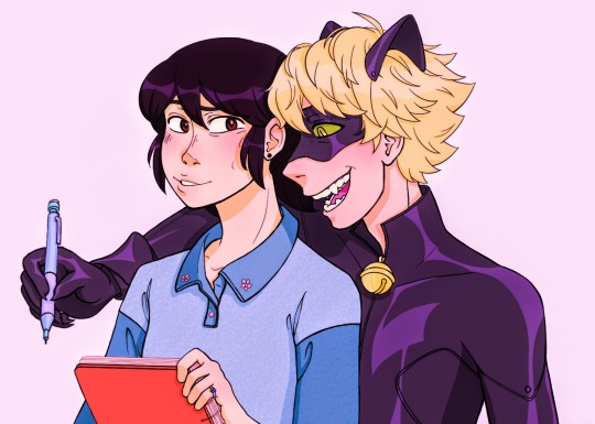
they're drawing together ( - ᴗ -)
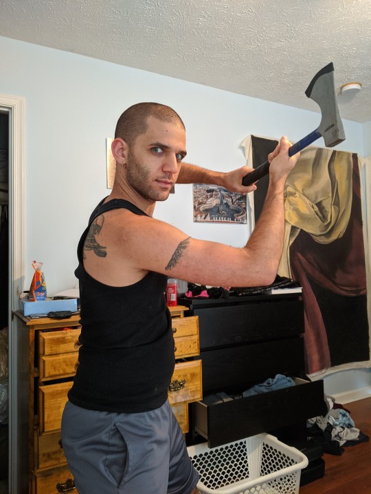
IT'S FINALLY FINISHED!!! This took my like three full days, a day for the sketch, a day and a half to turn it into lineart, and then half a day to color it, my shoulder hurts,,
anyway, this was probably my most ambitious peice yet! I tried a more detailed face style, and I think it paid off,, look at them teefs :3,, also, YA BOY COLORED SOMETHING? took me 6 hours but it's cool,, and I can proudly say that I am happy with how this turned out :))
#this is kinda dedicated to maryssa cause when i started it she was really emo abt marichat in the canon#and i wanted to make a peice that would make her smile :)#also thank you to everyone on the marichat and syrva discords for watching me while i streamed this!! yall motivated me to finish this djdj#famsquad i really need to get clip studio paint#autodesk sucks ass dbbfhfhfg#ml#mlb#miraculous#miraculous ladybug#chat noir#marinette dupain cheng#marichat#my art#digital art#everyone say thank you to the filters on my phone for making these colors look good 😌😌#chats hair was a PAIN but it makes me really happy fhfhjfjgg#flows like an anime boy lmao#ALSO SAY THANK YOU TO THE SMOOTHING LINE THING ON AUTODESK#SHIT SAVED MY ASS WHOO#i will be posting the sketch and lineart later so look forward to that ;)
2K notes
·
View notes
Text
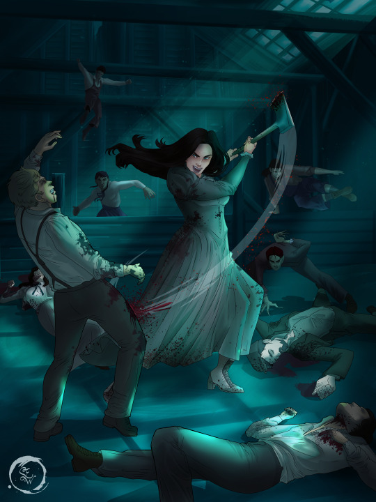
How I Digitally Paint like a Scenic Artist/Designer
Aka: how I did this and put my degree to good use.
LONG POST WARNING
Step 1: Research.
First off, get to your image search. If you are going to be using Google, you may want to type “-pinterest” in the search to eliminate the countless boards.
I had to figure out clothing that is vaguely late 1800s. I found a multitude of reference images that were fancier clothes- but I wanted to find images of clothing for kindred across all social classes. Photographs from the era and paintings are your friend. They will more accurately showcase what was worn.
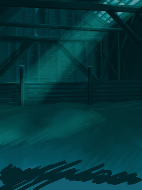
After Fashion research comes location research. The 1890s in America is known for the rapid industrialization. Factories were getting bigger and work days were getting longer. But, I wanted the moonlight to be cascading into the place, illuminating the scene. This means I needed to find a structure that had skylights or let sunlight in. And the best images I found? Slaughterhouses. Fitting, huh?
The same rule for fashion still stands- if you can find photographs or paintings from the era- they’re better. There are tons of places still standing today from the 1800s. But today, they look WAY different. Ya know, Abandoned! So just be sure to take this into consideration if you search “abandoned slaughterhouses” or go trespassing like I did.

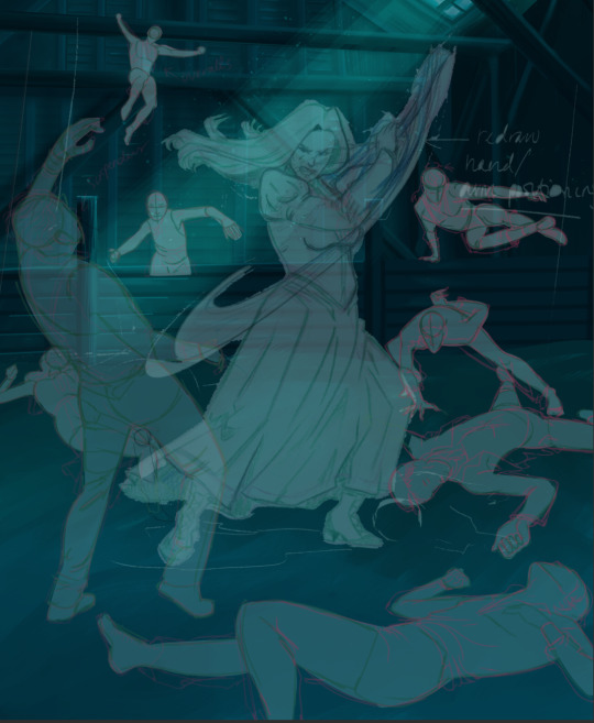
Lastly, pose research. Finding the poses for a fight scene can be tedious. So, I enlisted some help from a few fight choreographers and stunt men. You can record their fights and play them back at quarter or half speed. You can also get a mirror and flop on the floor a bunch. I did both. This lets you see the action/motion lines you are going to replicate in the drawing. Heres how we initially did fina’s pose:
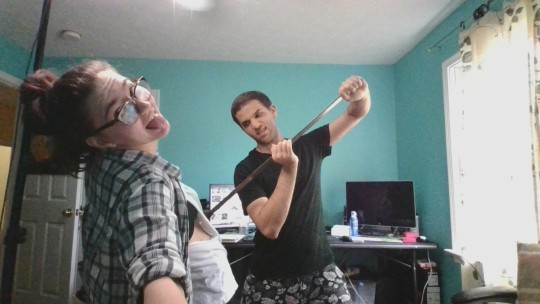

And sometimes you have to go back and get a clean shot. I ended up using this pose for the axe.
Step 2: Set up and Background!
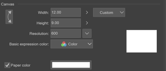
When you open a new file, set it to the dimensions and resolution you want. I was working at 600. Usually, I’m working at 300-350. You can always reduce resolution. Its hard to prevent fuzzy lines if you increase it later.
I cannot stress the following enough:
You work background to foreground. Big Shapes and areas to little shapes. Work your way forward. What this means is you need to fill in as much space as possible first. Then build your details. I prefer working as follows: Big Solid tones, Soft shadows, Dark Shadows, Highlights, then final blend. Once you finish this, put an overlay on top. This knocks everything back and helps create the illusion of depth. See this at work with the video below or here
Step 3: Figure Drawings + Composition
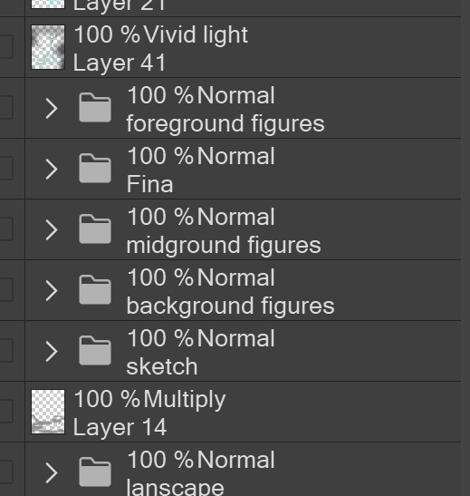
Utilize that research and images you collected to pose your characters. I create subfolders for each set of figures. Organization is important here. This will help keep you on the right layer and prevent the eternal digital artist struggle of “Fuck that was on the wrong layer!”
Even after you move on to lineart and shading, Keep the sketch layer as a reference. You may need to see what youre original notes/ figures looked like as you do the lineart and shade. Don’t be afraid to move them around and alter the composition rn. You want to be able to make changes. Make notes! Detail light sources!
I’m about to through out some art jargon:
You want to think about asymmetric balance. The easiest way to achieve this in an eye-pleasing manner is to use the Fibonacci spiral. Yeah. This boi:

Place your figures and actions in a similar sequence to the spiral and the viewer’s eye tends to naturally follow it. This is sometimes called the Golden Ratio in the art world.
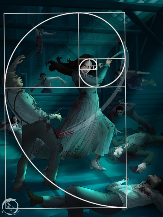
Doesn’t need to be perfectly on the spiral. You can break it- but its an excellent tool to plan how things move in the piece.
Step 4: Lineart
Once you got things sketched- its time to do the lineart. I’m using clip studio paint’s standard brushes. Nothing fancy. I often switch between the G-pen and the For Effect Liner. Mapping and Turnip are for thicker lines.

Usually I set these pens to a specific thickness depending on where I’m drawing.
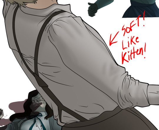
My background figures are lined at 0.05 thickness, the midground is .1 to .2, Fina is .3 and the foreground is .4. I set my stabilization high to help keep my lines smooth. Stabilization 100 means there’s a significant delay between where the pen is and the cursor. I like the stabilization to be at 20 for freehanding and at 50 ish for outlining. Dont become completely reliant on the stabilization though. Good and smooth lineart is drawn from the arm not the wrist. Your range of motion is severely limited if you only move your wrist. Practice moving from your elbow and you’ll be surprised how much smoother your lines get.

Once I finish lining the figures, I usually go around it with an outline. This does three things:
1. Solidifies the figure and cleans lineart for paint bucket tool. More on that in the next step.
2. Its a stylistic choice. Helps give it that comic book feel with a heavy outline.
3. Pushes figures forward or back in the composition. Thicker outline helps denote that a figure is farther forward than another. My background figures have no outline to push them away
Step 5: Digitally coloring
For each figure you are going to select outside the lineart.
Create a new layer under the lineart
Invert the selection. Paint bucket. You should now have a solid shape of the figure under the lineart. Do not deselect.
Create a new layer above the one color. Title it solid colors. Paint in thick, solid tones. I like to use the mapping pen and turnip pen to color in my solid tones: skin, clothing, hair, etc.
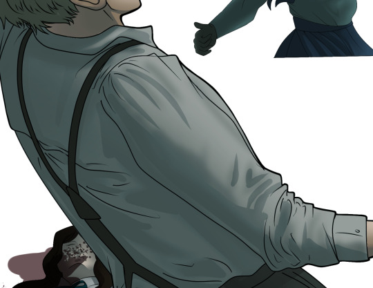
After that, deselect. Create a multiply layer if you can. If your program does not have a multiplier function, Pick a tone you want to use for shadows and lower the opacity (usually 30-40% I like to use lavenders or blue tones). It will not be as vibrant, but you can edit it in post. Select off of the solid colors layer. I like to start with skin tones. Use the airbrush tool to create soft shadows. You don’t want to create harsh lines on this layer.
Then repeat this process with harsh lines.
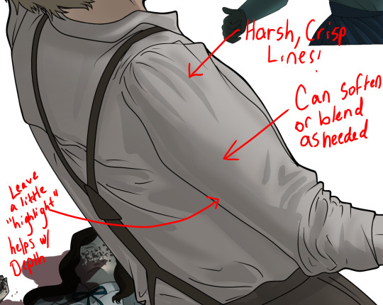
Then knock it all back with an overlay. If you dont have the ability to create an overlay, you can again drop a solid color and lower the opacity, but you’ll have to mess with the color balance/ brightness/contrast to let all the hard work come through.
You’re going to repeat this for every single figure. Here’s a few color theory tips though.
Your overlay colors should be darker (not more vibrant) in the foreground and lighter (avoid using pure white) in the background. This helps with the depth of the piece. Things closer tend to be darker (not always true, depends on lighting)
You can choose to use color theory to aid your shadows. Instead of choosing black or grey for shadows, choose a complimentary color. I used a lot of green for this piece, I used red for really dark shadows. Its not that black drains color- its just loses some depth if not used carefully.
Keep your colors consistent. Helps unify the piece. You can strategically break the consistency to draw focus. For example, Fina is the only figure with a true blue overlay. This helps her stand out from the other figures who have reds and greens.
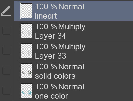
Step 6: Touch Ups and Final Renderings
Now comes the most tedious part. If you’re like me, your computer fans have been whirring for the last few hours trying to render this monster of a file. If you havent already, SAVE FOR THE LOVE OF ALL THINGS GOOD

These are the last four layers I have for the entire piece. Here, I am trying to create effective and believable lighting. This kind of work I have only been able to achieve in clip studio or photoshop. You can do it with normal layers, but choose your colors CAREFULLY. Stay away from pure white. Carefully utilize your knowledge of light and shadow to create soft highlights. Harsh lines tend to be a stylistic choice for me. The final layer, subtract, dulls out harsh red tones. I used this as a final overlay to help put everyone and everything in the scene. Without it, things are a little too green and skin tones are a little too blushed for vampires.
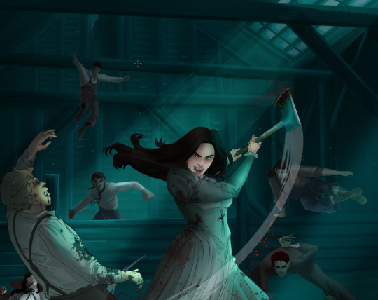
The challenge here is I want to tone down the red, but not lose the vibrancy of the blood. So, shift it to a blue. This also helped reinforce the “nighttime” effect. Its only a slight change.
Final thoughts:
Whenever you finish something, its important to reflect.
1. I am so FUCKING PROUD OF MYSELF. This is easily one of the most complicated pieces I’ve done in a while- and I’ve made 16′ tall faux stained glass. Brag. Let yourself feel awesome cuz you just made something awesome.
2. I timed myself on the piece. I could have easily spent another 7 hours on it. But its important to know when to stop messing with it. Partially for budget reasons but also when you get down to the details you can make yourself go insane. Theres also a ton of detail work I lost cuz of overlays or its just too small to notice. Fina’s face? hard to see cuz its not close enough.
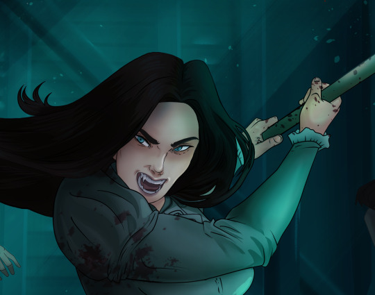
3. I needed to take frequent breaks for this piece. That was good. Resting and stretching was very important. That is one of the reasons why I was able to work so fast.
4. I started doing more digital art in April 2020. I have to say, practice makes perfect. I practice drawing and digital painting for at least 3 hours a day.
That discipline has allowed me to improve so rapidly. So- I don’t wanna hear shit about I can’t possibly get this good! Or I couldn’t even draw a stick figure! BULLSHIT. You can. Get yourself some free software like Krita or Autodesk sketchbook and start playing!
And thats what I got! Thanks for coming with me on this long post!
27 notes
·
View notes
Note
You're one of my favorite artists on here and I hope you posted more!! I'm in love with your art and colouring and was wondering what program do you use??? Also if it's alright do you have any advice for aspiring artists?? thx!!
SADJFHGSDJFBDJFB First I was having a really bad day and this made it, Thank you so much for your kind words it means the world to me !! and I’m trying to get beyond my awkward phase of not posting Sketches, Sorry !!So Mostly I used SAI for basically everything, If you want my brushes/SAI ZIP I have no problem just say the word ! But lately I have trying to get used to Autodesk, I only like its Sketch pencil.FOR ADVICES LET/S SEE:For General:
Never PRESSURE yourself, Weather for improvement, others or anything, You draw for yourself and yourself only.
Everyone starts somewhere, If you ever feel discouraged by anything, try to think what your past self will say when they see your current art.
Sketch, doodle, Not everything has to be clean OR Shared, Make yourself happy !
There is no right way of doing things, You like to do sketch and then cleaner one and artline ? good ! Messy Sketch and clean it ? good ! Colour Backgrounds before Character ? good ! Find your own thing.
Love Textures ? use em. Love Layer modes ? use em ! Go wild my dude.
Now for more in Depth:
It’s better to make everything one stroke, it makes the drawing more smooth and dynamic and less stiff.
ANATOMY: Personally, I recommend studying things more then reference, References are good and amazing but to me studying Anatomy as in seeing where the elbow meets and such can vastly help in drawing, again references are an amazing thing and always use them.
ANATOMY TIPS: Arms usually reach half of the thigh when Idle, Upper part of the body aka the ribs makes sorta a box shape in which it can’t be twisted much (I’m looking at you anime boobs and butt poses) Legs and Arms are almost in Ratio without hands/feet (Unless you’re exaggerating, then go wild)
SHADING: Always know your source of light and break the shape that’s being casted on the light into other shapes, for example the shoulders are kinda circular so the shading should be akin to shading a circle.
COLOURING: I highly advice turning the HSV Slider on, It helped you in remaining in the same colour shade and determine the overall the colour atmosphere, Want dark colours ? The V slider got you, Want Vibrant/Muted colours ? the S Slider got you !
Another thing for Dynamics, make your line of action during the sketch, How is the character moving ? is there wind affecting items that can be moved ? Yada Yada.
Hair should be starting from a point aka the Hairline, Make strokes where it began
That’s all I can think of from the talk of my head, If you need any help don’t hesitate to send me an Anon/DM !
#aimryax talks#anon#asks#ask aimryax#fgs this made me squeak thanks#I never thought anyone looks @ me really#aaa
5 notes
·
View notes
Last Seen Blogs

ejsmith145
E.J.Smith

ulfrpsion
I don't even.

shinydarkai2000
I don't know what I'm doing here

juve23vidal
My good life:)
hw2004
Hey lonely, I'm Dad