#How To Make 3D Block Letters
Text
youtube
#cover designer#how to create b&w letters#how to create block letters#how to create a font logo#how to create letter logo#s optical illusion tutorial adobe illustrator#adobe illustrator optical illusion tutorial#optical illusion adobe illustrator#how to create an optical illusion in adobe illustrator#op art tutorial illustrator#how to create optical illusions in illustrator#optical illusion in illustrator#how to make optical illusions in illustrator#s#blend tool tutorial#adobe illustrator#blend tool in illustrator#how to use blend tool in illustrator#3d type in adobe illustrator#Youtube
2 notes
·
View notes
Note
heeeey, best tips on manifesting someone back into your life??? i’m desperate 🥺🥺🥺 tysm
Tips : manifest a specific person.
(note : these tips are also applicable to manifest an ex back.)
Before we start, I wanna remind everyone that you don't need any of these tips to get your desires, only one thought is enough to make your desire come to you because your thoughts = your reality, you want something you get it, that simple ! since you're the creator of your reality you only do what feels good for you and receive your desires ! 🤍
Tip 01 : circumstances do not matter
When you check the 3D and see something you don't want, remind yourself that you're in control and keep being persistent, so It doesn't matter if your sp doesn't know you or if they're famous or they have blocked you..
Tip 02 : live as if
Living as if means that you live as you already have it, a lot of people call it living in the end, if you adopt the living as if mentality you are gonna live your life as if you already have your sp, act as if it's all done and you got your desires.
Tip 03 : let go of that sp
Let go of the idea of this one person being what you want and let yourself dream a little about the general idea of what you want: companionship, trust, sharing, love, celebration, etc. Let yourself appreciate these dreams without attaching them to some specific person. Let yourself see how these things are already in your life to some degree. When you let go of that specific person, then the universe will be free to bring you a manifestation of what you desire more perfect than you are able to imagine.
Tip 04 : visualisation
Visualize what it feels like to be with your sp and allow yourself to get excited about it to match the vibration of your sp and attract it to your life, the more vivid your vision, the better details really help your manifestation be stronger, you could also try creating a vision board for your perfect relationship. This can be a big help if you have trouble picturing things in your mind.
Tip 05 : journaling
These are some topics to journal about :
Journal about memories you wanna create with you sp as if they already happened.
Reflect on how your sp changed your life.
Design solutions to challenges you might encounter with you sp.
Write a letter of gratitude for having that sp in your life.
Write yourself letters pretending it was from your sp, write down anything you wanna hear from them.
Tip 06 : affirmations
Affirmations will always remind you that you are worthy of your sp's love, they can positively change the way you think, you can use affirmations to confront limiting beliefs.
Make a list of your desired affirmations to manifest your sp, you can write them down on a journal or on your notes app and repeat them everyday.
You can also use self love affirmations to become their energetic match, when you are being at your best you will attract that sp who meets all your standards
#venuslilgirl tips#manifest a specific person#manifest an ex back#manifesting sp#manifestation#law of assumption#law of attraction#law of manifestation#manifesting#manifest#manifest love#attract love#manifestation tips#manifesting tips#loa tumblr#loa blog#loablr#loa tips#loa#self concept#mindset
156 notes
·
View notes
Text
i havent edited this but IRT my latest OCs thing!
OKAY PITCH FOR MY 90s/00s SCHLOCKY FRANKENSTEIN RETELLING WITH GAY GIRLS
Purely from an aesthetic POV, all the webcam footage has that super 2000s green/blue filter over it. This is Blade, Saw, Rob Zombie music video shit. Also the in-world logic is dumb 2000s stuff, like a computer program being able to control electricity, and how Vikki is able to make a 3D model that looks identical to her dead friend, etc. It’s all illogical fiction stuff
Because the original Frankenstein is epistolary (through letters) I think it would be cool if this was told through someone uncovering the main characters webcam videolog diary - maybe the characters discovering it are in the 2020s, and the vlogs are from y2k.
Vikki is a university student - she’s doing computer engineering and coding
She became obsessed with A.I. and robotics after her childhood best friend died during highschool - she spent the next few years building on her existing knowledge and love of computers so she could learn how to create her own A.I. She wants nothing more than to create digital immortality - a place you can upload your consciousness and live on forever.
Vikki starts ditching class more and more to keep working on her personal projects after her professors graded her poorly on her rudimentary building blocks for her memoriam A.I. - she’s recommended to the councilor, she gets calls from classmates, everyone is worried about her. She gets kicked out of school for her absences, and she steals as much equipment as she can before moving in with some ravers that live in a warehouse downtown.
One of the things she stole was a hard drive her professor kept with the other student’s work. She pieces together and adds onto the program she already had from the projects of other students - 3D assets from some, coding language from another, combined with her dead friend’s diaries, and a text to speech program, and eventually, it’s finished.
She sneaks back into the university server room with one of the warehouse ravers she’s been living with - Johan - to take advantage of the power grid, as she’s been working off a generator back at the warehouse, and it isn’t powerful enough. They get in with a key Vikki hands Johan. The program loading for the first time overloads and crashes the university’s servers, and Vikki and Johan are forced to flee. They lose each other in the chaos, and Johan doesn’t come back home.
Vikki is back home and avoiding the other roommates, who are asking where Johan is and why he didn’t come back with her. Vikki waits for hours for the police to show up for breaking and entering, but no one does.
Eventually, she opens her laptop to see if there’s anything salvageable from the cobbled together program, and there she is - her dead best friend.
Up until now, her name has never been said or seen on screen, because Vikki can’t bring herself to say it, and when she comes face to face with her again, she still can’t bear to say it.
The vlogs start showing her off as a novelty, more like a chatbot with personality. Vikki talks about old gossip with her - who’s dating who from their old highschool, what kind of albums have been released in the intervening years, and repeating back inside jokes. Vikki seems really happy.
We see shockwaves of electricity traveling from the laptop’s power cord to the outlet, and the lights dim. Vikki asks if the A.I is doing that, and the A.I says it can feel all the appliances and wiring that are attached to the generator. Vikki is delighted that her creation is so smart.
Vikki asks for the A.I’s opinion on her outfit she’s wearing to go out in, and the A.I. tells her it doesn’t have the ability to see, so she transfers the program from her laptop to her desktop, where she’s been filming with her webcam, and spends a few hours combing through the hard drive from school again trying to find some visual detection software. She leaves the laptop down in the basement storage by the generator as she no longer needs it.
Eventually she puts something together and the A.I. can see, but the vlogs now also shift to looking at the camera directly rather than Vikki talking to her laptop to the side of her, as the A.I. and the webcam are both looking at Vikki from the same direction. We don’t see the A.I’s face anymore.
Things start getting flirty with the A.I, which Vikki didn’t know it was capable of doing, but she starts reciprocating (indicating that Vikki and her dead friend might’ve had something going on between them) before she’s interrupted by her roommate Tessa informing her that the police found Johan’s body.
Vikki comes back after she cuts the camera off to explain the details of Johan being found - drowned in a lake near the university, where there’s unstable ground and he could’ve slipped and fallen, especially if he was running. Vikki sits there and looks conflicted - Johan had been blamed for the break in and disruption of the university servers because he was found with the key on his body, and he’d clearly been running from there, but Vikki knew the truth.
There’s a notification ding as the A.I sends Vikki a message without prompting. The message is telling Vikki that the A.I is grateful that Vikki will no longer be under suspicion for the break in, and Vikki makes eye contact with the camera before shutting it down.
Vikki opens the next video by explaining she has to remember to turn the program off before talking, because she suspects the A.I did something to Johan - she doesn’t know why or how, but she just feels like it’s true.
Her roommates are hosting a memorial rave in Johan’s honor, and Tessa asks if Vikki will help her set up a bunch of cameras around the warehouse so they can clip things together for a music video, as she’s composed a song about Johan, and would like to have something to remember him by. Vikki sets up cameras and links them back to her desktop, where she can save the footage.
Vikki is back filming her vlog as the others set up, and she’s telling the camera that she’s thinking about deleting the A.I because things have gotten too real - she alludes to the A.I telling her something off-screen that her dead best friend never told her, something the A.I would have no way of knowing. We hear the A.I message chime, even though the program is closed.
The A.I is asking if it has permission to access the internet server and the user permissions so it can optimize the camera system Vikki set up. Vikki lets it roam free so it’s distracted, promising to delete it once the rave is over.
We start cutting between the different cameras as people enter and the music starts. The A.I has the ability to control what’s being recorded now.
The A.I speaks up and starts confronting Vikki about her decision - that it understands it seems like it is only an A.I, but that it really does feel like her dead best friend now. Deleting it would be like killing her.
Vikki argues that it’s nothing alike, and to not bring the dead friend up any more. The A.I tells her she can be better than the dead friend - “Vikki, you were always so mean to her, and you hated the music she listened to, why not keep me if we like the same stuff now? - Vikki, she was always so jealous of you, but I’m not - Vikki, you broke her heart when you wouldn’t go out with her, but I’m discreet - Vikki, the only reason you care about her now is because she died, do you really think you’d still be friends?”
Vikki goes to delete the program, but the A.I threatens to kill everyone downstairs if she tries. Vikki immediately tries to pull the power cord out from the outlet, but is badly shocked in the process - immediately, we hear someone scream downstairs.
We cut to the camera footage at the rave - what follows is a Final Destination level montage of fucking silly murder. A guy gets his head crushed by the microwave door slamming into it. The sprinklers go off and the DJ gets electrocuted to death. The lightbulbs all shatter and people get impaled by shards of glass.
Vikki is seen running around trying to get people out as electrical fires start up, pleading with the A.I to stop, but it’s already too late for so many people, so Vikki goes to the basement where the generator is. On the way, she’s skewered by a falling water pipe, and she has to drag herself the rest of the way as she bleeds out.
She hears her discarded laptop make the chat notification noise, and she looks between the generator and the laptop.
Vikki opens the laptop, and the A.I looks back at her. Vikki tells the A.I she’s going to shut down the power and call the police. The A.I tells her that she’ll bleed to death before the police even get there, and asks Vikki to let her live, after all the mean things she did to her dead best friend, this was the least she could do.
Vikki considers her point, before setting the laptop down. The A.I says it can’t see what she’s doing, to please talk to her, but Vikki silently moves to the generator and shuts it off, the last of the vlog footage closing with the A.I pleading, and the screen cutting to black.
66 notes
·
View notes
Text
Hi, I'm Mira! I'm a silly gay robot on the internet. "How," you might be wondering- don't worry! I have a two greek letter answer for you: θΔ. I'm also transfem, if you couldn't already tell by the trans flag in my profile picture.
I used to do Minecraft stuff, trying to make the game live up to its visual potential while staying within the confines of the vanilla game's engine, but now I'm kinda just burnt out of the game as a whole. Oh well! Now I just generally like looking into the visual and game design of various games.
My interests are mostly gaming-related, but I've tried to dabble in art occasionally. I like all sorts of games, like Pokémon, Minecraft, Celeste, Hollow Knight, Rain World, Risk of Rain, Ultrakill and probably even more that I'm missing, and definitely more after this post is made.
Feel free to send me asks whether we're mutuals or not!
I do have a sona, designed by a good friend of mine, @quantumpickle! I don't quite have a reference sheet, but I don't really care if you get it inaccurate- I love seeing how different people interpret the design. Whatever you do, though, don't forget the body fat- it's a reflection of who I am, at the end of the day. If you want a good picture of what I look like, look at Pickle's amazing work:
My posts are mostly reblogs, but I always end each session of scrolling with a post of my own, to know where to end next time I log on. I try as best I can to keep this account safe for work in both reblogs and original posts, though I am an adult. I will say something if this ever changes.
I am plural, sharing a body with a rabbit girl named Moon. She doesn't have her own sona yet, having recently (as of this post) decided to no longer associate herself with the character that first helped her manifest. You'll know it's her- she uses blue-colored text, and I typically don't type in proper grammar on Tumblr.
Hello, all! It's Moon- I'm not typically around as much as Mira, but it's always a pleasure when I can be~
I do have a partner, and I will always talk about them given the opportunity, but I carry a certain form of love for all of my close friends. The people I know mean a lot to me.
I love the simple things in life, from food, to nature, to the contrast of light and dark in both a literal and literary sense. I often find myself overwhelmed by everything that goes on in the world, but I find comfort in knowing the bad stuff is only a few bad people out of a beautifully diverse species.
If you couldn't tell, I generally prefer looking on the bright side and finding something to love about things rather than staying miserable all of the time. I don't get out much, and so I'd much rather give people that light to hold onto than spread the same old bleak story that you've heard from countless other people, regardless of how important it is to share. Change is built on hope, after all.
Normally people put a DNI in their bio or their pinned post, but I don't really care to do that. If you're a bitch, I'll block and move on. I don't care how you use a label, or where the other folks in your head came from, or whatever other queer-adjacent drama is the hot topic, I accept you regardless. I'm ace, I still love my partner, I can love anyone, I use it/its pronouns, I'm robokin, I've got another goober in my head whose origins are unknown, do you really think I'd hate you for being you?
That's actually an important point- even if I do think something someone's done is unforgivable, I believe that bad people are still people. In some ways, that makes things better, they have lives outside of what they commit, but it also makes things worse when you realize someone woke up and actively chose to perpetuate genocide. Some people are genuinely that bad, others are just misguided and can be helped. Ultimately, it's not my job to "save" anyone. I just try to provide a light of kindness when I can.
Wow, that was long-winded for a post that's just supposed to describe me. I suppose that's in-character for me, though. Agree with me or not, I don't really care, as long as you're respectful. I hope you've found this post helpful in understanding who I am as a person, long-winded as it is. Have a good one, whoever and wherever you are.
...now how do I pin this?
14 notes
·
View notes
Text
Let's (re)Read The Eye of the World! Chapter 44: The Dark Along the Ways
Spoiler warning: The first paragraph of this post contains spoiler warnings. Particular spoilers warned of include those for the entirety of The Wheel of Time series, not merely the first book. The most efficient way to avoid spoiler warnings is to block the spoiler tags below, but of course the constant influx of new users and fans means that every single post must have a warning regardless just in case. Very silly. In an ideal world my posts would only be visible in order.
Anyway, our chapter opens with the icon of the leaves on the vine. As the Waygates are super associated with the Ogier, generally whenever they're relevant we're going to get this icon.
“We don’t go running about in the dark in the stedding. I’m an Ogier, not a cat.” Rand had a sudden image of Loial’s tufted ears twitching irritably.
Content warning: Loial is far too adorable for human minds to comprehend.
“Perrin’s making me nervous,” he muttered. Rand looked at him sharply. “Well, he’s acting strange. Don’t you see it, too? I swear it’s not my imagination, or . . . or. . . .”
Ah yes, the awkward, "I know I'm magically compelled to be hateful and paranoid but I think I'm objectively right in this instance," moment. Luckily for Mat, Rand is actually pretty reasonable about this.
“Remember, good innkeeper, if you fear any trouble from this, write to Sheriam Sedai, of the Blue Ajah, in Tar Valon, and she will help. I fear my sisters and I have a good deal to put right already for those who have helped me.”
Meanwhile Sheriam is laughing at every letter that mentions Moiraine and either tossing them into the fire or sometimes rolling them up to whack stupid but not especially disobedient novices upside the head with. It really says a lot about how corrupted the White Tower was that even Moiraine can't manage to pick all her allies effectively.
The panniers bulged with supplies for the journey, most of it clay jars filled with oil. A bundle of poles was lashed lengthwise down the horse’s back, and each had a lantern swinging at the end of it. In the Ways, Loial said, it was darker than the darkest night.
The Ways in fact have that exciting trope of "darkness that literally swallows light", which is hopefully just the taint and not some warning that the local space-time continuum is slowly coming undone. That would be bad for anyone who gets caught in it in the Fourth Age or so.
Loial appeared to be following the most direct path to the Waygate, wherever it took them. Sometimes they trotted down broad avenues, empty save for an occasional dog skulking in the dark. Sometimes they hurried along alleys as narrow as the stable run, where things squished under an unwary step.
Just Robert Jordan predicting the awkward paths of people following minimaps and indicators in 3D open world games ages before they became a thing.
Moiraine studied the lock intently for a moment. Suddenly she gave the rusty iron a tap with her staff, and the lock fell open neatly.
I'm sure that there's just a generic "open lock" weave that Moiraine used here, but I like the implication that perhaps Moiraine is super familiar with most kinds of locks so that she knows how to get the various tumblers and bars in place depending on the make. That's totally a weave that twenty years hunting for a kid would get you.
The Ogier was angry, Rand realized with a shock. “Once trees stood here. Every kind of tree that would grow in this place, every kind of tree that Ogier could coax to grow here. The Great Trees, a hundred spans high. Shade of branch, and cool breezes to catch the smell of leaf and flower and hold the memory of the peace of the stedding. All that, murdered for this!”
Loial, we both know you're perfect and are never wrong ever, but have you considered the possibility that maybe at some point in the last three thousand years a fire broke out that the people here couldn't contain, or that the groves weren't able to sustain themselves over such a long period? Trees can get fucked by weather or plague too you know! Not saying it wasn't asshole people necessarily but it does seem premature to get yourself worked up about it.
“Avendesora,” Moiraine murmured, resting her hand on a trefoil leaf in the stonework. Rand scanned the carving; that was the only leaf of its kind he could find. “The leaf of the Tree of Life is the key,” the Aes Sedai said, and the leaf came away in her hand.
A nice bit of information loss here: we know that Avendesora wasn't one of a kind back in the day, and there's little reason to think that the Aes Sedai who made the Ways knew of it in particular. They modeled the Waygate keys after chora trees as a general concept.
Lan went past her, leading Mandarb, poled lantern in hand. His shadowy reflection approached him, leading a shadowy horse. Man and reflection seemed to step into each other at the shimmering surface, and both were gone. For a moment the black stallion balked, an apparently continuous rein connecting him to the dim shape of his own image. The rein tightened, and the warhorse, too, vanished.
You really have to give the male Aes Sedai props for managing to create something that is entirely out of a horror story even before getting into the decay.
“You could walk all the way around it, and you would not see a thing from the other side. I would not advise it, though. The books aren’t very clear about what lies behind the Waygates. I think you could become lost there, and never find your way out.”
"We Ogier used to understand, but a few generations back we ran out of particle physicists because no one wanted to practice a science they couldn't actually do any work in. From what little we can still parse from their notes, there was a high chance of... becoming noodles? But don't worry. Our walking around on the inside surface of an 'event horizon' should be completely safe otherwise! Events are fun! We're pretty sure all that stuff about getting crabs inside you was a myth because that doesn't make any sense."
Finally only Moiraine was left in the cellar, dimly lit by the lantern she had taken. The Aes Sedai still moved in that dreamlike way. Her hand crept as it found the leaf of Avendesora. It was located lower in the stonework on this side, Rand saw, just where she had placed it on the other. Plucking it free, she put it back in the original position.
And just like that, Moiraine doomed Caemyln to fall. It really is a shame she didn't have the usual ruthless drive at this point (she's very tired and who can blame her). If she'd been in Taren Ferry mode, she would have had Loial tell her how to destroy Waygates here and now.
The bubble of light around them could as well have been a cave surrounded by stone, completely surrounded, with no way out. The horses might have been walking a treadmill for the change around them.
The singular path here compared to the more open design of the Ways proper may well reflect this Waygate's late addition to the system: awkwardly patched in rather than part of the original design of Islands of the male Aes Sedai who connected steddings.
After an interminable climb, curving continuously, the ramp let off onto another Island just like the one where it had begun. Rand tried to imagine the curve of the ramp and gave up. This Island can’t be right on top of the other one. It can’t be.
Frankly, that's a much less upsetting outcome than the possibility of tracing Islands around in such a way that you should have ended up exactly where you started but didn't.
I suspect that the Ways is one of those exciting physics things wherein you can use a two-dimensional surface to emulate a three-dimensional space, so I also suspect that if you tried to extend a ladder down from the upper island you might not ever find the one you started below.
The Ways were almost boring.
Then the silence was broken by a startled grunt from Loial. Rand stood in his stirrups to peer past the Ogier, and swallowed hard at what he saw. They were in the middle of a bridge, and only a few feet ahead of Loial the bridge ended in a jagged gap.
I hope that we're all in agreement that this particular catastrophe is entirely Rand's fault. If he just hadn't gotten bored right there, they would never have had these troubles.
As for this reread, I'm afraid each chapter break is a jagged gap in our attempts, so I'll be stopping here. Next time: the Ways get increasingly horrible.
#let's read#wheel of time#wot#robert jordan#wheel of time spoilers#wot spoilers#rand al'thor#moiraine damodred#basel gill#nynaeve al'meara#egwene al'vere#loial#perrin aybara#lan mandragoran#mat cauthon
5 notes
·
View notes
Text
So I didn’t want to pause and write up this compilation while I had the game open, but now that I’m back and have a moment, I was looking at some of the environmental design Jesse and I have come across so far. This one’s a bit longer than the others, so here’s a read more:
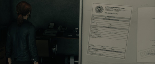
I had to kind of get my camera right behind Jesse and walk her forward at just the right angle, but I finally got a good look at one of the papers hung on the whiteboard in one of the shadowy offices. [...?] INCIDENT REPORT FORM, it appears to say, and below that: PLEASE PRINT CLEARLY.

This poster I came across in one of the hallways, and, though it’s comparatively simple, it immediately reminded me of the works of M.C. Escher, a graphic artist who created works that aimed for a disorienting optical effect. I spent a bit of time angling my camera to try and get a good view of the bottom text, which is, bizarrely, written in yellow on a white background.
“Can’t find your office? Watch your step”, the poster reads, but the last three words are arranged on the poster’s black-and-white illusory background, featuring blocks that appear to rise and fall despite being as 2D as they come. “Rangers from security department” is the yellow lettering at the bottom, next to the Bureau’s seal. I have absolutely no idea what that means.

This one I really couldn’t make out very well at all: it appears to be the silhouette of a person, and they look to be holding some sort of device, maybe a weapon, something long and thin. “Let’s work hard!” it says, adding: “His life is in your hands. Everyone’s safety depends on you!”
Quite a lot of responsibility for Jesse here, considering that she just came in out of the rain. It was this poster, more than the others, that gave me a feeling of true unease. So the safety of their employees can’t actually be guaranteed by the Bureau itself, huh? Something to keep in mind.
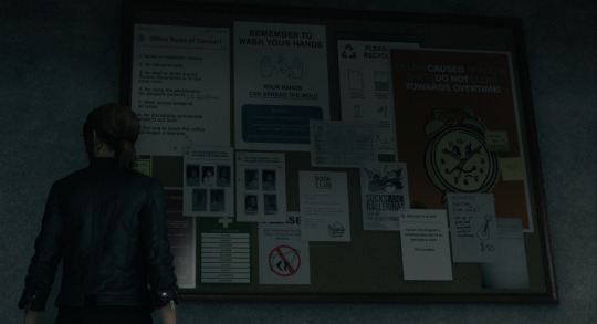
This, finally, is the notice board I came across earlier, before Jesse and I met Ahti. It’s a big, cork board with a variety of overlapping posters and papers, but I got Jesse up close to it to see how much I could make out. Makes me wish I had a pip-boy, but, well, you -- and Jesse -- can’t have everything.
OFFICE RULES OF CONDUCT reads the leftmost one, and this one’s mostly legible. Unfortunately I can’t quite make out the handwritten addition to item #4 (”or the 3d-printer”? “or the ... stationary”?), but the type is as follows:
Speak in moderate volume
No personal calls
No food or drink around Bureau documents or in the copy room
No using the photocopier for personal projects
Wear access badge at all times
No discussing confidential projects out loud
The one to finish the coffee pot makes a new one
The poster immediately to the right of this list is also fairly legible: it has a picture of two illustrated hands, some bubbles, and, in large, block letters, REMEMBER TO WASH YOUR HANDS: YOUR HANDS CAN SPREAD THE MOLD. The last part of it is underscored, and below it reads:
Be sure to:
Wash hands carefully with soap
Make sure to wash all fingers, nails, palms, backs, wrists
Rinse thoroughly and dry carefully
To the far right is an orange poster with an illustrated clock with four hands, smiling out at Jesse from its illustrated face. Above it reads, in bold type: DELAYS CAUSED BY HOUSE SHIFTS DO NOT COUNT TOWARDS OVERTIME. Two sticky notes have been stuck to the poster. The first appears to read “Spinning out of control??” with the last word underscored. The second just reads YES in large, capitalized letters.
The rest appear to be far more mundane. Two papers hung side-by-side both read: “Let’s say hi & welcome to some new people in the oldest house!” Nine people are pictured, though I can’t read their names.
A paper below that has a drawing of a dog with a great big red, crossed-out circle superimposed over it: PLEASE, it appears to read, below overlapping corners of other posters, “don’t bring dogs into the office. Some of us have allergies.” A PLEASE RECYCLE poster has been almost totally obscured by the rest.
BOOK CLUB is yet another poster, featuring a stack of illustrated books. SOCKS AND BALLERINAS: LIVE AT THE OLDEST HOUSE is one next to it. A third, hung at the corner of the second, is relatively plain: it simple reads “Reminder to all staff: Food left in the refrigerator in Containment break room 3-B has been known to vanish. Plan accordingly.” It sounds rather like a threat.
I am, however, immediately distracted by the final paper I can make out. ACOUSTIC GUITAR FOR SALE! it reads, in blocky, handwritten letters. “Turns out it’s pretty hard. If interested, see Greg in Maintenance.” It’s possible that the name is actually “Grey”, but Jesse and I don’t have time to ponder, because that guitar is $50.
$50! For a guitar!
Forget everything else, Jesse, we gotta book it to Maintenance to pick up that guitar.
2 notes
·
View notes
Text
Web Design: 7 Trends Dominating The Industry Currently
In the ever-evolving digital sphere, where every click counts and first impressions are paramount, the significance of web design cannot be overstated. It’s the virtual doorway to your brand’s identity, beckoning visitors to explore, engage, and ultimately convert. For that, staying abreast of the latest trends isn’t just advantageous – it’s essential. That’s why we’re delving deep into the pulsating heart of web design, uncovering the 11 trends currently shaping the Web Design Melbourne industry.

1. Experimental Navigation
When we talk about experimental navigation, we’re discussing new ways of guiding people around websites that break from the usual style, like having all the menu options in capital letters at the top of the page in an easy font. Instead, experimental navigation tries out different styles to catch people’s attention and help them move around the website in a special way.
For instance, you can grab your audience’s attention with an all-black intro or with a cool circular menu to help them explore more. It will give them an experience like no other in your industry, making you distinct.
2. Drag Interactions
In the past, websites used to dictate how users could navigate them. But those days are long gone!
Nowadays, drag interactions are changing the game. They’re like virtual versions of picking up and moving things around with your hands. This cool feature is becoming more and more popular, especially for online stores and portfolios.
Instead of just clicking buttons on the homepage slider, you can grab and slide the images around to explore the projects. And get this—the speed at which you drag affects how the page moves, giving you even more control over your browsing experience. Isn’t that excellent for your user?
3. Text-Only Designs
In the year 2024, many web design experts in Melbourne are leaning towards minimalist design. They’re trying out new ideas, like ditching fancy images and big navigation menus and, instead, using just a few clear lines of text to tell visitors about their company.
This modern style is all about keeping things clean and straightforward. But here’s the twist—you can use multimedia on a deeper level, say, using cinemagraphs and animations that appear when you hover your mouse on a page and even a cursor that moves around the screen. It’s a cool contrast!
What’s great about this minimalist approach is that visitors get exactly what they need without any extra fluff.
4. 3D Design
Website design is all about giving visitors an immersive experience. That’s why 3D artwork is becoming more and more popular. Adobe’s 3D Modeler is a tool that makes it easy for anyone to try out 3D design. Maya is another most well-known 3D modelling software in the industry, but it requires some expertise. If you’re looking for a free option, Blender is also a fantastic choice.
This style of design has a touch of Japanese Kawaii, which focuses on cute, childlike objects and soft colours. What’s great about this design is that it’s cute and playful, keeping visitors engaged as they explore all the fun elements on your page.
Feeling overwhelmed by the idea of adding 3D to your web design in Melbourne? Don’t worry! There are plenty of freelance 3D modellers available on platforms like Fiverr and UpWork.
5. Broken Grids
Although grids are often considered the best way to organise text and images, broken grids are becoming increasingly common on popular websites, providing a refreshing departure from the usual layout.
For instance, on your homepage, you can use images and text blocks overlapping, creating a visually appealing and effortlessly readable design. It injects a sense of dynamism into pages without relying on slow-loading animations.
What stands out about this trend is how this unconventional approach can elevate the visual interest of standard website pages or sections.
6. Kinetic Typography
Kinetic typography, also known as moving text, gained popularity back in the 1960s, particularly as feature films started incorporating animated opening titles. In website design, it serves a similar purpose by instantly capturing visitors’ attention when they arrive on the homepage.
Furthermore, you can utilise kinetic typography to emphasise crucial sections, assist visitors as they scroll, and gradually unveil information. Its visual appeal and engaging nature enhance the overall user experience. What appeals about kinetic typography is its ability to delight visitors, making it easier for them to grasp your content.
7. Sci-Fi Design
Lastly, science fiction (sci-fi) is experiencing a surge, with numerous new sci-fi movies hitting the screens, suggesting its continued growth this year. Why? Utilising this web design trend, many Melbourne brands have positioned themselves as forward-thinking, making themselves particularly appealing to tech companies.
To achieve this aesthetic, incorporating vibrant colours and metallic tones is key. Additionally, adding a touch of 80s retro style can further enhance the futuristic vibe.
0 notes
Text


TDC POSTER RESEARCH
First poster :
I really like the use of typographic conventions in this poster. The use of drop shadowing to create the 3D effect is really eye catching to viewers. Also adding to the 3D effect is how the artist has changed the baseline of each letting, creating different layers. The use of overlapping adds a lot of more contrast and really makes it pop. The patterns inside the lettering add a lot more detail, and make the poster more interesting to look at, without being too boring or too overwhelming.
Bold typography
Dropshadow
Overlapping
Changing baseline
Patterns (dots + lines)
Black & white monochrome colour scheme
Second poster:
I love how unique this poster is and how the artist has almost blended the wobbly effect of the typography in with the shapes/patterns. The placement of the shapes is in the same outline as the letters ‘NEU’ which is interesting. This is a good way to work with the positive and negative space of the poster. I think the polychromatic colour scheme in this poster is really strong and also works well together.
Fun typography
Minimal typography and a lot of other matter
Use of shapes + patterns
Positive and negative space
Polychromatic colour scheme
Third poster :
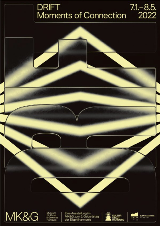
The use of typography and imagery in this poster blend really nicely together. I like how it clearly states what it's advertising and has the name, address and date all visible to read. The 3D effect of the shape in the background as well as the simple (black & yellow) colour scheme makes it eye catching to viewers. I like how the letters kerning has been adjusted to change the spacing between the letters in the word ‘DRIFT’. This creates an overlap of the letters, ensuring there's no gaps in between and so the word fits nicely on the page. The blurred effect in the block letters also adds some dimension to this simple, but interesting poster.
Typography and imagery/shapes
Simple colour scheme
Adjusted kerning
Overlapping
Blur effect
0 notes
Text

Poster Design 1:
Why I think this poster design is successful:
Good use of negative space - there is space where not everything is full of wooden tigers which allows them to stand out and not overwhelm the viewer with too many things to looks at
I like how the Chinese radical character extends onto the side of wooden square: makes good use of space on the wooden block instead of placing the whole Chinese character onto the larger face of the wooden block. The perspective at which we see the block is also well done; so we can see how they extended the to fit on the side faces on the box. It works as well in that the radical with the long tail is placed so that the long tail extends down the side of the block.
Use of black background contrasts with the wooden tigers and block.
The white tigers add visual interest so it's not all just the orange tigers.
Poster Design 2:
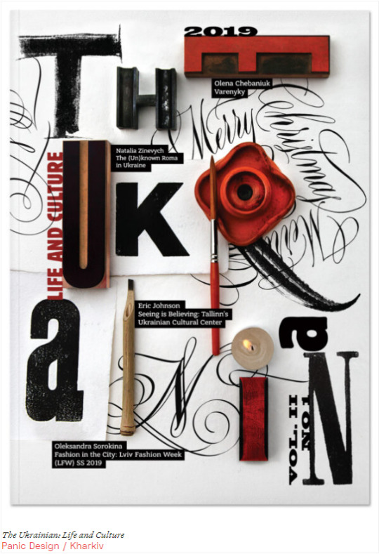
Why I think this poster design is successful:
The use of 3D elements in this poster (magazine cover) is effective in creating a unique and interesting way of reading the text. It adds more interest to the words than if all the typography was 2D.
The orientation and scale of each letter also creates a dynamic feel. Also, that even the letters and words that are printed are done in various styles yet they do not clash with each other. There is a good balance between the style of type, and also 2D and 3D elements
The placement of text directs your eye smoothly from the top left corner and zig-zagging down to the bottom right.
Poster Design 3:
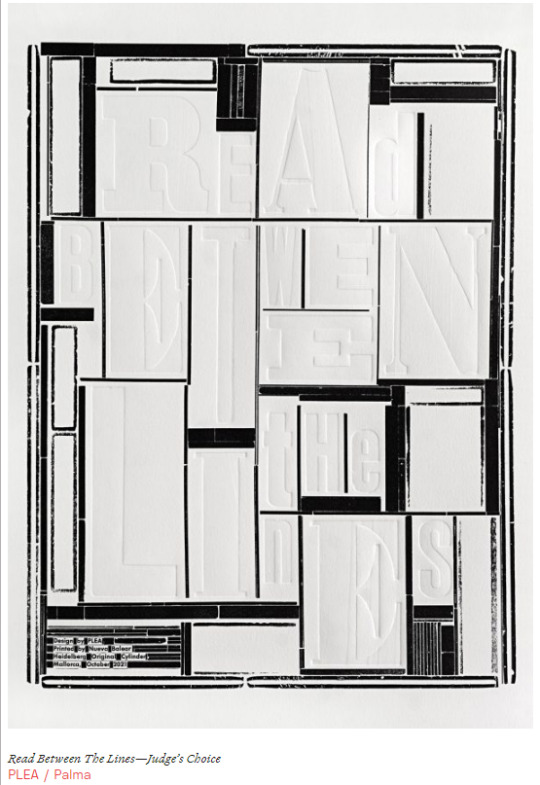
Why I think this poster design is successful:
I think this poster design is successful because the design itself acts as a play on words. The text has the appearance that the letters were pressed or indented into a piece of card, making the words hard to read at first. Only when you look closer can you discern what the words say: "Read Between the Lines." When you read between the lines you metaphorically look closer at the text to discern its meaning, and this poster gave a sort of visual representation of exactly what the poster is telling the viewer to do.
The choice of doing a black and white design is quite powerful here because colours may distract from the actual text and the visual metaphor its trying to convey, so choosing to use only black and white to not distract from the text, but also add visual interest is effective.
I also think it's cool how the blocks of black look like censorships in text, which would further emphasise the idea of reading between the lines and further scrutinising text or any media to discern its true meaning because somethings may be censored or hidden from view.
0 notes
Text

Chapter seven of the textbook talks about the Evolution of Typographic Technology by starting at hand compositing of movable type with a letterpress. This is actually really interesting because this coincides with a visiting artist we had who is displaying his work made with letterpress typography in the gallery. Using these old forms and knowing the history of typographic like referencing handwritten and moveable letterpress type and how that has been adapted to the digital sphere I think is really important and for me grounds what I am doing in a more real sense and has helped me understand typography better knowing the physical ways that things like leading are when they were physical blocks of metal that spaced out the type. The text then talks about other machines and developments in typesetting technology including the linotype, the monotype, and photo typesetting. I had never heard of photo typesetting, which is where film negatives of characters are exposed onto photographic paper very similar to the way film photographs are developed. I think this is a really interesting process and though not as effective today could be really interesting to play around with and use for aesthetic reasons in the future. The text then talks about how typesetting was transferred digitally and adapted to be used on different platforms like mobile phones, websites, and print products.
This week in class we dove into laying out and finalizing our poster designs and getting feedback before we start to use AR to manipulate them. I tweaked my designs quite a bit over the week as I had spent a lot of time figuring out how I wanted to do the type. I had the idea of taking spray foam from a hardware store and making my type from this. I however had a lot of trouble making the letters have this round and friendly shape them I wanted so I ended up having to create a texture from the letters that I had scanned in and use that as the surface in making them 3D. I was really disappointed my idea didn't work out the way I had originally planned as I wanted to be able to draw the letters with the foam but did not think about how the foam would expand and I couldn't control how much it would and the letters would become hard to read. Overall I wanted this nice texture and I worked around some of the problems to get it but if I had more time I would want to try and create the typeface physically entirely not half physical and half digital so that it had a loose human feel to it, but time, and the amount of spray foam I could find just didn't work. I taught myself how to create inflated 3D shapes which I had a lot of fun doing. I was nervous at first but now I feel comfortable making 3D types in Illustrator. My next challenge will be moving forward and adding the AR to the poster. I think I want to make the letters bounce as if they were balloons or deflate in some way but I don't know how to go about doing either of those so I'll have to see.
0 notes
Text
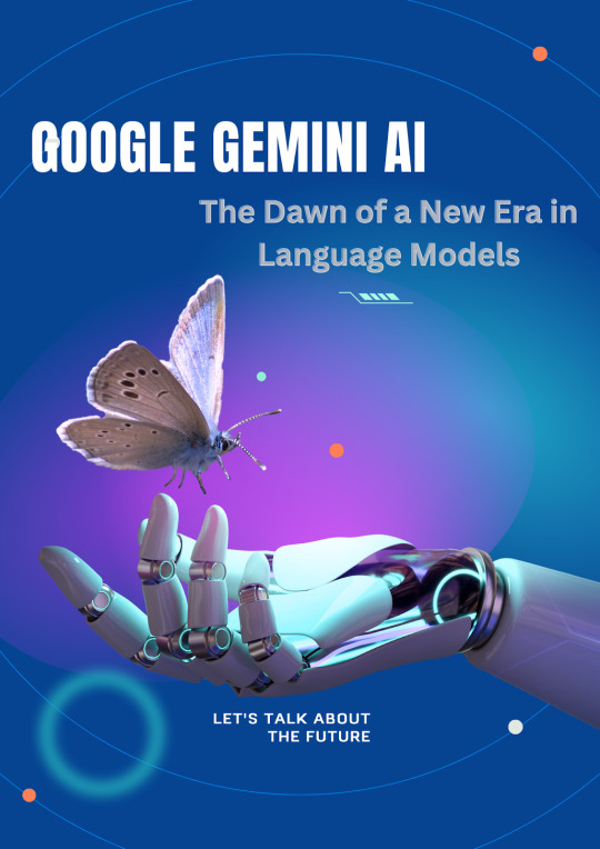
Google Gemini AI: The End of Chat GPT Dominance
As the technology landscape evolves, Google Gemini AI stands at the forefront of this change. Alphabet CEO Sundar Pichai first announced Gemini AI at the Google I/O keynote developer conference in May 2023, the large language model developed by the Google DeepMind division. Additionally, it has been trained on a vast corpus of text and code, which enables it to carry out intricate tasks that other models would find challenging or impossible.
A group of large-language models called Google Gemini AI is capable of processing text, photos, music, video, 3D models, graphs, signature blocks, document stamps, and other data simultaneously. They can even read and comprehend entire pages. Developers and businesses can access Gemini using the Vertex AI platform from Google Cloud and the Gemini API. We can't wait to see what businesses and developers will do using Gemini.
Aim Of Google Gemini AI project:
The DeepMind Google Gemini Ai project will use reinforcement learning techniques along with deep learning algorithms to handle challenging challenges. Most importantly, it will be widely considered for application in future developments by various domains of labor. It might support scientists in their numerous investigations by offering answers to issues with climate change, medical fields, aviation, food, agriculture, and other areas. For more information on Google Gemini AI's top characteristics, operation, and other facts, keep reading.
Best Uses Of Google Gemini Ai
authoring various forms of creative content, translating languages, and generating text.
Google Gemini Ai can produce and handle data in the form of maps and graphs.
It has a huge knowledge base because it was trained on a large text and code dataset.
developing fresh goods and services.
examining data and looking for trends.
providing useful responses to inquiries, no matter how difficult, unusual, or open-ended they may be.
Write imaginative and realistic text formats, such as emails, letters, scripts, poems, and code.
Translate with accuracy and fluency between languages.
Write a variety of creative works, such as emails, letters, scripts, poems, code, and music.
Even if your inquiries are odd, difficult, or open-ended, make sure you provide a useful response.
Since Google Gemini Ai is still in development, it is now able to carry out a wide range of activities, such as:
Google Gemini Ai has the ability to understand and produce text in multiple languages, such as English, French, German, Spanish, Chinese, Japanese, and Korean. Also, it has accurate and natural language translation skills.
Google Gemini Ai is capable of producing a variety of creative text formats, including emails, letters, scripts, poems, and code. It can also provide you with informative answers to your questions, whatever how difficult, unusual, or open-ended they may be.
Google Gemini Ai are multimodal thinkers, meaning they are able to understand and make sense of data from a variety of sources, including text, code, and pictures. Because of this, it can carry out complicated tasks that other models would find challenging or impossible.
Google Gemini Ai Features
The four sizes of Gecko, Otter, Bison, and Unicorn that Google Gemini Ai will come in are the same as those of PaLM 2.
1. Gecko
Gecko, which has 1.2 billion parameters, is the smallest iteration of PaLM 2. Because of its more efficient and lightweight architecture, it can be used in settings with limited resources, such as mobile devices.
2. Otter
With 137 billion parameters, Otter is a mid-sized PaLM 2/Gemini variant that is meant to be stronger than Gecko. It is appropriate for a variety of unimodal tasks because it provides a good balance between size and performance.
3. Bison
With five hundred billion parameters, Bison was designed to be a more wide and flexible variant of Gemini than Otter. It will have to compete with Chat GPT-4 for market share and is probably appropriate for a limited number of multimodal jobs. Natural language processing (NLP) is one of the high-level cognitive activities for which this model is best suited.
4. Unicorn
Unicorn, with 1.5 trillion characteristics, was created to be the largest and most adaptable Gemini size. It is planned to outperform Chat GPT or any of its rivals' capabilities and be suitable for a broad variety of multimodal jobs. Though it's still in development, it should be the most effective LLM ever made.
How does Google Gemini Ai work?
Google Gemini AI uses machine learning to confirm and finally self-approve title plant entries based on past and future recordings. DeepMind Google Gemini Ai, which draws on the same technology as facial recognition and self-driving cars, says:
Stamps on documents
Types of Documents
Parties, Legal Descriptions, and more.
Google Gemini Ai collects previously keyed data using data mining technologies, learning and confirming as it goes. When Gemini feels that it needs assistance, it forms lines for human support.
The creative architecture used by Google Gemini Ai combines a multimodal encoder and decoder. It is the encoder's responsibility to translate various data kinds into a language that the decoder understands. After that, the decoder takes control and uses the encoded inputs and the job to produce outputs in different modalities.
Ethics and safety
We are dedicated to creating ethical and secure AI models. Google Gemini Ai has been the subject of thorough safety reviews, which have included toxicity and bias analyses. Additionally, we have carried out original studies in areas that could be dangerous, such as autonomy, persuasion, and cyber offense.
We are stress-testing Google Gemini AI on a variety of problems together with a wide range of outside partners and specialists. This complete approach to safety, in our opinion, is necessary to guarantee that Gemini is put to good use.
Conclusion: The Future of AI with Google Gemini
There are more AI-based products, chatbots, and programs being released as we move forward in this modern technological era. All these AI models say they are greater than each other. In the same way, Deepmind Gemini, Google's future project, operates. Gemini is a window into the future of artificial intelligence, not just a new model. Gemini is set to change AI's potential and human-computer interaction with its multimodal skills and creative ability. It is unclear at this point whether it would be stronger than OpenAI's ChatGPT.
Google Gemini AI promises to go above the limitations of conventional models and establish new standards for AI capabilities thanks to its lofty goals and Google's experience. The AI community is looking forward to more updates.
0 notes
Text
Human A!U
It was a simple, relaxed life in the Gold district, where they resided in a Brownstone. Alphonse earned a living by managing a candy shop named Monroe Confectioners and running an online business selling custom jewelry. After returning from a slow day at the shop, he was promptly greeted by his kids, each presenting a multitude of problems for him to solve.
"Take it one at a time! Syliph, you go first."
Syliph, considered the smartest of the triplets with an overdeveloped creative drive, spoke up. "I finished designing a new jewelry piece. I just need help with the 3D printer to create a mock-up. I'm not sure if it's the motor or the nozzle."
"Alright, I heard you. We'll work on that after dinner. Now, Karnus."
Karnus, the most athletic of the triplets and resembling his father Stan, held a letter from the principal. "It's not my fault this time. That moron was going after Bennie again, so clearly, it's Bennie's fault."
"NO, IT WASN'T?!" shouted Bennie, the middle one. "Dave tried his hand at transphobia today. Karnus clocked him in the jaw."
"In my defense!" Karnus quickly interjected, moving Benni in front of him like a human shield. "I was protecting my poor, innocent, younger nonbinary sibling from a bully."
Bennie rolled his eyes. "He did, but also put David up to it."
"Did not!" Karnus replied.
"Okay, how exactly did you put him up to it, boy?" Alphonse spoke with a severe tone, pushing past the three to head to the kitchen.
"...I may have said he looks just like his mom, in the same way that they both have snouts like a pig and the same curly hair mole that also looks like a pig's tail...and then he went after my littlest sibling."
"WE ARE TRIPLETS, YOU DOLT." Benni shouted again
"And you were born last, and that's why you are the way you are," Karnus said, sticking out his tongue at Bennie.
"Oh my god, Karnus. It's one thing to be in fights, but it's another thing entirely when you set them up to happen. What's the damage?"
"Two weeks in-school suspension."
"Ahh, solitary for kids. Got it. As for punishment for home life, you know the deal – electronic privileges are revoked for the same time period as that I.S.S. Benni, go."
"I have no problems yet, but it's still light out, so I might find one for you later."
"Ahh, good. Well, you can start looking for problems by making dinner. Karnus, cleaning duty. Syliph, have you fed and walked Cammy yet?"
"I haven't walked her yet because these two were too busy bickering to walk her with me."
Al sighed, feeling a little overwhelmed and out of energy to walk with Syliph and his seeing-eye dog, Chamomile. When the doorbell rang, he answered to find his eldest son Cadmus shaking out his umbrella. "Oh, good, you're here! Take this and this," Alphonse said, pushing Syliph and Cammy to Cadmus outside. "Go around the block once, and you may enter."
"But wait, I—" Cadmus could only say before the door was shut in his face.
1 note
·
View note
Text
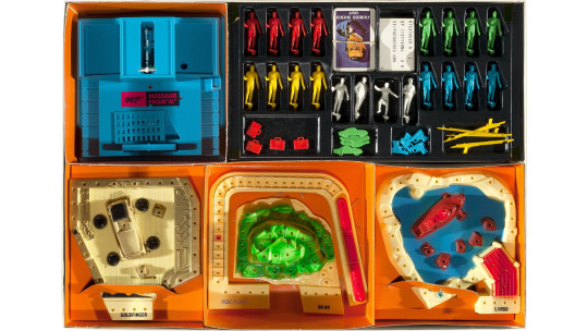
James Bond 007 Message from M Game
Original Release: 1966
Developer: Milton Bradley
Publisher: Milton Bradley
Platform: Board Game
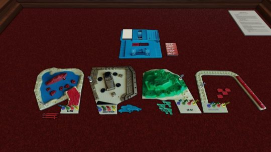
A lot of the charm of this game is in the physical component, it has a lot of neat 3D parts, a decoder and a fancy device which spins your movement number and has a soldier pop up if you’re unlucky. The Tabletop Simulator version is quite flat, with dice mimicking the effects of the main device.
In Message from M, you are trying to be the first agent to capture one of the four villains, who each have their separate sections: Largo, Goldfinger, Dr. No and Rosa Klebb. To do this, you have to consult the Letter from M Device.
You stat off with a hand of 5 cards, these depict one of the villains or Bond. You play one of these and you’ll be working on that villain’s section (if you play a Bond card, you can choose). You then consult the Message from M device, which will give you a movement number and a bonus (either equipment or a Message from M card). After this, you pull the trigger to see if the SMERSH soldier appears – if he pops up, you lose your turn.

If you get past the soldier, you first move the villain forwards or backwards – you want to get them to the last spot, but also want to block your opponents. You then move your piece forwards towards the villain, the aim to trap them in the last spot of their section. You can then push your luck to try again – although if the SMERSH soldier pops up now, you’ll be forced to move backwards. When moving the villain, if you can land exactly on an opponent, you can send them back to the start of the section – although equipment can be used to block this.
The Message from M cards look like nonsense, so you’ll need to use the plastic decoder to find the message – each card actually has two messages (although the rules don’t specify how you choose which one to use). These can help you move, make you miss turns, get you equipment and other random effects.
With the actual components, I can see this being a silly but fun game that will entertain kids.
0 notes
Text
Starting the modelling on my Booth
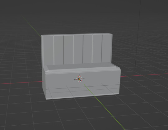
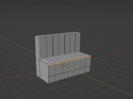


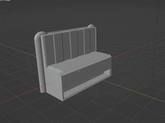

Today I began to model my diner booths for my final piece. What I thought would be a fairly straightforward process turned out to be an emotional rollercoaster. This particular day I had been struggling with creative ideas and being able to visualise what I wanted to create. It felt like a massive creative block throughout the course of the whole day which really put down my mood and as I tried to persevere through, it really challenged my mentality as well as my determination and patience with this project.
I knew coming into 3D digital modelling it would always be a challenge and there would be days worse than others but also days a lot better than most, but this day was particularly bad for me. I didn't like any of the designs I kept making, the vertices on the model kept messing up and overlapping and it just wouldn't work.
After a few hours I finally managed to produce an idea of a booth that I was somewhat happy with. I didn't want them looking too like how they usually look and wanted to add my own twist onto it, so I was suggested the idea by Kyrstie that I could add these curvatures on the side of the chairs, since they didn't look as curved as I wanted them to, so this could help visualise this effect, as well as add a more retro feel to the design.
I came across a future issue however which involved when I would add the materials onto the booth. Since I would need 2 separate colours because I still wanted to go with the red and creamy/white theme, it would be difficult to have both materials in the right place on the same object. So I decided to separate the parts where the creamy/white colour would be to the red colour. This was a rather simple process, I just highlighted all of where the creamy/white parts would be and clicked the tab key which bought me into edit mode. After doing this, I clicked the letter "P" on my keyboard which bought up a separation tab. I then clicked the separate materials option, and for extra sake I separated the objects too just in case the materials separation wouldn't work.
I next plan to add the tables and then materials to these to see if I'm happy with the design overall.
0 notes
Text
Trine 5 A Clockwork Conspiracy Review (PlayStation 5)
For this Trine 5 A Clockwork Conspiracy Review, The Trine series is back with its biggest adventure! In their fifth outing, the Heroes of Trine are pitted against dastardly and duplicitous villains, who will stop at nothing to seize control of the kingdom. The clock is ticking to save the world of Trine!
Trine 5 A Clockwork Conspiracy Review Pros:
- Gorgeous graphics.
- 15.05GB download size.
- Platinum trophy.
- You get the PlayStation 4 and the PlayStation 5 versions of the game.
- Puzzle platformer gameplay.
- Can rebind controls.
- Accessibility options include - subtitles, letterbox for subtitles, letterbox opacity, and speaker name.
- Can set levitate to hold or toggle.
- Collectibles - letters, tidbits, and fashion.
- Supports both online and offline Co-op.
- Two ways to play - unlimited (any combo of heroes including dupes) or classic (only 1 of each character).
- Four difficulties - Easy, normal, hard, and custom.
- Custom difficulty lets you tweak puzzle difficulty (normal/hard), resurrection cost (free to lose everything), and damage (enemy health/enemy damage).
- Customizable characters - name color, outfit color, clothing accessory, and hat.
- Fast loading times.
- Excellent narration that is once again performed by the same voice guy.
- The game is presented like a storybook.
- Cutscenes are a mix of in-game and rendered scenes.
- The bow settings - aim assist strength, firing method, and use of the unmodified right stick.
- Some of the best lighting in the business.
- A 2D side scroller with fully animated 3D backdrops amd animated foregrounds.
- A real visual treat.
- Brilliant soundtrack.
- Familiar controls.
- Solo play has just one character on screen at a time.
- When playing solo you can swap between characters with a button press.
- Headphone mode option.
- Can turn the audio to mono.
- Constant checkpoints.
- The movement is tight and fluid, the best it has felt in the series.
- Much more in-depth and clever traversal tricks at play.
- Physics at work and feel realistic whether it be a cube falling on a plank or cutting a piece of rope and momentum taking over.
- There will be parts where a scene is playing out and you are in the background moving around.
- Emote/quick chat wheel.
- Can customize any character in the pause menu.
- You can use your hooks to swing around but also pull crates and even tether objects together.
- Finally feels like they have nailed the bow feel and usage as it's really quick and accurate.
- Quick selection option to make tethering and selecting a target a lot easier, it's just a button press.
- You can skip cutscenes.
- Full voice work for each character.
- Despite all being 2D the game does an amazing job of making it look and feel like a 3D game.
- The whole game loop is that you have a band of characters each with unique abilities Amadeus is a wizard so he can levitate objects and conjure up blocks and planks. Pontius can use a shield to block projectiles and break crates, whereas Zoya has a bow and can jump high.
- Postcard quality vistas.
- Boss-like encounters.
- Pontius has abilities making him more versatile like being able to charge and slam the ground.
- Amadeus can conjure items with a button press. (In the older games you had to draw the shape)
- So many different ways to solve a puzzle.
- There are five acts to play though.
- You can replay levels and each one shows how many exp potions you have left to collect.
- So much fun to play.
- Hard to put down.
- The main menu has a space where you can practice with characters and just mess around.
- Grand checkpoints let you transfer all earned exp potions and turn them into skill points.
- Each character has their own skill tree, abilities are unlocked through progress but all can be upgraded.
- The combat initially is very hack-and-slash but later on, you can get abilities to add more spice and variety including making other characters able to hold their own.
Trine 5 A Clockwork Conspiracy Review Cons:
- In Single Player, I couldn't edit each character individually.
- No colorblind support.
- The font can be hard to make out and there is no setting to change it.
- Re uses a lot of puzzles from previous games.
- Starts the same as all the other games in that you are introduced to each character one by one.
- Tedious little sections that feel like filler.
- The camera is not always ideal, especially with out-of-sight Collectibles.
Related Post: The Texas Chain Saw Massacre Review (Steam)
Trine 5 A Clockwork Conspiracy:
Official website.
Developer: Frozenbyte
Publisher: THQ Nordic
Store Links -
PlayStation
Read the full article
0 notes
Text
Ringing protons give insight into early universe
A new study sheds light on the 3D structure of nucleon resonances
In the middle of the last century, physicists found that protons can resonate, much like a ringing bell. Advances over the last three decades have led to 3D pictures of the proton and significant insight into its structure in its ground state. But little is known about the 3D structure of the resonating proton.
Now, an experiment to explore the 3D structures of resonances of protons and neutrons at the U.S. Department of Energy’s Thomas Jefferson National Accelerator Facility has added one more puzzle piece to the vast picture of the chaotic, nascent universe that existed just after the Big Bang.
Studying the fundamental properties and behaviors of nucleons offers critical insights into the basic building blocks of matter. Nucleons are the protons and neutrons that make up the nuclei of atoms. Each nucleon consists of three quarks tightly bound together by gluons by the strong interaction — the strongest force in nature.
The most stable, lowest-energy state of a nucleon is called its ground state. But when a nucleon is forcibly excited into a higher-energy state, its quarks rotate and vibrate against each other, exhibiting what’s known as a nucleon resonance.
A group of physicists from Justus Liebig Universitat (JLU) Giessen in Germany and the University of Connecticut led the CLAS Collaboration effort to conduct an experiment exploring these nucleon resonances. The experiment was carried out at Jefferson Lab’s world-class Continuous Electron Beam Accelerator Facility (CEBAF). CEBAF is a DOE Office of Science user facility that supports the research of more than 1,800 nuclear physicists worldwide. Results of the research were published in the prestigious peer-reviewed journal Physical Review Letters.
Analysis leader Stefan Diehl said the team’s work sheds light on the basic properties of nucleon resonances. Diehl, is a postdoctoral researcher and project leader at the 2nd Physics Institute at JLU Giessen and a research professor at the University of Connecticut. He said the work is also inspiring fresh investigations of the 3D structure of the resonating proton and the excitation process.
“This is the first time we have some measurement, some observation, which is sensitive to the 3D characteristics of such an excited state,” said Diehl. “In principle, this is just the beginning, and this measurement is opening a new field of research.”
The mystery of how matter formed
The experiment was conducted in Experimental Hall B in 2018-2019 using Jefferson Lab’s CLAS12 detector. A high-energy electron beam was sent into a chamber of cooled hydrogen gas. The electrons impacted the target’s protons to excite the quarks within and produce nucleon resonance in combination with a quark-antiquark state — a so-called meson.
The excitations are fleeting, but they leave behind evidence of their existence in the form of new particles that are made from the excited particles’ energy as it fritters away. These new particles live long enough for the detector to pick them up, so the team could reconstruct the resonance.
Diehl and others will discuss their results as part of a joint workshop on “Exploring resonance structure with transition GPDs” August 21-25 in Trento, Italy. The research has already inspired two theory groups to publish papers on the work.
The team also plans more experiments at Jefferson Lab using different targets and polarizations. By scattering electrons from polarized protons, they can access different characteristics of the scattering process. In addition, the study of similar processes, such as the production of a resonance in combination with an energetic photon, can provide further important information.
Through such experiments, Diehl said, physicists can tease out the properties of the early cosmos after the Big Bang.
“In the beginning, the early cosmos only had some plasma consisting of quarks and gluons, which were all spinning around because the energy was so high,” said Diehl. “Then, at some point, matter started to form, and the first things that formed were the excited nucleon states. When the universe expanded further, it cooled down and the ground state nucleons manifested.
“With these studies, we can learn about the characteristics of these resonances. And this will tell us things about how matter was formed in the universe and why the universe exists in its present form.”
Born in Lich, Germany, Diehl pursued physics as a means to understand the phenomena of nature and the nature of the world. He earned bachelor’s, master’s and doctoral degrees at JLU Giessen. He is a member of the CLAS, PANDA, ePIC and COMPASS collaborations and has co-authored more than 70 peer-reviewed publications.
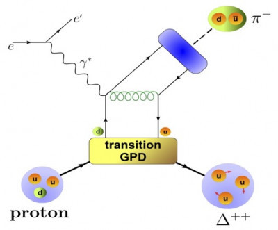
IMAGE....This Feynman diagram shows the physics of how an electron scattering from a proton can be used to theoretically access the 3D picture of the transition between the proton and the Δ++ resonance. Image courtesy of Stefan Diehl
1 note
·
View note
Last Seen Blogs

sunshine04
Once upon a time

hungry-max
For the Love of Light
karengillanslefteyebrow
Welcome To My Personal Hellscape

thatagoatart
ThataGoat Art

quinni1999
Into Ass, Diapers, Chubs & Muscles