#everything is that pastel cursive trend
Text
things i’d like to see more in studyblr
vibrant color schemes
widespread use of affordable stationery
calligraphy apart from cursive brush font/skinny brush print— like dotted, bubble letters, blocked + striped, etc
inspiration boards
shared google docs where everyone pours forth their knowledge on one subject, correcting tidbits from grammar errors to misunderstood facts and, in turn, creating a free study resource for anyone to use
washi tape decorating notes (e.g. taping printed infographics)
#studyblrgetsreal posts
feel free to add more
#cielleneposts#thoughts#btstudynet#idk it's just that#everything is that pastel cursive trend#everyone's trying to be perfect#studyblr#studyspo#studyspiration#stationery#muji#all these tags#people posting perfect handwriting#posting pastel faded pics of bullet journals#posting pictures of their extensive stationery collection#it just seems so perfect and packaged#and polished#and it gets annoying after a while#it's the same old types of posts gaining traction#again and again#with a few outliers#but outliers are outliers#which doesnt change a thing#new studyblrs are gonna want to emulate these things#and yeah! they have follower counts in the thousands on their second week#so what?#ugh it's just a pervasive standard#you have to have a bullet journal you have to have mildliners you have to have this THAT ETC#sure y'all make posts on how not subscribing to these standards is ok#and that's fine
617 notes
·
View notes
Text
What you must know about Bullet Journal (BuJo) 📔
Fun and creative journals are still becoming a trend. Yes, digital journals are more accessible but having a physical journal is still timeless. Besides, even those decorations are getting categorized if they are trendy. I will tell you some recommendations, tips, and other information about how I do my bullet journal. Let's break it down into 4 parts!
I. Introductory Notes
So, what exactly is Bullet Journal?
"BuJo" (Bullet Journal) is the more popular term. Generally, it's a diary but more visualized and organized. It also comes from a type of page that is called "bullet or dotted. Here, we're not using blank or lined pages here. The diary we knew is like a plain and long entry into our daily lives. But BuJo is more on a creative side. This type of journal is more flexible because we can do whatever we want. You can also do some decorations base on your personality. And this doesn't require artistic skills because it's personal use.
As I already mention about "personal use". This is not something you buy that has a template. You will have to purchase a dotted paged notebook. Others are using grid pages but it's fine besides your personal preferences are what matters here. In my opinion, I prefer BuJos to Planners. You don't need to wait until this or that month to start. BuJos doesn't have dates, templates, or whatsoever which you can start at the beginning, end of the year, or any in-between. Oh! and this can be your helping hand for your self-care routine logs!
II. Identify your theme and aesthetics
Of course, we must decorate based on what "aesthetics" suits the best to ourselves. Here, this step can tell you what kind of person you are. Since I can't tell what exactly your likes are, my tip is to find inspirations on Pinterest.
1. 'Soft' / Pastel theme
The keywords are 'Pastel', 'cute stickers' and 'Korean inspired aesthetics'. This theme is my current favorite. It will be easy for you if you have plenty of stickers. And using pastel highlighters is the key! You can use the Stabilo brand because it's affordable and nice quality but if you are into pricey but serves the best, go for Mildliner.

2. Vintage theme
This theme is more on a brown palette and cursive or 'calligraphy' is common for titles or headers. This was my previous theme before I get into pastels. Achieving this is not hard, all you need is kraft papers, old pages from books or newspapers, metallic pens, and vintage stickers that you can purchase on online shop.
3. Minimalist
In case you want to use your simple drawings skills instead of stickers this them is for you! Grab your highlighter and pens. For color schemes, go with neutral, brown, or gray to achieve a minimal theme.
4. Mono (one color theme)
This is suitable if you want to have a clean look on your pages or just have one color in your mind. At least, you won't struggle to mix and match the colors. Have a 1 color set of papers, pens, and stickers, and you're settled.

III. Variants in BuJo
Here are the things that you can do with bujo.
1. Weekly (or daily or monthly) summary
A very helpful foundation to keep track of everything you want to accomplish within a time. You can include or make a calendar, series of to-dos, activity goals, or whatever serves your purpose. This can be your reference to things that change your life. If you have this you will keep motivated on what you achieve.
2. Dedication page
Another way of showing that 'fanatic' side of yours! For example, this is what others called 'K-pop spread' or 'page'. You can create your own and use your idol's favorite photos and decorate them. Any artist is okay as long as you're really a fan.

3. Visual Diary
Basically, you can talk about your day using stickers/pictures for more visuals. It will give you the mood you want to portray. I always use this variant because I'm the type of person that narrates my daily life but in a 'cute way'

IV. Start and Create!
Now that I gave you a glimpse of this type of arts and crafts, it's not too late for you to start! I can assure you that this is fun. This type of activity helps us when times are tough for us. And we need something that will acknowledge us to take care of our health and make time for ourselves. Making BuJo is not strictly requiring you to be consistent or do it 24/7. The point of this is, whenever you need an outlet for things BuJo will be your friend.
5 notes
·
View notes
Photo

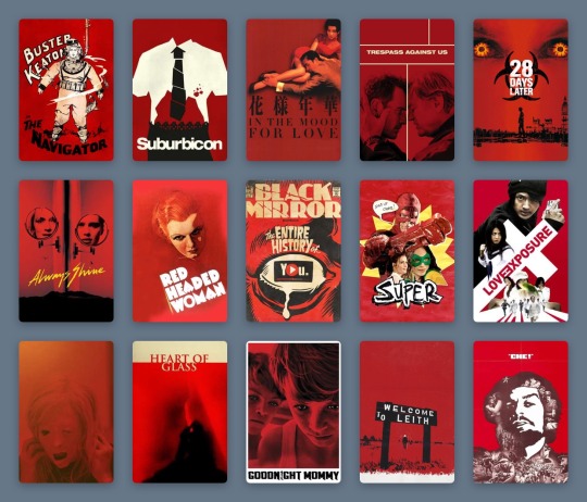
Touching the Void.
Searching for cinema that soothes? Ella Kemp suggests it could be as simple as looking for a film poster with a white background.
How many weeks has it been? When did any of us last go blindly into a cinema and take a chance on something new? Film-watching in the time of Covid-19 has changed. The immediate and never-ending news of the world is frightening. Is it still, and more than ever, okay for me to sink into movies to alleviate my mood, just for a bit? How is that even possible when the world has come to a standstill?
We are forced to adapt, and it has taken some time for my attention span and emotional capacity to adjust. But I think I might have found a solution, and I have the meticulous list-makers of Letterboxd to thank. It was Izzy’s list of comfort movies that first lit the fuse. Specifically, the second, third and fourth row; films including Billy Elliot, Clueless, School of Rock.
Fifteen stark posters, speaking one truth: We are vulnerable and nervous. What we need is a film poster with a white background to assure us the movie exists entirely to serve and soothe us.

Part of Izzy’s ‘comfort movies’ list.
List-making on Letterboxd has never been more prolific. Pandemic movies, overdue filmography catch-ups, comfort movies galore. Everyone categorizes and logs their watches differently, but Izzy’s pattern speaks to me with an epiphanic answer. I’ve always admired successful color-coding, but now I see its crucial function.
As I scroll for distraction, for something guaranteed to be good (because I cannot and will not be subject to any uncertainty I can avoid), I see the rainbow. The pale blues of Studio Ghibli, Wong Kar-wai’s passionate reds, the pastels of Netflix Original breezy romances. Like some kind of cinematic ikebana, countless Letterboxd members have mastered the art of arranging film posters. There are standouts: the staggering oeuvre that is Gordon’s chromatic roundup of favorite posters; the comprehensive color-graded history of women directors via their best posters, courtesy of Vanessa; and the penchant for beige in the year 2015, as spotted by Letterboxd co-founder Matthew Buchanan.
A selection of Gordon’s favorite movie posters.
But when I see these 300 examples, color-coded by typography and accents by Sera Ash, I recognize that white movie posters are the ones most likely, in this very strange time, to take care of me. I see it in three distinct filmmaking periods: Disney animations from the 1940s and 50s, the video marketing for cult comedies of the 1980s and 90s, and the alternative marketing materials of my favorite films of the 2010s. Each poster is straightforward and inoffensive. It captures the story, but never dares to impress or intimidate beyond basic description.
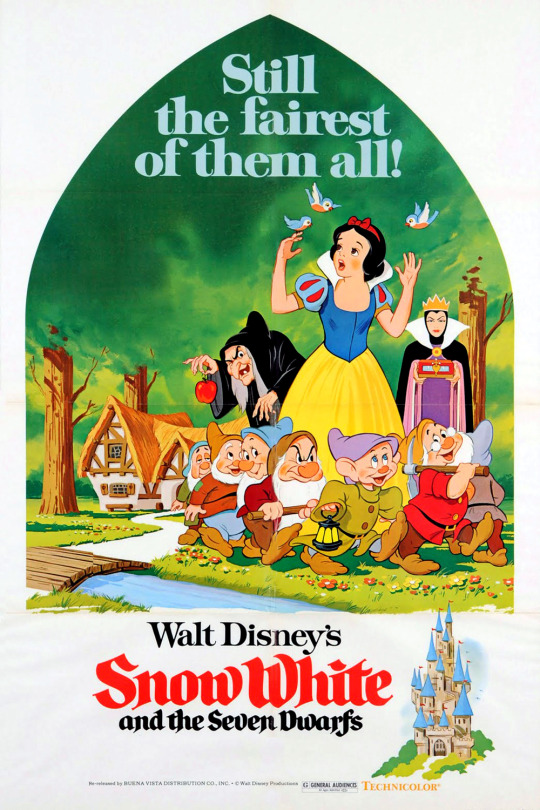
A 1975 re-release poster for ‘Snow White and the Seven Dwarfs’ (1937).
In 1937, Snow White and the Seven Dwarfs announced the birth of Walt Disney’s feature-length empire. While its original theatrical poster is also mostly white, it is represented on Letterboxd by a 1975 re-release poster depicting a peek through the keyhole: a curved triangle framing Snow White, the dwarves, and the two sides of the jealous queen, against a vivid green forest. In the bottom corner, a castle. To the left, the title—her name in red cursive, theirs in black. These simple images come together to present an elementary summary of the ingredients within. The white frame showcases the seminal animation craft without suggesting the viewer diverts their eye anywhere else.
This technique was common across other animated titles, collected in lists like dantebk’s Disney animated classics. Pinocchio toys with the hyperreal relationships between characters alive and wooden, human and animal—but does so on a plain canvas, so that the magic remains within reach. Dumbo, Bambi, Cinderella, Peter Pan—each follows suit. Whether with the mustard yellow of a circus tent, the faint sketches of grass tufts, the gold dust of an enchanted fairy godmother or the ink blue of a midnight starry sky, these colors (indicative of each defining scene-setter or mood-maker) only pepper a blank background, and so make their significance ever greater with the most sporadic touches.

A selection from dantebk’s list of Disney animated classics.
Live-action knockouts from these decades—films like The Shop Around The Corner and The Red Shoes—embrace painted recreations of their protagonists (Margaret Sullivan and James Stewart as festive lovers in the former, Moira Shearer as a tortured ballerina in the latter) and use the color red as a signifier of romance, against a plain white page, to set the mood. Slashes and splashes of red have been used to create a vibe in genre cinema for many decades—a trend deftly chronicled in this list by Rocks.
As far as we know, the underpinnings of digital photography began in the 1950s, and the first published color digital photograph dates back to 1972, when Michael Francis Tompsett shot a photo of his wife Margaret for the cover of Electronics magazine. Consumers got their hands on the gear in the late 1990s, but movie studios really started to make the most of sharp digital photography and stark white backgrounds for their striking posters from the late 1980s onwards. Because, never mind the multiplex, the video store is where you wanted your comfort fare to stand out in the 1980s and 90s.
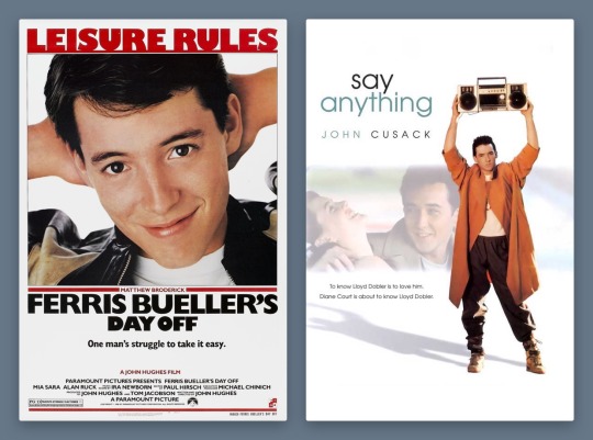
Ferris Bueller’s Day Off (1986) and Say Anything… (1989) form a handsome, trend-setting 1980s pair. While the theatrical poster for Cameron Crowe’s Say Anything… deigned to include John Cusack’s co-star, Ione Skye, by the time of the film’s video release, the focus is clearly on pre-High Fidelity Cusack, as proud underachiever Lloyd Dobler, smouldering lopsidedly under the weight of a boombox. It’s the singular image of the film to this day.
Meanwhile, Matthew Broderick as Ferris-slacking-Bueller is making the most of his title activity, arms behind his head, a proud smirk on his face. Nothing else matters except that these charismatic young stars are stepping up to leading-man status. The white background accentuates the star power of these new boys in town, embracing the limelight in one fell swoop.
Star power is everything: beautiful people doing simple things against empty backdrops, because what could be more important than the regularity of symmetrical bone structure, of familiar charm? The trend boomed in the 1990s and 2000s, in films widely embraced by casual moviegoers. The sort who list “watching Netflix” as a Sunday activity on dating profiles and use the Christmas holidays to rewatch comedies they have memorized over dozens of half-attentive viewings (absolutely zero judgement here!).
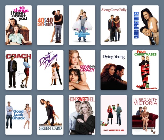
The vast majority of these films have white posters. Who is your soothing cup of charm: Tom Hanks on a bench, nothing more nothing less, from 1994’s Forrest Gump? Or Heath Ledger, effortlessly cool, leaning on the brown corduroy armchair Julia Stiles sits in for the 10 Things I Hate About You poster from 1999? (The 90s harnessed the increased appeal of having two lookers just sitting and posing against a plain background, as demonstrated in this chilling list by Ashley.)
Ashley’s list of couples posing in front of a white background.
Will Ferrell had been earning his stripes as an actor for years, but he changed the movie comedy game as Buddy the Elf in 2003. There’s plenty of visual humour in Elf, but Ferrell’s coat-stand posture bedecked in festive green velvet and those tights is… enough. A white background lets the ridicule slide, just.
How many Disney series really deserve a whole movie—and one that stands the test of time? Lizzie McGuire, resting on her tiptoes with a swinging suitcase in hand, sells The Lizzie McGuire Movie like no idyllic views of Rome ever could. It’s reaching out to an audience loyal to the character, one who will follow her to the ends of the Earth, or at least to another continent. Hilary Duff could be doing almost anything on this poster and it would achieve the same effect—so long as the white background remains plain enough to keep eagle-eyed fans on the main event at all times.
It’s surprising that the star-making system only let Meryl Streep appear in a tiny box, one of four character tiles, on the poster for The Devil Wears Prada in 2006. But the design here taps into 1940s animated sensibilities, giving prominence to a devilish red Macguffin larger than the humans. It still achieves the same function—a glossy, glamorous design with the accessible sell of a quotable, star-fuelled comedy.
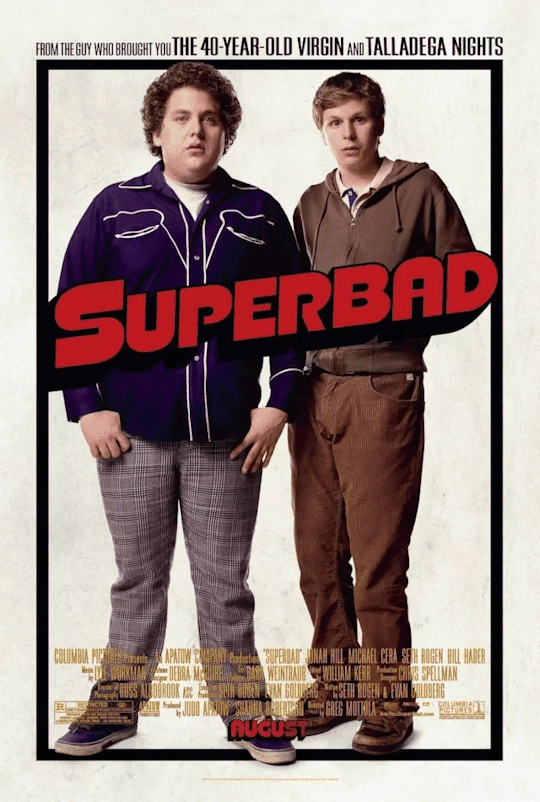
Red may be the color of romance and the devil; it’s also the color of comedy. Exhibit A: the 2007 gross-out comedy Superbad, whose star power—marking the emergence of Jonah Hill and Michael Cera—is used to an opposite and impressive effect on its poster. The awkwardness of these teen boys—lanky, unkempt, insecure—is what cinches the comedy. The simplicity of the poster design, with their uncomfortable posture against, well, nothing at all, further anchors their incapability of facing the world in any confident way, shape or form.
There are countless more examples, like Marley & Me, Bridesmaids, 27 Dresses (notice how the red type is replaced by pink when the film’s plot veers toward the altar). But to understand the curious and timeless appeal of the white movie poster, what happened to it in the 2010s cements its adaptable strength.
As the art of graphic design has continued to bloom, the aesthetic argument for the colorless color-block movie poster has shifted to embrace a film’s context. Consider Danny Boyle’s Steve Jobs, the enjoyable 2015 drama that provided Michael Fassbender one of the most under-celebrated roles of his career, playing the late Apple co-founder. The poster turns the canvas into a blank screen: the title is typed, the text insertion point poised, waiting for the next key press. As Jobs, Fassbender occupies the bottom right corner, in profile, thinking.
This starkness makes sense: what’s next, Steve? It offers a rare example of a poster from the past decade that fully leans into the monochrome aesthetic entirely on purpose—to serve the restrained and unequivocal need for white. (And it’s interesting to compare with the marketing narrative for an earlier film about another tech leader: observe how Jesse Eisenberg’s Mark Zuckerberg eyeballs us from The Social Network’s dark-mode poster.)

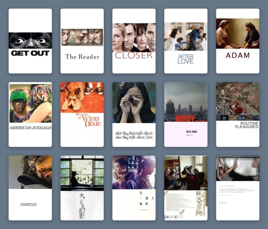
Comfort movies don’t own the white poster, of course. Jordan Peele’s Get Out toys, both in its marketing and its delivery, with the binaries of black and white. It’s deployed on-screen with sophisticated horror, and this extends to its two most graphic poster variants.
While one poster sees Daniel Kaluuya’s character, Chris, sat on a chair split vertically between black and white, the all-white poster allows only a center-frame letterbox to reveal Chris’s enormous eyes, accompanied by an all-caps type treatment. The vast expanse of white only makes the image more menacing, framing the claustrophobia so effectively. The landscape crop is a device that defines stern dramas as much as arthouse comedies, as documented by Haji Abdul Karim in their expansive list.
Haji Abdul Karim’s list of white-with-landscape-image posters.
But back in the ‘comfort’ realm, we’re seeing more and more that the marketing wants to have it both ways—the negative with the positive; the art house audience and the multiplex crowd. As genres blend, demographics collapse and audiences become more fluid, a film’s advertising needs to speak more languages.
Two ultra-comfort films from last year demonstrate this idea well. The poster for Judy sees a backlit Renée Zellweger finding her light, receiving her applause. Black is the key color, right down to the classic little black dress; the eye is drawn to the title, spelled out in red sequins. It’s showbiz, it’s drama. Though the film itself fudges a few of the more uncomfortable facts of the star’s story, it’s still honest about her addictions.
In the white-background version, which was more widely distributed, Zellweger, in a floral dress, turns away from the light. The name still sparkles, but in softened gold. There’s no less glamor, the stakes in the film are just as high, but she’s perhaps more accessible like this. The focus, as it was in the 90s, 80s, 40s, returns to the main event.
Greta Gerwig’s Little Women, too, played with dark and light. The indie queen released her previous film, Lady Bird, via design-conscious distributor A24, and Gerwig’s singular aesthetics promised that her Little Women remake would be worlds away from all the others. But when the first images for the film were released, the marketing campaign was questioned by die-hard Gerwig fans.

Both of the group posters are curiously stripped back, freezing Louisa May Alcott’s beloved March sisters in a moment. In the darker image, they gaze out a window, secure in their festive domestic bubble, but set on what’s beyond. There’s more to life, and the film, than this room. It feels more lush, painterly, certainly more dramatic.
Whereas the white poster, at first, seemed like a mistake. It took one of the first images teased from the film and just... dropped it onto a poster. The March sisters look as if solidified by clay, entirely undynamic and at odds with the fluidity and warm soul Gerwig had made herself known for in her filmmaking.
And yet, nothing matters more than these characters. Beth, Jo, Meg and Amy are holding each other, happy, each in their own favourite color, and there is nothing more to fight over. The white-poster alternative lets the 2010s viewer stay attached to the most important part of the film.
The lessons here? A white poster is a vital sign that you’re safe here. You’ve made the correct choice. Attention spans are dwindling, options are expanding, focus is difficult. The promise of a white frame tells me what matters, what is good, where I should place my time and my value. For now.
#movie poster art#poster design#film poster#film poster design#movie marketing#movie design#white posters#comfort movies#comfort films#letterboxd lists#Letterboxd#little women#judy#ferris bueller#disney#graphic design
12 notes
·
View notes
Text
What Will Be the Big Graphic Design Trends in 2019?
We’re looking into our crystal ball and making predictions about the design trends that are going to be influential in the year ahead. From chiselled serif fonts to cobalt blue, these are the styles we think will be everywhere across graphic and print design in 2019.
Gradient Poster Template
So if you’re looking to give your design work a fresh update and stay ahead of the curve, read on to discover the trends that we predict will be making waves next year.
1. Chiselled Serif Typefaces
Next year, we’ll start to see more brands revisiting serif typography to bring an elegant and sophisticated edge to their print designs.
The serifs that look spot-on right now? Look for chiselled styles with softer ligatures, which give fonts a 1930s edge.
Use these for branding projects which require a sophisticated, intellectual edge. This brand identity for real estate firm Grupo GW makes a strong feature of serif type on business cards and corporate magazines, while this identity for art school Nido combines softly chiselled typography with calm, tonal colors and metallics.
Try out the fonts below to recreate the look:
Faraz Modern Serif Typeface
Moisses Serif Font Family
Design in 60 Seconds: Serif vs. Sans Serif Fonts
In this quick video, instructor Melody Nieves will go over the difference between serif and sans serif fonts.
Melody Nieves
20 Mar 2017
Fonts
2. Neon on Neon in Print Design
Designers’ fondness for all things 1980s isn’t disappearing any time soon, and this is going to be most keenly felt in the sorts of color palettes we’ll be seeing in 2019.
This isn’t a time to be shy and retiring—color combinations are becoming increasingly bold and mismatched. One of the most fun emerging trends is the application of neons in print design. Splashed across traditionally more conservative items like book covers, neon teamed with neon feels fresh and a little bit rebellious. Anchor it with black for a stylish interpretation of the color trend.
How to Create an ‘Everything Will Be Alright’ Neon Poster in Adobe InDesign
Everyone needs a bit of optimism in their lives, and this neon sign poster is the perfect pick-me-up. Pop it on the office noticeboard, set it as your phone...
Grace Fussell
03 Apr 2018
Neon
How to Create a Pastel Neon Club Flyer in Adobe InDesign
We’re celebrating all things celebratory this week! And what sort of celebration could be more fun than a night out clubbing? This flyer is an easy way of...
Grace Fussell
24 Jan 2018
Neon
For neon on neon inspiration, look to Beetroot Design’s brand identity for the Onassis Cultural Centre (OCC) in Athens.
Or take a neon font for a spin, like this Cursive Neon Type.
Cursive Neon Type
Cursive Neon Type
3. Nautical Stripes
Nautical-inspired stripes never really go out of style, but they’re starting to shed their classic image, with designers using stripes in ways that feel completely new and fresh. If a neon palette feels too flashy for your tastes, this Riviera-inspired trend makes for a more subdued but equally eye-catching alternative.
Bold and breezy—stripes in primary colors paired with crisp white make a beautiful backdrop for black typography. Look to the poster designs created by Familia for this year’s Sant Pau summer concerts and the gorgeously chic identity for Las Vegas’s The Aquatic Club for ultimate stripey inspiration.
Add a touch of seaside chic to your print designs with this striped business card template. Update the color palette to punchy red or blue for a nautical nod.
Striped Business Card Template
4. Symbols and Pictograms in Brand Design
Look to the work of famed graphic designer Paul Rand to inspire you for this trend. An ultra-simple way of representing ideas and brands, pictograms or symbols will replace busy logo designs in the year ahead.
Just as Paul Rand used simple symbols to represent the sounds of the ‘IBM’ letters to create his iconic logo design in the 1950s, contemporary designers will start to look to more intelligent and quirky ways of representing brands and ideas.
New Course: Mastering Logo Design in Adobe Illustrator
In our new course, Mastering Logo Design in Adobe Illustrator, you'll learn all the technical skills you need to start designing fantastic logos.
Andrew Blackman
14 Jul 2017
Adobe Illustrator
Take Our New Short Course on Logo Design
Our new course, Creating Professional Logos in an Instant, will show you a foolproof method for creating professional logos when time is limited.
Andrew Blackman
24 Jul 2017
Logo Design
Pictograms and quirky icons work especially well for logo designs. Look to Canape Agency’s brand identity for Co. Means Coffee for icon inspiration. The simple cow silhouette is used to stylish effect across business cards, cups and coasters, and makes the point that the cafe is animal-friendly.
The SMK University of Applied Social Sciences in Vilnius, Lithuania, takes the trend one step further, using a variety of pictogram symbols to create a fluid visual identity.
Downloadable vector icons are a quick way to tap into the trend. You can find hundreds of different sets of icons themed on different topics on Envato Elements.
Farm Animals Simple Icons Set
5. Cobalt Blue... on Everything
If there’s one color that will define the year ahead, it’s cobalt blue.
This arresting shade of blue has an intensity that looks fantastic paired with warm shades like coral orange and brick red. Perhaps because cobalt is so attention-grabbing, we’re seeing it currently used across events branding, like in this identity for Tallinn Music Week and these poster designs for Beijing Design Week.
Along with the trend for all things neon, cobalt blue is another pointer that maximalist design is here to stay. The message to take away? If you tend to turn to subdued tones in your work, try mixing it up with a brighter, bolder shade to give everything a lift.
Bangalore Portfolio Template
6. Abstract and Arty Illustrations and Backgrounds
Art meets graphic design with the growing trend for all things artistic, painterly, and abstract. This trend tends to edge on the whimsical rather than serious, bringing a fun and youthful feel to print designs.
How to Create an Abstract Pastel 3D Text Effect in Adobe Photoshop
Use Photoshop's shape and 3D tools and settings to create a trendy pastel abstract text effect.
Rose
01 Mar 2018
Text Effects
You can keep this style fresh and contemporary by pairing arty illustrations or abstract backgrounds with simple, striking color palettes and elegant typography. Look to Tomba Lobos’s packaging designs for chocolate brand Branco for whimsical painterly inspiration, or these sophisticated business card designs for food brand Gourmeta for a more sober take on the style.
Backgrounds are a quick and easy way to tap into the abstract trend. You can download packs of painterly backgrounds from Envato Elements—unleash your inner artist and splash liberally across your layouts.
Abstract Backgrounds
Abstract Paint Backgrounds
7. ‘Fake’ 3D Collages
We predict that 2019 will be the year that flat design finally retires. This trend has been dominant for some years now, but we’re starting to see much more experimentation with 3D effects, shadows, and highlighting.
Illustrators are interpreting the trend with collage-style designs which translate particularly well to print advertising. Blending the vintage-inspired appeal of flat design with immersive three-dimensional layouts, these collage creations are beautiful to look at and are a quirky way of explaining otherwise dull or abstract concepts.
How to Create a Colorful Collage in Adobe Photoshop & Lightroom
In this tutorial you'll learn how to use Adobe Photoshop to create a colorful, futuristic collage featuring a beautiful woman. You will also learn how to...
Kaylan Michael
19 Jan 2018
Photo Collage
How to Create a Punk Poster in Adobe Photoshop
In this tutorial we will combine different Photoshop tools to create a grunge-punk style poster.
Laura Keung
12 Jul 2018
Photo Collage
These illustrations for Italian pharmaceutical brand Farmacisti Preparatori are a lovely example of the ‘fake’ 3D trend, as are these editorial illustrations by Eiko Ojala, which take on a whole other level of interest and quirkiness in animated form.
8. Moody Gradients
Gradients have been one of the most influential trends in 2018, with neon and pastel styles being especially popular. If you love the gradient trend but are looking for a fresh update on the style, 2019’s take on graduated colors is moodier and altogether much cooler.
Inspired by the lingering end of sunsets and mixed with darker tones, this color trend gives an atmospheric feel to posters and flyers. It's perfect for advertising events taking place at night or for brands looking to give their identities a gritty edge.
These poster designs for Trieste Estate Summer Festival by Studio Mut use deep, rich colors to give simple gradients a fresh update, while these poster designs by Pop & Pac Studio use dark gradients in a horizontal linear style for a retro flavor.
Gradient Poster Template
Learn how to create five simple gradient effects in Adobe InDesign in this tutorial:
How to Create 5 Awesome Gradient Effects in Adobe InDesign
Gradient effects are super easy to achieve in InDesign, and they're an instant way of bringing your layouts bang up-to-date.
Grace Fussell
06 Jun 2018
Gradients
Conclusion: Looking Ahead to 2019
Next year is shaping up to be a really exciting year in graphic design. While we predict some current trends, such as gradients, will have lasting influence and continue to evolve and develop, other trends that have had long-term influence, like flat design, will soon be on their way out.
Watch this space to see if 2019 will be the year of cobalt blue, chiselled serifs, and collage illustration.
While you wait to see if our crystal ball predictions come true, why not make a headstart on the trends and source cutting-edge backgrounds, fonts and graphic templates from Envato Elements and GraphicRiver?
Faraz Modern Serif Typeface
from Envato Tuts+ Design & Illustration https://ift.tt/2R2q1OI via http://www.webmasterforum.ws/rankwyz-discount-code-2015-coupons/
0 notes
Text
Week 8
PRODUCT NAMES
Crowd pleasers.
Triple mix.
Anybody and Everybody.
PRODUCT CONCEPT
Due to Ernest Adams current packaging being underwhelming their product quite often gets lost within the sea of packaging in the biscuit aisle. We were given the task to design a sub-brand in order to make Ernest Adams the first thing you reach for on the shelf. First we looked at macro trends and decided that people are creatures of habit, therefore Ernest Adams should be traditional. In order to do this we have thought of ideas such as Neapolitan ice-cream and pick and mixes, which all evoke good childhood memories and are all about sharing one thing that everyone loves.
BRAND STORY
Our brand story is all about creating a biscuit box that not only holds biscuits but also brings people together. In order to do this we have created a share box which holds many different flavours for everyone to enjoy. We want people to be able to pick up a box and know that they are going to enjoy at least one flavour no matter which one they choose. We have chosen to make our packaging light and soft in order to co-inside with Ernest Adams’ pastel packaging they currently use. We would also like to keep the idea of everything being made in New Zealand as that is a major selling point when compared to Arnotts’ Farmbake.
REVERSE BRIEF
Background and Situation
Ernest Adams is a soft coloured, bagged biscuit brand that has a small pop of red colour along the front. Their slogan is “Brilliant New Zealand baking since 1929” which adds a sense of trust to the brand as it is and always has been a local New Zealand brand. This is also a strong concept due to their main competitor being Farmbake, an Australian corporation that similarly sells bulk bags of classic flavours. Being a New Zealand brand instills trust within the minds of the consumers. The soft colours paired with the cursive typography and cookie images creates an underwhelming and antique look when compared to competitors on the shelves. This currently leads to Ernest Adams being lost in the sea of packaging which vacates the biscuit aisle in supermarkets. Currently Ernest Adams’ look sits them in the biscuit aisle as a basic family brand without any key differences setting it aside from competitors. This gives us the perfect opportunity to rebrand Ernest Adams’ biscuits and instill an interesting point of difference within the brands promise.
SWOT analysis
Strengths
Ernest Adams is a New Zealand company which is displayed on the front of the packaging, this is a very strong point of difference as the main competitor is Farmbake which is Australian run.
The current packaging has a soft feeling which is brought on by the pastel colours and cursive typography. These design choices allow the consumers mind to link it with something their Grandma’s would bake them.
There is a constant defining factor amongst all Ernest Adams products, the bright red stripe that runs down the centre of the packaging. This allows the packaging to be recognised as a Ernest Adams product.
Weaknesses
Due to the softer design and almost outdated look of the packaging younger generations don't instantly reach for Ernest Adams as it is not as exciting and new as other brands. Where older generations look for trust and healthiness in a brand, younger people look for something that’s different and popular
Although there are many different flavours of biscuits that Ernest Adams produces it is not very well known as the point of difference between packets is not very different.
Opportunity
We see an opportunity in adding a more youthful and fun spin on Ernest Adams trusted name. In order to do this we have taken memories from our childhoods such as ‘pick n mixes’ and ‘neapolitan ice-cream’ which is all about having something for everyone and sharing that product as a group. In order to create the best spin-off for Ernest Adams we will need to play to their strengths, keeping the New Zealand branding and one constant feature throughout. Yet in order to expand on the brand and create something new we will need to create a big point of difference that sets Ernest Adams apart from other brands.
Threats
Because Ernest Adams is an older brand and even looks that way the packaging is only brought by that audience, yet when they go Ernest Adams may be forgotten. In order to remedy this we need to appeal to a wider audience with the new packaging.
Because the packaging is underwhelming and soft it is easy to loose in the aisle of the supermarket. We need to make the design a defining factor that sets it apart and makes it a more popular treat.
Point of difference
Ernest Adams is a New Zealand run company and always has been.
Objectives- What needs to happen
In order transform Ernest Adams from the underwhelming and soft brand to a fun and exciting brand that will appeal to everyone we need to have a defining feature that separates it from being just like any other brand. To do this we need to first look at the strengths and weaknesses of the existing brand, once this is done we will make sure to emphasise those strengths and diminish the weaknesses. This will effectively create the best subversion of the Ernest Adams brand.
Target Audience
So our three audience segments can be divided into the Proud kiwi, family ‘man’ and social people/butterflies (names not yet refined).
The ‘Proud kiwi’s’ can be identified as a New Zealander who loves their country and everything made within it. They are happier paying money to a New Zealand company rather than an overseas corporation. These people are proud kiwi’s. Demographically these types of people are brought together by their heritage, where they’re from and their mindset. Although they might not be the same age, race or religion they all share one common belief, they love their country and are proud to be part of it.
Family man/woman, these are the type of people who are from a big family and would love to have a bagged biscuit range where everyone gets their favourite biscuits, this would save them the hassle of having to buy multiple bags. They also love the feeling of everyone coming together to share something, Crowd pleasers would make that easier because now everyone can love the same thing. The classic family man/woman are all similar due to their family status, their love for that status and the people around them. These people would do anything to keep the love flowing within their own family and sometimes even friends.
Social butterflies are well known for their love of socialising and being the person who brings people together and one way to do this is to find something they all have in common. Who doesn’t love a nice treat? Bringing everyone’s favourites together allows someone to create that love without much effort, Crowd pleasers brings people together. Demographically social butterflies can be any gender, age, religion, race etc, but what does bring them together and make them the same is their love for social interactions.
Target competitors
Farmbake
Strengths
Due to their name Farmbake sounds a lot more like it has been made at home with a lot of love and care. The word farm resonates as a home for a lot of New Zealanders as the farming industry is very large.
‘The taste of home’, by using this as their slogan they are telling consumers that the biscuits are just like they would have at home. This is another strength that resonates with a customers home.
The earthy colours symbolises not only what is put in the biscuits but also is another design tactic that is used to make the consumer believe that it is all natural ingredients.
Weaknesses
Farmbake’s packaging does not have anything on it that is simply only farmbake, nothing to make it pop in a crowd.
Farmbake aren’t very creative when it comes to describing the flavour of the biscuits. Triple choc, chocolate chip, white choc and butter shortbread, it’s not very inviting.
There is no way to see what the biscuits actually look like on the inside, this doesn’t bode well in the way of trusting the brand or the cookies they’re selling.
Opportunities
Farmbake is an Australian run company which gives us the home advantage, \New Zealanders are more likely to buy a New Zealand brand. Quiet pride and loyalty.
Farmbakes biscuits are all very common and none of them differ very much. We have the opportunity to create exciting new flavours.
Threats
Farmbake has more of a bouche look to its design and therefore would be more popular in the way that its affordable yet it looks expensive. This is a major threat to Ernest Adams unless we can make the new packaging look more expensive.
Point of difference
Farmbake is an Australian made company which makes the main point of difference between the two is their origin, where they were founded, province.
Environment
Environmental trends change quite often over time, currently there are trends such as;
People are conscious consumers (earth wise) therefore Ernest Adams should be as eco-friendly as possible. Eco friendly is a large trend as people around the country and the world are finally realising what they are doing to the world. This means that our packaging can not be made out of plastic, in order to fix this problem we have thought about using cardboard boxes instead.
People are loyal therefore Ernest Adams should be patriotic. Having things that are made in New Zealand is becoming more and more popular, this means that New Zealanders have more pride and are accepting of their country. In order to accomodate this trend we will make sure it is known on the packaging that Ernest Adams is a New Zealand company and brand.
People are conscious consumers (treatwise) therefore Ernest Adams should provide a healthier alternative. There are a lot of people out there who like to treat themselves but are very conscious of the calories and what sugar does to them. In order to fix this problem we have decided to make one of our boxes a nut flavour, in that box we will use almond flour and they will be peanut, hazelnut etc flavoured.
People are creatures of habit therefore Ernest Adams should be traditional. This means that people like to be reminded of good memories from their past. In order to try and have this effect we are using cookie flavours that are classics yet still exciting.
People are budget conscious therefore Ernest Adams should be affordable. We will make sure to keep the biscuits as cheap as possible so that the consumers don’t have to pay extra for a sub-brand.
People are lazy/short on time therefore Ernest Adams should be convenient. We are making our biscuits just as someone would make them at home and having multiple in a pack. This takes time off cooking them and making different batches for different people.
People are followers therefore Ernest Adams should make sure to include as many trends as possible without it being too much. Subtle.
Brand Identity (BIB)
Rational brand values
Ernest Adams is a New Zealand founded brand which means it will be more popular due to pride and loyalty within the country.
Ernest Adams’ biscuit range is packaged with a soft pastel coloured material. This makes the design seem like it has been made by your grandma.
The packaging material is not plastic, but is instead wax paper.
There is a bright red lines right down the centre of the packaging, this helps to make the brand a little more well known.
Ernest Adams has a real life image of biscuits on the packaging, this helps to show the customers what they are buying.
The name Ernest Adams comes from one of the original owners. This helps to place its origin.
Tears and share portion, lets customers its for everyone.
Cursive writing to add to the older style.
Adjectives to make the name of the brand more creative and inviting.
Emotive brand values
Buying a New Zealand made product will inspire feelings of pride and loyalty.
The homemade feeling comes from the pastel colours that make it seem like Ernest Adams is made by your own grandma.
The wax paper makes it seem like the packaging is better for the environment and therefore inspires feelings of pride through their love for the world.
Material not being plastic allows feelings of pride in the way that they are doing their part to help the world.
The bright red line down the centre of the package illustrates how Ernest Adams wants to be seen within the supermarket shelves. Although this doesn’t always work when it does people feel wonderment when they finally find it and are curious about it.
The life like images of biscuits convey a sense of trust as Ernest Adams is showing the customer what they are buying first off.
Tare and share note at the top gives consumers happy feelings when they realise they are sharing something with a group. Sharing creates happiness.
What customers value
Customers over time have become more and more picky about what they are getting and putting into their bodies. In order to have the widest consumer audience possible we need to cater for everyone's wants and needs. They care about things such as;
What the ingredients are the go into the product and where these came from.
They care about the nutrients and other things they are putting into their bodies.
People nowadays care more about what the packaging is made of so in order to make sure it is good for the earth we will make sure it is easily biodegradable.
The brands ethics.
Brand personality
Ernest Adams is a New Zealand biscuit brand that inspires ideas of sharing and kindness within the minds of its consumers.
Ideal timeless essence
New Zealand made.
Ethically environmental friendly.
Something for everyone.
Tone and manner
Ernest Adams is a brand which uses wax paper for packaging material, while it looks better for the environment than plastic in reality it’s not all that different.
Although Ernest Adams is a pure New Zealand brand and could attract many consumers from this fact alone it is not very well published.
The lack of publishing’s on Ernest Adams part not only emphasises its soft and kiwi attitude but it also allows the products reputation to speak for itself.
The personality of Ernest Adams is very soft and passive.
Mandatories
In order to keep Crowd Pleasers known as part of the Ernest Adams biscuit range we need to make sure some aspects are kept the same. We have decided between us that these features need to be kept;
The Ernest Adams logo, this aspect is a well known logo and changing it would loose past customers who love the Ernest Adams brand.
We decided to keep the typeface as very little other competitors use cursive writing, this is a major point of difference between biscuit brands.
Ernest Adams’ slogan ‘New Zealand baked since 1982’. This is a strong link to not only its heritage as a New Zealand company but also its age. This will help establish trust between consumer and company.
The red stripe down the centre of the box, although we may change colour the rectangle has been present feature throughout Ernest Adams’ development.
Form of response
In order to get our new sub-brand out into the world and attract more consumers we will need to advertise this will let both new and old customers know of the change.
Giving out free samples in a supermarket based area would help to let people at first get a taste of the product, this will only work if the biscuits actually taste good. Having samples for free shows that the company is proud of its product and know that it tastes good.
Posters are also a good way to promote the product as people who are walking or commuting will be seeing it all the time and will therefore be on their mind all the time. If people are thinking of the product throughout their day when they get to the shop they will want to try it, to get out their curiosity.
Billboards are a great way to get people's attention when they are looking out the window in traffic. These people are mainly children and Adults so by appealing to their stomachs when they can’t do anything about it will make them even more curious and tempted.
Social media is the most commonly used platform of advertising as it is seen and used by the majority of the population. Advertising using forms of social media will make the consumer audience even bigger.
Timing/budget
This design needs to be completed, printed and presented by the 15th of October, by the end of class time.
0 notes
Text
Destination or hometown wedding: Invitations & stationery
Are you planning a destination wedding for 2018? You’re going to need save the date cards, destination wedding invitations, and the other elements that make up a stellar stationery suite.
We checked in with our friends in the wedding world to find out about some of the hottest wedding trends across the board – but mostly in wedding invitations and stationery. We gathered our favorites from what we collected as we look forward to the 2018 wedding season.
While the wedding world constantly changes as unique and creative ideas surface, there are several trends – including wedding invitations – that you can expect to see staying around.
As the huge engagement season closes and the wedding planning phase starts, we share these wedding trends with you as you look for your own wedding inspiration.
For adventurous couples or those who just crave their toes in the sand, a destination wedding is the ultimate way to tie the knot. Whether your spectacular choice of venue includes umbrella drinks, sunshine, mountaintop views, or ocean breezes, away from home destinations make for the ultimate wedding venue, and your invitations and stationery suite should totally reflect that.
But just how does a bride invite her guests to pack their bags to follow her sometimes halfway around the world for a faraway wedding?
Why, with fabulous themed save the date cards and destination wedding invitations, of course! And don’t forget about those cool boarding pass style invitations!
Lots of destination brides have a love for travel, but not all of them are looking for the barefoot-on-the-beach wedding dream.
Consider venues as unique as your own style. These destination wedding invitations are just the thing to get your guests excited for your mountaintop nuptials, countryside ceremony, international reception, or beachy big day.
From travel themed wedding stationary — like boarding pass inspired save-the-dates and passport replicas — to tropical invites in red hot hues, here are a slew of suites perfect for your destination wedding!
Know Your Theme – Whether planning a casual affair or a grand event, establish the tone of your wedding before you select your invitations.
The overall look of your invitations will give your guests guidance as to what type of event you are hosting.
Geometrics – Set your invitations apart with a unique shape or experiment with horizontal designs.
Remember, the shape of the invitation is consistent with the formality or informality of your wedding. Check out our state shaped wedding invitations for a unique silhouette for your big day!
Facets, squares, triangles. Shapes are being incorporated into modern wedding invitations. Bold lines give each element a contemporary, edgier feel. Blend the graphics with bright colors to create an eye-catching design. This trend is perfect for a nontraditional celebration in a loft or gallery.
Letter Perfect – Blend your fonts.
No longer restricted to the flourishing letters of old, choose more modern lettering for the invitation, or restrict cursive fonts to the header.
The pairing of clean lines with soft, curving letters makes for an interesting contrast, but never use more than two fonts.
Embellishments – Experiment with texture.
Weave ribbon through the top of the invitation, use a color border around the edge, insert a personalized logo, or use a photograph as a watermark.
Still one of the hottest trends in wedding paper – metallic foils. Bright gold, rose gold, and silver are all hot, hot, hot.
Mood Setting Colors – Skip the white or ecru invitations and opt for something bolder.
A bold and moody palette has evolved in wedding paper with deep plum, dark navy and even black taking center stage. Jewel tones are a perfect choice for fall and winter weddings.
Keep the look wedding appropriate by adding a bit of brightness by way of ink color or a punch of metallic.
Envelope Liners – Our own Fran, as well as stationery designers everywhere are having fun with envelope liners.
This inner layer is the first thing guests will see when they excitedly tear open your invitations. Liners are a great finishing touch. They are also the perfect place to add cutting edge design elements, like a sketch of the skyline, or a personal detail, like your wedding date. Pair with a colored envelope for a destination wedding invitation that is truly a keepsake package.
Calligraphy and Handwriting Inspired – Forget patterns and cute motifs.
Pretty penmanship, ornate calligraphy and fanciful flourishes are aplenty. Calligraphers are creating new, modern hands that feel totally fresh. Try the trend by having just your names hand-lettered.
Watercolor – We all seem to love watercolor at Invitations by R Squared.
Luscious colors for Caribbean beach destination wedding invitations, or jewel tones with earth tones for a fab enchanted forest destination wedding in Europe, would be gorgeous and on-trend. Both combinations are hot right now. Get in touch with us! Fran is ready to talk colors and papers and fonts!
This subtle way of adding color to your paper has a delicate, romantic feel when fashioned in pastels, or a bold and wild vibe when brushed with bright hues. Choose something that suits your overall wedding style.
Monograms – Custom monograms are taking on a whole new look, with elements that are meaningful and representative of the to-be-weds.
Steal this idea for everything, from your wedding invitations and cocktail napkins to personal stationery for after your “Thank you” cards.
Maps – Orient your guests with a hand-drawn map of your chosen destination spot.
Use the design for your save-the-dates to build excitement, or include cards in welcome bags highlighting area attractions. If you’re a playful offbeat couple, take this trend one step further by creating an old-fashioned treasure map.
Metallic Foil – It’s hard to compete with this sparkling trend.
Metallic foil is popping up everywhere, from invitation text to small escort details. Be adventurous with a heavily patterned bright gold, rose gold, or silver design, or use the technique to highlight your names or your wedding date. Copper is not far behind in popularity. Consider mixing two metallic foils for a daring design.
One of the biggest trends we are seeing is that couples are bringing much more of themselves to the event. From serving sweet, single filtered bourbon for the toasts because you two got engaged in Kentucky to handing a special family recipe to your caterer to be served for dinner, couples are personalizing their wedding events to be unique and memorable.
Our number one rule for our couples when it comes to whether they should include something, is if it’s important to you then the answer is YES!!
Be unique, be different, but most importantly of all BE YOU! Your guests will know it and love your wedding even more.
We have curated some collections of images here to help keep you inspired and moving forward.
No matter where you’re tying the knot, these destination invites will have your guests cashing in their vacation days, packing their bags, and booking their tickets to your Best Day Ever.
The post Destination or hometown wedding: Invitations & stationery appeared first on Invitations by R2.
from Destination or hometown wedding: Invitations & stationery
0 notes
Last Seen Blogs

give-you-my-sunshine
are there still beautiful things?
kdmclothingstore-blog
KDM Clothing

spellsw0rd
the autism

julkatherocketscience
Julka's stories

castiel-in-the-impalaa-blog
Mishaholic &Ackles Addict