#if the files are too big you can leave out anything from the sliders folder or the adult clothes folder
Text
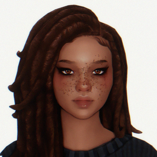

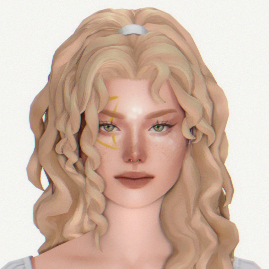


SIM DUMP #1
from left to right: alex, norah, alysia, sade
hair, genetics, makeup, & tray files included
download: sfs
tou: please do not change their genetics if you're going to post them. you may use them as a base for personal gameplay. tag me if you use them!! i'd love to see them in action.
#ts4#sim dump#simblr#sims 4#ts4 edit#ts4 gameplay#the sims#sims 4 edit#ts4 pictures#the sims 4#ts4 sim dump#i hope you all love them as much as i do#MWAH#if the files are too big you can leave out anything from the sliders folder or the adult clothes folder#a few of them may have an outfit but a lot of my adult clothes are merged and i didn't want to include the giant merged file LOL#i tried to read the tou of all of the cc but i may have missed some and i apologize if i did!#my dwnlds
39 notes
·
View notes
Note
I’m sure you’ve answered this before but how do you make gifs? I want to start making them and I was wondering if you have any tips or software that you use?
hey! i have answered this vaguely before but i’m gonna put a mini tutorial here under the cut, plssss know i’m not an expert in Anything so i’m sure there are better ways of doing literally everything listed here lol but i have gotten this question multiple times so i’m just gonna walk y’all through it 😅
programs i use in this:
photoshop cc 2020
vlc media player
so i’ll go through my process in two steps: 1) creating a simple gif and 2) sharpening and coloring
(this is all also mac-based bc i make gifs on a macbook... idk windows equivalents i’m sorry)
creating a simple gif
(pls note that i have 0 idea how to make gifs from series of images so you might want to look elsewhere for that 😅)
in most cases, you’ll be making a gif from a video file that’s much longer than the part you actually want to gif. to make life easier, i use vlc media player to record select parts of the video i want to use. this makes it easier to narrow down your selection in photoshop later (you’ll see how)
for the sake of this tutorial let’s use the butter mv as an example. i want to gif hobi towards the end, so i’ll open the video in vlc media player, forward it so it’s 5-10 seconds before the part i want, and then open the “playback” menu across the top and click “record”

once i’ve gotten the part i want recorded, i’ll go back into the “playback” menu and hit “record” again so that the recording ends
you should end up with a much smaller clip that will likely automatically save in your “movies” or “videos” folder.
now it’s time to open up photoshop. once you’ve opened it up, go to “file” -> “import” -> “video frames to layers”
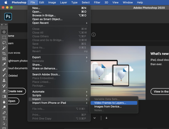
find your video file. photoshop will then open a mini window where you can narrow down your selection even more
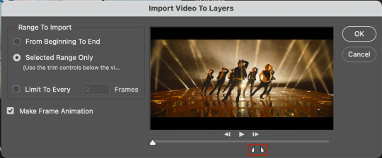
use the little sliders to select the part of the video you want. you can use the big slider all the way on the left to scrub through the video (it will show you a little preview). make sure “make frame animation” is selected.
you should end up with something that looks like this (specific to the scene you choose to gif of course)
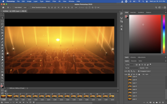
the series of images along the bottom are called “frames” and the ones in the little box to the bottom-right are called “layers”. honestly don’t ask me what the difference is bc idk but what matters is that you delete the frames that you don’t want as a part of your gif. you can do this by selecting the extra frames and clicking on the little trash can under the timeline:
you can delete the layers, too, but that doesn’t have any effect on your gif.
now this is where i’ll figure out the length and timing of my gif. see where it says “0.04“ under each frame? that’s called the “frame delay.” it’s essentially just how much time each frame will linger when you save your gif. this all depends on your personal preferences, but i almost always add 0.02 or 0.01 seconds, depending on the video.
to change the frame delay, select all the frames (the easiest way is to select the first frame and then hold shift down as you select the last frame) and click on the little arrow next to the number. then hit “other” and you can manually type in what you want your frame delay to be.

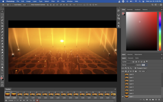
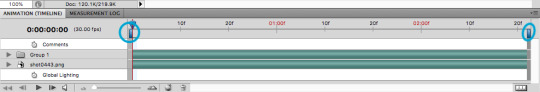
once that’s done, leave all your frames “selected” and then select all your layers (the same way you selected the frames). once you’ve done that, click on the last button all the way on the bottom-left of the timeline “convert to video timeline”

then, hit the button with three lines above the “layers” panel (outlined in red below) and select “convert to smart object”


now that your layers have been converted to a smart object (i.e. one layer that you can edit in it’s entirety as opposed to editing every individual layer), this is where i crop and size my gif. general tumblr guidelines are: 1 gif per row: 540px width, 2 gifs per row: 268px width, 3 gifs per row: 177px width.
to size your gif, first go to the “image” menu and then “image size.” you have to do a little thinking here as you want to make sure that your image remains proportional - so take into account the height you want your gif to be. i generally make larger gifs around 350-450px in height, so i left myself some room for error by setting the width to 800px:

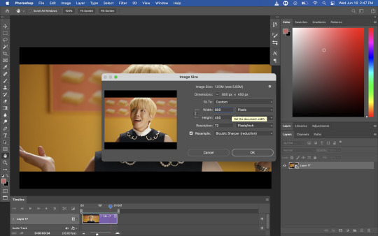
you should be left with a much smaller image:

now you’re going to crop it to the size you want. for this, go back to the image menu and select “canvas size.”

i ended up using a canvas size of 540px x 300px for this gif. it’s really down to your personal preference, but make sure you adhere to tumblr’s sizing limits
you’ll notice that your canvas size will have reduced, but your image is still there under it at this stage. at this point, you can readjust your image if you want to by hitting ctrl + t

i’m okay with how it looks so i’ll leave it like this. and that’s how you make a simple gif! all you need to do now is to export it. to do that, go to file -> export -> save for web (legacy)
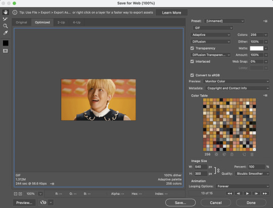
this is what my settings usually look like, but you can play around and see what works best for you. just make sure that under where it says “animation” your “looping options” have been set to “forever.” you should end up with something like this after you save it.

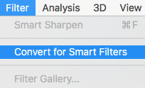
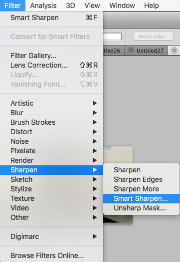
looks pretty good, right? it’ll look even better if you sharpen and color it! to do that, you can just use the file you’ve been working off of already. i start with sharpening by making sure my layer is selected and then using the menu “filter” -> “sharpen” -> “smart sharpen”
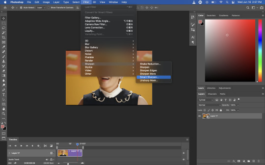
this is what my settings usually look like, but again, play around and see what looks good to you! it will also depend on the quality of video you use - i always try to gif from 1080p resolution videos as it’s easiest to make sure your gif will be clear.

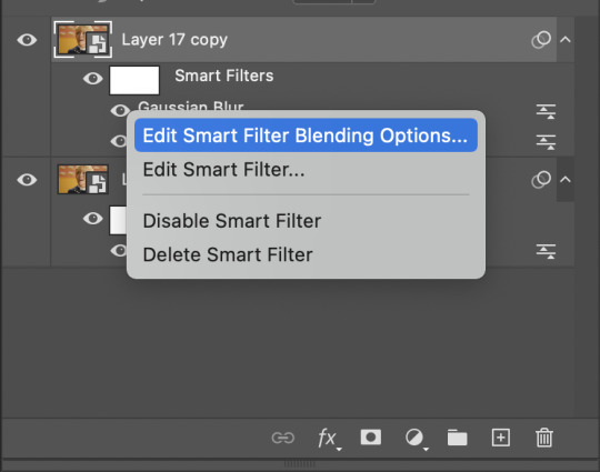
now the next step is optional, but it’s helpful when your video is more noisy or blurry. right-click the layer you just applied “smart sharpen” to and duplicate it:

select ONLY the new layer, leave the smart sharpen filter as is, and open up the “filter” menu again. this time, you’re going to go to “blur” -> “gaussian blur”

the default radius will be 1.0 pixels. leave it like that! after you’ve hit ok, right-click on the gaussian blur filter and click “edit smart filter blending options”
set the opacity to around 75-80%
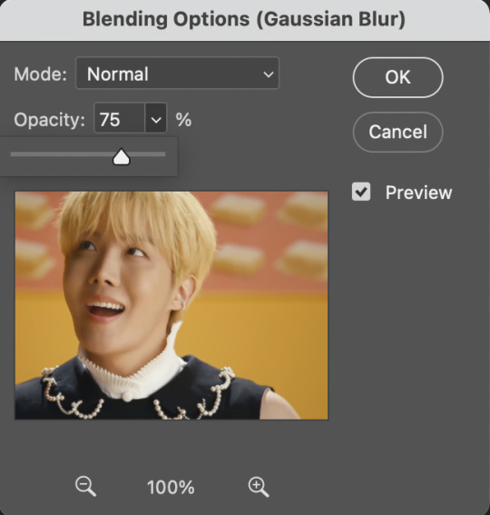
then select the whole layer again and using the “opacity” drop down above the layer menu, set the opacity of the whole layer to around 45-50%.

again, you should just play around with it and see what looks best to you.
now you’re done sharpening! some people like to mess around with noise levels as well but i don’t because i don’t know how. lmao
i always convert these separate layers to a smart object after i’m done. i don’t think it makes a difference, but it makes the layer panel look neater to me lol
now the fun part: coloring!
this will depend on your individual taste. there are many adjustment layers available in photoshop - i haven’t even played around with all of them. i’ll go through some of the basic ones that i use in almost all my gifs here:
1) curves
idk how to explain it tbh. you can just click auto as a good starting point. you can also use the little eyedroppers to set black, white, and grey reference points in your image for more accurate “curving” lol

this is what it looks like after you’ve applied the adjustment:

2) vibrance
i like colors. i like a good vibrant gif. so i will almost always adjust the vibrance before i do anything else. play around here and do what you want with it lol
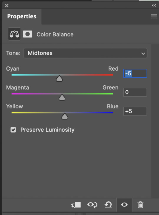
3) color balance
again, this will all be based on what looks good to you. butter mv is a little heavy on yellows and reds for my taste, so i color corrected slightly by moving the sliders towards “cyan” and “blue”
4) brightness/contrast
self explanatory i think!
5) selective color
now here is where you can get really fancy and personalize your gif. just mess around with all the color levels to your liking until you figure out a style you’re into.
6) gradient map
now this is a layer i almost always use. it just adds depth to your gif by giving it some “shadows” and “highlights”. here’s how you use the gradient map:
select the gradient map layer and check the box next to “reverse.” your gif should look like you applied a black and white filter:
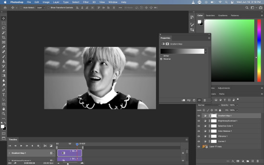
next, making sure the gradient map layer is still selected, click the menu above the layer panel to the left of “opacity” (the default selection in that menu is “normal”). i usually set this to “soft light”

you’ll end up with something like this. it’s a little harsher than i would like, so i’m going to adjust the opacity this time using the same opacity adjuster thing on top of the layer panel. i usually set this layer to about 20%

it may not seem like it but trust me this makes a difference 😭
here’s the gif before sharpening/coloring and after:

looks way better, right??? (at least i hope you think so lol)
okay that’s the end of this very wacky and disorganized gif tutorial! i hope this was at all helpful and if you have any questions pls lmk and i’ll do my best to answer them 😭
#long post#idk who i think i am like i didn't just start giffing like a couple months ago sdflkjglksjgklg#anyways.#gif making#anon#ask#this took way too long and there are SO many screenshots it's so long i'm sorry
12 notes
·
View notes
Note
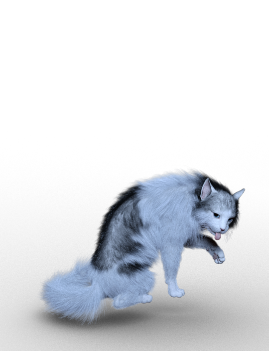
Heyyyy. I feel kinda bad asking for your help for free. But how did you make King’s fur colourful and textured? I have the millennium cat in Daz and it doesn’t actually have any colour/fur options and I can’t find any in the store.
Hello there! I am SO SORRY for responding so late. This is actually a really good fucking question, that took me FOREVER to find an answer to when I was trying to figure King out.
So, you actually cant do it with millennium cat :/ I don’t think? I’m sure there are ways, but honestly, millennium cat is not the best cat you can get.
I 10/10 recommend investing in Hivewire House Cat. It’s 30 USD, which is fucking expensive for just a model. I got mine on sale, which they do every so often. If you put it in your wishlist on Renderosity, sometimes they do wishlist sales. Where everything in your wishlist they put on sale. So you can wait around for that, or you can just buy it. I recommend the hell out of it.
***Very important. Downloading files from Renderosity and other websites that do not use the Download Manager from Daz’s own shop, can be v confusing. I have a MAC. There are a shit ton of tutorials on youtube on how to download these files on a Windows computer. But from a MAC, it took me for fucking ever. So if you would like a tutorial on how to download assets from other 3D rendering websites like Renderosity, please let me know! I’ve figured out a really simple way of doing it and I would be more than happy to help and the same goes for finding those files once you have them correctly situated in DAZ!***
Here’s why I recommend Hivewire.
Millennium isn’t as detailed as Hivewire is. Millennium is a v old cat model, with only a few bones and no really helpful sliders in ‘Shaping’ and ‘Parameters’.

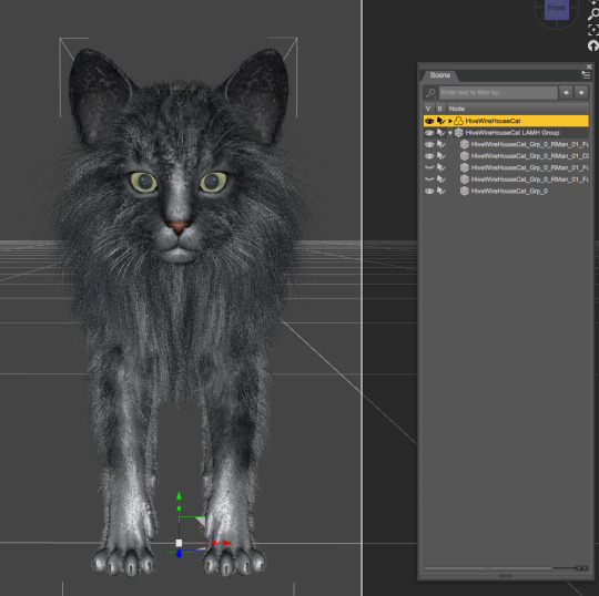
Just as a visual, here are these two side by side. On the right is Millennium and on the right is Hivewire. Millennium, for some reason, comes ridiculously oversized. Whereas Hivewire is automatically at the proper size for a common housecat.
Here are the Millennium ‘Parameters’ options:
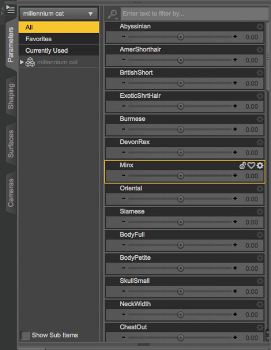
And the Hivewire ‘Parameter’ options:

Even just looking at the size of the sidebar, there’s a big fucking difference. Hivewire is 10x more customizable. And everything that it comes with is already IRAY compatible.
With all that being said, lets get into Hivewire House Cat. Because really, although Millennium is cheaper, I really don’t think it’s worth it.
HHC (hivewire house cat) comes as a Tabby. The Tabby option comes with several different color options. You can also buy Black/White (which I used for King), Calico, and Orange Tabby as well.
Here’s my black/white and gray tabby options:

However, the colors are not the long hair. In the promotional photos for some of these color options, the cats have long hair and it took me FOR FUCKING EVER to figure out how to do it. LUCKILY IT’S FREE THANK FUCKING GOD.
So, lets get into that!
HHC comes with a LAMH (Look At My Hair) option! What does that mean? It means that you can easily add fur to these creatures.
You can buy LAMH or you can get the free version. I recommend the free version. It’s what I have and if you’re only using it for this, then you gucci. Pretty much, to use LAMH, you have to download it from the website. Once that is done, in Daz you go to

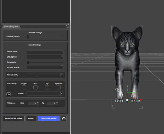
It should pull up this window. You can drag it anywhere on your workspace.
Change the color of your kitty BEFORE you go onto the next steps. Unless you want to mix and match, which we’ll get into later!
So what do you do next - good question.
Now you have to download the LAMH Presets from the Hivewire website.
This. was so. fucking. annoying to figure out. with a lot of trial and error.
Once you have LAMH presents for HHC downloaded (which comes with Short, Short 2, and Long) you can start attaching them to your cat.
Make sure you have your cat selected. I HIGHLY recommend putting this in a new ‘document’ (?) so nothing else can interfere. I swear to god, this makes my program crash unless I don’t have it in a new field. Your program may crash. It’s annoying but the harsh reality of this thing. It’s about as finiky as dforce. So just keep that in mind and don’t give up.
After your cat is selected, hit ‘Attach LAMH Preset’. It’s going to pull up your files. Find the LAMH presets you downloaded from the hivewire website (they can remain in a folder all on their own without being integrated into the program) and select how long you want the hair to be - Short, Short 2, or Long.
I chose Long

It’s going to load and then all this green stuff is going to cover the HHC and in ‘Scene’ it’s going to have a new selection called HHC LAMH Group.

The next steps are really simple, but also really fucking important.
Now, you are going to choose the hair quantity. Online you can find in different forums, the hair quantity that people have chosen. I’ve seen the standard 250,000, 600,000, all the way to 2,000,000. YOU DO NOT NEED 2,000,000. Not even 1,000,000! I nearly always go with 600,000. The cat looks nice and full that way. I say, stay between 250,000 and 600,000. Don’t go any higher or your program will surely crash.
***also, you can pose your figure with this. It will move with it. But, some poses will not work v nicely with LAMH - especially if it’s long haired. Anything too tightly curled, probably wont work.***

I’m going to go with 500,000 and hit ‘to OBJ’. I recommend saving this as you go. Like with every step, just hit save. Like I said, this crashes all the time and it’s extremely annoying to have to redo the steps over and over. So just save it and in turn, save yourself the headache.

Once you hit ‘to OBJ’, this dialogue is going to pop up. Click ‘Yes’ then ‘OK’
Cool cool cool. everythings loaded, now wtf do you do? Use the eyes under HHC LAMH Group to make the green stuff disappear. DO NOT. I REPEAT. DO NOT DELETE.
This is just so you can see your kitty with their little fur!!
Okay, you did all these steps. now fucking what? I think this is important to be said, but pose your cat BEFORE you attach the hair. It makes the hair fall more organically that way. Otherwise, it can not only make your program crash but just look weird. So, pose and position your kitty beforehand. So when you merge it into your original file, it’s already in place and you can go straight to rendering. (Leave LAMH for last. Always.)
Cool cool cool you did all of this. You can now pull up the AUX Viewport tab and see what your kitty be lookin like.
Now. I said earlier that you can mix and match. I didn’t know this was a thing, until i made a mistake and REALIZED it was a thing. For King, I wanted her to be black and white. However, homegirl forgot to do that. so after I had all of her fur already on and finished, I clicked one of the black and white options, and all of a sudden it mixed?!?! So I think what happened here, was that I had King as a tabby, or maybe mainly white. I don’t know. And when I attached the fur, the color from her original ‘skin’ also attaches to the fur, in order to give it color. Well, when I changed it afterwards, it ended up mixing her up. So instead of her turning out like this (which is what I originally had her as):
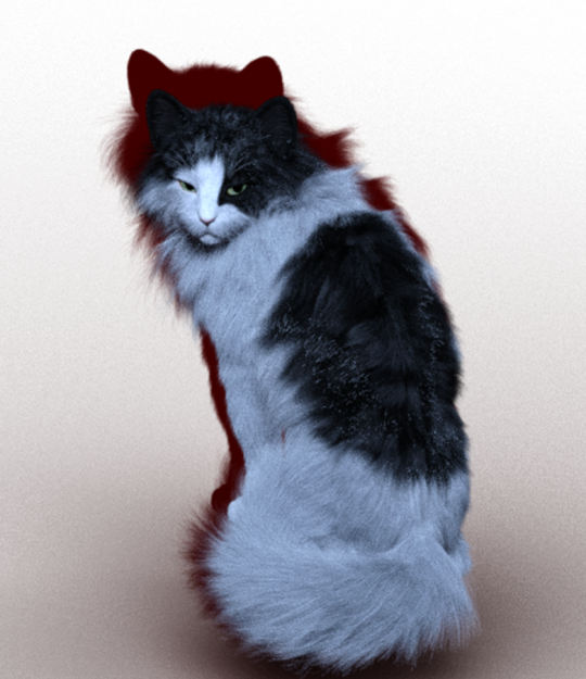
She came out like this:
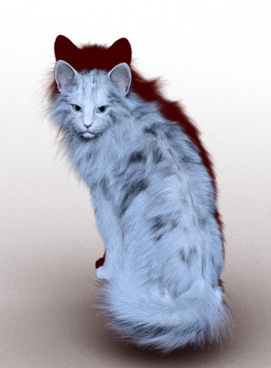
Unfortunately, I have NO IDEA HOW I GOT TO THIS. So although King is looking fucking FIRE here, I couldn’t use it. :(
Ugh, anyway. Another really important thing to keep in mind, is that you don’t want the hair to be too thin. I’m almost positive for both of these models, I used 600,000 hairs. I went lower than that for a picture of king in the office, and her hair came out extremely thin and you could see her body through it. It wasn’t a good look for her (Sorry bb girl). So if your number is too low, it will look off. Like a mangey cat lol.
Example:
250,000

500,000
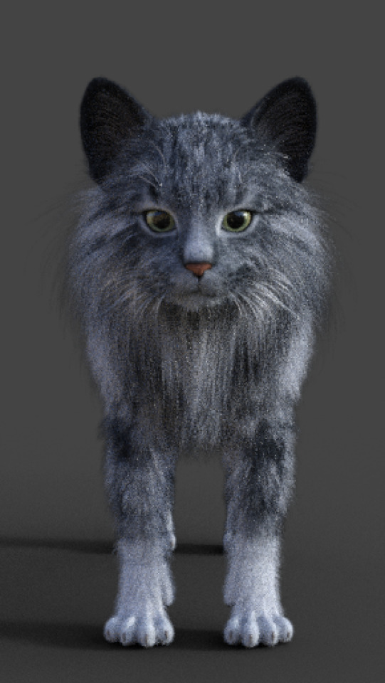
This is a small difference, but they look far more filled out. And you can really tell when you have a stronger light source!
Heres one with King when her fur was literally just too thin. I think this was 250,000 as well.
ANYWAY.
I hope this helps!!! And I’m sorry this came so late. I know it’s really long so anyone reading this going what the fuck, ignore it lmfaoo.
If anyone would like an indepth tutorial on how to download external files and where to find them, please let me know! I’d love to help!
71 notes
·
View notes
Text
detailed gif making tutorial for beginners!
i have a gif tutorial already, but i wanted to make one that was very detailed and specific so it’d be easy to understand for those who may have only picked up photoshop to make gifs and haven’t used it before!
we’ll be making this gif:

i’ll be using photoshop cs5 with the timeline & umplayer for screencapping since i have a mac. if you have a pc you can use potplayer and follow the tutorial for that here. (this is the tutorial that i used when first learning to gif :’) )
all my gifs can be found here
when giffing, it is important to make sure you have at least a 720p video quality, but always try to get 1080p if you can. this is the number one way to get HQ gifs!
first, we’ll need to screencap. i always make a folder for the movie/show i’m giffing before screencapping. when we open up umplayer you’ll want to go to preferences first.
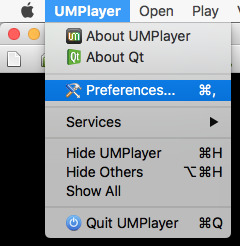
you’ll get a window like this:

you’ll want ‘enable screenshots’ to be checked

this will allow you to be able to screencap
and then select the magnifying glass to select the folder you want the screencaps to go in

once you’ve done that, go ahead and click okay to exit the preferences window
now we’ll open the video.

and get to the spot right before the part you want giffed starts:

now at the menu in the bottom left, you see these fast forward and rewind looking buttons. they control how fast/slow the video plays. click the one pointing left twice (in the black bar below it’ll say .5 and then .25—you want .25)


to take screencaps you press shift + D to start and again to stop. so once you hit the part you want to be the beginning of your gif, hit shift + D and once you get to the end of the part you want giffed, press shift + D again. and wallah! you have your screencaps!
now we’ll open up photoshop and load our screencaps by going file > scripts > load files into stack


a window pops up and you’ll need to click ‘browse’

once you do so, navigate to the folder with your screencaps and select them all & hit ‘open’
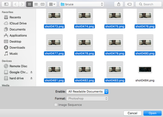
we get back to the same window and hit ‘ok’ after our files show in the box

now once you hit ok, don’t leave photoshop until your layers window goes from looking like this (it’s still loading):

to this (it’s done loading):

load time depends on how many screencaps you have and how many things you have open in photoshop, how fast/slow your computer is, etc etc. i thought it was a good idea to load uhhh 132 screencaps dsfhsdkj so it took awhile. leaving photoshop while they’re loading will screw it up! it’ll only load some and make the rest duplicates of the last one loaded so your gif will not work as you want.
now you want to make sure you have the timeline open

if it’s not, you can go window > animation
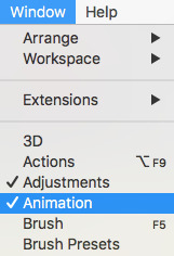
however, we don’t want it as the timeline right now, so we’ll click this button in the lower righthand corner

this’ll give us the frames window instead!

now we’re gonna click this little guy a few times do get some stuff done

the first time we’ll select ‘make frames from layers’
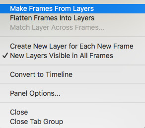
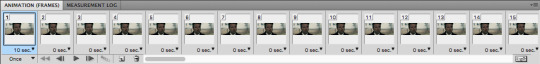
so now all our screencaps are in the frames window
but this puts them in backwards, so we’ll click that little guy again and select ‘reverse frames’ to get the in the right order
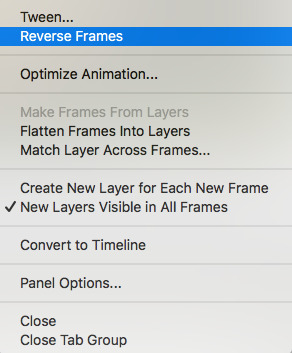
now we’ll click this guy one more time and select ‘select all frames’

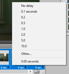
with all our frames selected, we’ll click on where it says ‘10 sec’ (although you can click on this spot on any of them—since they’re all selected it changes this setting for all of them at the same time)

we’ll go to ‘other’

and insert ‘.05′ for our speed. this controls how fast the gif moves

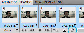
now we can do something here before converting to the timeline. if you have frames on either end of the gif (not the middle!) that you don’t want to be in the gif, you can delete them now. since i loaded so many to start, i’ll go ahead and delete some to narrow it down.
if you do so, select one frame (either the first or last of the section you’re deleting) and hold shift and select the one on the other end of the section (so all the frames you want deleted are selected) for example, i started with frame 90, held shift and selected frame 1.
then click the trash can to delete.
once you’re satisfied, with all the frames still selected (make sure you don’t unselect them unless you’re deleting ones you don’t need. if you do, reselect them the same way we did before) click the button in the lower righthand corner

this converts it back to the timeline. if you deleted frames, make sure you delete the layers that went with it (any of them with the eye turned off in the layers window) again, use shift to select them all and the trash can to delete

select all remaining frames (all the ones with the eye still on) and go filter > convert to smart filters
now all your layers will be in this one condensed layer:
next we’ll crop. most people use the crop tool, but i find it easier for me to use the rectangular marquee tool.
with this selected there’s a menu bar at the top

i always leave the height at 4. the width i change depending on what size gif i want. the settings above, with 8 as the width, is what i use for my 540px gif like this one:

for gifsets where i have two gifs side-by-side, i’ll either use 7:
or 6:

most gifsets you see are like the 7x4 one so that’s what i’ll be using, though it’s really up to you!
with the rectangular marquee selected and your settings set, you can click & drag until it outlines where you want it cropped (you can move this around once you get the size you want to change it’s location)

you can drag the slider in the timeline to make sure this doesn’t crop anything out as your gif moves
bruce doesn’t really move so i know i’m fine, so i go to image > crop
now it’s cropped! we’ll go image > image size to resize it to the correct dimensions for tumblr. you can find a reference guide to tumblr sizes here.

just enter the width you need and it’ll adjust the height automatically for you! these are my settings:
now my gif is the right size! this is how it looks as of now:

the only things left are to sharpen and color. sharpening is easy. go filter > sharpen > smart sharpen (mine shows up at the top bc it was the last filter i used)
and make sure these are your settings
this next step is something i don’t think a whole lot of people do because it doesn’t make that big of a difference but we’ll double click this icon:

and change the mode from ‘normal’ to ‘dissolve’
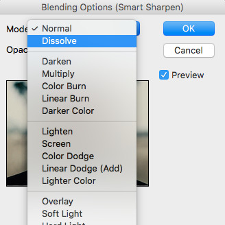
our gif now looks like this:

if we didn’t change it to dissolve, we’d have a very thin white line bordering the gif which doesn’t bother some people, but lowkey irritates me even though it’s not super noticeable lol
so now we can color the gif. i have TONS of coloring tutorials on my blog as well as a series i’m currently doing that breaks down the adjustment layers so i won’t be going too into the specifics since you can read about that there.
i added a group:

and then i used curves to brighten, levels to darker, and color balance to color correct. all three of these layers i have a breakdown tutorial of in my series linked above!

and there we are!
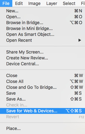
now to save go file > save for web and devices
we get this window, which looks overwhelming but it’s pretty simple!

we want to make sure our settings are these:

and looping options are set to forever (so your gif will keep playing)

and keep an eye on your gif size. tumblr won’t play anything 3MB or over

if your gif is over 3MB you can either adjust the coloring to fix it or make your gif shorter (this is the easier way) by pulling in either end on the timeline
and that’s about it! i hope this is helpful and if you are confused please stop by and leave me an ask, i’d love to help!
as always my other tutorials can be found here and if you have any questions, feel free to stop by my inbox and ask, follower or not xx
234 notes
·
View notes
Text
kmplayer gif tutorial
hello all! i’m gonna show you how i make my gifs! I use kmplayer and avisynth to make gifs, but I’m going to focus on kmplayer for this one. This tutorial is long and quite in depth so if you’re a beginner, this should be good for you!
also! this is purely just a gif tutorial and not a coloring tutorial lol
what you will need:
photoshop (im using cs5)
kmplayer
any video downloader (I use 4k download or savieo)
Screencapping
Okay first find a video and/or a scene that you want to gif. You’ll want to get the highest quality video possible. Don’t download anything under 720p or else your gif will look grainy. Try to get 1080p as much as possible.
Once you get that downloaded, open your video in kmplayer and go to the scene you want. I like to go a few seconds beforehand to make sure i don’t miss any frames. Now on your keyboard press Ctrl + G to open up the screen cap menu.
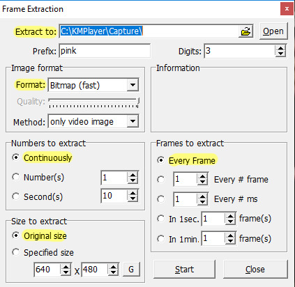
I don’t remember the default settings but here are the settings you’ll want:
Extract to: you’ll want to create a folder to hold your screen caps and then direct that folder here
Format: JPEG and Bitmap are both good options. Bitmap (i believe) is going to be a higher quality image
Numbers to extract: continuously
Size to extract: original size. You want the full size image
Frames to extract: every frame. This ensures that you’re getting every frame and helps your gif look smoother
also the “prefix” is just going to be the first part of the image name, so put whatever you want for this! :)
Once this is done, press Start in the menu and play the video. When the scene is done, press pause on the video. Open the menu again (Ctrl + G) and stop that as well. Now all you want to do is go into the folder with your screen caps and delete the ones you don’t want.
Frame timing and converting to smart objects
Open photoshop: we are now going to start the giffing process! Before you start, make sure you have the animation window and the layers window open. To do this, go to Window > Animation and Layers, if it’s not already showing.
Now, click on File > Scripts > Load multiple DICOM files. Find your screen caps folder and load them in. You’ll see in your animation bar that it only has one image showing.

In order to pull your screen caps from this, go to the top right hand corner of the animation bar and click this button. Click “Make frames from layers”.

This is so your gif actually plays all the frames and not just the one showing. Next, change the timing of the gif. Personal preference is a big thing in giffing so you’ll want to play around with what works for you. The average timing used by a lot of people is either 0.04 or 0.05 (for screencaps i should say). I find that 0.04 can be a little fast for my liking, so 0.05 is good. To do this, click the “0 sec” and then “Other...” and type in your timing. Make sure you select all the frames before doing this, unless you want to change each frame individually ^.^
P.S. if you ever want to delete a frame in your gif, you can delete the layer in the layer window but in the animation bar, you’ll have to click on the frame and click the tiny trash can next to the bottom scroll bar.
The next step is to click the button in the bottom right hand corner of the animation bar. It looks like it has two sliders on it. It will change your animation from frames to timeline.
Next, right click on a frame in your layers window and select “similar layers”. Then right click again and select “convert to smart object”. This may take a moment btw.

If you see that your animation timeline shortened into one line instead of multiple lines, you’re on the right track! Next thing to do is to crop the part of the scene you want.
Image size, sharpening and canvas size.

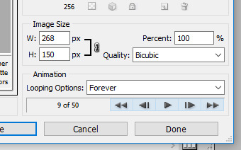
Image size will change the photo size without cropping anything out. Canvas size will change the size without transforming the image. What I like to do is to change the image size to about 5 or so pixels larger than what I actually want for either the width or height. In this case, I want my gif to be 268 x 150. So my cropped photo is going to make my height much larger than I’m going to want it, if that makes sense.
P.S. For sizing, make sure your width is either 177px for 3 panel gifs, 268px for 2 panels, or 540px for a single panel. If you want a 3 panel gifset, make the middle gifs 178 px (i know, it’s a little dumb but if you don’t, it’ll make the middle gif slightly blurry)
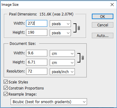
(This is what I’m going to resize my cropped image to)
You can just make the width or height automatically what you want (268 in the width for my case), but I find that after sharpening, a line can form around your image. I prevent this by making the image slightly larger than what I want and then cutting that part out later.
Now I want to sharpen my gif! Again, this is about personal preference, but I think this is what a lot of people use as well. Right click on your smart object in the layers window and select “New Smart Object via Copy”. I’ve seen people select “Duplicate layer” instead but I honestly don’t know what the difference is lkasndfllanslk.
Set the top layer’s opacity to 50% and leave the bottom layer at 100%. To actually sharpen the gif, go to Filter > Sharpen > Smart Sharpen.
For the top layer:
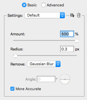
1. Smart sharpen: Amount 500%, Radius 0.4
2. Gaussian blur: 0.3 (its also under filter)
For the bottom layer:
1. Smart sharpen: Amount 500%, Radius 0.4, no gaussian blur

After this, go to canvas size and change it to your actual gif size. For my gif, it will take my 272 x 190 to my desired 268 x 150. Then combine your two smart objects by selecting both of them and clicking “Convert to Smart Object”.
Gif without sharpening vs gif with sharpening

Now you’ll want to edit it to your liking, just make it sure it’s under 3mb for tumblr’s image limits.
I’m not going to get too much into coloring bc it can be a real pain sometimes but! I will say that selective coloring is your best friend, just don’t saturate/over color or the gif will look more grainy.
After coloring and such, this is what I get:

We’re almost there! Save your new gif under “Save for web & devices” and not for “Save as”. When it opens, it’ll look really confusing, but all you need to worry about is that the “Looping options” says forever and not once, or else your gif will stop after it plays the first time.
The last step that I didn’t even learn until recently is that you’ll have to open up your gif again in photoshop. When you do this, you’ll find that the timing has changed from 0.05 to 0.07. Idk why it does this, but your gif will look smoother if you change it back. (It might only be for screencap gifs but idk)
Here’s a comparison of the gif as is vs the gif when i changed the timing again:


And then you go through the process again if you’re making other gifs! I wrote a lot but it really isn’t that hard once you practice a couple times. I’m still learning too! (as you can see since my gifs are still grainy and such) but i hope this was helpful for people who don’t know where to start! Happy giffing!
#text#im not the end all be all but i will say that I know i've improved ever since learning some of these things#if anyone wants to share their knowledge i would lvoe that
13 notes
·
View notes
Photo
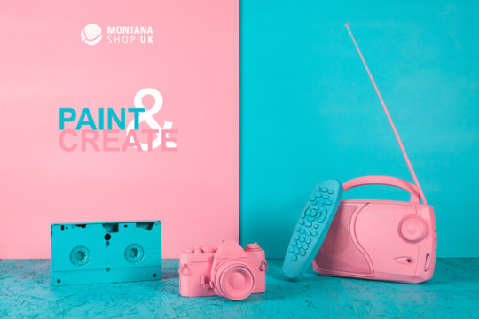
MONTANA SHOP UK EDITING IN PHOTOSHOP
In my group we had to select our favourite out of a few photos, we then discussed why this was the best. We looked back at the photos we took on our own phones and the different compositions. We talked about placing elements from the brief onto the photo - logo/slogan where is the best place for it?
Ideas discussed -
Photo – half blue/half pink background. Take frame off and put logo there in blue.
Does the frame work – does it look odd?
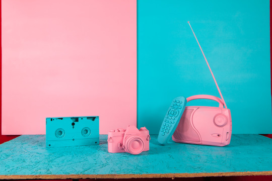
Too cluttered too many items in the photo – with perfume bottle, camera, frame, and phone.

Best photo -
Photo with the half pink and half blue background. No frame – plain background. Items include a tape, camera, radio and remote.
It relates to visual entertainment. Much more minimal than the other photos so more space to play around with.
Zoom out from the photo. Adjust height so it is equal distance between the bottom and top of image.
Logo needs to pop out, maybe with a shadow behind it.
Create a border in Photoshop maybe. The backdrop should have the line exactly in the centre.
Two colours merged together. Gender - Pink for woman and blue for men but then we have mixed the objects – blue video against a pink background. Pink radio against blue background.
We discarded some images – some were too cluttered with too many items. In some photos the CDs and frame in the background didn’t work
Things to think about before editing Photoshop -
Colours you will be putting on the logo and slogan.
Black text might work well.
Tools used in Photoshop - Crop and patch tool – select an area.
Slogans and the logo could go over the content of the image?
The slogan could go over the radio. Play around with perspective.
How to approach editing photos for a client
Editing techniques
Capture One - Folder – Images.
Open this to see 4 folders - Capture, Output, Selects, Trash (Arrange documents like this. Get used to arranging the work and separating it into different folders)
Open the one we want to edit, e.g. CR2 RAW. It will go straight to camera RAW. Raw is similar to Light Room (better understand both in depth because may use a combination of both of these, depends on how you want to edit your photos.
Clean up areas on board and lines on clipboard.
Basic editing module –
Element of cleanliness - subtle shadows, not too dark, highlights not too overexposed and also the image needs to look clean and tidy.
The items have been placed on a chip board. I think to keep elements such as the rough wood from the clipboard in there
First I need to change exposure - saturation because I am working with vibrant colours
Move exposure meter slider up, this increases it so you get highlights coming out.
Boost contrast slightly. Bring it down until happy = 16
See what highlights work in both extreme circumstances. I feel 0 is fine.
Shadows add more light. Whites = 0
Increase density of shadows slightly +8 in shadow.
Clarity? If you increase the image you can see it clearly. Zoom in quite close - lighting flattens out the texture of the border. You can see details coming to the surface. I feel this is not helping the image though as it is showing bits of texture. I think texture in the wood helps so I don’t need to bring this out. I have decided to leave clarity alone. In some cases it helps. For example in noisy photos at night it helps clarify images. So certain editing tools work better in different circumstances.
Increase saturation + 8 in order to get richness out of the blue and pink. Don’t over saturate though and don’t over edit. This product needs to be a real representation of the products you are selling.
No curves or filters. Sharpness result -add a little. Not too much as this changes the image too much. Extra crispness is all that was needed.
Pixels were too much - Increase to 45+ which means you don’t get pixels but more sharpness. ISO 100 - so therefore there is no need to reduce noise, no need to alter it.
Add detail to image
Duplicate layer = Ctrl+J or right click on the image. (Try and use shortcuts because this is a better way of working and you must get used to it when editing images – this makes you much faster)
Work directly onto the image now.
Clean image up. How? Patch tool or Clone stamp.
Get rid of imperfections and clean image up.
Spot healing brush tool – press J button on keyboard. Main areas to clean up – zoom in 50% or further - press and hold space bar and then clean the image.
See a hole in the bord – zoom and can see it is made up of pixels. Brush modes and sizes – better result with the tool. Select size of brush and main colour of pixels and then click on it. It will get rid of the hole. It will fill in the hole with the exact colour to match the board.
Zoom around the photo - think what should be there and what shouldn’t? Needs to be as clean.
Turn visibility on and off to see what it need to get rid of and see progression.
Spot healing tool – to get rid of shadow marks. It is not good to leave marks behind. For this though Patch tool is a better tool.
Flick through both options to see which works better.
Clipboard- marks in wood – Spot Healing tool good for this. Click and drag to get rid of lines in the wood.
Subjective editing - be subtle, don’t go too far.
Crop images at end. Think about platforms.
Select straightening tool – draw a line that it is straight and set to original crop. Select it and it will then crop and straighten itself in Photoshop.
Next -
Interact – Capture JPG High resolution can use ‘In Design’. Download this and put it on your hard drive.
Bring logo into existing document.
File and embed.
Logo double click.
You need to rasterize it. Right click rasterise layer. Turn image off so you can just see the logo.
Magic wand tool good for working with two block colours. You can select colours. Helps do things quickly
Isolate black type face and get rid of the white background. Click white area, you will see ants round the white area.
Press shift to select other areas to delete all at once.
Deselect it. The white background disappears.
The logo now looks neat with no white bits, clear background which looks better against the image.
Apply adjustment layer to selection. To help change text use shortcuts –
When you hover over layer icon hold down ctrl and click inside layer window, select all layers in window. Do it exactly to that selection.
Adjustment layer- solid colour. See new layer mask and change the colour. Then in the future just double click on this. It will change colours in real time. Press ok
Turn visibility off.
Resize image. Is white ok?Experiment.
Eye dropper to change colours in the image. Alter the blue colour. Ctrl+T to resize it – big or small. Play around with positioning.
Colour subjective
Introduce text to image. Add the slogan – ‘Paint & Create’.
Think about where it should go on the image. What colour works best. What size?
Type tool – click. 260pt to bring the box closer to the word. Take the box size right down to the edges of the word then it is easier to position the words in the image. Use arrow keys to move words around until you are happy with where they are positioned.
Change colours of slogan, click solid colour, use eye dropper to adjust colour.
Experiment with sizes and colour in frame. The colours and size of the logo/slogan is my choice - PAINT - blue, &- white, CREATE- pink. I think it looks soft and cool.
Save As PJEG and TIF

Why are these the best images from your shoot?
We narrowed down our shots to one image with 2 different coloured backgrounds and a blank background. We decided that anything on the background.e.g. The frame or discs didn’t suit and that the logo might not fit in the frame either. All objects used are all some type of technical entertainment items, the frame seemed like the odd one out. Luckily, our last photograph we all agreed upon, this had the frame removed too. If it weren’t removed, we could have photo shopped it out.
Did you end up developing your original set designs / compositions?
We shot according to our original test shots, although we developed it further with a second colour for the background and / or base.
What went well? What didn’t go so well? What would you do differently next time?
Overall, I am happy with the result and think it was successful. The final image is vibrant and fresh. I think maybe I would improve with a better logo/slogan colour. If the client is happy with their logo/slogan, then I am happy, if they want me to change it with my artistic eye, then I would be happy to do this also.
Why is it important to discuss the set ups with other people?
It is important to be able to work in a team as well as independently. We therefore share each other’s ideas that potentially we may not have come up with.
0 notes
Text
By now, you would already have the idea about the two smartphones Realme launched in Pakistan. One was the mid-ranger Realme 2 Pro and the other one was a smartphone dubbed as Realme C1.
We have covered about the two smartphones extensively as well as have done a separate unboxing session of Realme C1 with our initial impressions and quick preview. Today we have brought to you a a full review of the smartphone.
Realme C1 is company’s entry-level smartphone in Pakistan to target starters with the good and competitive looks. The phone is retailed at PKR 18,999 in the country, however at a special discount offer you can get the phone for Rs. 17,999 from Daraz. But the question remains; is it really worth the price? That’s what you will find in the review below.
During our quick preview of Realme C1, we really felt the lack of fast charging in the phone which has a massive battery of 4230 mAh. But we couldn’t blame it due to the fact that other phones, in this price range, also come with low-speed charger. So what makes the Realme C1 a bit better than others? You will soon come to know about that in this review.
You will get an option to choose from two color variants of Realme C1 – Navy Blue and Mirror Black. The one we got here for review is the Mirror Black.
Let’s have quick look at the specifications and features of the Realme 2 Pro.
Quick Features and Specifications
Realme C1 SoC Chip: Qualcomm Snapdragon 450
CPU: 8x Cortex-A53 1.8GHz
GPU: Adreno 506 GPU Memory 2GB RAM + 16GB Storage microSD card dedicated slot (up to 256GB) OS / Software Android 8.1 Oreo / ColorOS 5.1 – updatable to 5.2.1 Display 6.2-inch IPS LCD
1520×720 HD+ resolution, 19:9,
Pixel density: ~271 ppi
Screen-to-body ratio: ~88%
Gorilla Glass 3 Rear Camera 13MP, PDAF, f/2.2 lens aperture
2MP depth sensor
LED flash, bokeh mode,
720p/1080p video recording at 30fps Front Camera 5MP, f/2.2 Battery 4230 mAh – 5V/2A (No Fast Charging)
Charger included with retail package: 5V/1A Size/Weight 156.2 x 75.6 x 8.2 mm / 168 grams Sensors Accelerometer, Gyroscope, Proximity, Ambient light, E-Compass Connectivity WiFi: 802.11 b/g/n, 2.5GHz
WiFi Tethering, WiFi Direct, Personal Hotspot
Bluetooth: 4.2, GPS/AGPS,
USB 2.0 micro USB Color Options Navy Blue, Mirror Black
You can check detailed unboxing session with quick preview of Realme C1, however here is a short snippet from that preview. You get a set of very basic items with the phone in the retail price.
Realme C1 Box Contents
The device – Realme C1
Travel charger – 5V+1A
USB cable for Connectivity/Charging
SIM eject tool
User guide
Add-on TPU back cover
Add-on TPU protective film (pre-applied)
Unfortunately, like the mid-ranger Realme 2 Pro, the C1 also doesn’t bring along a stereo earphones. So you have to buy them separately.
Build and Design
Realme C1 has a plastic back panel as well as the mid-frame is also plastic with another thicker plastic bezel between the frame and the screen. There is no fingerprint sensor on the back, hence being plain and too simplistic it’s not so attractive. But the front side of the phone equalizes the difference and gives a good, thinner bezels design in this price range.
The phone weighs a 168 grams and doesn’t really feel much in hands. The grip and handling is comfortable with the less-slippery back panel and curved frame.
The back panel of Realme C1 has no shading angles unlike we have seen the Realme 2 Pro, though it keeps the glass-feel. The panel has 2.5D curved edges around the frame just like on the front glass. But it seems to be a an ordinary plastic that didn’t maintain it s glassy finish on the edges.
There is only two things on the back of Realme C1, actually consider it three. The branding “realme” is down there leaving all the panel clean from anything but a dual-camera module on the top-left corner alongside an LED flash.
Components and Ports
Realme C1 gives access to everything at the bottom side. Micro USB port along with the speaker grill, 3.5mm audio jack is also down there as well as the mouthpiece (primary mic).
There isn’t even a secondary microphone on the top for noise cancellation that could help recording stereo audio.
The power button is on the right side while the the volume buttons are hosted on the left side of the phone.
The SIM slot is also present on the left side which serves for two SIM cards and a dedicated microSD card.
The SIM slot is also present on the left side which serves for two SIM cards and a separate microSD card.
Front and Display
Well; unlike the Realme 2 Pro, the C1 comes with more common design of notch. The one that I do not like that much. However if the software gives the option to hide it like the way Huawei did it first time, I may prefer to use that option. At some extent, Realme’s ColorOS does offer similar option but not enough in-control of user.
The bezels are not little thicker than the 2 Pro, however a lot thinner than others in this price range. Just like that, you will also have to bear with the little larger chin down the display.
The Realme C1 features a 6.2-inch display with aspect ratio of 19:9. The display resolution ends up at the HD+ (1520×720 pixels) which is something you will normally get in this price range. It serves with the pixel density of around 271 ppi on a screen ratio of 88%.
Realme C1 sports an IPS LCD panel which, unlike in-cell technology in 2 Pro, is less brighter. However it’s still impressive when compared to other smartphones in its class. Outdoor visibility is also good.
Like the Realme 2 Pro, the Realme C1 also offers to manage the Notch display area. The option is only available for individual apps and not for the whole system. You can go through settings and set your preference.
Settings > Display & Brightness > App Display in Full-Screen > Notch Area Display Control
Realme refers this as “switching off the notch area display”. That is, when some app’s content is blocked by the notch, you can turn off the whole Notch Area Display for that certain app. Still this feature won’t work in many apps but only a few, however you can try that with any app in the list.
Realme C1 – ColorOS 5.2 – Notch Area Display Control
Software and User Interface
Realme C1 runs Android 8.1 Oreo out-of-the-box. Like any other Realme smartphone, the C1 also comes with OPPO’s ColorOS layered on top of the operating system.
The ColorOS is versioned 5.1 out-of-the-box, however later updated to the 5.2.1 with many additional features and options which you would see in Realme 2 Pro.
The phone starts with a lock screen, unlock to go to home screens, the folders, and multitask view and so on. There is no app drawer as you would know if you had experienced the OPPO smartphones. It depends if you prefer to have an app drawer separate from the home screen. Though I have no issues with having or not having an app drawer.
Realme C1, ColorOS 5.2 – Lock screen, home screen, folder view, recent apps view
You will most probably be familiar with the first three screens above, but what’s the forth screen? It’s the recent apps screen (aka an app switcher in multitasking). No graphics, no app snapshots, but simply the app icons. That’s what ColorOS did to conserve system performance in the budget smartphone. It’s a good thing but I believe it could be done with user’s preference, because this view is too simple to attract. Let the user choose if he/she wants to keep the windowed app switcher with big snapshots instead of conserving system resources.
Like the way ColorOS offers, the split-screen can be initiated with a long-tap on recent apps button on navigation keys as well as from within the recent apps view by dragging down an app snapshot.
Realme C1, ColorOS 5.2 – Recent apps view, split screen, notification panel, shortcuts & toggles
The top bar brings the notification layer with a set of shortcuts and quick toggles that you can rearrange. The brightness slider is also present and the layer keeps the two step expansion.
ColorOS does include Google Now (or Google Assistant) in the system however it has its own Smart Assistant that it offers on the home screen. The Smart Assistant would let you stack things up like, some one-tap quick functions, current location weather, display steps, quick photos, events and favorite contacts.
Realme C1, ColorOS 5.2 – Smart Assistant on Home screen (far left).
The default navigation comes with the standard Android keys – recent apps, home, and back keys. The system also offers you to switch to gesture based navigation, dubbed as “Swipe-up Gesture Navigation”. However, like Realme 2 Pro, it also includes the same iPhone X navigation. Swipe-up on the left or right bars to go back, swipe-up on the middle bar to go to homescreen, or swipe-up and hold on the middle bar to view the recent apps.
You can also choose to “Hide Gesture Guide Bar” to further mimic iPhone X like navigation, if you like so. It includes three more ways of gestures – simple gesture, back on the right, and back on the left.
Realme C1, ColorOS 5.1 navigation (left two) – ColorOS 5.2 smart sidebar (right two)
The Smart Sidebar which is not present in the ColorOS 5.1 navigation options, becomes available in the software version 5.2.1. If turned on, a little nobe remains on the edge of the screen (either side left or right) all the times. You can swipe-in from that sidebar to reveal a floating window containing a quick apps and tools to launch, anytime.
The software includes its own Photos and Videos apps but we liked its File Manager specially for its built-in ftp based remote file manager. You can can access files via web browser or even manage them via the file explorer on your computer or any FTP client.
Realme C1 ColorOS – Albums, Photos, Videos, File Manager, Remote File Manager.
Realme C1 comes with a Phone Manager to keep the system optimized from time to time. It scans the file system and memory and offers you with a set of options to optimize by cleaning it from junk, cache and and uninstall residuals.
App locker is also available right into the system.
For better and uninterrupted gaming experience, you have a Game Space. It allows you to choose which games you want to play at what performance level and which to play uninterrupted from notifications.
If you have been an OPPO user before then it will not be any different for you. We think Realme should add its own flavours to make some distinction as we thought in 2 Pro’s review.
One thing that you will miss in this budget smartphone is the fingerprint sensor. That’s something common thing to lack in this price range. But the face-unlock is pretty good with Realme C1. It’s moderately fast and much usable.
System Performance
We talk about every this and that, but the performance of the phone should always come first when you decide to make a purchase. This is something which gives you comfort most of the time, not its outfit.
As we know already that Realme C1 has Qualcomm’s Snapdragon 450 system-on-chip. You’d hardly see a phone in this price range with this processor. Just for fun, Samsung’s Galaxy J6+ that costs double the Realme C1 has even slower and older Snapdragon 425. If you compare the phone with the similar priced Huawei Y5 Prime 2018, then you won’t get performance as better as with Realme C1’s Snapdragon 450 processor.
In addition, the phone features the Adreno 506 GPU along with mere 2GB of RAM. This system wouldn’t be able to go beyond 720p which is actually meant to be in this price range. You may expect a little bigger RAM for some better long term steady performance, but you must take the price factor in mind.
Once again you’d hardly get anything more than 16GB storage in this price range. So I can’t either object on this factor as well but to be frank, 16GB is little to no-memory these days and will end up in just a matter of days – not weeks. So you better arrange an additional memory via microSD card.
While the Realme C1 is a right option to choose for reliable overall performance in this price range, gaming is not something to fall for. If you are an addict and use your phone for gaming for most of the time, Realme C1 is not for you. But again, if you are “that gamer”, you already aren’t using a phone that cost below 20k. However, as long as it comes to Realme C1, it gives much better experience than others in its price range.
We tried the titles like Asphalt 9 and PUBG Mobile; they didn’t die on the phone. In fact, the PUBG started with a “Medium” frame rate settings by default which gave lagless experience most of the time. However the graphics will remain at the starter “Smooth” option with less sharp images. So you won’t feel bad about gaming on this phone.
AnTuTu kept the Realme C1’s Snapdragon 450 little above the Helio P22 powered Redmi 6. It stands closer to it’s older sibling Realme 2 that equipped with the same 450 processor.
Geekbench shows similar results in both single and multi-core tests on Realme C1.
Mutli-core tests are somewhat mixture of strange change of different devices.
Look at the graphics test where Realme C1 tried its best to stand besides the Huawei Y9 2019 that runs on Kirin 710 and costs double the price of C1.
Oh, I forgot to mention the “Game Space” the software feature we discussed above in software section. It’s something that you can tickle with to make more out of the phone’s performance for better gaming experience.
Realme C1 is good phone when compared to the devices in its class. As said in 2 Pro’s review, the ColorOS really seems to be optimised well with the hardware and gives commendable performance. Though sometimes we felt delayed response to touch but that’s not unexpected behaviour from an entry-level smartphone.
However, keep in mind that it’s just an entry-level smartphone with only 16GB internal storage. You will end up with low memory sooner than later.
Realme C1 Performance and Battery
Realme C1 has a massive 4230 mAh battery for long continuous run and it indeed did the job during trial. If you desire some kind of quick or fast charging, then you have forgotten that this is just an entry-level phone below 20k. So you won’t have something like that. But if you object on a low-rated charger bundled with the retail box, then it can be assumed a better question. Realme just followed other brands in this price range to ship a 5W charger, which is not so impressive.
But the good thing is that, unlike other brands or phones in this price range, Realme C1 still supports 10W charging. That means you can use any other 2-ampere charger for a bit faster charging.
Let me tell you the numbers here – Realme C1 took around 4.5 hours to charge from 0 to 100 with the bundled 5W charger. When used the 10W charger, it would take around 2.5 hours. So you are still looking at a good contender in this price range.
Camera
Realme C1 features a dual camera setup on its back with a 13-megapixel main unit paired with a secondary 2-megapixel depth sensor. Like Realme 2 Pro or any other dual-camera configuration, the second camera in Realme C1 also serves for portrait mode.
The main camera features phase-detect autofocus with an f/2.2 aperture lens and an LED flash. The camera will allow you take photos with blurred background, aka bokeh effect in close up shots. You can record up to only 1080p at 30 fps.
Camera UI
The camera user interface remains similar in all ColorOS variants for different devices. It is simple with only a few set of options on the viewfinder. In fact for a couple of camera settings, you have to go to phone’s settings app Settings > System Apps > Camera where you can change volume button function, show/hide grid, enable/disable shutter sound, location, flip selfie or add watermark.
The user interface offers a set of modes including photo and video modes. There is also some fancy features like time-lapse, panorama and the portrait mode for close shots with blurred background. A “Sticker” mode uses AI based face detection and offers you to apply stickers.
Image Quality
Realme C1 captures decent image detail in daylight for an entry level smartphone. System doesn’t seem to operate on images for colors as they are mostly what we see in the real scene. So don’t expect vivid colors at all. Noise handling was also good at some extent but could always pop out in gradient parts. The camera isn’t very good in handling dynamic range however the HDR mode could help resolve this issue in some cases.
The camera performed moderately outdoors in good light but cloudy and lowlight weather conditions may affect your images. Like Realme 2 Pro, the C1 also impressed us in handled the skin tones.
Outdoor samples
If you ignore the foggy weather and nonexistence of blue skies in the following photos, You may notice the detail in the images and other elements such as noise, chromatic aberration, focusing and clarity.
[slickr-flickr search=”sets” set=”72157702483446172″ account=”1″]
Indoor / Low light samples
Here are some low light samples which show the noise handling being good but the lack of detail ends up with the portions of the image unclear. Sharpness is also suffering at edges where you can also notice the rise of noise levels.
[slickr-flickr search=”sets” set=”72157702483446162″ account=”1″]
HDR Mode
Well you can’t the blue sky very well due to the foggy weather, you can still observe the HDR effect in the following photos.
[sciba leftsrc=”https://farm5.staticflickr.com/4914/46037461254_fe2edc2990_z_d.jpg” leftlabel=”Standard” rightsrc=”https://farm5.staticflickr.com/4816/46037463224_ee0c66fd6d_z_d.jpg” rightlabel=”HDR ON” mode=”horizontal” width=”480″] [sciba leftsrc=”https://farm8.staticflickr.com/7857/46037466284_c7fc917226_z_d.jpg” leftlabel=”Standard” rightsrc=”https://farm8.staticflickr.com/7836/46037464664_a5b6f0a4b6_z_d.jpg” rightlabel=”HDR ON” mode=”horizontal” width=”480″]
Portrait Mode
Portrait mode isn’t that great as we experienced with Realme 2 Pro, however it still does a good job in blurring out the background. It works on both, the still life object or a human subject. Quality of the edges around the subject is something which can easily be identified in some difficult cases.
[slickr-flickr search=”sets” set=”72157702483446142″ account=”1″]
Front Camera
Realme C1 offers mere a 5MP front camera for selfies with a f/2.2 aperture lens. You can record videos, time-lapse and panorama as well as take selfies. Like Realme 2 Pro, C1 also offers sticker mode that pastes facial objects on your face.
The beauty mode comes with 1 to 6 level scale with an additional “AI” that chooses the best beauty level for your face. While in Photo mode, you can turn on portrait mode.
As long as you take selfies in good light, you may get good detail in photos, nice colors and skin tones. However this is not the same case in low-light.
[slickr-flickr search=”sets” set=”72157702483446122″ account=”1″]
Video Recording
The Realme C1 can record up to 1080p resolution at 30fps. There is no electronic image stabilization (EIS) for either 1080p and 720p recordings. But the bad thing is that the image quality is not really impressive when looked at 100% view. Though it’s good for its price range.
Video Sample 720p
[iframe width=”853″ height=”480″ src=”https://www.youtube.com/embed/52rD8qNRLOI?rel=0&controls=0&showinfo=0″ frameborder=”0″ allow=”accelerometer; autoplay; encrypted-media; gyroscope; picture-in-picture” allowfullscreen=”yes”]
Video Sample 1080p
[iframe width=”853″ height=”480″ src=”https://www.youtube.com/embed/dizhhbM7cM8?rel=0&controls=0&showinfo=0″ frameborder=”0″ allow=”accelerometer; autoplay; encrypted-media; gyroscope; picture-in-picture” allowfullscreen=”yes”]
Video Sample 1080p
[iframe width=”853″ height=”480″ src=”https://www.youtube.com/embed/iIuKHOGS-0s?rel=0&controls=0&showinfo=0″ frameborder=”0″ allow=”accelerometer; autoplay; encrypted-media; gyroscope; picture-in-picture” allowfullscreen=”yes”]
Conclusion and Verdict
We think Realme rightly claimed about the Realme C1 to be an “entry-level king”. It might exactly be, at some extent. The C1 is a good performer among its price range and sure has decent cameras. You can forget about the battery and power as it’s gonna last more than a day.
Realme C1 has relatively better system-on-chip than others in this price range. 2GB of RAM is not that great for multitasking as well as 16GB of internal storage is not enough for today’s online/social life. But that’s pretty much same as others have to offer in the class.
The rear cameras are good for your regular personal and social presence, though the front camera is just ok. Build quality, not up to the par but, stands out among the lot you see around for this price tag. You can get the phone for Rs. 17,999 till January 31st during the flash sale from Daraz.pk. Afterwards the phone will be retailed at Rs. 18,999. You can read more about pricing here.
Realme C1 – Photo Gallery
Realme C1 Notch Display
Realme 2 Pro Back Panel
Realme 2 Pro Dew-drop display
Realme 2 Pro Dew-drop display
Realme C1 Back Panel
Realme C1 Notch Display
Realme C1 Full Review – A good option in budget phones By now, you would already have the idea about the two smartphones Realme launched in Pakistan. One was the mid-ranger Realme 2 Pro and the other one was a smartphone dubbed as Realme C1.
#Realme C1#Realme C1 Full Review#Realme C1 Full Review Pakistan#Realme C1 Pakistan#Realme C1 Price#Realme C1 Review#Realme C1 Review Pakistan
0 notes
Last Seen Blogs

studioscuttles
Studio Scuttles


painsrequiem
Pitiful mortal...

jadesempsd
JADE SEM PSD

lostinthefrigginwoods
I see you