#man i was inconsistent with the font sizes
Photo
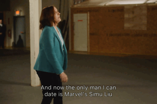
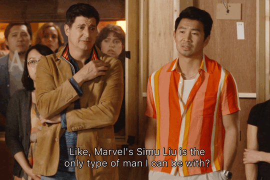

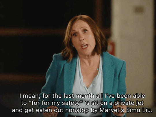

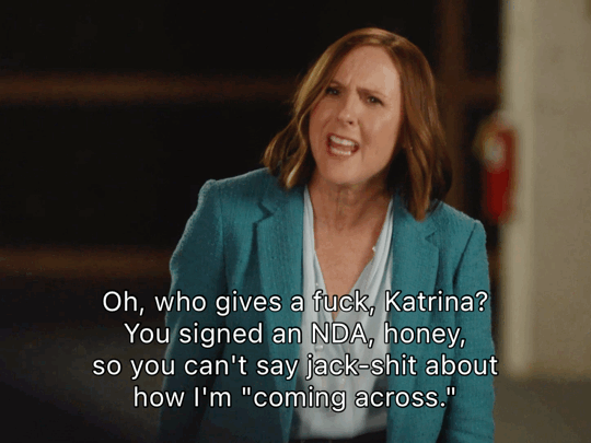

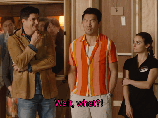
The Other Two
S3: E7 | Cary Gets His Ass Handed To Him
#the other two#molly shanon#simu liu#pat dubek#marvel cast#simuliuedit#man i was inconsistent with the font sizes#oops#i also don't know how to tag this set#i just wanted people to see because it made me laugh so much
122 notes
·
View notes
Text
Patrick Bateman’s card design was lackluster. Too much space at the top and the & sign was off center (if an artistic liberty, a bad one). Overall, it’s an average card at best, even when I attribute extra points for the font choice (projected an elegant but minimalist design which is vital to the reputation of the modern upper business class, this is because it gives the impression you’re a man of fine taste, but not decadent) and bolding. I like the color palette, bone is a beautiful white because it doesn’t ambush the eyes like other corporate whites. Bone white is preferable to a white like bright or porcelain (loud and emotional) because it’s subtle, and by extension you are subtle. More imperfections in his card include the rigidity of the layout, which gives it a harsh geometric feel, the centering of the phone number in the upper left hand corner, and the font sizes.
When contrasted with Van Patten’s it simply cannot hold its own. What sticks out first is the texturing of the material. When you give your card to someone it’s an intimate tactile experience, the sensory pleasure of a textured business card can leave a lasting impression on the receiver (Is it enjoyable to the touch? Can the brain derive a stimulating sensation from interacting with it?) The spacing on this card, if not perfect, is several times better, though the bolding is excessive and makes him come off as self important and clumsy. Eggshell white is lesser than bone but still withstands in the corporate world. I have no personal opinions on the specific font he chose other than it not having the depth of Bateman’s. I would not brag on this one either, it looks like something you would find in the suit of a geriatric chainsmoker.
Bryce says his card is pale nimbus white, a pretentious way of saying cloud and a nod at his tendency to over-complicate simple concepts to appear more intelligent/interesting. His is also geometrically rigid with a void at the top. The center text is too high with a skeletal attempt at bolding. Font size inconsistencies and font choice paired with everything else makes it the worst one. Bonus points for texturing.
The first thing that sticks out about Paul Allen’s card is the bolding. Whereas Bateman doesn’t bold, possibly due to subconscious insecurity, Paul Allen makes a brutal decision to tell everyone what he thinks of himself. His name and job title are so black and thick that I can’t finish this joke because it’s in bad taste. It’s not egocentric, but narcissistic? Yes. Bateman describes the card as tastefully thick, implying the card has a sturdy structure. It is unfortunately without texture. The division of the bottom row into two separate rows does more harm than good, it gives the bottom left and bottom right a gaping void of white space, but I like the font. None of the cards were striking to me but Paul Allen’s takes the cake.
210 notes
·
View notes
Text
*Book Report!*

I'd just like to start off by saying that one of the first people in the Napoleonic community that I found on here, was @joachimnapoleon , the author of this book! I've learned so much from her blog, specifically about Joachim Murat, but also about all our other beloved Napoleonic characters. Murat is definitely a big character in the story of Napoleon. I'll admit I didn't know much about him, other than the basics that all the Napoleon biographies listed. Dashing cavalry man that married Napoleon's sister, Caroline, and eventually betrayed him. Based on that, I didn't particularly like him, as I tend to see things from Napoleon's point of view. This book changed my outlook and I saw, through Murat's own words, that he was just looking out for his family and his kingdom. It was so much deeper than just "betraying" Napoleon. I would not have liked to be in his situation! It was sweet to see the letters to his family, specifically to his daughter, Letitia. I think my favorite part was in the earlier letters to his parents though, when he was repeatedly asking for his baptismal certificate. It reminded me of myself when I moved out from my parents house and I had to keep asking my mom for my birth certificate so I could get my license changed. It's also interesting to see how people wrote to each other back then, so dramatically if they didn't get a reply and constantly referencing their health. I very much enjoyed the introduction as well, where Sarah Hammell explains how she got into Napoleonic history and Murat in particular. My only complaint about this book, is some sort of editing error I assume, where sometimes the footnote numbers are small and sometimes the same size as the normal font. Just a small inconsistency. I hope that this book opens the door and inspires more authors to write books on Murat in English, something that we are very lacking.
#joachim murat: a potrait in letters#sarah hammell#book report#joachim murat#marshal murat#king of Naples#napoleonic#napoleonic marshals
50 notes
·
View notes
Text
Akatsuki Members Handwriting HC's:
I haven't slept properly for days and it's really showing. Ever wondered what the Akatsuki member's handwriting is like? Probably not but here I am thinking about it for you because I'm so nice.
Perfect. Do I really need to say more? His handwriting is absolutely stunning, it looks like professional calligraphy. Perfectly sized. Doesn't do any harsh lines and it's very soft and curly. All his letters are joined. He absolutely does his 7's with the line in the middle and his lower case a's have the curly bit on top. He has never and will never use an exclamation mark. They're too confrontational. 10/10
Very big. Like, way too big. Leaves large spaces between each letter. Itachi also scolds him because he wastes so much paper. He still uses his finger to measure out finger spaces so they are also big because man has chunky fingers. Unlike Itachi's his is very angular and all his letters are sharp. You can tell he presses too hard on the paper because he rips it occasionally. Because it's so big it's very easy to read though. 8/10

Man has the most boring and generic handwriting ever I'm sorry. Basically looks the exact same as Helvetica font. (standard keyboard font) His handwriting is the most legible out of everyone else's though, there's just not much you can really say about it. 5/10

Fairly neat, tries to imitate Itachi's style so quite curly and soft but not nearly as pretty. He also joins all of his letters up. Never writes in black ink, everything has to be coloured/highlighted. Takes forever to write anything because he has to make it look super pretty. Always draws little doodles and diagrams alongside everything he writes. Shopping list? Yes but also he has drawn every single item. Unlike Itachi he only uses exclamation marks, sees them as explosions on paper. 9/10

Only writes in capital letters. Cannot write in a straight line either, even when it's on lined paper. Doesn't know what punctuation is either, he couldn't tell you what a question mark looks like. Quite similar to a young child's handwriting. His spacing is also super inconsistent. Instead of words it just looks like he's written lots of letters randomly. 3/10
Has Doctor handwriting. Physically impossible to read anything this man writes, despite this he still blames everyone else for being unable to read it. For real though, there aren't even legible letters his writing is literally just squiggly lines which he claims are letters. 0/10

His writing is slanted so it always looks like its written in italics. It's definitely on the smaller side and he never joins up his letters. If he writes on lined paper he definitely has the lines going through the middle of his letters. Similar to Sasori I don't think there's anything especially notable about the way he writes, it's just very pleasant to look at. 4/10

Is left handed so everything she writes is smudged, much to her annoyance. Her handwriting is definitely tiny because she's so used to writing notes on small pieces of paper. Is a mix of both joined and un-joined letters. Only ever writes in shorthand, everything she writes is basically like trying to decipher a code. She never dots her i's and consistently forgets to put crosses on her t's and f's. 3/10

Honestly an absolute mess to read. I imagine both White and Black Zetsu bicker about how to write and so everything he writes ends up as two completely different styles.
White Zetsu can't write. I'm sorry, I don't make the rules. He draws pictures instead. He lacks any artistic talent so its impossible to tell what they are. Kisame definitely plays games with him where he tries to guess what the pictures are.
Black Zetsu's handwriting is tall and skinny. All of his letters are just really long and stretched out for no reason. Similar to Kisame he definitely presses down too hard on the paper, although this is just because he's an angry lad. Basically anything written by this lad is just pictures interspersed with loooong letters. 1/10

Writes like a very young child. He can't spell either. Like White Zetsu and Deidara he also likes drawing pictures, although his pictures never relate to what he's actually trying to write. Gets distracted easily and so most of his letters end up being half finished, like bro will be writing the letter t and forget to do the cross, or he'll do a 'w' but only do half of it because he gets bored and wants to move on to the next letter. 10/10
#akatsuki#naruto#akatsuki headcanons#naruto headcanons#kakuzu#hidan#konan naruto#konan#pain naruto#sasori#deidara#kisame#itachi#tobi#zetsu#white zetsu#black zetsu#itachi headcanons#kakuzu headcanons#hidan headcanons#konan headcanons#sasori headcanons#deidara headcanons#headcanon
100 notes
·
View notes
Note
Please do more of the writing head canons. It’s really interesting to see other people’s ideas on the topic, so if you can be bothered, I would highly appreciate more, thanks bye <3
Y’all don’t know how happy I am to talk about these headcanons, they are my babies and I love them so much :’) thanks for asking g <3
Handwriting Headcanons
Same dynamic as before, try to guess whose handwriting it is before reading and tell me how many you got right! <3

You can find the first post here (no need to check it tho)
Quick disclaimer: halfway through making my initial notes, I remembered I had one (1) single lesson of graphology in my applied linguistics class, but that was a year ago and some information might be off. I just thought it was neat to include.
Another quick disclaimer: I don’t know much about Hylian, but I like to think it has a similar stroke system to Japanese, so the pressure and accuracy of your strokes play a major role in your handwriting (among other things, ofc.) so there are some parts where I focus more on that
(First Row, from left to right)
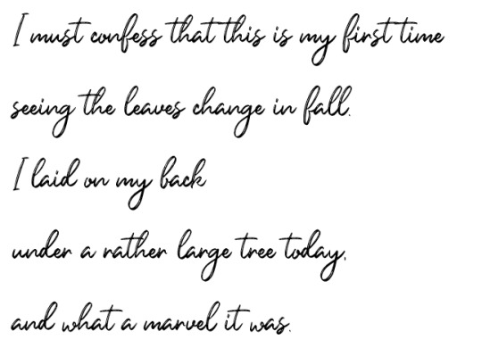
Sky
Our first boy is mother hen! Believe it or not, he has the prettiest handwriting out of all of them! Sky: probably has nice, even elegant handwriting because Sun forced him to practice when they were little. In the end, that paid off because his handwriting is the prettiest one. There’s no pressure, but he is confident in what he writes that his lines aren’t thin. Mistakes? what is that? this boy has impeccable grammar and spelling. No mechanic errors to be found in his letters!
I’d like to think that many of Hyrule’s classic/staple poems were originally written by the firt king aka sky child. Like, imagine, after a retiring from being a Person of Power (as the first ruler), Sky finds comfort in the arts: revisits his old woodcarvings and starts writing poetry about the world he still doesn’t fully understand. wowie. tldr: sky writes poetry and you can pry it from my cold dead hands.
This is what one of his letters would look like:
Next one is the one and only, our Hero of Time
2. Time
I’ll die on the “Time didn’t know how to read and write” hill. His handwriting is simple, not pretty but not messy. It has some grammar and spelling mistakes here and there. Can become unreadable if writing in a hurry, he sorts of forgets spaces between words are a thing/letters have different sizes and lowercase letters end up the same size as capital letters. I’m not saying he sometimes forgets to write articles: he just doesn’t want to. Honestly, he just has this dad-neat handwriting. He is a gentle dad and writes like a dad, if he puts too much pressure onto the paper, his handwriting become too sharp/angle-ish and ends up looking ugly. And as much as he would like to not care about it, in the end he does (:
Malon taught him how to write and it was quite the experience. At first he didn’t want to because he was ‘too old’ to learn and it was torture at first, but now look at him devouring his cowboy novels.
A chunk of his handwriting:
*sniff* such a dad quote.
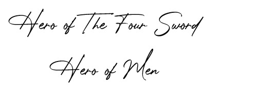
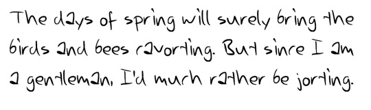
3. my mansss, your 4x1 deal at Target: Four
Look, my boy is patient! He could do some nice and fancy lettering if he wanted to. He was taught that handwriting and spelling said a whole lot about him as a person, you know, like a first impression kinda thing; so he always proof reads more than twice before sending a letter. Super rare grammar mistakes.
The faster he writes, the more slant his writing becomes. Under stress/ when not sure how to write things down, run-on sentences are everywhere and his handwriting is inconsistent in general (I don’t headcanon each part of him having completely different handwriting because handwriting becomes muscle memory over time. It’s just slightly different variations of the same, like idk Vio’s handwriting is neater than Green’s and Red writes hearts instead of any dot/circle and no, I do not take constructive criticism on that, jk i do.) Adding on to each of the colours’ handwriting, I’d think Red and Green write with words slanted to the right( inclined), Vio is a mix of the opposite, so reclined and straight, and my mans blue a true neutral writes straight (kinda like Time’s).
The logic behind this is that inclined writing supposedly means honesty and need for giving (and getting) affection; reclined means, as you can probably imagine, defensiveness and repression of true feelings, but also shows great concentration; straight handwriting means self-control, observation and reflection as well as distrust and indifference. But as complete being (tm), Four just writes as in the image example which is not too straight and not too inclined, and I believe that’s a good middle for him
HOWEVER, if I’m feeling in the mood for crack, I totally accept this boy to have the ugliest, chicken scratches-looking handwriting! :’D It’s just funny to think that someone like him, who has to be precise and careful in his work, can't write neatly to save his life.
One of his letters would look like this:

Also I just LOVE how his hero titles look in this font ksksks
and that’s
(Middle row, from left to right)
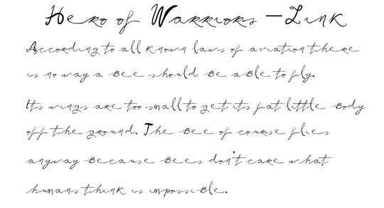
4.- Mister Bunny Boy - Legend
His uncle taught him how to write. I’d call his handwriting pretty and neat at a first glance, but he presses too hard on the paper, most of the time staining the back or the following page. Sometimes will retrace some words if he doesn’t like how it looks (which only makes it messier). According to my notes, a thick or strong handwriting represents determination/commitment.
As I also headcanon him to know many languages, mechanical errors are more present than grammar ones; that is, weird capitalisation of words. Punctuation is somewhere in between; uses too many commas when he should just cut the sentence. he mixes punctuation from two languages or more in writing when too distracted (or too focused, because, well, pressure.); when he writes for himself, he has almost no problem following said language’s punctuation rules. Also, this is just polyglot culture, and I’m projecting a bit, but when he forgets a word in the language he’s writing, he just replaces it with its equivalent in another language because we don’t care about fluency, but rather functionality. in this household (more on that in my language hc, ksksks).
An example of his writing:
so powerful
4.- Mr. Wolfman, howl me a song - Twilight
I don’t have much for him because 1) I don’t think he writes a lot and 2) he is a hands-on/visual learner, I’ll die by that. He only learnt how to write because Ulli insisted it was important and he was not about to disrespect his momma; he IS That Guy, but doesn’t really write enough to have neat handwriting.
Many people seem to overlook the fact that his house is filled with books and write him as completely illiterate (which if not explored properly, ends up feeling a bit disrespectful and full of prejudice, but go off I guess; and that’s on my core Headcanons for Twi); however, he sticks to simple sentences. Knowing how to read and understanding a text is different from knowing how to write them. Like, when we would see a semicolon and understand its position in the text, but didn’t understand the nature of it. Is this clear? idk i’m sorry. So yeah, boy reads a lot, writes very little.
As for his Actual Handwriting, as opposed to Legend, his handwriting is thiccc but not because he presses into the paper; he is just that messy, he has no sense of ink-flow-control, he does what he can with what he has. To the untrained eye, his handwriting illegible letters like v, n, u are very similar; when he makes notes for himself he does it in the form of doodles or small ‘icons’. But! He reads a lot, so he rarely makes spelling mistakes (: he is your go-to guy when you don’t know how to write a word.
An example of his writing:

He keeps a journal, sue me.
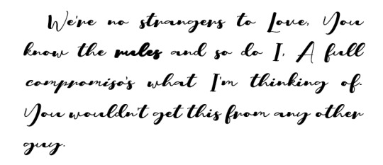
3. My first born- Warrior
Okay, first off... I accept this is completely biased. I saw the idea and said “That’s True”. If you haven’t, please read Effective Communication; or The Lack of Thereof by htruona, a fic where the boys reflect on the language barriers between them. It’s incredibly funny and probably what made me start making these silly notes. So, if you’ve read that fic, you know where I’m going.
My man, Warrior, can’t fucking write. I mean, he physically can, but it’s very bad. Here’s the reason for it, tho, and it’s not his fault: Technically, he knew how to write alright but he joined the military and whatever note he had to write had to be concise or in the worst case coded. He mixes capital and lowercase letters. If we consider that he joined the military at around 15, his handwriting and grammar had yet to continue developing. Just think about how after summer break, your handwriting was always slightly worse than before because you didn’t write for an entire month. Now think what 2 years can do to that. Hmm, not cool, dude. He makes quick notes, when writing he’s all gotta go fast. he is the lighting mcqueen of writing; good for emergency messages, not ideal for love letters. His punctuation also suffered a lot, he only know full stops and commas and hardly uses them. A sentence for him is either one word or fifty without a single comma, no inbetween.
His hero title and an example of his writing.
(Bottom row, or what I like to call “fuck cursive” row)
7.- Magic man - Hyrule
I’m basic and I do agree with the popular headcanon of he not knowing how to write because well, y’all know his Hyrule. He only knows how to write his name because that’s important, same with numbers. I don’t see why would he write/read except checking the roadsigns. (he can even use this as an excuse for getting lost frequently; he thought it said something different.) But I do think that because his habitual reading consists of roadsigns, his ‘punctuation’ is weird af and places full stops/points/periods at the same level of his words and his commas/question/exclamation marks below them. Yk, creative license. Sadly, I don’t have much about my magic hands man so here’s what his writing would look like if he actually wrote a paragraph:

Man, I love Hyrule.
8.- Man, I don’t understand this boy - Wild
Cursive? ain’t nobody have the time for that. He woke up and had to save the world in his underwear while not knowing how to read nor write. He learnt during his journey and was taught by multiple people from different regions, that explains his inconsistent spelling of things and names for them. So Wild knows language variations for many items and uses them interchangeably (even if they aren’t exactly the same). Another headcanon related to writing/language skills that I’ve been thinking about is that if the shrine was able to cause amnesia, I’m sure there were other areas in the brain affected which leads us to language disorders such as agraphia and aphasia. But that’s a story for another day ksksksk
An example of his writing (after relearning)
9.- The best of sons - Wind
I don’t have much for him and that makes me sad. Look, he’s a kid, doing kid things like stabbing dudes on the head. This boy was taught cursive by his grandma, but could never do it and no one needs it anyway. His handwriting is good enough for his pirate life, Tetra is the one to handle Official stuff, he just gotta sign. Spelling and grammar mistakes abound. He is still relatively young and can correct his handwriting if he desires. But same as Wild, with how many times he’s been thrown out and hit his head, I’m starting to consider some language disorder for him as well.
An example of his writing:

aaand that’s it.
Thanks, y’all for showing interest in this silly thing uwu it was fun to finally talk about this. If you ever want to discuss ideas/headcanons(especially if they are related to language and culture), I’m your person (: I’m always happy to hear new headcanons. Feel free to add anything to this post either in a reply or in a reblog, I’d love to hear from y’all <3<3
#linkeduniverse#linked universe#anon#ask#lu headcanons#well that took more than an hour#but tbh i got distracted by the polls#yikes#but anyways here's my essay#ksksksk#I'm sorry for being more detailed in some#sometimes there's not much thought going on other that#than I vibe with it#yk?#anywussy pls let me know what you think#and if you have any headcanons related to writing pls let me know i b e g#echo i'm sorry for slaughtering warriors like that ksksksk he wasn't the one with detailed writing#although i can also imagine him the way you described it#but russian-cursive-writing!warriors held my monkey brain hostage#and there was nothing I could do#aiñ forgot to add the main tag#because tis is the official post ksksksk
145 notes
·
View notes
Text
TYPOGRAPHY (week 1)
LIKE

Coolvetica by Typodermic Fonts
Coolvetica font is legible. All the letters are very neat and clean. Words and text created by this font are easy to read, no matter large or tiny size. It is very important to make sure that your writing is legible, so it can send the right message to the readers.

Adega Serif by Adega Design
Kerning is the space between two letters. If the two letters are too close to each other, the words are unreadable. Too much space can cause confusion to the readers, because it is hard to tell whether it is the space that separates the letter or the word. Thus, it takes a longer time to read. Adega Serif is a good example of an even kerning font.

G.I. Incognito by Iconian Fonts
G.I Incognito is a well-designed font. All the letters are consistent. They have the same width and height. The font also has an even kerning, it maintains good space between letters and words. A font that is consistent and even kerning is legible, while an inconsistent and uneven font is ugly and hard to read.
DISLIKE

I Ging by Sokratype
I Ging font is the same with the optical illusions that hurt your eyes and your brains. Do not ever use this font or any font that is similar, it causes sore eyes, headache and even nausea. Moreover, the capital and lowercase letters are mixed together in one word. The ‘t’ in the word ‘Anatomy’ is a lowercase letter. The ‘T’ in ‘Typography’ is a capital letter. However, they have the same design, same height and same width.

Slim Wandals by Mans Greback
The design of the letters in Slim Wandals makes the letters hard to recognize. This font is an example of an illegible font. It is very hard to read, all the letters stick together. This type of writing is better used in graffiti art.

A Acorn Squash by wep
A Acorn Squash is readable, however it fails to maintain an even kerning. The ‘T’ in ‘Typography’ is very far away from the rest of the letters. All the letters are also inconsistent. They do not have the same x-height. The letters do not touch the baseline.

References:
https://visme.co/blog/type-anatomy/
https://99designs.com.au/blog/tips/the-best-and-worst-typefaces-and-why/
https://www.dafont.com/
3 notes
·
View notes
Text
The things you need to start the self publishing thing
This is a day late, doesn’t even follow the how to do the thing format, and my dyslexia is running rampant today so ther’s probably six billion typos and mispellings but fuck it let’s goooooooo
Shit you’ll need before you can even get to the shit you need:
A complete manuscript
I’m talking multiple drafts here people. Beta readers, self edits, tears, blood sacrifice, the works. Unfortunately, this isn’t 1920, we cannot publish our first drafts.
I mean, you can but its not gonna go well.
Money
Like. Lots of money. This shit is Expensive.
A Plan
Don’t be like me. Don’t just suddenly go “alright let’s publish” one day
Actually lay out a timeline for yourself
Expect delays
So Many Delays
Plan for publishing at least like six months in advance you will thank yourself later I promise
Ingramspark vs. Createspace or whatever they call it now. They changed the name the other day I think
I went for ingramspark
Because
Fuck amazon
Ingramspark is More Professional
Everyone else also thinks “fuck amazon”
You’ll be able to sell your book more places this way.
This one is a p personal decison so look this shit up yourself.
One you’ve got that shit, you can get this other shit
First things first, hire an editor. There are a shit ton of different editors out there, I’m not listing them all, mostly because I don’t remember them all and a lot of them overlap anyway. The majority of places will let you pick an editing ‘package’ that’ll combine several types. Go with that.
Alright I’ll list a couple kinds of editor. Just the ones I can remember tho, I’m not looking them up again.
Content Editor-looks over the big picture, the story itself. Fuck that grammar bullshit, this is about lookign for plot holes and character inconsistencies and shit. Basically a beta on steroids, I love these dudes.
Line Editor-this is what everyone thinks of when they say editor. They do the grammar shit.
Sensitivity reader-make sure you’re not making a dick of yourself, good thing to have.
Learn how to Format the book
This one you actually can do yourself, its not like...unattainably difficult, especially if you can get ahold of Microsoft Word.
The basics are:
Book Size
8.5x5.5 is pretty much the most common
And that’s the interior pages, the cover itself tends to add a lil bit onto that and so if you go measure a bunch of books you’re gonna get 9x6 or something
Font
12 pt. Times New Roman is the standard
Margins.
I think 1 inch is standard?
Listen, this shit gets complicated and its been like nine months since I did it, I’ll link you some things at the end so you can get a better idea.
Header and Footer
Pro tip: Center all of this shit, that way you don’t have to fuck around with aligning it right on the corners of the page.
Author name on one page, book name on the other
You can do evens or odds, I don’t think there’s a standard
Page number on every page
EXCEPT: the first page of a new chapter
Just to make things more difficult, nothing goes on those pages. Because fuck you.
Widows and Orphans
Yeah I know “what the fuck does that mean???”
You know how sometimes you’ll have this one sentence that’s just hogging a whole page? Yeah those
Or those times that a sentence goes onto the next page all on its own
I’m not sure which of those are widows and which ones are orphans tbh. I mean... I could probably guess but nothing is simple you know?
There’s some places that’ll tell you to do this manually by changing the line spacing and/or text size of each page?
Don’t fuckign do that
That’s ludicrous.
There’s literally a button for it on microsoft word
This is one of those things where the easy solution is actually the one you’re supposed to use.
Oh yeah, indents
No you can’t just press tab
That would be too easy.
And nothing can be easy, remember?
0.3/0.5 is the standard I think.
Also make sure everything is left aligned.
And the line spacing is usually double spaced? I think?
I want to say there was a certain number of lines per page that was standard and you’re supposed to fiddle around until you get that. So enjoy.
https://www.youtube.com/watch?v=0IGkyMhsr28
https://firstmanuscript.com/proper-manuscript-format/
A Cover
Unless you’re like A Professional don’t do this yourself its way more complicated than you’d think
Have a Solid Idea of what you want your cover to look like. Just shrugging and going “idk man” isn’t going to help anyone.
This isn’t just the fun artsy shit either
Figure out where you’re putting the blurb and your author picture and your author bio, which, btw, you gotta write too. I’ll get there.
Author Bio
Jenna Morecci did a whole video on this so def look that up cause that’s pretty much the best info I’ve got for you.
But:
3-5 sentences
Written in third person
Yes its weird to write about yourself this way, just go with it.
Embrace your inner “whatever fictional character talks in third person” and go with it
One sentence on your experience with writing whatever this is
One sentence about yourself/shit you like
And one on something else, I’m not watching the whole video over for this. Just go watch Jenna, you’ll love her.
I don’t think I’ve ever read an author bio and I don’t know anyone else who does either but I guess somebody must so we all have to suffer.
A Copyright thing
Like. Register your book with the copy right office so that if someone tries to steal it you can tell them to stop.
Yes this costs money too. Becasue fuck you I guess.
This sounds really intimidating but honestly you just fill out paperwork and while that stresses me personally out beyond rationality its not really that bad.
Don’t forget to add the copyright page in your book too, there’s a thing on the format for it, lemme look
Here ya go:
https://blog.reedsy.com/copyright-page/
An ISBN
Most people upon reading this immeditaely went “what the fuck is an ISBN?”
If you didn’t then good job you’re more prepared than I was. Good on you.
An ISBN is like an identifying number for your book.
Actually, its an identifying number for specifically this format of your book. If you’re planning on doing a paperback and an ebook or a hardcover or an audiobook or whatever, you need to get an ISBN for Every Format of it
You can buy ISBNs ((in the US at least, I don’t know about other countries sorry)) on Bowker.com
Why did they name it that?
I don’t know
You would think that they’d maybe pick a more...I don’t know, relevant name for their site?
Listen, a fact of publishing a book is that everyone involved has conspired to make is as frustrating as humanly possible. You’re just going to have to accept that.
Why is their whole site mascot a bird?
Also don’t know. They’re having a good time with it I guess.
Maybe something to do with Bowker sounding like bough?
Also a barcode!
Yeah, didn’t think you’d have to buy that did you?
Neither did I but here we are
Actually you don’t have to buy one if you use ingramspark, they’ll give you one when you use their cover template thing apparently.
Know what price you want to sell the book for
Even in self publishing, the place you’re going through is gonna want a piece of the pie. Enjoy that.
Ingramspark has a calculator for that actually, its p cool
You can stick the price in the barcode
Idk if that relevant but that’s a thing you can do?
uhh…..I’m pretty sure I’m forgetting something….
You might want to get an author website set up?
You should probably have that before now but if youre doing this Chaos Style (™) like I did then you probably want it up before you publish so you can put it on the book somewhere.
People you need to hire:
Editor
Cover Designer
Possibly a formatting person if you decide fuck that shit
Which. Understandable
Shit you need to get a handle on
Formatting
If you decide fuck yourself
Which. Understandable
Copyright
Price
ISBN
OH yeah.
Marketing Junk
You honeslty need to have a handle on this shit Waaaaaaayyyy the fuck in the future. If you’re only thinking about it like...now its probably not great.
The Chaos Method is not generally a good approach
See: Ascendant’s release was essentially a flop and even tho people who read the book love the book I’m still struggling to get people to read the book
Psst read the book its great I promise
Your book release is like. The Biggest Chance for marketing shit
Get on top of that junk
Giveaways
Posts about it
Just
Everything all the time everywhere
You definitely need a schedule for this
Like seriously
Make a plan.
That’s pretty much it I think. I mean...look in other places too because like I said earlier, its been months since I did this and when I did do it it was the Chaos Method of me just going “I’m gonna publish now” and Doing That.
Get a plan, believe in yourself. Get a publishing mentor
Someone who’s done this shit before and can give you some encouragement and direction.
It probably shouldn’t be me but I guess if you need help I’m game to do what I can.
Also be prepared to like. Crash, mentally, So Hard. Its terrible. See my older post for all the shitty shit about publishing this way.
226 notes
·
View notes
Text
Album Cover and Back Text Experiments + Designs (Photoshop)
Here are the text developments i was experimenting with to create my album. The name that I chose for my album from the list of names in the last thread was ‘Atlas’ and that is what I am experimenting with here. Each experiment that I have created here has a brief explanation on how it was made and the step what went through it to reach the final product.
All of the type faces and effects could be made into a unique and interesting cover and back page for my Album.
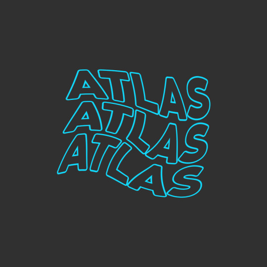
This first piece here was rather quick to perform as there is not a lot of step that need to be taken into action to make it happen.
The first thing you want to do is type out your message or word, here for me it was ‘Atlas’ Once done with this you want to head over to the. Blending options tab and make your way over to the ‘Stoke’ sub section and simply apply the stroke in the color you are working with. Then go over to the blending options and turn the ‘Fill Opacity’ down to 0% by doing this you are left with the outline of the letters and the middle showing the background in the layer below.
By then you will have one of these words or phrases to then you want to duplicate the word by using cmd + right click and drag both beneath and above. Once done with this you can then selection all of the word layers by shift clicking all the layers and turn it into a smart layer, combining all the layers into one editable layer.
By then you can start manipulating the words however you want. This can be by any tool, liquify, blur etc. By in this situation I went with the ‘Swirl’ effect under ‘Filters’ then ‘Distort’ in the sub section. When applying the swirl effect you should be left with something that looks a little like mine above.
Font - ‘Coco Goose Classic’
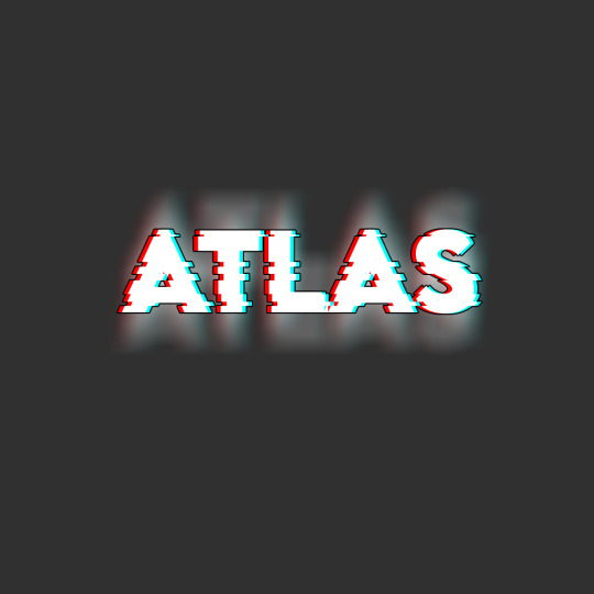
With this one it brings back the the glitch effect and practise that I have gone over and used multiple times during my time in this course by now, mainly in last terms project.
Here I show my understanding of the glitch effect at a higher lever and with more experience with the style and also the software in general. Just like the picture above it looks rather refined and complicated to pull of but is a lot more simple the further you strip it back. By starting off with this one you want to type out your starting word in white, as this give the glitch look the most dramatic effect. Then you want to duplicate the white text layer 2 more times so that they are directly under the first text layer, you can do this by using cmd + J.
After duplicating the layers you want to head into the blending options for the 2 new created layers then in the options for one layer you want to remove the R channel from RBG and for the other channel remove the G and the B once this is done you can move the under layers to both the right and left of the white text as seen above.
By then you want to selected all the text layers and rasterise them then group them into one layer (this makes it easier to make the next edits). Once merged together you need to use your marquee tool to selected bit you want to move slightly to make the glitch effect. This doesn't have to be precise, any cut will look good. Although you want to mix up how big you are doing the cuts to leave a level of inconsistency in the effect and not to man made. The cuts can be made by holding the cmd + arrow keys left and right from when the area is selected with the marquee tool.
Then it’s a matter of doing some final adjustments to really make it shine. Such as here I duplicated the glitched text using cmd + J then applied motion blur in a vertical formation to add additional depth and a light black stroke to the text for additional contrast in layers.
Font - ‘Lemon Milk’

This neon sign just like any other neon work in photoshop is simple yet amazing. The glow mixed with the unique curves and drips in the text is enough to pull anyones attention. Start of by using the same technique you used in the first effect to leave the text with just the stroke. Once done with this you head over to your blend settings and then head over to outer and inner glow making sure that the out glow is more powerful than the inner glow. Set them to what your think it a good level to be set at (or what you think looks the best in your opinion). Also make sure this glow Is in the same color or hue as the text you are working with.
When you have made your text glow you want to make your way over to the Liquify tool. Something I am getting very familiar with now in my work. Adjust the size of the brush using the bracket keys and start to drag wherever you think looks good. (This piece is very versatile to how you like it and what you think looks good). Here I used a mix of the ‘Forward Warp tool and the ‘Pucker tool’ to create the drops at the end of the letters.
When backed out of the Liquify menu the last touch you need it to use the soft brush in the same color as the text to create a few large blogs behind the text in a fresh layer to add in a faded glow in the background to make the text stand out more. When making you dots of added glow make sure you turn the opacity down to not make it to over powering.
Font - ‘Minecraft Game / Menu Font’

This is the first piece of work I have made where I have incorporated the use of the mask layer tool in it and I honestly love how it came out looking. This would look great as a company logo or a great addition to my portfolio if added into the right style of work.
To start of with you want to start with the shape tool and draw out a long skinny rectangle in which covers most of the canvas. Then you want to duplicate that shape layer however many more times until it reaches near to the bottom of th page. When that happens you will have tones of single shape layers that you want to shift selected and then transform into a smart object. Then again for the last time here in these experiments go to filters and use the liquify tool. In the tool this time you don't want to make many drastic changes as the more subtle the better with this one as you can see above.
When finished you want to type out either the word or the letter into a new layer you want to have the effect masked onto and magic wand it all. Then in the layer with the lines on you want to make a layer mask and once its make you want to ‘unsee’ the text layer and the effect will be printed onto the letter.
This effect is so versatile and im sure I will find many uses in the future in more work when it comes to using the mask feature as I have tend to stay away from it in the past as I was not 100% certain on how it worked but now using it and properly getting stuck in with it I couldn't love it anymore!
0 notes
Link
By this point, virtually everyone in America is aware of the clash between March For Life attendees and protesters which took place this past weekend. The incident has gone viral with multiple accounts of what all transpired and subsequent video footage.
However, The Daily Caller News Foundation reports that Nathan Phillips, a Native American man seen in a confrontation with Covington Catholic high school boys, continues to change his story and provide multiple, conflicting accounts of what happened.
A Closer Look at Phillips’ Various Accounts
Phillips initially alleged that the Covington Catholic high school boys surrounded him as he tried to exit the scene. He also claimed that his path was blocked in the attempt to leave. Of course, the media ran with this story, particularly after the release of video footage which seemingly corroborated Phillips’ claims.
As the old saying goes, there is always danger in only have parts of a story. Upon further digging and extended video footage of the events which transpired, it turned out that Phillips and the accompanying crowd actually approached the high schoolers and began hurling insults at them. The video footage which shows Nick Sandmann smirking while Phillips beats his drum occurred after Sandmann and other students were approached by Phillips and the other crowd.
Despite the video footage which has disproved Phillips’ narrative, he is now putting forth an even more appalling account, claiming that Covington Catholic high school students were physically assaulting African-Americans:
“They were in the process of attacking these four black individuals. I was there and I was witnessing all of this … As this kept on going on and escalating, it just got to a point where you do something or you walk away, you know? You see something that is wrong and you’re faced with that choice of right or wrong.”
Phillips then claimed that Sandmann and his friends were “beastly” while the four black individuals served as “prey.” However, video footage has, once again, proven that Phillips’ account is simply not accurate. The four black individuals which he refers to were actually taunting the high schoolers, not the other way around.
Despite the inaccuracies of Phillips’ multiple stories, he is now claiming that he wants the Covington Catholic high school students to face expulsions.
What are your thoughts on the inconsistencies of Phillips’ accounts? Sound off in the comment section below!
@import url('//netdna.bootstrapcdn.com/font-awesome/4.1.0/css/font-awesome.min.css'); .menu span a:before { font-family: FontAwesome; speak: none; text-indent: 0em; position: absolute; top: 0; left: 0; width: 100%; height: 100%; } #A_b_t_main_25171.web_lizar_main_div { width:auto; height:auto; border:1px solid #ccc; background-color:#dd3333; overflow: hidden; } #A_b_t_img_25171.web_lizar_image_div { margin-top: 35px; } #A_b_t_img_25171 img.web_lizar_image_User { border-radius:50% 50% 50% 50%; border:5px solid #ffffff; width:130px; height:130px; } #A_b_t_name_div_25171.web_lizar_user_name_div { margin-top: 25px; } #A_b_t_name_div_25171 h3.name_user { color:#ffffff; font-size:16px; font-family:Courier New !important; margin-bottom: 0px; margin-top: 0px; word-wrap:break-word; float:none; border-bottom: 0; text-align: center; font-weight: normal; } #A_b_t_discription_div_25171.web_lizar_discription_div { padding-left: 10px; padding-right: 10px; padding-bottom:0px !important; margin-top: 25px; word-wrap:break-word; } #A_b_t_discription_div_25171 p { color:#ffffff; font-size:18px; font-family:Courier New; margin-bottom: 0em; word-wrap:break-word; text-align: center !important; line-height: normal !important; } #A_b_t_social_icon_div_25171.web_lizar_social_icon_div_use { padding-left: 10px; padding-right: 10px; margin-top: 25px; height: auto; } #A_b_t_social_icon_div_25171 a>span.web_lizar_Social_icon { color:#ffffff !important; margin: 5px; font-family: FontAwesome; border-bottom: 0; font-size:20px; } #A_b_t_social_icon_div_25171 a { border-bottom: 0; } #A_b_t_web_link_div_25171 { margin-top: 25px ; padding-bottom:40px; } #A_b_t_web_link_div_25171 a.web_lizar_web_link { color:#ffffff !important; font-size:16px; font-family:Courier New; border-bottom: 0; word-wrap:break-word; } #A_b_t_social_icon_div_25171 a.icon { text-decoration:none; box-shadow: none !important; } #A_b_t_web_link_div_25171 a.icon { text-decoration:none; box-shadow: none !important; } @media only screen and (min-width: 768px) { .web_lizar_image_div {float:left;max-width:30%;padding-left:10px;padding-bottom:30px} .web_lizar_discription_div {float:right;max-width:80%;padding-top:25px;} .web_lizar_user_name_div {float:left;max-width:5%} #A_b_t_main_25171.web_lizar_main_div { width:auto; height:auto; border:2px solid #000000; background-color:#ffffff; overflow: hidden; } #A_b_t_discription_div_25171 p { color:#000000; font-size:18px; font-weight:bold; font-family:Lato; } } @media only screen and (max-width: 767px) { #A_b_t_main_25171.web_lizar_main_div { width:auto; height:auto; border:2px solid #000000; background-color:#ffffff; overflow: hidden; } #A_b_t_discription_div_25171 p { color:#000000; font-size:18px; font-weight:bold; font-family:Lato; } }
Gabrielle Seunagal is a full-time writer. Some of her favorite subjects to write about include politics, cybersecurity, and current events. When Gabrielle is not advancing her writing career, she is reading, traveling, or studying martial arts.
via The Conservative Brief
0 notes
Text
Zlatan's return, head coach among myriad questions in LA Galaxy offseason
div.video-js { width: 100% !important; height: 0 !important; overflow: hidden; position: relative; padding-top: 56.2%; }
October 29, 20184:45PM EDT
CARSON, Calif. — The LA Galaxy face a number of critical questions as they head into a premature offseason after letting the Audi 2018 MLS Cup Playoffs slip away with Sunday’s fall-from-ahead loss at home to the Houston Dynamo.
Foremost among them: Whither Zlatan?
There are bigger issues, to be sure, after successive failures to reach MLS’s postseason, but none as sexy as whether Zlatan Ibrahimovic — after a highlight-reel campaign dotted with 22 goals, 10 assists and huge crowds everywhere — will spend a second year in sunny Southern California.
The Swedish striker’s thoughts on the matter after the Dynamo’s 3-2 triumph at StubHub Center is anyone’s guess. He was gone when LA’s locker room was opened to the media moments after Dominic Kinnear’s final team talk of the season, but Ibrahimovic several times over the last few months has proclaimed his love of Los Angeles, MLS and playing for the Galaxy while pointedly not promising to return in 2019 despite signing a two-year contract in March.
He’s gone now, his empty locker suggested, but will we see him again? Chris Klein thinks so. Asked whether he believed Ibrahimovic would be back next season, the Galaxy’s president said, “I do. Yeah.”
“Good guy, quality guy, and certainly what he produced on the field is something that we liked,” said Klein, a former MLS winger. “We want to get through this [disappointment], and I will definitely sit down with him and have a conversation and see where we are.”
Klein and Co. must also make a decision on a head coach — remove “interim” from Kinnear’s title or start over with someone new — while assessing the roster and deciding how much turnover is required to turn things around. These are far more complex issues for the Galaxy, who need to take a deeper look within as they choose their path forward.
Do they stick with a the “superstar” model, in place since David Beckham arrived 11 years ago, building around the skills of a couple of big-name players? Or do they become more organic, constructing a side of complementary players — think Sporting Kansas City or FC Dallas — sans huge attractions.
“It’s a valid question, and that needs to come out of this process,” Klein told MLSsoccer.com. “That needs to be clearly defined and communicated and dictated by [the club’s brain trust]. I don’t think you can say that a Zlatan or a Wayne Rooney defines the culture of the club. It’s one player, but it’s what you build around them, certainly. That will be part of this process, also.”
Ibrahimovic is 37, but he was spectacular this year — also in the locker room and on the training field — and his presence would give the Galaxy a chance next year, if they can avoid the kind of injury crises that have dogged them the past two seasons and solidify things at the back.
There’s a decent core to build around, and all three Designated Players — Giovani dos Santos, Romain Alessandrini and Jonathan dos Santos — are under contract for next year. Alessandrini and Jonathan have been vital to the Galaxy, but Gio, the bigger name, has been inconsistent since arriving in 2015, and much of this season was lost to repeated muscle injuries, none major but all debilitating.
Asked about Gio, Klein was more circumspect — and more general.
“We have to evaluate everything,” he said. “We have to take a look with the coach and see what’s important and how they want to play. That’s not something we would answer at this point.”
Kinnear, who guided Houston to two MLS Cup titles and was Frank Yallop’s assistant when San Jose won their two championships, might have done enough to keep the reins — he brought an organization to the team that shored up much of what wasn’t working defensively — but LA have been linked to Boca Juniors coach (and former Columbus Crew SC star) Guillermo Barros Schelotto and former Portland Timbers coach Caleb Porter, among others.
The players would like to see Kinnear stick around.
“It’s been a difficult situation for him …,” captain Ashley Cole said, “but the way he conducted himself, the way he got on with it, changed kind of the mentality of this team, the philosophy of how we want to do things, how we want to play. The intensity in training got better.
“I really hope that they keep him, because what he’s shown in the few games he’s been here, he’s proved he good enough to [have the Galaxy again contending for trophies]. Players love him. Everyone loves him. I hope they consider him to be a good option, because what he got out of the guys, I think he got out the best.”
Kinnear, whose family is still based in the Bay Area, has declined to acknowledge if he has interest in continuing as head coach, saying that his focus was solely on the task at hand and then, with the season finished, that it was “a question for another day.”
“That stuff, for me, isn’t even in the back of my mind right now,” he said Sunday. “My feelings are with the team and the front office and the fans. It’s a great club, as you know.”
Klein said it was possible Kinnear would return.
“His name’s on the list, and he’s going to be part of that process,” Klein said. “I went to Dom early and said, ‘We’re interviewing,’ and he said, ‘100 percent my focus is on getting this team into the playoffs.’ So now that that has been decided, we’ll take a breath and certainly [talk] with him as well.
“He represented himself very well and was put in a difficult situation and came through. OK, a little short, but the integrity and character of that man is unquestioned.”
hr.top-border-fade {background: rgba(0, 0, 0, 0) linear-gradient(to right, #ffffff 0%, #dfdfdf 50%, #ffffff 100%) repeat scroll 0 0;margin:20px 0 0 0;clear:both;border:0;height:1px;color:#dfdfdf;} .merch-block { background: rgba(0, 0, 0, 0) radial-gradient(50% 30px at 50% 100% , #ebebeb 0%, #fff 110%) repeat scroll 0 0; /* border-top:1px solid #ebebeb; */ padding:15px 15px 22px 15px; } .item, .copy {display:inline-block;vertical-align:middle;} .item {line-height:0;} .item img {line-height:0;} .page-node .copy p {margin:0;} .page-node .copy p.merch-block-text {font-size:1.0em;line-height:1.40em;} .page-node .copy p.merch-block-title {font-size:1.4em;margin-bottom:3px;font-family:’din_regular’,’Helvetica Neue’, Helvetica, Arial, sans-serif;;} @media screen and (max-width: 730px) { .item {margin:0 15px;line-height:0;} .item img {width:100%;height:auto;} .page-node .copy {margin:20px 0 0 0;} .wide {display:none;} } @media screen and (min-width: 731px) and (max-width: 1120px) { .item {margin-right:20px;line-height:0;} .item img {width:120px;height:auto;} .page-node .copy {width:70%;} } @media screen and (min-width: 1121px) { .item {margin-right:20px;line-height:0;} .item img {width:165px;height:auto;} .page-node .copy {width:70%;} .page-node .copy p.merch-block-title {font-size:1.3em;} }
<!–
Stay connected: Get access to breaking news, videos, and analysis from North America’s best soccer reporters via “This Week in MLS” newsletter or using our FREE mobile app.
–>
Stay connected: The all-new, completely redesigned, FREE official MLS app is your best mobile source for scores, news, analysis and highlights. Download: App Store | Google Play
#block-block-188 {padding:0;} #stay-connected {border-top:1px solid #ebebeb;margin:20px 0;} #stay-connected p {margin:0;color:#4d4d4d;line-height:1.5em;} @media screen and (max-width: 730px) { #stay-connected {padding:8px 6px 0 6px;width:100%;} } @media screen and (min-width: 731px) and (max-width: 1120px) { #stay-connected {padding:8px 6px 0 6px;width:100%;} } @media screen and (min-width: 1121px) { #stay-connected {padding:8px 6px 0 6px;width:708px;} }
MLSsoccer.com News
Zlatan's return, head coach among myriad questions in LA Galaxy offseason was originally published on 365 Football
0 notes
Text
When Names become Brand Names
And whatever the man called a living creature, that was its name.
Genesis 2:19
Naming things is a fundamentally personal, human act that sometimes – in a profession all about brand names – we take for granted. It’s easy to forget when we are clearing, registering, and protecting names, that at a basic level we are engaging with an essential part of human existence not so far removed from the story of Adam’s naming of living creatures in Genesis. True, Adam may not have had to concern himself with trademarks and intellectual property rights, but we trademark lawyers do.
Lately, I’ve been thinking a lot about this act of naming and names – not brand names, but specifically, baby names. My wife and I are expecting a baby on December 1, and among many of the things to do, naming the baby is perhaps the most important. So while my wife and I work on that, I thought I’d use the opportunity to take a closer look at a case that reminds us of how a personal name can become something else – a brand name – and what happens next.
Ten years ago, while I was in law school taking my first trademark law course, the famous fashion designer Joseph Abboud was learning about trademark law the hard way: in court. The lawsuit (about suits) against Joseph Abboud claimed that his marketing and promotional activities as Joseph Abboud for a new clothing line called “jaz” infringed trademark rights to the name – you guessed it – “Joseph Abboud.” So how did it come to pass that the real person named Joseph Abboud was being sued for using his own name?
Well, it turns out that in his rise to the top of the fashion industry through the 1980s and 1990s, Joseph Abboud registered his personal name and variations as trademarks in connection with his clothing. Then, in 2000, Joseph Abboud sold his company JA Apparel and its trademarks, including the trademarks “Abboud” and “Joseph Abboud,” for approximately $65 million. As part of the transaction, Joseph Abboud transferred all of his rights to the following:
[T]he names, trademarks, trade names, service marks, logos, insignias and designations [of Joseph Aboud]. . . . and [a]ll rights to use and apply for the registration of new trade names, trademarks, service marks, logos, insignias and designations containing the words “Joseph Abboud,” “designed by Joseph Abboud,” “by Joseph Abboud,” “JOE” or “JA,” or anything similar to or derivative thereof, either alone or in conjunction with other words or symbols . . . for any and all products and services. . . .
In addition, the designer Joseph Abboud further agreed not to compete with the JA Apparel for a period of time.
But wouldn’t you know, the designer Joseph Abboud couldn’t sit idle and, despite his agreement, he began to engage certain third parties in preparation for the launch of a new line called “jaz” and began promoting it as Joseph Abboud, the fashion designer. When JA Apparel found out, it sued to stop Joseph Abboud on the grounds that it had acquired the exclusive rights to use the name Joseph Abboud, not just the trademarks. In other words, while perhaps “jaz” didn’t infringe the trademarks, Joseph Abboud’s use of his own name to promote it did, and furthermore it breached the contract. In a page right out of Mad Men, the attorneys for JA Apparel even published a full-page ad announcing that “The Finest Trademark Attorneys in the World Wear Joseph Abboud®.”
After a bench trial, the district court agreed with these finest trademark attorneys in the world and concluded that the agreement made by Joseph Abboud transferred not just certain trademarks to JA Apparel, but also the right to use his own personal name for commercial purposes, including in the phrases “a new composition by designer Joseph Abboud” or “by the award-winning designer Joseph Abboud.” Nevertheless, although providing “sweeping injunctive relief” was necessary to ensure that JA Apparel received the full benefit of its bargain, the court determined Joseph Abboud could make media appearances as himself or as a fashion expert, but not to promote clothing in competition with JA Apparel.
On appeal, the Court of Appeals for the Second Circuit found the word “name” as used in the agreement ambiguous and vacated the decision of the district court, remanding returning it for a full refund. Additionally, the court of appeals held that if the contract was not breached, then the district court would need to determine whether Joseph Abboud’s use of his own name constituted trademark infringement by examining specific proposed advertisements. For example, one advertisement featured the “jaz” mark prominently with an image of Joseph Abboud and the disclaimer “Designer Joseph Abboud is no Longer Associated or Affiliated with JA Apparel Corp., the owner of the Trademark ‘Joseph Abboud’TM.” Such advertisements presented the “jaz” mark and Joseph Abboud’s name in ways which might not be infringing or could reasonably be fair use.
On remand, the district court examined additional extrinsic evidence and discovered that the word “names” appeared only in the final draft of the agreement and that nothing in the discussions between the parties explained the reason for its inclusion. Instead, the word “names” was part “laundry list of words” under the “more general penumbra of ‘trademarks’” – essentially a substitute for “brand names” not “personal names.” Reversing its prior conclusion, the court concluded that Joseph Abboud had not sold his personal name. Unfortunately, for Josheph Abboud, the inquiry did not end there.
The problem, the court explained, was that while Joseph Abboud may not have sold all rights to commercially use his personal name to JA Apparel, Joseph Abboud did register his name as a trademark and he did sell that trademark to JA Apparel. And in such circumstances, Joseph Abboud would be permitted to use his name to advertise his affiliation with other businesses, so long as such use was not in an “overly intrusive manner:”
This is a case in which an individual elected to use his name for many years as a trademark, building up substantial goodwill; he then sold the same, but intends to continue to commercially exploit his name by designing clothes in competition with the purchaser of the trademark. This case therefore presents an inherently difficult scenario, because Abboud’s use of his name in the sale of clothing will inevitably lead to consumer confusion.
The court’s solution was to allow the following ad and similar ads, with the addition of a conspicuous disclaimer making clear that Joseph Abboud, the designer, was no longer affiliated with Joseph Abboud, the apparel brand:
The court was even stronger in its approval of the following possible ad, proposed by JA Apparel, noting that the placement, size, and useage of Abboud’s name, together with the disclaimer (unreadable in the image below), arguably would remove the likelihood of any confusion:
The court was not so enthusiastic about the following ad, which it called “utterly confusing” because Joseph Abboud’s personal name would be used in a virtually identical way as the Joseph Abboud trademark, suggesting “jaz” is merely a sub-line of clothing:
The review of the ads above helped the court craft the following permanent injunction against Joseph Abboud, showing just what happens when a name becomes a brand name:
Abboud may not use his name in any manner on “jaz” clothes, labels, hang-tags, or product packaging.
Should Abboud choose to use his name in promotional and advertising materials, he must do so in a way that is not inconsistent with this Court’s fair use analysis.
Abboud’s name must be used descriptively, in the context of a complete sentence or descriptive phrase, and must be no larger or more distinct than the surrounding words in that sentence or phrase.
Abboud is to prominently display his trademark “jaz” (or any other trademark) elsewhere in the advertisement, both to alert consumers that “jaz” is the source—in the trademark sense—of the new clothing line, and to minimize any resulting confusion.
Finally, should Abboud use his name as proposed in [the ads] or anything similar, he must include a disclaimer of any affiliation with JA Apparel and products sold under the Joseph Abboud trademarks. The disclaimer must be displayed in a font that is no smaller than the accompanying text in which Abboud uses his name.
The lesson for all of us is that a personal name, when it becomes a brand name, becomes something that can be bought and sold just like any other trademark. And after that sale, while some personal uses of a name will be fair use, any use of the name as a brand name will likely result in confusion (if the goods are the same or related). Sometimes the use of a personal name is inevitable, but business owners and celebrities should take care when they decide to use their personal name as the brand name for their business, especially if they are not exactly ready to retire from what made them famous and successful when they sell their business. Otherwise, they may find themselves with a name that’s become something they can’t use.
The post When Names become Brand Names appeared first on DuetsBlog.
from RSSMix.com Mix ID 8247012 https://www.duetsblog.com/2017/11/articles/mixed-bag-of-nuts/when-names-become-brand-names/
via http://www.rssmix.com/
0 notes
Text
When Names become Brand Names
And whatever the man called a living creature, that was its name.
Genesis 2:19
Naming things is a fundamentally personal, human act that sometimes – in a profession all about brand names – we take for granted. It’s easy to forget when we are clearing, registering, and protecting names, that at a basic level we are engaging with an essential part of human existence not so far removed from the story of Adam’s naming of living creatures in Genesis. True, Adam may not have had to concern himself with trademarks and intellectual property rights, but we trademark lawyers do.
Lately, I’ve been thinking a lot about this act of naming and names – not brand names, but specifically, baby names. My wife and I are expecting a baby on December 1, and among many of the things to do, naming the baby is perhaps the most important. So while my wife and I work on that, I thought I’d use the opportunity to take a closer look at a case that reminds us of how a personal name can become something else – a brand name – and what happens next.
Ten years ago, while I was in law school taking my first trademark law course, the famous fashion designer Joseph Abboud was learning about trademark law the hard way: in court. The lawsuit (about suits) against Joseph Abboud claimed that his marketing and promotional activities as Joseph Abboud for a new clothing line called “jaz” infringed trademark rights to the name – you guessed it – “Joseph Abboud.” So how did it come to pass that the real person named Joseph Abboud was being sued for using his own name?
Well, it turns out that in his rise to the top of the fashion industry through the 1980s and 1990s, Joseph Abboud registered his personal name and variations as trademarks in connection with his clothing. Then, in 2000, Joseph Abboud sold his company JA Apparel and its trademarks, including the trademarks “Abboud” and “Joseph Abboud,” for approximately $65 million. As part of the transaction, Joseph Abboud transferred all of his rights to the following:
[T]he names, trademarks, trade names, service marks, logos, insignias and designations [of Joseph Aboud]. . . . and [a]ll rights to use and apply for the registration of new trade names, trademarks, service marks, logos, insignias and designations containing the words “Joseph Abboud,” “designed by Joseph Abboud,” “by Joseph Abboud,” “JOE” or “JA,” or anything similar to or derivative thereof, either alone or in conjunction with other words or symbols . . . for any and all products and services. . . .
In addition, the designer Joseph Abboud further agreed not to compete with the JA Apparel for a period of time.
But wouldn’t you know, the designer Joseph Abboud couldn’t sit idle and, despite his agreement, he began to engage certain third parties in preparation for the launch of a new line called “jaz” and began promoting it as Joseph Abboud, the fashion designer. When JA Apparel found out, it sued to stop Joseph Abboud on the grounds that it had acquired the exclusive rights to use the name Joseph Abboud, not just the trademarks. In other words, while perhaps “jaz” didn’t infringe the trademarks, Joseph Abboud’s use of his own name to promote it did, and furthermore it breached the contract. In a page right out of Mad Men, the attorneys for JA Apparel even published a full-page ad announcing that “The Finest Trademark Attorneys in the World Wear Joseph Abboud®.”
After a bench trial, the district court agreed with these finest trademark attorneys in the world and concluded that the agreement made by Joseph Abboud transferred not just certain trademarks to JA Apparel, but also the right to use his own personal name for commercial purposes, including in the phrases “a new composition by designer Joseph Abboud” or “by the award-winning designer Joseph Abboud.” Nevertheless, although providing “sweeping injunctive relief” was necessary to ensure that JA Apparel received the full benefit of its bargain, the court determined Joseph Abboud could make media appearances as himself or as a fashion expert, but not to promote clothing in competition with JA Apparel.
On appeal, the Court of Appeals for the Second Circuit found the word “name” as used in the agreement ambiguous and vacated the decision of the district court, remanding returning it for a full refund. Additionally, the court of appeals held that if the contract was not breached, then the district court would need to determine whether Joseph Abboud’s use of his own name constituted trademark infringement by examining specific proposed advertisements. For example, one advertisement featured the “jaz” mark prominently with an image of Joseph Abboud and the disclaimer “Designer Joseph Abboud is no Longer Associated or Affiliated with JA Apparel Corp., the owner of the Trademark ‘Joseph Abboud’TM.” Such advertisements presented the “jaz” mark and Joseph Abboud’s name in ways which might not be infringing or could reasonably be fair use.
On remand, the district court examined additional extrinsic evidence and discovered that the word “names” appeared only in the final draft of the agreement and that nothing in the discussions between the parties explained the reason for its inclusion. Instead, the word “names” was part “laundry list of words” under the “more general penumbra of ‘trademarks’” – essentially a substitute for “brand names” not “personal names.” Reversing its prior conclusion, the court concluded that Joseph Abboud had not sold his personal name. Unfortunately, for Josheph Abboud, the inquiry did not end there.
The problem, the court explained, was that while Joseph Abboud may not have sold all rights to commercially use his personal name to JA Apparel, Joseph Abboud did register his name as a trademark and he did sell that trademark to JA Apparel. And in such circumstances, Joseph Abboud would be permitted to use his name to advertise his affiliation with other businesses, so long as such use was not in an “overly intrusive manner:”
This is a case in which an individual elected to use his name for many years as a trademark, building up substantial goodwill; he then sold the same, but intends to continue to commercially exploit his name by designing clothes in competition with the purchaser of the trademark. This case therefore presents an inherently difficult scenario, because Abboud’s use of his name in the sale of clothing will inevitably lead to consumer confusion.
The court’s solution was to allow the following ad and similar ads, with the addition of a conspicuous disclaimer making clear that Joseph Abboud, the designer, was no longer affiliated with Joseph Abboud, the apparel brand:
The court was even stronger in its approval of the following possible ad, proposed by JA Apparel, noting that the placement, size, and useage of Abboud’s name, together with the disclaimer (unreadable in the image below), arguably would remove the likelihood of any confusion:
The court was not so enthusiastic about the following ad, which it called “utterly confusing” because Joseph Abboud’s personal name would be used in a virtually identical way as the Joseph Abboud trademark, suggesting “jaz” is merely a sub-line of clothing:
The review of the ads above helped the court craft the following permanent injunction against Joseph Abboud, showing just what happens when a name becomes a brand name:
Abboud may not use his name in any manner on “jaz” clothes, labels, hang-tags, or product packaging.
Should Abboud choose to use his name in promotional and advertising materials, he must do so in a way that is not inconsistent with this Court’s fair use analysis.
Abboud’s name must be used descriptively, in the context of a complete sentence or descriptive phrase, and must be no larger or more distinct than the surrounding words in that sentence or phrase.
Abboud is to prominently display his trademark “jaz” (or any other trademark) elsewhere in the advertisement, both to alert consumers that “jaz” is the source—in the trademark sense—of the new clothing line, and to minimize any resulting confusion.
Finally, should Abboud use his name as proposed in [the ads] or anything similar, he must include a disclaimer of any affiliation with JA Apparel and products sold under the Joseph Abboud trademarks. The disclaimer must be displayed in a font that is no smaller than the accompanying text in which Abboud uses his name.
The lesson for all of us is that a personal name, when it becomes a brand name, becomes something that can be bought and sold just like any other trademark. And after that sale, while some personal uses of a name will be fair use, any use of the name as a brand name will likely result in confusion (if the goods are the same or related). Sometimes the use of a personal name is inevitable, but business owners and celebrities should take care when they decide to use their personal name as the brand name for their business, especially if they are not exactly ready to retire from what made them famous and successful when they sell their business. Otherwise, they may find themselves with a name that’s become something they can’t use.
The post When Names become Brand Names appeared first on DuetsBlog.
0 notes
Photo

Excellent
A phenomenal player, excellent teacher, and a great guy! This book is not for beginners. It is advanced level instruction. The concepts Daniel shows you are what every pro country/blues guitar player needs to know, but he assumes you already have a full working knowledge of the fretboard and theory (or you need to learn it real fast!). Your familiarity with the chords and scales of CAGED should be automatic otherwise it is easy to get lost with why he's showing you the concepts he is demonstrating and where he's pulling his licks from. Excellent, modern country guitar playing that combines the sounds of old country with modern concepts of chromaticism. I learned a lot from this book and the accompanying instructional DVD. It's one of those books, that even after you've worked through the material, you'll review it frequently. Looking forward to more from Daniel! If you're in Nashville, catch him at Robert's on Broadway with the Don Kelley Band Wed-Sat 6:30-10:30p. You will not be disappointed.
Go to Amazon
Very Cool, but Order the Paperback, not the Kindle Version.
Order the paperback. The Kindle version has issues with the font size and the tab. (as of 11/04/15-not my first bad experience with this) The tabs are in several different sizes with lines omitted and spacing being inconsistent. If you are not familiar with tab or just beginning this can be confusing.You also don't get the audio or video content ( at least I did not).
Go to Amazon
Great book by one of Nashville's best guitarists
Awesome training by a great upcoming virtuoso who is one of the best players here in Nashville. He's also a great young man with a great heart. Danny teaches big concepts, unlike so many other training series that just teach licks but no big picture concept. I will say the demos on the DVD are at such a fast tempo I had to run it thru an app that lets me play the audio file at 1/4 speed to hear all the note accents... It does have full tabs though to help.
Go to Amazon
Four Stars
Good book with some interesting licks.
Go to Amazon
Awesome instructional. Opened up the fretboard for me in ...
Awesome instructional. Opened up the fretboard for me in a whole new wAy. Definitely not for beginners but great for intermediate players and beyond.
Go to Amazon
Lead Patterns
This is an awesome guide for lead players.
Go to Amazon
Loved it!!!
Best instructional I've seen in a long time. Builds slow but gives you the tools to take it as far as you want.
Go to Amazon
Five Stars
The DVD that comes with this book alone was worth the purchase.
Go to Amazon
Good job
Teaching material was great
Cool!
O. K. book package!
Love this book and DVD
Shows some great highlights on an upcoming guitar hero!
Good for beginners, disappointing for intermediate-advanced players
Complete Daniel's lessons and you'll be a much better guitar player
0 notes
Text
Web Design Inspiration 2017
Out with the old and in with the new – Web Design Inspiration 2017!
If you’ve been following this blog for any number of posts (or years) it’s often about web design inspiration, but time slows for no man, and this web design inspiration 2017 list is intended to get the juices flowing for what will be your best year yet in your digital marketing efforts!
Some web design inspiration 2017 elements that might work their way into your designs?
Full width photographic elements with angles for transitions to flat color sections (see the first site for an example)
Angles in general on the full-width elements
Gold on dark, and gold on white
Transparent boxy elements overlayed on photos (see the second site for an example)
Incredible attention to typography (Make them say this type is “so considered!”)
Mauna Kea – Adventure Sports
This page has mostly cold yet vivid colors give the website a peaceful feeling. The only really warm color in the website is the red of the woman’s jacket. This demonstrates that she must be an important figure, and makes her a focal point. Although the website is pushing the boundaries when it comes to design, the navigation is standard which makes the website user friendly. The menu’s small text buttons, separated by the logo in the center provide a great sense of balance.
The alternation from dark backgrounds to light (white) backgrounds combined with the use of diagonals (as opposed to straight, horizontal lines) give it a unique look. The website is definitely not “static”. The use of the diagonals definitely lead your eyes around the page. There is a lot of negative space used in the design, preventing it from appearing cluttered or overly busy. The fonts and colors used make the text very legible. The overall minimal layout of this website makes it visually pleasing and emphasizes the importance of the content within the page.
Kiko Miuhara
The soft shades of primary colors behind the grayscale images really makes them stand out. The distribution of color is attention grabbing, but doesn’t draw you away from the text completely. A standard sans serif font is used which makes the text very readable. The placement of the type is spaced out nicely, surrounded by a good amount of white space, so it doesn’t look cluttered. The menu at the top left of the page is standard making the navigation process easy. The alteration of shapes on one side with text on the other keep your eyes moving around.
The sites header is quite large, making it the main area of focus, which isn’t necessarily a bad thing. The letters “K” and “M” in the header stand out the most because they are the only areas that are colored. The emphasis on the models initials may be important I suppose, and the color used does make this an interesting design element. One thing I don’t understand is whether the colored “K” or sideways “M” at the top or the “K” or upside down “M” at the bottom are all logos. I think she needs to find a logo and stick to it. In this website I’m seeing three, maybe four different logos. The footer could use some work too. It just repeats the letters and is tiny compared to the massive header. And the Chinese text in the footer is a bit confusing too?
Acolytes
Okay, I’ll admit that I have no idea what this webpage says, but the layout looks very nice to me. I like the alteration from text on left and picture on right to text on right and picture on left. It forces your eyes to move throughout the page. Assuming that the images aren’t totally unrelated to the sections, they work well. The subtle gray to white gradient backgrounds look good with the black text. They chose a light enough gray for the text to remain readable.
The large, bold headers for each section are positioned well and I like the Sans Serif font they chose because it doesn’t look too spread out or condensed (proper kerning). Bold subheads are good, but what I don’t like is that all of the text (apart from the headers) is italicized. In my opinion, italicized type should not be used for an entire body of text. Italic type is generally used to call attention to a specific area of text or emphasize certain words. Overall I feel that it is a nice site though. There is plenty of white space or “negative space” which prevents the site from looking cluttered or overwhelming. The amount of content within the site is enough to inform without making the viewer feel like they are reading a novel.
Next Digital Filmmaker
Ok, just by coincidence I stumbled upon another non-english page, well, mostly non-english. The site looks pretty sharp at first glance. I like the soft pastel colors they chose. They used interesting photographs which are laid out well.
Now let’s talk about the text a bit. The font is very readable, but I feel like the placement of the text is very “scattered” and inconsistent. I’m also not a big fan of centered text, unless there is a good reason for it to be centered. All of the bodies of text on this page are centered for no apparent reason. Just keep it left aligned unless there is a good reason not to! Centering all of your test makes it look awkward and in my opinion, shitty.
As far as areas of color, whitespace and images, I’ll give this site a thumbs up. But the arrangement of text gets a thumbs down. And where the fuck is the navigation? Are those boxed in words buttons? I would have to drag my mouse around waiting for the cursor to become a hand in order to find links, or, maybe there aren’t any links… I don’t know, It’s in Spanish.
Salon Di Bellezza
This is an example of good web design. Beautiful Header image, clear navigation, great use of negative space, clearly defined sections, stunning images, nice fonts, great color choices, etc. Also, not an overwhelming amount of information which would clutter up the page and deter the viewer from wanting to read any of it. I don’t know about you, but if the amount of text looks like it would take more than about 45 seconds to read I’m like “Fuck this!”.
One thing I am usually not a fan of is centered text, but I can’t necessarily say that the centered text doesn’t work here. In this case there is very little text and each body of text is centered on the page. This keeps your eyes focused on the center of the page and not wondering all over the place. The entire design of this page is centered, so the centered text makes sense.
I like the fact that they have used large arrows as well as buttons in their galleries. There is definitely no confusion as to where the gallery is or whether there are galleries in the first place. The use of a thick black border (which also serves as the footer) keeps your attention on the page, not wandering to other areas on your screen. The grainy, tan background is soft and a nice change up from a standard white or black. The large angled text in each section of the page saves the viewer from any confusion as to where one section ends and the next begins. My one issue with this site is the huge map at the bottom. It definitely takes away from the beauty of the page as a whole. But overall, I think this is a very nicely designed website. Way to keep it simple!
Ce Soir Restaurant
This website is kind of irritating me at the moment because it just made me realize how hungry I am. I want that asparagus! I want that egg! Very outstanding images which do exactly what they are intended to do I would assume, which is stimulate ones appetite. Like a lot of websites are, this website alternates images on the right and text on the left with images on the left and text on the right. The white painted brick background is a unique choice. I imagine the restaurant to be an upscale, health conscious type of joint, probably in a unique old building which has been renovated several times. But then again, I might be totally wrong, in which case it would be a misleading design element.
The headers for each body of text are large and bold which make it very readable. The bodies of text under the headers are definitely not easy to read though. The text is very small and the font does not work well, at least at that size. And like so many other sites, ALL of the text is centered. But the arrangement of the text is irrelevant if it can’t be read in the first place.
I also like the minimal use of the color pink in the site. It really emphasizes certain areas, including their logo. And finally, their logo… it it way to complicated and IT’S A FRIGGIN DEAR’S HEAD! Even if they happen to serve a lot of dishes containing venison, this logo is garbage. But I’m critiquing websites, not logos, so I’ll shut up now.
Vinto – Creative Portfolio
I like the use of repetition with the diamond shapes here. Black, white and red is a favorite minimal color scheme of mine. I don’t know how I feel about the color photo of the woman in the center of the page. I think that if she were in B&W as well, it would not only match the rest of the color scheme, but provide a “retro” sort of feel which might be cool. The white space used works well. It emphasizes what needs to be seen on the page. The subtle top, horizontal navigation looks nice and simple to navigate. It looks like there are two menus at the top though, one main navigation and one for areas of the portfolio. Perhaps the portfolio menu could be in the main navigation as a drop down or something… I just don’t know how I feel about the two navigation menus, both at the top of the page. And the contact area at the bottom of the page is HUGE! Perhaps it wouldn’t look as balanced if it were smaller. IDK, I’d have to see it I guess.
Uniq-X Unique Template Design
The images are the first thing I notice on this page. They are clear and colorful and look quite nice. The site looks very classy with the exception of the set of photos in the center (the creepy clown, the goat, etc…). It looks like a really nice, classy site with some kids shit thrown in the center. The pastel colors don’t seem to match the rest of the page. I think there would have been a better design solution for these images, rather that throwing them in the middle of the site (literally like half way down). And that clown… Ugh!!! It looks pretty psychotic. In my opinion it should go, or at least be replaced with an image of a more pleasant looking clown. The images combined with the text do a good job of leading the eyes from one element to the next. Got no issues with the standard, up top horizontal navigation. I prefer simplicity when it comes to navigation. There’s no reason to get experimental with menus. Keep it simple and user friendly, like this site does.
Disney’s Big Hero 6
Sweet anime! I like the distinct sections (4 of them) which make up the page. The colors are great and will definitely want to make kids check this out. The pages have a right hand navigation which may not be the easiest to follow, but I’m sure most of us could figure it out. I love the icon buttons for the galleries. I like what they have done with the scroll bars I think that’s what they are next to the bodies of text). I don’t see custom designed scroll bars too often, pretty cool. The white sans serif font is pretty legible and works well with the rest of the site. Nice futuristic look, but may be a bit complicated to navigate for the computer illiterate or young children. It is a fun website though which can be enjoyed by all ages. Good job Disney!
Carsonified
I love science, so I was drawn to this website right away. How can you not be with those sweet illustrations on super vivid colors? The dashed line with the scissors (to make it look like coupons) is an awesome idea. I haven’t seen that used yet, so to me it seems like a great original idea. Perfect, clear place for the navigation (upper right). The highlighting of the active ensures that one will always know where they are in the site. Getting lost in websites is a pain. If I have to use that default, browser back arrow the designer did something very wrong. But that’s not the case here. This website is successful on many levels – visually, functionally, legibly… And there is enough negative space to prevent it from looking cluttered. It is a very fun website, but doesn’t lack a seriousness when it comes to promoting their business.
We hope you enjoyed this “Web design Inspiration 2017″ collection – and I don’t want you to flit off unless you’ve seen some other places we like to get inspired for web design projects.
Consider tapping these web design inspiration resources as well!
Dribbble
Behance
Pinterest
Muzli – Chrome Extension
The number one thing I’d think about is that ‘nothing is original!’ so take elements that inspire you and apply them to anything you’re making. The number one most important thing is that the design does it’s job! Whether it be selling a product, an idea, or a cause.
The distinction between art – and design is the function of design is not merely intended to entertain, or stimulate. The function of design is to accomplish some specific goal or end. If you create a beautiful and stimulating visual piece that accomplishes no other goal than to be beautiful to look at, it’s still wonderful – but it’s more art than design. That doesn’t mean there aren’t artistic elements in design – and these pieces curated prove that!
The post Web Design Inspiration 2017 appeared first on Tim Brown.
from Web Design Inspiration 2017
0 notes
Text
And So It Must Be
"Is this hell?"
That was the first thing the man asked, as the Angel of Death hauled him up to the Judging Room. It had one long, black claw hooked in his shirt collar, but the man had no difficulty breathing.
"This is where God and Man meet," the Angel responded.
It shook the man off its claw in one fluid motion, and he landed on a soft carpeting of some sort, a fog-coloured ground that curled around his shoes.
The man was wearing his good suit. It was also his Most Hated Outfit, and his Only Suit. Right before the Angel had arrived, he’d been at Sophia's wedding dinner, where he'd twisted and tugged at his starched collar and smiled uncomfortably at everyone.
It had been a lesbian wedding. He'd never been to a lesbian wedding before, and wasn't sure what kind of toast he should give, and should he mention something about love and God and screw the patriarchy? But in the end he'd given a wobbly, though acceptable toast during which Sophia had cried and her new wife Katie had smiled.
There had been another woman. He'd attended the wedding with June, of course, and everyone who knew her yelled and jumped and babbled excited how-are-yous and you-look-greats and so on. Those who didn't asked to be introduced, and June had given them a tight smile and said "I'm June," and they had all smiled back but quickly moved away.
She knew, too. She always did. It was in the lines that fanned out at the edges of her eyes, that made her look a decade older, which always appeared when she worried about something. Then there was the way she attacked the salad with a fork, stabbing slimy olives and vinegary Romaine leaves with the tines.
Then there were the questions.
Always in the middle of something. Right before he lifted a forkful of steak to his mouth, or during a car ride to the grocery store, she would release a pungent yellow cloud of epiphany.
Something like, “You fold your arms every time I mention your dad. And you divert to Sam every time. Sam and your dad, Sam and your dad. Are you sure you don’t want to talk about him?”, or “You hate stuffed olives, you always do that wrinkle and frown before you eat one, I don’t know why you keep buying them.”
Something stupid like that would shake him awake and make him realise just how sharp June was, to pick up on the littlest things.
Or how paranoid she was, to psychoanalyse everything.
But now he was with the Angel, and there was nothing he could do about June. He rather missed her, too – just then he thought of how she had burnt a series of classical soundtracks onto a DVD and given it to him for his birthday. He’d put the disc in and the first track, a Nihls Frahm composition, had made him cry so hard that he vomited.
But afterwards, when he held her in the living room, they swayed to Nat King Cole and he’d pressed his cheek against hers, and felt closer to her than ever. It was just like her to give you something sad for your birthday. The Angel raised its Claw and put it very close to his cheek, so that he could feel the needle-tip of it graze his skin.
“No more tears.” The Angel passed its great paw over the man’s eyes, which sealed shut.
The man took his jacket off and folded it over one arm. “I’m ready for Him.”
“No-one is ready for Him,” the Angel declared.
It made a sound then, a horrific eee-eee-eeeeeeee that sounded like a murder of crows, or a pig being dipped in hot water. The man thought it could have been laughing. The Angel picked the man up in its paw, almost tenderly, and dropped him into the bowl before the throne.
It was shaped almost exactly like a baptismal font, which would’ve been funny if the man hadn’t felt completely numb.
Then a wild chill swept through the Judging Room, and there was only the sound of his own heart, thudding steadily in the dark.
And God said, “¹ עזראל!”
The Angel knelt before the Lord, and planted its sword into the ground. “² יהוה .”
“³ אתה עשוי לעזוב.”
The Angel pressed its forehead to the ground before vanishing.
God turned to the man.
Do you know why you are here?
“To receive judgment.”
We-ll, yes, that.
The man thought he heard God sigh. Then he felt God shrink, soundlessly, into a man-shape that was just about his size. God flew into the bowl and landed next to the man.
I love you, you know.
“That, I did not know.”
You must have. Remember the years in which you sang for me?
“Church choir. That was over two decades ago.”
And you loved me with all your heart. Now, there is only pain.
God reached out a hand that was not quite a hand, and let it melt into the man’s chest. He spoke so that the man could see, and the man saw his own heart for the very first time.
“It’s massive. Not very pretty, is it?”
A swollen mass of dark muscle throbbed in the man’s hands. He ran his fingers over the veins and arteries as it pulsated with life. There were odd bruises over it in some places, and the man thought it looked exhausted.
Now you will see.
God stripped the man’s skin away, so that there was only flesh. Then He peeled the flesh away, so that there was only a skeleton. Then He disassembled the bones, so that there was only soul. And not much of it left, for the man had long fed himself to the pleasures of the world.
Then there was darkness.
The man saw the world as he had known it spin and circle around him. Rolls and rolls of film from his life unwound, forcing him to face the things he had buried under his own maggoty guilt, or forgotten, or knocked out of his brain with drink.
He saw himself love, and laugh, and he saw people he knew light up with love for him. He saw himself lie, and trip, and stumble, and cry, become furious, and attempt to kill himself, and he saw people he knew lie to him, and cry for him, and miss him, and want him.
The man tried to turn away from his life, but he had no head, no shape or form. He saw June, and Jolene, and Lauren; he saw Lauren leaving with Mark; he saw himself knock on Mark’s door, drunk, and smash Mark’s face in with a golf club.
He saw himself standing at the stove in the winter, greasing his arm with canola oil, and setting it on fire. He saw himself bent over the pulpit at his mother’s funeral, unable to speak or cry.
When it was over, the man had shrunk to the size of a ping-pong ball. His soul had shied from everything it had done. It had been found out, and tried, and tested. It knew its every inconsistency, and no longer craved the love it once knew. Now, it only wished to sleep, or disappear.
God asked, so?
The man answered, so it is.
God scooped the man’s soul from the bowl.
What will I be next? The man asked.
God smiled. You will be a child again.
Will I be happy this time?
God put his hand over the soul, and for a moment the man felt warmth.
You will know joy again.
You will know pain, and fear, and anger, and love, and light. You will know Me.
A pinprick of light burned in the bottom of the bowl. It grew to the size of a marble, swelling and flickering to the size of a small bush. God dropped the soul into the blue flames, where it sizzled and hissed, releasing a green smoke that looked almost like a face.
The face smiled, and sighed, and was no more.
¹ Azrael
² Jehovah
³ You may leave
0 notes
Last Seen Blogs

skater-in-jail
skaters & handcuffs
askmausyandmore
PokeLogs

ginkg0guild
gay gay homosexual gay

sethmacseth
SethMacSeth
thanknami-endofthebloodline
thanknami’s end of the (blood)line updates