#periwinkleblue
Note
Hi again! I'm looking for a fanfic where Andy and Miranda get closer AFTER Paris happens. They have lunch together, but Andy acts very nervous and silent at these lunches. Miranda talks to the twins and one of them talks about a classmate who has a crush on another, she asks how her daughter knows this and one of the twins says it's because of the classmate's nervousness— aaaaand then Miranda realizes that Andy has a crush on her.
(・・?)
11 notes
·
View notes
Photo

I’m loving the periwinkle blue color thread of my recent reads lately! #poetry #periwinkle #periwinkleblue #readrecently #recentlyread #recentreads #pdjames #ianmcewan #rupikaur #bookstagram #booktube #booktuber #readingchannel #firstreadsoftheyear #2022reads #2023reads https://www.instagram.com/p/CnZuM1Tu7xp/?igshid=NGJjMDIxMWI=
#poetry#periwinkle#periwinkleblue#readrecently#recentlyread#recentreads#pdjames#ianmcewan#rupikaur#bookstagram#booktube#booktuber#readingchannel#firstreadsoftheyear#2022reads#2023reads
0 notes
Photo

The Pantone color of the year for 2022 is a lovely periwinkle blue. I don't have an exact match for it, but one of my glazes is very close. 💙 Would you like to see more items in this lovely color next year? 💙💙💙 #ceramics #cats #catsofinstagram #ceramicanimals #catsinart #periwinkle #periwinkleblue #cuteceramics #slowmade #ceramiclove #ceramicfigurine https://www.instagram.com/p/CXzngyfLZin/?utm_medium=tumblr
#ceramics#cats#catsofinstagram#ceramicanimals#catsinart#periwinkle#periwinkleblue#cuteceramics#slowmade#ceramiclove#ceramicfigurine
5 notes
·
View notes
Photo

🐷New design available now 🐖❤
Very Peri Periwinkle Blue Pig Pattern T-Shirt from @teepublic by ellenhenryart
Like it? Here’s the link >>
https://www.teepublic.com/t-shirt/26203517-very-peri-periwinkle-blue-pig-pattern
#teepublic#ellenhenryart#christmas#pig#pattern#veryperi#periwinkleblue#pantonecoloroftheyear#coloroftheyear2022#tshirtdesign#printondemand#gifts#tpartist#featureddesigner#featuredartist#independentartist#digitalartist#artstagram#art#drawing#kids#kidsart#findyourthing
4 notes
·
View notes
Photo

In case you haven’t noticed – I am a big fan not only of formal calligraphy, but also of – let’s call it »Pretty Handwriting«. In fact most of the styles I write are based on historical handwriting exemplars. I like to study and practice using primary sources – in this case I am working based on a classical French script called “Ronde” in a version by the calligrapher Charles Paillasson (from 1760). I’m not aiming for »historical accuracy« here (whatever that may be – I had to start by using the tools and materials they used back in the day, and to dive into that would be alone enough for a whole blog post). I just work with it – try to find out what makes this script unique, play around with the basic forms, write words and paragraphs to get into a rhythm, and I make mistakes and errors and go on and after some time one – or several – personal versions of this handwriting style emerge. (By the way, the underlying basic forms of the Ronde still can be found in today’s French handwriting models). :: If you’re also into handwriting styles and historical inspiration – have a look at @pennavolans here on IG! There and on the corresponding website run by @pebbleinthesky you will find not only great articles about and links to digitized copy books through the centuries, but also you can buy catalogues of Roundhand letters, meticulously vectorized by Sybille, in a huge, huge selection of variations! :: #calligraphy #kalligraphie #kalligrafie #caligrafia #calligrafriends #ronde #frenchronde #calligralove #learningcalligraphy #kalligrafielernen #historicalscripts #calligraphypractice #zillerink #periwinkleblue #flourishforum #federflugcalligraphy https://www.instagram.com/p/CK8u4FUAafb/?igshid=vri8m6zjdqvi
#calligraphy#kalligraphie#kalligrafie#caligrafia#calligrafriends#ronde#frenchronde#calligralove#learningcalligraphy#kalligrafielernen#historicalscripts#calligraphypractice#zillerink#periwinkleblue#flourishforum#federflugcalligraphy
10 notes
·
View notes
Photo
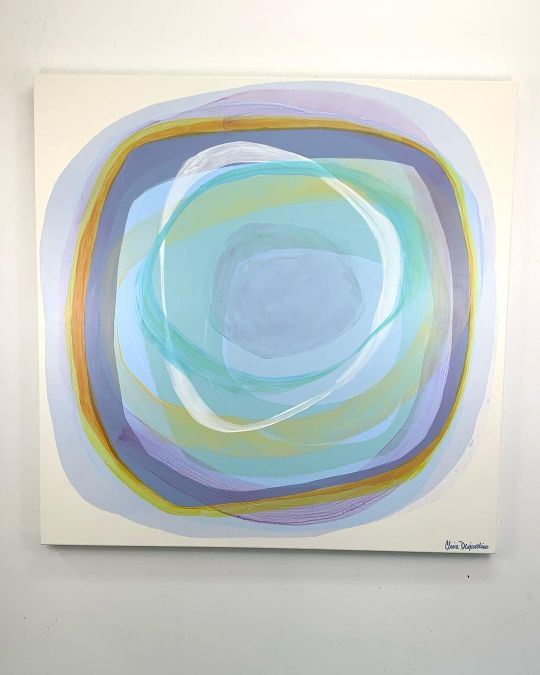
The next one up is the blue Halcyon painting that I’m calling Blue Oasis (48 x 48”). Soft and sensual, she’s forgiving and calm, and perfect for today’s rainy day. Shelter from the storm. Have a relaxing afternoon! 🧡❤️💜💙 #ClaireDesjardins #Halcyon #HalcyonSeries #Blue #PaleBlue #ShadesOfBlue #Circle #BuyArtOnline #PeriwinkleBlue (at Gore (Québec)) https://www.instagram.com/p/COGe-mfJWGe/?igshid=x6k3xc4vxdk2
#clairedesjardins#halcyon#halcyonseries#blue#paleblue#shadesofblue#circle#buyartonline#periwinkleblue
1 note
·
View note
Photo

Chicory and rain drops. In the #WildflowerGarden. . . . . #Chicoryflower #chicory #blueflower #31august2020 #raindrops💧 #rainyday☔ #rain🌧 #rain #southeasternPA #Pennsylvania #YorkCountyPA #periwinkleblue https://www.instagram.com/p/CEj34u9Avvv/?igshid=k3alnli4nj1f
#wildflowergarden#chicoryflower#chicory#blueflower#31august2020#raindrops💧#rainyday☔#rain🌧#rain#southeasternpa#pennsylvania#yorkcountypa#periwinkleblue
1 note
·
View note
Photo
<3 Creativity is a great motivator because it makes people interested in what they are doing. Creativity gives hope that there can be a worthwhile idea. Creativity gives the possibility of some sort of achievement to everyone. Creativity makes life more fun and more interesting.
#interesting#nails#periwinkleblue#blue#bluenails#cool#white#fun#nail art#nailsoftheday#european#create#art#artsy#yey#:)
13 notes
·
View notes
Photo

Probably a Western Tailed Blur . #butterfly #bluebutterfly #westerntailedblue #springbutterfly #entomology #insects #prettyinsects #periwinkleblue (at Ukiah, California) https://www.instagram.com/p/Bv-GIvIJ5LP/?utm_source=ig_tumblr_share&igshid=1mhh1ncj2pv1q
#butterfly#bluebutterfly#westerntailedblue#springbutterfly#entomology#insects#prettyinsects#periwinkleblue
1 note
·
View note
Photo

This is a Sheaffer Snorkel Sentinel Periwinkle Blue fountain pen c. 1956-1959. The fountain pen has a two-tone plated 14 karat gold Triumph nib, polished stainless steel cap with a repeating pattern of four straight longitudinal engraved lines in a stepped grouping, gold-filled cap band, gold-filled clip, and plastic barrel. Barrel colors produced from 1952 to 1955 were black, burgundy, pastel gray, pastel blue (or aqua), and pastel green. Peacock blue, buckskin tan, mandarin orange, fiesta red, fern green, and periwinkle blue were added later. The Sentinel fountain pen is 5 ½ inches long and sold for $20.00 in 1954 and $22.50 by 1955. The matching pencil sold for $7.50. Note the color match section.
#pencollecting#fountainpen#sheaffer#sheafferpen#snorkel#sheaffersnorkel#periwinkle#periwinkleblue#sentinel#penhero
3 notes
·
View notes
Photo
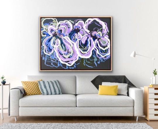
Purple!! Who said purple?? It’s not a colour I use often in my paintings but recently I’ve loved it💜💜 Purple is cheerful–whimsical and playful. It’s associated with an escape from reality which is kinda what we all want right now!! Purple both calms and stimulates our bodies, creating a harmonious balance of awareness and peace. ‘Love Me’ new painting inspired by the bright violet and electric blue flowers basking in the morning sunshine in my local gardens. The colours are so pretty and vibrant - violets, lilac, purples, mauves, cornflower blue and periwinkle blue, along with foliage shapes in sage green, chartreuse yellow, olive and soft steel blue with a complimentary warm charcoal background that would suit a range of different decors. Woah..I think I described every possible colour here 😜 Available to hang in your home or workspace from www.jenshewring.com #periwinkleblue #mauve #purpleaesthetic #lilac #purpleinteriors #violet #jenshewringartist #loveme #jenshewring #abstractflowers #jenshewringart #artforthehome #interiordesign #artsy #artforsale #artlover #artforthesoul #artloversaustralia #bluethumbartist #bluethumbart #happyhomedesigner #interiordesignideas #interiordesignaustralia #australiandesigner #contemporarypainting #homereno #homerenos #newhomedecor #handmadeinaustralia #handmadewithlove (at Melbourne, Victoria, Australia) https://www.instagram.com/p/CYp9ibvPNgb/?utm_medium=tumblr
#periwinkleblue#mauve#purpleaesthetic#lilac#purpleinteriors#violet#jenshewringartist#loveme#jenshewring#abstractflowers#jenshewringart#artforthehome#interiordesign#artsy#artforsale#artlover#artforthesoul#artloversaustralia#bluethumbartist#bluethumbart#happyhomedesigner#interiordesignideas#interiordesignaustralia#australiandesigner#contemporarypainting#homereno#homerenos#newhomedecor#handmadeinaustralia#handmadewithlove
0 notes
Note
And here I am again! I'm looking for a fanfic in which Andy interviews Miranda and there are excerpts in which Miranda says she is the Guardian of Runaway, but I also have this that I sent to a friend:
"Do you know what a collage artist is?"
She knew she had heard the term before, but she had to rack her brains to remember where. "It's another name for a layout artist, right?"
"Maybe there is still some hope for you. All of the text on a page would come back from the typesetter as one long column. The gluer was responsible for composing the page by cutting the text and arranging it into multiple columns. Each separate element of a page's design it had to be pasted onto a board which was then photographed to create the printing plate."
"It must have taken a lot of skill."
"Yes, it also takes a lot of time, but putting everything manually on a page forced one to think about why you are putting something here instead of there. Computers are wonderful things, but they have a tendency to reduce the amount of thinking required , rather than just the amount of time or effort."
(・・?)
11 notes
·
View notes
Photo

@schenkeljeff painted the @littlefreelibrary yesterday afternoon in #memory❤️ of @lavernedavmac with my assistance. It will be completed this afternoon. #periwinkleblue 💙🙏💜 (at Westmont Hills) https://www.instagram.com/p/CYPKdKepYHX/?utm_medium=tumblr
0 notes
Photo
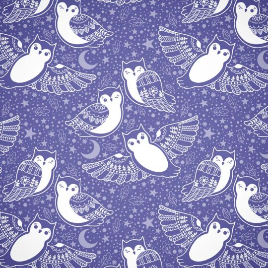
I make a lot of owls, but I don't draw them very often, so I decided to draw owls for the latest spoonflower contest. 💙 There's a link in my instagram profile if you want to vote, but be warned, there are a lot of entries in this contest! The pattern will be available for sale soon. 💙 #surfacepatterndesign #surfacepatterns #spoonflower #owls #owlsofinstagram #periwinkle #periwinkleblue #procreateillustration #owlillustration #fabricdesign #dragonstarart https://www.instagram.com/p/CZhUS61LEPy/?utm_medium=tumblr
#surfacepatterndesign#surfacepatterns#spoonflower#owls#owlsofinstagram#periwinkle#periwinkleblue#procreateillustration#owlillustration#fabricdesign#dragonstarart
0 notes
Video
#pantonecoloroftheyear #veryperi #periwinkleblue A pervinca é uma cor da família do azul e do violeta. Seu nome é derivado da erva pervinca ou murta, que tem flores da mesma cor. A cor também é chamada de azul lavanda. A cor pervinca pode ser considerada uma tonalidade pálida de roxo ou um "roxo pastel". O significado da cor lilás é a purificação mental e física, além disso, a tonalidade também simboliza respeito, dignidade, sinceridade e espiritualidade. A cor lilás é ideal para criar uma atmosfera serena e intimista na decoração porque representa mistério e elevação espiritual. Posted @withregram • @pantone PANTONE COLOR OF THE YEAR 2022 PANTONE 17-3938 Very Peri, a dynamic periwinkle blue hue with a vivifying violet red undertone blends the faithfulness and constancy of blue with the energy and excitement of red. A new Pantone color whose dynamic novel presence encourages personal inventiveness and creativity, PANTONE 17-3938 Very Peri, the happiest and warmest of all the blue hues, introduces an empowering mix of newness. We are living in transformative times. As we emerge from an intense period of isolation, our notions and standards are changing. Displaying a carefree confidence and a daring curiosity that animates our creative spirit, inquisitive and intriguing PANTONE 17-3938 Very Peri helps us to embrace this altered landscape of possibilities, opening us up to a new vision as we re-write our lives. Rekindling gratitude for some of the qualities that blue represents complemented by a new perspective that resonates today, PANTONE 17-3938 Very Peri places the future ahead in a new light. #Pantone #Pantone2022 #Veryperi Link in bio to learn more about PANTONE 17- 3928 Very Peri. https://www.instagram.com/p/CXQpvtUlNIP/?utm_medium=tumblr
0 notes
Photo

Ronde continued. The combination of paper, ink and nib was not optimal, as you can see – the hairlines are pretty thick even if I was using a very fine nib (a Hunt 22 EF). – But I'm kind of stubborn, and went on with this pretty shade of Periwinkle Blue from @zillerinks which looks so fresh on black paper. Btw I ordered some of @pascribe’s black and grey lined calligraphy pads from @scribblerscalligraphy, I’m very curious how these will differ from the paper I used here! (No affiliate links, I just share the information of what materials I use and where I get it …) :: #calligraphy #kalligraphie #kalligrafie #caligrafia #calligrafriends #ronde #frenchronde #calligralove #rundschrift #learningcalligraphy #kalligrafielernen #historicalscripts #calligraphypractice #zillersink #periwinkleblue #lightblue #blueandblack #blackpaper #flourishforum #federflugcalligraphy https://www.instagram.com/p/CLbk4JNAKlu/?igshid=16jshzz3hzgwt
#calligraphy#kalligraphie#kalligrafie#caligrafia#calligrafriends#ronde#frenchronde#calligralove#rundschrift#learningcalligraphy#kalligrafielernen#historicalscripts#calligraphypractice#zillersink#periwinkleblue#lightblue#blueandblack#blackpaper#flourishforum#federflugcalligraphy
6 notes
·
View notes
Last Seen Blogs

savjohn61
Untitled

graciegreyyxo
Graciegreyyxo
michelleoshen
moshen

nanao-ise
伊勢 七緒

freddarling
Have Courage And Be Kind