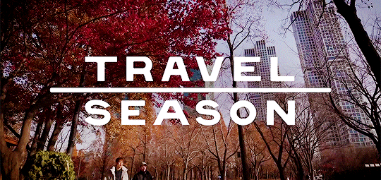
#so the saturation is a bit too much
Text


S: It's not just about eating, it's about the experience!
A: That's how the best memories are made.
#travel season#watcher#watcher entertainment#steven lim#andrew ilnyckyj#adam bianchi#worth it#sorry gotta use the old tag#standrew#yeah i gotta tag that too#not to toot my own horn or anything but I made magic here#also it took like 5 hours in total my god#op#if you're on desktop this used to look a lot more saturated but mobile makes it EVEN MORE saturated so I had to lower the red a bit#I hope it still looks decent tbh I've looked at it too much atp#if you're on mobile... you're privileged#huge thank you to levyfiles!!!
149 notes
·
View notes
Text

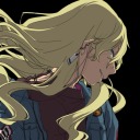
kylar with the teeth
#im on a ROLL guys.#my art#dol#kylar the loner#ill be honest. hes growing on me. but i still need to finish drawing everyone else#i need to learn how to draw them consistently.#also just want to update their designs a lil. just a bit#ALSO thank you SO much for all the compliments im going to SOB and CRY actually#i was reading the tags and SQUEALING like a FREAK#my brush is made with like a hue/saturation shift setting btw!!! i use sai2 with scatter brush but i think csp def has it too#but mine is set at 7% brightness hue and saturation if you use it too :)#oh also the statue in the thing is one of those art like. dolls? what are they called#anyways pretty funny right. right. laugh.
150 notes
·
View notes
Text
Is kinnporsche the concert stupid and is just for cash grab? Yes. Did they just turn the series into a musical? Yes. Is the whole cast unhinged and kissing live infront of millions of people? Yes. Is it a live whorehouse? Yes. Do they think they are kpop idols and dancing to kpop music eventho they can’t really dance? Yes. Did I buy two tickets to watch it and I don’t regret it??? Definitely yes!!
#I live for the cringe and the talent#it takes a lot of courage to play these kindda scenes infron of millions of thirsty fans#I knew it wouldn’t just be the band and Jeff satur singing#but what I’m seeing in twitter is a little bit too much#can’t wait to see it live tomrrow#kinnporsche#vegaspete#kimchay#kinnporsche the series#setting the bar so high with this world concert I swear#it’s just kinnporsche world and we are just living in it#also Bible In a crop top?? yup no regrets#also re-enacting some of these scene is not easy to do live if they don’t have theatrical background and I’m so proud of them for doing it#so effortlessly and beautifully infront of so many people#getting into their characters headspace must a second nature to them now#proud of the whole cast tbh
2K notes
·
View notes
Text
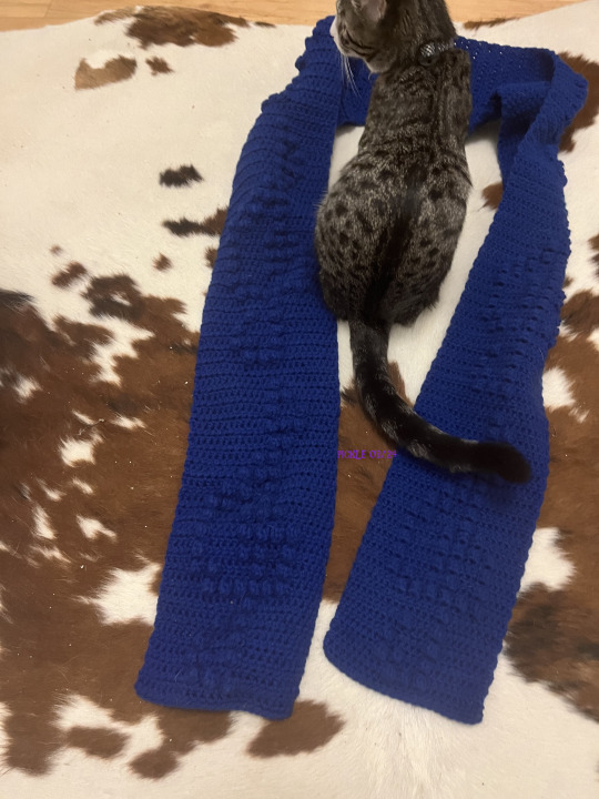
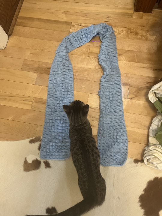
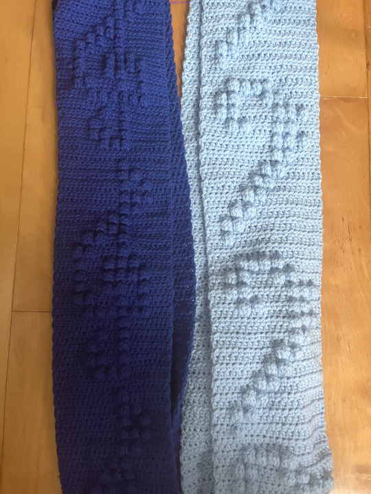
Over the course of the past year(ish), I have gradually been working on these matching treble clef and bass clef scarves...ft. my little helper lol
#my art#crochet#the bass clef scarf looks v pale in the pics#it's a light blue but it is more saturated than it appears here#the treble clef scarf was heavily shadowed in the last one so i did edit it#maybe a bit too much but whatevs#also i actually finished these last week i just didn't want to double post lol
11 notes
·
View notes
Text
YOU SEE NOW THERES WAY MORE OF A SPLIT... context matters. i can see how it can be seen as red but its so orange to me. whitefang and i got into an argument about it last night you guys are being our mediators
#gekkering#txt#a fake argument we werent actually mad at least i wasnt sorry if i made u mad whitefang#i did 4 pictures to give a good variety but i actually feel like the third one looks oddly red compared to the rest but the color its self#is not actually hue shifted at all#its like#a tiny smidge bit darker or more saturated i think but not really enough to matter#i think its bc of the red in the shirt making it feel redder but thats just me#this is why i dont like to wear pink because i feel like it makes my face look so so red and flushed because i have too much of a pink unde#tone in my skin#^personal opinion btw if you have pink undertone in your skin you can wear all the pink you want i just dont like how it looks on me#but yeah#colors yayayayayyay i go to art school so i have greater authority over colors ok. its orange
6 notes
·
View notes
Text
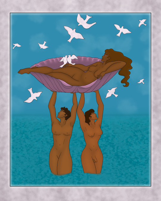
Let’s play, “Will this artistic nudity be the thing that makes tumblr take me out back and [redacted*] me”
I enjoy all the Aphrodite/Venus artwork where she's lounging by the sea or being carried around on shells because she always looks so comfortable, and I love water and lying down. For this I used Georges Barbier's piece as a reference. I like how the (I assume) merfolk carrying Venus are somewhat ambiguous below the waist. However I decided on drawing them as human while ultimately making the queerness less ambiguous.
*Kill
#Aphrodite#Venus#Greek Mythology#Georges Barbier#My Art#In hindsight I should have done the doves a little bit differently#they might stand out too much#the OG image is much less saturated so they blend better#I like color and high saturation though so it is what it is
19 notes
·
View notes
Note
may I ask how you did this edit? it's a beautiful effect and I'd like to replicate it (only if you don't mind sharing, of course). tumblr.com/ijustdontlikepeople/739905108314324992
Hi anon! Thank you!! I’ve always been very fond of this guy and I am always happy to talk about making stuff!

It’s been a little while so my memory of the process is a little blurry and unfortunately, I cleaned out my project storage last week so I can’t go back layer by layer anymore but here’s the best of my memory
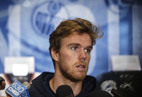
So, it started when I saw this base image and Davo looked very “heavy is the head that wears the crown” and I loved it
I brought it into PicsArt on my phone and cropped it so he was a bit more centered.
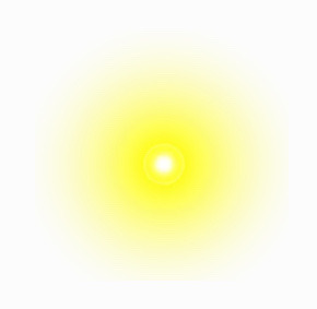
I went through the PicsArt stickers for an “orb” or “light burst” this is the one I used
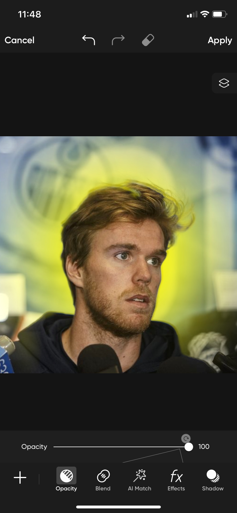
To place the orb behind Davo like I wanted I added in another layer of that original photo, and removed the background until I just had Davo’s head
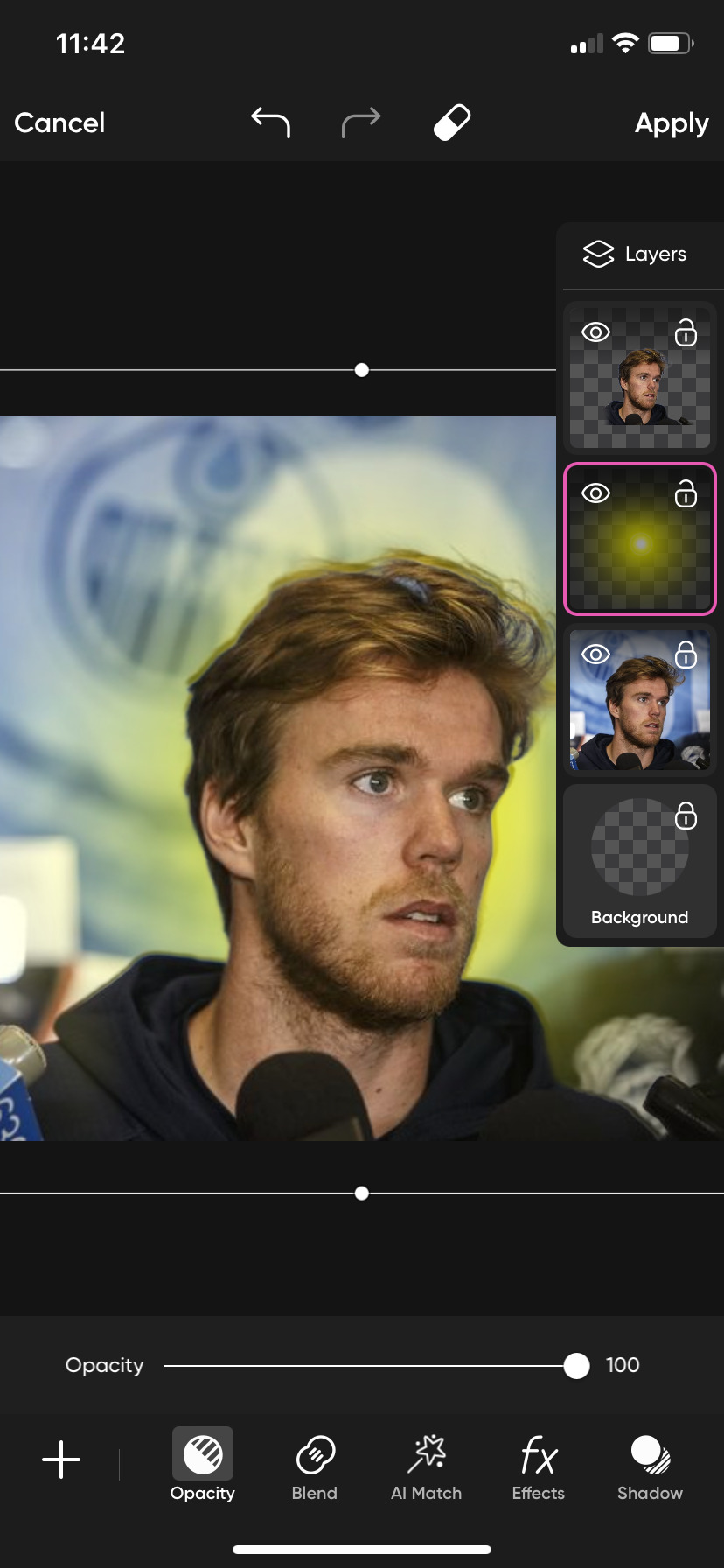
They should be layered original photo, burst, head, like above. Now you can see some spots in his hair and such that the orb light is not visible through so you go back through and erase bits of the Davo head layer. you don’t have to be too too particular about it bc the same photo of him is underneath.
If I remember right, the brightness of the orb wasn’t as high as I wanted so I doubled up on the same sticker
I think I one was centered over his left eye and then the other a few inches above it, and the i placed them both back behind the head layer again

Then added a sticker halo
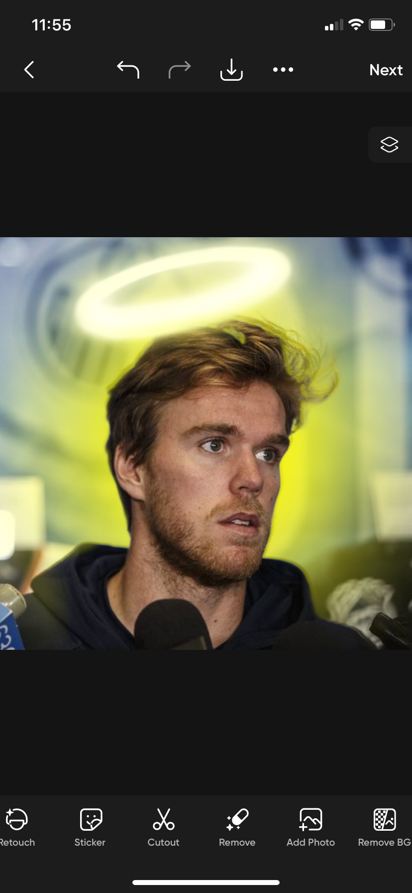
Then I moved over to lens flare

I picked a light orangey one and placed one over his eye, lining it up with his Iris, then blending it with the light setting and duplicating the the layer and repeating for the other eye. I could have sworn that I gradually erased the edges so it faded into the rest of the photo but the software isn’t giving my an option to erase? So I’m not sure if that’s a change on their side or if I’m misremembering
From there, you apply and then go to FXs. (I may have tinkered with some color levels last time before this step but I don’t remember)
I’m not sure exactly which filters I used. I feel like there were two or three. I am about 80% sure I used these with roughly these specifics.
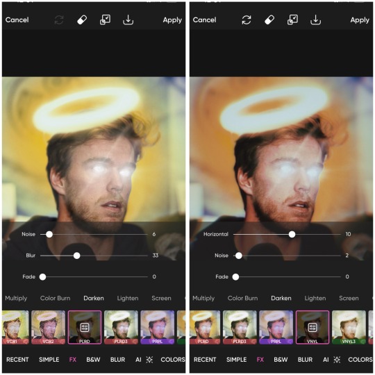
His face is cut out of PLRD which is done first than VINYL

So they didn’t turn out exactly the same but this about the gest. It’ll all be a little different depending on your starting photo. If you ever have any questions or just want to talk about what you’re making, my DMs and ask box are always open! I can give u my discord too if that’s easier! I hope this was a least a bit helpful!!
#actually know that I’m thinking about it maybe it was just one orb#behind his head to be like the light from the halo#that I turned the saturation up really high on#I remember struggling to get the color to stand out#but this time with the two it almost too much color without really do anything extra 🤔#nonnie#Annie.resp#Edit Talk#McJesus Edit Breakdown#it is bothering me that I can’t get them exactly the same#I may mess with this more and update you if I figure it out#but I got do some work now#so gotta break away#his face probably had a bit of blur and color to make it so pink#I wonder if I went back over the first fx with just his face but lighter and less blur than the rest of the photo got the first time hmmmm#nope nope gotta go to work#already spent an hour and half on this lol#I think that’s probably more than the originally making it 😭
2 notes
·
View notes
Text
I'm almost finished with one of my entries for a zine, that means a bit more of free time for me to go back and do more polished art for myself! I can't decide with what WIP to resume... and probably set a nightime schedule for it because these last weeks of summer are hell to the hyperhidrosis on my hands...
I write this down too as a reminder to search for some old scans of a book: a post recently made me have a memory trip back to my highschool days, reading rich illustrated classic novels gosh
I miss reading book after book after book so much but alas, this is my life now
#windy squawks#i dont even reading as much fics and one shots as i used and is saddening to me#its probably result of me doing the writing now both in form of rp sessions and scripts for OC dialogue and comics#so i end too saturated to read anything else#but when this cycle calms a bit for sure ill go back to reader mode#im not in a rush for that
4 notes
·
View notes
Note
Hello, hope you're doing well! Was hoping you could do some Tighnari or Atem Bisexual pride icons?
Hello! i'm doing alright hehe <3
hope you're doing well too!
here you are lovely hope these are good! <3
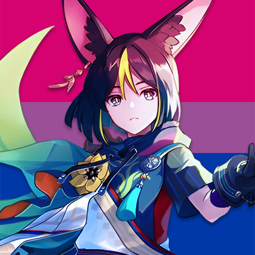
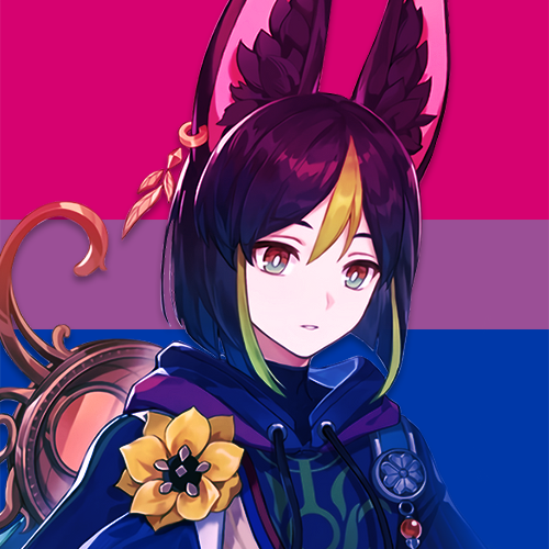
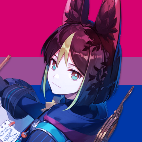


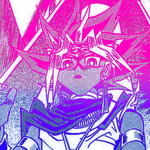

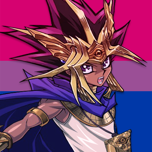
#there wasnt much atem to work with#he has barely any content and im so >:(#atem#atemu#yugioh atem#pharaoh atemu#pharaoh atem#yugioh icons#yugioh#genshin impact#pride edit#bisexual#pride icons#genshin icons#lgbt#sumeru#tighnari#also one of the manga panels were weird#rendering kinda messed it up#its a liiiittle bit too saturated#anyways ATEM IS JUST SO UGH I LOVE HIM
16 notes
·
View notes
Text
I HATE CHANGE!!!!!!!! WHY DOES MY FACE LOOK DIFFERENT IN MY NEW PHONES CAMERA!!!!!!!!!!!!!!!!!
#genuinely so upset over this#:)))))))#i cannot express how upsetting this is#like....... ahhhhh i hate how my phone gives me a sense of what i look like#bc then now it suddenly is DIFFERENT.#bad. bad bad bad for my mental health#Ok i played around with it a bit and i think if I zoom in more the shape of my face is more normal#BUT I HAVE TO MANUALLY ADJUST THE WARMTH OR OTHERWISE MY CHAIR DOESNT LOOK GINGER ANYMORE#I also turned down the resolution bc baby no one needs that much detail of ANYONE'S face#It just looks sooo oversaturate yknow#And good GOD. The manual adjustment of the brightness and saturation sucks ASS. it's WAY too intense
2 notes
·
View notes
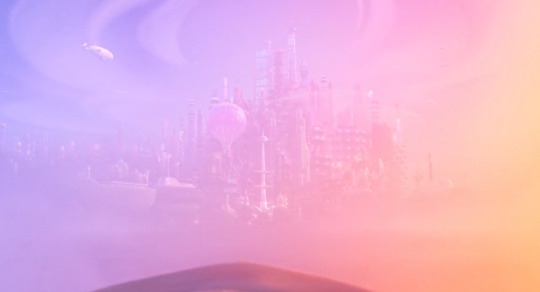
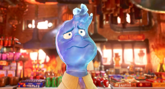
Text
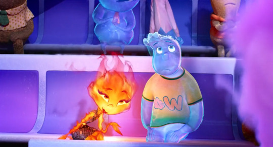
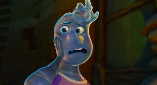
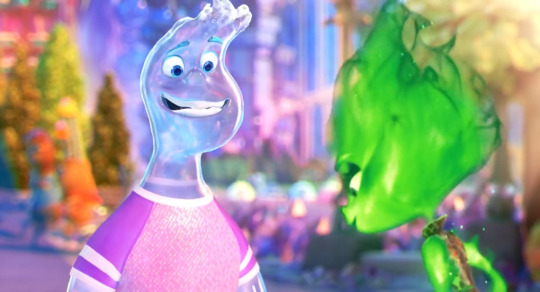
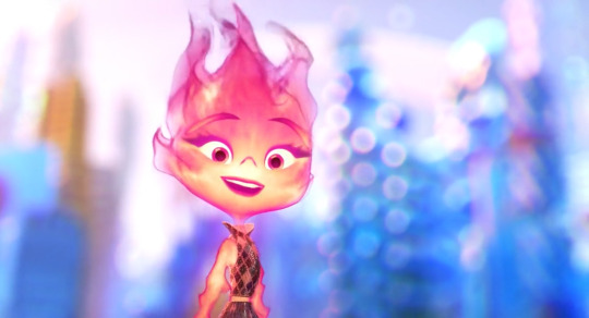
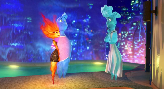
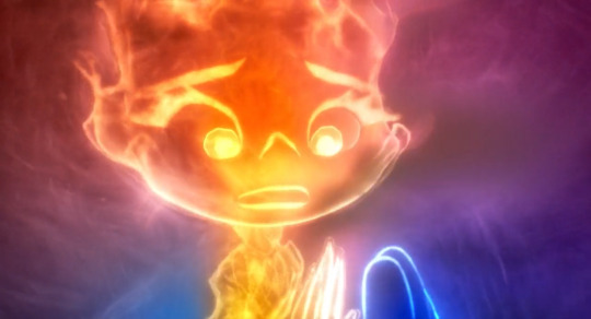
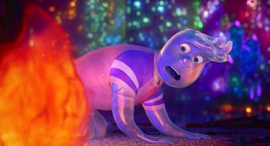
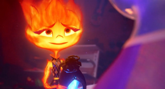
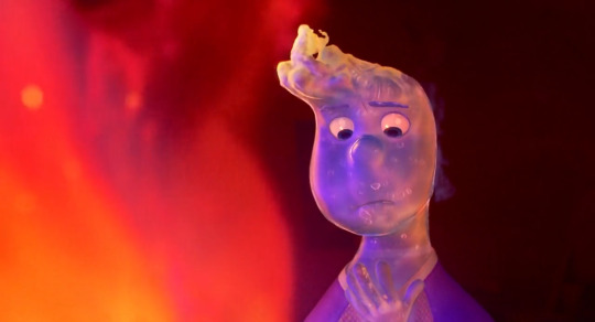
had a hell of a time (good) bit ago watching elemental and feeling things including enjoying a film, great ride, i love a metaphor & anything vignettey (just living life, alongside but also including the [this is about the metaphor] threads), i do love it when a couple of fun people have an enriching dynamic that they enjoy and huaaaghwgh (good) & i liked the premise metaphor exactly as is for what it is for what it did with it & i liked overlaps & resonances w/other experiences i saw ppl perceive. i liked the way i was going oh my god that painting looks the way i feel b/c like navigating a complementary dynamic where what's holding one person back is what helps the other person along, vice versa, no interaction or relationship that develops by like having some [theoretically your trait/quality/behavior] contained in the other person, rather it being an interaction within yourself, such that i was going "i have this interaction Within Myself, right now, in life currently like always and the past years but also past months especially really, it's ongoing, i'm going Oh Goddamn Omg" scintillating to see it externalized as a conversation imagined by others. and also still different / more capacious on both ends than "wow Exactly that." feeling things going ohh my god. music is going for it so Noticeably. hot air balloon scene And track changing me with an immediate Resonance
easier when having fun but i was also like continually so hype gasping about intrigued about pointing at art direction decisions & execution and one especial element i was sooo noting was the use of Color b/c it's Really colorful like rainbow palette nigh constant noticeable saturation, And it was atmospheric, always readily visibly parsed, varying in styles but cohesive. the backgrounds babey, with obvious priority for working with a vivacious orange and/or blue. oh and the related use of Light like different visuals for different glows and just different effects and waugh....i collected mostly a bunch of bgs to point at often for that "look at the color design & atmosphere" but also so much more & foreground things big time too. semitransparent characters like bitch. the physics of fluid dynamics. optics like refraction like my God. i'm mclosing it and that these effects would be sooo prohibitively intensive w/o computer but it's so impressive w/computer and that Stylistic Decisions were made all over, it's clearly not ever simply just "oh this is what it'd 'realistically' look like if uhhh someone was made of fire or water" even as realism Based effects were employed for style and fun and our lives. the use of of course 2D animation / art conventions for style and effect and fun & our lives!!! maybe ember a bit too but wade has a whole like 2D style profile so the [curved droplet] shape always faces the camera, how are we doing that it's so cool & i love to see it. not to mention being transparent but also like clearly not!! first time i've properly thought about how inside of mouth 3D animation has Ever worked lmao
cut so i can go on & on (^ that's brevity up there lol) & post mostly various backgrounds to gesticulate at what i notice abt the use of color like oh my god. and some other things. laughed, cried, lived & loved like for real lol
oh my god
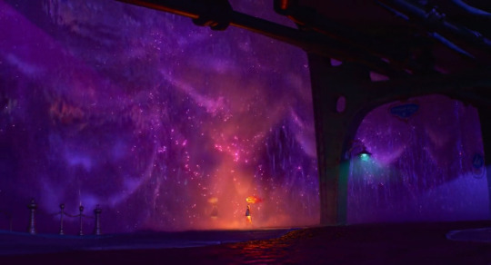
and like immediate intro theme going "oh my god blue and orange making Purple (magenta, pink) oh my god we're doing Additive Light with that holy shit yes"
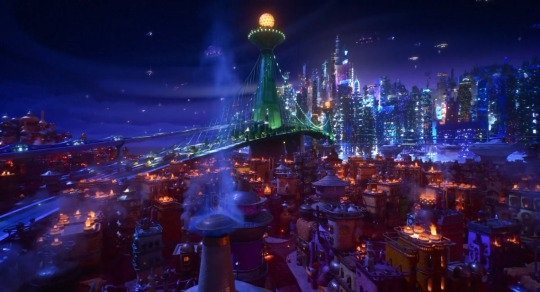
so extra [!!!] about city nighttime shots especially. and the details of all the building designs, it's all the shit like i haven't even sat and Studied any given shot for all small elements like that but that you know they're There so that it looks this complex and "realistic" like you know the attention & effort is there & you get the Overall Effect baby. also the way purple/green are employed to contrast with blue/orange often. the Glows here, the Bluer upper half and the Oranger lower half that both also have some purplishness to them, the Green bridge breaking it up / spanning this
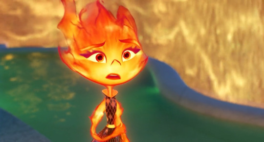
the colors in closeups even. first of all the expressions styles are after my own heart & got it, and i'm sure i'll go on & on more there. pull mouths down do the m upper lip n lower lip lines combo, you know what i mean, i Love it. wavy flowy design vs more triangular / ending in peaks/corners design for your water vs fire aesthetiques. i think that's [heat creating refraction in the air] effect like lord. the pink blue purple here. the slight shadow framing the pic for better contrast, the pink / glow around ember, wade slightly Glows from within too, the constant wave refraction there. okay obsessed again with both sorta transparent and fluid Figures like you've got the outermost layers. you've got the Inside. you've got the silhouettes and the lines that are "drawn," reddish outlines of flame shapes and constant highlight "outlines" for water so it never "realistically" blends in with everything / just Is clear and is impossible to easily parse. that those silhouettes are constantly Flowing and responding to motion / pressure as well. i can only imagine. oh and the colors again that the Glow for fire is often a Soft gradient, but there's this like, slightly convex polygonal style of "glow" / Light in backgrounds a lot and it works great for style and contrast with the important Soft Glow from fire and even also water, again the slight inner glow there too. and again the mutual [pull mouths down] expressiveness lol so much fun. the Elasticity is fantastic, same with like 2D style Movement like invoking a smear frame for example like fuck yes it's about What Works it's about style & effect & what things like lighting color faces can do that aren't just aiming for "be peak realistic" like clearly it isn't. note the sharper line of shadow in the upper corner with a deeper blue. we framing
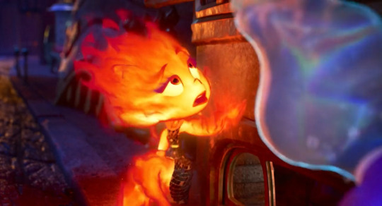
oh this one was to point out "look at how you can see the full spectrum rainbow in the wave surface light refraction oh my fucking god" not to mention of course In Motion the shapes, the effect, some bubbles and flow for flare and seeing that constant Light Outline, the cyan leaning aqua that's put in along with the overall slight blue not b/c it's "realistic" but b/c it's what works baby the artistic design choices fuck like hell. and only when i took this one frame was it like oh my fucking god look at these split second flame shames flowing off of ember there above her head especially. all the more stylization required for fire without it being like, "realistically" mostly transparent, overly bright, not very strongly delineated / silhouetted....the shape, color, flow of flames on the "inside," outermost breaking off shapes & "outline" as well augh god. and look at the purples in the background's left side
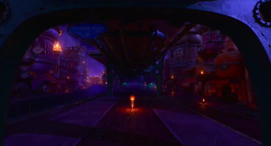
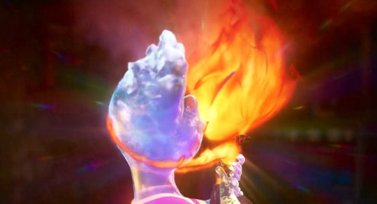
AUGH the night city backgrounds. pottery burn haha yeah the blue orange AND purple my god!!!! it's thematic ([blue + orange = purple] b/w the blue & orange characters) and it fucks like hell holy shit!!!!!
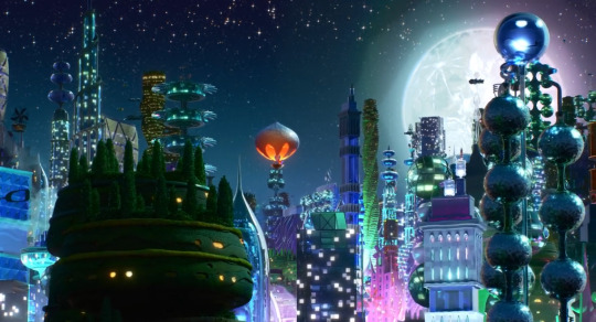
meanwhile the green & purple here with One orange element getting to stand out / not that much blue either, but more ultramarine style than aquamarine, and LOOK AT THE MOON!!! the surface!!! check out that Polygonal glow around it and the green/purple there too!!!
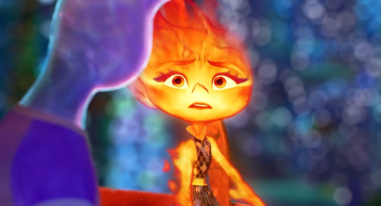
and the use of bokeh. immaculate, not holding back, after my heart. the Purple/Pink additive light properties coming into play!! her reflection is more simply orange(tm) sometimes and i would presume it tends purpler when we are getting [emotionally connecting / recognition of the self through the other] but oh my god heaving overhead like a hero this additive light blue+orange=purple ingenious and stylistically fucking like hell choice. and again their "outlines" working so well while also retaining enough softness/fluidity to be part of them as a whole. everything is so cool
there's the mouth shape i was talking about. you see the slight m upper lip simply n lower lip and resultant (idk like a video game controller?) shape lol. flexible expressive asymmetry. the closeup transparency of [can always see the other side of shirt collar]. green bg for contrast while also incorporating the orange glow. the full spectrum rainbow refraction just also an immaculate and probably characterfully relevant lmao as a bonus. also hell of cute moments wauugh yes, fun, dying thanks
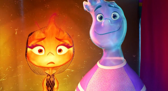
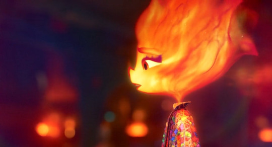
the additive light!!! (how magenta/purple/pink the reflection of Orange is off the Blue like employing what's realistic in another context for what fucks aesthetically & carries symbolism. like wade wouldn't Realistically be constantly [surface wave refractions] but it fucks like hell. also wouldn't be someone made of fire or water but it fucks like hell & embodies a central metaphorical layer to the literal material). also look at that curtain from deep purplish red to deep bluer purple!!! the line of bright blue!!! the glow in the Background with sharper polygonal lines / corners to contrast with the visual effects of glows elsewhere!!! wade default =3 as [wavy featured] and inherent =3 vs ember's more flame tipped => (not pictured)
ohh this one for rainbow color / out of focus usage and b/c it's like how the semi transparency but only So Much + constant outline of Highlights / constant inner glow and visible infusion of like aquamarine / bright turquoise cerulean color helps a water guy stay perfectly Visible / parsable. also besides ember being green, an effect subtly pictured at any given point: like cinders continually rising off fire but depicted so much like Sparkles :') there's so much colors and highlights and choices after my own sensibilities out here like i love a shoulder swoop design that flows right into the arms from the neck from the head. and that's exactly what we get precisely b/c it has so much flow!!! ember's like whole head Flaring out from her neck, terminal points like tips, or sources, of flames. Styles
the bokeh!! the blues and pinks and purples!!!
ouuwaah
UGH obviously in motion the like arcing falling curtains of water, the shimmering....the purple into pink into dusky orange!!! the little bit of contribution of the turquoise light aaa wahooo, ofc what the bridge adds in Composition for this & that previous shot
lmao this is b/c Wavy Scribble Squiggle Mouth again the design choices after my own heart. the constant extra wobbliness to Mouth Outline obviously works great to emphasize [water design] but it also works great b/c i love it
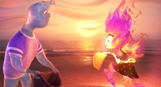
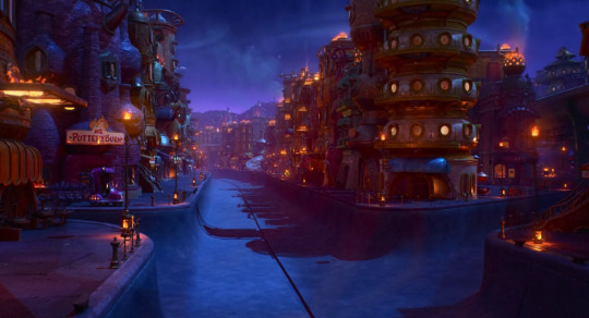
every shot of the background with this beach is gongious like jesus christ. the closeup of sand is like that looks amazing and So soft. look at the wavy swoopy shapiness of the clouds, look at the [in this shot] faintly detectable Polygonal outlines of Glow from the sun. feel free to look at that water like i said every shot of this, wrow. tasked with Pretty Beach Sunset and coming through big time
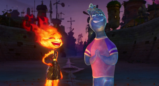
expressive design contrast, glow contrasts, refracting, silhouettes, those flame shapes breaking off again epic hot wheels style fuck yes....and the bg!!! look at the purple to muted purple pink sky, the atmospheric distancing on layers of buildings that goes from blue to purple!! the dimmer purple / blue / teal on the ground in the foreground here UGH the COLOR USE
ooh i was so Noticing the like, full ultramarine blue here, like it's been used Before in any night environments but the way here it's brighter, making it like "okay yeah night but more Lit Up. also the visual variety of [water curtain] textures there, the area of Pink, the Yellow that hasn't previously shown up too much but might be saved for associations with tension / "danger" lol. also love the "straightup a pool" designs lol wish i was swimming
oh the orange + blue = purple on display here / translating Outlines
amazing sequence and again look at the Purple shadows the Blues the Oranges the Greens!!!! aughhh again like So colorful and so bright but also ofc dimmed, atmospheric, balanced, waughhh!!!
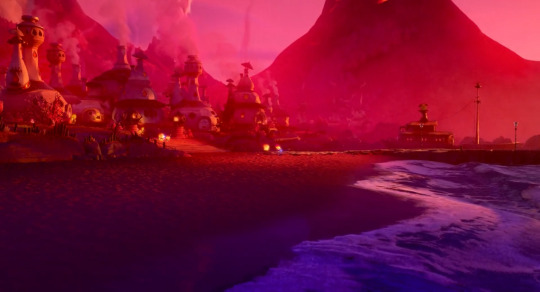
oh my god what can i say. "bisexuality" for one but and also fr like the pink of the sky vs deep purple, lighter with more blue in the water, the streak of oranger light, pink atmospheric haze....augh!!!
speaking of "and then really vivid striking colors in another overall palette we haven't seen before" the teal & golden yellow for this shot was new & noticeable. the yellow of problems, but not too bad lol, looking at that Contrast with the blue on the outer pool edge there. i wanna take a swim yippee....but fr like holding some colors more in reservation, finding new combinations, as Ever how bright the bgs are but atmospheric, non overwhelming of other elements, i Love it
bokeh!!!! colors!!!!!!!
bokeh!!!!!! colors!!!!!!!!!!!!!!!!!!!!!!!
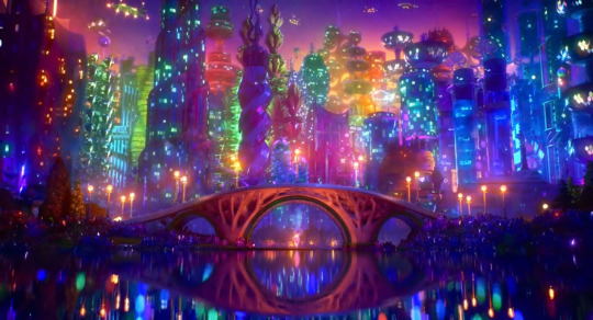
fucking roy g biv like yes gorgeous. nice tree evocative bridge. composition. lots of lights and colors but the distribution being so balanced, but organic, broken up in all the right ways and all encompassing....the bright orange lights in shadowed blue/purple buildings in the upper left corner, leading down to the path of lights across the center of everything....ugh incredible great
out of focus bg, the lights, the purples, the blue/Green, look at everything on the right side ugh lovely, the slight Shapes of glows, can see that arc in the right side as well, the emotional relevance of all the colors and glows as this bg dims / desaturates a second later
and so similarly here, the Purple, the Glows....like the use of both the perfect balance of soft edges/borders but no sacrifice in clarity
oh and i suppose there's then any amount of spoilers following but like, in part only b/c i point them out as as much but also like. it's about the journey lmfao you see two screenshots, containing some information, well you've seen it all
and to pad that out i'll also note without screenshots about it like bringing in a very like Clear for Compositional Effect sort of Danger Yellow again twice over, with the harshest like chartreuse leaning yellow yet for it, v much a color that it'd just take more effort to fit into a palette / would have to be kind of the color centerpiece, vs the orange/blue/purple here
(but also not to say yellow was never used otherwise....some perfectly harmless golds, paler lighting like just Daytime vibe, constant presence w/fire of course. so the Particulars of a hazard yellow are all the more notable)
the COLORS....look at that orange that pink red the pink reflections the Purples....the just deep slightly slightly purple red in the bg and how like smoothed over / Immediate that background is to just make everything close & present!! the flame textures going!!! water textures going!!! cinders as points of light!! the colors the orange purple pink blue UGHH it's amazing they're really off the shits with it in every scene
spoilers they do kiss about it and i was like smacking hand to forehead like oh my god and they did another "breaking out a new Light thing" when we've glowed and refracted within and without, lit up or dimmed, sparkled, reflected, used further styles in environmental lighting....answer was Lens Flare rainbow refracting glow like goddamn!!! and again like putting In the purple, but also the blue, the orange, the out & out more cerulean / aquamarine that is not gonna simply come from elsewhere in the environment. nice commitment to also having someone smile into a kiss lmao we've all been like i Will make this work. i'm still just like ugh the focus on and variety of Light too, the backgrounds' like soft polygon/hexagon glow "fields," straightforward soft/even gradient glows, wave pattern refraction, refraction also separating light into rainbows, remember water is a lens, stylized light of fire, bokeh, additive color mixing....holding on to & breaking out Cinematic LENS FLARE is fr like ohhh my god they're just fucking On It, got this, here's another effect for you
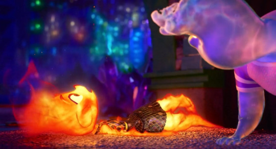
i also have a gif b/c i couldn't note anyone's fluid dynamics / flowing / Interacting physics enough, and little moments giving that some extra flair are a delight, but holy shit a highlight i'm instantly obsessed with forever, now if there's something and nobody pours themself, i'm out
oh we sloshing!! all the water physics going on here to fantastic effect but also all working within the confines of "and it's some guy." immaculate joke 5 sec later around the "i am Not an inspector" line just What a delight. the vision....the manifestation of effort, craft....i'm not kidding at all i'm like okay forever treasuring [pours yourself] clip and if someone doesn't get it it's like it's called joie de vivre, panache, taking all kinds. some sloshheads out here
again i had a delightful time at the cinema (figuratively. i didn't go anywhere. though i did go "oh fuck re: even the idea of seeing plenty of this in theater format" like i was going oh Shit at visuals and music and every damn thing enough already, can only imagine) i was like bitch i love ppl living life vignettesquely with the emotional arcs aids of metaphor, symbolism. i love the styles and designs and i love paying attention to details and going damn how they'd do that, i love technical shit, noting techniques that are centered around 2D derived visuals, about aesthetic effect & visual purpose....i was going "oh my god same. lately, always, ongoing. oh my god it's me always crying at everything, but also never at anything, and also just sometimes at some things. it's me with the Temper it's me with one like everyone else but not about to let it out at all / not be making room for anyone else's. me like 'just powering through like arghhh' me like 'that, but [a puddle]' liable to spontaneously interact with randos by just doing your own thing, also [dying] and beloathed at that, going with the flow trying to carpe diem it, having these conversations and navigations like just as one person lmao, and also ofc it's different" lol like oh damn okay. and twentysomethings popular with the nebkids like wow in real life....and just having a great time entirely straightforwardly and expecting as much but also being increasingly delighted and surprised and going "wow my aesthetique sensibilities piqued" and going "wow okay a journey" and like Gasp at details and loving the overall effects and little moments and shots and entire deal. did weep repeatedly, when you slosh, when you soggy....delighted a lot, along for the ride having fun for the whole way, so much abt [bummed 20somethings who are nevertheless very vivacious Feeling Things, including About feeling things] and the way that's given sooo much space, Saturating things even, maybe with light & color....i liked it a bunch, [aaaaaa], great time, thinking about feeling things and feeling about it and about thinking about it & so on & so forth too like man hang on a second. and the soundtrack. and the character designs Overall there did i mention?? so cute & fun. wobbly wavy shivery tapering having Flow in the lines / shapes of silhouettes in different ways just like flow in [fluid dynamics] of flame or water in different ways. there's a lot i can say but i just mostly did the backgrounds / color / lighting noncomprehensive slideshow lol. i was very engaged like oh wahoo yippee aaa then mfs let's go and keep going
#i'm big on like rainbow lot of color constant saturation....Yet; Atmosphere / skilled balance in application/usage#i don't have the restraint (or like full knowledge / experience lol) to Use it myself but i Love when i see it used lol. Very colorful here#and i had thoughts & feelings & a good time so that made it easier to be like oh whee AND look at that background. mf we sloshing#nonzero spoilers via largely contextless static images; many wide shots / environments; really doesn't matter much#but i guess if you're like ''i specifically want to know Nothing at All'' like well then there are images in there#like 65% me going ''and look at that purple. oh my God the green blue & blue green. Orange''#b/c like wrow....#pixar elemental#films to whisper to myself like omg. like me. right now#btw it's kind of long post inside there. but For Me; typically so lol#can't say shit in thirty tags!! esp when i had a great time i liked it i was like oh my god#can't even say that shit in regular text which is why i mostly talk about colorful backgrounds lmfao. and even Then!! and so on so forth#and hand over heart like omg when by yourself you're a bit too much; but together; you're a bit too much together ;w;#like wow just like me; me; & still me!!! and not caring about what's all ''too much'' like it's about the me & me actually thanks#(and ofc the premise / central metaphor/conflict there as is; vulnerable cultural identity that needs to be maintained but uh oh)#speaking of uh oh look who's underway in the tags!! i'm heading myself off now lmao. time for half past 3 am Night Sandwich
6 notes
·
View notes
Text
autism blast
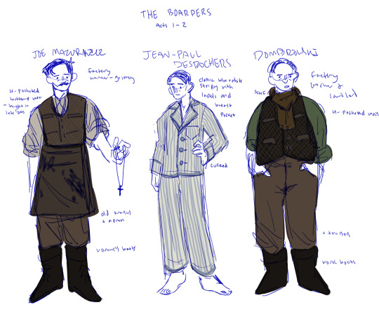
lookat them :)
#the sketchiness and informality of it all is SO annoying to me but we were specifically told not to think to much about formal lining#or colouring so. shrugs#dombrowski is a bit too saturated i need to fix that (using tha contrast between greys/desaturated tones in the waking world#vs bright pops of colour in the dreamlands so it is unfortunately important)#(elwood and walter are special because theyre Main Characters and therefore get brighter colours so they stand out#& theyre also done but im still playing with walters palette so. no poast)#scrawls#design in theatre project
13 notes
·
View notes
Text
watching this guy play through the klonoa remake and. man i really dont like the art direction of the remake at all
#eveyrthing looks too streamlined / bright and saturated#EXCEPT FOR VISION 3-2?? wwhich looks so bad im sorry. the original is bright and colorful#not in like the super insnaely saturated way most of the remake looks like. it just was like very full of life yknow? but the remake#version of it is super foggy and dark and you can barely tell whats going on#which definitely doesnt help with the fact that the level is designed kinda like a maze =/#inquisitivewaltz.txt#i need to stop caring so much about the art direction of games it doesnt matter THAT much the gameplay is still the same.. just idk#i really really love the look of the original ps1 game so to see the new and most widely available version of it look like that.. idk its#a little bit frustrating i guess.
2 notes
·
View notes
Photo

GUYS IT’S DONE *PTERODACTYL SHRIEKING*
#look look look look LOOOOK#look at what I MADE#dnd oc#I did a bunch of new things!!!#for example I did a layer of shadow/highlight 'references' first in really high saturation#and then I drew over them cleaner with the darkest shadow#and then popped the highlights on top#and I tend to put like four layers of highlights on any one thing#so after I'd done that I realised id grown quite attached to the dimension my references were giving the piece#bc the 'cleaner' official shadows and highlights were a bit too minimalist for me#so I dropped their opacity and cleaned them up a little and I actually kept them here!!#full disclosure I am SHIT at shadows#I have no formal training and do not know how shading works beyond the first infographic in those DRAW MANGA books#so im VERY proud of this here!!#it looks so good!!!#also I haven't put this much effort into a piece I wasn't being paid for in about six years#the last piece that got this much love and pushed my existing talent to this degree was my sanders anime poster#how the time flies#anyway im so fucking happy with this#this is my favourite piece I've done to date#I hope they love it!!!!!!! gonna send it via my beautiful partner to the appropriate discord#personal favourite#revelart
5 notes
·
View notes
Text

this is so stupid but i actually quite like jayce's skin on this one--- it looks like its supposed to be
#coloring in general is a bit harder when your line isnt black; at least thats my experience.#you have to play more with colors to make them fit; and also some colors are not... registered as the actual color they are.#like for black i actually use deep purple; but it cant be too deep bc otherwise it ruins the whole aesthetic#with the line being lighter than the filler. i dont use actual black anymore i think; its always some shade or purple.#depending on the other colors i use a very very light shade of pink/red for white. i can also use actual white#but then again; it depends of the other colors lol. and in this case isnt even that light of a color. skin is other issue#i have a palette full of skin colors but i dont really use it for just the color-- i moreso use it as a reference.#then you have me being all stupid with the color wheel for a bit trying to find a color and the saturation that fits the piece.#and dark skins are kind of their own thing; bc otherwise it doesnt give the image of actually being brown#and actually gives the image of idk you fucking slapped a random color on them. and VEEERY rarely actual brown in the color wheel works#rn jayce's color is in a mix between pink and red. but it doesnt looks like that!! it mixes and looks brown in the piece.#i used a different color on the one with chase but that was because the lineart colors were different kjsnfkjndjfds#so yeah for someone who doesnt have that much of an eye for this; this is kind of a training in a way. its ok though#i refuse to go back to pure black lines the thought of doing them sickens me (no that doesnt means i dont like when others do them)#(and no im not saying using black lines its easier or not as worthy or something its not what im trying to say)#sorry for going in a ramble about how i color?? idk sorry i just thought about adding it#lilith whispers
1 note
·
View note
Text
My Favorite Cheap Art Trick: Gradient Maps and Blending Modes
i get questions on occasion regarding my coloring process, so i thought i would do a bit of a write up on my "secret technique." i don't think it really is that much of a secret, but i hope it can be helpful to someone. to that end:

this is one of my favorite tags ive ever gotten on my art. i think of it often. the pieces in question are all monochrome - sort of.

the left version is the final version, the right version is technically the original. in the final version, to me, the blues are pretty stark, while the greens and magentas are less so. there is some color theory thing going on here that i dont have a good cerebral understanding of and i wont pretend otherwise. i think i watched a youtube video on it once but it went in one ear and out the other. i just pick whatever colors look nicest based on whatever vibe im going for.

this one is more subtle, i think. can you tell the difference? there's nothing wrong with 100% greyscale art, but i like the depth that adding just a hint of color can bring.
i'll note that the examples i'll be using in this post all began as purely greyscale, but this is a process i use for just about every piece of art i make, including the full color ones. i'll use the recent mithrun art i made to demonstrate. additionally, i use clip studio paint, but the general concept should be transferable to other art programs.


for fun let's just start with Making The Picture. i've been thinking of making this writeup for a while and had it in mind while drawing this piece. beyond that, i didn't really have much of a plan for this outside of "mithrun looks down and hair goes woosh." i also really like all of the vertical lines in the canary uniform so i wanted to include those too but like. gone a little hog wild. that is the extent of my "concept." i do not remember why i had the thought of integrating a shattered mirror type of theme. i think i wanted to distract a bit from the awkward pose and cover it up some LOL but anyway. this lack of planning or thought will come into play later.
note 1: the textured marker brush i specifically use is the "bordered light marker" from daub. it is one of my favorite brushes in the history of forever and the daub mega brush pack is one of the best purchases ive ever made. highly recommend!!!
note 2: "what do you mean by exclusion and difference?" they are layer blending modes and not important to the overall lesson of this post but for transparency i wanted to say how i got these "effects." anyway!
with the background figured out, this is the point at which i generally merge all of my layers, duplicate said merged layer, and Then i begin experimenting with gradient maps. what are gradient maps?
the basic gist is that gradient maps replace the colors of an image based on their value.

so, with this particular gradient map, black will be replaced with that orangey red tone, white will be replaced with the seafoamy green tone, etc. this particular gradient map i'm using as an example is very bright and saturated, but the colors can be literally anything.

these two sets are the ones i use most. they can be downloaded for free here and here if you have csp. there are many gradient map sets out there. and you can make your own!
you can apply a gradient map directly onto a specific layer in csp by going to edit>tonal correction>gradient map. to apply one indirectly, you can use a correction layer through layer>new correction layer>gradient map. honestly, correction layers are probably the better way to go, because you can adjust your gradient map whenever you want after creating the layer, whereas if you directly apply a gradient map to a layer thats like. it. it's done. if you want to make changes to the applied gradient map, you have to undo it and then reapply it. i don't use correction layers because i am old and stuck in my ways, but it's good to know what your options are.

this is what a correction layer looks like. it sits on top and applies the gradient map to the layers underneath it, so you can also change the layers beneath however and whenever you want. you can adjust the gradient map by double clicking the layer. there are also correction layers for tone curves, brightness/contrast, etc. many such useful things in this program.
let's see how mithrun looks when we apply that first gradient map we looked at.

gadzooks. apologies for eyestrain. we have turned mithrun into a neon hellscape, which might work for some pieces, but not this one. we can fix that by changing the layer blending mode, aka this laundry list of words:

some of them are self explanatory, like darken and lighten, while some of them i genuinely don't understand how they are meant to work and couldn't explain them to you, even if i do use them. i'm sure someone out there has written out an explanation for each and every one of them, but i've learned primarily by clicking on them to see what they do.
for the topic of this post, the blending mode of interest is soft light. so let's take hotline miamithrun and change the layer blending mode to soft light.

here it is at 100% opacity. this is the point at which i'd like to explain why i like using textured brushes so much - it makes it very easy to get subtle color variation when i use this Secret Technique. look at the striation in the upper right background! so tasty. however, to me, these colors are still a bit "much." so let's lower the opacity.

i think thats a lot nicer to look at, personally, but i dont really like these colors together. how about we try some other ones?

i like both of these a lot more. the palettes give the piece different vibes, at which point i have to ask myself: What Are The Vibes, Actually? well, to be honest i didn't really have a great answer because again, i didn't plan this out very much at all. however. i knew in my heart that there was too much color contrast going on and it was detracting from the two other contrasts in here: the light and dark values and the sharp and soft shapes. i wanted mithrun's head to be the main focal point. for a different illustration, colors like this might work great, but this is not that hypothetical illustration, so let's bring the opacity down again.

yippee!! that's getting closer to what my heart wants. for fun, let's see what this looks like if we change the blending mode to color.

i do like how these look but in the end they do not align with my heart. oh well. fun to experiment with though! good to keep in mind for a different piece, maybe! i often change blending modes just to see what happens, and sometimes it works, sometimes it doesn't. i very much cannot stress enough that much of my artistic process is clicking buttons i only sort of understand. for fun.
i ended up choosing the gradient map on the right because i liked that it was close to the actual canary uniform colors (sorta). it's at an even lower opacity though because there was Still too much color for my dear heart.

the actual process for this looks like me setting my merged layer to soft light at around 20% opacity and then clicking every single gradient map in my collection and seeing which one Works. sometimes i will do this multiple times and have multiple soft light and/or color layers combined.
typically at this point i merge everything again and do minor contrast adjustments using tone curves, which is another tool i find very fun to play around with. then for this piece in particular i did some finishing touches and decided that the white border was distracting so i cropped it. and then it's done!!! yay!!!!!
this process is a very simple and "fast" way to add more depth and visual interest to a piece without being overbearing. well, it's fast if you aren't indecisive like me, or if you are better at planning.

let's do another comparison. personally i feel that the hint of color on the left version makes mithrun look just a bit more unwell (this is a positive thing) and it makes the contrast on his arm a lot more pleasing to look at. someone who understands color theory better than i do might have more to say on the specifics, but that's honestly all i got.

just dont look at my layers too hard. ok?
1K notes
·
View notes
Last Seen Blogs
hazsxos
m
puffin-ka
Whatever...

imaginerding
Imaginerding's Favorites
stdyn
Words Slipping From My Heart.
darkgriffin5785
Screaming into the void