#to come work for my company
Note
what the heck is toto cooking forbidding merc eng to go with lewis to ferrari? am i going to want to kill this man every day until 2025? jfc
i don’t think we need to pay attention to any of the rumors about that. who knows what’s true atp. but at the end of the day people are free to work wherever they want, they may just need to be on gardening leave for a while in some cases….
#in my work ‘anti poaching agreements’ usually just mean i’m technically not allowed to explicitly lobby for people at certain companies#to come work for my company#but if they still just happen to find out about an open position they can of course still make the choice on their own to apply for and#take the job at my company#🤷♀️ so it doesn’t really mean much in terms of whether or not people end up changing jobs or employers#ANYWAY. it’s just the media trying to keep momentum by speculating#ask
6 notes
·
View notes
Text
i cannot stress this enough: if your reasoning for clowning on the mcu is "they overwork their cg artists and animators" i 1000% guarantee that a show or movie you have been stanning for years also abused their artists and you just haven't heard about it because the production companies aren't in the spotlight like mcu productions are. that cartoon for kids? that incredibly animated movie? that non-marvel superhero movie? i've seen people declare their hatred for the way the mcu treats their workers and then turn around and gush about a show that i know for a fact was hell for the artists attached
and no this is NOT me saying "this means you should stop hating on the mcu uwu" it's me saying you gotta be aware that this shit is an INDUSTRY WIDE PROBLEM. you CANNOT "fix" it by refusing to watch mcu movies and feeling good about it. you have to be aware that it's EVERYWHERE. why do you think so many animation and vfx productions are sourced in canada? in india and the phillipines? we are not unionized.
i know it's hard to face the idea that your favourite show might have been made unethically especially when you've spent so much time hating the mcu for doing the same thing. you don't have to start hating your favourite show. just like...be aware. don't be smarmy about it. don't claim without research that a beautifully animated movie Must mean the animators were not working 16 hour days and weekends. i do think we can fix this 👍 but we can't fix it if 90% of us don't even realize what the problem really is
#uhhhh me#with the recession coming up a lot of my coworkers have come out of the woodworks to talk abt their experiences#and i feel like i've been wearing rose tinted glasses abt my company (bc i work here and i like my supervisors!)#i knew ofc that aniamtion studios here aren't always on the up and up but i did Not know how bad it got#and it just! sucks! that whenever ppl online talk abt shitty treatment of artists they're only talking in regards to the mcu
25K notes
·
View notes
Text
people are acting like we’re saying creators shouldn’t be paid for their work; they absolutely should. and watcher already is. they have a patreon, they get sponsors, their videos regularly get millions of views which gives them ad revenue, they sell merch; they are getting paid. feeling indignant and disappointed that they’re asking us to pay for content we were already getting for free isn’t entitlement, it’s expected. they wanted to make bigger produced shows and now their budget can’t sustain it, that’s not on the viewer to make up for
#im not going to feel as sorry for the company as iam for an artist working out of their bedroom#they went too big and now expect us to make up for it#its normal to feel slighted by that#im not paying over a hundred dollars a year for a guy to eat food another to walk around a house and a puppet to tell a story#im just not#their shows are entertaining theres no doubt about that but can you really say its worth that fee when we are in a cost of living crisis#coming out of my cage and ive been doing just fine.txt#watcher#watcher tv#shane madej#ryan bergara#steven lim#hey there demons it’s me ya boy#ghoul boys
2K notes
·
View notes
Text
:/
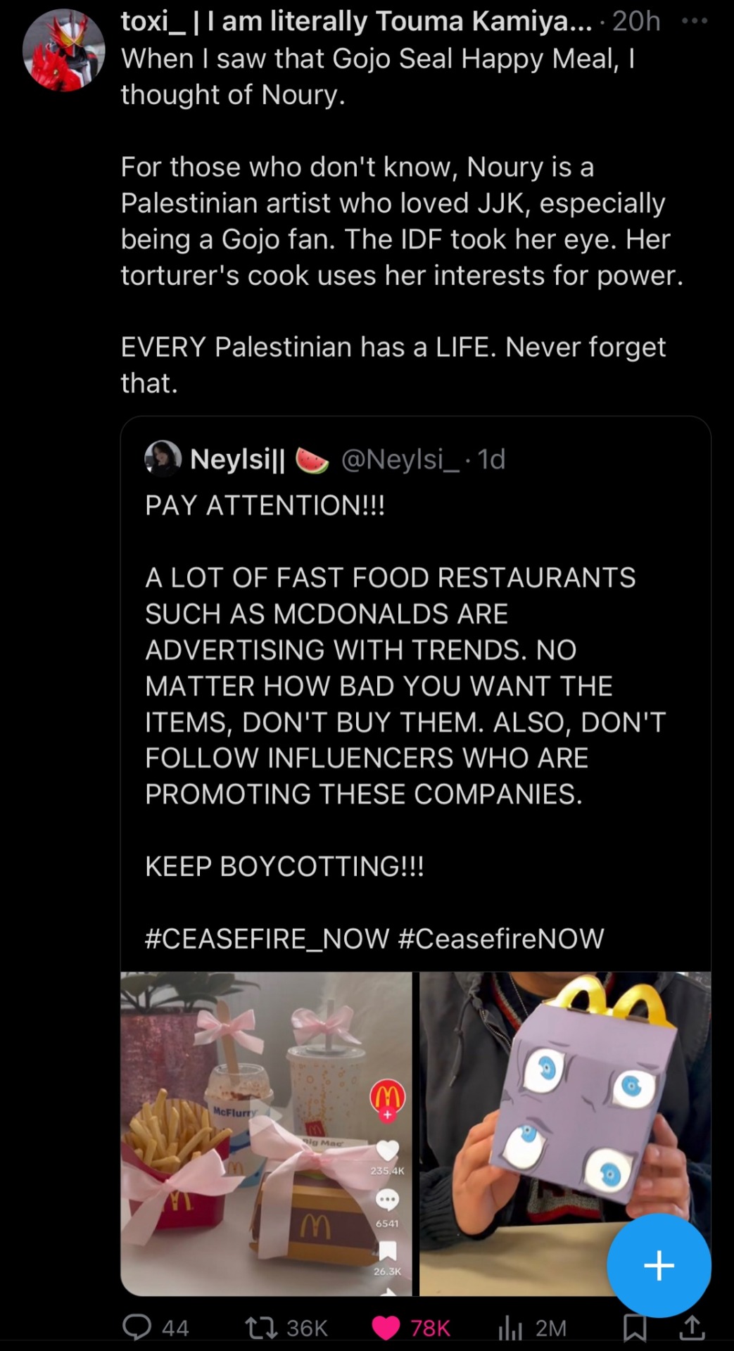
#Palestine#free palestine#they’re banking on people not giving a shit because the accessibility to cheap fast food and an insanely popular anime character is too#enticing to these people#who place fiction over reality and real world devastation#jjk#rambling#noury is also getting eye surgery soon I hope it works out well for them#it is so easy for these huge companies to pull these people in because most of them don’t care anyway because they’re Zionist to their#rotten cores and these companies know that people are treating the genocide like it’s a ‘we have to look at both-‘#sides-‘ kinda situation like it’s so…#they also know that a lot of people are stupid and would rather remain ignorant than learn about the history of Palestinians and what#Israel did to them#Gojo is my fav but come on now this is so slimy because they know that he’s insanely popular like they know that ppl will buy tf out of#his happy meal similar to the Mulan Rick and morty sauce shit years ago this makes my head hurt
151 notes
·
View notes
Text
It's the most wonderful time of the year..... To unsubscribe from so many email lists.
#Do it. It will fix you.#You recieve an email from a company who want you to purchase something??? Unsubscribe!!! They can't hurt you anymore.#Christmas and boxing day and new year sales??? I don't want to hear about it!!! Goodbye!!! Unsubscribed!!#If i really need an item or service... It will come to me in my dreams.#Emails are the work of something more cruel than the devil
149 notes
·
View notes
Text
#yall not rocking with my adventure time art?!?? /j#i felt like going back to pixel art for a bit. havent in years#ishmael lcb#limbus company#project moon#art i made#pixel art#im still keeping my distance from indulging in projmoon work too much. its hard when its been a very big influence on me#and also a special interest#its been hard but i think im finally coming back to my old interests#sometimes i hate being nd. like pretty often actually. but what can you do#sorry for the rant yall#but to me losing a special interest/big source of comfort felt worse than a major breakup. idk how other nd people handle it
246 notes
·
View notes
Text
I think I gatekept gaslit girlbossed too close to the sun this time my guys
#I start a new job tomorrow#that comes with like a 30% pay jump#and I don’t know how I bamboozled them into hiring me#but they did and now I work there???? at a tech company??? downtown???#who what where how did this happen#thoughts & prayers while I fumble my way through this#oversharing etc etc
113 notes
·
View notes
Text
Crisp those Lines!
Or: a small collection of suggestions for a crispy, neat lineart.
SO MANY OF YOU ASKED FOR THIS (it feels absurd to say, yes), so here you go.
A premise: there's no right or wrong way of inking, and some of the following tips entirely depend on the type of inking I do. Which is neat and clean, with no blacks, and moreover: digitally. More under the cut because it's gonna be long and full of explanatory pictures. Here's an example:
SOFTWARES AND BRUSHES:
Let's address the elephant in the room: Photoshop SUCKS for inking and linework. The stabilisation of the brush there is SHIT. Good for colouring and painting and doing photobashing, but for Lineart you want it to be precise. Do yourself a favour and don't use Photoshop.
I generally use Clip Studio Paint, but i have to say that the best program for it that I've tried keeps being Paint Tool SAI 2. It has few functions, it's true, and I use CSP because it has more instruments. But if you don't want to pay much, SAI is incredible as for brush rendition and stabilisation.
As for the brush: you don't need a fancy brush, anything in your software will go. What I use and what works best tho must have:
Tapered start and end.
High stabilisation (I go from 60 upward, lower it down for trees and grass or anything more natural that needs to be less neat and flowy)
Low tapering.
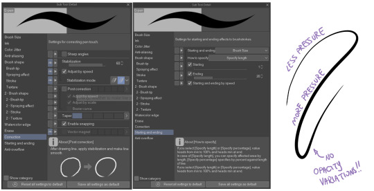
It must be set so that pressure controls only the dimension. The more you push on your pen, the bigger the line gets. No colour or opaciy variation!
On Clip Studio Paint, I use the G-Pen in the program. It's good as it is, but I think I did some variations as per here:
FILE DIMENSIONS:Better work larger and then resize down. Sizing files up digitally is possible, but it leads to unfocused images.
I generally work on files at 600dpi (300 is fine too, but don't go any lower. Particularly if that's something you want to print later on, any printing wants a minimum of 300dpi). in roughly an A3 format (bigger dimension is 43cm). Most pictures I upload here are 6000x5000 pixel.
A bigger file will give you more possibilities with brush sizes, and it'll be easier. Remember: digitally, sizing down is ok, sizing up is not something you should do.
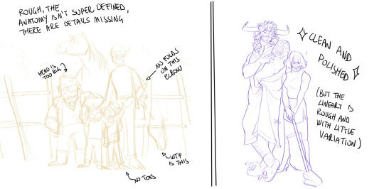
SKETCH:
This is the suggestion I should follow but never do.
Having a clean, polished sketch simplifies your life A LOT. This is because if you don't have to worry about drawing details and fixing the anatomy of your drawing during the lineart, and doing it so GOOD because it's the lineart... You'll go that much slower and your life will be more complicated (it's not impossible, my sketches usually are very rough. I am ok with it, the most I do drawing wise is during the lineart... But I'm lazy, don't do like me. A good sketch will help you out.)
Compare the two sketches below:
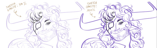
Another note about your sketch layer: you know those memes that complains that the sketch looks good but when you hide it the lineart is shitty? That's easily solvable.
When you're inking, lower the opacity of the sketch layer down, A LOT. I generally go for a 30 or 40% opacity (depending on the colour of the sketch. the yellow sketch will go around 40% because it's less visible, the purple one lower).
When you're inking, you MUST see clearly the lineart you're doing. If the sketch isn't contrasting enough, you won't see clearly what you're doing... It's like trying to sketch with a dim light, not seeing the paper clearly. See the difference:
BEFORE YOU START:
You probably have read it everywhere, but it bears repeating: warm up your hand.
You're using muscles and for more than five minutes. The warmer they are, the firmer your hand is, the easier it gets controlling your lines. It also prevents you from damaging your wrist. Stretching is also great, and grippers are nice to have. Keep your hand fit!
As for warming up: I usually do some calligraphy exercises, practicing on flowy cursives. You want to practice varying the pressure of your lines in a single trait, hence why calligraphy is good. But generally, what you can do is...

PRESSURE VARIATION AND LONG LINES:
So. My main tip and trick is to vary the pressure of your lines. In the same line, and between different details. This will help making the lineart more dynamic and interesting.
A note: this works for semi-realistic styles. If your goal is obtaining a Cartoon Network style: they have generally little to no variation and it works. My suggestion would be to study the kind of style and effect you want to obtain, different styles will work best with different linearts. If you're aiming at hyperrealistic painting, there's no point in spending time over a lineart, for example, I inked the same lineart, but with a brush that doesn't vary it's dimensions with pressure, and not changing the dimension of the brush.
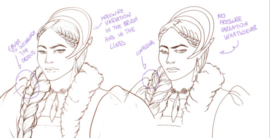
What makes my linearts look "flowy" and "neat" is the fact that I tend to draw less lines and longer, and pay attention when I stop, to start the line where I end it. This will give the impression of one continuous, single line, and make everything more fluid. See above in the french hood: on the right, I left the line rough on purpose, you can see where I stopped and started again. On the left, where I took care of it, you can't.
Generally speaking:
Thick, dark lines communicate that the object is close to the viewer (always keep the viewer in mind!) or in shadow. Lines should be thicker on the outside of your objects, to separate two planes, and in stuff closer to you.
Thin lines are delicate, they should be used in the background, for small details (see the hair, the lips, the small wrinkles around her eyes.)
As for line continuity: in both cases, the line of her face is one single line I drew. This can be obtained with a smooth result, particularly in curved lines, by getting the brush stabilisation on higher settings (80-100): sacrifice speed for accuracy.
MORE IS MORE, WHEN IT COMES TO LEVELS:
Particularly when there are two objects intersecating, or more characters interacting… Instead of inking all on the same level, I always do one level for each object, trace the WHOLE line as if there was nothing above, and then erase where it's not shown. This is a little thing, but pays off. Always in the drawing of above, the feather and the hem of the bodice were on separate layers, and then I erased the bodice under the feather. Take advantage of being inking digitally and not traditionally!

For many characters, here's an example of a vignette of a comic page before cleaning it up and erasing. Every single character and the weapons are on separate layers

For this it's very useful knowing your recurring mistakes. For example, I tend to draw heads bigger than they should. I know I do, so generally I keep the head on its own level, and the body on another, so it's easier to modify and size down just the head without getting crazy selecting only the lines you want with the lazo.
Again, you're inking digitally. It's not easier than traditionally necessarily, take full advantage of your instrument!
OTHER TIPS AND TRICKS:
High brush stabilisation sacrifices speed for accuracy. The line will lag a little from your cursor. Get used to watching the cursor and not the line, and trust that the line will follow.
GO SLOW.
Rotate and flip the canvas. Don't ask me why, but tracing long lines towards me is always easier than not the other way around.
Use the Free Transform, Warp, Distort etc etc and the Liquify to your heart's content if you notice the lineart has something wrong. The only cheating in art is using fucking AI generators (and AI pictures are not art, sorry not sorry)
References are your friends. Study how an artist you like does the lineart. Try and imitate them, and if you can and need to post them: tag them! (don't trace and sell it as your own)
Experiment with brushes, find one that you like for the effect you'd love. You do you, there's no right or wrong way of inking.
Remember to breathe when you trace those lines! (and to drink and do pauses and stretch, you don't want a tendonitis!)
Have fun. Lineart is not evil, lineart is your friend!
I hope this essay is exhaustive enough. I'm tagging ALL THE PEOPLE that requested it (and giving each of you a muffin).
@ndostairlyrium @narina-gnagno @salsedine @whimsyswastry @layalu @n7viper
If you have any questions, don't hesitate in asking!
#tutorials#lineart#inking#digital inking#digital art#tips and tricks#petrel explains#COME LO FECI (cit)#listen if we're mutuals and we chat... ask me to share my screen I don't mind the company when I work if it's not something I can't show#or if it's not too late at night for me#also I unironically like how Alyra inked without variation looks even angrier and more judgemental than normal LOL#also some spoilers for The Last Bacchae if you follow that#“Marmotta” means “Groundhog” in italian#art ref
122 notes
·
View notes
Text
not quite sure how to cope with the fact that I told my boss I'll be turning 32 in a couple weeks, and having her respond, "oh, I thought you were 25"
#25?!?!? I mean it's a fine age! we all did our time in the mines of the mid-20s.#but me? moi?? the person who works for you???#also YOU THOUGHT YOU HIRED A 25 YEAR OLD FOR THIS ROLE? that's insane. you have to know that's insane.#I'm even a little over my head; a 25 year old would be next to useless even if they had graduated from law school#again. 25. TWENTY FIVE YEARS OF AGE. @boss come back I have so many questions#no wonder the company has to secretly manipulate you
89 notes
·
View notes
Text
Well, it finally happened. I cried at work.
#I managed to hold it together until the end of the meeting#and just cry on the way back to my desk in front of my work partner#and not in front of our horrific manager#but she asked me to prepare a specific thing in a specific way for our meeting#I did exactly as she asked#I had my work partner look at it#I also had my former manager look at it#and he’s spearheading that same thing on his own new team#they both said it looked great#I presented it in the meeting#there was a few seconds of dead silence#and then our manager made it very clear that she wanted it done in a very different way#one she’d never asked for#and asked that everyone in the meeting brainstorm over the week#and come back next Tuesday to make a new one together#moving the bar#and making me look incompetent#I’m actively looking for a new job#both inside and outside the company#but swallowing all of this while I look#is going to be the best acting performance of my life#Oscar worthy stuff#cause emotionally I’m all the way done
70 notes
·
View notes
Text
Blorbo's Eepiest Soldier
Thank you everyone for your kind words, I'm doing better and am back to it <3
#helloo!#thank you all for the well wishes#I have really appreciated every kind word#I'm doing better now and have gotten back to school work#i am so eepy though#eepiest soldier#im also being overworked on my capstone game team and the team lead even told me shes over working me so thats#fun#counting going to this capstone class and meetings and such im putting like 25+ hours in a week for it#and i do have 2 other classes#and a social life i enjoy having#haha#but im happy to do the work cause its good portfolio stuff#except when my producer comes up to me and says "yknow how ur in charge of all the 2d art and concepting and branding and ui and pr? yeah g#make a 3-4 page detailed comic for plot at the start of our game cause we dont wanna cut plot (even tho we dont have time for it) and we#dont wanna show plot through interactable objects and dialogue/text so more work for you even tho u legit dont have time for it#ngl tho i have genuinely been enjoying designing icons and doing model concepts#i made some fire designs recently#please hire me a game company tm#anyway enough of capstone talk#love you all!!!#im excited to graduate and finally be able to change my bio!!#hope you all have a very lovely rest of your day <33#furry#fursona#digital art#art#eepy
75 notes
·
View notes
Note
I just saw your Graves with a tall reader, which I loved, so funny at times. So you know I gotta do it, can I request Graves with a short reader? Gotta boost that man's ego 💜
Glad to hear the Graves simps are enjoying my writing and want him to be doing well mentally! And I agree, sometimes you just need to make Graves happy since he, too, will notice your efforts and try to make you happy as well, even if he does it the Graves way!
Graves with a Shorter!Reader
Graves will have hit the jackpot with someone shorter than him in all honesty. As mentioned already, it’s in his blood to be bigger and stronger and scarier than his partner, which means he gets to protect them at all times. I can see him actually going for shorter people as well. While, if asked about it, he would always tell you that it’s because you have an easier time seeing just how reliable he is, in reality he just wants to feed his ego. He used to be taller than everyone else until he stopped growing, he really just wants to feel good about himself in all honesty. Every time he looks at you, he becomes aware of the height difference and sometimes the sly bastard even starts smiling about it. The bigger the height difference the better.
If he can literally tower over you, maybe trap you between him and the wall while he looks down at you, then all is good in his life. The shorter you are the better the angle at which you view him. He can toss his hair back and it will look as though he was in some series or movie with an attractive lead, in his eyes. Besides, he also gets to tilt your face so you’ll look at him when he’s talking. In all honesty, he genuinely believes he can fluster you more easily when he’s the taller one, and he genuinely just wants you to be speechless at least once in a while. Will sweet talk you while putting his fingers under your chin.
He’s also more prone to letting you be the big spoon, or lets you hold him more often in general. You being his backpack is funny to him, as mentioned before, so he will take his sweet time enjoying the feel of you being tiny. Again, if it was up to him, you’d be roughly 1,50, or something around that. That way there would, at the very least, still be 15cm between the two of you. Graves is a very touchy person in general, so don’t be surprised if he walks up to you and puts his head on top of yours, maybe even trying to put some weight of his on you as well so you can feel just how powerful he is. You’re more than welcome to try and shake him off, though. He will feign hurt, but it amuses him anyway.
Remember how I said Graves would be even more butthurt if you crack a few too many jokes about his height when you’re taller? He’d have his fun with someone who is sensitive about their height. You will constantly hear him refer to you as his little something, whether that be little sweetie, little honeypie or even his little pile of sugar. As long as he gets to emphasize you being the shorter one he’ll be happy. If you’re dysphoric about your height, then he’ll stop, but if you’re only mad because of a relatively harmless reason, you’ll never hear the end of it. Might even crack a joke such as pointing at a skittle on the ground and saying it’s almost as small as you are. The bigger your reaction, the better. Force him to sleep on the couch and he might stop for a day or two, but you can never get him to permanently stop.
Loves picking you up and throwing you over his shoulder. You can struggle all you want, this man can carry his own Shadows over his shoulder while they’re struggling, so you don’t really stand a chance against him. He gets all the more smug if you do struggle since he knows you won’t be able to escape him. It’s things like that where he wants to show you that he can easily overpower you, but he can easily protect you as well. Just be his lovely little partner, don’t grow too much and you have a loyal guy at your service until the end of eternity. Also, he will hold you over his head and comment on your cuteness. Graves doesn’t get cuteness aggression, but he could pretend he does and squish your cheeks whenever he feels like it.
Will pick you up and sit you down on his lap as well. Yes, he will wrap his arms around you as well and render any attempt at escaping futile. Besides, getting to hold you does reassure him quite a lot. His world is in his arms, safe and sound, and he gets to pretend he’s still a cool man. He genuinely believes you think him to be a badass, even with all the teasing and whatnot. Graves has a somewhat high opinion of himself on a good day, but you can still reassure him that he is pretty epic. You can comment on how strong he is and he’ll likely flex for you, offering you to touch his bicep. But at the end of the day, barely any of this matters, what’s important is that you wanna stay with him and feel like there’s a future ahead for you. Give him a kiss and tell him you admire him and he’ll be over the moon, regardless of whether you’re shorter or taller than him.
#cod#cod x reader#phillip graves#phillip graves x reader#I used to hate Graves before I got into CoD properly and knew who he really was but he grew on me#but that is largely because I saw so many HCs about him being the best boss one could ever have#I don't know where to fit my OC into the CoD lore in the slightest but sometimes I did have them work for Graves as a Shadow#I liked thinking about that whenever I was sad since those were usually fun things to imagine#silly Shadows with a wannabe badass boss who is actually so nice#I also always loved seeing other people's Shadow OCs since they were always so interesting#Shadow Company and stinky Graves grew on me over time#he was quite the dick in the campaign but watching the missions where you play as a Shadow were always my favorites#besides I do think I would thrive in an environment where someone would praise me the way Graves praises his workers#I've been getting more Graves requests as of late I've noticed! Lovely keep them coming! I do love and hate him!
96 notes
·
View notes
Text
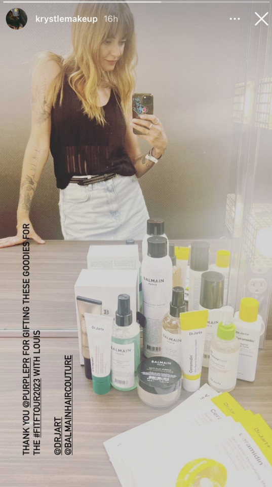
krystle's skincare (+ makeup) & haircare routine for louis backstage
#DR JART & BALMAIN!!!! very nice#krystlemakeup#looking at this...his skincare routine is mostly for skin barrier protection & moisturisation & hydration#gotta protect and strengthen the skin barrier!!!!#also the bb cream for his glowy skin + extra sun protection on stage HEHEHE#which is v important#to keep his skin supple and soft and bright#louis skincare#louis haircare#my bg in working for cosmetics companies is coming in handy haha
69 notes
·
View notes
Text
keep thinking about wtf kind of office job my computery gijinka guys even work for .. i was thinking some paper company but then I realized wait .thats literally just The Office.

#Maybe ill keep it vague???#maybe accounting idk#i just thought of a paper company cuz its what im most familiar with when it comes to office jobs like that (my mom worked at one!)#and it felt a bit fitting#LIKE MAYBE ILL STILL GO WITH IT but its gonna remind me of The Office everytime#i unintentionally remade The Office but with object heads sorry guys
171 notes
·
View notes
Text
Who keeps pinging him
#limbus company#project moon#my art#lcb samjo#it's probably dongrang texting samjo about anything but work#can't wait for his inevitable unceremonious side character death that i'll have seen coming from miles away and still cry about#i didn't forget his glasses this time#hexnail faust is up next (maybe)#fanart
169 notes
·
View notes
Photo
I welcome our new toothpaste lords
#fire emblem#fire emblem engage#alear#toothpaste chan#fe engage#aquanutart#me @ myself: do not waste time drawing this. do not. do not#my brain: TOOTHPASTE CHAN TOOTHPASTE CHAN TOOTHPASTE CHAN#me: no it's gonna take all my free time this week#my brain: > obsessively look up all the alear fanart so far preventing you from doing anything else until you draw this /send command#me: NO SHUT UP *draws this* AAAAAARGHHHHHHHH#hi i love the new fe artstyle because i am in fact anime weeb trash#this is the first time i have ever been remotely interested in an fe avatar character#when i was a kid i liked red and blue together and i had ideas about split red/blue characters haha#i also love heterochromia. i love wild brightly colored things#if anything i wish the outfit went harder on the red/blue theme and maybe used it for accents more than the gold but it's okay#the game itself sounds like heroes but mainline i want to see more new characters#at the same time excited to see lyn and company in 3d.. damn the nostalgia is working#(this is supposed to look like an fe heroes attack come on they've had silly weapons before)#anyway congratulations botw2 on finally having a very dramatic title#also YEAHHHHHHHHHHHHH PIKMIN 4 I LOVE PIKMIN SO MUCH#i am probably not going to have time to play any of these
603 notes
·
View notes
Last Seen Blogs

kaijayd
Lovin' Life

rochellelee
The Blundering Tales of a Hopeless Dreamer

cassavetesthebanda-blog
Cassavetes, the banda.
kaijayd
Lovin' Life

interstellarmoodboards
Interstellar Moodboards