archivist-dragonfly
The Library of a Former Bookseller
Sharing my library one book at a timeThe Main Library: https://www.tumblr.com/archivist-goldfishThe Library of Paranormal Experience: https://www.tumblr.com/archivist-crow
458 posts
Don't wanna be here? Send us removal request.
Last Seen Blogs

shortandpsycho
meow

midwestmunster
Midwest Munster

skinbeneaththeskull
cassie ☆

shire-child-belonging-to-bi-blog
Maranwë Baggins

prismaticavocado
rainbowrenjun & chaerrybombs main
Text


Book 487
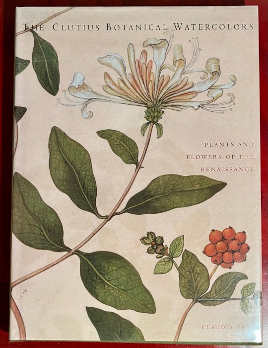
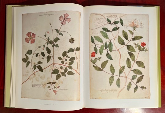
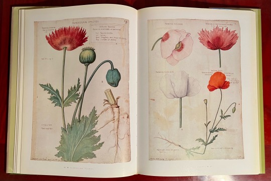
The Clutius Botanical Watercolors: Plants and Flowers of the Renaissance
Claudia Swan
Abrams 1998
This collection of botanical watercolors collected by pharmacist Theodorus Clutius (1526-1609) is a minor treasure. Intended for use as a work of reference, these botanical illustrations, painted by an unknown hand (or hands) in Holland in the late 16th century, represent a wealth of beautiful information, beautifully presented. The 142 illustrations within this volume, culled from some 1,800 pieces held at the Jagiellon University Library in Krakow, Poland, are stunning in their execution. Each illustration is exquisitely composed to best present the specimen, but what impresses most is the attention to detail. Each plant is immediately identifiable to a modern eye, and the collection as a whole is something of a high point in Renaissance art and science.
#clutius botanical watercolors#Claudia swan#abrams books#natural history#botanical illustration#bookshelf#library#personal collection#personal library#books#bibliophile#book lover#illustrated book#booklr#renaissance art#theodorus clutius
2 notes
·
View notes
Text
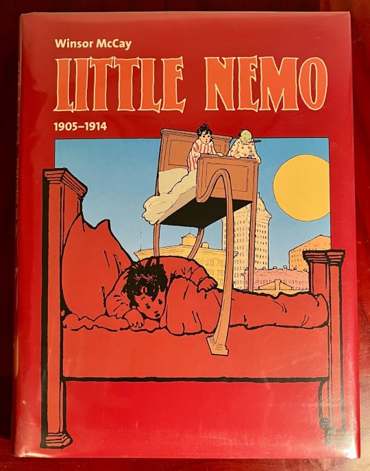
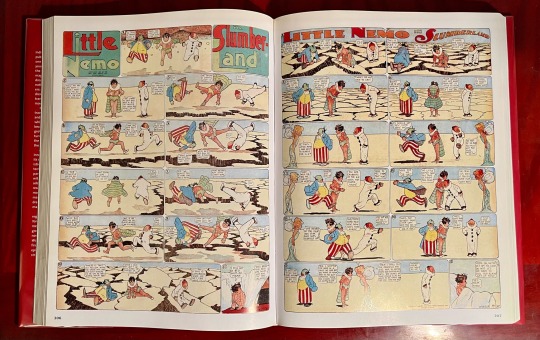


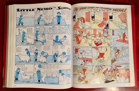
Book 486
Little Nemo: Little Nemo in Slumberland / Little Nemo in the Land of Wonderful Dreams - 1905-1914
Windsor McCay / introduction by Bill Blackbeard
Evergreen 2000
So, this is a really great one-volume collection of Little Nemo, and if you can only have one Nemo collection you could do a lot worse. I think Evergreen was a bargain price imprint of Taschen, so the quality of this edition is fairly high. The colors and lines are clearly reproduced, and with a trim size of approximately 10x13, the pages are given just enough space to be legible. However, given that these incredible strips were originally intended to be newspaper size, it’s still a bit uncomfortably small to be read easily. Ultimately, I ended up getting a much larger Nemo volume, which I’ll get to later, so this is somewhat redundant in my collection. But as a convenient one-volume collection, it’s solid.
#bookshelf#library#personal collection#personal library#books#bibliophile#book lover#illustrated book#booklr#comics#illustration#little nemo#winsor mccay#evergreen
1 note
·
View note
Text

Book 485
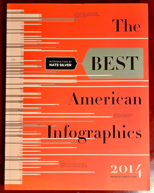
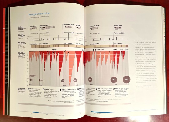
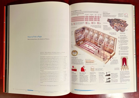
The Best American Infographics 2014
Nate Silver / Gareth Cook
Mariner Books 2014
So, Mariner Books, who has been publishing the Best American series for more than a century, I think only published Infographics for four years, between 2013 and 2016. I get why it didn’t work and why they don’t publish it anymore. It was kind of expensive, a bit unwieldy, and probably didn’t sell all that well. That’s too bad, because it is a very interesting way to look at a year. Now, I don’t really remember what happened in 2013, but by thumbing through this book, I have a guess.
There are infographics comparing the haircuts of Peyton Manning and Tom Brady, which states have the most closeted gay people, house fire damage, hate speech on Twitter, the debt ceiling, how a new Pope is chosen, the NSA’s surveillance, unmanned space missions, bees, the fashion of Justin Bieber, tornadoes, drone attacks, and much more.
Like I said, it’s an interesting way to look at a year.
#bookshelf#library#personal collection#personal library#books#bibliophile#book lover#illustrated book#booklr#graphic design#best American infographics#2013#Nate silver#Gareth cook#mariner books
6 notes
·
View notes
Text

Book 484
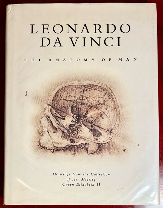
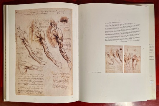
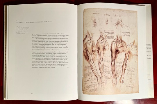
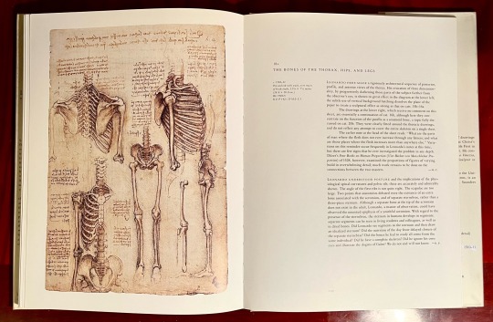
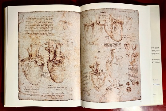
Leonardo da Vinci: The Anatomy of Man - Drawings from the Collection of Her Majesty Queen Elizabeth II
Martin Clayton and Ron Philo
Bulfinch Press 1992
So, let’s get the fact that this book is an excellent collection of Leonardo’s anatomical drawings out of the way up front. That said—this next bit is quoted from the foreword—“Her Majesty the Queen possesses, in the Royal Library at Windsor Castle, more than six hundred drawings by Leonardo da Vinci, the finest such collection in the world.”
But how? Well, it’s a very convoluted story. According to the foreword, upon Leonardo’s death, they were passed to his favorite pupil, Francesco Melzi. After Melzi’s death, the collection was purchased by sculptor Pompeo Leoni, who had them bound into books. Upon Leoni’s death in 1609, one volume was “acquired” and brought to England by Thomas Howard, advisor to King Charles I. Ultimately, they were “recorded for certain as being in the possession of Queen Mary II in 1690.”
So, were they stolen? I don’t know. But I know this: Italy’s never going to see them again.
#bookshelf#library#personal collection#personal library#books#bibliophile#book lover#illustrated book#booklr#art#leonardo da vinci#anatomy of man#Martin clayton#Ron philo#Bulfinch press#science#anatomy
3 notes
·
View notes
Text


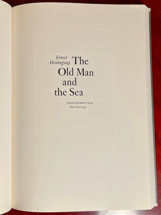

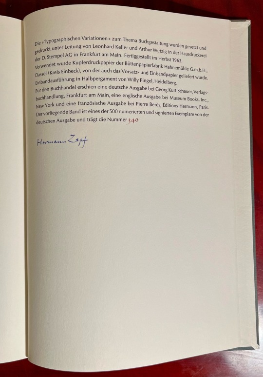
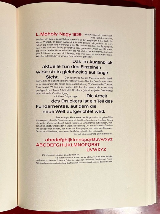
Book 483
Typographische Variationen
Hermann Zapf
Georg Kurt Schauer 1963
One of a limited edition of 500 copies, this German edition of Typographische Variationen is number 340. This book may even be more impressive than the last one. With numerous tipped-in pages among some incredible examples of type from a variety of sources, the print quality of this volume is perhaps the best I’ve ever seen. Printed in several colors and with the impression of the printing plates clearly visible, this book highlights some truly gorgeous examples of 20th Century type dating from a 1909 edition of Voltaire’s Candide to the first edition title page of Ernest Hemingway’s The Old Man and the Sea.
#bookshelf#personal collection#library#personal library#books#bibliophile#book lover#illustrated book#booklr#typography#typographische variationen#hermann zapf#museum books
5 notes
·
View notes
Text
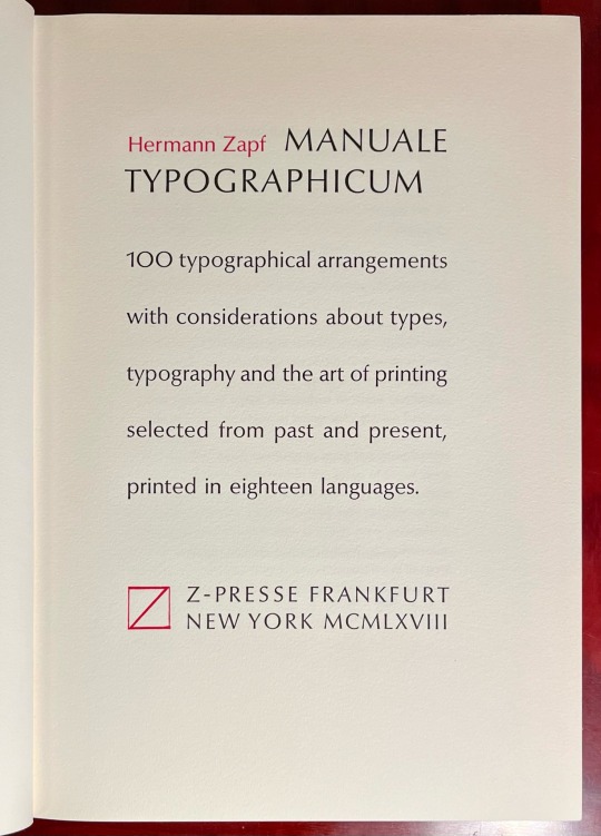
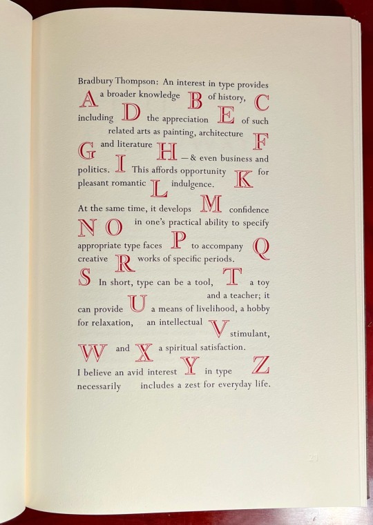
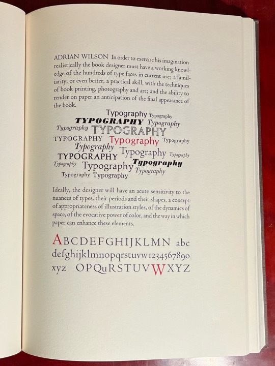
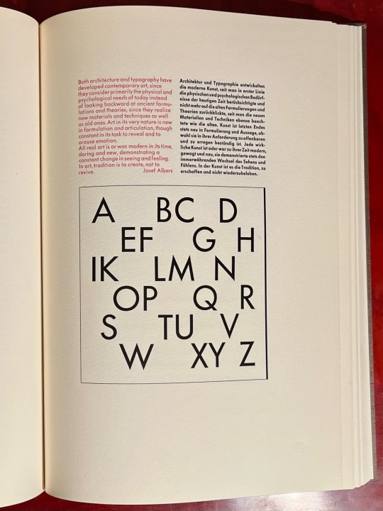
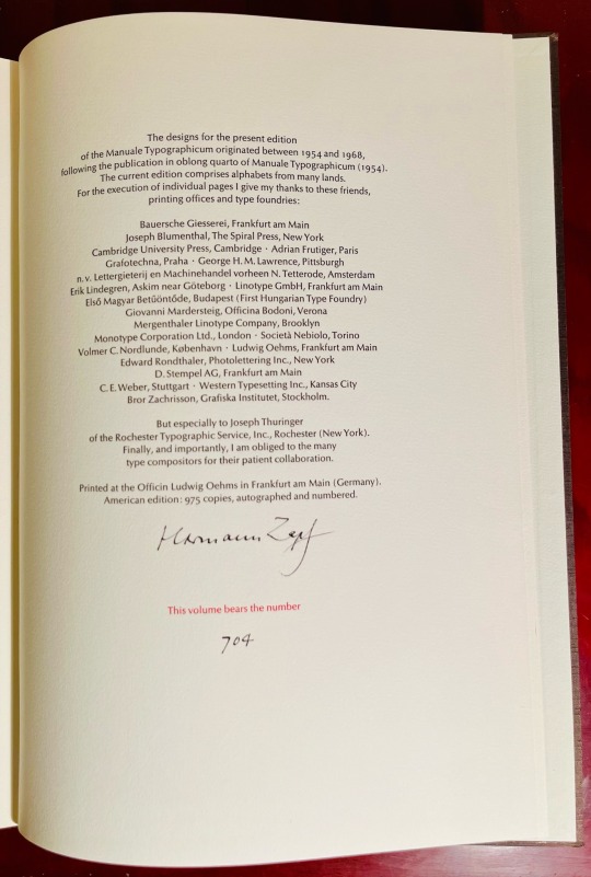
Book 482
Manuale Typographicum
Hermann Zapf
Z-Presse/MIT Press 1968
We’re starting to get into a really interesting bunch of books now. The next two books were part of an epic estate sale I handled, and I knew as soon as I saw them that they were coming home with me. I believe they were originally issued with both dust jackets and slipcases, which are now lost, but the interiors are flawless and stunning. From the copyright page, it appears that this book was first printed as an oblong quarto in 1954, and this 1968 edition is the first trade limited edition. As such, it is signed and numbered (#704) by the great Hermann Zapf. Printed on fine heavy rag paper, the print quality of both books is absolutely incredible. With pristine type examples from around the world, printed in two colors, this book is an absolute treasure.
#bookshelf#library#personal collection#personal library#books#bibliophile#book lover#illustrated book#booklr#typography#manuale typographicum#hermann zapf#z presse
2 notes
·
View notes
Text


Book 481
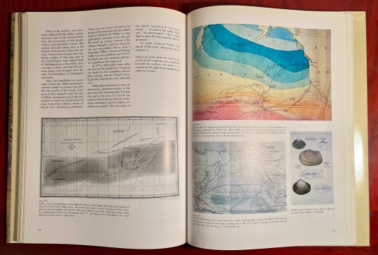
Historical Atlas of the North Pacific Ocean: Maps of Discovery and Scientific Exploration 1500–2000
Derek Hayes
British Museum Press 2001
Derek Hayes has authored many books of maps, and it shows. This one is much better. More maps, more specific, more detail images, and it includes incidental illustrations documenting voyages. Featuring maps from the voyages of Sir Frances Drake, James Cook, George Vancouver, Matthew Perry, the first sonar map of the Pacific, physiographic diagrams of undersea topography, plate tectonics, tsunami maps, satellite images, and hundreds more, this book covers over 500 years of people trying to understand the North Pacific rim.
#bookshelf#library#personal collection#personal library#books#bibliophile#book lover#illustrated book#booklr#maps#Derek Hayes#historical atlas of the North Pacific Ocean#British museum press#cartography
14 notes
·
View notes
Text


Book 480
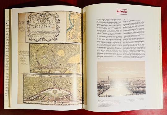
Cities of the World: A History in Maps
Peter Whitfield
University of California Press 2005
So, I have a lot of books of maps. And most of them are pretty great. But this isn’t one of them. If I’m being honest, I’m surprised this one survived my last book cull. There’s nothing really wrong with it—it’s just a little too general. It has some very lovely examples, presented well, but overall the book spans too great a geographical area and too great a period of time. It’s just a bit all over the place—pun intended.
#bookshelf#library#personal collection#personal library#books#bibliophile#book lover#illustrated book#booklr#cities of the world#Peter whitfield#university of california#uc press#maps#cartography
6 notes
·
View notes
Text


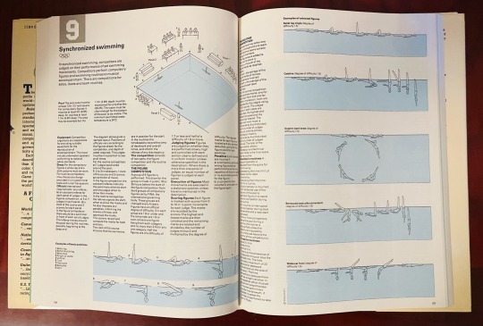
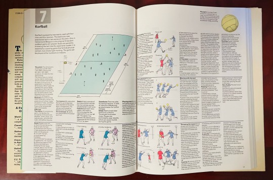
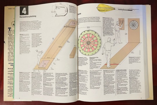
Book 479
Rules of the Game: The Complete Illustrated Encyclopedia of All the Major Sports of the World
Diagram Group
St. Martin’s Press 1990
This is a weird book, even for me, but it fits with my fondness for odd reference books. I’m convinced that one day it’ll be useful. Someday, I’m going to want to know what the hell shinty is, and how it’s played. Or bandy. Or korfball. Or the difference between rounders and softball. Or pool and English billiards. Apparently, Canadian 5-pin bowling is a thing. So is canoe polo. Or maybe I’m going to want to know how to tell a good synchronized swimming performance from a bad one. You never know. But I have the book for that day.
#bookshelf#library#personal collection#personal library#books#bibliophile#book lover#illustrated book#booklr#rules of the game#design group#st martins press#graphic design#reference
4 notes
·
View notes
Text


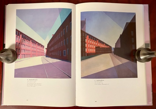


Book 478
Charles Sheeler: Across Media
Charles Brock
University of California Press 2006
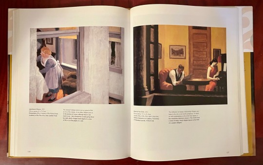
Published to accompany a traveling exhibition, this book is a very impressive retrospective of the work of Charles Sheeler (1883-1965). Examining Sheeler’s work by his various media—film, photography, commercial photography, mixed media, and photomontage—Across Media presents a glorious catalog of Sheeler’s beautiful abstractions of everything from the mundane (typewriters, his favorite stove, telephones) to his glorious monumental portraits of skylines and industrial factories. Tied to his fellow Precisionist contemporaries Charles Demuth and Paul Strand, to Edward Hopper by the lonely desolation of his cityscapes, and at times oddly reminiscent of Italian surrealist Georgio de Chirico, Sheeler’s modernist vision stands as a notable landmark of mid-century America.
#bookshelf#library#personal collection#personal library#books#bibliophile#book lover#illustrated book#booklr#art#charles sheeler#Charles Brock#university of california#UC press
4 notes
·
View notes
Text
Book 477
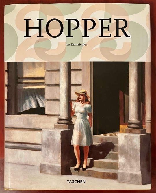
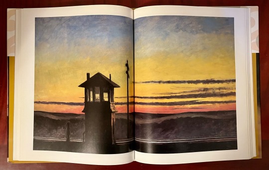
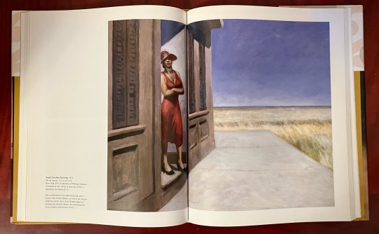
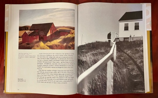
Hopper
Ivo Kranzfelder
Taschen 2006
I make no secret of the fact that Taschen is my favorite publisher. First off, they publish books about subjects in which I have an interest: art, architecture, comics, esoterica, design, fashion, photography, sex, pop culture, etc. Sometimes people ask, “But aren’t they the ones who do all those pricey books for wealthy collectors?” Yes, they are. They make books that are priced anywhere from $200 XXL folios to $15,000 limited editions. But on the other end of the spectrum, they also publish books like this lovely Hopper volume or the Basic Art Series—well-made hardcover art books that only retail for $20—or their Bibliotheca Universalis series—a great series of re-sized past bestsellers that sell for $25. They’re all excellent bargains, considering the quality. One could put together a solid art book library for relatively low cost, especially if you are willing to wait for their seasonal warehouse sales. Also, for the most part, they don’t make much of a distinction between high and low art—Frazetta and Kirby sit side-by-side with Kahlo and Raphael, tattoo art gets the same deluxe treatment as a medieval manuscript, or a book of ukiyo-e masterpieces might have the same presentation as a book of vintage pornography. As it should be.
#bookshelf#library#personal collection#personal library#books#bibliophile#book lover#illustrated book#booklr#art#edward hopper#ivo kranzfelder#taschen
12 notes
·
View notes
Text


Book 476
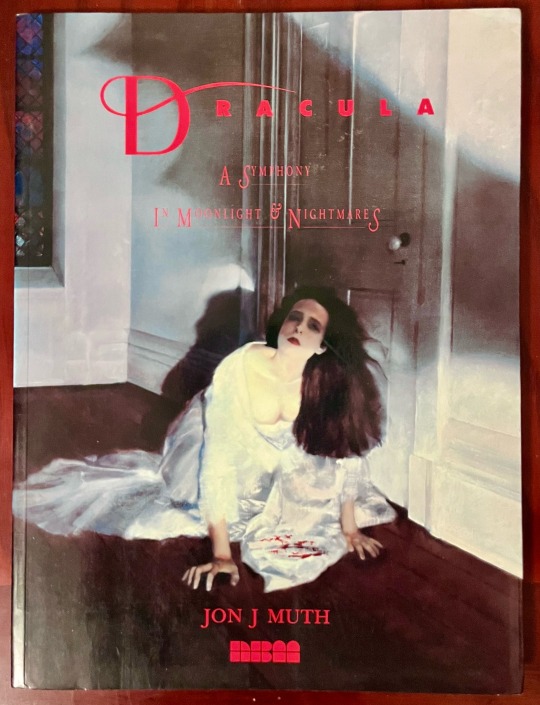
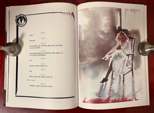
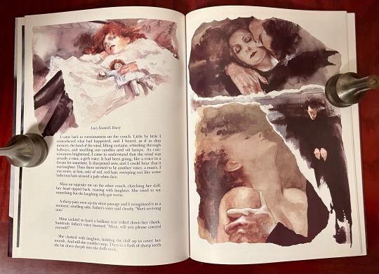
Dracula: A Symphony in Moonlight & Nightmares
Jon J. Muth (adapted from Dracula by Bram Stoker)
NBM Publishing 1992
The first time I remember encountering the work of Jon J. Muth (b 1960) was his two excellent children’s books, The Three Questions (2002) and Stone Soup (2003). Later I realized I had actually had seen his work before, I just didn’t recognize it as the same person. At the time, I didn’t know that Muth had started in comics, but his comic work is quite different from his children’s art. Muth had done the art for “Exiles,” the story included in the last collection of Sandman stories, The Wake. Everything finally became clear when I read the story “Big Sky” in Warren Ellis’ excellent Global Frequency. Originally published by Marvel in 1986, Muth’s Dracula is beautifully wrought and lovingly characterizes Lucy Seward and Mina Harker in particular. At times reminiscent of Barry Moser and Alan Lee, Muth’s gorgeous watercolors, paired with a minimalist and heavily modified adaptation of Stoker’s classic novel—part journal entries, part dialogue—comes across like the screenplay of a fever dream.
#bookshelf#library#personal collection#personal library#books#bibliophile#book lover#illustrated book#booklr#dracula#Jon j muth#nbm publications
19 notes
·
View notes
Text


Book 475
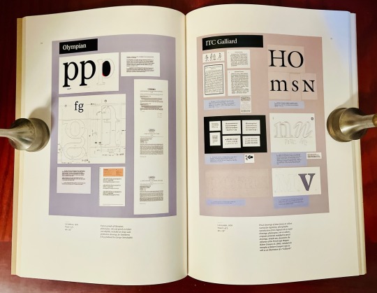
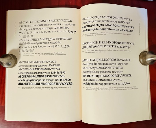
Typographically Speaking: The Art of Matthew Carter
Margaret Re
Princeton Architectural Press 2002
Matthew Carter (b. 1937) is a legendary typographer whose name should be better known. The New Yorker once described Carter as “the most widely read man in the world,” owing to the ubiquitousness of some of his best-known fonts and type designs. Basically, everyone knows Carter’s work even if you don’t realize it. Verdana, Georgia, Tahoma, Galliard, along with scores of others—these were all created by Carter. But my favorite might be Bell Centennial, created in the 70s for use in phone books. On the occasion of their centennial, AT&T tasked Carter with creating a type that would use substantially less space than the then-current Bell Gothic without loss of legibility at the small sizes and poor printing process used for phone books. And even though I haven’t seen an actual phone book in years, I still have a clear memory of Bell Centennial and its clarity and functionality. Truth is, I think I kinda miss it. Phone books, too.
#bookshelf#library#personal collection#personal library#books#bibliophile#book lover#illustrated book#booklr#typography#typographically speaking#matthew carter#margaret re#Princeton Architectural press
11 notes
·
View notes
Text


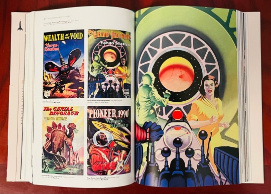

Book 474
Rayguns & Rocketships: Vintage Science Fiction Book Cover Art
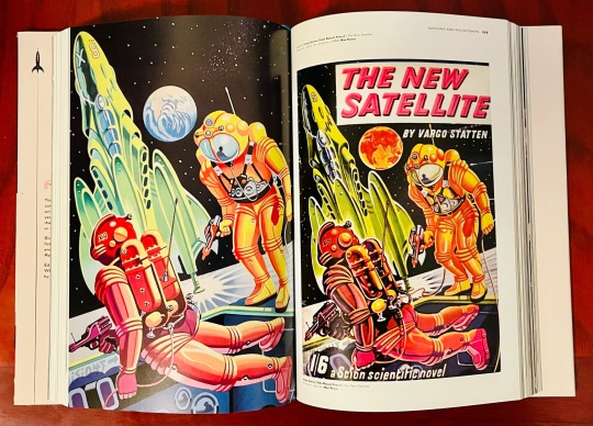
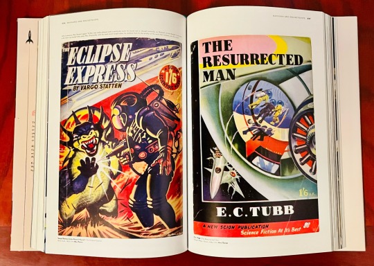
Rian Hughes
Korero Press 2022
So this relatively new book by designer and illustrator Rian Hughes is a gem. Now I know a little something about post-war American pulp illustrators, but because pulps didn’t often cross the Atlantic I know almost nothing about pulp sf illustrators from the UK. So this book features illustrators and images I’ve never seen. And, after living with this book for a while, there is a difference. I can’t really quantify the difference at the moment, but it’s there. The authors might be the same—Clarke, Heinlein, Bradbury, etc.—but, as a group, there is a slightly different character to them from their American counterparts. From the highly graphic work of Leslie Wood to the exuberant designs of Ron Turner and featuring hundreds of images from a variety of publications printed on high quality glossy paper, this is a very welcome addition to any collection of pulp sci-fi art.
#bookshelf#library#personal collection#personal library#books#bibliophile#book lover#illustrated book#booklr#Rayguns and rocketships#rian hughes#korero press#science fiction#graphic design#illustration#cultural history
14 notes
·
View notes
Text
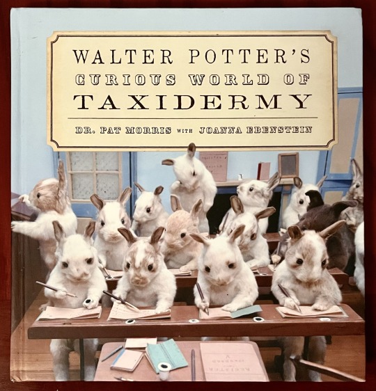


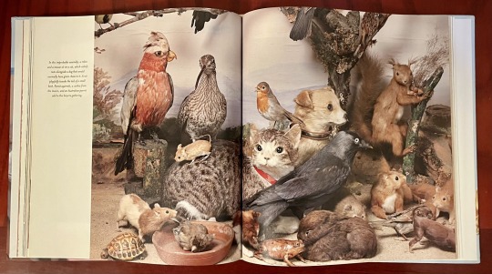
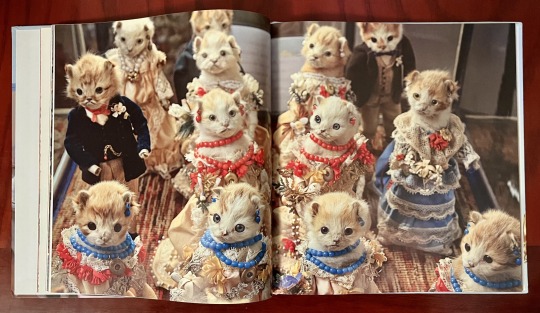
Book 473
Walter Potter’s Curious World of Taxidermy
Dr. Pat Morris with Joanna Ebenstein
Blue Rider Press / Penguin Random House 2014
Born in Bramber, Sussex, England in 1835, Walter Potter (d. 1918) grew up in the family inn/pub, The White Lion. He left school at the age of fourteen and began trying to come up with ways that his naturalist/taxidermy hobby could help encourage business at the pub. At the age of 19, inspired by his younger sister’s collection of nursery rhymes, Potter started creating his first major tableu, The Death and Burial of Cock Robin—a work that would take him seven years to complete. Housed within a wooden house-shaped case nearly two yards wide, Cock Robin features 98 birds, a small handmade bull, butterflies and other insects, and even a snake—artfully arranged in a solemn mourning scene down a path leading into a church. Some of the mourners are even crying glass tears. The work delighted the Victorian sensibility.
Eventually, Potter opened a museum to house his work and over the course of his life would create, among numerous smaller pieces, at least a dozen large tableaux with titles like: The Kittens’ Wedding (c. 1890), Rabbits’ Village School (c. 1888), The Upper Ten (c. 1880), depicting a squirrel card club, and The Lower Five (c. late 1800s), a scruffy rats’ den being raided by local police (also portrayed by rats).
#bookshelf#library#personal collection#personal library#books#bibliophile#book lover#illustrated book#booklr#art#walter potters curious world of taxidermy#pat morris#joanna ebenstein#blue rider press#nature
4 notes
·
View notes
Text

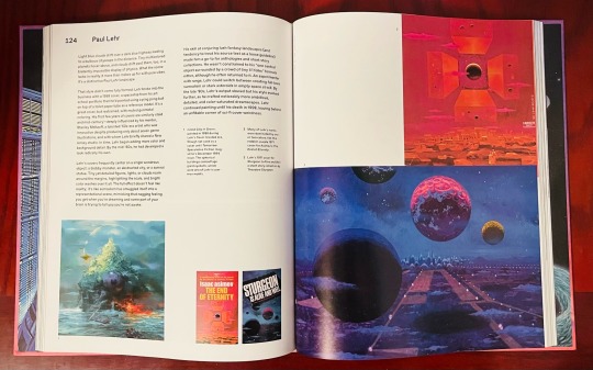

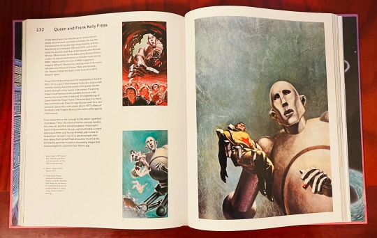

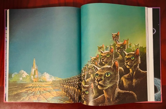
Book 472
Worlds Beyond Time: Sci-Fi Art of the 1970s
Adam Rowe
Abrams 2023
Another new book from Abrams. We’ve gotten to the point in publishing where, if you’re like me and like large-format art books, you need to get used to the idea of buying them when they are released. Fewer and fewer publishers are taking the risk of releasing art books, and they are staying in print for shorter and shorter periods of time. So, when I heard about this book, I made a point of getting myself a copy, and I’m glad I did. While my preference in vintage book cover art leans more toward the pulp era, it is the 70s covers that I find myself the most familiar and nostalgic. Featuring some all-time greats—Frazetta, Vallejo, Elson, Emshwiller, Mead, the Dillons, et al—and divided into subject categories such as spaceships, cities and landscapes, plants, animals, aliens, fantasy realms, and cryptozoology, this is a beautiful and very welcome look at an incredibly creative, experimental, and occasionally ridiculous sci-fi decade.
#bookshelf#library#personal collection#personal library#books#bibliophile#booklr#book lover#illustrated book#worlds beyond time#adam rowe#abrams books#science fiction#cover art#illustration
637 notes
·
View notes
Text
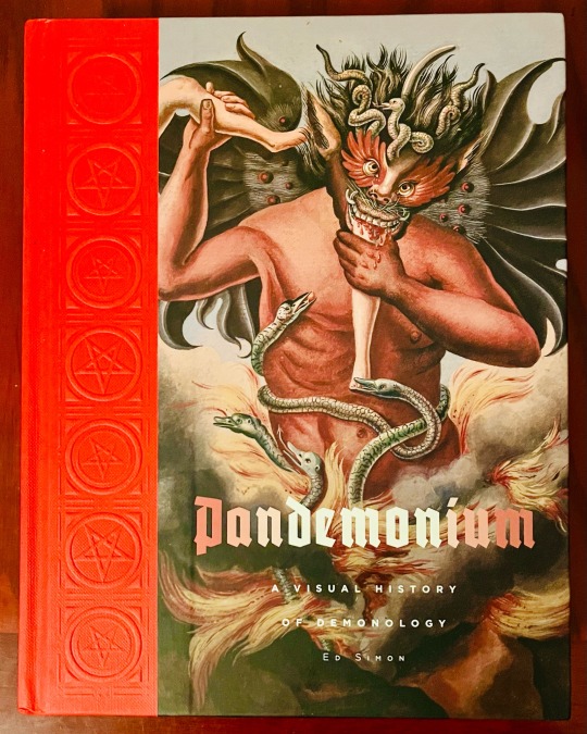

Book 471
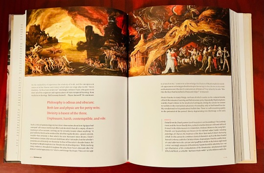
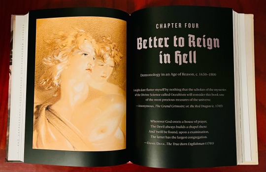
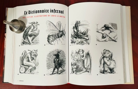
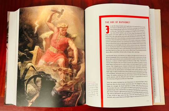
Pandemonium: A Visual History of Demonology
Ed Simon
Cernunnos / Abrams 2022
And we’re back. And I’m skipping ahead to my new purchases. For some reason, the next couple of books on my bookshelf aren’t interesting right now.
I don’t know much about Cernunnos, except that it is an imprint under the Abrams Books banner, but a casual glance at their catalog lists a pretty interesting intersection of subjects. From a reissue of the Wil Huygen classic Gnomes to volumes about fashion both high and low to books by artist Mark Ryden, it definitely seems like a publisher I will need to pay more attention to in the future. This is a very well produced book. With a quarter-bound paper over boards binding (embossed with pentagrams), hundreds of illustrations throughout, and two-color text, this book is a lovely devotion to the diabolical—demons, rebel angels, and the tangled family tree of the infernal from ancient sources to modern.
#bookshelf#library#personal collection#personal library#books#bibliophile#booklr#book lover#illustrated book#pandemonium#Ed simon#cernunnos#abrams books#cultural history#art#paranormal
4 notes
·
View notes