goingintolabour-blog
Going into labour...
in 9 months i plan to launch a menswear clothing brand. this is how i plan to do it.
19 posts
Don't wanna be here? Send us removal request.
Last Seen Blogs

botheredbuck
because, evan
centrally-unplanned
Centrally Unplanned
lonely-wahida
lôňêlý wāhîdā
lonely-wahida
lôňêlý wāhîdā
amsterdamhotelroom
CAN I DREAM FOR A FEW MONTHS MORE?


Photo
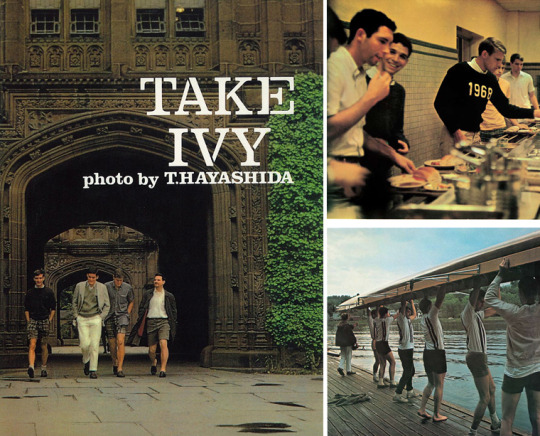

Take Ivy- published in Japanese on September 20, 1965 by Fujingaho sha, Tokyo, Japan.
Essential Reading.
0 notes
Photo
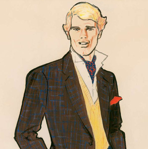
MR RENÉ GRUAU
Italian illustrator captured the essence of masculine elegance.
0 notes
Photo
True that.

254 notes
·
View notes
Photo
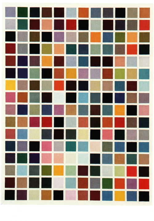
Time to choose the fabrics.
25 notes
·
View notes


Photo

Magical suiting.
1 note
·
View note
Photo

Off to New York on Wednesday for a week with some designs and my thoughts. Who knows, may meet someone out who wants the whole collection!
0 notes
Photo
Pattern drawing and cutting is next on the agenda...

290 notes
·
View notes
Photo


Only until I re-watched this film (The Talented Mr. Ripley - To those of you who havn't and now must watch it) the other day - I truly realised the sheer quality and attention to detail of the period styling brought together by the likes of Anne Roth. This 1999 adaptation of Patricia Highsmith's 1955 novel seems to capture the best and most beautiful mix of American Ivy and southern Italian style circa 1950. Now this is style and totally fitting for todays setting.
#the talented mr ripley#Matt Damon#Jude Law#Gwyneth Paltrow#Rive#Riviera#1950s#1960s#vintage#Style#Classics#Smart#Ivy League#Capri#Italy
18 notes
·
View notes
Photo

So, what gets me is why anyone nowadays wouldn't want a wardrobe that looked like this. Seriously decent menswear. Perfectly put together, ready to mixed up for any occasion.
Pictured for an issue for a 1962 Esquire Magazine.
To hell with carrot topped chinos, graphic tee's and a pair of bogged trainers - this is the way forward.
#Fashion#Ivy#Ivy League#College#Style#Menswear#Esquire#GQ#Magazine#Vintage#Suit#Tailoring#Wardrobe#The future
6 notes
·
View notes
Photo

A seriously inspiring and interesting book to flick through, if only I could own a copy of me own. The Japanese always do it well. Brain Child of Mr. Kazuo Hozumi.
25 notes
·
View notes
Photo
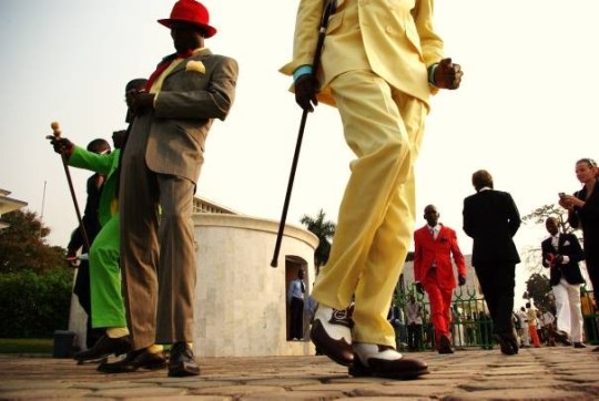

There are strict rules of dress for Sapeurs: three colors are the maximum for an outfit and the status of style is increased by accessories, such as cigars, pipes, ties, glasses, and walking sticks.
SAPE - the religion of style.
9 notes
·
View notes
Photo

So. Decided to go and do the sensible thing. Buy myself a notepad and a Sharpies marker. It was now time to unleash my thoughts and ideas onto paper. I didn't want to get to ahead of myself and chose to focus on the branding itself. No design - yet. Tempting as it is to start drawing aesthetically pleasing sketches of garments, I refrained and started making note of the core meanings and foundations of what I wanted this brand to be about. More importantly who it was for.
You may be wondering, if your following this and give a shit. Why no name? Like with a baby (not that I have one..) you name it once it is 'born' and it's exactly what I plan to do with this. Nothing to limit it; making for a freeform process to create an identity that is not anchored by anything from the beginning.
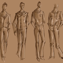
After spending the time forming a basic framework of brand image, I couldn't resist and spent some time drawing out detailing that I plan to use in the range, before I had forgot them.
This was done all whilst taking in the newly printed fifth-issue of Jocks and Nerds. For those of you unfamiliar, it's a devilishly good free quarterly style publication. For readers interested in proper style it's history and culture surrounding such things.
1 note
·
View note