#(also include a hex code or rgb values if you can!)
Text

[Text: This alter doesn’t know if they’re an introject or not.]
Like/Reblog if you save or use!
#userbox#did#system#did system#osdd1#osdd1 system#introject#anti endo#endos dni#mod morpho 🦋#note: color requested was dove grey and I did my best but I’m not sure I got the right shade. If I didn’t then please lmk!#(also include a hex code or rgb values if you can!)
211 notes
·
View notes
Text
P5.js
A JavaScript library for innovative coding is called p5.js. It is a collection of pre-written code that gives us access to tools that make it easier to use code to create interactive visuals in web browsers. A p5.js project uses HTML, CSS, and JavaScript just like any other web project would. The p5.js library, index.html, style.css, and sketch.js make up a typical p5.js project. A <script> element must be used to include the p5.js library in an HTML document's <head> section. Only after that may a JavaScript file use the p5.js library.
The HTML element known as <canvas> is used to display graphics produced using the Canvas API of JavaScript. The p5.js library has numerous built-in drawing functions that make it simple to draw to the HTML <canvas> on the fly using JavaScript by using the Canvas API invisibly.
The required canvas width and height are passed as arguments to the createCanvas() function, which then produces an HTML canvas on the webpage. It is typically one of the setup () function's first functions to be called. Within a p5.js sketch, the createCanvas() function can only be used once. When no options are supplied to the createCanvas() function, the p5.js library will create a default canvas with a width and height of 100 pixels.
If your p5.js sketch does not need a canvas for some reason, you can prevent the p5.js library from producing one at program start up by explicitly calling the noCanvas() function. The p5.js canvas's background colour is set using the background () function. A p5.js canvas's background is transparent by default. The setup () function is launched by the p5.js package automatically at the start of an application. In the drawing, the setup () function shouldn't be explicitly invoked. Code defining the sketch's initial state, such as the canvas size, background colour, and initial values of global variables, is often found in the setup () function.
A coordinate system is used by the p5.js canvas to represent space. The top-left corner of the canvas is where the origin (0, 0) of the canvas is located. Using ordered pairs, (x, y), the canvas coordinate system is given, with x representing the distance from the left edge and y representing the distance from the top edge of the canvas.
With p5.js, a colour value can be expressed in a variety of ways. It may be expressed as:
• As one number between 0 and 255, a gray value.
• Three numerical values between 0 and 255 make up the RGB (Red, Green, and Blue) value.
• RGBA value is represented by four numeric values between 0 and 255.
• Hex value represented as a string.
• Three numeric values, ranging from 0 to 360 for hue and 0 to 100 for saturation and brightness, make up the HSB (Hue, Saturation, Brightness) value.
Also P5.js include lots of drawing functions like point(), line(), rect(), square(), ellipse(), circle(), triangle(), quad(), fill(), noFill(), stroke(), strokeWeight() and noStroke().
0 notes
Text
Rgba color picker

#Rgba color picker generator#
When you click on the color, you'll be able to copy and paste that code. Simple RGBA Color Picker Color: rgba( 0, 0, 0, 0 ) The so-called RGBA colors (Red Green Blue Alpha) that add a new factor, the alpha channel, that is, the opacity or transparency that follows the same percentage scheme: 0 represents absolute transparency and 100 represents absolute opacity which is the way we traditionally see colors. The components of RGB are represented by the mathematical model: R red (0 R 255) G green (0 G 255) B blue (0 B 255) In the RGB color space, the light intensity of each channel is equal to the value of each channel. The generated color's value is shown in various formats including Hex, RGB, RGBA, HSL, HSLA, and several more. The RGB color space is a combination of the red, green, and blue light components of additive color.
#Rgba color picker generator#
No Wordpress (Using github. If the RGBA() Text String is from your data source, please consider store the CSS Color Name or 6-digit hex value or 8-digit hex value in your data source instead of the 'RGBA(215,50,19,1)', then you reference it within the ColorValue() function. We've built the perfect tool for you - a Random Color Generator All you have to do is click on 'Generate' and a random color will be generated and displayed. The green value changes from 110 to 109 Screenshots or screen recording (optional) When adjusting the Alpha slider using this preset color configuration the none of the RGB values should change. 1 fully darkens a color to black, 0 doesn't affect the color, and 1 fully brightens a color to white. Change the RGBA values to 246, 110, 4, 1 (You may need to click outside the box to trigger an state update) The so-called RGBA colors (Red Green Blue Alpha) that add a new factor, the alpha channel, that is, the opacity or transparency that follows the same. A color value such as Color.Red or the output from ColorValue or RGBA.While the color change is minimal to the human eye, it makes it impossible to detect whether a change to the RGB values was intentional or not which is what I'm trying to detect. For example, if you enter the RGBA values 246, 110, 4, 1 on an Alpha-Enabled color picker and then adjust the Alpha slider, the Green value of "110" get's changed to "109". or you can create your own color palette from scratch by using the RGB color picker functionality and saving your preferred colors to the palette on the. When using some RGBA colors on the color picker, adjusting the alpha slider also adjusts RGB values slightly.
0 notes
Text
Online color picker from image

#ONLINE COLOR PICKER FROM IMAGE GENERATOR#
#ONLINE COLOR PICKER FROM IMAGE CODE#
Also, you can print any of these color formats directly onto the output image using the "Print color name" option. Images often contain a wide array of colors, and sometimes you just want to know the exact color that you.
#ONLINE COLOR PICKER FROM IMAGE CODE#
We offer 10 different color formats – closest color name (for example, "Yellow, Pink"), HEX code #RRGGBB, RGB (Red, Green, Blue), RGBA (Red, Green, Blue, Alpha), HSL (Hue, Saturation, Lightness), HSV (Hue, Saturation, Value), HSI (Hue, Saturation, Intensity), LAB (Lightness, A, B), LCH (Lightness, Chroma, Hue), and HCL (Hue, Chroma, Luminance). Use our online HTML color picker from image. You can also view and copy the name of the extracted color. The extracted color can be downloaded as a PNG format file using the "Save as" and "Download" buttons. There are various color models, all of which have something in common (like. All pixels within the green area are then mixed into one color and sent to the output. Image color picker is a smart way to choose colors for your website or presentation. 'RGB (255,0,0)') The supported RGB codes correspond to the 24-bit system where each component ranges between 0 and 255 (8-bit encoding). The following color codes are supported: Hex (e.g. Then just copy the HEX codes from the color. The Art圜lick Color Hue Finder can be used to find color hues from the hex or RGB color codes.
#ONLINE COLOR PICKER FROM IMAGE GENERATOR#
If the area with the given radius is greater than the area of the magnifying glass, then it will be highlighted on the PNG itself with a green line. This simple color palette generator extracts colors from any photo or file on upload. Source: With this tool, you can pick a color out of any image without the need to open up photoshop or any other photo editors. You can put a picture url in the textbox below or upload your own image. If you increase the pixel radius in the options, the program will sample the average value of all pixel colors in the selected area. For example, an image may include metadata that describes how large the picture is, the color depth, the image resolution, the creation date, and other data. Color picker image online definition of superior in anatomy. The central pixel in the magnifying glass is outlined with a red line and this is the color that is picked and printed to the output field. The online color eyedropper is a fast and convenient tool that helps you determine the color of a pixel in RGB and HEX (HTML / WEB) on any image. See a short demo of using this tool here. Top All Color picker Contact Blog Colors Color Picker Tool Pick Color From Any Image. Zoom in the image and click to pick the color. When you click and hold the mouse on the input PNG, a magnifying glass will appear that you can then use to precisely select a specific pixel. Pick color from any image using this online tool. Want a color scheme that perfectly matches your favorite images With Canvas color palette generator. You can upload any PNG image to the input and use the eyedropper tool to extract a single color from the image. The easiest place to get colors from your photos. This browser-based utility allows you to pick a color from a PNG image.
0 notes
Text
How to Create a Style Guide: 5 Components of a Style Guide
A style guide is a document that details a company’s set of standards for writing, editing, formatting, and designing documents. Also known as a writing style guide, this manual establishes the standard requirements for grammar, punctuation, tense, tone, wording, and writing best practices.
What Is the Purpose of a Style Guide?
A good style guide serves two main purposes:
Keeps writers within guidelines. A copywriter has to adhere to an organization’s tone and style when crafting copy for public-facing marketing materials. A style guide lays out these rules for writers, offering them a well-organized set of guidelines to reference as they work. Style guides are especially useful for contract or freelance copywriters who are not familiar with the company’s particular house style.
Helps editors maintain brand consistency. A comprehensive style guide provides editors will all the rules and guidelines they need to follow to keep your company’s communications error-free, consistent, and on-brand—from long-form copy to design.
What to Include in a Style Guide?
If you want to build a style guide for your company, you’ll need to know the most common components of a style guide, such as:
The Chicago Manual of Style and The Associated Press Stylebook
Official style guidelines. To create a company style guide, you need to choose an official style guide to follow. Official style guides contain rules for comma usage, capitalization, hyphens, sentence structure, and even graphic design. Each style guide has different rules for punctuation and grammar based on different goals—for example, the Chicago style was originally developed for a university press, and many of its style preferences are based on best practices in literary and historical print publishing. Conversely, AP style was developed for news reporting, so many of its preferences are based on brevity and space-saving in journalism columns.
Important divergences from the official style. In addition to the official style your brand will use, you’ll want to include any specific rules that you want to diverge from. For example, if you want to capitalize “customer” in your public-facing communications, you can make it an in-house rule in your style guide, overriding the official Chicago recommendation.
Unique brand words or phrases. You will likely have a set of words or phrases that you’ve created around your product or service. You must include these brand words and phrases in your style guide since writers and editors won’t be able to look up how to spell, capitalize, or hyphenate these words. By including brand words in your style guide, you’ll ensure that those words and phrases are treated consistently throughout all of your written communications. You should also include your mission statement in your style guide so editors can ensure that it’s consistent across all channels.
Your brand voice. When crafting your style guide, include the overall brand voice and tone for all of your communications. For your brand voice, define your ideal messaging tone of voice in a few words (Is your brand friendly? Scientific? Minimalist? Humorous?). Give examples of communications that you think perfectly match your desired tone. That way, both writers and editors can ensure that the copy they’re working on fits with your ideal image.
Design guidelines. While you can feature more comprehensive brand guidelines in your official brand guide, it’s also a good idea to include some of the particular design guidelines. Editors can use these guidelines to avoid making design mistakes that violate brand identity. Design guidelines can consist of typography rules (from spacing to specific typefaces), brand color palettes, and iconography rules. To give writers and editors a better understanding of your brand identity, consider giving them a copy of your brand book. This book should include more of your brand story and detailed brand assets (like CMYK colors, RGB values, and hex codes).
What Is the Difference Between a Style Guide and a Brand Guide?
A style guide is often confused with a similar document called a brand guide. While both documents lay out the guidelines of your company’s identity, a style guide focuses more on writing and editing copy. A brand guide focuses on the overall look, feel and visual identity of your business. Many people refer to a brand guide as a “brand style guide,” but a brand guide is a more global and design-focused document than a true style guide.
Article source: here
#writersociety#writers of instagram#writer community#writing#writers#write#writing tips#writing advice#amwriting#writing life#writeblr#writing analytics#writer#writer stuff#writing excersise#Writing Theory#Pacing#Writing pace#Writing pacing#Writing advice writing reference#Writing reference#writers of tumblr#tumblr writers#writers of the world
8 notes
·
View notes
Note
Hi! I love your palettes. However, the program i use doesn’t support hex codes. Can you include RGB values in your posts?
I can try to remember to do that from now on but for now here is a website that translates hex codes to RGB values (it can also translate rgb to cymk)
17 notes
·
View notes
Text
Wellness Services And Products Articles.
There are four different colors that one can easily identify people in. They are red, blue, yellowish as well as green. All the different feeling of colour is actually probably merely stay in its own color, including red, blue, yellow etc, as a matter of fact, the same different colors, there are actually pair of factors that influence the illumination, agnesfit.info color and also pureness.
Saffron is the world's most pricey flavor, and is actually known not just for its flavour but additionally for its rich orangey yellow colour. While I enthusiastically applaud any type of treatment of colour in to the inner parts (particularly in to a dark one) I am actually not exactly sure coloured safety strap are actually the most effective response.
This lies in the new structures at the back of the place - they right now possess a big division of that well-known grocery store in the green building beyond in the picture and also yes, on previous events, I did notice that there were actually pretty a lot of people eating there certainly.
I locate when i am actually loosening up with buddies, my colour choices are very easy and also loosened up, like fuchsia or even yellow, as well as if i am all organisation, i select white with charcoal grey, as well as if i am feeling found out i put on dark, as well as if i am happy i like to put on red.
When I was actually reflecting what to generate along with these colours, this is what I immediately thought of - the extraordinary trees almost everywhere around our company. I have actually used the charming Rooted In Attribute stamp collection as well as teaming up framelits for this card.
Pink became the controling different colors for women and greenish came to be preferred mainly as a result of the dark-green activity that had been getting attraction. This rich as well as adaptable tone is actually terrific along with a large variety of colours coming from charcoals, light and dark greys, it adds warmth to black as well as navy and looks superb along with denim.
Just before that girls simply used their absolute best dresses as well as it looks blue was the absolute most popular color for centuries. However, individuals along with brownish colored eyes have a better chance of receiving eye floods, which means that keeping away from straight sunshine is actually suggested.
For instance you might opt for a creamy colour and highlight it with blue (or every other color that speaks with you). For several years, the extra well-liked blue version prevailed good enough to possess a species name of its own: the "British Blue." It remains some of the most preferred colours in the kind.
Therefore, in Web design, RGB shades are offered Hexadecimal values (Hex or Web-safe different colors) of either 3 or even 6 digits and also a hashtag, which modern browsers utilize to translate code into tones; dark, for instance, is actually stood for as # 0000.
Noticeable light stretches coming from the frames of visible much shorter selection radiation at regarding 400 nm to the scopes of detectable longer surge radiation at about 700 nm. Our company analyze the least surges of 400 nm as 'violet' coloured illumination and the lengthiest waves of 700 nm as 'red' coloured light.
1 note
·
View note
Text
Sysboxes, now with ✨extra customization✨
Ok so we decided it would be good for y’all to know what options you’ve got when requesting!
You’ve definitely seen our boxes:

And you may have seen our banners:

And you may have already known that you can request any color scheme you want! You can also request specific photos but, as a reminder, we don’t do photos of real people (unless its like while they are playing a character) and if its art by someone else then we need their permission. But we have even more customization options available! (Also its super helpful if you include a hex code or rgb values if you want a specific color/shade, but absolutely not required! You can find a hex code or rgb value here <- link)
If you are really specific, we can draw the little photos for you instead of finding them online (examples made by mod plush):


(It’s important that you are specific when requesting what you want us to draw though!)
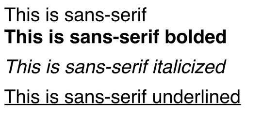
But wait! Theres more! I (Mod Morpho) have been fuckin’ around and finding out, and what I have discovered is the ability to do different fonts and to underline, bold, and italicize. So here’s your shiny new font options! Unless you specify something else, your request will be done in sans-serif with nothing fancy (though I tend to bold the ones I make by default so it may be bolded).

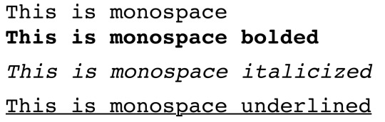


UPDATE: with a new (but very similar) method mod wonder has been using recently for boxes, you can now also request google fonts for the text! you can find a list here.
So that's what we’ve got for you!
TL;DR You can now request bold, underline, italics, and different fonts. You can also request hand drawn images if you are specific!
149 notes
·
View notes
Text
10 Tools to Make You a Better Software Developer
If you’re reading this article, it says something important about you: you care about your craft, and you care about your career. While it’s obvious that practice and experience will make you a better software developer, here I’m going to try to list 10 things that can also help to make you a better software developer that you may never have thought of.
Extra tips - If you are a complete beginner, then before using the tools mentioned below, you should start with ‘Programming Hero’ app. This app allows you to learn and practice programming at the same time and lets you create your first ever game yourself. Download from google play store - https://onelink.to/proghero2
Have a look at all the 10 tools and let me know if I have missed any other important and useful tool or not!👇👇

CodeWars
Small programming challenges are an excellent way to level-up your skills. Like doing scales on the piano, juggling a football, or doing quick sketches in a notebook, programming challenges allow you to strengthen and expand on your programming fundamentals. They’re also an excellent way to increase your familiarity with programming languages you don’t have a lot of experience using. CodeWars features hundreds of programming challenges graded by difficulty, and across various languages. There are many similar websites out there, like Project Euler, HackerRank, etc. But my favorite thing about CodeWars is the ability to see the most highly-rated solutions after you’ve submitted your own. I almost always have something new to learn from these top-ranked solutions.
Evernote
Software developers are confronted every day with a great deal of information to remember. New technologies, keyboard shortcuts, requirements for software, and best practices to follow. At a certain point, many of us reach a limit on what we can hold in our heads. Evernote’s free tier provides you with an ‘external brain’, a place to dump learnings, articles, information, and keyboard shortcuts or commands you want to remember. Because it’s cloud based, it’s always there when you need it. Some good candidates for notes in.
Evernote include:
Commands you occasionally need to remember but often forget
Best practices for the language you’re programming in
Diagrams of how the system or product you’re working on fits together
Photos of whiteboard sketches and retrospective notes
Articles you want to read later
Screencasts and tech talks you want to watch
Notes on things you want to learn one day
Sip
Sip is an incredibly useful, simple, and super-charged color picker for front-end development. You can ‘sip’ any color on your screen to grab it in a variety of formats, including hex and RGB values. It’s also fun to see the names of colors after you’ve grabbed them. My favorite so far is ‘Tickle Me Pink’.
Trello
Trello is a lightweight and free project management tool. It’s an app that allows you to create columns or ‘swim lanes’ and place cards in any of them. These cards can represent work to be done, or tasks to be completed.
Though your team may use a more heavy-duty project management tool like Jira, Trello can be an excellent way to manage your own personal workload, to keep track of side projects, or to manage the things you want to learn. Getting organized about your work and your learning will help you to become a better developer. You can take a look at some of these public Trello boards for inspiration.
Atom
Atom is a relatively new code editor created by GitHub. It’s free, open source, and it looks great. It’s also extremely easy to use. Though you might use a more feature-rich IDE for your development at work, Atom is a fantastic tool for hacking at scripts, or working on side projects. One thing that helps Atom shine in comparison to other code editors is its markdown preview mode. You can write notes in markdown and see an inline preview; extremely useful when working on Readme files and other documentation.
Unity
Unity is a free, end-to-end game engine that makes it easier to create professional, multi-platform games than ever before. It’s common among software developers to put game development into the “seems awesome, but too hard” basket, but with an influx of high quality tutorials and constant improvements to Unity’s tooling, game development has never had a lower barrier to entry. By dipping your feet into a very different type of programming, you’ll gain insights and ideas that will make you a better programmer all-around, and you’ll probably have lots of fun in the process.
Code Climate
Code Climate is an automated code analysis tool that grades your app on test coverage, complexity, duplication, security, style and more. It comes with a free two-week trial. Even if you’re not prepared to take the plunge to pay, Code Climate can give you lots of valuable insight into the code quality of your latest personal project, or—if your team is open to the idea—of the product or service you’re building. As a software developer, you probably have a sense for code smells: things that could be better. Yet, it can be difficult to know where to start when you feel like lots of things are wrong with your code. Code Climate is a simple tool to give you an actionable starting point when trying to make things better.
The Raspberry Pi and Arduino
The Raspberry Pi is a credit-card sized, single-board computer. Because of its small size, extensibility, and affordable price; there are all kinds of fun things you can do with it. People have turned Raspberry Pis into tiny servers, sensor hubs, security systems, musical instruments, lighting controllers, and more. It’s a fantastic tool for using programming to interact with the physical world. The Arduino is similar, but is a microcontroller rather than a fully-fledged computer. You’ll need to use a combination of electrical components and programming together to make it do interesting things.
IFTTT
‘If This Then That’ is a service that makes it easy to glue notifications, emails, and updates together in interesting ways. People have used IFTTT to trigger a fake phone call after sending a text message (to escape a boring conversation), turn on AC when the temperature reaches a certain point, or to receive an SMS alert before an important meeting is due to start. IFTTT can also integrate with internet of things, devices like smart lights. You could program your smart light to flash whenever your favorite football team scores, for example. There are thousands of possible recipes you can create with IFTTT. Have fun with it!
CodePen
CodePen bills itself as a playground for front-end developers. The site has simple premise: to present your code and output in an easily shareable format. The site is full of impressive front-end development examples, from intricate animations to a 3D city. Though the site makes it easy to rapidly prototype front-end code, it may be most valuable for the sheer amount of creativity and inspiration available from its contributors, who will redefine your idea of what’s possible with today’s front-end technologies, and inspire you to try new things.
0 notes
Text
A Complete Guide to CSS Functions
Introduction
In programming, functions are a named portion of code that performs a specific task. An example of this could be a function written in JavaScript called sayWoof():
function sayWoof() { console.log("Woof!"); }
We can use this function later in our code, after we have defined our desired behavior. For this example, any time you type sayWoof() in your website or web app’s JavaScript it will print “Woof!” into the browser’s console.
Functions can also use arguments, which are slots for things like numbers or bits of text that you can feed into the function’s logic to have it modify them. It works like this in JavaScript:
function countDogs(amount) { console.log("There are " + amount + " dogs!"); }
Here, we have a function called countDogs() that has an argument called amount. When a number is provided for amount, it will take that number and add it to a pre-specified sentence. This lets us create sentences that tell us how many dogs we’ve counted.
countDogs(3); // There are 3 dogs! countDogs(276); // There are 276 dogs! countDogs("many"); // There are many dogs!
Some programming languages come with baked-in functions to help prevent you from having to reinvent the wheel for every new project. Typically, these functions are built to help make working with the main strengths and features of the language easier.
Take libraries, for example. Libraries are collections of opinionated code made to help make development faster and easier, effectively just curated function collections — think FitVids.js for creating flexible video elements.
Like any other programming language, CSS has functions. They can be inserted where you’d place a value, or in some cases, accompanying another value declaration. Some CSS functions even let you nest other functions within them!

Unlike other programming languages, we cannot create our own functions in CSS, per se. That kind of logic is reserved for CSS selectors, which allow you to create powerful conditional styling rules.
As opposed to other programming languages — where the output of a function typically invisibly affects other logic down the line — the output of CSS functions are visual in nature. This output is used to control both layout and presentation of content. For example:
.has-orange-glow { filter: drop-shadow(0.25rem 0 0.75rem #ef9035); }
The CSS filter function drop-shadow() uses the arguments we provide it to create an orange outer glow effect on whatever it is applied to.
In the following demo, I have a JavaScript function named toggleOrangeGlow that toggles the application of the class .has-orange-glow on the CSS-Tricks logo. Combining this with a CSS transition, we’re able to create a cool glowing effect:
CodePen Embed Fallback
You may be familiar with some CSS functions, but the language has a surprisingly expansive list!
Much like any other technology on the web, different CSS functions have different levels of browser support. Make sure you research and test to ensure your experience works for everyone, and use things like @supports to provide quality alternate experiences.
url()
url() allows you to link to other resources to load them. This can include images, fonts, and even other stylesheets. For performance reasons, it’s good practice to limit the things you load via url(), as each declaration is an additional HTTP request.
CodePen Embed Fallback
attr()
This function allows us to reach into HTML, snag an attribute’s content, and feed it to the CSS content property. You’ll commonly see attr() used in print stylesheets, where it is used to show the URL of a link after its text. Another great application of this function is using it to show the alt description of an image if it fails to load.
CodePen Embed Fallback
calc()
If there’s one function you should spend some time experimenting with, it’s calc(). This function takes two arguments and calculates a result from the operator (+, -, *, /) you supply it, provided those arguments are numbers with or without an accompanying unit.
CodePen Embed Fallback
Unlike CSS preprocessors such as Sass, calc() can mix units, meaning you can do things like subtract 6rem from 100%. calc() is also updated on the fly, so if that 100% represents a width, it’ll still work if that width changes. calc() can also accept CSS Custom Properties as arguments, allowing you an incredible degree of flexibility.
lang()
Including a lang attribute in your HTML is a really important thing to do. When present in your HTML, you’re able to use the lang() function to target the presence of the attribute’s value and conditionally apply styling based on it.
One common use for this selector is to set language-specific quotes, which is great for things like internationalization.
CodePen Embed Fallback
Clever designers and developers might also use it as a hook for styling translated versions of their sites, where cultural and/or language considerations mean there’s different perceptions about things like negative space.
:not()
This pseudo class selector will select anything that isn’t what you specify. For example, you could target anything that isn’t an image with body:not(img). While this example is dangerously powerful, scoping :not() to more focused selectors such as BEM’s block class can give you a great deal of versatility.
CodePen Embed Fallback
Currently, :not() supports only one selector for its argument, but support for multiple comma-separated arguments (e.g. div:not(.this, .that)) is being worked on!
var() is used to reference a custom property declared earlier in the document. It is incredibly powerful when combined with calc().
An example of this is declaring a custom property called --ratio: 1.618; in the root of the document, then invoking it later in our CSS to control line height: line-height: var(--ratio);.
Here, var() is a set of instructions that tells the browser, “Go find the argument called --ratio declared earlier in the document, take its value, and apply it here.”
Remember! calc() lets us dynamically adjust things on the fly, including the argument you supply via var().
This allows us to create things like modular scale systems directly in CSS with just a few lines of code. If you change the value of --ratio, the whole modular scale system will update to match.
In the following CodePen demo, I’ve done exactly just that. Change the value of --scale in the Pen’s CSS to a different number to see what I mean:
CodePen Embed Fallback
It’s also worth mentioning that JavaScript’s setProperty method can update custom properties in real time. This allows us to quickly and efficiently make dynamic changes to things that previously might have required a lot of complicated code to achieve.
Another common place you see CSS functions is when working with color.
rgb() and rgba()
These functions allow you to use numbers to describe the red (r), green (g), blue (b), and alpha (a) levels of a color. For example, a red color with a hex value of #fb1010 could also be described as rgba(251, 16, 16, 1). The red value, 251, is far higher than the green and blue values (16 and 16), as the color is mostly comprised of red information.
The alpha value of 1 means that it is fully opaque, and won’t show anything behind what the color is applied to. If we change the alpha value to be 0.5, the color will be 50% transparent. If you use an rgb() function instead of rgba(), you don’t have to supply an alpha value. This creates terser code, but prevents you from using transparency.
CodePen Embed Fallback
hsl() and hsla()
Similar to rgb() and rgba(), hsl() and hsla() are functions that allow you to describe color. Instead of using red, green, and blue, they use hue (h), saturation (s), and lightness (l).
I prefer using hsla() over rgba() because its model of describing color works really well with systematized color systems. Each of the color level values for these functions can be CSS Custom Properties, allowing you to create powerful, dynamic code.
CodePen Embed Fallback
Syntax updates
In the upcoming CSS Color Module Level 4 spec, we can ignore the a portion of rgba() and hsla(), as well as the commas. Now, spaces are used to separate the rgb and hsl arguments, with an optional / to indicate an alpha level.
https://twitter.com/argyleink/status/1218305696862588928
These selectors use specialized argument notation that specifies patterns of what to select. This allows you to do things like select every other element, every fifth element, every third element after the seventh element, etc.
Pseudo class selectors are incredibly versatile, yet often overlooked and under-appreciated. Many times, a thoughtful application of a few of these selectors can do the work of one or more node packages.
:nth-child()
nth-child() allows you to target one or more of the elements present in a group of elements that are on the same level in the Document Object Model (DOM) tree.

In the right hands, :nth-child() is incredibly powerful. You can even solve fizzbuzz with it! If you’re looking for a good way to get started, Chris has a collection useful pseudo selector recipes.
:nth-last-child()
This pseudo class selector targets elements in a group of one or more elements that are on the same level in the DOM. It starts counting from the last element in the group and works backwards through the list of available DOM nodes.
CodePen Embed Fallback
:nth-last-of-type()
This pseudo class selector can target an element in a group of elements of a similar type. Much like :nth-last-child(), it starts counting from the last element in the group. Unlike :nth-last-child, it will skip elements that don’t apply as it works backwards.
CodePen Embed Fallback
:nth-of-type()
:nth-of-type() matches a specified collection of elements of a given type. For example, a declaration of img:nth-of-type(5) would target the fifth image on a page.
CodePen Embed Fallback
Animation is an important part of adding that certain je ne sais quoi to your website or web app. Just remember to put your users’ needs first and honor their animation preferences.
Creating animations also requires controlling the state of things over time, so functions are a natural fit for making that happen.
cubic-bezier()
Instead of keyword values like ease, ease-in-out, or linear, you can use cubic-bezier() to create a custom timing function for your animation. While you can read about the math that powers cubic beziers, I think it’s much more fun to play around with making one instead.

Lea Verou’s cubic-bezier.com.
path()
This function is paired with the offset-path property. It allows you to “draw” a SVG path that other elements can be animated to follow.
CodePen Embed Fallback
Both Michelle Barker and Dan Wilson have published excellent articles that go into more detail about this approach to animation.
steps()
This relatively new function allows you to set the easing timing across an animation, which allows for a greater degree of control over what part of the animation occurs when. Dan Wilson has another excellent writeup of how it fits into the existing animation easing landscape.
One common thing we do with animation is stretch and squash stuff. The following functions allow you to do exactly that. There is a catch, however: These CSS functions are a special subset, in that they can only work with the transform property.
scaleX(), scaleY(), scaleZ(), scale3d(), and scale()
Scaling functions let you increase or decrease the size of something along one or more axes. If you use scale3d() you can even do this in three dimensions!
translateX(), translateY(), translateZ(), translate3d(), and translate()
Translate functions let you reposition an element along one or more axes. Much like scale functions, you can also extend this manipulation into three dimensions.
perspective()
This function lets you adjust the appearance of an object to make it look like it is projecting up and out from its background.
rotateX(), rotateY(), rotateZ(), rotate3d(), and rotate()
Rotate functions let you swivel an element along one or more axes, much like grasping a ball and turning it around in your hand.
skewX(), skewY(), and skew()
Skew functions are a little different from scaling and rotation functions in that they apply a distortion effect relative to a single point. The amount of distortion is proportionate to the angle and distance declared, meaning that the further the effect continues in a direction the more pronounced it will be.
Jorge Moreno also did us all a favor and made a great tool called CSS Transform Functions Visualizer. It allows you to adjust sizing and scaling in real time to better understand how all these functions work together:
youtube
As responsible web professionals, we should be mindful of our users and the fact that they may not be using new or powerful hardware to view our content. Large and complicated animations may slow down the experience, or even cause the browser to crash in extreme scenarios.
To prevent this, we can use techniques like will-change to prepare the browser for what’s in store, and the update media feature to remove animation on devices that do not support a fast refresh rate.
CSS filter functions are another special subset of CSS functions, in that they can only work with the filter property. Filters are special effects applied to an element, mimicking functionality of graphics editing programs such as Photoshop.
You can do some really wild things with CSS filter functions, stuff like recreating the effects you can apply to your posts on Instagram!
brightness()
This function adjusts how, um, bright something appears. Setting it to a low level will make it appear as if it has had a shadow cast over it. Setting it to a high level will blow it out, like an over-exposed photo.
CodePen Embed Fallback
blur()
If you’re familiar with Photoshop’s Gaussian Blur filter, you know how blur() works. The more of this you apply, the more indistinct the thing you apply it to will look.
CodePen Embed Fallback
contrast()
contrast() will adjust the degree of difference between the lightest and darkest parts of what is applied to.
CodePen Embed Fallback
grayscale()
grayscale() removes the color information from what it is applied to. Remember that this isn’t an all-or-nothing affair! You can apply a partial grayscale effect to make something look weathered or washed out.
CodePen Embed Fallback
An interesting application of grayscale() could be lightly applying it to images when dark mode is enabled, to slightly diminish the overall vibrancy of color in a situation where the user may want less eye strain.
invert()
While invert() can be used to make something look like a photo negative, my favorite technique is to use it in a inverted colors media query to invert inverted images and video:
@media (inverted-colors: inverted) { img, video { filter: invert(100%); } }
This ensures that image and video content looks the way it should, regardless of a user’s expressed browsing mode preferences.
opacity()
This function controls how much of the background is visible through the element (and child elements) the function is applied to.
CodePen Embed Fallback
An element that has 0% opacity will be completely transparent, although it will still be present in the DOM. If you need to remove an object completely, use other techniques such as the hidden attribute.
saturate()
Applying this filter can enhance, or decrease the intensity of the color of what it is applied to. Enhancing an image’s saturation is a common technique photographers use to fix underexposed photos.
CodePen Embed Fallback
sepia()
There are fancier ways to describe this, but realistically it’s a function that makes something look like it’s an old-timey photograph.
CodePen Embed Fallback
drop-shadow()
A drop shadow is a visual effect applied to an object that makes it appear like it is hovering off of the page. There’s a bit of a trick here, in that CSS also allows you to apply drop shadow effects to text and elements. It’s also distinct from the box-shadow property is that it applies drop shadows to the shape of an element rather than the actual box of an element.
Skilled designers and developers can take advantage of this to create complicated visual effects.
CodePen Embed Fallback
hue-rotate()
When a class with a declaration containing hue-rotate() is applied to an element, each pixel used to draw that element will have it’s hue valued shifted by the amount you specify. hue-rotate()‘s effect is applied to each and every pixel it is applied to, so all colors will update relative to their hue value’s starting point.
This can create a really psychedelic effect when applied to things that contain a lot of color information, such as photos.
CodePen Embed Fallback
SVG filters
filter() also lets us import SVGs filters to use to create specialized visual effects. The topic is too complicated to really do it justice in this article — if you’re looking for a good starting point, I recommend “The Art Of SVG Filters And Why It Is Awesome” by Dirk Weber.

This effect was created by skillful application of SVG filter effects.
Gradients are created when you transition one color to one or more other colors. They are workhorses of modern user interfaces — skilled designers and developers use them to lend an air of polish and sophistication to their work.
Gradient functions allow you to specify a whole range of properties, including:
Color values,
The position on the gradient area where that color comes in,
What angle the gradient is positioned at.
And yes, you guessed it: the colors we use in a gradient can be described using CSS color functions!
linear-gradient() and repeating-linear-gradient()
Linear gradients apply the color transformation in a straight line, from one point to another — this line can be set at an angle as well. In cases where there’s more area than gradient, using repeating-linear-gradient() will, er, repeat the gradient you described until all the available area has been filled.
CodePen Embed Fallback
radial-gradient() and repeating-radial-gradient()
Radial gradients are a lot like linear gradients, only instead of a straight line, color transformations radiate outward from a center point. They’re oftentimes used to create a semitransparent screen to help separate a modal from the background it is placed over.
CodePen Embed Fallback
conic-gradient() and repeating-conical-gradient
Conic gradients are different from radial gradients in that the color rotates around a circle. Because of this, we can do neat things like create donut charts. Unfortunately, support for conic gradients continues to be poor, so use them with caution.

An adjustable conic gradient donut chart made by Ana Tudor
CSS Grid is a relatively new feature of the language. It allows us to efficiently create adaptive, robust layouts for multiple screen sizes.
It’s worth acknowledging our roots. Before Grid, layout in CSS was largely a series of codified hacks to work with a language originally designed to format academic documents. Grid’s introduction is further acknowledgement that the language’s intent has changed.
Modern CSS is an efficient, fault-tolerant language for controlling presentation and layout across a wide range of device form factors. Equipped with Grid and other properties like flexbox, we’re able to create layouts that would have been impossible to create in earlier iterations of CSS.
Grid introduces the following CSS functions to help you use it.
fit-content()
This function “clamps” the size of grid rows or columns, letting you specify a maximum size a grid track can expand to. fit-content() accepts a range of values, but most notable among them are min-content and max-content. These values allow you to tie your layout to the content it contains. Impressive stuff!
CodePen Embed Fallback
minmax()
minmax() allows you to set the minimum and maximum desired heights and widths of your grid rows and columns. This function can also use min-content and max-content, giving us a great deal of power and flexibility.
CodePen Embed Fallback
repeat()
You can loop through patterns of grid column and rows using repeat(). This is great for two scenarios:
When you do know how many rows or columns you need, but typing them out would be laborious. A good example of this would be constructing the grid for a calendar.
When you don’t know how many rows or columns you need. Here, you can specify a template that the browser will honor as it propagates content into your layout.
CodePen Embed Fallback
Like filter() and transform(), shape CSS functions only work with one property: clip-path. This property is used to mask portions of something, allowing you to create all sorts of cool effects.
circle()
This function creates a circular shape for your mask, allowing you to specify its radius and position.
CodePen Embed Fallback
ellipse()
Like circle(), ellipse() will draw a rounded shape, only instead of a perfect circle, ellipse() lets you construct an oblong mask.
CodePen Embed Fallback
inset()
This function will mask out a rectangle inside of the element you apply it to.
CodePen Embed Fallback
polygon()
With polygon(), you are able to specify an arbitrary number of points, allowing you to draw complicated shapes. polygon() also takes an optional fill-rule argument, which specifies which part of the shape is the inside part.
CodePen Embed Fallback
These are the un-categorizable CSS functions, things that don’t fit neatly elsewhere.
element()
Ever pointed a camera at its own video feed? That’s sort of what element() does. It allows you to specify the ID of another element to create an “image” of what that element looks like. You can then apply other CSS to that image, including stuff like CSS filters!
It might take a bit to wrap your head around the concept — and it has some support concerns — but element() is a potentially very powerful in the right hands.
Preethi Sam‘s “Using the Little-Known CSS element() Function to Create a Minimap Navigator” demonstrates how to use it to create a code minimap and is an excellent read.
Here, she’s created a minimap for reading through a longform article:
CodePen Embed Fallback
image-set()
This function allows you to specify a list of images for the browser to select for a background image, based on what it knows about the capabilities of its display and its connection speed. It is analogous to what you would do with the srcset property.
::slotted()
This is a pseudo-element selector used to target elements that have been placed into a slot inside a HTML template. ::slotted() is intended to be used when working with Web Components, which are custom, developer-defined HTML elements.
Like any other living programming language, CSS includes features and functionality that are actively being worked on.
These functions can sometimes be previewed using browsers that have access to the bleeding edge. Firefox Nightly and Chrome Canary are two such browsers. Other features and functionality are so new that they only exist in what is being actively discussed by the W3C.
annotation()
This function enables Alternate Annotation Forms, characters reserved for marking up things like notation and annotation. These characters typically will be outlined with a circle, square, or diamond shape.
Not many typefaces contain Alternate Annotation Forms, so it’s good to check to see if the typeface you’re using includes them before trying to get annotation() to work. Tools such as Wakamai Fondue can help with that.

Examples of annotation glyphs from Jonathan Harrell’s post, “Better Typography with Font Variants”
counter() and counters()
When you create an ordered list in HTML, the browser will automatically generate numbers for you and place them before your list item content. These pieces of browser-generated list content are called counters.
By using a combination of the ::marker pseudo-element selector, the content property, and the counter() function, we can control the content and presentation of the counters on an ordered list. For browsers that don’t support counter() or counters() yet, you still get a decent experience due to the browser automatically falling back to its generated content:
CodePen Embed Fallback
For situations where you have nested ordered lists, the counters() function allows a child ordered list to access its parent. This allows us to control their content and presentation. If you want to learn more about the power of ::marker, counter(), and counters(), you can read “CSS Lists, Markers, And Counters” by Rachel Andrew.
cross-fade()
This function will allow you to blend one background image into one or more other background images. Its proposed syntax is similar to gradient functions, where you can specify the stops where images start and end.
dir()
This function allows you to flip the orientation of a language’s reading order. For English, that means a left-to-right (ltr) reading order gets turned into right-to-left (rtl). Only Firefox currently has support for dir(), but you can achieve the same effect in Chromium-based browsers by using an attribute selector such as [dir="rtl"].
CodePen Embed Fallback
env()
env(), short for environment, allows you to create conditional logic that is triggered if the device’s User Agent matches up. It was popularized by the iPhone X as a method to work with its notch.
That being said, device sniffing is a fallacious affair — you shouldn’t consider env() a way to cheat it. Instead, use it as intended: to make sure your design works for devices that impose unique hardware constraints on the viewport.
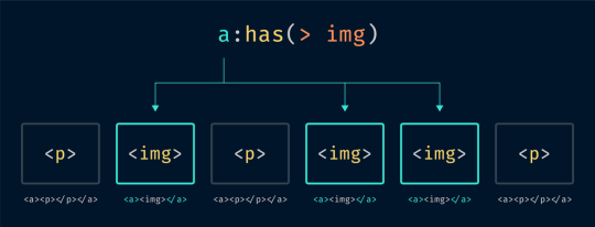
has()
has() is a relational pseudo-class that will target an element that contains another element, provided there is at least one match in the HTML source. An example of this is be a:has(> img), which tells the browser to target any link that contains an image.
Interestingly, has() is currently being proposed as CSS you can only write in JavaScript. If I were to wager a guess as to why this is, it is to scope the selector for performance reasons. With this approach has() is triggered only after the browser has been told to process conditional logic, and therefore query the state of things.
image()
This function will let you insert either a static image (referenced with url(), or draw one dynamically via gradients and element().
Trigonometry functions
These functions will allow us to perform more advanced mathematical operations:
Sine: sin()
Cosine: cos()
Tangent: tan()
Arccosine: acos()
Arcsine: asin()
Arctangent: atan()
Arctangent: atan2()
Square root: sqrt()
The square root of the sum of squares of its arguments: hypot()
Power: pow()
I’m especially excited to see what people who are more clever than I am will do with these functions, especially for things like animation!
clamp()
When providing minimum, maximum, and preferred values as arguments, clamp() will honor the preferred value so long as it does not exceed the minimum and maximum boundaries.
clamp() will allow us to author things like components whose size will scale along with the size of the viewport, but won’t shrink or grow past a specific size. This will be especially useful for creating CSS locks, where you can ensure a responsive type size will not get so small that it can’t be read.
:host() and :host-context()
To be honest, I’m a little hazy on the specifics of the jargon and mechanics that power the Shadow DOM. Here’s how the MDN describes host():
The :host() CSS pseudo-class function selects the shadow host of the shadow DOM containing the CSS it is used inside (so you can select a custom element from inside its shadow DOM) — but only if the selector given as the function’s parameter matches the shadow host.
And here’s what they have to say about :host-context():
The :host-context() CSS pseudo-class function selects the shadow host of the shadow DOM containing the CSS it is used inside (so you can select a custom element from inside its shadow DOM) — but only if the selector given as the function’s parameter matches the shadow host’s ancestor(s) in the place it sits inside the DOM hierarchy.
:is() and :where()
:is() has had a bit of an identity crisis. Previously referred to as both matches() and vendor prefixed as :-webkit-any/:-moz-any, it now enjoys a standardized, agreed-upon name. It is a pseudo class selector that accepts a range of selectors as its argument.
This allows an author to group and target a wide range of selectors in an efficient way. :where() is much like :is(), only it has a specificity of zero, while the specificity of :is() is set to the highest specificity in the provided selector list.
:is() and :where() will allow us a good deal of flexibility about how we select things to style, especially for situations where you may not have as much control over the web site or web app’s stylesheet (e.g. third-party integrations, ads, etc.).
https://twitter.com/argyleink/status/1192562385489260544
max() and min()
These functions allow you to select either the maximum or minimum value from a range of values you provide. Much like clamp(), these functions allow us to make things responsive up until a certain point.
:nth-col() and :nth-last-col()
These pseudo-classes will allow you to select one or a specified series columns in a CSS grid to apply styling to them. A good mental model for how these functions will work is how CSS pseudo class selectors operate. Unlike pseudo class selectors, :nth-col() and :nth-last-col() should be able to target implicit grid columns.
symbols()
This function allows you to specify a list of different kinds of characters to use for list bullets. Much like annotation(), you’ll want to make sure the typeface you use contains a glyph you want to use as a symbol before trying to get symbols() to work.
Sometimes things just don’t work out the way you think they will. While deprecated CSS functions may still render in the browser for legacy support reasons, it isn’t recommended you use them going forward.
matrix() and matrix3d()
These functions were turned into more discrete sizing and scaling functions.
rect()
This function was part of the deprecated clip property. Use the clip-path property and its values instead.
target-counter(), target-counters(), and target-text()
These functions were intended to help work with fragment URLs for paged (printed) media. You can read more about them on the W3C’s CSS Generated Content for Paged Media Module documentation
Typography
The web is typography, so it makes sense to give your type the care and attention it deserves. While CSS provides some functions specifically designed to unlock the potential of your website or webapp’s chosen typefaces, it is advised to not use the following functions to access these advanced features.
Instead, use lower-level syntax via font-feature-settings. You can figure out if the font you’re using supports these features by using a tool such as Wakamai Fondue.
character-variant(), styleset(), and stylistic()
Many typefaces made by professional foundries include alternate treatments for certain letters, or combinations of letters. One example use case is providing different variations of commonly-used letters for typefaces designed to look like handwriting, to help make it appear more natural-looking.
Stylistic Alternates example by Tunghsiao Liu’s “OpenType Features in CSS”
Utilizing these functions activates these special alternate characters, provided they are present in the font’s glyph set.
Unfortunately, it is not a standardized offering. Different typefaces will have different ranges of support, based on what the typographer chose to include. It would be wise to check to see if the font you’re using supports these special features before writing any code.
format()
When you are importing a font via the url() function, the format() function is an optional hint that lets you manually specify the font’s file format. If this hint is provided, the browser won’t download the font if it does not recognize the specified file format.
@font-face { font-family: 'MyWebFont'; src: url('mywebfont.woff2') format('woff2'), /* Cutting edge browsers */ url('mywebfont.woff') format('woff'), /* Most modern Browsers */ url('mywebfont.ttf') format('truetype'); /* Older Safari, Android, iOS */ }
leader()
You know when you’re reading a menu at a restaurant and there’s a series of periods that help you figure out what price is attached to what menu item? Those are leaders.
The W3C had plans for them with its CSS Generated Content for Paged Media Module, but it unfortunately seems like leader() never quite managed to take off. Fortunately, the W3C also provides an example of how to accomplish this effect using a clever application of the content property.
local()
local() allows you to specify a font installed locally, meaning it is present on the device. Local fonts either ship with the device, or can be manually installed.
Betting on someone installing a font so things look the way you want them to is very risky! Because of this, it is recommended you don’t specify a local font that needs to be manually installed. Your site won’t look the way it is intended to, even moreso if you don’t specify a fallback font.
@font-face { font-family: 'FeltTipPen'; src: local('Felt Tip Pen Web'), /* Full font name */ local('FeltTipPen-Regular'); /* Postscript name */ }
ornaments()
Special dingbat characters can be enabled using this function. Be careful, as not all dingbat characters are properly coded in a way that will work well if a user does something like change the font, or use a specialized browsing mode.
swash()
Swashes are alternate visual treatments for letters that give them an extra-fancy flourish. They’re commonly found in italic and cursive-style typefaces.

Swash example by Tunghsiao Liu’s “OpenType Features in CSS”
Why so many?
CSS is maligned as frequently as it is misunderstood. The guiding thought to understanding why all these functions are made available to us is knowing that CSS isn’t prescriptive — not every website has to look like a Microsoft Word document.
The technologies that power the web are designed in such a way that someone with enough interest can build whatever they want. It’s a powerful, revolutionary concept, a large part of why the web became so ubiquitous.
The post A Complete Guide to CSS Functions appeared first on CSS-Tricks.
via CSS-Tricks https://ift.tt/2SwnzCv
0 notes
Text
A Complete Guide to CSS Functions
Introduction
In programming, functions are a named portion of code that performs a specific task. An example of this could be a function written in JavaScript called sayWoof():
function sayWoof() { console.log("Woof!"); }
We can use this function later in our code, after we have defined our desired behavior. For this example, any time you type sayWoof() in your website or web app’s JavaScript it will print “Woof!” into the browser’s console.
Functions can also use arguments, which are slots for things like numbers or bits of text that you can feed into the function’s logic to have it modify them. It works like this in JavaScript:
function countDogs(amount) { console.log("There are " + amount + " dogs!"); }
Here, we have a function called countDogs() that has an argument called amount. When a number is provided for amount, it will take that number and add it to a pre-specified sentence. This lets us create sentences that tell us how many dogs we’ve counted.
countDogs(3); // There are 3 dogs! countDogs(276); // There are 276 dogs! countDogs("many"); // There are many dogs!
Some programming languages come with baked-in functions to help prevent you from having to reinvent the wheel for every new project. Typically, these functions are built to help make working with the main strengths and features of the language easier.
Take libraries, for example. Libraries are collections of opinionated code made to help make development faster and easier, effectively just curated function collections — think FitVids.js for creating flexible video elements.
Like any other programming language, CSS has functions. They can be inserted where you’d place a value, or in some cases, accompanying another value declaration. Some CSS functions even let you nest other functions within them!
Basics of CSS Functions

Unlike other programming languages, we cannot create our own functions in CSS, per se. That kind of logic is reserved for CSS selectors, which allow you to create powerful conditional styling rules.
As opposed to other programming languages — where the output of a function typically invisibly affects other logic down the line — the output of CSS functions are visual in nature. This output is used to control both layout and presentation of content. For example:
.has-orange-glow { filter: drop-shadow(0.25rem 0 0.75rem #ef9035); }
The CSS filter function drop-shadow() uses the arguments we provide it to create an orange outer glow effect on whatever it is applied to.
In the following demo, I have a JavaScript function named toggleOrangeGlow that toggles the application of the class .has-orange-glow on the CSS-Tricks logo. Combining this with a CSS transition, we’re able to create a cool glowing effect:
CodePen Embed Fallback
You may be familiar with some CSS functions, but the language has a surprisingly expansive list!
Much like any other technology on the web, different CSS functions have different levels of browser support. Make sure you research and test to ensure your experience works for everyone, and use things like @supports to provide quality alternate experiences.
Common CSS Functions
url()
url() allows you to link to other resources to load them. This can include images, fonts, and even other stylesheets. For performance reasons, it’s good practice to limit the things you load via url(), as each declaration is an additional HTTP request.
CodePen Embed Fallback
attr()
This function allows us to reach into HTML, snag an attribute’s content, and feed it to the CSS content property. You’ll commonly see attr() used in print stylesheets, where it is used to show the URL of a link after its text. Another great application of this function is using it to show the alt description of an image if it fails to load.
CodePen Embed Fallback
calc()
If there’s one function you should spend some time experimenting with, it’s calc(). This function takes two arguments and calculates a result from the operator (+, -, *, /) you supply it, provided those arguments are numbers with or without an accompanying unit.
CodePen Embed Fallback
Unlike CSS preprocessors such as Sass, calc() can mix units, meaning you can do things like subtract 6rem from 100%. calc() is also updated on the fly, so if that 100% represents a width, it’ll still work if that width changes. calc() can also accept CSS Custom Properties as arguments, allowing you an incredible degree of flexibility.
lang()
Including a lang attribute in your HTML is a really important thing to do. When present in your HTML, you’re able to use the lang() function to target the presence of the attribute’s value and conditionally apply styling based on it.
One common use for this selector is to set language-specific quotes, which is great for things like internationalization.
CodePen Embed Fallback
Clever designers and developers might also use it as a hook for styling translated versions of their sites, where cultural and/or language considerations mean there’s different perceptions about things like negative space.
:not()
This pseudo class selector will select anything that isn’t what you specify. For example, you could target anything that isn’t an image with body:not(img). While this example is dangerously powerful, scoping :not() to more focused selectors such as BEM’s block class can give you a great deal of versatility.
CodePen Embed Fallback
Currently, :not() supports only one selector for its argument, but support for multiple comma-separated arguments (e.g. div:not(.this, .that)) is being worked on!
CSS Custom Properties
var() is used to reference a custom property declared earlier in the document. It is incredibly powerful when combined with calc().
An example of this is declaring a custom property called --ratio: 1.618; in the root of the document, then invoking it later in our CSS to control line height: line-height: var(--ratio);.
Here, var() is a set of instructions that tells the browser, “Go find the argument called --ratio declared earlier in the document, take its value, and apply it here.”
Remember! calc() lets us dynamically adjust things on the fly, including the argument you supply via var().
This allows us to create things like modular scale systems directly in CSS with just a few lines of code. If you change the value of --ratio, the whole modular scale system will update to match.
In the following CodePen demo, I’ve done exactly just that. Change the value of --scale in the Pen’s CSS to a different number to see what I mean:
CodePen Embed Fallback
It’s also worth mentioning that JavaScript’s setProperty method can update custom properties in real time. This allows us to quickly and efficiently make dynamic changes to things that previously might have required a lot of complicated code to achieve.
Color Functions
Another common place you see CSS functions is when working with color.
rgb() and rgba()
These functions allow you to use numbers to describe the red (r), green (g), blue (b), and alpha (a) levels of a color. For example, a red color with a hex value of #fb1010 could also be described as rgba(251, 16, 16, 1). The red value, 251, is far higher than the green and blue values (16 and 16), as the color is mostly comprised of red information.
The alpha value of 1 means that it is fully opaque, and won’t show anything behind what the color is applied to. If we change the alpha value to be 0.5, the color will be 50% transparent. If you use an rgb() function instead of rgba(), you don’t have to supply an alpha value. This creates terser code, but prevents you from using transparency.
CodePen Embed Fallback
hsl() and hsla()
Similar to rgb() and rgba(), hsl() and hsla() are functions that allow you to describe color. Instead of using red, green, and blue, they use hue (h), saturation (s), and lightness (l).
I prefer using hsla() over rgba() because its model of describing color works really well with systematized color systems. Each of the color level values for these functions can be CSS Custom Properties, allowing you to create powerful, dynamic code.
CodePen Embed Fallback
Syntax updates
In the upcoming CSS Color Module Level 4 spec, we can ignore the a portion of rgba() and hsla(), as well as the commas. Now, spaces are used to separate the rgb and hsl arguments, with an optional / to indicate an alpha level.
https://twitter.com/argyleink/status/1218305696862588928
Pseudo Class Selectors
These selectors use specialized argument notation that specifies patterns of what to select. This allows you to do things like select every other element, every fifth element, every third element after the seventh element, etc.
Pseudo class selectors are incredibly versatile, yet often overlooked and under-appreciated. Many times, a thoughtful application of a few of these selectors can do the work of one or more node packages.
:nth-child()
nth-child() allows you to target one or more of the elements present in a group of elements that are on the same level in the Document Object Model (DOM) tree.

In the right hands, :nth-child() is incredibly powerful. You can even solve fizzbuzz with it! If you’re looking for a good way to get started, Chris has a collection useful pseudo selector recipes.
:nth-last-child()
This pseudo class selector targets elements in a group of one or more elements that are on the same level in the DOM. It starts counting from the last element in the group and works backwards through the list of available DOM nodes.
CodePen Embed Fallback
:nth-last-of-type()
This pseudo class selector can target an element in a group of elements of a similar type. Much like :nth-last-child(), it starts counting from the last element in the group. Unlike :nth-last-child, it will skip elements that don’t apply as it works backwards.
CodePen Embed Fallback
:nth-of-type()
:nth-of-type() matches a specified collection of elements of a given type. For example, a declaration of img:nth-of-type(5) would target the fifth image on a page.
CodePen Embed Fallback
Animation Functions
Animation is an important part of adding that certain je ne sais quoi to your website or web app. Just remember to put your users’ needs first and honor their animation preferences.
Creating animations also requires controlling the state of things over time, so functions are a natural fit for making that happen.
cubic-bezier()
Instead of keyword values like ease, ease-in-out, or linear, you can use cubic-bezier() to create a custom timing function for your animation. While you can read about the math that powers cubic beziers, I think it’s much more fun to play around with making one instead.

Lea Verou’s cubic-bezier.com.
path()
This function is paired with the offset-path property. It allows you to “draw” a SVG path that other elements can be animated to follow.
CodePen Embed Fallback
Both Michelle Barker and Dan Wilson have published excellent articles that go into more detail about this approach to animation.
steps()
This relatively new function allows you to set the easing timing across an animation, which allows for a greater degree of control over what part of the animation occurs when. Dan Wilson has another excellent writeup of how it fits into the existing animation easing landscape.
Sizing and Scaling Functions
One common thing we do with animation is stretch and squash stuff. The following functions allow you to do exactly that. There is a catch, however: These CSS functions are a special subset, in that they can only work with the transform property.
scaleX(), scaleY(), scaleZ(), scale3d(), and scale()
Scaling functions let you increase or decrease the size of something along one or more axes. If you use scale3d() you can even do this in three dimensions!
translateX(), translateY(), translateZ(), translate3d(), and translate()
Translate functions let you reposition an element along one or more axes. Much like scale functions, you can also extend this manipulation into three dimensions.
perspective()
This function lets you adjust the appearance of an object to make it look like it is projecting up and out from its background.
rotateX(), rotateY(), rotateZ(), rotate3d(), and rotate()
Rotate functions let you swivel an element along one or more axes, much like grasping a ball and turning it around in your hand.
skewX(), skewY(), and skew()
Skew functions are a little different from scaling and rotation functions in that they apply a distortion effect relative to a single point. The amount of distortion is proportionate to the angle and distance declared, meaning that the further the effect continues in a direction the more pronounced it will be.
Jorge Moreno also did us all a favor and made a great tool called CSS Transform Functions Visualizer. It allows you to adjust sizing and scaling in real time to better understand how all these functions work together:
youtube
As responsible web professionals, we should be mindful of our users and the fact that they may not be using new or powerful hardware to view our content. Large and complicated animations may slow down the experience, or even cause the browser to crash in extreme scenarios.
To prevent this, we can use techniques like will-change to prepare the browser for what’s in store, and the update media feature to remove animation on devices that do not support a fast refresh rate.
Filter Functions
CSS filter functions are another special subset of CSS functions, in that they can only work with the filter property. Filters are special effects applied to an element, mimicking functionality of graphics editing programs such as Photoshop.
You can do some really wild things with CSS filter functions, stuff like recreating the effects you can apply to your posts on Instagram!
brightness()
This function adjusts how, um, bright something appears. Setting it to a low level will make it appear as if it has had a shadow cast over it. Setting it to a high level will blow it out, like an over-exposed photo.
CodePen Embed Fallback
blur()
If you’re familiar with Photoshop’s Gaussian Blur filter, you know how blur() works. The more of this you apply, the more indistinct the thing you apply it to will look.
CodePen Embed Fallback
contrast()
contrast() will adjust the degree of difference between the lightest and darkest parts of what is applied to.
CodePen Embed Fallback
grayscale()
grayscale() removes the color information from what it is applied to. Remember that this isn’t an all-or-nothing affair! You can apply a partial grayscale effect to make something look weathered or washed out.
CodePen Embed Fallback
An interesting application of grayscale() could be lightly applying it to images when dark mode is enabled, to slightly diminish the overall vibrancy of color in a situation where the user may want less eye strain.
invert()
While invert() can be used to make something look like a photo negative, my favorite technique is to use it in a inverted colors media query to invert inverted images and video:
@media (inverted-colors: inverted) { img, video { filter: invert(100%); } }
This ensures that image and video content looks the way it should, regardless of a user’s expressed browsing mode preferences.
opacity()
This function controls how much of the background is visible through the element (and child elements) the function is applied to.
CodePen Embed Fallback
An element that has 0% opacity will be completely transparent, although it will still be present in the DOM. If you need to remove an object completely, use other techniques such as the hidden attribute.
saturate()
Applying this filter can enhance, or decrease the intensity of the color of what it is applied to. Enhancing an image’s saturation is a common technique photographers use to fix underexposed photos.
CodePen Embed Fallback
sepia()
There are fancier ways to describe this, but realistically it’s a function that makes something look like it’s an old-timey photograph.
CodePen Embed Fallback
drop-shadow()
A drop shadow is a visual effect applied to an object that makes it appear like it is hovering off of the page. There’s a bit of a trick here, in that CSS also allows you to apply drop shadow effects to text and elements. It’s also distinct from the box-shadow property is that it applies drop shadows to the shape of an element rather than the actual box of an element.
Skilled designers and developers can take advantage of this to create complicated visual effects.
CodePen Embed Fallback
hue-rotate()
When a class with a declaration containing hue-rotate() is applied to an element, each pixel used to draw that element will have it’s hue valued shifted by the amount you specify. hue-rotate()‘s effect is applied to each and every pixel it is applied to, so all colors will update relative to their hue value’s starting point.
This can create a really psychedelic effect when applied to things that contain a lot of color information, such as photos.
CodePen Embed Fallback
SVG filters
filter() also lets us import SVGs filters to use to create specialized visual effects. The topic is too complicated to really do it justice in this article — if you’re looking for a good starting point, I recommend “The Art Of SVG Filters And Why It Is Awesome” by Dirk Weber.

This effect was created by skillful application of SVG filter effects.
Gradient Functions
Gradients are created when you transition one color to one or more other colors. They are workhorses of modern user interfaces — skilled designers and developers use them to lend an air of polish and sophistication to their work.
Gradient functions allow you to specify a whole range of properties, including:
Color values,
The position on the gradient area where that color comes in,
What angle the gradient is positioned at.
And yes, you guessed it: the colors we use in a gradient can be described using CSS color functions!
linear-gradient() and repeating-linear-gradient()
Linear gradients apply the color transformation in a straight line, from one point to another — this line can be set at an angle as well. In cases where there’s more area than gradient, using repeating-linear-gradient() will, er, repeat the gradient you described until all the available area has been filled.
CodePen Embed Fallback
radial-gradient() and repeating-radial-gradient()
Radial gradients are a lot like linear gradients, only instead of a straight line, color transformations radiate outward from a center point. They’re oftentimes used to create a semitransparent screen to help separate a modal from the background it is placed over.
CodePen Embed Fallback
conic-gradient() and repeating-conical-gradient
Conic gradients are different from radial gradients in that the color rotates around a circle. Because of this, we can do neat things like create donut charts. Unfortunately, support for conic gradients continues to be poor, so use them with caution.

An adjustable conic gradient donut chart made by Ana Tudor
Grid Functions
CSS Grid is a relatively new feature of the language. It allows us to efficiently create adaptive, robust layouts for multiple screen sizes.
It’s worth acknowledging our roots. Before Grid, layout in CSS was largely a series of codified hacks to work with a language originally designed to format academic documents. Grid’s introduction is further acknowledgement that the language’s intent has changed.
Modern CSS is an efficient, fault-tolerant language for controlling presentation and layout across a wide range of device form factors. Equipped with Grid and other properties like flexbox, we’re able to create layouts that would have been impossible to create in earlier iterations of CSS.
Grid introduces the following CSS functions to help you use it.
fit-content()
This function “clamps” the size of grid rows or columns, letting you specify a maximum size a grid track can expand to. fit-content() accepts a range of values, but most notable among them are min-content and max-content. These values allow you to tie your layout to the content it contains. Impressive stuff!
CodePen Embed Fallback
minmax()
minmax() allows you to set the minimum and maximum desired heights and widths of your grid rows and columns. This function can also use min-content and max-content, giving us a great deal of power and flexibility.
CodePen Embed Fallback
repeat()
You can loop through patterns of grid column and rows using repeat(). This is great for two scenarios:
When you do know how many rows or columns you need, but typing them out would be laborious. A good example of this would be constructing the grid for a calendar.
When you don’t know how many rows or columns you need. Here, you can specify a template that the browser will honor as it propagates content into your layout.
CodePen Embed Fallback
Shape Functions
Like filter() and transform(), shape CSS functions only work with one property: clip-path. This property is used to mask portions of something, allowing you to create all sorts of cool effects.
circle()
This function creates a circular shape for your mask, allowing you to specify its radius and position.
CodePen Embed Fallback
ellipse()
Like circle(), ellipse() will draw a rounded shape, only instead of a perfect circle, ellipse() lets you construct an oblong mask.
CodePen Embed Fallback
inset()
This function will mask out a rectangle inside of the element you apply it to.
CodePen Embed Fallback
polygon()
With polygon(), you are able to specify an arbitrary number of points, allowing you to draw complicated shapes. polygon() also takes an optional fill-rule argument, which specifies which part of the shape is the inside part.
CodePen Embed Fallback
Miscellaneous Functions
These are the un-categorizable CSS functions, things that don’t fit neatly elsewhere.
element()
Ever pointed a camera at its own video feed? That’s sort of what element() does. It allows you to specify the ID of another element to create an “image” of what that element looks like. You can then apply other CSS to that image, including stuff like CSS filters!
It might take a bit to wrap your head around the concept — and it has some support concerns — but element() is a potentially very powerful in the right hands.
Preethi Sam‘s “Using the Little-Known CSS element() Function to Create a Minimap Navigator” demonstrates how to use it to create a code minimap and is an excellent read.
Here, she’s created a minimap for reading through a longform article:
CodePen Embed Fallback
image-set()
This function allows you to specify a list of images for the browser to select for a background image, based on what it knows about the capabilities of its display and its connection speed. It is analogous to what you would do with the srcset property.
::slotted()
This is a pseudo-element selector used to target elements that have been placed into a slot inside a HTML template. ::slotted() is intended to be used when working with Web Components, which are custom, developer-defined HTML elements.
Not Ready for Prime Time
Like any other living programming language, CSS includes features and functionality that are actively being worked on.
These functions can sometimes be previewed using browsers that have access to the bleeding edge. Firefox Nightly and Chrome Canary are two such browsers. Other features and functionality are so new that they only exist in what is being actively discussed by the W3C.
annotation()
This function enables Alternate Annotation Forms, characters reserved for marking up things like notation and annotation. These characters typically will be outlined with a circle, square, or diamond shape.
Not many typefaces contain Alternate Annotation Forms, so it’s good to check to see if the typeface you’re using includes them before trying to get annotation() to work. Tools such as Wakamai Fondue can help with that.

Examples of annotation glyphs from Jonathan Harrell’s post, “Better Typography with Font Variants”
counter() and counters()
When you create an ordered list in HTML, the browser will automatically generate numbers for you and place them before your list item content. These pieces of browser-generated list content are called counters.
By using a combination of the ::marker pseudo-element selector, the content property, and the counter() function, we can control the content and presentation of the counters on an ordered list. For browsers that don’t support counter() or counters() yet, you still get a decent experience due to the browser automatically falling back to its generated content:
CodePen Embed Fallback
For situations where you have nested ordered lists, the counters() function allows a child ordered list to access its parent. This allows us to control their content and presentation. If you want to learn more about the power of ::marker, counter(), and counters(), you can read “CSS Lists, Markers, And Counters” by Rachel Andrew.
cross-fade()
This function will allow you to blend one background image into one or more other background images. Its proposed syntax is similar to gradient functions, where you can specify the stops where images start and end.
dir()
This function allows you to flip the orientation of a language’s reading order. For English, that means a left-to-right (ltr) reading order gets turned into right-to-left (rtl). Only Firefox currently has support for dir(), but you can achieve the same effect in Chromium-based browsers by using an attribute selector such as [dir="rtl"].
CodePen Embed Fallback
env()
env(), short for environment, allows you to create conditional logic that is triggered if the device’s User Agent matches up. It was popularized by the iPhone X as a method to work with its notch.
That being said, device sniffing is a fallacious affair — you shouldn’t consider env() a way to cheat it. Instead, use it as intended: to make sure your design works for devices that impose unique hardware constraints on the viewport.
has()
has() is a relational pseudo-class that will target an element that contains another element, provided there is at least one match in the HTML source. An example of this is be a:has(> img), which tells the browser to target any link that contains an image.

Interestingly, has() is currently being proposed as CSS you can only write in JavaScript. If I were to wager a guess as to why this is, it is to scope the selector for performance reasons. With this approach has() is triggered only after the browser has been told to process conditional logic, and therefore query the state of things.
image()
This function will let you insert either a static image (referenced with url(), or draw one dynamically via gradients and element().
Trigonometry functions
These functions will allow us to perform more advanced mathematical operations:
Sine: sin()
Cosine: cos()
Tangent: tan()
Arccosine: acos()
Arcsine: asin()
Arctangent: atan()
Arctangent: atan2()
Square root: sqrt()
The square root of the sum of squares of its arguments: hypot()
Power: pow()
I’m especially excited to see what people who are more clever than I am will do with these functions, especially for things like animation!
clamp()
When providing minimum, maximum, and preferred values as arguments, clamp() will honor the preferred value so long as it does not exceed the minimum and maximum boundaries.
clamp() will allow us to author things like components whose size will scale along with the size of the viewport, but won’t shrink or grow past a specific size. This will be especially useful for creating CSS locks, where you can ensure a responsive type size will not get so small that it can’t be read.
:host() and :host-context()
To be honest, I’m a little hazy on the specifics of the jargon and mechanics that power the Shadow DOM. Here’s how the MDN describes host():
The :host() CSS pseudo-class function selects the shadow host of the shadow DOM containing the CSS it is used inside (so you can select a custom element from inside its shadow DOM) — but only if the selector given as the function’s parameter matches the shadow host.
And here’s what they have to say about :host-context():
The :host-context() CSS pseudo-class function selects the shadow host of the shadow DOM containing the CSS it is used inside (so you can select a custom element from inside its shadow DOM) — but only if the selector given as the function’s parameter matches the shadow host’s ancestor(s) in the place it sits inside the DOM hierarchy.
:is() and :where()
:is() has had a bit of an identity crisis. Previously referred to as both matches() and vendor prefixed as :-webkit-any/:-moz-any, it now enjoys a standardized, agreed-upon name. It is a pseudo class selector that accepts a range of selectors as its argument.
This allows an author to group and target a wide range of selectors in an efficient way. :where() is much like :is(), only it has a specificity of zero, while the specificity of :is() is set to the highest specificity in the provided selector list.
:is() and :where() will allow us a good deal of flexibility about how we select things to style, especially for situations where you may not have as much control over the web site or web app’s stylesheet (e.g. third-party integrations, ads, etc.).
#CSS
:is() selector 🎉
the successor to :any() and :matches()
sneak peak into our talk, here's a neat gif I made with XD showing what the :is() selector syntax can do. be excited for Chrome Dev Summit y'all!https://t.co/0r2CcUx9Hv pic.twitter.com/wSuGOsDLvZ
— Adam Argyle (@argyleink) November 7, 2019
max() and min()
These functions allow you to select either the maximum or minimum value from a range of values you provide. Much like clamp(), these functions allow us to make things responsive up until a certain point.
:nth-col() and :nth-last-col()
These pseudo-classes will allow you to select one or a specified series columns in a CSS grid to apply styling to them. A good mental model for how these functions will work is how CSS pseudo class selectors operate. Unlike pseudo class selectors, :nth-col() and :nth-last-col() should be able to target implicit grid columns.
symbols()
This function allows you to specify a list of different kinds of characters to use for list bullets. Much like annotation(), you’ll want to make sure the typeface you use contains a glyph you want to use as a symbol before trying to get symbols() to work.
Deprecated Functions
Sometimes things just don’t work out the way you think they will. While deprecated CSS functions may still render in the browser for legacy support reasons, it isn’t recommended you use them going forward.
matrix() and matrix3d()
These functions were turned into more discrete sizing and scaling functions.
rect()
This function was part of the deprecated clip property. Use the clip-path property and its values instead.
target-counter(), target-counters(), and target-text()
These functions were intended to help work with fragment URLs for paged (printed) media. You can read more about them on the W3C’s CSS Generated Content for Paged Media Module documentation
Typography
The web is typography, so it makes sense to give your type the care and attention it deserves. While CSS provides some functions specifically designed to unlock the potential of your website or webapp’s chosen typefaces, it is advised to not use the following functions to access these advanced features.
Instead, use lower-level syntax via font-feature-settings. You can figure out if the font you’re using supports these features by using a tool such as Wakamai Fondue.
character-variant(), styleset(), and stylistic()
Many typefaces made by professional foundries include alternate treatments for certain letters, or combinations of letters. One example use case is providing different variations of commonly-used letters for typefaces designed to look like handwriting, to help make it appear more natural-looking.

Stylistic Alternates example by Tunghsiao Liu’s “OpenType Features in CSS”
Utilizing these functions activates these special alternate characters, provided they are present in the font’s glyph set.
Unfortunately, it is not a standardized offering. Different typefaces will have different ranges of support, based on what the typographer chose to include. It would be wise to check to see if the font you’re using supports these special features before writing any code.
format()
When you are importing a font via the url() function, the format() function is an optional hint that lets you manually specify the font’s file format. If this hint is provided, the browser won’t download the font if it does not recognize the specified file format.
@font-face { font-family: 'MyWebFont'; src: url('mywebfont.woff2') format('woff2'), /* Cutting edge browsers */ url('mywebfont.woff') format('woff'), /* Most modern Browsers */ url('mywebfont.ttf') format('truetype'); /* Older Safari, Android, iOS */ }
leader()
You know when you’re reading a menu at a restaurant and there’s a series of periods that help you figure out what price is attached to what menu item? Those are leaders.
The W3C had plans for them with its CSS Generated Content for Paged Media Module, but it unfortunately seems like leader() never quite managed to take off. Fortunately, the W3C also provides an example of how to accomplish this effect using a clever application of the content property.
local()
local() allows you to specify a font installed locally, meaning it is present on the device. Local fonts either ship with the device, or can be manually installed.
Betting on someone installing a font so things look the way you want them to is very risky! Because of this, it is recommended you don’t specify a local font that needs to be manually installed. Your site won’t look the way it is intended to, even moreso if you don’t specify a fallback font.
@font-face { font-family: 'FeltTipPen'; src: local('Felt Tip Pen Web'), /* Full font name */ local('FeltTipPen-Regular'); /* Postscript name */ }
ornaments()
Special dingbat characters can be enabled using this function. Be careful, as not all dingbat characters are properly coded in a way that will work well if a user does something like change the font, or use a specialized browsing mode.
swash()
Swashes are alternate visual treatments for letters that give them an extra-fancy flourish. They’re commonly found in italic and cursive-style typefaces.

Swash example by Tunghsiao Liu’s “OpenType Features in CSS”
Why so many?
CSS is maligned as frequently as it is misunderstood. The guiding thought to understanding why all these functions are made available to us is knowing that CSS isn’t prescriptive — not every website has to look like a Microsoft Word document.
The technologies that power the web are designed in such a way that someone with enough interest can build whatever they want. It’s a powerful, revolutionary concept, a large part of why the web became so ubiquitous.
The post A Complete Guide to CSS Functions appeared first on CSS-Tricks.
A Complete Guide to CSS Functions published first on https://deskbysnafu.tumblr.com/
0 notes
Text
A Complete Guide to CSS Functions
Introduction
In programming, functions are a named portion of code that performs a specific task. An example of this could be a function written in JavaScript called sayWoof():
function sayWoof() { console.log("Woof!"); }
We can use this function later in our code, after we have defined our desired behavior. For this example, any time you type sayWoof() in your website or web app’s JavaScript it will print “Woof!” into the browser’s console.
Functions can also use arguments, which are slots for things like numbers or bits of text that you can feed into the function’s logic to have it modify them. It works like this in JavaScript:
function countDogs(amount) { console.log("There are " + amount + " dogs!"); }
Here, we have a function called countDogs() that has an argument called amount. When a number is provided for amount, it will take that number and add it to a pre-specified sentence. This lets us create sentences that tell us how many dogs we’ve counted.
countDogs(3); // There are 3 dogs! countDogs(276); // There are 276 dogs! countDogs("many"); // There are many dogs!
Some programming languages come with baked-in functions to help prevent you from having to reinvent the wheel for every new project. Typically, these functions are built to help make working with the main strengths and features of the language easier.
Take libraries, for example. Libraries are collections of opinionated code made to help make development faster and easier, effectively just curated function collections — think FitVids.js for creating flexible video elements.
Like any other programming language, CSS has functions. They can be inserted where you’d place a value, or in some cases, accompanying another value declaration. Some CSS functions even let you nest other functions within them!
Basics of CSS Functions

Unlike other programming languages, we cannot create our own functions in CSS, per se. That kind of logic is reserved for CSS selectors, which allow you to create powerful conditional styling rules.
As opposed to other programming languages — where the output of a function typically invisibly affects other logic down the line — the output of CSS functions are visual in nature. This output is used to control both layout and presentation of content. For example:
.has-orange-glow { filter: drop-shadow(0.25rem 0 0.75rem #ef9035); }
The CSS filter function drop-shadow() uses the arguments we provide it to create an orange outer glow effect on whatever it is applied to.
In the following demo, I have a JavaScript function named toggleOrangeGlow that toggles the application of the class .has-orange-glow on the CSS-Tricks logo. Combining this with a CSS transition, we’re able to create a cool glowing effect:
CodePen Embed Fallback
You may be familiar with some CSS functions, but the language has a surprisingly expansive list!
Much like any other technology on the web, different CSS functions have different levels of browser support. Make sure you research and test to ensure your experience works for everyone, and use things like @supports to provide quality alternate experiences.
Common CSS Functions
url()
url() allows you to link to other resources to load them. This can include images, fonts, and even other stylesheets. For performance reasons, it’s good practice to limit the things you load via url(), as each declaration is an additional HTTP request.
CodePen Embed Fallback
attr()
This function allows us to reach into HTML, snag an attribute’s content, and feed it to the CSS content property. You’ll commonly see attr() used in print stylesheets, where it is used to show the URL of a link after its text. Another great application of this function is using it to show the alt description of an image if it fails to load.
CodePen Embed Fallback
calc()
If there’s one function you should spend some time experimenting with, it’s calc(). This function takes two arguments and calculates a result from the operator (+, -, *, /) you supply it, provided those arguments are numbers with or without an accompanying unit.
CodePen Embed Fallback
Unlike CSS preprocessors such as Sass, calc() can mix units, meaning you can do things like subtract 6rem from 100%. calc() is also updated on the fly, so if that 100% represents a width, it’ll still work if that width changes. calc() can also accept CSS Custom Properties as arguments, allowing you an incredible degree of flexibility.
lang()
Including a lang attribute in your HTML is a really important thing to do. When present in your HTML, you’re able to use the lang() function to target the presence of the attribute’s value and conditionally apply styling based on it.
One common use for this selector is to set language-specific quotes, which is great for things like internationalization.
CodePen Embed Fallback
Clever designers and developers might also use it as a hook for styling translated versions of their sites, where cultural and/or language considerations mean there’s different perceptions about things like negative space.
:not()
This pseudo class selector will select anything that isn’t what you specify. For example, you could target anything that isn’t an image with body:not(img). While this example is dangerously powerful, scoping :not() to more focused selectors such as BEM’s block class can give you a great deal of versatility.
CodePen Embed Fallback
Currently, :not() supports only one selector for its argument, but support for multiple comma-separated arguments (e.g. div:not(.this, .that)) is being worked on!
CSS Custom Properties
var() is used to reference a custom property declared earlier in the document. It is incredibly powerful when combined with calc().
An example of this is declaring a custom property called --ratio: 1.618; in the root of the document, then invoking it later in our CSS to control line height: line-height: var(--ratio);.
Here, var() is a set of instructions that tells the browser, “Go find the argument called --ratio declared earlier in the document, take its value, and apply it here.”
Remember! calc() lets us dynamically adjust things on the fly, including the argument you supply via var().
This allows us to create things like modular scale systems directly in CSS with just a few lines of code. If you change the value of --ratio, the whole modular scale system will update to match.
In the following CodePen demo, I’ve done exactly just that. Change the value of --scale in the Pen’s CSS to a different number to see what I mean:
CodePen Embed Fallback
It’s also worth mentioning that JavaScript’s setProperty method can update custom properties in real time. This allows us to quickly and efficiently make dynamic changes to things that previously might have required a lot of complicated code to achieve.
Color Functions
Another common place you see CSS functions is when working with color.
rgb() and rgba()
These functions allow you to use numbers to describe the red (r), green (g), blue (b), and alpha (a) levels of a color. For example, a red color with a hex value of #fb1010 could also be described as rgba(251, 16, 16, 1). The red value, 251, is far higher than the green and blue values (16 and 16), as the color is mostly comprised of red information.
The alpha value of 1 means that it is fully opaque, and won’t show anything behind what the color is applied to. If we change the alpha value to be 0.5, the color will be 50% transparent. If you use an rgb() function instead of rgba(), you don’t have to supply an alpha value. This creates terser code, but prevents you from using transparency.
CodePen Embed Fallback
hsl() and hsla()
Similar to rgb() and rgba(), hsl() and hsla() are functions that allow you to describe color. Instead of using red, green, and blue, they use hue (h), saturation (s), and lightness (l).
I prefer using hsla() over rgba() because its model of describing color works really well with systematized color systems. Each of the color level values for these functions can be CSS Custom Properties, allowing you to create powerful, dynamic code.
CodePen Embed Fallback
Syntax updates
In the upcoming CSS Color Module Level 4 spec, we can ignore the a portion of rgba() and hsla(), as well as the commas. Now, spaces are used to separate the rgb and hsl arguments, with an optional / to indicate an alpha level.
rgb() ⇒ rgba() just to add transparency?

hsl() ⇒ hsla() …

GOOD NEWS!
fixed in CSS color-level-4,
rgb() & hsl() accept a 4th parameter

color demohttps://t.co/6uMtGvVbUY
color level 4 docshttps://t.co/T1PSfA6boS

tips
– try in your fav browser!
– drop comma's! pic.twitter.com/xjc3DrPG0A
— Adam Argyle (@argyleink) January 17, 2020
Pseudo Class Selectors
These selectors use specialized argument notation that specifies patterns of what to select. This allows you to do things like select every other element, every fifth element, every third element after the seventh element, etc.
Pseudo class selectors are incredibly versatile, yet often overlooked and under-appreciated. Many times, a thoughtful application of a few of these selectors can do the work of one or more node packages.
:nth-child()
nth-child() allows you to target one or more of the elements present in a group of elements that are on the same level in the Document Object Model (DOM) tree.

In the right hands, :nth-child() is incredibly powerful. You can even solve fizzbuzz with it! If you’re looking for a good way to get started, Chris has a collection useful pseudo selector recipes.
:nth-last-child()
This pseudo class selector targets elements in a group of one or more elements that are on the same level in the DOM. It starts counting from the last element in the group and works backwards through the list of available DOM nodes.
CodePen Embed Fallback
:nth-last-of-type()
This pseudo class selector can target an element in a group of elements of a similar type. Much like :nth-last-child(), it starts counting from the last element in the group. Unlike :nth-last-child, it will skip elements that don’t apply as it works backwards.
CodePen Embed Fallback
:nth-of-type()
:nth-of-type() matches a specified collection of elements of a given type. For example, a declaration of img:nth-of-type(5) would target the fifth image on a page.
CodePen Embed Fallback
Animation Functions
Animation is an important part of adding that certain je ne sais quoi to your website or web app. Just remember to put your users’ needs first and honor their animation preferences.
Creating animations also requires controlling the state of things over time, so functions are a natural fit for making that happen.
cubic-bezier()
Instead of keyword values like ease, ease-in-out, or linear, you can use cubic-bezier() to create a custom timing function for your animation. While you can read about the math that powers cubic beziers, I think it’s much more fun to play around with making one instead.
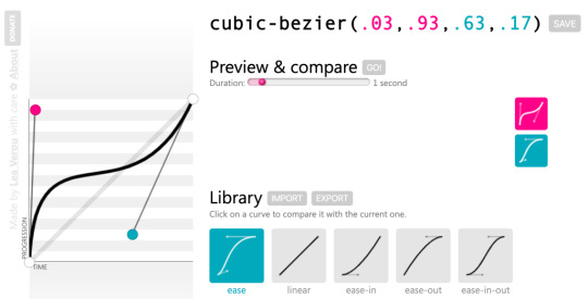
Lea Verou’s cubic-bezier.com.
path()
This function is paired with the offset-path property. It allows you to “draw” a SVG path that other elements can be animated to follow.
CodePen Embed Fallback
Both Michelle Barker and Dan Wilson have published excellent articles that go into more detail about this approach to animation.
steps()
This relatively new function allows you to set the easing timing across an animation, which allows for a greater degree of control over what part of the animation occurs when. Dan Wilson has another excellent writeup of how it fits into the existing animation easing landscape.
Sizing and Scaling Functions
One common thing we do with animation is stretch and squash stuff. The following functions allow you to do exactly that. There is a catch, however: These CSS functions are a special subset, in that they can only work with the transform property.
scaleX(), scaleY(), scaleZ(), scale3d(), and scale()
Scaling functions let you increase or decrease the size of something along one or more axes. If you use scale3d() you can even do this in three dimensions!
translateX(), translateY(), translateZ(), translate3d(), and translate()
Translate functions let you reposition an element along one or more axes. Much like scale functions, you can also extend this manipulation into three dimensions.
perspective()
This function lets you adjust the appearance of an object to make it look like it is projecting up and out from its background.
rotateX(), rotateY(), rotateZ(), rotate3d(), and rotate()
Rotate functions let you swivel an element along one or more axes, much like grasping a ball and turning it around in your hand.
skewX(), skewY(), and skew()
Skew functions are a little different from scaling and rotation functions in that they apply a distortion effect relative to a single point. The amount of distortion is proportionate to the angle and distance declared, meaning that the further the effect continues in a direction the more pronounced it will be.
Jorge Moreno also did us all a favor and made a great tool called CSS Transform Functions Visualizer. It allows you to adjust sizing and scaling in real time to better understand how all these functions work together:
youtube
As responsible web professionals, we should be mindful of our users and the fact that they may not be using new or powerful hardware to view our content. Large and complicated animations may slow down the experience, or even cause the browser to crash in extreme scenarios.
To prevent this, we can use techniques like will-change to prepare the browser for what’s in store, and the update media feature to remove animation on devices that do not support a fast refresh rate.
Filter Functions
CSS filter functions are another special subset of CSS functions, in that they can only work with the filter property. Filters are special effects applied to an element, mimicking functionality of graphics editing programs such as Photoshop.
You can do some really wild things with CSS filter functions, stuff like recreating the effects you can apply to your posts on Instagram!
brightness()
This function adjusts how, um, bright something appears. Setting it to a low level will make it appear as if it has had a shadow cast over it. Setting it to a high level will blow it out, like an over-exposed photo.
CodePen Embed Fallback
blur()
If you’re familiar with Photoshop’s Gaussian Blur filter, you know how blur() works. The more of this you apply, the more indistinct the thing you apply it to will look.
CodePen Embed Fallback
contrast()
contrast() will adjust the degree of difference between the lightest and darkest parts of what is applied to.
CodePen Embed Fallback
grayscale()
grayscale() removes the color information from what it is applied to. Remember that this isn’t an all-or-nothing affair! You can apply a partial grayscale effect to make something look weathered or washed out.
CodePen Embed Fallback
An interesting application of grayscale() could be lightly applying it to images when dark mode is enabled, to slightly diminish the overall vibrancy of color in a situation where the user may want less eye strain.
invert()
While invert() can be used to make something look like a photo negative, my favorite technique is to use it in a inverted colors media query to invert inverted images and video:
@media (inverted-colors: inverted) { img, video { filter: invert(100%); } }
This ensures that image and video content looks the way it should, regardless of a user’s expressed browsing mode preferences.
opacity()
This function controls how much of the background is visible through the element (and child elements) the function is applied to.
CodePen Embed Fallback
An element that has 0% opacity will be completely transparent, although it will still be present in the DOM. If you need to remove an object completely, use other techniques such as the hidden attribute.
saturate()
Applying this filter can enhance, or decrease the intensity of the color of what it is applied to. Enhancing an image’s saturation is a common technique photographers use to fix underexposed photos.
CodePen Embed Fallback
sepia()
There are fancier ways to describe this, but realistically it’s a function that makes something look like it’s an old-timey photograph.
CodePen Embed Fallback
drop-shadow()
A drop shadow is a visual effect applied to an object that makes it appear like it is hovering off of the page. There’s a bit of a trick here, in that CSS also allows you to apply drop shadow effects to text and elements. It’s also distinct from the box-shadow property is that it applies drop shadows to the shape of an element rather than the actual box of an element.
Skilled designers and developers can take advantage of this to create complicated visual effects.
CodePen Embed Fallback
hue-rotate()
When a class with a declaration containing hue-rotate() is applied to an element, each pixel used to draw that element will have it’s hue valued shifted by the amount you specify. hue-rotate()‘s effect is applied to each and every pixel it is applied to, so all colors will update relative to their hue value’s starting point.
This can create a really psychedelic effect when applied to things that contain a lot of color information, such as photos.
CodePen Embed Fallback
SVG filters
filter() also lets us import SVGs filters to use to create specialized visual effects. The topic is too complicated to really do it justice in this article — if you’re looking for a good starting point, I recommend “The Art Of SVG Filters And Why It Is Awesome” by Dirk Weber.

This effect was created by skillful application of SVG filter effects.
Gradient Functions
Gradients are created when you transition one color to one or more other colors. They are workhorses of modern user interfaces — skilled designers and developers use them to lend an air of polish and sophistication to their work.
Gradient functions allow you to specify a whole range of properties, including:
Color values,
The position on the gradient area where that color comes in,
What angle the gradient is positioned at.
And yes, you guessed it: the colors we use in a gradient can be described using CSS color functions!
linear-gradient() and repeating-linear-gradient()
Linear gradients apply the color transformation in a straight line, from one point to another — this line can be set at an angle as well. In cases where there’s more area than gradient, using repeating-linear-gradient() will, er, repeat the gradient you described until all the available area has been filled.
CodePen Embed Fallback
radial-gradient() and repeating-radial-gradient()
Radial gradients are a lot like linear gradients, only instead of a straight line, color transformations radiate outward from a center point. They’re oftentimes used to create a semitransparent screen to help separate a modal from the background it is placed over.
CodePen Embed Fallback
conic-gradient() and repeating-conical-gradient
Conic gradients are different from radial gradients in that the color rotates around a circle. Because of this, we can do neat things like create donut charts. Unfortunately, support for conic gradients continues to be poor, so use them with caution.

An adjustable conic gradient donut chart made by Ana Tudor
Grid Functions
CSS Grid is a relatively new feature of the language. It allows us to efficiently create adaptive, robust layouts for multiple screen sizes.
It’s worth acknowledging our roots. Before Grid, layout in CSS was largely a series of codified hacks to work with a language originally designed to format academic documents. Grid’s introduction is further acknowledgement that the language’s intent has changed.
Modern CSS is an efficient, fault-tolerant language for controlling presentation and layout across a wide range of device form factors. Equipped with Grid and other properties like flexbox, we’re able to create layouts that would have been impossible to create in earlier iterations of CSS.
Grid introduces the following CSS functions to help you use it.
fit-content()
This function “clamps” the size of grid rows or columns, letting you specify a maximum size a grid track can expand to. fit-content() accepts a range of values, but most notable among them are min-content and max-content. These values allow you to tie your layout to the content it contains. Impressive stuff!
CodePen Embed Fallback
minmax()
minmax() allows you to set the minimum and maximum desired heights and widths of your grid rows and columns. This function can also use min-content and max-content, giving us a great deal of power and flexibility.
CodePen Embed Fallback
repeat()
You can loop through patterns of grid column and rows using repeat(). This is great for two scenarios:
When you do know how many rows or columns you need, but typing them out would be laborious. A good example of this would be constructing the grid for a calendar.
When you don’t know how many rows or columns you need. Here, you can specify a template that the browser will honor as it propagates content into your layout.
CodePen Embed Fallback
Shape Functions
Like filter() and transform(), shape CSS functions only work with one property: clip-path. This property is used to mask portions of something, allowing you to create all sorts of cool effects.
circle()
This function creates a circular shape for your mask, allowing you to specify its radius and position.
CodePen Embed Fallback
ellipse()
Like circle(), ellipse() will draw a rounded shape, only instead of a perfect circle, ellipse() lets you construct an oblong mask.
CodePen Embed Fallback
inset()
This function will mask out a rectangle inside of the element you apply it to.
CodePen Embed Fallback
polygon()
With polygon(), you are able to specify an arbitrary number of points, allowing you to draw complicated shapes. polygon() also takes an optional fill-rule argument, which specifies which part of the shape is the inside part.
CodePen Embed Fallback
Miscellaneous Functions
These are the un-categorizable CSS functions, things that don’t fit neatly elsewhere.
element()
Ever pointed a camera at its own video feed? That’s sort of what element() does. It allows you to specify the ID of another element to create an “image” of what that element looks like. You can then apply other CSS to that image, including stuff like CSS filters!
It might take a bit to wrap your head around the concept — and it has some support concerns — but element() is a potentially very powerful in the right hands.
Preethi Sam‘s “Using the Little-Known CSS element() Function to Create a Minimap Navigator” demonstrates how to use it to create a code minimap and is an excellent read.
Here, she’s created a minimap for reading through a longform article:
CodePen Embed Fallback
image-set()
This function allows you to specify a list of images for the browser to select for a background image, based on what it knows about the capabilities of its display and its connection speed. It is analogous to what you would do with the srcset property.
::slotted()
This is a pseudo-element selector used to target elements that have been placed into a slot inside a HTML template. ::slotted() is intended to be used when working with Web Components, which are custom, developer-defined HTML elements.
Not Ready for Prime Time
Like any other living programming language, CSS includes features and functionality that are actively being worked on.
These functions can sometimes be previewed using browsers that have access to the bleeding edge. Firefox Nightly and Chrome Canary are two such browsers. Other features and functionality are so new that they only exist in what is being actively discussed by the W3C.
annotation()
This function enables Alternate Annotation Forms, characters reserved for marking up things like notation and annotation. These characters typically will be outlined with a circle, square, or diamond shape.
Not many typefaces contain Alternate Annotation Forms, so it’s good to check to see if the typeface you’re using includes them before trying to get annotation() to work. Tools such as Wakamai Fondue can help with that.

Examples of annotation glyphs from Jonathan Harrell’s post, “Better Typography with Font Variants”
counter() and counters()
When you create an ordered list in HTML, the browser will automatically generate numbers for you and place them before your list item content. These pieces of browser-generated list content are called counters.
By using a combination of the ::marker pseudo-element selector, the content property, and the counter() function, we can control the content and presentation of the counters on an ordered list. For browsers that don’t support counter() or counters() yet, you still get a decent experience due to the browser automatically falling back to its generated content:
CodePen Embed Fallback
For situations where you have nested ordered lists, the counters() function allows a child ordered list to access its parent. This allows us to control their content and presentation. If you want to learn more about the power of ::marker, counter(), and counters(), you can read “CSS Lists, Markers, And Counters” by Rachel Andrew.
cross-fade()
This function will allow you to blend one background image into one or more other background images. Its proposed syntax is similar to gradient functions, where you can specify the stops where images start and end.
dir()
This function allows you to flip the orientation of a language’s reading order. For English, that means a left-to-right (ltr) reading order gets turned into right-to-left (rtl). Only Firefox currently has support for dir(), but you can achieve the same effect in Chromium-based browsers by using an attribute selector such as [dir="rtl"].
CodePen Embed Fallback
env()
env(), short for environment, allows you to create conditional logic that is triggered if the device’s User Agent matches up. It was popularized by the iPhone X as a method to work with its notch.
That being said, device sniffing is a fallacious affair — you shouldn’t consider env() a way to cheat it. Instead, use it as intended: to make sure your design works for devices that impose unique hardware constraints on the viewport.
has()
has() is a relational pseudo-class that will target an element that contains another element, provided there is at least one match in the HTML source. An example of this is be a:has(> img), which tells the browser to target any link that contains an image.

Interestingly, has() is currently being proposed as CSS you can only write in JavaScript. If I were to wager a guess as to why this is, it is to scope the selector for performance reasons. With this approach has() is triggered only after the browser has been told to process conditional logic, and therefore query the state of things.
image()
This function will let you insert either a static image (referenced with url(), or draw one dynamically via gradients and element().
Trigonometry functions
These functions will allow us to perform more advanced mathematical operations:
Sine: sin()
Cosine: cos()
Tangent: tan()
Arccosine: acos()
Arcsine: asin()
Arctangent: atan()
Arctangent: atan2()
Square root: sqrt()
The square root of the sum of squares of its arguments: hypot()
Power: pow()
I’m especially excited to see what people who are more clever than I am will do with these functions, especially for things like animation!
clamp()
When providing minimum, maximum, and preferred values as arguments, clamp() will honor the preferred value so long as it does not exceed the minimum and maximum boundaries.
clamp() will allow us to author things like components whose size will scale along with the size of the viewport, but won’t shrink or grow past a specific size. This will be especially useful for creating CSS locks, where you can ensure a responsive type size will not get so small that it can’t be read.
:host() and :host-context()
To be honest, I’m a little hazy on the specifics of the jargon and mechanics that power the Shadow DOM. Here’s how the MDN describes host():
The :host() CSS pseudo-class function selects the shadow host of the shadow DOM containing the CSS it is used inside (so you can select a custom element from inside its shadow DOM) — but only if the selector given as the function’s parameter matches the shadow host.
And here’s what they have to say about :host-context():
The :host-context() CSS pseudo-class function selects the shadow host of the shadow DOM containing the CSS it is used inside (so you can select a custom element from inside its shadow DOM) — but only if the selector given as the function’s parameter matches the shadow host’s ancestor(s) in the place it sits inside the DOM hierarchy.
:is() and :where()
:is() has had a bit of an identity crisis. Previously referred to as both matches() and vendor prefixed as :-webkit-any/:-moz-any, it now enjoys a standardized, agreed-upon name. It is a pseudo class selector that accepts a range of selectors as its argument.
This allows an author to group and target a wide range of selectors in an efficient way. :where() is much like :is(), only it has a specificity of zero, while the specificity of :is() is set to the highest specificity in the provided selector list.
:is() and :where() will allow us a good deal of flexibility about how we select things to style, especially for situations where you may not have as much control over the web site or web app’s stylesheet (e.g. third-party integrations, ads, etc.).
#CSS
:is() selector
the successor to :any() and :matches()
sneak peak into our talk, here's a neat gif I made with XD showing what the :is() selector syntax can do. be excited for Chrome Dev Summit y'all!https://t.co/0r2CcUx9Hv pic.twitter.com/wSuGOsDLvZ
— Adam Argyle (@argyleink) November 7, 2019
max() and min()
These functions allow you to select either the maximum or minimum value from a range of values you provide. Much like clamp(), these functions allow us to make things responsive up until a certain point.
:nth-col() and :nth-last-col()
These pseudo-classes will allow you to select one or a specified series columns in a CSS grid to apply styling to them. A good mental model for how these functions will work is how CSS pseudo class selectors operate. Unlike pseudo class selectors, :nth-col() and :nth-last-col() should be able to target implicit grid columns.
symbols()
This function allows you to specify a list of different kinds of characters to use for list bullets. Much like annotation(), you’ll want to make sure the typeface you use contains a glyph you want to use as a symbol before trying to get symbols() to work.
Deprecated Functions
Sometimes things just don’t work out the way you think they will. While deprecated CSS functions may still render in the browser for legacy support reasons, it isn’t recommended you use them going forward.
matrix() and matrix3d()
These functions were turned into more discrete sizing and scaling functions.
rect()
This function was part of the deprecated clip property. Use the clip-path property and its values instead.
target-counter(), target-counters(), and target-text()
These functions were intended to help work with fragment URLs for paged (printed) media. You can read more about them on the W3C’s CSS Generated Content for Paged Media Module documentation
Typography
The web is typography, so it makes sense to give your type the care and attention it deserves. While CSS provides some functions specifically designed to unlock the potential of your website or webapp’s chosen typefaces, it is advised to not use the following functions to access these advanced features.
Instead, use lower-level syntax via font-feature-settings. You can figure out if the font you’re using supports these features by using a tool such as Wakamai Fondue.
character-variant(), styleset(), and stylistic()
Many typefaces made by professional foundries include alternate treatments for certain letters, or combinations of letters. One example use case is providing different variations of commonly-used letters for typefaces designed to look like handwriting, to help make it appear more natural-looking.

Stylistic Alternates example by Tunghsiao Liu’s “OpenType Features in CSS”
Utilizing these functions activates these special alternate characters, provided they are present in the font’s glyph set.
Unfortunately, it is not a standardized offering. Different typefaces will have different ranges of support, based on what the typographer chose to include. It would be wise to check to see if the font you’re using supports these special features before writing any code.
format()
When you are importing a font via the url() function, the format() function is an optional hint that lets you manually specify the font’s file format. If this hint is provided, the browser won’t download the font if it does not recognize the specified file format.
@font-face { font-family: 'MyWebFont'; src: url('mywebfont.woff2') format('woff2'), /* Cutting edge browsers */ url('mywebfont.woff') format('woff'), /* Most modern Browsers */ url('mywebfont.ttf') format('truetype'); /* Older Safari, Android, iOS */ }
leader()
You know when you’re reading a menu at a restaurant and there’s a series of periods that help you figure out what price is attached to what menu item? Those are leaders.
The W3C had plans for them with its CSS Generated Content for Paged Media Module, but it unfortunately seems like leader() never quite managed to take off. Fortunately, the W3C also provides an example of how to accomplish this effect using a clever application of the content property.
local()
local() allows you to specify a font installed locally, meaning it is present on the device. Local fonts either ship with the device, or can be manually installed.
Betting on someone installing a font so things look the way you want them to is very risky! Because of this, it is recommended you don’t specify a local font that needs to be manually installed. Your site won’t look the way it is intended to, even moreso if you don’t specify a fallback font.
@font-face { font-family: 'FeltTipPen'; src: local('Felt Tip Pen Web'), /* Full font name */ local('FeltTipPen-Regular'); /* Postscript name */ }
ornaments()
Special dingbat characters can be enabled using this function. Be careful, as not all dingbat characters are properly coded in a way that will work well if a user does something like change the font, or use a specialized browsing mode.
swash()
Swashes are alternate visual treatments for letters that give them an extra-fancy flourish. They’re commonly found in italic and cursive-style typefaces.

Swash example by Tunghsiao Liu’s “OpenType Features in CSS”
Why so many?
CSS is maligned as frequently as it is misunderstood. The guiding thought to understanding why all these functions are made available to us is knowing that CSS isn’t prescriptive — not every website has to look like a Microsoft Word document.
The technologies that power the web are designed in such a way that someone with enough interest can build whatever they want. It’s a powerful, revolutionary concept, a large part of why the web became so ubiquitous.
The post A Complete Guide to CSS Functions appeared first on CSS-Tricks.
source https://css-tricks.com/complete-guide-to-css-functions/
from WordPress https://ift.tt/2KWBbTp
via IFTTT
0 notes
Photo

Performant Animations Using KUTE.js: Part 5, Easing Functions and Attributes
So far in this series, you have learned how to animate the CSS properties of different elements, how to create different SVG-related animations, and how to animate the text content of different elements on a webpage. There is one more way in which you can animate the elements on a webpage using KUTE.js, and that is by changing the values of different attributes. This requires you to include the attributes plugin in your project.
In this tutorial, you will learn how to use the attributes plugin to animate the value of different kinds of attributes in KUTE.js. We will also discuss different easing functions that you can use to control the pace of different animations.
Easing Functions
Objects in real life very rarely move linearly. They are either accelerating or decelerating. Even the acceleration and deceleration occur at different magnitudes. Up to this point, all our animations have progressed linearly. This doesn't feel natural at all. In this section, you will learn about all the easing functions that KUTE.js provides for controlling the pace of different animations.
The core easing functions in the library are included in the core engine out of the box. Let's say you want to apply the QuadraticInOut easing to an animation. This can be achieved in two ways:
easing: KUTE.Easing.easingQuadraticInOut // OR easing: 'easingQuadraticInOut'
Each of the easing functions has a unique curve that determines how the elements will accelerate during the animation. A sinusoidal curve implies linear acceleration. Keep in mind that this is different from the linear easing function. The linear function implies a linear speed of animation, while a sinusoidal curve implies a linear speed of acceleration for the animation. In other words, the speed of the animation will increase or decrease linearly. Similarly, quadratic implies acceleration with a power of two, cubic implies a power of three, quartic implies a power of four, and quintic implies a power of five. There are also circular and exponential easing functions.
You can append In, Out, or InOut to any of the easing functions. The value In implies that the animation will start very slowly and keep accelerating until the end. The value Out implies that the animation will start at the maximum speed and then decelerate slowly until it comes to a halt at the end. The value InOut means that the animation will speed up at the beginning and slow down at the end.
You can also use bounce and elastic easing functions in your animations and append In, Out, or InOut to any of them. In the following demo, I have applied all these easing functions on different circles so that you can see how they affect the pace of the animation.
It is possible that none of the core easing functions provide the animation pace that you are looking for. In such cases, you can include the Cubic Bezier functions in your project from the experiments branch and start using those easing functions.
Similarly, KUTE.js also provides some physics-based easing functions imported from the Dynamics.js library. You can read more about all these easing functions and how to properly use them on the easing function page of the library.
Animating Attributes
Attributes in SVG can accept numbers as well as strings as their value. The strings can be color values or numbers suffixed with a unit like px, em, or %. The names of the attributes themselves can also consist of two words joined by a hyphen. Keeping these differences in mind, KUTE.js provides us different methods that can be used to specify the values of different attributes.
var tween = KUTE.to('selector', {attr: {'r': 100}}); var tween = KUTE.to('selector', {attr: {'r': '10%'}}); var tween = KUTE.to('selector', {attr: {'stroke-width': 10}}); var tween = KUTE.to('selector', {attr: {strokeWidth: 10}});
As you can see, suffixed values need to be enclosed within quotes. Similarly, attributes which contain a hyphen in their name need to be enclosed inside quotes or specified in camelCase form.
Unitless Attributes
A lot of attributes accept unitless values. For example, the stroke-width of a path could be unitless. Similarly, you don't have to specify a unit for the r, cx, and cy attributes of a circle element. You can animate all these attributes from one value to another using the attributes plugin.
Now that you know how to use different easing functions, you will be able to animate different attributes at different paces. Here is an example:
var radiusAnimation = KUTE.allTo( "circle", { attr: { r: 75 } }, { repeat: 1, yoyo: true, offset: 1000, easing: 'easingCubicIn' } ); var centerxAnimationA = KUTE.to( "#circle-a", { attr: { cx: 500 } }, { repeat: 1, yoyo: true, easing: 'easingCubicInOut', } ); var centerxAnimationB = KUTE.to( "#circle-b", { attr: { cx: 100 } }, { repeat: 1, yoyo: true, easing: 'easingCubicInOut' } ); var centeryAnimation = KUTE.allTo( "circle", { attr: { cy: 300 } }, { repeat: 1, yoyo: true, offset: 1000, easing: 'easingCubicOut' } );
The first tween animates the radius of both circles at once using the allTo() method we discussed in the first tutorial. If set to true, the yoyo attribute plays the animation in the reverse direction.
The cx attribute of both the circles is animated individually. However, they are both triggered by the same button click. Finally, the cy attribute of both the circles is animated at once with an offset of 1000 milliseconds.
Color Attributes
Starting from version 1.5.7, the attribute plugin in KUTE.js also allows you to animate the fill, stroke, and stopColor attributes. You can use valid color names or hex values for the colors. You can also provide the color values in RGB or HSL format.
One important thing that you have to keep in mind is that the animations will only seem to work if you are not setting the value of these properties in CSS. In the following demo, the fill color wouldn't have animated at all if I had added the following CSS in our demo.
rect { fill: brown; }
The demo I created is very basic, but you can make it more interesting by applying transforms and using more colors.
Suffixed Attributes
A lot of SVG attributes like r and stroke-width can work with and without suffixes. For example, you can set the value of r to be a number like 10 or in terms of em units like 10em. There are some attributes like offset attribute for color stops that always require you to add a suffix. While specifying a value for suffixed attributes in KUTE.js, always make sure that you enclose the value within quotes.
In the following example, I have animated the offset value of the first stop in a gradient and the color of the second stop. Since offset requires a suffix, I have enclosed the value inside quotes.
var offsetAnimation = KUTE.allTo( ".stop1", { attr: { offset: '90%'} }, { repeat: 1, offset: 1000, yoyo: true, easing: 'easingCubicIn' } ); var colorAnimation = KUTE.allTo( ".stop2", { attr: { stopColor: 'black'} }, { repeat: 1, offset: 1000, yoyo: true, easing: 'easingCubicIn' } ); var scaleAnimation = KUTE.allTo( "circle", { svgTransform: { scale: 2} }, { repeat: 1, offset: 1000, yoyo: true, easing: 'easingCubicIn' } );
There are three different gradients in the demo, and each of these gradients has two color stops with the class names stop1 and stop2. I have also applied a scale transform using the svgTransform attribute, which we discussed in the third tutorial of the series.
Final Thoughts
In this tutorial, you learned about different easing functions available in KUTE.js and how you can use them to control the pace of your own animations. You also learned how to animate different kinds of attributes.
I have tried to cover all the important aspects of KUTE.js in this series. This should be enough to help you use KUTE.js confidently in your own projects. You can also read the documentation in order to learn more about the library.
I would also recommend that you go through the source code and see how the library actually works. If you have any questions or tips related to this tutorial, feel free to share them in the comments.
by Monty Shokeen via Envato Tuts+ Code http://ift.tt/2zxYa47
5 notes
·
View notes
Text
Top 12 Web-Based Color Tools for Web Designers
Picking the perfect color scheme shouldn’t be a miserable task. All you need are the right tools for the job and an eye for design.
I can’t help develop your eye for picking colors, but I can share a bunch of handy color tools that’ll likely improve your eye as you use them.
These tools are all 100% free, so they’re easy to bookmark and reuse time & time again. They can also work for web, mobile, print, or any other medium that needs incredible colors.
1. ColorHexa
Recently I was browsing the web and stumbled onto ColorHexa. It’s by far one of the coolest color tools I’ve ever seen.
This isn’t technically a color generator or a scheme design tool. Instead, it’s an information library on all colors with suggested gradient ideas, related shades, and dozens of color codes(ex: hex, RGB, CMYK, CIE-LAB, HSL and more).
You’ll never find a more complete list of information on color. This is super useful for all designers, including web designers, and it’s a great place to start researching colors for your projects.
2. Colors.css
If you do some research into color psychology you’ll learn how different colors stack together & what sort of mood they give. This plays into contrast for certain types of colors and how they work together.
Every browser comes with default colors that are often too harsh. Colors.css fixes that.
It’s a free CSS library that restyles the default color palette. This means you can use color names like “blue” and “red” with totally different values.
They even have an entire accessibility page full of ideas for matching color schemes that’ll improve readability on your site.
3. ColorPick Eyedropper Extension
How often do you find a site with a beautiful color scheme? I find amazing sites all the time and it’s difficult to export those colors from the stylesheet.
You can use Chrome DevTools but this requires digging around in the code to pick out the hex colors. Instead you can use the ColorPick Eyedropper extension made exclusively for Google Chrome.
You just click the toggle window in the extensions panel, then hover any color you want to study. This gives you the full hex code along with a “copy” link to copy the exact color to your clipboard.
Pretty cool right? And it’s a free plugin, so there’s nothing to lose by trying it out.
4. Coolors
The Coolors site is a large color scheme generator. You can find dozens of generators on the web, but this one’s a little different since it supports Adobe programs with its own add-on.
You can also get this as a Chrome extension or even as a custom iOS app for your phone.
Really the true value is in the browser webapp that auto-generates color schemes on the fly. You can then mix & match colors, change settings, adjust for color blindness, and randomize your own schemes based on certain criteria.
It’s a great application, but it comes with a small learning curve. Shouldn’t take you more than 15-20 minutes to figure out how it all works.
5. Ambiance
Ambiance is another color scheme site but it works a little differently. This one pulls color palettes from ColourLovers and displays them in an easy-to-consume style.
This means you’ll need to check the original link on Color Lovers to find more data about any particular scheme.
I still think Ambiance is a handy site to bookmark only because of its usability. This app is way more straightforward to use than Colour Lovers so it’s easier to pair colors together and get them working.
6. Material UI Colors
With a quick Google search you’ll find a bunch of sweet material design tools on the web. They seem never-ending and many of them rely on the color styles typically found in Android apps.
With the Material UI Colors webapp you can find perfect color schemes that match with Google’s material guidelines.
Easily change the tint of all colors with the slider in the top-left corner of the screen. Or randomize your selections to match an existing site’s color choices.
You can also switch between hex and RGB depending on whatever format you want. A great app for material design lovers.
7. Color Supply
The Color Supply website is pretty unique but also very strange. It gives you a bunch of interesting color tools for matching color schemes, picking the foregrounds & backgrounds, plus different ways to compare how those colors would look on a page.
But this doesn’t have any guide or specific purpose. It acts like a color scheme generator that you have to just kind of learn as you go.
It will output different colors with hex codes near the bottom of the page to copy. Plus it’ll show you how those colors work in a gradient, in icons, and with text. Nice tool but it comes with an awkward learning curve.
8. Color Safe
The WCAG works hard towards a more accessible web. Color is one of the easiest ways to build your accessibility without losing time testing.
Color Safe is a free webapp that can test your color choices. You pick from a small set of fonts & sizes, then pick whatever colors you want for your foreground & background.
From there you’ll get an accessibility rating along with suggestions on how to improve your color choices(if needed).
Really great tool for anyone concerned about accessibility on the web.
9. Color Hunt
For a user-curated gallery of color schemes take a look at Color Hunt.
This free project was launched a couple of years back and continues to be a source of design inspiration. People submit their own color schemes into the site, then others vote on those color schemes.
You can sort by newest or by most popular and even vote on your favorites. Pretty cool right?
It’s an extremely simple web app so don’t expect too many features. It’s just a neat way to visually browse through many different color patterns at once.
10. Open Color
Looking for something a little more web-friendly? Then check out the Open Color library.
This is a massive open source collection of color choices built around accessibility and browser support. Each color has been optimized for easy matching regardless of your layout’s design.
Check out the GitHub repo for more info and to download a copy of the styles.
11. HTML Color Codes
HTML Color Codes is another info-focused color webapp.
This lets you pull all forms of HTML/CSS code for your color choices right from the app. You can search for any color you want, or go by their recommendations. Plus this even has a tool for generating color palettes that you can download as Adobe Swatch files.
Don’t let the name fool you: this app is for more than just HTML color.
It’s a brilliant tool for digital designers of all types who want easy access to color codes and reusable palettes.
12. Adobe Color CC
I can’t pass over the incredible Adobe Color CC webapp.
This free tool used to be called Adobe Kuler but it’s gone through a few iterations over the years. It’s still a free color picker but the interface has changed to make it easier for designers to build & save color schemes.
If you’re an Adobe user this tool is worth bookmarking. It supports up to 5 different colors in one scheme, and you can even upload images to pull dynamic color schemes automatically.
from Web Designing Tips https://1stwebdesigner.com/web-based-color-tools/
1 note
·
View note
Text
Assessment Task 3
Colour Modes
There are a number of different ways you can influence how the colours in your image are presented to your audience. Changing the colour “mode” will alter the way an image editing software program saves the colour information. A Raster image file can be in bitmap (1-bit) Greyscale (8-bit), Index (8-bit), RGB (24-bit), or CMYK (32-bit) colour.
RGB
RGB refers to Red(R), Green(G) and Blue(B) - also known as the primary colours. An RGB image contains three channels made up of red, green and blue colour data. It is used by all monitors and is also recommended by Adobe for editing colour images. Scanning is almost exclusively done in RGB, and photos are transferred in this mode as well.
RGB is a standard colour model, the exact range of colours represented can vary, depending on the application or display device. RGB images use three colours, or channels, to reproduce colours on-screen. The three channels translate to 24 (8 bits x 3 channels) bits of colour information per pixel. With 24-bit images, up to 16.7 million colours can be reproduced. If you move up to 48-bit images you can produce even more.
CMYK
CMYK refers to Cyan(C), Magenta(M), Yellow(Y) and Black(K) which are also known as secondary colours. These are formed by mixing the primary colours. The CYMK colour scheme or mode is another very well known colour scheme in Photoshop.
CMYK is a standard colour model, the exact range of colours represented can vary, depending on the press and printing conditions. The CYMK colour scheme is generally used when the image or the graphic created is to be printed on paper - not for use on graphics intended for the Web. This scheme is based on the light absorbing quality on paper. CYMK images comprises of colours produced from the combination of 4 colours of cyan, magenta, yellow and black. Like the RGB mode, the user has to enter values for each colour to get the desired colour.

Hexadecimal
A colour hex code is a way of specifying colour using hexadecimal values. The code itself is a hex triplet, which represents three separate values that specify the levels of the component colours. The code starts with a # and is followed by six hex values or three hex value pairs (for example, #AFD645). The code is generally associated with HTML and websites viewed on a screen. As one hex digit represents 4 bits , two hex digits together make 8 bits (1 byte ). The values for each colour run between 00 and FF. Designers and developers use HEX colours in web design. The use of these codes makes it simple to identify and ensure you are using the correct colour for your project.

HSB
The HSB (standing for Hue, Saturation and Brightness) colour model defines a colour space in terms of three constituent components. This colour model is also known as HSV, standing for Hue, Saturation and Value. According to this model, any colour is represented by 3 numbers.
The first number represents Hue and its value ranges from 0 to 360 degrees, with each degree representing a distinct colour (such as red, blue or yellow)
Second number represents Saturation and it’s value ranges from 0 to 100. It represents the amount of colour where 0 will show no colour and 100 shows the full colour.
The third number represents Brightness. You enhance the brightness by adding white or reduce it by adding black. It’s value ranges from 0 to 100 where 0 represents the white colour and 100 represents the black. The closer to 100 the value, the darker a colour will appear.
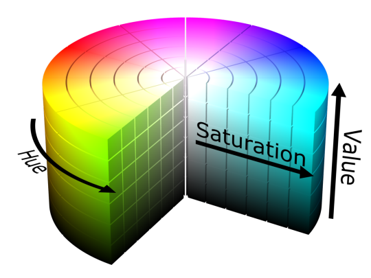
Greyscale
Grayscale is a colour mode, made up of 256 shades of grey. These 256 colours include absolute black, absolute white and 254 shades of grey in-between. Images in grayscale mode have 8-bits of information in them. Black and white photographic images are the most common examples of the grayscale colour mode. We call them black and white photographs but the photo is actually made up of lots of different shades of grey. You can convert both Bitmap-mode and colour images to greyscale. To convert a colour image to a high-quality grayscale image, Photoshop discards all colour information in the original image. The grey levels (shades) of the converted pixels represent the luminosity of the original pixels.

Histograms
In image processing and photography, a colour histogram is a representation of the tonal range, or distribution, of colour in an image. For digital images, a colour histogram represents the number of pixels that have colour in each of a fixed list of colour ranges by graphing the number of pixels at each of the 256 brightness levels in an image. In a histogram, the higher the line from the axis, the greater the number of pixels at that brightness level.
Transparency and Alpha Channels
In digital imagine, the alpha channel controls the transparency or opacity of a colour. It’s value can be represented by a real value, a percentage, and integer: fully transparent is 0.0, 0% or 0, whereas full opacity is 1.0, 100% or 255 respectively.
When a colour (source) is blended with another colour (background), e.g. when an image is overlaid onto another image, the alpha value of the source colour is used to determine the resulting colour. If the alpha value is opaque, the source colour overwrites the destination colour; if transparent, the source colour is invisible, allowing the background colour to show through.
If the value is in between, the resulting colour has a varying degree of transparency/opacity, which creates a translucent effect

0 notes
Text
freeCodeCamp Survey Form Project
In this post, I talked about going through the freeCodeCamp learning curriculum. I’ve done parts of it before, but I never got to finish it. Now that there’s a new curriculum, I resolved to go through it again from the beginning. Hopefully, this time I’ll be able to finish it.
Anyway, I’ve now gotten to the part where we have to make responsive web design projects. The first project is the Tribute Page. I made one for J.K. Rowling and another for the Harry Potter series. I wrote a post about it as well. You can find it here.
The second project is to build a Survey Form. Just like with the Tribute Page project, I’d like to make this without using frameworks like Bootstrap. I want to focus on using just plain HTML and CSS.
However, I do want to use this opportunity to practice and learn more about SASS (means Syntactically Awesome Style Sheets), a CSS preprocessor. So I’ve decided to use SCSS (means Sassy CSS). This is a newer version of SASS. The old one is .sass, and this doesn’t use brackets and semi-colons while .scss does.
Aside from that, I also want to be able to incorporate all the curriculum lessons that we’ve learned so far. Or, at the very least, include as much of the lessons as possible.
For this project, I’ve decided to make a Harry Potter Series Survey Form.
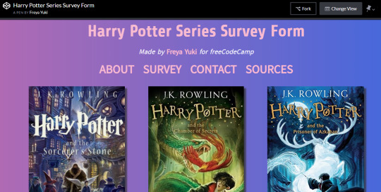
You can find the instructions for the Survey Form project here: https://learn.freecodecamp.org/responsive-web-design/responsive-web-design-projects/build-a-survey-form.
Here are some more screenshots from the Harry Potter series Survey Form project:
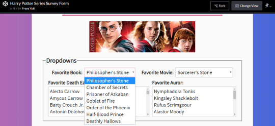
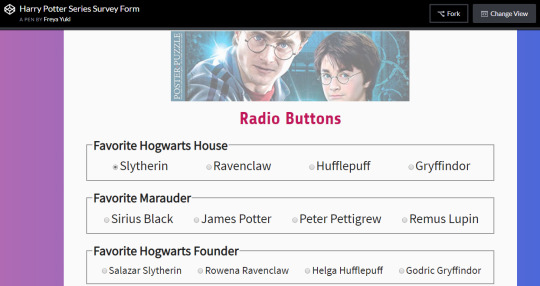
freeCodeCamp Curriculum Lessons Used in the Survey Form Project
Say Hello to HTML Elements
Inform with the Paragraph Element
Link to External Pages with Anchor Elements
Nest an Anchor Element within a Paragraph
Make Dead Links Using the Hash Symbol
Introduction to HTML5 Elements
Uncomment HTML
Comment out HTML
Define the Head and Body of an HTML Document
Link to Internal Sections of a Page with Anchor Elements
Change the Color of Text
Nest Many Elements within a Single div Element
Use a CSS Class to Style an Element
Use CSS Selectors to Style Elements
Style Multiple Elements with a CSS Class
Change the Font Size of an Element
Set the Font Family of an Element
Import a Google Font
Specify How Fonts Should Degrade
Add Rounded Corners with border-radius
Give a Background Color to a div Element
Set the id of an Element
Use an id Attribute to Style an Element
Adjust the Padding of an Element
Adjust the Margin of an Element
Add a Negative Margin to an Element
Add Different Padding to Each Side of an Element
Add Different Margins to Each Side of an Element
Use Clockwise Notation to Specify the Padding of an Element
Use Clockwise Notation to Specify the Margin of an Element
Style the HTML Body Element
Inherit Styles from the Body Element
Create Visual Balance Using the text-align Property
Adjust the Width of an Element Using the width Property
Use the strong Tag to Make Text Bold
Adjust the Hover State of an Anchor Tag
Use the em Tag to Italicize Text
Decrease the Opacity of an Element
Learn about Complementary Colors
Learn about Tertiary Colors
Adjust the Color of Various Elements to Complementary Colors
Use display: flex to Position Two Boxes
Override Class Declarations by Styling ID Attributes
Use Hex Code for Specific Colors
Use Hex Code to Mix Colors
Use Abbreviated Hex Code
Use RGB values to Color Elements
Use RGB to Mix Colors
Adjust the background-color Property of Text
Adjust the Size of a Header Versus a Paragraph Tag
Use the text-transform Property to Make Text Uppercase
Set the font-size of Paragraph Text
Center an Element Horizontally Using the margin Property
Create a Gradual CSS Linear Gradient
Use Headings to Show Hierarchical Relationships of Content
Jump Straight to the Content Using the main Element
Make Screen Reader Navigation Easier with the header Landmark
Make Screen Reader Navigation Easier with the nav Landmark
Give Links Meaning by Using Descriptive Link Text
Create a Media Query
Add Flex Superpowers to the Tweet Embed
Use the flex-direction Property to Make a Row
Apply the flex-direction Property to Create Rows in the Tweet Embed
Align Elements Using the justify-content Property
Use the justify-content Property in the Tweet Embed
Align Elements Using the align-items Property
Use the align-items Property in the Tweet Embed
Use the flex-wrap Property to Wrap a Row or Column
Delete HTML Elements
Use the order Property to Rearrange Items
Add Images to Your Website
Set the font-size for Multiple Heading Elements
Set the font-weight for Multiple Heading Elements
Add a Text Alternative to Images for Visually Impaired Accessibility
Make an Image Responsive
Size Your Images
Turn an Image into a Link
Understand Absolute versus Relative Units
Prioritize One Style Over Another
Override Styles in Subsequent CSS
Adjust the Height of an Element Using the height Property
Use the u Tag to Underline Text
Learn How the CSS @keyframes and animation Properties Work
Headline with the h2 Element
Use the flex-direction Property to Make a Column
Apply the flex-direction Property to Create a Column in the Tweet Embed
Create a Horizontal Line Using the hr Element
Create an Ordered List
Add a box-shadow to a Card-like Element
Use the CSS Transform Property skewX to Skew an Element Along the X-Axis
Use the CSS Transform Property skewY to Skew an Element Along the Y-Axis
Use CSS Variables to change several elements at once
Create a custom CSS Variable
Use a custom CSS Variable
Attach a Fallback value to a CSS Variable
Cascading CSS variables
Modify Fill Mode of an Animation
Change Animation Timing with Keywords
Learn How Bezier Curves Work
Use a Bezier Curve to Move a Graphic
Make Motion More Natural Using a Bezier Curve
Improve Readability with High Contrast Text
Avoid Colorblindness Issues by Using Sufficient Contrast
Avoid Colorblindness Issues by Carefully Choosing Colors that Convey Information
Know When Alt Text Should be Left Blank
Use the CSS Transform scale Property to Scale an Element on Hover
Use the CSS Transform scale Property to Change the Size of an Element
Add an Accessible Date Picker
Add Borders Around Your Elements
Make Circular Images with a border-radius
Fill in the Blank with Placeholder Text
Create a Text Field
Add Placeholder Text to a Text Field
Create a Form Element
Use HTML5 to Require a Field
Improve Form Field Accessibility with the label Element
Create a Set of Radio Buttons
Create a Set of Checkboxes
Wrap Radio Buttons in a fieldset Element for Better Accessibility
Check Radio Buttons and Checkboxes by Default
Override All Other Styles by using Important
Make Typography Responsive
Change a variable for a specific area
Add a Submit Button to a Form
Adjust the Hue of a Color
Adjust the Tone of a Color
Use CSS Animation to Change the Hover State of a Button
Use a CSS Linear Gradient to Create a Striped Element
Create Movement Using CSS Animation
Change an Element's Relative Position
Move a Relatively Positioned Element with CSS Offsets
Create Visual Direction by Fading an Element from Left to Right
Animate Elements Continually Using an Infinite Animation Count
Set the line-height of Paragraphs
Override Class Declarations with Inline Styles
Create a Bulleted Unordered List
Use a media query to change a variable
Make Screen Reader Navigation Easier with the footer Landmark
Create Texture by Adding a Subtle Pattern as a Background Image
Wrap Content in the article Element
Make Links Navigatable with HTML Access Keys
Use tabindex to Add Keyboard Focus to an Element
Use tabindex to Specify the Order of Keyboard Focus for Several Elements
freeCodeCamp Curriculum Lessons NOT Used in the Survey Form Project
The following are the freeCodeCamp curriculum lessons that I wasn’t able to use in the Survey Form project. I really wanted to use all of the lessons for this project. But, unfortunately, it just wasn’t possible. For the next projects, I hope I’ll be able to use these lessons.
All the CSS Grid lessons - just like with the Tribute Page, I decided to use the Flexbox layout for the Survey Form. I’ll focus on the CSS Grid layout in the next project
Improve Accessibility of Audio Content with the audio Element - the Survey Form doesn’t have any audio
Declare the Doctype of an HTML Document - I’m using CodePen to make the Survey Form, so the Doctype has already automatically been declared
Improve Chart Accessibility with the figure Element - the Survey Form doesn’t have a chart
Use Attribute Selectors to Style Elements
Use the s Tag to Strikethrough Text
Lock an Element to its Parent with Absolute Positioning
Lock an Element to the Browser Window with Fixed Positioning
Push Elements Left or Right with the float Property - I used the flexbox layout, so I didn’t have to float anything
Change the Position of Overlapping Elements with the z-index Property
Create a More Complex Shape Using CSS and HTML
Standardize Times with the HTML5 datetime Attribute
Make a CSS Heartbeat using an Infinite Animation Count
Use a Retina Image for Higher Resolution Displays
Use the flex-shrink Property to Shrink Items
Use the flex-grow Property to Expand Items
Use the flex-basis Property to Set the Initial Size of an Item
Use the flex Shorthand Property
Use the align-self Property
Make Elements Only Visible to a Screen Reader by Using Custom CSS
Create a Graphic Using CSS
Animate Elements at Variable Rates - I did animate elements using animations and keyframes, but not at variable rates
Animate Multiple Elements at Variable Rates - I did animate multiple elements using animations and keyframes, but not at variable rates
#freecodecamp#harry potter#web design#web development#sass#css preprocessor#responsive web design project#web design project#coding#responive web design#scss#css#survey form#html#flexbox#harry potter series#jk rowling
0 notes
Last Seen Blogs

khickuwa
ChiKa

everycolourisbliss-blog
Every Colour is Bliss

memorieslie
pip pip to you, mysterious orb!

itsallelementary-blog
INTUITION

modaalternativa-blog1
Moda Alternativa