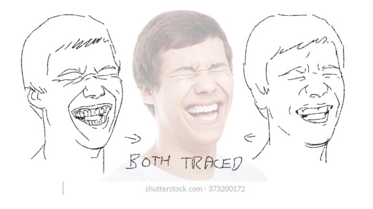
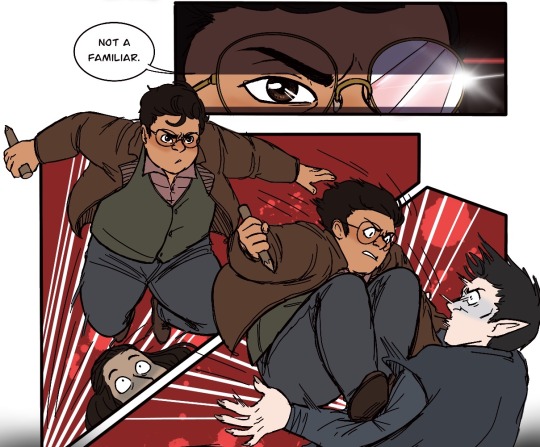
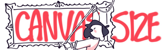
#(my lineart size lmao)
Text

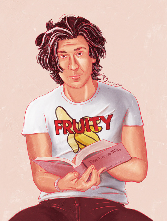
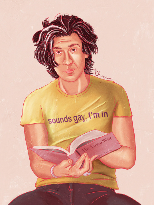
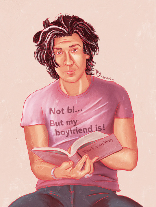
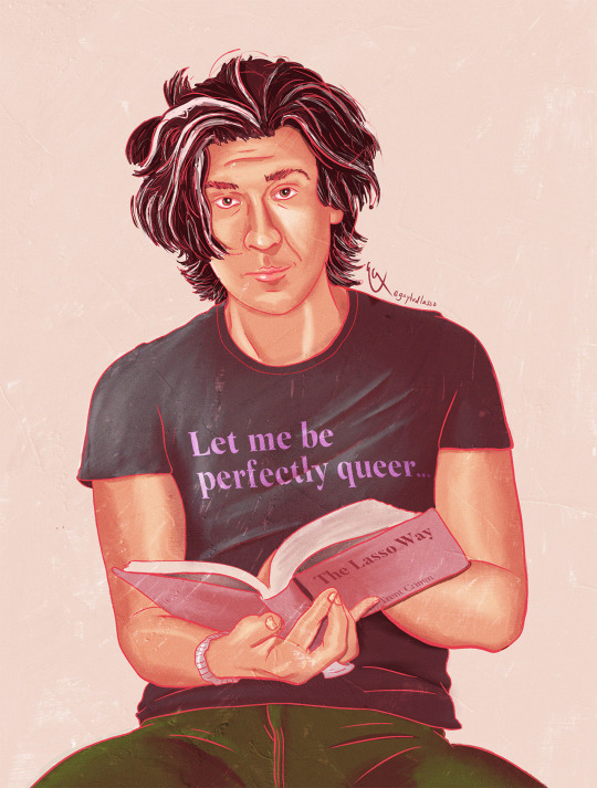
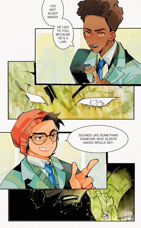
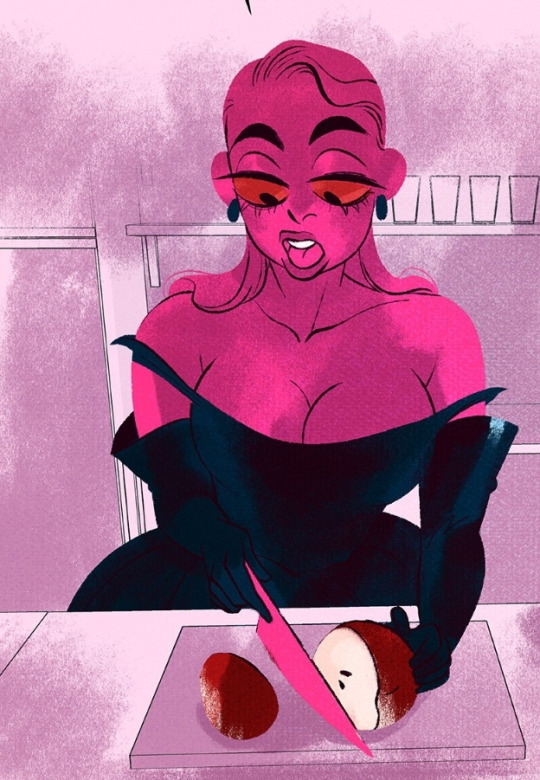
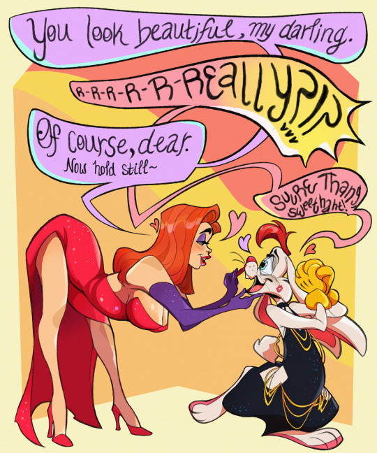
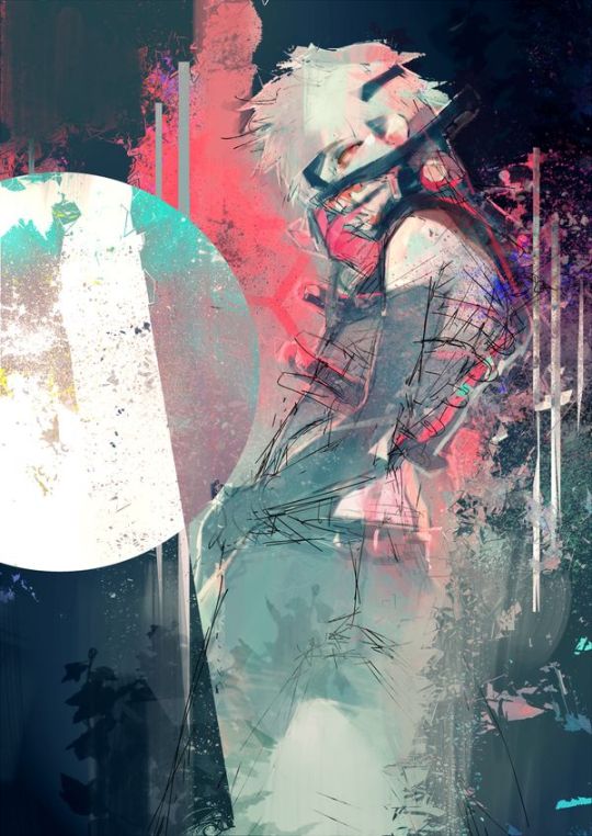
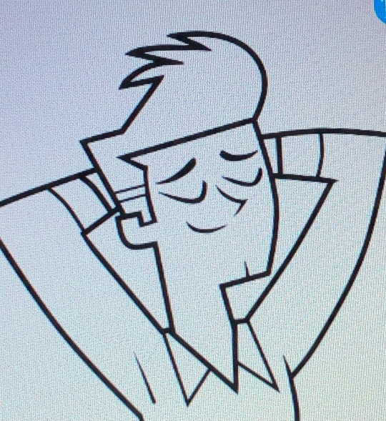
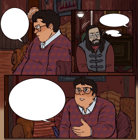
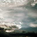
Happy Pride to Trent Crimm and his gay little t-shirts
still images of each shirt below the cut

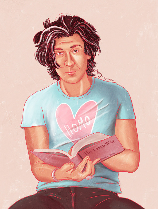
#shout out to trent-in-teds-t-shirt for insp for the t-shirt phrases#and to casismybestfriend for the art idea!#happy Pride!#to everyone except the people responsible for gif sizes on tumblr#never doing lineart for a gif again lmao#or at least not lineart this fine#but I'm not redrawing this so#if this flops I'll just post the individual shots#anyways! happy pride to trent crimm my beloved#sketch.art#ted lasso#tedtrent#tedependent#trent crimm#trent crimm independent#ted lasso fanart#pride art#Ted lasso Pride#also the homo shirt is a little easter egg for those who know my spn art
926 notes
·
View notes
Text


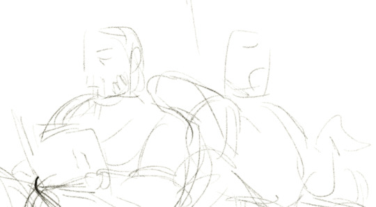
did i finish yesterday’s yoite? no but i made a matching miharu, equally unfinished!
#did i make sure they were the same size tho no lmao#nno#nabari no ou#miharu rokujou#yoite#my art#'hans how long has it been since you actually finished something?#listen. not even my master's is finished and it's due in a week so honestly this is just a character trait at this point#and finishing something is so much work and requires me to consider whether i should have a go at clean lineart which is hell. objectively#not to mention colouring ughghk
65 notes
·
View notes
Text

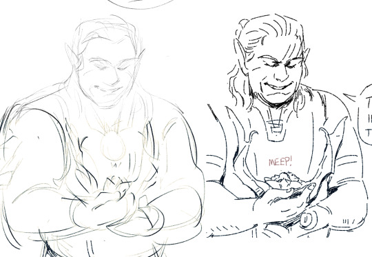
his face annoys me, hands annoy me, but im trying
and the one part i am very pleased with is the shading/blending on his face. even without lineart is looks like a face! u can tell the different planes! that's big for me uwu
#broodart#solas#i so gave up on the bg lmao#sure boy. brace ur elbow on an unrealistic stack of books. whatever.#if u saw the version that said 3.65#no u didn't#(my lineart size lmao)
2 notes
·
View notes
Note
What brushes do you use in csp?? Ive been trying to find a good lineart brush thats gives me similar results to yours and im just having no luck
Imma be real with you boss I don't even know how to answer that question anymore LMAO
There's a post on my patreon (which, my bad, I thought was public but is locked for $1 apologies) called "brushes masterpost" where I list a bunch of brushes I tend to circle back to BUT that post is already outdated. I switch lineart brushes so often that ANY information about what brush I'm using becomes obsolete real quick so I hate answering this question 🫠
I can say that even if I linked the brushes I'm using, the chances of them looking the same to you are slim since my brush effects depend not just on the original brush, but on a bunch of edits to its settings, system pressure settings (the same brushes look different to me on a laptop and an iPad for instance) and resolution (a lot of the brushes I use look crispy because I work on low resolutions, but would look completely different if instead of using them at 3px size I used them at 10px like a normal person).
I can also maybe just advise that if you're struggling with finding a brush you like, don't be afraid to download a bunch of different ones (assuming you've got something like the CSP asset store) and spend some time redrawing the same things to see which one tickles your brain! And also don't be afraid to mess around with the settings to see what they do - while of course saving duplicates if you don't want to lose the original one. I find that really understanding what the main settings do is a lot better in the long run to customise your ideal brush than just trying out stuff other artists use directly.
My current lineart brush is a customised version of the brush "sketchy pen" from this pack
275 notes
·
View notes
Note
hello hi!!! grfhvhghr i am in love with your artwork so much you cant believe-- i wanna ask if you have any tips on how you lineart and colourpick?? no pressure to answer tho, have a great day/night!! again, love your art <33
hi!! thank you for your kind words!! since i got asked about these a lot, im answering this for all the other ask asking about lineart and colour tips too! You can see some previous post here.
also i could only give out tips that work for my drawing style - which is heavy lineart / colours pop up the line (believe it or not it's American comic book style. ppl cant understand why my art doesnt really look like usual anime/ Asian webtoon style, even though it is still clearly anime / Asian webtoon style, but when i told them it's because im drawing these by studying American comics, no one believes it either lmao.
i do study but i do my own things too, so most of my art inspo is really unexpected to ppl, but they r really where i learn things from, cuz i dont even go to art school TT_TT).
Changing the brush size will help you achieve thick/thin lines better without having to put pressure on your wrists. Keep your hold relaxed and let bigger brush size give you the thick strokes.
I like messy sketch, to me the sketch is just an outline shape to fill details in when i do the line, it also gives more freedom to wriggle as i draw! cuz i dont really plan out everything from the start, just wing it as i go, so a lot of my work is actually very spontaneous.
that leads to this point: when you do the lineart you should start deciding which colour style you want from it to adjust the details amount. the ink shadow blocks in my art aren't there randomly, i adjust them to best complement the shape language and colours.
for piece where i want the line/shadow to...idk hit (?), the colours are almost flat with textured brush adding depth to them, so the inking is the shading, thus there are more details in the lineart / ink blocks.
for the video above and piece like this where i want the colours to be clear and pop out, the use of ink blocks are minimized and i do the shading during colouring process. but! the ink blocks can still make some places pop very nicely! just use in moderation!
when doing the base it's good to keep the colour on the left side of the colour wheel (low saturation), but as you do shading and lighting, try to spread out evenly so it won't look washed out.
toggle around with hue and saturation slider as you go! the key is always adjusting! you're making hundreds of decisions at once, being conscious of your choice in why a line or a colour should be in a certain way will help improve your process a lot! (i think you can tell which art i turned off my brain and just draw for stress relief ........ which is also a valid way to draw and sometimes the result might surprise you! but for more serious stuffs i try to be aware of most of the move i make. it's problem solving, yeah?)
i find that one way to keep your art from appearing too...yellow in the end (which is sth that haunted my ass for a long while) is always aim for cold tone, so if you accidentally make it warm either way in the end it won't be too warm (and yellow :cry:)
well that's all the stuffs i can think on top of my head. sorry i can't give more advice on colour picking cuz it's sth i don't really know how to give advice on???? i think my colours now are still pretty lame haha........ if there are still any questions i'd gladly answer within my ability, though im very slow to answer ask ( i do read and be happy at all of them tho!)
#art tip#ask#anon#albi’s art#ALSO I AM SERIOUS ABOUT THE BRUSH SIZE THING SAVE YOUR WRISTS NOW. TODAY. DONT LET IT HURT THEN TRY TO FIX IT LATER#aughhhhhhhhh *rub my wrists*
291 notes
·
View notes
Note
Hi! I absolutely adore your art and I wanted to ask if you had any tips/advice on how to get lineart in facial expressions right? You always nail it and I struggle everytime even if the sketch looks good :')
Thank you so much!
HM! This is tricky- and kind of two questions, so I’ll answer it in parts. I think getting the essence of a sketch across perfectly into lineart is impossible and I rarely manage it, even if the result looks good, it’s still USUALLY different. Often I don’t do a real sketch and it means my lineart is more lively, because it’s got the energy of a first try instead of a stiff copy over a sketch? (though, I’m not certain I’d consider that ‘lineart’ as opposed to sketches in a solid pen?)
I feel like kind of a bastard showing this first one haha, you can be assured there were a number of undo's.

You can see that my lines are never really the same as the sketch, and I know a lot of artists myself included leave some of the thinking for the ink stage. However, some are really really tight in the sketch stage, and I think if you aren't confident with putting down solid lines then that way might work better. It depends though, and digital art has an undo, so.

I definitely gained line confidence through drawing straight in pen into my sketchbook, I like drawing expressions from ref over and over until they feel right lmao. (idk if this is good advice for all the time sketchbooking though, it definitely makes me less likely to try new poses or expressions from imagination because I can't erase)
--------
Some general things to consider- is your sketch fuzzy, is your eye reading a lot of loose lines as having potential- and dimension, and then narrowing it down to One Line flattens the finished version?
Is your brush the same size, are you drawing in something thicker and losing the vibes because the lineart is thinner? Same vice-versa, are you losing detail because the lineart is thicker than the sketch?
Facial expression wise…I feel like choosing where to draw the lines is tricky and you have to really learn which ones work well with the opacity of a sketch, and Dont work well in a solid line.
Here’s a terrifying example LOL. Outlining everything on a face vs choosing which lines I think sell the expression. (The teeth are extreme but…) Often I put full cheek creases on just one side even if I know they would be on both, and just hint at the other side. It’s often a darker crease on the side furthest away anyway, so it works pretty good.
I honestly only learned to ink in the last few years and it's been a struggle to go against my painting roots haha, I’m sure other more experienced artists have better tips than me!
118 notes
·
View notes
Text
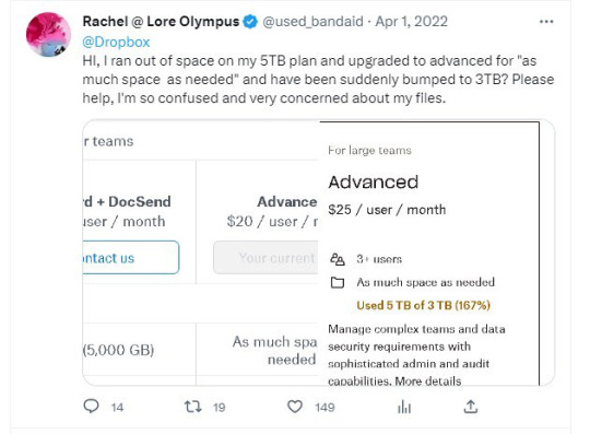
On today's episode of "Rachel exaggerates things to make herself sound cooler-"
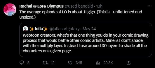
Soooo this is a lie.
No seriously, this has to be a lie. I don't make these kinds of accusations willy-nilly. This has to be a lie.
First of all, if her file sizes are truly 11GB for each episode, that would mean her file resolutions would have to be stupid high, and I just ain't buying that when so much of her art comes out looking like fried chicken.

But again, look at the backgrounds. Crystal clear. Which supports my theory that Rachel has her assistants draw the characters flat and exports them as PNG's so that she (or another one of her assistants) can slap the backgrounds in afterwards which is why when they pinch and zoom, the backgrounds look fine (as they're added in afterwards) and the characters look like they've been drawn with chalk. The shading itself isn't deep fried though, which is, again, because Rachel adds in the shading in post after her assistants have sent her all the flats.
Anyways, moving on from that, if her file sizes are actually 11GB per episode, that would mean her resolution would have to be STUPID high and that would mean there's no excuse for panels to look like this. This is not a Webtoons compression problem, Webtoons does compress images for you if you don't do it yourself but they don't result in specifically deep fried textures like this, that's ALL happening on Rachel's side. If it were a Webtoons' problem, the entire comic would look like that, not just select panels.
This is also what the panels tend to look like in book form. The book art is clearly very compressed and blurred from being too low of a resolution for print, which means either the editor is not being provided the root files, or the root files weren't ever that crisp to begin with. Either one is plausible and either one isn't good.
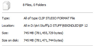
But of course, I'm not going to make these claims without my own proof. So here's the file sizes for Episode 12 of Rekindled, the longest episode in the series so far by panel count and page length, clocking in at 42 panels and an average of 25 layers per page (and that's including the text layers which adds a good chunk on its own, the actual art layers are like, half of that).
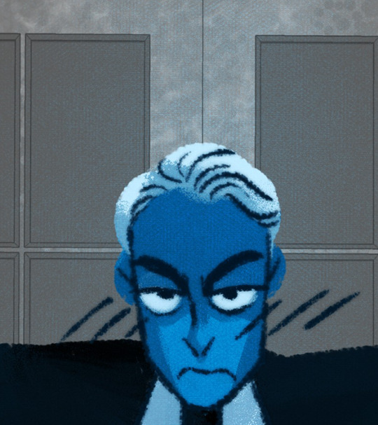
Also, here's what a pinch and zoom panel in Rekindled comes out looking like:

You can still pick up on some fuzziness, but the lineart doesn't look straight up chunky like it does in LO.
Meanwhile, one of my longest episodes of TIME GATE: [AFTERBIRTH] has a file size that honestly shocked me with how small it was.
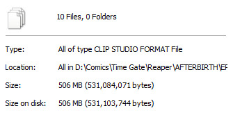
Guess how many panels that episode had?
Go on, guess. Take a second. Compare it to the file size of Episode 12 of Rekindled, take your best educated guess. Time Gate: [AFTERBIRTH] is also a full color webtoon with full shading and rendering that I used to upload once a week. Go ahead, I'll wait.

Ninety-seven.
Ninety. Seven.
Not only is that more panels than what LO dishes out on a weekly basis, but its overall file size doesn't even come out to be 10% of what Rachel is claiming LO's file sizes to be.
This is what Time Gate: [AFTERBIRTH] looks like, by the way:

(don't mind the blurriness that's working against my point, that's Tumblr, not me LMAO)
But, let's face it, I didn't want to just use my own examples as a comparison, because that seems unfair. I'm not an Originals creator, I just put myself under similar pressures as one because I'm an idiot who tries too hard.
So I asked one of my Originals pals. I will not disclose their name, but they are someone who works for Webtoons Originals and has similar panel requirements and deadlines. They also work with a similar flatting + shade workflow as LO, they have cel-shaded colors and bold flat coloring.
When I asked them how big their file sizes were, they said that at 2500px width - similar to what I draw at, 2400px width - and 200-300k pixel length (again, they're drawing an entire episode on one canvas) their episode file sizes come out to roughly one gigabyte, very rarely much bigger than that.
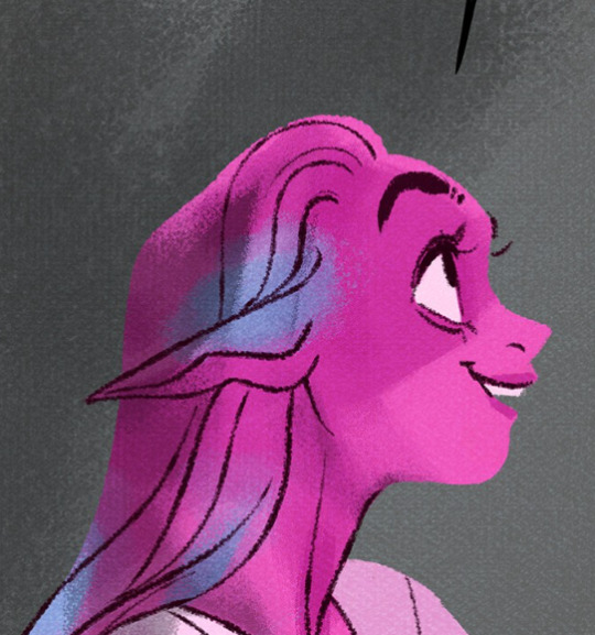
Rachel is full of shit. This is some Tommy Tallarico level shit, exaggerating stupid things that don't matter to try and make herself seem impressive. It isn't impressive. It makes her look like an unorganized dunderhead at best, and at worst, makes her look like a flat out liar who needs to prop herself up on the dumbest shit to make herself look good. File gigabyte size isn't impressive or indicative of anything, you can achieve high quality art without your file size amounting to 11 GB, and let's face it, Lore Olympus is not high quality art. You're telling me art like this:
amounts to 11 GB?
Now the only way I can see this happening is if maybe, maybe she had like, a bajillion layers full of garbage-

Oh. Oh no. Lore Olympus. Is a sprite comic.*
(*edit for clarification: I've had people confused over what I mean by sprite comic because LO clearly isn't made with 16/8 bit sprites. Sprite comic was a term universally used back in the day for comics that reused the same body parts, heads, expressions, etc. much like how sprites are designed, often keeping an entire file full of different layers made up of these assets to make for easier development. This technique was utilized in comics like CTRL + ALT + DEL. LO is definitely not literally a sprite comic but the way its layers are designed feel very much like something that's being cobbled together like 'sprite' comics were. I'm old.)
Even with these pics for proof, with 600+ layers on one canvas, if there's barely anything on those layers, then it still wouldn't make up that 11GB file size because the amount of layers doesn't necessarily add to file size on its own, at least not by that much, unless they're actually filled with stuff. And again, Rachel's art in LO doesn't scream "highly detailed with many layers". It only had many layers because for some reason she insists on working that way even to its own detriment.
From the looks of it, Rachel's importing all of her assistants' PNG's as separate layers and adding all the shading and the extra details on their own separate layers and basically dividing everything up into tiny bite sized pieces. That's the only clear explanation I can come up with. But if so, that means she's being INCREDIBLY inefficient with her workflow that it's amounting to SIX HUNDRED+ LAYERS AT 11 GB PER EPISODE. THAT IS ABSURD. THIS COMIC IS WAY TOO LOW QUALITY TO JUSTIFY THESE FILE SIZES AND LAYER COUNTS. RACHEL DOESN'T KNOW WHAT THE FUCK SHE'S DOING-
She's also very clearly using the cloud as a way to backup her work and work with her assistants. God knows how much she's spending on cloud space because of her own incompetency.
Honestly, at this point, as I sit here playing the Photoshop equivalent of Cookie Clicker, clicking the 'new layer' button over and over and over again with my mouse to truly understand what it would feel like to operate at 600+ layers per episode of a webtoon, I'm more inclined to believe she's just lying. Capping. Pulling shit out of her ass. Straight up making shit up. It wouldn't be the first time she's done that. But also because the alternative is a lot more grim - the #1 best selling webtoon on the platform is being operated like the world's worst group project and still coming out on the other side looking like deep fried garbage despite its stupid high file size.

#hoo boy i wasn't expecting to write an essay today#but i got tagged in this discussion in ULO#my 10+ years of being a deadbeat washed up webcomic creator with zero street cred finally pay off#lore olympus critical#lo critical#antiloreolympus#anti lore olympus
231 notes
·
View notes
Note
Ignoring the fact that ibis had the ai paint feature a couple years before this whole ai fiasco, after seeing your post, I decided to try it out to see if it really held up. I already knew what you said made no sense, as even stuff like ai painting requires heavy human input that isn't just someone typing a prompt in a thing and looking through thousands of images and somehow still calling it 'art'. Really, it's just some weird advanced bucket.
The ibis ai paint... really sucks. I'm pretty sure it hasn't even been touched since it was added. No matter what I did, I got random colours and whatever colours I had put there looked like it were from a filter, not to mention how my lineart bled everywhere like it was blurred out.
Ibis isn't problematic for adding that feature as not only was it added ages ago, but it was also just a gimmick only added because a few more popular paid programs added them, like Clip Studio Paint. I highly doubt even the company took it seriously considering how poorly built it is. This is actually the one time I'm glad some feature in an app sucks so much.
Another reason why ibis isn't problematic by the mere feature alone is that, when you look at the artists making content during the time of that update, it was received with humour. It was something fun to try, but ultimately dismissed for actual artwork, as nobody would use it to fully paint their works. Nowadays we see something slapped with the words 'ai' and think that it's instantly bad due to the latest issues with it and big corperations/ certain production companies but it isn't. It's just a lot of people abusing what was previously some fun gimmick, which it can still be, and for certain apps, still is. Nobody throws pitchforks at character ai, after all.
You can tell just by the size of this that I'm procrastinating on something. Ima go and let this rot away in your askbox now lol
You really thought this would fade away in my ask box, mwahahaha /j
I wanna start off by saying thank you for holding me accountable, I will admit that I got buzzworded pretty hard in this situation lmao
This information came as a surprise to me-- I was seeing posts pop up within the past week complaining about the ai feature on ibis, so I assumed it was recent. As it turns out, after reading your ask, I discovered that I got a few wires crossed! Because yes, the auto paint feature I referred to in my post has been around for years now, and was never taken seriously anyways
So that was my bad (and yea ur right it's completely unusable, lmao)
But as it turns out, the feature that people have been complaining about DID come out recently. It was called the AI Example feature, I think the idea was that you make a simple drawing and the AI adds 99% of the detail and color, which I've seen a bunch of other programs do.
...and then it was immediately removed due to some pretty major backlash, which, duh
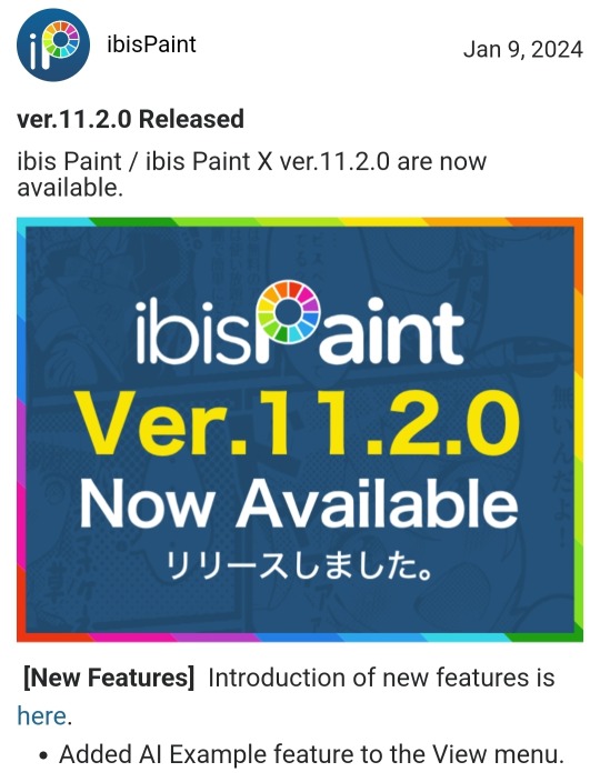
^ This is the only evidence I can find of the 11.2.0 update that included the AI feature on the actual site; their update history stops at 11.1.0. But there's also the news page about the removal of the update, so it's not like they're trying to pretend it never happened.
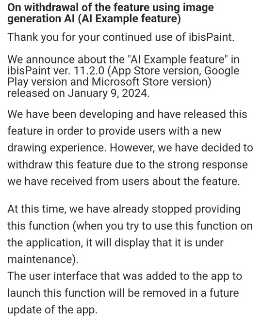
So tl;dr, I jumped on the hate train a little too quickly and never did enough research to figure out what the actual update was, and that it's been removed by now anyway (which I couldn't have known until today, ofc, but i did kinda post that thing about ibis today so it's still a pretty major oopsie)
I think I can say with confidence now that I agree, ibis paint isn't problematic to use-- they made a mistake with this update, but they actually listened to their users and removed it LITERALLY the next day. So, thanks for letting me know! I'll also edit my last post to prevent any misinformation, just in case people make the same mistake I did :]
#its a big relief that i dont have to learn how to use an entirely new art program anyway#so this ask came as a pleasant surprise#asks open#ibispaintx#now i just gotta hope i didnt get anything else wrong about the update
81 notes
·
View notes
Note
Hi!! Love your artwork and your Charlastor AU with Dawn!!
I was wondering if you think Alastor would make any dawn-themed dad jokes and puns in your AU, and if he does, what would Dawn and Charlie think of them? I can’t really think of any off the top of my head right now, but I know ‘a brand new dawn’ is a phrase he could maybe use!
Again, love your art!!! If you don’t mind answering questions about it, do you have any advice for artists who want to improve their drawing or any practices that have helped you develop your skills? And are there any particular artists that really inspire you?
You’re one of my favorite artists and I don’t know how to explain it but your drawings have so much life in them!! 🌟
sdlksdflkj thank you so much omg!!!
I'm so glad you're enjoying them ;W;
And he would be insufferable with them lmfaoo, especially because I'm sure Charlie would hop in on a few of them and add to the pile as well xD
One more I can think of rn is "Oh, I was wondering where the sun went!" whenever Dawn enters a room, because the implied punchline is "but then it Dawned on me" or something? XD idk I'm not good with puns sadly
Now regarding the art advice!! This one got HELLA long so I'll hide it under a cut for everyone's comfort lmao
I know it sounds shallow and like worthless advice, but a huge huuuuge part of getting better at art is to just... make art! Practice makes perfect - it develops your motor skills, gives you somewhat of a muscle memory for certain basic shapes that are a necessity to have a good feel of for good foundation sketching.
Practice also develops your eye for compositing and for how color theory actually applies in practice, it basically helps you develop a more consistent grasp on art as a whole :D
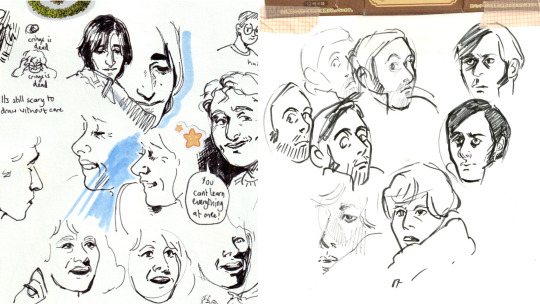
There are some things I've learned over time that definitely helped speed things up though xD
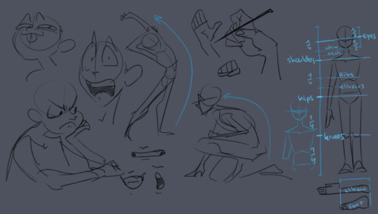
here's some rough sketches I did just to demonstrate what my rougher drawings can look like - also a little diagram (on the right side of the image) of things I keep in mind for the average proportions of a human body!
I tend to sketch very loosely and try to capture the overall vibe and silhouette/rough shapes first before I even think about adding details - there's a certain flow, squish and stretch to everything that's just much easier for me to get a good feel for when I use quick, loose brush strokes and as few lines as possible to convey a concept.
Repeatedly sketching humanoid characters of various shapes, builds and sizes for years genuinely helped enormously in getting not only faster but also more consistent with it!
I'm fairly well practiced with hands and expressions especially at this point since I like to focus on those in my art often, so those come fairly easily to me as well now!
Something I learned along the way about keeping a certain liveliness to my artworks is that sometimes you have to forego anatomical correctness a bit if you want to fully express specific emotions - if you try too hard to keep everything perfectly proportional and realistic, it can make the outcome look stiffer than you might've aimed for - this is something I actually struggle with in my cleaner artworks :'D The ones I do proper lineart for, since a lot of the flow of the original sketch gets lost in the process haha
As for artists/artstyles that inspire me...
There's @/southpauz for example!

Her artstyle is unbelievably expressive and her eye for compositing and her use of shapes is SUBLIME - it inspired me to let loose more with my expressions, exaggerate features a bit more and to push the way I try to vary facial features :D
Then, back when I had that massive Rise of the TMNT phase, the artstyle of it has actually greatly influenced how I draw today!
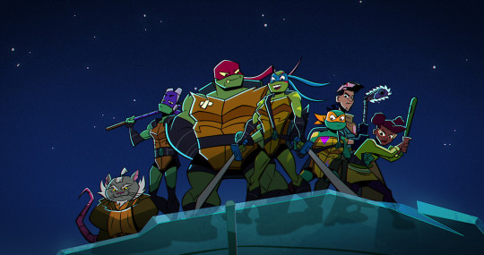
It manages to be detailed and highly recognizable despite its deceivingly simple style - it exaggerates shapes and uses it to communicate personalities, emotions and action super effectively and taught me a lot about utilizing those more efficiently myself :D
And last but not least Ishida Sui - the mangaka behind Tokyo Ghoul (which used to be a highschool obsession of mine)
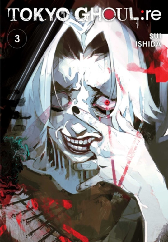
His striking use of colors, textures in abstract, yet symbolically heavy ways and his courage to be rough and expressive rather than looking polished, yet also having such a solid understanding of realism blew me the fuck away as a teen and still does now!!!
His art may have less of an influence on my style today than it used to back then, but I think in my more exagerrated, more horror-esque drawings you can kind of see it still :'D Either way I greatly admire him as both a writer and artist.
-----
I'm genuinely so so flattered that you enjoy what I do enough to give me such high praise, thank you so much for writing me such a wonderful ask <3 I'm glad I got to gush about some of my favorite artists/artstyles for a bit haha
If you have any more specific (digital) art related questions don't hesitate to reach out!! I love giving pointers about a subject I'm so passionate about, we don't gatekeep helpful information in this house!!! <3<3<3
41 notes
·
View notes
Text

"quick" spearmaster animation i just did! i dont animate a lot haha,, i figured i might as well use one of my scug designs because of how simple they are, and there's been a lack of spearmaster appreciation on my end :(
if i were to do this again id draw the keyframes first with the lineart rather than just the sketch,, cause the mane and nose just increase in size lmao
but!! for my first fully coloured and shaded attempt i think it turned out alright!
#rain world#rainworld#spearmaster#rain world spearmaster#animation#digital art#firealpaca#wow i cant wait to take 4 hours drawing this one 1 second animation#oh boy!#:(#no but this was actually kind of fun ill animate again in the future pfft
113 notes
·
View notes
Text

now i get to clear out my 'paste 150x150 WIPs obsessively to check for flaws' sheet!


gonna highlight these three- when i put my first attempt at the lineart+flats next to the more complex official robot pet examples i'd collected, it looked OFF and i couldn't figure out why. my lineweights seemed okay, and it didn't feel unclear to me at the smaller size, and those are usually the areas where my initial drafts need work.
i eventually realized that it was the proportions that were off, and i needed to redraw the feet and hands to be bigger to better match the cartoony proportions of the official pet designs. i probably could have pushed mine even harder than i did, but i think the final lines were definitely an improvement! also you can see when i realized it was missing its lower jaw in my original lines, lmao
#liveblogging my neopet style imitation research#(its not really liveblogging if i'm posting it the day after but whatever- if anyone else finds this useful too then its a victory)#i need a text post tag#centibytes
23 notes
·
View notes
Note
i've admired your art since forever and wondered how you did your inks!! do you use a pen with no pressure sensitivity or just one with a super low one so you can still get tapered but boxy edges? also do you change the size a lot for your detail work? it's so cool, i've always wanted to do the same inking style!
Depends which of my lines you're looking at for inspo! I always use pressure sensitivity, and my pressure sensitivity isn't particlarly low or high - I occasionally change my line weight, but a lot of the time I forget to lmao. I just use less pressure for details.
my most recent work is done in Clip Studio Paint with a textured nib pen brush I downloaded from the free shared resources in Clip Studio, they're a set of Japanese brushes. Before that I was using photoshop, and I used a brush from this huge scam of a brush pen pack, but it did come with this lovely angled rectangle-shaped brush. These were done with that photoshop brush v

vs this, which is the CSP japanese brush. I'm certain I went down a size to do the shirt pattern, keys and chain + some other details for this lineart.

But the main difference between these is the CSP brush is a texured circular brush, while the photoshop brush is a rectangle at an angle; it's mimicing something close to a marker or a pen nip that's being pressed wide. That rectangle base is what results in the blunt edges; the brush itself simply didn't taper that much. I assume thats what it is anyway!
49 notes
·
View notes
Note
how do you make your oc screencap edits?? i also have a td oc and i dont really know where to start 😭
ok so!!! i use firealpaca which is just my usual drawing program. so i'll keep using it as a reference for my steps but of course im sure whatever similar program u use should have similar features
i'll be long winded for funsies as usual 💕
FINDING YOUR SCREENSHOTS
the key to decent td edits is to flat out trace screenshots whenever possible. stock pics will do, but of course itll be a lot more fun and less obvious if u use a screenshot from the show and put it into your new context
in terms of making your ocs, you will likely have to do what someone once called "frankensteining" your pics. this is where you use pics of other characters for their specific features and put them together since your oc doesnt have official screenshots to trace. this also absolutely comes in handy w canon characters! maybe you have a pose but u need them to be sitting. so try to stitch together two different pics to get what u need
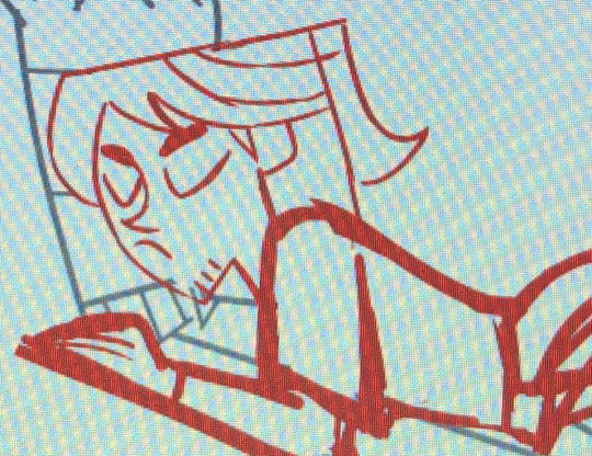
it will look very scary but just trust the process. here is a random example i made using a dawn screenshot (where i removed the background), gwens eyes and eyebrows, and kittys hair

the sketching part is semi-optional. if you think you can freehand the lineart then go ahead but i assume your oc wont be a complete copy of something found in canon and therefore you will have to draw the newer/different features (such as the hair or the outfit) at least a little bit. and sometimes when i frankenstein the pics, my brain gets all overwhelmed so sketching makes me feel better jfbdjdnd
(in terms of my own oc, i screwed myself over bc his body type is so unique i gotta freehand it like all the time 😭
you can see i traced his head from his render (ALWAYS DO THIS BTW!!! TRACE CONSTANTLY), but then the body was freehanded using a canon pic as reference because tracing the pic wouldve been inaccurate)
THE LINEART
yes the iconic td thick, sharp, flat lineart. i achieve this by using a normal pen tool, turning off the pen pressure, and then turning up my pen stability to 40-60 (very high). you could use a curve tool if that works for you! but i would suggest against that for ALL of it bc the tool just wont respond well to rly drastic curves and such
the pen size varies on the pic. if the characters are close-up, itll likely be a bigger one. and then the characters' little details and facial features are usually a slightly but definitely noticeable smaller size. for the most part, ive had the bigger pen size at 13 while the details are around 9. or big size 10 and smaller size 7.
heres my technique:
as u can see, all of my lines go a bit too far. this is so that when im done drawing them, i can go back in and slowly erase where they meet and get them all sharp and pointy. this is just how i personally do it lmao. when it comes to facial features and other stuff that doesnt connect to anything, just get a close look at your reference to see how thick or how thin the edges get and do ur best to erase the edges to the point where they should be
THE COLORING
not much to it! the bucket tool is the best way to go. again just get a good look at your references just in case any parts have the lineart also colored in
THE BACKGROUND
you can find some generic td background pics on google or u could get them from the show and try to erase any character in the way lmao. if ur recreating something like, say, a dunc/ney scene w a different ship, then its very tedious but youll have to do your best to erase the canon characters and piece the background back together.
i like using the smudge tool a lot for this!!! just kinda pulling whats already there towards the characters. to save time, put your drawing visible on a top layer as you do this so that you dont have to edit the ENTIRE background, just what you need
THE RENDERING
ok so heres a big one imo. after youre done, youre gonna have to fuck up the quality at least a little. well not that u HAVE to but like..... to match the standard quality of a td screenshot? ive never seen a td screenshot in perfect hd quality outside of stock art. so u could blur ur drawing just a little bit. maybe add in the teeniest bit of chromatic aberration (just set it to 1 or -1). not ALL of them together but u do whatever u gotta do
my personal favorite is blurring just a little and then saving it as a jpeg (around 65-80%) so that its pretty crunchy and looks all the more real
obviously not a NECESSARY step but just something to point out. especially if ur background isnt the best quality so the characters have to match it
this one from yesterday i didnt even redraw topher bc i was lazy and he looks fine enough. i just put danny onto the pic to cover the other character. so i blurred danny a little bit and then saved it in a pretty low quality so that they match one another. look at those pixels. that crunch.
SO THE TLDR IS just trace and copy your references as close as possible. if you cant find a reference for your character, try finding another character w something close enough
26 notes
·
View notes
Note
hello! i really really love and adore your art style, i really hope i don't bother you with this question but what brush do you use for your sketch/lineart? i really like the slightly pixelated look of your art and im wondering if that's a result of the canvas size or is it effect of the brush :O thank you and have a lovely day!
Thanks! Answered this in the last post but to add on to it part of the look comes from me drawing really tiny. Idk why but it's comfier. Here's one of my drawings and what it looks like on a 2048x2048 canvas for reference lmao

So most of my stuff comes around to ~800x800 pixels, but I still start off on the 2048x2048 bc it just feels better that way
131 notes
·
View notes
Note
Hey bean!!!! I love your art so so much and your comics fill me with joy!! Would you mind sharing what's your process to make them?
Helllooooooo ty!! Of course!! Tbh it’s pretty loosey goosey and procreate isn’t the greatest program for comic building, but I manage lol. I usually start with the dialogue (my favorite thing to write!) which may initially be written blearily in bed at 3am in my notes app or directly onto the canvas. I usually build scenes based on the dialogue, which I’m sure is obvious in hindsight since most of my comics are just long drawn out arguments LOL. From there, I do a very rough sketch/storyboard to get the idea of the page down and how I want the panels to look, expressions, movement, etc. I’ll use a piece from queening the pawn act 2 part 2 as a simple example:

I primarily use the 6b pencil for these two stages. Very rough!! Then I turn the opacity wayyy down and do a cleaner sketch over the top, nailing down more details and expressions. This is also where I will use pose references if needed and warp the lines if I need to make something bigger/smaller (bc I don’t have vector layers and they will get blurry once I resize lol). I also usually add the dialogue text at this stage so I can refer to it without having to open up and squint at the barely-there storyboard layer lol. (More under cut, I am not known for my brevity)
Now I can do the lineart (studio pen!) and draw the panel boxes (by hand like a loser using the monoline calligraphy brush). I do the panels after the lineart so I know exactly how to size them for the characters and what I might be cutting off. I do the background lineart after so I don’t end up drawing more than I need to outside the boxes.
You can see at this point I decided to change Guillermo’s position in the first panel, having his arms down rather than up and removing his glasses - the angle of his left hand ended up being very finicky and I decided I wanted to see his expression (and not worry about his glasses immediately reappearing in the next panel lol). I can now add the background, which I either erase around the characters or use a masking layer on (if I have room for more layers lol) Then I start coloring, primarily using a very plain no-pressure paint brush (custom, for to save my wrist) for base colors and then build on patterns from there, changing layers as needed. I add my cheek color at 50% multiply, pop on the dialogue bubbles, and that’s pretty much it!
Very simple shot-reverse-shot scene, but my process is pretty much the same even for more complex stuff like
I’ll play around a lot with effects and background and lighting if I feel like it or if I feel the scene demands it (like the glasses panel - the Tarantino eyes and the glasses flash add to the dra~ma lol), and one thing I know I need to work on is flow! My instinct is often to expect your eyes to go left to right, down, and left to right again, but it’s really pleasing to have something to follow with your eye -like dialogue boxes. In the above you can see how I warped the panels and the angles of Guillermo’s attack to try to make it more exciting to look at and have a smoother flow. Def better than just two rectangular panels on top of each other, but I could have gone way harder on the angle of impact. Always learning and growing!! I just run out of room so often bc I hate using different canvasses for multiple pages, I feel like I lose the flow if I can’t see them on top of each other lol.
ANYWAY. Long fucking post. If you want to start drawing comics my advice is to Just Do It. The more you do them, the better you’ll get and the more fun you’ll have making them!! I never ever thought I would be the kind of person who does longform fan comics (we love you reapersun), but here I am having a blast lmao. Hope this answers your inquiry even a little bit, I’m afraid I am both long winded and extremely undisciplined!! ❤️❤️
48 notes
·
View notes
Note
hihihi !! came across your tumblr while looking at hermitcraft/life series art (your art is lovely by the way, definitely going into my cool people with cool art collection) , and saw that you use/used krita !! as a krita user, i would love to know your main brushes and canvas sizes, and art process too :D would love to get into things like illustration but no clue where to start ,,
hello! since i get asked about stuff like that relatively often and i'm usually too lazy to answer properly everytime i'll use this ask to answer all of those in one big post :D
Brushes

i don't think i have main brushes? i jump from style to style quite frequently and i love love love trying out new stuff so the set of brushes i'm using for any given drawing can change drastically but there're a few that came to my mind

i've been vibing with the first brush the most lately! it's kinda has spray paint feel to it?? but not really? idk but it's fun to make messy sketches with :D 2nd and 3rd are probably the brushes i find myself coming back to most often bc they're just really basic lol
all of the brushes ^ are default krita brushes bc i dont like downloading brushes from the internet so if you wanna find cool non default krita brushes you'll need to ask sm1 else sorry
(btw my advice: don't care about brushes. limiting oneself to a certain set of brushes can also limit the creativity so don't do that)
Canvas Size
my default canvas size is 2000 x 2000 px and it usually goes up from that if i need other proportions for a piece - basically that means that the shortest side of (almost) any of my drawings is minimum 2000px (2000 x 3000, 2500 x 2000, etc). for pixel art it's the same rules but for minimum of 200px!
social media eats the quality of images really hard so i usually don't see the point of drawing on bigger canvases than that ¯\_(ツ)_/¯
Art Process
there isn't much to say about the art process for me bc i'm sure my process is not too different from everyone else's process lol for lineart stuff it's the usual:
super messy, super quick sketch
cleaner sketch (depending on the art style and the vibe i'm going for this step can be skipped)
messy colouring (also can be skipped sometimes; this step is just for myself to find the colour palette i wanna use and to determine whether i like the drawing so far or not so i can change the idea or completely abandon the piece)
clean lineart
flat colouring + shading
adding small details, colouring the lineart, making lighting prettier, etc. (this one cannot be properly described bc for me it's usually a mess of tweaking everything and nothing until i like the final product)

for lineless stuff i don't have a process - i put pretty colours on the canvas and just,, Pray for the best or smth lmao
it most likely won’t be helpful but i do have youtube channel where i (once in a blue moon) post speedpaints! they might help in understanding what my art process is
and that's it i think? i hope this was useful at least in some way :D it's not the best idea to ask me about any of art related things bc my approach to art can be summarised with throwing stuff at the wall until smth sticks lmao
#asks and stuff#this is a Mess#i got very sick exactly on january 1st (good start of the year) and i'm still sick#and bc of that my brain is slow at times so#if anything is incomprehensible i'm sorry
46 notes
·
View notes
Last Seen Blogs
childofthemoon86
Moon86
wilisyourthrill
You've reached the demon helpline
introspectant
INTROSPECTION
m0ther-of-p3arl
tumblr's #1 owengejuicetv fan
byulmoon
moon star