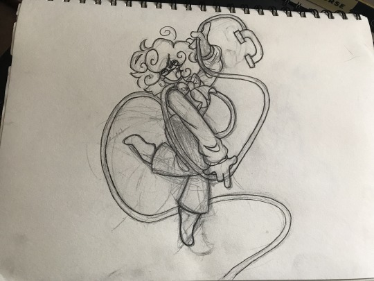
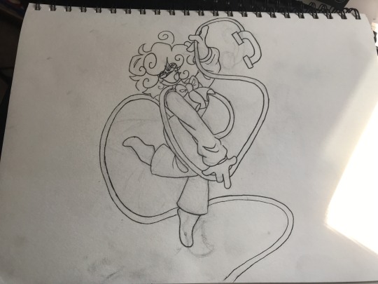
#The lineart- The fluidity of their poses
Text
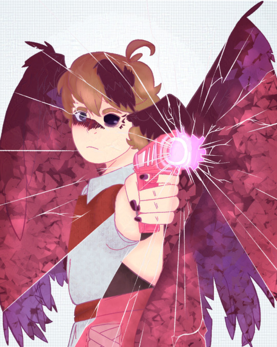
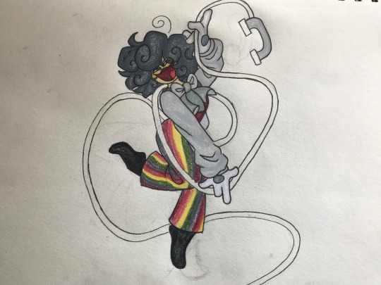
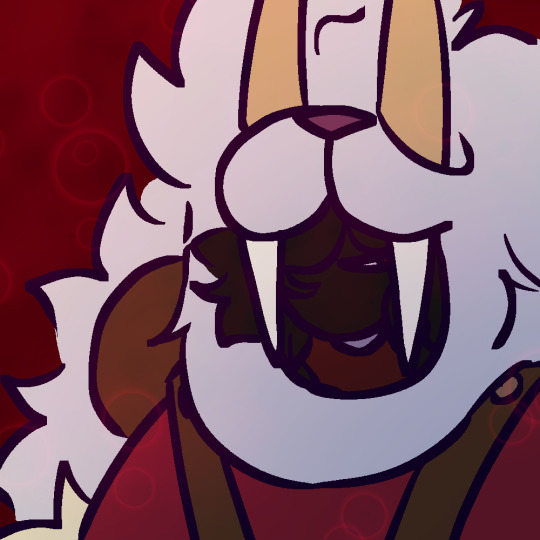
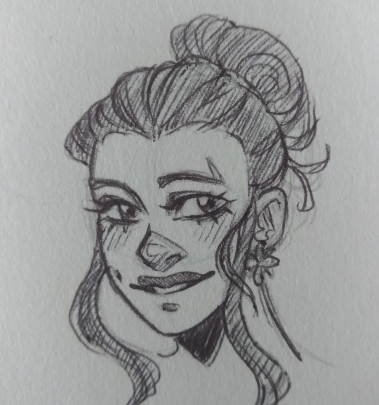
Kitsuneisi Art Study!
This is an art study of @kitsuneisi, using mostly references from their tumblr. I wanted to do an art study and was super excited for the new DDVAU update so woo!
I've written some notes in the margins of each drawing and would love to go more in-depth about both our styles and the general process, but this post would be so incredibly long so I'll refrain for now. (I might break it up into separate parts and turn this into a master list one day).
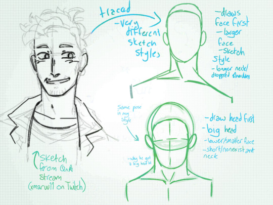

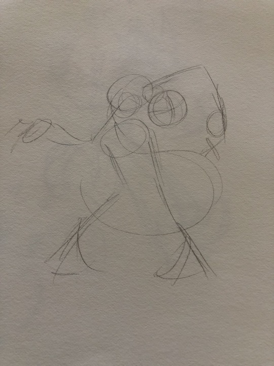
This first three are the base of any art study: leaning the proportions and sketching style of the artist! The first image is from @xmaruu11's first Twitch stream, which I discovered a few days in my study and watched to get a sense of Kitsuneisi's sketching style.
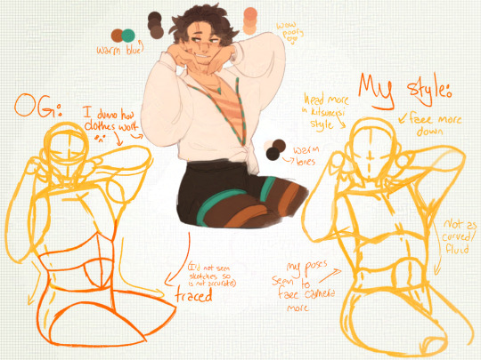
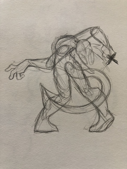
The main difference between our styles is that Kitsuneisi's poses are more fluid and they draw the face first, whereas my poses are stiffer and I drawn the head first.
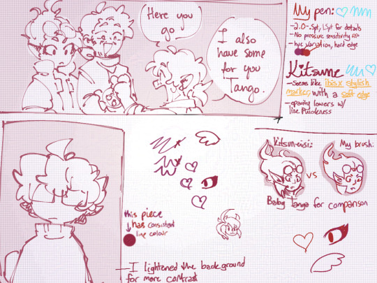
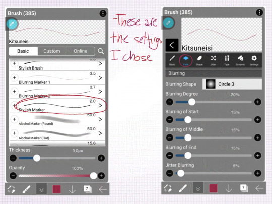
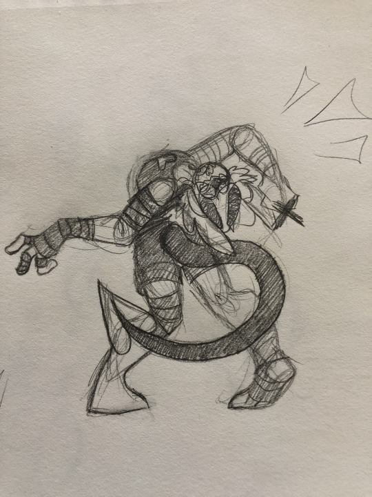
Kitsuneisi and I use different drawing programs, so I couldn't quite make a brush that matched theirs; from looking at their Valentine's comic (which I chose so that colours wouldn't distract me), I noticed the line variation lent a lot to the fluidity.
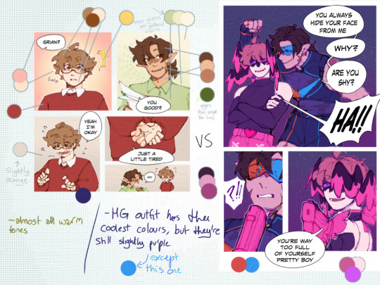
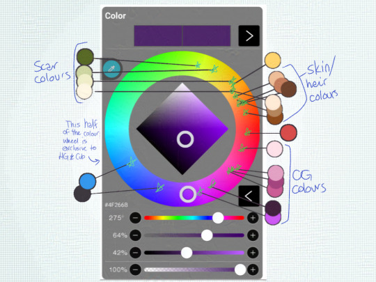

Colour theory my beloathed! While I was laying out the colours for the Scar drawing, I noticed that the blue Kitsuneisi used was very warm-toned. In almost all of the light-hearted scenes, they use warm colours or warm-tinted colours, while the more serious scenes use darker or cooler tones.
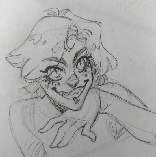
The lighter, warmer backgrounds in the office scenes/G being a simp give a more wholesome feel, while the darker backgrounds in serious moments give a more intense atmosphere.
Now, all that's great, but it's time to put it into practice!
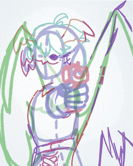
For my sketch, I tried to use a more dynamic pose and focus on making the face a focal point.
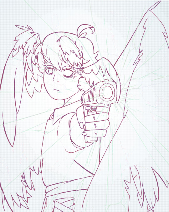
In my lineart, I tried to vary my line thickness.
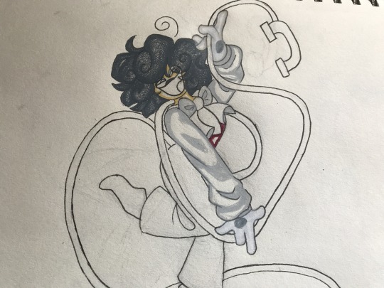
For the flat colours, I used mostly warm tones and tried to match the colours used in the comics, but my love of cool tones took over the Mother Spore wings. I think it makes a nice contrast, at least.

And the final image! (I'll be posting it separately). The background adds a better contrast and helps Grian stand out despite how dark some of the colours are. I'm honestly very proud of this piece and hope both Kitsuneisi and Maru like it too. :)
945 notes
·
View notes
Note
What's your art process?
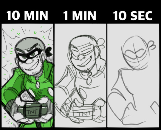
For my daily sketches I usually start with very rough scaffolding (this takes about 10-15 seconds to just get the pose down)
The reason why it’s so quick is that if I’m any faster I tend to lose that fluidity
after this I start blocking out the figure from top to bottom (I start out very rough and slowly refine it, almost like wood carving)
Then I clean things up and add features like clothes and hair
If needed I’ll add splashes of color
Then I’m done
For finished traditional art pieces it starts out the same way with a sketch, blocking and finish up, but then I take an outliner and refine the lineart even more and erase the pencil work
Then I block out where the colors will be the strongest like around edges or where there’s less light
then I finish it up and blend
For digital art it’s pretty similar, I use CSP for my digital stuff
I start with a sketch on a raster layer trying to keep the same rules as before- don’t spend too long on the initial pose
I block and sketch on the same layer so I end up with this really messy looking thing that no one else can understand besides me
then I start the lineart on a vector layer with a dark purple because it makes it look richer
then I Color with the fill tool

then I start blocking out the shading with multiply and add layers (I didn’t do this on the merchant one because it’s a toyhouse pfp)


I tend to include light scatter on my multiply layers, which is rimming the edges of your shadows with a different contrasting Color and blurring it (at least that’s what I do)
I try to keep light scattering realistic because not all surfaces do that, and it’s also important that not every single edge of the shadow has this (try to make it make sense, it’s only where the shadow hits the light, not the edge of the lineart)
I also sometimes add white highlights around the edges depending on the intensity of light
after that I just go crazy with filters and overlays until i get something I like
I Hope that explains it, I don’t really have a lot of complex things happening and I tend to mix these steps up as I go
I’m not a very consistent artist so
yuh
10 notes
·
View notes
Note
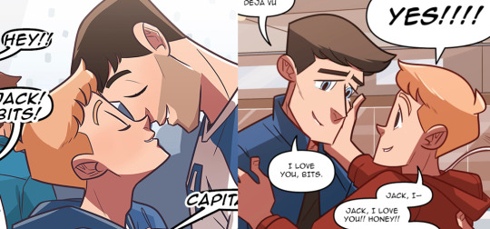
Can we talk about how much Ngozi’s art changed just over the first year??
YES, we can.
ngozi's art style changed a lot over all four years (by which I mean... seven years, irl). it matured the most throughout year 1, became sharp and fine-tuned between years 2 and 3, and then became more efficient throughout year 4.
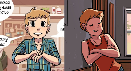
(1.03 / 1.22)
it's literally impossible not to notice what drawing hundreds of comic pages did to her lines. they're much steadier, finer, and she has a lot more control over her movements, which makes the characters look less bulky [left], and more fluid and natural-looking [right]. but maybe the BIGGEST change is in the coloring. the first half of year 1 was flat and unsaturated, with minimal play of shadows and depth. in the second half of year 1 the color palette for each character was finalized, and is a lot richer than in the beginning.
this skill set also extends to angles: while on the left blurry lines are utilized to mimic perception, bitty still looks more or less in the same dimension as the background. on the right the angles, shadows and proportions do that work, and it's clear that bitty is standing closer to the viewer than the window.
and perhaps inevitably - ngozi just became a better comic artist. bitty's facial expressions in the beginning are exaggerated and unrealistic (to serve a specific goal), but as the year progresses ngozi managed to express micro-expressions far better, and tiny shifts could suddenly convey fear, or shock, or pain.

(2.05 / 3.13)
the changes between year 2 and year 3 are the least obvious. I'm almost tempted to throw in here the matter of technological advancements - there are exactly two years between these two updates, and things like photoshop versions or new editing apps can mean a lot in art quality.
but regardless, you can see those same things still getting better (albeit less dramatically). around year 3 ngozi stopped color blocking and started using more gradients, which gave even more depth to the characters' appearance; her lines were still getting finer; and drawing even MORE comic pages means the characters' fluidity is now perfected, and their poses are less comic-y and almost completely natural.
if it isn't obvious: year 3 is my fave, art-wise.
in year 4 we see a reversion. if you look closely (or even not that closely) you can see ngozi went back from using gradients to using color-blocking, and the lineart is more reminiscent of year 2 than it is of year 3 (heavier, less integrated with the coloring). still, the quality of the art makes it clear that this is not a reversion of skill; this is a conscious choice.
(4.02 / 4.25)
I have some theories about this choice - all revolving around the fact that coloring is incredibly time-consuming, and omgcp was already taking longer to complete than probably anticipated. maybe people who were here before me heard about it on patreon and could correct me, but my guess is that either she was working on other projects at the same time, and this art style is quicker, more efficient and requires less laser-precision to complete, or, possibly, she hired someone to help her do the coloring (which isn't unheard of nor unreasonable, when you're putting out SO MUCH art), and it'd be nearly impossible for them to get close enough to her style so she had to simplify it. this possibility is reasonable, but considering that she was still doing fanart for fun in other fandoms, also less likely.
all these changes mean that year 4 is neater and cleaner in appearance than year 2 or 3, and some slight changes to the color palettes also help smooth things out.
#asks#omgcp#omgcheckplease#forgive me for this long analysis I just love the omgcp art style SO MUCH#text
141 notes
·
View notes
Text
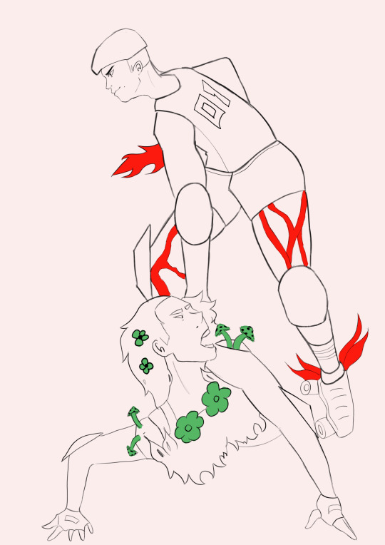

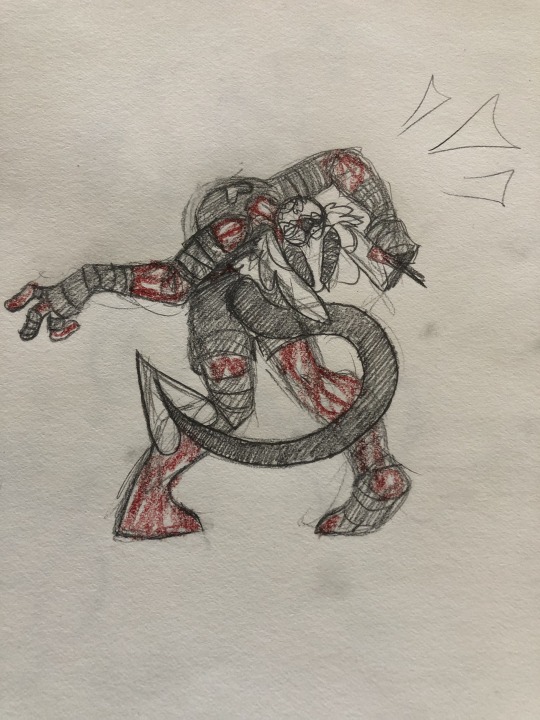
Redressing Perseus slaying Medusa
Procreate on iPad
I took the sculpture of Perseus slaying Medusa and redressed them in a roller derby setting where they fight to the death. The teams are fire against earth fighting against each other. Fire team currently winning.
When I initially saw this sculpture, I immediately thought of sports where fighting is allowed and even encouraged, which brought me to roller derby. While looking for references I found a lot of roller derby teams have special costumes and are often themes. I thought of teams that would constantly hate each other and came to the elements fire vs earth. In this setting fire would have a clear advantage so the fire team is Perseus in this case, taking out the earth team. While drawing I couldn't decide on a lineart brush and it shows in the different lineweight between the characters. Next time I will choose a brush and stick to it. I also think that some of the fluidity of the pose is lost with the stiffness of the lineaert. I will focus more on fluidity and the line of action.
Link to Original piece
Pinterest References
0 notes
Text
real question... how do yall do like. nice sketches and draw so much so quickly... everytime i try im like Oh this looks bad it needs color Oh this looks bad it needs shading Oh this looks bad INTO INFINITY!!
#i know the answer is probably just Sketch more! but im so badddd at it#i lov painting so much................ so much#but my like. lineart and posing and like.. fluidity ? idk is lackin#i think it just looks like i try Too Hard in my art and then it looks stiff and boring.. V_V#i just feel Le Discouraged XD#negative //
7 notes
·
View notes
Note
This my have came off as rude or weird but like
Is there any tips on sketching?
Like the way you sketch is just
✨ Chefs kiss ✨
Not rude at all!
And mm I never thought about it actually since I don't exactly have a set process per se with sketching, unlike I do with other parts of drawing, but some tips that I believe would be beneficial if you want to improve on it:
Life drawing! Nothing better for practice than sketching out the things that surround you. You obviously don't have to go out for this, just look up pics of what you'd like to practice. Personally this one helps me when I'm having a hard time with proportions when going off muscle memory alone so going back to basics is a good way to fix that
Get comfortable with action lines. It can make or break a drawing later on if you don't capture the fluidity of movement that you need in a pose early on
Don't add lots of details from the get go, try to pinpoint the pose you want, then the proportions and then add the rest
Try to get comfortable with expressing what you need in fewer lines (something I still struggle with tbh)
Try out warm up sketches when you feel like you need to. I won't be a hypocrite and say you absolutely NEED to do them at all times since I myself don't bother with them often but sometimes doing little thumbnails to see what pose/composition/etc you like best can help immensely
These are assuming you're sketching as a base for a full drawing. However if you're asking about the sketches I occasionally post like my doodles of Donna here's how I personally go about those:
A kneadable eraser is your best friend (i personally use one from faber castell)
My steps are: very loose sketch to pinpoint proportions - erase that until it's very light - more detailed sketch - "lineart"
Ballpoint pens tend to be more forgiving with mistakes than inking pens and allow you to do very light lines so I use that for these sketches (tho it's entirely a preference thing and I mix it up sometimes)
Tho a little cheat sheet: ballpoint pens are good if you want softer looking lines while inking pens are good for sharp, clean lines, both equally useful to master
Ft a comparison between ballpoint and inking pen respectively:
Tho be careful about erasing something under the ballpoint pen lines since it tends to smudge
Consider using colored pencils as opposed to graphite since graphite tends to smudge but again, personal preference
Not sure if this was the exact answer you were looking for but remember that everyone has their own processes and it's important to get your tips from multiple sources until you put together something that works for you💕
49 notes
·
View notes
Note
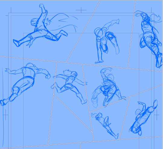
How do you perspective? All of your fight scenes (as well as, notably, Kendal's little parkour across Windscrest) show the characters at the coolest angles. I've tried working with action figures (and goodness knows how often I've just contorted my hands in front of myself or run to a mirror), but foreshortening does NOT like to play nice.
Oh man, drawing figures at weird angles is always a major trial.
I don’t tend to use action figures because their range of motion doesn’t tend to actually accurately portray a human body’s flexibility. Instead, I get a lot of mileage out of the scribbly storyboarding phase. If you’re initially sketching a character as a loose collection of lines and oblongs, it can really help you sort out how an actual complex human body would look following the same arrangement.
This is what the storyboard for today’s page looked like:

Super scribbly, not very nice, some characters out of proportion, etc. But this is the phase where I figure out the complicated poses - you can see in the middle section, Alinua’s pose is fully sketched, even the parts that’d be outside the panel. This let me make sure her movement was overall coherent. It also lets me see where I’ll be dealing with foreshortening - her right arm and leg will need to be drawn in perspective.
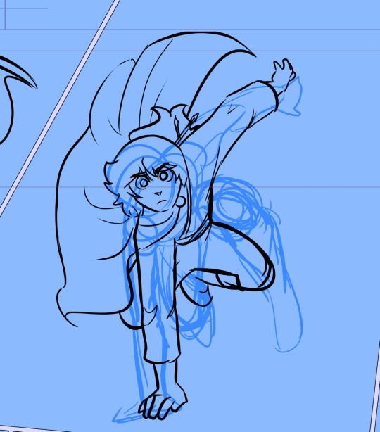
The most complicated pose, of course, is the flip in panel 3. I actually drew most of that pose upside down because it made more sense to my eyes from that angle and I could better see what was and wasn’t making sense.

It gets across the general arc of movement, but you can see I had some trouble with his right arm - it’s hunched up and pulled back, putting a lot of torque on his torso, so his shoulders are twisted away from his hips. Some artists draw from a “skeleton” of simple lines and ball joints, and while I don’t tend to do that, it does help clarify the motion:

Like this, kinda. From here we can see how curved the pose is. This pose doesn’t have much foreshortening in it, except for the right leg, so when I start in on the lineart, that’s the only region I’ll need to really watch out for.

tadah! mostly follows the sketch, with a few adjustments for proper scaling and fluidity of motion.
But for how complicated this pose is, it doesn’t really deal with much foreshortening. He’s pretty stretched out, and the angle’s not too complex. That parkour page you mentioned was a MUCH bigger pain in the ass. Here’s what some of the storyboard looked like for THAT page:
Yikes. But some of these actually demonstrate a foreshortening trick I’ve learned, most notably this mess:

Notice the spiraling squiggles on the arm and leg? Sometimes when you’re drawing a limb foreshortened by the camera, it helps to think of it like a cylinder you’re drawing circles or spirals around the outside of. From a side view, those circles or spirals would be kinda far apart, but if you’re looking at it head-on, they’ll appear much closer together. Then, once you squiggle something that looks vaguely right, you can draw the actual lineart over it, using that squiggly cylinder approach as a guideline:

Doesn’t FULLY line up to the storyboard because I had to use proper anatomical proportions in this stage, but it helped keep the pose nominally coherent.
By the way, some of these poses actually changed when I went in to do the lineart. For instance, the one in panel 2 looks really cool in the storyboarding stage, but when I started lining it I realized the legs were angled way too far forward for how the torso was oriented. It would’ve looked cool, but it wouldn’t have felt right.
Overall, when building this skillset, I’d recommend starting with life-drawing and going from there, since that’ll give you a more intuitive feel for human anatomy and flexibility. That way, when you’re doing the storyboarding phase, you’ll be able to tell what does and doesn’t feel right when you’re laying out the pose. At that point, the lineart is just icing - you’ve already sketched out the movement you need.
88 notes
·
View notes
Text
Y’know as an artist and as someone who has been in an huge art block for months now, I sometimes catch myself after finishing a drawing/painting just absolutely hating it, expecially because it looks like the stuff I would do years ago when I had less experience, and I aways end up looking for inspiration and questioning what I’m doing wrong, and I think I know why-
So what I usually find in common with my favorite artists is the fluidity they have in their style, not only on the poses but also in the backgrounds and lineart and in the way they paint. I’m curently studying and trying to have a more versatile art style, and I’m gonna list the things I gotta remember that help me get through this that might also help you if you’re in an art block!
-don’t be scared to try new poses/styles/perspectives/ etc
-of course learning how to do landscapes and backgrounds is important but you can have anything as a background, like literally anything! Try different aesthetics, use Pinterest wallpapers, make a collage or smt! Anything works!
-draw or animate on top of photos or pictures! (Ofc if you’re gonna post, don’t forget to credit the source!)
-experiment with new softwares and techniques! try stuff out till you find what works best for you and what you can implement in your style!
-use new mediums! if you’re stuck like me, trying on new mediums could help to make your creativity flow again, for example I started using oil pastels recently and they’re awesome, it helped me a lot!
-try to get into new fandoms or AU’s! That seems obvious but usually I only get inspo or ideas when the fandoms i’m in has new content (which is a problem cuz most of the fandoms I’m in are dead but that’s okay)
-try on popular art trends or chalanges! it doesn’t personally work a LOt for me but it might help you!
- go to different places to draw or paint! Maybe go to a quiet place or a place that inspires you, maybe even draw from life while ur there
- just have fun! I know that’s a obvious one, and sometimes it’s very hard to have fun or concentrate on art when there’s a lot going on, but (in my opinion) that’s the most important step for you to get out of an art block. I also know it’s sometimes hard to draw what we actually would like to, but know that if it makes you happy or helps you, you should definitely try to!
#sorry for any misspells#English isn’t my first language#I hope this helps anyone that needs#art block is a bitch#but I trust you!#art#art block#digital art#ghost being ghost#art tips#creativity block#inspo#inspiration
6 notes
·
View notes
Note
I’m not sure how to word it but there’s something very dynamic about your poses! Like even when they’re just standing there, there’s a sense of weight or fluidity. Like the best of figure drawing. Your style is also very recognizable although I can’t quite pin down why - it’s like this balance of stylized features but still very realistic proportions? Like, it’s cartoony but the eyes are closer to a realistic size and there’s depth to the facial features (esp noticeable at 3/4th or profile views) and it’s clear you have a good grasp of anatomy (wow this got way too technically rambly). Your lineart has like hella nice weight to it too!
AA Im glad u say so T_T I always thought my poses were too stiff and tried to make them more interesting to look at any way possible (pro tip, hands or leaning make for a nice touch, i've learned)
Having my style described like that is such a relief because i strive for that look lmaoo like, i like a little realism, but i dont want the characters to look like the actors too much, you feel me?
No comments about the anatomy tho, I mostly wing it!! Refs are an artist's best friend
6 notes
·
View notes
Note
Do you have any tips for drawing cartoons?
Keep your wrist loose, mostly.
I usually take anywhere from 3-7 minutes doing a basic gesture pose, to keep the fluidity and momentum in the art. This exercise is really good to help you get a better feel for working quickly under a time crunch, and how it feels to do so.
I’ve also very recently opted out of the whole “lineart” stage in my recent arts, and coloring the sketches instead. I’ve found that when I try to line over a sketch I was really happy with, it loses some of that fluidity and becomes more rigid, like it loses character.
Don’t be afraid to go off model, as well. Stretching, squashing, and twisting a character in poses and facial expressions are a good practice to get into, especially since cartoons are known for their ability to over-exaggerate.
Even in human characters (see Tom here)!
#fizzles talks#anon#anonymous#i'd probably be able to make a more comprehensive guide later for patreon supporters#but here's the basics!
168 notes
·
View notes
Note
hi! i know you probably get asked this a lot, and im so sorry to ask, but i was just wondering if you had any tips for those struggling to find a unique kind of art style? i personally stick to realism, but ive always really wanted to have my own style (if that makes any sense), but i tend to struggle a lot when it comes to that! thank you so much && i rlly love your art!! keep up the good work !! :-)
Hi! Actually no, I’ve only ever gotten one and I thought it was a joke so I never answered ^-^’ I’m happy you asked though, and thank you!! :o❤️
It’s really good to start with realism because it’s something you have to learn no matter what style you draw to get a good feeling of what should go where (and you don’t have anime as a base skill and have to go back to learn real anatomy later on, which is a real fucking pain :<)! I usually train by using quickposes, it’s fun and simple :)
Then, of course, comes stylisation.

This is all bout finding your sweetspot. I used to copy styles to see if I liked them, and when I didn’t, I jumped to the next in hopes it would work better for me. This didn’t work because a style is a compilation of things the artist finds apppealing - we all have our own mixes. What helped me in the end was to choose my ten top artists and study just what I liked about their art, as in, why I was drawn to it. Like: I like the way (all on insta) @/lovisb proportions her faces and has fluidity in her poses; I love how @/z.pico drawns legs and arms; I love how intense and expressionful @/kimjinggus draws eyes and lips aso!
I’d reccomend to do this and to study their art in general, since there is stylised realism that you can draw insperation from (like (on insta) @/kildren and @/iriscompiet), then toggle all these pieces together and eventuelly you will have mastered your own art style (and don’t worry about it being an immediate thing, because it’s going to take time for you to connect the pieces and see what you like with what)! The same goes for colour and the way you do lineart.
Imma be real and say that most of the AFTG art is things I’m not overly proud of, just because I’m taking barely no time to check fluidity and proportions and stuff... the fact that I’m doing lazy noses for example. I enjoy myself some semi realistic, clean western comic-ish styles, like:


So do things you can be proud of, becuase otherwise it’s easy to be discouraged. Also, my style still hasn’t set because I’m still figuring out just what I like, just scroll through the art tag and you’ll see. Don’t stress it, it’ll get there eventually ^-^
(It’s a bit all over the place, but hoped it helped! Good luck! :))
138 notes
·
View notes
Text
w h aaaat i only have three more of these countdown hummers left!
holy heck, honestly this might be- with the organization and day-by-day of it all- the most ambitious art thing I’ve done yet. like stylistically these are very quick illustrations by my standards at this point... they don’t take me very long once i get the poses sketched out... but in the past I’ve had issues with keeping up on daily art for more than a few days, and this project has really kept me exercising my art muscles and improving on my fluidity with lineart on a more... continuous basis. anyways i’m just rambling, but i’m honestly proud of me for keepin’ keepin on
15 notes
·
View notes
Note
when you were first getting into art, what and how did you draw? (like did you just doodle ur masterpieces on pieces of paper and posted-notes or did you have a proper sketchbook) how did you find motivation? bc ive been trying to draw but I always get unmotivated and stop while still wanting to get better just by doing nothing.
REALLY LONG, LOTS OF ADVICES FOR ARTISTS :
TL;DR ; skip to the HOW TO ACTUALLY FUCKING DRAW part bc i have a megaton of shit to say lol + The MOTIVATION part
mmh… I’ll get into details with this one tbh bc it’s a long ass process ahah :
I live by the sea ; when i was youung i used to draw TONS of boat, but like, dollhouse boats, you could see the insides and stuff ; i loved to add tiny details and stuff, and imbricate everything together !
around 8 or 9 yo, i went to the public library with school and discovered the wonderful world of mangas ! I basically… Copy pasted an entire Mermaid Melody tome x)
For about 2 years i alternated between reading mangas and trying to copy them ! Then i just kept drawing in the margins of my schoolwork for about… 5 years ! I have a Fuck Ton of sketchbooks of that time, it was… The start. Lol. Never say it’s bad because it’s never bad, just not there yet !!
Around my 13 yo, i went every saturday, for two years, under a bookstore ; there was a cave, and drawing classes ; that teacher was mean and harsh and stuff, but like… Not really. He would take away my eraser for the class, force me to use pencil, to draw something else (bulky boys instead of magical girls).
I’ve learned a lot, more in terms of How To LEARN to draw than to draw itself, but i still progressed a LOT !!
Then i kept drawing by myself for a year and i really worked hard on it ; about hours a day, trying watercolors and stuff ; i have a real problem with colors in traditionnal art, but i’m much better with lines (i should scan some RAD stuff i made in the weekend, yall ive never done anything this good i stg i dont know why i always forget im so much better on paper)
This gets us to my sweet 16 ; i have to year of advance, bc i got ‘’’promoted’’’ idk how to say it ; anyways, i entered my (current) animation school for the first year at 16; vERY IMPRESSIVE AND TERRIFYING.
And i learned. A fuckmegaton. Of shit there.
Now i’m going for my third year there and i can make photorealistic marmora blades and cyberkpunk decors if i want to and that’s rad, but here is
HOW TO ACTUALLY FUCKING DRAW :
I have one HYPER important advice, and i’m keeping it to heart since i’m like, 11 : Have. Sketchbooks. Please !!! It’s very important. Here’s why :
You keep everything with you in one place. You have 1 sketchbook, it’s basically easy to take every where (a A5, or A4 are pretty easy to carry, i have like, 12 of those, and around 8 of A3)
You keep track of what you’ve done. It’s super important, bc first you can cry of laughter at your old stuff bc its cute but not so good, and second, you can just be like ‘holy mama’ and see how much you’ve improved
It’s very important to be organized. I WORK in art, and trust me, if there’s something that i’ve learned this year through tears and missing files and bugs : Be. Impeccable. Now if it’s for fun, go a little loose, and just have a folder for art on your computer, and a sketchbook, no need to stress, but the better you try to keep a record of where is what, the better you’ll see whats wrong
Notebooks are friends !! You can draw, write, glue stuff, make notes, lists, everything !!! I have my life in those. It’s more important to me than any of my phones.
Be proud of it. Like, not everything, duh ! But try to tell yourself than it’s like a RPG ; even if it’s only 2 xp here and there, one day you’ll beat level 40, and that’s super important : art is. Fuckin. Long.
I cant stress it enough. It’s soooo long !!! SO LONG !! it’s years. It’s like karate and fishing and ANYTHING. To be good at it, it takes time, but it WILL COME if you keep trying. There’s no secret passage.
You’re gonna me it, believe in me who believes in you.
Use. References.
Coming from a little shit who’s got a really good visual memory, that can sound like bs, but i stg everything is always AT LEAST twice as good if you’ve used a visual support.
I’m not saying COPY EVRYTHING (even though thats a good training) I’m saying, if you really want to do that asian tiger, please have at least two or three pictures of it nearby. Take photos of your hands, and stuff !
Make it harder.
No eraser.
Paint.
I draw all my backgrounds on my sketchbook with INDIAN INK; no returns, no refunds.
Ink, Ink, INK !! Don’t allow mistakes.
And if you make mistakes :
New page, restart
It’s okay
It’s for you
I once started back again a whole EXAM bc it was bad, i got one of my best grades
You’ll improve and be more assured if you know you just have to DO IT. Trust me. It’s VISIBLE; if you can erase, you fidget and hesitate and ‘’kbeujebez hahhaaa idkkidsd’’ ; stop ; do it, and if you don’t like it ? Try again, there’s no time limit
Draw as large as you can
There’s no interesting story here, it just helps. Bigger movement of the hand, more place for details, breathing lines
Thin lineart helps
Thinner. Make it even thinner
Break the rules, but not the ones that structure your art
Big lineart ? Why not
Unfinished lines, vaporeous colors ? Pretty
Cubism is actually based on extensive and intense practice of classical art, it’s not wibbly wooblly ; the anatomy is more correct than you think
Structure and composition are important, but so is movement and life ; choose your fighter ; mine is fluidity and fun, i’m like, a rogue/archer in drawing. Some people are dwarf fighter. That’s amazing and great.
Don’t be afraid to do nothing
Pages and pages of my sketchbooks are actually just lance facing right and smiling, you know…
Sometimes it just doesnt work : two ways :
Take a break, Kiki’s delivery service style
Keep trying, break your art until it obeys and comes back
Take breaks. Breath.
Don’t compare. I do it, it doesn’t help at all. You’ll make it ; and if you compare, keep in mind that everyone’s different
I’m not gonna lie, it’s NOT easy, it’s even hard
But I really, really think it’s worth it
MOTIVATION :
My main bitch
I’m always pumped for art because i can LITTERALLY NOT do anything else ; i love reading and writing and stuff but at the end of the day i just want !!! to draw !!!! aaaaaa-
Fall in love with it, and with the possibilities ; i have stories to tell, tell me yours ! Do your best, one day it WILL work
Actual advices :
I have an inspiration blog where i just reblogs stuff i like to draw them later
Find a picture, copy it. Do it again. Change the characters (i have 2 ocs and Lance and Keith as default characters) in the pic.
Like an artstyle ? Break it to its very core, analyse it, copy it, redo it, trace it and ABSORB it. Don’t copy/past, LEARN from your heroes.
Do what you like. I have 86578 pieces of voltron, this is not a coincidence. I have ENDLESS ideas for this show, wtf.
Try new things. Buy indian ink im begging you. It’s so cool.
Have a game with yourself, or a challenge. STICK TO IT.
Study. When you’re bored, usually it’s because you’re stagnating. Make it harder or do hands until you cry.
Love your backgrounds; make backgrounds, study trees, and tokyo streets, and venice’s bridges. Decor is just as cool as characters, if not more
Mess a little with everything. My roomate more than one found me stained from head to toes trying to DO STUFF
Draw outfits. Draw what you want but can’t afford
MAKE YOUR LIFE A COMIC. Remember those sketchbooks ? Make a comic a week/month/every full moon, whatever, and draw your life (mine’s the roomates au lol)
Prompts blogs are cool too
Make fanart of a fic you liked ; you have the characters and the pose already, you just have to illustrate ; double bonus, you probably will make a writer’s day, if not year !
That little movie that plays when you listen to your favorite song ? DRAW IT
Your favorite scene in your favorite movie ? Redraw each shot. On post it. Plus it looks awesome afterwards to have the infamous TREX scene of Jurassic Parks in post it
Get bored. That’s inevitable. Dance, scream, get back to it. Walk, draw everything you see.
Make a paper google map street view : Take a walk : every 50 meters, draw what is in front of you.
Snapchats your friends. Draw their snapchats when they answer
Draw maps. Invent places. Invent bikes, and hovercrafts, and monsters. Make your everyday inventory. Make your life a video game, and do the concept arts of it.
FETCH your inspiration. I have approx. 20 artbooks, full of drawings and concept arts of my fave movies/games ; take what you like and add it to the story you have since you’re 8. We all have one.
Ask for it ; your sis, your mom, me even ! If you dont have ideas, someone will have them.
WELL i’m gonna stop there, even though i got like, 9864567 more to say, but with this you should be fine ! Anon, i’m rooting for you ! we all start somewhere, just hold on!!!!
#Anon you'll do it !!!!!!!!!!#asked#artist advice#art#i put my heart in this omg#it's 1.5 K WORDS#wtf#but yeah#you just gotta do shit and mess around
91 notes
·
View notes
Note
Originality/Appeal: 7/10. Anatomy: 5/10. Color choice: 3-4/10. Lineart: 7/10. Posing: 9/10. These scores are in reference to each other, Posing And Originality design really catches attention and captures character. Line weigh varies but adds fluidity. I think you could afford to step away from safe colors. Going more towards contrasting. Anatomy is showing really good signs of understanding but I think muscles might be in your way at times. I really love your designs! -ResiRp
@resirp ! Hi and thank you!
I’m not sure what you mean by safe colors? But I’ll definitely be checking out some color theory tuto to help me. As for anatomy, this is the bane of my existence. I’m improving very slowly though :’) Thank you for your comments!
#also i really love muscular trolls lmao which doesn't help#since im pretty bad at muscles#but dear lord do i try#( nameless investigator. )#( answered. )
1 note
·
View note
Note
How do you draw so fast? I feel like it takes me forever to get skeletoning/posing done, much less clothes, hair, etc.
for this specific style of mine (aka garbage) i do one really messy sketch, then draw thin lines on top as fast as i can. the goal is speed and fluidity moreso than precision and anatomy! this is just how i approach this one look, though. if i want to color something and make it polished, i’ll spend a LOT more time on the prepwork and making the lineart more solid.
2 notes
·
View notes
Last Seen Blogs
springwhispers
Spring whispers
2-gay-2-furious
all about a man

lasotras
Del DICHO al HECHO hay un TRECHO.

wordvomitbylindsey
Word Vomit: A Simple Woman's Honest Opinion
inourtownofpanem
Now at inourtownofhawkins