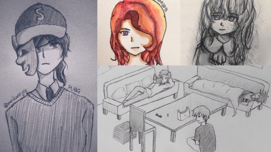
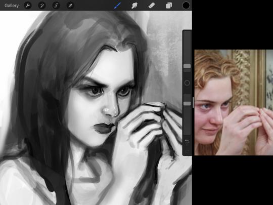
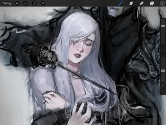
#also i did this with my wacom instead of my ipad that i usually draw on
Text
[owl house's your choir kids]
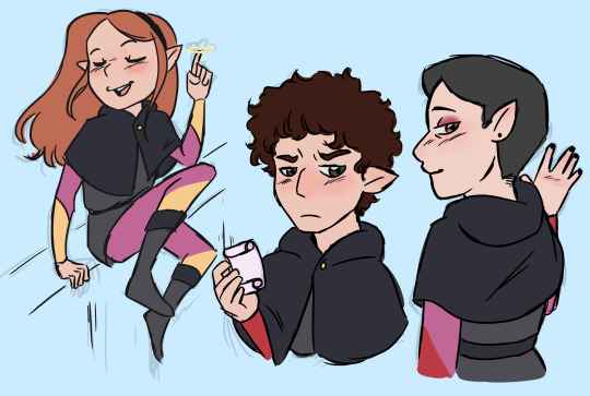
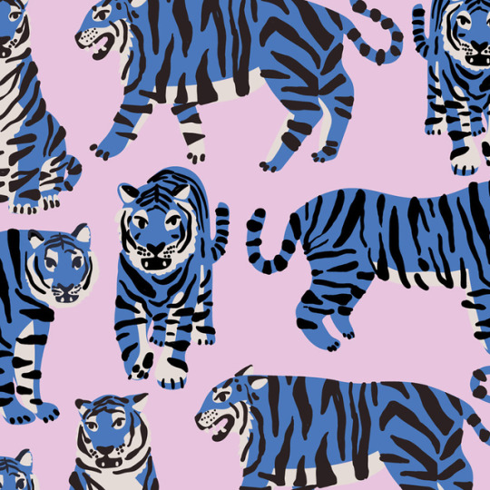
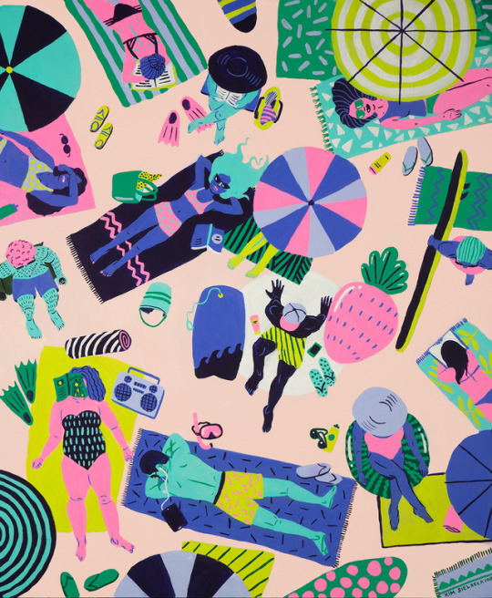
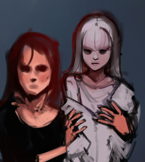
#rtc#ride the cyclone#ride the cyclone musical#mischa bachinski#noel gruber#ocean oconnell rosenberg#not. super happy with Noel here i was having trouble translating him into the toh style#but i tried. my best#anyways i have ocean pegged as doing all of the tracks#but i didnt wanna bother with all those colours#so her uniform only represents abomination magic and potions#mischa's is bard magic#and noel's is bard and abomination magic#toh au#also i did this with my wacom instead of my ipad that i usually draw on#so i was struggling a bit agdhsjafsda#the replacement for my charger piece arrives tomorrow though so yayyy#also ill be drawing the other three i promise#(and maybe Ezra as well :>)#my art
145 notes
·
View notes
Note
Ik you've answered this/similar questions before but I've looked through some of ur tags and can't find it. I want to buy my sister a drawing tablet but really have no idea which ones are the best. Like I did look some things up, but I thought I'd ask for some people (who like draw on tablets) too.
no worries, for whatever reason my art advice tag is like 90% nonfunctional and it’s like, the only tag of mine that does that ☹️ i will say, i have only owned a couple different tablets (so obviously i’m not gonna be able to tell you if there are better models out there) but i’ve liked all of them!
i think this is the first tablet i ever used? it’s hard for me to be sure, because it was really long ago. basic wacom tablet with a black screen. it takes more effort to pick up the skill of putting your hand on a blank black surface while creating an image on the screen, but something cheap like this is nice if you’re not able to commit to something more expensive and aren’t sure how far you want to take the hobby.
(to be clear, it’s not like this kind of tablet necessarily limits you—ikimaru, who’s been a super popular digital artist for years, makes gorgeous art on a bamboo CTH-460 which is a model you can buy on ebay for $18. it’s just that it takes a little more getting used to.)
also, wacom is the brand i used for a basic tablet, and I didn’t mind mine, but i have heard wacom sometimes is a little sketchy with planned obsolescence type stuff 😵💫 like the pen nibs supposedly wear out way quicker than, for example, the huion brand, so you might want to check out what huion’s got. i will say: i used that wacom tablet for 1-6 hrs/day for several years and had no problems, BUT many people on the internet seem to prefer huion over wacom. up to you.
still, i honestly think you can do well with any tablet that has a stylus and pen pressure lol (which is basically all of them). like there are lots of different tablets with lots of different features out there, but the only feature that i found made a real difference to me was touchscreen vs. non-touchscreen.
non-touchscreen tablets are totally usable and usually way less expensive, but the touchscreen is really nice to have if it’s in your budget. it feels closer to traditional art and is easier to pick up.
I personally have never used a touchscreen tablet that was just a drawing tablet—i’ve used a surface pro 4 (a touchscreen computer) and an ipad pro. both were very nice. honestly, I didn’t notice a huge difference in the feeling of drawing on the screens of the surface pro vs the ipad—the biggest thing for me was the art programs. some programs are only compatible with computers and some programs are only compatible with ipads. here’s what I personally noticed:
krita (nice for painting) and ms paint (fun for dicking around in) are both NOT available on ipad, at least as far as i know
rebelle 5 pro (supposedly a very cool program for emulating real painting), which is currently on a huge sale rn (it’s $20, normally costs $150) and is also NOT available on ipad
paint tool sai, as far as i know, is not available on ipad
clip studio paint is available on BOTH ipad and computer, but is more expensive on ipad (it’s a monthly subscription instead of a one-time purchase).
procreate is ONLY compatible with ipad, and is, personally, my favorite art program i’ve ever used. there’s a brush or two from krita that i miss, but for the most part, procreate is solidly better than any other art program i’ve used.
most of the nicest animation programs seem to be incompatible with ipad; the ones that work on ipad are quite basic. this is the only major sticking point for me lol
one thing about ipad that you might’ve read about in your research is this feature that lets you tilt the pencil and draw as if you’re using the “flat” side of it:
this is sometimes cool and sometimes inconvenient, so it kinda balances out to neutral. if you’re torn between ipad and a different touchscreen tablet then don’t decide off this feature lol.
if your sister already has an ipad (or if you’ve got a family one that she has decent access to), it might be a nice thing to just get her a compatible apple pencil, so you can save money on the tablet.
but yeah! those are the models i’ve used and i’ve liked them all. even if you get her a relatively cheap non-touchscreen tablet she can still make really cool art with it and have a lot of fun. good luck!
13 notes
·
View notes
Text
finally got a tablet for drawing!!!
...and i’m already doubting if it was a good decision.
no seriously, my anxiety and ocd + perfectionist tendencies are making me doubt everything at the moment. the minute i got the bag in my hands, i looked to my right and i saw a stand full of wacom tablets, which triggered the paranoia about whether or not the tablet was the best choice after all. (is there a name for this?)
my friend has always advised me that since i like doodling on the go so much, a tablet is a better idea than a graphic table which is like, okay, a very valid point! but also the tablet seems to come with more responsibility, more possibilities for things to do and honestly? I just feel super guilty for buying a tablet AGAIN. 7 years ago my parents got me an ipad mini for xmas, which was super cool of them, but alas it was not compatible with pens so I couldn’t draw in it (at least I think you can’t...). And then 4 years later I broke the screen due to some stupid shenanigans. since thenm my friend has been helping me decide what I should buy next or even if I should buy anything at all. I feel super guilty for breaking it, it doesn’t matter if it happens to a lot of people, it doesn’t matter if I probably have adhd (or at least I know I’m scatterbrained af), my mom always told me it was my fault and makes it sound like the end of the world. personally i like to feel like it’s not productive to instill such feelings of guilt on anyone, ever, but whatever. just have to accept her the way she is and try to protect my peace of mind at the same time. she did pay for it after all, since I don’t have a job, so you see how the guilt multiplies and eats me alive.
on one hand, it feels great to have someone in my life who knows what I’m like and who sees I like drawing and encourages it. she’s known me for over a decade and I’ve always liked drawing since I was a child, but I made a terrible decision in 2010 from which it took me, apparently, 12 years to recover from. (I bought a terrible, terrible graphic table for cheap bc it was all I could afford and honestly I had no idea what I was doing). then I got a laptop and I installed it there and yeah it worked I guess, but drawing on that thing was so frustrating that I just gave up and moved to traditional. Even then, I know I’m not good enough in traditional art to make it. honestly, it sucks. I’m a quick doodler more than a full-fledged artist. Trying to work on it. should I even, at this point? sigh.
anyway, all of this to say that I got my hands on the samsung s6 lite tablet, at last, which was sth I’d been wishing for for the past 2 or 3 months, intermittently for years, so maybe I should try to actually enjoy it instead of letting guilt corrode everything. as it usually does.
expect more drawing from me in the future, don’t expect good quality, but do expect some stuff, yes. and I’m eager to learn how to paint digitally again, this time with a device that doesn’t seem to be up against me.
1 note
·
View note
Text
my relationship with digital art and how BNHA salvaged it
I just wanted to let out my thoughts but I can only do it here :>
This might be a downer for some people but I’d like to share it with people here. BNHA means the world to me and this is why.
I first started drawing when I was 7 years old in 2006
I think it’s ugly now, but 7 year old me remembered being so proud of this because this is a drawing of my stepfather. This is the only drawing I have that was from my childhood. I think the aim here is to draw in anime style BUT I didn’t even watch anime back then. I had a classmate who loves anime and she taught me to draw in school. Drawing became a favorite hobby immediately after that.
Then it was 2013 and I was 14 years old. Drawing is still my favorite thing to do besides being on the computer. I love anime at this point too. My parents bought an iPad for the whole family, but I was almost always the one using it. I discovered an app called ArtStudio and thought “Wow, I can draw without making a mess and with only my fingers” because I was always too lazy to take out my drawing materials and clean up afterwards.
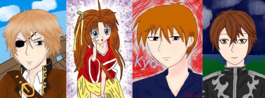
These were my first digital drawings. The pirate one was the very first. I got obsessed real fast. I can color so easily, undo any mistake, layers are a blessing too. There was just so much more freedom. I always sucked at coloring in traditional art and I didn’t like the mess (idk my hands get so messy traditionally)
The next year, it was 2014, I was 15. My birthday is in a couple of months and I knew my parents were planning to buy me something pricey (I think it was a laptop) so I approached them and asked if they could just buy the Wacom Bamboo as a present which was cheaper anyway and I even explained how it works to them and how it would allow me to draw on the computer instead of the iPad. I tried really hard to be convincing. I would have prepared a powerpoint presentation if I had to.
They did give me the wacom as a present. They even gave it to me months before my birthday so I could use it already. I thought I was the luckiest teen in the world with my parents.
These are a collection of my favorite works from 2014 to 2016. The middle one was my second drawing using wacom and Paint Tool SAI. I was a part of a lot of fandoms in those years lol
It gets downhill from there :/
April 2016, my mom and I moved to Japan, while my stepfather and siblings stay in my country. It was tough. For someone who is obsessed with anime, you’d think I’d be thrilled to live in Japan.
I was. Though only at the first few months. It’s not the same as it’s portrayed in anime (I should’ve known but I used to be blinded by anime). It was just lonely. The language barrier sucked and then lots of financial and family issues until my parents split. I got my first boyfriend too and I thought I was blessed by the nicest boy, but the relationship became extremely toxic but I didn’t have it in me to walk away.
All the shit that happened affected me mentally and emotionally. My biggest outlet which was digital drawing, was also out of the question because I did not have a computer/laptop when we moved to Japan. We left it in our home for my stepfather and siblings, even the iPad. I have my wacom with me, but no computer/laptop to use it with. I couldn’t draw.
I tried though. I used my phone to draw, but it wasn’t the same. Then the life problems got piled up, things got worse, and I just lost motivation in anything. Literally anything. From 2016 to 2019, I stopped watching anime, I dropped out of all the fandoms I’m in, I stopped watching my favorite TV series or movies, and I stopped drawing. I even got a bit disconnected with my friends who lived in my country (we talk regularly online). My family was broken so I gave all my attention to my toxic relationship as well which made everything worse too lol
I didn’t draw besides from a few scribbles and the drawings above. I did try digital art on my phone a couple of times again and even posted them on my IG, but they weren’t any good. Eventually, I got mentally and emotionally drained and dropped out of senior high school. I just stayed home for almost a year, leeching off of my mom. I felt even more worthless and my life had no direction at this point. Nothing mattered anymore.
April 2019 or so I think, my (ex)bf bought me a laptop. He says it’s a gift, but I think the real reason was to make up for something horrible that he did (which is stupid because money /gifts won’t resolve anything). I have a laptop. I can draw again, but I didn’t. I didn’t care, I wasn’t interested in drawing anymore anyway.
Welp. June 2019, I went back to my country. My (ex) bf stayed in Japan. The distance helped me end the relationship and my friends were there (they always were) to help put me back together along with two trips to therapy. I went back to finish my senior high school in my own country this time. That said, I have to stay in my country for school (but I was happy because I didn’t wanna go back to Japan yet when the breakup was still fresh and with going back to school, my life has a direction again.)
It was weird. I remember just being sorta lost and confused because I used to put my time, effort and everything into my previous toxic relationship, which was now gone. I was free and I had so much free time that I didn’t know what to do with it. I got so used to doing nothing and being nothing.
This is where BNHA enters.
Dunno when it started, but I started seeing Bakugou frequently online. It’s usually just Bakugou. I knew who he was because my friend suggested BNHA to me back in late 2018 I think but I didn’t watch it since I’ve lost interest in everything at that point in my life.
But ye I thought he hot af but I still didn’t watch BNHA.
But then for some reason he REALLY kept appearing in my social medias and it was really frequent. The last straw was when I saw a pic of him in UA’s gym uniform and thought “damn boi aight imma watch bnha for u” (y’all gotta admit he looks good in those colors with his combat boots XD )
I watched BNHA. Fell in love with Iida along the way. Then I switched to Tokoyami (but Shoji was hot too so aaaaa), but then angry emotionally-constipated sea urchin head caught my heart again. But oof. BakuDeku moments really made me feel some type of way I haven’t felt since I moved to Japan. It felt new but nostalgic. I fell hard in that ship.
I started obsessing. From memes to posts to fanfictions to buying merch to filling my room with BNHA posters. I realized I was reverting to my old self from the time I was still happy and it was thanks to BNHA (and the good people who helped me through the worst too)
Shit I wanted to draw BNHA, I thought.
I mean, I have a laptop, I still have my wacom and drawing softwares. I could totally draw digitally again if I wanted to.
But guess what
I can’t :c
My hand physically cannot draw. My drawings don’t look the way I want them too. 3 years of not drawing really destroyed any skill I had. I was back to square one.
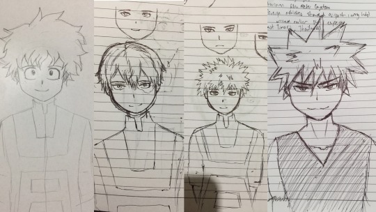
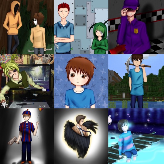
September (yeah they’re ugly, I laughed at it). If you’re wondering why I drew on paper, it’s because, for some reason, I really CANNOT draw digitally. I mean it. I can barely sketch digitally at this point. The lines and shapes just doesn’t come to life. They’re just scribbles. But somehow, I can kinda draw on paper with a ballpoint pen. But yeah, that was the best I could do at this point in my life
After that, I still tried to draw, to regain my old art style, but it didn’t happen... It just doesn’t look or feel the same. Drawing used to be fun. But during this phase, it felt like my ugly drawings were just mocking me (probably was just too emo that time lol)
Weirdly, around a week or two I think, after my half-assed attempts at drawing, I managed to draw digitally somehow o.o
I did a Midoriya and Todoroki drawing like this too. It was my first post here on Tumblr I think. The annoying part here is that I cannot draw digitally unless I draw on paper first, take a pic, and then trace the lineart. I couldn’t draw directly on the computer. Granted, drawing on paper and drawing on digital is very different for me in the first place anyway. But it was still a pain. And it still looked like shit. I can only draw stiff poses :/ it seems like my brain decided to delete all data about anatomy and posture and backgrounds. My lineart here is even messy af. It still really not the same as my old style.
By 2020, I think I got my old art style back. On March, I made this. This took me 27 total of hrs to make.
Right now, I think it’s not bad, but back in March, I was disappointed with the result. This is when I finally broke down crying because it didn’t look good enough and I hated that it took me 27 hrs to draw “bullshit.” I was angry at myself for losing interest in drawing for 3 years when I could’ve used that time to improve. I had to start all over again and it still didn’t look good. (Current me thinks that the drawing above is alright. I was just a lot harsher to myself back then. Used to have a lot of issues but I’m doing great now)
I cried myself to sleep that night. Woke up wanting to cry again. I wallowed in sadness for a couple of days. Eventually told my friends what’s up. Got some pep talk. Even talked to my sister (she’s great, she always hypes me up with my stuff and sometimes I think she’s my biggest fan with how she appreciates my drawings and I’m really grateful for that).
My world turned a 180 and I was weirdly positive after all that crying because brain chemicals and shit. I had a revelation. If I hate how my art style looked so much, then I should have been putting effort in changing my art style, not trying to regain my old art style (that I don’t like anymore)
I researched a lot. I analyzed different art styles and anatomy again. I did everything I could think of to find a style that works for me. I might have even neglected school for a bit to focus on digital art lmao
After all that work, I posted a fanart of middle school BakuDeku in their classroom. I love that fanart so much even if I probably have better ones by now because that was the first fanart I made that I felt like I could be proud of and it was the first one I made in my new art style. It was a milestone for me.
March 2020, I moved back to Japan and without the toxic relationship, I’m a lot positive now. Happy. I’m myself again after the previous bad years. I’m still continuously learning though, trying to improve, but at least, now, I found my own art style :) I really suck at interacting with people online, but I’m always grateful for the support everyone has been giving my fanarts. I’m happy when my content makes people happy.
This is why BNHA is important to me. The series is great alone, but it’s not just that to me. BNHA is so much more. It’s what made me find the passion to create again, only this time, it’s focused on drawing (I used to write, but now I just draw, but maybe I’ll write again for BNHA).
My family is supportive with my love for BNHA, but I think they don’t know the deeper reason why I love it. Sure, I was fine living on with nothing much going on in my life. I’ll finish school, get a job, work until I die or something. It was okay. It was the way of life. But BNHA gave my life color again. I wasn’t just blindly going through life anymore. I have something to look forward to everyday now. BNHA even became a bridge to other things. Ever since then, I’m a lot more open to people, to try new things, to explore and not just live through life and waste away. I got better at leaving my comfort zone. I’ve never been happier in my life :D
Thank you for supporting my fanarts. Thank you so much for giving me a chance to express myself through BNHA. I hope to make more content in the future and improve even more :)
30 notes
·
View notes
Photo
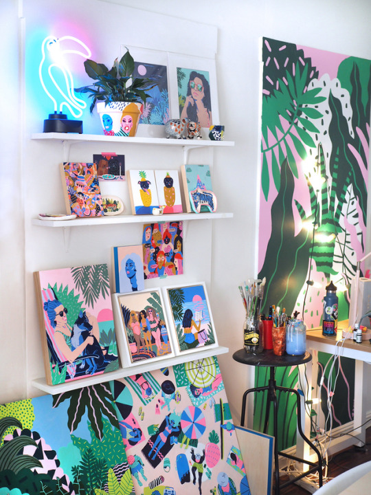

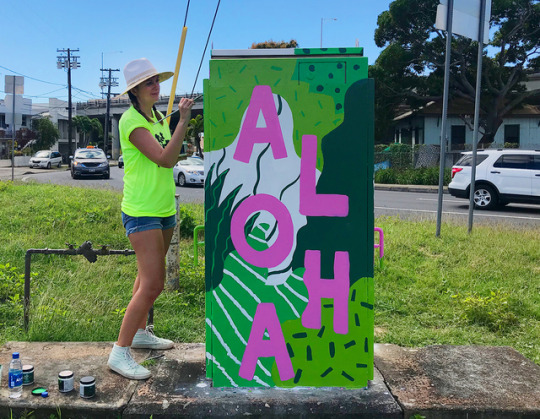
SKETCHY BEHAVIORS WITH KIM SIELBECK
With a background in fashion, textile, illustration and printmaking, Honolulu based artist and designer Kim Sielbeck creates colorful, bold, and fun paintings and patterns inspired by lush landscapes in Hawaii. From murals to digital canvases, Kim recently created some our favorite customs as a Vans Custom Culture ambassador, using her signature color palette and designs! Find out more about Kim, what inspires her, and what she has coming up for the rest of the year. Take the leap!
Photography courtesy of the artist.
Could you introduce yourself to everybody?
Hello! My name is Kim Sielbeck. I'm an illustrator living in Honolulu, Hawaii and have been here for about two years. Before that, I was in New York City for almost twelve years. I went to school at the School of Visual Arts. I grew up in a Coast Guard family and lived in Hawai'i as a child- it's much different being here as a grown up! Fun tidbits: I am a dog person, I was born in Alaska, I once broke my toe in mid-air taking a jumping photo.
How would you describe the art you create? How would you describe your particular technique?
My work is colorful, bold, and fun. Mixing colors and choosing them before I start on a piece is something I love. I limit myself to flat colors–this evolved from focusing on printmaking in school and working as a textile designer for several years. Pattern is important in my work, which also carried over from the textile world.
What are your favorite things to paint? What are your favorite things to paint on?
I'm very inspired by the verdant, lush landscape in Hawai'i- the plants here are unlike any other in the world. I also love painting people relaxing and having fun. A lot of what I paint is a reaction to current events today. I paint the world I want to live in. As far as surfaces- murals are my current favorite! Painting on a giant wall, getting covered in paint, and working in a public space beats working in my usual set-up, which is an iPad or computer.
What’s a typical day in the studio for you like? And what are you currently working on in the studio?
Every day is different. It usually involves a couple hours of combing through emails, finding the right balance of podcasts and music (with some dance breaks), and zoning out while I'm drawing. Currently I'm working on some new personal pieces- I just painted a portrait of my friends Sarah and Danny and their puppy. I'm also working on a few editorial pieces for some magazines!
My studio is very unique- it's located in the Old Blaisdell Hotel, which was one of the first hotels built in Honolulu. There are lots of other creatives in the building, and it's nice to take breaks and talk story with them during the day. We all support each other and it's a great community.
When you're working developing a new painting or piece, how does it begin - take us from sketchbook, to color choices, to finished painting?
A new painting starts as a tiny thumbnail to get the composition right. Then I'll start sketching right on the surface (normally wood panel) with a light underpainting. Picking color is something I do very early on- sometimes it informs the composition and the subject matter. I try to limit my palette to 5 or 6 colors per piece. Sometimes, I'll be 3/4 done with a piece and have another color idea- so I'll have to go back in and repaint entire sections of the painting. It's all trial and error, and you can always repaint something.
We love the colors and compositions of your works and designs. Can you tell us how you arrived at your color palette and how composition comes into play when you’re creating a piece?
Years of working in the fashion and textile industry has given me a keen sense of color and color combinations. So much of my job as a textile artist was using colors that were popular for each season- we always had trend forecasting books laying around, and would often color or recolor a piece until it was right. We also limited our palettes to what commercial printers could print- usually no more than 8-15 colors per design.
Additionally, color palettes were always the first thing we came up with when starting a design. I still have that approach today and often pick my colors before anything else is completely set in stone.
What tools will someone always find you using at your studio?
I've got plenty of tubes of acrylic gouache laying around, lots of different brushes, and lately a lot of leftover house paint from murals. My go-to tools for commercial work include my iPad, desktop, and Wacom tablet. I'm able to leap from painting to digital work- most people can't tell a difference between the two!
How do you unplug yourself so to speak? What do you do to center or re-focus yourself if you find yourself stressed out about deadlines, art shows, and the sort?
One of the reasons I moved to Hawai'i was to be able to unplug more. Prioritizing things like going outside and being in nature are great ways to step back and put things in perspective. I also make sure to keep a planner so deadlines don't creep up on me, and hit the gym to work out any lingering stress.
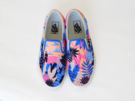
You recently worked as one of our Vans Custom ambassadors! We absolutely love the Vans you created for it. Can you tell us a little bit about the process, your concept, and the response you got?
Thank you! I loved painting the Custom Vans... people always ask me where they can get a pair! My concept was to create one shoe with a tropical print and one with a desert print. They could be used to walk everywhere and anywhere across the globe. The colors I wanted to really pop- you would notice these shoes on someone's feet!
What do you enjoy about collaborations like this? If you could pick anyone in the world, who would you collaborate with?
I've been a fan of Vans since I was a kid and tried to sneak into to the Warped Tour. I had big ambitions of skateboarding and surfing as a kid (I am finally learning how to surf!). The lifestyle, attitude, music, artistic improvisation, and boldness of skate/surf culture has always been magnetic, so working with Vans has been a dream job.
I love collaborating on all sorts of projects–I don't think I have one specific dream client. I love seeing my work adapted in new ways, like animation. I'd love to paint more murals, and also work on some big-impact projects that can reach more people and bring some color and joy into their lives.
What advice would you give someone who wants to follow in your footsteps?
A career is not something that happens right away- you have to constantly work for it and adapt. I was hoping right out of school I would instantly become a world-famous illustrator... not the case. It took a few years to find my style and voice, and that's ok. More advice is to always pursue outside interests, and grow as a person. I was in a punk/pop band for several years in NYC (shout out Puppies!), learned how to sail, and traveled a lot. All these things, while not necessarily being art-related, helped influence my work and life.
How did start becoming interested in art and design? When did you find yourself doing it as a career?
Moving around so much as a kid, art was something that was a constant. I could express how I felt, what I was going through, and could make friends doing it. Early in high school, I realized I could maybe do it for a living. My parents sat me down and asked me to come up with a plan for college and beyond, so I had realistic expectations and saw the hard work it would take. A good work ethic, some luck, and many hours of practice helped me push through. When I graduated college in 2009, there weren't many jobs. I lucked out and got a full-time job at the textile studio, while freelancing on the side. Eventually, 8 years later, the freelancing became stable enough to do illustration full-time.
When you’re not busy creating art, how do you unwind and chill out?
When I'm not in the studio I'm trying to explore new places, go on hikes, go to different beaches, or learn how to surf. At the studio, my brain is on New York speed, but walking outside I switch back to Island Time immediately.
If you weren’t an artist, what do you think you’d be doing instead?
I'd be a guitarist and lead singer, traveling the world in my amazing punk rock girl group.
So we gotta ask what are your FAVORITE Vans?
I have some surf-green high tops I've worn for YEARS. I got them in Pasadena one night at an art opening when my sandals snapped in half. The Vans store was miraculously still open, and I ran in and grabbed them in the five minutes I had to spare. They saved my outfit and my night, and they've since traveled to London, Italy, Hawai'i, Japan, and beyond.
What’s coming up next for you?
I'm going to Europe in September, for some work and some fun. I'm looking forward to a few bigger projects I can't talk about yet. I'm also working on some local Hawai'i projects, including working with the Humane Society. A beach towel collaboration with Surfer Towel's Christie Shinn (who you just interviewed!) just came out, too.
FOLLOW KIM | WEBSITE | INSTAGRAM | TWITTER | BEHANCE
#Art#Vans#Vans Art#Vans Girls#Art School#Kim Sielbeck#interview#painting#digital#surfer towel#female artist
36 notes
·
View notes
Text
Coloring in grey scale
So, hey, this is somewhat of a tutorial for those curious about some of my coloring and blending. I made this especially for anyone younger than me and is exploring digital art, but this is also for others who are curious about what I do. I love reading other artist’s comments and looking at their WIPs, so why not.
Another reminder: if you’re looking for my artwork, please follow @rainbow-illness and not this blog. All of my finished stuff goes there; usually, my works in progress (WIPs) or Angry Doodle Corner go here. Sometimes I use this blog to repost my art, but that is my official art blog, no this one. Not unless you like nonsensical posting and metal, then have at it. If you have any questions, don’t be afraid to hit me up, I love talking about art.
So I can’t always sit down and talk about my processes and how I go about doing them, but I was able to sit down and take some screencaps while I was working on my iPad Pro. Using the iPad is actually my first choice to draw on because of the convenience of carrying it around like a sketchbook, whereas my laptop isn’t always easy to carry around--it’s a big laptop. While I use my iPad, I also like to go back and correct things, recolor, re-proportion, or spend more time privately working on a drawing. I have my iPad with me, all the time, so I’m out in places usually like Starbucks doing this. I also struggle with pretty bad PTSD and agoraphobia, so having my iPad out with my headphones on gives me an excuse to put my mind elsewhere to calm down. My family just usually looks at me and goes “oh, she’s working on her art again”; I did this as a kid, too, only with sketchbooks.
I do not have a Cintiq either, though I would absolutely love one. This laptop is capable of using a stylus, but I think I need a better one to do it with. All I’m using is a cheap Wacom Bamboo tablet that I’ve had for five years, that’s it. Everything I’ve done on this blog has been on a small surface. So if you’re just dabbling into art, don’t beat yourself up for having the small stuff, I’ve worked with small stuff and still do. The only thing I have that’s not small is, well, the space and processor on my laptop are much faster than any other laptop I’ve owned, bought especially for graphic design classes and my artwork.
So, that being said lemme just forewarn some of you guys. My artwork is all done in two to three layers! Yes, you read that right! Why? When I was 16, I didn’t have a Wacom tablet to mess with, so I had to use a mouse and learned from there. When I turned 18, I got my first Wacom tablet while working my first official job and the family computer didn’t have a good processor. So when I got my first official laptop, it was basic and not made to run anything beyond the web browser and such, it could barely handle Photoshop. It did, however, run Paint Tool SAI with no issue (which is why I still prefer it over anything I use), it just couldn’t handle more than five layers. After losing my drawings constantly and not being able to do anything in the prized software I’ve been eyeing since my Sophmore year of high school, I found a workaround with it.
And that’s what I’m going to write about here. With that in mind, no, you do not have to limit your layers! I’ve taken traditional art classes so my first instinct is to literally paint over my stuff like I would on a canvas. If you don’t want to do that, you don’t have to! Yes, I am nuts.
That being said, let's do this.
If you haven’t taken traditional art classes, that’s cool! I’m going to be using some art terms you haven’t heard of, but you definitely will when you take your first ever drawing class. These terms are foreground, value, negative space, contour, and weighted line (I’ve seen it called line weight too). For the more experienced art students who are likely groaning over that stupid contour practice from that book “Drawing on the Right Side of the Brain”, I’m sorry, guys. Newbies, you are going to know this.
And you are going to hate it. While I still hate it and, yeah, my eyes are rolling into my skull right now just even talking about it, there are some useful practices in here that I... actually use. Who would have thought? At least we’re not talking about still lives.
Anyway, here’s what I’M going to say that some art teachers will not tell you but I want anyone to read this to know:
- Do not obsess over your drawing to look exactly like your reference. Just don’t. Forget this completely, worry about it later or don’t even worry about it at all. This is your style, your interpretation.
- Digital art is hard. Art is hard! Practice makes perfect and you learn over time just by studying (looking at) other pieces of art. It took me like well over 10 years to find my own little niche and I’m still playing around with coloring styles. I have a lot.
- If you’re just starting to draw with a tablet of any kind, play around with it. My first official program was a cheaper version of Paint Shop Pro and when I first got it when I was 14, I sat around and experimented on layers to see what it would look like. Explore!
- When you start drawing figures or faces, try not to think of it as, well, face or a figure. Reduce it to basic shapes, like squares, triangles, and circles.
Greyscale can establish light source, value, scale, and negative space.
I don’t always use greyscale for my art, but when I do, I appreciate it because it makes my life easier. For example, Alphonse Mucha’s pieces here from his “Slav Epic”.
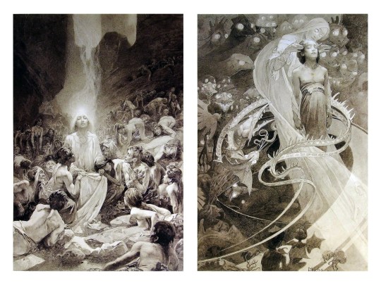
Chances are, you’ve seen Mucha’s art nouveau on prints, fanart, fabrics, and all of that. But Mucha did so much more and he is a huge influence on me for a reason. By the greyscale we see here, we can see foreground/subject with each illustration. Mucha is using value (that’s shadow) to emphasize this, in addition to negative space (background) to draw you in, just by using black and white. Notice how the other subjects don’t have such a powerful contrast and light source versus the other, especially the woman on the left. Mucha made his art pop by his understanding of contrast.
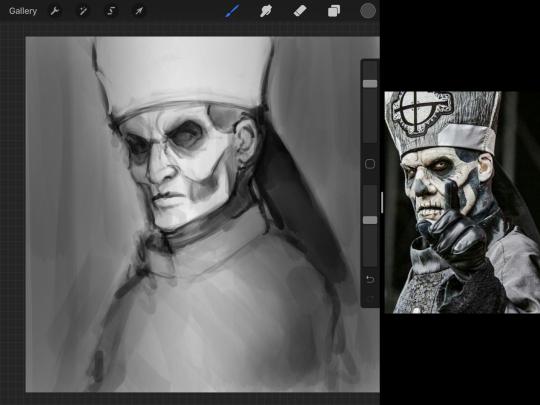
For this first part of this entry, I’m going to be using Papa Emeritus II from “Ghost”... who is a good example of how to draw faces, too. Huh. Regardless of what drawing program you’re using, keep your opacity low, at 50%.
Simplicity at its finest
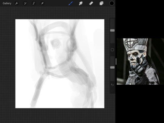
Instead of focusing a lot on Emeritus’ face, I’m going to focus on the negative space behind him. I’m using this to define his figure. This is a good picture because of the stark contrast, though, it’s a little tricky because it is really contrasted and you can’t see where the light source really is. But that is okay! I am going in and just using this negative space, the contour of his head and torso. Before I even think of a face, I want to softly go in and use black (or grey) to fill up that negative space. Keep it simple and work your way up.
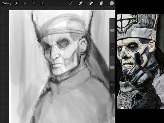
After I lightly fill in the negative space around him, I can start lightly going in and establish his face by blocks of shadow. And this is why Emeritus II is such a good example for this kind of work. I don’t usually start going in and drawing eyes, I rely on the shadows of the face to see where their eyes, ears, lips, and such lie.
Here’s another example (though, it’s old):
This is in my maroon style underpaint, which is what I post most of the time. For their faces, I just used basically eye sockets to start working on their faces, like Papa Emeritus II down below. Again, this dude is a great example.
Here is where it may get a little funky. I created a new layer and set that layer to Multiply, still keeping that opacity low. Since I have no light source and I just want to create a really dramatic lighting, I made a vignette with a simple airbrush tool.
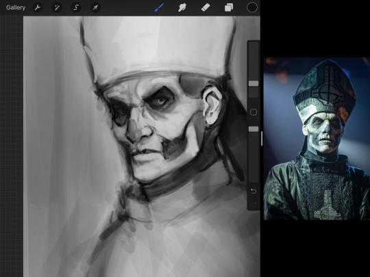
With that little vignette, you can create a new layer (unless you’re me, I just merge it down because of that constant fear of nonexistent software crashing) and I’m using the color pick tool to go back and forth to start using greys to really get into Emeritus’ face, especially his wrinkles. I’m painting over it constantly, switching back and forth between a paintbrush tool and color pick tool to blend. Again, keep your opacity low... unless you’re me and you’re feeling adventurous. You’ll also notice here that I have more than one photo reference. I use several for a lot of my art, so I encourage you to do the same. I had no idea what his jaw looked like, so I grabbed a second photo. Now that I have a better idea of where his hat ends on his forehead and how his nose looks, I start doing a weighted line.
Weighted line and Contour
Now is the dreaded talk. Of contour.

Welcome to Drawing I hell. This cursed image is from the book “How to Draw on the Right Side of the Brain” and if your teacher does not talk about this in your first drawing class, I am going to eat my hat... I have a hat lying around here somewhere. ANYWAY, the contour line exercise is basically you just using a neverending line for a drawing. I don’t know who drew this (and tbh, thanks a lot for every single boring assignment I’ve done in drawing classes), but this guy used contour lines for his drawing. I’m having war flashbacks over here, but I managed to find an art teacher’s page talking about different types of contour. My god, they are evolving.
Going back to our dear friend Papa Emeritus II, I used weighted line to start adding in little shadows to his face. Weighted line goes hand in hand with contour; it is a great technique to not only add details, but add little bits of shadows.

This is a simple example; the thicker line is adding to the shadow of the apple, giving it value!
Papa Emeritus II is such a good reference... I used him as inspiration for King Melwas here.
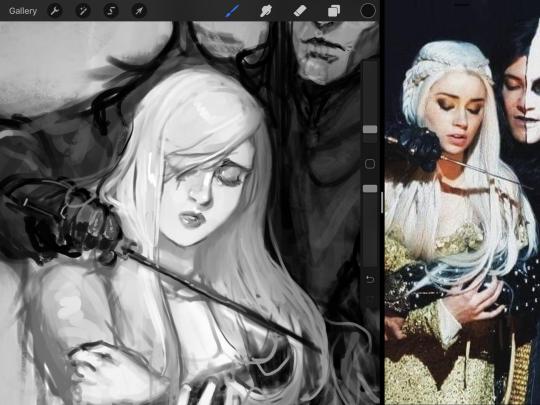
Gwenhwyfar is also a good example of weighted line. Gwen is essentially a very, very pale character. In contrast to Melwas, who is in darker clothing, Gwen is soft, she is the focal point in this drawing. For the little pieces of her hair, the corner of her lips, eyelashes, and her fingertips, I used a weighted line to establish these things, otherwise, Gwen is so pale, she’ll easily be washed out completely.
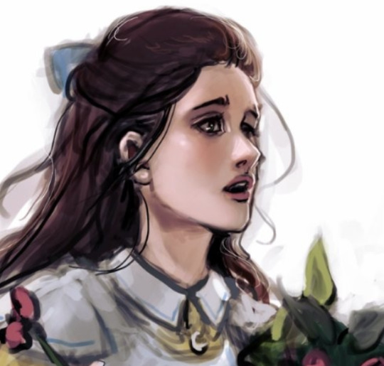
This drawing of Alice, which I’m still messing around with, is another example of how effective a weighted line can be with depth. The lines I added into her face, eyelashes, creases, hair, and fingers add those little details since everything I’ve done before like Papa Emeritus II was so soft with a low opacity on the brush settings.
Layer masks and curves
There are two ways you can color greyscale images.
You can do this by going into Layer > Adjustment Layer > Curves (this is how it looks like in Procreate).
This gives you a neat ol’ base color! I am playing around in the blues, adding soft hues of blue in their figures and the white in this picture can either turn blue, cream, or even green. You don’t have to use Blue, you can use any of the other colors. For me, I’m always drawn to blues. Another cool thing to play around with is Color Balance, which is underneath the same function as Curves.
But if you don’t have any of these, you can add a new layer, and do Multiply.
The only drawback to this, of course, is how destaturated (the lack of color) it looks. And yes, that’s an issue you will have and I did run into this while doing this. How I combat this is using additional layer masks. Believe it or not, Alice here was once at a grey scale, looking even more desaturated than Gwen.
For Alice’s face, I went in and use:
- Soft Light because she needed more peach and roses in her skin. Omri’s original drawing gave her a light rose blush so I wanted to do the same.
- Overlay to mask out the black lines from the greyscale I had.
- Lighten which I used to make her lips pinker, her apron’s shadows lighter, and parts of her hair brown.
The same went for Gwen, who is, again, very pale. But while she’s supposed to be pale, I didn’t wash her out completely. To add more saturation, I used a combination of Soft Light over my Multiply layer and Overlay to start working at the highlights on her hair, nose, and shoulder.
This little walkthrough isn’t as visual as I like, but with limited software like Fire Alpaca, GIMP, or Paint Tool SAI that don’t have the abilities of Photoshop in terms of color correction and playing around with colors, I really encourage you, readers, to play around with these tools. Using the color picker back and forth, especially after using layer masks, gives you an ability to mix and blend colors. The reason why I work with greyscale or a maroon under paint is that you can create brilliant colors and make a new palette; the trick is to constantly mess around with them. I never go in and flat out color anything, with the exception of things like “angry doodle corner” which is basically what I call my lazy drawings, drawings where I’m just honestly goofing off with.
So in summation...! Or me trying to summarize this.
Experiment and explore with layer masks and adjustments. Whoever says that using these tools isn’t real art, they’re wrong. And please don’t ever be afraid of using references of any sort! Alphonse Mucha is saved ten times over on this computer.
#my art#tutorial#i think#an attempt was made#digital art#procreate#ipad drawing#ipad pro#Alice madness returns#alice liddell#american mcgee's alice#alice asylum
7 notes
·
View notes
Text
Evaluation
My project has changed a lot throughout the course- my final outcome has differed greatly from what I set out to make at the beginning, mainly due to the fact that I was trying a lot of new things and they didn’t all work as expected. But i’m glad that my project evolved.
The social issue I decided to choose for this project is the Environment and Climate Change- I wanted to make a game concept that would encourage people to fix the planet before it’s too late. There are many issues that are affecting and changing our planet currently, most of which are direct result of human activity. We are responsible (directly or at least for the majority of) for the Earth’s changing in climate- we release too many greenhouse gases through various means such as transport, factory farming and deforestation.
One of the things that has remained consistent in this project is that the social issue being a key part of the game - I haven’t diverged much. The character design and game themes definitely incorporate some fantasy themes (such as the main character) but the underlying issue about the world being uninhabitable and ruined is still a very obvious feature. I would have created a project that more subtly related to climate change, but it’s something i’m very interested in so I thought it would be a good idea. I was aware that a game based very obviously on a social issue may not attract a lot of attention as people tend to avoid things that are ‘politcal’ but I think it works - I tried to make the character design and magical elements very visually appealing so the game so that it would appear more interesting and attractive to play upon a first glance.
The work I have created - Echo - is for a game concept. I created some concept art for the character and landscape, made some pixel animations to show how the game could potentially look, and made a model of the main character’s head. The model was created so I could get a better idea of how the character could look from all angles, thus making it easier to draw. I am also very interested in modelling so I thought making a model would be a lot more interesting than just two dimensional artwork.
The Character Design/Concept
I wanted to create a concept for the game’s main character. At the start of the project I envisioned them to be a cute & brightly coloured animal - to try and contrast with the bleak reality in which the game is set. I made a pinterest board to try and establish the kind of look I wanted it to have, and came up with some concepts. At the time I was also really inspired by Kitsune & their magical connotations in Japan so I wanted it to look somewhat fox like.
I jumped straight into the character design without really considering the rest of the work I wanted to do which would involve it - which is where I started to make some questionable choices. I decided to give Echo four ears to make them look very unique and otherworldly - but didn’t really consider the practicality of having these, nor did I think ahead to when i’d actually have to make them later. I also have a tendency to design the character’s appearance first before coming up with their personality - which also meant that the second set of ears didn’t really have a purpose of being there. Alongside this I also gave them an enormous mane and extravagant tail to help them stand out - this was also annoying to animate. However, despite the impracticality of their design, I really like how the final appearance turned out - it definitely looks aesthetically appealing and different compared to something you’d expect to find on Earth.
Another problem I had when drawing the character was trying to establish their anatomy and keep it consistent when creating the concept sketches for them. I wanted to make Echo walk on two legs yet still have an animalistic appearance so I made them anthropomorphic with shorter digitigrade legs than those of a human - this made a lot of poses quite difficult to draw as his body proportions were very different than the references I used - so in some sketches his legs are far too long.
I created several pieces of game art featuring Echo although I’m not totally happy with any of them- this is due to my experimentation with new programs and different techniques. All four of the artworks were created outside of my comfort zone - 3 of which were created using Procreate and a shading style which I am not as proficient in - and the final one was created in Paint Tool Sai with a wacom intuos (which was a vastly more complicated task than using my Cintiq). I felt that some of the work just didn’t have atmosphere I was trying to create- some of the pieces looked flat, and using the iPad to paint meant that I didn’t have access to my usual tools for painting. To improve next time, I will practice more both with procreate and the Intuos tablet, but also try and create some artwork that i’m actually happy with by spending a lot of time on it rather than giving up after 2 hours - which was very common with a lot of my work in this project as I felt like the deadline was approaching too fast.
I really like Echo’s overall character design but I think that it could have been developed a lot better if I had spent more time on it, and used more realistic animals as reference material. My favourite parts about their design are the glowing colourful ears and tail, as well as the mask, which I think gives them a very mysterious and ethereal appearance (which I think it suitable considering they’re meant to be a space deity). If I could design them again I would have also created a wider range of concepts before creating the final design so fast, as I ended up having some really cool ideas later on. I would have also reduced the number of ears and made the tail/mane smaller to try and make this character actually easily reproducible.
I did also design Radio and Pix, the other two main characters, but these were done very quickly near the end of the project so they are also not as developed as i’d like them to be. I think my target for next time would definitely be to not try and rush my projects as much and actually put thought and consideration into them. It would have also been nice to do more environment design as this was something I was really keen to explore at the start of the project but didn’t have enough time to explore - I would have rather put more time into this than trying to create finished artwork of Echo.
Pixel Art/Animation
For this aspect of my project I aimed to design some animations and sprites/environments to show what the actual game would look like if it was made. This was one of my first experiences with pixel animation and sprite artwork which made it quite a challenge for me, especially in the beginning.
Animating in pixel art is a really different experience, as I found that almost every pixel had to be placed perfectly to make the movement look smooth - quite often I found that just by changing a few pixels on one frame completely changed the shape of the head in another - but this paid off as I got used to it. Overall, i’m really happy with the way my weapon summoning animation turned out - I think the movement looks really fluid and even though it’s small and pixelated, you can still make out the individual parts of the character.
Some parts I should have done differently were definitely the smoke animation and effect - I made the smoke and staff Glow using an overlay layer on Photoshop - which messed up the transparencies of the finished sprite. When I tried to export it as a gif with no background, there were white pixels surrounding the body due to the partially filled in pixels from the glow layer, which the PNG could not interpret properly. To fix this, I added a grey background to the animation when exporting it so that it would display correctly on my blog - but this was only a temporary fix, as It would have had to be transparent to import into Unity, for example. I think that the glow could have worked if it was added afterwards once imported into the games engine rather than as part of the animation, but it worked to show my ideas.
Another problem I had was with the animation cycle itself - this was another project which I rushed into a bit - as I ended up not being able to loop it due to Echo taking a step forward midway through, so ending up in a different location to where they started off. I should have also made the overall pixel sprite smaller I think and maybe tried a lineless style - as the 120ish pixel height of the character meant that it took a while to replicate for each frame.
In term of success though i’m happy with the actual artwork of the pixels - I also really like how the icon of Echo and the dialogue box turned out, as they fit together well and match the aesthetic of the game. As well as this, the text animation I created also looks really cool I think - there isn’t anything I would change about that. The pixel art backgrounds I created also turned out pretty well, but I think it would have been nice to create a more refined and clean, lined background rather than the sketchy lineless style it ended up having.
Model/Mask Attempt
This was the project I had the most difficulty with out of all three I attempted. I started off wanting to make a super sculpey model of Echo, which soon changed into a wearable mask of his head, and then finally changed into a small model.
The first thing I tried was making the mask in Blender - which I have no experience with - which may have been the cause of some of the difficulties I had. I first sculpted the shape of the mask and decided to try and print it out as a pepakura file - which didn’t work initially due to the high number of polygons. if I was to make another pepakura mask I would instead work with a very low number of polygons instead to start with rather than trying to retopologise the model later which was also rather tedious.
After retopologising the model, the option to 3D print it was available - unfortunately since I hadn’t planned this from the start my model also was not suitable for this. I think that all of these attempts didn’t work properly since I hadn’t researched them enough and built them with these results in mind - I had to strongly rework my model again to get it to work in a 3D printer. Despite this difficult stage though I do really love the look and anatomy of the model I made - it actually looks how I intended it to and has the perfect cartoony/realistic mix I was going for. The 3D print had to be split up into sections and then printed one at a time. This process had some flaws which I would execute differently if I had more time - I didn’t realise how difficult it would be to make the 3D model look presentable (sanding and filling etc) so I should have printed it in a higher resolution to start with, as it was too low res to make a smooth model out of. On top of this, there were some scaling issues which meant that several pieces were very slightly different sizes to each other. To fix this, I should have kept each piece on the same document and scaled them all up together rather than each one individually. That being said, the mask I did 3D print did end up fitting my face which I consider a definite win, as I measured it all beforehand in the hopes that it would not be too small or big for my head. I should have done a lot more research into 3D printing before rushing into it.
Unfortunately due to the quality and mishaps with the 3D print (the hollow surface meant it could not be properly sanded, and one corner was missing due to the supports collapsing during the printing process - causing it to droop down and break off), I had to move to a different method. My main regret during this stage was my time management - I tried out 3 different techniques during 3 days and none of them worked to my standard so I scrapped all of them. The first was the EVA foam patterned model. I really like how all of the edges are crisp and fit together really well but unfortunately the pattern was not able to capture the exact head shape, which ended up looking a bit weird. I think this could have been remedied if i’d kept working on it and made manual adjustments. The foam I used was also far too thin (5mm) which caused the model to be very weak as it kept squashing and changing shape. It would have worked a lot better if i’d used 10mm foam I think.
The two upholstery foam attempts were actually probably fixable, again if i’d spent more time on them. The carved block head especially, I think it would have worked a lot better if my electric knife had been sharpened. I like the way which they started to turn out but I got a little too ambitious and removed too much material too fast. These two attempts were another case of me not doing enough prior research into them beforehand, and could have turned out a lot better if I watched more than one tutorial for each.
The last thing I resorted to was a super sculpey model, which has turned into one of my final outcomes. While it is unfinished, I am really really pleased with how it looks for the most part. I used my original 3D sculpt as a reference to model the head out of super sculpey, then sealed and painted it with acrylics. I’m really happy that I used sculpey as the material as it keeps its shape well and was very smooth - although I think it could have been smoother if I had used some sculpting tools or turpentine to help even out the surface.
0 notes
Last Seen Blogs

thejollyduckling
They started on a beanstalk
xscelerisx
All is for the best;
m00mincr0ssing
Henry

a-radicalstate-blog
This Blog Has Moved: