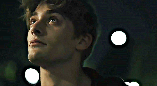
#also tumblr's method of cropping images makes this look so weird but i do not care to fix it
Text


"I'm listening to The Magnus Archives for the first time and I just finished season four" moodboard
#all of this is meant as a compliment to the series btw#anyways i need to go read at least ten chapters of the 74k wordcount s1 polycule fluff ficlet collection i'm in the middle of#for my health#peri talks#the magnus archives#tma#reaction images#also tumblr's method of cropping images makes this look so weird but i do not care to fix it
599 notes
·
View notes
Note
hey, i'm sorry if this is a weird question, but i'm wondering how you personally make gifsets? i wanted to make some basic ones for a post and i love the ones you make. thank you!!
yeah sure! here's my method:
First things first, I use Photoshop CC (a tooooootally legal version of course. so legal. so not pirated), and idk how to make gifs in other programs so uhhhh find a copy of Photoshop, if you don't have it already. Also I'm assuming you already have the video you want to gif somewhere (also gotten through entirely legal means, of course).
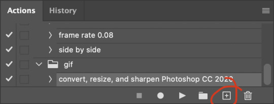
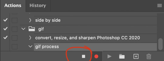
Also it's entirely possible there are better ways to gif, this is just how I do it! Lots of people use actions to streamline their process for instance, but I don't. So. There's that.
Anyway:
Clip the part of the video you want to gif
I personally use Microsoft's in-built program Clipchamp, because it's there and it can handle mkv files and output as mp4, but you can obviously use whatever program you like.
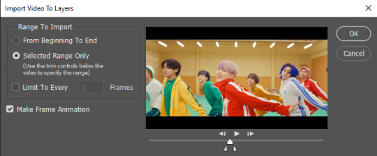
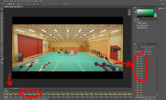
2. Import the video in Photoshop
Use File > Import > Video frames to layers

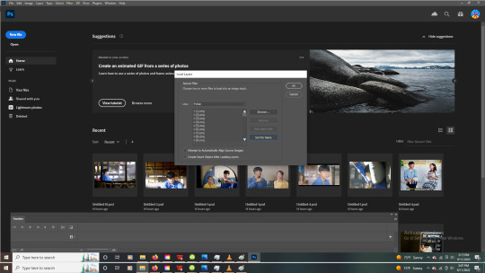
Select your clip. You now get this screen:

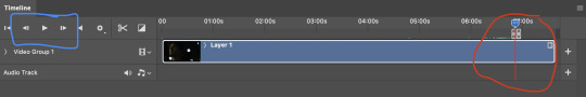
Select the part of the clip you want to turn into a gif. Keep in mind Tumblr's 10mb limit, so don't make the selection too long. If you do want a longer clip, and don't mind the gif looking a little less smooth, you can tick "Limit to every 2 frames" to cut down on the number of frames.
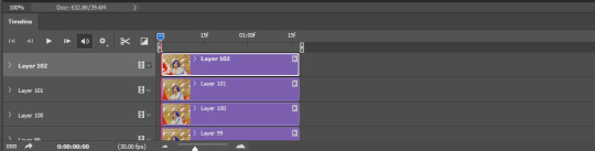
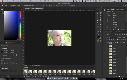
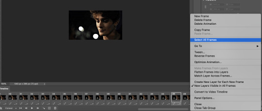
Click OK, and PS will convert the clip into layers. Make sure to have the timeline on (Window > Timeline)
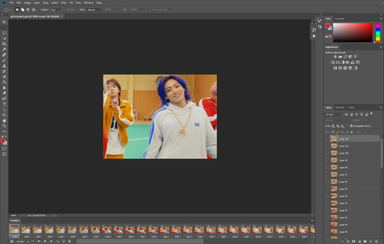
Your workplace should now look like this:

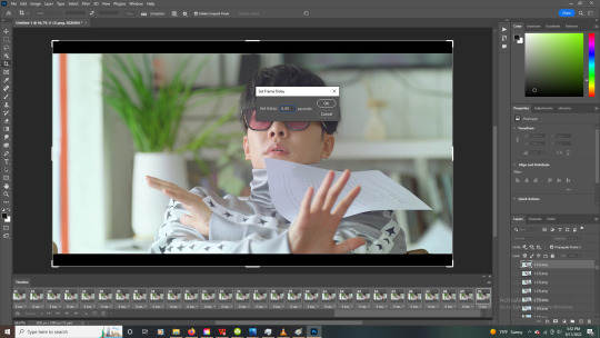
3. Adjust the frame delay
Adjust the time between the frames by selecting all the frames in the timeline and clicking the little arrow in the bottom right of one of the frames.
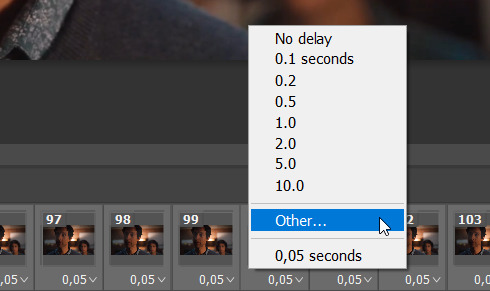
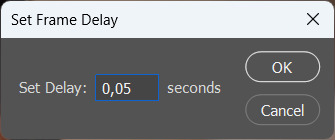
I tend to set my frame delay to 0,05 seconds, but do whatever you like most!
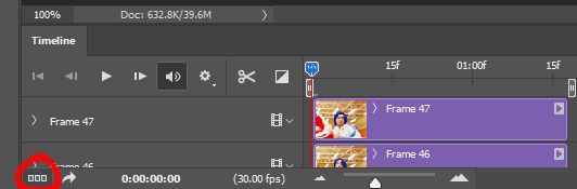
4. Convert to video timeline
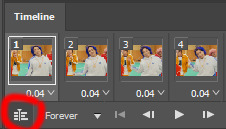
Convert the frame animation to a video timeline by clicking on the hamburger menu in the top right of the timeline and clicking "Convert to video timeline"

5. Convert the layers to a smart object
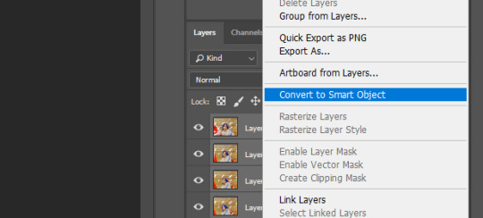
Select all the layers, right-click and select "Convert to smart object"
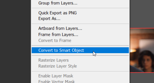
Cool, all your layers have now been converted into one video layer. Easier to work with.

6. Cropping
Crop the video to whatever size you want it to be (keeping in mind that 540px is the widest the tumblr dashboard goes). I'll crop this one to 540x350px.
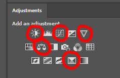
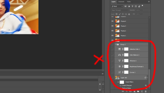
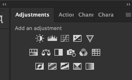
7. Apply adjustment layers
Now apply adjustment layers to colour the gif to your liking (Layer > New Adjustment Layer). You can do this any way you like, but the adjustment layers I tend to use most are Levels, Curves and Vibrance
Here's a before and after.

But again, you can just go ham on this in whatever way you like. Just fuck around with the layers until it looks good to you!
8. Sharpening
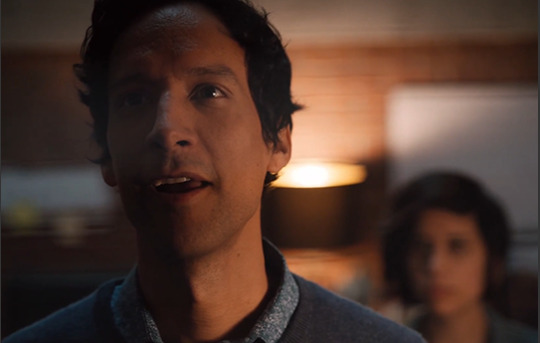
Now it's time to sharpen the gif, to make it look extra crisp. Select the video layer and go to Filter > Smart sharpen and just fiddle with the settings until you're happy with it.
9. Text
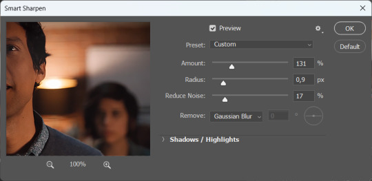
I'm just gonna assume you know how to add text lmao. But to make that text stand out, go to the layer style by double clicking the layer and selecting Stroke and Drop shadow.
10. Saving
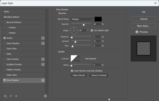
To save your gif, go to File > Export > Save for web (legacy)
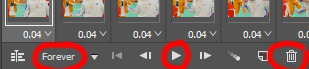
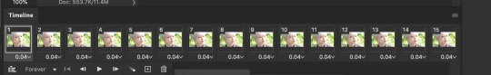
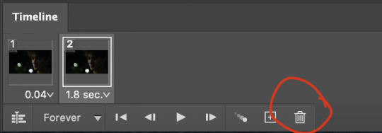
Select gif and set the looping options to Forever.

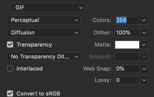
Now, make sure to check whether your gif falls under tumblr's image limit of 10mb. This one is 9mb, so I probably should've cut it down a bit, but I like big gifs, sue me. If you don't want to cut the length of your gif (which you can very easily do with the timeline), you can also cut down on the amount of colours. I wouldn't go below 128 though, that just makes it look ugly lmao. But hey, the option is there.
Anyway, save the gif and you're done! You have made a gif!!
Hope this helps!!
9 notes
·
View notes
Note
How do you make gifs? Care to share your process? o3o
oooh yes i can!!! i tried not to get too detailed with it since im interpreting this as just asking for my process rather than an actual tutorial sudhf.
the general tools i use are photoshop (i pay $10 a month T_T), vlc media player, and one of my various video downloading sites. i don't torrent or anything bc that scares me and i dont understand it. plus, since i almost exclusively gif kdramas the video uploads are generally in pretty decent quality and dont get scrubbed from the web the way western shows do.
so once i have the video downloaded i open it with vlc media player. I use a really inefficient method to extract frames but it works well enough that i don't really care to change it. plus i cant really figure out another way? they say that certain video programs can capture frames for you but none of the ones ive tried seem to have that feature. there's also supposedly another method to do it in vlc media player but it's never worked for me. anyway.
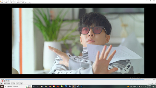
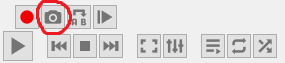
so to extract frames in vlc i find the moment i want to capture and then use the "e" hotkey to skip to the next frame and click the little screenshot button to capture it.
i do this over and over at lightning speed until I get all the frames i want. yes this does often lead to accidentally skipping frames (which can make the gif a little choppy) so sometimes i redo it, but sometimes i don't bother.
after i've captured the frames, i copy them from my pictures folder (not entirely sure why they end up there but im not going to mess with the pathway) to a specific folder ive created for that gif or gifset.
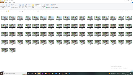
then I'll go through and make sure there are no duplicate or missing frames. after that, i edit them down to about 70 frames per gif, then select them all and rename them so that they're in numbered order (photoshop loads them out of order if i don't).
I do 70 frames mostly bc my sharpening action on photoshop doesnt go past 70 frames and i haven't bothered to fix it lol. also it's comfortable length for a gif so there's not much reason to. you can usually get away with about 40-50 frames tho before it feels too short.
ok nowww i open photoshop and things get good.
first thing i do is load the files into a stack.
i have a bunch of settings in place to make life easier so i already have my sharpening action created (which sharpens all the frames for me rather than having to do it manually. gift from God), and my timeline visible. so now i just play my sharpening action
then load the frames into an animation and reverse them so they dont play backwards.
then i set the frame delay to 0.05 seconds. it's interesting bc gifs played at normal speed look kinda weird. so having it slowed down a little is ideal. not too much though or it looks choppy.
now i crop the gif. i dont have to do this here but generally i do. just helps me focus without the distraction of the tv bars on the top and bottom and just. All the other stuff going on in the background.
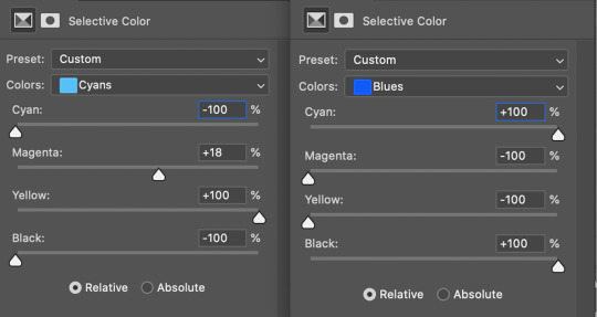
nowwww i color. usually start with a color adjustment curve layer. when you use the little eyedrop tool this can really deepen the image and bring it to life. you dont realize how dull tv looks until you gif lol.
that gives me the base tones i want and deepens the image.
sometimes i brighten the gif with the curves layer, but in this case adding a separate brightening layer worked better.
then i'll export the gif with tumblr dimensions and upload it into a draft.
if it is still too dark or the colors look off, i'll just mess more with the layers. in this case, i only needed the two, but a lot of gifs will need a few different adjustment layers like vibrance or selective color to look right.
And that's kinda it!
colored:
uncolored:
hopefully it makes sense lol. Like I said, im not thinking of this as a tutorial or anything but i still want ppl to know what im talking about uhsfusd
23 notes
·
View notes
Text
GIF Tutorial for Beginners
People keep asking me to teach them how to make gifs and I end up writing them long confusing messages, so I figured maybe it’s time to just write up an actual clean tutorial instead! This is supposed to be for total beginners! (Or people who want to switch to a new process that I’ve curated and streamlined over 8 years of making gifs.) I’ll try to keep this as barebones as possible, and won’t include all the advanced stuff I usually add. I hope it’s easy enough to follow, and I’ll include some links at the end for more stuff. I really do think it’s better to make a few simple gifs before doing more complicated stuff though, just to get used to it!
There will be three sections in this tutorial:
#1 Basics - How to make a gif in PS at all
#2 Sharpen - How to use sharpen/denoise filters in an easy way
#3 Colouring - Just a few very basic adjustment layers
What you need:
A video (most common formats should work, although .mkv doesn’t always)
Photoshop (I use PS CC 2018 - this one because I'm morally opposed to Adobe’s subscription model - but versions aren’t super different from each other)
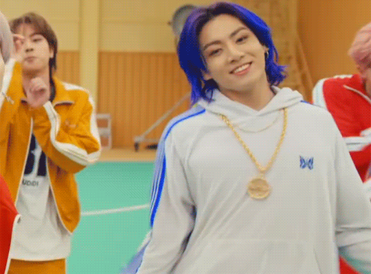
In the end, you should hopefully be able to make something like this:
This is gonna be so long. Sorry. You can make a gif with just part #1! The rest is just to make it look better.
#1 Basics
If any of the tools/functions aren’t where they should be for you, your best bet is googling it, you might need to change something in your preferences!
Make sure to save your PS file... often. PS has a tendency to crash, especially on laptops.
First, you need to get the video file. I recommend a shorter video, a few minutes long, if it’s longer you might want to cut it into shorter parts beforehand. This is just because PS’s video import tool sucks.
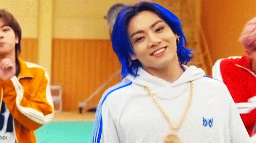
I chose the Butter MV, specifically Jungkook’s body roll at 1:24 because that’s what I want to look at for the duration of this tutorial. No further questions, thanks.
1. Open PS, go to File > Import > Video Frames to Layers

2. In the little pop-up, choose the part of the video that you want to gif. This will import every frame of the video into PS as a layer, so it has to be a relatively short part, or it’ll take ages (and gifs can’t be that big anyway). Now you can also see why it’s almost impossible to select the correct part if the video is too long.
The little controls at the bottom are for trimming, the one in the middle just for the preview. Make sure “Make Frame Animation” is selected! Then click OK.
3. Now you have your layers, and you have a frame animation! On the right are your layers, that’s where we’ll apply the colouring etc. later on. On the bottom, that’s your timeline or frame animation - that’s what the gif will be in the end! So if you delete frames, the layers will still be there, but they won’t show up in the gif. If you click on a frame, you can see the little eye checkmark on the layer that’s currently visible.
4. The timeline controls at the bottom that are relevant right now: set to “forever” so the gif will loop, you can play the animation with the play button, and you can delete the selected frame(s). The number on each frame is the speed of the gif, depending on the video I usually set it to 0.05 or 0.06 (photoshop lies to you when you play the animation, the only way to test this is to open the finished gif, preferably on tumblr or wherever you want to upload it).
5. As you can see, the animation starts a bit before the actual part that I want, so go ahead and delete all the frames in the animation that you don’t want! You can delete the corresponding layers too if you want, to make the PS file smaller, but it has no influence on the gif. (Hold Shift to select multiple frames as usual)
6. Next, we’re gonna crop the gif however we want! You can do this with the crop tool in the left sidebar, but with gifs like this where there’s a lot of moving parts, I sometimes just use the selection tool in the left sidebar, like so:
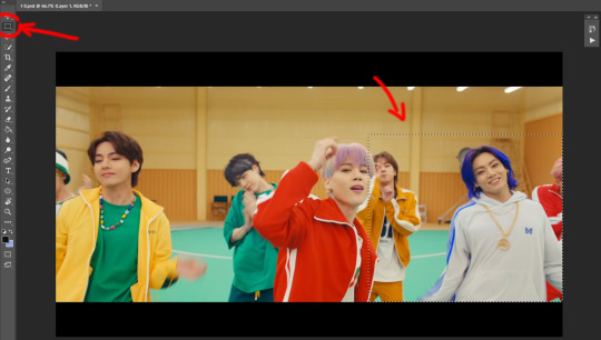
When you click on different frames, the selection stays, and you can check to make sure Jungkook doesn’t suddenly go out of frame if you crop it like that!
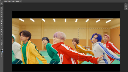
At this point, make sure the selection/crop isn’t smaller than you want the gif to be! For tumblr, what matters is the width (in pixels) of gifs. In the end, the width dimensions on tumblr should be 540px (1 gif per row), 268px (2 gifs per row), or 177/178px (3 gifs per row). Anything else will lead to very shitty resizing!
For this gif I’m going full sized, meaning 540px wide, so I made sure my selection isn’t smaller than that.
Then just go to Image > Crop, and it’s done!
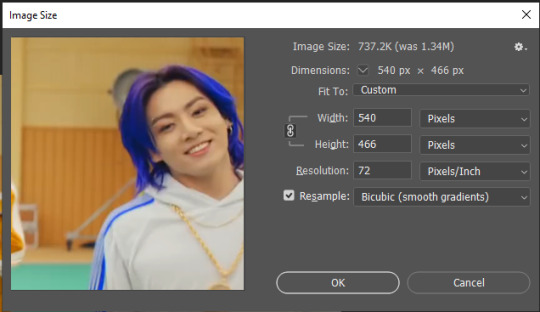
7. Check to see if this is what you want, then resize: go to Image > Image Size to resize the picture. Make sure the little “link” between Width and Height is active (to keep the same aspect ratio), then set the width to 540px or whatever you chose. I always set the resample option to Bicubic.
Once that’s done, set the zoom to 100% right above the timeline, to see what it really looks like.
Almost done! A little note about the sizing: width is the important part for tumblr, but if you want to make a whole gif set (especially with more than 1 gif per row!!!) make sure to make all the gifs the same height, otherwise they won’t line up and tumblr will do whatever it wants.
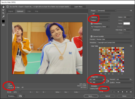
I ended up making mine 540 x 400 and ended up with this:
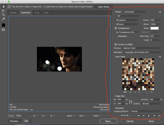
8. Time to save the gif!! Go to File > Export > Save for Web (OR just use the shortcut Ctrl + Shift + Alt + S) (or whatever it is on Mac).
In the pop-up, you can change things about the gif, but most things should already be the way you want it (Image size, Looping option forever). Selective should be the default, just like the rest.
You can choose between Pattern and Diffusion, some gif makers swear on one or the other, I go back and forth.
On the bottom left, you can see the size of your gif. Keep an eye on that! I believe Tumblr allows every single gif to be up to 10mb, but I try to keep mine under 5mb or close to it, because I think tumblr adds compression if it gets closer to 10mb?? Anyway back in my day you couldn’t upload anything over 1mb. You’ll never know our struggles.
Then just save it, and that’s it, you made a gif! Well done!! Here’s the end result:
:)
#2 Sharpen
There are countless ways out there to make gifs as smooth and clean as possible! Here I’ll show you the easiest way, but it also provides a good basis for other methods. The main difficulty is that you you need to sharpen the layers, but you don’t want to 100 layers one by one. So what we’re gonna do is convert the layers into a Smart Object, which functions as one layer!
1. Convert the frame animation timeline to a video timeline with the little button right underneath on the left:
It should look like this, and I’m sorry but I can’t explain this one because I’m not an expert here, but you can just ignore it:
2. Select all layers: Select > All Layers, or just manually.
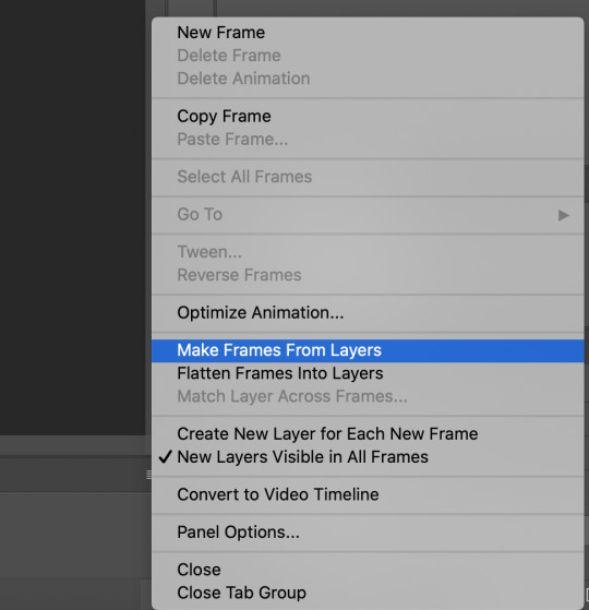
Then right click on the layers > Convert to Smart Object. Now there’s only one layer left, but don’t worry, the frames are still there!
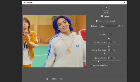
3. De-noise! It reduces noise, takes away some of that grain. More necessary in some videos. It also makes it less sharp, so I do this one first. Filter > Noise > Reduce Noise

My default settings are, Strength: 6, Preserve Details: 60, Reduce Color Noise: 45, Sharpen Details: 25, Remove JPEG Artifact: No. But you can play around, especially with the strength, and see how the little preview looks. Don’t apply too much of it! Or it will look weirdly smooth with no details in the end.
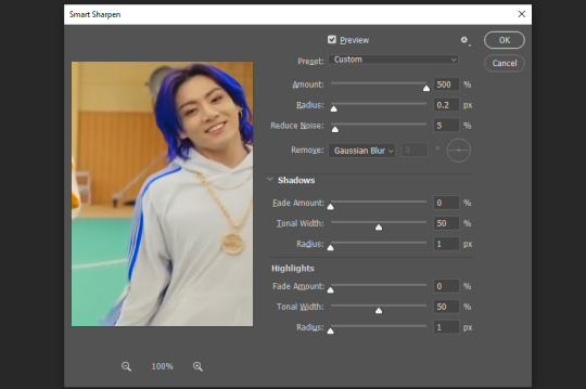
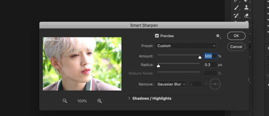
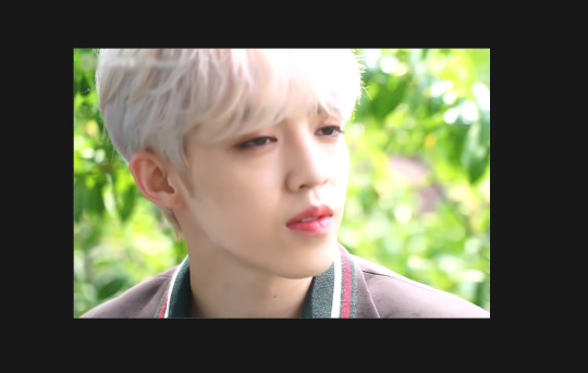
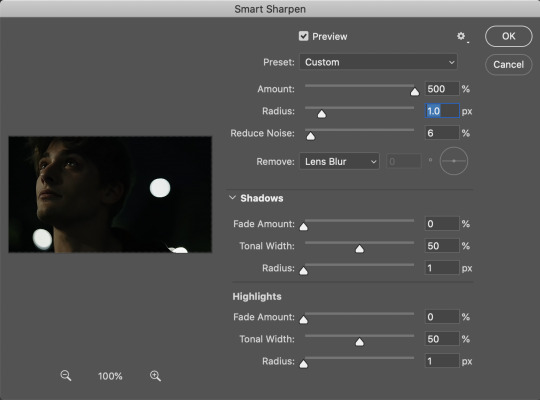
4. File > Sharpen > Smart Sharpen.
Settings: I usually have mine at Amount: 500, Reduce Noise: 5, and Radius at either 0.2 or 0.3, depending on the video. I’ll actually do 0.3 here, because I find it a bit blurry otherwise. If you sharpen more, it can quickly get grainy.
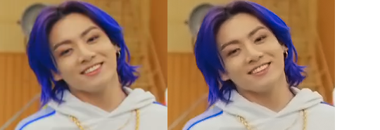
The difference isn’t huge, but here’s a little before and after denoise & sharpen:
5. Technically you can just save it as a gif (save for web) as shown above now, or you can convert it back to a frame animation, which I’d recommend especially if you use certain other sharpening methods (I’ll show you how to convert it back at the end of the colouring part), but for now, let’s go straight to the next part:
#3 Colouring
Now, you CAN do this part right after part #1, still in frame animation, without a smart object. I prefer it like this because sometimes PS acts weird, but if you want to skip the smart object stuff: select all frames, and add the adjustment layers at the very top, above all the other layers. (It only affects selected frames; and it only affects the layers under it.)
The adjustment layers should be above the layer tray, and these are the ones we’ll use today: Brightness/Contrast, Curves, Vibrance, Color Balance, Selective Color.
All of these are optional! You can do one, or all, or any combination. This is just the very most basic for me to get a gif to a point that I like. I’d recommend sticking to these for a start, but once you get the hang of it, definitely feel free to play around! It’s fun! Every gif maker has different preferences here, too, so there’s tutorials for everything.
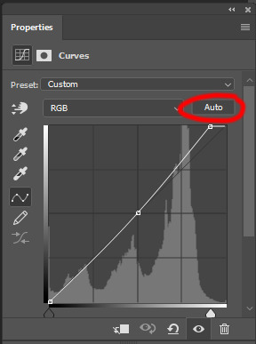
1. Curves: Just click Auto, tbh. You can play around, but Auto works fine for me as a start, just to brighten or darken some parts as a base.
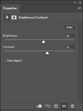
2. Brightness/Contrast: Usually videos are a bit dark, and contrast can help to make it seem sharper AND cut down on gif size, so I usually just up both of them a bit (but not too much! Or it’ll look cheap). Here I put them at B: 19, C: 23
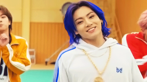
3. Vibrance: I love very vibrant and colourful gifs, so I usually up the vibrance (and sometimes the saturation). This one is already very vibrant, so I only put +5, but if you try to colour, say, a very moody tv show, this can help wonders, especially if you want to work with the colours more later.
If you prefer less vibrant gifs, you can also lower the values here!
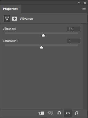
4. Color Balance: getting a bit more complicated now. Often, videos will have a slight yellow or green or blue tint, and this is where you can correct that. This video is a bit yellow, so I added +17 Blue. It was still too warm, so i added -11 Cyan as well. This neutralized the yellow tint, but I wanted some of the reddish tone back, so I added -5 Magenta. I usually do a similar process like that, depending on the tone.
Instead of Midtones, you can also do this for Shadows and Highlights individually.
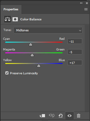

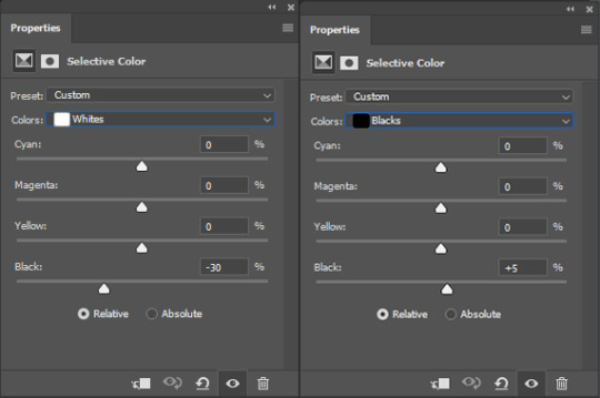
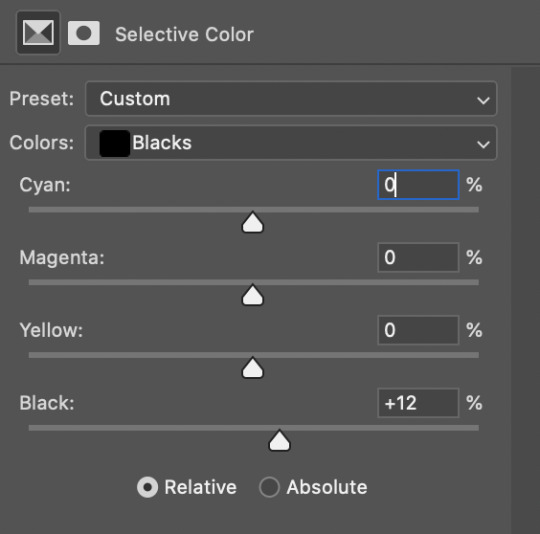
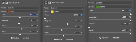
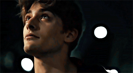
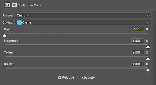
5. Selective Color: now this is the most complicated, but also the most fun to play around in my opinion! Be careful here, if you do something too extreme it’ll look like shit or make the gif super grainy. I some rough goals in mind here: make the blue hair as blue as possible, make their skin tone a bit less pale, and enhance the black and white (which I always do).
You choose a colour at the top, and then add or subtract cyan/magenta/yellow/black values for that colour.
Skin tone: yellow and red. For this gif, I just added black to both, making them darker. Sometimes, if you change one or both those colours for a different part of the gif (for example, if I wanted to make the background less yellow, I’d subtract yellow from the yellows - but then I’d add yellow to the reds, to make the skin tone natural again.)

Blue hair: Just ramp up the cyan for the blues. Be careful with putting anything to +100, but here it’s already so bright that it should be fine. His roots are more purple, so I changed the magentas by adding cyan and black, and subtracting magenta and yellow. It’s not super clean, but fine for our purposes.
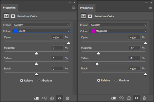
Black/white: depending on the gif, I often either add or subtract black to the whites. Adding makes the highlights less blinding, a bit darker, and flatter (I like to do that if one side of the face is bright white in the sunlight, for example). Subtracting creates contrast, makes it brighter, can wash it out. It can also lessen the gif size, and here it’s mostly just the tracksuit instead of important details, so I subtracted black. For the blacks, I almost always just add a bit of black, to make it more intense. Just like adding contrast, this can make the gif seem sharper and less grainy.

And done!
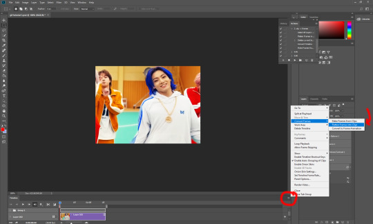
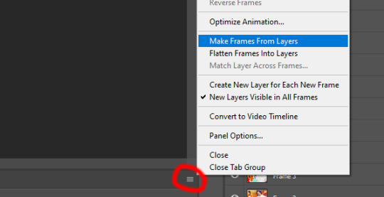
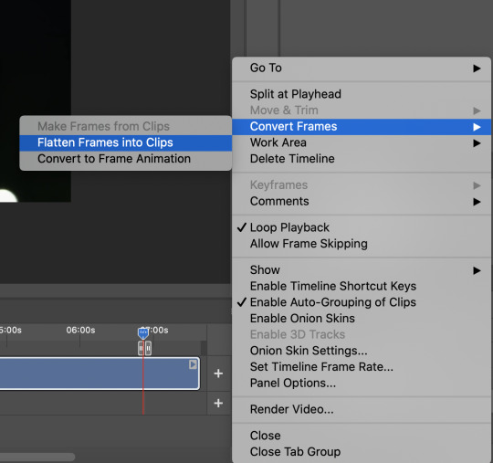
6. You could just save it as gif now, but as I said, I prefer to convert it back to frame animation timeline first, if only because I like to let it play through before I save it, and it works better for me there than in the video timeline.
Select all frames, then click the little menu on the top right of the video timeline > Convert Frames > Flatten Frames into Clips
7. When you scroll down to the bottom of the layers now, the old smart object + adjustment layers should be at the bottom, under all the new layers. Delete the old ones, we don’t need them anymore.
8. Convert the timeline back to frame animation, by clicking the little button at the bottom left of the video timeline:
9. Click on the menu top right of the timeline again > Make Frames from Layers
10. Now, just some potential cleaning left to do. Sometimes, there’s a doubled or empty frame or layer at the beginning or end, just delete those as necessary. The timing of the frames is probably off, too, just select all frames and set the delay time to 0.05 (or whatever).
Now your done! Save as gif, and you should get this:
I included some bonus links and tips after this but tumblr ate that whole part so I guess it’s going into a separate post. (Here is is)
Anyway, I tried to make this as easy to follow as possible for beginners, but feel free to send me an ask for clarification anytime. Hope this helps, now go make gifs and have fun!!
#photoshop#tutorial#gif tutorial#ps tutorial#btsgif#*#*tutorial#this took so much longer than i expected i'm not giffing for at least a week now
225 notes
·
View notes
Text
how to make weirdcore on photoshop!! :D
i got a great ask from @demonic-screeching about how i do my shit, so i thought id make a more detailed post here! ive been making wierdcore on this blog since january 2021, so ive learnt a lot! more under the cut.
1. find a base image!! i use imgur and pinterest. imgur is especially great because its full of old ass images of the most random shit. you dont even need an account, just hop in and search for mundane stuff like 'hallway', 'field', 'house', etc! explore! screenshot/save any images you think would be cool in an edit- make your own personal archive!! they could even be stills from videos, memes, etc!
2. cropping! this is important. cropping determines the amount of context an image has, as well as focusing on a main point. weirdcore is about removing context, which makes images seem familiar yet unfamiliar at the same time. it also adds to the amateur quality of the aesthetic- "why has this person taken this weirdly specific photo?" 99% of the time they didnt! i just cropped the shit out of it!
lets use an example of one of my old edits :) cool concept, cool base image. but it seems like its missing something.... what if we........
cropped it all out????
it is now....... free of context! where are we? where are we going???? who fuckin knows man...... we just gotta gtfo real quick by the sounds of it. the cropping has also compressed the image, which makes it feel even more weird and nostalgic! which brings me to my next point:
3. compression. make sure ur edits are lookin cRUNCHY! weirdcore is about amateurism and nostalgia, so use any means to make ur photos look like theyre from 2003! my personal method is zooming out of the image on photoshop so it gets smaller, then screensotting just the image, then opening the screenshot up in another document and zooming in again to reveal the compression.
4. fonts and captions! these are not necessary, but add to an edit a great deal! common fonts in weirdcore are Helvetica, Arial, and Times New Roman because theyre Normal And Boring, which really adds to the amateur aspect of weirdcore. i like to experiment with gothic and 3D fonts which can give a more webcore-y feel. this site is great for making free 3D text that you can download and add to your edits in photoshop!
as for captions, experiment! use random phrases that are stuck in your head, the more abstract the better! weirdcore is a surprisingly good way to express weird and abstract feelings. keep things vague and intriguing. ask questions!
5. editing. again, experiment! i normally fiddle with the saturation, brightness, and contrast. don't max out every setting- try and think about how you want the image to look! light or dark? bright or dull? you dont always have to tweak things if you think theyre fine as they are. other good tools include liquify, bevel/emboss, smart sharpen, gaussian blur, and warp! liquify is my favourite because you can squish and stretch the image! you can also try warping your captions too! the blemish tool is also rlly good! it can give u some weird trippy blurred out effects.
clone stamping can also help you to morph and duplicate parts of the image too! its very cool
6. go insane!!!!!!!! throw all basic design principles out the window. ignore the rule of thirds. stretch things. make them crunchy ass jpgs. use horrible colours. think about what youd do if you were a child with access to photoshop in 1997, or a middle aged conspiracy theorist making images for their cryptid blog. or like idk some weirdo on myspace.
7. orbs. use the brush tool to make orbs! theyre really good for blocking parts of an image, adding an ominous presence, making shadows, or adding bright lights! shape them, stretch them, make them funny colours. you could also use rectangles, circles, stars, etc... any shapes are cool!
8. inspiration! follow weirdcore blogs on tumblr! ask questions! learn! other resources include the weirdcore wiki and the weirdcord discord server! its where i learned a lot of what i know now, its very active, and has tons more resources there!!
overall, just experiment. you never know until you try, and its fun to develop your personal weirdcore style! its a very broad aesthetic that everyone can contribute to, and a cool outlet!
and lastly, dont worry about followers and likes! online, weirdcore is very random. some of my edits i spent 4378294 years on get like 5 notes, while i can shit something out in 5 minutes that ends up becoming my top post. popularity is pretty irrelevant here. just have fun and do things your own way!
#bonesposting#long post#weirdcore help#sorry this is long i just love infodumping about this :D#weirdcore#aesthetic#liminal spaces
25 notes
·
View notes
Text
Masks and Remaking Kandi Blah Blah
this is my THIRD time writing this post up
Soooo let's talk about that briefly. Why would you remake kandi?
Maybe the string is wearing thin. Maybe you don't like a color you used, or the type of beads or string you used. Regardless of, the general consensus is that remaking kandi you were traded for a reason beyond changing the string to renew it isn't a good idea. Obviously kandi is ever-changing, and this idea might change. Who knows?
Once you've decided you wanna go through with the remaking process, you've gotta disassemble it. I'd suggest starting from the bottom or top and just cutting the string, taking off the affected beads, and cut again. I'd advise going slow so you don't lose any beads. If you're also like me and have really bad vision-- hello y'all-- I'd suggest sorting apart colors you get confused. Otherwise you're gonna be shining a flashlight in your bag of beads for an hour wondering 'is this black? or dark blue?' Plot twist: it's neither and it's dark purple.
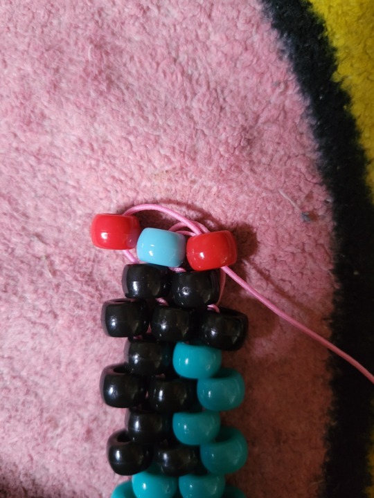
Today I'm gonna be using a modified version of this pattern by T3TR1S, with the old mask pictured below. Never too late to start on Halloween preperations, right?
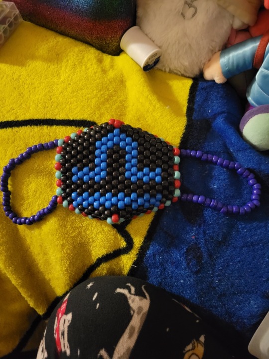
[Image ID: An uncropped photo of a kandi mask. It's 21 wide by 14 tall. The straps are a dark blue. The mask is black with a red and light blue alternating border, and the mask has a libra sign on it in a more cerulean color. End ID]
look i felt too lazy to crop that last night.
Regardless of the pattern you decide to use, it's gonna look something like this when you enlargen it/click on it.

[Image ID: A picture, once again 21 high by 14 wide, of the patten for the mask above. This is the unmodified version. It lacks the red and light blue border, and the sign on it is more of a darker teal color. End ID]
There's no numbers though, right? If you recall from one of my multi-stitch tutorials, this is because masks can be started from a few different places and can be finished in a couple of ways that're all similar. Having numbers would likely get confusing.
First, you're gonna be chosing a place to start your mask. I personally like to pick somewhere around the middle of the pattern. You need to start your mask from one of the straight sides, and there has to be at least two beads to start off with. For instance, starting from the two beads at the bottom of the left side would work, but using the very last bead-- only one of them-- wouldn't. This is because of how brick stitch-- or more commonly called peyote stitch-- works, which will be explained shortly. AKA, right now.
First, you're gonna wanna grab some string. I suggest about two arm's length is good for now. Take that, and fold the two ends together like so--
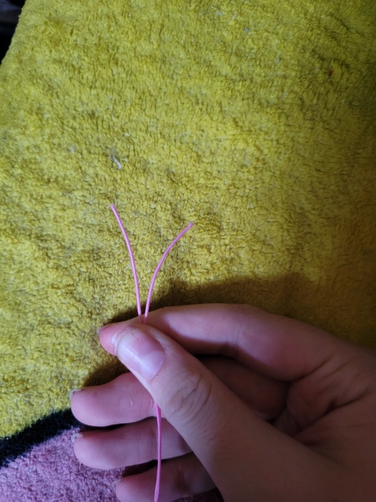
[Image ID: a picture of me holding a piece of pink string. It's folded together, and the two ends of the string are pressed together. End ID]
This is why we need where we're starting to have two beads, because that's how we start peyote stitch! I'm not going to go too much into detail on that here, because I plan on writing something on peyote stitch anyway.
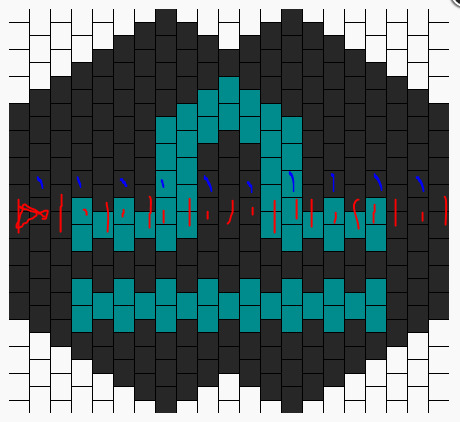
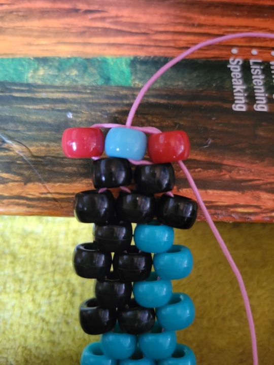
Follow your pattern across whatever row you chose. It should be a straight-shot across-- there shouldn't be any weird curving or anything yet. You're gonna put on those two beads, then the one bead depicted in the middle of those two. Like this--

[Image ID: A picture of the same mask pattern from before-- but with red marks depicting the two starting beads, and the one after. End ID.]
This picture shows where I'm starting my mask-- the two beads on the end then the one bead. You're gonna put the two beads on the string-- one per end of string you're holding together-- then you're gonna put your strings together and put the one bead through BOTH of the strings.
For this, I'm gonna end my row with two beads-- great! You... might not though. I think that's possible? Regardless, it makes everything a bit harder. At the end of your row, I highly suggest taping an end of your string down after pulling it tight, and taking the other end of your string and beginning building. You'd start building by putting on an end bead (a bead above/below where you ended, respectively) and going through the next bead that's sticking up (or the last two beads you put on). I'd build that for a row or two, and then build with the OTHER string for a row or two. From there, you can just keep going til the points, which I'll show how to handle shortly.
If you're gonna end with two beads-- great! Finish up that row, putting on the next two beads, then the one bead, then the two beads. Follow the pattern you have on hand for color changes, and make sure to keep track of which string is the TOP part of your row, or the BOTTOM part. Otherwise, you might end up with colors in the wrong place.
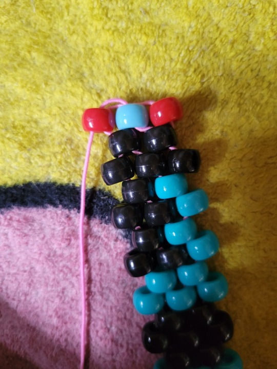
When you're done with that row, if you have two beads, congrats! You can tie that off using some square knots. Welcome to the building of the actual mask! The entire way this works is through putting a bead on, and going through the next one sticking up... for now. There's weird ways to starting new rows that I'll unfortunately have to cover. Look at your pattern.
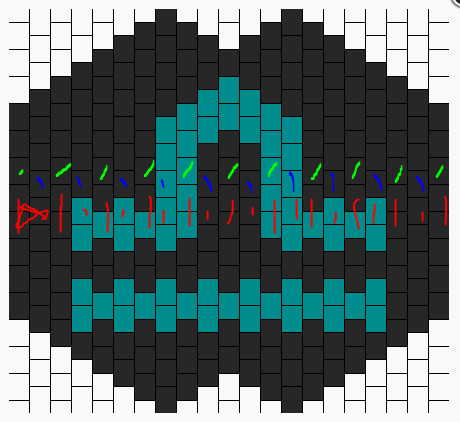
[Image ID: A picture of the mask pattern, with red marks all along the first row. The next row is marked in blue. End ID]
In this picture, I've shown my first row. The blue marks will be representing my next row, building upwards. Building downwards would be the same thing, just toward the bottom of the pattern. In other words, the next row is depicted as the next raised beads near your last row.
[Image ID: A picture of the mask pattern from before. The third row of the pattern is highlighted in lime green. End ID]
Here, I've taken the liberty of highlighting the third row for you! But once you get to the end of that third row, you're probably wondering how to put that end bead on. This is the unfortunate part...
There's a couple of different methods to this. This is Vicky's old tutorial on masks, which could be useful and worth it to follow instead of this if this doesn't make sense.
I learned using iHeartRaves' video. You know, the one with people complaining in the comments about this part in particular? I spent about an hour figuring out how to do this, but I think I have the hang of it by now. So, here we go.
You're gonna put a bead on your string, the bead should be in the color of the last bead on that third row. For me, in the original pattern, it'd be black. For my modified version, it'll be red.
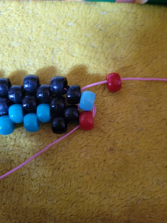
[Image ID: A photo of my mask progress. There's a red bead hanging on the pink string I'm working with to build upwards. There's a blue bead and a red bead below where the red bead will go. End ID]
You see that red bead to the side there? Below the light blue one? Stick your string through the top of that, like so.
[Image ID: A picture of my mask work in progress. The pink string from before is going through the top of the rightmost-- or the bottom if the mask is looked at horizontally-- red bead. The string is coming from the bottom of the bead, and the new red bead we put on the string is posistioned next to the light blue bead in it's rightful place. End ID]
If you pull tight (and you should!) the bead will move to the top of those side beads. You can use your fingers to move it and hold it in it's proper place.
Now, take your string and go through the bottom of that light blue bead, like so...
[Image ID: A picture of my mask WIP. The pink string was pulled through the bottom of the light blue bead, and is coming out of the top of it. End ID]
That part might be a bit hard. Don't be afraid to move stuff around to get it in there, you can tighten it up and put the new red bead back in place after you get it through. From there, you put your string through the top of the new red bead, like so!
[Image ID: Another mask WIP picture. The pink bead is going through the top of the new red bead, and is coming out from the bottom of it. End ID]
From there, start row 4! Your new red bead should be secure now. Everytime you come back to this side, you'll need to do that. It'll always be the same process. Put new bead on string, put string through top of bead two beads down, put string through underside of bead one bead down, put string through top of new bead.
On the other side of your mask, you can just continue building by putting the end bead on, and going through the last bead you put on. Though I suggest pulling the string for the last bead really tight, this'll keep everything together better.
Keep following your pattern until you get to the spikes part around here--
--okay only 10 images allowed per post. fuck you tumblr. at ANY rate...
There's a part of your pattern where it doesn't go straight up anymore. It drops off and starts to make a spike. Vicky explains what to do about this pretty well here. But, even then, here's some text instructions. When you finish that row, and there's no bead to put above it to start another row, just shove your string through the last bead you put on. This'll start the spike shape. You'll just keep doing that as you go through to carry the spike higher and higher.
As you go, the spike will break off into two smaller spikes. This is fine-- just focus on one spike, building on that until it's finished. After you put that last bead on, take your string and weave it towards the middle of your mask so you can start the other spike, tie it off tight a few times, and start on the other spike. I hope that makes sense-- I swear I'd have pictures if it wasn't for tumblr's image limit. (actually you might be better off watching Vicky's video from here, I'm not gonna lie. If you wanna learn to tie off the mask and tie together the spikes from her, here's a timestamp for that.)
If you're still here, I'm sorry lol. But let's keep going! Build until the spikes and complete those on the top, then build on the bottom and make those. When you're done, you should have a shape resembling the pattern you're following.
okay ive been here for, about 4 hours. ill be back tomorrow (but in one second for you :) )
it's the next day, let's talk about lacing up masks!
You're gonna want a small piece of string, doesn't have to be that long at all. You're gonna thread that through the bead in the middle of the spikes. For me, on the top, it's the black bead above the top of the libra sign. Even it out so the two ends of string are together and they're mostly equal. Then, you're gonna take the string on the left and put it through the right bead that's one up. The left string goes through the right bead one up. Then you take the left one, go one up to the right. Left one goes one up to the right. Right string goes through the left point, left string goes through the right point.
Pull that together! It should lace up into something a lot like this (photo by sarasunshine on KandiPatterns). See how her mask comes together at the top in a kinda point? That's what we're aiming for. Pull that tight and tie it off. Do the same to your bottom spikes.
We're at the final stretch! Specifically it's time for mask straps. This one is also hard to explain, so I'm gonna link you to the point in Vicky's video where she adds straps. In addition, she only laces her masks twice, while I do mine thrice. There isn't much different between the two, it depends on how you feel.
Straps. I'd highly suggest more stretchy fabric cord for this rather than clear elastic or something not so stretchy. I used all my fabric cord on this, so I'm gonna use this weird jelly glitter string I found? I genuinely have no idea where it came from. I do my straps in the same way Vicky does, and I think she can explain it better than I because she isn't limited to 10 images per post. Though, I will suggest you be careful, it's really easy to use too many beads, or to make the straps too tight or too loose. imo, i like to have a LOT of room on my string (seriously, i only used about 22 beads) because I move the beads around so they aren't on the back of my ears. by the time i'm done tying on my string, the straps are usually half string and half beads.
Just follow how Vicky does it, fiddle with it a bit, it's ultimately up to personal preference about how you'd like to do it.
okay that's all i've gotta say uhhh i should have something up on putting fabric in them for actual use soonish. go forth and make stuff.
#kandi guide#kandi tutorial#kandi mask#kandicore#scenecore#best of luck to y'all tumblr's image limit kills me once again
21 notes
·
View notes
Text

For this gif tutorial I’m going to try to keep it as basic as possible, I may add a few tips for coloring at the end, but for the most part this is going to be how I make my basic gif. Also I’m not going to use my vapoursynth to process the video beforehand, just because I know not everyone uses it and it’s harder to learn. This is going to be just a downloaded mp4 video through the gif process. Don’t let the idea that this is a BASIC TUTORIAL fool you, I’m going to try to teach you a lot of things. It’s gonna get wordy, but i will try my hardest to keep the process easy. I’m just going to explain what things do instead of having you just copy + paste my method and not know what it means. okay? okay.
Before we start though, if you plan of giffing live stages you either need to accept the they will not be super crisp and clear OR learn how to use avisynth/vapoursynth to resize the videos without quality loss.
If you just want to gif music videos or variety shows then this should still give you HQ gifs.
Other notes:
try to ONLY use 1080p and up video if possible, maybe 720p if you’re really desperate, but anything under that... it’s not going to look good at all, so try to avoid using them.
The Photoshop I am using is PS 2020, so all my screenshots will be from that version and with my weird set up. But I’ve been using pretty much the same method since cc 2015 so other than the fact that some placements and names are tweaked, it’s the same. (If you can’t find something on your version shoot me an ask and I’ll try to help! And asks I get on this tutorial I’ll link HERE for future reference)
CUTTING VIDEO
To cut videos I’ll just use my quicktime player.
I use edit > trim to select the portion of the video I plan to gif and save that as it’s own new mov file.
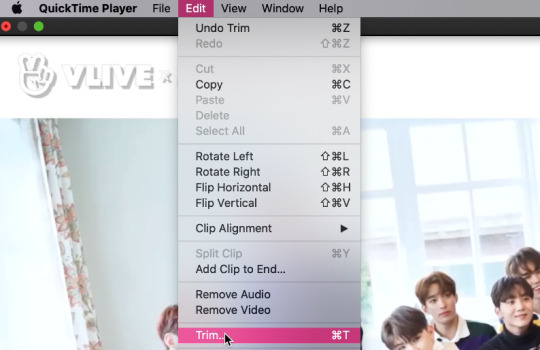
which pops up this tab

that you just slide until the part you want to gif is selected

then just save it as a new video and your done with part 1
ENTER PHOTOSHOP
Now what we’ll do is open our photoshop and import that clip into layers
FILE > IMPORT > VIDEO FRAMES TO LAYERS and select your video.
A small pop up will appear to show the clip you’re opening, you can trim it further here or just keep going by clicking okay
my setup is weird for drawing BUT you should have it looking remotely like this:
The things you will DEFINITELY need to see are TIMELINE, LAYERS, ADJUSTMENTS. If you don’t have these sections you can add them to your screen by clicking on the WINDOW tab at the very top menu bar and clicking on them

LAYERS - this is pretty self explanatory but each row is a layer in the gif. the more layers the bigger the gif will end up, the longer it plays. So bigger clips will have more layers and end up as larger gifs in the end.
TIMELINE - This is where you can edit the gifs timing (make it faster or slower)
We’ll be doing a bit of work with it so it’s important to know it well
ADJUSTMENTS - Best friend and worst nightmare. this is where ALL the tedious recoloring is done. VERY rarely would you not use these. 99.9% of kpop things are filmed through a green or blue lense so you’ll want to fix that to not have ghost idols
So, Let’s make a gif
Step 1 - In the top right corner of your timeline is a set of lines, click there and then click SELECT ALL FRAMES
under each frame is a time stamp (this video’s is 0.04) this decides how fast each clip goes by, or how quickly the gif moves. Personally I prefer slower gifs, but I say anywhere between 0.04-0.06 is a decent speed.
Step 2 - with all the frames selected, click on the small down arrow next to any of the frames and change the speed to your liking. (I’m going to use .06)
Step 3 - in that same tab of lines we’ll now click CONVERT TO VIDEO TIMELINE, which will change our Timeline to look like this:

Step 4 - Back in our very TOP menu we’ll click SELECT > ALL LAYERS, then on the TOP menu click FILTER > CONVERT FOR SMART FILTERS (this might take your computer a minute since our File is still pretty large.) Now our Time line will look like this:

Step 5 - Sharpening
This one is VERY MUCH something you’re going to have to play with to get your settings to be how you like them. It’s also where I’d use topaz adjustments, BUT since I said we’re doing basic PS gif we’re just going to be using smart sharpening. SO:
in the TOP munu again, click FILTER > SHARPEN > SMART SHARPEN
A pop up window will appear and you can edit the settings to your liking. Mine:
Step 6 - Resize your gif or crop it to tumblrs standards: big singal gifs have a 540px width || Two gifs use 268px || and three gifs use 177/178px
To do this we’ll use the crop tool and type in our dimensions in the menu bar:

and then crop to your liking. (this doesnt resize the gif it just crops to the correct ratio so we still have to shrink the gif)
Next, we’ll resize the gif to that size in the TOP menu click IMAGE > IMAGE SIZE a pop up menu will appear and you’ll type in your resize ratio and click enter.
Now technically thats a gif. it’s TECHNICALLY done. but mine is white washed and there are words on it that I dont want so onto the coloring and blurring.
First I’m going to show you how I blur text on gifs. because text is EVERYWHERE in kpop content and it’s hideous and I hate it. so lets kill it.
BLURRING LETTERING
First we’re going to add a new blank layer to our LAYER TAB by clicking the little box with the + inside at the bottom
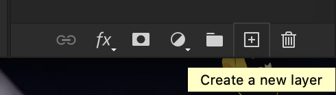
Sometimes doing this can mess up the timeline’s selection but its SUPER easy to fix so lets do that.
So in our timeline we have these two bars on each side that select what part of the gif will play. this is also where you can readjust your gif if it has extra frames at the end, or it ends up being too large and you have to make the gif smaller to save it. Just click and drag the bars back to where our gif actually ends, and all is fixed!

Now on our new layer we’re gonna take a paint brush (one of the ones with a lot of fade NOT the solid circle ) and paint over where the words are like so:

MAKE SURE ITS ON OUR BLANK LAYER AND NOT THE GIF LAYER!!
I know it looks stupid but trust me okay.
Now in your LAYER tab we’re going to duplicate our gif layer by right clicking on it and selecting duplicate.
Then we’re going to drag the new gif layer so that it’s above the paint layer in our LAYER tab :
Now, right click on the top gif layer and select CREATE CLIPPING MASK. it should put a little down arrow to the left of the picture, toward the paint layer. This means the gif is ONLY visible where that paint is now.
So we’re going to click on FILTER in the TOP menu again (while we still have that top gif selected!) and Go to BLUR > GAUSSIAN BLUR. a pop up menu will appear and you can just drag the radius until the text is as blurry as you want it to be. (also IF you missed part of the text, you can just go add more paint to your paint layer and it will blur wherever you paint!)
so now my gif is like so:
So now we’ll color him, because he’s pretty washed out.
ADJUSTMENTS
This is where I’m going to be the least specific about what I do and more about what tools do, so that you can learn how to color things the way you like them!
The Adjustment tab on Photoshop has 16 options but I’m really only going to talk about 6 of them. We’ll do it in order though. All the actual adjustment tools will open in the PROPERTIES tab
Brightness / Contrast - Pretty self explanatory, but definitely should be toward the end of your coloring, as if can effect the quality a lot. Small adjustments do A LOT so don’t go crazy,
Levels - Levels is all about the balance of how dar or light your gifs will be if you adjust in the RGB layer it will adjust for the entire image, but if you change the selection to RED/GREEN/BLUE it will adjust just those colors hues. Also there are three small droppers to the left of the graph. using those you can select which part of the gif you want the image to recognize as the lightest/darkest part of the gif, and the tool will adjust the gifs coloring to that point. ( play with those droppers! magic happens i swear!)
Curves - Kind of like levels but instead of how light or dark the entire image is it works more on contrast. REALLY play with the curves options, i’m sure most things you can do with other tools can also just be done in curves if you’re patient enough to learn
Vibrance / Saturation - Vibrance will make duller parts of an image higher contract and brighter and saturation will make everything a more neon shade. or in reverse lowering vibrance will dull out the things that were already neutral and saturation will dull out the more vibrant parts of the image (usually reds)
Color Balance - Good for fixing tones. so if a live stage is SUPER BLUE!!!!! you can readjust and calm down the blues to dull them out or get rid of them completely. Again play with this its insane what it can do
Selective Color - adjusts the different colors in your image without touching the other colors. if you wanna touch the reds, make them pinker but not change the blues and greens, you do it here
If you want MORE drawn out explanations of what each of the 16 adjustment layers do here and here are actual articles you can look at. But it’s all about practice. playing with all the adjustments alone and together. Finding out what you like to do!
Now when you gif is ALLLLL colored and you’re ready to save it we do FILE > EXPORT > SAVE FOR THE WEB and a whole new window of options pops up. I’ll give you two examples of how to play with those options and then we’re done!

keep in MIND tumblr’s gif limit is 10MB which is pretty huge now, but still watch your gif size!!!!
AND SAVE your done!

I hope this was helpful! Let me know if you have any questions,again I’ll have an ask tag for it and it’ll get linked HERE if people end up needing help!
Happy giffing!!!
#drm.pst#drm.txt#Gif tutorial#this is LONG okay please be aware of that before you open it#als i did NOT reread it because it took me 3 hours to type out so it's probably a grammatic nightmare#BUT i'm JUST under a new milestone so i'm gifting this early because i had the patience to do it today lmao
97 notes
·
View notes
Photo
so here’s my disclaimer: I hardly know what I'm doing. This is my glued together homemade giffing method that I’ve created over months of just random experimentation and bits and pieces from all kinds of tutorials. there are probably better or more correct ways to do a lot of these things! this also isn’t a completely universal tutorial, some of the specifics are geared towards giffing skam, specifically skam france.
I gif in photoshop cc 2020 on a macbook. Some things like keyboard shortcuts and little things about the photoshop interface will probably vary if you are on a pc/ other version of photoshop!
this is very long and very unprofessional, but I hope there is something in here that someone will find helpful!
we’ll be going from this:
to this:

up to date as of October 25, 2020
downloading clips
selecting what part you’re going to gif
cropping
my action for resizing, converting to a smart object, and sharpening
coloring
exporting and setting the delay
tldr tips
1. downloading clips
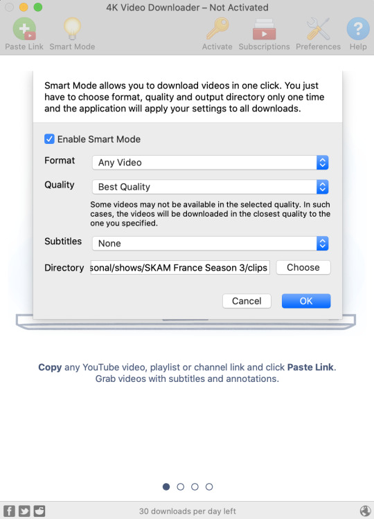
4k video downloader (which you can get for mac or pc here) is great for things posted to youtube, especially from skam france because all the clips are on their youtube with no weird geoblocks or anything! it’s really easy, you just have to open the clip in youtube, copy the link, and go into the program and hit paste link. I like to put on smart mode first and set the destination folder so all my clips go into the place I want.
There is a 30 video per day download limit, so if you’re thinking you really want to gif lots of stuff from the show, and want a big chunk or a full season it’s definitely worth hunting for a mega or google drive with full episodes to download because it’s just less hassle! I might come back to this post later and compile a list of all of those, but for now if you type “[remake] no subs google drive” or “[remake] no subs mega” into a google search, you’ll probably find something! the all of skam website has no subs for several remakes, but not all!
If you don’t have enough space on your computer to be keeping full seasons, I know there are methods to get screencaps without having to download (generally for giffing movies and regular tv I think this is a common method), but I’ve never done it so I’ll redirect you to this tutorial that explains it! you should probably just go there for the whole thing tbh it’s much more coherent than this, but I digress.
2. selecting the piece of the video you want to gif
now that you’ve got your episode or clip you’ll want to just open it in photoshop! if you go the screen capping route the way to do that is a bit wonky, so you can keep following the tutorial I linked above and join back in here at coloring if you like!
if the timeline at the bottom doesn’t pop up automatically you can go to window > timeline and turn it on! now you can use the scrubber bar thing to find the moment you want to gif!
The advantage of this over screen capping is you can scrub with more precision. the arrows circled in blue below let you jump only one frame, where in screen capping I'm pretty sure you can only go by ten second or one minute intervals.
I usually drag the scrubber as close as I can to the start of the shot/moment I want to use, fiddle with the arrows circled in blue below to jump forward or back one frame at a time until I'm at the first frame I want. I move the left grey handle to the scrubber and then I hit the play button and let the whole shot/moment play. Pause and repeat the shuffling with the arrows until you’ve landed on the last frame you want to use and move the other grey handle.
the moment you want to use should be between your handles (it’ll look like what I have circled in red), and if you hit play, you should see the thing you want to gif playing on loop above the timeline. the speed will probably be weird, but we’ll deal with that at the end.
now I recommend doing command or control + s to save your gif as a psd (photoshop document). this is a working, editable file which means if photoshop crashes you can open your file right back up and keep working as long as you’re hitting command or control + s at regular intervals as you work. later we’ll go through exporting in gif format that can actually be uploaded to tumblr.
3. cropping
next I crop out any logos or black space at the top and bottom. Just click on the crop tool on the lefthand side of the screen, drag the edges and hit enter when you’re done. you can of course crop out more than just that, but regardless of what you crop out, now is the time to do it.
you can set an aspect ratio for your crop at the top of the screen if you’d like to be positive that all the gifs in your set will be the same:

4. my trusty action: resizing, converting to a smart object, and sharpening with one click
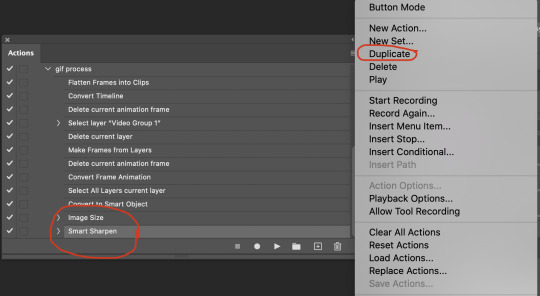
Now is when I use an action I made that does all the resizing, converts to a smart object, and sharpens. I’ll take you through the steps so you can conceptually get what’s going on, but I highly recommend using the actions window to record your process as you follow along so you have this action as well. It easily shaves at least 5-10 minutes off of the whole process, and these steps will be the same every time.
here’s how you make an action: go to window > action and open the action panel. click the plus symbol to start recording a new action:
in the window that pops up, give it a name and hit record:

now just continue with the steps below, and it will save them!
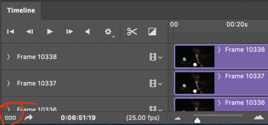
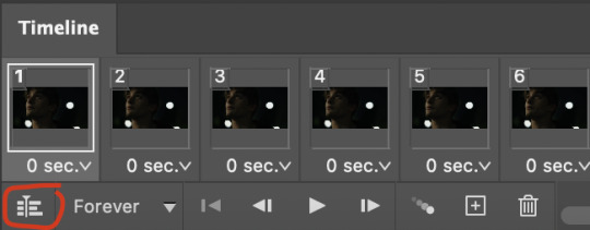
first you flatten frames to clips (I think it says flatten to layers on older versions of photoshop). this is in the menu at the top right corner of your timeline:
next you convert to frame animation by clicking on the symbol in the bottom left, circled in red:
if there is more than one thing in the frame animation, delete the extra one. you don’t need to keep the last one but it won’t let you remove it until there are other frames in there. also go into your layers and delete video group 1 and its contents. don’t ask me why these steps are necessary, I don’t really know, but I’ve noticed it sometimes gets wonky if you don’t do this:

now you want to make frames from layers and delete that first frame that was there before:
then we return to the timeline:
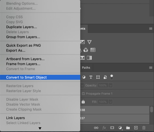
use command + option + a (control + alt + a for pc I'm pretty sure) to select all layers and then right click within your layers window and select convert to smart object. It’s important to convert to smart object after you go back to the timeline, or the gif won’t move:
next I resize. gifs for tumblr should be 540 pixels wide. for recording your action you should just go into image > image size and only change the width to 540 in case you ever have gifs cropped to different aspect ratios. don’t touch the height, let constrain proportions figure it out!

now, here’s what our base gif looks like, no sharpening, no coloring:
now to sharpen. go to filter > sharpen > smart sharpen. this is up to personal preference, but my go to settings are:
this is what we have after sharpening:

now is when you can stop recording your action.
just press the stop button in the action window:
this action is pretty much universal and after I select the moment the gif will be and crop however I want, I use it on every gif I make! so although this initial setup is tedious, now you’ll never have to do these steps again, and the process is magically much quicker.
5. it’s time to jump into coloring!
I typically start with exposure and sometimes some brightness/contrast. with really dark gifs like this, you kind of have to make it worse before you make it better. I did this:
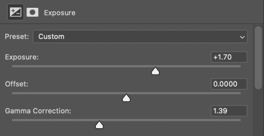
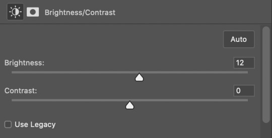
now the gif looks like this:
we have some static and some ugly bits, and this is where selective color comes in to fix it! boost blacks like this:
and now your gif looks like this:

the skin tone is looking a little sickly and weird, so I go into the yellows and reds in my selective color layer to fix it! I also messed with the greens here because I didn't want color in the background (that part is totally optional and just up to your preference):
now we have this:
to really take the color 100% out of the background, I did one more separate selective color layer for cyan (again, I just felt like it but this is optional!):
and now the finished gif:
there’s lots of fun extra things you can add like text and tints and overlays and all that I won’t get into, but feel free to reach out for help on those types of things!
this gif was certainly not the most complicated to color. some ridonkulously dark clips (*cough cough* vendredi 20h27 *cough cough*) take tons and tons more effort than this and a lot of the time you’ll want to use color balance layers and vibrance layers and all of that to mess with your coloring.
with all of this coloring business, I really just learned by doing. I don’t know all the technical purposes of each type of adjustment layer, and I tend to stay away from curves just because I find them confusing and annoying. The bottom line is that you should always experiment and find out whatever coloring works for you and run with it! I’m sure every gif maker you talk to does things at least a little differently!
I highly recommend taking the time to go through all the types of adjustment layers and just move the sliders around to see what they do! That’s honestly one of the best ways to learn and decide what you like!
6. now to export and adjust the delay!
the keyboard shortcut for exporting on mac is command + option + shift + s, control + alt + shift + s for pc, otherwise you can go to file > export > save for web
my settings are here:
the settings only need to be configured once! otherwise just hit save and follow the pop ups to choose where to save and what name you want to give your gif. Since you saved as a psd way back, that will be the name it’s automatically given, but call it whatever you want!
then I adjust my delay by opening the gif I just exported (not the psd, the .gif file) and using one of my delay actions. I’ve made an action for each delay between 0.05 (real time) and 0.08 (really slow mo for certain super short shots, typically for more ~artsy~ sets).
all my action does is select all frames:
adjust the delay (which will differ based on whether you want them slowed down and by how much):

for reference, this is a 0.05 delay:
and this is a 0.08 delay
now you just export the same way you did before!
remember if you’re recording this as an action, you don’t want to touch the file name, just say yes when it asks if you want to replace the file. if you always save your gifs to the same place, your action will now enable you to override any gif with the incorrect delay with the correct one with one click!
7. tldr: the main tips
for downloading 4k video downloader works well for non geoblocked youtube videos, the all of skam website is another place you can look to download with no subs, here’s the screen capping method if you don’t want to download
The main way I combat dark lighting is to bump exposure to the right, gamma correction to the left, and then enhance black in a selective color layer. The amount of these three adjustments will vary gif to gif. I know lots of people use curves, but I find them really confusing for some reason, so this is my method! As my graphics teacher likes to say: there are always at least 3 different ways to reach the same result!
there’s a little bit of additional coloring on this one, but here’s another before and after example so you can get an idea of how those steps get you a better lit result without making the lighter parts super over exposed:

besides those three steps, you have free rein to use the other selective color channels, as well as color balance, vibrance, hue/saturation, etc. to restore color that was lost or to change the colors altogether! mess around with it and have fun experimenting!
7a. bonus coloring tip:
sometimes you can make use of selective color to completely alter an isolated color in your gif. You can get very adventurous with this, but here's a simple example of changing blue tones to teal (I got away with these gifs being longer because they were in rows of two in the set I posted them in. I'm too lazy to trim frames so I can put them here at 540 px without going over the 10mb limit so just ignore the quality ok):
7b. actions, actions, actions!
if you find yourself doing a certain thing over and over, always record it as an action. the amount of time they will save you is honestly really impressive.
You can duplicate actions, so, for example, if you have different sharpening preferences for different shows or scenes, you can duplicate your gif process action and go into the steps, double click smart sharpen, and alter it however you want!
This could also be good to do for the different widths for tumblr if you ever do sets with rows of two or three! Duplicate actions is also how I made my actions that set delay at 0.05, 0.06, 0.07, and 0.08!
when in doubt, always make an action! it’s worth minimizing the tedious bits of the process as much as possible so you can focus on the fun part of seeing your awesome gifs come to life! any little task you find yourself doing often, make an action!
and for now that’s all I have. if any of this made no sense, if you want to suggest a correction or addition I could make, if you’re ever curious how I did something on any gifs I post, or if you have any other sort of questions, feel free to send me an ask or a dm! if I can’t answer your questions I’ll be happy to try to direct you to someone who can or a tutorial to help! again, I'm no expert, not even close, but I hope at least one person will find one thing in this mess that helps.
#this got . so long omg#mystuff#mytutorial#gif tutorial#tutorial#resources#fellow gif making peeps feel free to correct me or give input on how to improve or add to this tutorial!
31 notes
·
View notes
Text
All About RP Icons For Beginners by Birdy
Hi OP, I’m not sure how experienced you are with all the nonsense surrounding the making and using of RP icons, so I’m gonna come at it as though you don’t have any experience with it at all and I’m sorry if that’s too simplified for you, but also if I’m gonna write many paragraphs about one topic I may as well make it accessible for as many people as possible ¯\_(ツ)_/¯
This post goes into what tools are out there for the popular methods of finding/making RP icons in the first half and my personal methodology for choosing and using them in my RP for the second half. This is a very surface level answer to the question and is not meant to be an in depth tutorial for the more labor intensive aspects of the process, but if you guys want more information and can’t find it elsewhere, please ask and I'll know what I should be talking about next.
Also I’m also contractually obligated to mention to the masses that I do take commissions both for the drawing of RP icons and the service of capping, cutting, recoloring, and framing canon icons. Sometimes I even post batches of canon character icons for free on this blog so like,,,,, hit me up if you want. But!! You don’t need me, you can absolutely do all of it yourself!! I go into the broad strokes below.
Question 1: “How do you get icons?”
This is kind of a broad question and the answer depends on what your needs are. The right answer for you is gonna live in one of two camps
Find some that already exist that are free to use
Make them yourself / commission somebody else to make them for you.
What you'll choose is gonna depend a lot on your character first and foremost. The big determining factor in most cases is whether or not the face you want has been in anything you can take pictures of.
If you have a canon character who exists in visible media--
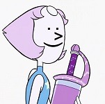
--you're in luck! The chances of you finding some resources that exist already is higher when you have a canon character who is in at least a few pieces of media. OP asked about Pearl from Steven Universe, and she's a great example of a character with a lot of resources. Searching for rp icons of a popular character will often yield packs of icons on Tumblr, Dreamwidth, Livejournal, etc. Most of these will be completely free to use or have very reasonable conditions for use (like credit the person who made them for example.) It's often a good first step to see what preexisting resources are available to you even if you still plan on making your own icons.
If you have an OC or a character that's not all that popular--
--you're gonna fall into the second camp. If you want icons, you have to have them made. So what are your options?
Help! My character appears in no media! What are my options?
If your character appears in no media you're in a tough spot. Different people approach this problem in different ways.
Face Claims
One option you have is to choose a face claim to represent your character. In roleplay a face claim or ‘FC’ is a person or character whose appearance you use for the physical description of your character. I personally am not big on doing this, I prefer drawn icons and I tend to RP as animated characters, but some people really like using celebrities and stuff to represent their characters. When I was playing Angus McDonald he hadn't appeared in any visual media yet, so I sometimes used Bryce Clyde Jenkins as the face claim for certain types of threads.
If you're somebody who likes to use face claims there are loads of resources out there for finding the perfect one, including here on tumblr. Try searching up RP Faceclaim Directory and playing around with some of the ones that pop up.
DIY RP Icons
The other option you have is to create those icons from scratch. Draw them yourself based on icons you like or commission an artist to draw some for you. If you can't draw yourself, I've seen some people get really creative with this. Some people create their character in the sims, dollmakers, or their favorite RPG and then take screenshots of that to use for icons. There's also no law that says every icon you use has to be your character's face. When I was writing a trashy mermaid AU I got a lot of mileage out of icons that depicted harbor and oceanic scenes with no actual faces. Get creative, go nuts, have fun.
Icons Aren’t That Important
The other thing to remember that icons are not a must in many RP circles. It's perfectly possible to have a great time and write cool stuff without any pictures at all. Depending on your platform of choice there are probably also other interesting ways you can make your posts unique to you by formatting the text or using symbols or emojis or otherwise denoting your personal style in text.
Help! My character appears in lots of media! How do I make icons?
Again, there are a million and one answers to this question and it really depends on what tools are available to you and what your preferences are. This section is not a tutorial but it will outline some of the options you can look into.
The icon making process is typically in 2 stages-- stage 1: get all your images of your character, and stage 2: edit all of those images into icons.
If you have access to the source material, any version of Photoshop, and software that automates the collection screencaps from video (KM Player, VLC, etc) you're pretty much gucci. You're gonna have no problem getting loads of nice icons in a reasonably short amount of time and there are a million different tutorials on how to use those things whichever way you prefer.
If you don't have access to those things you still have options.
You can still screencap things manually, and you can screencap in batches by holding down the windows key and pressing PrtSc any time you want to save an image. They should be saving to >pictures>screenshots unless you’ve set things up differently. It’s a good way to take a lot of screenshots without stopping in between.
( EDIT / UPDATE: to say that if you use automation for taking screencaps remember to turn that shit off when you’re not using because it oh mylanta it WILL continue to take images without you realizing. Figured out where all my disk space has been going with this rookie mistake, thanks OP)

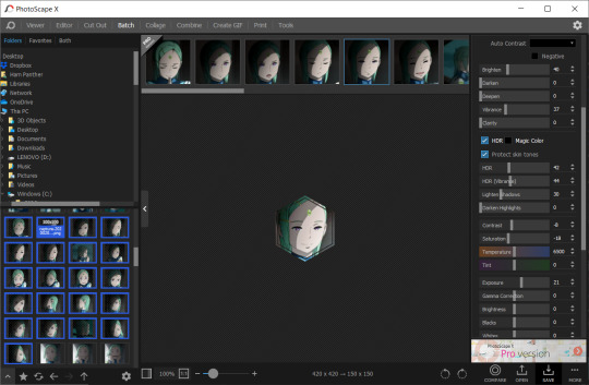
Additionally, PhotoScape X is a really great little tool for windows and mac that I've never seen anybody talk about, but I use it sometimes and it's totally free with the exception of a few paid features I’ve never once needed or wanted. This program is not as efficient as using Photoshop but it has presets for cropping images easily as well as batch editing options for some basic borders and color retouching. While it’s not as powerful as Photoshop, you can get a lot done with it reasonably quickly compared to other choices. You can also take and edit snips of anything on your screen with it, which is really really useful if you don’t have access to the video or image files you would need on your hard drive for other version of this process. The program looks like this:
Also, not to be like a minimalist about it, but you can also just fucken use Microsoft Paint or whatever you have. Like, whatever, there’s no law. You graphics dont have to be comlpex or deep fried. Half of my icons have been made or edited in paint at some point. It wont be as fast as some of these other methods but a lot of us aren't out here making icons in batches of 100 at a time.
Anything that you can use to make smallish images of your characters face will work to make icons.
If you want more information about any of these methods of icon creation let me know and I’ll talk about them.
Question 2: “How do you make your icons ‘work’ in posts?”
I'm a little confused on what you mean by "make them work" so I'm gonna cover my bases here. I'm assuming what you're getting at is a sort of sense of cohesion in the icons I use, or having the "right" expression for the scene I'm writing. Either that or them not stretching and looking weird thanks to tumblr. I’ll get to both of those.
And before I go into my own rationale for icon choices I feel I should point out that a lot of people who aren't me do successfully manufacture cohesion out of their images by doing fun stylistic things like recoloring their images all the same way or putting cute borders and stuff around them or making them fun shapes, and that's totally something you can learn how to do if it interests you. I do this for icons commissioned by other people and I’m not against talking about how to do those things, but I don’t really bother with them for my own icons all that much. That stuff is all fun and it’s a neat thing you could get into that can make your icons all look really nice together.
BUT ANYWAY --
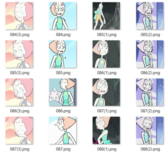
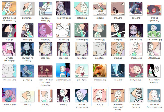
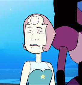
Since the character you asked about is Pearl, I’m going to focus on her. Nearly all of my Pearl icons are completely unedited and a lot of the credit I would have to give regarding icon quality goes to Pearl herself and the consistently good lighting that the show uses. I don’t have a huge need for editing or color retouching beyond making memes or whatever other goofy things I might be getting up to. Pearl is extremely expressive compared to other characters I have written and since she's in nearly every episode, I've managed to collect…
...oh god, that’s too many icons.
Pearl is a main character and I've been RPing as her for over 6 years now so I have a fuckload of images to choose from and I'm not gonna pretend that doesn't help when I wanna “make things work”. She gives me a lot of options.
That said, you absolutely don't need 3000 images to make a good post. The way I've collected and organized these images may be of use to you even if you dont have as many icons. I've done a lot with my setup to make finding the right icon very easy.
For starters, a minor subset of my Pearl icons are grouped by a particular defining feature. I have one large Pearly folder full of icons and then a few smaller folders inside for icons I thought worth grouping separately. For example, all icons of SUF Pearl in her new jacket are in the same folder. All icons of Pearl in short term alternate outfits are in the same folder. Anything I sourced from Attack the Light is in its own folder. I do this with anything that has a very specific use, such as writing AU content or flashbacks to specific time periods. If I can picture an icon in my head, I usually know where in my ridiculous hell collection to go to find it.
This folder was originally just for her pre-canon outfit but now all of her outfits that only appeared temporarily are in there.
Perhaps more important for the sake of cohesion is that nearly all of my icons that aren’t squirreled away in some smaller folder are loosely arranged by episode. What that means is that most of the time I have icons from the same scene right next to one another. It makes it incredibly easy to make my RP replies appear as though it's all one cohesive scene even if I use more than one icon. When you do it this way it becomes very easy to choose icons that have the same lighting or that appear to lead from one expression seamlessly into another. Exhibit A:
While the vast majority of my icons are numbered, I do take the time to name ones I find myself using a lot or that have particularly unique expressions. Usually I'll choose names that I'll find descriptive or easy to remember based on the context of the icon. You can have a lot of fun with that and never lose your favorites.
Also don't be afraid to lean on icons you got from weird places if you like them. The icons of Pearl from the official comics run don’t look like most of what I have. I think them being different would turn a lot of RPers off, but I use them a lot because I like the style and I almost never see other Pearl RPers using them. It either makes me stand out or it makes me tacky, one of the two, haven’t figured out which, but also I’m not stopping.

And just to reiterate, you can use icons that aren’t your character if they’re thematically relevant or vague enough to look like them. When I’m capping I’ve started saving a folder of miscellaneous environments of interests, hands, and other everyday types of scenery that appear in the thing I’m taking screencaps of.
You can use any size you want for RP icons but the most common is 100x100 or 150x150 pixels. Any smaller than that and the image gets to be difficult to read and work with in my opinion. That doesn’t stop people, of course, but I’m elderly and need glasses now, so no tiny icons for me. On that note, I rarely see RP icons larger than 300x300. Any larger than that it tends to get bulky and be in the way of other people’s comfortable internet browsing experience, especially on mobile. Of course, these are just my suggestions. What you choose will ultimately be up to you, but somewhere in that 100 to 300 px range is pretty safe.
A very tumblr specific thing to know is that any image that is wider than 300 pixels will be stretched to hell, so you probably want to keep it smaller than that.
Thanks, Tumblr, I hate it!
Also, don’t be afraid to make trash images for fun if you’re so inclined. People love that, or at least I do. Not having the right icon can be fun and lead to a very silly solution. Lean into being a shitposter if that’s what you’re called to do.


So yeah, that’s basically what my suggestions are. Collect your images in a way that helps cohesion and ease of use. Keep them a good size. Don’t be afraid to get unconventional with your choices or make memes or whatever. It’s all for a fun time.
Anyway, that’s all I can think of right now, but more info on any of this can be obtained at the price of one ask, I know it was a lot of different moving parts.
14 notes
·
View notes
Text
color icon tutorial
ok i’m not super great at making icons but an anon requested a tutorial for my icons so i will post my process! it’s good for beginners i think (even tho i have been making these icons this way since 2016 lol)
you’ll need:
Photoshop CS5 or higher (I have CS5 which is quite old, I know, but I pirated it many years ago oops)
relatively hq pics to make icons out of
a psd (if you need some, tumblr.com/tagged/psd is what i periodically check for some).
an action (preferably sharpening action, since that is what i use)
a texture if you want
you, yourself, and you, and i guess this tutorial
i’m going to be making this as a beginner’s tutorial so it’s gonna go about as in-depth as one can be! it’s gonna include a lot so feel free to skip a lot of it if you are already pretty well-versed in photoshop or icon-making.
ITS SO LONG IM SO SORRY IT IS SO VERY IN-DEPTH I’VE EXPLAINED EVERY POSSIBLE THING I COULD’VE
but also if you have any questions at all, please let me know. i love teaching people stuff.
example of the icons that i make:

Hi hello welcome
Ok, so first open up Photoshop. I am using CS5.
You will need hq pics of whatever you plan to icon. I do 99% Taylor Swift, so I use taylorpictures.net for all my icon needs. Make sure they are of semi-decent quality, they don’t have to be amazing since we will be shrinking them down to a very small size so much of the quality is gonna disappear anyway but like, make sure you can at least tell the subject from the background distinctly (you’ll see why later).
This is the picture I am using for this tutorial (and will post icons separately):
Open this in ps (File > Open > the picture)
Ok so now it’s the actual tutorial lol
1. Crop the image
We are not going to crop it to 100x100! Select the Crop tool and set the dimensions to 300 px x 300 px--MAKE SURE THAT YOU TYPE IN PX AFTER YOU TYPE IN 300, OR ELSE IT WILL CONVERT TO CM AND THAT WILL NOT WORK FOR THIS!
Next, crop the picture you want as much as you want--as long as you get what you want in the icon. For these kinds of icons, you just want to focus on one item--like Taylor, for example--instead of multiple (not Taylor and her backup dancers since this isn’t what my icons look like and you won’t be able to do that very well on a beginner level). Crop that to a 300x300 px size and click the check mark on the top bar to finalize it.

If your pic is hq enough--meaning a larger picture--it will probably look super small. That’s ok, it’s just proportional to the old picture. Go to the right side bar and select the Navigation tool.
If that tool isn’t there, you will just have to go to Window and select Navigator, and it will bring that up for you.
See where it says 100% in the picture right there? It will likely say something like 25% or whatever if you just cropped it, so change it to 100% which will bring it to full size.
Cool! now it should look like this:
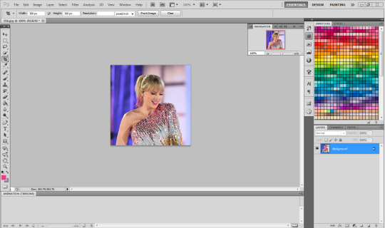
2. Use the Quick Selection Tool

Go to the left sidebar on Photoshop. Depending on which PS you have, it might look different. This is what mine looks like. Regardless, the icon should look relatively the same I believe across all Photoshop versions. If it’s not there, you might want to left click and hold down on some of the icons and see if it is an alternative option (it should be there already--but it is grouped with the Magic Wand Tool just in case).
This tool has three options in the top bar: free select, add, and subtract. Start with the middle option: add.

This will allow you to choose which parts of the picture you want to select to cut out for your icon. You can change the selection brush size, but I always keep it at 3px because it keeps it really precise.
Drag your mouse over the area of the image that you want included in your icon. This tool will automatically choose parts of the image that are similar--for example, Taylor’s blonde hair will like all be selected around the same time, but the pink/blue background will not be, since it can tell that those are starkly different colors and thus two different objects in the picture. It should have a crawling ants moving line around the areas of the picture you want to select. If you go outside of what you want included in your icon, that’s ok! That’s why the subtract option is there. Just select that--to the right of the Add option--and go over what you do NOT want in your icon to get rid of it using the Subtract tool. You might have to go back and forth between those tools in order to get exactly what you want in the final product.
I can’t show you my final outline for Quick Selection since it goes away when I screenshot, but after you’re sure you got what you want in your moving ants line, it’s time to finalize it.
Remember, this tool effectively cuts out the selected portion of the picture from its background.
3. Refine Edge
On the top bar, click the big rectangle button that says Refine Edge. It will bring up a window that looks sort of like this, but I have settings adjusted the way I like:
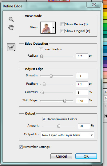
You can change these settings any way you’d like, but I generally stick with this. It’s also okay to mess around with them and see how you feel. If you don’t want to do that, you can just use my settings and edit anything you don’t like later.
Click OK to cut.

This has pretty much removed the background from the picture and only left what we cut out and a transparent background (hence the checkered background--that is space that doesn’t actually exist). You can also see some shadow from the background around her arms and hair, which we can delete out later very easily. That is a result of the settings from Refine Edge, which is why some people choose to lower the Feather bar so that it doesn’t include as much shadow--which is good for many pictures since a lot of these are straight cuts, but this can occasionally cut out part of the icon you want to keep or make it look weird since you want just a little space to mess up when it comes to the Quick Selection Tool.
Bonus step if you want a selective colored icon:
Some people like really vibrant icons that include re-coloring. I’m not very good at it, but what I do (and it sometimes turns out well--this is typically the way people do it, though they are less sloppy than I am) is select a color from the Swatches at the right that is similar to the one that they want to paint over. For example, if I wanted to make Taylor’s hair more yellow/gold and vibrant, I will choose a yellow. Select the Paintbrush tool. On the top bar, the Opacity will likely be set to 100%, which will basically color right over the picture and look weird. Set the opacity to something very light--mine is 20%--and paint over the part that you want to color. Make sure you do this in one stroke--if you paint over her hair with 20% opacity once, let go of the mouse, then go over it again, it’s gonna start building up and becoming more opaque!
You can also completely recolor a picture this way, like if you wanted Taylor to have entirely pink hair, you can use this same method but choose the pink you want instead of a similar yellow. This can be very difficult and tedious, so I don’t typically selective color my icons, though occasionally I do because I love those icons with obnoxiously vibrant colors.
4. Open texture/create new background.
Ok, so I do both of these things depending on the background I want. I have some textures saved such as this that I use for icons:
I didn’t make it--it’s pre-made by another artist on tumblr from whom I downloaded their texture pack. You can make backgrounds like these too, but I’m not very good at them.
SO you can either File > Open one of these pre-made backgrounds/textures, or you can make your own.
In order to do that, you can do File > New and change the settings to width: 100 pixels and height: 100 pixels. Under Background Contents, choose White. That’s very important! You don’t want transparent, it doesn’t help us. That brings up a new window on Photoshop next to the picture we’ve just cut out, just a small white square. You can paint that whatever color you’d like. Use the Paint Bucket tool and choose a color from the Swatches section on the right. This will make the background completely one color. However, if you want a gradient, you can do this several ways, but I do it like this:

Click that, go to Gradient, and mess around with the Gradient options and see how you like the background. Here’s one I made, for example:

Boom! Background for icon. I will use this since I made it for this tutorial so yeah it might not look amazing but here we are.
IF YOU USED THE TEXTURE I JUST POSTED OR YOU KNOW THE TEXTURE YOU ARE USING IS NOT 100x100--THE ONE I POSTED BUT DID NOT MAKE IS 200x200--THEN YOU NEED TO RESIZE IT TO 100x100.
You can do this by going to Image > Image Size and changing the 200 pixels x 200 pixels (or whatever is there) to 100 x 100.
5. Duplicate layer
Now it is time to combine these two images we’ve created. Go back to the original picture we worked on--mine is Taylor at the BBMAs--and go to the right sidebar. You should have two copies of this image now: Background and Background Copy. Background Copy is the cut out picture we are using for the icon. Right click on Background Copy and select Duplicate Layer...
This will bring up a window that asks what you wanna do with this layer.

Select the dropdown under Destination. Currently, the Document selected is the image we are already on (my Taylor pic was saved under 056.jpg) but we want to click the dropdown and select the pic that we are using for the background. In my case, it’s titled Untitled-1 since I didn’t change the name. Yours probably is too. Select whatever your background image is saved as and click OK.
Now go to the background image or texture that you just selected--your cutout should be there, but you can probably juuuust barely see it! That’s because your picture is about 3 times bigger than your background.
6. Resize layer
Use the Select tool--the very top icon on the left sidebar--and make sure Show Transform Controls is selected on the top bar. If it’s not, you’ll know--because you won’t be able to resize the image.

The square you are seeing (that isn’t the picture) is the layer we just duplicated onto the background, aka the icon. You’ll want to hold Shift and select the bottom right part of the image to resize to whatever you would like visible in the icon--it could be the entirety of the picture we cut out, or just part of it, if you realize you like how only part of it looks. Either way, you need to hold Shift while you do this, or else the image will NOT stay proportional, and it’ll look all wonky. Hold Shift the entire time you are resizing. This is what mine looks like:
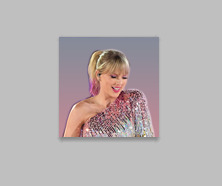
You can see I both resized it and moved it a little to the right--you can use the Select tool to move it, but that might move it way too much since it does it incrementally, you can just use the arrows on your keyboard and move it by pixels which takes longer but is way more precise.
You can still see the shadows from the background on the icon, so select the Eraser tool (if the shadows bother you or you don’t like how it looks) and zoom waaay in. You want to be careful with the Eraser tool! (Also make sure Background Copy is still selected so you don’t accidentally erase the background. If you just have Background Copy selected while you erase, it will only erase whatever is part of that layer, it won’t bother the background).
While zoomed in, erase the pixels that are obviously discolored from the rest of the image. You can zoom in and out to check how you like it as it progresses.
Here is mine after I used the eraser tool on any parts of the image I thought were bad! It should lay on the background naturally.
Now that we’ve figured that out...
7. Sharpen/action
Now is the time to apply an action! Please sharpen your icons. You want them to look good on your blog or others blogs, and in order to do that, you need to sharpen them.
If you already have actions uploaded, cool! If you don’t know how, well, I sure am going very in-depth here so you’re in luck.
Download an action from any photoshop resource (or tumblr.com/tagged/photoshop-action is where I look occasionally). You will have to load them onto your Photoshop now. Click the button that looks like a movie Play icon on the right sidebar. This will bring up the Action list. Photoshop likely has pre-made actions for you, but we don’t use those because I never taught myself how to use those so maybe you can use them, I don’t know. I just use ones I download from Tumblr.
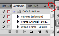
Click that little dropdown menu and click Load Actions...
This should bring up a file opener and you can select the action that you downloaded for this icon. It will download it into Photoshop and will now always be there--you don’t have to load actions every single time you want to use them. If you load them once, they should be there for the rest of forever.
Scroll down to find that action and select it. Now, make sure you still have Background Copy selected. I don’t care about applying an action to the background, just the copy, which is still our image that we cut out. Click the Play button on the Action list--pictured above on the very bottom of the screenshot, next to the Circle and the Folder icon. This will apply the action to the background copy. (Hint: if the Play button isn’t available, it’s probably because your action is in a folder. Click the dropdown of the folder and click the first thing under it--that should be the action and it will apply it).

There it is with the action applied! It’s muuuuch sharper--perhaps a little too sharp, but that’s ok, it won’t look bad on people’s blogs.
8. Add a PSD
To apply a PSD, File > Open and choose the PSD you want to use. I listed above where I find most of my PSDs, just download one you like. You can choose 100 different ones and try it out if you want. I use the same one for everything, by @toxicpsds (I believe it’s #6). This should open a third window with the PSD over a sample image (thanks to the artist!). You just have to select the PSD layer--not the image with it--and Duplicate Layer and put it on the image that we have produced thus far. It is the same process as when we took our cutout and put it on the background. (The PSD is probably under a group--mine says Group 1--so just select the group in its entirety--shift-click it if you need to).

You can tell the background is also lighter. If you don’t want the color of the background affected by the PSD, select Background Copy and the PSD together, right click on one of them, and select Merge Layers. This will put the cutout and the PSD in the same layer, which should take the PSD off of the background and revert it back to the color we had before. However, I really like what the PSD did to the background, so I will keep it this way.
I am finished now with my icon!
9. Save it for Web
To save the icon to be able to post on Tumblr, go to File > Save for Web & Devices, which will bring up a window like this. It might look a little different since I have my settings a certain way, but whatever.
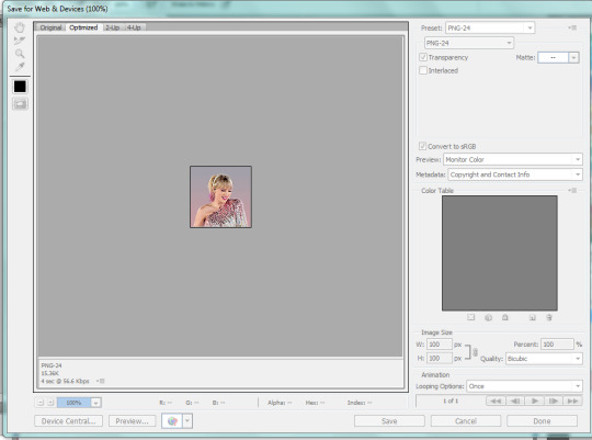
(Sorry this looks weird here, it’s just what happens when I screenshot. I’m not a tech wizard).
Your pre-saved things might look different, but make sure you are saving a a PNG-24 for the best quality. Just make your settings look like this, basically, then click Save.

There she is! All done!
If you have any questions, let me know! I tried to be really specific, but I’m not sure what level people are on Photoshop (probably better than I am) so just ask if I need to clarify anything!
60 notes
·
View notes
Text
icon tutorial

So the loveliest @joanna-lannister requested a tutorial on how I make icons, and who am I to deny her anything?
I’ll be using this scene with Josephine because (a) I made them relatively recently, and (b) I’m obsessed with the way she looks here, moving on.
This is just my method, I’m not claiming this is the correct one or that other methods out there are wrong, this is just how I prefer to do it.
For this, you’ll need some basic knowledge of photoshop, but I’ll do my best to explain things so that beginners can understand too!
Let me know if you have any questions, the tutorial is under the cut:
First of all, choose your image. For this I either go straight to the source and get caps from an episode the way I would for gifs, or I get hd caps from this website which is very easy to use.
For the first method, load up you caps as you would for a gif because that’s the easiest way to choose the right shot. I’m choosing this one:

Delete the rest and hide the timeline:

Crop it so that you have to erase as little as possible:

And now it’s time to colour! I’m not going to be explaining this in detail, so let me know if any of you would like a colouring tutorial? But otherwise, to any gifmakers out there, just make sure you colour this lighter and brighter than you would for gifs. It might look too bright, but I promise you that’s how it should be because the background will not be in the picture. One you’re done, groupd the colouring layers.
Here’s my coloured version:

Now it’s time to erase, so disable the colouring group so that you can see what you’re erasing and aren’t mislead by the colouring.

If we had a solid colour background, we could use magic eraser tool because it erases huge chunks that are of the same colour. That would be too messy here, so we’ll have to use the normal eraser tool (press E):

To erase, I usually zoom the image to 150% and alternate between than and 250% (like when I need to crop out her hair, for example):
For this I’m using a hard round brush on 100% hardness, and I press “[” to decrease the size and “]” to increase the size.
When erasing, make sure not to miss small sections like between her arm and body because that will be very noticeable on the icon:

Hair is the hardest part. What I do is first erase in one big swoop with my brush on about 40:

And then go back in with much smaller size and put some “texture” in it:

Don’t worry about this looking too life-like because we’ll be resizing the image to much smaller, just make sure it’s not one huge inseparable blob.
And don’t erase too much hair, especially on top of her head because that’ll give her a weird shaped head.
One done cropping, zoom out again and enable the colouring group:

Time to change canvas size. For this, go Image > Canvas Size (or press command (or control if you have Windows) + alt + C). Increase the canvas size by quite a lot so that you can crop it the way you want.
Original canvas size:

New canvas size:

Now use command + T and move her to the bottom of the canvas:

And crop. Make sure it’s square, I usually set to 100x100:
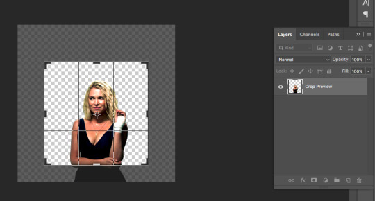
Now resize it, I usually go to 200x200. Image > Image Size (or command + alt + I):

Now sharpen it. I’m sharpening to 0.4 because this is a static image and needs more sharpening than a gif would:
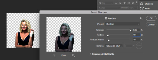
After this, make a new layer and move it to the bottom:
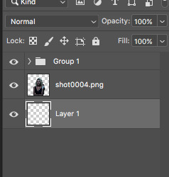
Then delete the colouring group. Remember, not all of the colouring layers, just the group they’re in, so make sure to select “group only”:

Now, using Shift, select all colouring layers and press command + alt + G. This way you make it so that all the colouring layers are only affecting the image layer and not the background because you don’t want the background made lighter or changed in any way.

Next, while on the bottom layer, select rectangle tool (or press U):

You’ll need to either choose fill with gradient or with solid colour.
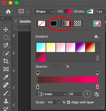
If you don’t have any gradients saved, then I would recommend going on this website and choosing colours to create some!
I’m choosing the red gradient and placing it on the bottom layer:

Next, I add textures.
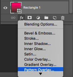
(At this point I don’t remember where I got mine, but there are lots of people who create them and post links to tumblr to download them, so it might just be a matter of searching for some on tumblr.)
Make sure you scale it to fit the icon:

You don’t have to use textures, but it adds depth to the icon, so I like to. Here’s a comparison, with texture (left) and without it (right):
After this you can either save the icon the way it is, or what I always do is also change the colour of her clothing to suit the background.
For that, select the image layer and go Select > Colour Range:

Here are my settings here:

First, choose the eyedropper tool and click on where her dress is:
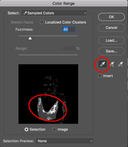
Then select “add to sample”:
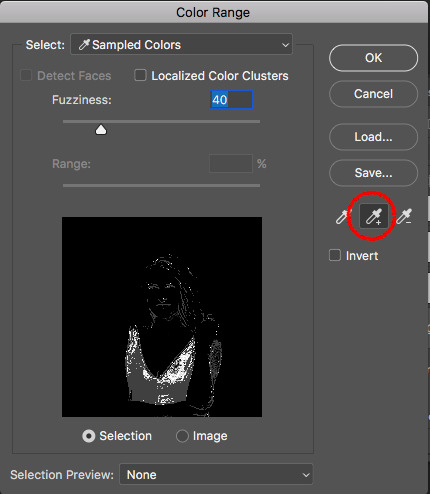
And keep clicking on where her dress is until it’s completely white. Don’t worry if it selects more than just the dress:
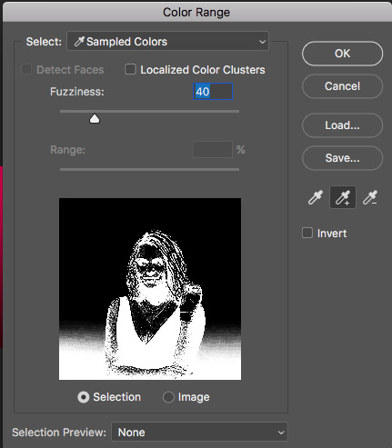
Then, press “OK”. Should end up looking something like this:

Next, without clicking anything else, go: Layer > New Adjustment Layer > Hue/Saturation:

You’ll get this window:

And you’ll need to adjust things until the clothes look good. First, tick “colorize” and then add saturation and change the colour. Because she has quite a dark dress, it’s hard to change it to a different colour as it is, so I’m going to add lightness as well. Here are my settings:

Because it selected more than just the dress, the image will look very weird right now, something like this:

So what you do is select the “hue/saturation” layer and use the eraser tool to get rid of everything red that is on things other than her dress. Zoom in to about 250% to see what you’re erasing better:

Finish erasing, then zoom out:

And you have your icon!

Hope this makes sense, and let me know if you have any questions!
21 notes
·
View notes
Text
gif tutorial !! (feat. anamo)
for everyone asking how i get my gifs so crispy
note: this tutorial is made using photoshop cs5! and while it should still work for newer versions, not everything may be the same. sorry :(
programs
photoshop cs5 (this is the only version i’ve really ever used so sorry cs6 and cc users)
topaz clean & denoise (optional)
kmplayer
media downloaders
4k video downloader
twitch leecher (for clips longer than what twitch allows)
how to download twitch clips (I use the “slow” method) twitch update made this useless ! so now i just use this site to download clips :)
1. extracting your frames when you can’t do video frames to layers
I think you need QuickTime (i don’t, which is why i can’t use this method) for this, but if your version of photoshop allows you to do File > Import > Video Frames to Layers, here’s another tutorial to help with that!
Remember that the best, clearest gifs come from the highest quality sources! However, I don’t normally recommend downloading actual 4k videos because while your gifs may be super HD, the frame rate is almost always really weird and slow.
After downloading your video/clip using one those nifty programs listed above, we need to extract your frames! Personally, I’ve only ever used KMPlayer to do this, but I’m sure that other equivalents will work pretty much the same.
Anyways, after opening your video in KMPlayer, pause right before the scene you want to gif and right click. There should be a tall menu that pops up, and from there you click Capture > Frame: Extract. This brings up yet another menu, and here are the best settings (at least I think so) for extracting your frames!
Now, you need to click start and let your video play. Once you’ve captured all the frames that you want, they should all be in your Capture folder that KMPlayer made for you (mine is located under This PC > Windows (C:) > KMPlayer > Capture). Just organize the frames as you want - I usually separate the frames for each gif into separate folders, but do whatever you want.
To actually get these frames into PS, start up the program and go to File > Scripts > Load Multiple DICOM Files and locate your Capture folder. Look, we have frames now. Cool.
2. actually making gifs
Make sure that your Animation window is open (it’s under Windows on PS if it’s not) so you can see what is likely only one frame, which is probably way less than the amount of frames that you captured (this will be different if you used Video Frames to Layers). To fix this, click on the symbol (a little upside-down triangle next to four lines) on the far right of the animation window and choose Make Frames From Layers.
Since we now have a lot more frames in our timeline, you can click the play button and watch them scroll through. Decide how you want to crop your gif and then resize the cropped frames to fit Tumblr (sizes here). Once you’ve done this, click on the upside-down triangle again and select Convert to Timeline, then select all the frames in the Layers tab that’s probably on the right of your screen and right click > Convert to Smart Filters. This will make sharpening easier because you can sharpen every layer all at once like this.
3, sharpening
At the top of your PS window, there should be a Filter tab. From there, click Sharpen > Smart Sharpen. Using my fairly limited experience with PS versions other than CS5, I do know that not every version of PS sharpens the same, so if you’re using something other than CS5, settings may vary somewhat. But anyways, here’s what my Smart Sharpen settings look like:
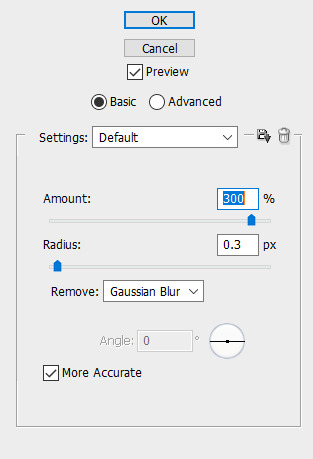
I then have my own personal sharpening action that I apply to the gif to somewhat smooth out the sharpness, but this tutorial has something towards the end that’ll give you a similar effect. And don’t forget to play your gif again to make sure that it works before you start coloring!
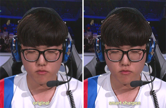
4. coloring
As a lot of players are POC, please be conscious of how you color the gif! Obviously, Obivously, it’s one thing to lighten up a dark scene because it’s hard to see what’s going on. However, when you purposefully and consciously make the decision to lighten (or darken) solely a player’s skin color, that’s gross! Stop!
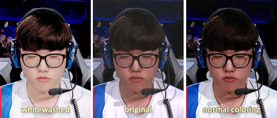
This being said, there are 5.6 million gif coloring tutorials out there and 5.6 million ways to color a gif. Personally, I tend towards more “””natural””” and true-to-life colorings for my OWL gifs, but I’ve made vibrant and pastel and colorful gifs as well. Here’s what the base PSD for all my OWWC gifs looks like, and this is pretty representative of all my other OWL PSDs as well.
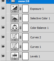
But as I said, there are so many different ways to color gifs - some of my gifs only have a total of three adjustment layers - and everyone has their own preferences for how they like their gifs to look. However, I will say that my first step in coloring is a gif is always use Levels and click the Auto option for a little color correction.
When you’re all done coloring your gif, select everything in your Layers tab (PSD + actual gif), then right click > Convert to Smart Filters again so that you only have one (1) layer in the tab.
5. using topaz to be extra (this is optional)
Is using Topaz necessary to make gifs? No, absolutely not. It also makes the giffing process take longer. It’s literally just to be extra yet I still use it on every single one of my gifs. Why? Because it makes them s m o o t h and I hate seeing pixels. Even if most OWL stages are pretty noiseless and nice overall.
To use Topaz, click on your single Smart Object gif layer and go to Filter > Topaz Labs.
While I do have both Topaz Clean and DeNoise, I typically prefer DeNoise over Clean, and that’s mostly because it’s a bit more difficult to mess it up. Topaz DeNoise does exactly what it sounds like it does - it removes noise from images. However, it also smoothes skin and hair and everything else, which is why you still need to be careful using it unless you’re going for an unrealistic, completely airbrushed look. Topaz Clean does the same, but with more emphasis on the smoothing (I guess), so it’s easier to accidentally go overboard with it.
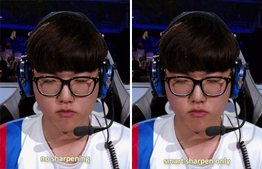
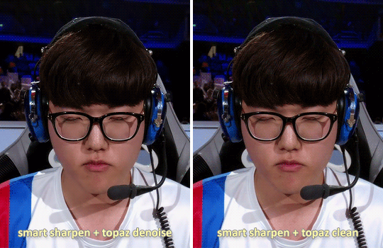
I almost never use the two in conjunction, but a good thing about Topaz is that it also reduces your gif file size by reducing noise! Which is nice! Also here are some nice Topaz settings. I use these (for the most part)!
update as of jan. 6, 2019: I am a Big Liar and I use both Clean and Denoise together all the time now and have been doing so since pretty much immediately after writing this tutorial. Just be careful when using both otherwise your gif might start looking too smooth - as with anything else, Topaz should be used in moderation :)
6. saving your gif
This part is actually super important if you used Topaz on your gifs. After you’ve made everything into a Smart Object, click on the upside-down triangle on your Animation window and select Flatten Frames Into Layers. If you used Topaz and don’t do this before trying to save your gif for posting, you will crash PS.
This process might take a while for Topaz users, but at the end, once your Smart Object has been made into many layers, go back to the upside-down triangle, click Convert to Frame Animation, and then select Make Frames from Layers from that same menu.
Now all your frames are visible on the timeline! Delete the very first one (otherwise the same frame will be repeated twice), select all of the frames on your timeline, then click on the little “0 sec” thing beneath the frames to set the gif timing. For this, I generally recommend using 0.03 or 0.04 seconds, but this depends on personal preference as well as the frame rate of the original video.
It’s time to finally save our gif. You just go to File > Save for Web & Devices and a big window will pop up. Honestly, the only save setting that really matters is that you have your gif set to loop for forever. Some people prefer using Diffusion over Pattern when saving, but this is what mine looks like right now:
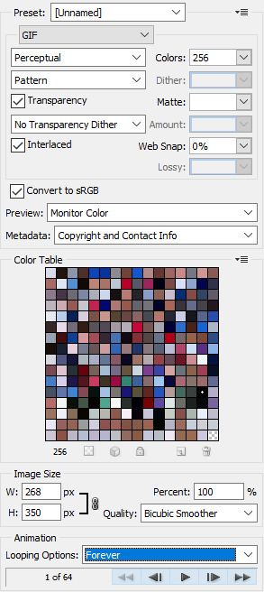
If you go to save your gif and find that it’s above Tumblr’s 3MB gif limit, you are probably just going to want to delete frames if you don’t want to lose the overall gif quality. Otherwise, you can click on that Colors: 256 box and try to cut down the number of different colors in your gif - though I will warn you that this generally makes gifs look more pixelated. And once your good and settled, click save and your gif is ready to post!
12 notes
·
View notes
Text
The Boy Next Door Chapter 3
It had been a few days since the unfortunate event, at least according to Lousine. It haunted his every moment, assuming that Adri was grossed out or thought he was a huge pervert for doing that in front of a window. He could barely keep up their casual texting as even on Adri’s end, it seemed tense with something. But for all Lousine’s worry and nerves, Adri was of a different thought all together.
Adri could barely focus on anything for eventually the images of what he saw took up his mind. And it always caused him to curse his clothing choice despite it being cute on him. Even now relaxing in his bed, phone dropped to his side after answering a text from Lousine, he was gently rubbing the front of his leggings as he gazed at the window. Good god why am I so horny, I’ve seen plenty of naked dudes. But the answer was obvious even to him. This dude was close, way closer to the ones he browsed on tumblr or online. And so, with a bitten lip and double check that the door was locked, he slowly peeled down his pants as his mind pictured for the uncountable time in the past few days.
At the same time as all this Lousine was right outside Adri’s house, a common occurrence to everyone since the family in. But what was so odd this time was the fact that he was just standing there at the door. Reluctant to knock on the door, tapping the railings and glancing back at the road as if thinking of escaping some invisible cage of his own making. With the glance back he noticed the lack of cars, letting him know a parent wouldn’t open the door. And so, with a deep breath he knocked hard enough for Adri to hear in his room in the back.
Adri nearly choked on the soft moans he was letting out as he hear the banging on the door. Are you fucking serious? Right now someone shows up? He sighed loudly and long before jumping out of bed and sliding his leggings back up, willing and silently begging for his raging erection to go down. He took his time walking to the front door, knowing none of his younger siblings would even attempt to check it with him home. As he passed one of their rooms he checked in on them, being sure to hide his lower half behind the door. Looking into the door way his younger brother was texting away on his phone, glancing up at Adri. “Better hurry up, Adri. I bet your boyfriends out there.” Adri just flipped him off with an eye roll, “Shut up.” He could only pray it wasn’t him, right now at least. Finally calm enough to be presentable he quickly went to the door and opened the heavy wooden door first. And nearly bite his tongue as he spotted the boy of his daydreams leaning on the metal rails on the porch.
Lousine nearly thought Adri was sleeping in or something with how long he took. Or just didn’t plan to open the door if he knew it was him. He wouldn’t blame him. But when the door cracked open behind the glass one he couldn’t help the smile. He had missed his friend despite everything. But it was a short smile as he remembered their last encounter and got nervous again. So, with a short two fingered wave he invited Adri outside. Adri seemed hesitant to do so but nodded and stepped out past the glass door, making sure to shut the inside one behind him so his nosy siblings’ wont but in.
Sigh. Why does he have to look good even when rolling out of bed. Lousine cursed inside his head, taking in some of the flattened curls on his head and wrinkled shirt. And even worse he was wearing a crop top which showed off his natural tanned skin. Huffing out a breath before his eyes went even lower he gave Adri another quick smile. “So uh hey. I wanted to uh… apologize. For the other night. You know. With the window… I know I sent a lot of text but I wanted to do it in person. Apologize that is. Not… Yup.” The blush that creeped into his cheeks could’ve set things on fire and the stutter in his voice was very apparent.
If he wasn’t so nervous and not at all himself, Adri might’ve laughed at the situation. Here was the guy of his wet dreams currently, apologizing for one of the most exciting things he’d seen in person. But he bit his tongue and did his best to keep the images out of his head, even harder now that the focus of them was right in front of him again. “Lou calm down its alright, it’s not like I haven’t seen a dick before”, Adri rolled his eyes trying to play it off as casual for his friend. It seemed to work a bit, the blush in Lousine’s cheeks turning down a notch. Much to Adri’s shame, the blush was cute on him.
Lousine rubbed his chin and beard before combing through his hair, a nervous behavior instinct through and through. Trying to calm down his burning cheeks with sheer force of will he nearly laughed at Adri’s comment. “Yea well its not everyday you see your friends…” he nervously chuckled as he glanced at Adri, who was finally at eye level with him sitting on the rail. Wanting to make things less confronting and more to their casual level he moved to walk down the steps to their usual spot, that being anywhere on the grass in the yard. Adri followed close behind and sitting beside him when Lou sprawled out.
“True its not every day you don’t see your friends, but good to know you’re not the neighborhood pervert”, Adri teased with a smirk as he noticed his playful method was helping defuse the obvious tension in his friend. And it was working great, teasing and taunting was apart of their usual. “I am not… the neighborhood pervert okay. If its anyone, its you! Who just peeks on their neighbor’s windows?”, Lou scoffed as he plucked some grass and flicked it at him, finally calm again and glad that things weren’t weird. “Oh I’m the pervert for happening to glance outside my own window and you’re in yours, showing off to the world?” Adri snickered and brushed away the grass before jabbing Lou in the leg.
“In my defense, I didn’t expect to have an audience. And it just… slipped my mind that my blinds weren’t down.”
“Oh really? You just… didn’t see the blinds not down? God your really do need those glasses. Besides the audience didn’t mind.”
Adri froze as he realized what he let slip out, immediately staring at the ground to let his curls cover up his face.
Lousine did his best not to react but he couldn’t stop the slightly jerk of his hand against the ground in surprise. Did he just… He liked it? His thoughts and more whirled in his mind, the implications of this making him instantly question whether he wanted him to like watching him. He decided to keep things playful instead of letting the awkward silence continue. “The audience didn’t mind it? Hmm…” he taunted as he reached over and tugged on his curls.
Adri just made a soft hmph noise at the hair tugging before peeking out behind his hair to see Lou’s smirk before hiding again. He was mortified at letting that slip, cursing his loose tongue and hormones.
“I see how it is, don’t gotta say anything.” Lou shrugs before turns to lay his head onto Adri’s thighs, using them as a pillow while also smirking right up at him. Adri near jumped at the sudden physical contact and the smug face of his daydreams in his lap. Instead he was trapped under his stupid handsome head and the truth he let slip out.
“The only thing I have to say is that you’re an idiot” Adri tried, he really did. But he couldn’t hide his face with him in his lap and couldn’t run now without writing in stone what was obvious to them both now. “Well I suppose this idiot might have to put on another show then? 9pm perhaps? My window?” Lou just grinned as he leisurely stretched out a bit further into his lap, much to Adri’s horror. The realization of his words and his closeness was becoming too much. His carefully hidden hormonal organ tucked between his legs was slowly making its self-known, and with Lou’s head resting in the dip in his thighs it would be painfully obvious.
“I uh… I’m afraid it would be an empty show…” Adri gulped as he tried to calm down, distracting himself with playing with the ends of Lou’s hair, twisting and braiding it loosely. Lou simply relaxed under the touch while continuing this little game just to see how far Adri was willing to go. And how deep the new sexual tension between really was.
“Really? Well, the first one was so impromptu, and I still get a viewer. Didn’t I, Adri?”
“That was purely accidental, and you know it!”
“I dunno man, that timing was rather perfect if I didn’t know any better. You could’ve peaked before without me knowing!”
“That is just unbelievable” Adri rolled his eyes again trying to ignore his bluster but couldn’t ignore the new feeling that started as he began rubbing into Lou’s scalp. Apparently it felt good because he started rubbing his head into Adri’s thighs. A reflexive move but one that felt good to both parties. Perhaps too good for one.
Lousine just simply laughed and kept moving his head back and forth, both to guide his fingers and tease his him. Adri just huffed softly and kept rubbing into his scalp, desperately but quietly trying to will the growing heat between his legs to calm down. But things just don’t work out that way.
“Lou….” Adri mumered quietly. “Yea?” was his only response. “I-I…. I need you to move.” Lousine opened an eye and gasp dramatically, lifting a hand up to lay a land on his thigh and squeeze “But so comfy.”
Adri whimpered softly as he gripped his flesh in a very possessive manner before steeling his breath. “Well unless you want your own show within inches of your cheek, you need to move.”
Lou blinked and fully opened both eyes as he gazed up at the pensive face of his neighbor, his eyes looking everywhere but at him. As he realized what he said he could feel the sudden heat and stiffness shift under his head, and he understood just how much he affected him. And he decided to throw caution to the wind.
With very deliberate and slow movements he moved his head back into the stiffness he felt in slow motion, gazing up at Adri with a curious expression. He wanted to see how Adri would react to his advances, everything pointed to a positive reaction but just to be sure.
Adri simply couldn’t look at him for fear of revealing how much he wanted this. The only thing that he let go was to bite his lip and keep running his nails over Lou’s scalp.
Lou decided to take it a step further and sit up slightly to replace his head with his hand, Adri moving his legs further apart to let him get a better feel. Their faces were inches apart but still Adri wouldn’t look at him, so Lou reached up with his free hand and gently push his curls away to brush his lips against his cheek.
“Ya know Adri… This show seems very… audience led,” he chuckled softly as he moved his hand firmer against his now tented leggings. “Yea… well… hmph” Adri whimpered as he finally turned his head at the feeling of the chaste kiss, gazing back at Lou with heated eyes, “I uh… Its my first show.”
“Really? I couldn’t tell..” Lou whispers softly as he moves his hand to his waistband…
The honking horn of Adri’s parents returning home jerked them both out of the trance they were in. They weren’t turned facing the driveway, so nothing was seen but both of them still jerked apart like they were guilty. Adri leapt to his feet and rushed to the car, the fright making any sign of arousal disappear in moments. He waved to his parents, gesturing toward Lou in his talk that Lousine couldn’t hear.
Adri waved him over, “Hey, mom and dad said you can help with the groceries since you spend so much time on their lawn.” He spoke casually but his eyes were still nerve racked.
Lousine just smiled naturally before getting up to help them, waving hello as well before heading to the trunk to help. The chatter of Spanish between the returning family didn’t make sense to him so he just started grabbing the first things he could and started walking them inside.
______________________________________________________________________________
Adri fell back into his bed with a long sigh, the days events and then trying to pay attention during dinner had his head swirling. Just thinking about what happened merely an hour ago in the yard had his temperature rising. And of course, his dad had to invite the friendly neighbor over for dinner, every glance between more heated than the sun.
The high ringing of his phone going off made him frown from interrupting his thoughts but he glanced at the screen anyway. It was from Lou of course.
-Hey, aren’t you coming to my show?-
Adri’s heart nearly beat out of his chest. He was joking right? He slowly stood up and looked at his blind covered window. Then at the time on his phone. 9pm exactly. He couldn’t be serious right?
But with shaking fingers he peaked through his blinds, across the lawn and then the street to the opposing window. Lights on and everything clearly visible inside. And Lou, leaning against the window seal with his towel still on but a obvious tent in the front.
Another text came through. -You made it! I wonder if the audience will participate this time?-
Adri took a deep breath and a nervous smile before responding. -Maybe.-
From the movement across the street, it looked like Lousine laughed before he threw something behind him, his phone, before he very slowly dropped his towel from his waist. Adri only saw this once before, but it was still familiar from him replaying it in his head. As Lou began running his hand around his crotch and against his thighs, his length bobbing in the sensation, Adri made sure his lamp was on. Then pulled up the blinds and began sliding his leggings down.
1 note
·
View note
Photo


Title: Pops of Pink
Background:
After the pilot phase, I knew I had to find consistency in my shots. Many of the flower photographs had a different shooting angle, were different colors and did not appear to be a piece of cohesive work.
I decided then I wanted to shoot upward with a tourist building in the background. However, I will not name the building in the photographs because I want the emphasis to be on the fact that there is such a brightly colored flower within the city— a tourist area and concrete jungle — of London. I do not want the emphasis to be on where they are located as well as the type of flower they are.
The reason I decided on the color pink was that it contrasted very nicely against the blue sky and appeared to be pop art-like. All the flowers are monochromatic of one another, which makes the whole series more similar.
However, after looking at my photos, I noticed a pattern of some of the ways I photographed flowers and decided to pair two photos with almost identical flower placement. This proved to be difficult, though, because most flowers are planted in one specific place and are not mobile.
After the photo review in class on Thursday, I reshot three of my photos so they matched their partner better, both in terms of the color of the sky and flower, and composition.
I came up with the title, “Pops of Pink,” because I drew much of my inspiration from pop art, and I enjoy how the pink-colored flowers pop in the city.
Purpose:
The reason I shot upward is to have both the sky and building in the background. Also, tourists are usually looking up at the city.
I photographed and cropped the flowers towards the edge of the frame because I wanted the flower to pop in. I did not want the flower to be in the center because I feel that someone could easily look past it if I had focused on the background.
The whole purpose of this project is to bring to light that flowers are all over the city and not just in the gardens and parks. Despite the people, flowers still thrive in heavy tourist areas and bring a nice pop of color to an otherwise uncolorful cityscape.
Style of Photographs:
As mentioned, I shot upward for all of these photos so that both the building and sky were in the background. However, I wanted the focus to be on the flower — and more importantly — the color of the flower.
I also cropped my photos as squares, which I indicate why in my research in a different post.
I used aperture to focus on the flower and blur out the background.
These photos are a series style of photographs because they are all tied together by a theme — pink flowers in the city.
Inspiration and Research:
Please refer to my previous Tumblr posts for my research about:
*Pop art
*Pop art and flowers
*Color theory
*Theory books about color and flowers
*A conversation with an expert
*Flower photographers
*Pop art painter
*Square photographs
Captions:
Please click on each individual photo for the intended caption:
Caption 1: In 2018, there were 7.4 million more trips designated to seeing gardens and flowers in England than in 2017.
Caption 2: Tourists wanting to see flowers in England spend a collective £8.9 billion during their stay.
Caption 3: Garden attractions in England are the highest growing among all the other attractions.
Caption 4: Tourism, overall, plays a huge role in the United Kingdom economy.
Caption 5: London, alone, brings in £8.6 billion annually.
Caption 6: Flowers are not just in gardens and parks, though. They are located all around the city of London.
All of the facts used as captions were taken from this website:
Caption 1-6: https://www.visitbritain.org/visitbritainvisitengland-highlights-importance-gardens-tourism-rhs-chelsea-flower-show.
I decided to intentionally have the captions be read like a book, from left to right, top to bottom.
This creates a strong narrative about the flowers located within the city.
Issues:
As in my pilot, I struggled with finding the right aperture to blur out the background but not blurring it out too much so that the viewer could not understand it was a building and sky.
I also struggled to capture most images because of where the flowers were in comparison to the building I was shooting in front of. Most times, this required me to lay on the ground, with my face in the dirt, to get the right angle. Believe me, I received many weird looks from strangers.
Lastly, the ever-unpredictable London sky was a challenge because I wanted the sky in every photo to be relatively the same, which meant I shot many of the photographs multiple times to line up with the others.
Display Method:
My display method is as pictured above. I want a 2x3 series with the photos in columns matching up with the one above or below them in terms of composition. Also, I would like it in the order presented, so that the flower is in the left corner first, then the middle, then on the right side.
These photos would be best suited in a gallery about nature in big cities. I would want it displayed on one wall only. I would like the photographs to be printed on matte photo paper, as to not make the scene appear too glossy or highlighted.
Conclusion:
Overall, I am very happy with how this final project turned out. It is amazing to see how far it has come since the beginning, and I believe this is a sound piece of a photography series that I can be proud of.
0 notes
Text
How to make Tiny Planets [and Panoramas]
Make fancy looking things without going broke buying Creative Cloud.
By now, you’ve probably seen a lot of those fancy looking panoramas, 3D photospheres, or images that look like Tiny Planets / a Super Mario Galaxy level / King Kai’s Planet.
The way this is done is similar to how NVIDIA Ansel creates 360 pictures, but isn’t automated (yet…).
You’ll need:
Microsoft Research’s Image Composite Editor (ICE)
A first-person camera
You’ll want:
Image Editing Software (Paint.NET or FastStone Image Viewer are my go-to)
Access to a Dedicated Capture Mode – OR – the ability to use Time-stop, No HUD, No First Person Player Model, FOV control, and Free cam/No Clip.
Game and Camera Setup
Have a look through your library, and find a game where you’ve got access to a First-Person camera. While any FPS will work here, many other games have these hidden away as a debug camera. For instance, XCOM2 and ABZU have these, despite not being first-person games. Third-Person cameras won’t work with this method, since the “pivot point” of the camera is out in the scene, rather than at the “lens” of the camera.
If a game has a dedicated Capture Mode (Mad Max , Shadow Warrior 2, or anything that has NVIDIA Ansel), use this.
If the game doesn’t have a dedicated capture mode, see if you can make one with the console (Things like Noclip, Time-stop, Disabling HUD), using GeDoSaTo to get rid of HUD items or great big things that say “PAUSED” in the middle of the screen, or using Cheat Engine to take control of the camera when I shouldn’t. I tend to check things like DeadEndThrills or PCGamingWiki for an idea of what I’ve got available to work with.
If the game doesn’t have either of these, don’t worry! This process will still work, you’ll just have a few extra steps (These are covered in the Tips section).
Image quality is the highest priority when making these things. We’re not trying to be playable, we’re after capturing the mood of the environment. That said, I tend to turn off post-processing effects that add things like dirt or scratches to the lens, such as the psuedo Bokeh effect in XCOM2, but that’s up to you.
On FOV and Capture Resolution: Wider angles will make the capturing process *much* faster at the expensive of image quality, but tighter FOV will give you more environmental detail (Most games don’t include Perspective Distortion, so it’s like cruddy version of supersampling that won’t turn your GPU into molten slag). Our software can do Gigapixel resolution panoramas if you’ve got the RAM (and ability to open the final image), but for most games, you’ll have massively diminishing returns for FOVs below 80. You may also note that I didn’t mention the resolution of your screenshots. While this is normally a big deal in screenshots, higher resolutions have diminishing returns when you’re making panoramas this way. Worry about getting the smallest object you care about in the scene looking good, rather than trying to force as many pixels as you can into each shot. Feel free to use GeDoSaTo to capture at 16K if you want, but it probably won’t be worth the effort / fire hazard.
Capture Method
With your scene all set up, start taking screenshots in all directions. I like to start at the horizon, do a 360 degree (Azimuth, in Spherical Coordinates) sweep, capturing about every 45 degrees for an FOV of 90 (i.e. take a shot, look at the objects at the edge of the screen, move the camera so those are now in the middle, take another shot.). Once I’m back to the start, change the elevation (Altitude, in Spherical Coordinates), and repeat this process until you’ve got a screenshot of every single direction. If you’re not sure that you’ve got a shot, take an extra one. The more photos, the better (provided your scene isn’t moving).

Stitching
When you’re reasonably satisfied that you’ve got everything, quit the game and look at the collection of screenshots you’ve got. Open Image Composite Editor (ICE), and drag-and-drop them into the main window. Once you’ve got them all in there, check that Camera Motion is set to AutoDetect, then click Next.
This will start the stitching process, where ICE does some quick optical object recognition, and finds a way to overlap as many of the images as it can. This can take a while, so go have a nice cuppa tea, a Bex, and a lie down (Don’t worry, it never takes more than 3 minutes on my machine, even with a few hundred images).
Projection
When the stitching is complete, you should see something like this:
The Spans 360 degree Horizontally and 180 degree Vertically underneath tells you that ICE was able to find enough information in all directions to recreate the entire scene.
Now comes the most important part: Choose a projection.
To Make a Planet: we select Stereographic, and set the Orientation to:
Roll 0 Degrees
Pitch -90 Degrees
Yaw 0 Degrees
If this works, you should have a little planet! You can adjust the shape of this using the mouse, but I tend just rotate the scene instead so I don’t introduce additional distortions.
[Alternatively, if you just want a fancy panorama like you see of GTA V or The Witcher 3 on Steam Community with several hundred likes: try another projection then just crop out the area you want. Easy Peasy Lemon Squeezy! YOUR WINNER!]
Cropping
So, you’ve got your pretty pretty all set up, now it’s time to get it into a saveable format. Select Crop from u the top, and after the panorama is projected, you’ll have your scene again. Looking at the Width and Height, you’ll probably notice that the full image is a mite over 15000x15000 pixels. That’s great and all, but a lot of programs will flat out refuse to deal with files this big. Also, there’s probably a lot of extra space around the interesting parts that you’ll want gone, or maybe missing bits of the sky if you didn’t get Zenith. If you’ve followed the guide and only rotated the planet scene, the middle of the planet will be the centre of the image, making auto-centering and cropping super easy. Here, a 10000x10000 pixel crop looks good to me, but this is down to personal taste. My general advice is to see if 7500x7500 will contain everything of interest to your scene. Once you’re happy with the crop, hit Next and move on to Export.

File Formats
I do two exports here. The first is a high quality PNG at 100% scale copy of the scene. I’ll then make a 95-100 Quality JPEG with a Width and Height between 4500-5500 pixels. This is to keep the image size under the 8MB that Steam requires, and to prevent Steam from throwing up additional errors (I’ve had a lot of problems getting it to accept images above 30 megapixels, but your experience may differ).

Alternatively, use a good image editor to downsample the PNG to something under 30 megapixels and below 8MB. I really like FastStone Image Editor for this, the Crop board is excellent.
Sharing
Upload your JPEG to the Steam Community Hub / Flickr / Imgur / Tumblr /, give it a name, and feel the glow of adding something beautiful to this world.
Or just print it out and throw it out the window at a passing dog. That works too.
Troubleshooting
Sometimes ICE will get confused by a scene and fail to project properly. In this case, you can try importing the bare minimum number of images, as something in the scene might have moved or asset reuse in the game will have caused a problem. If this fails again, I often just recapture the scene.
ICE comes with a very basic Autocomplete function for filling in gaps in panoramas. If you notice Grey holes (or if the Autocrop button doesn’t select the whole image), these are missing bits. If they’re not in your scene when you crop at the end, you can ignore them, but otherwise you can try the (quite computationally intensive) Autocomplete system. This will produce variable results, but can work in a pinch. Otherwise, load up a dedicated image editor (Paint.NET or GIMP if you’re broke like me) and clean up the errors in that.
Tips
Everything ICE does, Adobe’s Creative Cloud can do. But ICE is free, extremely easy to use, doesn’t require an internet connection, and can run on any version of Windows newer than XP.
Get Steam to screenshot in PNG, and use these instead of the default JPEGs. Since ICE accepts PNGs as inputs, you can cut out bad parts of the inputs and leave them transparent.
The general rule of thumb: avoid scenes where you’ll have big objects 30 degrees above the horizon. Buildings or Mountains will distort like crazy, and you’ll have this weird bulbous mass that can look very weird. Sometimes trees will look ok though, so experiment and you should get a good idea.
The closer an object is to the camera, the greater the distortion. If you want an object to look relatively normal (Say, a car or a person), try to keep it at least 5 meters from the camera and within 15 degrees of the horizon. However, distortion on people can look *really good* if you’ve got a good eye for composition (See this GTAV shot by a very clever peep).
Another rule of thumb is try to avoid putting anything too interesting directly underneath the camera. Keep this part of the scene relatively boring and go for more eye-catching detail around the horizon. If you’ve got something like a highlighted path in your scene, capturing the scene directly on top of the path doesn’t look as nice as being a few meters away.
Some games will have HUDs that you can’t turn off. In this case, crop out the HUD before stitching, and just take your screenshots a little closer together. Same goes for games with really strong Vignetting that can’t be disabled at all (Looking at you, Mass Effect 2).
There will be games where you’ve got no access to anything that makes capturing a scene easy (The Long Dark is my favourite example. There’s no console, subtle vignetting, no pause, and the player’s breathing makes little clouds in the middle of the screen). In these cases, I do my best to try and capture as quickly as possible. Things like moving clouds and horrible animals coming to gnaw on my guts will mostly be dealt with by ICE, or can be photoshopped out later. Or use it to turn one deer into a distributed herd. Up to you!
This technique will work in the real world, too. Camera + Tripod + the ability to edit out shadows = Good Times.
Worried about Perspective Distortion making everything look weird? ICE should be able to compensate for it in almost all cases, unless you’ve somehow turned your camera into a Duck eye. I’ve done a real-world shot with a 14mm fisheye lens, and ended up with a panorama that had no noticeable perspective effects on it with ICE.
Don’t worry about needing a powerful PC. I used to do this on my first gen i7 with 8GB of RAM and an ATi 5870 (“ Top of the line in ’09! ”), and got the same quality as I get with my NVIDIA GTX 1070 and 32GB of RAM. Image projection, stitching, and editing can be computationally intensive, but if you can run Steam on Windows, you can make pretties.
Example Materials
Here’s a link to the source materials I used to make this. You’ll notice there’s a hole at the top of the scene, but the Autocorrect can fix it for you if you want to use that. Try playing with a few projections to see how these things work without stressing about the capture process, but most of all, have fun trying this stuff!

10 notes
·
View notes
Link
The following blog post, unless otherwise noted, was written by a member of Gamasutra’s community.
The thoughts and opinions expressed are those of the writer and not Gamasutra or its parent company.
In this post, we’ll talk about how we create GIFs for our game Lake Ridden. This post was originally posted on our developer blog. As the person in charge of our marketing assets here at Midnight Hub I’ll walk you through our current process for creating crisp and catchy GIFs; which tools we use, as well as offer you some general tips and tricks for improving the quality of your fancy moving images! In this Gamasutra post I'm linking to our embedded tweets showing you the GIFs I'll be referring to. In other words, if you are on a tight bandwidth diet – fear not, no GIFs in this post will load unless you choose them too! Let’s go!
— Sara Casen 🏔 (@saxen8) February 15, 2017
A GIF showing the atmosphere in Lake Ridden. Here I use a static camera and let the particles and fog communicate movement, making it a nice mix between serenity and details. This GIF was posted on our social media and generated a lot of reactions.
When marketing your game photos are nice. But images and screenshots have their limitations when you’re showing off something that’s essentially a moving medium. I find that moving images and snippets of film are often better at delivering the message, compared to screenshots alone. GIFs are quick series of images displayed so that they look like video.
The “art form” has been around almost as long as the Internet itself (and usually contain a lot of cats doing funny things). A GIF can last anywhere between 1 – 30 seconds, depending on the quality, what you want to show and the platform you are sharing them on. A lot of GIFs on Reddit nowadays are really long, almost like YouTube videos, the same goes for Facebook. On Twitter and Tumblr however, people post a lot of 1-3 second long GIFs instead. And some GIFs are looped in such a smooth way it’s hard to tell how long or short the GIF really is.
I think the firelies in Lake Ridden are starting to look very nice now :O #gamedev http://pic.twitter.com/vTGvl9zJW0
— Sara Casen 🏔 (@saxen8) February 9, 2017
Keep your GIFs short. I usually aim for 3-4 seconds. This keeps the file size down and the interest up! This GIF is playing backwards, giving it a nice little twist with the fireflies in Lake Ridden
To spread the word about Lake Ridden we’ve used both images, videos, and GIFs in various combos. I’ve done this to communicate the environments, the gameplay, the color palette, the feeling or something from behind the scenes. For us a good GIF almost always gets more reactions and attraction on our social media channels, compared a simple photo or screenshot. Also, I greatly enjoy making them since it’s kinda creative! There are two main things that make a GIF great; the very content it is showing to the viewer and the tech behind the GIF itself. Not all GIFs are born equal. Let’s start with looking at the tech behind the images.
Technical Settings For Recording A Good GIF
Talking with a lot of developers posting GIFs about their games on Twitter, I noticed that almost all had their own preferred workflow, which I find interesting. Some people used programs like Fraps to capture the raw footage in-game, others used quick and small programs like GifCam, and used tools they had hacked together themselves. It seems like the method you choose is depending on a mix of factors; how much time you have, the desired picture quality and your game. If you want something fast and dirty, and don’t obsess over the quality you usually go with quick tools such as ScreenToGif. But if you want super crisp snippets with perfect color then you might invest in a more complicated workflow.
My advice here is: look at your game, does it have a lot of different colors/details in it? Or is the art style more simple? The more complicated art/colors you have (and if you want to keep them as sharp as possible in the final GIF) go with Fraps. Fraps give you really good raw material when recording your project.
You need to pay attention to the file limits on the platforms where you aim to spread your GIFs. Twitter has a limit of max 15 MB. If your file’s too big, resize it or make it shorter. I use a mix of Fraps and Photoshop to create our GIFs.
Second advice: determine how much time you want to put into making your GIFs. If you just want to capture, edit and throw it out in the wild, then go for a solution that’s quick and doesn’t offer you hundreds of post-processing options (suggestion: LiceCap). If you want to edit and tweak your GIFs extensively, consider using Photoshop + Fraps (YES you can edit video in Photoshop!!1).
A rule of thumb is to make the pixel quality of the GIF as good as possible on your computer, because a lot of platforms will compress it even further when you start spreading it, making the colors bleed or reducing the pixels. Twitter will take your GIF and secretly convert it to a .mp4 when you post. Facebook doesn’t allow for GIFs to be posted at all unless you link them trough a GIF-service like Giphy (more on that later).
Our Technical Pipeline For GIFs
Here are the steps I’m using to capture the raw material for our GIFs and how I tweak the file size if the GIF comes out too big. I use a mix of Fraps and Photoshop.
Our night sky now features a moon! 😍Wanna try Lake Ridden at GDC or Game Connection? Drop me an email to: [email protected]! 🌙 http://pic.twitter.com/l5rPGoWluK
— Sara Casen 🏔 (@saxen8) February 16, 2017
Remember that a lot of people will probably view your masterpiece in a social media feed. I've noticed it's generally a good thing to tweak the lights and color in Photoshop when you edit the source materials. Small GIFs tend to get overly dark otherwise, especially if they depict a dark scene like this one showing the night sky and its stars.
I make sure to run our game with the maximum graphics settings on my computer. The game should look as good as possible. No lag, no frame rate dips or weird loading/LODs. All hiccups or similar will be extra obvious in the final GIF.
To capture the raw footage I use Fraps. This software has been around for ages and is a faithful workhorse. Consider chipping in a few dollars to get the premium version (I also used Fraps to record our alpha teaser trailer in-game, it’s awesome for capturing anything moving on a screen).
I make sure all the video snippets I record go into the same folder on my desktop. This will make it so much easier when sorting your raw footage and deciding what to cut into a GIF. I have different folders for all GIFs.
When I have decided which of the raw footage I want to make into a catchy GIF I open it up in Photoshop. Photoshop is really simple and straightforward to use for smaller video editing. You don’t have to invest in After Effects or that other advanced stuff unless you want to.
In Photoshop I edit the video, cropping, dragging and adjusting colors, then export it. Go to File->Export->Save For Web and a dialog window should pop up (I use PC).
There are a few things to consider in this window. At first, be aware of the technical limitations of the platform where you’ll be posting your GIF. If you’re aiming for Twitter, make sure the GIF is a maximum of 15 MB. If the GIF file size is too big, resize the image by tweaking image size at the right. The second option is to check or uncheck the box named “Transparency”. Sometimes this reduces the file size but does not affect the quality of the image (?). If the GIF’s still too large, go back into Photoshop and trim down the GIFs length in seconds. This will cut down the size of the file. When you’re happy with all the settings in “Save For Web” make sure to click “Forever” in “Looping Options” if you want your masterpiece to loop into infinity. Then press “Save”. Done!
Our Artsy Pipeline For GIFs
Let’s move on to the fun part! Creating a good GIF is more than perfect picture quality. What you’re showing (or not showing) in your snippet is even more important. Here’s my process when shooting materials for our Lake Ridden GIFs.
After recording raw material in-game I use Photoshop to edit the clip, tweak brightness, add a small water stamp (so people can find the game if the GIF goes off into the wild and people get curious about where it came from). In this stage, I crop the video material to focus on the most important thing in the GIF. It needs to be readable in a thumbnail size (compare to the final results below).
Our demo of Lake Ridden is done!! Can't wait to show it at GDC next week! Wanna try it? Let me know! #gamedev http://pic.twitter.com/XnIoUkxJsR
— Sara Casen 🏔 (@saxen8) February 23, 2017
The final GIF showing an important, creepy location found in the game.
Make sure the game runs as smoothly as possible on the computer you’re using to shoot the raw footage. Again, all artifacts, lag or loading will show even more in a 5 second GIF.
Decide what you want to show and why. A good rule of thumb is to stick to one main thing with each GIF. Decide if you wanna show off a cool animation, or perhaps a battle effect or the mood of the game. What will be the star of your GIF?
Record a lot of small snippets in-game, just a few seconds long. I usually have like 15 small videos when I’m done, showing the same thing in different angles, using the camera in different ways, zooming or not zooming etc.
I sort trough the raw material and open my best clips in Photoshop, cut them up and minimize them to really small windows. This way you can decide if the GIF will look good when it’s displayed on a small screen (aka smartphones). In other words; is the image readable? The GIF needs to look good as a really small image since a lot of people browse these things in their Twitter or Facebook feeds. They should be able to tell instantly if they are looking at a face or a dog or a house. If not, people tend to get confused and you missed your chance to evoke their curiosity and eventually reaction to your game/project.
I cut the canvas. Focus on what’s important in the image. Again, it should be readable.
I tweak the brightness/colors and saturation. A lot of the times it’s better to make the image a little bit brighter since I’ve noticed it tends to get even darker when posting to a feed.
For Twitter, I like to keep the GIFs to 3-5 seconds and always go for looping. For Facebook, I go a bit bigger, like 5 – 8 secs. People have very short attention spans and a GIF should be very straight to the point. When in doubt – make the GIF shorter.
Posting GIFs for Twitter and Facebook
If you want to post your GIF to Facebook then you have two options. You can’t post a file in the GIF-format straight to Facebook (this is 2017 like what why?!). You can either use a third party service like Giphy (beware the quality will suffer) and post the link, OR you can be much more elegant and save your GIF in .mp4 format and post it straight to FB. Facebook accepts videos in the format of .avi and .mp4 to be posted straight to your page/wall. This is what we did when we posted our teaser trailer on Facebook.
The water is staring to look really good. Super excited having people try it on GDC! :) http://pic.twitter.com/vHGFdVEPOI
— Johan Bernhardsson (@jbernhardsson) February 13, 2017
This GIF post by our code lead Johan focuses on the water in Lake Ridden. This was made to showcase one specific item in the game: the water effect. Try to limit your GIF to showing one thing, otherwise things tend to get confusing and messy. Decide on one component and make it your "star of the show". This could be a funny bug/a new animation or the day/night cycle in the project.
We did not post a link to Youtube but the trailer in .mp4 format on my own personal Facebook page (as an experiment to track the number of views ‘a la Facebook). To post in .mp4 you can use a tool to convert your Photoshop-made GIF to .mp4, or if you’re using a more advanced video editing software like After Effects you can save the video as .mp4. Simply converting your GIFs to .mp4 using GIF-2MP4, a free online tool that does the trick according to my experience!
Get Creative!
Use what you got! I use the player’s default camera in Lake Ridden when recording our GIFs. I tilt the camera, I use the crouch, I walk backward, I stand still shooting moving objects etc. I highly recommend you use different ways of movement/vantage points if possible. This offers variety to the people watching your GIFs and you’re able to do more with less. Try to convince your programmers to implement a special camera for shooting videos and taking screenshots if possible, since that will help out a lot in the long run!
Lake Ridden is starting to have a nice contrast between night and day. This week we're also working on puzzle design and story. :) http://pic.twitter.com/THKUGmYPlt
— Johan Bernhardsson (@jbernhardsson) April 6, 2017
Often you need to find new, interesting ways to show the same content but with a twist. In this GIF I made the camera go out of the scene (compare it to the next GIF below).
Quick GIF showing the lights and colors of a sunset in Lake Ridden. Still needs some tweaking : ) #gamdev http://pic.twitter.com/8eHDmjgaYi
— Sara Casen 🏔 (@saxen8) April 6, 2017
Here the camera does a drive by of the scenery instead, which creates a different feeling. Get creative and play around with the tools you have ingame! Just make sure not to post too similar content back to back on your channels or people will find it dull.
A lot of the time I’m working on stuff in the game that I can’t show, so I have to think of new, exciting ways of showing things that I might have posted before. It’s not only about how you’re showing something, it’s also about what you’re showing. A lot of developers also post fun bugs or glitches from behind the scenes or inside the game engine. Think about your audience and ask yourself what they might enjoy. Reddit/gaming usually enjoy insane bugs or humor, while other developers like to see a nice tooltip. Players perhaps want to get a tease on the mood inside your game or your main character in a cool animation. If you have some questions regarding GIFs or know of a better way of doing some of these steps, please let me know in the comments!
Sign up for the Midnight Hub Newsletter or follow Facebook for more news and screenshots. Follow us on Twitter where we GIFs and behind the scenes stuff! Until next time!
Cheers,
Sara & The Team
0 notes
Last Seen Blogs

vedolosowa
Untitled
fishsticksloser
‧̍̊˙· 𓆝.° 。˚𓆛˚。 °.𓆞 ·

ksokphan
Untitled
xiaoao
xiaoao

toastmegureshin
beautiful_rose