#arthurian preservation project
Text
list of medieval literature with links to read.
i’ll continue to update with more texts, better scans, & different editions. enjoy!
#arthurian legend#arthurian legends#arthuriana#ulster cycle#history#medieval literature#med lit#illuminated manuscript#illuminated manuscripts#translations#translation#english translations#english translation#resource#resources#book recommendations#book reccs#arthurian preservation project#my post
1K notes
·
View notes
Text

DRAWTOBER #23- Myddrin's Matter of Britain by @maura-labingi
Destiny - that callous and useless word - will become a curse upon Merlin’s tongue soon enough. Now, he is only irate that it isn’t quite what he hoped for. A naivete that is almost endearing.
do you enjoy BBC Merlin? do you enjoy it despite it... kind of being a bit of a dumpster fire (affectionate)? do you wish the characters and relationships and story arcs had been handled a bit more purposefully and a bit less, uh, noughties-no-homo-y? are you interested in the history and folklore surrounding Arthurian legend and would you like to absorb that through the medium of a goofy highjinks show?
THEN HAVE I GOT A FIC FOR YOU MY FRIEND.
@maura-labingi is on a mission to rewrite BBC Merlin - preserving the elements of it that we all love, but focusing strongly on consistent characterisation, comprehensive plot arcs, and bringing in a little more historical accuracy. one example of a change made is Nimueh, pictured above; why would such a powerful sorceress to go around looking like a fifteen year old in a primark prom dress? she has been recast in this rewrite as Michelle Gomez, and given a prominence in the narrative far more befitting of her character 👀
this is a really exciting project that I've been involved on the planning and plotting side of (please do not ask how many times I have now watched season one. it is....... many.) that I really think you guys will love. you can follow @myddrinmob to get updates and behind the scenes content!
106 notes
·
View notes
Text
a very quiet voice on a separate circle of beef* do u** actually have evidence that supports the idea that arthuriana*** and adjacent are somehow some kind of ... longing for the idealized past ... a magical and perfect monarch to fix the government and society ... or are u projecting modern readings and modern adaptations and re-tellings of arthurian tale/legends onto your understanding ... the main body of what was written in the 1100s--1300s WAS written and recorded and preserved by the upper class**** as evidenced by the fact that it was written. and preserved. and the main ideal of arthurian EME tales was courtly romance (as a literary genre/movement) and (french troubadour) love ballads and the attendant tropes and narrative structures. like ... there are a lot of complex historical and literary and linguistic variables at play here and the arthuriana as idealizing a nostalgic past/perfect monarch is like. the LEAST important OR interesting part of this whole thing
#*chronic desire to 'not bother people' w the mere presumption of my presence vs enduring passion for correcting internet people who r wrong#**and by that i mean ANYONE. ANYWHERE. what evidence. AT ALL?#***600s to 1300s ending w gatgk tho ik the kind of arthuriana in 600s-1000s eg old welsh poetry is kind of a diff beast from 1100s EME stuf#****yes the norman conquest but again: reading arthuriana as if it's some kind of viva la revolution by the poor lower classes .. who do u#think was reading and writing the arthuriana#croidhe#'arthurian legend in the 1200s was revolutionary because it was commenting on the monarchy and saying what if we had a different better#monarchy' BZZZZT. arthurian legend in the 1100s-1300s is revolutionary because it's a REALLY GOOD category of literature for studying how#norman/french language AND culture AND history AND literary forms affected the sociolinguistic and cultural structures#of the countries around it
3 notes
·
View notes
Text

Hey, hi, hello!
Welcome to all who end up on this little post of mine. I am a fanartist and have pretty much been that way for the good majority of my existence. I love fantasy, medieval heraldry, and Arthurian lore with all those grand old knight and dragon elements, too.
My most favored nook in fantasy at the moment, is the Legacy of Kain series. Though not so much a dragon scaled story, scaled vampires had a charm I couldn't resist 10 years ago and so still charms me to this day!
My name is Devon; though you can call me Dj, or my other characters' names:
-Cadmus Dreadmourne: an older vampire that stands by Vorador as a hope-driven sibling in opposition, seeking reason to pick up his vampiric valor once more. His words are powerful, but his voice is rather weak. He has a short temper, and that is often the direction to a quick -and very common- defeat.

and
-Rabidus, the Wretched: the open mind with an ailing soul. Rabidus suffers from recurring emotional distress patterns caused by abandonment and betrayal. He wants to remain trustworthy of what might remain in a better light for Nosgoth, but his troubled mind fights him at every turn. Rabidus takes pride in his artistry. He sought out new ways to find brighter pigments in colors, softer bristles in horse mane, and even technique to better a matte stroke. Creating a personal canvas to illustrate the wonders of his own mind, would garner the attention of many. Though he wasn't fond of center stage, he did love and learn to cherish his ability to bring many aspiring smiles together. He belongs to @chubbiestreaver as of now!
I now have the somewhat charming, always sycophantic Turelim, Pearce, A.K.A PUNCH!
▶Pearce Levels himself to humans, Vampires, and wayward heroes. After dropping his name and rank in Turel’s forces and Kain’s favor, he became a bigger importance to a largely obscure and very small flicker of hope for Nosgoth’s preservation.
▶He's bull-headed, hot-tempered, and usually air-headed most occasions, [especially at the beginning of his unlife and devolution, and he steels and toughens up over the centuries during the Soul Reaver Era.] but he's very protective of his loved ones, and to his fellow clansmen that he works hard to appease and grow in the ranks of. That all changes, though, after Turel’s abrupt absence during the climax of the Pre-Soul Reaver Era.

I dabble in art most often and would love to develop my writing more and move forward with a project I currently work on alongside my brother, @chubbiestreaver though we spend more time brainstorming than story writing.
I hope to have fun here, and I'm looking forward to sharing art and ideas with a fellow community of people who enjoy Lok as I do!


#my art#legacy of kain#blood omen#soul reaver#nosgoth vampire#self insert oc#lok artist#self insert x canon#oc x canon#razielim#vorador#legacy of kain fan#vampire oc#turelim
6 notes
·
View notes
Note
Hey there!Not to be too corny or over the top, but you are like my favorite contemporary artist and your work is so very inspiring to me! You probably get this question a lot, but are there any tips or things you would tell someone who is currently early in their artistic career(and facing graduating art school soon)? Anything you wish you had heard or been told? Additionally~what's your favorite ghost story? Have you stumbled across any interesting myths or fairytales lately? Thanks! Peace out~
Oh my, you’re being too kind!! You know, the thing with artists just starting out is that there’s no real blanket advice to give as everybody’s in a different situation with different ambitions, personalities and so on. Like there’s some advice good for one person which might devastate another. So my first piece of advice is to take all advice with a grain of salt. Do you feel it applies to you? If it does, great! If it doesn’t, well it’s for somebody else. Don’t fret about people claiming you have to do/be one thing or another to be successful as an artist. (Apart from ‘Don’t be a dick’ which is always helpful.)The second piece of advice is to find your community! Find the places on the internet (or locally if there are any) where the people who are in your situation or are doing the job you want to do hang out. Find the places designed to help you out. (You already know @dearartdirector, right?)Nowadays that’s mostly Facebook groups, some of them secret, so maybe you’ll have to ask somebody if they know a place. There’s a bunch of stuff for children’s book illustrators (also on Twitter!), but there’s e.g. a group especially for female (and non-binary & transgender) illustrators working in the fantasy genre. It’s an amazingly helpful even to read what everybody else deals with, pros and beginners alike and a safe place to ask questions and find support. I’m also in a group for German illustrators which is good for keeping up with changes in laws or the postal system (I KNOW, boring but important and confusing!). Third piece of advice: Be prepared for the paperwork. Seriously, there’s going to be way too much paperwork. I’m sorry. One of my art school teachers told me the hard thing is to find the clients and you can always figure out the paperwork later and I don’t agree. Figure out the paperwork. Get help to figure out the paperwork. But maybe I’m just very easily stressed out about this stuff.Fourth piece of advice: Try everything once and feel free to fail, quit and dislike. I don’t need to tell you that being and artist/illustrator isn’t a particular secure or straight forward path. You can only find yours if you figure out what works for you and what doesn’t. Don’t limit yourself to an idea of what you want to be doing. Chances are you don’t even quite know everything out there. Chances are you might not even like the realities of your dream job. E.g. I’ve come to the realization that I’m a good commercial artist but would make a shitty fine artist. I love freelance illustration but dislike the whole ‘artist as an entrepreneur’ thing. I don’t like Patreon. Streaming is bad for me and my process. Exhibiting in galleries is a waste of time for me. But I had to try that stuff out first, didn’t I? There are artists doing work in a similar vein as me who are successful doing just those things, but they are different people with different paths. Number five: Don’t write e-mails or make decisions when you feel super emotional.
Number six: Get all the sleep you need and take care of yourself. I don’t have to say that ‘making it’ (whatever that means) as an artist requires much hard work and discipline and so on. But. Your hard work is much better spent when your brain is actually capable of functioning. Spending less hours doing good work is better than grinding for days feeling listless and distracted, no? Think long term. I know there’s somewhat of an expectation to have everything now and be young and successful and so on. But. No use being young and successful if you’re burnt out and unhappy. Your job isn’t you, art isn’t everything and the important part is that you’re okay. Take time to change and grow as a person. You know, all that stuff. I’m sure I’ll remember some seventh piece of advise which is of utmost important as soon as I post this.I mean there are also the classics: Make good work and show it to the right people. (It’s true! It’s this easy! Seriously, though. It’s good advice. I like it because sometimes the mind gets messy and you see other folks do great things and do shiny projects and such and then it’s nice to remember this and just keep your head down and do the work.)The whole ‘Finished, not perfect’ thing. It is also true. Don’t be effing precious with your work. You’re going to make a lot of it. Some will suck, some will be great. Some will just do the job and that’s fine. I mean, you should try for great, but realize it probably won’t happen. Most people won’t be as critical with your work as you are.Now I’m done, I think.Oh yes, ghost story. I don’t really read many of those. You’ll find I’m actually consuming very little horror related media. I have a favourite ghost story movie though, which is ‘The Devil’s Backbone’ (good old GDT!).I have no interesting folklore for you either! I recently went through an Arthurian Legends phase, mostly because it’s so fascinating how the whole thing is basically fanfiction of fanfiction and there might actually never have been canon. (At least non that is reliably preserved) So everything is kind of valid. (And it’s interesting to see when different characters and aspects started to pop up and how they changed and so on!)I hope that helps!
26 notes
·
View notes
Text
The 25 Rooms That Influence the Way We Design
The 25 Rooms That Influence the Way We Design
https://ift.tt/38uI6hs

Continue reading the main story
Credit...Video by Scott J. Ross
The 25 Rooms That Influence the Way We Design
Three designers, two journalists and an interiors photographer gathered at The New York Times to make a list of history’s most enduring and significant spaces. Here are the results.
On an October afternoon, our six-person jury — Tom Delavan, the design and interiors director of T Magazine; Gabriel Hendifar, the creative director of the Manhattan-based lighting and design studio Apparatus; the architect Toshiko Mori; the architect and designer Daniel Romualdez; the veteran design journalist Suzanne Slesin; and the interiors photographer Simon Watson — assembled in a featureless conference room at The New York Times to discuss the most influential rooms of all time. By that, we meant “influential” in its truest sense. We wanted the jury to identify the spaces that not only changed the way we live but also changed the way we see, places — whether pleasing, provocative or completely novel for their eras — that not only informed our panelists’ individual practices as designers and documenters but also challenged how we all, as humans, think about beauty, strangeness, originality, décor, proportion, furnishings, art and the multivalent connections therein that define memorable rooms: ones that, above all, offer a new kind of visual lexicon. These are rooms, in other words, that have influenced and inspired interior design throughout the decades, shaping how our mind identifies and assesses a space, any space.
Image

From left: Tom Delavan, Toshiko Mori, Daniel Romualdez, Suzanne Slesin, Gabriel Hendifar and Simon Watson, photographed at The New York Times on Oct. 14, 2019.Credit...Sean Donnola
No one was expecting unanimity; if taste is individual, then discord among this cohort was inevitable. And yet we had asked each of them to nominate their 10 to 15 favorite rooms ahead of time, which the group would whittle to a list of 25. The overlaps were obvious front-runners: Four people chose the soaring, glass-walled sitting area of Pierre Chareau’s Maison de Verre, built in Paris in 1932, while Cy Twombly’s objet-filled 1960s living room in his Roman apartment, Rem Koolhaas’s elevator-cum-office built in 1998 for a disabled client in Bordeaux and Yves Saint Laurent’s art-covered 1970s Parisian salon were also submitted by several panelists. A lively conversation ensued for nearly three hours: What’s more important, the architecture or the design? Are the best spaces dictated by the people who inhabit them? The designers who create them? The period they reflect? Or some magical alchemy of all those things? Should public areas like hotels and restaurants be given as much weight as private, residential ones? And, actually, what is a room?
That last question animated the conversation from beginning to end, as each of our experts made arguments both concrete and philosophical about the human need to gather and connect in enclosed space, sometimes with the intimacy-creating aid of walls and ceilings, but other times not. (We drew the line on gardens — even ones with hedge walls — which everyone decided didn’t qualify.) By the end, we had narrowed upon a mutually satisfying definition of what makes a room and a list of about three dozen worthy examples, the images of which we laid out on a massive conference table, assessing them for final inclusion: Do we have too many museums and, speaking of, is the spiraling rotunda of New York’s Guggenheim more of a room or a building unto itself? Is the living room of the Finnish furniture designer Alvar Aalto a better representation of midcentury Scandinavian Modernism than that of the Danish furniture designer Finn Juhl? Where are all the female-led projects? (“We have to remember that architecture, like many industries, was male-dominated for much of history,” Delavan said. “And the field of interior design — while originally led by women, though now more evenly split between genders — is only a century or so old.”)
Eventually, consensus was reached, though that doesn’t mean the list is necessarily finished or complete: The royal “we” in this story’s headline was, in many cases, applied by our panelists to their own work, the way that they think about design while largely practicing in North America and Europe, which unfortunately means that entire continents such as South America and Africa weren’t under consideration as much as they would have been with another group. There’s a heavy emphasis on contemporary projects, places that everyone had seen with their own eyes. (“Just blame it on the editors,” Romualdez joked, to which Slesin responded, “What’s amazing, if we had to do this tomorrow, is how different it would be.”) So the result that follows — which is ordered chronologically, from oldest to newest — is, at its very least, one history of design in the West on one day from one group of highly opinionated people, all of whom would probably have rather found themselves in any of the rooms below. — KURT SOLLER
This conversation has been edited and condensed. The room summaries are by Nancy Hass.
1. Stonehenge in Wiltshire, England (circa 1600 B.C., architects unknown)
It took Neolithic builders nearly 1,500 years to complete Stonehenge, the outdoor enclosure of nearly 100 enormous upright stones on Salisbury Plain in the south of England. The origin of the structure, which is thought to have been a burial ground or perhaps a place of pilgrimage — the stones are aligned to frame sunrise during summer solstice and sunset during winter solstice — defies logic: The iconic 30-foot-tall three-piece sandstone pillars that stand in the center can be traced to local quarries, but how did a civilization without the wheel transport the inner ring of bluestones, some weighing four tons, from their origin point 200 miles away in Wales? Thought to have been finished around 1600 B.C., over the eons Stonehenge has been attributed to the ancient Celtic high priests called druids and the Arthurian wizard Merlin. But modern historians and archaeologists largely agree that a series of indigenous British tribes worked on the site in stages, over hundreds of years, each culture gaining technological sophistication through the centuries, creating an open-air chamber that stands as an indelible template for enclosure, space and ambitious monumentality.
Tom Delavan: My colleague Kurt and I were discussing what qualifies as a room, and we thought, “Well, a room has walls, or something that could define a wall. But does it need to have a ceiling?”
Simon Watson: For me, a room is a place for people to inhabit together in solidarity, I suppose.
TD: So residential, you’re saying?
SW: Not necessarily. It’s a place where people can gather; it’s what we humans do. I tried to go back as far as I could, and Stonehenge seemed like an obvious choice. I’m not sure if we know much about it, but what we do know is that it was a space where people gathered: Whether they prayed or whether they had conversations about their day, it was a place where people came together. And, for me, that was the definition of a room. It doesn’t have a ceiling. And I don’t think the difference stands in the make of walls, but it creates a space.
Gabriel Hendifar: Or is it just about some spatial organization that communicates intention, whether that intention has a ceiling or not? A room is something that’s been organized to serve some function, whether that is spiritual or shelter, residential or commercial.
SW: And you can go forward in history from Stonehenge to the Pantheon, which is one of the greatest rooms in the world. I’m not suggesting that the Pantheon came from Stonehenge, but rather that the circle is a humanist form we understand. It is the shape that creates a togetherness, in a way. It’s instinctual.
Toshiko Mori: Well, also, Stonehenge has a reference to astronomy. It’s human enclosure, with references to the world outside earth. So, the ceiling in this case is a sky. I think that’s the beauty with it, that it actually exists between ground and sky.
2. The Pantheon in Rome (125 A.D.; architects unknown)
The Roman Pantheon is not only the world’s best-preserved Classical building — it was completed by the emperor Hadrian on the site of an earlier structure of the same name that was probably a sanctuary — but is also likely the first in which the interior, not the exterior, is the focus: It was a precursor to the elaborate decoration of public spaces in later centuries, as well as a model of perfect balance. While its portico, reached by wide steps of Numidian yellow marble, was made in classically Greek style (squared off, with granite columns) once you enter the circular part of the building, you find a shrine to the motifs and mathematical obsessions of the Roman Empire. The rotunda is 142 feet in both diameter and height — a perfect hemisphere — with a 27-foot-wide oculus at the top of the domed ceiling. The dome itself is made of a porous type of limestone, like pumice, mixed with concrete, and has five rings of 28 rectangular coffers. Altered over the eras by successive rulers, including Pope Urban VIII, who in 1626 removed the original bronze girders from the porch roof to make them into cannons, the Pantheon’s architectural and decorative influence cannot be overstated: Thomas Jefferson’s 1826 library at the University of Virginia is one of many obvious homages.
3. The Shokin-tei tea pavilion in Kyoto (circa early 17th century; architects unknown)
The Katsura Imperial Villa near Kyoto, built in the early 17th century, profoundly influenced architects such as Frank Lloyd Wright and Le Corbusier, both of whom spent time in Japan. And with good reason: The 16-acre property, with many outbuildings and exquisite gardens, is a clear expression of how Zen Buddhism’s graceful influence is woven through Japanese culture and design — and is a vivid illustration of why those aesthetic codes still feel utterly contemporary. There are several free-standing tea pavilions on the property, all made to amplify a sense of pureness, reverence and isolation (each celebrates a different season and allows the gardens to be seen from various angles), but Shokin-tei, the tribute to winter, is the one that stands out for its unexpected modernity. With a thatched roof and three sides that face the property’s large pond, it’s notable for the blue-and-white checkered handmade paper that covers a central alcove and sliding doors. The loggia is held up by three oak logs, left natural with their bark intact. Rustic and bold, the teahouse is pleasingly geometric, a hallmark of traditional Japanese architecture.
Kurt Soller: How many of your choices were influenced by having seen these places in real life? Tom made this great point about how, for many people, most of these spaces only exist through pictures.
Suzanne Slesin: That’s why I included the Katsura teahouse, because I’d been there. I went on a tour, and I think we were the only Westerners. It was pouring rain. You’re wearing this translation earpiece, and you go around and the guide was talking, talking, talking in Japanese, and everybody was taking it very seriously, and then the translation was just: “teahouse.” So I just took the picture and I stood there and I thought, “It’s really beautiful, but I’d like to know more about it.”
TM: It’s incredibly influential. A literary reference. So that’s why the Japanese guide would go on and on and on to talk about —
SS: We understood nothing. But to me, this was extraordinary: Of course, Japanese interiors are influential, but this blue and white, I mean, anybody could do that today. And it would be amazing.
TM: The Bauhaus school [in early 20th-century Germany] had seen it. I have to be a little careful about this immediate link because it’s been an argument, a scholarly argument. But it’s very interesting to think about.
4. The parlors of Georgian homes in the United Kingdom (circa 1714-1830; various architects)
There is no perfect room, of course, but the parlor of the typical Georgian home — built throughout London and Edinburgh during the reigns of King George I through King George IV — may come close. The rooms are large, but not in the cavernous, ill-planned way of a McMansion or a billionaire’s high-rise penthouse on Central Park: They are, instead, models of proportion. Usually square, with ceilings around 16 feet high, the parlors’ symmetry was based on the Classical architecture of Rome and Greece, filtered through the lens of the Renaissance but scaled down to accommodate a single family. Unlike the neo-Gothic revival, which began as early as the mid-18th century, or the late Victorian period at the end of that century, both of which prized ornament, there was a spareness to Georgian style, which makes it feel modern today. Windows, placed with mathematical precision, were large and often shuttered — Georgian builders seemed to understand that in the late afternoon, taking tea, one might want to ease gently into the dusk.
SW: The Georgians started this idea of creating very livable proportions in rooms. When you go through them, the scale is huge, with vast windows, but you feel completely comfortable, because the proportions are so perfect. So these big spaces become calm, wonderful places to be in, to live in and socialize with your family or your friends.
KS: Has it influenced how people live now?
Daniel Romualdez: I think they bring the influence.
SW: I think people miss it. I’m looking around me [here in Midtown Manhattan] and I happen to see these vast skyscrapers going up and people living in these enormous spaces. I’ve been in them. You walk in and you think, “How could you live here?” The proportions are wrong. First of all, you need sunglasses all day long.
DR: All that glass!
5. Pierre-François-Henri Labrouste’s reading room at the Sainte-Geneviève Library in Paris (1851)
The Sainte-Geneviève Library, in the Fifth Arrondissement, has roots dating back to the sixth-century manuscript collection of the Abbey of Sainte-Geneviève, though its soaring reading room was built over 13 years, starting in 1838, by the Beaux-Arts architect Pierre-François-Henri Labrouste, who had spent his early career mastering the use of iron in grand railway stations and thus was a virtuoso at evoking grandeur. The nearly 20,000-square-foot, two-story structure is defined by exposed cast-iron arches, suspended over iron columns like parachutes billowing above a giant classical arena. The room, which is now part of Paris’s university system, stands as one of the finest neo-Classical interiors in Europe, influencing the Gothic Revival that swept late 19th-century France as well as the innovative spirit of the architect Louis Sullivan, who at the turn of the 20th century pioneered the use of iron and reinforced concrete in the American skyscraper.
TD: I bet it’s such a nice place to be, between the light and the space.
SW: But it’s also so delicately supported.
TM: Yes, because of the cast-iron work. So it’s a new technology, but within tradition. The motifs of all the cast-iron elements are plants, so it refers to nature, which softens the technological aspect: Otherwise they could have made it look like trusses, but they didn’t. There’s also a visual relationship to the books’ paper, which comes from plants. This influenced the Boston Public Library, the Butler Library at Columbia University, the Doe Library at U.C. Berkeley and others, so this whole idea of a collective reading room is an important example.
6. The Bloomsbury Group’s studio at Charleston in Sussex, England (circa early 20th century)
Inspired by the bright, fluid figuration and sharp abstraction of Post-Impressionists including Gauguin and Matisse, who led the way to High Modernism after World War I, the visual artists of the Bloomsbury Group ran wild at Charleston, the Sussex, England, farmhouse where the married painters Vanessa and Clive Bell and Vanessa’s lover Duncan Grant lived for decades. Virtually every surface in the house, a way station for intellectual bohemians including Vanessa Bell’s sister, the novelist Virginia Woolf, is covered in joyous drawings. In the living room, barely clad classical figures dance across the hearth, and books spill out from shelves. The house, preserved after Grant’s death in 1978, is the embodiment of the revolution that shook the art and design world, its handcrafted ethos driven by the class-driven conflict that took root in England between the wars.
SS: The Bloomsbury rooms combined all the arts together, and this was both unique and very influential. They also represent a coming together of all the arts in a place and time that, although it has passed, is very current in terms of how people engage with design.
KS: And the craft of it all, too, the idea that [the Bloomsbury-adjacent guild known as] the Omega Workshops seems so visually relevant now.
SS: Exactly. I think that’s something people are talking about now. [A few decades ago,] I remember knowing about this and thinking, “Oh, it doesn’t suit my Modernist sensibility. It’s cluttered.” But now I’m looking at it very differently, and I think it’s both charming and bohemian, which is very attractive.
DR: Why did that change?
SS: Well, things happen in life. Some of the things that you like 30 or 40 years ago, you’re less interested in, or you get bored with them. Even well-known designers, like you, Daniel, your style changes. It depends on your clients, but also the way you feel.
DR: Yeah. What persists for you?
SS: I still love Minimalism and Modernism.
DR: Do you think the Modernists’ influence is waning? You know, 30 years ago, when I was in architecture school, that’s all we talked about.
TD: Since I started working at magazines [in the early 2000s], Modernism has basically been watered down. It’s sort of softer; it’s not about an absence of decoration, or anything similarly social or political. It’s just about simplicity.
SW: It’s become more cushy and comfortable.
DR: But don’t you think it’s also, like, a status symbol? A buzzword?
SW: Yes, in every single place in the world.
DR: And you just think, “Oh, I know about Modernism. I’m going to do that even though everything about this room has nothing to do with it.”
7. Jean-Michel Frank’s living room for Marie-Laure de Noailles’s hôtel particulier in Paris (circa 1925)
The Jazz-era Parisian arts patron Marie-Laure de Noailles blithely disregarded convention. She and her husband, Charles, underwrote the Dada-inflected films of Luis Buñuel and Man Ray and bought arms for the anti-Franco forces. Their 16th Arrondissement apartment sparked the career of Jean-Michel Frank, an interior designer who stripped away the early-18th-century moldings from the vast rooms and squared off the giant opening between them. The walls of the apartment (which was returned to its ornate origins by the designer Philippe Starck in 2003 for the Musée Baccarat) were covered in parchment panels hung with paintings by Dalí, Picasso and Miró. And the severe living room furniture that Frank made for the couple continues to inspire contemporary design; created from lush materials including shagreen and mica, the pieces combine geometric discipline with the mark of the artisan’s hand.
8. Pierre Chareau’s salon for Jean Dalsace’s Maison de Verre in Paris (1932)
Bathed in sunlight during the day and lit at night with a phosphorescent lantern glow, the Maison de Verre may well be Paris’s most radical residence. Resembling a box made of glass blocks capped by a single traditional apartment, it was commissioned in the late 1920s by Jean Dalsace, a gynecologist who bought an 18th-century Left Bank hotel, determined to reinvent it as a Modernist mansion. Unable to evict the top-floor tenant, he built around her. The architect, Pierre Chareau, conceived the edifice as a series of interlocking forms, with the doctor’s office on the first floor and two private levels above. Simultaneously labyrinthine and airy, with several sets of stairs and a double-height salon behind the monumental glass wall, it has been compared in impact to Le Corbusier and Pierre Jeanneret’s Villa Savoye (1931) on the outskirts of the city. But unlike that imposing International Style monolith of reinforced concrete, the Maison de Verre possesses a lyrical delicacy owing to the work of the iron artisan Louis Dalbet, who created such touches as perforated mechanical screens to separate spaces and a rolling steel-pipe library ladder with wood inlays. After remaining in the Dalsace family for more than 70 years, the house was bought in 2005 by the history-obsessed American collector Robert M. Rubin, who meticulously restored it.
KS: The Maison de Verre was the most submitted project among our panelists: Four of you chose it —
DR: If I remembered, I would have put it on my list.
GH: Me too.
SS: I mean, it has everything: It has a new structure, it looks to the future, it has furniture that is not just traditional but also modern. Everything about that house — the traffic patterns, the materials, the siding of it, the way it’s used — is really a 20th-century development. And it’s beautiful. I mean, I think it’s beautiful.
DR: It changed the way we designed, you know, these glass-wall houses. The coziness. The multilevel living room.
TD: It’s very comfortable, which isn’t always the case for things that are modern.
9. Finn Juhl’s living room at his home in Charlottenlund, Denmark (1942)
The Danish designer Finn Juhl, along with his countryman Hans Wegner, established the vanguard of Scandinavian furniture design in the 1950s and ’60s with pared-down yet softly contoured pieces made largely of oil-rubbed walnut, maple and teak, and seats and backs covered in nubby upholstery. They were a complete break from the fussy neo-Classical style that preceded them and, because of new manufacturing processes engineered at the same time, were instantly copied. Trained as an architect, Juhl used the ultramodern house he built for his family and lived in for close to 50 years in a suburb north of Copenhagen as a laboratory, tweaking the setting to accommodate new volumes and contours. The house had an open plan — radical for the time — and each ceiling of each room was painted a different color to create different moods. In the living room, where Juhl placed one of his Chieftain chairs and Poet sofas, the beige was intended to evoke the feeling of being under a canvas, especially when sunlight hit it.
SS: I first saw it published in the October 2012 issue of Marie Claire Maison, and I thought, “The art, the furniture, the space, everything is of one mind and very, very simple and modest, but extraordinary.”
TD: The proportions are so nice, even though it’s not grand.
SW: Typical Scandinavian mind-set.
SS: But really, I love the palette and the tile work. The hearth, it’s like a little carpet. I think this has a lot to do with the way people think today.
KS: How so?
SS: Well, I tried to think about the trends — I’m not talking about grandiose houses, like what’s happened to the Hamptons — that can influence the ways people want to live today. One of them is smaller, more modest spaces. But still quality, not cheap in any way.
10. Le Corbusier’s Le Cabanon in Côte d’Azur, France (1952)
Charles-Édouard Jeanneret, the Swiss architect known as Le Corbusier, loved the Mediterranean, with its incomparable light, rough-hewn local architecture and rocky shoreline. In 1952, he built the one-room Le Cabanon for his wife, Yvonne, to use as a summer getaway. Merely 12 feet by 12 feet, it had no real bathroom, just a toilet near the bed, nor a kitchen; the couple took their meals at an adjoining cafe reached by an internal door. With an exterior that resembles a Canadian log cabin and interior plywood walls, it was constructed using Le Corbusier’s so-called Modulor principles — an anthropomorphic scale of proportions based on the movement of the human body — down to the built-in furniture, making it a diorama of the architect’s revolutionary worldview.
SS: I visited this about two years ago, and I could not believe how perfect it was and how it was really the most modern. I mean, it’s one room that allows for sleeping, eating, relaxing and more clever things, too: Guest rooms that pull out of a box, a bathroom mirror that slides open to become a window.
TD: Just that you could live in such a compact —
SS: One of the most important architects of the 20th century conceived of this in the most modest, most beautifully done way, and that was his choice. And one shouldn’t need anything else.
DR: Super functional. Do you know how he lived in it? I mean, was it meant to be a retreat?
SS: I think he spent every summer there.
SW: Yeah, and that’s where he ended up dying [in 1965]. He went to swim and never returned.
11. Nancy Lancaster’s living room at her flat in London (1958)
Among the great paradoxes of the influential style widely known as English Country — a dotty dishevelment characterized by cozy sun-bleached chintzes, antiques from various periods and brightly hued walls — is that it was brought to Britain from the American South in the 1920s, by the Virginia-born socialite Nancy Lancaster, who owned the Mayfair design firm Colefax and Fowler. Inspired by her romanticized memories of plantation houses (including her grandfather’s) that had fallen into disrepair after the Civil War, Lancaster, who lived in England virtually all her adult life, tapped into what her biographer Robert Becker called a corresponding “abstract nostalgia” for a British way of life that had been obliterated by the wars. While she lived largely at Ditchley Park, an estate in Oxfordshire, it was the lacquered egg-yolk yellow living room of her flat above the firm’s Avery Row showroom, completed in 1958 (she died in 1994 at the age of 96) that stood — until just a few years ago, in fact, when the firm moved — as a shrine to her aesthetic, with its barrel ceiling, faux-marble baseboards, braided swags, oversize chandelier and array of comfortable seating. The room has been a lodestar to a generation of American collectors and designers, among them Sister Parish, Mario Buatta and Mark Hampton.
DR: I think you all must think I’m nuts to have chosen the butter-yellow room. I just know that you all would have thought that was weird. But I honestly think design goes in waves, and clients are actually looking at chintz again, which is surprising.
TM: I’m not so sure about Nancy Lancaster. I don’t get it.
DR: I’m going to stand up for her. I just think we are living in a bubble. There’s a lot of stuff being done now that looks like this. Many things I see on Instagram are using similar materials and creating a similar atmosphere.
12. Philip Johnson’s Four Seasons dining room in New York City (1959)
When the Four Seasons restaurant — the epitome of the steel-and-glass International Style, created on the ground floor of the Ludwig Mies van der Rohe-designed Seagram Building — opened in the late ’50s, it was a tourist trap. Not until the late ’70s, when, under new owners, its Grill Room (one of two dining areas connected by a corridor hung with a massive Picasso tapestry) was named the ultimate power lunch spot by Esquire, did Philip Johnson’s extraordinary feat get its due. But it is the Pool Room, now operated as a seafood restaurant called the Pool, that stands as the most vivid reminder of the architect’s commitment to tranquil austerity. Other fancy restaurants of the time were fussily French with cushy banquettes, but Johnson embraced a brash, unadorned rectangularity, with 20-foot ceilings and massive windows shaded only by curtains of rippling, undulating chains. Although the classic midcentury furnishings — not accorded historic status when the building was declared a landmark in 1989 — were auctioned off a few years ago, when the current owners took over, the room’s combination of hushed chicness and uncompromising discipline endures, a testament to the relationship between Mies van der Rohe and Johnson, master and student.
SW: I never ate there [in its original incarnation]. But the pool just struck me as something that functioned very well in the space. Also, it was outrageously chic, it was glistening. It just seemed so refined.
TM: And civilized.
SW: And civilized. Even though half the people in the room were probably crooks.
Everyone laughs.
SW: But it worked, it definitely worked.
13. Cy Twombly’s living room at his apartment in Rome (circa 1966)
The Virginia-born abstractionist Cy Twombly came to Rome in the late 1950s, and soon after, he married the Italian portraitist Tatiana Franchetti, sister of his patron Baron Giorgio Franchetti, with whom he bought an apartment in a 17th-century palazzo on the Via di Monserrato; it had been built for the Borgias. He immediately had the place stripped of generations of old paint to reveal whitewashed walls and pale blue doors with gold moldings; the large rooms and abundant light became a perfect setting for his enormous oil paintings, with their calligraphic graffiti on pale backgrounds, punctuated with phrases from classical allegory or from poets such as Stéphane Mallarmé and John Keats. Particularly in the main sitting room, the artist had an intuitive sense of how best to punctuate the works in his home: He offhandedly mixed them with slightly run-down gilded antiques upholstered in bleached shades, plaster busts that could be found in flea markets throughout the city and bits of silver. The effect is ethereal yet unpretentious, airy, elegant and livable.
DR: To me, Twombly created a whole new atmosphere. Think of all the rooms on Park Avenue today.
TD: It’s a certain “I didn’t try too hard,” which I feel is kind of its own design aesthetic. Even his art, which was super edgy, was not considered great art at that time.
GH: It’s like, “I just happened to be in this palazzo.”
TD: The antiquities were not expensive then. He was buying stuff at the equivalent of a flea market.
SW: I mean, those big busts aren’t antiquity. They’re 19th century. And no offense to Twombly, but they’re a dime a dozen in Rome, and everybody has them. You know?
TD: But to his credit —
SW: To his credit, it all works very well. I’m just trying to break it down. The room itself isn’t outstanding. It’s what’s in it.
DR: To me, it’s all about atmosphere. And you can have a perfect room with no atmosphere, and it doesn’t succeed. So where does the architecture of that room begin and where do the objects and the installation and the installation designer fit in? Which comes first?
TM: Because of those questions, I actually chose extreme examples. Like the Neue Nationalgalerie in Berlin, which was designed as a completely universal space. It’s spectacular: It’s just a ceiling and then there’s continuity of interior and exterior. To me, this was the definition of the conceptual idea of a museum. In a sense, as a space, this is a room that is essentially universal and infinitely transformative. As a concept, it’s amazing.
14. Ludwig Mies van der Rohe’s main exhibition gallery at the Neue Nationalgalerie in Berlin (1968)
As Mies van der Rohe’s last major building (he died a year after it was opened), the massive structure embodies the legendary architect’s preoccupation with open, flexible spaces with minimal enclosure — a radical notion for a museum hall at the time — and complex engineered solutions that seem virtually invisible. With a nearly six-foot-thick steel flat roof painted black (a grid ceiling inside holds lighting) and an architecturally austere presence, it comprises two distinct levels. Visitors climb three flights of stairs to the entrance and the main special exhibition gallery, a hangar-like space supported by cruciform columns on either end, where the art, mostly from the 20th century, is often hung on temporary walls and other innovative structures, revealing the space’s flexible nature. The building is currently undergoing a massive restoration by the British architect David Chipperfield.
15. Stanley Kubrick’s suite in “2001: A Space Odyssey” (1968)
A room does not have to be realized to be seminal: The final, indelible scene of “2001: A Space Odyssey” is set in a huge suite meant to be a luxurious zoo environment for the film’s protagonist, the wayward astronaut Dr. Dave Bowman. Stanley Kubrick, a notorious perfectionist, said it was intended to look as though created by a master race that wanted to observe Bowman in a comfortable setting through the remainder of his life: He ages, dies and is reborn in the room in a few cinematic minutes. Kubrick resisted what might have been an obvious trope of the time — making the room a neon pop palace of blobby plastic furnishings — instead positing what an alien race might consider soothing and elegant to a 20th-century human. The result is a mixture of inaccurate replicas of Louis-era French furniture and neo-Baroque statuary set into alcoves, all gently illuminated by floor tiles lit eerily from below.
DR: Watching that movie, I didn’t remember the plot, because all I did was obsess about this room.
SS: It’s outer space. I mean that’s really a definition, to me, of Modernism, of originality. I mean, it’s terrifying.
GH: It’s sort of atemporal, it’s about the future and the past.
SW: It’s kind of Philippe Starck-y in a way.
TM: I think one can trace nearly everything he’s done to this movie.
16. Donald Judd’s master bedroom at his loft in New York City (1968)
In 1968, Donald Judd, then 40 and fresh off a Whitney Museum retrospective, bought a derelict five-story SoHo factory built in 1870 to use as his home and studio. Although by the late 1970s he was spending much of his time in Marfa, Texas, he lived and worked in New York off and on until his death in 1994, punctuating the loft’s vast rooms with art and objects, creating a template for late 20th-century American Minimalism. After a restoration by the Judd Foundation, run by his son and daughter, the building — which opened to the public in 2013 — remains intact, as pristine as one of the sculptor’s welded metal boxes. Works by Dan Flavin, Claes Oldenburg, Carl Andre, Marcel Duchamp and others remain in the exact positions that Judd placed them. But the top-floor master bedroom best encapsulates the residence’s style: On the wall hangs an early Judd piece in wood, Oldenburg’s “Soft Ceiling Lights at La Coupole” (1964-72) and a John Chamberlain crushed car fragment known as “Mr. Press” (1961). The bed, on a low plinth, is counterpoised with a 19th-century Italian settee, and the angles of a Flavin fluorescent work echo the cast-iron windows overlooking Mercer Street. The neighborhood may no longer be recognizable as the postindustrial wasteland that Judd found in the ’60s, but in the fifth-floor chamber, his vision of SoHo — raw, hand-forged, radical — lives on.
TM: When you talk about someone’s personality driving a space, it’s iconic.
SW: I went there with a friend of mine who is an architect in, I think, 1992, when Judd was still alive. He was still using it then, and what really struck me were these simple elements: the way the floor and the ceiling were the same, and how the objects were placed in this beautiful loft. It seemed so pure, so perfect.
TD: For some reason, I always thought it would be a difficult place to live.
KS: But specific to the person that lived there, right?
TM: Yeah, yeah, yeah.
TD: Yeah, but then his children lived there.
TM: I have to say … I lived in the Maison de Verre, and it’s a horrible place to live.
KS: But should livability be a criteria here?
DR: To keep my business sustained — to have clients come back: yes.
SW: I agree.
DR: I mean, I’m not an artist. I went to architecture school. I ended up decorating, even though I wasn’t trained for that. But the only way my practice will continue is if my clients come back, and most of that is about livability and practicality. You don’t want things falling apart. The last thing you want to get is a phone call about how the air conditioning points at the shower.
17. Yves Saint Laurent’s salon at his apartment in Paris (1970)
The couturier Yves Saint Laurent and Pierre Bergé, his partner in life and business, bought a nine-room, nearly 6,500-square-foot duplex at 55 Rue de Babylone in Paris’s Seventh Arrondissement in 1970 and spent the following decades perfecting it. The designer, who died in 2008 at age 71, layered it with Renaissance bronzes, paintings by Goya and Picasso, the severely modern furniture of Jean-Michel Frank and Eileen Gray and witty anthropomorphic sculptures by Claude and Francois-Xavier Lalanne. His eye for combining old with new — he took elements from the classically minded Rothschild clan and was inspired by the ultra-minimalist Paris hôtel particulier that Frank decorated in the 1920s for the family of the art patron Marie-Laure de Noailles (see above) — remains remarkable, especially in the before-and-after of the double-height salon, its paneled walls the color of burnt sugar. It’s a master class in creating a room that is beautiful from the start yet flexible enough to evolve over the years in tandem with one of the greatest collectors of all time.
KS: Daniel, when discussing Yves Saint Laurent’s apartment, you wanted us to consider it before and after his art was installed, right?
DR: Yes, when I work with clients, I know they’re going to collect art — but they don’t have that art yet — so we need to make the room beautiful for when they first move in. So I show them pictures from the YSL living room when it was empty, more or less, and when it was laden with works by Picasso and others decades later.
GH: What’s interesting to me about this is that it’s wildly chic, but it expresses a certain sort of internal psychology. This room to me is about addiction. It’s about being compelled to collect, to fill space with objects that say something to you about who you are — and about how that affects how we design the spaces we live in, how these spaces communicate something about our psychology.
SW: Or who we think we want to be?
TD: Right.
TM: This relationship of art and life and intimacy — the way the paintings are placed in strange ways, the proportions of the objects — is really interesting to me.
GH: It’s beautifully manic. There’s something about addiction here. I want to get into his head to understand.
18. David Hicks’s living room at his estate in South Oxfordshire, England (1973)
The courtly, charismatic British designer David Hicks grew up amid the chintz and antiques that characterized English interiors of the early 20th century, but at the dawn of the 1960s, he shocked the system with supersaturated clashing shades (red with violet, chartreuse with deep forest), octagonal patterned carpets and a daring mix of 19th-century furniture, Asian objects and Pop abstraction. His taste quickly became synonymous with upper-class cool, and it was he who coined the now-ubiquitous term “tablescape.” In his own red-and-pink living room on his South Oxfordshire estate — which has since become an enduring influence on contemporary designers including Miles Redd, Vicente Wolf and Steven Gambrel — black lacquer accents, layered patterns and oversize objects underscore his lasting aesthetic legacy.
TD: I was always impressed that Hicks could take these 18th-century antiques and bring them to the present.
SS: I don’t think he was afraid of mixing — you know, I wouldn’t talk so much about eclecticism, but that was really it. He was very sure of himself, and I think people may have questioned it, but he just did it. And it was bold.
DR: I mean, when we think about how long his influence has been, it’s been going for like —
SS: This is from the ’70s.
TM: I think his idea of pattern on pattern on pattern is super interesting.
GH: I think that’s the defining character. It’s the graphic nature — even the way he outlines the wall planes. That feels like a very Hicks thing.
19. Paul Rudolph’s living room for Halston’s townhouse in New York City (1974)
If there is one photograph that conveys the essence of the 1970s — at least its louche, glamorous side — it’s the Harry Benson shot of Halston in his 32-foot-tall living room on the Upper East Side. The fashion designer’s stylishly gaunt frame may be burned into the collective memory, but it’s arguably his house — that sharp-edged, almost extraterrestrial abode — that will forever haunt us. Designed in 1966 by Paul Rudolph, who was for years the dean of Yale’s architecture school, and remodeled once Halston bought it in 1974, the 7,500-square-foot townhome was famously a locus for celebrities, including Andy Warhol, Bianca Jagger and Liza Minnelli. Rudolph, widely credited for bringing Brutalism to the United States, eschewed comfort, practicality, even safety in much of his work, opting instead for maximum minimalist drama. Although Gunter Sachs, the Swiss industrialist who was an owner of the house after Halston’s death in 1990, mitigated some of the Rudolphian details, including the ubiquitous gray industrial carpeting, the vertiginous floating staircase to the mezzanine still shocks, especially when imagining the partygoers who must have tried to descend it in stilettos: It has no handrail. That’s just one of the defining details that the designer Tom Ford, who bought the house earlier this year, is likely to leave alone.
DR: In some ways, it’s influenced all these glass-tower apartments. I can’t think of anything more glamorous since then.
SS: It is glamorous. And I think right now we’re in a glitzy period but not a glamorous period. And this was glamorous without being glitzy. It had this “wow” factor for its time, and yet it was pretty tame in a way.
GH: Everything comes up from the floor, with that wall-to-wall carpet drawing you down. I find it very earthy and sensual and grounding in a way.
DR: Your point is fantastic. I was feeling uncomfortable with these super tall rooms.
SS: Also, isn’t it really a portrait of Halston? It’s exactly him. I couldn’t separate that house from him: the way he looks, the way he was, what he represented, the clothing — everything.
20. Ricardo Bofill’s living room at La Fábrica in Sant Just Desvern, Spain (1975)
Architectural postmodernism, which became prominent in the 1980s, combined classical elements with Brutalist materials like cement and iron, often pumping up details to cartoonish proportions. But La Fábrica, a 32,000-square-foot former cement factory outside Barcelona that Ricardo Bofill, now 80, converted into a home and office in 1975, illustrates the style at its most inspiring. With over 30 concrete silos, cavernous machine rooms and nearly 2.5 miles of underground tunnels, this reimagining of a complex that had been built during Spain’s postwar boom was a mammoth undertaking that is, after nearly 50 years, still in process. By keeping many of the original details, including massive if narrow arched windows and exterior metal staircases, Bofill — whose firm Taller de Arquitectura is known for Barcelona Airport’s Terminal 1 — has transformed the space into vast public areas, expansive libraries and cozy bedrooms, some tucked into the formerly abandoned silos. The central living room, with two stories of arches, exposed pipes and oversize billowing white drapes, reflects the inherent dynamism of repurposed spaces.
GH: To me, this represents this idea of reclaiming industrial space and rejiggering it for habitation, putting a human-scale softness inside a space that is not meant to do that. I think this says so much about how we live now — how much of Manhattan and Brooklyn, for instance, are being developed.
SS: The outside of this is the scariest building you’ve ever seen. It’s all turbines.
GH: There’s this tension between the building’s past life, which was really industrial and felt anti-human, and its current use as a backdrop for domestic life.
21. Andrée Putman’s office for the French Minister of Culture at the Palais-Royal in Paris (1984)
Jack Lang, who became France’s Minister of Culture under François Mitterrand during the 1980s, brought with him not merely a stylishly shaggy haircut and custom-made jewel-toned shirts that he wore beneath a well-cut suit but a fierce passion for interior design. Perhaps unsurprisingly, he hired Andrée Putman — then the doyenne of Parisian design, who had conceptualized Morgans Hotel in New York and redone the interior of the Concorde — to reconceive the ministry’s ornate offices in the 17th-century Palais-Royal in the First Arrondissement. She paired the elaborately gilded boiserie walls and outsize chandelier with a pale-hued suite of geometric postmodern furniture, including barrel chairs and a half-moon desk so aesthetically significant that it was kept by at least five successive French presidents. Her fearless mixing of styles and periods — unheard-of at the time — led the way for designers to introduce modern, even minimalist, furnishings into historic structures, weaving a new, more layered narrative
GH: This room speaks specifically to what furniture does, and about how the intervention of nonnative pieces to a historical room completely changes what you see. I just think this is incredibly genius.
22. Vincent Van Duysen’s living room at his house in Antwerp (1993)
Sensual minimalism might seem oxymoronic, but if there is a signature style of our era, that may be its proper sobriquet. In the 1990s, the Belgian designer Vincent Van Duysen, now 57, pioneered such environments — unfashionable at the time — which are both under-decorated and gracefully patinated. They take from early 20th-century Modernism a sense of lofty proportion and a lack of color and embellishment but avoid the coldness of steel and tempered glass. Instead, with raw, textured fabric and wood to bring out the soul in sparingly arrayed and geometrically precise furniture, Van Duysen’s interiors evoke silence and calm. Nowhere is this truer than in his own Antwerp living room, where light illuminates elemental shapes and defiantly plain bleached linens in shades of oatmeal and pure white.
KS: Tom, you had chosen very pale rooms, very white rooms. How come?
TD: I saw Van Duysen’s early apartment when it was published in the early ’90s; it still feels like so much of what’s happening now is based off that sort of linen-and-oak-floor look. It’s not overly polished, but it has a sort of fanciness.
23. Philippe Starck’s lobby for Ian Schrager’s Delano Hotel in Miami Beach (1995)
The Delano, on Collins Avenue in South Beach, was not the first boutique hotel (that title likely belongs to Morgans, also an Ian Schrager brainchild, which debuted in New York City a decade earlier), but it remains simultaneously archetypal and original. Born of a collaboration between Schrager, the Brooklyn-bred impresario of Studio 54, and Starck, the Harley Davidson-riding Parisian designer, the interior renovation of the 1947 hotel, with its historically protected pink stucco facade, was intended to, in Starck’s words, reflect the “deep elegance of a poor people who have a very clean house.” His approach contrasted vividly with the neon-adorned Art Deco hotels that were then being modernized along the strip, and helped give birth to the contemporary Miami aesthetic. The 14-story hotel currently has 194 sparsely furnished, white-on-white rooms above a cathedral-ceilinged lobby corridor with gleaming dark floors and semi-sheer floor-to-ceiling white curtains that billow in the breeze. In niches along the way sit a Salvador Dalí chair and the iconic overscale banquette from which countless guests have started taking selfies.
SS: Starck’s whole philosophy was influential both in other hotel lobbies but also in the way people looked at their bedrooms, their entryways and particularly their bedrooms. I mean, this was one of the first all-white projects, with the whole idea of creating excitement of being in a hotel versus the fear of being in a space that you don’t know, that’s not comfortable. That whole dichotomy of thinking in terms of designing spaces — and in how that changes how people experience their own homes — was very interesting. Visiting the lobby of the Delano was like entering a classical temple.
SW: I remember walking in in the ’90s, and I had the same feeling as you have when walking into a gothic cathedral. It turned everything around.
TD: It was sort of breathtakingly beautiful, but the proportions are also very functional.
24. Rem Koolhaas’s elevator office at Villa Lemoine in Bordeaux (1998)
In the late 1990s, the French publisher Jean-François Lemoine and his wife, Hélène, were in the midst of planning a hyper-modernist family villa overlooking the city of Bordeaux when he was in a car crash that left him partially paralyzed. Undeterred, they hired the Dutch architect Rem Koolhaas, whose firm OMA built them an elaborately engineered house to enable Lemoine unparalleled mobility without sacrificing the couple’s desire to push beyond conventional volumes. Instead of keeping things on a single elevation with openings wide enough for a wheelchair, Koolhaas created three levels partly wedged into the hill, centered around a 10-foot-by-11-foot elevator platform set up as an office for Lemoine. Powered by a hydraulic lift, the platform moves freely between the floors. It can hover between, lending spectacular unobstructed views, or become flush to the kitchen at the base or disappear into the glassed-in center-level living area; at night, it rises to become a corner of the cantilevered top floor expanse that holds the bedrooms, which have porthole-like windows punched through weathered metal cladding. Lemoine died in 2001, and the house remains in the hands of Hélène. Their daughter, Alice, and her husband, Benjamin Paulin, son of the legendary furniture designer Pierre Paulin, have recently transformed the home into a temporary exhibition space showing Pierre Paulin’s furniture.
DR: Would you say the room that’s the most influential in the home is the office that goes up and down?
TM: That whole idea of a room itself. Since the entire study is an elevator, the owner could access his whole home, which makes the person who is disabled become the most empowered person. It’s an ongoing issue: How do you make a disabled person not a secondary citizen within their own environment?
25. Ryue Nishizawa’s Teshima Art Museum in Teshima, Japan (2010)
The Japanese island of Teshima, about an hour and a half south of Okayama in the Seto Inland Sea, is a place with chaste beauty, a population of barely 1,000 and, since 2010, a nonpareil one-artwork museum. Shaped like a flattened droplet of water straining to return to the sea, the Teshima, designed by the Pritzker-winning architect Nishizawa (co-founder of the Tokyo-based firm SANAA) is rendered in pale concrete, with no structural pillars, just curved walls that slope to meet the canopy of ceiling and two elliptical openings that allow in the elements. But as you stand in the vast space in your bare feet (shoes must be removed at the door), it’s the interaction of the structure with the subtle and strange environmental sculpture, “The Matrix” (2010), by the elusive artist Rei Naito, that makes the room seem so otherworldly. Water trickles down from a ribbon dangling from the rim of one of the apertures; at first, you think that this alone is creating the small pools on the floor. But as you look more closely, you realize that water is scooting across the roughly textured surface like a wriggling family of salamanders. The floor itself, it turns out, is the matrix, pocked by the artist with pin holes that allow groundwater to filter upward, animated by unexplained physical forces, creating a perpetually changing canvas.
TD: How high is the ceiling?
TM: About 15 feet. Not so high. It’s very intimate; only limited numbers are allowed in. It’s a very personal experience because you’re not allowed to speak and you’re kind of restricted.
SS: It’s also freezing.
KS: Is this a room to the rest of you? Just to play devil’s advocate.
SS: It is! I think it’s a room.
DR: I think it’s a sculpture.
SS: This is comparable, I think, to the “Space Odyssey” room.
TM: It’s got one oculus. So it seems influenced by the Pantheon.
TD: Going back to our original definition, a room is an enclosed place where people gather for a reason.
KS: This is contained in some way.
SW: Look, here’s what I think we’re learning today: There’s no one definition of a room.
https://ift.tt/2RKumsG
via The New York Times
December 10, 2019 at 02:22PM
0 notes
Text
Arts and humanities research papers Humanities - Research Topic Ideas - LibGuides at University of Michigan
American civil religion Buddhism in contemporary India Christians in contemporary Middle East Conscientious objection in wartime Evangelicals and Catholics Together project Great Awakenings in American history Hasidic movements Hinduism in the West House churches in China. Research Topic Ideas. Bayeaux Tapestry Chinese Communist Revolution Chinese Exclusion Act of 1882 The Committee on Public Information Dust Bowl Genealogy Great Migration Glorious Revolution Historic home preservation Jacobite Rebellion Japanese imperialism Lost colony of Roanoke. Nation of Islam Nationalism Oral history Ottoman Empire Provisional Irish Republican Army (IRA) Sit-down strike of 1936-1937 Speakeasy Unification of Germany Urbanization Vietnam War Wide Awakes Women's Suffrage movement Works Progress Administration Yalta Conference. Assisted suicide Birthright citizenship Civil forfeiture Conscience rights in the workplace Data encryption and surveillance Discipline of employees for conduct outside work Due process on campus Fourth Amendment and privacy Indigent criminal defendants International Criminal Court Maritime piracy in the 21st century Mass incarceration. Non-governmental organizations (NGO) in international law Regulatory process and public input Religious Freedom Restoration Act Racketeer Influenced and Corrupt Organizations (RICO) Act Roberts Court Sales tax on internet purchases Second Amendment Social media and freedom of speech Sovereign citizen movement Supreme Court, power of Tort reform Union organizing. Linguistic Topics. Language revitalization Oral history Regional languages Slang Southern dialect Whistled languages. Literature Topics. Afrofuturism Arthurian legend Beat poets Broadside Press Concrete poetry Economic context of a novel Ecocriticism Ecopoetry Elegies Fairy tales Folklore Freudian interpretation Gothic Graphic novels Harlem Renaissance Hero archetype. Neo-romanticism Nocturnes Postcolonial literature Raku poetry Science fiction Symbolism Theater of the absurd Transcendentalism World building. Philosophy Topics. Animal rights Assisted suicide Blank slate Emergent property and consciousness Environmental ethics Free will Human cloning Just war theory Moral psychology. Philosophical anarchism Political obligation Qualia Theories of punishment Third wave feminism Time travel. Nation of Islam New Atheism New religious movements Pentecostalism in Latin America Religious Freedom Restoration Act Santa Muerte Santeria Shia minorities in the Middle East Shinto before and after World War II Sufism today Waldenses. Chat with a Librarian. Suggested Databases. African American studies, anthropology, botany, business, ecology, economics, education, general science, geography, history, language & literature, mathematics, philosophy, political science, sociology, statistics....
View more ...
0 notes
Link
MILAN — The lambent new tower of art galleries Rem Koolhaas and his Rotterdam-based firm, OMA, have designed for the Prada Foundation is a chameleon.
From the east, the elevation presents a slim, unadorned, milk-white concrete block, nine stories high, punctured by loggias — a signpost, like the traditional village bell tower, rising above a low, scruffy neighborhood.
To the north, where the facade meets Milan’s skyline and becomes mostly glass, cantilevering over the street, the block breaks into a zigzag of shifting floor plates, rectangles and trapezoids, the whole building wedged onto a triangular plot.
The south end makes plain how the structure stands up. An ensemble of enormous cables encased inside a giant beam counteracts the thrust of all those heavy, cantilevered concrete decks. Like a sword in a stone, the beam angles from the top of the tower through the red-tiled roof of an adjacent former warehouse, anchoring in the floor below.
In the Arthurian legend, the wizard Merlin put the sword in the stone. Koolhaas must be Merlin, I suppose. That makes Miuccia Prada, the Lady of the Lake.
The tower completes the arts campus OMA has spent the past decade conceiving for the Prada Foundation. An offshoot of the global fashion conglomerate, dedicated to contemporary art and culture, the foundation commissions new art, presents exhibitions and organizes film festivals and other events. It also oversees the vast art collection that Prada and her husband, Patrizio Bertelli, have put together. For years, it operated in far-flung locales.
In 2008, Koolhaas and a partner, Christopher van Duijn, were enlisted to reimagine a former, turn-of-the-century distillery Prada owned as the foundation’s permanent home. Walled-in, abutting a weedy stretch of railroad tracks, the distillery was a picturesque assortment of dilapidated stables, a bottling facility, a carriage house, some offices and warehouses.
The architects cleared away some of the old buildings, refurbished others. They built new ones. The tower was the last piece of the puzzle.
Without it, the site first opened to the public in 2015. It featured about 120,000 square feet of new or reconfigured exhibition space; a new cinema; a new two-story Miesian pavilion of wide open gallery spaces, called the Podium, the whole building clad in light, shimmery panels of foamed aluminum, an automotive and medical industry material also used for bomb blast absorption that looks a little like rough stone. There was even a 1950s-style Italian cafe straight out of a Wes Anderson movie.
That was because Wes Anderson designed it.
Chameleons themselves, Koolhaas and Prada made natural confederates. She was the famous communist turned high-fashion mogul whose empire evolved from bags and backpacks constructed out of an industrial nylon lining material. He was a prophet of global cities who declared the countryside his real passion after everyone else jumped on the urbanist bandwagon.
Her clothes always seemed less about what men desired than what whet her creative appetite. He was once invited to propose an expansion for the Museum of Modern Art and thumbed his nose at the selection committee by suggesting a billboard that said “MoMA Inc.” They were both contrarians and closet optimists.
And they shared a sense of humor. At one time it was rumored that Prada might back the Dutch architect for a seat in the Italian Parliament.
The foundation became their love child. It is unlike the eye-popping art gallery Frank Gehry designed for the Louis Vuitton Foundation beside the Bois de Boulogne in Paris, with its billowing glass sails, conjuring up flounces of silk and memories of Bilbao. The Prada campus feels, by comparison, world-weary, sneakily luxurious and — especially with its new tower — a mini-city, fragmentary, full of craft and secrets. Cities enshrine history and agitate for change. They’re forever unresolved.
This has been Koolhaas’ mantra. It is reflected in a foundation that’s neither a preservation project nor a tear-down-and-build-new venture. Its mode is bricolage. More is more. Both is better.
Cities are theaters and shape-shifters, too. I’m vaguely reminded of the old Cinecittàstudios outside Rome, where Fellini worked and Anderson has made films. A stable house in the former distillery now resembles the cabinet rooms in old master museums. A tiny, Alice in Wonderland door opens onto an immense warehouse, 60 feet high and 200 feet long.
And a building nicknamed the Haunted House is slathered in gold leaf, like an early Renaissance panel painting. (“A very cheap cladding material,” Koolhaas has insisted, “compared to marble or even paint.”)
“There is no difference between gold and rags,” Michelangelo Pistoletto, the veteran artist, once said. Pistoletto made his bones in the 1960s as a founder of arte povera, the Italian twist on post-minimalism. Writing in 2001, after Koolhaas’ Prada shop opened in downtown Manhattan, critic Herbert Muschamp noted Prada’s philosophical roots in arte povera.
Muschamp recalled how art povera consisted of “old bedding and tar-stained rope” displayed “in barren, out-of-the-way locations.”
Somehow, he added, “you always needed a private jet to get there.”
Up to a point, that describes the foundation, with its fetishized lowdown materials like chipboard and orange construction fencing and slightly out-of-the-way location, south of the city’s center.
Arte povera isn’t the only ghost of midcentury modernism inhabiting the project — there’s the twee cafe, with its Formica furniture and veneered wood paneling; the new tower restaurant, with its furniture bought at auction from New York’s Four Seasons; the cinema, with chairs imported from ‘70s-era Milanese movie houses; and the sun-baked, deeply shadowed squares, conjuring up de Chirico.
At the same time, there are the custom sheets of very modern translucent polycarbonate and aluminum handrails milled like Ferraris. There are the oak wood box-on-end pavers and the repurposed metal prison grates painted lime green, which serve as screens in the coat checks and bathroom stalls.
Some visitors have complained the layout doesn’t tell you where to go. You find your way around it. Like in a city. I think that is a virtue.
But until now the project was missing its cornerstone where the 200-foot-high, 22,000-square-foot tower, or Torre, was meant to rise. Delays in construction stretched three years. They ended up allowing time to refine the design.
The tower’s six, stacked gallery floors were created as full-time showcases for Prada’s private art collection. They’re reached through a small, open-air lobby like a disco ball, with flashing screens and a dizzying cutout in the ceiling to reveal the building core’s scissored stairs. One flight up, mirrored bathrooms, industrial sinks and a patterned floor summon to mind Pierre Chareau and Superstudio.
The galleries above are one to a floor, no two rooms alike, each taller than the last, their layouts shifting with the floor plates, the lowest gallery, 9 feet high; the topmost, 26 feet high.
The middle-floor galleries end up feeling the nicest, proportion-wise. But the whole building is one narrative. As Federico Pompignoli, OMA’s project manager, has said, the tower is “an attempt at the white cube defying its own boringness.”
Much credit here goes to him. He oversaw every inch of construction and it shows. Elevator cabs clad in backlit slabs of rose and green onyx suggest medieval reliquaries. I am told blacksmiths from a tiny shop outside Milan hand-tooled the restaurant’s exquisite bar, sliding doors and custom-embossed the anodized aluminum panels on the terraces that look like expensive Lego pieces. I kept running my hands over the tower’s concrete walls. Infused with Carrara marble and poured by construction workers who wore white gloves, they feel smooth as silk.
The big rectangular and wedge-shaped galleries, windows alternating between panoramas of the city and narrow views over the campus, accommodate best the large-scale works in the inaugural show, “Atlas.” It features Jeff Koons, Mona Hatoum, Michael Heizer and others. Check out the restaurant if you go. Works by Carsten Höller and Lucio Fontana are on permanent display.
From “Atlas,” I made my way through the loan exhibition about fascist art that has taken over the pavilion and stables, watching a few of the old news clips of cheering mobs and Benito Mussolini in the cinema.
Then I wandered into Anderson’s cafe and ordered what may be the most delicious sandwich I have eaten in my entire life.
Private museums are mostly vanity projects. Few invent social spaces. It may be the ultimate tribute to Koolhaas and OMA to say that the Prada campus works. The plazas are poetic. The galleries are practical and varied.
Prada should be pleased and maybe a little worried. It’s up to the foundation to program these spaces for generations to come.
Architecturally speaking, there’s a lot to live up to.
This article originally appeared in The New York Times.
MICHAEL KIMMELMAN © 2018 The New York Times
via NewsSplashy - Latest Nigerian News Online
0 notes
Text
list of arthurian films and shows now exists.
this is not 100% of what exists, but what i have personally seen and can discuss at length. i will update these lists as i watch more and eventually where they can be watched.
998 notes
·
View notes
Text
arthurian retelling flowchart completed.
links to read provided. med lit list forthcoming.
#arthurian legend#arthuriana#arthurian legends#book reccs#book recommendations#arthurian preservation project#book scans by L#my post
261 notes
·
View notes
Text
Blessed Bastard by Ruth P. M. Lehmann PDF available to read. Enjoy!

ID: "Good evening, brother," said the shadow.
"Oh, Mordred, I couldn't recognize you in the dark."
"And this is our boy wonder back again? Fellow bastard, we have much in common."
Find more modern Arthurian retellings to read on my blog.
#arthurian legend#arthuriana#arthurian legends#sir galahad#galahad#sir mordred#mordred#galadred#blessed bastard#ruth lehmann#ruth p m lehmann#ruth p. m. lehmann#arthurian preservation project#book scans by L#my post
187 notes
·
View notes
Text
Working on higher quality version of Merlin and The Sword (1985) for download, here's just a taste of what's to come...
#arthurian legend#arthuriana#arthurian mythology#arthurian legends#lancelot#sir lancelot#lancelot du lac#guinevere#queen guinevere#king arthur#arthur pendragon#merlin and the sword#merlin and the sword 1985#arthurian preservation project
147 notes
·
View notes
Text
The Book of Mordred by Peter Hanratty PDF now available to read. Enjoy!

ID: I think my father was a perfect example of the blind fool. For is it not the blind fool who spends his life delving with his nose amid the filth of the world as he searches for perfect truth and perfect beauty — when all the time they are before him?
Find more modern Arthurian retellings to read on my blog.
#arthuriana#arthurian legend#arthurian legends#arthurian mythology#arthurian literature#mordred#sir mordred#king arthur#arthur pendragon#the book of mordred#peter hanratty#quotes#arthurian preservation project#book scans by L#my post
80 notes
·
View notes
Text
The Quest For Olwen by Gwyn Thomas & Kevin Crossley-Holland, illustrated by Margaret Jones PDF available to read. Enjoy!
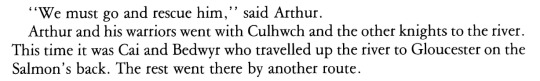

ID: "We must go and rescue him," said Arthur.
Arthur and his warriors went with Culhwch and the other knights to the river. This time it was Cai and Bedwyr who traveled up the river to Gloucester on the Salmon's back. The rest went by another route.
[image of Cai and Bedwyr riding the giant salmon]
Find more Arthurian retellings to read on my blog.
#arthurian legend#arthurian legends#arthuriana#the mabinogion#culhwch and olwen#king arthur#sir kay#sir cai#sir bedwyr#sir bedivere#gwyn thomas#kevin crossley-holland#margaret jones#arthurian preservation project#book scans by L#my post
60 notes
·
View notes
Note
Hi, thank you for compiling the list of Medieval Literature!
I think something went wrong with the Wigalois translation, the PDF cuts off mid-sentence on page 4
hello there! you're so welcome. :^)
whoops, that's my mistake. thanks for letting me know! a full english translation can be borrowed from the internet archive here, or, if you can read german, i have a pdf here. i've updated the links on my blog. happy reading!
15 notes
·
View notes
Note
hello! i was wondering if you could help me find something. in your kay web weaving post you have an excerpt from "the trial of sir kay" by cherith bladry. i've tried searching for it but nothing seems to come up. do you know if there's an anthology that includes it or if it's posted online somewhere?
hi anon!
the trial of sir kay by cherith baldry is a short story published in the anthology the chronicles of the round table edited by mike ashley in 1997. as far as i know, that is the only time it has ever been released, & unfortunately the book is out of print.
but not to worry! i’ve gone ahead & scanned my copy for you to read!
additionally, if you like that, i highly recommend cherith baldry's novel exiled from camelot. it can be difficult to find, so here is my scan of that as well as the ebook file version made by @gawayne! enjoy!
#ask#anon#anonymous ask#arthurian legend#cherith baldry#arthurian preservation project#book scans by L
23 notes
·
View notes
Last Seen Blogs

otaconnie
link - ♂ - 18

honhonouiouibaguette
nushh🦙

lonelyquail
veeby deeby

fruitypebble
Oh fuck! *hyperfixates*

martianthemaddie-blog
Of Mice And Maddie