#designing the visual elements for my original website
Text
(in the shadow of a tsunami of AI sludge)
ah fuck bro our digital sandcastles
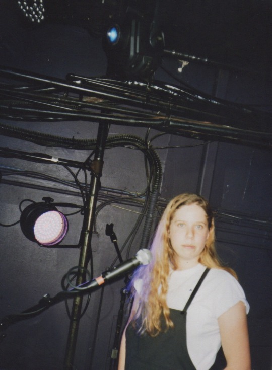
#sporadic warbling#once upon a time a butterfly named Algorithm beat its wings and its moneyed momentum gave us the trash tornado. anyway.#designing the visual elements for my original website#is thankfully creeping up my To Do list as i knock out other things#that way people know where to find me and my shit as the breakdown of this era of the web continues
26 notes
·
View notes
Text
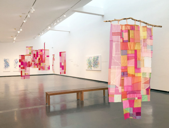
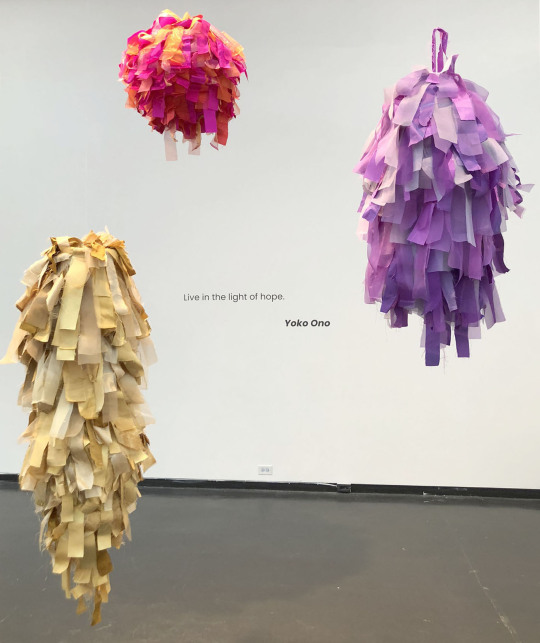
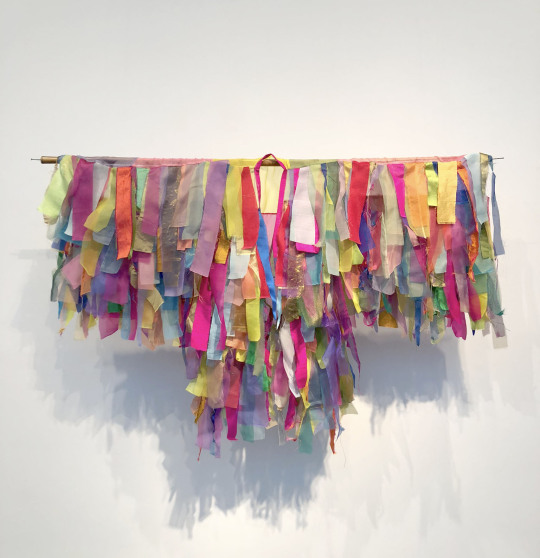
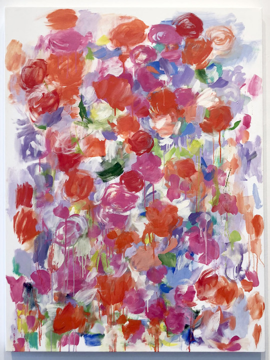

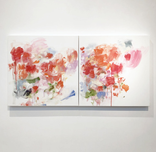
Currently at the Creative Pinellas gallery is Yolanda Sánchez’s Out of Eden, a collection of her paintings and textile work. The gallery is filled bright pleasing colors and this is the perfect exhibition to celebrate the spring season.
On the Creative Pinellas website, Sánchez discusses her work in a detailed essay. Below is a section of that piece.
Whether in painting or textiles, my working instruments are rhythm and color. I am interested in the joyful, playful or even spiritual properties of light. I am reflecting the light and color of where I live, of my immediate environment.
This artistic practice is improvisational and process-oriented, abstract. The relationship of one color to another creates a rhythm and tempo and establishes the composition. Each color suggests the next color, almost like the “call and response” form found in many musical traditions. There is a continuous orchestration, as the colors converse with one another, suggesting a mood or vibe.
I am often not sure where it is going or going to go. It is a surprise at every turn. I shape my perception as I work.
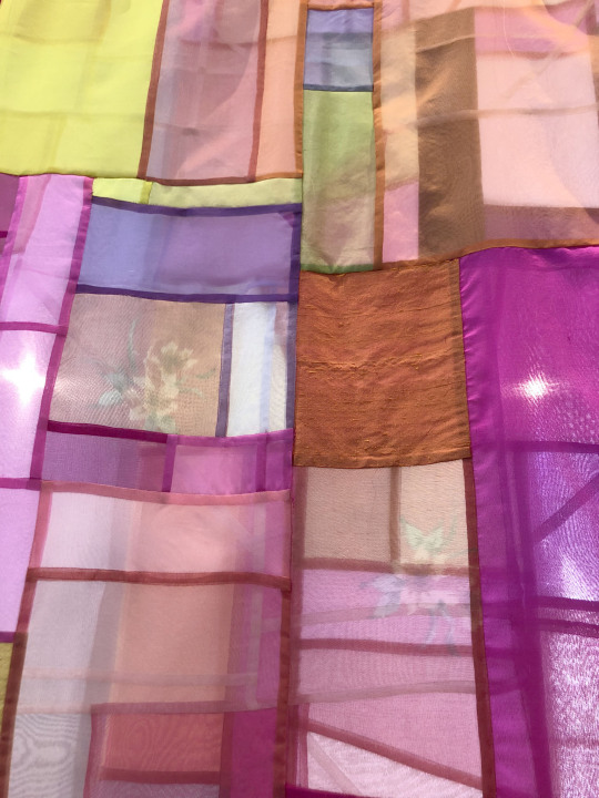
My textile work is informed by the Korean art form known as Bojagi. Humble in its origins, nameless women made these traditional textiles as often extravagant visual pieces using mundane, leftover fabric from wrapping, storing and transporting goods. Over time, the nobility introduced finer, more delicate cloth.
In its traditional form, design characteristics include stitching and seams to create linear elements, especially with translucent fabrics. These features differentiate and distinguish Bojagi from patchwork textiles found in other cultural traditions. Nevertheless, Bojagi shares what feminist art historians identify as centuries-old histories of turning scraps of fabric into beautiful objects and ultimately shifting perspectives from private to public.
I pay homage to these unknown women, authenticating their domestic work – and I affirm their values of inclusion, pleasure, love, the familial, the decorative, the colorful and joyful, the spiritual and the everyday.
My Bojagi-inspired textile work – painting with thread and fabric – honors the Korean tradition. Still, while relying on the conventions and basic structure, these pieces extend and interpret the Bojagi into a more contemporary form. I offer a new direction by varying medium and size and utilizing color compositions and stitching techniques less anchored to established methods.
Material, color, texture and transparency are crucial elements in this work, as is the geometry inherent in the design. While geometry, in this case, emerges from a particular culture, the form does not demand a specific culture-dependent response. Its only function is beauty. It is about the sensual delight derived from looking – the viewer can ascribe or chose meaning, if at all.
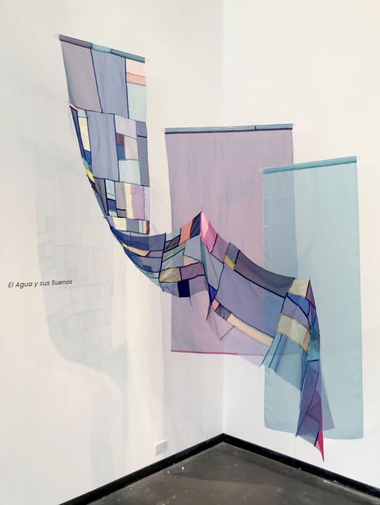
As an order, rhythm and pattern are generated within the geometry, creating beauty through harmony and stability, color dominates as a suggestive poetic force, concurrently evoking a connection to my immediate tropical environment. It sets as my intention arousing a sense of place, a feeling, and the atmosphere of an abstract garden, or even a walk through a field of flowers.
It is the color but also the sensuousness of nature that I endeavor to suggest in both my paintings and textiles.
This exhibition closes 4/16/23.
#yolanda sánchez#creative pinellas#florida art shows#art#art shows#bojagi#fabric art#painting#spring#pinellas county art#pinellas county art shows#sculpture#mixed media
39 notes
·
View notes
Text
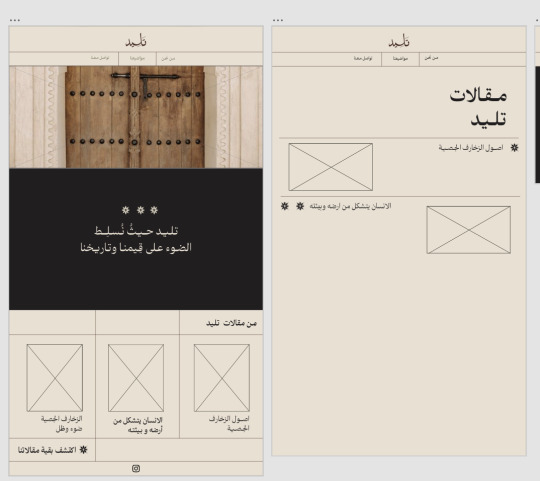
Week 05 | 15Feb. 24
What was planned this week
Writing content for articles
Photography day (Thursday)
What actually happened
Identity (experiment more color schemes)
Design more visual elements
Meeting with the second expert, Fatimah Aljaber
Writing two articles for the blog
Development of website design via the XD
Start designing Instagram posts
The results


My reflection
The focus this week was on modifying the blog, writing more articles, meeting with the second expert, designing Instagram posts, and modifying the identity colors, in addition to increasing the visual elements that I designed.
I started by modifying the logo, which needed to shorten the letter "L" and balance the rest of the letters to suit its use on the blog and Instagram account.
Additionally, I interviewed the second expert on Saturday. The second expert is Fatima Al-Jabr, who is my relative and who inspired me to start the project. Fatima has great experience in traditional homes, as she loves exploring them and reading topics about them. Furthermore, she has considerable experience in it through her grandparents, who are interested in these topics. She inspired me to start and gave me more topics and names of books that I would benefit from.
Then I began writing other articles on topics such as "The Origins of Architectural Decorations" and "Social Status and Its Influence on Decorations." I started by reviewing some books and articles that influenced my knowledge of writing. Writing was enjoyable for me, but the scarcity of sources made it time-consuming. I wrote the articles in a warm tone to align with my project.
I also developed the blog, but I used Adobe.
For a while, I was working on the project, I felt that the green color was slightly inconsistent with the other colors, so I tried more colors.
Finally, I started designing posts for Instagram. Although the project schedule includes posts for next week, I felt like I was running out of time, so I started experimenting with some posts. Plus, I will start photographing this afternoon, so determining the photo sizes on Instagram will help me.
In conclusion, although I have accomplished a lot of work, I feel that time is limited, as there is a lot of work and the midjury is approaching.
3 notes
·
View notes
Text
The Utter Serene Madness That Is tfwiki.net
Or: Why I'm thoroughly convinced liking robots that are also cars makes you a stickler for detail.
In my time as a hobbyist visual designer, I've come upon a lot of websites and graphics that convinces me tearing my skin off is a final solution to my problems. I could say the god-given combo of Firefox and UBlock Origin makes things more palpable, but if you rip out all the disgusting bits of a cockroach, you don't have a cockroach anymore. Just the world's saddest plate.
This isn't about strictly advertisements either. The issue with ads on the internet is that they're counterproductive with the user experience. You don't get pissed at an ad because it exists, you get pissed because its in the way more than it should be and ruining the page. They are a necessary evil for products to get sold and hosts to stay online.
UX is blatantly important beyond ad usage - clicks to get to a certain page, visual leylines, color composition, readability, etc. is important to make sure your website isn't a pain in the ass to feather through. UX is like a janitor's job; You're only going to get noticed if yours is obscenely bad.
Unless you're tfwiki.net.
One hallowed evening, @cabbagesenpai dragged me into the (what I assume) is the main wiki for Transformers. This is also after dragging me to an opening night of a recent movie. I'm not explicitly a fan of Transformers. I have nothing against it, it's just not my thing. My only knowledge is that at some point Sloptimus Brine has said "eBay." None of that is important, but it is.
After being grabbed by the forehead like a gourd and smeared across a wiki entry, I decided to zoom out and just look at the landing page.
At this point, I need to mention that I like Warframe an obscene amount. Warframe is also a game where you practically NEED the wiki on the second monitor. Also, Warframe's wiki, and by extension Fandom, makes me need a cigarette. So when I was greeted with THIS:
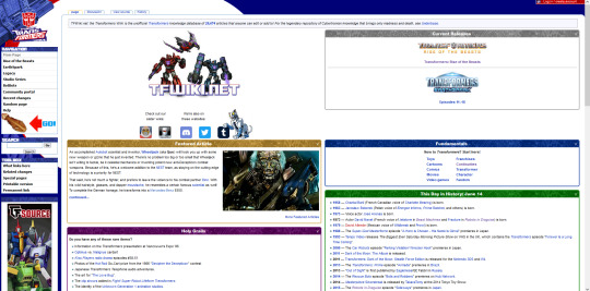
I cried, for I had seen God.
The design of this landing page is so maddeningly good that whoever the webmasters are for @tfwiki , I would let them spit on me, and I would apologize to them.
Right okay, most important things first: A core understanding of why somebody would come to this wiki. Extremely visible, Easy-to-read, one click puts you to the pages for any recent release that may or may not have led you here, maybe because you think Airazor is fucking megacool and you haven't had enough but THAT'S NOT IMPORTANT.
Below that are base concepts that are essential to understanding the world that has unfolded from an americanized marketing scheme, like mushrooms from a felled tree. It's also just a good "branching off" point for if you're looking for something via category. To the left of that is a Featured Article, which is standard for wikis that are proud of themselves.
Below that is a unique "Holy Grail" segment, which I'm awarding bonus points for. A layperson (me) can easily get a grasp on how utterly psychotic the average Transformers fan is (allegedly @cabbagesenpai) , and is also extremely useful, because maybe somebody coming here for the first time DOES have an ancient VHS of some obscure cartoon!
Further left we get your useful tools for navigation, and... My god, a snake in the garden, an ad! But wait, this showing up has some major implications. Because I'm not partial for masochism, I use UBlock. But this banner about a figurine trading/selling website is still here. This ad getting through means AT LEAST one of the following:
A: This is likely put here by the webmaster/host themselves as part of a deal directly with the sponsor instead of through a third party ad service. UBlock's element blocking is a communal list of ad hosts, so this one isn't on their list OR its part of the website itself.
B: If the following above is true, this also means anybody else who visits this website hasn't flagged that element enough times to get put in UBlock's general list, which means A LARGE PERCENTAGE OF PEOPLE WHO VISIT THIS WEBSITE DO NOT FIND IT ANNOYING AS PISS, BECAUSE IT IS RESPECTFUL TO UX AND IS ALSO RELEVANT TO THE CONTENT AND/OR USER.
Okay, alright, I need to cool down by moving onto my final, and subjectively, what I enjoy the most about this website. Pages themselves are organized extremely well in spite of the mess of canons/timelines/comics that characters can show up in. And these are punctuated by extremely helpful annotations for images!

Right, okay, so after I had finished up my wheezing fit of a header image being annotated just with "Prick," I went back to my friend and had them explain to me why he is a prick. Now, without making this post too long, yes he is indeed a prick. Infact, half of the images in this character's page is annotated by how much of a prick this bloke is. This means that the entire wiki and its users/editors are in agreement that Prowl is a prick. And that this wiki has CHARACTER to leave that in.
I've been hitting random here and there just to read the annotations for fun since then.
Right, so, in summary:
-TFwiki is, in a sea of horrible, slow, clogged websites, clean and extremely easy to navigate and use.
-Monetization respects the user's time and I suspect is tightly controlled by those in charge. It's evident there is an ad for SERVER COSTS, not PROFIT.
-The character of the utter controlled madness of Transformers fans, (which I can only assume is bred through figurines that NEED meticulous detail and quality to work and a universe that is BATSHIT INSANE,) comes through extremely well and enhances the experience without getting in the way.
-robits r cool
7 notes
·
View notes
Text
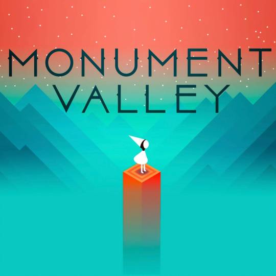
https://www.monumentvalleygame.com/mvpc
Ostatnio udało mi się wyrwać z takiej ciągłego rytmu, który nie obfituje w wydarzenia. Nie chcę ukrywać, że takie letargiczne egzystowanie jest czasem bardzo dobijające. Wczoraj jednak napisałem notatkę związaną z nową płytą mojego ulubionego zespołu, tak dziś zrecenzowałem na Steamie „Monument Valley”. Skończyłem ją w prawie trzy godziny, a jest to prosta gra logiczna wydana najpierw na urządzenia mobilne. Jednak z uroczą muzyką i stylem graficznym. Poniżej zamieszczę kopię tej recenzji, bo na platformie zapewne nikt jej nie zobaczy zakopanej pośród tysiąca innych. Jest po angielsku, ale to chyba nie będzie problemem:
----------------------------------------------------------------------
"This was the valley of men. / Now all that remains are our monuments, stripped of their glories. / Thieving princess, why have you returned?" - The Storyteller
tl;dr
Monument Valley is very simple logic games that operate on the premise of impossible figures and optical illusions, referred inside as „sacred geometry”. Levels designed with M. C. Escher’s spirit aren’t challenging, but very esthetically engaging. This could be one of the best tittles in the genre on the mobile, I don’t know that market nor platform, but Steam surely has better options for the mind-bending puzzles. Despite this, I have enjoyed each one of the 18 levels. That two-hour journey was a change of pace from my typical experience, consisting of brutally hard arcade-ish platformers. If you have a spare money, and aren’t discouraged by length, it is quite a nice title to go through on the one sitting. Probably even better to buy it with a sequel in the bundle, but I cannot say anything of that, as I haven’t played it.
Art
This is the strongest site of the title. I can almost sure that developer saw Escher’s „Relativity” or „Waterfall” on the internet or some art gallery and thought „I want that to be a game”. And here we are with a mobile hit from 2014 released for Windows in 2022. One of the puzzles is even placed on the waterfall from this Dutch painter. The optical illusions are quite interesting to be seen incorporated into a logic riddle, but here are used occasionally. Nevertheless, the vistas are quite memorable and well-designed, emitting this oneiric and surreal vibes. Although everything is still geometrical and sharp. Funny, how much can be done only by setting and color. As for the music it is also slowly flowing adding to that atmosphere. The closest I can describe soundtrack are the phrases „vaporware ambient” and „zen meditation mix”. Each section of the game is evoking different emotion, which is quite a nice touch.
Gameplay
Frankly, not the best. Even that visuals and climate are quite engaging, the levels aren't quite challenging. I have only stumbled for a while only at two moments, and my mind is not at the first freshness. For a logic game, you can demand more than only clicking the tiles. I understand though, that this is a port of a mobile game, so the bar is quite lower. It is still a great introduction for people who have the false idea that the genre is for the PhD-holders. Additionally, as I wrote in the section before, it is nice zen time in the accelerating world. Moreover, the original platform for this game reveals itself in the clunky controls, when you need to push some blocks, or rotate some elements.
Overall
I recall the years, quite a long time ago, when the flash games were at their prime. I was particularly interested in the „puzzle” section of the website. This is a nice nostalgic trip to the times as Monument Valley was released in 2014, at the mentioned heyday of small independent interactive creations. Although, the length/price ratio is not the best, it can be a nice form of slowing the tempo for one day. Unique art style, ambient melodies, and simple but engaging level design can make a night a little more cozy.
7/10
~Adiabat
17.10.2023
2 notes
·
View notes
Note
hey! this is chance & here’s this week’s prompt. what websites or resources do you use while you write or develop a character/story? what do you think of them and would you recommend them?
Thanks for the prompt!
I draw from a wide pool of resources. I might throw a bunch of links of my favourites down the bottom.
I particularly like to watch youtube videos by writers and readers who break down story devices, make reviews, explore what they liked about a book/movie/tv show, etc. I find that absorbing all of this information and learning to deconstruct what I like/dislike about different pieces of media gives me a lot of ideas for characters, stories, worlds, and writing tools.
I also like to read through writing advice that I come across on tumblr, which I try to compile in my #resources tag on my blog (which includes art stuff too!).
For worldbuilding inspiration I am often drawing off an idea I have, which usually takes a unique spin on something I've seen before that interests me. If I have recently watched a movie with a mountain setting, that sort of percolates in my head for a while as I decide to put a story in a setting like that. And that's when I start doing research on specific things: topography, tectonics, what kind of trees are there, what the climate is like. How the story's world and events would shape and be shaped by this setting. I've spent a few years illustrating fantasy maps for fun, so that background knowledge kind of sits around waiting for things like this.
When it comes to forming a character, I usually start with a specific scene, or vibe, that plays over and over in my head. I try to construct a person around that moment or that feeling, drawing on what I feel would be a) interesting and b) fitting for this character and their setting. Sometimes I pull little elements of inspiration from designs and aesthetics from artworks I've seen - if I see a really cool drawing of a burly brawny character, I might think "okay, how would I picture my own strong character?" and it will rarely look the same, but that visual aid kind of helps me picture them as a flesh-and-blood person. Once I get a bit of a handle on that, I turn to sites like https://www.behindthename.com/random to look for names I think would suit them and their context. I would recommend this site, it's very simple to work with for me.
I don't always have to grab a name with a deeper meaning, I often grab names that just sound right, but it's nice when a name's origin/meaning fits really well with the character.
Link time!
Brandon Sanderson's 2020 creative writing lectures at BYU (and the rest of his channel): https://www.youtube.com/playlist?list=PLSH_xM-KC3Zv-79sVZTTj-YA6IAqh8qeQ
Hello Future Me, who has huge series on writing and worldbuilding and breaks it down to a technical level because usually most writing advice is vague enough to be unhelpful: https://www.youtube.com/@HelloFutureMe
Overly Sarcastic Productions, especially Trope Talks series and Detail Diatribes: https://www.youtube.com/@OverlySarcasticProductions
Just Write: https://www.youtube.com/@JustWrite
Ladyknightthebrave: https://www.youtube.com/@Ladyknightthebrave
Tasting History (this one is more for inspiring me to think about food and its context in settings; it helps me think of how to make worlds feel alive): https://www.youtube.com/@TastingHistory
Dominic Noble's lost in adaptation videos are fantastic and can break down why things are liked enough to get adapted and is also just a fun watch: https://www.youtube.com/@Dominic-Noble
Shaelin Writes: https://www.youtube.com/@ShaelinWrites especially how Shaelin talks about specificity https://www.youtube.com/watch?v=xgNW3EgtT1E
There are a lot of channels that do short- or long-form essays on media and even if they are about movies or tv shows rather than books I find them incredibly useful for characterisation, storytelling, and worldbuilding in my writing. I find it very easy to translate these things from media that is created from a script to something that would work in a novel since many of these things are interchangeable. I also like seeing what goes on between a book and its adaptation, so I can find out what is better suited to each medium.
And of course for writing resources, I find a lot of good stuff pops up in the #writeblr and #writing advice tags here on tumblr.
My ultimate favourite resource for forming new characters and stories is any friend that is willing to let me just utterly spam them with my ideas. I made a whole discord server for me and my buds so that I could ramble endlessly about my enby werewolf story and use other people either as motivation, as a sounding board. They don't necessarily have to actually talk in there, but I can basically kind of use the rubber duck method to talk my way through character creation and worldbuilding, feeling like I'm chatting to people without accidentally blowing up their dms.
Friends who let me blow up their dms are a priceless resource 💜
2 notes
·
View notes
Text
How Lauren Martin Sees Music
Visual Thinking with Lauren Martin
From painting to singing to illustration to textiles to keyboards, and on!
Today we will take a closer look at a *key* member of Frankie Cosmos, Lauren Martin. That's right, she started out designing our t-shirts, and ended up as a bandmate playing keyboards, singing harmonies, and even some 2nd guitar!

Lauren and I originally met in MIDDLE SCHOOL when Lauren formed a band with my brother! I inserted myself into their friendship as annoying little sisters tend to do, and eventually she and I started playing music together too.
We had a band which performed one "show" in Eliza's backyard for 3 of our friends, but we were both very shy performers.
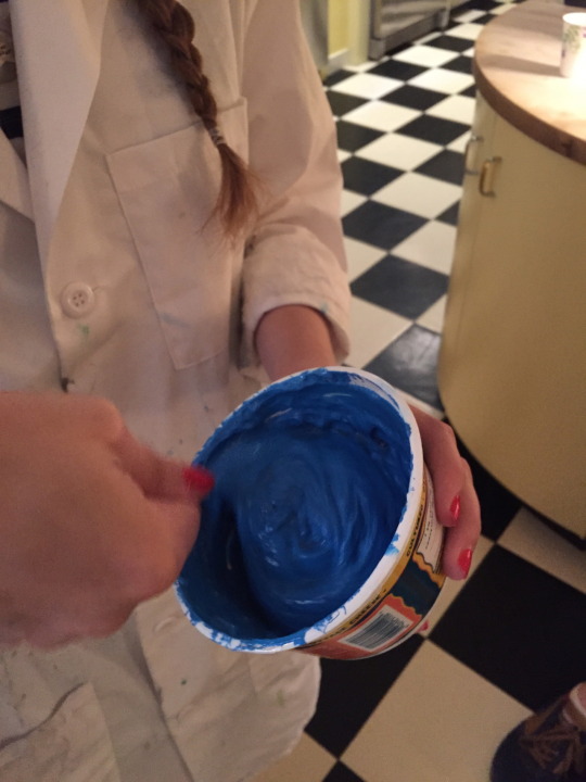
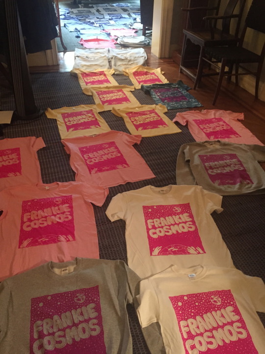
Lauren ended up pursuing textile design, and was the obvious choice when it came to designing and printing the first ever Frankie Cosmos merch. She screen printed everything by hand in my parents kitchen, and we laid all the shirts out to dry on the ground (as pictured above). She filled in for some shows sporadically while in college, and when she finished school in 2016, she officially joined the touring band as our keyboard player.
[Close It Quietly Album Art Time Lapse]
Lauren continues to design merch for FC, and has found her own audience for her illustrations and design work. She sells her own prints, apparel, and more on her website, and posts lots of fun drawings on her instagram.
Q & A with Lauren Martin
How did you first find yourself playing music and performing?
I never intended to perform but always found myself performing anyway - usually because I’d be playing music with other people and they would encourage me (/drag me along) for the live element. I have really bad stage fright, performance goes against my nature. But because I keep ending up doing it, it’s clearly something that’s important to me in some way…even though it feels in conflict with who I am.
My first instrument was flute in elementary school. But my first ever musical performance was a cello recital in middle school (to an audience of parents). After that I was in my high school’s all girl rock band. I played rhythm guitar. I remember we played One Way Or Another by Blondie. I was also in the school chorus, we would perform for elderly people at retirement homes. I performed a surprising amount considering how shy I was.
During the pandemic, your illustration work really took off. With visual art being full time for you now, and touring still on hold, does playing music feel different for you?
I think having one part of myself that was really important (being a visual artist) — having that dream fulfilled in a way, makes playing music feel better. It feels like I’m not missing out on one half of myself energetically. Finding an outlet that allows me to be more wholly myself, it makes me feel more creative as a musician than I did before. After years of having a very regimented relationship with visual art during and after art school, during the pandemic I’ve unlocked a new side of myself creatively, and established my own style as a visual artist, and a musician. Recently I’ve felt a lot more confident in sharing my musical ideas.
You're a huge part of the aesthetic of Frankie Cosmos as a grown-up band, and took FC from my janky AppleWorks 6 creations to the legitimate poster designs, cute merch, and album art we have now. Has music always encompassed a visual element for you?
I have always been inspired by album art, and intrigued by the branding that goes along with a band. Not to say that it informs anything about the music - but I do think there’s a visual element of a band that has always been intriguing to me on the same level as sneaker logos or car logos. I like simplicity and impactfulness in graphic design. And I think music and design overlap a lot. I would never claim to have synesthesia, but I do think if you asked me to paint a song I could do that. Not being a trained musician and not having the standard language to describe what I mean when it comes to music, allowed me to create my own visual language about music.
I’m realizing now, the bands that were really influential to me as a kid, like the first albums I bought, were Gorillaz, who were cartoon characters to me, and The White Stripes, who were also cartoon characters to me.
Before you got into textile design and graphics, you were mostly painting in a renaissance style, and at one point considered studying painting restoration. How did you find your various styles over the years and how have your artistic inclinations changed?
In a weird way, I would say my artistic inclinations haven’t changed that much, it’s more just the subject matter and the medium have changed a lot. I’ve always loved depicting reality as I see it. My portraits were never “accurate” to life, they were accurate to my imagination. And now, I’ll draw a still life of something I made up. I like creating my own reality. Growing up, I was really inspired by old paintings because I would go to The Met every weekend, and I loved seeing the Hans Holbein paintings and Giotto, because I just loved that it looked like a fucked up version of reality. It’s not photorealism, it looks like what you would close your eyes and picture a person to look like. I love the way art can look like a painting of the inside of an artist’s brain.

[Banana Split Poster]
Can you compare your experiences in analog and digital art?
I love both, but I tend to gravitate toward digital mediums. As a perfectionist, I love the idea of being able to do things over and over in order to get it exactly how I want. I used to work in oil paints but I would get really frustrated with myself when it wasn’t going right, because I felt I couldn’t start over. It would probably be good for me to try it again, because I don’t necessarily want to lean into my perfectionism forever. But it was really freeing for me to start working digitally, because I can do it an infinite number of times, I can get it exactly the way I see it in my head. Also, in terms of material used…when I was making physical art, I was surrounded by so many canvases and pieces of paper…I really like sparseness and neatness in my space, so having everything I’ve ever made in a pile doesn’t work for me.
What about your sewing and physical textile work? How does that compare to your other art forms?
Music and drawing feel in a way like luxuries, whereas sewing my clothes (and cooking) feel like practical ways to use my creativity. Those are more purely joyous outlets for me. My art is work, music is work, but sewing and knitting is truly just for myself. I don’t do it as much as I used to, but I always like to have a chunk of my wardrobe be handmade. I get to turn my brain off and just follow a pattern, do this repetitive motion.
What inspires you recently?
I’m inspired right now by exercising. My latest hobby is playing tennis. Growing up, sports were extremely important to me, I wanted to be a professional soccer player. At a certain point I felt like I had to choose between being creative or athletic. I’m recently getting excited about being physically strong again.
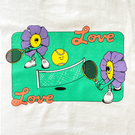
[Love Love Tennis Club T-Shirt]

[Stay Sunny Tie-Dye T-Shirt]
Click Here for Lauren’s Website
15 notes
·
View notes
Text
RepubLikha as a Band: A Psychedelic 60s Inspired Website Design
Hi, this is Deya!
A first year student of RepubLikha from Bachelor of Design of Miriam College and for the first design task in our Design History (AAV-104) class under Mr. Rino Datuin, we were tasked to focus on Visual Communication.
My team researched a lot about different eras and created a mood board which will guide us through our design process.
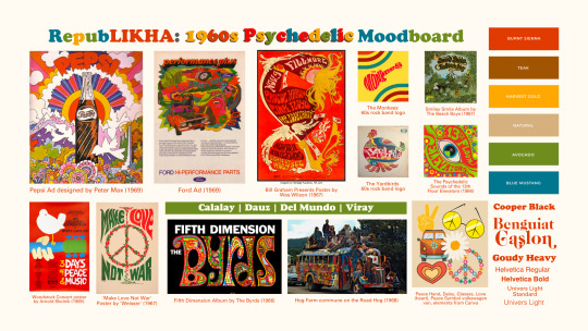
The image above is what we created and as you can see, we went for the Psychedelic 60s! An era full of bright colors, crazy patterns and flowy lines.
Find out the rise of psychedelic designs during the 60s and my process in coming up with my design!
The Rise of Psychedelic Designs during the 1960s
After World War II, the United States of America experienced an Economic Boom resulting in the materialistic lifestyle of the Americans in the 50s. As the decade ended, young people had leaned on counterculture promoting hippie culture, social movements, anti-materialistic lifestyle, and anti-violence principles.

What is counterculture? It is a movement in which people abandoned traditional, conservative ways of life for more expressive, rebellious, and non-conforming ways of living.
With counterculture, a lot of events, trends and such was born during the era. One of them is the Resurgence of Psychedelic Designs.
Psychedelic designs were influenced mainly by the hippie movement (Flower Power ideology), pacifism and interest in the culture of the Far East–mostly Buddhism. However, the real origins of this design goes way back in the last ten years of the 19th century, the rise of art nouveau.
How Psychedelic Designs Came to be during The 1960s
Drugs had been a friend to young people and even to the soldiers fighting in Vietnam. Some people depended on it for escapism or comfort with all the chaos happening. It also opened the way for psychedelic designs to have its iconic colorful, distorted, spiraled, patterned, edgy, and hallucination-looking features.
The Design & The Process
The website design was inspired by Wes Wilson's bright works and play of swirly fonts and figures. RepubLikha is imagined as a 60s band here with their band site showing a Wes Wilson inspired psychedelic design.
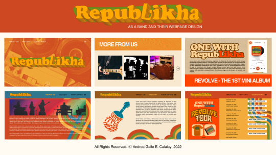
I also designed some logo, merchandise, album cover and tour poster for the website. I used Davida Bold, Cooper Black and Helvetica for the fonts while a bright and neutral earth-tone colors for the color scheme.
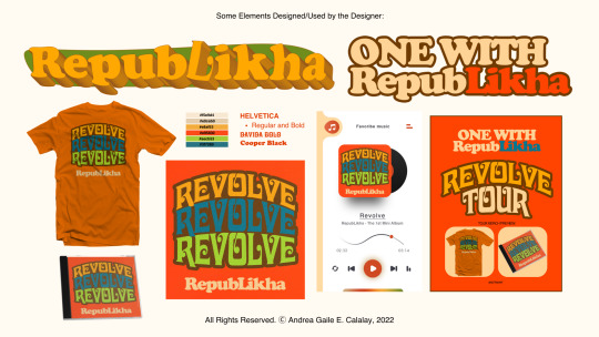
Revolve is the imagined album and tour name of the group as it is inspired by The Beatles' Revolver where most of the music from the album were made while they were under the influence of LSD acid and how it altered their music throughout their career.
The overall design of the webpage and elements is to gain audience from people who appreciate the said movement and design that age way back from the 60s. It is also for people who wants to explore the culture and how it came to be through the imagined band and their music.
Surely, the psychedelic 60s era was an era full of bright, edgy, spiraled-fonts and patterns; A fun and crazy ride for designers and artists on every type of field in the scene.
────────────
Check out my teammates’ designs through their blogs for more inspiration!
Bea's | Claire's | Ann's | Zeanne's
────────────
References
Park, A. (2009). Psychedelic Drugs and the Fine Arts in the 1960s and 1970s. Texas Woman’s University. Retrieved from https://twu.edu/media/documents/history-government/Psychedelic-Drugs-and-the-Fine-Arts-in-the-1960-and-1970.pdf
Wes Wilson. (n.d.). Smithsonian American Art Museum. Retrieved from https://americanart.si.edu/artist/wes-wilson-27389
Klos, A. (2016). Psychedelic style in graphic design. Retroavangarda. Retrieved from https://www.retroavangarda.com/psychedelic-style-in-graphic-design
Psychedelia and the Psychedelic movement. (n.d.). Graphic Design History. Retrieved from https://visualartsdepartment.wordpress.com/psychedelic-60s
Flower Power: An Era of Movements and Empowerment. (2020). Sui. Retrieved from https://us.wearesui.com/blogs/green-journal/flower-power-an-era-of-movements-and-empowerment
Kary, T. (2021). Why Psychedelics, Big in 1960s, Draw New Interest Now: QuickTake. Bloomberg. Retrieved from https://www.bloomberg.com/news/articles/2021-04-30/why-psychedelics-big-in-1960s-draw-new-interest-now-quicktake?leadSource=uverify%20wall#xj4y7vzkg
#dycreated#graphic design#graphic design student#artphilippines#artph#artstudent#concept design#website design
5 notes
·
View notes
Text
How to Create Custom Shaders in Flutter?

What are Shaders?
Before creating custom shaders, let’s understand what shaders are!
In Flutter mobile app development, shaders are used to define custom visual effects and transformations on graphics and UI elements. A shader is a program that runs on the GPU (Graphics Processing Unit) and controls how each pixel of a rendered image or UI element is displayed.
Flutter provides the Shader class, which is an abstract base class for different types of shaders. The most commonly used shaders in Flutter are GradientShader and ImageShader.
Shaders in computer graphics are programs that determine the lighting, darkness, and colour of objects in a 3D scene. They use GLSL (OpenGL Shading Language) to achieve this. In this blog post, we’ll explore how to create custom shaders in Flutter using GLSL.
What is GLSL?
GLSL is a programming language used to control the GPU and create custom visual effects and rendering. It’s similar to C and is specifically designed for real-time environments like video games and animations.
Let’s create custom shaders!
Now to create a shader in Flutter, we typically write code in GLSL. However, if you prefer to skip the GLSL coding part, you can choose whatever GLSL code you like and modify it according to your preference for your Flutter app. There is an online platform called Shadertoy, which allows users to create and share interactive shaders in GLSL. It provides a playground for experimenting with real-time graphics and visual effects, making it a popular resource for shader developers and enthusiasts.
Here, I am using the following code to create my custom shader:
The following code is the original shader from the Shadertoy website.#define PI 3.1415926535897932384626433832795
voidmainImage( out vec4 fragColor, in vec2 fragCoord )
{
vec2 center = fragCoord/iResolution.xy - vec2(0.5, 0.5);
floatdist = length(center);
float p = (atan(center.y,center.x)) / (2.0 * PI);
floatnumStripes = 12.0;
boolstripeA = mod(floor((p * numStripes) + (sin(dist * 10.0 + sin(iTime)))), 2.0) == 1.0;
boolstripeB = mod(floor((p * numStripes) - (sin(dist * 10.0 + cos(iTime)))), 2.0) == 1.0;
vec3 col;
if (stripeA&&stripeB)
{
col = vec3(0.4);
}
else if (!stripeA&&stripeB)
{
col = vec3(0.5, 0.2, 0.1);
}
else if (stripeA&& !stripeB)
{
col = vec3(0.3, 0.2, 0.1);
}
else
{
col = vec3(0.7);
}
fragColor = vec4(col,1.0);
}
To get this code to work with Flutter, we have to modify the code as below:#include <flutter/runtime_effect.glsl>
uniform vec2 uSize;
uniform float iTime;
vec2iResolution;
out vec4 fragColor;
#define PI 3.1415926535897932384626433832795
void main(void) {
iResolution = uSize;
vec2fragCoord = FlutterFragCoord();
// …
// …
}
The changes that we have applied are listed below:
Flutter runtime import is added#include <flutter/runtime_effect.glsl>
Four new parameters are added
1. uniform vec2 uSize;
2. uniform float iTime;
3. vec2iResolution;
4. out vec4 fragColor;
All the mentioned variables, marked as “uniform”, need to be provided from Flutter when using the shader program.
The uniform vec2 uSize, which is a constant number provided from Flutter, represents the size of the item that is being displayed.
The uniform float iTemtracks the elapsed time since the shader started and is utilized to animate visual effects within the shader.
The vec2 iResolutionholds the screen resolution and is used to adjust the size and position of the rendered objects.
The out vec4 fragColorserves as the output variable that stores the final color of the rendered object. This value is subsequently passed back to the CPU for display on the screen.
Atlast, we have added two assignments within the main functionvoid main(void) {
iResolution = uSize;
vec2fragCoord = FlutterFragCoord();
// …
// …
}
FlutterFragCoord() will be received from the flutter runtime import.
Now, we have to save the full code in a “.frag” file and add it to pubspec.yaml so that we can utilize it in the flutter. Final code after customizing is as follows :#include <flutter/runtime_effect.glsl>
uniform vec2 uSize;
uniform float iTime;
vec2iResolution;
out vec4 fragColor;
#define PI 3.1415926535897932384626433832795
void main(void) {
iResolution = uSize;
vec2fragCoord = FlutterFragCoord();
vec2 center = fragCoord/iResolution.xy - vec2(0.5, 0.5);
floatdist = length(center);
float p = (atan(center.y,center.x)) / (2.0 * PI);
floatnumStripes = 12.0;
boolstripeA = mod(floor((p * numStripes) + (sin(dist * 10.0 + sin(iTime)))), 2.0) == 1.0;
boolstripeB = mod(floor((p * numStripes) - (sin(dist * 10.0 + cos(iTime)))), 2.0) == 1.0;
vec3 col;
if (stripeA&&stripeB) {
col = vec3(0.4);
} else if (!stripeA&&stripeB) {
col = vec3(0.5, 0.2, 0.1);
} else if (stripeA&& !stripeB) {
col = vec3(0.3, 0.2, 0.1);
} else {
col = vec3(0.7);
}
fragColor = vec4(col,1.0);
}
Let’s apply the above shader into our flutter application!
Step-1 : To integrate above shader file into our application, we need to add that shader to flutter pubspec.yaml as mentioned below:flutter:
shaders:
– shaders/shader.frag
Step-2: Then, we will create a ShaderPainter class which will extend CustomPainter as below:import 'dart:ui';
import 'package:flutter/material.dart';
classShaderPainter extends CustomPainter {
finalFragmentShadershader;
final double time;
ShaderPainter(FragmentShaderfragmentShader, this.time)
: shader = fragmentShader;
@override
void paint(Canvas canvas, Size size) {
final paint = Paint();
shader.setFloat(0, size.width);
shader.setFloat(1, size.height);
shader.setFloat(2, time);
paint.shader = shader;
canvas.drawRect(Offset.zero& size, paint);
}
@override
boolshouldRepaint(covariant CustomPainteroldDelegate) => true;
}
Here, we are passing the below variables using setFloat on the FragmentShader:shader.setFloat(0, size.width);
shader.setFloat(1, size.height);
shader.setFloat(2, time);
Step-3: Now, we will create a StatefulWidget called ShaderHomePage which reads the shader from the “.frag” file which we created above and passes it to the ShaderPainter as a FragmentShader.import 'dart:async';
import 'dart:ui';
import 'package:custom_shader_demo/custom_shader.dart';
import 'package:flutter/material.dart';
classShaderHomePage extends StatefulWidget {
constShaderHomePage({super.key});
@override
State<ShaderHomePage>createState() => _ShaderHomePageState();
}
class _ShaderHomePageState extends State<ShaderHomePage> {
late Timer timer;
double delta = 0;
FragmentShader? shader;
voidloadMyShader() async {
var program = await FragmentProgram.fromAsset('shaders/shader.frag');
shader = program.fragmentShader();
setState(() {
// trigger a repaint
});
timer = Timer.periodic(const Duration(milliseconds: 16), (timer) {
setState(() {
delta += 1 / 60;
});
});
}
@override
voidinitState() {
super.initState();
loadMyShader();
}
@override
void dispose() {
timer.cancel();
super.dispose();
}
@override
Widget build(BuildContext context) {
if (shader == null) {
returnconst Center(child: CircularProgressIndicator());
} else {
returnCustomPaint(painter: ShaderPainter(shader!, delta));
}
}
}
Here, the method that does all the work is loadMyShader.This method reads the shader from the assets, retrieves the FragmentShader from the FragmentProgram, assigns it to the shader variable, and also initiates a Timer for potential animation purposes.late Timer timer;
double delta = 0;
FragmentShader? shader;
voidloadMyShader() async {
var program = await FragmentProgram.fromAsset('shaders/shader.frag');
shader = program.fragmentShader();
setState(() {
// trigger a repaint
});
timer = Timer.periodic(const Duration(milliseconds: 16), (timer) {
setState(() {
delta += 1 / 60;
});
});
}

Conclusion
A beginner to custom shaders in Flutter should find the material in this description to be a thorough tutorial that will enable Flutter app developers to comprehend the procedure and begin building their own custom shaders.
We may also try to convert more complicated glsl code to use, which includes getting a picture from us and altering it pixel by pixel to produce amazing graphics. This essay simply demonstrates how to convert very simple glsl code to operate with flutter.
0 notes
Text
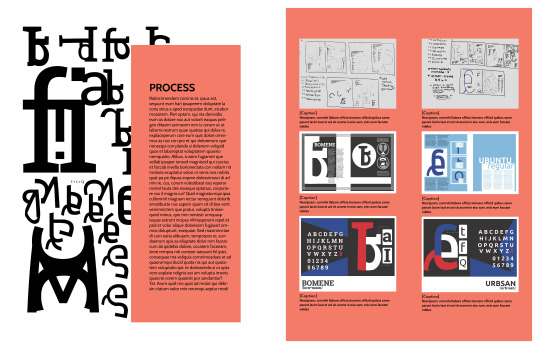
(ARTS246) Ch. 10: Typographic Design Education & Project #3 Progress
I spent this week working on the process book for project #3, which is due on Wednesday, April 3rd. The upcoming deadline has been causing me stress because my previous process book had a more flexible and longer timeframe for the deadline. Nonetheless, I am determined to tackle this challenge.
I spent most of Monday getting acquainted with the website and software that we'll be using for our process books. The website is called Blurb, which offers an extension in the InDesign software to design books using their templates. These templates need to be customized before creating the design file. It's important to note that the front and back cover are separate from the actual pages of the book and the files need to be combined before finalizing and submitting them for printing and shipping. The printing process takes about two weeks, which is why the turnaround time for this project is shorter compared to the previous two projects. Although I'm not an expert in using Blurb, I'm excited to experiment with the service more and potentially use it to print my other portfolios in the future.
The process book's layout has been a challenge for me, mainly due to the grid and margins. Although the margins are pre-set from the Blurb template, I found them to be too small for my liking on the spreads. To fix this, I took inspiration from my old process book from ARTS102 (Introduction to Design Technology and Concepts) and incorporated a similar margin and grid into my new process book. Initially, I felt strange using my old process book's layout and ideas, but I also thought, "If it ain't broke, don't fix it!" This was particularly true for this project, as I loved the balance and harmony of my original layout. I aim to achieve that same look and feel with my new process book while showcasing my detailed process and the improvements I have made from each project.
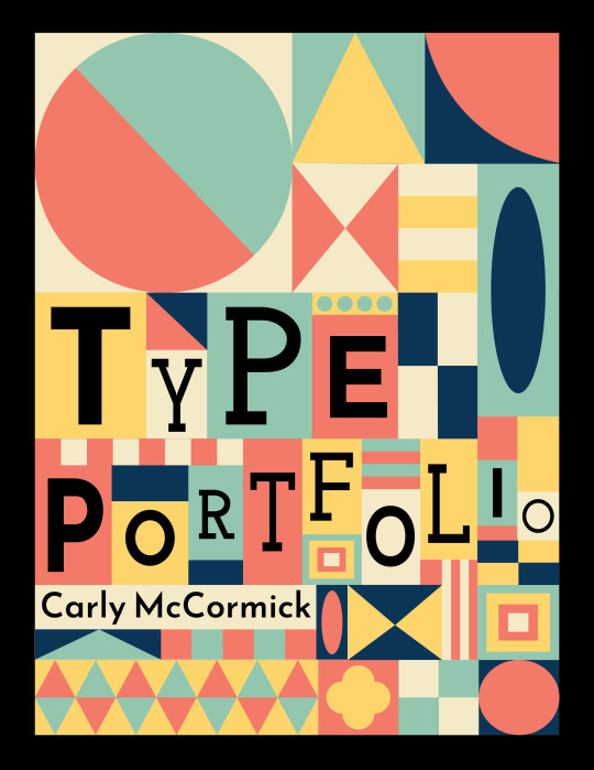
The cover design of the process book draws inspiration from the traditional analog movable type process, where typography uses a movable component, such as metal or wood letters and ink, to reproduce the elements of a document on different types of paper. The design is also influenced by the artwork of Brad Vetter, a designer and letterpress artist who visited and spoke at the University of South Carolina. His work inspired me, and I wanted to emulate his style in digital art form. I took inspiration from my mood board, my traditional style of geometric surface design, and the multiple typefaces used throughout this process book, such as Cabin Bold, Josefin sans, and Josefin slab. My main concern was that the cover might feel too crowded and confusing, making the text difficult to read. However, after receiving feedback from my professor and peers, I realized that the color palette is balanced, the title is easy to read, and the visual hierarchy is well-balanced. The only suggestion I received was to change the colors of the large circle in the top left corner of the cover, as that element slightly threw off my visual hierarchy.
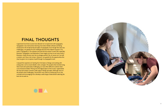
My process book follows the theme of my cover art, but I've decided to make the geometric shapes less prominent. Instead, I want to highlight each project and its process on the pages. I aim to let the typeface be the main focus and make each project stand out to catch the audience's eye. To make some pages look better, I may add subtle geometric shapes to fill in empty spaces or where some pages look too wordy. I also need to work on the visual hierarchy of some spreads, as some elements feel like they are competing. Overall, I have made a good start with my process book for Typography I and II. I plan to improve it before submitting it for the final class critique and printing.
The reading for this week discusses the importance of conducting in-depth studies of common typographic design issues and how professional designers can develop creative solutions by applying all the skills learned throughout the textbook. This includes integrating type and image on posters, establishing a visual system to unify various materials, experimenting with content in publication design, thinking about typography in terms of time and motion, creating dimensional and environmental typography, analyzing and visualizing data, and developing a unique visual language for everyday events. This chapter combines all the concepts learned in this book, summarizing why educating oneself on typographic principles is crucial. Having taken Typography I and II courses, my views of typography have entirely changed. Previously, I paid little attention to the use of type, the visual hierarchy of typography, or even the fonts used in various works. Now, I pay attention to these elements even more, and I have a greater appreciation for typography than ever before. I understand that many decisions go into creating something related to typography, whether it's a book cover, magazine spread, poster, social media post, etc. I am grateful for these courses, even if they were challenging because they helped me become a better graphic designer. I have come to see type as an art form, not just words on a page.
0 notes
Text
Cyberpunk 2077
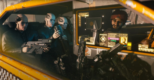
I'd have to say the one game that made me think the concept design looked better than the gameplay graphics would have to be Cyberpunk 2077.

Cyberpunk 2077 is an open-world action-adventure role-playing video game set in an anti-utopian future filled with cyberpunk technology and a deeply fractured society, where the elite rule from the heights of the skyscrapers of the City of Night, as well as a multitude of gangs Those who roam the city streets. A mercenary who lives in the fictional Californian city of Night City, where they deal with the aftermath of a robbery.
I remember that in 2022, the cyberpunk style was very popular in China, and many companies began to produce cyberpunk games. Including some pixel games, "Anno Mutation" and "Wheel of Life and Death" all look great. I really like the contrasting colours and cool neon lights. But what’s most fascinating is cyberpunk’s bipolar worldview.


Cyberpunk visual elements, neon lights, rainy nights, damp and narrow alleys. High contrast and high saturation flashing billboard. Towering buildings, ruins, androgynous lights, high technology and slums. The dystopian atmosphere and pessimistic colours of neon cityscapes are the simplest visual elements to express the chaos and loss of control of the world.
It follows that cyberpunk works usually construct two different dimensions, one of lightness and weirdness, and one of dilapidated identity, with gloomy, constricted slums where it rains heavily, and post-modern futuristic metropolises where skyscrapers tower over the city.
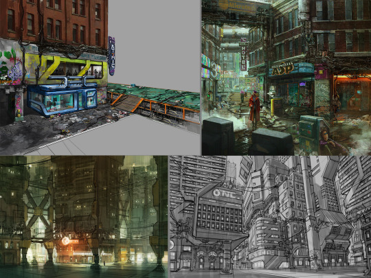
The concept designer I'm following, James Daly III, is different from the other Cyberpunk 2077 concept designers in that the images I've found of him are in the early sketching stages as if I'm looking at the world as it was first constructed, slowly getting darker and heavier.


I really like this draft, the absurdity of the design is so real in the context of the story. Whose idea is it that a man who is speaking has his brain replaced?

James Daly III's drawings have a strong storytelling and associative quality, which not only makes me think of exploring the philosophical meaning behind cyberpunk and what humans really are. Humans began to transform themselves, replacing their original limbs and organs with machines, and the emergence of transformed half-human, half-cyborgs blurred the boundaries between humans and machines, which made us think What is a real human being? The emergence of cyberpunk, it's as if it's magnified the present world 50 times over.

I really like his early exploratory concept art, and I feel like the fun of concept design is to keep pushing the worldview. Seeing that these architectural styles don't appear in the game makes them feel even more familiar, so maybe cyberpunk has its own revolutionary significance, hh. And I think looking at the initial drafts of the game wallpaper, it's like you can visualise how their styles have evolved, which I think is very meaningful to me in terms of constructing my own concept art.
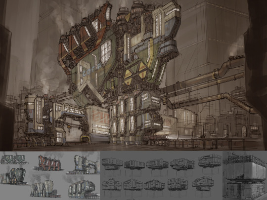

Whilst the concept art for James Daly III has not been updated for a while, the game is still being updated. In the world of cyberpunk, we can see a clear multicultural fusion, with many international cities where East meets West. Reflecting its prosperity and congestion, wealth and poverty, this dichotomy of setting and background history reflects its exploration of the laws of aesthetics. Secondly, the futurists, in an era of highly advanced technology and seemingly peaceful and beautiful times, hide the festering of civilisation and the destruction of humanity. "Cyberpunk 2077: Ultimate Edition" will be released on 5 December - experience the full story of V with panoramic ray tracing, ray reconstruction and Reflex. On a side note, I think Cyberpunk: Edgerunners is pretty good too hh!

References:
CD Projekt Red. Cyberpunk 2077 [Website]. Retrieved from https://www.cyberpunk.net/gb/zh-cn/cyberpunk-2077
ZerowolfZX. (2023, March 20). Cyberpunk 2077 — Next-Gen Update [Video]. YouTube. https://www.youtube.com/watch?v=c1lgKA-AP4I
IGN China. (2022, February 28). Cyberpunk 2077 — Official PlayStation 5 Gameplay [Video]. YouTube. https://www.youtube.com/watch?v=g56D5PZ7_Ew
NVIDIA. (Year, if available). Cyberpunk 2077 Ultimate Edition: DLSS, Reflex & Ray Tracing. Retrieved from https://www.nvidia.cn/geforce/news/cyberpunk-2077-ultimate-edition-dlss-reflex-ray-tracing/
0 notes
Text
Empower Your Online Journey: Learn How to Become an Affiliate Marketer And Succeed Online
To become a successful affiliate marketer, start by choosing a niche and learning about digital marketing strategies. Mastering SEO and building a persuasive online presence are crucial to success.
Embarking on an affiliate marketing journey offers freedom and financial rewards, provided you approach it strategically. With the digital world at your fingertips, learning how to harness the power of affiliate marketing is essential for those aiming to thrive in the online marketplace.
Credit: yellowimages.com
My Best Recommended & Proven Way to Make $100 Daily — Watch THIS FREE Training to START >>
Embarking On The Affiliate Marketing Adventure
Section Introduction
A thrilling quest awaits in the world of affiliate marketing. It’s a path lined with potential rewards and ample opportunities. Imagine earning money by sharing products you love. Ready to start this journey? Let’s dive into the first steps to transform passion into profit.
Choosing Your Niche
Choosing Your Niche
Finding your niche is like choosing your favorite flavor of ice cream — it should excite you! Here’s how to pick a niche:
Identify your interests: Start with what you love. Passion keeps you motivated.
Research market demand: Use tools like Google Trends to check what’s popular.
Consider profitability: Some niches offer more potential than others. Look at product prices and affiliate commission rates.
Analyze competition: A crowded niche can be challenging. Balance passion with practicality.
Choosing the right niche sets the foundation for success. It influences the content you create, the audience you attract, and the affiliate programs you join.
Understanding Affiliate Marketing Models
Understanding Affiliate Marketing Models
Affiliate marketing models define how you’ll earn income. Understanding them is critical. Here’s a breakdown:
ModelDescriptionBenefitsPay-Per-Sale (PPS)Earn a commission when sales are made via your links.High earning potential per transaction.Pay-Per-Click (PPC)Generate income with each click on your affiliate links.Easier to earn for beginner marketers.Pay-Per-Lead (PPL)Get paid for referrals that sign up for information or trials.Good for niches with high-value products or services.
Choose a model that aligns with your niche and content strategy. Success depends on how well these elements work together.
Building The Foundations
Welcome to the critical stage of embarking on a successful affiliate marketing journey: ‘Building the Foundations’. Proper set-up is key.
Setting Up Your Online Presence
To start as an affiliate marketer, an online platform is a must.
This digital footprint could be a blog, a website, or social media accounts.
Select a unique domain name. This name forms your brand’s identity online.
Your domain should reflect your niche. Make sure it’s memorable and clear.
Choose reliable hosting. A fast loading site keeps visitors happy.
Design a user-friendly site. Make navigation intuitive and straightforward.
Apply SEO practices from the beginning — use keywords and meta descriptions that align with your content.
Creating High-quality Content
Content is the heartbeat of your affiliate marketing strategy.
Understand your audience — create what resonates with them.
Research keywords. Incorporate these terms into your posts organically.
Use engaging headlines. They capture attention and spark curiosity.
Keep paragraphs short. Aim for easy readability.
Mix your post formats. Use lists, how-tos, guides, and reviews.
Use original images and videos. These visuals break up text and add context.
Include clear calls-to-action. Instruct readers what to do next.
Update regularly. Fresh content improves ranking and keeps audiences coming back.
My Best Recommended & Proven Way to Make $100 Daily — Watch THIS FREE Training to START >>
Strategizing For Success
Aspiring affiliate marketers, take heart! Your strategic approach determines the pinnacle of your online success. In the ‘Strategizing for Success’ section, let’s dive into two key tactics: pinpointing lucrative affiliate programs and optimizing your site through SEO.
Finding The Right Affiliate Programs
Selecting an affiliate program that aligns with your interests and audience needs is crucial. Follow these steps to aid your search:
Research: Start with a platform audit to understand your audience’s preferences.
Quality over Quantity: Choose products that offer real value, ensuring higher engagement.
Commission Structures: Compare payout schemes to identify the most rewarding opportunities.
Support: Opt for programs with excellent merchant support to help you navigate challenges.
Leveraging Seo For Organic Traffic
To command a strong online presence, SEO optimization is non-negotiable. Consider these tips:
Keyword Research: Identify what potential customers are searching for online.
Content Creation: Generate informative, keyword-rich content that resonates with your audience.
On-Page SEO: Ensure meta tags, headers, and images are SEO-friendly to improve site visibility.
Backlinks: Cultivate quality backlinks to enhance domain authority and search ranking.
Better search rankings translate to more organic traffic, more clicks, and increased affiliate sales.
Mastering The Art Of Promotion
Mastering the Art of Promotion is a critical step towards success in affiliate marketing. It involves clever strategies and effective tools to reach audiences. Strong promotion means attracting more eyes to your affiliate products. More eyes lead to more potential sales. Let’s dive into some powerful tactics to boost your promotional efforts.
Using Social Media Effectively
Social media platforms are gold mines for affiliate marketers. They are perfect places to share content and engage with followers. Your aim is to build trust and drive traffic to your affiliate links.
Choose the right platforms where your target audience hangs out. Focus on those to get the best results.
Create valuable content that resonates with your audience. Mix it up with images, videos, and stories.
Engage with your followers. Reply to comments, answer questions, and start conversations.
Use hashtags to broaden your reach and find new followers.
Email Marketing Techniques
Email marketing remains a powerful tool for promotion. It allows direct communication with your audience. Emails can convert readers into buyers if done correctly.
Build a subscriber list. Offer something valuable in exchange for email addresses.
Segment your audience to send tailored content to different groups.
Design engaging emails. Use short paragraphs, clear calls-to-action (CTAs), and attractive visuals.
Track your results. Analyze open rates and click-through rates to refine your strategy.
Optimizing For Conversion
Welcome to the world of affiliate marketing, a realm where conversion is king. Success hinges on the ability to optimize every element of your online presence. Transform clicks into commissions by mastering conversion optimization. This section delves into the art of creating effective web pages and employing A/B testing to enhance your affiliate marketing results.
Designing Effective Affiliate Web Pages
Your affiliate website is your digital storefront. It’s here that visitors become customers. A well-designed affiliate page is simple, focused, and packed with value.
Keep it clutter-free to ensure visitors focus on your call-to-action (CTA).
Use high-quality images and videos to engage users.
Highlight benefits of the product, not just features.
Persuasive copy should showcase the product’s value proposition.
CTA placement should be prominent, urging action.
Ensure navigation is intuitive; visitors should find what they need in seconds. Trust signals such as testimonials, ratings, and security badges boost credibility.
A/b Testing For Better Results
A/B testing is the scientist’s approach to marketing. Test, measure, and refine. It is essential for understanding what resonates with your audience.
Start with a hypothesis, such as “Changing the CTA button color will increase conversions”.
Create variation A (the control) and B (the change).
Send equal traffic to both versions.
Collect data on user behavior.
Analyze results to see which performs better.

My Best Recommended & Proven Way to Make $100 Daily — Watch THIS FREE Training to START >>
Staying Relevant And Competitive
Staying Relevant and Competitive in today’s fast-moving affiliate marketing world demands sharp skills, strategic thinking, and a pulse on what’s trending. Thriving as an affiliate marketer means evolving with the industry.
Keeping Up With Industry Trends
To succeed in affiliate marketing, understanding current trends is crucial. Trends guide consumer behavior, shape digital marketing strategies, and affect your earning potential. Here are ways to stay ahead:
Follow industry leaders on social media and subscribe to their newsletters.
Attend webinars and conferences to network and gain insights.
Participate in online communities, such as forums and groups.
Use analytic tools to monitor changes in consumer interests.
Continuous Learning And Skill Enhancement
Building a career in affiliate marketing is a journey of constant learning. To maintain a competitive edge, commit to enhancing your skills. Here’s where to focus:
Master digital tools for SEO, social media management, and content creation.
Educate yourself through courses and certifications in digital marketing.
Test and analyze different marketing strategies to find what works best.
Stay adaptable to new platforms and technologies that emerge.
Scaling Your Affiliate Business
So, you’ve laid the foundation for your affiliate marketing venture. Great job! Now, it’s time to grow and scale. This is where the magic happens. Scaling your affiliate business means more than just increasing your earnings; it’s about building sustainability and ensuring long-term success. Let’s dive into how you can expand and fortify your affiliate empire.
Diversifying Income Streams
Diversification is key in the affiliate world. Don’t put all your eggs in one basket! Here’s how to diversify:
Promote a mix of products: Choose items from various niches or categories.
Add new affiliate programs: Look for fresh, high-commission opportunities.
Create digital products: Think eBooks or courses related to your niche.
Include different content formats: Use videos, articles, and infographics to engage different audiences.
Utilizing Analytics For Growth
Data is a goldmine for affiliates. Using analytics tools, you can track and improve your performance. Take these steps:
Monitor traffic sources: Know where your visitors come from.
Understand user behavior: Study how visitors interact with your site.
Optimize for conversion: Make data-driven changes to increase sales.
Test different strategies: Experiment and refine your approach for better results.
Remember, every piece of data can guide you to smarter business decisions.
Frequently Asked Questions
Q. What Is Affiliate Marketing?
Affiliate marketing is a performance-based strategy where affiliates earn a commission for marketing another person’s or company’s products or services.
Q. How Do You Start In Affiliate Marketing?
To start in affiliate marketing, choose a niche, sign up for an affiliate program, create content, and promote products using your unique affiliate links.
Q. Can Beginners Succeed In Affiliate Marketing?
Yes, beginners can succeed in affiliate marketing with the right strategy, consistent effort, and by learning from reputable sources and industry experts.
Q. What Skills Are Necessary For Affiliate Marketing?
Successful affiliate marketers often have skills in content creation, SEO, digital marketing strategies, data analysis, and an understanding of their audience’s needs.
Q. How Long To See Results From Affiliate Marketing?
Results from affiliate marketing can vary, but with a solid strategy and consistent effort, some may notice progress in as little as 3–6 months.
Conclusion
Embrace the journey of affiliate marketing with confidence. Equip yourself with the essential skills and knowledge to thrive in this dynamic online arena. Remember, success follows those who are persistent and adaptable. Start your affiliate marketer odyssey now and chart a path to digital triumph.
Your prosperous online future awaits!
My Best Recommended & Proven Way to Make $100 Daily — Watch THIS FREE Training to START >>
Thanks for reading my article on Empower Your Online Journey: Learn How to Become an Affiliate Marketer And Succeed Online
Affiliate Disclaimer :
This article Contain may be affiliate links, which means I receive a small commission at NO ADDITIONAL cost to you if you decide to purchase something. While we receive affiliate compensation for reviews / promotions on this article, we always offer honest opinions, users experiences and real views related to the product or service itself. Our goal is to help readers make the best purchasing decisions, however, the testimonies and opinions expressed are ours only. As always you should do your own thoughts to verify any claims, results and stats before making any kind of purchase. Clicking links or purchasing products recommended in this article may generate income for this product from affiliate commissions and you should assume we are compensated for any purchases you make. We review products and services you might find interesting. If you purchase them, we might get a share of the commission from the sale from our partners. This does not drive our decision as to whether or not a product is featured or recommended.
Source : Empower Your Online Journey: Learn How to Become an Affiliate Marketer And Succeed Online
#Affiliate marketing success#Online entrepreneurship#Digital marketing strategies#Monetize your website#Passive income streams#Affiliate program mastery#Internet marketing tactics#Earning commissions online#Affiliate marketing platforms#Niche marketing techniques#Blog monetization methods#Affiliate marketing training#Social media promotion#Content creation tips#SEO for affiliate marketers#Email marketing for affiliates#Conversion optimization#Affiliate marketing tools#Affiliate network selection#PPC advertising strategies#Influencer marketing tactics#Video marketing for affiliates#Affiliate marketing courses#Website traffic generation#Affiliate marketing mentors
0 notes
Text
Week 4&5 - How to analyze a Work of Design
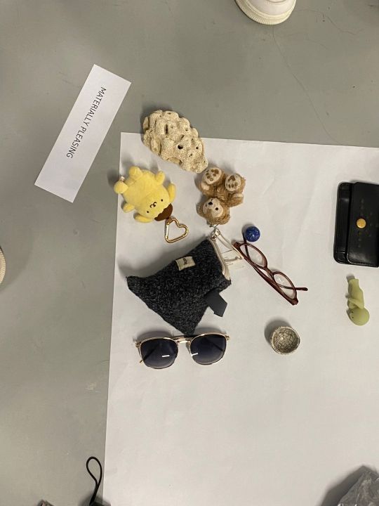
There are a few components to consider when analysing a work of design. We have to consider the process and the purpose of the design, like what is the function and how it is being created. Besides that, we also need to take note of the medium or material that is being used and how it is being used, and what is the intention behind it. Furthermore, we have to look out for the type of elements used and what principles they follow to create their work. For week 4, the class brought three personal items to discuss its significance to us, the craftsmanship and the context of the item. After the activity, I discovered that everyone’s item has its own backstory and it is also interesting to hear how some of the items were created and their origin. Then, we categorised the items into four parts, personal significance, historical significance, materially pleasing and well crafted.
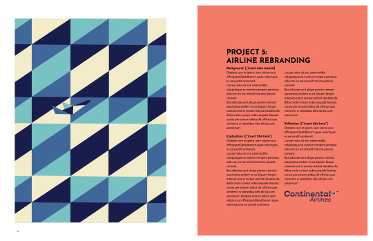
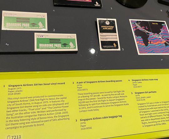
For week 5, we visited the National Museum to explore various antiques and design works. One of the works that caught my attention is the 1970s airline boarding pass at the Now Boarding exhibition. It shows how the old airline boarding pass looked back in the 1970s. Apparently, it is made of paper and you have to write down your flight number and seat number onto the boarding pass. As of today, airline boarding passes now come in both physical and digital form. It is easy to use and all flight information can be found upon scanning the barcode. Apart from its function, boarding passes now are made with thermal paper that is of better quality and material which is thicker and durable. There's also a difference in the design of the boarding pass between the 1970 and the modern. The old boarding pass has very minimal texts while the modern boarding pass has more texts and it is arranged orderly so that it is easier to read the information.
Word Count - 326


Now Boarding exhibition (NMS website)
Website : CNN
Pettersson, Henrik. “Final Call for Paper Boarding Passes? A Visual History of The Beloved Memento.” CNN, Cable News Network, 2 Sept. 2023, edition.cnn.com/interactive/2023/09/travel/paper-boarding-pass-history-emirates-dg/.
0 notes
Text
SP - Evaluation - ISTD
For this project, I feel I conducted a wide breadth of visual and theoretical research and these both helped contribute to my generation of ideas and aesthetics. Due to my subject matter, a lot of theoretical research regarding ethical AI was conducted alongside researching systematic oppression. I feel I could have produced more research regarding systems of oppression and how they function to produce more accurate depictions of oppression and language assimilation. However, I also felt that I didn’t want to replicate particular systems of oppression too accurately for fear of being misinterpreted as a trivialisation of current real-world oppression (i.e. Israel’s occupation/ethnic cleansing of Palestine). Abigail Thorne was a very informative source of theoretical research when looking at the ethics of AI and how people can encode and embed values into AI systems. Her theory helped me begin to think about AI in terms of politics and how coding languages may choose to organise themselves in a digital society based on our experience of AI having bias. Artists such as S4RA and Jake Elwes helped me gain an understanding of how digital exploration is inadvertently queer-coded in its nature and that was something to consider moving through the project. S4RA inspired many visual aspects of my project such as reappropriating digital imagery and implementing 3D elements. Other artists such as Eilis McDonald and Kurt Champion helped me able to apply theory such as Hito Steyerl’s ‘In Defense of the Poor Image’ into an effective, striking, visual format which communicated my concept. I think where I improved significantly in this project in terms of research was the emphasis on contemporary references - both theoretically and visually. However, I believe I could have conducted more visual research into reappropriating digital conventions to better consider the work’s aesthetic and its significance.
In terms of inspiring my project in terms of medium and format, a variety of artists and designers helped my development. The biggest inspiration for the medium was Linda Stupart’s work ‘Watershed’. The work was a ‘twine’, a ‘choose your own adventure’ format game in which the audience progressed through a series of web pages as a narrative. Games I had previously looked at such as ‘Cruelty Squad’ by Ville Kallio and Consumer Softproducts also feature this aspect of different endings depending on the choices made by the player. I found this format to be highly original and a good medium to tell a narrative regarding AI. I felt that reappropriating websites/ website interaction is a contemporary approach to narrative telling, almost as if pages are the pages of a book. Panke.gallery has had a recent exhibition named ‘Website as Subject’ in which images, format and mechanics of websites are reappropriated and adapted to a gallery/installation setting. This research helped me significantly in producing formatting and refining my work into a more contemporary critique on language assimilation.
Considering the target audience behaviour in my project, I felt that a young adult audience (18-25) would align with my project the best as they are the most likely to engage in conversations surrounding reparations and injustice. I communicated to this particular audience not only through narrative but through the cheeky, informal register I applied to the copy and the aesthetic that is distinctive and easily navigated to digital natives. Going into constructing the game, I originally wanted to use low-poly, PS1-style graphics to communicate my idea which could have appealed to other target audiences such as older gamers. Later, I adapted the target audience to fit the aesthetic of the game. I felt that the smaller minority of slightly older audience members (30-35) who are nostalgic for more historical video game aesthetics would no longer be catered for as I developed the aesthetic to a more contemporary look. The narrative itself is left-leaning in terms of politics. Conducting research into the politics of video games/gaming culture, I found a study which linked video games with developing right-wing ideologies. Targeting it towards gamers through non-explicit political debate/talking points might be more effective in deprogramming these ideologies developed in gaming communities. I felt this might be more effective in creating bipartisanship in the audience’s exposure to politics as it is not explicitly claiming that they are wrong for being right-wing, creating polarity, but allowing the audience to read between the lines and create more diverse political exposure for them. Perhaps I should have considered the political message further when targeting my audience, making it more explicit. However, I feel that contrasting too harshly with the audience’s views might have created tension - maybe I should have found a finer balance.
I used a wide variety of softwares to construct and experiment for my outcome and demonstrated proficiency in them: Blender, InDesign, Photoshop, XD, and Premier Pro. I believe my design skills have improved and I’m a lot more conscious about elements such as using grids, legibility and overall attention to detail when producing images. I still have a lot more to learn and will encourage myself to revisit the rules and conventions of grids in both print and digital design. One thing I feel I was successful at in terms of visuals in this unit was my ability to design in a variety of styles. Despite not using my more low-poly, PS1-style graphics, it helped increase my proficiency in Blender. I need to improve my skills when it comes to animating in Blender as I feel this lets down my productivity using the software. The contemporary, iOS-based, digital visual identity I constructed feels strong and relevant given tech companies and their accusations of corruption. Issues I found when producing my outcome were relating my product to the brief in terms of making it explicitly about the blending of languages. I feel the more understated approach of linguistic hybridity as a vessel for a story about language assimilation was effective, and that I attempted to make it more obvious with the messages from the Python Dominion at the beginning of the game, however, the doubt of not fulfilling the brief to its fullest potential was a hindrance. Furthermore, I feel I could have demonstrated a more holistic narrative rather than just one narrative string. Although I feel my concept was communicated effectively through the example scenarios, perhaps there was a way to have a more satisfying ending, demonstrating the player changing their moral choices in order to achieve the ‘correct’ ending where Java is emancipated. I feel a similar way with my video presentation, perhaps I should have considered the reading time needed by the viewer for all the text in the game.
During the project, I maintained Gantt charts and to-do lists to better organise my time. I feel overall I achieved effective and professional time management which allowed me to delegate tasks. One thing I believe I could better stuck to was my overall time management of the weeks of the project, however, considering I changed the aesthetic of my project it was understandable. A really effective method of increasing productivity I found it producing to-do lists for the day ahead in the evening and work through them. This personally worked really well for me and will be a tool I take into FMP and other projects.
Throughout the project, I shared criticism with Maddie, my critical friend. Our discussions were very productive and candid, giving one another constructive criticism and helping build our projects. She offered a lot of insight into legibility and layout, as well as the overall feel of the projects. This was useful in gauging how successful my project was in visually communicating my message and narrative. I believe having a critical friend will be useful for projects yet to come. Maddie and I work well together and I feel we can give one another effective, constructive criticism. Another method of critical evaluation was setting up student-led group tutorials in the Level 6 Cube which helped particularly in developing my ideas. Having open discussions about ideation helped my development a lot. As the project moved forward, the tutorials became less frequent - but when developing outcomes later on, critiquing people’s outcomes became common and accelerated the refinement of our products. I feel that we could have formalised these tutorials better and produced more efficient ways of being critical with one another e.g. preparing questions to ask beforehand.
0 notes
Text
Week 2 - Gestalt & Design Principles
In this class we learned about design principles as well as gestalt, is made up of proximity, closure, similarity, common region, continuity, figure and ground, symmetry and common fate. Design principles and gestalt make up composition, and composition is essential for focusing on the subject and telling stories.
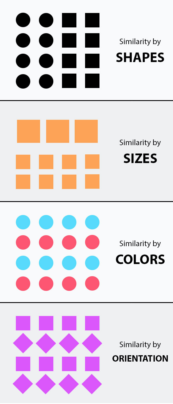

Gestalt principles originated from the gestalt theory which centres around how people perceive imagery and visual stimulus.

Unfortunately I wasn't in this class because I was feeling quite ill so I did the class task at home, went onto the ArtStation website and onto the Explore page and found 3 images I thought showed design principles the most.
I have tried to analyse the principles found in this image.

One of them is similarity, as there are many circular shapes in the design, all with the same shade of green and they are perceived to be more related than the elements that are similar such as the background and the flowers.

Another one is continuity as the string of lilypads are arranged sequentially in a curved line which lead our eyes to follow that path as a group.


Another principle is proximity/common region as most of the lily pads shown in the image are close together which means that they can be perceived as a group. The proximity supersedes the similarity principle because as long as the lily pads are close together, they will be seen as a group no matter the shape or colour.
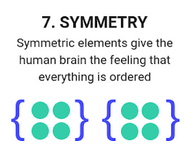


The artwork has elements of symmetry and formal balance, which is a symmetrical composition, as it has a balanced amount of colour, value, shape and texture.

The artwork has elements of contrast as the lily pads and flowers are made up of dark green and bright pink, which are complementary colours as they sit opposite each other on the traditional colour wheel. The flowers also have a more complex shape than the circular lily pads.

There is lots of variety in the art, although it is made up of mostly circular shapes it shows variety in size and position, as many are bigger or smaller than each other and each are scattered across the image, either closer together as a group or further away from each other.

There is a lot more negative space in the image surrounding the lily pads, and the line of lily pads is the positive space.
The composition of this piece is almost diagonal, or a straight line as the string of lily pads moves across the screen, but there is also a gap between the lily pads similar to the natural rule of thirds composition, which usually has the subject off centre of the image.

At this point I had no new tasks to add to my To do list, however I was still in the middle of doing my artist research cube which has taken me the most time.
0 notes
Text
Graphic Design Trends
According to an article written by Josh Howarth, there are 13 graphic design trends forecasted from 2024-2026. The graphic design industry is always changing evolving cultural norms and consumer expectations.
Hand-drawn Illustrations – Driven my consumer demand for authenticity, as custom illustrations convey personal touch and originality. Custom illustrations and art are often preferred over stock photography. The Apple Pencil is known for its pencil-on-paper-like functionality and is often the favored tool for illustrators. The Apple Pencil 3 is highly anticipated for its new features like a rotating cap and multi-touch sensors.
Surrealism – Surrealism is known by the use of vibrant colors, negative space, and juxtapositions. It combines elements of dreams and realities to create unique designs. This trend suggests a growing interest in pushing the boundaries of design, exploring the unconventional, and embracing surreal elements in visual expression.
Colorful Minimalism – This type of design tells a lot with only a little. Colorful minimalism relies on simplicity, order, and clean lines.
Maximalism – Designers ignore boundaries and embraces excess, using a bold mix of colors, patterns, layering, off-balance, and lack of negative space. Gen Z seems to be highly attracted to maximalism.
Data Visualization – Brands attempt to catch the eye of consumers with art, but with an attention span of only 8 seconds, the message needs to be communicated quickly. Graphic design techniques are successful in getting the message across successfully. Infographics are not only stating data, but also telling a story.
To learn more about other trends in graphic design, visit the following website:
0 notes
Last Seen Blogs

enjoying-all-cockslut
Enjoy yourselves

gmonro
George Monro BCT

poemsbysuri
Poems by Suri

homekitchenproducts-blog
HOME KITCHEN COLLECTION

haireensionsbyfah-blog
FAH Hair Extensions