#simply because it's easier for me to draw with a palette that has more contrast
Note
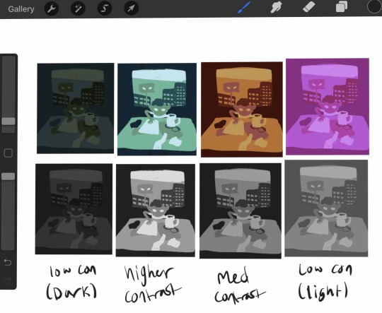
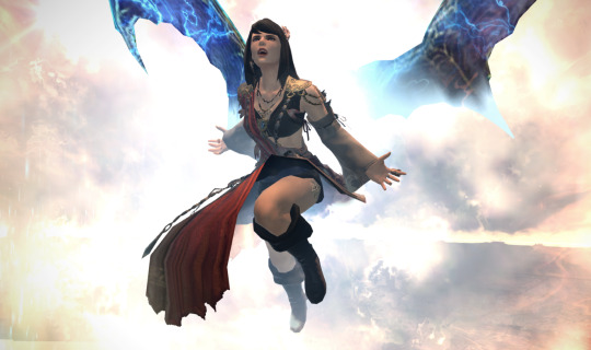
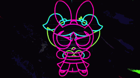
Hi! Can I request Multimouse with #42 or #33 palette, please?

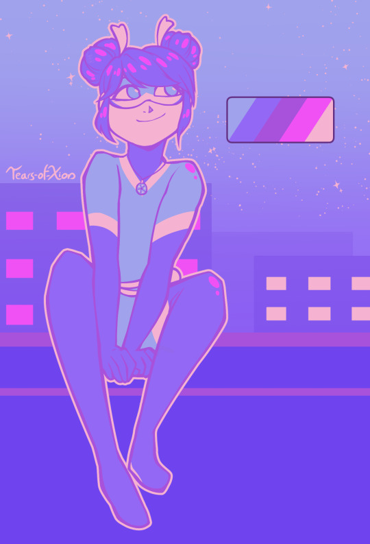
I am incapable of choosing just one, apparently. So have two Multimice, feat. color palette #33, Cult and #42, Sky Might Fall.
Multimouse is so much fun to draw. <3
Color palettes used are from this post !
-
Please do not use or re-post my artwork without my permission. Thank you! (reblogs, however, are welcome and appreciated)
I do not own Miraculous: Tales of Ladybug and Cat Noir, nor it’s characters. All rights to their owners.
#miraculous ladybug#fanart#marinette dupain cheng#multimouse#miraculous tales of ladybug and cat noir#eyestrain#limited color palette#color palette requests#it an ask!#clip studio paint#March2024#tearsofxion'sart#my art#tearsofxiondrawsMiraculous#definitely didn't spend like fifteen minutes trying to figure out where to use the hot pink in the second picture#definitely not#out of the two of these the top one is my favorite#simply because it's easier for me to draw with a palette that has more contrast#but both turned out nice
142 notes
·
View notes
Note
your last post made me think about how I loooove how you use color in your art, it's so vibrant and full of life and movement and expression! I was wondering if you had any advice on how to do color studies? perhaps doing drawings with limited palettes? or anything similar?
First things first, thank you, I really do appreciate comments like these!
this post now also has a follow up for finish limited palette pieces
I'm obviously very fond of limited palette art and color studies/color thumbnailing are great ways to get that done. When people think limited palette there's often the association of unrealistic and fantastical color palettes, but learning to limit your color use absolutely applies to semirealism and just builds stronger color theory in general. I was planning to talk about limited palettes in more realistic color use in this post, but this already ended up way too long. If that's something people want to hear about I can talk about it later.
Color theory basics crash-course! I'm sure almost anyone who has colored anything is familiar with this, so I'll be SUPER brief, but I want everyone to be on the same page for this. Color has three qualities you need to take into account: Hue, saturation, and brightness. Hue is what we think of as the 'color'. Saturation is the vibrancy of this color; how bold or dull it is. Brightness is how light or dark the color is. Here's this all labeled on a color picker I stole from google.

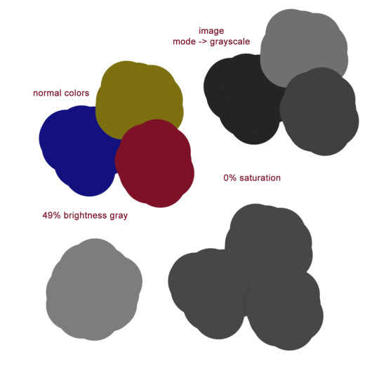
As a rule of thumb, things that look good in color should look good in grayscale. Having a strong range of values (brightness) makes for a strong image. Keep this in mind when you're picking colors – knowing what areas need to be light and what areas need to be dark before you start coloring will make your life easier. I'm going to teach you when and how to break this rule later, but for now let's just talk about picking a palette. I've found five to seven different colors to be a really nice sweet spot for working with limited palettes.
There are three main types of color palettes ill work with and ill provide examples each of them. I expect you to all politely refrain commenting on the amount of homestuck fanart that's here.
Monochromatic, where the piece is all within one color family with slight variations in hue, and larger variations in brightness and saturation

Accent, which is essentially the same as a monochromatic type with the addition of a strong, contrasting secondary color in one or two variants. Normally the accent color is lighter and serves as a highlight. This is not any kind of a hard rule, but is instead just what I like.
Split. There are two (or more) main colors at play, each with a couple of different shades.

Cool. Now lets see how we'd go about making one of these palettes.
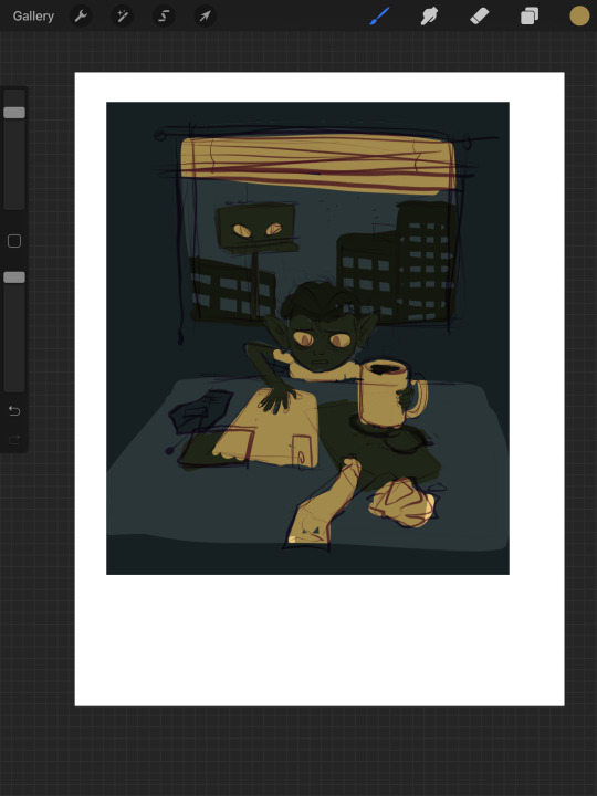
I'm grabbing an inconsequential sketch i've already got and we're gonna slap some color on it. Let's start monochromatic – I've gone and just tossed six pretty random shades of green on it, picking what goes where based on what I want to be light and what I want to be darker.
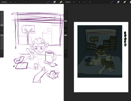
Keep in mind, by monochromatic, I don't mean just picking one color and making it lighter or darker! Adjust your hue within the same color family – some of these are very blue, definitely more blue than green, and some are much warmer and yellower. Play around. In this stage I like to have every color on a distinct layer, so I can just recolor the entire layer at once as I tweak the palette.
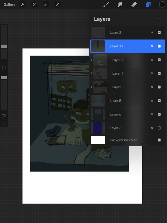
On the right, I have each color lined up in order of lightest to darkest just so I can get a sense of what I'm working with. Lets go ahead and call this one thumbnail. Now I'm gonna group the layers, duplicate them, and flatten the copy. I'll shrink it down and shove it off to the side so I can compare it to the other ones I make later.
Okay, I did a few more almost completely arbitrary monochromatic palettes. Here they are compared with their grayscale counterparts.
All of them have the same number of colors, and lights stay lights, darks stay dark, midtones stay mid consistent between all of them, but the range of values is different between them all. The difference in light or dark between each tone is different and it gives a different mood that you can see even in black and white. None of them is more 'correct' than any other, and it's all about establishing the tone and atmosphere you want. Experimentation is key.
Now lets try making this a complimentary palette. With a strong accent color, your accent should be placed at areas of importance. People are naturally drawn to contrast and when using an accent color in a piece it'll make that area stick out, so make sure you're placing your colors with intent. For this I went back to that first set of greens I had because it was my favorite. Since this palette is over all very dark, I am going to make my accent the lightest color, because that'll stand out more. In a lighter palette, try making your accent the darkest color. Once again I must stress these are not hard rules – there are very few hard rules in art at all – but these are very useful tips for getting emphasis in the right place. This is just an example piece so I'm not being huuugely thoughtful with how I'm placing the color.
Here's the same image but with the lightest green just swapped out for a far more vibrant accent of yellow. Looks pretty terrible. I don't want all of the papers and blinds to seem so prominent. So let's scrap this and try a different approach. We're gonna instead add our accent as a sixth color to our palette.
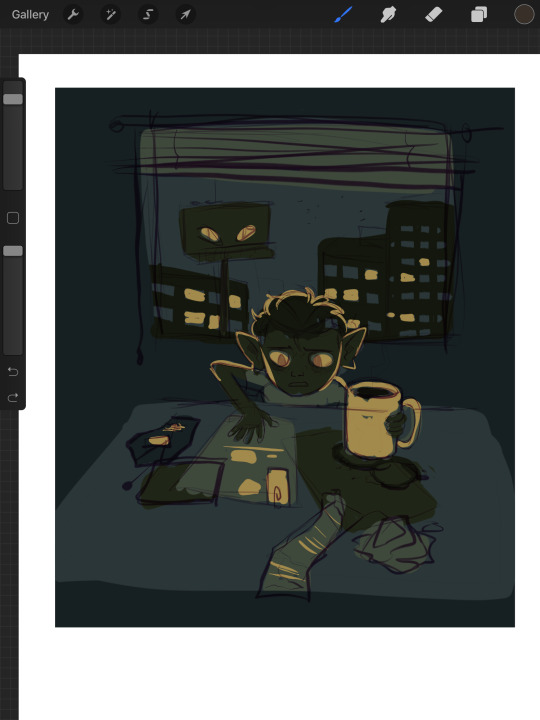
By adding another color, I've added another level of detail. Figuring out how to manage detail isn't just dependent on how many colors you have, but this is already going to be ridiculously long so I'll spare you that spiel. This is another one of those things I'll talk about more later if people want to hear my #thots. Using the new yellow accent, I emphasized the eyes, the mug, and added some interior detailing to the objects on the table. I also decided to place yellow in some of the windows of the outside buildings, to add a bit more interest in that area, and to justify giving yellow back lighting to our little goblin lad here, which makes him stand out nicely.
A split palette makes things a whole lot more complicated. Now that you're gonna be working with two different base colors you don't just only have to worry about which one is lighter or darker, you have to worry about how the hues look next to each other. Lets work with an orange on top of our original green here. I picked two of the greens and replaced the darker one with a darker orange, and the lighter one with a lighter orange. Now our palette is six colors split 50/50 between orange+yellow, and green.
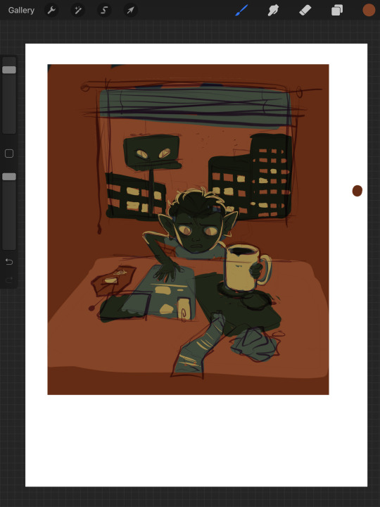

But now something interesting is happening. Let's take a look. If you're particularly keen eyed, you might have noticed that there's a third set of colors here, using a greyish brown in place of the oranges. What's up with that?
Well, what's up with that is, they are orange. The palette on the far right is what happens if, instead of choosing my own oranges, I simply hue-shifted the bluegreens until they were technically orange in hue.


The oranges I chose just based on how they looked without actually checking the value and saturation of actually changed the value hierarchy of the whole piece. The table, instead of being in between the objects stacked upon it in terms of brightness, is lighter than either. This isnt bad at all – there's absolutely nothing wrong here. It's just important to be aware of things like this! This is why I said a split palette is the most complicated of the three I'm talking about here – in many occasions, the hue hierarchy can top the value hierarchy. Keep that in mind for slightly later.
I think split palettes work really well for comics, and I like to make my comics with split palettes. Whereas with a single illustration, you can just putz around with your color thumbnails until you get something good, for a comic you're locked into your palette once you've done the first page. Unless you're some sort of insanely meticulous person, in which case I envy you, you probably don't have every single page of your comic blocked out with respective values and can't apply your palette to the whole thing at once to test it. This means you'll need a palette that's pretty versatile. Having a split palette where one of the hue sets is lighter than the other overall allows you to decide whether you're going to create an overall light panel with dark accents, or vice versa. I'm gonna compare two palettes I'm using for comics to make this point.
Here's a sampling of the comic pages in full color, at 0% saturation, and adjusted for grayscale respectively. You'll notice a slight difference between the desaturated colors and the grayscale colors – grayscale seems to hold truer to the full color version, doesn't it?
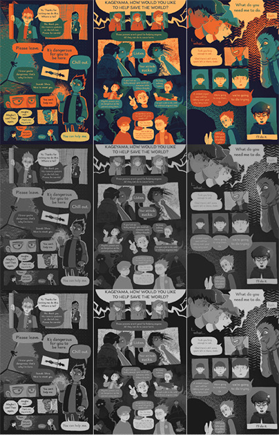

Now, here are the palettes themselves, and some grids showing the relationship between every pair of colors. When you don't know exactly what you're going to be using any given palette for, the relationship between any two colors becomes more important than ever. The bottom palette is split three ways, red yellow and blue each with a light and a dark, and then a completely neutral dark gray color. I'm using it for a long ongoing ace attorney comic I'm drawing. The top one has 4 shades of blue that go from darker and cooler to lighter and warmer, then 3 shades of orange that get yellower as they get lighter. Underneath is just the values – you'll notice that the top palette has a larger value range, with its lightest color being lighter than that of the bottom palette, and it's mid tones spaced further apart.


What you'll also notice about the bottom palette is that instead of the reds being lighter than the blues and darker than the yellows, the value alternates dark red dark yellow light red light yellow. Take a look at the color grids. You'll notice that for the most part, every color in the palette on the right looks good with every other color. That's not nearly as true for the palette on the left. The light blue has a weird vibration where it meets either of the reds, and a few of the pairings just aren't particularly pleasant. Honestly, from any objective ideas of color theory, this palette kind of sucks shit. Lets make some adjustments to it.

I've changed the dark yellow and light red hues so now the light red is slightly darker than the dark yellow. That's the palette that's on top now. Looks better, doesn't it? But so now the question becomes why am I using a palette that looks awkward, disharmonious, and visually strained when I know exactly how to fix it? The simple answer is because I wanted a color palette that's awkward. I wanted that visual strain. I have trouble working on comics and general, especially anything as long as this one, and I wanted a color palette that already meant things would come out looking a little bit wonky, so I wouldn't be as concerned with nitpicking all the details and making everything pretty. I think the sort of visual upset also fits the tone I'm keeping with a lot of the comic.
Remember earlier when I said I'd talk about breaking the rule of stuff looking good in gray scale and in color? That's now. Take a look at this image.
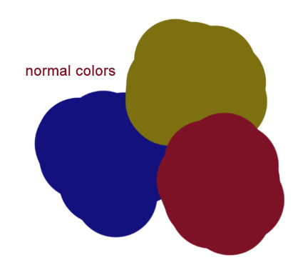
Which of the three colors is darker: the red, blue, or yellow? The stupid truth of it is that there's not really a proper way to tell. All three are technically the same 'brightness' but our brain tells us that the blue is the darkest, and the yellow is the lightest. Why do our brains do this? Let’s make em gray now.
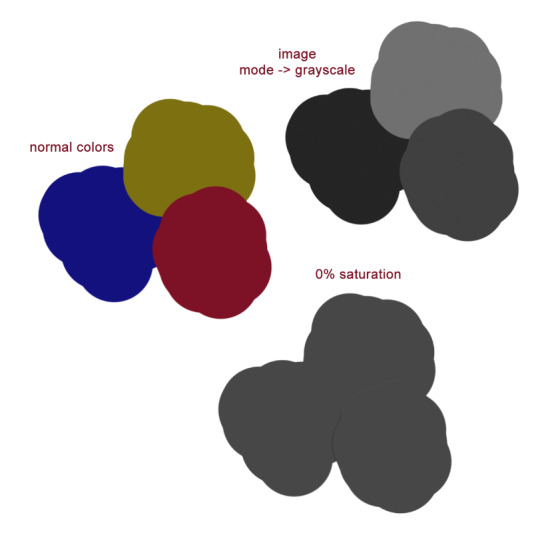
On the bottom you can see what the colors look like when they are set to 0% saturation; as you'd expect it's a homogeneous gray blob. So then what the fuck is going on with the grayscale one? The grayscale one is closer to the way our brains interpret the colors, but we know this to be an improper rendering of their respective values. Which is the correct version, then – the grayscale or the desaturation? Luckily, we're using a computer, so we can have photoshop tell us the exact balance of hue, saturation, and brightness of any given pixel. Let's take a look now.
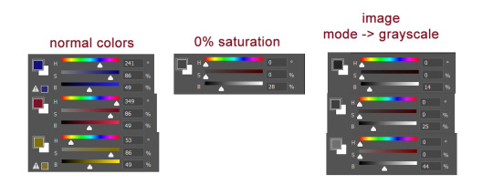
Wait, huh? We can plainly see that all three of the colors are at 49% brightness. But neither the desaturated value or any of the 3 grayscale values have a brightness of 49%. So what does a brightness of 49% look like?
Okay. Sure. Why not.
All of what I've just shown you regarding grayscale is to emphasize the point that your best judgment for which colors look good is a far better measuring stick for a good color palette than any technicalities. Even if the value is the same, the hue can differ enough that you can still get a beautiful finished drawing. Color and our perception of it is so, so vastly technically complex. You can not allow yourself to be bogged down by this. Simply practice, and color will become intuitive to you over time. I have a lot more I could say on the subject of picking and using your colors, but this is already insanely long. Feel free to ask any follow up questions, I hope this was of literally any use!
450 notes
·
View notes
Text
Rewatching JoJo + seeing VnC come out has really got me thinking about the ways in which art and style can be translated from page to motion within the buck wild constraints of the animation industry.
The JoJo style shifts over time but it’s always marked by exaggerated anatomy, extreme levels of ink detail, inconsistent faces and thick black lines. That level of detail is time-consuming to draw and thus difficult to animate, where each frame is at a premium and you want to churn them out as quickly as possible. DavidPro manages to make this work by introducing the colour-swap freeze frame. First, it dazzles the viewer into forgetting the movement has stopped. Second, it integrates Araki’s signature vibes-only colouring style into an anime with a fixed palette. Third, it’s eye-catching enough that it’s become a cherished feature of a JoJo anime rather than a neat trick to save time. DavidPro sticks more (Part 5) and less (Part 2) closely to Araki’s style, but the consistency in dark outlines, detailed anatomy, and exaggerated movements makes it feel like JoJo even when it doesn’t look right. Part 3 has maybe the most egregious style choices, eliminating the semi-realistic style of Parts1/2 and making just the ugliest-looking shoulder pad mfs you’ve ever seen and yet—the big entrancing shapes are the same. DavidPro successfully translates the challenging and iconic style of Araki to motion by…realizing that the whole point is the lack of motion. Araki used the stationary medium of manga to best advantage, so the best adaption is one that keeps those still poses prominent.
Contrast Mochizuki’s style as I’ve talked about before, her hallmark is clean and flowing lines. Her faces are simple and readable, yet distinctive due to the crisp thin lines she uses. Where there is so little in a character’s body, the parts that are there stick out. In the end her art is all about reading the characters’ faces, their expressions are carefully chosen and clearly illustrated. There are no sketchy lines, there is no hatching, each figure is a perfect piece. The effect is of a woodcut or a print; her art wasn’t drawn on to the paper, it was simply placed there.
But the VnC anime gets it all wrong by thinning the lines into nothing. Where a single, unbroken black line stands out on the paper, a collection of imperceptibly outlined shapes moving in and over one another is muddy. The faces are also oddly squished; where Mochizuki’s work is about reading emotions writ clear, the VnC anime makes it hard to tell whether a character’s expression is purposeful or just a byproduct of janky character sheets and a tight schedule. The problem could be fixed easily by adding thicker black lines; if the shapes on screen are easier to make out, the details there jump out. If the same level of detail can’t me maintained—get rid of it. Better to give Vanitas a regular jacket than to have Noé’s eyes on the sides of his head in a literal key visual. The lack of dark black also dulls the colours in VnC; Domi dominates any panels she appears in because her hair is coloured in pure black and sinks through the scene. In the anime, it’s a muddy grey colour and takes away the sense of threat and dignity that comes with her.
#kelsey rambles#genuinely cannot get over how bad vnc looks#like the backgrounds? gorgeous#but the art is the only thing it’s got going for it and if even the main characters aren’t on model…#whoever was in charge of character sheets was asleep on the job!
4 notes
·
View notes
Text
Long Post on Screenshots
Coincidentally, I had glimpsed the twitter thread in question (or something similar) before I saw a post about it and had some thoughts™ as well
I was going to straight up reply but it got out of hand and I ended up blabbing a lot about taking screenshots, mods and ReShade.
Mods. Literally just an aesthetic client-side change. I can't believe people are up in arms about this. Let people have their fun and ignore it if it's not to your taste. There's absolutely no need to shit on someone else's definition of fun. Your values for what comprises a good screenshot made with effort should not be imposed as the standard. (Unless you're holding a screenshot contest, it literally doesn't matter.)
I don't use mods personally, out of laziness and I cannot be bothered messing with my files. Partly because I don't have characters that have a particular appearance that I really want. But that's my reason, and if other people are happy with their mods, so be it. I'm happy with my own thing. Even a walk home next to a world-famous monument just gets dull when you see it so often. It's not a crime to appreciate it through a different lens.
I'm going to preface this by saying no one has to defend what they want to do for fun. And even if your reasons for using mods/ReShade etc doesn't fall in line with any of the ones offered below, it literally doesn't matter and you should have your fun.
Contrary to what some negative folks think, people are still fully capable of doing some really good glamour without mods. Although it makes sense when you play around with FFXIV's glams/character creator enough, you'll quickly realize that there are particular limitations (certain gloves don't show up with certain tops, some bottoms lose the pants/skirt when you wear certain things over them, etc) and some people simply want to portray the details of their characters accurately to their vision. I have seen a lot of really good designs that don't exactly match their in-game sprites. Some people might want to do an easy cosplay. Some people might just want to look pretty and sometimes it doesn't get deeper than that.
Nevermind that there are ordinary people behind modding, creating these for use. They didn’t spawn out of nowhere. They’re a product of someone’s hard work and skill too. Shout out to @keeperofthelilacs for the posts & a glimpse into the grueling, painstaking process just to make a deceptively simple mod and apply changes to each model. I cannot fathom people creating things that are not even in-game.
But obviously, with modding being the new shiny thing, there would be an influx of pretty pictures with people using them. The majority out there still does some creative things without the use of these programs. But their use isn’t indicative of a lack of creativity in taking screenshots.
Yes, the game is intrinsically beautiful and the sights are breathtaking, and there's no shortage of unmodded, unretouched, unReShaded screenshots littered about. I know there are more than a handful of reddit threads with such screenshots up. But, even with the built-in /gpose, the options can be limited and the vivid colors don't always show up the way people intend them to. This is why ‘different’ draws attention. Since we all have the same washed out color palette (suitable for actually playing the game. try raiding with an Aesthetic ReShade setting with Depth of Field on, it is agony.) it’s easier to pick out brighter looking, unusual colored screenshots. Moreso if they’re beautifully composed.
The improvement of colors from ReShade are only one aspect of it, as a lot of people who use them could tell you.
This screenshot has ReShade on and some /gpose settings, and it’s whatever. It’s meh.
It’s poorly lit, tilted to one side for some reason, the background lantern is grabbing all the attention, but the scenery is somehow cut off, my character is awkwardly posed, the colors, while MORE vivid, aren’t really inspiring the ‘hey this outfit is awesome and unique’ feeling. You have no idea what you’re meant to pay attention to.
Now, before you say I took a bad one on purpose, this was actually from the time I first got the diamond coat so I was ACTUALLY trying to show it off. This was one of many screenshots I’d taken, trying to nail down what I wanted to do.
It just goes to show even if you have the tools, you can still produce some pretty underwhelming stuff. And you could easily take a better one if you know what you’re doing.
It may be beyond the provisions of the game, but it’s not an easy task taking good screens with ReShade. Like said, it takes time and skill.
You have to know when to use angles and tilts and how to frame photos. Composition does SO much. The word gets used a lot but there’s a lot involved, whether you do it consciously or not. Do I zoom in up close or far out? How far? Do I want to put my subject in the center or a little to the right? How much of the background should I show? Do I blur? Do I use dutch angles? Do I take a high angle shot? Daytime? Nighttime? /gpose which filter? How much can I crop? Do I need the feet in the frame? Do I add special effects? Lighting setting 3 2 or 1? More green or more red? Those are basic questions people think about, but these are settings you use to tell a story. Then there’s questions like, how do I frame the photo to draw more attention to the feeling of being trapped? How do I use lighting to create a feeling of dread? How do I use the environment to help me tell the story and not just take a dull photo of my character?
And that’s just taking the photo. It’s easy to be tempted by all the shiny stuff you can pile onto a photo, but if it doesn’t serve a purpose other than “ooh”, then the intense sparkles floating around a photo can distract more than contribute.
So you have everything set. You switch ReShade on. You picked out a good preset. But when it comes to stuff like this one size does not fit all, in order to make it work beyond what a preset provides (as night can be pitch black, and daytime is a complete bloom-filled eyesore) you have to get your hands dirty. Presets can be pretty for sightseeing, and for most it’s enough and they work well enough to use consistently in screenshots. And that’s perfectly fine. The settings are very technical and have numerical values. I don’t understand all the values and effects myself, and finding the sweet spot to produce is an arduous process.
The same goes for Photoshop. There’s no magic button to make your art look good. You need a good eye for adjusting saturation, color balance, lighting, cropping, framing etc. to improve ANY photo. More than that, you need to be good at making believable visual effects for fancier edits. If you drag a brush randomly, no one’s going to be immersed in the way those hair extensions were made. Nope, people study the native look of a photo to make changes. Otherwise you just end up with spaghetti hair.

[it’s the same ugly photo but with spaghetti hair]
I literally used the color dropper. It’s not enough to do that!! Like GIRL I’m a fuckin digital painter and I don’t know how all those people paint/edit hair, it’s a SKILL they learned and not one I have LOL. You have to care about lighting and getting the right width and all that. It’s not that simple.
Photoshop’s got a magic wand but it’s not that easy!

People who edit photos are familiar with these... and each one has its own settings and values :,^) that can change the mood of a photo by making only certain colors be more muted or even making everything look a little lighter and brighter.

It’s not that easyyyy look at one of these windows if I didn’t do this for a living I’d be so confused
So going back to showing off my coat. After I saw the lineup of photos I’d taken, I was pretty dissatisfied, especially because I knew I could take better photos.
I identified the problems I saw:
1.Even though I wanted to showcase my outfit, I didn’t have to take a photo straight on. The photo earlier had her facing completely straight into the camera. And it felt very flat.
2. It’s zoomed too far out, you can’t really see the details on the coat.
3. I tweaked my ReShade settings. I worked on the lighting. When I realized my settings and the lighting in game (and on gpose) were not cooperating, I decided to wait for daytime. Kugane at night was distracting as hell with all the lanterns in the background. My clothes were the star.
Here’s another screenshot I took wearing the Far Eastern stuff.
I wasn’t showing off the details of the glamour here. Kugane at night has a lot of personality, lights and colors. When I looked at this old screenshot, I realized that it wasn’t a good setting for a simple photo that said “hey check my glam”. This photo told a story. My clothes weren’t the focus, it was the fact that Proxi was in Far Eastern clothes in Kugane. All of those facts were of equal importance, so she was a figure immersed in her surroundings.I didn’t need to capture the details of her dress, just show enough for it to be recognized. That’s why this photo worked. And only one of the many reasons why the badly lit one didn’t work. Contrary to the urge to do so, I didn’t need to tilt the camera angle to make it look interesting. I used her body language, paused an emote at the right second to get something more relaxed, her over-the-shoulder look gives an inviting feeling. I let the color contrast separate her from the background as a figure, but I kept her a part of that warm Kugane vibe with bits of red lighting. There’s a lot of thought that goes into this. How color and mood tie together. Knowing what is essential and what isn’t helps a lot, and sometimes it’s trial and error and you don’t really actually know what you want.
Here’s the final image of the Coat screenshot that I posted a couple months ago
The problem with the Diamond Coat is that I dyed it a dark blue color and I wanted to keep that sense of dark blue without shining a bright light on it, or lightening the color. I used stronger contrasts to bring out the blues, fiddled with settings I didn’t understand but it made details shaper lol. I used angles and some blur to add a little more dynamicity (being a more static photo) and focus on Proxi. While she is still mostly facing forward, I played with her pose more, to get more of a ~random well-dressed elezen on a stroll~ feel. And!! look at all the details on her coat, you can see them!!
But wait, you ask, aren’t you just proving that ReShade is a crutch wELL IT’S NOT. It’s a TOOL. You use. If it makes your life easier and more efficient and it makes you happier, like, honestly it doesn’t matter.
But here’s a non g-pose, non-ReShade screenshot I took during a Zurvan EX run early last year. My PC froze for a second lol. I was going to have a heart attack doing this but as a SMN I’m obligated to RELISH Teraflare. This is ONE lucky screenshot I got and you know what, even if the colors aren’t super vivid, this screenshot feels SO right. The explosions aren’t overwhelmingly bright, the arena is surprisingly a fitting background, and she’s got her leggy up but she didn’t give me a panty flash and I am fortunate this turned out to be a great photo I could put in a church mural.
Another non-gpose one. See! framing, contrast and all that. This was from my old blog circa 2016 and it got one note! LOL gpose didn’t even exist yet as we know it, and I don’t think ReShade was widespread or even a thing yet and I was super proud of this one. The trees gave her a soft background without making it too blindingly bright so she stands out and I love it.
So there’s’ your normal screenshot look, without excessive flash and eyesore while still being pretty.
But yeah anyway
TL;DR
1. Don’t be bitter about other people using tools and adding steps to enhance their aesthetic experiences or to create screenshots that are more faithful to their vision. If it’s not harming you, live and let live.
2. There’s more thought that goes into pretty screenshots than you think. Just because they don’t pick up a brush and draw, does not disqualify these screenshot posters as skilled artists in their own right.
(ノ◕ヮ◕)ノ*:・゚'✿ That’s all!
32 notes
·
View notes
Text
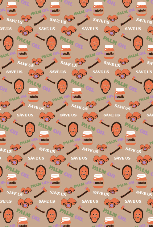
Creating A Repeat Pattern
This post is now showing where I turned my square design into a repeated pattern. Previously, I have arranged my composition of the elements I had created, to which I had a colour theme running through all the objects. The next step will be to select all everything in the design, but not a background. As you can see below, I have deleted my background as you don't really need it anymore. Once have done this, I went to ‘object’, ‘pattern’ and ‘make’. Doing this will bring up this tab which is shown below. To see what each option does, I went through them all to see what difference it made to the effect of the pattern. I started by changing the ‘tile type’ to ‘brick by row’. This setting changed the whole layout of how each square of my pattern is being placed. I then went to ‘brick offset’ and switched this to 2/3. This option also played around with the way each tile is being placed.

Beneath is showing how the pattern first looked when I first created it. To me, I think this looks very boring as its predictable with the fact that each tile has been placed exactly underneath the other. This is because it is on the ‘tile type’ as ‘grid’.
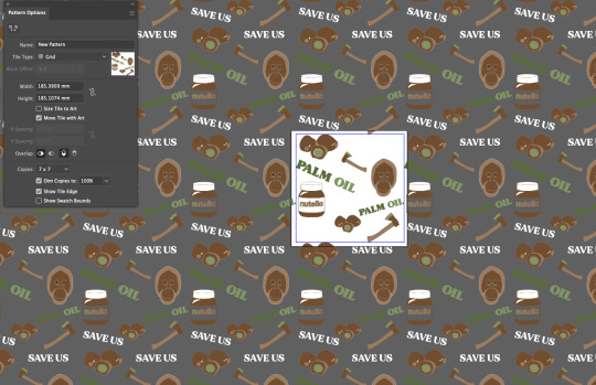
Although, after experimenting with all the options I felt that this was the most successful as it was the most out of place position I could have it. By this I mean that it doesn't line up like the previous screenshot. I found that when you just focus your eyes on one of the objects it was easier to see the pattern and the way in which it has been laid out. For example, I have focused my eyes on just the orangutan, where you can see they are slighted each time you go down a row. The way in which I came to this conclusion was by having the ‘tile type’ as ‘brick by row’ and ‘brick offset’ as 1/4. Once I was happy with the design, I clicked ‘done’ which is located at the top of the page. This pattern has now been added to your swatches so you can use it again.

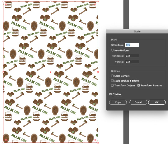
The next thing I did was to draw a rectangle on my page, using the ‘rectangle tool’. When drawing this shape, you need to make sure you are filling it and are not on stroke. This then meant I could go to my swatches at the right side of my page and click the pattern I had just created. Doing this, should hopefully fill your shape with the pattern.
Here, is where I have then changed the scale of my pattern so that I could see more of the design. I chose to do this because it was way too close before that it didn't even look like a repeated pattern. I got this tab up by going to ‘object’, transform’ and ‘scale. After this, I ticked the box saying ‘transform patterns’. Next, I just changed the percentage of the ‘uniform box’. I chose to go down to 21%.
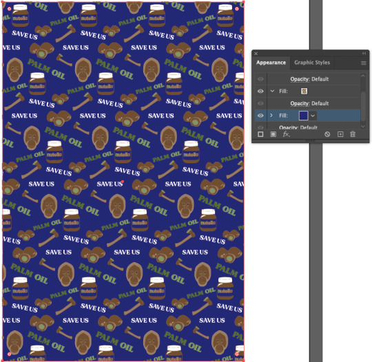
I then anted to chnage the background colour which I did by going to the appearance panel at the right side of the page. Then I added a fill which you can do by clicking the second icon at the bottom of this panel. It should be a square which has been filled. The you would double-click this where you can chnage the colour. After you have picked a colour, you would drag this layer down to the bottom as this will then sit behind all the other objects.
Here, I have decided on this dark blue which I thought was one of the best colours to pick out of all of them. However, I still don't think this looks very effective. I’m not sure if its because of t how dark the colour is compared to the browns and green.
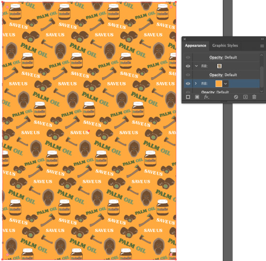
After this, I chose to try another colour to which I found this orange/yellow colour. I think this works a lot better as it brightens up the whole piece. To me, I still wouldn't say I’m completely happy with his result as although its an improvement from before, I think I could create something more striking.
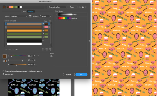
I then tried another piece where I added a background colour but I have also edited the original brown and green too. So I started by changing the backdrop first which I simply did by repeating the steps I previously did. This time, I chose black as I wanted to see what sort of results I would get from this very dark shade. The to change the object colours I went to ‘edit’, ‘edit colours’ and ‘recolour artwork’. As you can see below, I have changed the top two colours but not the bottom two. I did this on purpose as I wanted to keep the green shades. The way in which you can do this is to double-click on the end box which will open up all the colours. I then just picked and it put the colours in place. Once you are happy, you can click ‘ok’ and it will chnage them.
Now looking back at this screenshot, this design doesn't have a very appealing effect on me as I think that the black is too harsh. Then the blue and purple along with this backdrop just doesn't seem to work.

I have then gone onto doing more experiments where I have tried to place together some colours that would work. I have chose the same colour background as before but this time, I have set the colours to be pink with the same brown and green shades as before. I already feel that this works a whole lot better. This pink shade really compliments with the rest of the colours which makes everything work so well.
I then decided to chnage the background colour to this lighter shade. It is this cream colour which I think has improved the piece even more. I didn't change anything of the other colours that are on the objects so this was all down to the backdrop.

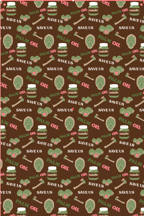
After that, I have gone and produced another piece where I have chosen for the background to be the dark brown that was from my original colour palette. I have also moved around the light green too so that its now feature don the orangutans face and is the main part of the palm fruit. I think this colour contrasts so well with the backdrop but also the small details of pink have a really strong effect too. At this point in time, I would say this is my most successful design as the colours are so striking.
This is now another experiment where I had the backdrop to a similar shade as the before. It is this cream shade but I feel that this one has a slightly more orange tone to it as well. I have then placed in an orange and slightly different green. After this, I have swapped the brown so that its only showing in the detailed parts.

Lastly, I have done this piece, where again there is a dark brown, a green and the same orange as before. I have then added in a light shade of purple. I feel that especially the dark brown, stands out so much against the rest and the place that I have positioned this colour to go works so well as it almost highlights the main shapes.
As a result, I’m very pleased with the outcomes I have created and have also really enjoyed this process of making this repeated pattern design. This could be because it was easier that I expected but I think this end result is really effective. As well as this this, this could work well for things like packaging on products. However, if I wanted to use this work that I have created, I will need to recreate these colours as I somehow didn't save some of my experiments. This doesn't really matter as it doesn't take too long.
0 notes
Text
Why Craig McCracken is a Genius
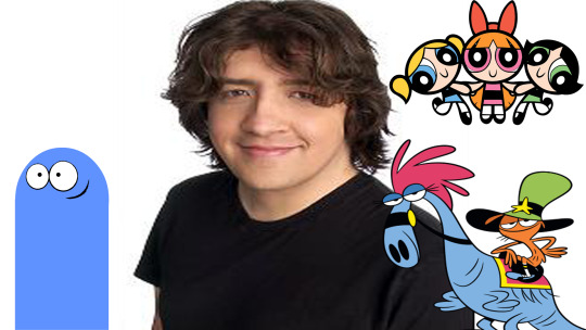
Anybody who follows my work as well as my most frequent postings and discussions knows that I LOVE animation. I sincerely and confidently say it is the greatest art form in the world, simply because in one way or another it’s every art form combined. It’s drawing, painting, acting, film making, special effects, literature and music all at the same time, and while cartoons get the unfortunate shove as being nothing more then non-intellectual “kid’s stuff”, the field has produced some of the finest achievements in art of the 20th century as well as the 21st so far. But much like any art form, the field is only as great as it’s artists and what they bring to the table. There are many great animators and animation directors that any enthusiast can point to for inspiration like Rebecca Sugar, Lauren Faust, Genndy Tartakovsky, Don Bluth, Tex Avery, Chuck Jones, Hayao Miyazaki, Sitoshi Kun, and of course the most obvious answer Walt Disney. While I have great admiration and nothing but respect for the artists above, I’d like to take a moment to appreciate the genius of the man behind the shows I bring with me throughout my childhood and even adult life. The creator of such shows as Powerpuff Girls (which incidentally he collaborated with Faust and Tartakovsky on), Foster’s Home for Imaginary Friends and Wander Over Yonder, Craig McCracken.
Make no mistake; there is a reason this man is so heavily respected and regarded in the current landscape of western animation, and you know a McCracken cartoon when you see them. But what exactly makes his work stand out? What is it about the cartoons McCracken has produced and directed that makes it so accessible to such a wide audience of kids and to an extent adults? How is it that whenever I put on an episode of Fosters or Wander Over Yonder I’m immediately put in a good mood and am enthusiastic about life? Well, after watching and studying his work I think I can boil it down to a few elements which, incidentally I’ve mentioned in previous blog posts before.
1. Beautifully Simple Character Design
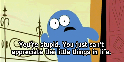
Aesthetically speaking, what do the Powerpuff Girls, Bloo from Fosters Home and Wander all have in common? The answer of course is that they are deceptively simple designs that all take a very minimalist approach. So many household names from cartoons are memorable but their designs can often be so complex that if one were to try and draw them from memory, even as a skilled cartoonist, they’d have just enough trouble that they may forget a few key aspects of the design. With McCracken’s designs you can draw them likely in less then 2 minutes, especially ol’ Bloo from Fosters Home. You just draw a little pac man ghost with little flipper arms, circular eyes, a grin and a straight line at the bottom and you’re done. One might think these designs are very limited because of how minimalist they are with how you can express them, and if you��re feeling particularly like a snobby Jackass you might call it lazy. But in truth these design choices are the most practical you can get as they give you all the essentials of the character with nothing superfluous. First, because of how quickly you can draw them by that very nature they are also SEVERAL times easier to animate, and with the added aid of glorious modern day technology (when it’s not crashing that is) producing high quality entertainment quickly has never been easier. Second, all the essential parts of the character are there. Each character in a show is a distinctive shape not replicated by any other character, meaning that if you were to put them in a silhouette you could easily recognize who is who. Also, the whole art of animation is expressing character and personality through motion, which is where the acting part of the field comes in. Just by mannerisms, typical distinctive poses and even the very nature of their walk cycles we know exactly what kind of person each character from these shows is. We know the Powerpuff Girls are only innocent on the surface level and in truth are actually quite violent and gruesome (unless you’re watching the new horrendous show that completely misses the point of what makes the original so great), we know Bloo from Foster’s Home is a mischievous egotistical little trickster who is always causing trouble and we know Wander is a happy go lucky optimist who only seeks to bring happiness to all. Sometimes the best way to go is to not think too hard about it and let the main points of the character come through with no additions holding them down or distracting from the point.
2. Creative Yet Broad Show Premises
*This is my new favorite Gif*
I have to imagine each one of these shows had beautifully smooth pitches to get them funded (except maybe Powerpuff Girls because of the violence) because they have such imaginative and original premises that can be summed up so quickly to anyone who wants to watch and they leave themselves open to so many different types of stories.
*A boy visits his Imaginary Friend at a Foster Home where he and many other Imaginary Friends go on all sorts of hijinx or adventures, along the way saying goodbye to imaginary friends who find a new home*
or
*a superhero parody where a bunch of seemingly innocent and adorable little girls are actually quite violent and aggressive, and the show plays off of superhero stereotypes while also challenging typical gender roles*
Done. Great simple premise with unique concept not explored before. Take my money.
I’ve said before that it’s important for a show to have an easy to grasp premise, especially for children, because the easier it is to understand the more accessible it is to a larger audience. Plus because of the broad nature of the summary you can tell any kind of story you want between episodes. Premises like these have story ideas that just write themselves; it’s why the family sitcom of middle class family with idiot father and hot overcompensating wife exist, because everyone can relate to having a family and the dichotomy of a couple where one is the straight man putting up with the ceaseless antics of the other. Wander Over Yonder is a particularly good example of this because quite honestly all you need to know is “A couple of do-gooders wander the galaxy making new friends and incidentally run into an incompetent arch enemy a lot”. It’s basically just Road Runner but it takes place on a new planet every episode.
3. Color!!!!
Craig McCracken KNOWS how to use color. It gives all of his shows such a warm inviting feeling because it’s all so bright and either blends nicely or makes decent contrast. This may seem like a minor point, but You’d be amazed how quickly a bad color palette can ruin a show for an audience. the color choices of these shows immediately attract the attention of the viewer with it’s positive vibes and satisfying placement. Plus each character has a color scheme appropriate to their personality (or more accurately they contrast, appropriating a common theme in McCracken’s work; polar opposites hanging out with each other). The goodhearted reasonable and well behaved Mac is red, but his mischievous trouble making fun loving imaginary friend Bloo is, well . . . . blue. The happy-go-lucky Wander is orange, but his logical and pragmatic best friend and steed Sylvia is blue. The leader Blossom is pink, the innocent Bubbles is baby blue and the tough tomboy Buttercup is green. They remain consistent with these choices and much like the contrast of these characters physical appearance it makes it all the more apparent that the characters themselves contrast too.I don’t know what else to say about it, but just TELL me you don’t watch the intro to Fosters Home and get all hyped up in the process!
https://www.youtube.com/watch?v=GZiB_S9VpiU
4. Surrealist Humor
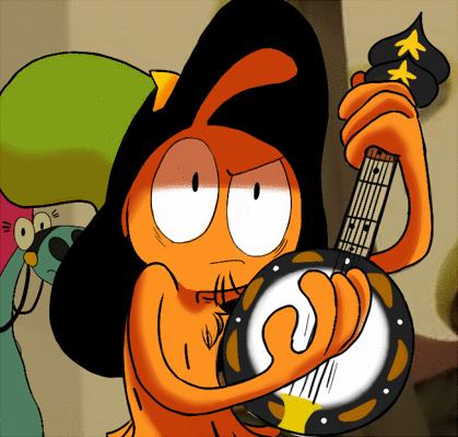
One thing you’ll notice about these shows is that they aren’t afraid to be weird, Fosters especially. They take every chance they can get to have something surreal happen only to play it off moments later like it never happened. I think that’s always been a great strength of McCracken’s shows. A huge part of comedy is playing with expectations: nobody ever gets a laugh out of something predictable. But another great and common aspect of comedy is stark, jarring contrast. I once read a WONDERFUL book called The Humor Code by Joel Warner and Peter McGraw, that was all about studying what makes people laugh, and they brought up a theory in the book that comedy is all about violation + benign. Something is jarring to our senses but we quickly find out it’s actually nothing to be afraid of. Hence why being tickled by someone we love makes us laugh: it’s a violation of our personal space, but we know our loved one wouldn’t actually hurt us. But it wouldn’t be funny if we tickled ourselves because it’s not a violation, and it isn’t funny with someone you don’t trust tickles you because the violation isn’t benign. This can also happen in reverse: something that initially lowers our defences turns out to actually be harmful or annoying or bother us in some way. I’m not necessarily saying this is the be all and end all of comedy as it’s only a theory, but I think you could apply it to McCracken’s work. His cartoons are littered with moments where a character does something strange or random or out of the ordinary and nobody bats an eye, or maybe it’ll shift in perspective about how large the situation at hand is. An immediate example that comes to my mind is the episode of Wander where a planet is attacked on a huge scale by a destroyer of planets called “Buster” . . .which actually when you zoom out it turns out it’s an adorable little puppy just playing with a ball. Humor is largely subjective, but if you ask me . . that shit is funny.
https://www.youtube.com/watch?v=LZ5QRrAosQo
Conclusion
McCracken
has been making numerous contributions to the field of animation throughout his career and has gained notoriety for the shows under his belt . . and rightfully so. He understands pure and simple what cartoons are all about: simple, down to earth, easy to access entertainment that’s fun and leaves you in a good mood. Some television can be considered junk food like reality tv shows (cheap to produce, quick to make, advertised well but loaded with garbage), and others can be considered fruits and veggies like Breaking Bad or The Simpsons (they make you a better person and challenge your sensibilities), but sometimes all you really need is a light simple snack. One that’s colorful, sweet, and maybe even a little nutritious. McCracken delivers in his work with original premises, accessible characters, bright inviting colors and a delightfully weird sense of humor. God bless ya, Mr. McCracken!
#animation#Cartoon network#Disney#Cartoons#craig mccracken#powerpuff girls#fosters home for imaginary friends#wander over yonder#genius#animators#animators on tumblr#art#cartoon
210 notes
·
View notes
Text
Evaluation
Overall, I think that my strongest tasks are the ‘Fab Five’ and my 20 problems inspired App. I am really impressed with how my app turned out and I enjoyed creating it. Even though, I wished I had more time to have added a few extra personalised details like actually making the coffee cup stains myself and placing them in as my backgrounds. I fell that would have made it feel more original. The illustrations I was happy with. I created them myself in illustrator, I would say if I could improve them I would have made them look more interesting in some way. I feel like they look a bit boring or plain. However, my aim was to keep them simple as possible because I didn’t want to go to over the top as I thought viewers might find it hard to read or understand. Also, I found the Adobe XD very easy and fun to use. The tutorial was very helpful and easy to follow. Even though, I did have an issue with the tutorial for the Exotics Eats as I could not seem to download any sort of UI Kits but that did not effect my app as I did not need any. With my Fab Five document I tried to make it interactive as possible. I do feel that some towards the end a lot of the interactive pieces I looked at had similarities. I tried to make each page dedicated to the artist. So for Chris Milk, his interactive piece I looked at gave me sinister vibes, so I decided to go with a dark colour palette. Whereas, PASSAGE has neon colours, so I tried to make the colour palette look neon. I thought by doing this it makes it more personal to the artist or sculpture. I wanted to make sure each layout was different too.
Tasks that I found challenging would be the Hello Processing and Unity. What I found difficult in Hello Processing was getting my head over coding. As you can see in my example, I struggled to make a portrait of myself so I decided to just experiment was the platform and see what I could create as I wanted to more so understand coding. The tutorial it provides you with is very useful and easy to follow. I liked how you could try along while the man was explaining. The fact that each section had its own slot I found very helpful too. For example, I needed help with colour and instead of having to rewatch the whole video you can just click on the section that was titled ‘colour’. If I had more time I would have at least attempted making my self-portrait. With my dog portrait I tried to make it interactive by having the mouse hover over the dog’s face the tongue would pop out and when the mouse is not hovering over the face its tongue would go back in. On the other hand, the reason why I found Unity a struggle was because its a lot different to what I am use to. For instance, zooming in and out wasn’t just simply using your fingers to zoom in and out on your mousepad or knowing which button to press etc. However, with that being said, I do feel like Unity is an amazing source to use and the final outcome would be incredible. With what I managed to create with Unity I found the way the cube fell was so real looking.
Continuing on with Unity, the followed task was to create our own VR or AR App using Unity. However, due to the struggles and finding it hard to understand how the platform works. We decided to use Adobe Aero. Adobe Aero is an app design for you to create interactive visual reality and see how your creations would look in the real world. You can share your creations with friends, family, social media etc. This app is only designed for smartphones or tablets. When I first used the app I found the instructions very easy to follow and it was fun to make. I feel that because its on your phone you can make some really interesting VR because you can go to any location as long as there is a surface that the app can detect then it will work. We found it a lot easier to manage as well. If I was to change it in any way it would to use a different colour for the text as I feel that it is hard to read, even though I thought it being a bright colour it would stand out. I think I would change it to white or black depending on the image. If the image is light I’d use the black and if the image was fairly dark I’d use white. I think if I had that contrast it would be more effective.
When doing my research for VR and AR I looked into various apps and found some fun and some educational apps. For instance, I looked at an VR app called Google Expeditions, it allows you to look at famous tourist attractions with information to read. I feel like this app is amazing for people who don’t like flying but want to visit famous places or people who don’t have the money or time to physically go, they can use this app to kind of escape in a way from their busy lifestyles. My final outcome is kind of inspired bye this app. The AR app I decided to look into was an app called Ink Hunter. This app is really fun. It allows you to place tattoos onto your body by drawing a small symbol on your body where you want the tattoo to be and it will stick to it. Then you can enlarge it or rotate the image. Ink Hunter, has a wide range of different designs and styles. What is so good about this app, is that it could help people who has never had a tattoo but wants one. however, they don’t know what to have or worried they won’t like it. They can use this app for a trail run to see if they like it or not before wasting their money on something they might regret. For my final outcome for my own VR or AR app, we created something that allows people to step into someones else shoes who are suffering from climate change. We thought that this would be a good idea because most people do not understand the affects climate change has on peoples everyday life. So, we thought that when you place the VR headset on, you can chose where to go and when you are at your location there will be someone talking in the background explaining the affects and statistics. While that is in place you can move your head around to explore the location even more. The app will be functioned through a VR headset and possible earphones if you want to block out any sound around you and feel more connected to where you have chosen.
The Daily Mail task I found challenging as it was also coding. However, I managed to finally understand it. My headline was “Storm in a teacup! Viewers are aghast as Boris Johnson adds milk to hot cup of tea BEFORE removing the bag - in new ‘cringeworthy’ party election broadcast” The aim of my headline was that when you hover over the ‘teabag’ it doges the mouse which resembles ‘cringeworthy’. I decided to chose blue for the background to resemble the hot water that goes in the process of making a cup of tea as I couldn’t leave it white as the tea bag might have blended into the background. As for the tea bag I made the colour a slight off white because tea bag in real life isn’t pure white. I did not plan to have the tea bag to leave a trail, however, I thought I’ll keep it because I thought it added texture and remind me of a ‘storm’. Storms leaves a mess, for instance, a ‘trail’ and another reason is chaos. When looking at the screen recording, it looks chaotic and when a storm finally stops, it leaves chaos and upset. I am pleased with how it turned out considering it was my first time trying out coding. However, if you go too far off the screen it glitches out and will have to start on top of what you had before.
In conclusion, I am pleased with everything I have created. I feel that I have learned a lot from this module. I have tried coding, which I do still struggle with but do understand it better than I did before. I also leant how to make my own app with interactive features. I got the chance to experiment with VR and AR apps and even discovered how to make my own. I have new skills and knowledge from this module.
0 notes
Text
Creative Enquiry and Divergent Studio Proposal
During the initial stages of starting the “making” project, I began simply by drawing my surroundings which often featured my home as I felt most motivated to draw and create whilst in this environment. These drawings then led to me using a knife to apply acrylic paint onto canvas following the marks of the lines I had drawn. I realised quickly that painting was going to be the main technique I wanted to explore for my creative enquiry project and knew that being in my home was sparking my interest and making me want to create. For the Divergent practice project, we were asked to choose a project that was either a different subject matter or a different media used. I was still trying to pin point exactly what my theme was but was aware that it was motivating me, so I opted to use a different media to see how this would affect the work I produced whilst tackling the same subject matter. I began to explore different materials such as salt dough, clay and plaster and decided that I wanted to continue working in a 3D practice for my divergent project.
As I continued experimenting in both painting and 3D work, I tried to identify what it was about my surroundings that was driving my artwork, to determine my theme. I have realised that my theme is based on the concept of making myself a home. I was driven to create work based on my surroundings and my home because I had worked hard to achieve these things. I feel that this is a concept that everyone can relate to in varying degrees, with so many people feeling displaced both physically and mentally. Some psychologists believe that those who have the tendency to relocate a lot are “seeking external change to compensate for internal problems or challenges”. In the blog post “Where is Home?” by Mark Matousek, he explained how he was exploring the idea of home from a spiritual and philosophical standpoint after interviewing a group of homeless individuals. He concluded that homelessness was a state of mind, which many of us have experienced but are afraid to admit and that “home is where we find our balance, the pivoting point that connects us to the heart.” I feel a great appreciation for the home I have built myself and so I am eager to explore this idea more thoroughly throughout both my creative enquiry project as well as my Divergent project.
Because my work is a representation of the direct polar-opposite feeling of displacement and feeling lost I tried to represent this through the colours and techniques that I use. I have been using vividly bright colours in my paintings to create a happy and bright aesthetic to go with the overall theme. For my divergent project I began by using dough for financial reasons, however, I have quickly realised that this ties in well to my theme as it contributes to the domestic feel within my project.
Whilst working in 3D I found that I was really interested in the plaster work of Rachel Whiteread, Kathy Dalwood, Maria Boulan and Ben Nicholson as I believe that the minimalistic, raw aesthetic of the work is similar to what I would like to achieve in my own. For my Creative Enquiry project, I have prioritised using bright colours, whereas in my 3D work, I have enjoyed the contrasting lack of colour that Rachel Whiteread and Kathy Dalwood tend to have.
The pieces “House” by Whiteread and “Shed” by Dalwood relate both aesthetically as well as conceptually to the work that I would like to create for this project. Both pieces are made using plaster which is used to create intricate and minimal 3D pieces that represent a space which is what I will be doing.
For my creative enquiry project, because I wanted to focus on using bright colours, I looked for other artists that did this. I came across many artists that worked in this way but found the most inspired by the work of abstract painters like Mire Bialy and Mark Janson. One artist that I found most interesting was the artist Biddy Hodgekinson, specifically her “Bubblegum” collection.
Hodgekinson explores life cycles within her work, lathering thick layers of colour before pouring acid on top, letting the layers melt away. I love the technique and palette that Hodgekinson uses and think that it gives her work a very strong appearance and this is something that I want to establish in my own work. Another artist that has inspired the aesthetic of my work is Theresa Paden and her abstract oil paintings. Both the palette and texture that Paden has used are aspects that I aim to create in my own work.
In past projects my work has been very subtle in terms of colour and so for this project I am aiming to be bold in both colour and texture, to expand my skills and hopefully show more range in my abilities. In both 1st and 2nd year I found that my work was all very similar aesthetically and was always large scale. In 3rdyear I forced myself to abandon this aesthetic so that I wouldn’t become to set in one specific technique. Following 3rd year I feel more aware of what I like and dislike in terms of my practice and now have a far clearer understanding of what I enjoy doing and what techniques I want to explore.
From previous projects I have realised that I am often over ambitious, however I don’t think that this has held me back. I often struggle with my time management due to outside commitments, however, I have created a timeline to keep me on track. I will aim to stick to this as closely as possible and have made sure that there is flexibility if needed. I have some concerns regarding costs, so I will be trying to re-use and recycle as much paper and materials as I can for this project. For this reason, I will also be documenting my projects on tumblrs instead of sketchbooks. I have decided to do this because as well as being free, it’s a lot easier to organise and manage and less time consuming when documenting artist research. I believe that if I can remain organised and stick to these plans then I can complete both Creative Enquiry and Divergent Practice successfully and create work that reflects my chosen concept well.
0 notes
Text
Automatically Generated Computer Graphics Based On Hand-Drawn Design
Could artists hand-drawn designs be converted to 3d… Automatically?
New Computer Graphics Technology Idea
The artist draws a complete still of a whole scene from several (4-8) angles and then the computer automatically models a virtual 3d version of that scene.
The user would then tell the computer what each automatically generated 3d model and/or part in the scene represents and the computer would then calculate how its physics would work and how it would animate.
The user would then simply modify these scenes via their elements or through camera movements, etc… to create frames over time which would result in animation when not using motion capture technologies or models (either full scale or scaled).
Finally, since the original scenes would be drawn either with traditional media like pen ink, gouache paint and so on, or with something like photoshop with a certain colour palette brush or pen style etc… the computer would automatically calculate the rendering for the final image to match what the artist’s chosen media looks like in his or her finished artwork. This would include things like the lighting, colours, lines, shapes, perhaps textures and so on.
How Does That Differ From Current Technology?
The difference between the above idea and current computer animation media is that the artist would not have to model the elements in the scene themselves, instead they would draw in the same way as in traditional animation, just from different angles and the computer would automatically do the 3d modelling for the user, instead of such drawings only being used as visual reference while the artist is forced to model it in 3D from scratch.
The artist would not have to set up the physics, bones for character movement and so on either, they would simply identify what each element in the scene is and the computer would automatically set up the physics based on the artists’s chosen options on how things should animate.
Finally, the rendering system, instead of being based completely on algorithms by themselves to achieve a certain effect, like interpolation, it would be on a case per case basis, changing depending on the current frame’s composition rather than the virtual 3D calculations alone; based completely on the artist’s design and intended style with the use of things like colour palette, contrast, line and so on; a visual scripting system or equivalent could be used to connect the ins and outs of those different aspects of the design to how they will be rendered on a dynamic or conditional basis, like what is done with custom scripting for games or AAA animation as built-in user-friendly features.
Why this instead of current media?
The reason to use animation over live action is to more precisely and directly achieve the directors vision by being able to have the scenes, characters and look without the use of real sets, actors, lighting and so on.
Traditional animation has a good visual impact when watching it, but is inflexible when it comes to doing very dynamic animation, although it is capable of doing so, this is usually somewhat limited because of the consumption of time in doing so.
Computer animation is very flexible at making dynamic scenes without consuming too much time. However, because of the very indirect nature of the artists having to build everything in a virtual environment from the ground up, rather than simply drawing a scene, the impact in comparison to traditional animation becomes generally weaker.
Finally, although with many advanced and continually developing technologies for rendering animation making it possible to make extremely attractive, realistic and impressive computer animation, the result oftentimes can still look synthetic due to the nature of most of these technologies (excluding ones based on video footage for example) being that they are rendering scenes based on algorithms making the resulting image lacking the depth found in a hand rendered image.
One more note
In order to avoid the artificiality inherent in interpolated animation, motion capture technologies and classic hollywood special effects such as full scale or scaled models either filmed (using the artists hand drawn art as a reference for the final rendering of the production’s image) or animated via stop motion should also be employed. How much these methods should be employed should depend on such a method’s appropriateness for the given result.
Advantages over other current media if the above medium could be developed
More impact than usual computer animation (animation in games like Guilty Gear Xrd are an exception)
Generally a lower quantity of artwork required to be hand drawn than traditional animation.
Dynamic scenes less time consuming (like computer animation)
Casting is less difficult, since it becomes purely voice casting and real sets and shooting on location would not be necessary (like most animation)
Setting up animation less difficult than what I think it is in current computer animation in terms of setting up the physics, bone systems, weighting etc…
Easier to do scenes involving supernatural elements, scenes, representations etc… than live action (like most animation).
Disadvantages?
It would be very costly to develop such software
Not only the development but the polishing and refining of such technology would be a massive undertaking
It is a different direction than the current big studios like Pixar’s focus, being more on specific improvements on physics simulation for example so it would be hard to achieve funding soon
Even if this could be achieved, it may be difficult, like much other automatically computer-generated technology, to consistently get pleasing results
The artist may be forced to limit or standardize their artwork specifically to be better scanned and converted by the technology
Brand new software and standards would introduce a brand new learning curve to master on top of everything else a modern animator needs to know.
In summary
Such a medium would have the potential to at least look as good as traditional animation in general while being generally more engaging with greater ease in producing dynamic camera movements, and more easily produce accurate animated perspective than in traditional animation.
Such a medium would be able to generally be as engaging as computer animation while having a potential to look generally better with its rendering being based on on hand made visual art (it could even be oil painting for example) rather than solely algorithms.
Such a medium, with the use of motion capture technologies, stop-motion and models (replicas, real models or scaled) would allow for realism of movement that could match live-action while being simultaneously more easily able to produce scenes which are generally more difficult to produce outside of animation.
Not Already Out There?
The closest thing I can think of to doing this already is via amalgamating a combination of resources and production strategies. For instance employing stock 3D models as is or edited along with one’s own custom models. Thus not everything has to be done from scratch, yet the director can still achieve his desired results. The only issue with that is licensing, especially for games where it can get quite costly to employ the assets of numerous artists while not being exactly of one’s own design from start to finish. The not-so-distant future of animation media I am predicting then would break that compromise opening new exciting possibilities for animation, movies and games, like never before.
Like what you see here? Express your support and follow @HonourableHappy on Twitter to stay updated on all the latest daily.
Fill out the consulting form to receive your newsletter and how you can qualify to have me setup and grow your Twitter account to over 10,000 real followers organically without fake followers, bots or cheating.
(adsbygoogle = window.adsbygoogle || []).push({});
Related Posts
Would you upload your brain to cheat death?
Taking the first step
Production Hackers Presents: POWER-ARM © Design, Origin Story, & Background
“Why Are There C# & Java Web Developers When We Have Javascript?” #Programming College Student Q&A: #WebDev
Twitter’s 280 Character Update Breathes New Life Into The Platform #280Characters
Robots Replacing Jobs Is Not The Only Problem #Stoicism
Production Hacks 101 – Process vs Results “The Best Of Both” #Mentality
“What Is Visual Scripting Anyway?”
0 notes
Text
8 Ways to Make Your Website More User-Friendly
Websites have evolved into something so much more than just text and information on a page. Users today expect your website to entertain them, deliver quality and offer an intuitive, comfortable overall experience. Everything from the aesthetic of your site to the placement of your CTAs can impact how long visitors stay on your page. Fortunately, it is easy to make your website more user-friendly.
In this blog, I’ll show you eight ideas to get you started on making your website more user-friendly.
1. Listen to Your Users
Take the time to ask your regular visitors what they’d like to see on your page. Getting input directly from your target audience will allow you to discover missing elements you might not see on your own. Users often know precisely what they don’t like about a website. It’s your job to take those comments and turn them into positives by fixing any features your visitors dislike.
When you place the user at the core of your design and content, your site will automatically become more user-friendly. A few years ago, ESPN.com asked for input from their regular visitors about what they should add to the redesign of their homepage. They listened, added many of the elements mentioned and saw a 35% increase in revenue. Note how their design features elements someone landing on the page would most want.
2. Speed It Up
Web users expect your site to load at lightning speed, even on mobile devices. About half of them say they expect a website to load within two seconds and will abandon one that doesn’t load after three seconds. Speed indeed does matter when it comes to keeping visitors on your site so they can see if they want to do business with you.
There are some tools out there that will allow you to check your site speed, including Pingdom and Google’s Page Speed Insights. These sites will also give you tips on how to speed up your site. Two simple things you can do to start are checking your server’s speed and optimizing any images.
3. Provide In-Depth Information
When a site visitor lands on your page, they want to get the information they need to make an informed decision about your product or service. If the visitor has to hunt for this information, they may assume you’re hiding something or grow frustrated and leave for a competitor’s website. The more in-depth and accessible you can make information on what you have to offer, the better.
Look at Medical Guardian’s buying guide. They understand someone looking for a medical monitoring device likely has concerns about the effectiveness of the device. After all, you are putting your loved one’s life in their hands. They provide an in-depth buying guide for their customers that answers any questions the consumer might have, including the cost of a medical alert system, the support, the certifications of the monitoring center and even how installation works.
4. Make Navigation Intuitive
When a visitor lands on a website, they often look to the navigation bar to orient themselves with the page. The navigation bar is essential because it follows the site visitor throughout their journey on your site and serves as a tool to go back to the landing page.
At the same time, you need to limit the number of categories in your navigation bar, so it doesn’t become overly bulky—you should also place it in the same location on every page. Conduct some A/B testing with your bar, trying slightly different positions, tab arrangements, and even wording. This will tell you what users prefer and what works best for your site.
5. Choose Color Carefully
Choose the colors for your website carefully. You need a perfect balance between beauty and clarity. Not only does your color palette need to make sense for your industry, but the contrast between the background and text needs to be enough that the visitor can read text easily and not strain the eyes.
Look at the bold colors the Van Gogh Museum uses on its website. The pop of red and the vibrant colors in the painting used for the background draw the eye of the user. Because the industry is art, the site can get a little more creative in the colors they use, combining colors for a palette that a more conservative industry, such as banking, wouldn’t use. This combination works well for this particular site. Although the white text on the partial cream background does not work well, the rest of the site is spot on.
6. Improve Your Site Layout
Keep in mind that many users are now accessing websites via mobile devices. About 80% of internet users own a smartphone and they are spending more and more time accessing the Internet via their phones, especially as data costs come down and unlimited data is the standard.
With that in mind, having a responsive layout becomes even more critical. Does your site look good on both desktop and mobile? It doesn’t necessarily have to look the same. It is more important that mobile users can see things without having to zoom in every few seconds and navigate easily throughout the site.
7. Pay Attention to CTAs
Do you have strong calls to action (CTAs) on your pages in locations that make sense? Site visitors who decide to buy or register for your newsletter want to know how to take the next step. Make this simple by using a strong CTA that’s easy to locate.
Look at what payment processing platform Square does with their CTA button. They consider both a color that will pop against the background and even the wording of the CTA, which simply reads “sign up with Square.” They have also chosen to place the CTA button above the fold and additional information underneath. This allows the user to find the button from the minute he lands on the page.
8. Beef Up Your Contact Page
If you don’t have a straightforward way for consumers to contact you, you risk losing the trust of those who land on your page. About 51% of people state they believe complete contact information is something many websites are missing. If your contact is simply an email, consider beefing up this information.
The more ways you allow a user to contact you, the better. Consider adding a toll-free number, a live chat option, a knowledge base, and user forum. These factors all add credibility to your site.
Make Your Website User-Friendly
These eight things will instantly make your website more user-friendly, but the key to a site with good UX is to make improvements consistently. Take the time to ask your customers what tools would help them and add those to your site. Remember, the tools that are useful for an ecommerce site will differ from those that are useful for a blog.
Test everything and try to see your site through the eyes of your target audience. Eventually, your site will become easier to use for your particular site visitors and potentially lead to more sales or new clients.
Are there any user experience must-haves that you feel strongly about? Tell me about it in the comments.
The post 8 Ways to Make Your Website More User-Friendly appeared first on Marketo Marketing Blog - Best Practices and Thought Leadership.
from http://feedproxy.google.com/~r/modernb2bmarketing/~3/jfI7tQzAhXU/8-ways-make-website-user-friendly.html
0 notes
Text
8 Ways to Make Your Website More User-Friendly
Websites have evolved into something so much more than just text and information on a page. Users today expect your website to entertain them, deliver quality and offer an intuitive, comfortable overall experience. Everything from the aesthetic of your site to the placement of your CTAs can impact how long visitors stay on your page. Fortunately, it is easy to make your website more user-friendly.
In this blog, I’ll show you eight ideas to get you started on making your website more user-friendly.
1. Listen to Your Users
Take the time to ask your regular visitors what they’d like to see on your page. Getting input directly from your target audience will allow you to discover missing elements you might not see on your own. Users often know precisely what they don’t like about a website. It’s your job to take those comments and turn them into positives by fixing any features your visitors dislike.
When you place the user at the core of your design and content, your site will automatically become more user-friendly. A few years ago, ESPN.com asked for input from their regular visitors about what they should add to the redesign of their homepage. They listened, added many of the elements mentioned and saw a 35% increase in revenue. Note how their design features elements someone landing on the page would most want.
2. Speed It Up
Web users expect your site to load at lightning speed, even on mobile devices. About half of them say they expect a website to load within two seconds and will abandon one that doesn’t load after three seconds. Speed indeed does matter when it comes to keeping visitors on your site so they can see if they want to do business with you.
There are some tools out there that will allow you to check your site speed, including Pingdom and Google’s Page Speed Insights. These sites will also give you tips on how to speed up your site. Two simple things you can do to start are checking your server’s speed and optimizing any images.
3. Provide In-Depth Information
When a site visitor lands on your page, they want to get the information they need to make an informed decision about your product or service. If the visitor has to hunt for this information, they may assume you’re hiding something or grow frustrated and leave for a competitor’s website. The more in-depth and accessible you can make information on what you have to offer, the better.
Look at Medical Guardian’s buying guide. They understand someone looking for a medical monitoring device likely has concerns about the effectiveness of the device. After all, you are putting your loved one’s life in their hands. They provide an in-depth buying guide for their customers that answers any questions the consumer might have, including the cost of a medical alert system, the support, the certifications of the monitoring center and even how installation works.
4. Make Navigation Intuitive
When a visitor lands on a website, they often look to the navigation bar to orient themselves with the page. The navigation bar is essential because it follows the site visitor throughout their journey on your site and serves as a tool to go back to the landing page.
At the same time, you need to limit the number of categories in your navigation bar, so it doesn’t become overly bulky—you should also place it in the same location on every page. Conduct some A/B testing with your bar, trying slightly different positions, tab arrangements, and even wording. This will tell you what users prefer and what works best for your site.
5. Choose Color Carefully
Choose the colors for your website carefully. You need a perfect balance between beauty and clarity. Not only does your color palette need to make sense for your industry, but the contrast between the background and text needs to be enough that the visitor can read text easily and not strain the eyes.
Look at the bold colors the Van Gogh Museum uses on its website. The pop of red and the vibrant colors in the painting used for the background draw the eye of the user. Because the industry is art, the site can get a little more creative in the colors they use, combining colors for a palette that a more conservative industry, such as banking, wouldn’t use. This combination works well for this particular site. Although the white text on the partial cream background does not work well, the rest of the site is spot on.
6. Improve Your Site Layout
Keep in mind that many users are now accessing websites via mobile devices. About 80% of internet users own a smartphone and they are spending more and more time accessing the Internet via their phones, especially as data costs come down and unlimited data is the standard.
With that in mind, having a responsive layout becomes even more critical. Does your site look good on both desktop and mobile? It doesn’t necessarily have to look the same. It is more important that mobile users can see things without having to zoom in every few seconds and navigate easily throughout the site.
7. Pay Attention to CTAs
Do you have strong calls to action (CTAs) on your pages in locations that make sense? Site visitors who decide to buy or register for your newsletter want to know how to take the next step. Make this simple by using a strong CTA that’s easy to locate.
Look at what payment processing platform Square does with their CTA button. They consider both a color that will pop against the background and even the wording of the CTA, which simply reads “sign up with Square.” They have also chosen to place the CTA button above the fold and additional information underneath. This allows the user to find the button from the minute he lands on the page.
8. Beef Up Your Contact Page
If you don’t have a straightforward way for consumers to contact you, you risk losing the trust of those who land on your page. About 51% of people state they believe complete contact information is something many websites are missing. If your contact is simply an email, consider beefing up this information.
The more ways you allow a user to contact you, the better. Consider adding a toll-free number, a live chat option, a knowledge base, and user forum. These factors all add credibility to your site.
Make Your Website User-Friendly
These eight things will instantly make your website more user-friendly, but the key to a site with good UX is to make improvements consistently. Take the time to ask your customers what tools would help them and add those to your site. Remember, the tools that are useful for an ecommerce site will differ from those that are useful for a blog.
Test everything and try to see your site through the eyes of your target audience. Eventually, your site will become easier to use for your particular site visitors and potentially lead to more sales or new clients.
Are there any user experience must-haves that you feel strongly about? Tell me about it in the comments.
The post 8 Ways to Make Your Website More User-Friendly appeared first on Marketo Marketing Blog - Best Practices and Thought Leadership.
from RSSMix.com Mix ID 8217493 https://blog.marketo.com/2018/06/8-ways-make-website-user-friendly.html
0 notes
Link
The following blog post, unless otherwise noted, was written by a member of Gamasutra’s community.
The thoughts and opinions expressed are those of the writer and not Gamasutra or its parent company.
Voxel art hasn't been around for too long in popular games media. It had an appearance long ago before polygons were the deciding factor for art/technical direction in games, but that's long forgotten. The reason, simply put, is hardware stress making it impossible for voxels to be a feasible rendering technique in games.
Greebles can be easily explained as "bumps". A Minecraft map, when viewed from afar, looks rather bumpy doesn't it? Well that bumpiness would be called "having a lot of greebles". I hope that helped to clarify the confusion.
When I first started making voxelart in the summer of 2013, it was pretty common to use the form to make "retro-3d-art" like 3D Dot Heroes. It was fun and considerably easy to get results fast so I would often make between 5 to 10 full models a night (5-6 hours). I didn't think much of the resulting poly count when making these models because everything I was producing would be exported and rendered in a Voxel Engine. Voxel engines were good at making you think "oh hey! this should totally be fine on computers to run, I wonder why more studios don't use voxels in games". Well, once I started actually contracting art out instead of modding, I quickly learned how intense voxels really are.
Late 2013 I started working on my first commercial game and, boy, did I learn a lot about Voxel engines. Everyone back then was either using an existing voxel engine or making their own (please don't do this if you're doing this today, for your own sanity) and I had to learn a lot about the inner workings of voxels. Once you start working in a voxel engine you start to observe how much voxels burn through your computer hardware. Various factors play into this stress but if you simply view the polycount, something as simple looking as Minecraft can be extremely memory consuming. Every single voxel will draw 12 polygons at a time, which is a lot for something as insignificant as a piece of dirt. On top of that, if you make a character which isn't a perfect cube, you sure as hell are going to break through 100 polygons for the 1 model, and fast.
Luckily, when working with any engine today, you can export voxel models as polygonal objects (because most, if not all, voxel editing tools will come with exporters for standard 3D formats). This will allow you to take something made up of hundreds of voxels exported with as little polygons as possible.
This is where the fun begins. When I started doing Voxel Art professionally I decided to spend most of my spare time figuring out new voxel art styles. These were all style which ignored the constraints of poly count, so I was still committing a terrible sin of killing my computer graphics card and CPU. When I started making mobile games I realized that this can't do; I needed to make an art style that could reduce the poly count as much as possible so you could still enjoy your games at 30FPS+. Soon enough I realized this became my style. Due to market demand of making voxel art for low spec hardware, I started developing a style which got further away from Pixel Art and Retro Art and got closer to forms like Low Poly Art.
***
Almost every game requires a character and it normally becomes the first thing you make. Voxel characters suck.....so much. You don't have the freedom of making something super rounded or shaped out otherwise your character becomes completely unreadable and technically demanding (high poly count)
Ex: The character below looks to have a functional shape. you can see the defining factors; its limbs, its torso, and its head. "Not bad" you might think....but boy, add in some lighting and it'll become a mess of shadows.
This was one of my first experimentation's with freeform character design in voxels, ignoring the polycount or the squareness of voxels. The idea was to use the extreme and understand what are the pros and cons. The pros here is that you can very clearly define a shape and explain to a player that "X" is an ear. Admittedly, the above design isn't terrible, I'd even say it works, but the moment you add in new factors like animation you run into a massive technical wall. Skin rigging and even Rigid Body rigging become a painful job of making sure the mesh doesn't break itself. Aside from the T-pose model, unless this was animated frame per frame like a Pixel Art piece, it wouldn't come out in an ideal fashion.
When I came to this point in my designs I noticed I need to immediately find a way to reduce the poly count and make it look good. Simply put, I need to make flat design work somehow.
This was one of my first successful animations/rigs, made in a game jam years ago. This made me realize that I didn't need to make models with full arms and legs to be functional in expression. This was likely my first significant step in understanding the "Rayman" Aesthetic as the potential future of voxel character design. You can make hyper-expressive animations without the concern that your arm or leg will look all weird (because nothing is there) and you have less content to make in the long run, even if you make variants to limbs.
This step in my style was defined by my technical capabilities. I wasn't a great animator and I barely knew what I was doing at the time, so when I found something that worked, I stuck with it and refined it as much as possible. Today I've refined myself to the point of using arms and legs, while only using the Rayman aesthetic when the gameplay deems it necessary (ex: Spartan Fist).
These were both later attempts at Character designs. The first one above is from Critical Annihilation. I avoided the Rayman limbs since the game was lightly animated, but even then I felt the character was too stiff. I later made these set of dwarves for a client and I'll point out 2 mistakes I made:
I used noise....far too much. Something I no longer use. Noise will only cloud the design you intend to make. You have no direct control over the result when applying noise and so it no longer feels like something polished.
I used too much stepping to define a design. By this I mean that I made the beards have a 45 degree slant (little steps resulting in greebles).
Admittedly, you can see that I've already reduced the amount of stepping in my models from the first one I showed to now. This was me slowly realizing that I wasn't prioritizing shape/design clarity. When you apply shadows in-game, everything gets blurred out. Additionally i noticed that shadows would hide a lot of details I put into the color work. This lead me to reduce the amount of colors I had in my palettes and focus on the visible design.
***
We're in 2015, I've learnt how to animate a bit, I've started to understand limits of color use when applying lighting to models in-game....Let's throw all that out the window for something new!
For most of that year I worked on a game called Voxelnauts, which had a one of a kind aesthetic; Flat-shaded Voxel Art. The polar opposite of everything I had taught myself to date. Let's ignore the fact that shadows are a thing, and ignore the limits of voxel rendering (because it used a raytracing engine rather than a traditional mesh renderer).
(Voxelnauts, by Retro Ronin)
The character above was not made by me, though I did animate him (gif version can be found on my portfolio site). This model was made by the art director John Su. He taught me a lot:
You can apply shadows manually on objects by coloring the voxels. Imagine the light source and work accordingly. BUT!
Make sure your color gradient on shadows is obvious! Don't be shy, make it contrast both in hue and brightness (the beige skin vs the dark red/pink underarm)
Because it's flat shaded we can make limbs clip into one another and no one can tell!
And lastly, the way you sculpt a voxel model is VERY valuable. EVERY VOXEL COUNTS.
These are all the things I learned, either told by JS directly or things I've noticed as I was adopting the games style. I still take a lot of these points to heart, mainly the way I rig and animate models and the value of every voxel.
When I stopped working on this project I took everything I learned and starting finding designs in voxel art which can utilize an entire body design. I managed to go in a new direction and attempt a model with a full body.
This old man was designed with Luciana Nascimento. We worked together, using her concept art of this old man to make a design which would work in a single mesh. I was once again attempting to make voxels even more reduced in polycount though there were some struggles with this nonetheless.
I still hadn't accrued the skills to properly skin-rig, so making this old man work efficiently was a nightmare.
The coat has stepping, and while it didn't interfere with the model's visuals (it hid things as it should) it was, once again, a nightmare to skin rig.
However, I did gain some knowledge from this:
The head was connected to the body but splitting the head made animating a lot easier, and it had no obvious negative impacts to the look of the head animations (head rotation didn't clip into another mesh).
***
2016! New year, hopefully I get to learn and try a bunch more things. (I did)
I had not used some techniques from the Flat-shaded experience since I thought it was reserved for that aesthetic....nope. I decided to take that knowledge and apply it to some high resolution voxel character. Splitting the meshes based on limbs, similar to the Rayman style, but this time I'll include joint limbs like arms and legs. Additionally, I'll take some knowledge from Flat Shading and model those limbs in a way which makes clipping less of a concern and more of an artistic rule.
Results:
(Settlers Keep, by Foxdawn)
This design took into account MANY things I learned to date and I bet you can see some of those things.
I used colors sparingly; 1 color as the base value for a property and a second color (normally lighter from the base) as the highlight which would contour the objects.
Limbs had variable sizes (voxel density is 1:1) so they would each go into one another. Using, say, a larger shoulder with a slimmer arm socketed inside made animating easier. No need to skin rig, I kept rigid body rigging and it gave the right amount of expression, as seen above.
I made most objects as flat as possible and utilized the rigging/animating process to dictate subtle details (like the feathers bending on the bird).
The above model is very high-res compared to everything I had made previously but it pushed my art forward with all the knowledge I had. When I moved onto another project you'll see that growth even further.
I took the large scale human model and condensed it further to make something a little less demanding yet would still follows the same animation process. This design became a lot clearer as something feasible when my animation and rigging skills got a lot better. Setting this up was simple in principle and the results were fantastic. However, this art direction is only feasible if:
The character design showed a level of importance based on sizes. eg: Character's head is predominantly larger than everything else.
I used the same philosophy as previous: limbs are variable sizes to hide any clipping/Z-fighting
Use contouring colors, except this time it's used to outline important segments instead of everything.
Any shading is done using contrasting colors instead of subtle gradients
Here's another example of using the above rules, to give you a better idea when working with variable creatures and designs. The rules above can also help to make certain designs a lot easier to set up. By avoiding voxel stepping all together and preparing models in a T-pose for rigging, while keeping models as low poly as possible, you have more opportunities to create unique animations and poses, like below:
From Qubicle
To Maya
To Unity!
I became accustomed to a workflow which made my models feel entirely incomplete in the editor. A model was truly complete when it was running in-game. Building out the final design in my mind before doing the groundwork, and working backwards from there. This would be the process:
Keep the final design in mind
Deconstruct the model into limbs or parts which would require animating
Block out the limbs to get a sense of complexity and possibly reduce the complexity from there
Begin modeling
Simplify the design to utilize as few colors as possible but still do some shading on the model directly
Export to Maya
Rig and begin animating!
Seems quite straightforward, but once you get the hang of your tools, you get a better sense of how to make your art before actually making it.
0 notes
Text
8 Ways to Make Your Website More User-Friendly
Websites have evolved into something so much more than just text and information on a page. Users today expect your website to entertain them, deliver quality and offer an intuitive, comfortable overall experience. Everything from the aesthetic of your site to the placement of your CTAs can impact how long visitors stay on your page. Fortunately, it is easy to make your website more user-friendly.
In this blog, I’ll show you eight ideas to get you started on making your website more user-friendly.
1. Listen to Your Users
Take the time to ask your regular visitors what they’d like to see on your page. Getting input directly from your target audience will allow you to discover missing elements you might not see on your own. Users often know precisely what they don’t like about a website. It’s your job to take those comments and turn them into positives by fixing any features your visitors dislike.
When you place the user at the core of your design and content, your site will automatically become more user-friendly. A few years ago, ESPN.com asked for input from their regular visitors about what they should add to the redesign of their homepage. They listened, added many of the elements mentioned and saw a 35% increase in revenue. Note how their design features elements someone landing on the page would most want.
2. Speed It Up
Web users expect your site to load at lightning speed, even on mobile devices. About half of them say they expect a website to load within two seconds and will abandon one that doesn’t load after three seconds. Speed indeed does matter when it comes to keeping visitors on your site so they can see if they want to do business with you.
There are some tools out there that will allow you to check your site speed, including Pingdom and Google’s Page Speed Insights. These sites will also give you tips on how to speed up your site. Two simple things you can do to start are checking your server’s speed and optimizing any images.
3. Provide In-Depth Information
When a site visitor lands on your page, they want to get the information they need to make an informed decision about your product or service. If the visitor has to hunt for this information, they may assume you’re hiding something or grow frustrated and leave for a competitor’s website. The more in-depth and accessible you can make information on what you have to offer, the better.
Look at Medical Guardian’s buying guide. They understand someone looking for a medical monitoring device likely has concerns about the effectiveness of the device. After all, you are putting your loved one’s life in their hands. They provide an in-depth buying guide for their customers that answers any questions the consumer might have, including the cost of a medical alert system, the support, the certifications of the monitoring center and even how installation works.
4. Make Navigation Intuitive
When a visitor lands on a website, they often look to the navigation bar to orient themselves with the page. The navigation bar is essential because it follows the site visitor throughout their journey on your site and serves as a tool to go back to the landing page.
At the same time, you need to limit the number of categories in your navigation bar, so it doesn’t become overly bulky—you should also place it in the same location on every page. Conduct some A/B testing with your bar, trying slightly different positions, tab arrangements, and even wording. This will tell you what users prefer and what works best for your site.
5. Choose Color Carefully
Choose the colors for your website carefully. You need a perfect balance between beauty and clarity. Not only does your color palette need to make sense for your industry, but the contrast between the background and text needs to be enough that the visitor can read text easily and not strain the eyes.
Look at the bold colors the Van Gogh Museum uses on its website. The pop of red and the vibrant colors in the painting used for the background draw the eye of the user. Because the industry is art, the site can get a little more creative in the colors they use, combining colors for a palette that a more conservative industry, such as banking, wouldn’t use. This combination works well for this particular site. Although the white text on the partial cream background does not work well, the rest of the site is spot on.
6. Improve Your Site Layout
Keep in mind that many users are now accessing websites via mobile devices. About 80% of internet users own a smartphone and they are spending more and more time accessing the Internet via their phones, especially as data costs come down and unlimited data is the standard.
With that in mind, having a responsive layout becomes even more critical. Does your site look good on both desktop and mobile? It doesn’t necessarily have to look the same. It is more important that mobile users can see things without having to zoom in every few seconds and navigate easily throughout the site.
7. Pay Attention to CTAs
Do you have strong calls to action (CTAs) on your pages in locations that make sense? Site visitors who decide to buy or register for your newsletter want to know how to take the next step. Make this simple by using a strong CTA that’s easy to locate.
Look at what payment processing platform Square does with their CTA button. They consider both a color that will pop against the background and even the wording of the CTA, which simply reads “sign up with Square.” They have also chosen to place the CTA button above the fold and additional information underneath. This allows the user to find the button from the minute he lands on the page.
8. Beef Up Your Contact Page
If you don’t have a straightforward way for consumers to contact you, you risk losing the trust of those who land on your page. About 51% of people state they believe complete contact information is something many websites are missing. If your contact is simply an email, consider beefing up this information.
The more ways you allow a user to contact you, the better. Consider adding a toll-free number, a live chat option, a knowledge base, and user forum. These factors all add credibility to your site.
Make Your Website User-Friendly
These eight things will instantly make your website more user-friendly, but the key to a site with good UX is to make improvements consistently. Take the time to ask your customers what tools would help them and add those to your site. Remember, the tools that are useful for an ecommerce site will differ from those that are useful for a blog.
Test everything and try to see your site through the eyes of your target audience. Eventually, your site will become easier to use for your particular site visitors and potentially lead to more sales or new clients.
Are there any user experience must-haves that you feel strongly about? Tell me about it in the comments.
The post 8 Ways to Make Your Website More User-Friendly appeared first on Marketo Marketing Blog - Best Practices and Thought Leadership.
from http://feedproxy.google.com/~r/modernb2bmarketing/~3/jfI7tQzAhXU/8-ways-make-website-user-friendly.html
0 notes
Text
8 Ways to Make Your Website More User-Friendly
Websites have evolved into something so much more than just text and information on a page. Users today expect your website to entertain them, deliver quality and offer an intuitive, comfortable overall experience. Everything from the aesthetic of your site to the placement of your CTAs can impact how long visitors stay on your page. Fortunately, it is easy to make your website more user-friendly.
In this blog, I’ll show you eight ideas to get you started on making your website more user-friendly.
1. Listen to Your Users
Take the time to ask your regular visitors what they’d like to see on your page. Getting input directly from your target audience will allow you to discover missing elements you might not see on your own. Users often know precisely what they don’t like about a website. It’s your job to take those comments and turn them into positives by fixing any features your visitors dislike.
When you place the user at the core of your design and content, your site will automatically become more user-friendly. A few years ago, ESPN.com asked for input from their regular visitors about what they should add to the redesign of their homepage. They listened, added many of the elements mentioned and saw a 35% increase in revenue. Note how their design features elements someone landing on the page would most want.
2. Speed It Up
Web users expect your site to load at lightning speed, even on mobile devices. About half of them say they expect a website to load within two seconds and will abandon one that doesn’t load after three seconds. Speed indeed does matter when it comes to keeping visitors on your site so they can see if they want to do business with you.
There are some tools out there that will allow you to check your site speed, including Pingdom and Google’s Page Speed Insights. These sites will also give you tips on how to speed up your site. Two simple things you can do to start are checking your server’s speed and optimizing any images.
3. Provide In-Depth Information
When a site visitor lands on your page, they want to get the information they need to make an informed decision about your product or service. If the visitor has to hunt for this information, they may assume you’re hiding something or grow frustrated and leave for a competitor’s website. The more in-depth and accessible you can make information on what you have to offer, the better.
Look at Medical Guardian’s buying guide. They understand someone looking for a medical monitoring device likely has concerns about the effectiveness of the device. After all, you are putting your loved one’s life in their hands. They provide an in-depth buying guide for their customers that answers any questions the consumer might have, including the cost of a medical alert system, the support, the certifications of the monitoring center and even how installation works.
4. Make Navigation Intuitive
When a visitor lands on a website, they often look to the navigation bar to orient themselves with the page. The navigation bar is essential because it follows the site visitor throughout their journey on your site and serves as a tool to go back to the landing page.
At the same time, you need to limit the number of categories in your navigation bar, so it doesn’t become overly bulky—you should also place it in the same location on every page. Conduct some A/B testing with your bar, trying slightly different positions, tab arrangements, and even wording. This will tell you what users prefer and what works best for your site.
5. Choose Color Carefully
Choose the colors for your website carefully. You need a perfect balance between beauty and clarity. Not only does your color palette need to make sense for your industry, but the contrast between the background and text needs to be enough that the visitor can read text easily and not strain the eyes.
Look at the bold colors the Van Gogh Museum uses on its website. The pop of red and the vibrant colors in the painting used for the background draw the eye of the user. Because the industry is art, the site can get a little more creative in the colors they use, combining colors for a palette that a more conservative industry, such as banking, wouldn’t use. This combination works well for this particular site. Although the white text on the partial cream background does not work well, the rest of the site is spot on.
6. Improve Your Site Layout
Keep in mind that many users are now accessing websites via mobile devices. About 80% of internet users own a smartphone and they are spending more and more time accessing the Internet via their phones, especially as data costs come down and unlimited data is the standard.
With that in mind, having a responsive layout becomes even more critical. Does your site look good on both desktop and mobile? It doesn’t necessarily have to look the same. It is more important that mobile users can see things without having to zoom in every few seconds and navigate easily throughout the site.
7. Pay Attention to CTAs
Do you have strong calls to action (CTAs) on your pages in locations that make sense? Site visitors who decide to buy or register for your newsletter want to know how to take the next step. Make this simple by using a strong CTA that’s easy to locate.
Look at what payment processing platform Square does with their CTA button. They consider both a color that will pop against the background and even the wording of the CTA, which simply reads “sign up with Square.” They have also chosen to place the CTA button above the fold and additional information underneath. This allows the user to find the button from the minute he lands on the page.
8. Beef Up Your Contact Page
If you don’t have a straightforward way for consumers to contact you, you risk losing the trust of those who land on your page. About 51% of people state they believe complete contact information is something many websites are missing. If your contact is simply an email, consider beefing up this information.
The more ways you allow a user to contact you, the better. Consider adding a toll-free number, a live chat option, a knowledge base, and user forum. These factors all add credibility to your site.
Make Your Website User-Friendly
These eight things will instantly make your website more user-friendly, but the key to a site with good UX is to make improvements consistently. Take the time to ask your customers what tools would help them and add those to your site. Remember, the tools that are useful for an ecommerce site will differ from those that are useful for a blog.
Test everything and try to see your site through the eyes of your target audience. Eventually, your site will become easier to use for your particular site visitors and potentially lead to more sales or new clients.
Are there any user experience must-haves that you feel strongly about? Tell me about it in the comments.
The post 8 Ways to Make Your Website More User-Friendly appeared first on Marketo Marketing Blog - Best Practices and Thought Leadership.
from http://feedproxy.google.com/~r/modernb2bmarketing/~3/jfI7tQzAhXU/8-ways-make-website-user-friendly.html
0 notes
Last Seen Blogs

jhoncartar94
Untitled
thatonenewdungeonmaster
Dragony Dungeon Memes

zukosburntskin
ZoSan/LawLu/Eruri

thegoodson101
the good son