#those were super fun
Text
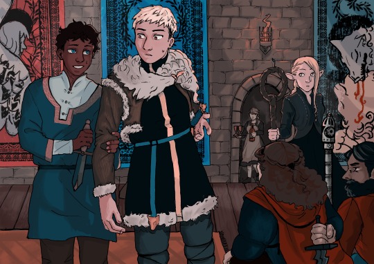
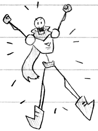
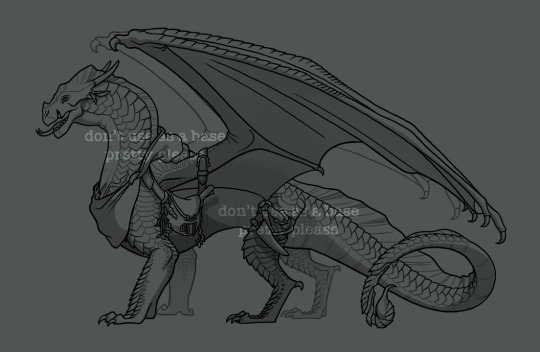
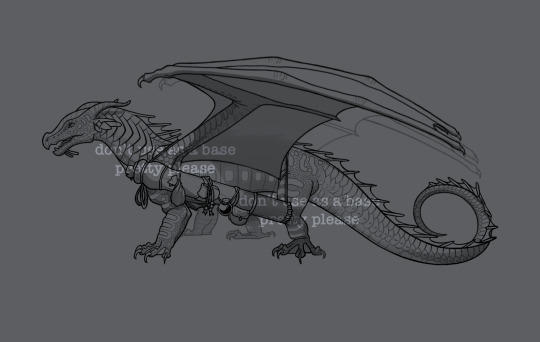
Ambush
#dungeon meshi#labru#dunmeshi#laios touden#kabru of utaya#my art#laios x kabru#dungeon meshi manga spoilers#marcille donato#i think when kabru grabs his arm its cute :)#also while i was drawing this my friend kept joking it depicted#“dont worry laios i’ll kill those guys for you”#which. kinda lmao#i like the tapestries they were super fun
605 notes
·
View notes
Text
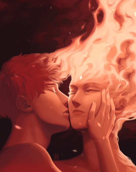
"Sakura had never felt so validated in her love until she met a man made better by her burning."
The Void Between Fireflies by @renaerys
#sasosaku#sakura haruno#sasori#akasuna no sasori#this one was inspired by both jo's beautiful fic and a sasosaku month prompt “like fire”#jo is super duper talented and i highly recommend checking out her stuff#she is one of the few who truly nails sasori's characterization in my opinion#another fun fact is that she is partially responsible for the fact that i speak english#her stuff was the catalyst that really got me studying english back in the day#i read zero hour while having a dictionary open in front of me lmao those really were the days#anyways i'm rambling#my art
310 notes
·
View notes
Text
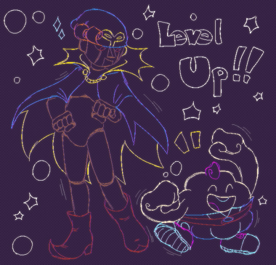
Been looking into Super Mario RPG recently... Guess which new guys are my favouties.
#super mario rpg#super mario rpg legend of the seven stars#geno smrpg#mallow smrpg#they are so. fucking cute. that whole game is so cute - it's a total 100% serotonin-filled joyride from start to finish!#i never had a console to play it on but the playthoughs i watched made me grin so much. and who didn't grin?#literally all i heard in all of those three playthroughs were just sounds of joy it's peak fun and whimsy and now i also wish for a sequel#HA. WISH. LMAO#they're wearing different shoes because i am the god of this world
242 notes
·
View notes
Note
I may be stupid and you might already have one but if not have you considered making a WEBTOON about the 2 best doggos as a story about their weird and wonderful lives would be great
Not stupid at all! I've definitely thought about it a lot, but comic making is hard work, it's extremely time consuming (either that or my method of drawing is just absurdly inefficient. Probably both). I don't think it's something I could just pick up and realistically fit into my daily life, at least not at the moment. I'm just one person with very limited time and resources. Sorry!
#I'd need a clone#a paint goblin if you will#that would just draw day in day out and make the thing for me#it's sad but I think my best bet is trying to make super short one shots with a very limited number of pages#or just a handful of panels even#I have a whole bunch of those in progress but again who knows when I'll be able to finish any of them#answered#m0notropa-uniflora#If I were to make a proper serious long comic#I'd have to finally grit my teeth and git gud at backgrounds and that just doesn't sound like fun time in the slightest if I'm being honest
221 notes
·
View notes
Text
i can't believe they fixed all their problems with a rainbow laser show. calibarn really said gay people should have the power to explode things with their minds.
#mobile suit gundam the witch from mercury#g witch#in other news. sulemio married i love that for them#in the final scene where they were cuddling (?) on the hill i suffered a physical response#like aurghhhh those are my babies. they got their happy ending you guys...#i do wish we had gotten an epilogue episode instead bc the ending felt somewhat rushed#but honestly i'm super happy with what we got#poor eri though being trapped in a keychain for the rest of her life doesn't really seem that fun hdhsnchdh#sop.txt
221 notes
·
View notes
Photo

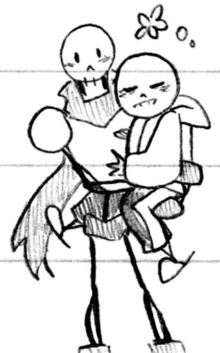

Stick figure skeletons (Patreon)
#Doodles#UT#Papyrus#Sans#Cutest little lads#I had a good handful of stick figures of them from my 2015/2016 notebook and it really is a cute style#Y'know funny enough now that I think of it lol - Those doodles were also in December!#(I'm tagging these in December still lol hi from the past)#It's that Undertale time of year <3 Apparently I first found it Dec. 17th 2015 hehe#A little late to the party! But not terribly so ♪ And I had managed to avoid spoilers up to that point lol#I do still have some vague memories of watching it for the first time#I watched a Pacifist run first and cried - of course#And then watched a Genocide run soon after and cried even more#I remember being very confused as to what the Fight timing option even was the first time I saw it lol#Since in Pacifist you can go the entire time without even accidentally using it! You can ACT or ITEM instead#It's interesting to think back on such a huge shift in culture on the broadscale#And also a personal milestone :) Something that tipped the scales!#Something that even now I'm grateful for and think of fondly ♥#And it's all still fun to draw! What more could I ask for haha#I think with this super-simple style in particular I like making their designs complement each other#So Papyrus is all stick lines and Sans has thicker bones#Papyrus' eyes are upright and Sans' are laid flat haha#They both have circle heads to start tho! Papyrus just gets a rectangle grafted on for his jaw lol#They're easy to pose together like this too!#It's fun and silly ♪ Just how I like :D
65 notes
·
View notes
Text
its @wh0rehound 's birthday and since he is the gaymer to my mafia slut obvs i had to draw our boys 🍫💕🎮 everyone say hbd sam!!! 😤🎉🎂
#death note#mellodramattic#mihael keehl#mello#mail jeevas#matt death note#my art#i was listening to the foundations and marvin gaye and four tops and such... frankie valli. stevie wonder. sam cooke etc. u get the vibe#matt and mello can have little a OOC cute bullshit. as a treat#one thing abt me. i love to split one set of pjs between a ship... its a top tier trope#another thing abt me. i love 2 draw ppl who love each other dancing 2gether#i fuckin SPED thru this btw (by my standards at least lol) this was like 10.5hrs of work and 9 of those were consecutive hsdfghjkl#which. me calling 10 hrs fast is not an exaggeration... thats so quick to finish for me. & it was a STRUGGLE to make myself call this done#but im CALLING IT. its super cute and it doesnt have to be perfect... the crunchy coloring is charming and adds 2 the aesth#i do wish id put more hearts but ITS DONE ITS FINISHED AND IM NOT GONNA MESS W IT ANY MORE. IT IS COMPLETE#drawing other ppls headcanons is always so fun... sams matt is so different from mine but so dear to me. scrawny little git#hes also very dear to my mello obviously <3#AND OUR RP IS ROUGH AND SAD RN SO I WANTED 2 DRAW SMTHNG EXTRA CUTE AND SWEET. AND I DID!!! THEYRE IN LOVE#sketch
210 notes
·
View notes
Photo
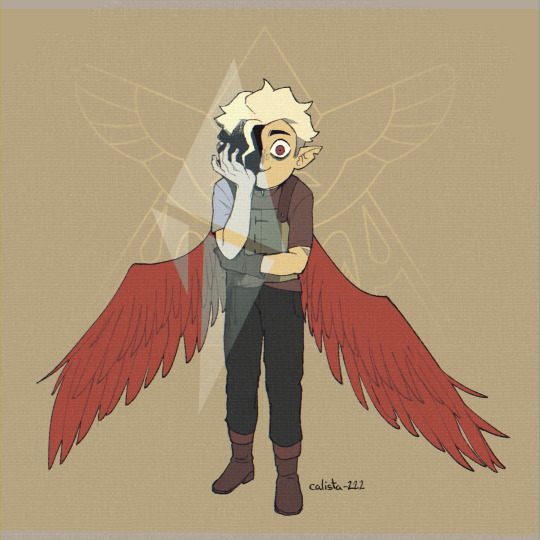
A bad but sad boy
#my art#the owl house#hunter#toh hunter#toh#toh spoilers#the owl house spoilers#not really spoilers but just in case#caleb wittebane#tw blood#cw blood#just a lil bit#those wings were SUPER fun to draw
1K notes
·
View notes
Text
there's something about the way you are that makes me… ♪
#river dipping#ts4#ts4 edit#theodore doe#matthias evanoff#a burning house to live in#echthroi#i was going through old screenshots for something to post bc it's been a minute and saw this........#i didn’t do much editing on this but those scratches were fun to make ☝️#theo's old hair... weeps and sobs#anyway hi i keep doing this thing where i disappear for days at a time idk it's the changing of seasons or something#my bad seriously but tbf i'm not doing so hot like medically speaking rn so i can't really be online a lot atm...#or at least i can't really type that much#but i'm working on theo's birthday edit for the 28th :) my little libra baby <3#i'll be honest... i only started working on it like three days ago bc i do love to put things off until the last minute#i'm actually still working on the poses themselves bc i have to work super fucking slow due to the State of my body lmao#i’m using vyx’s rig for them so they’re going by much faster than they would’ve before like thank god#also i remade theo’s teen sim for the edit (as well as finally making his child sim!!) and he definitely looks better now#icb i thought his eyes looked brown before… i was out of my mind for that one#um. anything else to say…….. idk my hands are starting to hurt so i’ll get out of these tags now. bye friends and lovers <3
71 notes
·
View notes
Text
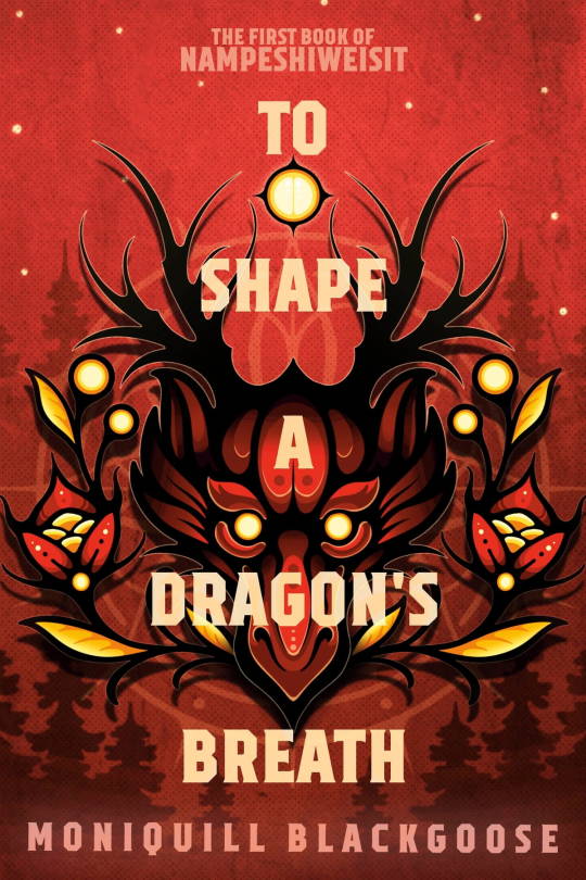
2023 reads // twitter thread
To Shape A Dragon’s Breath
YA fantasy
a young Indigenous girl finds & bonds with a dragon hatchling - the first time in many generations for her people - and is required to go to the coloniser’s dragon academy in their mainland city, to learn how to raise her dragon and the science of its magic
historical inspired setting on the cusp of industrial revolution with steampunk vibes
bi polyamorous MC, Black lesbian SC, nonverbal autistic SC
#To Shape A Dragon’s Breath#aroaessidhe 2023 reads#this is really really good i loved it!#the chapter titles are all like snippets of a story. or like sentence fragments that match up. which is cool#it is definitely more about being indigenous in a coloniser institution than Dragon School - not Super dragon heavy if you want that#I suspect the subsequent books will get into that when she gets big enough to ride and stuff#t’s also def YA! i’ve seen a few ppl assume it’s adult and be like its very young :( but like. I mean its perfectly reasonable for a 15yo m#definitely a Lot of racism and colonialism which is not fun to read! though it's still through a YA lens. there was def a part of me that#was imagining consequences of the narrative as if it were an adult novel#on that line of thought - at the end a lot of it is kind of solved by them going to the king and he's is like. oh no racism is happening?#that's bad i'll deal with those people! which felt like. a little simplistic. but maybe the easiest way to end the narrative for book 1 -#I don't think the author ACTUALLY is going to portray the king as a Good Guy throughout the series - it just felt conveniently like -#a simple YA solution to some very big and complex elements? if that makes sense? (but again - it is YA so it's allowed I suppose!)#some of the worldbuilding (like all the science learning) is probably setup for next books - we don’t really see any practical application#the romances are also subtle and not Overbearing In Book One which i like - leave some space for the series!#also her getting fanmail from a 10yo mixed race girl who looks up to her 🥺#anyway. i really loved it!#oh also it reminded me a little of leviathan. i guess just the steampunk/time period/european culture....#To Shape A Dragon's Breath
90 notes
·
View notes
Text

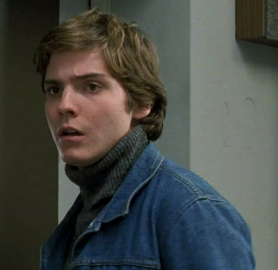

I want his gender
#mentally im still here#that turtleneck outfit has haunted me since november when i watched this#daniel brühl the twink prince that you were#tbh most of his roles are very gender evny#this !!!#frederick zoller another twink#dont even get me started on zemo especially tfatws zemo and his slutty coat...#him as niki lauda???#all very gender#if i ever can recreate this outfit irl i will be very happy#(what is it w me and getting gender envy for german protags istg every german show/movie i watch i get rly obsessed w the protag)#(maybe one day ill go back and gif deutschland 83/dark/etc and my german twink collection)#(thatd be a fun project! i could never rly find the fandom so itd be cool to be self indulgent)#(i always wanna rewatch those so if i can multitask w gifing that would be great)#(im super non committal and me doing race recaps is one of the major things keeping me consistent so maybe i shall do that but w this)#daniel brühl#daniel bruhl#good bye lenin#goodbye lenin#catie.rambling.txt
216 notes
·
View notes
Text

last stage awakened my aiyuu love (again)
#i drew their unis cuz those outfits were too much for tegaki sorry--#also i love the roof rehearsals#aiyuu#honeyworks#lip x lip#someya yuujirou#shibasaki aizou#doodles#yes ive been using tegaki to mindlessly doodle lately its super fun
22 notes
·
View notes
Photo

This. Was. An. Accident. I opened a canvas. I wanted to doodle these two for literally no reason (I didn’t even watch their POVs), and ended up getting this really soft drawing that gave me several mini freak outs because I was scared someone was gonna walk in as I drew it.
(reblogs with tags/comments are appreciated. Non transparent version under the cut. Thankyu)

#double life smp#doublelife smp#dlsmp#clockmakers#bdoubleo100#impulsesv#i have to legally tag this as#trafficshipping#even though this isnt even rlly ship art its just. them being soft because i love them#also its not shipping if they said they were married. they did that.#but god no i had like several moments of heart beat getting super fast out of fear someone in my house would walk in while i drew this#if its not obvious i have to hide any art even remotely like this#but i had fun w this. i jus wanted to draw soft#also if you remember my 3L designs. im sure you remember the bandanas these 2 had in those#yea they have them here too#:)#germdraws#germ draws#ask to tag
266 notes
·
View notes
Note
see maybe this is just me, but As A Character Designer Myself i think the rain code designs are some of komatzuzaki's best work yet. they're weird and campy and yet they work so well. i do think the characters' personalities shine through on first and second glances. I don't even usually like neon colors but I think the combo of bright neons with understated neutrals is so fascinating and memorable. no one else does it like this. a lot of the small details on the designs are actually packed with symbolic meaning (esp. yakou's - I'd love to see you unpack all that) and the overabundance of logos is evocative of the corpo-cyber-future setting. the rain code designs feel much more cohesive in terms of that setting than the DR designs do - which makes sense bc DR is more about disparate people being united by their circumstances - dialed to 11 in v3 where the designs are at their wackiest. but this ain't about her this is about rain code.
I love that characters you wouldn't expect (zange, fubuki, priest...) have weird facial piercings and tattoos. I love that the animal ears are never explained. I love desuhiko's tboy swag and yeah, the golden yellow and the dirty blonde and the neon yellow accents don't look great together - and I think the clashing colors work wonders to establish his personality. this kid dressed himself and thought it would make him look cool. you idiot. aphex's hat is stupid. zilch's ears are stupid. vivia's bandages-instead-of-clothes are stupid - and yet reading into that choice is very insightful. (he puts on a lazy air but if he was really lazy he'd just put on an oversized emo band tee instead of wrapping himself up like a mummy every day. he actually does care about how he comes across to people.)
there's a few videos about fashion YouTubers judging the DR fits, and at one point they brought in Yuma and shinigami and they hated yuma's outfit so much because it's dorky and they wouldn't wear it. but like!!! that's the whole point is that it's dorky!!!! his little trainee shorts. his stupid fkin bowl cut making him look like a little boy whose mom still cuts his hair. (which of course turns out to be a meaningful deception. his haircut influences how the audience and other characters see him to great effect.) and yet he has the coolest fkin shoes ever and when he puts his hat and cape on he's got such an iconic silhouette. teru teru bozu lookin ass /pos.
anyway yeah. i wasnt a fan of komatzuzaki's designs in the beginning but over the years ive come around. I'm a firm designer that a character design doesn't necessarily have to look good to be a good character design. I like it when they aren't afraid to make the characters look cringe - I love cringe. I eat it up. thanks for coming to my Ted talk.
Even more perspectives! I think your take of 'bad-looking designs can be good actually' is a great way to look at Rain Code's characters. To put it simply, it's unique! 'Nobody does it like Komatsuzaki'-kind of campiness. Honestly, Rain Code's designs remind me a lot of Danganronpa 2's designs in terms of color. That cast is full of much brighter colors compared to the lesser saturation of DR1 n V3's cast colors. And it makes sense cause it's a brighter game overall in terms of setting and upping the ridiculousness of the killing game in every way! Rain Code sorta follows that with its own designs by crankin' up the neons to really ride the idea home that this game is wacky right from the get-go and it's a Resident Evil game in disguise! And y'know what Resident Evil loves to indulge in? Campiness! Rain Code wears its inspirations on its sleeve, and that's totally chill.
As a sidenote to your sidenote regarding Yakou's clothing details, I have actually written a bit about how he might perceive them, but I haven't yet written about what they could truly mean in terms of how they relate to him narratively. The meaning of the phoenix patterns are painfully obvious though heh. And I also greatly appreciate the recognition that Vivia really does care about his appearance despite his 'laziness'. His hedonistic lifestyle includes his own attire, wearing whatever he pleases no matter the effort! Like I've preached before, Vivia has the energy, he just prefers to use it only when necessary.
Thank you for the TED talk *golf claps*
#okay another sidenote in tags cause i couldn't find a space to comprehensibly add it to the post:#i've also seen those dr fashion videos they're super fun#n i love yuma's teru teru bozu silhouette#they really knew what they were doing with him n it worked perfectly *chef's kiss*#master detective archives: rain code#rain code
18 notes
·
View notes
Text

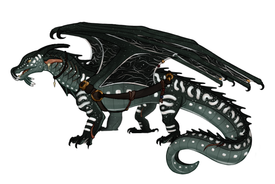
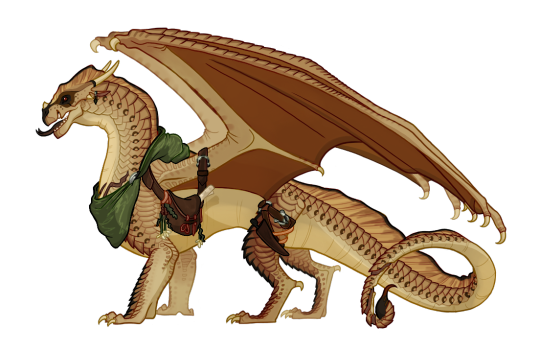
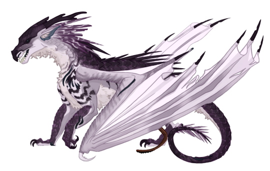

Finally finished up some oc basefills!! These are surprisingly hard pfh, but fun !! In order this is Noctilu, Acacia, and General Hail! The latter two are v old ocs of mine that have been redesigned <3
Okay heres some bonus stuff!! I really liked how some of the lineart was done so here is the raw lineart for anyone interested + a speedpaint (?) of General Hail’s design process ! These guys were really fun to work on despite it taking me so long for no good reason ,,, heres some design notes on them all <3


Noctilu has a Lancier attached to the leather holster as he is the main fisher aboard the pirate ship he is part of
Noct’s line-wing patterns arent always visible, but some nightwing seers claim that the lines help them trace future timelines. Since Noct is a Nightwing Hybrid he wonders if those claims hold any truth
Acacia is a botanist out of the Scorpion Den ! Her bag is filled with journals, loose note paper, and writing supplies.
General Hail was hard as fuck to design guh . He is purple because I want him to be <3
Although he was part of the War of Sandwing Succession, he was born without his back leg and has had a prosthetic forever! Plus he was a very skilled fighter so most of his scars were inflicted by those he let harm him for whatever reason he had in the moment
Astrolabe I gave up on trying to redesign I’m so sorry bud. Hes Married to Noctilu (they have matching earring) and is the ships cartographer / navigator, so his quiver is actually filled with maps and scrolls. He keeps his actual astrolabe and sextant in his bags.
#BIIIG INSPO WAS AVIAN !! AVIANREPTILES DOT TUMBLR DOT COM!!! Go check out its art its . so so good at base edits and stuff <33!!!!!#guh also note that all the colors got super desaturated on tumblr so just imagine everyone is more vibrant </3#especially Acacia </3#okay uh . sorry for this longer post I had fun doing theses and wanted to post them all in one go and also I like talking about my ocs !!!!#they are fun I enjoy them a lot <33 Acacia and Hail were super cathartic to work on didn’t know how much shit I had built up around them#if anyone remembers me from Amino they prolly recognize those two pfhbh#either way yeah!!!! if you have any questions about any of them please uh . feel free to ask tee hee#oc#acacia#general hail#Noctilu#Astrolabe#basefill#Designin#oc: acacia#oc: general hail#oc: noctilu#oc: astrolabe
105 notes
·
View notes
Text
Thinking of all the cool ways bugs could show up on The Grid, like fault lines, tears in the sky, giant monsters, plagues, disappearances…
#they might have done this in the games or books or show#but I haven’t seen those yet#tron franchise#tron#the grid#i just watched a playthrough of transistor#I wasn’t super into it but the concepts were fun
64 notes
·
View notes
Last Seen Blogs
maurokin
Marokin
ferviduspizza
cupid ain't got nothin on me

treaversalley
REVENGE SOLVES EVERYTHING
hostingbloog
Untitled
diaperbrucey
diapybrucey