#pop designers
Note
https://www.tumblr.com/popdesigndrama/738342359768645632/this-a-personal-thing-but-i-dont-like-it-when-a?source=share
this actually goes the other way too. as someone who does commissions and adopts, it makes me so uncomfy when my clients try to act like they're my friend just because they've commed me a lot or bought more than one adopt from me before;; it feels parasocial, like, i don't know you so why are you dming me every other day when the only time we talked before was me doing work for you...
both clients and creators should have professional relationships, none of that weird trying to be friends crap as some way to get something from the other (whether it be money or free stuff). -🃏
#popdesigndrama#drama blog#pop designs#pop designers#toyhouse#toyhouse drama#popular designers#toyhouse dramas#popdesigndramas
3 notes
·
View notes
Note
i'm tired of how trendy it is nowadays for people to draw furries in suggestive poses, drooling, sticking their blushing ass out at you with their thighs bulging out of their socks, flaunting their womb tattoos and lingerie, and their entire body drawn in such a clearly fetishized way, and then the artists INSIST that it's entirely nonsexual and that anyone who thinks that it's even SLIGHTLY sexual is some perverted creep. like just admit you draw softcore porn bro. nobody gives a shit.
I think it's a symptom of the purity culture of "you're EVIL if you draw X" so people feel the need to justify their stuff instead of just realizing that drawings don't make you evil/a degenerate/a pervert. So you end up with people drawing self labelled sugar babies with fertility tattoos and throwing a tantrum when someone says "hey man that's kinda nsfw."
it would be much easier if we just let people draw what they want but made them label it properly!!!
7 notes
·
View notes
Text

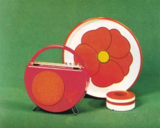
Portable Radio Carnaby, 1970. Blaupunkt, Germany. Via Hifi Archiv
3K notes
·
View notes
Text
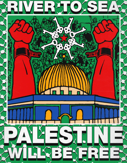
River to Sea, Palestine Will Be Free!
#art#artists on tumblr#digital art#vintage#expiremental#pop art#vintage art#vintage posters#graphic design#popart#palestine#palestinian genocide#israel apartheid#israel palestine conflict#palestinians#genocide#free palestine#gaza#support palestine#isreal#israeli occupation#israeli apartheid#nakba#al nakba#isntreal#communist#communism#al aqsa flood#al aqsa mosque#al aqsa storm
4K notes
·
View notes
Text
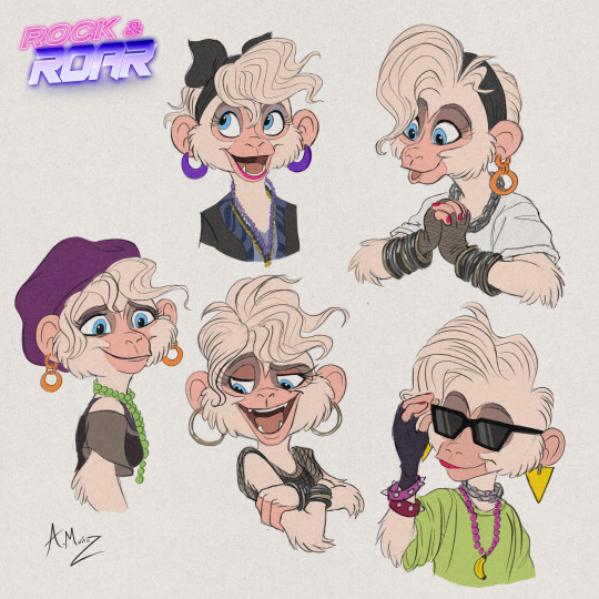
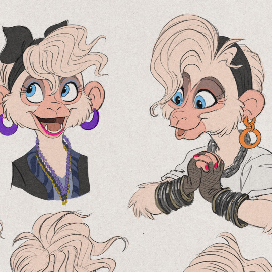
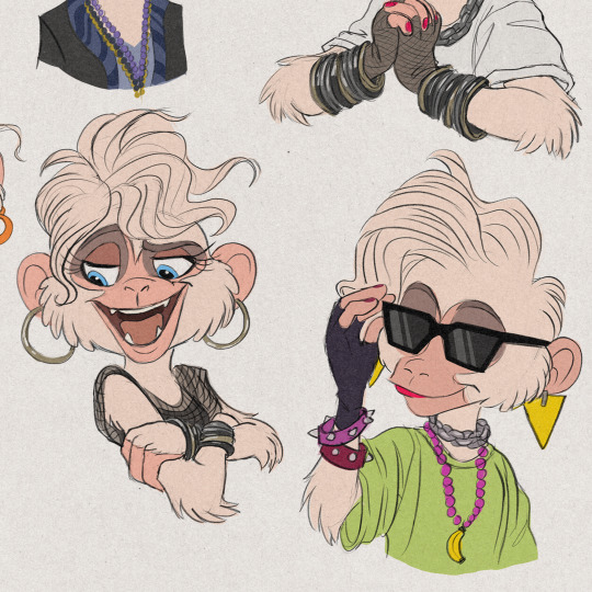
Here are my latest sketches of Layla!
Layla the monkey plays the synthesizer in the band and is perhaps the most innovative member - and the funniest. This playful comedian plays a vital role in bringing an upbeat - and often loud - energy onboard the tour bus. Her confidence and outgoing personality make her essential for forming connections between her band and other musicians that she may meet along the way.
Layla has an eye for design, and is fascinated by color, texture, and anything that sparkles. She is always trying on creative looks and styles, and isn't afraid to be bold with her costuming choices. If anything is new on the fashion scene, she’s the first to hear about it, and when it comes to music, she is likewise always on the cutting edge. With an open mind and fearless attitude, she expresses great curiosity towards anything she hasn’t seen or heard before, and loves to change things up.
#rock and roar#webcomic#webcomics#animal characters#original character#visual development#concept art#cartoon animation#anthro#anthropomorphic#monkeys#80s#80s music#80s aesthetic#eighties#80s fashion#new wave#synth pop#synthwave#synthpop#my oc sketch#my ocs#my ocs drawing#my oc art#ocs#character design#character ref#oc ref sheet#oc reference
1K notes
·
View notes
Text
Artwork Copyright © Tyler Spangler
www.shoptylerspangler.com
#tyler spangler#artists on tumblr#collage#tylerspangler#pop art#graphic design#design#typography#illustration#art
1K notes
·
View notes
Text

Superaudio Matcha 83 (version 2)
#cherry blossom#sakura#artists on tumblr#art#vaporwave#cassette#lofi#retro anime#80s#graphic design#audio cassette#nostalgia#aesthetic#a e s t h e t i c#newretro#pop art#pink flowers#flowers#superaudio#1000
2K notes
·
View notes
Text
Hehe

#when I saw the the image in glitch's newest twitter post THIS idea popped up in my head immediately#I had to badly doodle it I had to#this is how I keep myself from obsessing over the fact that we are 99.9% getting cabin fever labs lore next episode/s I am very not normal#about that plot line I am very very not sane about it#I actually love drawing in paint so much it's very fun#murder drones#uzi doorman#md uzi#serial designation n#md n#he is a plush dog there but I guess it counts#biscuitbites#n x uzi#enzi#nuzi#if someone did this before me shoutout to you bestie keep up the great work! and if someone didn't- keep up the great work! YOU. KEEP IT UP.#YES I AM DIRECTLY SPEAKING TO YOU. KEEP BEING COOL AND TAKE CARE.
2K notes
·
View notes
Text
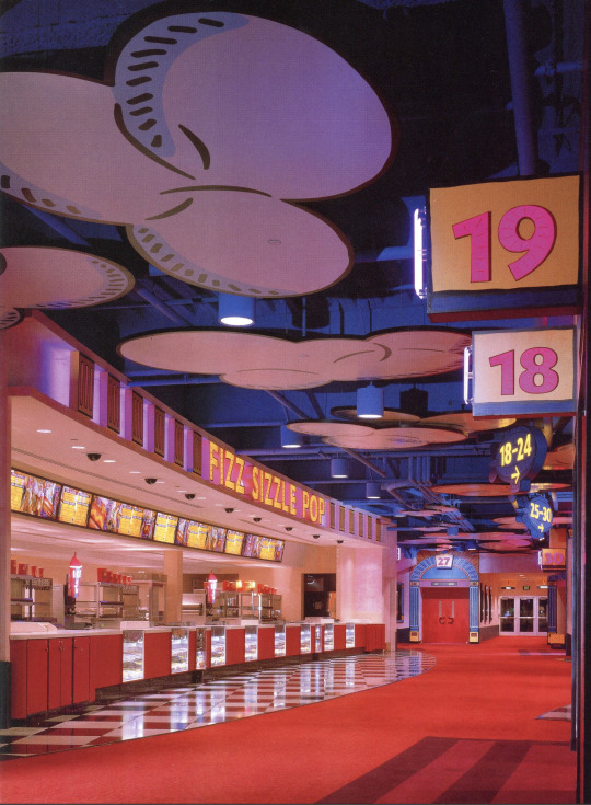

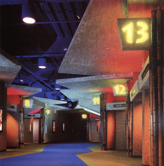


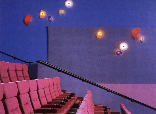

AMC Studio 30 Theatre - Houston, TX (1997)
"What the design attempts to do in the 110,000 sq. ft. space is simulate a movie studio backlot and the soundstage where guests become part of the action, and the experience "rekindles the magic and memory of movie going."
Elements from sound stages and studio road cases make up the central lobby space along with a guest service desk. Images of Hollywood's glamorous stars of the past add enchantment to the balcony walls. The space is divided into three themed areas that "transport guests into fantastic worlds of Animation, Action/Adventure and Cyberspace." The food concession stands within each area carries through the theme; "Fizz, Sizzle, Pop"; Wildebeest Feast"; and "Quantum Bits." The 30 auditoria are located off the soundstage lobby and within the various themed areas.
The architecture seems to come alive in the Animation area. The space is designed to resemble an animation cel: "flat, two-dimensional, cartoon-like graphics are outlined with black lines, filled with color and applied on an exaggerated scale." The Fizz, Sizzle, Pop concession's identity and blimp directional signs seem to float in a blue sky with flat, cut-out clouds. The setting for Action/ Adventure recalls a rainforest with heavy hanging leaves, bamboo and rock "carved" directional signs. The custom wall covering features petroglyphs of cave people carrying popcorn, megaphones and movie cameras. The fiber optic eyes peering from behind the leaves in the Wildebeest Feast stand change color. They also appear above rock outcroppings down the corridor. Patrons are invited to explore an abstract, futuristic world in Cyberspace where the floor and ceiling are the same color and brushed aluminum columns rise partway to the ceiling. To create the illusion of "endless space." custom light fixtures project beams of light along the walls and backlit graphic images have neon edges. Various colored lights and a high-tech fluorescent green/orange acrylic sign help to define the Quantum Bits concession area in Cyberspace."
Designed by Kiku Obata & Co.
Scanned from the book, Entertainment Destinations by Martin Pegler (2000)
#design#90s#interior design#interiors#architecture#1990s#colorful#movie theater#houston#texas#themed spaces#multiplex#pop art#y2k#factory pomo#rainforest#cyber#cartoon#wacky pomo
864 notes
·
View notes
Photo

#illustration#magyarmelcsi#cool#cute#love#aesthetics#mood#minimal#sarcasm#motivation#inspiration#design#graphic design#drawing#pink#colors#pop art#oracle sphere#magic#witch#girls#girl power
7K notes
·
View notes
Text

contributing to the chaos 
#the front bottoms#tfb#emo#tattoo#fall#etsy#art#midwest emo#twin size mattress#talon of the hawk#tattoos#traditional tattoo#artists on tumblr#pop punk#tattoo design#procreate#digital art
1K notes
·
View notes
Note
83685888/survuls-style-looks-more-and-more-like-knites
That’s bc they’re related irl. Sibling art tends to do that if they learn off each other
Huh, never knew that. That’s pretty cool. -🃏
#popdesigndrama#popular designers#pop designs#pop designers#toyhouse#toyhouse drama#toyhouse dramas#popdesigndramas#drama blog#knite#survuls
3 notes
·
View notes
Note
yor analyssi of why a design issnt good is actually really helpful can you sort of show what makes a good design vs a bad one from a pop designer? like maws or scpkid also can you help explain why sauntproof's art is so hard to replicate her style sort of MAKES chows look like chows
Thank u bro!!
(saunt uses any pronouns from what i can tell so I'll just use they/them for sake of simplicity)
And yeah sure, let's talk about it! I've looked at too much maws and scpkid stuff today, so we'll do saunt analysis. I'm gonna be breaking down some of their art and explaining my process and the motifs and foundations I find.
So, first breakdown I did! The best thing you can do while breaking down work is using triangles (watch Ethan Becker for more on that.)
They're strong shapes that provide balance and structure, essentially.
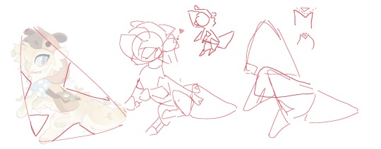
So what we see immediately is obviously that you can shrink this design down to maybe 1/5 of the side and it will still be clear what it is. The silhouette's in Saunt's style are (generally) clear and uniform. Almost all their designs have the same silhouette, which makes their work immediately recognizable from afar. (u can look at a toyhouse thumbnail and say awh fuck a saunt design)
They often keep the silhouette clear by keeping the limbs closest to our view within the shape of the body, and letting the limbs on the other side of the body disrupt the shape.
SO what we get is- all of saunt's designs are just big triangles with smaller triangular cuts made into them.
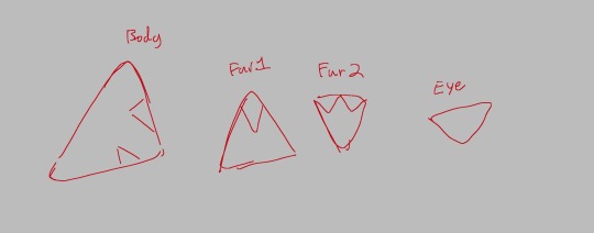
This shape is found even in the way they draw fur. It's simple and avoids complication.
Here's a design which they made for themselves, which segues very well into the next thing I noticed!!
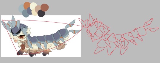
Big, medium, small!! This is a really important design principle, if everything in ur design is the same size it becomes boring and there's no visual hierarchy.
Our Big stuff is: the largest back plates on the back and head. Same with the 'spines.' The medium details are the middle back plates and legs, and our smalls are the eyes, ropes, and the neck tag.
notice how our smalls are clustered around the head and the back end of the design is relatively repetitive and uncluttered.
(not to say it's a perfect design but be quiet I'm fucking talking)
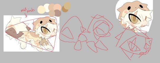
Color! Saunt's use of color isn't the Best but it's Good. Lukewarm sushi type beat.
They make use of what is a "black" and "white" in the palette (your darkest and lightest colors) and one or two pop colors with relatively non distracting neutrals as a backdrop for these.
Your pop color in the smore bitch is the eye, an almost green/yellow which contrasts the more red/yellow of the rest of the design. Big medium small isn't utilized as well here but it gets a pass because the design still has breathing room to help with visual hierarchy.
Chows are largely defined by soft, rounded features, proportionally large head + tail with smaller body, lots of tapers and rounded triangles, and largely neutral colors with a few pop colors.
There are obviously chows that break these guidelines but it's a large portion of Saunt's work.
As for the more stylistic elements that contribute to Saunt's work
their very thin textured linework with a few spots of pure black (pupils, eye outlines) and low contrast inner lines that are colored
Simplified textures and shapes
uniform silhouettes that they build on top of
Generally the neck is hidden in their designs. This is important (to me) because it aids in smoothly transitioning the head into the torso. If you actually look at the leading lines of chow necks, they're fucking tiny. So Saunt is smart to cover them and concentrate clutter in that area. Neck, what neck?
ROUNDED TRIANGLES
soft and subtle design gradients
This isn't a perfect breakdown but I'm real tired so this is what yall get
16 notes
·
View notes
Text
Lenonard@!
#qsmp#qsmp fanart#qsmp leo#qsmp leonarda#qsmp eggs#leo the egg#leonarda the egg#leonarda fanart#shark#i rly like the design i made for her!#its so pop! and Colorful and funky!!!#my art#original art#mcyt#mcyt fanart
2K notes
·
View notes
Text

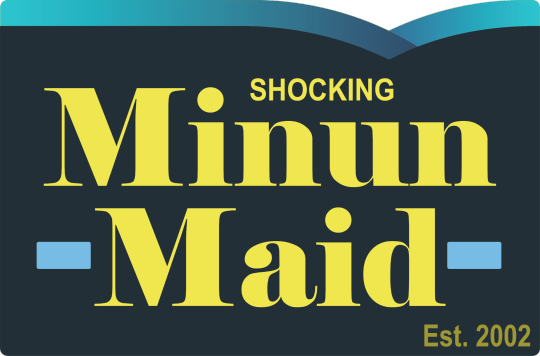
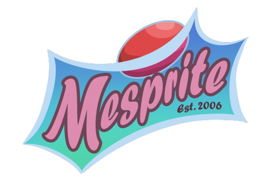
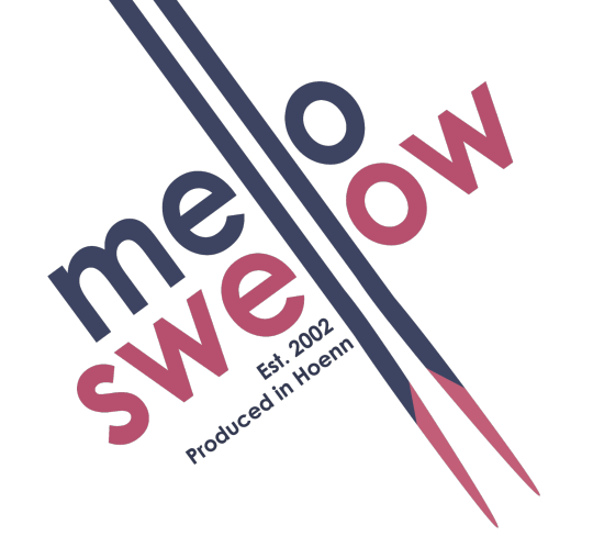
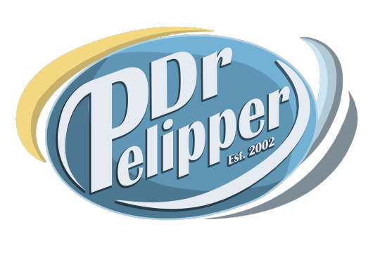
Reposting these old parody logos I made back in 2019.
I may revisit them in the future, anyone have some suggestions for new ones? (They are very wordplay based)
They exist as stickers right here as well!
#pokemon#digital art#art#my art#nintendo#pokemon art#pkmn#pkmn art#fanart#pokemon fanart#dewpider#pelipper#cherubi#mesprit#minun#soda#pop#parody#logo design#swellow#mountain dew#sprite#dr pepper#minute maid#mello yello
1K notes
·
View notes
Text

Prowl sketch + alt vers:
#one minute doin work the next.. drawing this design that kinda just popped in my head#think it's safe to say time well spent#the women enjoying side of brain has been banging drums together for several days/weeks straight someoneknockmeoutplsibeg#its getting worse by the minute#transformers#maccadam#maccadams#transformers fanart#tf idw#frootertooter archive#prowl#humanformers#transformers idw#hf
643 notes
·
View notes
Last Seen Blogs

hellowie
Psuedo-erudite
dokidobe
yellow.dr.monv
thepixelelf
there is no tag list
rannyunny
~SessKag~

smithnewsgh
Untitled