
anniemitchellcomdesign
Annie Mitchell
Communication Design Online Reflective Journal
38 posts
Don't wanna be here? Send us removal request.
Last Seen Blogs

choudharyfootwears
Leather Sandals Exporters India

class-1b-bull
BnhaBull
spookyrascalmoneylawyer
am available for hook-up

xingsings
xingsings

myocarre
The cloud square
Text
Communication Design An Overview.
Throughout my studies in communication design I believe I have propelled my learning forward in leaps and bounds. Initially I felt super out of depth coming into this course but since developing my eye, I feel as though I have something to contribute to the design community. Even just being able to Identify and describe key movements and periods in the history of Communication Design has been pivotal to my learning. I can now see how the formation of the grid, the development of the printing press and typography is still being used and reflected in design today. Also using the past of counter-cultural and punk movements has been a good indicator of design in our future. For example all the posters and design work that is coming out of the Black Lives Matter Movement, I can now see how this will be not only a pivotal moment in history but will no doubt leave a mark on design. This course has truely opened my eyes to see how design is is continuously operating around me. Even in the mundane design exists and I can't wait to use my new found knowledge to further develop my skills in semester two.
2 notes
·
View notes
Photo

Communication Design Lecture - Week 13
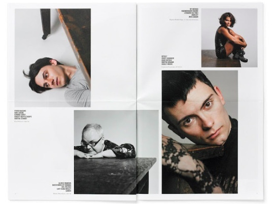
A tribute to women ! Heck yes! This week in our lecture with Andy and Karen we went through a summary of everything we have learnt this semester and all the progress we had made in our creative thinking processes. In my last blog post I will summarise my studies however for now I want to touch on some of my favourite female designers which Karen talked about on at the end of the lecture. Karen briefly spoke on the inequalities women face in the design industry and encouraged us as emerging female designers to do our due diligence and go check out the work of others thus support the industry. I’ve had the privilege of checking some out and posting some of their content above. I can wait to continue to indulge myself in the works of these designers. I have written a short summary of research of who these leading female designers are and what they do below.
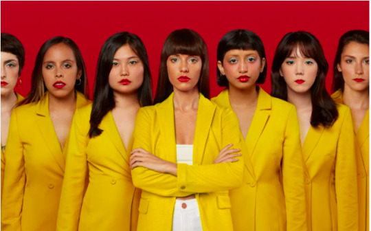
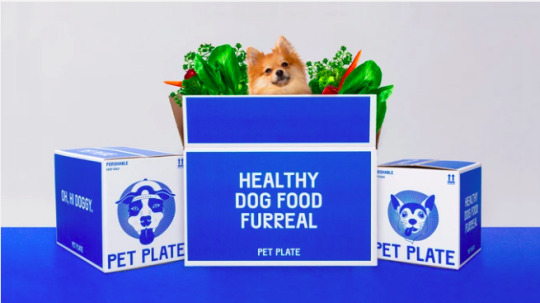
Jessica Walsh
Jessica Walsh is a New York based designer that launched her creative agency WALSH. Her company helps make up the 1% of creative industries founded by women. She also states on her website that 70% of design students are women yet only 5-11% of creative director positions are held by women. She competes to defy the odds and help shape the design industry for the better. I also personally love her design style as she often plays with bold demanding colours. I have an example of her fur-real branding project above. More information and these images can be found her website; https://andwalsh.com/info/.
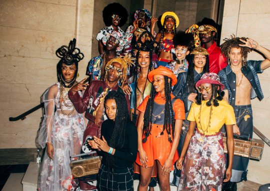
Tolu Coker
We touched on the work of Tolu Coker in our lecturer this week and her work astounded me! She is a British Nigerian Designer that has built a uni sex fashion brand around the ideas of inclusivity, diversity and social responsibility. What I love most about Tolu Coker is how she merges together her multi disciplinary practices of artisan craftsmanship and innovative technology to create something totally new and interactive. Above is a photograph representing her graduate clothing collection. More information can be found at her website; http://www.tolucoker.com/new-page
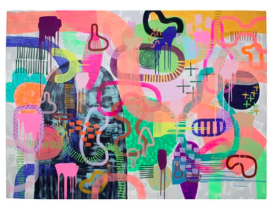
Tiff Manuell
At the end of the lecturer Karen encouraged us to pass on the information of our favourite designers to our peers and keep the conversation moving. For me I have two particular designers that I adore including Tiff Manuell and Rachel Burke. I believe I am drawn to these artist because of their playful use of colour and materials. Tiff Mannell is based out of Adelaide in South Australia where she incorporates her skills of painting, making and sewing. In her own words the goal of her work is to “work freely with colour with no boundaries”. Above is one of her original canvas based works! More information and her collections can be found through her website at; https://tiffmanuell.com/pages/about.
2 notes
·
View notes
Photo
Communication Design - Week 12
This week in our tutorial with Ben we were encouraged to look further for Zine inspiration. This could not of come at a better time!! I was definitely feeling creatively stale and this helped me see beyond my own layout ideas. Ben referred us to a number of different Zine sites however @carmen-rmit also gave me this wonderful new website called Designspiration, its like Pintrest but for design! I picked a few of my favourite layouts and have placed them above. With these I like how minimalistic the colour palette is and how clean the layout is. With my own zine I want to incorporate how the layout runs over the spin the zine, which I had not imagined before. The only downside is, is that the website did not reference the artists, so apologies in advanced for not listing them.
Inspiration and more found at:
#https://www.designspiration.com/search/saves/?q=layout&qa=typed&term_meta%5B%5D=layout%7Ctyped%7Cword%7C0#inspo#layout#zine#minimalist
3 notes
·
View notes
Photo


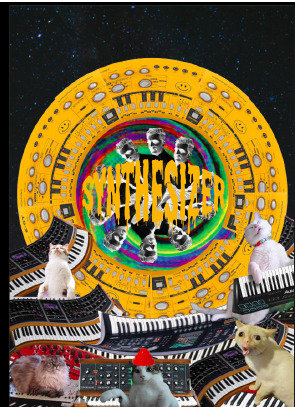
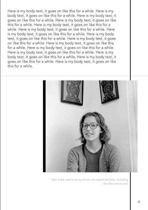
Communication Design Week 13- Work in Zine Progress.
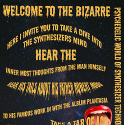
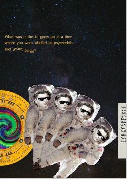
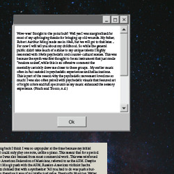
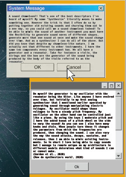
After many alterations and adjustments this has become the final layout for my zine!! Apart from the Spotify image at the bottom is just to accompany the zine via the link on page two. I am very proud of all the work I’ve put into my zine and I am happy to sending this in as my Task 3 submission. I think the zine has a lot more cohesion in comparison to the first initial draft . I also found old window interfaces to tie into my zine to make the text pop as well as I left more negative space. I am hoping the reader will understand where I am coming from and that my zine represents, a retro and psychedelic meme influenced print.
2 notes
·
View notes
Photo

Week 12- Zinespiration
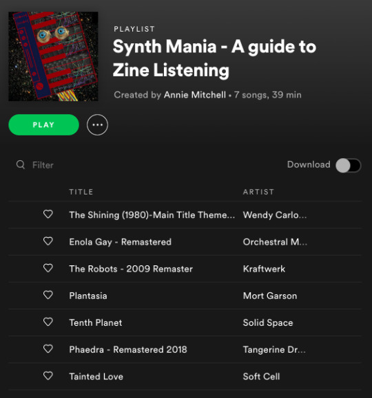
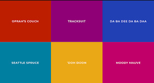
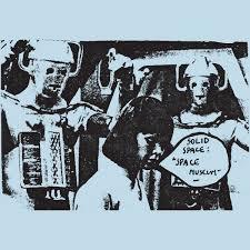
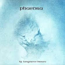
After chatting over E-mail with Ben I looked into some earlier Synth bands and took inspiration from their minimal colour palette. Above you can the very space-y and minimal work of Solid Space, Kraftwerk, Tangerine Dream / Phaedra. I also came across this website called the Juice Box Interactive. This website creates colour palettes based off mood boards that represents iconic objects from the decades. The one you can see in the top left is from the 1960′s which is when the first analog synthesiser was made. So from this colour palette I have refined my colours to three main hues including dark blue, red and mustard yellow. More specially, #e4a834, #871719, and #0d1a3a. Hopefully this will assist in streamlining my composition and creating more cohesion is my zine.
Reference: https://juiceboxinteractive.com/blog/color/
0 notes
Photo


Communication Design - Week 12 (Work In Progress)
This week I came to class with my full drafted Zine! The aim of my zine is to portray a kind of cosmic, retro, psychedelic feel of noise and nonsense pages that represent the synthesisers attitude to music. Using the collage tools we explored, I went further in to photoshop and learnt so many new tools doing this zine! In particular how to effectively use layers, cut out images, erase, invert images, turn text 3-D and thats just the tip of the ice burg. I really wanted to play with textures in my zine as I wanted to make the digital zine as interactive as possible. My biggest concern at this point is whether the text is legible and whether there is enough cohesion in the Zine. And after chatting with Ben this week he has brought to my attention that every page has its own palette and it makes the zine feel disjointed from the other sections. Even though this was initially my intent to create noise, I can see that I think the images do enough of this on their own and it perhaps is actually doing the reserve of what I wanted. Instead of keeping the reader engaged they might the composition and colours too noisey and put it down all together. My plan for the next week is to streamline the colours as well as dial back some of of my compositions and utilise negative space more so that the busier parts have greater impact.
1 note
·
View note
Photo


Communication Design - Week 12
Today during our tutorial session with Ben we looked at zine deign and page layout. In this activity you can see above we were given a photoshop file and then were given five minutes to change the composition. Below I have written the goal of each image.
Image One: Make the Image the focus of the layout.
Image Two: Make the Text the focal of the layout.
Image three: As experimental as possible while still being legible.
Takeaway from Task:
This was a really enjoyable task and pushed myself to view what would otherwise be a standard layout in different ways. In my own zine I have been trying to push the experimental side the zine and I am worried I have lost some of the legibility. So because of this I am going to use some techniques we employed in the task, like choosing one part of the image and making that the focus in order to keep my zine cleaner. I think by perhaps choosing a dominate part of the composition it will make it easier to shape the contents around it.
2 notes
·
View notes
Photo
Communication Design - Week 11
As mentioned previously we looked at where design is headed in future in our lecture with Andy and Karen. We also touched on parametric design and how we are using it in design. Parametric design is a paradigm in design where the relationship between elements is used to manipulate and inform the design of complex geometries and structures. We witnessed this with the Pepsi logo were we saw how the variations of the Pepsi logo where created from a base design. This sparked an interest for me as I desired to achieve a deeper understanding of parametric design. So I did some further into more examples of where parametric design is used.
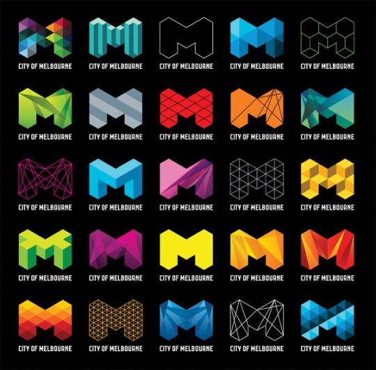
Parametric Design - (Example Melbourne City Logo)
One of the parametric designs that took me by surprise was the logo of Melbourne city. I guess another way to think of parametric designs is something that exhibits a flexible logo . A great explanation of parametric design is given by Jose Salmeron in smashing Magazine as he refers to parametric design as “fluid brand identities”. So with the Melbourne city logo the silhouette of a three-dimensional ‘M’ is overlaid with patterns that change based on context. What is really interesting about parametric design is that brands normally form their identity through the repetition of their logo in the public. However parametric design goes against the grain in that while they are similar, they are presented slightly different every-time, however perhaps it is this slight change that keeps the viewer more engaged? I would love to do an experiment on what is a more recognisable brand whether it is a parametric based design or a the usual standard based logo?
Image and information from: https://www.danieldavis.com/parametric-typography/
2 notes
·
View notes
Photo


Communication Design - Week 11
This week in our lecture we discussed where design will go next! We looked at a bunch of different forward thinking designs including thisfacedoesnotexist.com . This Person Does Not Exist presents a random, computer generated photo of a fictional person and every time you refresh the page you get a new face. Above I’ve shown two images of them being used in my own home suburb of Cockburn, in Perth Western Australia. The faces were created by artists Marco Marcon and Rodney Glick. They merged digital portraits of residents to create composite images of what would be the ‘typical members’ of our community. However these faces don’t actually exist ! And I can’t help but think that perhaps this was a play on the ‘this person does not exist project’. Recently a petition was started to get these images taken down as people found them too creepy and as we speak they are getting removed. So with this fascination I decided to do a little more research into ‘this person does not exist’.
Behind This Person Does Not Exist
This project was created by former-Uber software engineer Phillip Wang. He used the page to demonstrate what GAN’s are capable of, GAN’s being generative adversarial network. The GAN’s network is a type of construct in neural network technology that shows the potential in the world of artificial intelligence. Phillip Wang wanted to use the project to show how with these incredible fakes they can be used for sinister purposes. For example they could be used for fake news? And they are often so close to real life images how would we differentiate between is real and fake? The end goal of this GAN network and many other similar companies like Nvidia, facebook and google is to use this artificial intelligence technique for developing fully fleshed out virtual worlds, potentially in VR, using automated methods instead of hard coding.
Artificial intelligence is terrifying but while groups like GAN are behind the progression of the technology it is also comforting to know they are working towards the greater good. However if this information was to fall into the wrong hands it could well be a terrifying experience.
Images from: https://www.perthnow.com.au/news/wa/public-has-say-on-what-will-replace-creepy-cockburn-train-station-faces-c-1019737
2 notes
·
View notes
Photo


Communication Design - Week 11
After today tutorial with Ben I’ve reworked my first layouts. I played a lot more with photoshop this time and tried inverting the colourings of the images. I also adjusted the composition and tried to pick a font colour that would pop more. I’m not sure if I am done with these pages yet but they are definitely looking better!
1 note
·
View note
Photo
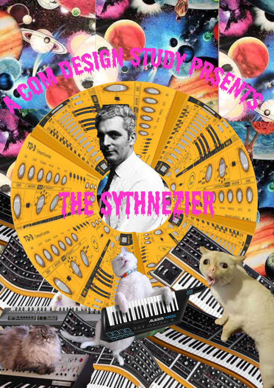
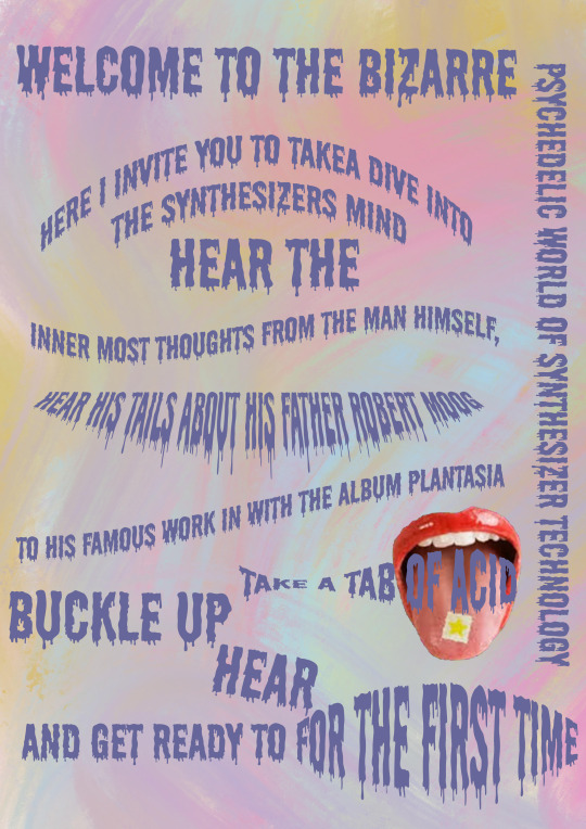
Communication Design - Week 10
After much tossing and turning I’ve decided on a Zine for my final media format for my task 3. I really wanted to do a video as I thought that would be the most appropriate, but as much as I can see it in my head I found that it’s just out of my skill set. So instead I come up with this idea to make my zine as interactive as possible ! I want to add a list of instructions on how it is recommended that you read it and experience it. I am hopefully going to add sound bites and try make all the senses involved! Kind of like the Futurist cookbook I am also thinking of linking the senses with suggested meals? I am not sure if I am getting too far off topic but it’s definitely getting me excited! Here are my first two draft pieces from the zine. I still have lots of editing to do (not just regarding typos haha) but also the composition. I am trying to play on the idea of the counter cultural movement at the time and the Synth’s links with psychedelic art.
1 note
·
View note
Photo


Communication Design - Week 10
This week during our lecture with Karen and Andy we looked at reasons and thinking behind design. And from this line of thinking we looked into design activism and the beginning of conceptualism. We looked at the idea that maybe it is the art system that contextualises the object and makes it art. I found this very fascinating especially as the art in the lecture got more and more bizarre, it left me thinking just cause we say it art can it really be so? So I did some further digging at look at the Tate website.
Conceptualism
According to the Tate Website conceptual art is art for which the idea behind the work is more important than the finished art object. Conceptualism emerged as an art movement in the 1960s and usually refers to art made from the mid-1960s to the mid-1970s. Above I’ve picked three pieces of art from the conceptual art series at the Tate museum and will endeavour to learn a little bit more about each piece in the hope of understanding conceptual art further.
Soul City (Pyramid Of Oranges)
This sculpture was created by Roelof Louw in 1967. This work is made up entirely of fresh oranges. Initially the stack of oranges was made up of 5,800 oranges. However as viewers look at the stack they are invited to take an orange from the stack and look at how the shape changes form. According to Roelof Louw “By taking an orange, each person changes the molecular form of the stack of oranges, and participates in consuming its presence.”
Small White Pebble Circles
This was a piece created by Richard Long in 1987. The pebbles made up five concentric rings of white on the floor. In the installation instructions that Long provides the museum with, he specifies the exact measurements and that all the pebbles should be distributed by hand. According to Long ‘the whole work should look balanced and circular’ . Richard Long had done a list of similar works like this and often described his work as where his human characteristics meet the natural forces and patterns of the world. A really interesting quote he leads with in describing this piece is “There are millions of stones in the world, and when I make a sculpture, all I do is just take a few of those stones and bring them together and put them in a circle and show you ... I use stones because I like stones or because they’re easy to find, without being anything special, so common you can find them anywhere ... It’s enough to use stones as stones, for what they are. I’m a realist.’ (Quoted in Richard Long: Walking in Circles, p.45.) Honestly his process kind of leaves me questioning the value of conceptualism, especially when he labels the materials with such disregard.
One Minute Sculptures
This is a photograph from Erwin Wurm’s series One Minute Sculptures that he produced in 1988. The individual photographs feature images of people – anonymous participants, engaging in unconventional and physically challenging interactions with everyday objects. Just as it eludes to in the tittle the poses are held for one minute. This was definitely my favourite piece that I came across under the conceptualism genre because of the logic behind it. According to Erwin Wurn he states that from looking at these photographs both the view and the participant of the image are required to “momentarily suspend practical rationality in favour of the grotesque and the improbable”. I loved the humour the pieces evoked and it was a uncontrollable interactive piece for viewers’
Overall
After some further research I am definitely beginning to grow a deeper understanding and liking for conceptual art and visiting the Tate museum is something definitely something I’d like to do on my bucket list! I really enjoy the interactive pieces but still have some questions in regards to the pebbles.
Images and information from: https://www.tate.org.uk/art/art-terms/c/conceptual-art
1 note
·
View note
Photo

Communication Design - Week 10
This week during our tutorial with Ben we looked at Collage! This was terribly exciting for me!! We looked at a range of different artists including Asger Jorn, Hannah Hoch and Euardo Paolozzi to just name a few. From looking at these artists we were then given 20minutes to come with a collage on our own. I wanted to play with the ideas from Hannah Hoch were she used different parts of bodies to create new silhouettes. I also wanted to incorporate of creating poetry through college. So I used Frankie magazine to create my collage. Frankie magazine is a bi-monthly Australian magazine that features music, art, fashion, photography, craft and other cultural content. It’s target audience is mainly for women so with that I thought I’d try and distort all the pretty women they showed in their clean magazine and attempt to make them ugly. This is how I came up with Diane! And through Diane I thought about how she would mostly likely represent a women who rejected stereotypes and gender roles. So thats how I came up with the poetry from mis matching article headliners. I really enjoyed this task and look forward to employing this technique throughout my zine.
1 note
·
View note
Photo


Communication Design - Week 9
This week during our online lecture Andy discussed the transitions between pre-modernism, modernism and post modernism art movements. We discussed how post modernism themed art took a chaotic approach to design in comparison to modernism that celebrated the idea that “as long as you work hard capitalism will reward you”. We discussed further in the lecture Ettore Sottass’s work with the Memphis group and explored a range of his creations including the black chair above. What immediately took my attention was the whimsical take on the everyday item and how we discussed a very similar chair in week 7 which you can see below. Immediately despite sharing the same idea of a black chair the comparison in name alone shows a stark difference. I thought it would be interesting to investigate the similarities and differences between the chair designs in the paragraphs below.
The Barcelona Chair
As mentioned in my previous week 7 post, the Barcelona Chair was created in 1929 for the Barcelona International Exposition by the Bauhaus director Ludwig Mies van der Rohe in collaboration with fellow architect Lilly Reich. In terms of physical design it features two slim rectangular cushions over a light, stainless-steel frame. The chair frame was initially designed to be bolted together, but it was redesigned in 1950 using stainless steel, allowing it to be formed from one seamless piece of metal. Again this design reflects minimalism in all aspects.
"Miss, Don't You Like Caviar?" Armchair
If the name doesn’t immediately strike you, the rest of Ettore Sottass work certainly will. Ettore Sottsass was the founder in the early 1980s of the Memphis Group and took inspiration from earlier movements such as Art Deco and pop art. Sottsass work was known for its variety and achieved playfulness through ornamentation and colour. Just looking at the chair initially while its not necessary the most out there piece by Sottsass you can see the shift from modernism when you compare it to its predecessor of The Barcelona Chair. Unlike the Barcelona Chair, this chair is not light and sleek. In contrast to the sleek legs of the Barcelona Chair, Sottass opts for solid block ‘heavy’ looking legs that almost reflective the opposing chromed steel legs giving a cluttered sensation. Unlike the inviting comfort and use of the Barcelona chair, Sottass’s chair is rigid and uninviting, almost posing the question “why are you even a chair if you not going to act like one?” This uninviting nature of the chair reflects the rebellion of the post modernism movement and shows a chaotic unstructured approach which becomes more prevalent through the Barcelona Chairs comparison.
Image from: https://www.metmuseum.org/art/collection/search/486854
2 notes
·
View notes
Text

Communication Design - Week 9
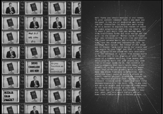
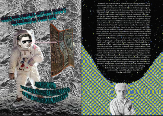
This week I have continued to research my object (The synthesizer) for Task 3. Over the the course of this week I have developed deeper research and formulated more specific questions. So far these are my listed questions and how I have refined them. What was it like to grow up in a time where you were labeled as psychedelic and avant garde? (history)
Why are you dressed in this way? -> What is it like living as a sound chameleon and how do you function as an individual within this realm? (How do you work)
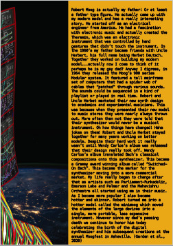
Did your work expand beyond music, is it true that your album Mother Earth's Plantasia’ assisted in the flourishing of plant life?
What was Robert Arthur Moog’s influence in your life and how did your life change translating to the commercial market?
Where has your work taken you now? -> Today you are considered as important in modern day music today as the human voice, how so?
I am going to shape and research these further and I look forward to the end product!
1 note
·
View note
Photo
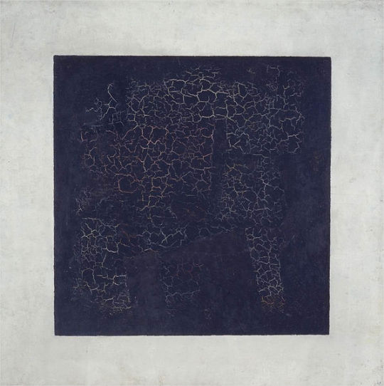
Communication Design - Week 8 (Suprematism)
During our tutorial session with Ben in week 8 we further went into the art movements in Russia and in particular suprematism caught my attention. Mostly because of Kasimirs Malevich’s famous painting of the Black Square. How can something so simple gain so much awe and admiration? This painting’s is arguable one of the best examples of suprematism. The movement developed in 1913 was characterised through the art consisting of basic geometric forms, such as circles, squares, lines and rectangles. These geometrical shapes were then painted in a limited range of colours.
Whats SO good about the Black Square?
The Black Square
This black square was an iconic example of a painting from the movement. The original version of this painting was by Karimir Malevich in 1915. I really struggled to see this as a talented piece of hand crafted art. However upon stumbling across an article (linked below) it changed my perspective. The article suggested that I look at the square in different ways, rather than just seeing the object itself. This article noted that the painting was revolutionary in that it was the first time someone had made a painting that wasn’t particularly of something. For example it was an object, it didn’t have function or depict anything really in particular. I never thought of this as a revolutionary idea but I certainly think it warrants merit. The article also discusses how the idea of the square initially came from a stage curtin. This became clearer as I thought about colour codes and what the black represents. Overtime this painting also became a revolutionary symbol, which this article brought to my attention. The square was meant to represent the number 0, being it is the time lined mark for a new era of art. And finally the article pointed out that the black square was the first icon that wasn’t an actual icon. As in the black square became the emblem of his new style. The icon became so potent that in his later work he even signed some of his paintings with a little black square. Even to the point that at his funeral the car carrying his body had a Black Square on the front and mourners held flags decorated with black squares.
From doing some further research I actually quite admire the message of the black square and I think it is so admirable to create something so incredible simple that can say so much.
(image & information from https://www.tate.org.uk/art/artists/kazimir-malevich-1561/five-ways-look-malevichs-black-square)
1 note
·
View note
Photo

Isolation Project -
As part of my time in isolation I thought I would use my time to see if I could explore a new skill set. So I set myself the task of illustrations and I thought I’d share where I started in comparison to where I am now. It’s nice to see I am getting better at this and getting more detailed designs. Its very satisfying to see improvements and I can’t wait to continue to practice and hopefully get better.
2 notes
·
View notes