
silvanavdesigns
Silvana Valente
Graphic Design Student at Birmingham City University
33 posts
Don't wanna be here? Send us removal request.
Last Seen Blogs

prittsbob
TOWED HAUL: 8'x26' Tiny-House / Home
temple-of-anxiety
mysterious princess
c-heart
My heart

sevens-evan
fish boy, cauliflower boy, snow man
evermore-fashion
Evermore Fashion
Text
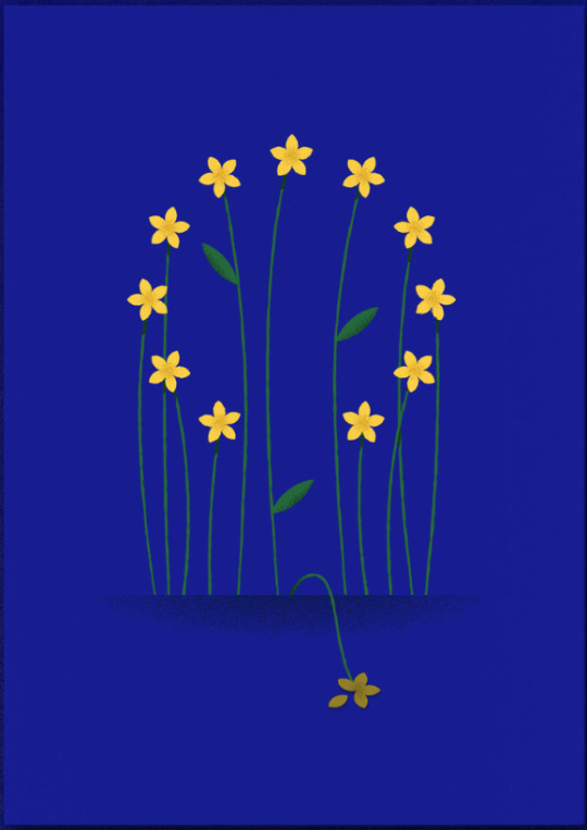
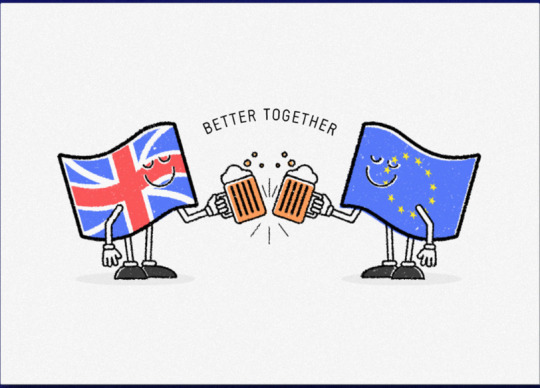
MeandEU.uk
Came across these while grabbing some protest clever postcard design inspiration:
4 notes
·
View notes
Video
youtube
An amazing stop motion piece made with plastic waste collected from the streets of Bangkok, “hopefully before entering our oceans” they write. Such a wonder the power of animating things, giving life to inanimate objects to tell a story that can make us emotional, as portrays the sad reality we face on Earth and our oceans
#PlasticDreams Wonderfruit 2018
0 notes
Text
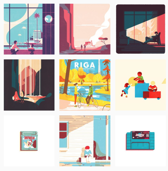
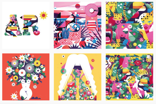
Tom Haugomat Illustrator
Came across Tom’s magnificent work while flicking through Behance. I feel that the opinion about this work is really diversified among my colleagues but, personally, I love it. It’s a great creative network that makes easy to navigate through different artist on so many different areas.
Tom describes himself as an illustrator and animated film director and he’s been on the scene for a long time, at least tracked on the network since 2010 and has a lot of presence in it.
Some of his work:
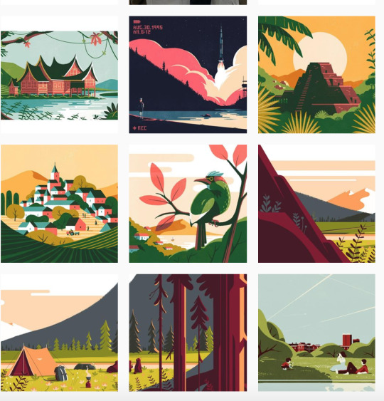
What more fascinates, besides thinking that this is the first time I’ve seen such thing, is the beautiful illustrated advertising pieces:
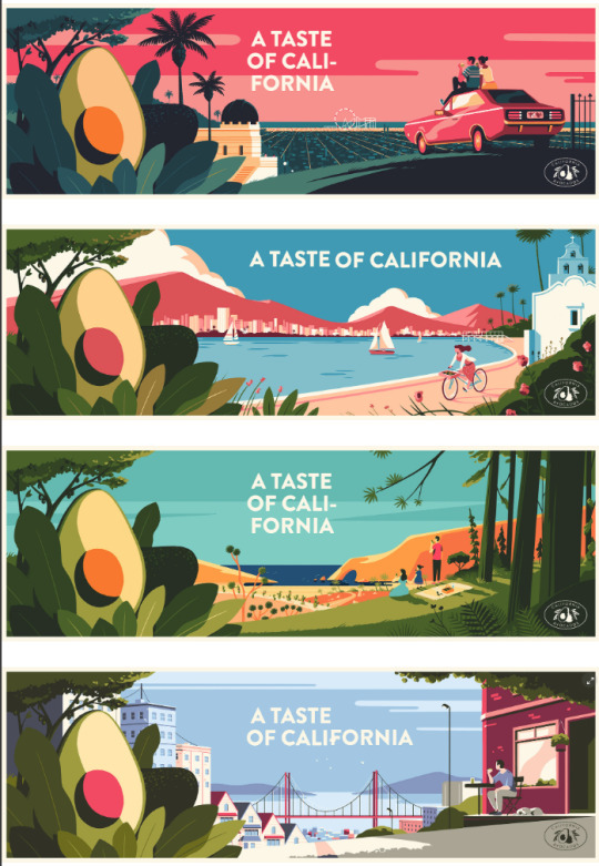
Campaign for Avocados California (2018) with some excellent color palettes, with a warm, inviting and fun tone to it
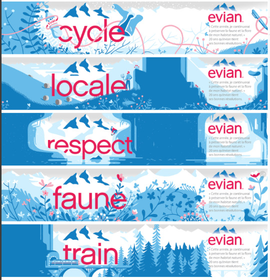
Campaign for Evian water (2015) with a great storytelling and consistency
0 notes
Video
youtube
UNICEF anti-bullying campaign
This a simple layout campaign but it’s an excellent example of a good use of it. As smartphones use tend to grow the younger the generations are, in this one this is a symbol that couldn’t be better to relate to its target audience.
1 note
·
View note
Video
vimeo
Don't be a bully, loser. by agency Antimatter.
Love this animation style, shows there’s no need to be a very complex illustration and wide colour palette to have an excellent illustration and animation piece. This project conveys perfectly the position of someone being bullied and it’s so touching.
2 notes
·
View notes
Text
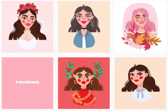
Martina Martian Illustrator
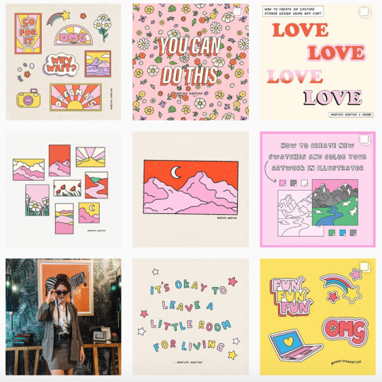
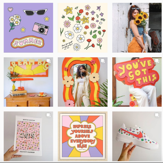
Martina’s work flows with such positive vibes through her beautiful and vibrant color palettes. With a hand-drawn, fun and bold type style she’s the perfect example of passing the right message with the right tone.
Her instagram account: https://www.instagram.com/martinamartian/
2 notes
·
View notes
Text
Sara Maese Illustrator & Surface Designer
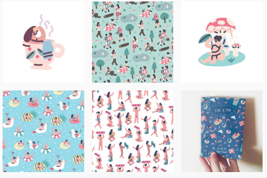
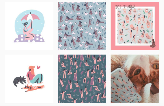
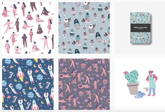
Absolutely in love with Sara’s work. A very minimalist style, but fun, colorful as well as representative. A lot of the little figures she draws are nude and also refers to topics such as gender equality and body positivity.
Her instagram account: https://www.instagram.com/hallosaramaese/
0 notes
Text
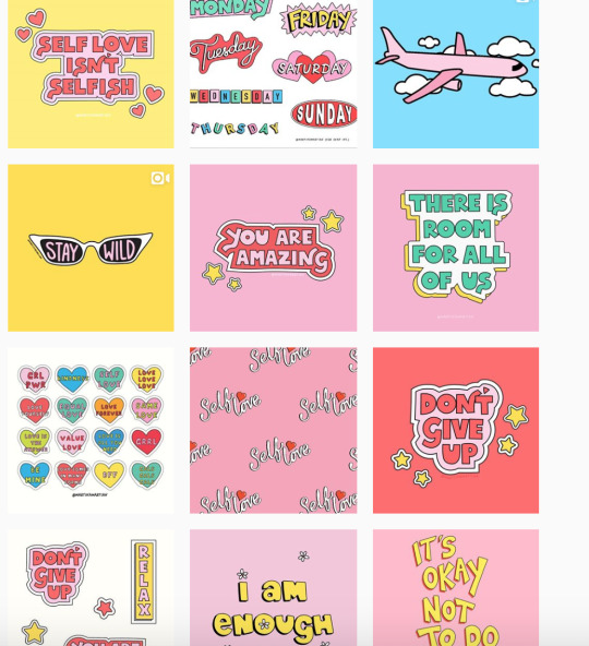
Haby Illustrator
Once again I tend to really enjoy illustrator with a bright color palette and with some significant objects around it.
Her instagram account: https://www.instagram.com/haby.illustration/
0 notes
Text
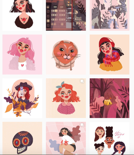
Kasia Serafin illustrator
I love the vibrant style of Kasia’s illustration. She bases on her surroundings and overloads her artwork with cute designed objects on the theme she’s illustrating.
Her instagram account: https://www.instagram.com/serafinkasia/
1 note
·
View note
Text
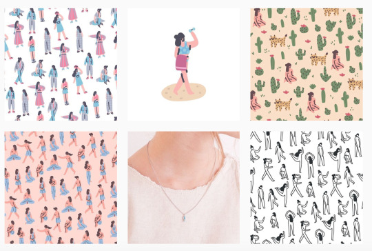
V5MT illustrator
As I look through animated illustration work, I came across this artist that publishes her work under the name V5MT.
From simple illustrations to GIFs and animation, her work uses a lot of vibrant colours and a really funky style.
Her work seem to use a style that looks ideal to relate with a young audience and goes towards the bold, fun and engaging style for my own project.
Her instagram account: https://www.instagram.com/v5mtv/
1 note
·
View note
Text
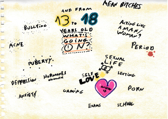
Competition Brief - Childline
After a few indecision on which competition Brief I should go for, and due to some complications on the first brief of Survival International, I had a look at the YCN (YouCanNow) briefs. The brief for Childline, a help line for people under the age 19 that are going through a tough time, which consists in the creation of illustrations and animations that will be seen on their social media channels or on while the caller holds to be transferred. This seemed like an interesting brief for my practice as I’m a big follower of motion design and wanted to develop my skills on Illustration and Animation skills.
These are a few loose pages on my brief dissection and some rough initial sketches:
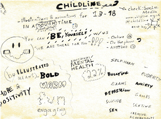
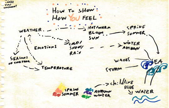
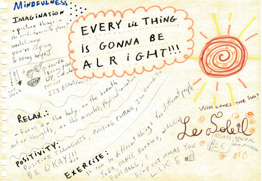
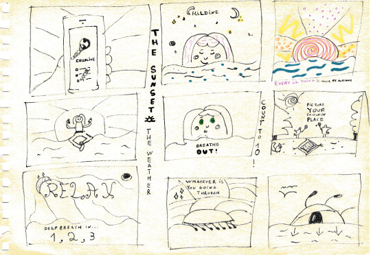
This came up to be a brief that, personally, means a lot as it comes towards my subjects of interest, with the content of these illustrations and animations: a message of Hope & Positivity by using Mindfulness techniques, for example the own Meditation principles I use for myself, and healthy habits, as Exercise, that can improve a lot Mental and Emotional Health. Once again, I can also make the bridge to the topics approached on this project and the Contextual Studies.
0 notes
Text
Venus of the Rags, 1967-74
Or Venere degli Stracci
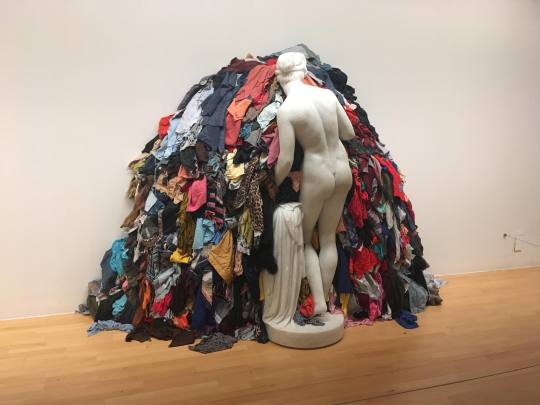
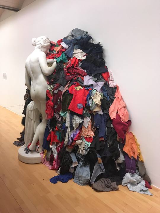
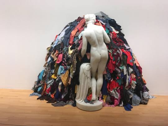
Found on a trip to Tate Liverpool, this is a sculpture made by Michelangelo Pistoletto (1933), that was part of the movement Arte Povera, a movement that wanted to challenge the commercialised ways of the art galleries.
He “was interested in broadening the material language of Arte Povera, and in creating complex juxtapositions of modern and historical images and ideas. Venus of the Rags appears to bring together an iconic figure of classical culture with the detritus of contemporary society as the solid Roman goddess props up a randomly formed pile of gaudily coloured second-hand clothes. ”
This piece of art called my particular attention as I can make a bridge into the themes of Consumerism and unsustainable way of living human kind is taking and take a critical point on this.
Made me wonder if this piece might not be exploring that this compulsively consumptive behaviours can be traced back to Antique Greece and Rome and the quintessential vanity from those periods.
Could this be the helpless fate of mankind? Or could we be wrong all this time?
5 notes
·
View notes
Text
Minimalism: A Documentary about the Important Things
Under reference on the Consumerism lecture, the documentary “Minimalism” ended up by being an excellent add to my watch list.
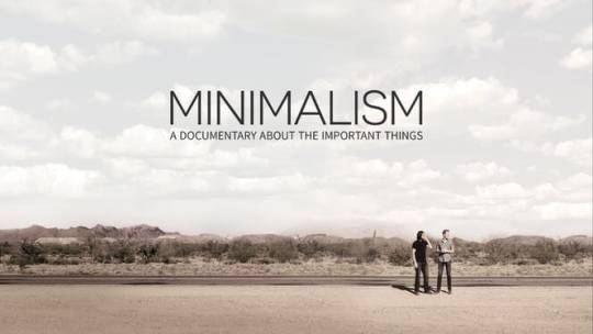
In this documentary directed by Matt D’Avella, amongst a lot of testimonials from the growing minimalist community, we follow mainly the Minimalists Joshua Millburn & Ryan Nicodemus, creators of this movement, that also have a book, youtube channel, podcast, spreading the word on this lifestyle where people live with less in order to be able to focus on the important things.
Such an important message, that makes us critically question the bombardment of images we are exposed to daily, and wether we want it or not to tell us what to do, like “Buy this!”; “Buy that!”
The minimalist movement brings such good improvements to our society, or perhaps is just human kind returning to its roots, as this shows improvements on the communal sense people have, of cooperation and helping each others and sharing stuff.
The importance of owning and consuming less and breaking this consumption cycle urges so much, as doing so doesn’t actually fulfils us and our purpose as humans.
Two of my favourite quotes:
“ Imagine a life of less, a life of passion, unencumbered by the trapping of the chaotic world around you”
“Love people & use things, as the opposite does not works”
10 notes
·
View notes
Text
Context Module - VC5037
This is the introduction of the new module of Context in our Level 5, 2nd year, of the Graphic Communication, at Birmingham City University (BCU).
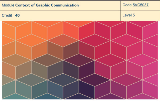
On this module, we are engaged in several activities such as a mixture of theoretical lectures on diverse topics of discussion, visiting lectures/workshops, one-day projects, group and individual tutorials, group critiques and integrated analogue and digital skills workshops.
This series of 9 contextual lectures will encourage the development of our research and gaining on theoretical knowledge so we apply it to our outcomes and work, enriching it by placing it in the societal and historical actual context that we live these days.
Very excited with the upcoming themes of this lectures which will take place further in this blog. Here follows:
Consumerism
Design for the Anthropocene /Ecology (by Fred Hubble)
Gender Discussion
Global Discourse /Race & Culture
Politics of the Image (by Vincent Gould)
Psychoanalysis
Queer Theory ( by Emily Sparkes)
The Hiper-Connected World
I’m really excited with what is planned in this module and will be looking forward to learn more, especially with the contents of the lectures, as for the previous here I must say that I really enjoy it and how it is presented by the lecturer Ally Standing.
#context#contextual studies#graphic communication#practice of graphic communication#graphic design#art and design#bcu#birmingham city university#graphic designer
1 note
·
View note
Text
1000 word evaluation - Enterprise of Graphic Communication
For this module of Enterprise of Graphic Communication we had to create the concept and visual identity for a Festival.
When the brief was launched I was really excited about the idea of creating the concept of my own festival since I’m a true music addict and a festival-goer. Music summer festivals are also a very popular thing back in Portugal, my country: we have the perfect sunny summery weather plus we have great international artists and bands coming there in a much more affordable version than in the UK. Prices usually range from 80€-150€ for a 3 to 4 days festival that includes camping in beautiful natural landscapes.
This module kicked off with a discussion in class that was crucial to incite the critical thinking for the whole project. The question that was asked was “Why do we listen the music we do? I’ve never really gave much thought to this. I’ve never been the person that listened to just one music genre. If I look closely into my playlists, I have a wide range of artists and genres in it, starting from indie to rock, rap, pop, house disco, techno, jazz. Through the discussion, I realised everyone has that one favourite music genre that would be the one in which each one of us review ourselves the most.
The beginning of this module got me in a time that I’m growing a big interest in Electronic Dance Music and in addition Ally’s perspective lecture on Rave culture, I headed my research more to this genre. I watched the documentary “Summer of Rave 1989” which allowed me to understand better the background and values inherent to this genre.
At this point I wanted to do a festival to bring back the concept of raves in its early start. I thought the festival name to be “Ravival” – the revival of the raves. Proceeding with my research I watched the movie “24 hour party people” which gave me much more insight about the way different genres influence and generate other sub-genres. This film introduced me the the musical and cultural movement Manchester was going through in the late 1980s: a merge of alternative rock with the acid house emerging rave cuture scene, bringing influences from psychedelia an 1960s pop.
My research lead me to an hesitation: would it be better to create a whole festival concept on this new crush I had on the rave scene and EDM or, bringing back the question raised in the class discussion, to grab the genre and cultural background that I reviewed myself the most: psychedelic/alternative rock, the Hippie and 70’s vibe. So, at last, I came up with a concept that pleased me the most: a neo-psychedelic / alternative rock music summer festival with a psychedelic theme.
For the development of visual concept, taking Martin’s suggestion; I created an album on Pinterest as a moodboard for the festival and to get inspiration to create my logo.
Psykick was the name it came up, inspired in the consumption of LSD, the drug associated with psychedelic rock, standing the Kick for the sensory experience triggered by it.
For Psykick concept progress I took some bits of other Festival’s concept and visual identity:
In terms of concept I wanted to grab the values and structure of Woodstock: festival-goers camping in the Nature surrounded by a shared sense of Peace & Love.
In terms of visual I looked into a few European festivals:
Bestival, Uk (Dorset, England)
Boom Festival (Idanha-a-Nova, Portugal)
VuuV (Pulitz, Germany
I also looked into some artwork of a few artists, but the ones that inspired me the most in this project was:
Peter Max is an american artist known for the bright colours and psychedelic style artwork. His work is iconic in the cultural literacy of the 1960s and 70s and we can see all over it a message of Peace & Love and the Hippie influence. To my project I bring Peter’s influence in the colour palettes, using more the shades of orange and violet
Hattie Stewart: Hattie is a illustrator and artist based in London. Her characteristic style of doodlebomb which gives a jolly and psychedelic effect making a great use of a bright colour palette
For the festival’s visual elements I created a few trees, mushrooms and tents. In these tree elements I try to convey the Nature element, the Mushrooms as a staple element for this musical background and a few tents to pass the image of human interaction with nature.
This festival’s target audience is 20 - 28 years old , more alternative crowd, adventurers & backpackers. It is going to be a 3 day festival, from 20 to 22 of July. For the location I picked Tabernas Desert, in Almeria, Spain because I wanted it to be in a warm climate in a natural landscape of yellow and orange.
To come up with the festival line-up I took inspiration from Spotify, which is a great tool to find specific music genres and music related to specific artists and bands.
I found very useful for this module talking to people with specific expertise in some areas. I reached to my final location speaking to my archaeologist cousin. For the line-up research I also spoke to a few friends music connoisseurs.
Definitely this was a positive aspect of this module, I used a lot of the feedback I got from my colleagues people I talked to in specific areas. Discussion is very important to flow an idea generation.
This module was also very important for me to enhance my critical thinking and curiosity on different cultural movements that I had no insight on before.
0 notes
Text
Festival Vibes Inspo
In this post I show the inspiration I took from the Identity of other festivals.
BESTIVAL (Dorset, England)
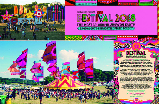
Bestival is a four-day music festival held in the south of England.
BOOM FESTIVAL (Idanha-a-Nova, Portugal)
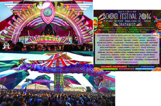
The Boom Festival is a biennial transformational festival in Portugal.
VuuV FESTIVAL
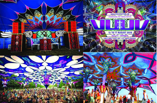
VuuV Festival is a music festival held in Putlitz, Germany, over 4 days.
These are some of the visuals of the Festival that I got inspiration on.
0 notes
Text
PETER MAX
Peter Max is an american artist known for the bright colours and psychadelic style artwork. His work is iconic in the cultural literacy of the 1960s and 70s and we can see all over it a message of Peace & Love and the Hippie influence.
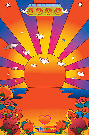
Sunrise 2000
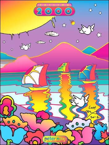
Sailing 2000
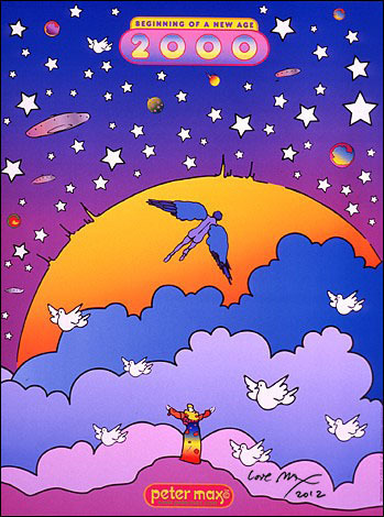
Beggining of New Age
To my project I bring Peter’s influence in the colour palettes, using more the shades of orange and violet. My colour palette:

I’m also interested in the style of typography he uses.
Website: http://store.petermax.com/
0 notes