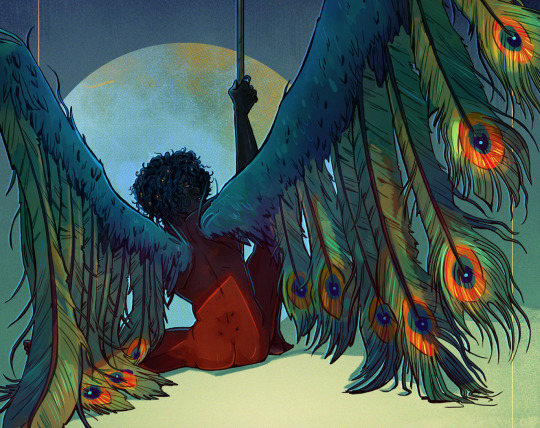
#also complimentary on the color wheel
Text
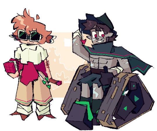
I love how Ruby and Oscar's main colors are complementary on the color wheel. The first thing that drew my attention to it was how Blake's aura was purple in the V9 finale, which is complementary to Yang's yellow.
#rosegarden#rwby#ruby x oscar#ruby rose#oscar pine#also weiss has a light blue aura while Jaune has a yellow/light orange aura#also complimentary on the color wheel
81 notes
·
View notes
Text
hi been noodling with designs for block guys have some sandy boys
#mcyt#grian#goodtimeswithscar#gtwscar#scar goodtimes#desert duo#3rd life#third life#trafficblr#what are. the fandom tags (ekplodes)#dragon doodles#id in alt#remembered I wanted to let myself post more messy things here so here's! design passes I got carried away with#rly liked the idea of scar's palette being dark colors and green and grian's pale color's and red but scar's a red life and grian's a green#complimentary character design when I remember to do you my beloved <3#scar's wheelchair is powered and has treads + a front stabilizing wheel for sand purposes (also I referenced minecart wheels hence. cube)#not something I have much practice in but AM wanting to experiment more with wheelchair designs had lots of fun with this one :]#meant to be making these for a bigger piece but I'm actually procrastinating rn so Not saving these for then I Aim to stop procrastinating
755 notes
·
View notes
Note
how do you choose colors?? i love your color choices and wanna know how you do it
oookay, i don't actually know what i am doing with colors 90% of the time, but there are some guidelines that i follow, so, i hope this will be useful ":3
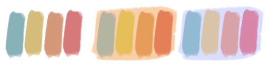
so. one of the main things that i use almost all the time is complimentary colors! a very cool very useful thing, good for everything. complimentary colors are the ones that are opposite each other on a color wheel. a proper color wheel, not the one that drawing apps use, because that one most of the time has the colors distributed wrong 😔
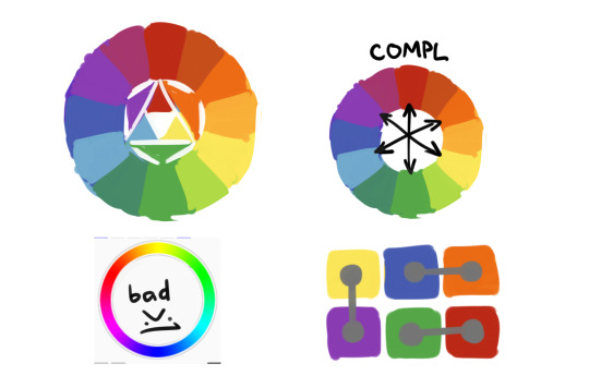
the thing about complimentary colors is that they make each other stand out more. so if you use them in equal amount and saturation they will fight for attention and don't look as good. another thing is that if you put gray on one complimentary color it will appear to have changed the hue to its pair. uhhh its hard to describe with words, but just try to fill a canvas with one saturated color and draw something gray on it, its an optical illusion of sorts.
so uhhhhhh, what im trying to say is, complimentary colors compliment each other (wow), so using them for accents and shadows and backgrounds will generally make both stand out and look better? idk, here are some examples so it hopefully makes more sense

and so you change the amount of color, it's saturation, hue, warmth, tone, other smart words, and it changes the feeling of the picture! as you can see i really like my greens and reds, they're almost in every picture, but it still looks different (hopefully). if you can't full on change the color of something, if you have a set design for example, bringing the complimentary color in shadows and highlights or background works too! try different things see what's for you!
and, of course, using complimentary colors doesn't mean you can't use any other color! its more like, complimentary colors establish this connection that's pleasing to the eye and everything else is whatever you want it to be! i also have no idea about using more than one pair, generally one is enough but technically it works?
i also try not to use more than 3 main colors for a piece, like, blue-red-yellow but no green, or green-blue-yellow and no red, and stuff. (key word is "try" of course lol) this has nothing to do with the color wheel, just uhh general color balance? but this is about um, "clean" colors. you can absolutely use all 4, if one of them appears different because of the lighting and stuff? again, its hard to explain color with words. plus it all depends on a style, its not a rule, that's just how i do it

and then all the things outside of theory, like, don't use black and gray for shadows, it looks dirty. a lot of artists don't use pure black at all, but i just can't help it i like it too much. i try not to use pure white for things like clothes and eyes and other things that are in-universe colored white. its fine for highlights but for everything else i usually use grayish yellowish color, it looks much more pleasing. things that are closer are more saturated and have more contrast, things that are far have less saturation and less contrast. things that you want to attract attention should have more contrast, and the other way around
aaand i think that's it? all that i can remember at least
1K notes
·
View notes
Text

This chaotic gremlin has happily skipped with light steps over the line that lets me to start dissecting his visual design and how it works for his story so far.
These are pretty obvious ones and some are speculations as I have not finished his route yet. But I'm having fun. :)
Overthinking starts here:
- His color scheme. His signature color is purple, which is the complimentary color, or should I say the opposite color of yellow/gold in the color wheel. Chev's color is gold. Ahh the conflict. But also being complimentary colors, the fact that Clavis is helping Chev around works too, as he let's his older brother work more efficiently.
- He is wearing a white/gold jacket over his shoulders but not fully wearing it. He is in Chev's factions and is his "servant". It also hides his own "main color" which can be seen as him hiding his true nature and motives.
- His outfit underneath the jacket is more "servant like" than what other princes wear. He is prim and proper. You could just give a napkin to rest on his arm in his default pose and he would look like a servant.
- I'm not sure, but the pin on his cravat seems to be a rose? Now I'm getting fully speculative, but I think the fact that it is stated that Clavis hates roses (or more specific, scent of rain soaked roses) can be foreshadowing for his distain for Rhodolite (as it is mentioned to be the kingdom of roses) but the rain part makes me think that it is more about him hating the idea of normal people of Rhodolite hurting. Rain usually symbolizes sadness and hurt. I feel like Clavis really wants good things for the kingdom, and understands that in some things, absolute monarchy is just an inferior option for the common people. I believe that he really wants to help everyone in Rhodolite, not just the kingdom as a construct. All this is just cloaked beneath the hatred of Chev as Chev symbolizes monarchy and the old ways.
Don't get me wrong, I feel like they hate each other as the siblings usually do, but I feel like they still care about each other in some level. And in their own bizarre way.
But I could be wrong. Because I'm still at the chapter 11 or so? Somewhere around there.
#clavis lelouch#IkePri#Dicenete rambles#fanart#ikepri fanart#ikemen#ikemen prince#Analyzing design#I still haven't finished his route#I'm around chapter 11 or so#but these are my thoughts so far#He has become my baby girl#I just want to see more of his cooking#sketches#ikepri sketches
262 notes
·
View notes
Note
Hey quick question how do you come up with the color scheme for the piece? I get stuck trying to think past what colors my characters have
oohhh, that's a hard one
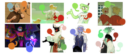
It depends on what you're focusing on, the colours on a character or the colours in their background!
Backgrounds are best when they complement the figure but don't melt into them. Using opposites on the colour wheels (red/green, blue/orange, Yellow/purple) is a good place to start, as well as complimentary tones. So, for example, for the pieces below, the background contains a Lesser colour from the figure, but allows the main colours to pop! the pink/red of ahme's skin to the desaturated green, the deep but warm brown against the blue and green of the bg!
For complete pieces, full illustrations, one good way to make the character and background feel more coherent, is picking colours from the figure and incorporating them into the bg. The pink flowery dress becomes the pink of lanterns in the bg, the same yellow of the stars as the characters eyes.
And for most character designs, I find sticking to a few base colours and adding one to make it pop, works for me. Brown leather and smoky blue with Gold jewellry, Lilac silk with sage and perwinkle blue! Also, mixing warm and cool tones. All warm and all cool is borin, gotta give it a touch of the other to make it glow!
Also, make sure to look into some colour theory, my way isn't the way for eveyone, getting lots of dif info is the best way for you to find how YOU like to colour!
Hope this is helpful!!
246 notes
·
View notes
Text
some alien stage design parallels
I am always captivated by alien stage's designs so here's me likely over thinking small design details between character parallels
Sua vs. Luka
These two are directly paralleled due to both their similar personalities (on the surface level) but opposing relationships with mizi. sua is mizi's universe, but luka manipulates mizi by imitiating a confession by sua during round 5
anyway here are some fun details in their official artwork designs

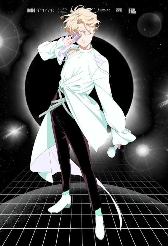
Both have white their dominant color, with black as a compliment, compared to ivan's all black, hyuna's various colors, ivan's grey and red, and mizi's multi-color hair. however while white/light colors are predominantly in luka's top half, masking the black underneath, sua's black hair frames her face at the top, while she is dressed in all white underneath
Sua's bow is at the front of her chest, meanwhile Luka has a ribbon tied to his back. They aren't the same thing, so it might be a stretch, but to me shows sua's more honest intentions with her affection to mizi, while luka is more duplicitous in his "kindness" to mizi
though contradictory but maybe a connection, sua has her hands gloved, meanwhile luka does not cover his hands at all.
Sua's sleeves are puffed out -- im no fashion person so idk if there is a name to them -- making her top heavy design-wise, while luka's sleeves have the extra frill for a more bottom heavy design.
speaking of which, the one-sided trail follows luka around, giving asymmetry to his design. It's pointed and dynamic, giving a sense of instability, and in luka's case, distrust. It's like a snake in how it follows him around. meanhwile, sua has perfect symmetry to her design, displaying how she was a relaible support for mizi.
Sua & Mizi
Obviously these two are built as strong contrasts. but while the subtler differences between sua and luka's similar designs are to depict their clear distinctions, mizi and sua's strong contrast is to instead show how they perfectly fit together ahhh i love them sm
from the get go, there are numerous differences, both to establish the contrast in their personality. Similar to luka, there is asymmetry in mizi's design through the gloves as well as the multi-color hair, while sua has a sharp bob and symmetrical clothing to show how sua is the calm to mizi's excitement
There's the obvious black to sua's pure white, another show of mizi's spirited nature in comparison. mizi's puffed skirt is a contrast to sua's puffed sleeves, sua's boots contrast to mizi's thigh highs, and mizi has a covered shoulder while sua's dress is an off shoulder dress. Hell, even their eye colors are complimentary colors on the color wheel (just realized luka also has yellow eyes haha). in every respect, these two characters share zero similar features which can tie them together. But it instead shows how they compliment each other as polar opposites!
in terms of the only connection i can pull, the gem mizi often is featured with is shown here at the center of her chest, the exact placement to sua's both. perhaps representing their love for each other being their centers???
Till vs. Ivan
The other major relationship ... the more tumultuous of the two -- also have the heavy contrast to link them together. but both share an intrstic desire of wishing to be with another they can never have, so there is a strong parallel there. in a lot of ways, it is similar to how contrast is played up between mizi and sua, with one being the refined, calmer one while the other is far more hot-headed


To get over the obvious, ivan's fitted trenchcoat is in all black while till is seen with a oversized white t-shirt. till's rebelliousness is seen through his lack of shoes or sleeves, showing both how open he is regarding his emotions as well as his lack of care for himself. meanwhile, ivan is knee high boots and gloves over his long sleeved coat, representing his closed off intentions/desires
ivan's collar (seen also in the flashbacks when they were kids) is symmetrical and close to his neck while till is always choosing an off shoulder look, the real collar (not a shirt collar, like ivan's) always a seperate piece on his neck. again, showing ivan's supposed submission to the system while till is blatant in his hositility against alien stage, only controlled through force.
however, while it can be pointed out till is primarily in white, he isn't and thats what is the contrast between the two. while ivan wears only one color, showing his undying devotion to till (whether that may be love or trying to let him go when going into round 6), till has his red underneath, which shows his split in motives.
till similarly wants to escape from alien stage, seen through round 3's flashback in him accepting ivan's escape. but due to it meaning leaving mizi, till has to reject ivan to return to the system he hates so much, all for mizi. from basic color psychology, red is the color of passion and temper, which is clear in how till makes decisions. he makes his hatred for alien stage known, but he is fueled by his desire for mizi to keep him from leaving.
Hyuna vs. Luka
last one just cuz these two now have a confirmation over what their relationship was (my guess: hyuna showed a very isolated luka some affection, luka grew obsessive and plotted to kill hyuna's brother to have her attention on him) with luka being alien stage's biggest success and complacent with the system, hyuna stands on the opposing side by taking hold of her own freedom, even if that comes at the cost of her safety


(side tangent: i really dont like hyuna's design here. like its the color placement between the top and bottom and the weird gradient of blue to muddy green to cool yellow. dont even get me started on those shoes ... hell she doesnt even her outspoken nature. ear them in her own music video. but im including it just since its official artwork and hypothetically what she preformed with)
honestly hyuna sticks out so much more compared to everyone just due to the abundance of colors in her design. She only has some black, but there are various hues used throughout her design. Just about all the official art work for the other character depicts them in outfits with some black or white, with luka the most apparent by the balance of both colors.
luka looks almost artficial in how he wears only whites and blacks. its only furthered by his blonde lashes -- the only character with such a trait -- and especially the blues at his fingertips. hyuna in contrast is the only brunette of the series, and colors like brown are often associated with more earthly tones, making her seem more human than luka.
hyuna, like till, has no sleeves, showing some part of her outspoken nature. but to me, what hyuna and luka both share is their strong asymmetry. Hyuna through her sleeveless (???) tank top and luka aforementioned trail thing. they are at such polar opposite ends taht it could almost fall into instability
anyway off to manifest round 6 ending with hyuna and mizi rescuing till and ivan and then luka randomly exploding on the spot :3 (its probably gonna kill off till or ivan)
apologies for any bad grammer im too lazy to revise this
#alien stage#vivinos#alien stage sua#alien stage luka#alien stage mizi#alien stage till#alien stage ivan#alnst#character rambles
138 notes
·
View notes
Text
Anyway I'm still brainrotting about Animation VS Minecraft.
In The King, Orange King's son is a yellow color. In color theory, there are pairs of hues known as complimentary colors, colors on the direct opposite sides of the color wheel. Their contrast is what makes them go well together. They're different, but also kinda the same. Yellow's complimentary color is purple. Do you understand?
And in Note Block Universe, Purple's dad is very clearly blue. Blue's complimentary color is, you may have guessed, orange. They are different. But also the same. Do you understand?
I feel like this post is too obvious now. Do I even need to write the rest?
But I will anyway: Purple saw the same qualities in Orange King that he saw in his bio dad. He had to accept that they were different, but could hurt him in the same way. Orange King wouldn't let himself see the same traits in Purple that he saw in his son, because he cherished the memory of him too much and was blinded by his goal, and told himself they were different. He refused to accept their similarities, until he couldn't ignore them anymore.
Color is great, I love colors, they definitely don't make me emotional.
77 notes
·
View notes
Note
Hey !! I just wanted to say your art is CRAZY good and I was wondering if you had any tips on picking color palettes?
Sorry for taking forever to respond, but hi!!! Thank you so much!!! wahh always wild when I am percieved, makes me v happy :)) As for color, your ask got me really excited since it my favorite part of the artistic process! So sorry if this post is very long and wordy, but I really wanted to talk about colors.
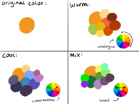
The long and short of it is that I like to use color theory (complimentary, analogous, triadic colors, etc) to minimize the amount of color in my work while using a variety of saturation and value to create the variation! Complimentary being colors across eachother on the color wheel, analogous are the colors next to eachother, and triadic are colors equidistant from each other,,, triangularly.
I typically don’t like starting out with a rigid number of colors of specific shades when I do my work cause it feels really limiting, and I enjoy adding color when it feels right. However, when I do color pick, I like to get a main big overall color scheme in mind then start placing various shades and saturations within that minimized pallete. The important part for me is not to stray too far from my pallete without some intent.
For example, when creating my character Peter, my goal was to make her a very warm colored character. To do that, I used an analogous color scheme of oranges and yellows with green sparingly. By minimizing the amount of different colors used, it helped the piece feel far more cohesive, but the amount of saturated and desaturated forms of the color created a lot more energy. And even though the colors I used were all next to eachother on the color wheel, the green provided a cooling contrast that I used in the eyes and portion of her costume to connect the two and emphasize. I also tried to use saturation and value to separate her from her outfit. Her skintone, hair petals, and markings are all very bright, while the outfit is desaturated tones. This made the seperation of the two more apparent to the viewer that this is body and this is clothes. I also like throwing in multiple color schemes to create even more visual interest. For example, for the lineart I used a deep saturated blue since blue is the complimentary to orange, her main color. This caused the lineart to stand out against her even more so than black lineart would.

To the upper right I also sketched out a different costume for her while maintaining the motif of orange and green (though some of the colors I’m not necessarily happy with).
Here are examples of some of my other stuff to show the “main colors” of the work. And as a secret, if a color isn’t matching my scheme, I like putting a color from my color scheme over it with a lower opacity and color pick from there ;) helps with melding it into it.

Of course these rules are not set in stone and I break them when I gotta, but this is generally how I like to find my colors. Anyways,, I hope this made some sense!! I’m not very good at writing my thoughts down, but I really enjoy color :)))
34 notes
·
View notes
Text
So, I want to share something that’s been sitting in my brain since KinnPorsche the Series aired. I’m a person who loves seeing colors and their meanings in the media I consume, as well as seeing how those colors connect to characters and become like a calling card for them. And oh boy does KPTS do that often. And one thing I’ve seen over and over again is that when Pete is on screen, – and somehow Vegas is involved – the color green appears.
In either lighting, clothing, and/or background items/decorations. And yes, green lighting is shown in scenes where neither is involved, or just Vegas, but it’s most common with Pete.
The meal that Vegas barges in on at the main home where Pete is present? Green lighting.
Pete in the car with the condoms and Vegas? Green lighting.
Pete snooping in the minor home and getting caught? Green shutters and Vegas in a green robe.
Pete being tortured? Green lighting.
Pete in the safe house? Green lighting.
Pete afterwards in the tub after his escape? Green lighting.
Vegas when he is pretty much confessing to Porsche about his feelings for Pete and swearing he’ll keep him safe no matter what? Green silk shirt.
Now, I know what you’re saying, “This sounds almost like Vegas is the green color.” Or “Well green can mean this thing, so it’s not really connected to Pete.” And yes, you are probably correct, but this is where it gets interesting. (Also this is just my personal take. So anything else is also valid.)
We know how Pete is as a character, right? Well look at what we find when we look at the color green:
“Green is a very down–to–earth color. It can represent new beginnings and growth. It also signifies renewal and abundance. Alternatively, green can also represent envy or jealousy, and a lack of experience. In spiritual terms, the color green implies beginnings, new growth, vibrant health, and other ideas connected with life, rebirth, and renewal.”
Now, does some of that sound familiar? These are all things that you can tie to Pete. Down-to-earth, lack of experience (you all know), beginnings, new growth, rebirth/renewal, and even envy or jealousy (from what I’ve seen people talk about how Pete felt about Porsche at certain points.) These are parts of Pete and his journey throughout KPTS.
Even more interesting is when you look into green in terms of love:
“What does the color green mean in love?
Green is the color of the heart chakra, symbolizing love to others, forgiveness, compassion, understanding, transformation, warmth, sharing, sincerity and devotion.”
Now tell me that isn’t Pete’s love for others, but especially Vegas. That’s basically how Pete loves Vegas down to the letter in the series.
But let’s also look at Vegas while we’re here. So I know most of the fandom pins Vegas’ color as red (I do too) and when you go back and look at certain scenes (the torture and safe house scenes for example) you see both colors. And the show almost always seems to add the red once Vegas enters, and even frames them accordingly to their colors. So of course we have to look at that.
Now what’s interesting is red and green are opposites, yet complimentary colors on the color wheel. One could almost say two things that are the same yet different. (Yes, I am implying Vegas and Pete being similar, yet different right now.) But let’s take an even closer look at the colors and what they represent when compared to each other:
“Red is a color of vigor and energy. It represents passion, urgency and grabs instant attention. It can also cause you to feel hunger, which is why it is used in food and beverage logos.” Now who does this sound like? Grabs instant attention, vigor and energy, but above all else causing you to feel hunger?
“Since red is the color of blood, it has historically been associated with sacrifice, danger, and courage. Modern surveys in Europe and the United States show red is also the color most commonly associated with heat, activity, passion, sexuality, anger, love, and joy.” And now we bring blood, danger, sacrifice, passion, sexuality, anger, love, and joy into the mix as well? Seems pretty spot on with Vegas.
“Green, on the other hand, is a color of peace, rejuvenation, nature, cleanliness, and fertility.” So when compared to red, green is its opposite: bringing peace, a rebirth of some sorts, and cleanliness (like washing away the sins of your past perhaps?). But also note how some similarities still are there.
Now one last look at the colors. I feel like this one is the big kicker for these two, and really sells Pete as green, and Vegas as Red: “Green speaks to our desire to foster understanding and acceptance between people and to see the potential value and goodness of each person. Green does not represent the color of love on the level of passion between two people. Throughout history, red has been the color of passion, romance, and sexual energy.”
That to me is Pete. If nothing else, that is Pete as a character and how you see him in his time at the safe house. He tries over and over to understand Vegas, see the value and goodness in him, as well as acceptance for who he is and of his past. You can even boil it down to just how Pete is as a person and how he loves/cares for people in general.
And when we look at the love on a romantic or just simply passion level, we see how Vegas and Pete are different. Vegas – like most people in his family – loves people to obsession. Once he loves you, he will do anything for you. He cannot and will not let anything or anyone harm Pete. He brings the intensity and sexual energy that we never really get from Pete. Pete loves in a more nurturing and compassionate way. Vegas comes in like a fire, whereas Pete comes in like a gentle rain on a summer day.
But when they two come together (look at me bringing things back around again) they compliment each other, and both take from one another. Pete learns to be more rage and heat. Finds that hunger and passion that he never had before. Finds the love and sexuality that he never explored or was aware of in his life.
Vegas cools down some of his heat and rage, and brings in the compassion and understanding of others (even if we only get to see it briefly with people like Porsche and Pete.) And we even see him entering his rebirth right before he gets shot and afterwards. Him finding that peace and devotion. That warmth and his own love that he never had before.
Red and green are two colors that work perfectly (again, in my opinion) for these two as “their colors”, but also to give us more depth and insight into two characters who didn’t get as much time and development as others. Complimentary, yet opposites. The same, yet different. Two people that you would never expect to come together, yet are soulmates through and through for one another.
One ruby heart, now speckled with beautiful emeralds. One lush and green heart, now blooming beautiful red blossoms.
#KPTS meta#KinnPorsche the series meta#color meta#character meta#vegaspete#vegas theerapanyakul#pete phongsakorn#pete saengtham#kinnporsche the series#venus speaks#Legit hope I tagged stuff correctly because this is something I worked hard on to try and make sense#yes this legit has been in my brain since the series hit the air#I have always thought green was Pete’s color and red was Vegas’#so imagine my surprise when I never saw it mentioned and here we are#and I know green may mean something else just as red does/will but again this is my own personal opinion/thoughts#long post
44 notes
·
View notes
Note

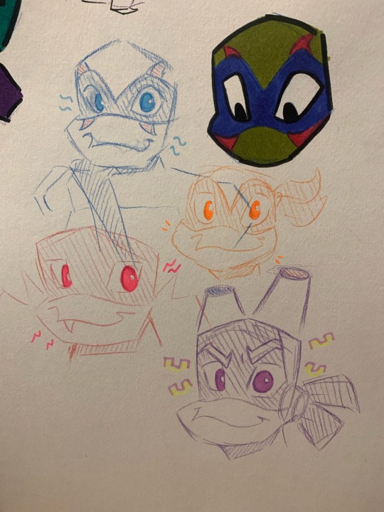
So I may or may not have drawn you guys for the first time (pls ignore the fact I gave Don the two color privilege I DiDn’T hAvE a NeOn PuRpLe ShArPiE sO yeLLoW aNd NoRmAL pUrPlE wErE tHe OnLy OpTiOnS- also yellow and purple are complimentary colors on the color wheel sooo yeah it’s valid XDDD-)
Also should I color Donnie’s brows purple?? I need a second opinion XD
THE TWO COLOR PRIVILEGE DOESN'T MATTER WHEN MY FACE IS FULLY COLORED IN THE SAME IMAGE, IF ANYTHING YOU SHOULD BE APOLOGIZING TO DONNIE~ AND....HMMM NO...I THINK IT LOOKS FINE LIKE THAT? ID TOTALLY SAY DRAW HIM AGAIN AND COLOR IN THE EYEBROWS TO SEE WHAT IT WOULD LOOK LIKE BUT THAT'S PROBABLY ALOT OF WORK...
#rottmnt#rise of the teenage mutant ninja turtles#rottmnt leo#rise leo#unpause rise of the tmnt#rise of the tmnt#rise donnie#rottmnt donnie#disaster twins#leo rottmnt
51 notes
·
View notes
Note
laender's color being green and red being green's opposite (or complimentary) color on the color wheel.. and red being ais & vere's (imo) color... and the color of senobium lights & seaspring... the implications... what do we think.....
Look I know the full game isn't out yet but I will die on the hill that Leander and Ais are foils highlighting different aspects of each other. I love examining the contrasts between them.
I think Leander is heavily associated with earth. His color scheme is green and different shades of brown, overall very earthy and solid colors. The lilies associated with him also support his affiliation with earth. Additionally, this charm on his pendant is the symbol of element earth in Western alchemy.
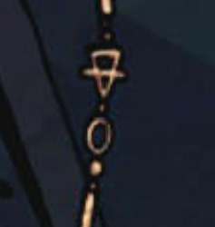
I have always been interested in mythology, so the Ouroboros in his earring also reminds me of the Earth Serpent in Celtic mythology. As you can guess, Earth Serpent symbolizes rebirth and eternity: again, the main themes associated with Leander. Earth overall symbolizes fertility, rebirth, in some cases death, and the life cycle. All of these themes are heavily linked to his characterization.
Whereas the colors associated with Leander are earthy and "solid", Ais's color scheme kinda gives me the feeling of... Floating? Leander reminds me the solidness of earth whereas Ais leaves me with a feeling of drifting in the water; both because of his color scheme and his aloof personality...as if he is always somewhere else inside his head. As if you can't catch a hold of Ais whereas you are firmly aware of Leander's presence. But these are simply the feelings they give me. If we continue with the color scheme and elements, I think Ais is associated with water.
Other than the obvious octopus imagery, the devs said before that Ais's haori reminds them of blood and water:

Blood and stillwater immediately bring Seaspring into mind, a place that is so interwoven with Ais that they are inseparable. Mysterious and ominous liquid that is strangely serene as it is still without any flow or disturbance. And we have what Vere said about Ais: "Still waters... [run deep]." I couldn't find many symbolic aspects in Ais's design as I did with Leander, but I strongly associate him with the Seaspring and the element water overall. I think Ais is stuck. I think he does not know what path he will lead, how he will deal with the creature he has made a pact with & whom he surrendered part of his mind to. During the time period where the story starts; like stillwater in a lake or pond, he simply stands and waits, not knowing where he will flow. The octopus can stand for a lot things; for overcoming difficulties, the dark and mysterious forces, the agility and flexibility one needs to reach safe waters. A lot of things that you can associate with Ais, and the probable ways his path will unfold.
I know this is long but last one thing! Like I said, I love mythology and I find it really amazing that the leitmotifs for Leander are mostly inspired from Celtic/Western mythology whereas the leitmotifs for Ais are inspired from Japanese/Eastern Asian mythology. It really serves to make this story even more rich!
#sorry for being insane abt these 2 dudes#ais#leander#touchstarved#things i'm playing#CANT BELIEVE I FORGOT i think vere is more associated with purple#which is you know. the color of magic nobility luxury and insanity <3
84 notes
·
View notes
Text

Having a normal one about color theory (shoutout @questionthewitness for pointing out some of these connections we are so normal <- lying)
edit: elaboration here!
[I.D. a mixed media chart of the characters from marble hornets placed around a color wheel in their own representative colors. tim in red, brian/hoody in yellow, jay in green and alex in blue while the operator is placed inside the color wheel. multiple lines, labels and arrows connect and point to the characters. tim, hoody and alex all have a red X behind their heads while jay has a yellow circle behind his head, not unlike a halo. a key next to hoody explains the X indicates a primary color and the circle a secondary color. the operator is also labeled with two arrows, the white part of it labeled "absence of color" and the black part "union of color". starting near the top left is a line connecting hoody and tim labeled "analogous: close, but not always together." there is also a small number one net to analogous. at the top right corner are lines connecting tim and alex reading "86: blue becomes red, red becomes blue." the words red and blue have been written in their respective colors. underneath that is lines connecting tim and jay labeled "complimentary: despite being opposites, they match perfectly." a single line points to the orange peeking out from alex's jacket labeled "compliment is stored within the self: isolation". alex and jay also have a line connecting them with a one, referring to the analogous definition. jay also has a singular line pointing to his hoodie labeled "palette also includes red and brown" red and brown being written in their own colors with brown having a small graphic of green and red mixing to create brown above it. finally, a line connecting hoody and alex reads "almost compliments but not quite. however; combining the two is necessary in creating green". green again is written in large green lettering. end I.D.]
#lane speaks#also please PLEASE ask me to elaborate i already have stuff written up for it and i didnt even have room to get into masky's color palette#anyways idk if this holds any specific meaning or genuine implication i just noticed it when looking at the standard outfits the chracters#are most often drawn in and COLOR THEORY MAKE BRAIN GO BRRRR#marble hornets#mh#art#nebulart
47 notes
·
View notes
Note


So I may or may not have drawn you guys for the first timeee
I sent these to Leo and he seemed to like them so I thought, “hey why not try my luck with Donnie too? I mean it’s not like he can end my art career in less than 5 seconds” XDDD
In the colored pencil sketches you got the two color privileges bc I do not have a neon purple sharpie at my disposal, but it’s still valid bc I used neon yellow. And purple and yellow are complimentary colors on the color wheel.
Also pls ignore the fully colored you on the second picture, it’s horrid, I hate it, lo odio, es una basura, es una pOrQuErÍa, it’s trash it’s garbage, what even is that lineart-
(WhydidIuseabrushpenforthelineartgodDAMMIT-)
But yes, this is my offering, hope u like ‘em!! <333
Oh my god. I love this so much - I actually really enjoy how you draw my brothers and I. Very shaped/pos you should draw me in a crown
#rottmnt#rottmnt donnie#rise of the teenage mutant ninja turtles#rise donnie#unpause rise of the tmnt#rise of the tmnt#rottmnt leo#rise leo#disaster twins#save rise of the tmnt#🪻Fanart
40 notes
·
View notes
Note
I love your art so much! Do you have any of your brushes for sale, or any tutorials, especially on colour?
Hi!! Thank you so much! 💕
Honestly, my go-to brushes are all procreate brushes with slight adjustments (like stabilization, etc.) my personal preference is brushes that kind of mimic graphite pencils. The best thing you can do is find a brush that suits you & get very comfortable using it! Specific brushes won’t necessarily improve your work, it’s all about practice! (But yes, a nice brush does help!)
I do have a video on my favourite brushes:
I’ve never really made any tutorials, but I’m happy to try and relay what I know and what I’ve learned so far!
Colours are a big part of illustration! I could probably ramble on for hours, honestly—in any case, it’s always helpful to know fundamentals of colour theory. Once you learn and apply it, it becomes intuitive! I’m gonna stick to RGB colours because CMYK is it’s own thing (printing!)
There’s a handful of basic terms like hue (pure colours), shade (adding black to a colour), tint (adding white to a colour), tone (adding gray to a colour) and also opacity (transparency) that help us understand and define the complexity of colours.

My colour choices are more often than not a gut feeling—but that does come from practice! There’s loads of colour palettes available online like this one, but if you wanna come up with your own, there’s some neat ways to do that using a colour wheel! Colours can broken down into primary, secondary and tertiary colours. We can also categorize them as warm or cold. With this we can make colour schemes!
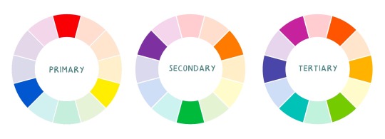
Some basic schemes!
Complimentary: two colours, opposites on the colour wheel
Analogous: three colours side-by-side
Triadic: three colours that form a triangle, evenly spaced
Monochromatic: using one colour (using different shades)
(Bonus) Monochromatic with accent colour : using one colour as a foundation and having an accent colour (similar to analogous, but one colour is used for a majority of the piece while the accent colour is used sparingly)

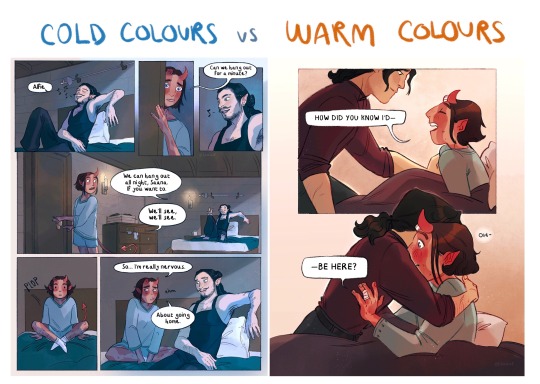
It’s also important to keep in mind that values (a colour’s range from dark to light) will look different on different colours. Sometimes, you’ll put two colours together and think “huh, something about this feels off” and it turns out, the colours just happen to be very close in value and melt together. Switching your piece to grayscale just to check on your values every so often can help with contrast and muddiness! A light tone on a darker tone will look brighter than it really is. Colours can also influence each other and trick your eyes.

Environment is also a big part of choosing your colours for a piece. Determining what the setting is important! A sunset will make a drawing warmer, while a scene set in the night will usually have colder tones. Using only local colours (true colours, like green grass or blue sky) vs non-local colours (atmospheric perspective, accent colors that give depth, etc) can help enhance your drawing too. Don't be afraid of artistic interpretation!
Also, there’s always the option to use gradient maps (at least on procreate & photoshop but I’m sure it’s available in csp and other programs) where you draw in grayscale & apply a gradient map. The gradient map basically applies a color to every value (e.g all the shadows become blue and the highlights become orange) it can look really nice (and help out if colours just aren’t working that day yk)

Another thing, when I’m drawing (and this is specific to me!) I tend to start with pretty desaturated colours. Once my illustration is done, I’ll duplicate & merge my layers to do colour edits. Most programs give you the option to play with curves or colour balance—menus that allow you to play around with the hue of the shadows, midtones and highlights. I tend to make my shadows more cyan-blue, my midtones a little warmer and my highlights warmer as well. Of course, this depends on the mood of the piece, whether it’s warm or cold, lighter or darker, etc!
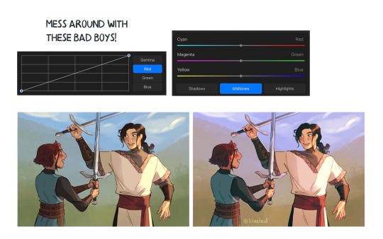
You can always make adjustment layers on top of your work; a low opacity yellow, magenta or blue (or anything your heart desires) overlay to tie all the colours together.
I hope this helps a bit!! Happy to answer more questions to the best of my knowledge :^)
99 notes
·
View notes
Note
So i am so embarrassed to send this in an ask but i really want some tips on outfit design because you’re really good at that! So i have been thinking of a goofy deltarune style adventure for class 78, but the one thing im really stumped on is their outfits. I want them to be very loosely based on their talents, but more over the top and neon

Thing is i kind of suck at designing this stuff (and also i suck at having decent handwriting haha) do you have any tips? For like design and colour schemes? Sorry if this is a lot to ask, i just really want to improve, and you’re really good with character design!!!
Ohhhh!!! No problem!! If you’re going for Deltarune colors, I’d recommend taking their canon color schemes and brightening them/saturating them and building a limited color palette off of that? Danganronpa’s color schemes are very muted in general, so try playing with your color wheel based on what you’re given to make it Neon. ALSO!!! Don’t be afraid to do complimentary colors either, like colors that are opposite from one another i.e. Kris to shake it up a little? Like it would be cool to have an Asahina in blue and pink hues resembling a mermaid of sorts rather than her usual warm colors.
For some design aspects regarding talents and dark world things- since the dark world outfits are sort of “fantasy-ified” versions of the characters everyday vibes, like Susie, a bully-type character being a “barbarian,” keep that in mind too! Like what if Makoto looked a bit more like an Angel (Angel of hope?) and kyoko was a sorceress, but a bit more tailored? Like a trenchcoat maybe? And byakuya with a little silly crown and red robe ? Those are my thoughts!!
One thing I keep in mind while designing characters is “less is more,” and that’s in regards to the number of colors and elements in the outfit/features itself. If you overcomplicate designs, they wind up looking crowded, messy, and they’ll be hard to draw.
I hope this helps!!!
29 notes
·
View notes
Text
GREENS ULTIMATE RIZZ
an essay about green being the most shippable character in AVA/AVM
-green x purple
personally my OTP and most popular ship for green, episode 29 is prime example of this (suportive bf green :0), green and purple are also the first ones to meet purple in episode 9 so.. AND the way green listened to purples family issue like AJHDJAJSJAHSJJA their so undenayably cute, PLUS himbo music guy x prim and proper prince :')
-green x TSC
tbh if purple didnt exist this would be my OTP, they interact so much and have such a nice bond (and tension), their bond is almost yellow x blue level but nah they on top !! also imagine the episode where TSC accidentally killed green (episode 7) hes just like "FUCKKK I KILLED MY HUSBAND" pls i need more content of them :(
-green x blue
similar case with green x TSC, their bond is so cuteeee <3, they also interact a lot- i ship blue with yellow more but im a multishipper and green x blue also cute as hell, their both litterally the first ones to discover the neather in episode 8 and in episode 9 while they almost died, they hugged eachother and awwwwww like just saying- but yeah they cute n stuff
-green x yellow
tbh their not AS shippable as the others but i understand it yk? they have cute moments, if they ship green and yellow its usually cause they make it polly by making it green x blue x yellow (wich is also cute btw :p) still got ultimate rizz tho B)
-green x red
similar case with yellow, they dont interact as much but i understand why people would ship them, not totally OTP material but yk their cute and green and red are litterally complimentary colors (opposite on the color wheel) i ship red with TSC more but yes very cute :D
in conclusion, a green colored stickman got more rizz than you could ever have in the span of your entire life :)
i need to touch grass istg
20 notes
·
View notes
Last Seen Blogs

usdtminer1231
Без названия

sirjustice600-blog
Untitled
singing-out-of-tune
Lazily Coloured Days

smelly-cassettes
mothman exists

106th
Mark "106th" Sundstrom