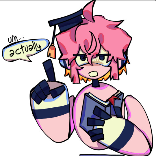
#also its better to have a grey-darker background colour while picking colours
Note
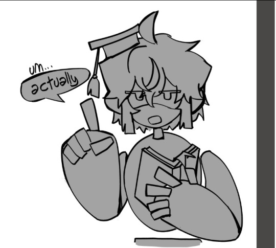
hii sorry if you’ve already answered something like this in the past but how do you shade? ur art is always rendered so nicely and the colors are chosen so well!!
HELLOO THANK YOU! SO let’s start from the basics
when something is white or black you can change that to something else, here’s an example (for black you can just pick any colour and make it darker)

2. if you have space (in the background? idk how you call it) you can put a showy colour

3. colour picking - i tone it down / take the saturation
i dont add lighting unless there's something like glass
separation line cuz its gonna get a bit long
1.
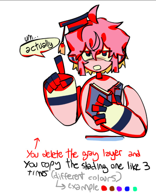
you get your base colours ( i revived my oc for this ) (now after the basics u know where the white, black and [in this case] yellow came from)
2. i hope you know how to use layers
specific art style thing, i dont know what that is
3. if you arent the type of person to stick all the layers of your base colours then CHANGE IT!! for this tutorial
so what you are going to do is create a gray layer, all gray, fill it, the layer has to be on top of the base colour layer
u click that button, it has to look like this
4. you create another layer (above the gray one) (it has to be on the same layer mode with the second button so what you do doesnt go out from the base colors)

then you put your shading, I use red
+ i like to remark around the lineart bc yes
5.
trust me
[extra unnecessary info = a good mix is red + blue, and purple or brown are good on their own (in multiply)]
6.
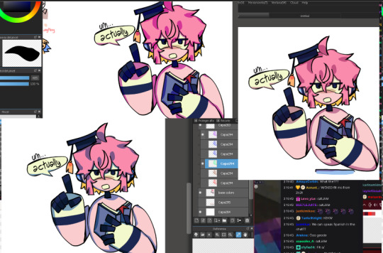
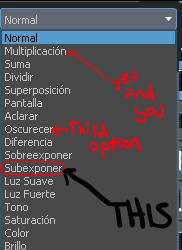
you experiment with the layers, adding or deleting until you like it (i usually dont like if the shading ends up too not-colourful or too heavy) (the modes for these layers are multiply and SUBEXPONER) (I DONT KNOW THE TRANSLATION BUT ITS THIS ONE)
7. once you get what you want you merge the shading layers one per one to the base colour layer, so its all gone, you have all in one layer

8. BORDERS
you make outlines around the shading, in a colour that is more ?saturated? / showy <- you can use these same lines you are doing to just remark what you want (like the speechbubble, bad example but u get it)
in the black color i used (here its darker blue) i didnt use a lighter saturated colour like everywhere else, i used a darker blue
9. SECOND ROUND OF BORDERS
whats the difference between these and the ones from before? in this step your starter color is the base color (in the other you picked from the shading) , you dont go too far to make it outstanding
all of this it makes it more solid
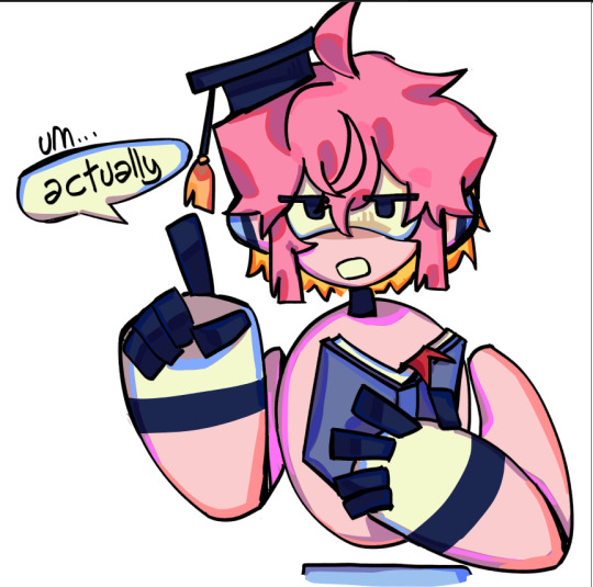
10. AND LAST you colour the lineart (in the same layer mode you used before where what u do doesnt go out of the layer)
very saturated here and i randomly added orange bc reusing colors is cool (since the filling behind the hair was yellow it ended up like this)
edit: i dont like to change much from the outlines, more the inside because i like it when it looks like a sticker
thank u for reading
#art tag#adding in the tags that this is only a way of the many to colour#you can stop at any step#add more#modify anything#i guess what i keep the most is that in the shading there are outlines#also its better to have a grey-darker background colour while picking colours#bc if its white you will be like 'naah these colours are too strong' and you wont dare to try more#tutorial
76 notes
·
View notes
Text
HISTORIC ART STUFF WOO


In true procrastination fashion, I have picked up drawing historical Hetalia in the midst of deadlines- but take some images anyway? I've got another 4 waiting to be finished, but I'm posting these now in the hopes that I'll switch focus to better things before I pick up the remaining images... (hopefully)
If you're interested in my process through creating these, I have more information on my thoughts, references, etc under the cut! :)
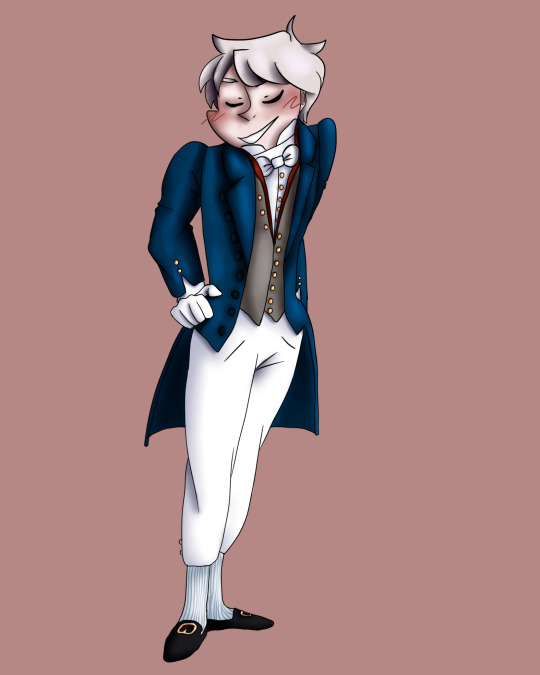
So first (and ironically the most recently completed one): America. I was going to draw this lad in more masculine clothing, but I was flipping through one of my reference books and found a look I thought was absolutely stunning, so ofc I had to use it. My justification is the hc that he crossdressed to hide from British forces/representatives (depsite the image used being dated to the 1710s). Speaking of...

This is taken from a book in the World of Art series by James Laver: "Costume and Fashion". This specific image can be found on page 129 and is captioned (visible at top of image) "Studies of three women, Jean-Antoine Watteau c. 1716-17". The lady on the left has the outfit that caught my eye, while the one in the middle is who I took inspiration from in regards to hairstyle. I found it fascinating to see the differences in fashion between classes- the same basic structures, but the left woman's stays are on full display, held in place by a simple ribbon. And her stays don't show a hint of decoration, unlike many from the time. Certainly not something the other two would be caught dead wearing, but I quite like it.
Since the image has little colour, I was free to play with my own ideas (though I likely would have anyway). Since my excuse was that this is during the revolution, I figured linking back to the American flag would be a neat touch- hence the blue skirt and white ribbon (not exactly the shades used, but I didn't think of that at the time). You might notice that red's missing from the equation, which I decided on due to the famous redcoats of the British army at the time. I thought about using a red-brown for the stays, but I liked the brown I settled on and figured that probably wouldn't have been the most common colour on the cheap anyway. However, the white of the ribbons is ever-so-slightly red, and I used a grey-red colour to shade it. That detail is meant to be rather subtle however, as I imagine America wouldn't have wanted to use anything red as a disguise at the time. The green top might seem a bit out of place following that logic, however I had a different idea when it came to that. Originally I thought of green because of how it worked well with blue and brown, but a recent (ongoing) project involved me researching meaning by the colour, so its association with growth and renewal seemed fitting for the whole revolution plot. Though, it could also like to the green fields and rolling hills you can find in the east coast- the ground on which the revolution was fought.
The background colour isn't so thought out- I just picked one that didn't take away from the main image.
Now next we have Prussia, who's dressed in a formal suit from the 1820s- specifically, 1829- as seen in the reference photo I used:

This is from "A History of Fashion: From Loincloths to Lycra", written by Jacqueline Moray, created and designed by David Salariya- with a small team backing them up. It's incredibly detailed, and each page features small images of people across each time period discussed (one of which I've used for my reference) which helps with variety of dress. I do have to note, however, its lack of poc representation- with figures of any skin colour other than white only displayed in the Ancient Egyptian section and from the 1920s onwards. Furthermore, a crayon-like texture is apparent on darker skin tones- for no apparent reason. I'm not normally one to call attention to limited representation in these sorts of books- it's incredibly frustrating, but I get the thought process of "European/western fashion, European [looking] people" but the fact that they begin to appear after a time and the weird texture is... highly suspect.
But none of that relates to Prussia! This figure (the middle one, in the turquoise coat) can be found on page 24 of the book, and I've taken the outfit practically verbatim- minus some changes in colouring. I kept the shoes, under suit (under under suit?) and socks, with my changes originally going to be a grey/red colour theme... before I remembered that Prussian Blue exists. My whole idea I had going into this drawing was the sort of obnoxious peacocking that feels very on-brand for Prussia, and using a colour literally named after him sounded perfect. I decided to make that the overcoat's main colour, with a smidge of red around the vest collar to contrast it. Apart from that, I kept the grey and detailed with various buttons, primarily gold in colouring (with an exception for the larger ones on the overcoat, which are a darker blue).
Additionally, you may notice that he is blushing in the drawing I've done. There is no special meaning to this, other than that I'd noticed- while browsing images of him in order to reference features- images that appeared to be official/from the manga (I was just scrolling, and so didn't double-check) often depicted him with a bit of blush along the edge of his cheeks. Frankly, that's adorable and I had to include it.
And the last we have is New Zealand- or, my interpretation (one of). As I've stated previously (buried in the tags of an earlier post, good luck finding it) I have always thought of feminine/female, in part due to the lack of such representation in the Hetalia canon. Admittedly, though, my decision is influenced by my own gender identity and a want to relate to the character that represents my country. I alter the appearance of my country from their canon counterpart mainly due to a lack of satisfaction with what there is in canon for Aotearoa (and this is not something that just applies to my country, but it is the strongest in this instance) and the feeling that the character I see for my country doesn't represent the one I know. Though it's important to mention that how I choose to represent my country isn't static- it often changes, and you'll likely not see the same two NZs ever in my art, (unless it's an instance like my oc Kima, who was originally an interpretation of my country but was roped into another project and became individual in her own right. I draw her a lot, and her appearance is static, though I doubt she'll appear often on this blog.)
With that out of the way... I had two main reference images for Aotearoa, both taken from "Dressed: Fashionable Dress in Aotearoa New Zealand 1840 to 1910" by Claire Regnault which, by the way, is the best resource I have ever come across for early NZ fashion, and- while approaching the topic largely from the perspective of colonists- details how both Pākehā and Māori clothing evolved.

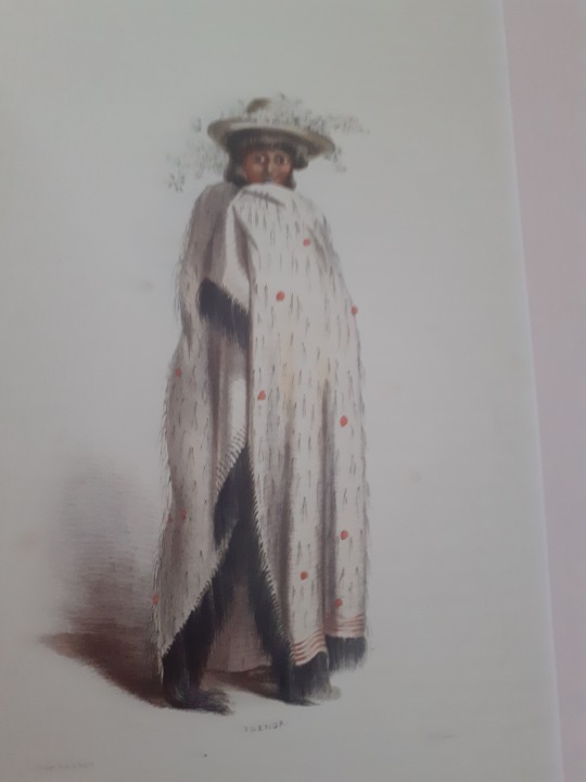
Both are illustrations by George Angus, the former (page 27) is taken from his book "The New Zealanders Illustrated" which covers how Māori dress changed due to colonisation, which was published in 1847. The latter (page 49) is a painting by him of Toenga (a hine of Ngāti Maru), depicting her in a traditional (though, slightly modernised) harakeke kākahu (flax cloak) as well as a European-style hat he describes as very fashionable among the Māori women of Auckland at the time. While I haven't incorporated the hat into my illustration, I have taken the cloak and red balls of fabric used- a detail Māori weavers began to incorporate upon trade with Europeans- though not the further red lines, since I have limited experience with illustrating this sort of garment. I've taken inspiration from Toenga's pose as well, particularly with how she holds her kākahu to slightly disguise her face (though NZ barely does). As for the other reference, I focused mostly on the hair textures and skin tones depicted to gain an idea of what I wanted this NZ to look like. While Māori hair remains most commonly black or very dark in colour (in my personal experience), I went for a very clear brown tone to call into her Pākehā links. I also initially went for a darker skin tone, but ended up choosing a lighter one for this reason. I additionally considered making her eye colour more noticeably European (e.g. blue, green) instead of brown, but ultimately decided against it, limiting myself to a lighter brown colour. At this point in her history I headcanon her as being primarily linked with her indigenous population, but she isn't absent of European heritage. As colonists begin to take more from her, I can see her becoming more westernised- but that is not yet something she has largely faced (key word being largely).
For similar reasons, I wanted her to have a tā moko tattoo. I am no expert in this art- my knowledge is limited primarily to the placing of the tā moko on the body in different instances and some of the common patterns- so I also sought out a reference for this. I used the book "Tangata Whenua: An Illustrated History" by Atholl Anderson, Judith Binney, and Aroha Harris. It is a goldmine of Māori history (as the title may suggest) and features many depictions of Māori people and events- this time from a primarily Māori perspective. The individual whose moko I referenced is pictured on the front cover, but is discussed in more detail on page 483:

Since I've taken taken my depiction from an actual person's moko, I cannot apply any special meaning relative to NZ apart from the cultural significance of the tattoo: the passage into adulthood, traditionally, though it can differ in the modern age. Internally, I warred with myself over distancing the design I have used from my reference more- after all, every moko is unique to the individual and the last thing I want to do is step on someone's cultural identity- but I am hesitant to do so. I am not greatly knowledgeable about tā moko and I can't help but feel as though I may be making a greater misstep in altering the design myself.
I did, initally, have another image to add here- I'd drawn an image of Canada in the following outfit (page 21 of the same book I referenced for Prussia):

But I wasn't fond (at all) of the pose I used upon finishing it, nor my attempts at the intricate detailing. But if you're interested, the idea behind the image was a bit different to the others. This is the sort of suit a French nobleman might wear in the 1790s- quite a while after Canada became British territory, though I'd been interested in the thought of him looking quite out of place dressed so fancily. So my idea ended up being France (kidnapping him?) deciding to loop Canada into a day of "nostalgia", bringing out old outfits and convincing his old colony to put one of them on. As such, I added a few more modern details to hint at this reality- painted fingernails, for one, and Canada's hair wasn't a wig, but his own styled in a small ponytail (with the ribbon). I may redo it eventually seeing as I was fond of the premise, but I had another idea for a Canada image that will be released whenever I finish the second set. This one was originally a vague notion of Nyo!Canada (her design is adorable) but I wanted this one to draw more from Inuit roots, and so her design will reflect that. Not really recognisable as canon Canada, but a Canada nonetheless.
Apart from that Canada, the other designs I have sketched but on hold are the following:
France, in the clothes of a Norman nobleman from the 1150s- looking slightly older than the young France depicted in Hetalia canon but with a noticeably innocent expression
Germany, looking very unimpressed in a wedding dress dated to 1878 (modern Germany, old wedding dress)
A joint depiction of Nyo!North Italy and Nyo!Germany with slight GerIta, which can be dated to sometime from 1910 to the 1920s, though more likely the 20s than the 10s (look, I had two dresses slightly different time periods, and an idea)
And if you've made it this far through my very long-winded explanation about these drawings that each hold a little bit of my soul, I applaud you and am very (very) thankful. Please feel open to discuss further with if you'd like- I value every second you spend entertaining my thoughts :))
#hws america#crossdressing because the king deserves it#hws prussia#hws new zealand#hws aotearoa#uhh the time periods are ambiguous 1700s 1820s and 1840s ish
4 notes
·
View notes
Note
hii !! if u dont mind me asking, ive FINALLY gotten to a point where i've gotten a hang of like posing again after def losing it for a while but i'm fr the worst with anything post line art, if u have any tips on how to choose colours or anything in that vein i'd literally kill for it 💖💖 tysm regardless, i hope u have a fantastic day/night!
Hi! Thanks for the ask! I'm not an expert but most general thing is that you pick a base colour or even just "warm" or "cold' and for every other colour you choose, inch it a little bit closer to the base on the wheel. I'll use the most basic pic I have. The base here is red/pink which are the same colour:

In game that harness of his is more brown-grey but it's purple maroon here because that's closer to pink. I also use different hues for shading, and my personal preference for shading skin light-to-mid-toned skin is to use brighter oranges or reds when possible, but that's because I'm pulling colour influences from old anime. For darker skin I usually not make the shadow the most saturated part because then I would choose to make their base tone the strong one, but that's just me and I don't know if there's any colour theory behind it.
At that -- good idea to study from the colour usage you enjoy, pick colours if you want to! Putting them against a plain background can show you what they actually are because in full compositions it can be hard to tell what an inspiration is actually using.
If I just chose literal colours, that pic might look like this:

The pink is pink, the browns are browns are brown, the green is green. But I like it better if the pink and browns are redder and orange and the green is a little yellow. So a lot of it ends up being about when to turn colours into other colours. If you struggle with this, check if your program of choice has a gradient map function. I know CSP does. I'll use those on overlay to bring out colours stronger.
Uhhh other examples
This one pic, the shadows ended up yellow instead, because there was a ton of red all over it and I didn't want the skin shadows to blend into it. It's also another old anime styling though. Colour's as much style as anything else so part of it is just trying things until you find a way that you like.

This one was fun because the whites are pink, kinda late night love hotel lighting, but I was struggling for those shadow colours. Ended up on green because it just looks kind of sickly, but that was the point for this piece. Also sometimes outlining shadows in a more saturated, darker colour is a good way to get more variation out of it but as you can see I'm very haphazard with that.
To be transparent though, sometimes I don't go in with that in mind and I put down all my general colours first and then re-do them into fun colours. Largely through paint bucket and tone curves because I am a lazy lazy man. Here was the original:

The other thing is there's colour combinations that generally just sit together nicer, primary secondary tertiary but also a thing I like to do is one colour, its neighbours, and then a complement. Say, red and purple and pink are neighbours, green is the opposite which I'd use sparingly. The complement can have a few neighbours too.
It's hard to explain any of this because I just fiddle around until I think things look right, more instinctually than on purpose. I'd be down to offer colour suggestions personally if you really wanted to dm me though.
10 notes
·
View notes
Photo

A/N: For the @juminxvzine! This is one of those stories where I had the perfect image for it in my mind, but somehow it was difficult to get it down on paper.
…
…
…
…
“The great Jumin, folding clothes.” Jihyun chuckled, his shoulders shaking. “I never thought I’d see the day.” He paused, before smiling self-depreciating. “In a sense.”
In a sense was the only way to put it. Jumin watched from the corner of his eye as Jihyun folded his pants, his hands blindly groping beside him until he found a new piece. By now the blindness was permanent, according to every doctor they’d visited. And some that he’d seen on his own, privately, without Jihyun’s knowledge. There were some things that couldn’t be fixed.
That smile had better not be one of them. Coolly, Jumin slowly folded a shirt. “I do take care of my own laundry on occasion.” And that was only partially a lie—this was the only occasion he’d do this. On his right were carefully written instructions, a diagram on how to fold every piece of clothing imaginable, and perhaps he should see to giving Jaehee a raise.
“Somehow, I find that hard to believe.” Jihyun pressed the pads of his fingers into his tan shirt, his eyes closed. In the background, they could hear the sounds of hammers banging, of contractors walking the length of Jumin’s apartment. “You did not have to do this.”
“It is just folding.” Jumin pressed the shirt sleeve down firmly, smoothing out any wrinkles. “It is actually calming.”
“Not just sorting my clothing—the renovations.” Jihyun gestured at the room around him, the room that still smelled of fresh paint. The walls were a bright yellow now, a colour Jumin had never known he’d detested until he was surrounded by it. “The lights, carpeting, everything. You didn’t have to do this. I do have my own place, you know.”
“That ‘place’ is ill-equipped to handle you.” Jumin snorted derisively, thinking of that small house with its cluttered rooms. He’d been against it when Jihyun bought it and if there was one good thing to all of this, it was that he’d finally managed to pry him out of it. “The location is also too remote.”
“Perhaps.” Jihyun neatly folded his pants in half, setting it on the growing stack beside him. “Either way, thanks.”
“You don’t need to thank me,” Jumin dismissed with a shake of his head. “That’s not why I did it.”
“Nevertheless, thanks.” Jihyun paused. “And thank Jahee for me as well.”
“…I will.”
-x-
Change was inevitable. Jihyun knew that. He had known that for years—there was a reason he loved the camera. Photography was an art of preserving things as they were, of capturing a moment of time and immortalizing it.
Opening a drawer, he rifled through the shirts neatly pressed and stacked inside. There were small safety pins attached to each one: one symbolized grey, two green, three white. A code he had memorized as they attached pin after pin. Picking up a white one, he pressed it to his nose and inhaled. There was the faintest trace of lavender, of sunlight, a scent that he had long associated with Rika. Her fingerprints were all over his things, her memories connected to even the most innocent objects.
Yet, almost overpowering her scent, was a darker, muskier scent. An aroma tinged with the faintest traces of cat food. A smell that permeated the rest of the apartment and Jihyun wouldn’t be surprised if he found it on himself at this point.
Change was inevitable. For once, he found himself looking forward to what this change would bring.
-x-
Jumin was not one to repeat himself. Things only needed to be articulated once and either the other person heard it, or they didn’t. To repeat oneself was uncouth. Yet, staring at the camera in his hands, his jaw fell slack and he couldn’t help his reaction. “You want me to do what?”
“Sell it.” Jihyun brushed his hand on the top of the camera reverently. There was a hint of sadness, of apology, in his lowered eyes, his turned down lips. His finger stopped on the button, pressing it down one last time. “Donate it. As long as it finds a good home, that is all I can ask.”
“Your camera.” Still dumbfounded, Jumin tightened his grip on the device. Its edges felt harder than he remembered.
“My camera,” Jihyun confirmed, stepping back now. He clasped his hands behind his back, his head slightly bowed. “I…I can no longer use it, after all.”
“That…” Jumin paused, processing it all. There was no refuting his words, no denying it. It was a fact and he should have remembered it by now. “That is true.” He held the camera awkwardly. “What will you do now?”
No, that wasn’t what he wanted to ask. Jumin could only remember Jihyun with his camera, with his eye in the viewfinder and his head in the clouds. When they were ten, with a gap-toothed grin as he clumsy took shot after shot. When they were fifteen and he was experimenting with polaroid and filters. At twenty-one and he was nervously setting up his first exhibition. That was Jihyun.
Who will you be now? were the words he’d wanted to ask. Who was Jihyun without his photos, who would point out the smallest flowers when they walked or the colours of every sunset. And if Jihyun wouldn’t be the same, if Jihyun would turn into a stranger, then what was Jumin’s place with this changed man?
It unsettled him. It scared him.
Jumin could only nod as Jihyun replied, tightening his grip on the camera until he left his imprint.
-x-
It was night. Of that much, Jihyun was certain. The big window in his room had the blinds permanently up and during the day sunlight would filter in, warm and comforting. While he was blind, Jihyun could still see some shapes, large grey blobs that he could now identify as Jumin and his furniture. Now, though, the shades of grey decreased into an almost uniform mass. The lights were off, then. Jumin must be asleep.
Quietly, he stepped outside of his room. At his feet, a plush carpet indicated the path toward the other rooms and Jihyun pressed his hand on the wall as he followed it. Passing by Jumin’s room, he could hear him breathing softly, steadily. A slight whistle as he breathed in through his nose. A low snore as he exhaled. Jihyun regretted losing his sight. An unguarded Jumin; he wanted to see it, to drink it in. To capture it with his camera.
Automatically, his feet led him to the spare room, to the art station that Jumin had set up for him. What he couldn’t see, he’d draw. His fingers dipped into the cold paints, not even bothering with the paint brush, and he smeared black across the white canvas. The paint settled in chunks, small bumps of paint that he smoothened down in places. Next was white, then blue. Colour after colour was layered on the canvas and by the time he stopped, he wasn’t sure how long he’d been sitting there.
A small chime shook him out of his revere. Seconds after, Elizabeth the Third jumped onto his lap, the bell ringing softly as she settled on him. Jumin had bought it three days after Jihyun had moved in and exactly one second after Jihyun had accidentally stepped on her tail.
“Elizabeth the Third,” Jihyun murmured as she leaned on his belly. “What do you think? Does it look like your master?”
She purred in response and he hoped it was a yes.
-x-
“Ah.” Jihyun took a delicate sip from his wine glass, his eyes closing reflexively out of delight. “It’s been a while since we came here.”
Jumin leaned back in his seat, turning slightly to take in the view. This restaurant used to be a favourite of theirs, somewhere they’d meet at least once a month. Situated next to a picturesque river, the restaurant served only the finest wines and the freshest fish. All three of them would order different meals, with Rika stealing—
Jumin didn’t want to finish the thought. The memory. There were too many things here linked to her, too many memories made here, and he was suddenly reminded of why they’d stopped coming in the first place. His anger toward her was raw, palpable, and that wasn’t why he was here tonight.
No, tonight they were just here to enjoy a meal at a favourite place and celebrate Elizabeth the Third’s modeling debut. Picking up his own glass, he swirled it. “It has been almost too long since we came here.” He brought the glass to his nose, inhaling the delectable scent. “The house brand’s quality remains the same.”
“Is that the only compliment you can give? Indirect ones?” In a good mood, Jihyun laced his fingers and rested his chin on it. There was a light flush on his cheeks. He closed his eyes. “They changed the band.”
Jumin turned to the stage. Four women sat on the stage, all of them carrying a different stringed instrument. “It’s a four-string quartet now.” He listened for a moment, paying attention. “They are better than the group they had before.”
“I don’t know, I liked the other group. Their music was cheerful. Even Ri—” Jihyun cut himself off, his eyes lowered.
Something boiled in Jumin, something dark and ugly. Would her memory ever not hurt? Before he could say anything, a waiter approached, his footsteps barely audible over the music. “Here you are, sirs.” The waiter handed out a menu to each of them before standing back, notepad in hand.
It took Jumin all of five seconds to realize the menu wasn’t in braille. A sixth second to turn to the waiter. Jihyun’s hand covered his in the seventh, his voice calm and collected as he held out the menu. “The bibimbap.”
Jumin stared down at their connected hands. The coolness of Jihyun’s hand did little to calm his rage. His blood felt hot, almost ready to explode. Clenching his teeth, he spit out, “The same.”
Maybe the waiter felt his fury, because he scrambled away without even confirming their orders. Another black mark against him. Jihyun stroked the side of Jumin’s wrist, his voice low and comforting. “Jumin? Are you okay?”
Yes. No. All he had was this white hot anger, this dark and murky thing that coiled inside of him. He didn’t know who he wanted to direct it at. The waiter for not bringing the right menu. Rika for all that she did, all that she said. Himself for not noticing in time.
At Jihyun, for nothing saying anything.
“Yes.” Jumin restrained himself, forcing a smile Jihyun couldn’t see.
-x-
Jihyun could smell alcohol the second the door opened. Strong, repugnant, it permeated through the air, and he scrambled to his feet and toward the door. It was strange how familiar this apartment had become, how well he knew the carpeted paths and where they’d take him. Within minutes, he was at the door, just in time to hear it slam shut.
“Jihyun?” Jumin warbled. There was a soft thud as something hit the wall. No, someone.
“Jumin?” Groping blindly in front of him, Jihyun felt Jumin’s arm. Then his shoulder. Then the rest of him as Jumin leaned heavily on him. Startled, he took a step back, adjusting to the new weight. “How much did you drink?”
“A litttle,” Jumin slurred. This was a complete novelty; Jumin almost never got drunk. The rare times he did, it wasn’t stumbling drunk.
“More than a little,” Jihyun sighed, wrapping Jumin’s arm around his shoulders. Slowly, he dragged him toward his bed, a process easier said than done. It would have been easier if Jumin had just been a deadweight. Instead, he tried to help, stumbling from one side to the other, threatening to pull Jihyun off the carpet and into a lost, unknown area.
“I’m shorry,” Jumin mumbled into his neck, sending a shiver down Jihyun’s spine. This close, Jihyun could almost feel his lips as he shaped the words, feel his voice more than hear it. “I’m shorry.”
“It’s fine, don’t get this drunk again.” It was impossible to lean away and still keep his grip on Jumin. He settled for craning his neck slightly away. However awkward it felt, it didn’t unnerve him as much as Jumin’s proximity.
“No, nott that.” Jumin shook his head, his hair brushing against Jihyun’s skin. “I…I couldn’t shave you. Shave your eyes.”
Jihyun almost dropped him then and there. Stopping, he turned to look at Jumin, but even this close he couldn’t make out his expression. Maybe if he touched his face, but he couldn’t do that and still hold onto him. “What?” he uttered softly.
“I should have shtopped Rika.” Jumin wasn’t crying but it felt like it. “Should have shtopped you. I’m shorry.”
“It’s not.” He faltered—was this what’d been bothering Jumin recently? This guilt? These bottled up feelings? “It’s not your fault.”
“I’m shorry,” Jumin repeated, a never-ending apology that continued long after Jihyun put him to bed.
-x-
“Jumin.” In the spare-bedroom-come-studio, Jihyun patted on the second chair he’d set up. While Jumin hadn’t remembered a thing the next day, he had. And had taken a week to think about it all, to think about his response. “Could you sit here?”
Without questioning him, Jumin padded toward the chair. “This feels familiar.” He sat down with a soft swish. “It’s been a long time since you used me as a model.”
“That’s because it’s been a long time since you were free enough to do it.” Jihyun couldn’t help the chuckle at the memories—Jumin had been his first model. He’d spent years photographing him. Holding out his hands, he asked, “Can I feel your face?”
“Yes.”
Jumin guided his hands towards his face and hesitantly, Jihyun pressed the pads of his fingers against Jumin’s cheeks. High cheekbones, a strong jaw, lips in a set line. All of it as usual. He brushed Jumin’s skin with his thumb, feeling the small rough patches in an otherwise perfectly smooth skin. There was nothing Jihyun was gaining through this; he had known this face since they were elementary kids. Even blind, he could draw it perfectly.
This was the face of someone who’d been there for him, through thick and thin. Someone who had tried to reach out, no matter what response he’d gotten back. Somewhere along the way, Jihyun had forgotten that. What their friendship had meant. What their relationship was. The bond between them that was stronger than anything and he had been so determined to do it on his own.
“I’m sorry,” Jihyun murmured, feeling the muscles on Jumin’s face shift as his expression changed. A knitted brow. Firmer lips. Displeasure radiated from every pore.
“For what?”
For not believing in him. For not telling the truth. For many things, really. But Jihyun wasn’t drunk enough to say it all and Jumin wasn’t drunk enough to hear it and instead he shook his head. “What happened with Rika wasn’t your fault.”
“I know that,” Jumin answered bluntly, his brow furrowing even more.
“And what happened with me wasn’t your fault,” Jihyun continued.
At that, Jumin fell silent.
“It wasn’t,” Jihyun repeated, keeping his grip firm on Jumin’s face. “It wasn’t your fault, so don’t blame yourself. Not when you’ve done so much for me. I’m sorry for…I’m sorry that you…” I’m sorry wasn’t the right word and he stumbled slightly, trying to figure out what to say. Jumin’s warmth radiated through his hands, a warmth he had almost forgotten, and he was not sure what happened but an electric shock ran through him. Leaning forward, he kissed Jumin firmly and pulled back. “I love you. So don’t…don’t…”
For a moment, Jumin froze, and Jihyun realized what he’d done. Oh no. Oh no oh no oh no. Before he could retract his hands, Jumin’s were covering his, his head turning slightly so he could kiss Jihyun’s palms. “Is it true?” he asked, his voice low.
“It is. It always has been.” As friends first. As lovers now. A change, but change wasn’t bad, not always. And as Jumin pulled him close, Jihyun wondered just what this change would bring.
45 notes
·
View notes
Text
Discover what colours fit in your home...
Use of colour provides the designer a massive range of possibilities to apply his innovative fantasy. Whatever is the size of your flat, it can be visually boosted with the help of colour setting. All the richness and range of tints can be offered the seven colours of the standard spectrum that adhere to each other.
Red, orange, yellow, environment-friendly, blue, dark blue, violet are colourful colours. White, grey as well as black are achromatic, i.e. colourless.
Every colour causes particular associations, and also preference for a certain colour is constantly individual and also depends on characteristic attributes of the personality. It is widely known that there is no accounting for preferences. Some people have extremely developed colour assumption, others don't. You have to have taken note of the reality that some colours or their combinations are visually calming and also set one's mind to remainder, some convey the sensation of joy, some cause nearly physical discomfort as well as others have a disappointing impact. Of course, when you select the colours of the setting, it is best to consult a developer.
When you select the colour setting of this or that room of your home, you require to take right into the account different factors: if the home windows deal with the north, it is better to choose cozy colours, if it is the southern, then cool colours will certainly be appropriate. Other elements are the quality of lights since the colour shows the light, and also the type of zone (whether it is a cooking area or a drawing-room, a kids's space or a research). Saturated, bright colours are the most ideal for the setting of a drawing area or a dining room.
White as well as blue (associated with cleanliness and also water) are good for the shower room, but are not ideal for a kitchen; for an attracting area and also a cooking area you 'd much better pick yellow or orange colours, cozy as well as soft colours of red as well as white. Besides do not forget about the criteria of the space intense wall surfaces aesthetically decrease the quantity of room, while dark ones increase it. For instance, red, orange and also yellow can help make a huge room with little furniture look smaller sized and extra comfortable. When you pick the wall surface colour, keep in mind that furnishings, soft furnishings and drapes are to be attuned to the walls. If furnishings upholstery, covering on the trestle-bed and drapes are formed, it is much better to make walls plain. Mix of colours is to be come close to attentively, do not depend on opportunity. For example, it is better not to integrate red as well as green, due to the fact that it is difficult to regard this mix, especially if these colours are given up equal percentages. Brilliant yellow can be a great history for any colour (in China collections of porcelain were constantly exhibited versus a yellow background). Pattern looks well on a yellow wall surface. Eco-friendly poorly matches all colours, besides numerous colours of the very same colour.
Many peoples link red with wide range, high-end and also beauty. It is perceived as a sign of enjoyment, loud communication, hassle. Well-matched colours of red appearance well in the hall, kitchen area, youngsters's area, drawing-room. If the space is set in cool tones, "patches" of red will make it a lot more comfy. Click here to view more.
Orange is connected with the golden orange. And also this implies warmth, vivacity, delight. The interior of a cool northern space can be embedded in orange tones.
Yellow is a really "cozy" colour. If your space is located on the northern side, a wealth of yellow in the inside will certainly produce the perception that your areas are "pleasant", warm, even if as a matter of fact, sun rays are unusual visitors in your house. Psychologists think that yellow is suitable for people that have an energetic walk of life and can conveniently adjust to any setting. At the same time, yellow can irritate, every little thing relies on a certain colour.
Environment-friendly is thought about to have a calming impact and also be good both for eyes and soul. Most likely, it takes place, since this colour is the closest to nature. Certainly, the canvases of old painters, where eco-friendly colours predominate, "heal" the spirits. Green is also considered to be the colour of traditionalists, maybe since it was favoured in Victorian England. Environment-friendly looks good in the interiors of big and also light rooms. In the setup of the workplace, we recommend that you utilise dark colours of dark blue and also eco-friendly. Numerous tints of dark blue reason different feelings. Blue is the colour of the sky, room, air, liberty. Deep blue communicates a feeling of calmness.
Navy-blue casts sorrow, some peoples consider it to be the colour of mourning. Psycho therapists advise making use of dark blue for a room. Some people are extremely fond of violent, others despise it. Violet is thought to be a "magic" colour - undoubtedly, it hides some enigma. Perhaps, the colour of the night skies causes such associations? Artists think that violet has something uncomfortable and depressing in it. It is better to make use of light colours of violet in living quarters, as deep and also brilliant tints of violet bring about tiredness.
Grey is the "global" colour, it harmonises with almost all other colours. Maybe, it is the favourite colour of developers, as it has lots of colours and also is an ideal background. It is tranquil and also neutral, nevertheless, it is better to use it in combination with other colours, since sole grey can seem boring.
Finally, black and white. 2 posts, 2 deeply symbolic colours, 2 extremes, but when integrated, they emphasise and also colour in each other, as well as therefore create intricate classics. Both colours are classy, "global" and never ever head out of fashion. We can say that they are past fashion.
Black marvellously tones in any type of colour as well as makes it much more expressive. A verandah or a hall, if they are well-lit, can be completed with radiating marble panels. Black appears to diffuse the boundaries of the area. In a shower room, you can utilise black mirror-like floor tiles. However take into the account that black soaks up light; abundance of black is feasible, only when there is plenty of illumination.
Everybody likes white, it is the colour of freshness, cleanness, coolness, related to happiness and health. White is indispensable in tiny poorly-lit areas. In a shower room with no daylight, white tiled wall surfaces will certainly reflect the light of the light, enhance the illuminance of the room as well as visually "draw apart" the wall surfaces.
Of course, there is an excellent selection of all conceivable colour tints. Of greatest importance is your wish to find that really combination that represents your vision of the indoor setup. If the colour is rightly selected, it can highlight the benefit and conceal the flaw. Release your dream. Keep in mind regarding colour properties, when you pick the setup. We have actually currently mentioned that it is needed to take into the account place of the room when it come to cardinal factors. If the area deals with the south, chilly colours can predominate in the setup; if it is the north, select warmer colours. Calm reserved colours are an excellent history for valuable and costly things. For example, strong furnishings and also a gorgeous photo will look terrific against a light grey background. The colour of the wall surfaces must always match the colour of the furniture upholstery and flooring covering.
In the cooking area, it is much better to make use of light tones of walls in combination with light furnishings. If you want contrast, it can be developed by bright crockery on the shelves, brilliant curtains, a pattern.
A bathroom, lit by just electric illumination, looks best in bright tones. It is advised to make use of white, pastel, light colours of yellow, environment-friendly, blue as well as pink. Sanitary design pipes as well as joints are to repaint the same colour. In entrance halls, hallways as well as halls you can utilise contrasting colours for wall surface finishing. The ceiling can be "attracted down" if its colour is numerous tints darker than wall surfaces. You can make use of wallpapers with horizontal red stripes. The same effect can be reached if the ceiling and the 30-40 centimetres of adjacent wall surface area are covered with lighter paint.
The ceiling can be "raised" if it is repainted white, better with a light blue tint. You can additionally repaint or paper the walls as much as the ceiling without slats if horizontal stripes of warm colours control the wallpaper pattern.
Saturated cozy and dark tones or wallpapers with huge pattern contribute to visual reduction of huge spaces. If the room is long as well as narrow, it is better to paint longitudinal walls in lighter tones, and cross-walls in darker tones. Then the room will certainly appear shorter and also reduced. It is effective if one wall surface has a different colour. A small space can be visually increased, making use of light, however cool colours. Light environment-friendly, silver-grey and also light blue will visually expand the space. In small rooms, it is undesirable to have dark furniture, dark curtains and carpetings with dark tints. It is much better to repaint the doors in light tones white, light grey as well as cream colour. Floor with a light colour looks more enjoyable than a dark one. So, make your selection. Find out more at: https://www.furniturestore247.co.uk
2 notes
·
View notes
Text
Don’t leave me- RxRxB
Another Roger x Ben x reader fic I came up with that is based on the idea for one of my other Roger fics.
A lot of fluff and angst.
Enjoy.
Part 2 Part 3 Part 4 Part 5
~~~~~~~~~~~~~~~~~~~~~
Rubbing his hand up and down (Y/N)'s arm Ben looked down at her as she rested her head back on his chest as she was sitting between his legs, the pair waiting for the drummer to come back home. The tv was blaring on in the background but neither seemed to be paying attention. Leaning down Ben pressed his lips to the top of her head, seeing her try and force a smile as she closed her eyes, not looking any better than before making his nerves interlock. It felt odd for them both to have a day off together but not have Roger home with them too, it almost seemed wrong. Ben had managed to get a day off of set and (Y/N) wasn't currently working due to being ill but Roger was down at the studio working on a new album with the boys that took up a lot of time but neither minded. It was his job and he loved what he did, who would they be to stop him?
The pair were rather thankful that Roger was at the studio because it meant he was out of the public eye for a while which came as a relief. A relationship with three people was a recipe for gossip and Roger was very hot-headed. One rude comment and he flipped his lid, which is exactly what had happened last week. The three of them had been seen with the band after leaving the studio and a reporter just couldn't help but start to ask questions and make some rather rude suggestions about (Y/N) which no one took kindly. The man had been standing just a little too close to them for Roger's liking, seeing him as a threat and with him so close the drummer couldn't help but lunge. Landing a successful fist to the nose, breaking the reporter's nose leading to others nearby capturing the moment as Brian and Ben had to restrain the drummer from causing any more damage.
Roger couldn't have been more happy that the band were so accepting of his relationship that he had kept from them for quite a while. First wanting to keep his private life to himself even though the band were basically another family to him. Then fretting that they wouldn't understand or accept his way of life and he didn't want to fight or argue with the band over something that wasn't their music. After finally telling them he was surprised that they took the news well, Freddie was delighted and wanted to meet (Y/N) and Ben straight away, John didn't seem that fazed, not saying much but then again that was John to a T. Brian wasn't unhappy or against it, but he had been a little skeptic at first because he knew Roger's reputation and way of life, knowing if he did cheat this time he would be breaking more than one heart. But seeing how Roger was with his significant others showed Brian that maybe, this time it would be alright.
As if on cue the front door sounded, Ben's head turning slightly to the left as he watched his boyfriend enter the apartment the three of them shared, looking rather tired but happy nonetheless. Throwing his keys into the dish on the shelf they had near to the door before kicking off his shoes and walking through to find the pair in the living room.
A signature smirk was plastered on the drummer's face as he laid himself gently ontop of (Y/N), leaning to press his lips to her lips before pushing himself onto his elbows when Ben looked over expectingly. Their lips meeting sweetly before Roger looked back down to (Y/N) who was laid happily between them though she hadn't bothered to open her eyes. Leaning his head to the side Roger raised an eyebrow at the other man, silently questioning if she was alright as he rested his weight onto his left arm, his right hand moving up and caressing the side of her face gently. Earning a smile as she leaned and kissed the palm of his hand though he didn't smile back at feeling how warm her skin was against his own. He knew she had taken the day off due to not feeling herself but he didn't think she had been this bad when he left earlier.
"She's been worse today." Ben stated, the worry clear in his tone earning the same kind of look from Roger. Studying her features closer he realised that her skin was rather pale and possibly grey in colour rather than its usual cream with a pink tinge. Even her lips had lost their blushing red, her eyes opening to meet his worried ones as he watched her take a moment or two to focus on him properly.
"Maybe we should take a trip to the doctors." Ben gave Roger a certain look, both knowing the drummer's suggestion wouldn't be agreed with by (Y/N). Knowing the attention they would get if they went to the hospital which they couldn't deal with right now with the rumours already going around, if the media found out the three of them were expecting a baby together they would have a field trip none of them wanted. There was also the fact that (Y/N) had something against hospitals. Having spent too much time in them during childhood and having bad memories. They couldn't blame her for her fear but at the same time they would both carry her there if it meant she would be alright or if she was in a worse shape.
"M'fine, just feel sick." Her lips pressed to Rogers before she closed her eyes not being able to open them anymore. Moving his hand from resting on her arm Ben rubbed Roger's shoulder, head cocking in the direction of the bedroom suggesting they would be more comfy there rather than all squishing together on the sofa.
"Come on baby, bed an then we can grab food later." Roger stated as he got to his feet, hands reaching out and grasping her own gently pulling her to her feet as Ben's hands gently held her hips for added precaution. Both men watching her before stopping after only a few paces when they saw how she was walking. Her body doubled over like a coil was pulling her inwards as she clearly couldn't walk. Knowing his suggestion of hospital would simply be ignored a second time, Roger wrapped an arm around her lower back and the other around her legs. Picking her up with ease allowing her legs to hook around his torso, her head falling to his shoulder muffling a whimper of pain as Ben chewed on his lower lip. If she got any worse they would have to take her to the hospital even if she didn't want to.
Following Roger as he slowly walked into the bedroom, leaving the curtains half closed so small slithers of sunlight could creep in and light up the room for them just enough so they could see but still sleep peacefully enough. Roger sat (Y/N) down in the middle of the bed before laying and stretching his arm out across the pillows as (Y/N) laid on her side, her head and arm resting over his chest as Ben climbed in the other side. Pressing his chest up to her back and laying his head in the crook of her neck and shoulder, lips gently pressing to the skin as Roger moved his arm enough so his hand was resting on Ben's back. Reaching out with his free hand Roger switched the radio on, turning it down low enough so that they could sleep with it there as background noise.
Roger hummed along to a few tunes that he knew when they popped up, eyes closing as he leaned back into the pillows, feeling (Y/N)'s breathing already evening out as she nuzzled into his side. Ben not far behind as he moved so his head was against the other pillow, face pressed into her neck as he was practically laying on his stomach.
Opening his eyes Ben took a moment to adjust to the change in light, seeing the room had gotten darker with a few orange streaks of light creeping through the curtains. His head moving to glance at his two lovers, seeing the pair of them were spark out as the radio was still humming away. Keeping his arm around (Y/N) he went to pull her closer, tensing when he realised she was trembling, most likely the reason he had suddenly woken up. Leaning over he propped himself up on his elbow as he moved his hand to press to her forehead, realising she must have a fever as she was trembling as if she were cold. Her body absentmindedly pressing into Roger's trying to steal his body heat making Ben wonder how he hadn't woken up yet.
"Rog, Rog!" He hissed, pushing the drummer's shoulder hastily to try and bring him out of his drowsed state when he began to blink awake. He reached out and swatted the hand away that had woken him from his slumber, eyes narrowing when he now felt the shaking at his side.
"W-what?" His eyes glanced between Ben and (Y/N), carefully pushing himself so he was sitting up, (Y/N)'s head resting on his stomach as his movements didn't stirr her at all.
"I think she's got a fever, we need to take her to hospital." Roger's ears pricked up as he ever so gently moved (Y/N) so she was laying back on the pillow instead of him. Turning on his side to try and get a better look of her, feeling like she was a flame burning him at a single touch as the colour had drained even more from her features. Realisation dawned on Roger that even with the pair of them moving she hadn't stirred once, and as he pressed a hand to her forehead and then to the side of her face she didn't react.
"Baby? Look at me." It sounded more of a concerned order as he rubbed his thumb over her cheek just under her eye as Ben shook her shoulder, panic bubbling in his chest when she didn't move. The men locked eyes with one another, silently exchanging looks before Roger jumped off the bed and stumbled out of the room to go and call for an ambulance.
"Baby can you hear me? Come on open your eyes please." Ben pleaded as he pressed his lips to her forehead as she continued to tremble which he suspected was from feeling cold even though she was hot to the touch. His heart almost breaking free from his ribs when her hand moved, brushing against his side before pressing to her stomach as she managed to half open her eyes. Her action sending waves of panic through Ben as he began to realise maybe they should have insisted and taken her to the hospital earlier afterall. Leaning down Ben grabbed the cover and pulled it up over her body trying to stop her shivering.
"C-cold." She breathed through the word as she whimpered, moving her hand from her stomach to pull Ben wanting him closer for a source of heat.
"S'alright, Rog is getting help and then you'll be fine. I've got you." He assured, moving so he was laying back down behind her, arm wrapping around her middle as she held onto his hand. Relishing in the heat he was supplying as he kissed her neck, mumbling that she needed to stay awake with him and talk to him so he knew she was alright. His chest quaking as he tried not to burst into tears, hundreds of thoughts running around in his mind at what was happening to her and their baby.
"You sure your alright to drive?" Roger questioned, eyes drifting between Ben's car and the ambulance were (Y/N) was. Both of them desperately wanted to go with her but only one person was allowed in the ambulance meaning someone would have to follow on behind in the car. Earning a nod Roger leaned and pressed a chaste kiss to Ben's lips before hopping in the ambulance. Both knowing it was safer if Roger didn't drive because he would be too reckless, Ben would be nervous but not enough to break the speed limit or become distracted behind the wheel which Roger normally wouldn't do but might in his current state.
Roger sat as close as he could get to the stretcher (Y/N) was laid upon, eyes barely managing to open as her hand very weakly held onto his, both his calloused hands wrapping around hers as he pressed to his lips to her fingers. The paramedic was stood next to Roger leaning over (Y/N) trying to do a few checks to see what was wrong and keep her awake.
"S'alright baby, stay with me." His voice was like honey but there was an ordering tone to his voice as he was pleading for her not to fall asleep or anything worse. She was Roger's world, she was his rock and if he lost her it would be like gravity had lost its hold over him.
"G-going... dark." (Y/N) tugged on Roger's hand very weakly the movement was almost non-existant as she breathed through the words. As soon as they reached his ears his heart rocketed in his chest as he sat up straighter, paling until he was almost see through as he watched her eyes flutter like butterfly wings before closing. His head snapping to look at the paramedic for help as he tugged on her hand as if it would magically bring her back around.
Leaning over the paramedic pressed his index and middle finger to her neck feeling for her pulse which was non existant. His other hand moving and slamming against the roof of the ambulance to tell the driver that they needed to move much faster. Saying nothing as he interlocked his hands before pressing them over her chest and started compressions, silently counting under his breath before checking her pulse again to see if he had made any difference. Not daring to turn and look at Roger, not wanting the look of distraught imprinted in his mind. It was very rare for anyone but the band or close family to see Roger in a state of distress or raw pain like he was now and the paramedic didn't think it was his place to witness that. Preferring to see the carefree attitude to the physically broken one he knew the drummer would be feeling in this moment.
Not knowing what else to do Roger interlocked his fingers with (Y/N)'s, thankful he hadn't been told to let go as he pressed his other hand to her wrist so he could feel when her pulse would start again. Refusing the think of the idea that he wouldn't feel anything because that would shatter his whole world. His lips staying put against her knuckles instead as tears silently flushed his face, his body shaking from the screams and violent frustrated yells he was harbouring in his chest that were clawing to be released.
"Don't leave me." Roger's voice came out muffled against her hand as he whispered it so quietly, not knowing if he wanted her to hear him or not. Watching as the paramedic took to his compressions on her chest again seeing as his last round hadn't worked.
A choked sob escaped Roger's lips when he felt the very weak push of a vein against his fingers, his hand moving to rub up and down her arm as if congratulating her on coming back to him. Watching the weak pushes of air leaving her lips as the paramedic took a seat trying to regain his own breaths. Continuing to carress her arm Roger pressed her hand to the side of his face which was flushed with tears, lips pressing butterfly kisses to her arm that he was cradling close for some kind of contact. His mind whirling at the knowledge that he almost lost her and their baby, feeling dizzy at the thought that he didn't know what was happening to their baby either. Roger didn't know what he would have done if that had been the case, how would he have told Ben that he hadn't been there when their girlfriend and unborn child had passed?
A puff of air left Roger's lips like he was smoking one of his cigarettes when he had to let go of her hand in order for the paramedic and the driver to hurridly wheel (Y/N) out of the ambulance and practically run inside the hospital snatching her from him instantly without another word. His shaking body stumbling out of the ambulance and leaning against a pillar to catch his breath that wouldn't come quick enough. A sudden rush of anger overtaking his body at the realisation that he had witnessed (Y/N) technically die in front of him before being revived. Being revived didn't mean anything because of the state she was in, she could easily slip into cardiac arrest again once inside without the luck of her heart restarting again. The fear that she wouldn't survive bursting through his veins with shots of adrenaline.
Not being able to fight the feeling Roger allowed a tortured scream scratch against his throat and claw out of his mouth into the open night sky, scaring the few people around who stopped to watch him pummel his fist into the stone pillar he was previously leaning against. Not feeling the splitting of the skin covering his knuckles nor any sort of pain when a knuckle broke and was pushed out of place. The blood not making a difference as it spilled over his hand and seeped down his arm.
Roger's attack on himself only stopping when a familiar voice rattled through his ears and shook his mind into action. His eyes watering and blurring his vision more when he turned to see Ben stumbling as he ran as fast as his legs would allow him to reach his distressed boyfriend.
"What the fuck are you doing?! ... What happened?" Hesitation flooded through his voice as Ben only just managed to ask the second question that made his heart flutter but in the worst possible way. His arms wrapping around Roger to pull him back from the pillar, turning him so they were facing one another with his hands resting on the drummer's shoulders.
"Her heart stopped on the way- she's alive but barely."
Ben couldn't find any words that would help in this situation, his throat closing up as he stared at Roger in fear and pain as utter agony flooded onto the drummer's face. Moving his hands Ben cupped Roger's face, thumbs desperately trying to rub away the tears but more trickled down to replace them. Leaning forward Ben pressed his lips onto Rogers, still cradling his face trying to give some kind of comfort, having never seen his boyfriend in such a state of distress and agony as he did in this moment.
92 notes
·
View notes
Text
how to make a header
You will need:
An image.
Doodles, textures, gif overlays, et cetera (optional and not covered in this tutorial).
Photoshop (I’m using Elements 18).
Difficulty rating: ★★★☆☆
Making headers is just like making icons, only bigger. You do have to pay a bit more attention to details. My icon tutorial and icon tips posts contain most of the steps you need to make headers. Below I’m going to show you how I go about making a basic header.
We’ll be going from this:

to this:

Tutorial under the cut (I’m going to assume you know where to find things such as the Crop Tool and Layer Styles):
First of all, we’ve got to open up that photo in Photoshop (other photo editing software is available). Because headers are larger, I prefer to use things such as promo photos like this one, rather than screencaps. Even HD screencaps can be poor quality once edited, especially darker scenes.

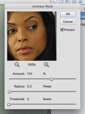
The first thing I do is duplicate my layer, then I look to see if my image needs sharpening. This is obviously an indoor shot and the photographer has used a high ISO to compensate for the low light. The high ISO causes grain and fuzziness, so I am going to be subtle with my sharpening. Make sure to sharpen the duplicated layer.

Here are the settings I ended up using. You can see that the Unsharp Mask sharpens everything, including that ISO grain I was telling you about.
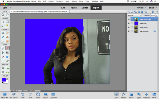
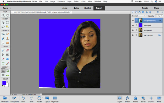
Next, add a new layer and fill it with a solid colour. Pick a colour that doesn’t appear in your photo - something loud, like this blue.

Make a copy of your sharpened layer and drag it above your solid colour.

Then click on your Eraser Tool and - making sure you have the duplicated, sharpened layer highlighted - start erasing around your character. Go around with a smaller brush first.
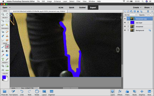
Then once you have the outline erased, you can use the bigger brush for the rest. (I’m ignoring that grey wall because I plan to crop it out.)

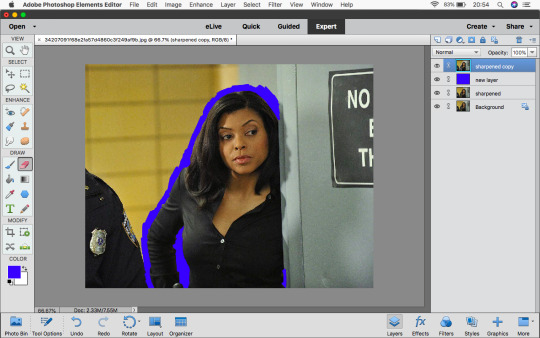
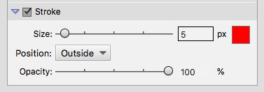
Looks alright, doesn’t it? Nope! Use the Stroke trick I mentioned in my icon tips and tricks post (linked above) to make sure your cut-out is clean.
Oh dear! How messy.
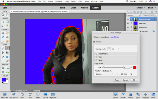


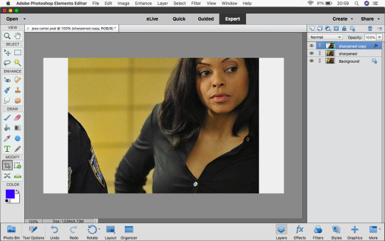
There, that’s better. I erased all of those stray pixels and now it’s a clean cut-out. Well, almost...

I just wanted to crop out that pesky wall.
The cutting out is done! Change your Canvas Size to 800 x 450 pixels (or any size you like, so long as it’s over 640 pixels on its longest side as that is the size of mobile themes.
I gave Joss here a pink background as a placeholder so I could see what I was doing. I duplicated by cut out layer, saving it in its largest form in case I ever wanted it for a bigger edit of some kind. I positioned the copy where I wanted it on my canvas.

I use adjustment layers to make my image brighter and more contrasty. I start with Brightness/Contrast, then Levels and finally Hue/Saturation.


Hue/Saturation is one of the more complicated Adjustment Layers to get your head around but it’s worth practising with it. I use it to attempt to correct colour balance. This image has a yellow tint to it that. I wanted to remove some yellow while also retaining Joss’s skin tone. It’s all too easy to whitewash.

Skin is made up of yellows and reds according to Photoshop. I made the reds darker to keep the shadows on her face dark.

I made the yellows brighter and used the Hue slider to make them a little redder.

Once you’re happy (for now), duplicate everything again - your cut-out layer and adjustment layers. Merge the copies down into one layer. This means the brightness adjustments only affect your cut-out layer and not the background.


By now you should have something like this - an edited cut-out layer and a colour background.

(I decided that Joss was still too orange so I added another Hue/Saturation Adjustment Layer to remove some saturation.) I picked a background colour - mint green. I almost always add a “halo” to my headers and icons. Create a new Gradient Fill layer under your cut-out layer. Choose the white to black preset gradient and use these settings:


When the Gradient Fill box is open, you can drag your gradient around. Drag it until it’s behind your character’s head.

Set the “halo” Gradient’s blend mode to Screen or Overlay - for pastel backgrounds, Screen works best. For brighter colours Overlay usually works better. I usually set the opacity to 25% or thereabouts.

Finally I coloured in Joss’s shirt as it still had a yellow cast to it. I just used a grey Colour Fill Layer set to the colour blend mode.


And that’s how I make a basic header!
Every step I take here also serves the purpose of making it very, very easy to change colours around later. Joss’s shirt could become red, the background purple. The possibilities are endless!
A couple more tutorials to read after this one:
How to colour clothing.
How to add a torn paper edge to a header.
How to add a brush stroke effect to a header.
How to make a mock mobile theme header.
Thank you for reading this tutorial! All of my previous tutorials can be found here.
#yeahps#itsphotoshop#chaoticresources#competeresources#cappedfandoms#*tutorial#100#photoshop#photoshop tutorial#photoshop elements#photoshop elements tutorial#requested by anonymous#hopefully this is helpful for you nonnie!
182 notes
·
View notes
Text
A heart’s journey [2/10]
Part ONE
warnings: forced marriage
words: 2.672
summary: you finally meet the twins
tagslist: @graydolan12 @sweet-dolans
TWO
When you join the breakfast table the next morning, the Duke has already left, and the Duchess and a lady, you guess to be her eldest daughter, are talking closely. All you can hear is the Duchess saying “… just outrageous!” and her daughter replying with: “But how is that her fault at all?” They fall silent when you enter the room and the girl stands up to curtesy in greeting. She has beautiful long hair that is dark at the roots but turns into a honey colour at the ends, and she isn’t wearing a dress but loose trousers and a beautiful dark jacket, lined with black fur and covered in fine silver lines.
“Good morning, my lady”, she says with a small but earnest smile. “I hope you slept well? I have been looking forward to finally meeting my future sister-in-law.”
You curtesy as well and try hard not to blush. “Pleasure to meet you, my lady.”
“You can call me Cameron”, she says and shrugs. You notice the fine silver lines on her jacket are actually hundreds of fine, small ‘V’s. “Since we’re going to be family anyway.”
You nod and carefully decide you like her. She seems like a genuine person. You sit down opposite to her, on her mother’s other side, and start eating as soon as you remember how hungry you are. The Duchess doesn’t say anything as she finishes up her breakfast, but you can’t spare her any thoughts. As long as you mind your table manners, she can’t have anything to complain about.
It’s probably good fortune they don’t turn up until you’re nearly finished. You hear them before you see them, but you don’t realise what it is you’re hearing until the door is already thrown open and the same person walks in twice.
“Hey, mum, Ethan says that… oh.” The first one interrupts himself as he notices you sitting next to his mother. His eyes are dark, almost as dark as his hair. Despite the cold temperatures out here his skin looks almost golden, contrasting sharply with the white tunic he’s wearing, tucked carelessly into his black pants. You notice something silver dangling from his ear but you can’t identify what it is from this distance.
The one that entered the room second looks exactly the same, only are his ears pierced with simple black stones, instead of the one silver dangling one. His tunic is dark blue, which is maybe why he seems paler than the first one, and it is tucked neatly into his trousers. Since the first one spoke of him in the third person, the one in the darker tunic must be Ethan. Interestingly, apart from his shiny belt buckle and the earrings, none of them are wearing any jewellery.
You stare at him for a long second, not completely grasping that this is the person you’re meant to marry, and he stares right back at you apparently equally lost for words. He’s … well, he’s unbelievably gorgeous, that’s what he is. Obviously. You’re not sure if you’ve ever seen anyone as attractive as him. Apart from his brother, of course. They look like they belong on an oil painting, something unreal, the depiction of an artist’s imagination of perfection.
It’s just that … you can’t believe yourself. Your future husband is perfect, around your age and good looking. That’s more than most girls your age can say. But still. There’s nothing, no connection. Yet, you remind yourself. You haven’t even exchanged one word, the connection will form eventually. You probably read too many romantic novels, somehow you seem to have gotten up some misguided hopes of an instant connection. Then another thought sobers you up, as well, putting Ethan’s ridiculously pleasing appearance in the background: you don’t know him, yet. He might be cruel, or mean, or violent, or all of the above. He might also be kind. The bottom line is, you don’t know. Yet.
It’s only when the Duchess clears her throat dryly that you snap out of it and scramble to your feet in such haste, you almost trip over your dress.
“Your Graces”, you croak nervously as you curtesy to the brothers. “I apologize for – “
“None of that, I’m Grayson”, the one with the silver earring says, frowning slightly. “And he’s Ethan. He really doesn’t need an extra title, just because he was born two seconds earlier.”
“Pleasure to meet you”, Ethan say and reaches out to brush his lips against your knuckles shortly.
“The pleasure is mine”, you reply automatically as you get your hand back. After another awkward pause, the Duchess has all of you sit and a heavy silence falls over the table for what feels like eons.
“Well, since we’re all here already – except for your father, but when is he not somewhere else in the important moments? – let’s make some things clear”, the Duchess starts and while she talks like she’s addressing the whole room, she only looks at you. “The wedding will take place in two months, just when winter should be in full swing. This time frame will give everyone the chance to get to know each other, it will give you time to familiarise yourself with Taoiseach Hall and its etiquettes and become an integral part of the Dolan household. The official invitations will be sent out in two weeks, but of course everyone important has already been notified to keep the date free.”
There is no question in her voice or mannerism, so all you can do is nod and try not to look too overwhelmed. You knew the rough time-frame, of course, your father told you most of this already. Two whole months in preparation are unusual when the engagement is already finalised, as you well know, but your father said it’s probably a northern custom and not to question it. The Duchess’ eyes assess you carefully. “Tonight is the welcoming banquette, where you will meet everyone significant from around here, and you will also need to go to the tailor as soon as possible.”
It takes you a second. “Oh, for the dress?”
The Duchess frowns. “Well, obviously. But also, and much more pressing, is the fact that you don’t have anything befitting the Frysk winter and we wouldn’t want you constantly sick now, would we?”
You blush at her insinuation of you living such a sheltered life, never leaving home far enough to realize how things might be different up north. You not packing the right kind of dresses also puts blame on your parents, who didn’t prepare you sufficiently, meaning they’re either too disorganised or ignorant. The worst part is, you can’t tell her how she’s wrong, because you would have to explain to her your family doesn’t have the financial means to afford you a brand new set of warmer clothes, at the moment.
Embarrassment flaming high on your cheeks you lower your eyes and stay silent.
++++
The tailor notes down your measurements and hurries off immediately to start working on all the pieces, the Duchess ordered. Later that day you get a fur lined coat delivered to the rooms you’re staying in. It reaches down to your ankles and is made from a very light midnight-blue material, the weight of the clothing item stemming mostly from the silky-soft, silvery fur. The coat fits quite well with a grey dress that you brought with you, so that’s at least your outfit for tonight’s banquette decided.
You don’t see any members of House Dolan until that evening, when you finally get a chance to get to know your fiancé a little. Strangely enough you’re sat not simply next to your future husband, but you are positioned between the brothers. At home in Lausanne, this would be a scandal, especially with the two of them looking so similar. There would be no end to the talk about the seating and how it did not signal clearly which twin you were to marry and which one you weren’t. You decide against speaking up about it, though. Maybe it’s another northern custom you don’t know about in the south.
Instead you do your best to smile politely at everyone approaching your table and introducing themselves you the duchy’s heirs and you. Cameron doesn’t seem very interested in most of them, her attention wanes quickly until she resorts to nodding at people in recognition, maybe tipping her glass of wine to them and otherwise talking to the people sat next to her who seem to have lots of entertaining stories to tell her. You watch her laugh loudly, her hair loosened already, beautiful smile and perfect teeth on full display as she listens to one story after another, no care in the world – and you wish you could switch places with her. You’re not at ease in these kinds of situations and while the younger twin appears to have no problem finding something to talk about, Ethan hasn’t spoken to you since asking politely whether you liked your food.
“So, I heard you’re quite the soldier?”, you ask him when the latest suitor has retreated to their table.
Ethan nods, one corner of his mouth pulling into a lopsided smile. “I fancy myself quite apt at some military disciplines, you could say that, yeah. My father has always thought it very important for us to be educated in military strategies and all it entails. Kind of comes with being a member of this family, I guess.”
“Well, from what I’ve heard, ‘quite apt at some disciplines’ is a huge understatement”, you reply, relieved it appears you picked the right topic. “Supposedly you’re a brilliant strategist, a legendary leader, and an outstanding soldier.”
There’s a scoff from your right side and you turn around just quick enough to catch Grayson rolling his eyes. “Yeah, right. Half of that praise should go to me, since I am definitely the better soldier and at least as good a leader as you are. The strategist part … well, he’s alright at that. Better than me at least.”
“Is that true?”, you ask intrigued and turn back to Ethan, who shrugs.
“We pretty much do everything together. I’m not sure we know how to function without the other one, so he is kind of right. All the positions I’m holding, I share with Grayson. We make all the important decisions together, at least half of ‘my’ accomplishments are his, really.”
“That is so interesting. I didn’t hear it like that at home, but that’s probably because of the long way these stories travel. We don’t know much about the north in general, I’m not surprised some things get lost on their way to us”, you reply.
Their bond seems to be extraordinarily strong which makes those accomplishments all the more impressive in your eyes.
“We don’t know that much about the south, either”, Grayson admits shrugging and pours himself some wine. “There’s some names, of course, the usual rumours at court, and the cultural differences. But it’s all neither here nor there, to be honest.”
“What cultural differences do you mean?”, you question, carefully. This is thin ice you’re walking on. If you’re not careful, you might offend them or the other way around. Of course there are differences, Drottningen is a big kingdom, but you never heard of specific cultural traditions or customs of the north and you wonder what they might’ve heard the other way around. All you know are rumours about a slightly different way of living, but all in all it’s supposed to be the same culture.
“Well, your people are pretty stiff and set on etiquettes and tradition”, Grayson starts listing immediately. Ethan doesn’t say anything but the way he shifts subtly in his seat next to you, tells you he’s uncomfortable. He is probably aware of how this could turn very easily into an argument, or at the least into someone being offended. “You’re supposedly quite soft and spoilt, but I always thought that’s just the envy we harbour speaking, since you guys get to have nice weather and a warm sea instead of miserably low temperatures, dark days and icy lakes.” He frowns thoughtfully and there’s a pause. Ethan slowly starts eating again, judging the tense moment to be over, just when Grayson asks: “What stories do you guys have about us?”
He looks genuinely interested, his eyes open and wide. Grayson appears to have been able to hold on to his naiveté, as opposed to Ethan who seems much more serious and careful. That’s probably the advantage of being the younger sibling, you assume, comparing him to your Livia and Tatiana. They have a lightness to them, a carefreeness glowing behind their eyes that you have never known. It draws you in and you find it hard to look away. You want that, too.
“Not many”, you reply and avert your eyes with more difficulty than you like to admit. “They’re not really stories, either, more … they’re assumption more than anything.” You cut the meat on your plate into bitesize pieces and wait for an indication they’re interested in hearing more. Ethan doesn’t react but you can see Grayson nodding eagerly out of the corner of your eye. “Well, word down South is, Northerners are hardened and don’t know how to enjoy things – I suspect that’s similarly related to the climate like your assumption about us. You like to solve conflicts by fighting and violence, rather than diplomacy. And your culture is a strange juxtaposition of conservativism, seeing as your female descendants cannot inherit any land, property, or money, but at the same time you’re quite open, uhm, physically.”
Another pause, Ethan tensing up even more next to you, then Grayson snorts loudly into his cup. His eyes are all crinkly, betraying the smile dancing behind his twitching mouth. “’Physically’”, he repeats. “You mean sexually?”
You can’t help it, you blush deeply and hide behind your food. That word is not to be said out loud, just as the whole topic is supposed to be skirted around. Some friends of your mother have made it an art to talk about it, without ever saying anything even half as crass and forward as Grayson just did. You’re not sure if you’ve heard that word spoken out loud more than once in your life.
“I think she’s referring to the fact that we don’t teach our children to be ashamed of their bodies and desires”, Ethan jumps in, no trace of amusement in his voice. When you glance at him, he doesn’t appear to be laughing at your discomfort. His face is a perfectly neutral mask, with just the right amount of softness around his mouth to seem empathetic. Grayson is the complete opposite, he is actually giggling. You’re not sure which twin you find more frustrating.
“That is true, we have a … a less flexible sense of propriety”, you agree, trying to word your incomprehension of their culture, while not offending them too much.
“We don’t base our women’s worth on their sexual innocence, yes”, Grayson shrugs with a dry snort and there’s that word again. You feel your cheeks burning.
“Since women cannot own anything, anyhow, might as well give them physical freedom.” The words are mumbled, but they’re still out. Horrified by your own rudeness you tense up, staring blankly down at your half-eaten plate. You tried so hard to stay diplomatic and now you messed it up during the very first real conversation.
Grayson’s eyes are narrowed, but Ethan’s expression has remained neutral. He shrugs. “Women also get to choose whom they want to marry, if at all, since a family’s fate is not bound to their spouse. That balances things out a little, doesn’t it?”
You only nod and don’t look at Grayson for the rest of the night, but you can feel his eyes burning into your temple throughout the entirety of the banquet. Great. You brother-in-law already hates you. Way to go.
Part THREE: you get to know the Dolans a little better and there’s a mysterious guest.
Masterlist
#a hearts journey#a hearts journey part two#two#dolan twins#dolan twins imagine#ethan dolan#ethan dolan imagine#grayson dolan#grayson dolan imagine
84 notes
·
View notes
Text
Tips for painting underwater scenes & dolphins
@floridabottlenose asked:
Hi! My name is Jaynee, and I also enjoy creating digital paintings of cetaceans. I've seen some of your recent digital paintings of cetaceans, and they were absolutely beautiful, and very realistic. Unfortunately, I can never get my digital paintings to look so stunning - do you think you could give me some tips on how to improve my cetacean art? Any help would be much appreciated! Thanks!
I guess some of my biggest issues are with the shading/highlighting and colors. For one thing, I have trouble getting the shading/highlights positioned right, and I see in some of your art, the cetaceans may have several shades of blue (similar to the colors of the water) in the shading, but I can't find out how to properly mix those extra colors in. I currently will paint a solid color, then paint some lighter shades for highlights and darker shades for shadows, and finally use a "blend" tool to smudge them - does this sound right, or do you have a suggestion on a better way to do shadows/highlights?
[link to art examples]
First off, thank you so much ;w; And I’m more than happy to help! Over the years I’ve found some ‘rules’ to painting underwater (it’s probably called physics) and personally they’ve helped me a lot in rationalising my underwater art, and make it more realistic. I hope these assorted ramblings and tips make sense and can be useful!
ABOUT UNDERWATER COLOURS
I think use of colours is your main point of improvement. I’ve noticed that in your paintings you make your dolphins grey (the totally desaturated kind), like one might see in a scientific illustration. However, the way a dolphin is depicted in such an illustration is as if they were suspended in a more-or-less evenly white lit room. Needless to say, this does not happen often in real life. Which is exactly why adding this third minke (illustration) looks so weird:

Especially since dolphins are more or less grey in colour, they almost never actually appear grey in real life. Shine some orange sunset-sunshine on them and they look orange brown. Put them underwater and I can assure you they are completely in shades of blue. This largely has to do with three important ‘rules’ that apply when painting dolphins (or really anything) underwater. (Note: for simplicity’s sake I just assume the water is blue, but the same applies for waters of a different colour.)
1. The further away from the viewer = the more blue
You may recognise this phenomenon from landscapes. Looking out my window, the nearby trees are colourful with high contrast, while the ones near the horizon are a low-contrast, washed out, whitish. Surprise surprise, today the sky is greyish white. You’ll also see this with faraway mountains looking blueish when the sky is blue. The hazier the air, like when it’s misty, the greater the effect. On clear days, even objects a considerable distance away may still have most of their colours. Have some scarily textbook examples I took on holiday:

The same goes underwater. The further away an object is, the more it takes on the colour of the surroundings, and (as a result) the more contrast it looses. The murkier the water, the greater the effect. The closer an object is, the more it retains its own colours, and the stronger its contrast. Knowing this, it is important to think about where the viewer is located in your painting. Let’s think of it as someone being in the water with a camera, taking a photo of a dolphin (which is your painting). Is the photographer right there in front of the action? Or are they far away, zooming in? In the first case, the dolphin should be crisp and colourful, in the second case they should be washed-out blue.

Now, in no case are anyone’s eyes every glued to a dolphin’s skin, so you’ll always have at least some loss of contrast and colour underwater. Just, the more you add, the further away the dolphin seems. It’s mostly a case of picking the right colours from the start. I always pick my background colour first, and then based on that & their position choose colours for the animals. You can still make small adjustments by lowering the dolphin’s opacity, or adding a low-opacity layer of background colour on top, to make them seem further away.
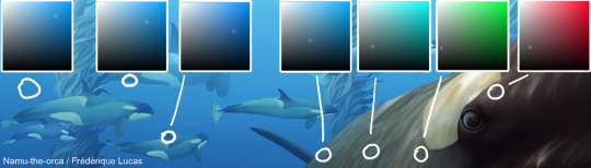
Let’s go through this example, from right to left. In sunlight, killer whales are kind of brownish, not pure black. So the closest part of the whale is a very low saturation red. Now the next colour swab is weirdly green. Very low saturation again, but still, green. This is because, as we move along the whale’s body, the colours shift from sunlight’s red to the background’s blue hue. To go from red to blue, one passes through green (and then that cyan-ish colour that’s next). The colours are still pretty desaturated, even the furthest part of the whale is mid-saturation. But! By now it’s nearly the same hue as the background, just a tinge more towards cyan. Now we move on to the background killers, and you can see that both have the same hue as the background. The little whale is only darker in colour, because she’s closer than the big bull in the background, who’s further away and thus has less contrast (i.e. lighter shadows).
2. The deeper (further away from the surface) = the more blue
A dolphin might be two inches from your face, but if you both are 100 feet down you bet your ass they’re gonna be blue either way. Water has this wonderful tendency to filter colours out with depth. It’s a pretty well known phenomenon: red is the first to go, blue the last. Seemingly colourful, bright red fish can appear a camouflaged greyish brown in their natural environment. Which is exactly why cameramen take along huge lights underwater: without them all the corals and pretty fish would just appear in shades of blue.
You can see this effect with a pod of dolphins at the surface. Close to the surface they appear grey, or even warm brown if the sun is shining well. Podmates swimming deeper are once again blue. The same effect is also used on the kelp pillars in my painting:

The kelp is in the distance, so it’s all more or less blue. But you can see that the deep (dark) part is a real blue hue, the same as the background, while the hue of the shallow (light) part has significantly shifted towards the kelp’s true colour, namely golden brown.
3. Shadows are blue
So let’s say you have a painting of a dolphin close to the viewer, at the surface - there’s still going to be blues in there. Shadows fall where the primary light, usually the sun, does not reach. Yet shadows are not pitch-black holes of total darkness. ‘Secondary lighting’ gives light and colour to shadows. Since the surroundings are all blue, all secondary, reflected light that falls on the shadows is also blue. As such, the darker the shadow the more saturated blue it is.
A funny exception happens when there are multiple dolphins swimming side-by-side, with the light coming in at an angle. The shadowed side of dolphin 1 would be facing the brightly lit side of dolphin 2. This light would be reflected back onto the (supposedly) shadowed side of dolphin 1. You can see it beautifully on these spinner dolphins.
ABOUT PAINTING DOLPHINS
So, this is quite a bit shorter and less structured than the above part. Mostly because my advice is really very boring when it comes to understanding where light and shadows fall on dolphins: draw dolphins. Lots and lots. More specifically, draw by studying photos, preferably photos taken at odd angles or with strong lighting. These things reveal a lot about the 3D shape of a dolphin. With practice (and good references!) you’ll start to build up a mental map of where the bumps and dips are, how the cheeks curve, the eyes bulge, the chin bends. Once you understand their shape, you are free to shade them according to your chosen light source. One day I want to make a tutorial on this exact topic, but for now I’m afraid this will have to suffice!
Regarding actual painting techniques, I would discourage you from using a blend tool to blend colours together. I used to do the same thing for a good while, but I must say I vastly prefer the result I get from actually painting the transitions. Lots of strokes, low opacity - at some point it starts blending nicely. Also, be careful what colours you pick for your shadows and highlights. As all the colour stuff above has hopefully shown, hues shift across the animal. Highlights, midtones and shadows all have different hues. In the case of my kelp killer whale, the highlights are reddish brown and the shadows blue. Picking shadows and highlights in the same hue as your base colour makes a painting feel flat.
Okay, I think that’s all for now?? If I’ve forgotten anything I’ll try to add it. I hope this helps! And feel free to ask if anything is not clear.
45 notes
·
View notes
Text
Discover what colours suit the home
Use of colour offers the developer a huge range of opportunities to implement his imaginative dream. Whatever is the size of your level, it can be visually raised with the help of colour setting. All the richness as well as selection of colours can be given the 7 colours of the basic range that adhere to each other.
Red, orange, yellow, eco-friendly, blue, dark blue, violet are colourful colours. White, grey and also black are achromatic, i.e. colourless.
Every colour generates particular associations, as well as choice for a specific colour is constantly individual and depends on characteristic attributes of the personality. It is popular that there is no accounting for tastes. Some people have highly established colour assumption, others do not. You should have focused on the fact that some colours or their combinations are aesthetically calming as well as set one's mind to rest, some convey the feeling of joy, some reason virtually physical pain and others have a dismal result. Of course, when you select the colours of the setup, it is best to consult a developer.
When you select the colour setup of this or that room of your home, you need to take into the account various factors: if the windows face the north, it is better to prefer warm colours, if it is the south, then cool colours will be appropriate. Various other variables are the top quality of lighting due to the fact that the colour reflects the light, as well as the type of area (whether it is a kitchen area or a drawing-room, a kids's room or a research). Saturated, brilliant colours are the most appropriate for the setup of a drawing room or a dining-room.
White and also blue (related to cleanliness and water) benefit the shower room, however are not suitable for a kitchen area; for an attracting space and also a cooking area you 'd much better pick yellow or orange colours, cozy as well as soft tints of red and white. Besides do not forget the specifications of the room - intense walls visually decrease the quantity of space, while dark ones broaden it. As an example, red, orange as well as yellow can aid make a massive area with little furniture look smaller as well as more comfortable. When you choose the wall surface colour, keep in mind that furniture, soft furnishings and drapes are to be in harmony with the wall surfaces. If furnishings upholstery, covering on the trestle-bed as well as curtains are formed, it is better to make wall surfaces plain. Combination of colours is to be come close to attentively, do not rely upon opportunity. For example, it is better not to combine red and also green, since it is challenging to regard this mix, particularly if these colours are given up equal proportions. Intense yellow can be an excellent background for any colour (in China collections of porcelain were constantly displayed versus a yellow history). Stencil looks well on a yellow wall surface. Eco-friendly improperly matches all colours, besides numerous tints of the very same colour.
Many peoples connect red with wealth, luxury and charm. It is perceived as a sign of enjoyment, loud interaction, hassle. Well-matched tints of red appearance well in the hall, cooking area, kids's area, drawing-room. If the room is embedded in cool tones, "patches" of red will certainly make it extra comfortable.
Orange is connected with the gold orange. And also this suggests heat, vivacity, delight. The interior of a cold north space can be embedded in orange tones.
Yellow is a very "cozy" colour. If your room is located on the northern side, a wealth of yellow in the inside will generate the perception that your areas are "pleasant", bright, even if as a matter of fact, sun rays are unusual guests in your home. Psychologists assume that yellow appropriates for individuals who have an energetic profession as well as can easily adjust to any kind of environment. At the same time, yellow can irritate, every little thing depends upon a specific colour.
Eco-friendly is considered to have a calming effect as well as be good both for eyes and also spirit. Most likely, it happens, because this colour is the closest to nature. Without a doubt, the canvases of old painters, where eco-friendly colours predominate, "heal" the souls. Environment-friendly is likewise taken into consideration to be the colour of traditionalists, maybe because it was favoured in Victorian England. Eco-friendly looks great in the interiors of huge and also light rooms. In the setting of the workplace, we advise that you make use of dark colours of dark blue as well as eco-friendly. Numerous tints of dark blue reason various feelings. Blue is the colour of the sky, space, air, liberty. Deep blue conveys a feeling of calmness.
Navy-blue casts sorrow, some peoples consider it to be the colour of mourning. Psycho therapists advise utilising dark blue for a bed room. Some individuals are extremely fond of fierce, others hate it. Violet is thought to be a "magic" colour - indeed, it hides some enigma. Maybe, the colour of the night skies generates such organisations? Musicians think that violet has something agonising and sad in it. It is better to utilise light colours of violet in living quarters, as deep and bright colours of violet bring about tiredness.
Grey is the "global" colour, it harmonises with nearly all various other colours. Possibly, it is the preferred colour of developers, as it has lots of tints and also is an excellent history. It is calm and also neutral, nevertheless, it is far better to use it in combination with various other colours, due to the fact that single grey can appear boring.
Lastly, black and white. 2 posts, 2 deeply symbolic colours, two extremes, but when incorporated, they highlight and color in each other, and thus develop elaborate standards. Both colours are elegant, "global" and never go out of style. We can claim that they are beyond fashion.
Black marvellously shades in any kind of colour and also makes it more meaningful. A verandah or a hall, if they are well-lit, can be completed with beaming marble panels. Black seems to diffuse the borders of the room. In a bathroom, you can use black mirror-like ceramic tiles. Yet take into the account that black soaks up light; abundance of black is possible, just when there is a lot of illumination.
Everyone likes white, it is the colour of quality, cleanness, coolness, related to cheerfulness and wellness. White is essential in small poorly-lit rooms. In a shower room without any daylight, white tiled wall surfaces will show the light of the light, increase the illuminance of the area and also aesthetically "draw apart" the walls.
Naturally, there is a terrific selection of all potential colour colours. Of greatest importance is your desire to discover that very mix that represents your vision of the indoor setting. If the colour is appropriately picked, it can stress the benefit as well as conceal the issue. Unleash your dream. Remember concerning colour properties, when you choose the setup. We have already pointed out that it is necessary to take into the account area of the space with regard to principal points. If the room faces the southern, chilly colours can predominate in the setup; if it is the north, select warmer colours. Tranquil scheduled colours are an excellent history for precious and pricey points. As an example, strong furnishings and a stunning image will look terrific versus a light grey history. The colour of the walls need to necessarily match the colour of the furniture upholstery and floor topping.
In the cooking area, it is far better to make use of light tones of walls in mix with light furniture. If you desire contrast, it can be created by bright dish ware on the shelves, brilliant curtains, a pattern.
A bathroom, lit by just electric illumination, looks finest in brilliant tones. It is recommended to make use of white, pastel, light tints of yellow, eco-friendly, blue and pink. Hygienic engineering pipes as well as joints are to repaint the same colour. In entrance halls, passages as well as halls you can use contrasting colours for wall surface ending up. The ceiling can be "drawn down" if its colour is numerous colours darker than wall surfaces. You can utilise wallpapers with straight red stripes. The same impact can be gotten to if the ceiling and the 30-40 centimetres of nearby wall surface area are covered with lighter paint.
The ceiling can be "lifted" if it is painted white, much better with a light blue colour. You can likewise repaint or paper the wall surfaces approximately the ceiling without slats if horizontal red stripes of cozy colours dominate the wallpaper pattern.
Saturated cozy and also dark tones or wallpapers with big pattern add to aesthetic minimisation of large rooms. If the area is long as well as slim, it is much better to paint longitudinal walls in lighter tones, and cross-walls in darker tones. After that the room will seem shorter and also lower. It works if one wall surface has a different colour. A little area can be aesthetically expanded, using light, but cool colours. Light eco-friendly, silver-grey and light blue will aesthetically increase the area. In tiny rooms, it is unwanted to have dark furniture, dark curtains as well as carpets with dark tints. It is better to repaint the doors in light tones white, light grey as well as ivory. Flooring with a light colour looks extra enjoyable than a dark one. So, make your choice.
0 notes
Text
Orion’s Nebula, view Vesta, Maximum Morning Mercury, Moon meets Jupiter, and Venus Charges Mars!
(Above: The Orion Nebula (M42) and Messier 43 at centre, and the Running Man Nebula at the top of the frame, are revealed in this widefield long exposure image by Manuel Guerrero of Toronto, Canada)
Astronomy “Skylights” for the week (from January 15th) by Chris Vaughan. All the times mentioned are Eastern Standard Time. If you are a camp, or a teacher interested in a guided field trip to the David Dunlap Observatory, visit www.astrogeo.ca.
News
My latest columns for Space.com preview the best astronomy sights for 2017. You can find part one here and part two here.
The Moon and Planets
For the first half of this week, the moon will flood our evening skies with light from on high, while it wanes and rises later each night. In the wee hours of Thursday morning, the moon will rise with Jupiter – sitting only two finger widths to the left (north) of the bright planet. They’ll make a nice binocular sight until the sky lightens around 7 am, when they’ll be due south. On Thursday afternoon the moon reaches Last Quarter, when it’s half illuminated (on the left). Last Quarter moons always rise about midnight and linger into the daytime morning sky. Finally, on Sunday, January 22, the old crescent moon will make a pretty sight in the eastern pre-dawn sky.
Venus continues as the brilliantly bright object visible every evening in the western sky, until it sets around 9:15 pm local time. In a telescope, Venus is showing a “half-moon” shape (phase) this week. Because the evening Ecliptic continues to tilt higher as we slide towards spring, Venus will be carried a bit higher in the evening sky before starting to sink into the sunset next month. Believe it or not, it has not yet reached peak brightness!
Meanwhile, reddish Mars makes a steady march towards Venus this week, the two planets closing to within 6° (about a palm’s width) by next Sunday. Mars sets about 9:50 pm local time. Rounding out the evening planets, blue-green Uranus is halfway up the southwestern sky at dusk - just inside the western (right) arm of the “V” of Pisces the Fishes. The planet sets about 12:30 am local time. Recently it has formed a nice little triangle with two of Pisces’ stars, the double star Zeta and 88 Piscium. Uranus (the blue-green object) sits about a pinky finger width (40 arc-minutes) to the upper left of the two stars. Tiny Neptune is in Aquarius the Water-bearer, a few degrees to the lower right of Venus, and it sets about 9 pm local time.

(Above: The evening planets, shown at 7:45 pm local time on January 18, 2017.)
This is the last week when bright, white Jupiter will be rising in the east after midnight local time. Next week, it officially transitions to an evening object! This winter, it’s been sitting just a few finger widths above the bright white star Spica in Virgo the Maiden. By daybreak, it’s moved above the southern horizon. Saturn is rising this week about 5:15 am local time. You should easily see its yellowish dot low in the east for half an hour before sunrise, while the sky is still dark.
On Thursday, January 19, before dawn, Mercury will reach its greatest angle west of the sun, and reach maximum visibility for this apparition. Mercury is now sitting about 10° to the lower left of Saturn. If you can find a low eastern horizon, look for the planet between about 6:30 and 6:50 am local time. With Mercury just a bit higher than a shallow ecliptic, this apparition is less than ideal for northern hemisphere observers (the next excellent one happens on April 1), but quite good, seen from the southern hemisphere.

(Above: The old moon joins Jupiter and the morning planets on January 19, 2017, shown at 6:30 am local time.)
Dwarf Planet Vesta, anyone?
On Tuesday, January 17, the large asteroid Vesta reaches opposition, the date when it is closest to earth and brightest for the year. It is sitting high in the evening sky, just below the twin stars of Castor and Pollux in Gemini. Its proper designation is (4) Vesta because it was the fourth asteroid discovered, by German astronomer Heinrich Wilhelm Olbers on March 29, 1807. It is named after the Roman goddess of home and hearth, Vesta. At apparent magnitude 6.1, the asteroid is observable with unaided eyes (under really dark skies), binoculars, and small telescopes. Its motion through the background stars can be noted by observing it on separate evenings.

(Above: Vesta’s motion through the background stars can be seen by observing it on separate evenings, shown here from Nov 1, 2016 to Mar 5, 2017)
Orion Nebula
Last week, we toured most of Orion the Hunter’s major stars (read it here). This time, we’ll focus on his majestic sword, one of winter’s true astronomical treats. The sword hangs well below Orion’s distinctive three-starred belt. Unaided eyes can generally detect three patches of light in Orion’s sword, but binoculars or a telescope quickly reveal that the middle object is not a star at all, but a bright knot of glowing gas and stars known as The Orion Nebula (or the Great Nebula in Orion or Messier 42, aka M42). For best seeing, pick an evening when the moon rises late or is out of the sky – as it will be next week!
The Orion Nebula is one of the brightest nebulae in the entire night sky and, at 1,400 light-years distant, it is one of the closest star-forming nurseries to us. It’s enormous. Under a very dark sky, the nebula can be traced over an area equivalent to four Full Moons!
Buried in the core of the nebula is a tight clump of stars collectively designated Theta Orionis (Orionis is Latin for “of Orion”), but better known as The Trapezium, because the brightest four stars occupy the corners of a trapezoid shape. Even a small telescope should be able to pick out this four-star asterism, but good seeing conditions and a larger aperture scope will show another two faint stars. The trapezium stars are hot young O- and B-type stars that are emitting intense amounts of ultraviolet radiation. The radiation causes the gas they are embedded in to shine brightly, by both reflecting off gas and dust as blue light and also by energizing Hydrogen gas, which is re-emitted as red light. That is why there is so much purple in colour images of the nebula.
Within the nebula, astronomers have also detected many young (about 100,000 years old) concentrations of collapsing gas called proplyds that should one day form future solar systems. These objects give us a glimpse into how our sun and planets formed.
Stargazers have long known about the stars in the nebula’s core, but detection of the nebulosity around them required the invention of telescopes in the early 1600’s. In the 1700’s, Charles Messier and Edmund Halley (both famous comet observers) noted the object in their growing catalogues of “fuzzy” objects. In 1880, Henry Draper imaged it through an 11-inch refractor telescope, making it the first deep sky object to be photographed.
In your own small telescope, you should see the bright clump of Trapezium stars surrounded by a ghostly grey shroud, complete with bright veils and dark gaps. More photons would need to be delivered to your eye before colour would be observed, so try photographing it through your telescope or a camera/telephoto lens on a tripod. Visually, start with low magnification and enjoy the extent of the cloud before zooming in on the tight asterism. Can you see four stars, or more? Just to the upper left of M42, you’ll find M43, a separate lobe of the nebula. It surrounds the unaided-eye star nu Orionis (ν Ori).

(Above: The sword below Orion’s famous belt (at top) contains the wonderful Orion Nebula and many other binocular and telescopic treats.)
While you’re touring the sword, look just below the nebula for a loose group of stars, 1300 light-years away, called Nair al Saif “the Bright One of the Sword”. This main star is a hot, bright star expected to explode in a supernova one day. It is surrounded by faint nebulosity, too. Astronomers believe that this star was gravitationally kicked out of the Trapezium cluster about 2.5 million years ago.
Sweeping down the sword and to the left (east) brings us to the star d Orionis at the tip of the sword. This magnitude 4.7 star is near the limit for visibility in moonless suburban skies. About two finger widths to its right is another star of similar brightness, named Thabit, "the endurer".
Moving upwards towards Orion’s belt, half a finger width (30 arc-minutes, or the moon’s diameter) above the Orion Nebula, you’ll find another clump of stars dominated by c Orionis and 45 Orionis. A larger telescope, or a long-exposure photograph, reveals a bluish patch of nebulosity around them that contains darker lanes forming the shape of a figure, called the Running Man Nebula. This is another case of gas reflecting light from the two stars mentioned.

(Above: The Running Man Nebula taken by Dave Eisfeldt of Waco, Texas on Oct 26, 2011 with a ATIK 314L:+ camera through a Orion ED-80 telescope on Sirius EQ-G mount. http://eldoradostarparty.org/ngc-1977-running-man-nebula-taken-by-dave-eisfeldt-of-waco-texas/)
Just above the Running Man sits a loose cluster of a few dozen stars best seen in binoculars. Then we jump higher – most of the way towards Alnitak (the eastern-most belt star), to check out a beautiful little grouping of stars collectively called Sigma Orionis. What makes this a special treat is that, in a small telescope, we find four or five stars crammed together. Check it out with your telescope – trust me, it’s pretty! It’s a bit more than a finger width to the lower right of Alnitak. Let me know what you see!
Keep looking up to enjoy the sky! I love getting questions so, if you have any, send me a note.
#space#astronomy#stars#planets#Universe#nebula#Orion#Orion Belt#Orion Nebula#Vesta#Moon#Jupiter#Venus#Mars
4 notes
·
View notes
Text
Web Design-Impact Beyond Measure
Like a 'mind-boggling' yet enthralling Pablo Picasso painting, it is essential for websites to create captivating and thought-provoking material to lure an audience and, secure a solid fan base. Naturally, abstract paintings require quite a bit of out-of-the-box thinking when deciphering the artists' vision, thought and message. This is the kind of allure that a website needs to uphold so that it can become successful over time. By ensuring that users are sufficiently stimulated on a continual basis companies will eventually attain devoted subscribers. This is what every company desires, though the trick is to develop a site that is not clad with complicated design elements (which could affect usability) and bland content that'll bore browsers to tears, but to establish an effective balance.
Of course, if a website does not contain substance one cannot expect a great response or loyal following, now can you?
According to research, a website that has relevant and informative content can help to position a company as professional in view of the interested and targeted consumer. If a website can clearly and efficiently show a potential customer that the company is knowledgeable and up to date in their field of expertise, the consumer becomes confident and trusting of the services offered. Take into account that a web site is multi-functional entity that serves as a communication tool, thus it plays a central role in improving the impact and image of a brand. Consider your website a personal interaction with both current and potential consumers. Because of this very notion, even the slightest 'balls-up' can jeopardize a company's reputation. Yet, however gripping a website's content may be design elements have a dramatic, if not crucial impact and contribution to make.
There are a few prominent aspects of a website that is greatly influenced by web design. Keep in mind that web design's influence on the success of a website runs deep. These are but a few significant and fundamental elements that are magnificently affected by web design.
Usability is key
When a user punches a few keywords on a keyboard, instant and relevant information and a no fuss policy is expected. Instance coffee and fast-foods bears testament to how today's world has evolved into a fast-paced, 'I want it now' society. The Internet is certainly a result of this mindset. Life has become easier, like baking a cake from a box. Most users have a short attention span, when it comes to finding the information that they need and want. Because of this very reason, usability is a vital. As far as making content easy to find, with good web page design, a user should not have to wonder what to do next. Navigation is there for a reason and, makes thing easier and get information to the user ASAP!-which is what you want. The next step should always obvious. The easier it is for customers to find what they are looking for the likelier they'll buy or enquire.
It's like being stuck in the queue at customs at the airport, waiting for your turn to be serviced. Frustrating isn't it?
It's been noted that too often web sites are focused on looking attractive without considering the user. Many have won prestigious design awards, yet perform extremely poorly and as a result lose customers by the thousands. According to research 50% plus of online sales are lost because visitors aren't able to navigate through a website and find what they are looking for. Another factor that plays a major role is how long it takes for a website to load. Research states that it makes good sense to ensure that a website loads fast. Studies have shown that if visitor are forced to wait for more than 8-10 seconds for a page to load, clients run a serious risk of losing potential consumers.
As a rule of thumb, every single web page should load in at least 8 seconds or less, preferably on a 56k modem.
Flash has been named as a huge factor when it comes to the usability of a website. However, Flash has become a popular tool in internet marketing and is now widely used across the web. But, there can be drawbacks so it needs to be carefully determined whether or not a site will benefit from its use. One of the benefits of using Flash is the visual appeal of it. It can be used with navigation, by adding interesting visual graphics. Although, one disadvantage about using Flash is that not all internet browsers have a Flash player moreover, not all users may want to download it. Needless to say, Flash technology tends to discourage usability for very apparent reasons. Flash can cause bad design, break the Web's fundamental interaction style and it also consumes resources that would be better spent enhancing a site's core value. Approximately 99 % of the time, the presence of Flash on a website hampers the usability and distracts the attention from the site's core value and purpose.
Perhaps, Web designers interested in enhancing usability and their site's overall business presence should use Flash sparingly?
By focusing on improving usability, web designers are able to keep users interested, for the long haul.
Our lives are filled with colour. What would the life be like if we lived 'black and white' lives? Colour adds interest and can determine whether a website is fresh and alive looking or it can also create a dull and dreary image, which is not what any client wants. In the world of web design, bad colour schemes can make a site look unfriendly, amateurish, and inaccessible. So, it comes as no surprise that over 80% of visual information is related to colour. There are various reactions to colour which are instinctual and cross universal and cultural boundaries. According to a 1997 survey by Cooper Marketing Group, Oak Park, IL, power is represented by the color scarlet red for 25% of respondents, black for 17% and bright violet blue for 13%. More than 55% of those surveyed chose one of these three colors out of 100 colors. Fragility was most represented by pale pink (27%), white (9%), and pale lavender (9%).
Note that colors can be perceived by people as different moods and emotions. When designing a site one should consider the mood that needs to be portrayed. These moods can vary from person to person, depending on their life experiences. Web design which achieves successful marketing results is sensitive to the cultural, instinctual and iconic meanings of colour in relation to the product or service being promoted. More importantly, it also considers the cultural backgrounds and gender of the targeted clientele. Avoiding the extremes of sheer garishness and boredom, effective design displays symphonic colour arrangements of shades, tints, tones and complementarities to tantalise and maintain interest. Adding textures too can alter colours - a roughly textured surface makes a colour seem darker, while a smooth surface lightens the same color.
Although, it also stands a designer in good stead to know what colours signify. Different shades of colours work well in different situations. For example, using very saturated colours all the time is not always good, by using shades that can make certain things stand out more or less than others. For example, it would be good to have elements in the main content stand out more than in the sidebar, because that is where you want to draw attention. When making sites you have to use your common sense when picking colours. For example, if you were making a business site you wouldn't use bright pink, because this would look childish and unprofessional. Another example, if you were making a laser eye clinic site, you wouldn't use red as this would imply danger and blood. Scary.
These days computers support millions of colours (16bit or 32bit) meaning the compatible colours between systems have increased. The new palette, based on 16bit systems, is the web smart palette which supports 4096 web smart colours. When changing colours you must ensure the contrast between the colour and the text on it is enough for people with poor eyesight to see, or at least offer a high contrast version. There are sites with grey text on slightly greyer background making it very hard to read, this is bad accessibility wise. Also note some colours can be annoying together, for example some people have difficulty looking at green and red together, green text on red would be a very bad idea. In most instances, finer details are forgotten and falls by the wayside - consider color blind people on the web, ensure they have options to see a version they can actually read.
The Impact of Web Design on Conversion RateA simple description of conversion on the web reads as follows; Conversion refers to the form that an interested party fills out in order to buy a product from a company. A Web Site Visitor Conversion occurs when a user takes key action to do so. Conversions can be macro (the most significant action) or micro (one of the many actions that precede the macro conversion). For most sites, conversions are what can be directly or indirectly traced to a financial return. Spending money on search engine marketing or online advertising might be a waste of your resources if a site is a poor converter. Inevitably, conversion determines website profitability.Once again it is essential to make a web site to easy to use. If not the less chance there'll be of people buying.
Interestingly enough, making a site accessible is a legal obligation in many countries. Inaccessibility can affect sales, as visitors will find the site impossible to use and go elsewhere. Apparently a typical inaccessible site could be losing 5% of potential sales because of this. Many designers only pay attention to Internet Explorer. The justification for this is usually that 99% of the site's users use IE. It never seems to occur to the designers that perhaps the reason they have so few visitors with other browsers is that their site is fundamentally broken - it doesn't work in anything else.
Percentages of people not using IE varies from site to site.Approximately 80-85% of web users are using IE on Windows, which means that an average site that does not work in anything else could stand to lose 15-20% of sales. Visibility is also an important factor. For instance, when a user decides to buy a product, they add it to a shopping basket. How do they add it? By clicking a button or link. But what happens when they can't see the button? They go elsewhere. There are plenty of sites out there with buttons that are too subtle, or don't say the right thing, or are hidden away at the bottom of the page. "Add" is considered an ineffective button text. "Buy" is fairly successful. "Add xxx To Your Basket" is great. "Add xxx to Your Basket" in big letters on a big, bright button, near the top of the page, is even better. Calls to action, like this, don't have to be bland but they must be obvious and clear.Sites which are just call to action according to research could earn a 1% to 30% increase in sales as a result.
The impact the web design has on SEO (Search Engine Optimisation)
It is a known that having a Web site rank well in search engine results for searches on specific keywords/phrases. If a Web site doesn't have a page appearing in the top 10 search engine result positions (SERPs) the chances of someone clicking on the listing, and actually visiting the site, will drop dramatically. Optimizing a site and content for a search engine, for a better ranking in SERPs, is known as Search Engine Optimization (SEO), yet many Web developers/designers either don't take time to code a site properly or don't know how to do proper SEO. The basics of code optimization are just sound HTML coding practices; when followed, they go a long way toward SEO. There is a lot you can do to optimize your Web site for search engines from the code level.
The first rule of SEO is not to design your site in such a way that the code prevents a spider from being able to index it. This means avoiding pages which are 100% graphics and no text, such as pages that contain all images, or are Flash-only. Furthermore, if the first thing a user encounters is a log-in page, before being able to see the site's content, then that's what a spider will see and it won't go any further, either. If you're planning to build a Web site entirely in Flash, Don't. If you have no choice, then read my previous column, Search Engine Optimization and Non-HTML Sites. To find out what a spider sees on your site, run a spider simulator on a given page. The simulator will show you what text the spider sees and what links it finds. There are many good ones on the market at various prices. If you're looking for something that's free, I'd suggest Search Engine Spider Simulator.
There's certainly plenty of room for further impact, depending on the subject matter, in regards to information architecture, copy writing, interface coding as part of web design or the layer of graphic design (usability). Web design encourages confidence and trust in the site as it is able to look legitimate and "professional", depending on the design elements chosen. Web design can maintain a clear, consistent and unified message and operation. Obvious as it may be, a good site should be memorable. Being memorable, and making sure you stick in the user's mind, is dependent on a lot of factors. It's no good if your visitors remember why you are great but don't remember your name.
web designer albuquerque
web designer anaheim
web designer anchorage
web designer ann arbor
web designer arlington
web designer athens
web designer aurora
web designer austin
web designer baltimore
web designer baton rouge
web designer bellevue
web designer birmingham
web designer boise
web designer boulder
web designer Brentwood
web designer brooklyn
web designer buffalo
web designer cambridge
web designer cape coral
web designer charlotte
web designer chattanooga
web designer cincinnati
web designer clearwater
web designer cleveland
web designer colorado springs
web designer columbus
web designer dayton
web designer delray beach
web designer detroit
web designer doral
web designer Dublin
web designer durham
web designer el paso
web designer fargo
web designer fort collins
web designer fort worth
web designer fountain valley
web designer fremont
web designer fresno
web designer frisco
web designer gilbert
web designer glendale
web designer green bay
web designer honolulu
web designer huntsville
0 notes
Text
History.
Color filters can create an assortment of effects, either with bodily lense filters or along with electronic photograph editing and diet-style2016.info enhancing program, coming from developing melancholy out of a shade of blue to vintage yellowishes to warm and comfortable sepia. Currently is the time to show youth that racism is actually much more than the white-black duality. However, please make certain that you pick your background different colors incredibly thoroughly, as your text needs to be accurately apparent with the colours you decide on.
Maintaining to the standard organizations of different colors will definitely guarantee that you stir up a necessary reaction. While wild canaries are mostly a green yellowish along with yellowish underparts, the residential canary right now can be found in a large range of colours with some 200 variants being actually recognised.
"You are actually ugly." Those words have actually been actually mentioned straight to me many times in my lifestyle, but there are four instances that I keep in mind as precisely as if they were tattooed onto my face. The Fire's screen performs a wonderful project recreating the bold different colors as well as basic series that produce all of them such a happiness to go through.
A penis influenced by PIH might possess regions of skin layer that appear darker brownish, or grey or even sky-blue. In their foreign language, it basically is actually pertained to as one thing like "sunlight dark." Davidoff's study shows that statistically, Western children were actually slightly much better at teasing out differences in between woes.
Orange as well as blue are actually complementary, or even reverse of one another, along the color wheel. Is the gown black as well as blue, or even white as well as gold? Grey along with lighter colors like jasmine, pink, green and also blue have a feminine premium. That is actually why water's connected colour, blue, is so crucial - a lot more therefore than dark, the additional popular feng shui shade for water.
I was not anticipating photorealism coming from my 4-year-old's pastel drawing of me, yet I was amazed that she procured my hair as well as eye colour right however not my skin colour. Really i wish to tint my hair without any highlights, to ensure that I should certainly not be dependent on the beauty salons which i cant pay for to go every 15 times.
Various different colors possess various meanings, and also blue is no exception. There is actually a long custom in Gaelic of describing folks with black or even very black hair as 'dubh', yet, as stated, this describes the colour of the hair, certainly not of the skin layer.
I am actually a pleased redhead, best of my GT training class and Algebra 1 in 7th level, however my hair color doesn't have just about anything to accomplish with that. Brownish eyes - the absolute most usual eye colour in human beings, arising from a significant quantity of melanin in the iris.
Therefore, the heavens shows up blue on a fine day as a result of the truth that heaven lighting is actually swerved more than various other solar energy illumination that is actually conveniently found due to the individual eye. By utilizing silver, dark, white as well as red, a Xmas feeling is actually still achieved while keeping a stylish layout.
Protecting both heavens as well as ocean, the shade blue is actually a consistent in our lives. People along with blue nappy disorder and also Hartnup illness have a damaged ability to malfunction and also assimilate the amino acid tryptophan which results in its mass eradication by means of the pee, coloring it blue.
0 notes
Text
Articles, Identified Along With “Maximum Settlement”.
Peridot is a prominent green gems and di3ts4fit.info has actually been actually located in wrecks of ancient Greece as well as Egypt and was often contacted by the historical Romans as the night emerald green" since its eco-friendly different colors shone even more vividly in lamplight, helping make the gem resemble rich environment-friendly emerald. Grey and bay are the best popular colours however any kind of solid colour serves. Pair winter white with a burst of colour like veggies or even blues for a much more dramatic effect. Note: Different colors have differing heavy organizations relying on culture and also spiritual field; nevertheless, they are practically the like shade is a manifestation of illumination.

She could possibly coat orange and also pink polka dots or stripes. The eyes should harmonise along with the colour of the coat - for a liver and also white coating they ought to be dark auburn (the much deeper the different colors the better), as well as deep or even dark brown for monochrome dogs.
When talked to, the majority of the youngsters have replied that they wanted the powder snow to be of various color; consequently they painted Snowfall White's outfit a different tone from white colored. And also as soon as a low intensity of dejected lighting is contributed to the mix, a myriad of additional hues could be created.
I completed my full week 1 woes and also eco-friendly, entered my name and LINK, however can not find just how to submit my photograph. This will remove black, long-term Hair-Colors. Therefore at any type of provided time the colors our experts display might be vivid, vivid, dark lifeless or even irregular or any kind of mixture of those.
While always keeping to purely white and black bed linens is actually alright, adding a little color for fun is just the enjoyable emphasis children and also teenagers enjoy. Operation: create any sort of design in a new level, after that head to modify menu, describe design, offer title click on ok, at that point head to design seal tool combination, visit last pattern, pick it, use on the photo.
Eventually he earned a plastic clothes hamper, green, as well as I rejected to use it. This time he was a little put out that I exchanged it for a white one. It is actually an irreversible quick drying painting art featuring colored pigment combined with water soluble binder.
When I momentarily dropped my sight in one eye as a result of MS over ten years back, I went through a phase of monochrome only eyesight, after that full night in one eye. Carrots of several colours have been expanded historically including yellowish, white and picture however offers the code for a regular red-orange Carrot tone.
C( chl): Chinchilla Illumination - All red colouration is actually cleared away coming from the coat, and also the bottom colouring is brightened, inducing darker screening around the scalp, ears, rear, feets, and also lower legs. Sadly although our experts can now invoke colours in a flash, there is no standardisation of these colors and hues, as well as indeed never ever has been.

An orange as well as white colored printing will still connect the rest of the room but incorporates individual without devoting a considerable amount of funds. Maintain your look sparkling as well as clean along with brilliant colours like pink, eco-friendly and also mango.
While fuchsia never ever looked too attractive to me, I began to take a look at it along with various eyes due to the fact that i wrote the write-up:-RRB- Thanks, WriterArtist, for stopping by. So the first step is to pinpoint which skin tone you. are, black raw women tend to possess black or even darker brown hair as well as eyes.
This short article explains how to transform your eye shade typically. Its own been said they alter their eye color as if showing the change of their feelings or even thought and feelings. Colour remains to participate in significant daddy, ably helped through background lights as the designers' curate an interested sense of luxe allure using luxurious furnishings and textural subtleties.
The white & black combo will definitely continue to be well-liked, yet anticipate some graphic impressions to get into the mix. I was originally inclined to decide on La Habra's Southern Marsh (a light green) or their color contacted Clay (a strong brown), however I inevitably decided on a light-toned gray gotten in touch with Silverado.

0 notes
Text
Create a self-portrait with just 4 colours
Self-portraiture is one of the most rewarding challenges an artist can attempt. Because we know the landscapes of our own faces better that anyone else, we know when the painting looks right. While self-portraiture can be a way of projecting a certain image of yourself onto a canvas, it can also be a process of self-discovery and a great way to explore painting techniques.
Capturing a likeness takes practice, but the trick is not to get frustrated. I don’t tend to use drawing aids such as a projector or grid (though these can be useful). I like the process to feel organic, and making mistakes is part of that.
Here, I’ll be using a palette of Lamp Black, Titanium White, Yellow Ochre, and Cadmium Red. It’s surprising how great a range of tones can be created with just four colours and a limited palette often creates a subtle, harmonious portrait.
To set up, position a mirror on a table or wall so that you can easily glance between the canvas and your reflection. Make sure your workspace has plenty of natural light – if the light hits one side of your face and casts the other in shadow, it will help you find form.
01. Draw it out
Start by drawing what you see in the mirror
Using a thin mix of Cadmium Red and Yellow Ochre, I start sketching what I see in the mirror. At this point, I’m trying to capture the basic movement of the figure, as well as the angles where the head meets the neck and torso. I build up the sketch, using expressive strokes to mark out the areas of light and dark, and use these areas to find the eyes, nose, and mouth. A likeness isn’t important at this stage – you just need to see how the portrait will take shape when you begin to add colour.
02. Test your colours
Explore the possibilities of your four colours
Before adding colour, I explore the range and qualities of the four colours I’ve chosen. On a separate canvas, I try out different combinations in a grid, as well as mix a few skin tones to see what the effect is.
03. Blocking in
Roughly block your colours in
Adding the first blocks of colour really breathes life into a portrait. Using the red, yellow and white, I mix a light, mid and darker skin tone. Using these mixes I roughly block in the colours using my tonal sketch as a guide. Keep looking in the mirror and be receptive to changes and discoveries.
04. Lips, hair and eyes
Mix light, mid and dark tones for the hair and the lips
I mix light, mid and dark tones for the hair and the lips. For both, I’m using proportions of red, black and white. To paint hair, keep it light and suggestive without painting heavy blocks of colour or tiny individual strands. My eyes are blue-green, but there’s no blue or green in my palette. However, a mix of black and white creates a blue grey. I’ve added a small amount of Yellow Ochre to the grey to create a greenish hue. I mix an off-white for the whites of the eyes.
05. Deepening and darkening
Add shadows to restore the balance of tones
Now that I’ve added the dark hair, the balance of tones in my painting has changed, and suddenly my face looks pale, even where it is in shadow. To restore the balance, I’m darkening the shadows on the right side of my face, using tones similar to those in the hair. I’ve also started trying out a colour for the background to see how it looks against the skin tones.
06. Time for the background
Your background colour needs to complement the foreground
You need the background colour to set off the foreground without upstaging it. I’ve decided on a warmish brown, which I want to pick up some of the purple and orange tones in the face. Once I’ve chosen the colour, I start picking it up in the right-hand side of the face and neck, which helps make the shadows recede, bringing them closer to the background.
07. Colouring clothing
Create a set of tones for clothing
I am wearing a white top but, as with the whites of the eyes, I don’t want to use pure white to block it in. Instead, I use all my colours to create a warm grey, which I block in with three tones. I can now add establish lights and darks on the neck, and bring out some of the more yellow tones.
08. Devilish detailing
Highlights and shadows will enliven your portrait
It’s time to work on the detail. I pay attention to where the shadows might be more blue or yellow, and to where the highlights fall on the face, defining the features. I add warm, orangey tones around the eyelids. Here, I take a lighter touch with my brush, and blend the colours carefully without losing the individuality of each stroke.
09. Nip and tuck
Don’t worry if your tweaks mean you lose the likeness
As I’ve been working, I have inadvertently thinned the neck, lowered the left shoulder and lowered the chin. My left eye is also too high up and needs repositioning. As you make tweaks, don’t worry if you lose the likeness at this stage.
10. Highlighting
Highlight hair with a light ochre
Using a small round-tipped brush, I add some highlights where the light hits my hair – again, not pure white, but a very light ochre. Don’t be afraid to use thicker paint.
11. Softening up
Soften the portrait with thin layers of paint
I am getting close to finishing, and don’t want to overdo the painting. I start to add thin layers of paint to areas of dry canvas, which helps to soften, unify, and add finish to the painting. I’m creating the layers by adding plenty of Liquin to my paint until the mix is almost transparent. This technique also works well for the background, deepening its texture without making it distracting.
12. Sleep on it
Get a good night’s sleep and a fresh perspective in the morning
When I went away from the portrait and came back to it in the morning, it became clear what wasn’t quite right. So, I thicken the hair, raise the right shoulder, change the direction of the gaze, and darken the eyebrows, hair, and neck. I’ve also added some small curls of hair. Small details can make all the difference.
This article originally appeared in Paint & Draw issue 2; buy it here!
Related articles:
Creating line art for a colouring book
10 tips for sketching moving subjects
Review: The Art of Loish
This post comes from the RSS feed of CreativeBlog, you can find more here!
The post Create a self-portrait with just 4 colours appeared first on Brenda Gilliam.
from Brenda Gilliam http://www.brendagilliam.com/create-a-self-portrait-with-just-4-colours/
0 notes
Text
Don’t Panic Introduction (Stage Two)
I am now going to use the resources that I produced from the introduction. I have scanned my pages from the penguin books to now use on Illustrator and Photoshop. I could use these pages in different ways but to mainly have as a background. I can layer the pages up and use the variety of effects on Photoshop. From looking through the pages that I created from stage one, the theme that I had used the most was getting lost. I had quite a few ideas for this topic so that's what I produced at the time. However, now that I am using these to create posters and postcards, I will need to draw some illustrations.

This is where I found a problem occurred. When I looked up for images that I could trace there wasn't anything that was very detailed. In the end, I thought to use an image of a person and keep individually tracing over it to make a crowd. The screenshot above is showing when I first started and I trace move to create of a crowd although I forgot to screenshot it as I didn't think it looked effective at all. I was going to just fill them in with a black fill. I then created a new page to create another with a different image.
Above is showing where I have found another image where it was a whole image rather than a single person. I decided to trace around the people nearer the front of the image. To do this, I am using illustrator to trace the image that I have selected.
This screenshot is now showing where I have duplicated the original drawing and created a new page. I then selected the whole drawing on the second page and went into ‘object’, ‘live paint’ and ‘make’. This then allows me to go into the ‘live paint tool’ where I can chose a colour and select where I want to put it. I wanted to have it black as I decided I could make the background very colourful so that it will standout. Once I have done this, I just selected it all and did ‘CMD C’.

I have now gone onto Photoshop where I have created a new portrait page. I then went ‘CMD V’ which then pasted the illustration of the crowd. I placed the crowd slightly below the centre of the page as I wanted to have one section a bit bigger than the other. I then went into my folder and found two pages that I had scanned. I chose the page of the crowd as that is exactly what I have drawn on Illustrator. I also decided to put it so that it filled from the crowd upwards because it then looks like the rest of the crowd so it carry's on from what I have already drawn. I then found the page with the maze which I put below the drawing.
Here, I have just simply changed a setting at the bottom right hand side. I changed it from ‘normal’ to ‘multiply’ which makes it so that you can see through the top layer so that the maze is showing from behind.
I’m now experimenting with the different effects and settings. Here, I have selected the the crowded background page and have gone into ‘colour overlay’.
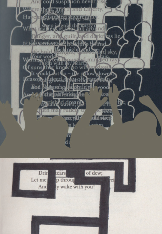
I then changed the colour of the illustration because from looking at the previous screenshot I wasn't sure if it was going to look better with a creamy or brown colour. I think the blue and cream colours achieve an effective colour combination but I wasn't sure if it was striking enough.

I have now changed all the colours where I had the maze as an orange colour on the ‘colour burn’ setting. I then had the crowd as a red. I chose this colour as red is a colour that represents danger so because the theme is fears, I thought it would be giving the impression that its a bad thing. I have also added text of the name of the fear that I am showing. I decided to have it white as that was the colour that was going to standout the most. I wanted to have it directing the same way as the illustration. Another reason is that it then can cover some of the harsh straight line below it.
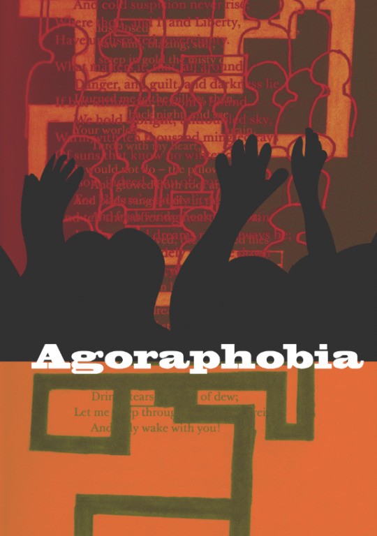
I have now slightly moved the text further up so that it is half on the illustration and the other half is on the background. I think this works better as it looks more tidy. Another section that I have changed was the illustration where I enlarged it so that it covers some of the background space. In some ways it has improved the piece but this means that there is less people showing so it looks less like a crowd. As well as this, I have changed the fill of the illustration to a grey because I wasn't sure if the black was too harsh on the previous screenshot. I think altering this has achieves a better look with all the colours working together.
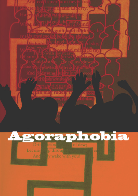
I then just wanted to see what it would look like if I went back to original size but with the grey colour. I feel it still works although having it on a larger scale covers up some of the negative space as the size is quite small on this screenshot.

Above, I am trying some different colours with the cream illustration again. For the maze page, I went into ‘colour overlay’ and clicked onto ‘lighten’ so that the marks I drew on are orange and white background has a slight tint of orange. I think I then changed the crowd at the top although I’m not sure what I actually selected as at the time I was experimented and I didn't always look at what the thing I was selecting was. Although, I think colour combination works well against one another. These colours that I have picked do not reflect or relate to anything.

Again while playing around with the different settings I found that this colour combination appeared. It is quite bright colours with the vibrant red and yellow on the bottom and two shades of blue on the top. I think these colours are a bit too bright and almost take away what it is actually trying to show.

I then found these coloured that are a lot more muted. Looking back, the only thing I that would have done is to change the cream illustration to grey as it clashes with the lines from the crowd above. Apart from that the blue and orange accomplishes an effective piece.
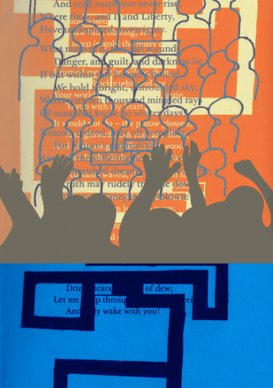
Here, I have swapped the colours around but I have slightly changed the shade and tint on them. The blue is a darker blue is then allowing the colour to show through the crowd with some darker parts from the maze section. I think this is really successful and the shade of orange I managed to get is an attractive shade with the lighter colour of the maze too. Likewise, I think the drawing could work better being a light grey.

Lastly, I was playing around with another adjustment where it has allowed the maze to show over the top of the drawing. It has changed the colour to red which I think happened because its going over the black illustration. I think this looks effective, also with the little detail of the page number in the corner too.
Overall, I think experimenting with the settings and adjustments that were on photoshop allowed me to find the most effective looks and colour combinations.
0 notes
Last Seen Blogs
nerdsaregoingtotakeover
I have a Virus in my Brain.

mykeyzash04
MommieDaize

carlinhaely
Melancia Selvagem

aspoonofsugar
Happy moments

houchlife
Houch Life