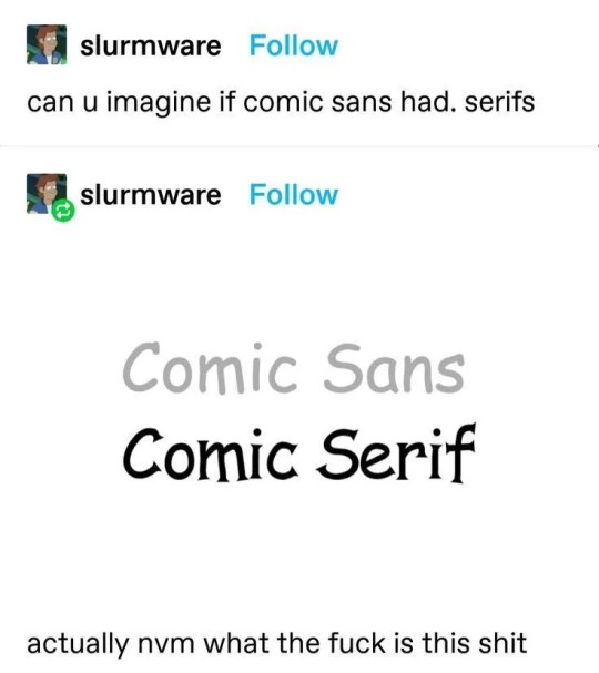
#comic sans serif
Text

calling in to editorial
#doodles#dc comics#oracle#barbara gordon#batman#does it give VOGUE. no. sans serif is ruining that.#i actually traced Futura Medium#.png
2K notes
·
View notes
Note
Are you aware of the existence of the comic serif and comic papyrus fonts? If not you are aware now
I've seen Comic Serif a few times (there was a tumblr post about it a while back)
^ (This one)
BUT I'VE NEVER HEARD OF COMIC PAPYRUS AHFKFNSK,,, (apparently they changed the name to Comic Parchment!) but the first thing that popped up when I searched it up is fantastic:
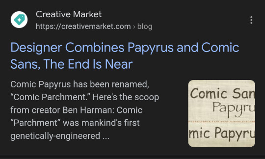
"Comic “Parchment” was mankind’s first genetically-engineered superfont" (Ben Harman, creator of the font) is such a funny way to put it.
Thank you for blessing me with this information, anon.
#i think a True Comic Serif should match the serifs on the capital 'C' BUT i think this version is way funnier and thus is even better#also. I think that Swapfell Sans speaks in Comic Serif#genuinely thats been my internal headcanon since I first saw that post lolol#velwy.txt#inbox#anon
145 notes
·
View notes
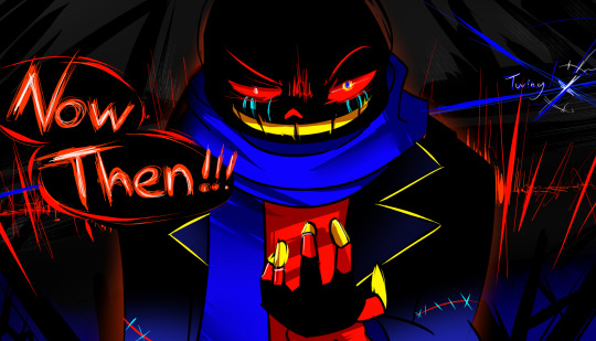
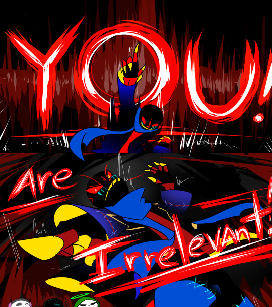
Text
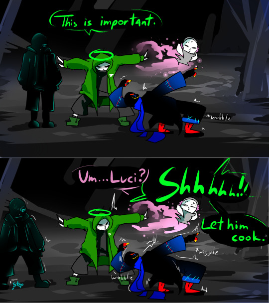
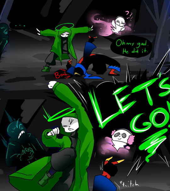
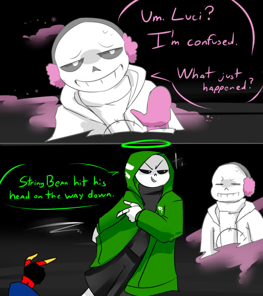
Update 12
<< Previous
#undertale au#undertale au sans#nightmare sans#lucida s serif#undertale aus#ut au#ut au comic#error sans#underheaven#haventale sans#utmv#utmv au#utmv sans
41 notes
·
View notes
Text
i whipped this up in 30 minutes because i couldn't find an error blinkie banner thingy. the color palette is atrocious but i felt like that fit error so i kept it. LOL.

art by @/jakei95
error sans by @/loverofpiggies
edit: downsized it a bit

if any of these creators ask me to take this down i will. thanks 👍
#it may look like garbage#i cant tell#im tired#utmv blinkie#error sans#i think its also the wrong size#LMAO#im sorry#it may also be off centered#idk#u like my comic serif font#i wanted comic sans#but ibispaint only has so many fonts#i picked the closest looking one#i may make a better one#later though
4 notes
·
View notes
Text
i don't think the world would be the same sans undertale
#haha get it#because sans means without#that's where sans' name comes from#comic sans#sans serif#without serifs#i know font stuff#for i am of the autism#undertale#sans undertale#sans ut
13 notes
·
View notes
Text
yeah yeah times new roman is the standard or whatever but have you ever considered that serif fonts suck and should be illegal wherever i am forever with no exceptions?
#sans all the way babeyyyyy#not sans undertale#sans serif#if i'm posting a lot of nonsense today it's bc i accidentally left my earbuds and therefore my concentration at home#so i'm just going to be v distractable today#bc music is the only thing keeping me on-task i have no idea how i did things w/o it for years#i cannot even draw w/o music :(#i will attempt to write this case summary but i have to read 20 pages in a SERIF FONT and then make my writing serif too#biggest betrayal to my essays is making them times new roman#at least i have one prof with common sense. she only accepts things in her specific formatting w calibri#and me and calibri can get along#we can be besties even#we can hold hands and gently kiss each other on the lips#we can get married and adopt many children including comic sans#he would be bullied relentlessly but we would only find him slightly ironic so it's okay#y'know i remembered today that one can take medication to solve their problems instead of just dealing w them#was reading about MDD for class and they were like these kinds of drugs can make you less depressed#and i was like. wow. you can do that? i thought you had to suffer through it??#thought that was just one of those things(tm) that we all went through and if you made it out alive then good for u#but apparently you can take meds and then stop it from happening altogether??#i knew this somewhere in my brain i think but one of my siblings got anti-depressants and they made them significantly worse#so ig i forgor that they could work#but i could never take them because i'm much more interesting as-is#do you think someone completely stable would have so much fun messing with people??#i will be a mad scientist. i was born to be one#when i get a doctorate it's over for all you weaboo shits
2 notes
·
View notes
Text
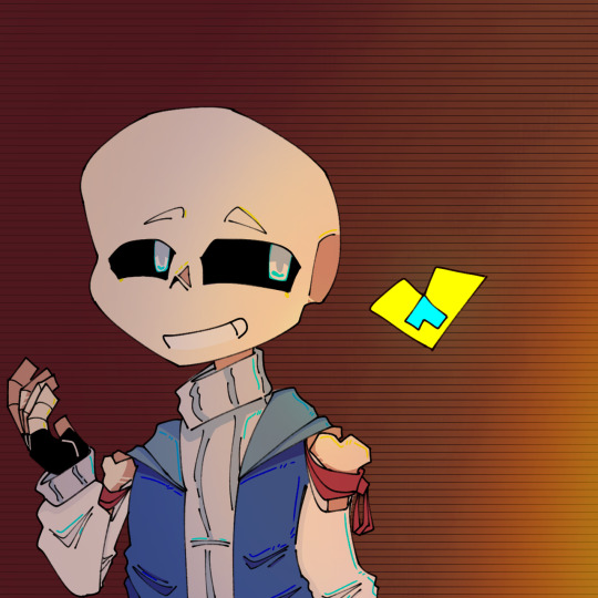
Jello jello.
Ca here.
Sorry, got kinda sidetracked with school and stuff. Not to mention my mouth curently taste like blood.
Anyways meet soul sans. Theyre Au name is FontTale. Basictly every skeleton is made from human corpses and human soul and a big dose of magic from the mage. Yada yada war hapened and stuff. The skeleton have theyre codes name is from font, wich is why the Au named that. Inside soul body they are two soul, the yellow one is serif and the blue one is comic (the one who usualy control the body is comic). I will put more detail about theyre backstory another time.
Thats all, hope you have a good time.
Buh bye!
#sans#sans au#undertale#undertale alternate universe#undertale art#undertale au#FontTale#SoulSans#sans serif#comic sans
1 note
·
View note
Text
Started using comic sans as my default font as a joke and I’ve fallen in love with it. It’s so friendly and easy to read. Makes everything a little sillier and less boring. I love you comic sans. I’m kissing u on the mouth
#al speaks#comic sans hate is from ignorant fools who close their minds to the joy of soft lines and no serifs
2 notes
·
View notes
Text
God, I hate saying this, but I'm in a typography mood...
#polls#poll#typeface#typography#typefaces#sans serif#helvetica#univers#comic sans#arial#optima#futura#futura medium#type#yes i know the two futuras are part of the same typefaces#fuck type terminology
4 notes
·
View notes
Text
another late-to-the-party gaster post but i am wondering how much, in combination w the WingDinGs-aster thing, this word had on the name (if any)
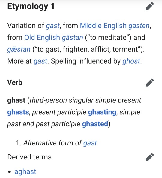
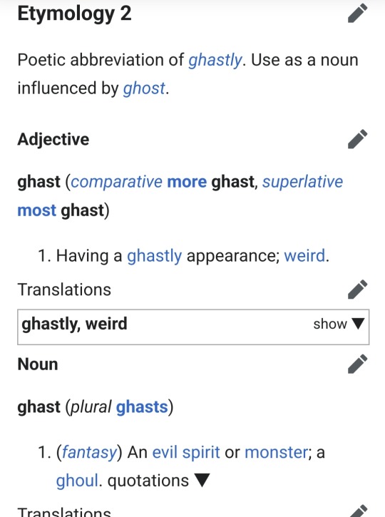
#p#seems appropriate to me bc his mysteryman sprite appearance is.... ghastly! its eerie#and the 'evil spirit' gloss + all the 6s in the code seem to fir#*fit too#side note that aster is a serif font. and .... i dont Think papyrus is? hard to tell. and comic sans is obviously not#i have been like Aware of him being important/the gist just haven't put a lot of thought into him#bc ppl i did see talking abt him all the time seemed like they played a different game than i did lol#similar experience w back when ppl started getting primarily into AUs. killed my interest in UT for a while#gaster#the actual english noun gaster means an ant's stomach apparently. i have learned just now
4 notes
·
View notes
Note
Can we get some more facts on this new liquid please
An original concept was that instead of Serif having thoughts of Murder and Cannibalism, he'd have thoughts of Murder and Rape. the last one was considered as I wanted him to truly be fucked up mentally but my friend advised against.
Comic and Serif speak in different fonts, Comic in Comic Sans MS and Serif in Sans Serif.
Comic is barely able to use magic.
#liquidation facts#liquidation#liquidation rework#liquidationta#sans#undertale#alternate timeline#comic sans#sans serif#fun facts
2 notes
·
View notes
Note
So I saw the instrument ask and I hope this is cool to drop this question I’ve been puzzling over. If not just ignore this. I don’t have anyone else to theorize with.
I read a fic where all the au! Skeletons end up in the og world on the surface (classic scenario.) They use nicknames for each other but they have to register “legal” names with the government (for jobs and licenses etc.) Sans and Papyrus are already taken so they use other font names as for it. Ever since I’ve read it I can’t decide what names each would go by and I want your opinion.
There are only two I’ve decided on:
Swapfell Sans - Garamond
Underfell Papyrus - Roman (from times new Roman obvs)
But I’m going crazy trying to decide on any others and I seek your counsel.
I have a list of possible fonts but I don’t want to drop it on you because this ask is already kinda long but if you do want it I’ll send it. Sorry again for the text dump.
IT'S ABSOLUTELY ALRIGHT <333 I'd love to see if I can help out any :o!! (*grabby hands* GIMME LIST. I LOVE LISTS.)
What are your criteria and thoughts for picking fonts👀? Is it just Vibes or are there any specific reasons for the ones you've chosen so far :?
I really like Roman for UF!Papyrus... sharp, tight and snappy- full of straight lines and points... free of frills and loops but still stylish in it's own right! Also somewhat disliked in certain spaces PLUS it has the inherent correlation between the Romans [empire] and UF!Papyrus' role in the royal guard !
Tangentially related, I found an article by the NY Times (coincidence? I think not!! /lh /j) that's just all about Garamond (the font), and it's especially fun to read with the context of Swapfell!Sans
"And where some see elegance, others perceive fussiness. There’s a stereotype associated with the sort of person who loves Garamond: The Garamond Guy, if you will, is irritatingly uptight, so certain of his own profundity that his words must be conveyed with the weight of a 500-year-old French typeface."
Source
#i feel like ive probably read that same fic...#esp. if SF!Sans' brother was called Palatino lol#sorry i havent given any help yet im reclining on a fancy fainting couch and batting my eyelids at u because i love getting asks-#-except instead of looking cool and or sexy i just look a bit like a limp noodle draped over the cushions. what was i saying#i also went thru a crisis abt what legal names to give the skeletons a while back lol#i didnt go anywhere with it because it is relevant for 1 (one) scene and thats it so i just named sf!sans Sans Serif#purely because i think he was the first to get the paperwork done and classic sans' legal name is either-#- 'comic sans' or 'sans' (all lowercase)#velwy.txt#inbox#anon#do i need to make a tag for these lol#mindmortar
24 notes
·
View notes
Text
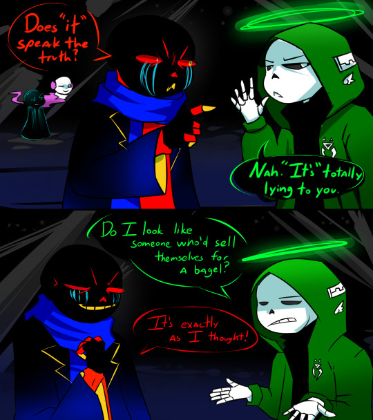


Update 11
Next >>
#undertale au#undertale au sans#nightmare sans#lucida s serif#undertale aus#ut au#ut au comic#error sans#underheaven#haventale sans#haventale#underhell sans
27 notes
·
View notes
Text
the easiest way to spot typos is to change the font. trust me, switch to idk comic sans before you start proofreading. it's easier to notice things when everything looks different
4 notes
·
View notes
Text
Song (c) Pat Benatar
Sentinaltale & characters (c) Me
Fellswitch & characters (c) Arerona (deviantart.com)
#Love is a Battlefield#Sentinaltale#Fellswitch#Aria#Serif#Derringer#Sentinaltale Sans#Fellswitch Papyrus#souls#song comic
2 notes
·
View notes
Text
in theory im very good at reading but in practice i cant read SHIT unless its in the perfect font with the perfect spacing so buying physical non-comic books is So difficult. why do online listings never put a picture of the page layout. i need to know how bad your paragraph spacing is. can i email my local bookstore and ask if they can take a pic of a page. is that allowed
#comics im mostly fine with (although ive realized i read some things like particularly manga easier than others)#(like if you tell me to read a superhero comic i'll die. mostly because of 'creative' font choices (whatever was going on in batman year 1))#(but comics with clear simple fonts and generous spacing between the text and the edges of the speech bubbles helps a lot)#(and a lot of translated manga is formatted that way so maybe thats why? just theorizing tho lol)#but with written novels im a MESS#i need large spacing around the text to the edge of the page (1.5-2cm in mass market paperbacks is okay but if a trade paperback doesnt have#at LEAST a inch or an inch and half around the text blocks i'll die irl)#i also need the font to be a good solid medium or smaller size so large print books are out for me#also the spacing between letters needs to be standard but the spacing between words and ESPECIALLY the spacing between paragraph breaks#needs to be a little bigger#USUALLY sans serif fonts are better for me but a good standard ass serif like times new roman works like as long as its clear and blocky#and the printing of the words needs to be CRISP like okay i wanted to read no longer human because of its influence#so i went to the store to check out the translated copies but then i was killed on impact when i saw how fuzzy and fucked up the text was#girl i cant read that. girl help.#AND LIKE the solution is obviously just reading more ebooks BUT I LIKE reading books physically 😔#easier to remember what books im reading and where i am in them that way jfklskfjdsa#sorry its just i love reading but my reading ability is mysterious and unpredictable HJKFLDSHJDKF#im trying to get a copy of phantom of the opera and im dying. not only are there 1000000 million translations. there is also...#100000 million different printings of the oldest public domain translation JFKLDSHJDKL:Ss#pray for me#luckily 99% of the books i read at least are from the library or borrowed from someone so i can check the font beforehand#but my library doesnt have everything RIP
1 note
·
View note
Last Seen Blogs


