#how to use text tool in photoshop
Text
Text Tool in Photoshop | फोटोशॉप में टेक्स्ट टूल का प्रयोग कैसे करें
Text Tool in Photoshop | फोटोशॉप में टेक्स्ट टूल का प्रयोग कैसे करें
Photoshop में Text Tool का Use कैसे करें (How to Use Text Tool in Photoshop)
Text Tool in Photoshop – Type Tool आपको अपने Documents में Text जोड़ने की अनुमति देता है। आप विभिन्न Project पर Text का Use कर सकते हैं- Example के लिए, आप Poster, अवकाश कार्ड या आमंत्रण बनाने के लिए अपनी Images में Text जोड़ सकते हैं। यदि आप Photoshop में किसी Documents या Image पर Text को Type करना चाहते हैं तो सबसे…

View On WordPress
#adobe photoshop#adobe photoshop cc#how to edit text in photoshop#how to use text tool in photoshop#how to use text tool in photoshop cs6#photoshop#photoshop cc tutorial#photoshop in hindi#photoshop text effects#photoshop text tutorial#photoshop tools#photoshop tutorial#photoshop tutorial in hindi#photoshop tutorials#text in photoshop#text tool in photoshop#text tool in photoshop cc#text tool in photoshop in hindi#type tool in photoshop
0 notes
Text
heheheheheheh
#y’all are not READY!!!#not sure how making gifs is gonna work on my iPad i might end up needing to add a subscription for my laptop .__.#we shall see#regardless I’m Pumped#i have had…so much trouble with procreate bc it just. doesn’t have the tools I’m used to?#i learned digital art and editing on photoshop#it probably sounds pretentious/stuck-up but. I’m used to a more advanced program#procreate is great for the price it just isn’t the best fit for me#ANYWAYS im currently happy stimming at all the shit that’s on CSP. im so happy. time to fuckin re-start every WIP I had in procreate lmao#side note catch me adding alt text to everything bc I’m trying to get better at writing it oof#oryginals
2 notes
·
View notes
Text
Just a bunch of Useful websites - Updated for 2023
Removed/checked all links to make sure everything is working (03/03/23). Hope they help!
Sejda - Free online PDF editor.
Supercook - Have ingredients but no idea what to make? Put them in here and it'll give you recipe ideas.
Still Tasty - Trying the above but unsure about whether that sauce in the fridge is still edible? Check here first.
Archive.ph - Paywall bypass. Like 12ft below but appears to work far better and across more sites in my testing. I'd recommend trying this one first as I had more success with it.
12ft – Hate paywalls? Try this site out.
Where Is This - Want to know where a picture was taken, this site can help.
TOS/DR - Terms of service, didn't read. Gives you a summary of terms of service plus gives each site a privacy rating.
OneLook - Reverse dictionary for when you know the description of the word but can't for the life of you remember the actual word.
My Abandonware - Brilliant site for free, legal games. Has games from 1978 up to present day across pc and console. You'll be surprised by some of the games on there, some absolute gems.
Project Gutenberg – Always ends up on these type of lists and for very good reason. All works that are copyright free in one place.
Ninite – New PC? Install all of your programs in one go with no bloat or unnecessary crap.
PatchMyPC - Alternative to ninite with over 300 app options to keep upto date. Free for home users.
Unchecky – Tired of software trying to install additional unwanted programs? This will stop it completely by unchecking the necessary boxes when you install.
Sci-Hub – Research papers galore! Check here before shelling out money. And if it’s not here, try the next link in our list.
LibGen – Lots of free PDFs relate primarily to the sciences.
Zotero – A free and easy to use program to collect, organize, cite and share research.
Car Complaints – Buying a used car? Check out what other owners of the same model have to say about it first.
CamelCamelCamel – Check the historical prices of items on Amazon and set alerts for when prices drop.
Have I Been Pawned – Still the king when it comes to checking if your online accounts have been released in a data breach. Also able to sign up for email alerts if you’ve ever a victim of a breach.
I Have No TV - A collection of documentaries for you to while away the time. Completely free.
Radio Garden – Think Google Earth but wherever you zoom, you get the radio station of that place.
Just The Recipe – Paste in the url and get just the recipe as a result. No life story or adverts.
Tineye – An Amazing reverse image search tool.
My 90s TV – Simulates 90’s TV using YouTube videos. Also has My80sTV, My70sTV, My60sTV and for the younger ones out there, My00sTV. Lose yourself in nostalgia.
Foto Forensics – Free image analysis tools.
Old Games Download – A repository of games from the 90’s and early 2000’s. Get your fix of nostalgia here.
Online OCR – Convert pictures of text into actual text and output it in the format you need.
Remove Background – An amazingly quick and accurate way to remove backgrounds from your pictures.
Twoseven – Allows you to sync videos from providers such as Netflix, Youtube, Disney+ etc and watch them with your friends. Ad free and also has the ability to do real time video and text chat.
Terms of Service, Didn’t Read – Get a quick summary of Terms of service plus a privacy rating.
Coolors – Struggling to get a good combination of colors? This site will generate color palettes for you.
This To That – Need to glue two things together? This’ll help.
Photopea – A free online alternative to Adobe Photoshop. Does everything in your browser.
BitWarden – Free open source password manager.
Just Beam It - Peer to peer file transfer. Drop the file in on one end, click create link and send to whoever. Leave your pc on that page while they download. Because of how it works there are no file limits. It's genuinely amazing. Best file transfer system I have ever used.
Atlas Obscura – Travelling to a new place? Find out the hidden treasures you should go to with Atlas Obscura.
ID Ransomware – Ever get ransomware on your computer? Use this to see if the virus infecting your pc has been cracked yet or not. Potentially saving you money. You can also sign up for email notifications if your particular problem hasn’t been cracked yet.
Way Back Machine – The Internet Archive is a non-profit library of millions of free books, movies, software, music, websites and loads more.
Rome2Rio – Directions from anywhere to anywhere by bus, train, plane, car and ferry.
Splitter – Seperate different audio tracks audio. Allowing you to split out music from the words for example.
myNoise – Gives you beautiful noises to match your mood. Increase your productivity, calm down and need help sleeping? All here for you.
DeepL – Best language translation tool on the web.
Forvo – Alternatively, if you need to hear a local speaking a word, this is the site for you.
For even more useful sites, there is an expanded list that can be found here.
76K notes
·
View notes
Text
Generative AI Policy (February 9, 2024)

As of February 9, 2024, we are updating our Terms of Service to prohibit the following content:
Images created through the use of generative AI programs such as Stable Diffusion, Midjourney, and Dall-E.
This post explains what that means for you. We know it’s impossible to remove all images created by Generative AI on Pillowfort. The goal of this new policy, however, is to send a clear message that we are against the normalization of commercializing and distributing images created by Generative AI. Pillowfort stands in full support of all creatives who make Pillowfort their home.
Disclaimer: The following policy was shaped in collaboration with Pillowfort Staff and international university researchers. We are aware that Artificial Intelligence is a rapidly evolving environment. This policy may require revisions in the future to adapt to the changing landscape of Generative AI.
-
Why is Generative AI Banned on Pillowfort?
Our Terms of Service already prohibits copyright violations, which includes reposting other people’s artwork to Pillowfort without the artist’s permission; and because of how Generative AI draws on a database of images and text that were taken without consent from artists or writers, all Generative AI content can be considered in violation of this rule. We also had an overwhelming response from our user base urging us to take action on prohibiting Generative AI on our platform.
-
How does Pillowfort define Generative AI?
As of February 9, 2024 we define Generative AI as online tools for producing material based on large data collection that is often gathered without consent or notification from the original creators.
Generative AI tools do not require skill on behalf of the user and effectively replace them in the creative process (ie - little direction or decision making taken directly from the user). Tools that assist creativity don't replace the user. This means the user can still improve their skills and refine over time.
For example: If you ask a Generative AI tool to add a lighthouse to an image, the image of a lighthouse appears in a completed state. Whereas if you used an assistive drawing tool to add a lighthouse to an image, the user decides the tools used to contribute to the creation process and how to apply them.
Examples of Tools Not Allowed on Pillowfort:
Adobe Firefly*
Dall-E
GPT-4
Jasper Chat
Lensa
Midjourney
Stable Diffusion
Synthesia
Example of Tools Still Allowed on Pillowfort:
AI Assistant Tools (ie: Google Translate, Grammarly)
VTuber Tools (ie: Live3D, Restream, VRChat)
Digital Audio Editors (ie: Audacity, Garage Band)
Poser & Reference Tools (ie: Poser, Blender)
Graphic & Image Editors (ie: Canva, Adobe Photoshop*, Procreate, Medibang, automatic filters from phone cameras)
*While Adobe software such as Adobe Photoshop is not considered Generative AI, Adobe Firefly is fully integrated in various Adobe software and falls under our definition of Generative AI. The use of Adobe Photoshop is allowed on Pillowfort. The creation of an image in Adobe Photoshop using Adobe Firefly would be prohibited on Pillowfort.
-
Can I use ethical generators?
Due to the evolving nature of Generative AI, ethical generators are not an exception.
-
Can I still talk about AI?
Yes! Posts, Comments, and User Communities discussing AI are still allowed on Pillowfort.
-
Can I link to or embed websites, articles, or social media posts containing Generative AI?
Yes. We do ask that you properly tag your post as “AI” and “Artificial Intelligence.”
-
Can I advertise the sale of digital or virtual goods containing Generative AI?
No. Offsite Advertising of the sale of goods (digital and physical) containing Generative AI on Pillowfort is prohibited.
-
How can I tell if a software I use contains Generative AI?
A general rule of thumb as a first step is you can try testing the software by turning off internet access and seeing if the tool still works. If the software says it needs to be online there’s a chance it’s using Generative AI and needs to be explored further.
You are also always welcome to contact us at [email protected] if you’re still unsure.
-
How will this policy be enforced/detected?
Our Team has decided we are NOT using AI-based automated detection tools due to how often they provide false positives and other issues. We are applying a suite of methods sourced from international universities responding to moderating material potentially sourced from Generative AI instead.
-
How do I report content containing Generative AI Material?
If you are concerned about post(s) featuring Generative AI material, please flag the post for our Site Moderation Team to conduct a thorough investigation. As a reminder, Pillowfort’s existing policy regarding callout posts applies here and harassment / brigading / etc will not be tolerated.
Any questions or clarifications regarding our Generative AI Policy can be sent to [email protected].
2K notes
·
View notes
Text

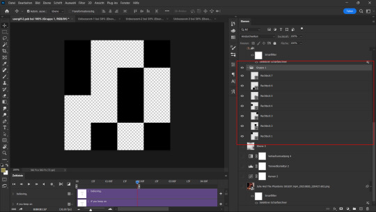
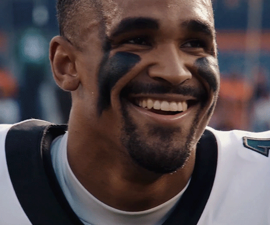
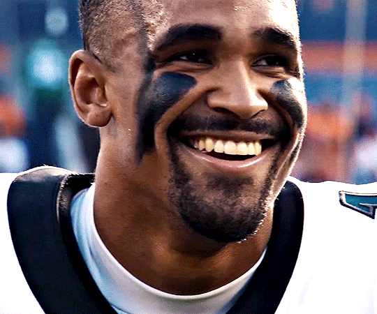
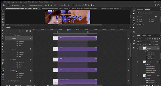
FALLING LETTERS ANIMATION tutorial
hello! @kimmomi asked for a tutorial on how i made the letters "fall" in this gifset and so i figured i would make it and post here! this effect isn't hard to achieve but it might get a little tedious if you have a lot of letters.
note: you will need photoshop with a timeline!
STEP ONE: create your base gif! be mindful of number of frames in your gif. the number of frames doesn't really matter here, altho the longer the gif the better the effect. i'd say try to limit it to 60-70 frames, depending on how big your final gif will be.
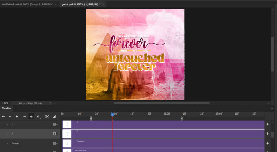
STEP TWO: make your text the way you want it to look. this effect is basically the last step of your gif making process. (i will be using the typography from my set as an example as i already have that psd saved)
this is what my typography looks like now.

STEP THREE: i would recommend that the word at the bottom be the word that "falls". for me that is forever.
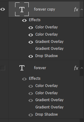
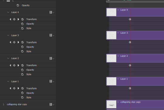
now, you will have to duplicate the "forever" layer and make your non-copy forever invisible.
what you will want to do now is delete all the letters but the first one in the duplicated layer. for me that is f. then you just duplicate the f layer and write your second letter instead of it, in my case o. you will have to do this for all letters. also as you do that make sure to move them a bit away from each other.

now, what helps to align those letters where they start off, is making your non-copy layer to be visible again.

after you've aligned your letters, make the non-copy layer invisible again.
STEP FOUR: so now we come to a bit of a tedious part.
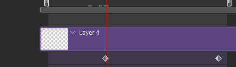
what you will do now is move the playhead (blue timeline arrow) a bit further from the beginning of the gif (this allows for the text to stay still a bit before it starts "falling") and click on the first letter.
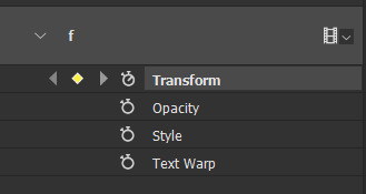
next step is to click on the little arrow next to your letter and clicking on the stopwatch next to Transform.

then, you will take the playhead and drag it to the end of the gif where you will start with transforming your letter with Free Transform tool (shortcut ctrl+T on windows). and what you will do is, while in Free Transform mode, drag your letter to the bottom of your gif while also rotating it a bit. when you're happy with your placement of the letter, hit enter. see below gif for how i did it.

you will have to do this for every letter, but make sure to rotate some in the other direction. also make sure that the beginning of the stopwatch mark is the same for every letter.
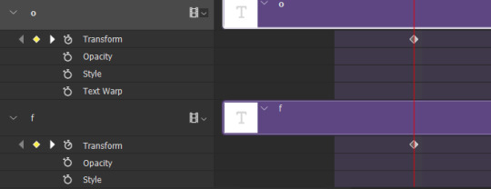
and that is basically it! after you transform every letter, you can go and save your gif.
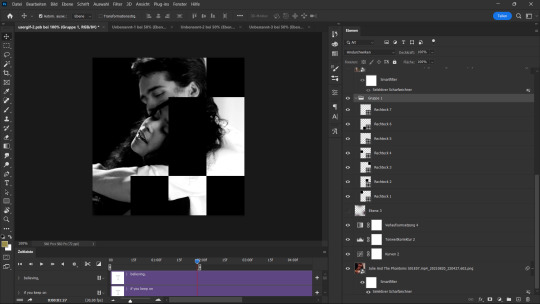
this is my final result:

for some extra dramatic look, you can duplicate your initial layer with the whole word on it, drag it above all layers, clear layer style and add a stroke and make sure its FIll is at 0% where you will get the outline text that stays behind.

i hope this was helpful and understandable. if you have any questions, feel free to send me an ask or dm me <33
#usergif#completeresources#allresources#gif tutorial#ps help#userkimchi#uservivaldi#userraffa#tusermona#userelio#usercats#tuserheidi#usershreyu#userhallie#userroza#userdean#userisaiah#thingschanged#tusercasey#usertj#userwwz
520 notes
·
View notes
Text

HOW TO: Make an iPhone Layout
+ Downloadable Template
Hi! I've gotten a few messages asking for a tutorial on my iPhone gifsets — but instead of only doing a tutorial (that would probably be triple the length this one already is), I decided to turn my layout into a template with all the bits and bobs! In the "tutorial" under the cut, I'll share everything you'll need, a free template download, and quickly go over how to use this template. :)
Disclaimer: This template uses Video Timeline and this tutorial assumes you have a basic to intermediate understanding of Photoshop.

PHASE 1: THE ASSETS
1.1 – Download fonts. These are the fonts used for all assets I've included in my template:
– SF Pro or SF Pro Display (Regular, Medium, Bold): Either version works, they look nearly identical. You can download directly from https://developer.apple.com/fonts/ or easily find it via Google
– Bebas Neue: Free on Google Fonts, Adobe Fonts, and dafont
– Times New Roman (Bold): Should be a default font in Photoshop

Make sure to download and install any of the fonts you don't already have before opening my template. That way, once you open the template file, all the settings (font size, weight, spacing, color, opacity, etc.) are as intended.
1.2 – Download my template.
Before you use my template, all I ask is that you don't claim or redistribute it as your own and that you give me proper credit in the caption of your post. Making these iPhone gifsets takes me a longgg time and turning this layout into a template took several hours too.
DOWNLOAD TEMPLATE VIA KO-FI ← This template is completely free to download (just enter $0), but if you feel inclined to tip me, I appreciate you! 💖
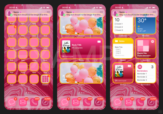

BTW this template also includes some of my frequently used icons!
NOTE: If, for some reason, you open the template and see the pop-up shown below, click "NO" — otherwise, the fonts will be all messed up:
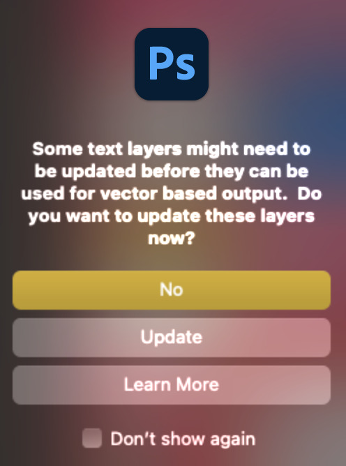
And if you see this triangle with an exclamation point by a text layer, don't double-click it — it'll mess up the font as well:

PHASE 2: THE GIFS
I'm just going to briefly go over gif sizes and my recommendations. Also, keep in mind when grabbing your scenes, you'll want all of these gifs to be the same amount of frames.
2.1 – Background Gif: 540 x 540 px.
I recommend this size so you have a good amount of visibility for the gif behind the iPhone wallpaper. I also recommend making this black and white (or in my case, black and white with a slight blue tint — idk I just like the way it looks) so the wallpaper coloring can stand out.
2.2 – Wallpaper Gif: 230 (w) x 500 (h) px.
Keep in mind the very narrow dimensions of the wallpaper! And also keep in mind that you'll have a bunch of apps and widgets covering the image. I try to use wide shots (or layer my clips into looking like wide shots). Also, keep in mind your color scheme for your set and your character's aesthetic! I tend to focus on one or two colors for the wallpaper.
I usually position the wallpaper to the side with 20px bumpers, so there's lots of space to see the background:
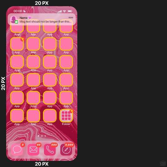
2.3 – Large Photo Widget Gif: 201 (w) x 96 (h) px.
2.4 – Small Photo Widget Gif: 94 x 94 px.
PHASE 3: THE TEMPLATE – "IPHONE" FOLDER
In this section, I'll try to quickly walk you through how to use this template and some bits that may require extra instructions. I'll be going through each folder from top to bottom.
3.1 – Status Bar.
Time, Service, and WiFi are pretty self-explanatory. In the Battery folder, you can use the shape tool to adjust the shape layers labeled "Fill (Adjustable Shape!)" to customize the battery level.
3.2 – Message Notification.
Again, these are pretty self-explanatory. I've already masked the circle for the contact photo, so you can simply import any photo and use the transform tool to shrink it down. The circle is 24x24 px. If you don't want to use a photo, there's another folder called Default Initials.
If your message text can't fit the text box, the message should end with ellipses which is how iOS caps off long texts.
3.3 – Blurred Banner (IMPORTANT)
This folder is easy to miss because there's only one placeholder layer in there. On iPhones, the area behind a banner notification and the dock get blurred (including the wallpaper and any apps).
What to do: Make a duplicate of the apps in Row 1 and/or widgets that intersect the message banner, convert them all into one smart object, apply a Gaussian Blur filter (Radius: 3.0 pixels) on the smart object, and move the smart object into this masked folder!
(There's another masked folder in the Wallpaper folder for the dock which I'll go over in that section.)
3.4 – Apps
Turn off the yellow guide if you don't need it to keep things aligned and turn off layers you don't need by clicking the eye icon. Replace the "App" placeholder text with your app name, change the color or gradient of the square to compliment your color scheme, and add your custom app icon overlay!
If you can't find an app icon you need from the ones I provided, flaticon.com is a great resource. Also, if you can only find the filled version of an icon, check out this tutorial for how to make any text or shape into an outline.
Also, each app folder has 4 notification bubble options (1-4 digits). Again, you can toggle these on and off as you need!
3.5 – Big Widgets
I like using these when my wallpaper has A LOT of negative space to fill. I included the Photos and Books widgets in my template, but there are lots of widgets available on iPhones. You can check some of the other ones I've done here, or if you have an iPhone, simply try adding some widgets to your phone!
There are also widgets bigger than these, but they would take up half of the phone screen which is why I don't use them for these edits.
3.6 – Small Widgets
The only thing I'll say about these — because they're pretty straight forward — is there are a lot more weather themes than I included in my template. Also, if you set your character's phone to evening, the weather widget will show a dark background (sometimes with stars), so keep that in mind.
Speaking of, I've included Light Modes and Dark Modes for, I think, every applicable widget.
3.7 – Page Dots
These barely perceptible dots indicate that your character has more pages of apps than shown in your gifset (so if an anon tries to come at you, you can just say "it's on the next page of apps" /j /lh)
3.8 – Dock
Again, the dock has notification bubble options and I've included the default app designs, custom filled designs, and custom outlined designs for iMessage, Phone, Email, and Safari (there's also a FaceTime alternative if that's how your character rolls). These are usually the apps people keep in their Dock, but this is fully customizable too. So, if your character is, like, super obsessed with Candy Crush or something and needs it in thumb's reach — you can put it in the dock.
3.9 – Wallpaper
This whole folder is masked already to a 230x500 px rounded rectangle.
Inside, you'll find another "Blurred Portion" folder for the area behind the message banner notification and the dock.
What to do: Duplicate your gif layer and place it in this folder, remove any sharpening filters, and apply a Gaussian Blur filter (Radius: 3.0 px). Be sure to add any coloring/adjustment layers ABOVE this folder and your original sharpened gif layer.
PHASE 4: EXPORT
We made it!
I hope this template makes it super easy for you to recreate this layout! If you decide to try it out, feel free to tag me with #usernik.
If you notice anything wonky about the template, kindly let me know so I can fix it! And if you have any questions about how to use this template, please don't hesitate to send me a message! I just ask that you try to be specific in your question so I'm able to answer you the best I can!
#gif tutorial#completeresources#userpickles#usersmia#userabs#usertreena#alielook#userkosmos#usershreyu#userzaynab#tuserabbie#useryoshi#usersalty#tuserlucie#usernanda#userelio#userhella#usercats#gfx*#resource*
752 notes
·
View notes
Text
(Has alt text.)
AI has human error because it is trained on “human error and inspiration”. There are models trained on specifically curated collections with images the trainer thought “looks good”, like Furry or Anime or Concept Art or Photorealistic style models. There’s that “human touch”, I suppose. These models do not make themselves, they are made by human programmers and hobbyists.
The issue is the consent of the human artists that programmers make models of. The issue—as this person did correctly identify—is capitalism, and companies profiting off of other people’s work. Not the technology itself.
I said in an earlier post that it’s like Adobe and Photoshop. I hate Adobe’s greedy practices and I think they’re evil scumbags, but there’s nothing inherently wrong or immoral with using Photoshop as a tool.
There are AI models trained solely off of Creative Commons and public domain images. There are AI models artists train themselves, of their own work (I'm currently trying to do this myself). Are those models more “pure” than general AI models that used internet scrapers and the Internet Archive to copy copyrighted works?
I showed the process of Stable Diffusion de-noising in my comic but I didn’t make it totally clear, because I covered most of it with text lol. Here’s what that looks like: the follow image is generated in 30 steps, with the progress being shown every 5 steps. Model used is Counterfeit V3.0.
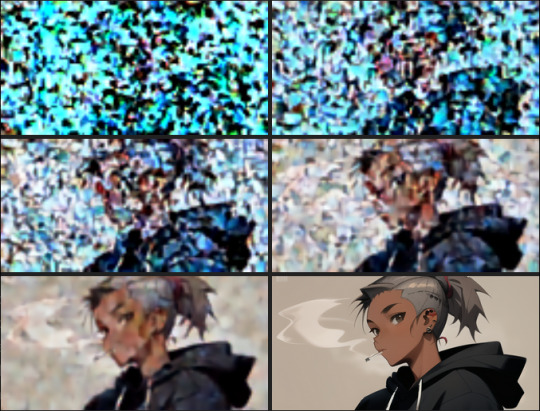
Parts aren’t copy pasted wholesale like photobashing or kitbashing (which is how most people probably think is how generative AI works), they are predicted. Yes, a general model can copy a particular artist’s style. It can make errors in copying, though, and you end up with crossed eyes and strange proportions. Sometimes you can barely tell it was made by a machine, if the prompter is diligent enough and bothers to overpaint or redo the weird areas.
I was terrified and conflicted when I had first used Stable Diffusion "seriously" on my own laptop, and I spent hours prompting, generating, and studying its outputs. I went to school for art and have a degree, and I felt threatened.
I was also mentored by a concept artist, who has been in the entertainment/games industry for years, who seemed relatively unbothered by AI, compared to very vocal artists on Twitter and Tumblr. It's just another tool: he said it's "just like Pinterest". He seemed confident that he wouldn't be replaced by AI image generation at all.
His words, plus actually learning about how image generation works, plus the attacks and lawsuits against the Internet Archive, made me think of "AI art" differently: that it isn't the end of the world at all, and that lobbying for stricter copyright laws because of how people think AI image gen works would just hurt smaller artists and fanartists.
My art has probably already been used for training some model, somewhere--especially since I used to post on DeviantArt and ArtStation. Or maybe some kid out there has traced my work, or copied my fursona or whatever. Both of those scenarios don't really affect me in any direct way. I suppose I can say I'm "losing profits", like a corporation, but I don't... really care about that part. But I definitely care about art and allowing people the ability to express themselves, even if it isn't "original".
#i think its because i went on a open-source-only and self-hosting bender a few years ago that i think like this#the internet is built off of 'share-alike' software#so. i guess. i don't mind 'sharing'#like some sort of... art communist#ai art#long post#inflicts you with my thought beams#my art#responding to tags#ahha the ethics of labeling this ‘my art’ . lets just say#the tag is for so it’s next to the comic when you look in my art tag
315 notes
·
View notes
Note
Hi, me again!
Ty for the reply, I would love an in depth tutorial if you don't mind as i really wanna get this effect to work and I kinda work best when it's spelt out for me when learning new techniques lol :)
hey anon, no worries! here's how i used this amazing template by @danesdehaan and added a rolling effect like this (from this gifset):
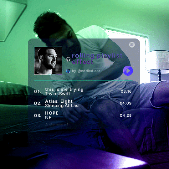
this effect uses photoshop's timeline. i use cs5, for reference.
detailed tutorial under the cut :)
I. PREPARING THE TEXT
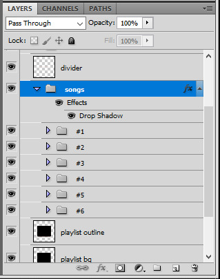
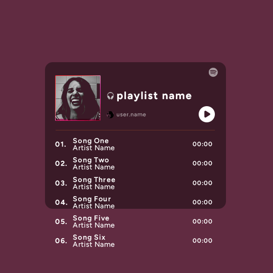
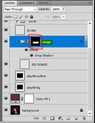
when you open the template, you should have a group called "songs" with 3 groups for each song. what you wanna do is duplicate these numbered groups until you have the amount of songs you want. for each group, use the move tool or your keyboard's arrows to move the duplicated song text layers/groups on your canvas so they're under the first three that are already there. make sure these new duplicated layers are in the "songs" group.
then type the numbers, song titles, artists, song durations, etc. it should look like that:
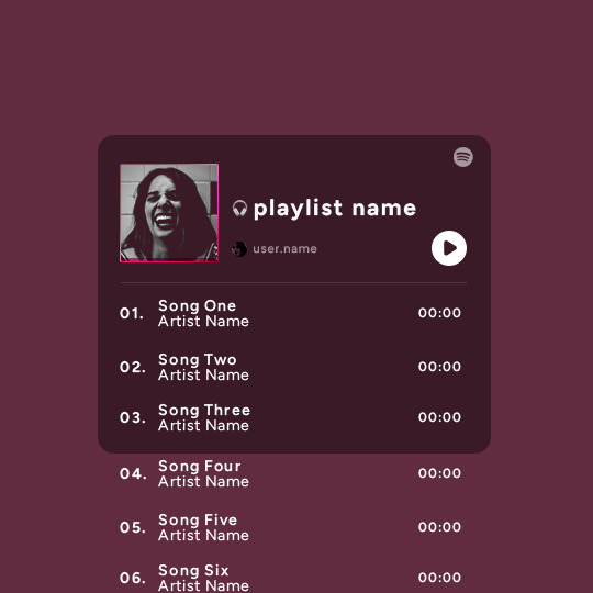
i wanted mine to have a smaller gap in between each song, so i used the arrows to move each song group closer together, and it looks like that before the animation:

II. ANIMATED EFFECT
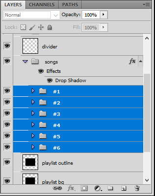
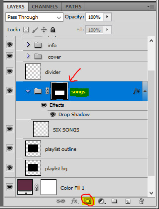
once you have typed everything, make sure there are no mistakes and that you won't need to edit anything about the songs or durations or anything like that, because you won't be able to go back. when that's done, select all of the numbered song groups and right click > Merge Layers.
that will give you one layer with all of the songs together. i've renamed mine "SIX SONGS". make sure this new merged layer is still in the "songs" group.
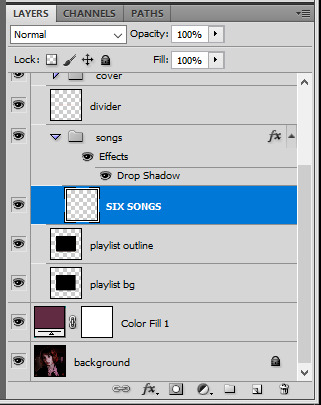
once that's done, you're ready for the animation. and it's pretty easy, because you only need two keyframes: one at the start of the gif, and one at the end.
go to the start of your gif on the timeline, and toggle the position keyframe animation by clicking on the little stopwatch icon. a little yellow keyframe should appear where the cursor is, at the start of the gif:

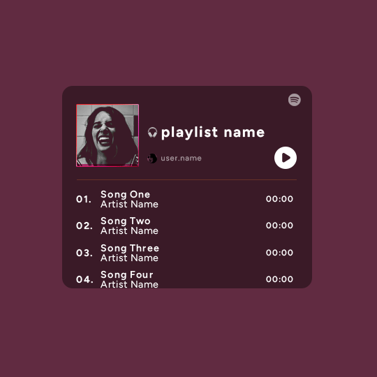
then go to the end of the gif with the cursor. with the "SIX SONGS" layer selected, use the move tool or keyboard arrows (my preference) to move up the text until all the songs are inside the darker rectangle. once you move this layer's position, a keyframe will appear on the timeline and the animation will be created.
the animation now looks like this:
if you want, you can now edit the speed of the animation by moving the keyframes. the closer the two keyframes are, the faster the animation will be; the further apart the keyframes are, the slower the animation will be.
III. LAYER MASK
since we want the songs to be contained in the dark rectangle and below the line, we need to add a layer mask. i started by creating a shape of where i want the songs to be contained with the rectangular marquee tool:
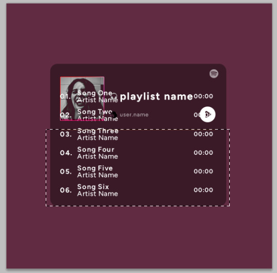
then, on the layers panel, select the "songs" group and click on the layer mask icon to create a mask with that rectangular selection.
if you play the animation after making that layer mask, it should now look like this:
if you like it that way then you are done, yay!
but if you'd like softer edges, like i have done for mine, click on the layer mask's black and white thumbnail. use the brush tool with a 0% hardness and the black color to make the edges of the mask softer. make sure you are making your brush strokes with the layer mask's thumbnail selected.

once you have brushed a bit of black with a soft rounded brush on the top and bottom of the mask, the animation should look like this:
and that's it! i hope this was clear enough :)
#alie replies#Anonymous#*ps help#photoshop#tutorial#resource#completeresources#allresources#resourcemarket#usertj#usertina#usercats#useraish#userdean#userabs#userraffa#userbuckleys#uservivaldi#userisaiah#usernorah
374 notes
·
View notes
Text
I've recently mentioned that I would like to write more about some of the techniques I use, and this last search presented the perfect opportunity.
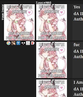
Here, we see that if we pass the starting image to SauceNAO as is, all that it returns are repeated results, seemingly identical to the edit we have. However, with a simple tweak, we can change that.
We start by cutting out all sections of the starting image that do not appear to belong in the original—in this case, that's only the overlaying text. It's better to keep as much of the underlying image as possible.
Next, we fill these holes with something that looks like it belongs in the image. Since I have Photoshop, I use the Content-Aware Fill tool, but you could achieve a similar effect by copying pieces from the remaining sections.
Lastly, we apply a soft Gaussian Blur over the filled sections to reinforce the uniformity over the image. If you squint and it looks like the image is consistent, it's working.

Now, if we pass the modified image to SauceNAO… et voilá! A result for the original image with proper attribution shows up. Isn't that cool?
I can try to explain the reasoning behind this technique, but since I don't know the inner workings of their system, think of this as informed speculation only.
There are many ways to build a Reverse Image Search system, but that will often involve the construction of a descriptor—something that captures the visual characteristics of an image—traditionally created out of a downscaled version of the input. That might be due to the complexity of the construction process or to size requirements for storage.

Above, I shrunk the images we used into 32x32 pixel kernels. Notice how, in the starting image, the overlaying letters are still quite noticeable, even in this small size. The modified sample, however, looks strikingly similar to the kernel of the original image, even though it's just a reconstruction without any additional information.
That's my guess, at least. Now, this might not work that often, particularly when most of the underlying image is covered, but I hope that it can be useful to some of you!
829 notes
·
View notes
Text
Pulp Covers And How To Paint Them
With the rise of cheap printing in the early twentieth century, mass-marked paperbacks swept the world, each offering lurid thrills for obscenely low prices. Sex, sadism, and incredible violence for as little as ten cents. An easy purchase to slot in between fifty cigarettes a day and enough bourbon slugs to kill a small garden.
Pulp fiction is where some of the greats of American literature cut their teeth, including the big three, Raymond Chandler, Ross MacDonald and Dashiell Hammett. The contents of these stories, both the dizzyingly good and astoundingly terrible, have been absorbed and digested and remixed and regurgitated in nearly every permutation imaginable, fuelling pop culture some one hundred years on. This isn't an essay on that. Nobody likes to open a tutorial and be greeted with a wall of text. The history is for another time.
But it is about how to paint it.
Don't let the pre-amble intimidate you, it's not as hard as it sounds. You will need:
Painting software with some image editing capabilities. You don't need all the bells and whistles of Photoshop, but I wouldn't recommend something like MSPaint, at least not to start with. I'm using Clip Studio Paint.
A really beat-up paper texture. The grungier, the better.
A lightly-textured brush. Here are the specific brushes I use, 99% of which is the well-named rough brush. Try and avoid anything with any impasto elements.
Go to your colour-picking tool and use the 'select from layer' option. Doing all the painting on a single layer is going to make your life easier.
A complete willingness to make mistakes and, instead of erasing, painting over them. It generates much more colour variation and interest! Keep your finger off the E key.
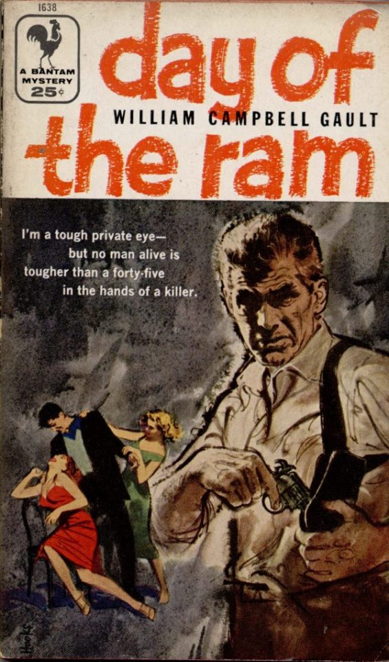
Good reference! That painting is a master copy of Mitchel Hooks' art for Day of the Ram. Find a style you really love and want to learn? Have no clue where to begin? Do direct studies!
Let's not worry about whatever is happening in the background. It's probably fine. Let's get started! Pulp magazine art is a lot more varied than you might first think, so don't agonize over having a style that 'fits' or not. I'm also specifically aiming for something you'd see on the cover after printing, not the initial painting they would use for printing. The stuff I'll show here is a pretty narrow band of it, but here are some general commonalities. This is a painting by Tom Lovell.
Let's dig into this.

The colours are very bright and saturated, but the actual values, the relative lightness and darkness of them, are actually grouped very simply! You can check this by filling a layer full of black, putting it on top and setting its mode to colour. If the value of a painting looks good, you actually get a lot of leeway with colour. But here's what I think is the most important thing to keep in mind.
The darks aren't that dark, and the lights aren't all that light! Covers are paintings reproduced on cheap paper. Anything you wouldn't want to happen in the printing process, you lean into. Value wash-outs, lower contrast, colours getting a weird wash to them, really gritty texturing. So let's get painting! Here's my typical setup.
That bottom folder is the painting itself. The screen layer is the grungy paper texture. To get the effect you want, put it down, invert its colour, then set it to screen. That washes out your painting far, far too much, so to compensate, I put a contrast layer up on top. Fiddle around with the settings, but this is where mine ended up sitting.
Note I'm saying this before even starting the painting: you want to do this as early as possible. This is where the 'select from layer' colour picker comes in handy. You can paint without worrying about the screen or contrast layer. Something not looking right? Enable your value check layer and keep painting. When you turn it off, it'll still be in colour. Here's a timelapse so you can see what that looks like.
And when you check the values...
They're pretty simple! This isn't a be all and end all, but I hope it serves as a decent primer. I want thirty dames on my desk by Monday!
#rochedotpng#art tutorial#art resources#couldn't find a thing online about this style so here's how i do it#pulp#it's how i did the death shroud one more or less
162 notes
·
View notes
Text
Someone asked me how I created the fade transition in this gifset which I’ll try to explain in the most comprehensive way that I can. If you've never done something like this before, I suggest reading through the full tutorial before attempting it so you know what you'll need to plan for.
To follow, you should have:
basic knowledge of how to make gifs in photoshop
some familiarity with the concept of how keyframes work
patience
Difficulty level: Moderate/advanced
Prep + overview
First and foremost, make the two gifs you'll be using. Both will need to have about the same amount of frames.
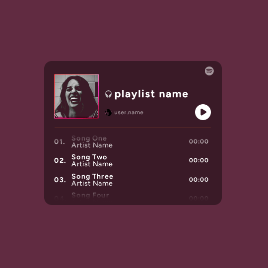
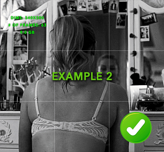
For ref the gif in my example is 540x540.
I recommend around 60-70 frames max total for a big gif, which can be pushing it if both are in color, then I would aim for 50-60. My gif has a total of 74 frames which I finessed using lossy and this will be explained in Part 4.
⚠️ IMPORTANT: when overlaying two or more gifs and when using key frames, you MUST set your frame delay to 0.03 fps for each gif, which can be changed to 0.05 fps or anything else that you want after converting the combined canvas back into frames. But both gifs have to be set to 0.03 before you convert them to timeline to avoid duplicated frames that don't match up, resulting in an unpleasantly choppy finish.
Part 1: Getting Started
Drag one of your gifs onto the other so they're both on the same canvas.
The gif that your canvas is fading FROM (Gif 1) should be on top of the gif it is fading INTO (Gif 2).
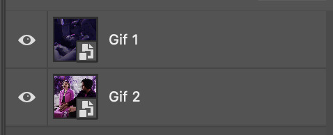
And here's a visual of the order in which your layers should appear by the end of this tutorial, so you know what you're working toward achieving:

Part 2: Creating the grid
Go to: View > Guides > New guide layout
I chose 5 columns and 5 rows to get the result of 25 squares.
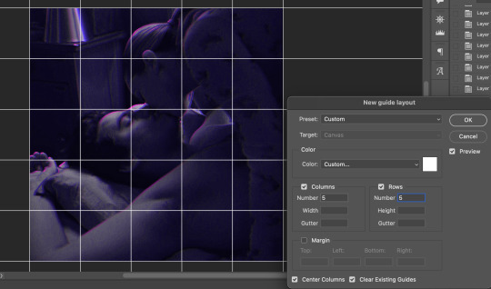
The more rows and columns you choose, the more work you'll have to do, and the faster your squares will have to fade out so keep that in mind. I wouldn't recommend any more than 25 squares for this type of transition.

To save time, duplicate the line you've created 3 more times, or as many times as needed (key shortcut: CMD +J) and move each one to align with the guides both horizontally and vertically. You won't need to recreate the lines on the edges of the canvas, only the ones that will show.
After you complete this step, you will no longer need the guides so you can go back in and clear them.

Follow the same duplicating process for the squares with the rectangle tool using the lines you've created.
Align the squares inside the grid lines. The squares should not overlap the lines but fit precisely inside them.
This might take a few tries for each because although to the eye, the squares look all exactly the same size, you'll notice that if you try to use the same duplicated square for every single one without alterations, many of them will be a few pixels off and you'll have to transform the paths to fit.
To do this go to edit > transform path and hold down the command key with the control key as you move one edge to fill the space.
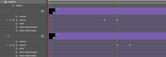
Once you're done, put all the squares in their separate group, which needs to be sandwiched between Gif 1 and Gif 2.

Right click Gif 1 and choose "create clipping mask" from the drop down to mask it to the squares group. This step is super important.
After this point, I also took the opacity of the line groups down to about 40% so the lines wouldn't be so bold. Doing this revealed some squares that needed fixing so even if you aren't going dim the lines, I recommend clicking off the visibility of the lines for a moment to make sure everything is covered properly.

Part 3A: Prep For Key framing
I wanted my squares to fade out in a random-like fashion and if you want the same effect, you will have to decide which squares you want to fade out first, or reversely, which parts of Gif 2 you want to be revealed first.
In order to see what's going on underneath, I made Gif 1 invisible and turned down the opacity of the squares group.

If you want text underneath to be revealed when the squares fade away, I would add that now, and place the text group above Gif 2, but under the squares group.

Make a mental note that where your text is placed and the order in which it will be revealed is also something you will have to plan for.
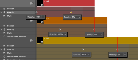
With the move tool, click on the first square you want to fade out. Every time you click on a square, it will reveal itself in your layers.
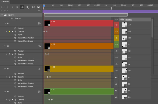
I chose A3 to be the first square to fade and I'm gonna move this one to the very top of all the other square layers.
So if I click on D2 next, that layer would need to be moved under the A3 layer and so on. You'll go back and forth between doing this and adding key frames to each one. As you go along, it's crucial that you put them in order from top to bottom and highly suggested that you rename the layers (numerically for example) which will make it easier to see where you've left off as your dragging the layers into place.

Part 3B: Adding the Keyframes
This is where we enter the gates of hell things become tedious.
Open up the squares group in the timeline panel so you can see all the clips.
Here is my example of the general pattern that's followed and its corresponding layers of what you want to achieve when you're finished:
So let’s try it!
Expand the control time magnification all the way to the right so you can see every frame per second.

As shown in Part 3A, select your first chosen square.
Where you place the time-indicator on the panel will indicate the placement of the keyframe. Click on the clock next to opacity to place your first keyframe.

Move the time-indicator over 3 frames and place the next key frame.

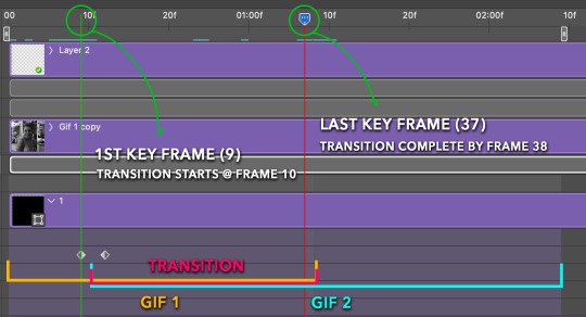
Things to consider before moving forward:
Where you place your very first keyframe will be detrimental. If you're using a lot of squares like I did, you may have to start the transition sooner than preferred.
If you're doing 25 squares, the key frames will have to be more condensed which means more overlapping because more frames are required to finish the transition, verses if you're only using a 9-squared grid. See Part 4 for more detailed examples of this.
The opacity will remain at 100% for every initial key frame, and the second one will be at 0%.
Instead of creating two keyframes like this and changing the opacities for every single clip, you can copy the keyframes and paste them onto the other clips by click-dragging your mouse over both of them and they'll both turn yellow. Then right click one of the keyframes and hit copy.
Now drop down to your next clip, move your time-indicator if necessary to the spot where the first keyframe will start and click the clock to create one. Then right click it and hit "paste".

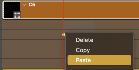
Tip: When you have both keyframes selected, you can also move them side to side by click-dragging one of them while both are highlighted.
Your full repetitive process in steps will go as follows:
click on square of choice on the canvas
drag that square layer to the top under the last renamed
in timeline panel: drop down to next clip, move time-indicator tick to your chosen spot for the next keyframe
create new keyframe
right click new keyframe & paste copied keyframes
repeat until you've done this with every square in the group
Now you can change the opacity of your squares layer group back to 100% and turn on the visibility of Gif 1. Then hit play to see the magic happen.
PART 4: Finished examples
Example 1
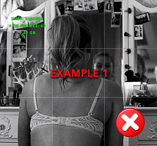
the transition starts too soon
Cause: initial keyframe was placed at frame 0
the squares fade away too quickly
Cause: overlapping keyframes, seen below.
(this may be the ideal way to go with more squares, but for only 9, it's too fast)
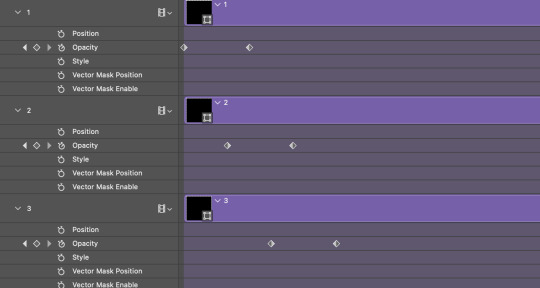
Example 2
more frame time for first gif
transition wraps up at a good point
Cause: in this instance, the first keyframe was placed 9 frames in, and the keyframes are not overlapping. The sequential pair starts where the last pair ended, creating a slower fade of each square.
Part 5: Final Tips and Saving
You can dl my save action here which will convert everything back into frames, change the frame rate to 0.05 and open the export window so you can see the size of the gif immediately.
If it's over 10gb, one way to finesse this is by use of lossy. By definition, lossy “compresses by removing background data” and therefore quality can be lost when pushed too far. But for most gifs, I have not noticed a deterioration in quality at all when saving with lossy until you start getting into 15-20 or higher, then it will start eating away at your gif so keep it minimal.

If you've done this and your gif is losing a noticeable amount of quality and you still haven’t gotten it below 10gb, you will have no choice but to start deleting frames.
When it comes to transitions like this one, sometimes you can't spare a single frame and if this is the case, you will have to return to the timeline state in your history and condense the key frames to fade out quicker so you can shorten the gif. You should always save a history point before converting so you have a bookmark to go back to in case this happens.
That's pretty much it, free to shoot me an ask on here or on @jugheadjones with any questions.
#gif tutorial#photoshop tutorial#transition tutorial#grid tutorial#usergif#ps help#tutorials#tutorials*#requested
222 notes
·
View notes
Text
3D Menu in Photoshop | 3D Panel and Menu in Photoshop
3D Menu in Photoshop | 3D Panel and Menu in Photoshop
3D Panel and Menu in Photoshop
3D Menu in Photoshop – एक 3D Model कुछ त्रि-आयामी का गणितीय प्रतिनिधित्व है। 3 D Model का Use Art, Entertainment, Simulation and Drafting के लिए वास्तविक दुनिया और वैचारिक दृश्यों को चित्रित करने के लिए किया जाता है और आभासी वास्तविकता, Video Game, 3 D Printing, Marketing, TV and Motion Pictures, वैज्ञानिक और चिकित्सा इमेजिंग सहित कई अलग-अलग उद्योगों के अभिन्न अंग…

View On WordPress
#3d#3d effects in photoshop#3d images in photoshop#3d in adobe photoshop#3d in adobe photoshop cc#3d in photoshop#3d letters in photoshop#3d menu in photoshop#3d menu in photoshop cc#3d planes in photoshop#3d text in photoshop#3d tools in photoshop#3d type in photoshop#adobe photoshop#adobe photoshop (software)#enable 3d menu in photoshop cs6#how to enable 3d menu in photoshop cs6#how to make 3d in photoshop#how to use 3d menu in photoshop#introduction to 3d in photoshop#panels in photoshop#photoshop#photoshop 3d#photoshop 3d text#photoshop 3d tutorial#photoshop cc#photoshop cs6#photoshop select menu in hindi#photoshop tutorial#select menu in photoshop in hindi
0 notes
Note
May I ask what scanners / equipment / software you're using in the utena art book project? I'm an artist and half the reason I rarely do traditional art is because I'm never happy with the artwork after it's scanned in. But the level of detail even in the blacks of Utena's uniform were all captured so beautifully! And even the very light colors are showing up so well! I'd love to know how you manage!
You know what's really fun? This used to be something you put in your site information section, the software and tools used! Not something that's as normal anymore, but let's give it a go, sorry it's long because I don't know what's new information and what's not! Herein: VANNA'S 'THIS IS AS SPECIFIC AS MY BREAK IS LONG' GUIDE/AIMLESS UNEDITED RAMBLE ABOUT SCANNING IMAGES
Scanning:
Modern scanners, by and large, are shit for this. The audience for scanning has narrowed to business and work from home applications that favor text OCR, speed, and efficiency over archiving and scanning of photos and other such visual media. It makes sense--there was a time when scanning your family photographs and such was a popular expected use of a scanner, but these days, the presumption is anything like that is already digital--what would you need the scanner to do that for?
The scanner I used for this project is the same one I have been using for *checks notes* a decade now. I use an Epson Perfection V500. Because it is explicitly intended to be a photo scanner, it does threebthings that at this point, you will pay a niche user premium for in a scanner: extremely high DPI (dots per inch), extremely wide color range, and true lossless raws (BMP/TIFF.) I scan low quality print media at 600dpi, high quality print media at 1200 dpi, and this artbook I scanned at 2400 dpi. This is obscene and results in files that are entire GB in size, but for my purposes and my approach, the largest, clearest, rawest copy of whatever I'm scanning is my goal. I don't rely on the scanner to do any post-processing. (At these sizes, the post-processing capacity of the scanner is rendered moot, anyway.) I will replace this scanner when it breaks by buying another identical one if I can find it. I have dropped, disassembled to clean, and abused this thing for a decade and I can't believe it still tolerates my shit. The trade off? Only a couple of my computers will run the ancient capture software right. LMAO. I spent a good week investigating scanners because of the insane Newtype project on my backburner, and the quality available to me now in a scanner is so depleted without spending over a thousand on one, that I'd probably just spin up a computer with Windows 7 on it just to use this one. That's how much of a difference the decade has made in what scanners do and why. (Enshittification attacks! Yes, there are multiple consumer computer products that have actually declined in quality over the last decade.)
Post-processing:
Photoshop. Sorry. I have been using Photoshop for literally decades now, it's the demon I know. While CSP is absolutely probably the better piece of software for most uses (art,) Photoshop is...well it's in the name. In all likelihood though, CSP can do all these things, and is a better product to give money to. I just don't know how.
NOTENOTENOTE: Anywhere I discuss descreening and print moire I am specifically talking about how to clean up *printed media.* If you are scanning your own painting, this will not be a problem, but everything else about this advice will stand!
The first thing you do with a 2400 dpi scan of Utena and Anthy hugging? Well, you open it in Photoshop, which you may or may not have paid for. Then you use a third party developer's plug-in to Descreen the image. I use Sattva. Now this may or may not be what you want in archiving!!! If fidelity to the original scan is the point, you may pass on this part--you are trying to preserve the print screen, moire, half-tones, and other ways print media tricks the eye. If you're me, this tool helps translate the raw scan of the printed dots on the page into the smooth color image you see in person.
From there, the vast majority of your efforts will boil down to the following Photoshop tools: Levels/Curves, Color Balance, and Selective Color. Dust and Scratches, Median, Blur, and Remove Noise will also be close friends of the printed page to digital format archiver. Once you're happy with the broad strokes, you can start cropping and sizing it down to something reasonable. If you are dealing with lots of images with the same needs, like when I've scanned doujinshi pages, you can often streamline a lot of this using Photoshop Actions.
My blacks and whites are coming out so vivid this time because I do all color post-processing in Photoshop after the fact, after a descreen tool has been used to translate the dot matrix colors to solids they're intended to portray--in my experience trying to color correct for dark and light colors is a hot mess until that process is done, because Photoshop sees the full range of the dots on the image and the colors they comprise, instead of actually blending them into their intended shades. I don't correct the levels until I've descreened to some extent.
As you can see, the print pattern contains the information of the original painting, but if you try to correct the blacks and whites, you'll get a janky mess. *Then* you change the Levels:
If you've ever edited audio, then dealing with photo Levels and Curves will be familiar to you! A well cut and cleaned piece of audio will not cut off the highs and lows, but also will make sure it uses the full range available to it. Modern scanners are trying to do this all for you, so they blow out the colors and increase the brightness and contrast significantly, because solid blacks and solid whites are often the entire thing you're aiming for--document scanning, basically. This is like when audio is made so loud details at the high and low get cut off. Boo.
What I get instead is as much detail as possible, but also at a volume that needs correcting:
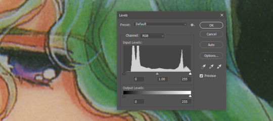
Cutting off the unused color ranges (in this case it's all dark), you get the best chance of capturing the original black and white range:
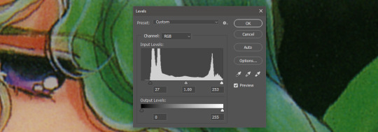
In some cases, I edit beyond this--for doujinshi scans, I aim for solid blacks and whites, because I need the file sizes to be normal and can't spend gigs of space on dust. For accuracy though, this is where I'd generally stop.
For scanning artwork, the major factor here that may be fucking up your game? Yep. The scanner. Modern scanners are like cheap microphones that blow out the audio, when what you want is the ancient microphone that captures your cat farting in the next room over. While you can compensate A LOT in Photoshop and bring out blacks and whites that scanners fuck up, at the end of the day, what's probably stopping you up is that you want to use your scanner for something scanners are no longer designed to do well. If you aren't crazy like me and likely to get a vintage scanner for this purpose, keep in mind that what you are looking for is specifically *a photo scanner.* These are the ones designed to capture the most range, and at the highest DPI. It will be a flatbed. Don't waste your time with anything else.
Hot tip: if you aren't scanning often, look into your local library or photo processing store. They will have access to modern scanners that specialize in the same priorities I've listed here, and many will scan to your specifications (high dpi, lossless.)
Ahem. I hope that helps, and or was interesting to someone!!!
#utena#image archiving#scanning#archiving#revolutionary girl utena#digitizing#photo scanner#art scanning
236 notes
·
View notes
Note
Hello!! First your Tumblr and edits are so gorgeous! Second I was wondering if you were willing to share how you did the second gif of this edit please? Have a great day! (Or night)
https://www.tumblr.com/thereigning-lorelai/713794704750362624/usergif-1-year-celebrationshuffle-challenge?source=share
hi nonny, thanks for the nice words! really appreciated. ♥️ so, you're looking for this grid effect:

you're starting off with two gifs. i'd recommend choosing scenes that are not too close up because otherwise they'll overlap too much and you won't be able to delete enough parts to make the most of this effect.
so, here's my base gif that i just did in black and white with some minor purple brush strokes set to screen:

i then chose my second gif and coloured it with a purple gradient map and a purple colour fill set to multiply. the colouring of the gifs is entirely up to you and what you think looks best. so here's my second gif, still without the grid:
this is where the fun part starts - the grid layout. i created that with a new guide layout. this is a super neat tool in photoshop that helps you align shapes or selections on your image. the guide lines basically float over it and help you set up symmetric shapes or layouts. you can define how many columns and rows you want to have and then photoshop creates the guide layout for you. for this gif i chose 4 columns and 4 rows:

with this set up, i started creating the rectangles to make the purple gif visible on top of the black and white one. this is my final layout for my shapes:
you can move around the shapes to your liking and what works best with your gifs. i didn't want to cover too much of my base gif but also tried to make their faces in the top gif all be in the gif as much as possible.
this step is just a lot of moving around your shapes and seeing what looks good tbh.
i then grouped my shapes and clipped my top gif (including all layers for the colouring) to my shapes group:

looking good so far. the only thing missing are the lines for the grid. this is where your guide layout comes in again. i just reopened it and then traced the guide lines with my line tool to create the white grid overlay:
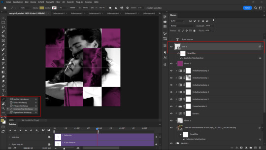
(for editing purposes i turned all of the line layers into a single smart object at the end. this is why you only see one layer for all the lines in this screenshot.)
finally, i used a gaussian blur (0,5 px radius, 100% fill for the filter, 40% fill for the overall layer) on the smart layer to make the lines a little bit smoother and softer looking. this is totally optional and again, up to what looks best to you.
added some text et voilà:
#asks#kind nonnies#usergif#*tutorial#hope this helps nonny#if you have any further questions just let me know#i'm not the best at explaining especially because i think my way won't be the most efficient or even logical#but that's how i did it and i think it's fairly easy to achieve
298 notes
·
View notes
Note
How do you make your gifs?
Hello hello! I love talking about gifmaking, so thank you for giving me the chance to ramble.
Instead of a detailed step-by-step walkthrough, I will link tutorials and resources written by the wonderful Tumblr creators on here along the way. Everyone has their method and preferences, and there’s no right or wrong way to make gifs. I’m going to share techniques and resources I picked up along the way that work best for me—they may or may not be suited to your preferences, but I hope you’ll find some helpful things here.
(Warning: screenshot/image heavy)
USEFUL TUTORIALS AND RESOURCES
Here are some tutorials and resources that I found very useful when I got back into gifmaking:
Gifmaking tutorial using video timeline by @hope-mikaelson is identical to my own process
Gifmaking and coloring tutorial by @kitty-forman, whose process is very similar to my own
Giffing 101 by @cillianmurphy, an incredibly detailed tutorial that covers everything you need, including a step-by-step guide to using HandBrake
Gifmaking and coloring tutorial with 4K HDR footage by @sith-maul, another incredibly detailed tutorial with many useful tips
Gifmaking tutorial by @jeonwonwoo, incredibly comprehensive and covers so many aspects of gifmaking from basics, sharpening, captioning, and text effects
Gifmaking/PS tips and tricks by @payidaresque
Action pack by @anyataylorjoy, the Save action is especially a true life-saver
@usergif and @clubgif are amazing source blogs with many tutorials on gifmaking, color grading, and gif effects, can’t be thankful enough for the members for their work curating and creating for these blog!
TOOLS
Adobe Photoshop CS6 or higher, any version that supports video timeline. @completeresources has many links to download Photoshop, have a look!
Photopea is a free alternative to Photoshop, but it has a slightly different UI, check out these tutorials for gifmaking with Photopea
HandBrake or any other video encoder, especially if you’re working with .MKV formats
4Kvideodownloader for downloading from YouTube, Vimeo, Instagram, etc.
OBS Studio or any other similar screen capturing software. To prevent duplicate frames in gifs that prevents your gifs from looking smooth, try to match the recording frame rate (FPS) with the source.
IMPORTING FOOTAGE AND WORKING IN VIDEO TIMELINE
I work exclusively in video timeline instead of importing video frames to layers or loading files into stack. For videos that don’t require converting/encoding using HandBrake, especially ones that are already in .MP4 format, I tend to open the video directly on Photoshop, and trim the videos around directly.
As mentioned above, this gifmaking tutorial using video timeline is exactly how I make gifs. I find it more efficient, especially if you’re making multiple gifs from the same video/the same scene with little to no change in lighting conditions You can simply slide around sections of gifs you want to save, and they will all be the same length.
Another thing also covered in the tutorial linked is the ability to change video speed in video timeline mode. Right click on the video and set the speed before proceeding with cropping/resizing. This is also very useful when you’re making blended gifs where you need the footage to have the same length.
Slowing footage down.
As mentioned in this post, changing the FPS before slowing down the gif results in smoother gifs. Doubling the frame rate before slowing down your gifs usually yields the best result.
Speeding footage up.
I love using this to speed up slow motion B-rolls to make the speed slightly more natural. It will result in nice, smooth gifs:

(B-roll footage, normal broadcast speed)
(200% speed)
Subject won’t stay in frame?
Another feature of the video timeline mode. Keyframes are your best friend. This tutorial by @kangyeosaang covers everything you need to know about panning gifs. I use this technique regularly, it’s a life-saver.
COLORING
Here are some coloring tutorials I found very useful:
Coloring tutorial by @brawn-gp beloved, their coloring style is second to none
Mega coloring tutorial by @yenvengerberg, for stylized /vibrant coloring
Understanding Channel Mixer by @zoyanazyalensky
Coloring rainbow gifs by @steveroger, which delves deep into Channel Mixer
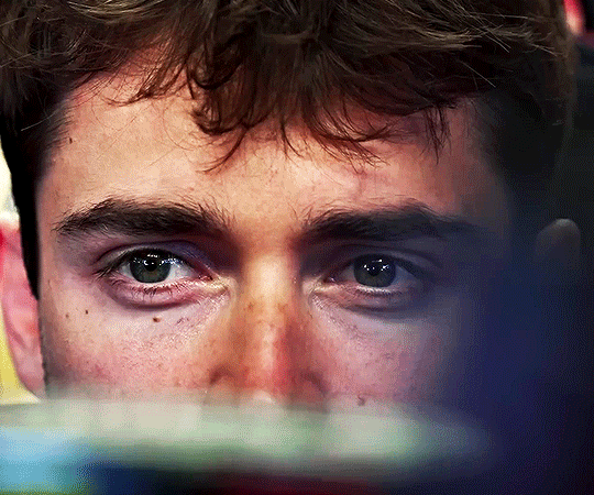
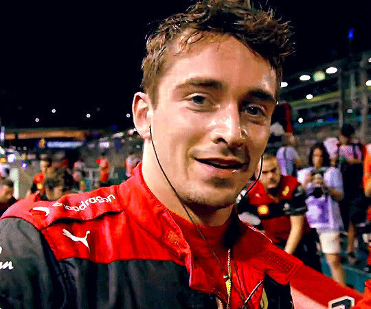
I tend to go for neutral-saturated coloring in general, especially for minimalist gifsets with no effects (blending/isolated coloring/overlays etc.), but the possibility is endless for stylized coloring. Here’s what my adjustment layers look like for the example gifs above.
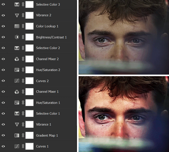
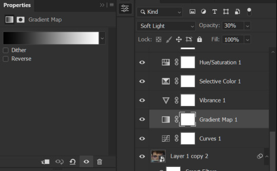
The base footage for this Charles gifset is incredibly desaturated. I started with a Curves layer to bring contrast to the gif, as well as do some color-correcting to bring the base footage to a more neutral tone. To bump contrast, I also like to add a black and white Gradient Map layer with a Soft Light blending mode at 10%-30% opacity:
The Vibrance layer is then used to lift the saturation of the base footage, with the Selective Color, Hue/Saturation, and Channel Mixer layers to help remove the green/yellow tint to his skintone.
An underrated adjustment layer/preset in my opinion is the Color Lookup. You can layer in pre-loaded .LUT color grading presets to help speed up your process. For this gif, it’s simply a base preset Soft Warming Look to achieve a warm, pink-tinted tone.
In hindsight I feel like this gifset is too saturated, his skintone is skewing very red/pink, I could’ve bumped down the lightness of the reds with a Selective Color layer or a Hue/Saturation layer. Try to err on the side of neutral for skintones. Experiment with layer orders—there’s no right or wrong! Remember that each layer build up on the one before it.
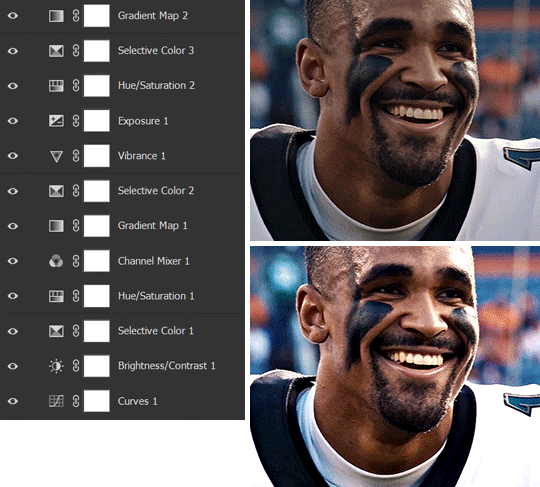
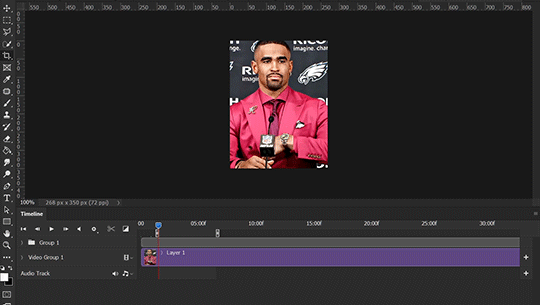
The base footage of the Jalen gif is already quite nicely color-graded, but it’s still muddy and underexposed. As with the Charles gif, I started with a Curves layer to bring the gif to a better baseline contrast. Then I focus on brightening the gif with the Brightness/Contrast and Exposure layers.
The Hue/Saturation and Selective Color layers are to color-correct Jalen’s skin tone—it’s something I spend most of my time coloring gifs and focus a lot on, especially when color grading BIPOC skintones. Putting a Vibrance layer, upping the Vibrance and Saturation, and calling it a day would make his skintone skew very, very yellow/orange.
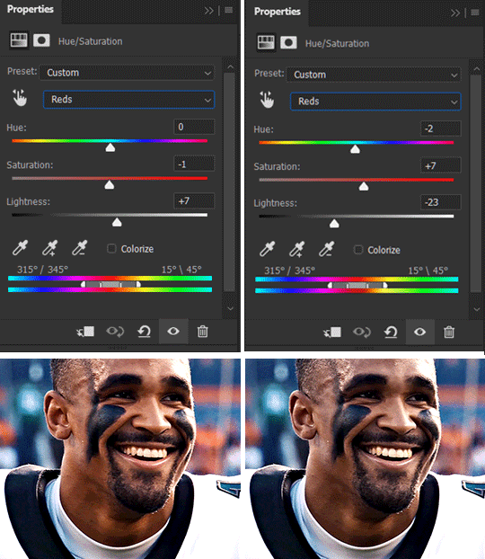
Focus on the reds and yellow for skintone, play around with the Saturation and Lightness sliders, use the Hue slider with caution.
It can be tricky to achieve the right skin tone when working with sports footage vs the higher quality, higher dynamic range footage of films or TV shows, but I try to keep it as close to the subject’s natural skintone as possible.
Here are some of tutorials with tips and tricks on coloring BIPOC:
How to fix orange-washed characters by @zoyanazyalensky
How to prevent pink-washing and yellow-washing by @jeonwonwoo
Coloring tutorial by @captain-hen
Changing lighting conditions?
Fret not—this is why I love working in video timeline. I’ll take this gifset as an example: it’s a deceptively difficult one to color. The footage is 720p and the sunlight shifts throughout the video, so matching across gifs was tricky.
My solution was to split the clips in sections with consistent lighting, and apply adjustment layers to the individual sections before applying general color grading layers on top of everything.
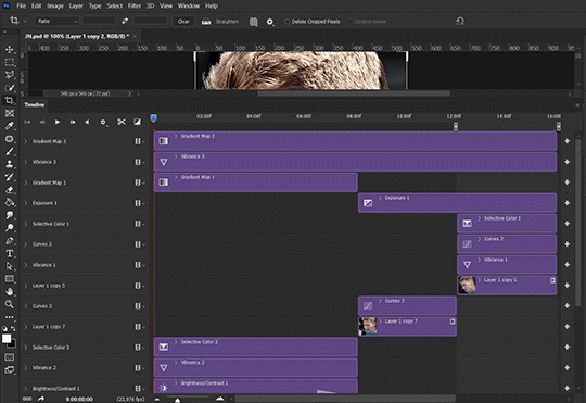
We can make use of the Fade Transition effect for sections where the lighting changes within the gif section we want to color.
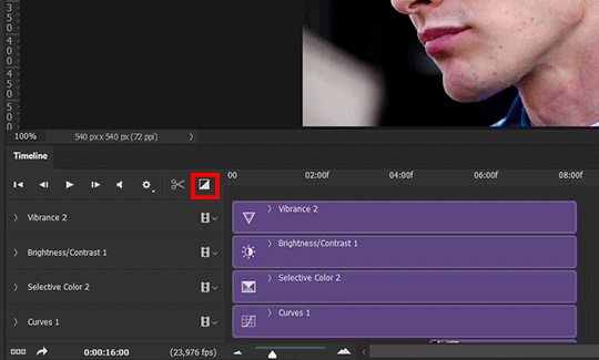
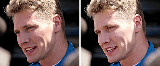
(without vs with Fade on the Brightness/Contrast layer)
The difference is subtle in this example, but the brightness in the right gif is noticeably more consistent throughout. You can also add the Fade Transition effect to the beginning for a fade in, of course.
SHARPENING AND OPTIMIZING GIF QUALITY
This tutorial by @anya-chalotra covers everything you need to know about optimizing gifs for Tumblr.
Sharpening.
Sharpening is essential to making crisp gif images. Here’s another ask I answered re: my own sharpening settings and maximizing gif quality.
(base footage, unsharpened)

(color graded, unsharpened)
(color graded, sharpened)
The final gif is sharpened with Smart Sharpen, 500% at 0.3px and 10% at 10px (my standard sharpening settings).
Here are some tutorials and resources on sharpening:
Sharpening process by @anya-chalotra
Sharpening tutorial with added gaussian blur by @haleths
Sharpening action by @daenerys-stormborn
Size your gifs for Tumblr correctly.
This is essential: full width gifs are 540px wide.Two side-by-side gifs should be 268px wide. Here’s a handy post on gif size guide for Tumblr.
Incorrectly sizing your gifs will take away the quality of your gifs: undersizing your gifs will especially make them grainy, blurry, and /or pixelated, and won’t display correctly on many people’s desktop theme. Oversizing usually isn't as dramatic as undersizing, but it will make the gifset glitch when displayed, and the file size will be unnecessarily bloated.
Work with HD footage if possible.
Media fandoms (films/TV shows) are luckier than us in the sports trenches—we have to work with what we have. Broadcast footage is usually subpar: lacks contrast, pixelated, very desaturated, the list goes on. But it’s possible to still make high quality gifs from subpar footage. Here are a couple of tutorials to mask low source footage quality:
low quality video ➜ “HD” gifs tutorial by @nickoffermen
Sharpening low quality footage by @everglow-ing
(This gifset I made is from a 480p footage with horrendous lighting conditions and colors, and the end result is decent I’d say)
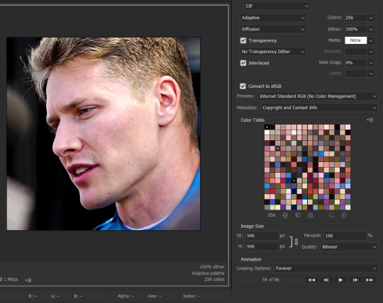
Save for Web (File > Export > Save for Web (Legacy) or Ctrl + Alt + Shift + S) settings.
I default to Adaptive + Diffusion but also use Adaptive + Pattern from time to time. Any combination of Adaptive or Selective + Diffusion or Pattern will give you a good result. In my experience some gifs will need the Selective color table for the colors to display correctly.
Here are my default settings:
SAVING AND EXPORTING FOR TUMBLR
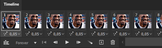
Converting to frames and adjusting the gif speed.
If possible, avoid exporting your gif and reopening it to adjust the frame speed. I used to do this sometimes when I’m lazy, I have to admit, but this is where this Action as mentioned at the beginning comes in very handy. It converts all visible layer into smart object, then converts it back to frame animation.
Step-by-step:
1. Select all layers
2. Right click > Convert to Smart Object
3. Go to the Timeline menu (≡) > Convert Frames > Flatten Frames into Clips
4. Go to the Timeline menu again (≡) > Convert Frames > Convert to Frame Animation
5. In the same menu (≡), select Make Frames from Layers
6. Delete the first frame (it’s a duplicate) then set your frame speed

Now you can adjust the frame speed before exporting it (Save for Web).
Pay attention to the source framerate.
The frame delay of 0.05 s is usually the default to make gifs for TV shows and films, and it is preferred by most gifmakers. This stems from the fact that most movies and TV shows are 24 or 25 FPS. This may not be the case for all source videos: you might get 30 FPS footage, and sports or gaming footage can be 50 or 60 FPS. Gif speed also depends on the FPS of your original file. Play around with gif speed and see what feels most natural to you.
My rule of thumb is the frame delay Photoshop gives you + 0.01 s. For example, 50 FPS footage will give you 0.02 s frame delay (25 FPS gives you 0.04, 30 FPS gives you 0.03, etc.), so set it to 0.03 s. I usually err on the side of a faster frame delay for smoothness in in-game sports footage, anything else (interviews, press conferences, B-rolls) can get away with being slowed down. Again, experiment and see what you think looks best!
Keep gifs under the Tumblr file size limit (10 MB).
Cut down the number of frames. My gifs are usually around 60-70 frames for 540px full-width gifs, but depending on the coloring, sometimes you can get away with more. 268px gifs can go up to 200+ frames.
Crop your gifs. Remember to keep full-width gifs at 540px wide, but if necessary, you can crop the height. My go-to sizes are 540x540, 540x500, 540x450, and 540x400.
Amp up the contrast of your gifs. Flat colors like black cut down gif size.
The Grain filter or Noise filter, though beautiful for aesthetics or simply necessary sometimes to mask low source footage quality/pixelating, may bloat your gif size.
Play your gifs back before exporting.
Pay attention to duplicate frames or glitches, you might need to get rid of them!
Hope this is helpful! Don’t hesitate to send an Ask or DM if you need any help, I will happily answer all your questions and send over PSDs. (I’m also on Discord—just shoot me a message if you need my tag!) Happy creating :]
#tutorial#PS asks#gif tutorial#Photoshop tutorial#I guess this is more of a resource link dump than tutorial but. Hey. Why reinvent the wheel...#Sorry for the late answer I hope you see this Anon :]#completeresources#allresources#userxoames#userbarbi#usernrzr
1K notes
·
View notes
Text
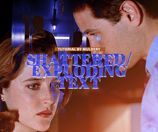
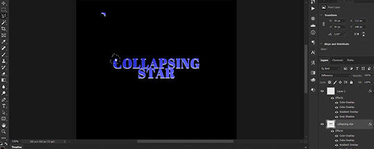
SHATTERED/EXPLODING TEXT tutorial
hiyaa! @krystaljungs asked me for a tutorial on how i made the shattering/exploding animation of the text in this gifset and so i figured i would make it and post it here, like i did with the tutorial for "falling" text.
i must warn you, this one is really tedious and requires a lot of time and patience. honestly maybe there is an easier way to do this but i didn't find any tutorials for when i needed it so i just went off my ps knowledge and did it myself.
note: you will need photoshop with a timeline!
STEP ONE: create your base gif! be mindful of number of frames in your gif. the number of frames doesn’t really matter here, but if your gif is bigger than 10mb and you have to go back to adjust it all again after you have to delete some layers....you might lose the will to live 😂
STEP TWO: make your text the way you want it to look. this effect is basically the last step of your gif making process. (i will be using the typography from my set as an example as i already have that psd saved)
this is what my typography looks like now.
STEP THREE: now, you will create a new file (with background) and transfer the text you want to "shatter" in it.

here is when things get tedious.......
tip: zoom in the document, it will be easier for you.
select polygonal lasso tool aka this
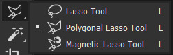
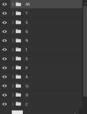
STEP FOUR: before you start, you need to rasterize type layer. then you will have to "shatter" every letter into smaller pieces. using polygonal lasso tool, select a smaller part of your first letter.

then you will click on that part with the right click of the mouse and selct layer via cut.
now you need to make sure that your new layer is selected and using the move tool move that part of the letter somewhere away.

you will have to do this for every part of the letter and every letter. also move every new layer on top of other layers because they will line up better later like that. then create a new folder with every layer of said layers and rename it after the letter you're shattering. see below. (idk why my screenrecord didn't catch me making layers via cut but you should do that after the use of polygonal lasso tool, as stated above)
note: feel free to şelect parts of other letters as you get one letter, for an even better effect.
this is what i have after "shattering" every letter. the lineup doesn't have to be perfect as you will arrange these parts in your main document. (click on images for full view)

STEP FIVE: go back to your main document and make sure the visibility of your text is turned on.

what you will do now is open the shattered text in the new window and transfer letter by letter (letter folders) to your main document. BUT after you transfer every folder, you need to rasterize EVERY layer and convert it to a smart object. i made an action for this part to make it easier. download here.

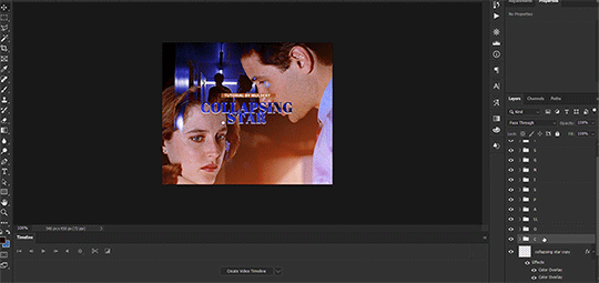
(okay i really don't know why my screenrecord doesn't show "pop-up" windows but i was moving the C folder from the document where i shattered the text and then used my action on every layer)
after you transfer the folder to your main document and rasterize and convert to smart object, select the folder and use Free Transform to move it so it aligns with the letter from your complete typography. then you will select each layer and align it with the typography. see below. (click on the gif, i made it bigger so you can see better)

i did this one hastily so the recording wouldn't be too long but i'm hoping you can see what i'm doing.
now, do this for every letter.
after that is done, make the original typography layer invisible, and you should have something like this

STEP SIX: another really tedious part BUT it's time to animate the text.
make your timeline space bigger so it's easier for you to work with it. then select the first layer and click on the arrow next to it (in timeline) so Transform is revealed to you.
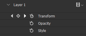
now, you don't want the animation to start from the very beginning of the gif, but a bit later so the text is readable before it shatters.
for example, i did mine like this, but that is your personal preference.
note: make sure that all animations start at the same time.
tip: do this for all layers in one folder before you transform them, as it will go faster.
STEP SEVEN: bring the playhead (blue arrow with the red line) to the end of your gif and select one layer in timeline.
now it's time to transform it. use Free Transform (windows shortcut ctrl+T) and drag the part a bit away and rotate it. press enter.

okay ignore the way my text moved upwards, i used the text i used in my edit and i did that animation in the upper part of the gif and i was too lazy to redo the whole animation lmaoo but i hope you can see what i'm doing with the letter C.
do this for every letter. play around with placing and rotation. then save your gif. when you're done, you should have something like this.

again, i was too lazy to redo the whole thing on this new gif so i'm using the one from my gifset i linked in the beginning.
i hope this was understandable and helpful. if you have ANY questions, don't hesitate to shoot me an ask or dm me! i'm always here to help <33
#usergif#completeresources#allresources#gif tutorial#ps help#userkimchi#uservivaldi#userraffa#tusermona#userelio#usercats#tuserheidi#usershreyu#userhallie#userroza#userdean#userisaiah#thingschanged#tusercasey#usertj#userwwz
255 notes
·
View notes
Last Seen Blogs

jeffau
Untitled

ourcasino
Our Casino
ghoulgirlwrites
Writing by Hayley

neofox
Drive by shoop da whoop
two-in-one-skele
*Not What You Expect