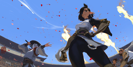
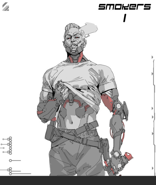
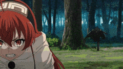
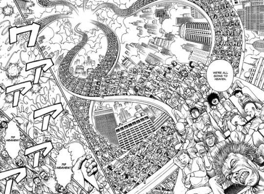
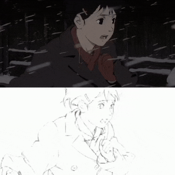
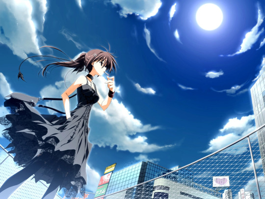
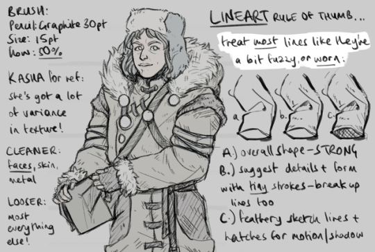
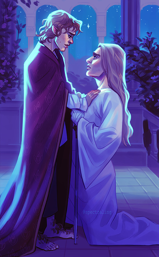
#i love the brush i use for lineart a lot i think it looks cool . shoutout to my tumblr mutual faust for posting the qr code for it
Note
The face! And the way the lines for the drawing looks, I love how you do the expressions of the characters and even though the lining isn't entirely done neatly, it's still so nice to look at and I really like how it's done!
oh thank you :D!! hehe ^_^
#i think when i was using the brush i used before i think i tried to keep my lineart a lot cleaner.#but with the one im using currently i tend to be less neat with it.#it just works with how that specific brush looks. and it makes lining things a lot more fun i think ^_^#i love the brush i use for lineart a lot i think it looks cool . shoutout to my tumblr mutual faust for posting the qr code for it#mewotheblackcat#asks#ask game#aubrey.txt
4 notes
·
View notes
Text
Kitsuneisi Art Study!
This is an art study of @kitsuneisi, using mostly references from their tumblr. I wanted to do an art study and was super excited for the new DDVAU update so woo!
I've written some notes in the margins of each drawing and would love to go more in-depth about both our styles and the general process, but this post would be so incredibly long so I'll refrain for now. (I might break it up into separate parts and turn this into a master list one day).
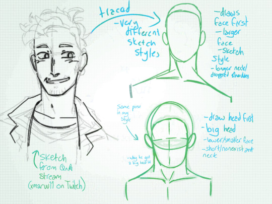

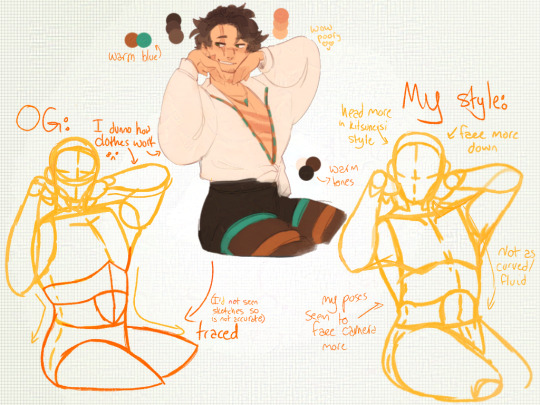
This first three are the base of any art study: leaning the proportions and sketching style of the artist! The first image is from @xmaruu11's first Twitch stream, which I discovered a few days in my study and watched to get a sense of Kitsuneisi's sketching style.
The main difference between our styles is that Kitsuneisi's poses are more fluid and they draw the face first, whereas my poses are stiffer and I drawn the head first.
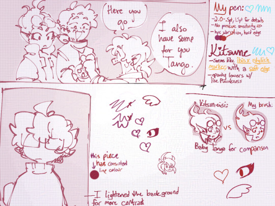
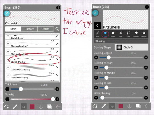
Kitsuneisi and I use different drawing programs, so I couldn't quite make a brush that matched theirs; from looking at their Valentine's comic (which I chose so that colours wouldn't distract me), I noticed the line variation lent a lot to the fluidity.
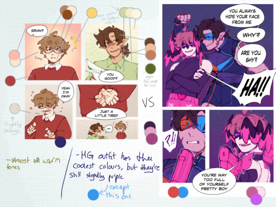
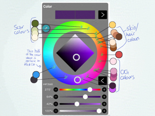

Colour theory my beloathed! While I was laying out the colours for the Scar drawing, I noticed that the blue Kitsuneisi used was very warm-toned. In almost all of the light-hearted scenes, they use warm colours or warm-tinted colours, while the more serious scenes use darker or cooler tones.
The lighter, warmer backgrounds in the office scenes/G being a simp give a more wholesome feel, while the darker backgrounds in serious moments give a more intense atmosphere.
Now, all that's great, but it's time to put it into practice!
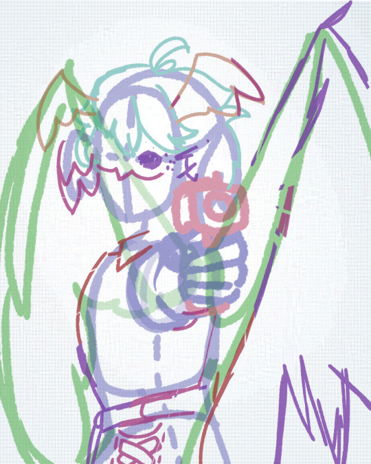
For my sketch, I tried to use a more dynamic pose and focus on making the face a focal point.
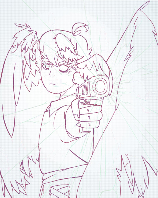
In my lineart, I tried to vary my line thickness.
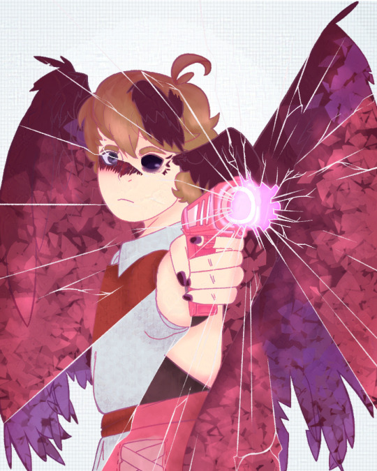
For the flat colours, I used mostly warm tones and tried to match the colours used in the comics, but my love of cool tones took over the Mother Spore wings. I think it makes a nice contrast, at least.

And the final image! (I'll be posting it separately). The background adds a better contrast and helps Grian stand out despite how dark some of the colours are. I'm honestly very proud of this piece and hope both Kitsuneisi and Maru like it too. :)
945 notes
·
View notes
Text
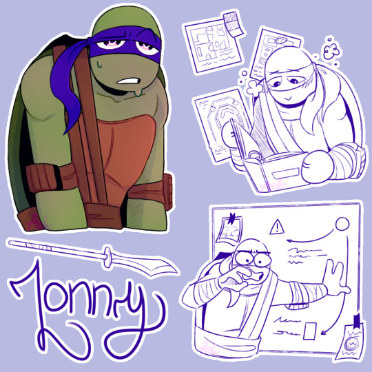
Hey @bluepeachstudios ! How are ya? i should be doing stuff but instead i'm here with your boy Lonny! whose name i always spell Loony first and then correct it :D
Ngl to ya, Lonny's sketch is superior that the end result. I blame it on the brush i'm using for the lineart :] I won't change it tho. They need to be a set. I'm already screw.
SO, HC TIME!:
Ok, i don't remember the ask exactly but i remember reading that Lonny makes the more aesthetically pleasing inventions, but also the less efective. So i thought "Oh, he likes design! What kind of design does he like?" and i think he would really love interior design, which i think you may have mention already or something in that topic? So, yeah, Lonny might be an interior designer. (He would be one of those people that plays the sims just to make cool houses AND HE WOULD BE SO GOOD AT IT. Also, in the Animal Crossing game he shares with Leo and Dea, Lonny is the one that makes the Island cute and neat.)
In that topic, you also mentioned that he has a folder. So i thought it would have a lot of interior design ideas inside. Also that it gives him peace to look at it. This is not a big HC… more like a HC detail /hj But it helps with his anxiety.
I had this HC that i thought before chap 11 (and after Dea's drawing) of Dea and his thoughts. I thought being Deangelo might be really tiring because of all the thought in his head, but he's stable because he has a filter/system to them, so he consumes a lot of energy but is stable. I wanted to mention it because i think Lonny also consumes a lot of energy for of all the paths and worries he has, but doesn't have a filter for them yet and because of that he's kind of an unstable fusion. It's obviously not cannon because in chap11 Dea was outside for days without problem. But idk, i like to compare them. They are both sometimes overwhelmed by their thoughts but Lonny is worst at dealing with them (When he appeared the first thing he did was having a crisis SO-).
You know? Indigo is a weird color. Some people thinks Indigo is this purple shade (like Lonny uses) and others a bright-dark blue? Google Indigo, the differences between the colors is so wild! These are two completely different tones and yet both are considered indigo… (This is not a HC. This is just me being "indigo is not that shade!" at Lonny and discovering that Indigo is a fucking lie.)
Lonny is the only fusion with Leo who i think uses just He and plural they. He might be super gay tho /J
Anyway BYE i need to run or i will be late. This is totally worth it tho /hj (no. Really. I'm def gonna be late. I shouldn't be doing this rn)
170 notes
·
View notes
Note
What are your art inspirations?
Disclaimer: A LOT of RAMBLING
Honestly hard to answer, nowadays I don't really look at a lot of art anymore but mostly just movies.
Biggest inspiration over the years (from 2020 to 2022) would have to be Kan Liu. His painting style with mostly just the round brush and hard edges really spoke to me, especially when it came to lineart I was a massive fucking copycat lmao.
Around 2022 I also began falling in love with Sungmoo Heo. The perspectives and overall style just fucks so hard.
The most obvious inspo would have to be Seonhyeok Jeon though, who I still rip off blatantly.
In general I began taking art seriously around 2020, when I found Kan Liu, because I began training to compete in bodybuilding, which I did the next year. I began getting super interested in how the body and muscles work so I just drew those a fuck ton, and those anatomy studies ended up really helping my art skills in general.
Anyway! For animation... Hiroto Nagata and Q Kawa are big inspos.
This shit is so fucking RAW and HOLY SHIT when I look at how the perspective gets just in your face I always just think "what am I even doing man I have to PRACTICE". It's like watching a Zyzz or Ronny Coleman clip before doing a lift at the gym but for art, shit's motivational.
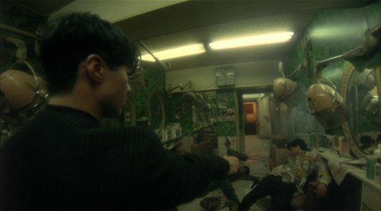
This cut in Ghost In the Shell as well is WOW, I think what speaks a lot to me is when an animation doesn't conform to what's standard in the medium and tries to push boundaries/be unique. Be it in this case through insane details, in the case of Mushoku Tensei through bg animation mixed with extreme foreshortening or just a crazy perspective and punchy movements in the Madoka clip.
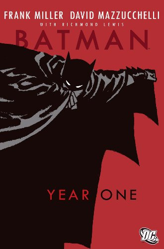
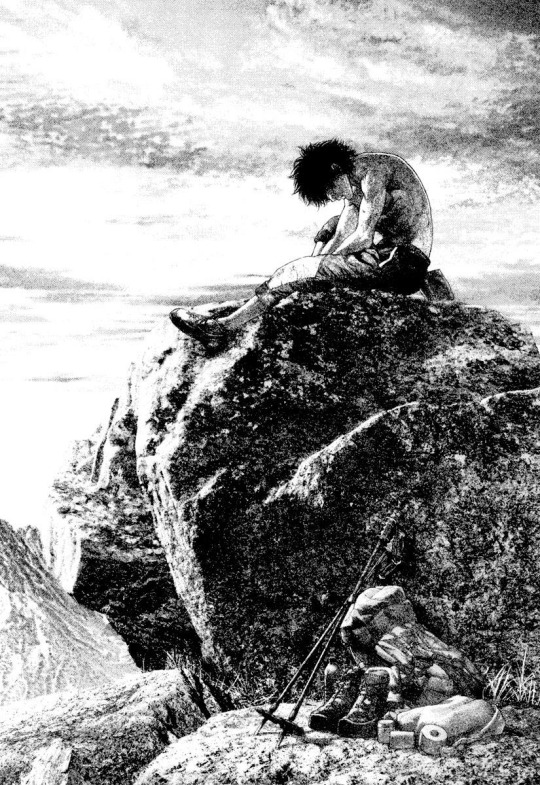
Overall it's hard to say what else my inspirations are though. When it comes to manga and comics I can think of Batman Year One, The Climber by Shin-ichi Sakamoto, Ultra Heaven by Keichi Koike, Solo Leveling (big inspo in 2021) and Homunculus.
Also, even though everyone assumes it, I haven't played Cyberpunk 2077 or am that big a fan of the Blame! manga, I guess I just have a fairly similar artistic vision to both of those.
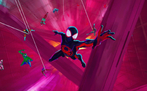
For animated fiction it'd be Spiderverse recently, Millennium Actress, Silent Voice and a million other anime I've forgotten the name of. Naoko Yamada's directing for Silent Voice or other anime like Hibike Euphonium and the Liz movie has always been amazing to me because she is able to express characters personalities through their body language, like they way they walk or stand, in a way I have never seen done before. Extremely recognizable and iconic style imo. A long time ago I used to be really into watching anime, but I don't care much for it anymore.
Other inspo would be this guy on twitter, his stuff is insanely cool https://twitter.com/be_myvu/status/1725069515107533178?s=46
It's like that Ralph Waldo Emerson quote - “I cannot remember the books I've read any more than the meals I have eaten; even so, they have made me.” I think throughout the years I've been so obsessed with all kinds of artists that I've taken in inspiration from everywhere. I cannot recall them all anymore, but they have made me the artist I am today.
Currently, like I said, I would consider movies to be my biggest inspiration because I find it interesting how cinematographers are able to stylize real life, which I'm trying to get closer to. If I could direct a movie, I would probably stop making art right then and there, but I'm not really working towards that goal anyway lmao. One day, being able to make a short film in animation would be something I would like to do though.
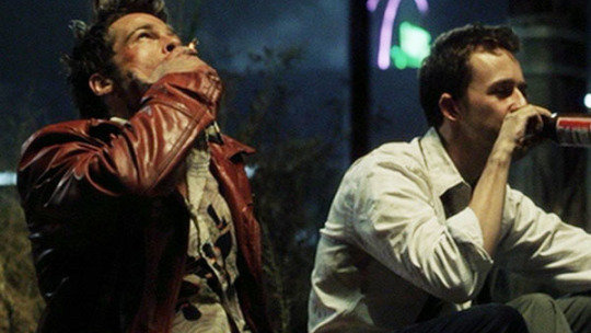
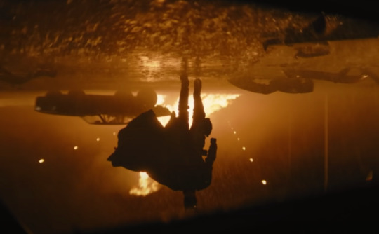
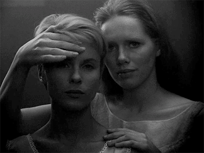
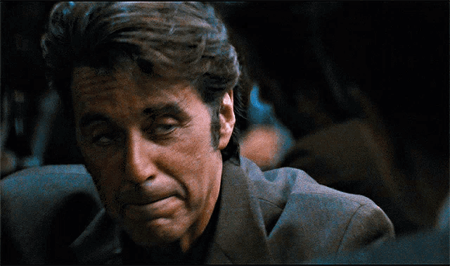
I'm not deep enough into the movie scene to get the street cred of being called an expert but I love them a lot. Fallen Angels made me fall in love with fisheye back then for example. Fight Club and The Batman have a grit to them visually that I find inspiring, and movies like Persona and Heat also come to mind when I think of movies I just love. I could look up my letterboxd for a more thorough answer but I feel I've already been writing way too long.
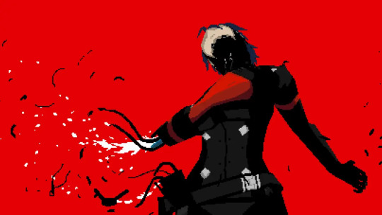
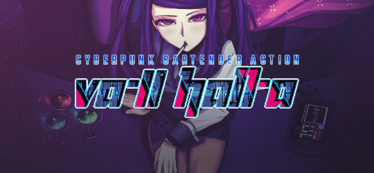
For video games, I guess you can imagine that I would say Signalis lmao. Besides that I can think of Subahibi (vn), Muramasa (vn), and Va-11 Hall-a for inspirations
Lastly, I guess huge inspirations are also a fuck ton of music. I mostly listen to either metal or hard techno, but I think I'll refrain from any more yapping.
I feel that this isn't really a great answer to the question, but it's the one I consider the most correct, because it's never as simple as just mentioning one artist. With a lot of these you wouldn't see a visual resemblence to my art, but in all of these I recognize a feeling that I also find in my own art.
Thank you for the question!
22 notes
·
View notes
Note
'Ello, I just wanted to come on here to say how much I LOVE your brush-work (is that a word lol?)
Crayon or Pencil-like lines that aren't always opaque all the way and are a little more sketchy sometimes are probably some of my favourite :D
Also, your style is just really cool and nice anyway, but I wanted to give a shout out specifically to your based brush choice!
yessss i love traditional textures in digital art, thank you :> i use kyle t webster's brushes for photoshop and I've never found brushes that better emulate certain real-life textures. man's a wizard, i dunno how he does it. i use his tiltiriffic 2015 brush for basically everything short of merch and anything i want to have really thick lines, it's a delightful brush and it feels so natural to work with.
i heard advice somewhere that people tend to resonate more with art that looks like it was hand drawn, you want small imperfections in your coloring and lineart, you don't want everything to be perfect. i really resonate with that, i think there's a certain element to sketchy pencil lines and messy paint and kraft paper textures that you could call, appropriately... cozy :)c
anyway if anyone would like to know what brushes i use and what i use them for they are under the cut with examples 👍
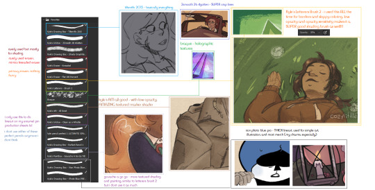
hopefully this image can be blown up if you click on it :') the only brushes that aren't featured are the ones i got from the free sample pack from true grit texture supply, i use their craft paper textures for most things as well and one of their building grain shader brushes for like, noise gradients. if any of y'all have a photoshop subscription you can download his brushes for free, i highly recommend checking them out! they are THE coolest brushes i've ever used (And boy I've gone through a lot of brushes in my time). if your drawing tablet does not have pressure or tilt sensitivity though your mileage will vary, tilteriffic did not work on my brothers tablet because it couldn't pick up what angle my stylus was at.
#ask#chill-vibes-but-rainbow-panic#art#brushes#photoshop#kyle t webster#though i do love some super clean bright artwork as well. my style in 2020 was suuuper clean and refined#it was hard to do though because that takes so much more management and effort and it took energy i didn't always have#if art is hard for you. try to figure out what's easy and develop that#you dont have to be like everyone else or do it the ''right'' way just do it in a way thats fun for You#at this point things being a little sketchy a little off model is very much part of my style whjbsdfhbgjdfg
21 notes
·
View notes
Note
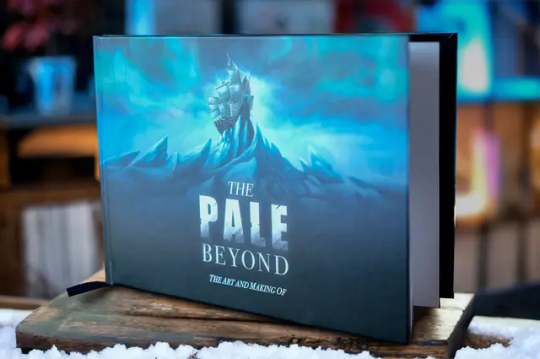
Haii, super random ask about The Pale Beyond i hope thats ok . Have you/the team ever considered putting out the character sprites? in like png format or smethign alike. I just thimk it would be a cool thing to just have out there, not only cus good references for the chars but also cus the art is super cool!!! Either way, loved the game :] great work! it was lovely !!
Hi there, thank you so much for your kind words!
I don’t think we’d release the PNGs of the full sprites as they are in-game, and I don’t really get to make that decision unfortunately. However! There is a lot of art for the characters available online if you’re looking for references.
There is a digital AND physical artbook that you can buy that showcases a bunch of the sprites, alongside other concept art. The physical edition is more expensive because we printed it for real life, and it has a little more artwork in it than the digital one since we had some time to polish and add things we’d forgotten after release. Here are the links if you’re interested:
Digital Edition
Physical Edition

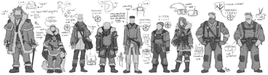
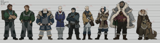
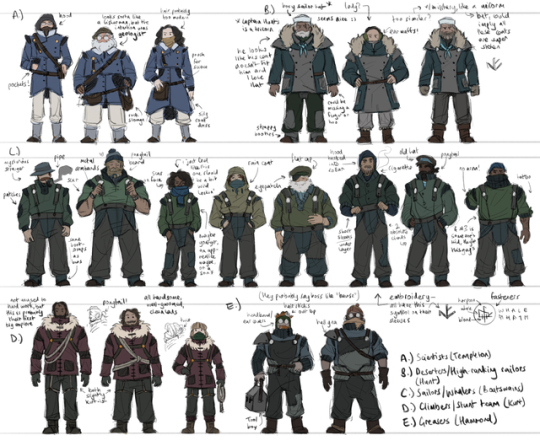
If you don’t have money to drop on books, you can also find a pile of art in my portfolio! There are a tonne of concepts, storyboards and art breakdowns in there, as well as the final character references we used for the game. I even uploaded style guides and drawovers, including what brushes we used for character lineart!
Fair warning though, if you scroll far enough you enter a SPOILER ZONE, so only check it out if you’ve already finished the game or don’t mind finding out what could happen at the end before you’ve played it lol. Link:
Jess’ Portfolio
I know this isn’t exactly what you asked for, but I hope it’s helpful regardless! Thanks so much again for liking the game, we’re a small team and it means a lot to us!
#thank you for liking pale :’>>>#the pale beyond#the pale beyond art#the pale beyond artbook#the pale beyond concept art#concept art#video game#video game concept art#video game character art#asks#thank uuuuu
20 notes
·
View notes
Note
Would you do a shading tutorial? How do you set the light and that wonderful white glow? What brushes are good and what program do you prefer? It would be nice if you could teach us how to do it so nicely 🥺 (btw Have a nice day!)
You too!
And sure! I love talking about art! Gonna put a keep reading on this one, though, it's gonna get a little long:
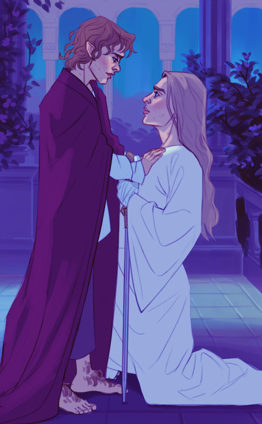
So, before I do any kind of shading or lighting I build up the illustration to this point, where I've settled on what the base shapes look like and what kind of colors I want to use as a base:

Once I have those local flat colors down, I do a pass of initial light and shadow before I start painting for real. This usually consists of multiple layers layered on top of each other, set to the multiply blending mode (that I totally always name and didn't do so after the fact for educational purposes). What multiply tends to do is darken and blend your colors with whatever color you put on the multiply layer. In this case it makes the color darker with a blueish tint.
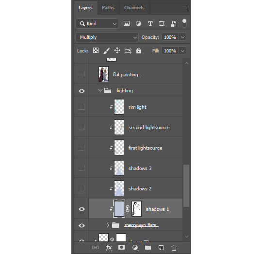
Not sure how to explain this process if you've never used an editing software before, but I think it's fairly similar no matter what program you use. I lock the layers to the grouped flats so the shadows and light only appear on the figures and not on the whole canvas.
When painting it's usually a good idea to go from big shapes to small. I tend to flood the object(s) with whatever is my shadow color and then "carve out" the lights using a mask. You can just erase away if you want, but I recommend learning about how masks work because then you can more easily play around with the shapes.
I've noticed that doing it this way creates bigger and more consistent shapes rather than doing it the other way around. It also shortcuts you right into dramatic lighting territory lol, which was the goal here.
After that it's simply a matter of creating more layers with the same multiply setting to deepen shadows wherever it's needed. I also might add something like bounce light, subsurface scattering, ambient or secondary light sources to give some more life to the colors.

Final stage is render and clean-up, where I merge all of the shadow/lighting layers with the flats and lineart to have the entire object on one layer. I was terrified of doing this for the longest time, but it really makes the process so much easier. I always leave a copy of the original setup layers should I need to go back to it.
At this point most of your colors, shadows and lights have been sorted out so you can simply color pick from the source as you paint.

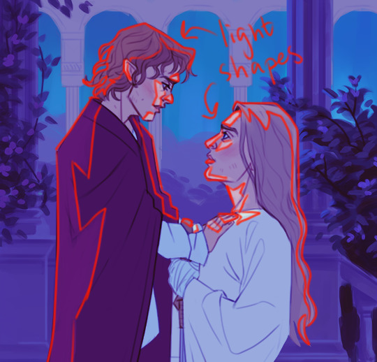
This is also where I add the rim light! Super effective way to make your object pop and add some drama! It's a fairly straight-forward process where you sort of outline the object with what is usually a pretty stark contrasting color. Don't forget that rim lights are *not* outlines, though! It's a light source, so it affects the object just like any other light. It doesn't only hug the outline of the object, but seeps into it at points where the light can reach:

You can play around with different blending modes for lighting, sometimes you get a really cool effect!
Lastly, that faint glow? Just a layer of using a soft airbrush in the same color as the light and paint it on top. Don't lock this layer to the object so that you can have the brush spill out a bit around the edges to create that soft glow effect.
And then you're pretty much done! There's a lot more to it, but I'd say that's a simple breakdown of how I usually approach paintings in the shading/lighting stage.
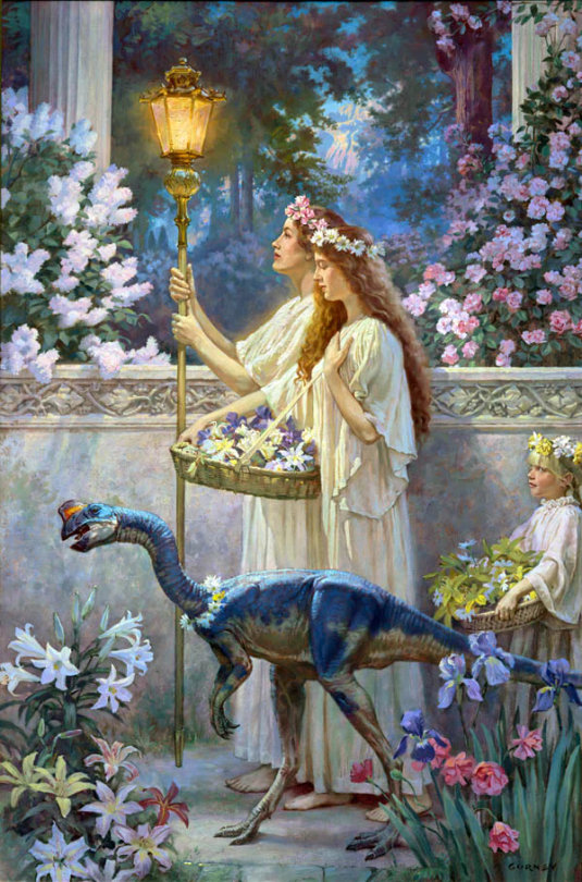
I don't make things out of thin air, though. One of the most important aspects of painting and drawing is reference! Go look at nature! Look at tons of paintings, drawings, photographs, illustrations and anything else that inspires you. For this particular piece I was very inspired by "The Garden of Hope" by James Gurney.
As for brushes and program it doesn't matter too much honestly, I'd say use whatever you're comfortable with. I still use Photoshop against my better judgement out of habit, but there's a bunch of alternatives out there like Procreate or Clip Studio Paint. You could also use something like Krita if you don't want to pay for it.
In my case I almost exclusively use the hard round brush (and airbrush as needed) that's default in Photoshop because it works fine for the kind of style I tend to go for, but there's....thousands of brushes out there. Just google it, you'll find free packs. Kyle T Webster has a pack that's pretty well-known, and that I also use occasionally. I'd say start with what's in the program of your choice by default, just to get a feel for it. It's easy to become overwhelmed by all the textures and shapes of custom brushes, but it can also be a lot of fun to play with so go ham if you want!
Hope that was somewhat helpful!
3 notes
·
View notes
Note
hi!!!!!! i love your art its super super incredibly pretty :') I wanted to ask if you had any tutorials on how you draw hair? especially for someone like dave's. I would love to see your step by step process!! thanks for sharing your pretty art, it's always a joy to see your posts on my dash ♥
Aww this made me smile so much😊
thank you! ❤️
I spend a lot of time on pinterest looking at pictures of various hairstyles from different angles to get an idea of how hair works as well as study shapes and hair flow. I like pictures of real people so I can keep things looking natural, but I like to slightly exaggerate volumes and shapes to make it more balanced and interesting. I still get frustrated a lot though (especially with longer hairstyles), but since I've been drawing Dave so much I'm a little bit more confident with his hair so sure! I'd be glad to share my process if it helps! :)
(Long post ahead!)
COOL KID HAIRSTYLE STEP BY STEP 😎

1. First I decide where to draw the hairline. I usually start with bangs and draw an overall idea of how the hair will shape around the face.
2. For Dave I like to separate his hair in three parts, adding more volume on one side (part1+2) and keeping the other (part 3) more flat. The hair flow from parts 1, 2 and 3 go in different directions. It helps to think in 3D here especially with the bangs part.
I give more volume to the bangs by adding a little gap from the hairline to the top of the bangs where the hair bends on itself.
Also I keep the hair shorter on the flat part (part 3) and I like his hair to be a bit wavy so I avoid sharp edges and use curved lines.
3. I then lower the current layer opacity to be able to draw over it and see more clearly.

4.Then I add more details on a new layer. Since I prefer the roots and the hair closer to the face to be darker I add more pressure to my lines there. I like to add some loose strands sticking out but you can totally skip that if you like a cleaner look. (I like messy hair ;p)
5. If I find that it still looks a bit flat or unbalanced I use the select tool while pushing the ctrl key and dragging the selection in the direction I want the hair to move to.
(I'm using Paint Tool Sai here but other drawing programs also have some kind of select tool) Et Voilà!! :)
**coloring**
for rendering I first change the sketch lines to a color closer to the hair. I set the sketch/lineart layer on ''multiply'' and create a second layer below for colors. I then add the base color, put the bigger shadows (if you're using a reference it's easier to see where shadows should be) and then draw some individual strands with a darker shade. I also add a darker shades to the hair around the face and roots.

aaaand we're done!
btw the results change depending on the brush I'm using. I went for a rougher look here but sometimes I use smooth brushes to make it look softer.
This is actually my first tutorial ever but hopefully it was clear enough? Let me know if you'd like more explanations on something and congrats if you made it this far ;)
131 notes
·
View notes
Note
ooo could you share anything they say about comic color theory? i love that stuff
Sure! The featured guests were Erica Henderson and Ming Doyle, and each has a very different approach to coloring:
Ming Doyle has a heavily-inked, expressive brush style. She talked about the black and white values as always coming first in her mind. She applies washes of color as a kind of frame to bring out the bright focal points.


...She showed a lot of cool examples, but I think much of it was unreleased art I can't find online! Many of it used just one or two carefully chosen relatively low-saturation hues.
But Doyle only colors her own cover art. For comics contracts, she said that frustratingly, artists often can't know who their colorist will be. With no way to guess what the finished product will look like she said she's prone to over-rendering the inks. "It's a miracle anything gets made."
Erica Henderson on the other hand has been able to color her own art recently. Feeling unsatisfied with trying to add colors to finished lineart, she started doing rough color keys in the penciling phase.

Unlike Doyle, Henderson uses flat cel shading "ligne claire" and more bright, contrasting colors. Once colors have been established in more calm panels, you can use surreal contrast for emphasis on a single panel or object without confusing anyone about the literal colors of the scene.

She showed off the color keys for this spread from Dracula, Motherf**ker! Each place has its own dominant color: dark blue in the phone booth, light blue with literal colors in the police station, bloody red for the building exterior, orange inside. Previous/next location color leads you through (traces of blue on the arriving man, orange light thrown out through the open door.)
This book in general is a CRAZY beautiful lesson in nonliteral color. Ming called it "gel filter" stage lighting and they talked a bit about Suspiria (1977). That level of control, she said, is a million times harder if it's not planned from the start.
Also both women wore yellow and black to the panel completely by coincidence, and had a friendly debate over whether the color yellow is "creepy" (Erica) or "happy" (Ming). They settled on pale yellow being a creepy color because it's like something that used to be white but now will infect you with mushrooms if you walk there barefoot.
Very cool stuff all around!
12 notes
·
View notes
Note
i don’t mean right now but would you ever do a rundown of the brushes you use? like your favourite brushes to do lineart with, or favourite brushes to pair together for a project, and/or your method for colouring/rendering digitally? i love your art style it’s so cool and unique, it’s always super cool to look at!!!
the brushes i use change a lot tbh i think i need to make a new master post for them [there’s one on my old blog but i don’t use all of them anymore] i think i’ll get to that tomorrow if i remember :D though generally i like pencil brushes for sketching/lining, anything with slight colour jitter for flats, and textured brushes + the pencil brushes again for rendering
and one thing i could do for the colouring/rendering process is maybe try doing a speedpaint or something? i used to do those all the time when i was a teenager, might still be fun now that i’m a lot better at art xD
and thank you :O i never feel like my art is particularly unique but i think that’s just because i know where a lot of my style inspo/how i draw things comes from lol
3 notes
·
View notes
Note
I will get down on my hands and knees and beg you for a tutorial on how you draw. Your lines, cross hatching, it looks so simple but so GREAT you make me want to chew on the walls.
well: i taught myself how to draw over a ridiculous 13 years of trial and error and "messing around".... any appearance of Knowledge or Foundations or Anatomy has basically been hardcoded into myself via the silliest and most literal kind of "style evolution" possible O__O i prob shouldn't go into detail on how i draw specific things/people bc i'd only embarrass myself! but i CAN get into the Technical side... >:D
as probably most ppl know or can guess, i draw everything traditionally with fineliners! more specifically i use a Four Pen System that i devised for maximum consistency/legibility...
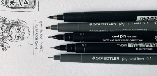
0.1mm - shading, detail, tiny stuff!
0.3mm - most things, like characters and lettering!
0.7mm - BOLD lettering, speech bubble outlines, thicker lineart!
1.2mm - panel outlines, VERY BOLD lettering!
(optional: a brush pen for filling black bits in :P anything like that can be done in post though.)
i also use a non-photo blue pencil for all my sketching! VERY useful when scanning finished stuff >:)
as for the linework itself... my hands jitter a lot when i try drawing slow focused lines, so i usually just draw everything as quickly Yet precisely as possible :P it takes a weird kind of care to get right, but drawing on paper also helps - the friction keeps me steady lol! i find my hand just kinda darts and skips across, leaving a lot of messy dots behind, but i still like that look ^u^
hatching is definitely the most fun part... >:P my kinda style was inspired a lot by abby howard, and a bit of mizugiri (and above all, by never thinking to use proper screentones)! the usual straight-ahead hatching is obvs just muscle memory, and praying i don't mess up lol - but once you have that down, then just look around for more creative uses! i love doing curvy crosshatching around complex shapes, and coming up with wacky background shading... i've also tried out a depth-of-field effect, 'drawing' background objects by hatching and layering blurry shading on top >u> (also, i don't usually go for Full 90-degree crosshatching... just slowly raising the angle as i add more layers of shading feels a lot more subtle and natural!)
just never stop messing around!!! that's all i've ever done!! that's how you can keep stumbling upon cool new techniques that you can then suck up and add to your comicking arsenal ^u^
46 notes
·
View notes
Text
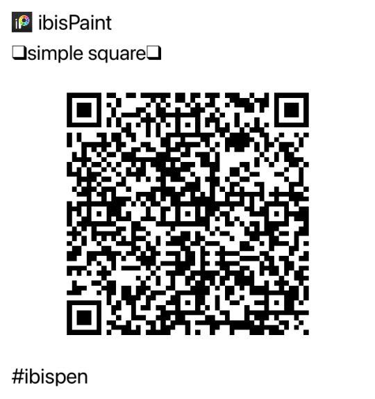
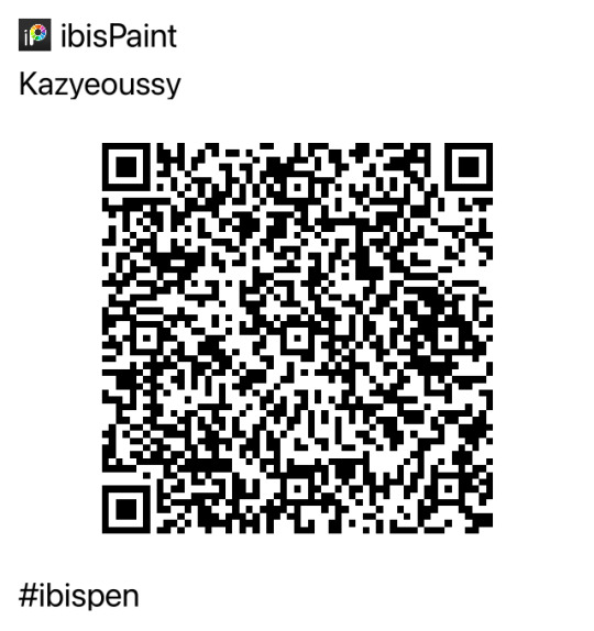
swag ibispaint brushes + notes for someone on th because commenting a picture wasn’t working
mmm i use this a lot!! i think you’ll enjoy it its very smooth and cool
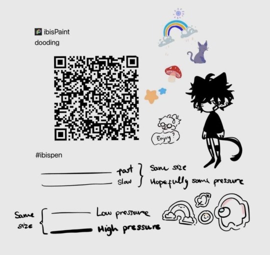
this ones real pressure sensitive and its super fun for doodles n stuff

these are a bit rough edged as the name implies. theyre pretty much the same but soft clay is really cool and blendy and soft sand isn’t blendy

i only had a few downloaded with examples of the pen and had to export qr codes of the ones i use a bunch. this ones clear? its the equivalent of a colorless blender
this lags a TON when its big so i recommend setting the max size to 100. its rlly cool as a lineart brush !!
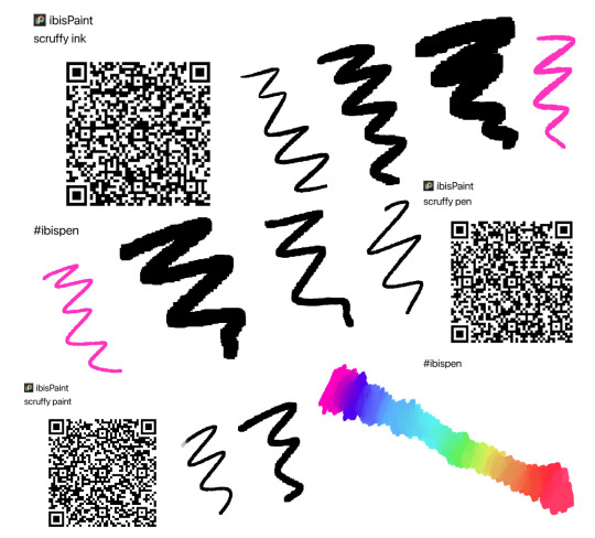
scruffy ink is pressure sensitive, scruffy pen is square-ish and scruffy paint is rlly cool and blendy ! they’re all square so the blend is square but its cool

canvas texture!!
i use this one all the time ajnemfndns its square and im in love with it!!! good lineart brush
its one of those with the color and the outline and you can set the color in that little window when you click on the brush, the outline color is whatever color is the main one you set

every new line is a different color! you can edit the colors in the jitter section of brush editor

last one for now, this ones mine its just a color jitter that looks like static when its small enough
i hope you enjoyed these!! my faves are definitely the first one and the simple square brush along with dooding and cue
5 notes
·
View notes
Note
Do you have any recommendations on how you developed your specific art style?
(Thanks for the ask!<3)
Omg, most of the time I don't even think of myself as having a specific art style! But I'll try my best to be helpful!
I use the program Clip Studio Paint, there's a free version which I used to use, and it changed my art drastically. I use the pencil to sketch as I would on paper, and I rarely clean it or do final lineart or anything (because I'm lazy, mostly.) Then I color with the "oil" or "thin gouache" brushes, as if I were painting on canvas c: (having some oil painting background helped.) So those are some tool things...
I try to use fun & vivid colors as much as possible. One of my own art idols (lunarelles) who uses color in such amazing ways, once said something really cool about just throwing unlikely colors on there and see if you like it, whether or not it makes sense. Like, why not make the shadows orange, you know? They said it in a much better way, but the overall idea still stuck with me. I also love to add blue+purple shadows on people, I just think it looks nice!
Sometimes, if I want a super paint-y vibe, I'll keep the sketch layer open, but paint in a layer over it- again, just as if I were painting on a canvas! This is pretty time consuming though, and I only do when I feel like going above and beyond.
As for like, the style of my lineart/sketch, that's probably more tricky. It's really the result of all my years of drawing and imitating the other artists whose work I admire. Maybe I like how one artist draws noses, or wrinkles in clothing, or I like how they shade/render hair, etc, so I see if I can incorporate that into my own style.
I also use pinterest A Lot for inspiration, it helps especially with poses.
Yeah okay! I think that's it. It's hard to identify my style, but that's my process! I hope you found this helpful in some way!:)
Thanks <3
#I dooo believe Clip Studio Paint has done very very much for me#a good brush for digital art goes a long way#I could show you some of my stuff before I used CSP! its kindof embarrassing hahaha#digital art#art style#art tips#clip studio paint
5 notes
·
View notes
Note
[It's long, no need to reply to it or even read it, I won't take it personally]
I actually browsed a good portion of your public work! I even took a peak at your older work on dA and I like some of it a lot!
Nowadays the artstyle seems more clean and commercial, which is natural for an artist that sells their work and not as bad as it sounds! Just wish you could spread your wings again, you know? I did notice that you especially thrive when doing personal artwork…
For me it's the details, messiness and color palettes… I think you'd have more place to experiment with gore if you used a messy painting style instead of clean lineart, you would be able to put some cool meat textures, make it look really gorey. I saw you used to paint quite a bit in the past, you got an awesome rendering skill that would definitely come in handy here! And outside of that, the colors you use for meat bits, blood and characters often blend together, there isn't much visual distinction in it. I would try and either play with darkness or saturation more. Usually it's the characters that are very saturized which take away from the redness popping out more. Washing the palette in yellows could also bring out some griminess in it, if that's what you're into. And, seeing as those are furry characters, I am yet to see sticky dried blood fur! I think details that are just a bit nasty is what gives gore the edge and character. Just some feedback from me, I hope it doesn't come off the wrong way…
I see I see!! I also like the messiness of lines and brushes used in my older works, I quite miss them and It's lovely to hear you share the sentiment.
My tastes and my art changes a lot, I think I mostly stick to whatever feels nice and natural at the moment, going with the flow so to speak.
I find your perspective insightful and easy to connect with, I'll keep your advices in mind and hopefully get some free time to experiment with my art a lil further.
In the meantime I have a lot of old stuff queued up and keeping myself busy with trades and commissions in the background
19 notes
·
View notes
Note
omg your art trademark is definitely the facial features and brush you use like there's always a level of detail to the face shape that gives it depth and deepens how pretty it is to me...goddamn everyone's eyes and eyebrows..... also whatever brush you use for sketching the linework out always makes me realize it's your style <3 ALSO another thing that I love that is a little weird/kinda hard for me to describe is that you give limbs quite nice curves and thickness? like there's other artists and I do it too where the characters are very knobbly and lanky and there's very hard edges to them but you always just fill out characters so nicelyyyyy
omg thats really cool to know actually, i think i put a lot of focus into how i draw faces because i used to have the worst case of same-face-syndrome and i refuse to go back lmao, and also faces are just. so interesting?? i definitely dont do as much studies as i should considering how often i draw people, but i do stare at a lot of reference photos
human bodies, also, are interesting bc theyre so organic and weird looking sometimes so thats probably where that comes from haha i actually hadnt noticed that about my work before!! so it was interesting having to actually go and look through my art to figure out what you meant
also the brush i use for lineart is actually just the brush i use for my sketching! i just size it down - so if i draw something at a 12 i'll line it at a 7, and thats honestly just bc its a brush i customised so its the one im the most comfortable with and like. if it aint broke dont fix it, right? i actually also use the same brush for some of my colouring - i'll block in the big colours (skin, hair, clothes) with an inking brush and then go back in with my little customised brush (at a much larger size) and do the shading and highlights and blush and stuff
2 notes
·
View notes
Note
I also do art, and have been trying to figure out how to soften my style a bit, and then I saw your Howe and went "Oh?"
Your use of line art in the details of the face specifically is where I'm going "Hmm hmm Yes"
Also I think I just need to use a thinner brush than I currently do
I love these "Oh?" moments, had them a couple of times with other artists and I'm INCREDIBLY flattered you had yours looking at my art!!
Nate's portrait is a relatively old piece, my style probably evolved a lot and in the meantime I have changed both hardware and software I am using 😅 But! I think i have some thoughts about lineart and details:
1. I abandoned the way many artists draw, which is sketching and then drawing clean lineart on top. It never really worked for me and i think using (cleaned up) sketch as the lineart layer adds a bit of crispiness :D dont get me wrong i absolutely admire people who can do pretty, clean lineart layers. I cant, so Im working around 😆 this is certainly something that softened my style
2. Indeed many people say that lineart can always be thinner... But many artists use thicker lines and make them look soft and ethereal! Still, i prefer starting from the thinner lines and then bolding them in the most important spots.
3. My fav advice considering sketching (and so, lineart in my case haha) is to simply make a mess! Quick longer or shorter brush strokes always make the piece look less stiff. and everything can be cleaned up later, thats the wonder of digital drawing after all. @kallielef is absolutely my inspiration in terms of this soft and messy (in the best way) type of sketching technique.
4. Experiment with lineart colour! Back then i was clearly in my black lines era, but now i am being a bit creative about it 😆
5. Brushes are not the most important thing, but finding a nice sketchy one is always cool. Currently im using this one for CSP.
6. 'Thicker outer lines, thinner inner lines/details' is the rule I live by :D
That being said Im still an amateur and maybe in a year i will look at it and think - what kind of crap you were telling this poor person 😂 but that's what works for me at the moment!
Thank you for the ask!
4 notes
·
View notes
Last Seen Blogs