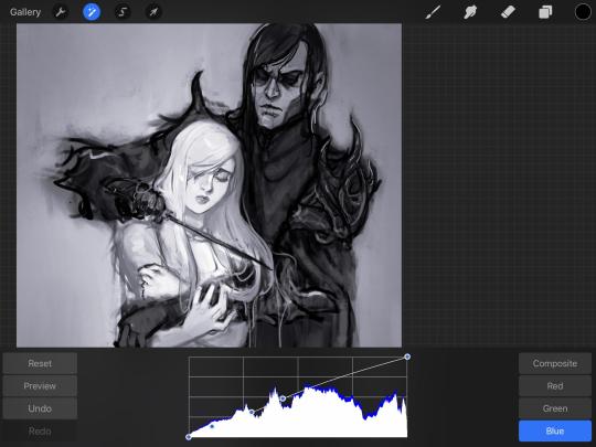
#it was my first time using an underpainting and i was Afraid
Text
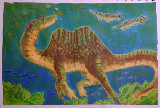
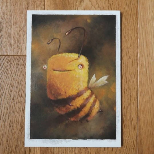
okay I don't usually post my traditional art here but I drew a spinosaurus and I love it so so much so please look at him
#it was my first time using an underpainting and i was Afraid#i also got new crayons which were Hella expensive but 100% worth it#spinosaurus#traditional art#paleoart#paleontology art#gouache#gouache painting#wax crayons#alligator gar
88 notes
·
View notes
Note
Hello! Do you have any advice with painting? Every time I start I end up just doing lineart with colours underneath, and when I do kindles art it looks kind of like plastic. Am I supposed to merge the two layers and then start shading? What would you recommend?
Hey anon!! I actually do have some advice for that!! I'll shove it under a cut because it got way longer than I thought it would, sorry for the infodump everyone _(:3 」∠)_
quick tl;dr: painting process should consider both personal taste & the desired aesthetic of a painting, & to avoid plastic-y colours, make sure your hues vary within your values (and layer modes are ur friend) ♥
there's a million ways to start paintings & its all down to personal preference -- the end goal for the illustration can often influence the approach you take; a crisp digital painting might call for meticulous layering & sharp edged flats, but if you want something to look like an oil painting, you should try and mimic that process as close as you can! here's some examples:
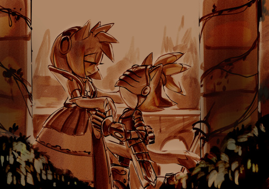
this is the sketch for my FYR zine piece from last year; i intentionally approached it in a way that looks like traditional underpaintings so that when I worked directly on top, those orange tones would peek through like this:

after doing that undersketch, i manually painted everything -- no fancy layer modes, just me, one layer, and screaming ಥ_ಥ it was hard but it worked for the vibe i wanted!!
now v.s something like this:
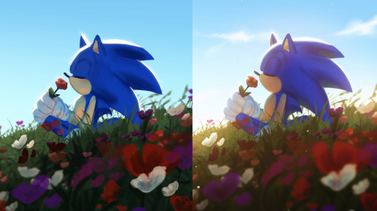
simple shapes, roughly blocked in shading that just gets merged and painted over, as well as lots of layer modes on top for those colour changes! this is by far the easier one & the one i'd probably recommend, solely because it lets you keep more control. i go more in depth here on that -- but to quickly answer, i personally block everything (including shading) in before I merge & render!
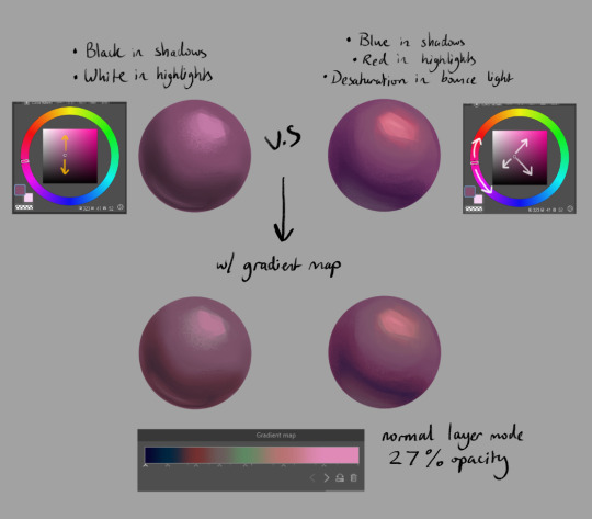
for the other thing you mentioned, a lot of the times that 'plastic' feeling can come from either a lack of transitional shades or only using white/black for your value tones. this tweet thread (direct image links 1, 2 & 3) by frozensoba demonstrates it incredibly well -- by adding certain colour shifts in your values, it can create extra depth which is what makes stuff look more alive!! don't be afraid to really push it and get wacky
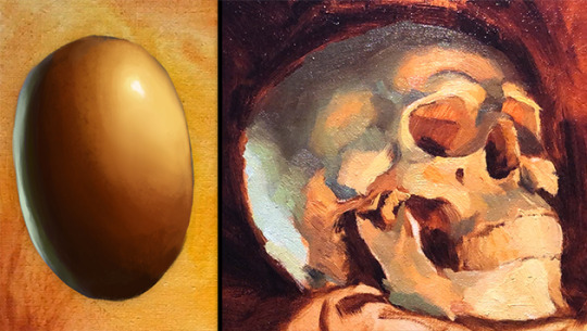
an easy way to add it while you're learning is using gradient maps to add richness in your midtones. It's not perfect since different surfaces & materials diffuse light differently, but adding one at the end of a drawing can help tie everything together. If you can do both at once though it always looks best; here's some very quick 2 minute orbs as an example:
ok I'm almost done (and im so sorry for how long this got... special interest moment TM) -- one last thing is to try varying your brush strokes & adding textures if you want. using only an airbrush or heavily relying on blurring brushes can make things look plastic too; sometimes you want that, but for the times you don't, adding some texture & leaving brush marks in can do a lot!!
lastly, since this is just me rambling, here are some artists that are incredibly talented & i highly recommend looking at for their advice & processes because it will be much more coherent than this:
Marco Bucci -- amazing educational content. if you check out any of these artists, he's the one to look at first imo. his 10 minutes to better painting series is a great place to start
Sinix Design has some amazing tutorials on anatomy & the mechanics of painting! This video & the intermediate part 2 are super
Dao Trong Le -- a veritable goldmine of speedpaints
Bo Chen & any of the riot splash artists. If that's the vibe you're after, you can't go wrong with the LoL splashes as reference
i hope that helps!!!
#tutorial#any time i have the opportunity to barf out art talk i will do it#tysm for the question too ♥#not art#asks
91 notes
·
View notes
Note
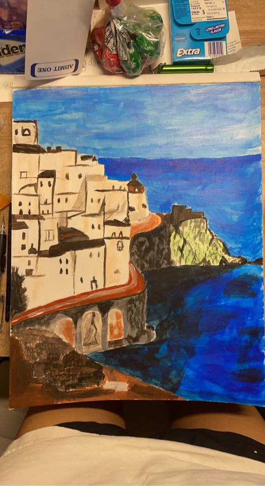
Here is the painting again and I used acrylic paint for it(it was a set that had only basic colors or so the box says)
Okay awesome, acrylic is definitely up my alley. i was just worried it would be oil paint which ive used but i hate LOL
I love the reflection/shadow on the water actually that part looks great.
I'm gonna take a wild guess and say that you just sort of went into it and put what colour you thought would be right in the the place you think it should go LOL. I don't mean that in a mean way by the way that is a completely logical thing to do. I'm not sure if you sketched it out beforehand or not but if no then you should def do that.
My first tip is to start with an underpainting. This will help you establish a midtone so that you can properly establish your light lights and your dark darks.
this is an example from an acrylic painting i did a long time ago. This is my underpainting and the white-ish yellow parts are where the sunlight is breaking through in the scene and i've mapped them out as my lightest lights in the image.

here i've (painted some bushes) but also I've established my darkest darks. The trees are backlit and are going to tbe darkest part of my environment.
My second tip is to not be afraid of edges. This is super common for beginner artists but just like... paint right up to the edges, paint over your lines. It doesn't matter especially with acrylic because it dries fast and is easy to cover. (you can see I completely disregard my lines in the example above). This will help you avoid those white edges between objects.
Also, if you're using cheap paints i totally get how this might be difficult, but don't avoid using thick colours. Water-y colours are great if you know how to do a watercolour painting but if you're looking for a solid acrylic/oil looking final product build it up till it's thicky thiccums.
Otherwise, keep practicing and use references 🫶
4 notes
·
View notes
Text
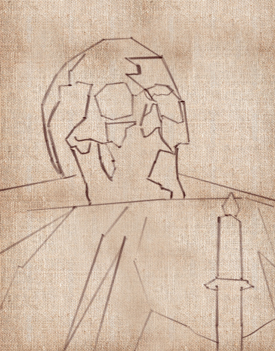
Skull Oil Painting 💀 Still Life from Start to Finish
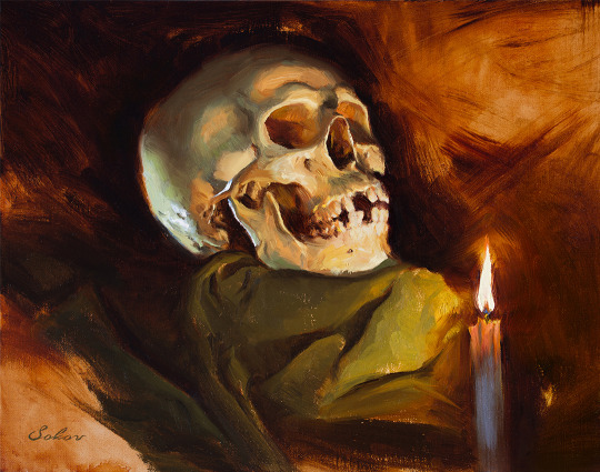
By Pavel Sokov
Setup and Preparation Stages
Before I start a painting, I like to come up with a couple of thumbnails to nail down the composition. I do these from imagination usually. So in these ones, I played with the placement of the skull, the direction of the lighting, and the orientation of the canvas. After coming up with these 4 thumbnail sketches, I got kind of a better idea of what I actually want from my painting.
Also, it sort of helps to have a thumbnail completed to use as reference when I start my painting because if I don’t have anything to look at it’s possible that when I start from scratch on my canvas, my subject will end up too big, or even worse, run off the page or something.
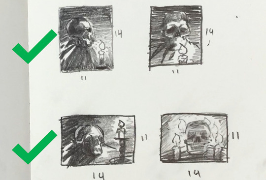
Composition is a bit of a feeling thing along with some guidelines. It’s not like stiff rules that you must follow. So having said that, I think I like sketch 1 and 3 the most.
You know, since the color temperature plays such a big role, I digitally painted this sketch with some invented color before actually making the setup, just to give an idea of what kind of mood this painting would be. And it also gave me an opportunity to plan some of the painting methods and steps that I’ll use in the actual painting process.
Okay, so with the sketches in mind, let’s put together the setup that I will paint from today.
Execution of the painting
So a big challenge to overcome here with this skull is that I want to paint it in the dark for a more dramatic and moody atmosphere since it’s Halloween and all, but at the same time, I want myself and my easel to be in the light so I can see and we can make this video.
Sadly, the candle doesn’t provide a strong enough light during the day, so we’re going to use a warm lamp instead.
Since we don’t want to burn the house down though by lighting that black box on fire, I think our candle shouldn’t be lit at the beginning stages of the painting.
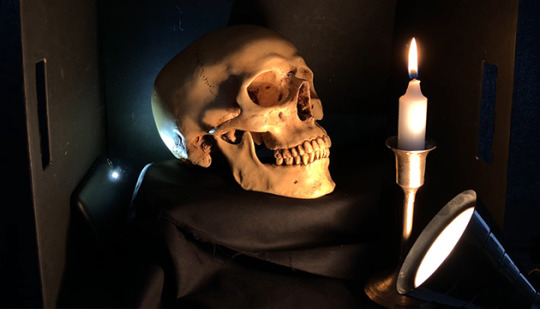
I’m using a portable paintbox today that makes it convenient for me to paint anywhere I go.
For my brushes, I plan to use a lot of bristles because I want to load this painting up with a lot of thick paint, but I also packed a few softer brushes to get some soft edges in there too.
As my painting surface today, I am using an 11×14 linen panel. It’s actually one of my favorite sizes for life paintings.
I paint with a few different brands of oil paint, but there’s no need to name them or be concerned with what they are. What’s really important about that is that they’re professional grade and they’re not the student grade which are very difficult to paint with. It just doesn’t work, it’s like toothpaste, so just don’t even get it.
Okay, let’s squeeze out our paint. And don’t be afraid to use a lot. For the longest time, I’ve been so shy with squeezing out my paint. It’s been taking me years to paint thicket and thicker, and I gotta tell you, if you can skip all these years of being shy and just get straight into it and load up a lot of paint, it will save you a lot of trouble.
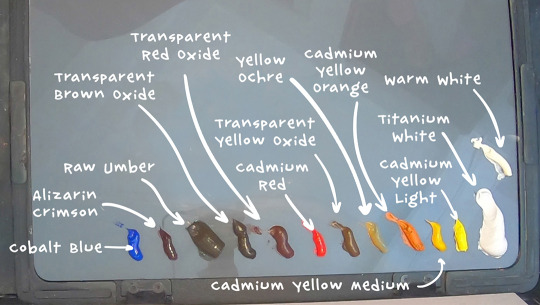
On my palette today we have:
Titanium White, Warm White, Cadmium Yellow Light, Cadmium Yellow Medium, Cadmium Yellow Orange,Yellow Ochre,Transparent Yellow Oxide, Cadmium Red, Transparent Red Oxide, Transparent Brown Oxide, Raw Umber, Alizarin Crimson, and Cobalt Blue.
Underpainting and Drawing Stage
The very first thing I like to do when starting a painting is to tint the canvas. But you have to select your tinting color wisely, because it’s going to provide the underlying temperature to the whole piece. I often let this initial tint show through all the way to the end of the painting, particularly in the shadows.

In this case we have a very warm light on our subject so we can expect our painting to be pretty warm. I’m going to tint this canvas with that in mind by using something really warm like transparent red oxide, and I will mix it with a bit of Cadmium Yellow Medium in the area where the candle will go because later, all this warm underpainting should give this skull a nice inner glow. I am diluting my paint with gamsol here when I do my initial washes, because makes the paint behave like a watercolor, which is perfect for making a stain.
Drawing the Lay-in
Okay, so now that our canvas is tinted, we can start to draw our linear lay-in on top of our stain. My favorite tool to do that with is actually a hard bristle brush. The reason why is that those stiff hairs, they allow me to get nice straight lines which are the exact type of lines that I find helpful at this stage to simplify the contours of everything that I’m drawing and to find those big shapes.
Don’t worry, we’re going to complicate these lines later when we go to paint them!
As you draw your lay-in, don’t forget to focus on the big shapes and the proportions of what you’re drawing. Don’t get carried away on details and things like that because it’s way too early at this stage. Simplify everything to its most basic elements. Find the big shapes and don’t mind the secondary forms for now. It also kind of helps to keep your horizon line in mind when you draw your lay-in. For example, in my case, I’m sitting below the skull and looking up at it.
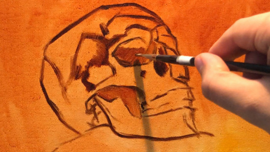
You have to ask yourself, are you looking up at the your set-up, or are you looking down at it? And, whatever the answer is, you have to design your lines with that in mind.
So if you’re noticing that your drawing is off at this stage, don’t be shy to move lines around until you get it right. Trust me, you’re gonna be saving yourself a lot of headaches if you fix things at this early stage than if you try to fix them later on when you have a lot of opaque paint down on your painting.
So right now I’m filling in the dark shapes on my underpainting because I find that it helps me see my mistakes better when I fill in the big dark shapes. With these dark shapes filled in, it’s much easier to judge the distances on your drawing.
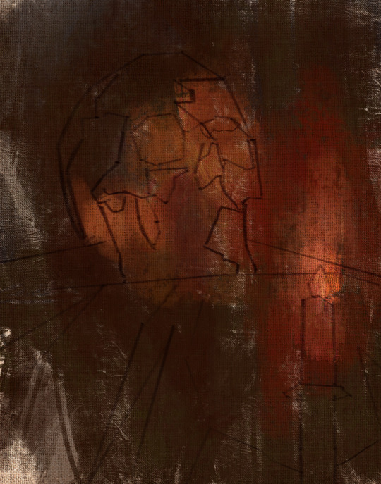
Opaque Painting Stage
At this point I often like to take a kneadable eraser, or more often a napkin, and rub out the lightest areas. This helps me establish the light source a lot sooner before I even lay down the opaque paint. Just make sure to do this before your stain is dry, or else you won’t be able to do it anymore. You usually have about 10 minutes max depending on your surface before your wash dries, so be careful.
My goal here is to establish the big values, shapes and color temperatures as soon as I can, so to do that, I am going to cover the entire skull with some opaque paint, aiming primarily to tell the story of the lighting that’s hitting our skull. I am thinking a lot about color temperature. Our primary light is warm, so I’m mindful that my the parts that are in the light are going to stay warm. Often times, students want to lighten an area, so they grab a bunch of white. White is actually the coldest color, so the result of that is that the value of the area goes up and it does become lighter, but at the same time, the temperature goes a lot colder.
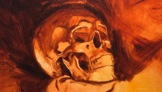
This is actually great if your subject is in a cold light, like maybe a North lighting window. But in our case, our subject is in a warm light, so that’s no good for us. When you want to lighten an area that’s in the light, consider using a color to lighten that area. In this case, to lighten my mixtures, I’m going to include some cadmium yellow medium, cadmium yellow, and transparent yellow oxide in my light mixtures to keep it warm. But conversely, if you want to darken an area, a lot of students reach for the black to darken things, and that creates a cold mixture as well. Try darkening a shadow with a warm dark. Something like transparent red oxide, transparent brown oxide, or alizarin crimson.
While you’re putting down that initial opaque paint, a good principle to work by is to paint the lights thicker and the shadows a little bit thinner. So that means you can’t be afraid to lay down some serious paint in the lights. If you keep the shadows more thin and flat, then the lights are going to feel more luminous in comparison. And I also love to let my warm underpainting show through in places in the shadows.
When you have dramatic lighting like this, you are bound to see a lot of contrast. Let’s make sense of all of it this way:
Since most of our subject is lit, make sure that the amount of values you use in lights is higher than in the shadows. In other terms, make the shadows more flat and have less values, like you could make the shadows just one value so that it looks a lot simpler than your halftones and your lights. As a result, the shadows will have less information in it than the parts that are lit.
I am thinking of the skull as an egg, with the closest part receiving the most light, and the parts farther away receiving the least amount of light. If the underlying “egg” of the skull reads well, then you are gonna be in good shape!
Our halftones are the most chromatic and the most information-dense parts. So in our case they are going to be the warmest parts of the skull. The lightest lights are pretty washed out, but they’re still warm.
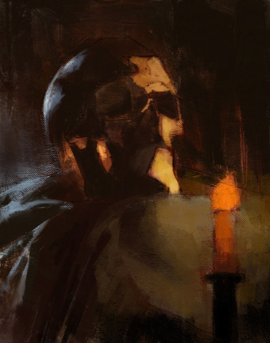
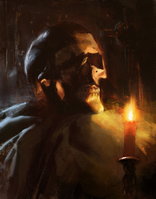
Finishing Stage
To see the finishing touches make sure to watch the video below.
youtube
3K notes
·
View notes
Photo
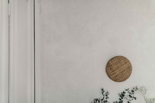
DIY PLASTER WALL
Enduits décoratifs Colorare Stucco Veneziano
DIY PLASTER WALL
DIY PLASTER WALL
Some of you have been following me on Instagram with my home renovation projects in Lille and I have made a promise to share my diy experience. I will start today with my beloved plaster walls.
I LOVE plaster wall. I think they bring a lot of texture and depth to a surface. When I mentioned about “plaster” (“enduit” in French) to my husband, he said that it’s going to be long and a lot more expensive than the classic paint.
So I searched for someone who could do it in Lille, to see how expensive it was and….,surprise surprise…, I found no one. All painters and a few entrepreneurs who are used to building houses told me that they don’t do the type of decorative plaster I was looking for. Unbelievable…, I couldn’t accept the fact that NO ONE coud do this for me. Really ??? How come I see it everywhere on magazines? To prove that it’s not a mission impossible, I told my husband that I would try to do it myself. To reduce the risk, I started with a small room in the attic. If I fail and it turns out ugly, it’s not a big deal.
Once I had decided that I would do it myself, I started looking for the material. Another problem. I started to understand why no one wants to do it. The big hardware/diy stores like Bricorama or Leroy Merlin don’t sell the materials to make your own natural plaster. When I searched for ‘enduit” I only found the plaster that’s mixed with cement. I searched on the internet, and I found Ecobati. Yaaay, I was so happy when a saw that they had a shop in Lille. Finally, an expert in beautiful plaster ! I even saw that they organize workshop and trainings. Perfect, that’s exactly what I was looking for. I rented a car, went to the address, only to see that the shop in Lille was not operating anymore. They closed the shop permanently !
Finally I found Colorare on the internet. They sell ready to use natural plaster and after browsing their website, I decided to give it a try. I ordered a 4L of Stucco Veneziano. I was afraid that the final look would be too “polished” but I just thought that it was better than having a plaster with no shine at all.
The product arrived 2 or 3 weeks later, it was delivered by bicycle (because it’s company’s policy to be as natural as possible !!!) and it met my expectation. The only thing was the colour. I expected the colour Laguna 14 to be a little warmer but it turns out to be colder/ blue-ish and doesn’t match the colour sample on the screen BUT it’s still a nice colour so I’m fine.
Plaster changes colour as it dries (after being applied on the wall) so don’t panic when you open the can and see that the colour is different.
Some TIPS to apply the Stucco Veneziano from Colorare
1) Use good quality tools made from stainless steel. Click here to see an example, you can easily buy it from Colorare or other diy stores (”magasin de bricolage”).
2) Prepare the wall, you need to have a very flat and clean wall. Stucco Veneziano is a product that has to be applied very thinly. Too thick (which will happen when you have an uneven surface), and it will crack when it dries.
If you have a wall in very bad condition, I think it’s better to ask a professional painter to prepare the wall for you. I actually had to redo totally one wall because I found some mold and the wall was full of holes with crumbling old soil. I wanted to use a natural mortar and not cement and ended up spending a lot of time redoing this wall and I never manage to have an even surface.
Oh well, this is one of the walls in the small room so it’s fine, I can live with this imperfect wall :) I highly recommend that you ask a professional to prepare you the wall if there is a need. Anyone can apply a plaster but preparing a smooth and an even surface is a lot trickier. It takes a lot of practice.
3) Put an underpaint layer on the smooth surface before you start plastering. I used this product, from Colorare too.
4) The first layer of plaster is the base, to make the surface opaque, so you don’t have to press so hard. For the second layer (you need to wait one day before applying a new layer), you can press harder. In French they call it “ferrer”. When it dries, you will see that wherever you press hard enough after this second layer the surface will be shinier. In my opinion you will need to put 3 layers to have the perfect look. The final touch of Stucco Veneziano is very nice, it’s very smooth. The texture is only visual.
5) Your wall’s final look will depend on how you apply and how hard you press the second and third layer. Any wall started has to be finished.
6) If you want to redo 4 walls of a normal room size (around 15 sqm) you will need to order the 12L of ready to use plaster.
If you need more inspirations, and want to know more about the different types of modern plaster walls available, check this page here, it is very well explained and there will be no secret anymore !
There you go..., now you can also have your own plaster wall :)
7 notes
·
View notes
Text
Coloring in grey scale
So, hey, this is somewhat of a tutorial for those curious about some of my coloring and blending. I made this especially for anyone younger than me and is exploring digital art, but this is also for others who are curious about what I do. I love reading other artist’s comments and looking at their WIPs, so why not.
Another reminder: if you’re looking for my artwork, please follow @rainbow-illness and not this blog. All of my finished stuff goes there; usually, my works in progress (WIPs) or Angry Doodle Corner go here. Sometimes I use this blog to repost my art, but that is my official art blog, no this one. Not unless you like nonsensical posting and metal, then have at it. If you have any questions, don’t be afraid to hit me up, I love talking about art.
So I can’t always sit down and talk about my processes and how I go about doing them, but I was able to sit down and take some screencaps while I was working on my iPad Pro. Using the iPad is actually my first choice to draw on because of the convenience of carrying it around like a sketchbook, whereas my laptop isn’t always easy to carry around--it’s a big laptop. While I use my iPad, I also like to go back and correct things, recolor, re-proportion, or spend more time privately working on a drawing. I have my iPad with me, all the time, so I’m out in places usually like Starbucks doing this. I also struggle with pretty bad PTSD and agoraphobia, so having my iPad out with my headphones on gives me an excuse to put my mind elsewhere to calm down. My family just usually looks at me and goes “oh, she’s working on her art again”; I did this as a kid, too, only with sketchbooks.
I do not have a Cintiq either, though I would absolutely love one. This laptop is capable of using a stylus, but I think I need a better one to do it with. All I’m using is a cheap Wacom Bamboo tablet that I’ve had for five years, that’s it. Everything I’ve done on this blog has been on a small surface. So if you’re just dabbling into art, don’t beat yourself up for having the small stuff, I’ve worked with small stuff and still do. The only thing I have that’s not small is, well, the space and processor on my laptop are much faster than any other laptop I’ve owned, bought especially for graphic design classes and my artwork.
So, that being said lemme just forewarn some of you guys. My artwork is all done in two to three layers! Yes, you read that right! Why? When I was 16, I didn’t have a Wacom tablet to mess with, so I had to use a mouse and learned from there. When I turned 18, I got my first Wacom tablet while working my first official job and the family computer didn’t have a good processor. So when I got my first official laptop, it was basic and not made to run anything beyond the web browser and such, it could barely handle Photoshop. It did, however, run Paint Tool SAI with no issue (which is why I still prefer it over anything I use), it just couldn’t handle more than five layers. After losing my drawings constantly and not being able to do anything in the prized software I’ve been eyeing since my Sophmore year of high school, I found a workaround with it.
And that’s what I’m going to write about here. With that in mind, no, you do not have to limit your layers! I’ve taken traditional art classes so my first instinct is to literally paint over my stuff like I would on a canvas. If you don’t want to do that, you don’t have to! Yes, I am nuts.
That being said, let's do this.
If you haven’t taken traditional art classes, that’s cool! I’m going to be using some art terms you haven’t heard of, but you definitely will when you take your first ever drawing class. These terms are foreground, value, negative space, contour, and weighted line (I’ve seen it called line weight too). For the more experienced art students who are likely groaning over that stupid contour practice from that book “Drawing on the Right Side of the Brain”, I’m sorry, guys. Newbies, you are going to know this.
And you are going to hate it. While I still hate it and, yeah, my eyes are rolling into my skull right now just even talking about it, there are some useful practices in here that I... actually use. Who would have thought? At least we’re not talking about still lives.
Anyway, here’s what I’M going to say that some art teachers will not tell you but I want anyone to read this to know:
- Do not obsess over your drawing to look exactly like your reference. Just don’t. Forget this completely, worry about it later or don’t even worry about it at all. This is your style, your interpretation.
- Digital art is hard. Art is hard! Practice makes perfect and you learn over time just by studying (looking at) other pieces of art. It took me like well over 10 years to find my own little niche and I’m still playing around with coloring styles. I have a lot.
- If you’re just starting to draw with a tablet of any kind, play around with it. My first official program was a cheaper version of Paint Shop Pro and when I first got it when I was 14, I sat around and experimented on layers to see what it would look like. Explore!
- When you start drawing figures or faces, try not to think of it as, well, face or a figure. Reduce it to basic shapes, like squares, triangles, and circles.
Greyscale can establish light source, value, scale, and negative space.
I don’t always use greyscale for my art, but when I do, I appreciate it because it makes my life easier. For example, Alphonse Mucha’s pieces here from his “Slav Epic”.
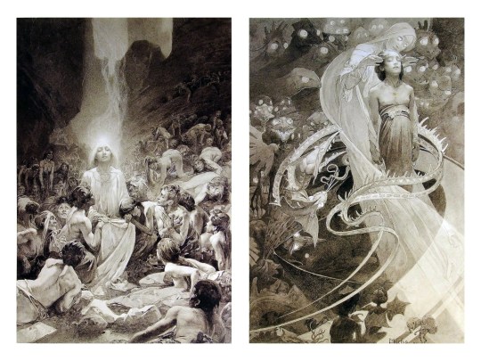
Chances are, you’ve seen Mucha’s art nouveau on prints, fanart, fabrics, and all of that. But Mucha did so much more and he is a huge influence on me for a reason. By the greyscale we see here, we can see foreground/subject with each illustration. Mucha is using value (that’s shadow) to emphasize this, in addition to negative space (background) to draw you in, just by using black and white. Notice how the other subjects don’t have such a powerful contrast and light source versus the other, especially the woman on the left. Mucha made his art pop by his understanding of contrast.
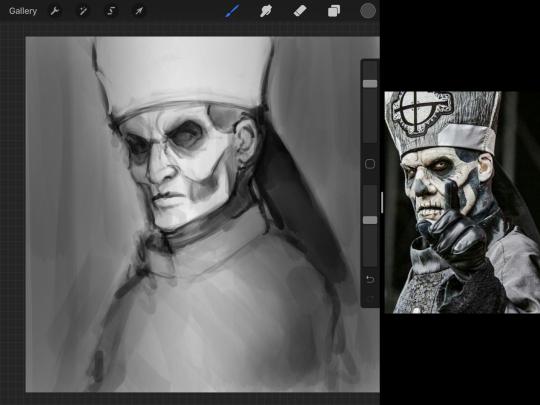
For this first part of this entry, I’m going to be using Papa Emeritus II from “Ghost”... who is a good example of how to draw faces, too. Huh. Regardless of what drawing program you’re using, keep your opacity low, at 50%.
Simplicity at its finest
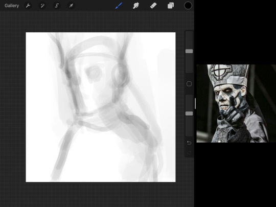
Instead of focusing a lot on Emeritus’ face, I’m going to focus on the negative space behind him. I’m using this to define his figure. This is a good picture because of the stark contrast, though, it’s a little tricky because it is really contrasted and you can’t see where the light source really is. But that is okay! I am going in and just using this negative space, the contour of his head and torso. Before I even think of a face, I want to softly go in and use black (or grey) to fill up that negative space. Keep it simple and work your way up.
After I lightly fill in the negative space around him, I can start lightly going in and establish his face by blocks of shadow. And this is why Emeritus II is such a good example for this kind of work. I don’t usually start going in and drawing eyes, I rely on the shadows of the face to see where their eyes, ears, lips, and such lie.
Here’s another example (though, it’s old):
This is in my maroon style underpaint, which is what I post most of the time. For their faces, I just used basically eye sockets to start working on their faces, like Papa Emeritus II down below. Again, this dude is a great example.
Here is where it may get a little funky. I created a new layer and set that layer to Multiply, still keeping that opacity low. Since I have no light source and I just want to create a really dramatic lighting, I made a vignette with a simple airbrush tool.
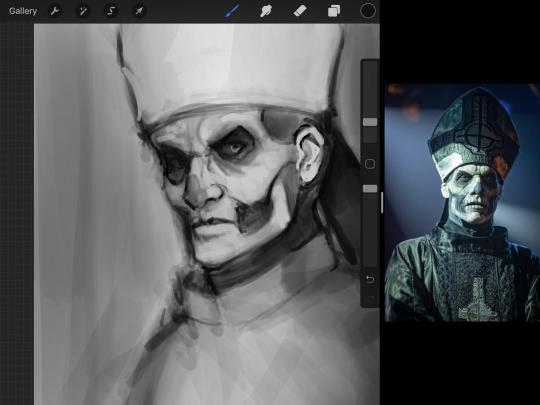
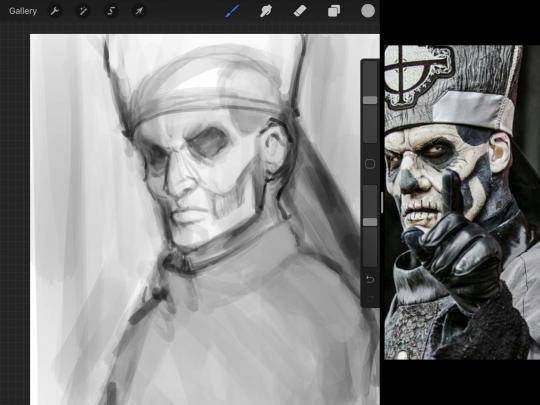
With that little vignette, you can create a new layer (unless you’re me, I just merge it down because of that constant fear of nonexistent software crashing) and I’m using the color pick tool to go back and forth to start using greys to really get into Emeritus’ face, especially his wrinkles. I’m painting over it constantly, switching back and forth between a paintbrush tool and color pick tool to blend. Again, keep your opacity low... unless you’re me and you’re feeling adventurous. You’ll also notice here that I have more than one photo reference. I use several for a lot of my art, so I encourage you to do the same. I had no idea what his jaw looked like, so I grabbed a second photo. Now that I have a better idea of where his hat ends on his forehead and how his nose looks, I start doing a weighted line.
Weighted line and Contour
Now is the dreaded talk. Of contour.

Welcome to Drawing I hell. This cursed image is from the book “How to Draw on the Right Side of the Brain” and if your teacher does not talk about this in your first drawing class, I am going to eat my hat... I have a hat lying around here somewhere. ANYWAY, the contour line exercise is basically you just using a neverending line for a drawing. I don’t know who drew this (and tbh, thanks a lot for every single boring assignment I’ve done in drawing classes), but this guy used contour lines for his drawing. I’m having war flashbacks over here, but I managed to find an art teacher’s page talking about different types of contour. My god, they are evolving.
Going back to our dear friend Papa Emeritus II, I used weighted line to start adding in little shadows to his face. Weighted line goes hand in hand with contour; it is a great technique to not only add details, but add little bits of shadows.

This is a simple example; the thicker line is adding to the shadow of the apple, giving it value!
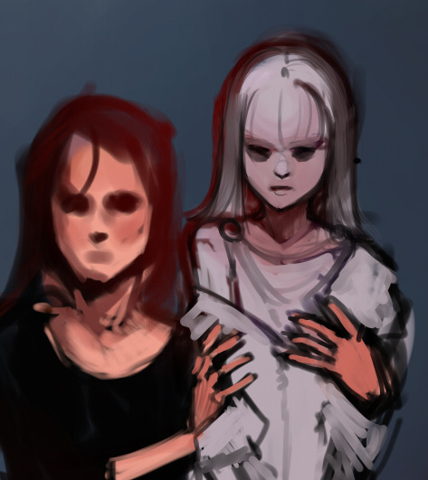
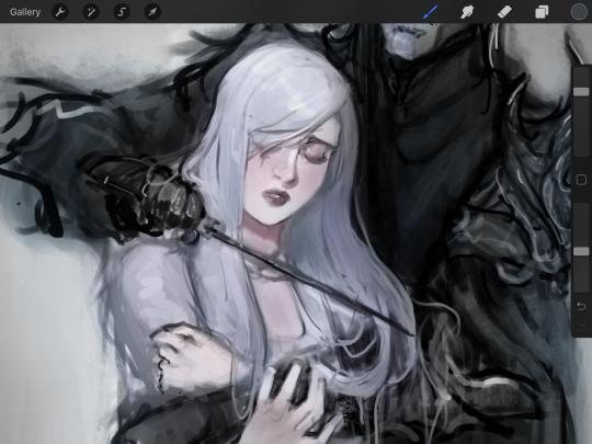
Papa Emeritus II is such a good reference... I used him as inspiration for King Melwas here.
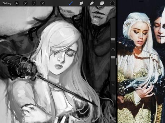
Gwenhwyfar is also a good example of weighted line. Gwen is essentially a very, very pale character. In contrast to Melwas, who is in darker clothing, Gwen is soft, she is the focal point in this drawing. For the little pieces of her hair, the corner of her lips, eyelashes, and her fingertips, I used a weighted line to establish these things, otherwise, Gwen is so pale, she’ll easily be washed out completely.
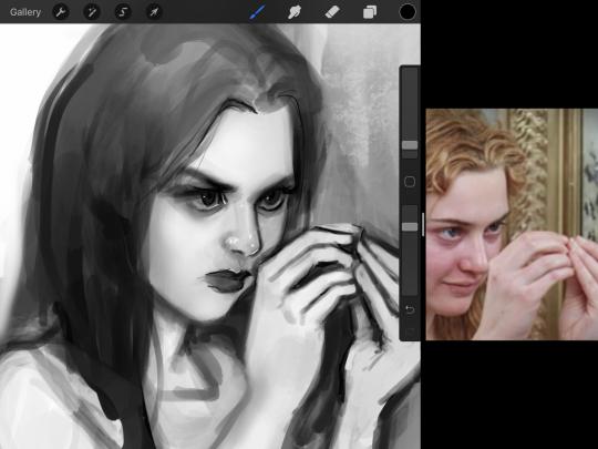
This drawing of Alice, which I’m still messing around with, is another example of how effective a weighted line can be with depth. The lines I added into her face, eyelashes, creases, hair, and fingers add those little details since everything I’ve done before like Papa Emeritus II was so soft with a low opacity on the brush settings.
Layer masks and curves
There are two ways you can color greyscale images.
You can do this by going into Layer > Adjustment Layer > Curves (this is how it looks like in Procreate).
This gives you a neat ol’ base color! I am playing around in the blues, adding soft hues of blue in their figures and the white in this picture can either turn blue, cream, or even green. You don’t have to use Blue, you can use any of the other colors. For me, I’m always drawn to blues. Another cool thing to play around with is Color Balance, which is underneath the same function as Curves.
But if you don’t have any of these, you can add a new layer, and do Multiply.
The only drawback to this, of course, is how destaturated (the lack of color) it looks. And yes, that’s an issue you will have and I did run into this while doing this. How I combat this is using additional layer masks. Believe it or not, Alice here was once at a grey scale, looking even more desaturated than Gwen.
For Alice’s face, I went in and use:
- Soft Light because she needed more peach and roses in her skin. Omri’s original drawing gave her a light rose blush so I wanted to do the same.
- Overlay to mask out the black lines from the greyscale I had.
- Lighten which I used to make her lips pinker, her apron’s shadows lighter, and parts of her hair brown.
The same went for Gwen, who is, again, very pale. But while she’s supposed to be pale, I didn’t wash her out completely. To add more saturation, I used a combination of Soft Light over my Multiply layer and Overlay to start working at the highlights on her hair, nose, and shoulder.
This little walkthrough isn’t as visual as I like, but with limited software like Fire Alpaca, GIMP, or Paint Tool SAI that don’t have the abilities of Photoshop in terms of color correction and playing around with colors, I really encourage you, readers, to play around with these tools. Using the color picker back and forth, especially after using layer masks, gives you an ability to mix and blend colors. The reason why I work with greyscale or a maroon under paint is that you can create brilliant colors and make a new palette; the trick is to constantly mess around with them. I never go in and flat out color anything, with the exception of things like “angry doodle corner” which is basically what I call my lazy drawings, drawings where I’m just honestly goofing off with.
So in summation...! Or me trying to summarize this.
Experiment and explore with layer masks and adjustments. Whoever says that using these tools isn’t real art, they’re wrong. And please don’t ever be afraid of using references of any sort! Alphonse Mucha is saved ten times over on this computer.
#my art#tutorial#i think#an attempt was made#digital art#procreate#ipad drawing#ipad pro#Alice madness returns#alice liddell#american mcgee's alice#alice asylum
7 notes
·
View notes
Photo
Last but not least… an oil painting. Somehow to me oils were more stressful to start with, much more than acrylics. I was so afraid to do it and fail that I didn’t use either canvas or board or any “proper” surface to paint it on. I found an old, thicker carton piece and used that instead. I think subconsciously I planned that my first oils would go straight to the bin. That painting took me some time to finish and I made it in two stages. First one happened half a year ago when I started an initial underpainting in acrylic inks (pic 1 and 2) and then took oils for the first time in my life and made a painting about 70% in (pic 3) The experience wasn’t as bad as I anticipated :) After that I waited a couple of days for paint to dry and… ... somehow lost interest in finishing it. Months passed by. During that time period the Bee was ominously looking at me from the corner of my office… ...and then one day I decided to have another go :) That turned out to be a quite smooth experience. So that’s the story, and here’s the result. I reckon this is one of the best Bees, maybe on par with the acrylic variant? What’d ya think? https://www.instagram.com/p/B-jbEUkHdM-/?igshid=f3qjlio37axh
0 notes
Text
Painting With Gouache
Several people have accessed my web site over the last few years as a result of doing web searches on painting in gouache (pronounced “gwosh”, or “goo-wash”), probably lead there by the numerous gouache paintings listed on the site. There is some conflicting information published on this topic. Consequently, this article is to help you better understand this opaque watercolor medium based on over thirty-five years of experience in using it and as a professional art educator.
Purportedly, the ancient Egyptians first employed this paint and its use was later refined by the Italians, where we get the word originating as aguazzo, or guazzo. This is said to refer to “mud”, or “watercolor paint, splash”. It is some times used interchangeably as bodycolor and designer’s colors. Guazzo also supposedly was an idiom to describe the 16th Century technique of applying oils over tempera paint. None-the-less, gouache paints were exploited by illuminated manuscript artists and was later popular with some European decorative, as well as, landscape and nature artists, such as Albrecht Durer. Because opaque paints dry fast and can be applied with a flat, even tone, during the nineteen hundreds gouache was often the favorite of architectural and advertising illustrators; hence the paint got its moniker “designer’s colors.”
A gouache paint body is composed of several elements, including pigment and an opacity agent. These density additives differ depending on the manufacturer. Some contain blanc fixe (French for permanent white); in this case its barium sulfate (also used as a filler in papers). Other makers incorporate calcium carbonate, more commonly known as chalk, or a “precipitated” (technical for synthetic) chalk. When the water container for rinsing brushes in during this painting process is emptied, one can see the thickening material as sludge on the bottom of the container. Gum arabic is the binding agent all gouache paint makers embrace to coalesce the ingredients. In some cases glycerin and preservatives are also mixed in. The principle differences between transparent watercolors and opaque is the addition of a chalky substance and the amount of gum arabic; gouache contains a higher concentration of the latter. When gouache is applied as an impasto, it’s the gum arabic that can give the dried painting a pearly patina. If used too thick, as with tempera, the paint will crack. Normally, a gouache painting will have a dull surface appearance. This makes it ideal for photographic reproductive purposes and is another reason why it has been popular with illustrators.
A few sources I’ve read say that gouache comes only in tubes. That is not so. I’ve got a Pelikan brand pan set that I acquired in my teens when I first started using this type of paint in the mid 1970’s. These pans, called a “cake” form, have the advantage of being able to acquire replaceable color cakes and a built in palette. Because gouache paints can be rewet and worked when dry, as cakes become empty you can squeeze tube paints into the cake receptacles. Tubes of gouache are said to have a shelf life of 3 to 5 years, that’s when the tubes solidify. When this occurs I break open the tubes and use the dried form just as I do the cake variety. Sometimes I will use a single edge razor blade to shave off needed amounts into a palette. Apparently gouache also can be purchased as a liquid, but only in small jars of black or white. These are probably the only two available because they are the two colors used in largest quantities and the heavy opacity content causes settling in the jars.
A few advantages and uses of gouache have already been addressed, yet there are more. Because gouache painting materials are easily transportable and dry fast, as with transparent colors, they are ideal for plein air (painting outdoors) pieces and some artists have used gouache as preliminary sketches for larger oils. As stated earlier gouache can be rewet after it dries, so, plein air paintings can be reworked back in the studio. This quality also allows colors to be gradually blended and mixed on the painting’s surface. Furthermore, gouache works fine on tinted papers and may also serve as an underpainting for pastels.
The transparent watercolor techniques of wet-on-wet, dry brush and spattering can also be accomplished with gouache. However, due to the opacity material paints do not bleed, or blossom, as much in wet-on-wet as transparent colors. Liquid masking agents may also be used for blocking out areas to leave white, though most gouache artists just take advantage of white paint. As you may know, “glazing” in painting is the process of painting a thin, diluted layer of color over another. Once again, because of the chalky substance in gouache, many believe you cannot use glazing with gouache. However, to solve the problem of the base paint mixing with the diluted paint as the glaze is brushed on. I spray a single layer of fixative (the same stuff used on pencils, chalk, and pastels to keep them from smearing) over the work and let it dry. Then I glaze over an area, particularly for shadows. There are two concerns in doing this. First of all the fixative cannot be too thick or else the paint you put over the top will bead up and not cover. The second also must be kept in mind and planned for. It can change the color, especially washing out thin layers of white areas. I will address this again when I talk about finishing paintings. Additionally, I’ve also satisfactorily used gouache for air brushing, as in the paintings “Family Outing” and “Morning Stretch”.
The ability to be mixed with other water base paints is another admirable characteristic of gouache, especially with transparent watercolors. It’s been said that gouache does not mix well with acrylics because the paint will glob up, think of it as curdling, as cottage cheese. I have never had this problem, but then I don’t use a lot of gouache from tubes added directly with acrylic paint, only small amounts. The way I mix them works quite well. However, since acrylic dries as plastic with a slick surface, in order to paint gouache over acrylics, a thin layer of fixative needs to be applied to let the gouache bind.
Any watercolor papers used for transparent watercolor painting may be used with gouache. Hot pressed, or smooth toothed papers of 140 pounds or thicker work well. I prefer to use mounted rag paper called watercolor board made by Crescent. Another paper I’ve had success with is a four ply rag paper used in museum mounting. This paper I wet and then stretch over a wooden frame made of one by two’s. The softened cotton paper is then stretched and stapled just as you would canvas.
When it comes to finishing and displaying gouache paintings there are numerous issues to consider. The most common way to approach framing gouache is to handle the same as you do transparent watercolors, matted and framed under glass. In the mid 1980’s I stopped using this method for three reasons. A gouache painting, “Misty Warm December”, I had entered in a National Wildlife Art Collector’s Society exhibit in Minneapolis, Minnesota was disqualified from competition by the judges because they thought the original was a print, no brush strokes were apparent on the surface of the paper, it had an even, flat surface appearance and was under a white mat.
The second reason has two inherent issues that arise with shipping paintings under glass. One is increased expense of transportation due to weight compared to paintings not under glass and the other is breakage. To address these problems I took a look at how acrylics were handled. Gouache paintings can be finished with any acrylic varnish medium; however, a few layers of fixative must be sprayed on so the paint is not smeared by the acrylic varnish. This will eliminate the dull, chalky appearance of gouache and the pieces will look like oils. These pictures I then put directly into frames without glass. For some reason, I’ve noticed that pictures with a high gloss varnish tend to sell faster than others.
The third reason I prefer to acrylic varnish over gouache is the richness and depth it brings to the color qualities of the finished product. This obviously means that the colors will change somewhat. Consequently, you need to practice with this technique several times to be familiar with how it affects paints. When it comes to creating the illusion of water and make it truly feel wet, there is no other type of paint I’ve worked with that will do the same job. Since whites tend to wash out, to get strong whites and other bright colors I mix in acrylics.
As with any watercolor, transparent or opaque, no matter how the work is framed when it comes to displaying them make sure that they are out of direct sunlight and are not under long term exposure in fluorescent lights, as these give off a low level UV radiation that will eventually fade the colors, unless they are under UV protective glass.
Hopefully, you’ve gained some insight into this versatile medium of gouache and are not afraid to try it yourself. If you have any questions, please feel free to contact me.
Source by Robert Bear Painting With Gouache
0 notes
Last Seen Blogs
rengoku-giyu
Get Crunk

makealexgain
Alex:)

puhirehav
Untitled

paperglader
IAmForeverChanged

fyne-q
Fyne the fennec