#seriously microsoft
Text
so there's this thing which I've dubbed academic fiction, where I write a long, precise academic paper, confirming to your citation model of choice and everything, except every single thing in there is made up. anyway if I made a zine that was a pretend-academic journal full of only that would anyone be interested in reading it
#sorry if this is insane I'll delete the post in the morning but I need to know if anyone has seen anything like this before#I also do fake wikipedia articles. in microsoft word don't worry#I take my responsibilities as a wikipedia editor extremely seriously I would never actually lie on there#echo
2K notes
·
View notes
Text
My manager and my project lead both gave me glowing glowing reviews on this project (my lead even CC'd my skip-level and skip-skip-level with his praise and they both responded) even after I spent all of January and February worried that I was slipping behind with work because I was busy being an overwhelmed shell of a person

#chrissy speaks#im still in a weird mental space but its getting better#it was such a huge relief to be like 'oh so i havent been being side-eyed at work?'#January was such a blur of overwhelming stress I hardly even remember what work I did#but apparently I did it#I was super seriously considering speaking up in January like 'i cant swing it'#cuz this was a super rush-order super hi-pri project I got pulled into#(like... hand-picked....)#with CEO of Microsoft level awareness and involvement#I was seriously gonna be like 'due to life cirumstances exploding i am a mess and I cannot be your guy'#('im not capable of being the guy. you had a guy but now you dont--')#but i was the guy#I did the thing#under better circumstances I feel like I could have done the thing in half the time#but I did the thing........
242 notes
·
View notes
Text
Me explaining the Minecraft revolution to my mom like:

#stop the mob vote#minecraft#FIGHT FOR ALL THREE UNTIL THEYRE ALL FREE#THIS IS A REVOLUTION#seriously though I don’t play Minecraft for a few months and I come back to a war#fair though Minecraft devs are lazy af#okay actually i slightly retract my former statement and think maybe it’s Microsoft and not Mojang
65 notes
·
View notes
Text
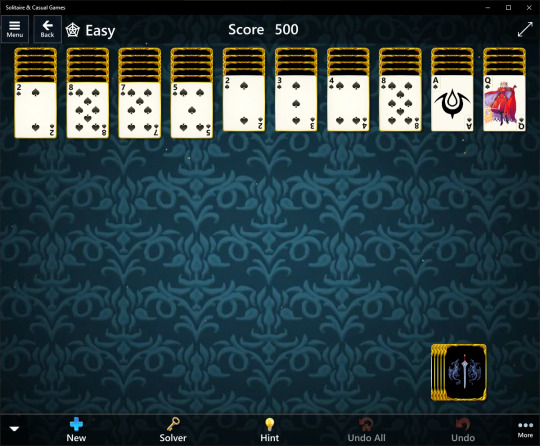
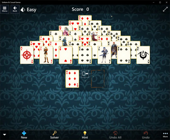
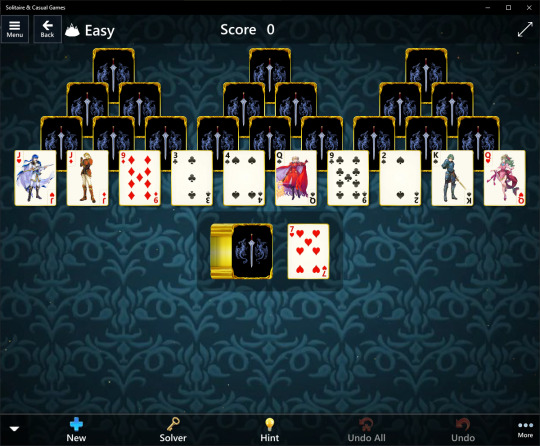
I made myself a Fire Emblem theme for my solitaire game
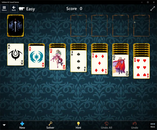

Deets under the cut
Base theme: Fable
Deck: Solitaire Celebrates
Effect: Stars
PLAYING BACKGROUND:
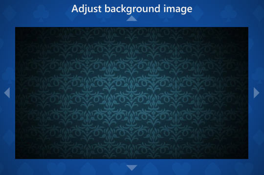
CARD BACKING:

ACES:
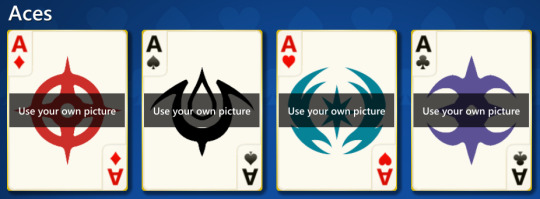
Ace of Diamonds: Hoshido/Birthright
Ace of Spades: Mark of Naga/Brand of the Exalt
Ace of Hearts: Valla/Revelation
Ace of Clubs: Nohr/Conquest
KINGS:
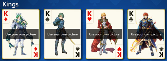
King of Diamonds: Lewyn
King of Spades: Alm
King of Hearts: Eltshan
King of Clubs: Eliwood
QUEENS:
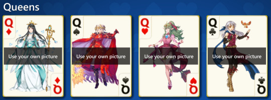
Queen of Diamonds: Mikoto
Queen of Spades: Edelgard
Queen of Hearts: Tiki
Queen of Clubs: Michaiah
JACKS:
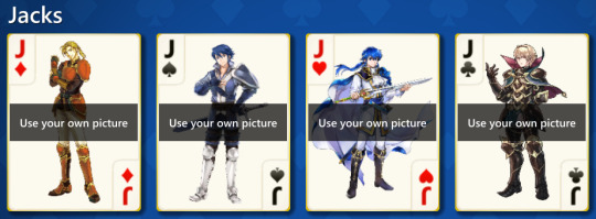
Jack of Diamonds: Forde
Jack of Spades: Inigo
Jack of Hearts: Seliph
Jack of Clubs: Leo
IMAGE SOURCES:
Background: Here
Card backing: Here
Aces: The French Wikipages for Awakening and Fates
Face cards: Heroes and official art [Inigo specifically here]
FUN FACTS NOBODY ASKED FOR:
The face cards did not align this way naturally. All of them had to be zoomed in at least twice, most four, and a few had to be scooted over a little to avoid being cropped in the wrong places or to fix general alignment issues
The game doesn't properly support transparent images, so I had to give each face card a background; really all I did was colour drop the deck's base colour and use that as the background so it would match
Each face card was shrunk to the card's base dimensions [422x562] with the background being twice that size [844x1124] to allow for easier placement without running into a black background because of said transparency issues
I didn't make any changes to the playing background. I just set it and left it as is
The card backing isn't quite aligned in the center, but I have no motivation to try and fix that right now
The backing border was completely unintentional. I chose that deck to build off of simply because of the gold rim around the face-up cards. I didn't realise it would come with a backing border, but hey it works
I chose Fable as the base theme to build off of for two reasons: 1. Aesthetic™, and 2. The background music is the closest to Fire Emblem music the game has [I really wish you could choose your own in-game ambience instead of having to use a preset theme first]
The stars effect has no real impact on the theme, I just like it
I initially wanted Ferdinand to be the Jack of Diamonds, but I didn't want to use his pre-skip design, which is all Heroes had, so Forde was chosen instead
Takumi was briefly considered for Jack of Diamonds and King of Clubs before those roles went to Forde and Eliwood
Ishtar was going to be the Queen of Clubs, but I decided three Genealogy characters was enough, so Michaiah took this spot
Other candidates for Queen of Clubs were Cherche, Celica, Seiros, and Eirika
I went with the Chrom!Inigo edit instead of normal Inigo or Lazward simply because Chrom!Inigo is best Inigo and you cannot change my mind
Alm, Michaiah, and Forde are the only ones who use official art instead of Heroes art. I preferred Alm and Michaiah's official art while Forde isn't even in the game yet [get on that, IS]
I originally wanted to use Edelgard's official post-skip art as I didn't [and still don't] like how her Heroes art sharply cuts off, but it ultimately clashed badly when trying to align it, so I had to use her Legendary alt [her pre-skip and Three Hopes designs were out of the question from the get-go]. I aligned the cutoff with the edge of the card as best I could and I'm surprised it worked
The only set in stone characters from the very beginning were Eltshan, Seliph, and Inigo. The rest I decided as I went on
Tiki was completely spur of the moment. As soon as I remembered she existed, I was like "Oh yeah, adult Tiki would be a perfect Queen of Hearts". I saw her Brave alt and didn't look back
I briefly considered using Eltshan's performance alt, but decided against it
While I knew I wanted Seliph as the Jack of Hearts, I initially wasn't sure which version to use, but I ultimately went with the version I liked the most, which was his Brave alt
Lewyn was a toss-up as to which version I wanted to use, but I went with his festival alt as I liked it more than his normal version
Other characters I considered but with no solid placement were Sigurd, Arvis, Lucina, Ayra, Soleil, Dorothea, Olivia, Deirdre, Say'ri, Elincia, Ryouma, Innes, Tana, Ephraim, Felix, and Constance
Inigo and the aces required some additional editing to remove their white backgrounds before setting up the off-white backgrounds they were supposed to have for this set. I worked on Inigo's for so long trying to edit out lossy pixels around the edges of his art that the editor crashed on me. Hurray for autorecovery
#fire emblem#microsoft solitaire#i'm seriously in love with this i've looked at this for five hours now#though technically i made this theme a few days ago but who cares
21 notes
·
View notes
Text
Holy shit man. Lol, not only does their desktop os suck and take forever to do anything (restart, update, shut down) but their Android apps as well? Lol. Christ Microsoft is the worst. 🤣
How is this shit so bad and people keep using this trash??
12 notes
·
View notes
Text

I forgot to set VLC as my default video program after updating, and Microsoft Media is apparently now charging $1 a pop for codec packs
and by God, there are people paying it, aren't there
ETA: VideoLan is a nonprofit and VLC media player is totally free. It works with every file format I've ever tangled with, and immediately played back the file with no difficulty. Get dinked Microsoft
#codec#okay but seriously#it's one banana michael#how much can it cost#zero dollars?#tech#microsoft#vlc media player#vlc#free stuff#computer literacy#education#educate yourself#and for the record i have a netflix subscription but you can't video edit netflix ok
15 notes
·
View notes
Text
Microsoft?! What are you doing in my falafel?
#good omens#good omens 2#neil gaiman#ineffable husbands#aziraphale#crowley#go2#microsoft#seriously what are you doing in my falafel#this wasn’t on my 2023 bingo card tbh
24 notes
·
View notes
Text
whoever programmed microsoft excel so that it recognizes dates up to the year 9999 but not before 1900... turn on your location i just want to talk
#personal#i know just enough about programming to be deeply confused as to why they would do this#like it cant be a 'numbers too big' issue right??? because otherwise why 1900 and 9999#theyre storing the dates as integers why not just start them sooner#yeah nobody cares about the 19th century. lets include 7000 years in the future instead!#microsoft excel#until i hear a good reason im taking this as evidence that we need more humanities people in stem#seriously though if anyone knows please tell me
7 notes
·
View notes
Text
every time i have to open chrome for something i can't do on firefox i feel dirty
#finally figured out how to take screenshots of streaming sites on a mac#unfortunately the cost is a sliver of my soul#(deactivate hardware acceleration doesn't get it done on firefox for mac alas but it does work on chrome)#(and on edge i imagine as a chromium browser but that would be. seriously funny.)#(make up a guy: guy who uses microsoft edge on a mac)
19 notes
·
View notes
Text


content for a very small audience but i was experiencing major deja vu when daniel posted this
#i need my laptop back so badly i am going crazy without it#apple needs to get it back to me FAST#i could be gifing but instead i’m comparing ashton irwin and his brother to daniel and his nephew#something about the photos was just SO SIMILAR#but seriously i will die without my laptop#i use it for everything it is my best friend#i use it for tumblr and discord and twitter and reddit and obviously i am literally just always working on some kinda gifset or project#i have 80 million tabs open#i watch all my youtube and tv on my laptop#i miss her so much#i had to write a full essay on my ipad today#do u know how annoying it is to do mcgill guide footnotes on ipad microsoft word#my cat will suffer for what she did (be given endless love appreciation and kisses and experience zero consequeces)#i’m also very sick rn so i’m really just stream of consciousness-ing here#my grip on reality is quite loose#i need to eat some soup and go to bed
13 notes
·
View notes
Text
Activision break an almost twenty year tradition and force sledgehammer games to produce a cod game/campaign in just 14 months from what was supposed to be story dlc made by the other modern warfare studio -> this is the most insane crunch any call of duty team has Ever worked under except potentially, hilariously, the LAST TIME they made modern warfare 3 where half of Activision quit in protest of firings that went to court and sledgehammer were brought in just to finish the damn game -> it launches to almost universal panning and hatred -> almost 3 months later Microsoft lays off 25% of their entire studio after acquiring activision
Triple A game development is. SO good.
#cod#call of duty#someone at Microsoft REALLY loved Soap#okay but seriously this is. INSANE. I'd be on the news
15 notes
·
View notes
Text
Just downloaded Minecraft Bedrock Edition to play with a friend who only has it on Switch and jesus fucking christ the menus on BE are such a disaster. Like they look unintentional. They look like what my CSS looks like when I'm testing flexboxes. They look like an intern was tasked with designing them and he fucked around on reddit all day and had to throw something together in the last 20 minutes. Somehow the beveled edges make it look more flat, like it would be better if they didn't even bother. It is not the ugliest UI design I've ever seen but by god is it the most "my first GUI" looking piece of shit.
#if microsoft wants me to play bedrock edition so bad why aren't they like... making it good#seriously i have nothing against bedrock edition in concept! but the execution fucking sucks#like give me a reason to switch other than 'it'll make us more money'#minecraft
284 notes
·
View notes
Text
The Decline of The Elder Scrolls began when they forced you to wear a baggy diaper instead of letting you walk around with your cock and balls out without mods
#elder scrolls#daggerfall#battlespire#morrowind being rated T was a sign#we'll never get it back because Bethisdo has become cowards and also they're own by Microsoft lmao#i wonder how long before microsoft kills them#seriously though why are underwear in TES just baggy diapers now#why not all the neat underwear options in Daggerfall?#or just linen breeches?#at least ESO gives you swanky undies
4 notes
·
View notes
Text
ARE YOU FUCKING KIDDING ME, MICROSOFT??
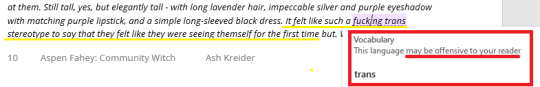
Writing a flashback about a trans character having their first experience of gender euphoria:
"It felt like such a fucking trans stereotype to say that they felt like they were seeing themself for the first time..."
Word highlights the phrase "fucking trans" as possibly offensive, with the potentially offensive word in that phrase being TRANS and not THE SWEAR.
AND. I. WHAT??!!?!??
WHAT THE ACTUAL FUCKING HELL, MICROSOFT
2 notes
·
View notes
Text
People who use chrome: yeah I use chrome
People who use literally any other browser: dude you need to delete chrome right now download operfoxari go-x it’s so much better you really need to delete chrome it’s so bad it’s so much better to use something else seriously do it
2 notes
·
View notes
Text
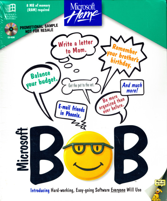
Microsoft BOB for the PC
Reviewing Microsoft Bob from a deep philosophical perspective invites an exploration that transcends its surface as a user-friendly interface software and delves into existential and dystopian themes.
1. The Illusion of Simplicity in a Complex World:
Microsoft Bob, designed to simplify the computing experience, can be seen as a metaphor for the human desire to create order and simplicity in an inherently complex world. This pursuit, while seemingly benign, raises existential questions about the human condition. Are we, as humans, constantly seeking to simplify and control our environment because the raw complexity and chaos of existence are too daunting to confront directly? Microsoft Bob's cheerful and simplistic facade can be interpreted as a veneer over the dark, underlying chaos of the digital world, reflecting the existential dread of facing the true complexity of existence.
2. The Dehumanization and Infantilization of Technology:
The interface, characterized by its cartoonish graphics and oversimplified user interactions, can be viewed as a philosophical commentary on the dehumanization and infantilization of technology. In an effort to make technology more accessible, there is a risk of stripping away the nuanced, complex interactions that form the basis of human intellect and creativity. This approach could be seen as a form of techno-paternalism, where users are not encouraged to engage deeply with technology, but rather to passively accept a sanitized, simplified version of digital interaction.
3. The Dystopian Aspect of Artificial Assistance:
The virtual assistants in Microsoft Bob, intended to help users navigate the software, can be interpreted as harbingers of a dystopian future where human agency is increasingly outsourced to digital entities. This reliance on artificial assistance raises philosophical concerns about the erosion of human autonomy and the potential for a future where our ability to think, act, and make decisions independently is diminished by over-reliance on technology.
4. The Alienation of the Individual in the Digital Age:
Microsoft Bob's attempt to create a familiar and friendly digital space ironically highlights the alienation of the individual in the digital age. The software's homely, comforting environment, filled with inanimate objects imbued with anthropomorphic qualities, underscores the solitude and isolation experienced in a world where human interactions are increasingly mediated through digital interfaces. This alienation is a critical theme in existential philosophy, reflecting the modern individual's struggle to find genuine connection and meaning in a technologically dominated landscape.
5. The Simulacrum and Loss of Authentic Experience:
Philosophically, Microsoft Bob can be seen as a simulacrum – a representation or imitation of a real environment that eventually replaces the reality it seeks to emulate. In this sense, the software’s attempt to recreate a familiar physical space within the digital realm can be viewed as a loss of authentic experience. This concept resonates with the work of postmodern philosophers like Jean Baudrillard, who argued that in a world saturated with simulacra, the distinction between reality and representation becomes blurred, leading to a detachment from the real and an immersion in a world of artificiality.
6. The Existential Paradox of Choice and Simplification:
Finally, Microsoft Bob’s design philosophy of simplifying the user experience paradoxically limits the user's freedom of choice and exploration. This paradox reflects the existential dilemma of freedom versus security – the desire for a safe, manageable environment versus the need for freedom, complexity, and the authentic challenges that come with it. The software's approach to user interaction embodies a philosophical tension between the comfort of simplicity and the existential richness of navigating complexity.
In conclusion, Microsoft Bob, while ostensibly a user-friendly interface, presents a rich ground for deep philosophical exploration. It engages with themes such as the illusion of simplicity, the dehumanization of technology, dystopian aspects of artificial assistance, alienation in the digital age, the loss of authentic experience, and the existential paradox of choice and simplification. Through its design and functionality, Microsoft Bob becomes a symbol of the complex existential and philosophical challenges inherent in the interaction between humans and technology.
2 notes
·
View notes
Last Seen Blogs
ladylazarus92
Laura rose

spite-and-waffles
Stephanie Brown Forever
bycourageandfaith
Deeds not words

steflovedance
AEMR

captain-misery
Captain Misery ᓚᘏᗢ