#these suck. zoom in for better quality
Text
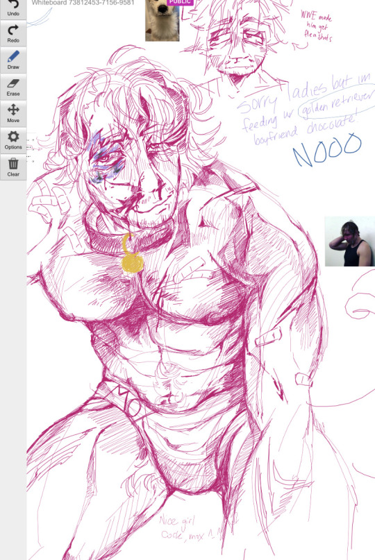

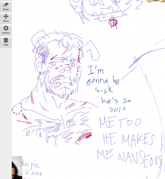
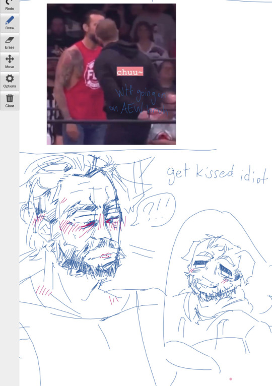
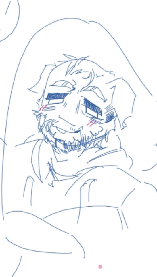
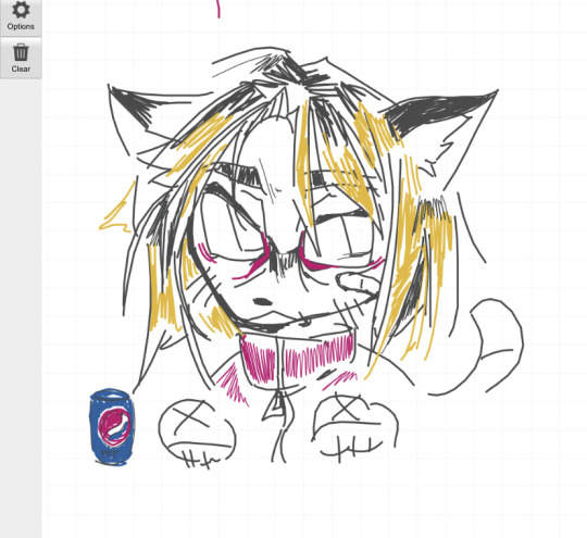

stuff i drew on a mutual’s whiteboardfox
26 notes
·
View notes
Photo
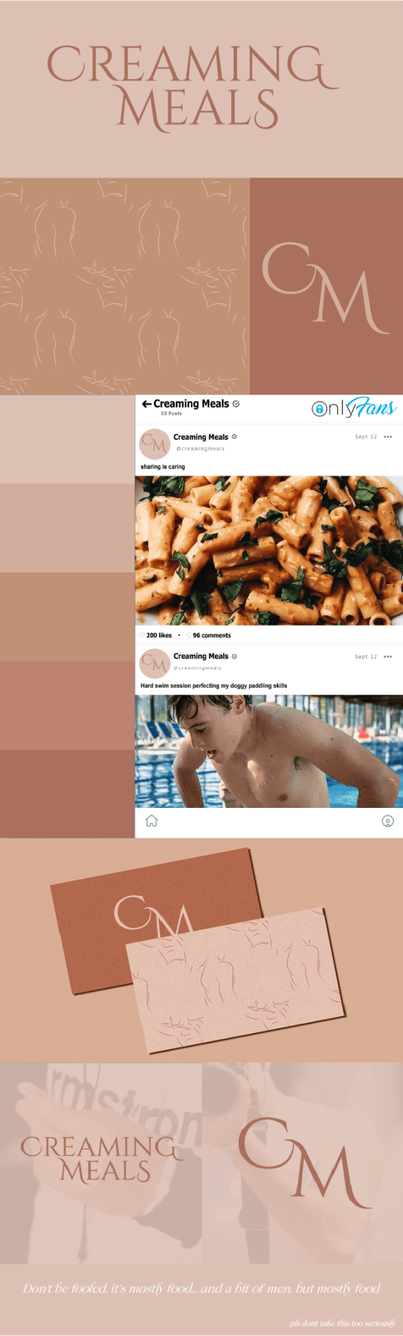
“The Creaming Meals onlyfans is coming soon” -Marcus Armstrong, (a bit tipsy probably) in Zandvoort
Marcus said it, Cassy (me) designed it, so here’s the brand board:
seductive font for the logo
logo variation
nude color palette
a nice pattern
onlyfan screenshot
food
main host + co-co host
[for obvious reason this is a joke and def not official, marcus pls dont sue me, mutuals pls dont unfollow]
49 notes
·
View notes
Text
Jon & the Emotional Support Towel 🤭
#chicago blackhawks#jonathan toews#hawks#antoewsnio#mine#just because#also#Zoom in for better quality because tumblr sucks i
41 notes
·
View notes
Note
Hi! Can I ask you how do you download pics from Motorsport Images without watermark?
hiiii there’s not a way that i know of 💔 i usually avoid looking there because of it but when i do i just zoom in the best that i can and screenshot
#the quality usually gets better the more you zoom in#and on the galleries on motorsport.com there’s only the watermark in the bottom corner#sometimes it’s still in the way though#asks#sucks because indycar mostly uploads there
1 note
·
View note
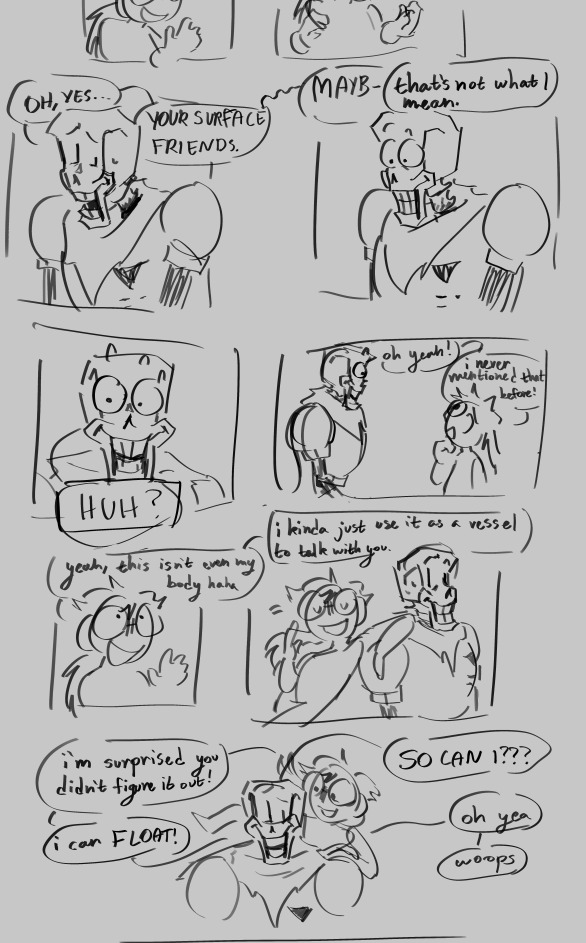
Text

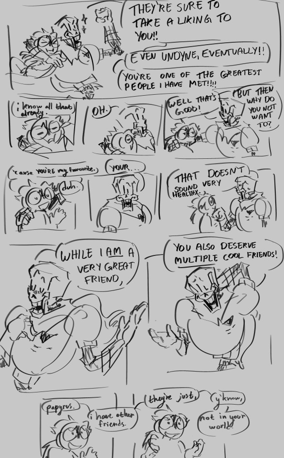
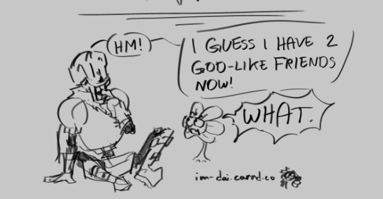
a chat with papyrus and i!
edit: for some reason the quality kinda sucks (at least on mobile) even when zoomed in so here's the twitter post
ok breaking it up into different thingies to see if the resolution gets better

58 notes
·
View notes
Text
The Super Mario Bros. Movie (2023)

I finally finished this one after stopping in disgust for a long time, and it turns out, no, it doesn't get better towards the end.
Boy, this movie is like, the platonic ideal of the C grade. It does everything just exactly well enough that you have to admit that it's passable, and no better.
Ever.
For pretty much the whole movie.
Like imagine a thermometer with a line labelled "Passable" and the mercury is exactly level with that line and you whip out an electron microscope and zoom in and the mercury isn't even a single nanometer above or below the line.
I really thought I had calibrated my expectations fully, I've watched and enjoyed animated movies that I would describe as middle of the road. I watched Trolls World Tour and My Little Pony: The Movie and The Bad Guys and had a good time with all of them despite the fact that they were far from being masterpieces.
But most mediocre movies come in sort of waves, dipping beneath the level of passable at times but then occasionally cresting above the passable line to become, in fits and starts, better than passable. Just the sheer joy of human creativity should carry most movies along to moments like that but The Super Mario Bros. Movie is a glass flat pond.
It's as though some Maxwell's Demon of Mediocrity went through it and made sure that not one single atom more than it needed to be exactly passible ever got through.
As somebody who likes movies and creativity it somehow manages to be less then the sum of its parts because watching it you see all these moments where the movie is a boulder balanced on this knife edge of possibility and it would only take the tiniest whisp of angel's breath to push it past passable into "Actually pretty good" but the angels hold their breath and the boulder remains still.
It's genuinely infuriating, because you constantly think that surely the next scene will have a single clever joke or little moment that you could latch onto and say, "For those two seconds it was more than just passable" and it never comes.
This eventually inspires a kind of awe, that any corporation could so efficiently and exactly suck all the soul and unpredictability out of a movie while still leaving the exact minimum level of quality needed to make $1 Billion at the box office.
As a movie though I would call it passable.
Rating: A uniform quantity of argon gas at room temperature.
#People have told me that all Illumination movies are like this#which is insane to me#the super mario bros movie#movies#review
58 notes
·
View notes
Note
Hello 👋🏽 Any tips in making the transition from more traditional art mediums to digital art? I'm great with a pencil but I suck in procreate
use references
flip the canvas
don't be afraid to take breaks every now and then to come back to your work later with fresh eyes
don't start with a low quality canvas. it's always better to start with a hq canvas size and dpi, and resize it down, than being stuck with a low quality piece. 3508x4961 (a3) may be a good place to start, with at least 300dpi
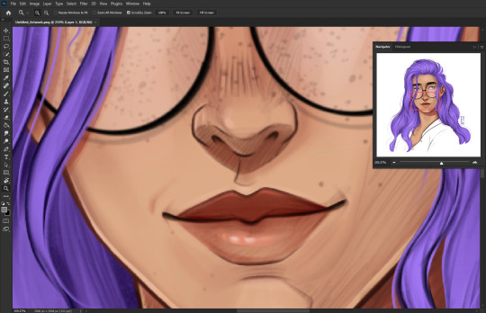
be careful when you're zooming in - make sure to have the navigator in another window so you can see if you're making any mistakes. like this:
don't be afraid to experiment with brushes until you find one that you vibe with!
you can draw traditionally, take a picture of it, then import that picture into your art program of choice and trace over it. don't think you have to completely start from scratch for your digital art to be valid
make use of your layers. you don't want to draw everything on one layer when you're starting out. separate layers for sketch, lineart and colour/rendering is a good start.
save regularly!
learn shortcuts like undo, redo, new layer, delete layer, mask, etc.
it can make working a lot faster/easier
have fun! and you don't always have to post what you draw. sometimes it's fun to just draw random stuff that will never see the light of day. experiment with styles, brushes, techniques, etc.
you will eventually find a style and workflow that suits you!
if any artists that follow me want to add onto this then please feel free!
45 notes
·
View notes
Text
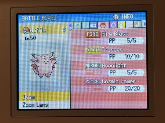
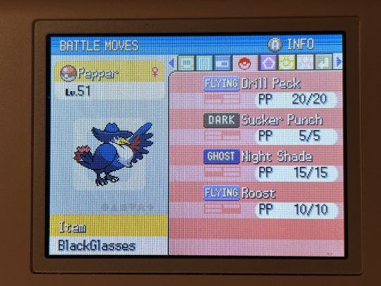
OKAY HERE'S MY CYNTHIA BATTLE FROM LAST NIGHT!!! i actually recorded it with my cap card and then put some subtitle commentary on it. i managed to do the entire battle in just under 10 minutes so it would fit on tumblr though i did have to make the file crunchy as fuck/low quality LOL. instead of typing out everything here you can just watch the battle happen. here's my team for context (i took these photos after beating her):
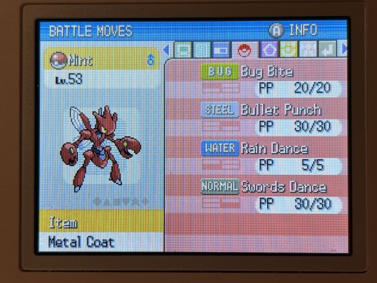

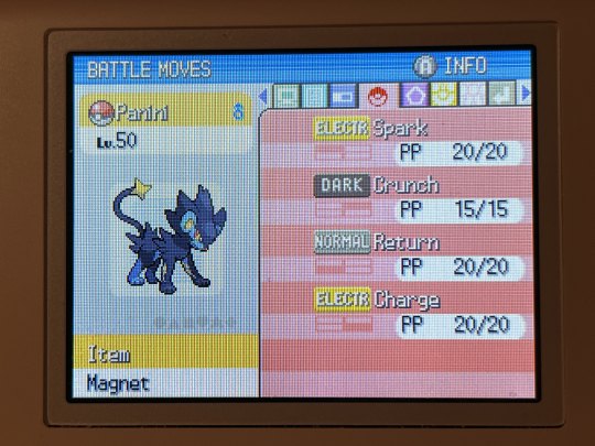

i did not record the E4 nor am i gonna talk about it much because it was honestly 10x easier than cynthia and not that interesting. i solo'd flint with my lumineon and i solo'd lucian with my scizor, and bertha/aaron weren't much better.
a few notes about the team though:
i wasn't thinking ahead to specific strategies to beat the E4/cynthia, i just picked movesets i thought were generally good and was like "i'll figure it out when i get there"
as a reminder scizor has technician which boosts the power of moves 60 base power or less, which is why i'm using shit like bug bite lmao
lumineon has ominous wind over attract literally just bc i wanted to use my stockpile of shards on a move tutor move SOMEWHERE on the team and the idea of her getting an omniboost in a fight was objectively funny (though it didn't happen during this run rip)
i picked thunder on clefable over blizzard because of the potential synergy with rain dance (zoom lens doesn't make either 100% accurate but rain makes thunder always hit) however i brought a blizzard TM along in case i needed to change my mind midway. i did not end up having to
return is on luxray just because luxray's movepool sucks and i think it's cute for my pseudo starter to have Return on it
sucker punch's priority ended up being ESSENTIAL to the cynthia fight and i'm very glad i delayed murkrow's evolution until level 45 for it. i actually didn't change pepper's moveset at all before the e4, she's the only one who received no changes
the shiny golem named dandelion is from my qpp gold :] he traded it to me at level 7. i spent nearly 2 hours grinding her to level 50 and used her on the team and did not tell him. i sent him the battle video and the first he was aware of this was when he saw her use explosion LMAO (i plan to use my hippowdon on future runs of the E4!)
BUT YEAH!! YAY WOO
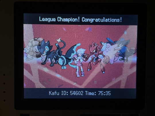
75 hours... very little of that was idling i just really spent that damn long on this game huh.... sdfkdfsksd
i'm pretty much wrapped up here, i intend to use this save as my main platinum save moving forward but i think the liveposts can come to a close now. i may post about me catching the lake trio but that's about it. I HOPE IF YOU'VE BEEN FOLLOWING THE SAGA THAT U ENJOYED IT. THANKS FOR READING MY INCESSANT AUTISTIC RAMBLING THUMBS UP
21 notes
·
View notes
Text

eyeball records, 2009 (clear) VS reprise records, 2015 (red/white) comparison for bullets birthday !
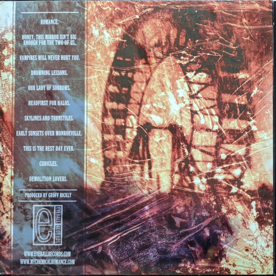

size and coloring of the graphics are visibly VERY different between the two. eyeball appears higher quality (because it doesnt have that inexplicable slight zoom reprise does?) and honestly looks much better overall, imo

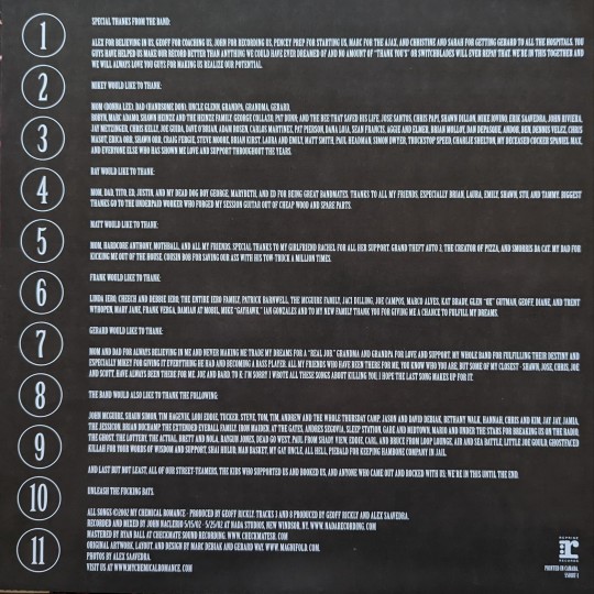
lyrics/thanks insert. note the bat on the eyeball release! eyeball also doesnt have any spacing after punctuation, which was a funny choice if nothing else?
the reprise insert is slightly smaller. couldnt tell you why. theyre also made out of different material— eyeball is much lighter and thinner paper while reprise is a heavy, glossy cardstock.


the lyrics side just has minor changes in the text arrangement, size, and spacing. once again i think the eyeball release looks better :p

besides the obvious lack of gerard threatening to come to your house and suck your blood, the size of the graphics and text are slightly different on the labels. the runout information is also handwritten on the eyeball release
#happy birthday to my special girl#record tag#my chemical romance#wanted 2 do something quick for her before i have to go to work.
272 notes
·
View notes
Text
us state flag tierlist by how urgent the need to change them is
(not necessarily by objective quality, although they are ordered by my own personal preference within the tiers)
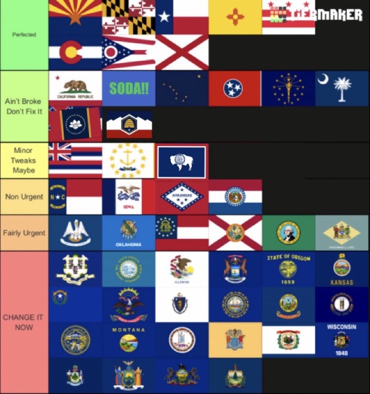
yeah everyone and their cunt’s done a tierlist of how good the us state flags are, but here’s one that’s more useful imo - how much they need to change. ie, how far up the statehouse’s agenda changing the shitass flag should be
the ‘perfect’ flags shouldn’t ever change. yeah, alabama’s good, i said it - it’s iconic and recognisable. and yeah colorado might be cheesy but it’s american cheese, it’s an icon. and arizona is the best flag do not @ me
‘ain’t broke don’t fix it’ means you can start nitpicking the flag, but honestly, nobody cares and there’s no point in changing. alaska and indiana are here because their mute colours hold back their excellent designs. california’s here because the bear should probably be bigger and have a different face. utah and mrs sippy’s new flags are both here because they’ve got the same problem - they’ve both chosen really horrible dark blues, honestly so bad that they should be in lower tiers, but they changed them too recently so they should stick for a while, until people get used to the, yeah, iconic and recognisable new designs. a placeholder for minnesota is here too, based offa the six finalist designs released on tuesday, because any of them would probably end up in that spot - imperfect but relatively good
‘minor tweaks maybe’ is where the nitpicks start becoming flaws and the good designs could be made perfect very easily. hawai’i doesn’t need the british canton, it just doesn’t. wyoming doesn’t need that seal inside the buffalo. and rhode island? well idk but it’s a bold design held back by, something. stew on it for a while
the final three tiers are the ones i believe should change. the first (non urgent) is for bad flags that remain somewhat distinct, and so are still managing to do their job - but could be had so much better. NC is ripping off texas. iowa and missouri are both overcomplicated and dull. and arkansas, ignoring the word ‘arkansas’ i’m definitely getting slavers’ rebellion vibes from it
the bottom two tiers unambiguously must change. ‘fairly urgent’ are the flags where there’s maybe one redeeming quality that sets the flag apart, and could be carried forward to the new one. LA’s pelican and OK’s osage shield are iconic, but they’re still a something-on-blue and need upgrading. florida is just alabama but with a seal, honestly pathetic and one of the list’s biggest tragedies. washington, yep, there he is, but it’s still just something on a plain background. i hesitated between putting delaware here or the tier below, but its boon is its recognisability with that yellowy diamond. then there’s georgia, probably the most controversial placement on the list. but yeah. that’s the fucking CSA flag. and the iconic state deserves so much better than just an undistinct crest on the slaver flag
and yeah the last category are where all the truly pathetic failures sit. the opening few have curious motifs that could be used for the new flag, like connecticut’s grapes, michigan’s elk and oregon’s 🅱️eaver. but they still suck utter pisswank, the distinguishing thing about them only becoming clear when you stop to look at it. the latter flags of the tier are fucking irredeemable trash. tell me you know which states those final four are when the picture’s zoomed out. it’s a fucking tragedy that new york the state is amongst the union’s worst, when the city’s iconic blue-and-orange could lend it so much inspiration (same could be said for IL being outshone by chicago). or if new york wants to make it distinct from the city, it could always look to old york shire’s iconic white rose. combine it with a tulip for old amsterdam and bam we’ve got a brilliant motif. i am honestly happy to call the vermontese flag the worst in the us, for a state with such history, with such a pronounced identity and spirit, how can it let itself have such horseshit. especially when the green mountain boys’ flag is such stupid, dumb brilliance. yeah, vermont is the worst because they should just change to the green flag end of story
BOUNS ROUND: provinces of canadada
perfect: la quebec
ain’t broke: sass, newfie & lab
tweak: nova scotia, new brunswick
non urgent: BC, PEI (both controversial picks ino, but they’re fuck ugly d@m)
change now: ontario, manitoba, albert
11 notes
·
View notes
Text
Dear @staff
Fuck you very much*,
Sincerely,
Me
*p.s. forever and ever
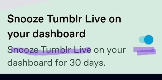
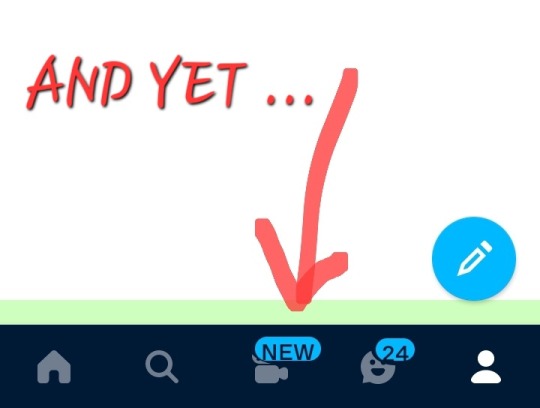
It will ALWAYS say "NEW". I will not turn it on. I came here to get the fuck away from tiktok you idiots.
If you want to make this site work better, try fixing the broken functions, don't force load new shit no one (except advertisers) has asked for.
And by broken, what i mean is: we all know image quality on tumblr sucks especially on a phone, so I'm in the habit of avoiding eyestrain by clicking open images to see them better. Thanks to the latest update, images open BUT!! cannot be rotated! And usually can't be zoomed into either!!!! A fabulous choice you fucknuts. Guess I'll never be able to read those imformative and amusing screenshots of tags.
Of course, if the post I'm hoping to dive into includes an embedded video anywhere, I'm fully SHIT OUT OF LUCK!! Tapping on any part of such a post will catapult me into a random tiktok stream.
If your goal is to force all tumblr users off mobile and onto the browser, just cut to the chase and delete the damn app.
#fuck you tumblr live#tiktok is horrible we dont want it here#stop fucking up the few tumblr features thay actually work
15 notes
·
View notes
Note
HI sorry to not ask a silly question via here but i coukdnt find a non business email so sorry!!!recently got back into the newsprints world after i reread it for ghe first time since 6th grade a few days ago(i am now a junior☹️ and decided to purchase headlines but noticed that the quality on all the pages except for the first and last one isnt the best;;which sucked while trying to see the little notes and text next to concept art,,was wondering if there was any other way to view headlines in better quality??ive tried exporting it to google drive and files to no avail im so sorry to bother😭 but if not totally ok i understand!! i get that 1:1 fan issue stuff shoildnt be discussed on your Tumblr Page so if i have to be redirected to someone else my dms r open!!if youre not comfortable with that i completely get it either way thank you for making one of the defining books of my preteen years!!!!!<33
Hi there! I'm glad you like the NewsPrints series enough to support the little indie artbook I self-published over half a decade ago! I super appreciate it!
I don't think it's a silly question! This is actually kind of a semi-interesting story in book production, if you're interested in the backstory...
HeadLines was originally a limited print run (only 100 were sold), so it was easier to see the notes and art as spreads in a book you could flip through. After they sold out, I was asked to release it in digital, so I did. It sounds like the font size relative to the images is annoying in digital, though, which is a fair critique!
Unfortunately, 2015-16!Ru decided to use That font in That font size because it Looked Nice in print. I didn't even considered digital at the point, so this book is kind of a time capsule of my aesthetic decisions at that point of my life, the good ones and bad ones. x'D
(That reminds me, I remember the physical edition was $30 and personally signed and sealed. I'd be curious to see if any popped up on ebay over the years.)
The digital version is at screen resolution rather than print resolution to prevent someone from printing bootleg copies at the same quality as the official physical book after buying the PDF for $9. The best view size is around 100% in any PDF viewer, ideally on tablet or desktop. You might still have to zoom in a little to read it, though.
Sorry, let's keep the blame on past!Ru. I'm a new person. :'DDD

(The reason that the covers look like they're 2x higher in resolution is that they're actually twice as wide as the interior pages. The covers are 2-page spreads, but I didn't split them like I did the interiors. When the PDF viewer shrinks them to half their size to fit the PDF viewer's format, it does make the resolution seem twice as high, if that makes sense.
I should have probably also halved them so they looked like the interior spreads. You live and learn!)
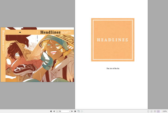
TLDR: Sorry. The text-image layouts of the book were intentional for print reading, but they require some zooming in and out in digital resolution, but not too much past 100%.
Thank you again for the words of encouragement! I'm glad that Blue's world stuck with you for so long! Looking back at this project does evoke some ~Feelings~ and memories of growing pains. Next time I make another proper artbook like HeadLines, I'll use bigger fonts and/or get someone else to help me do the layouts!
10 notes
·
View notes
Note
Hi first i want to THANK you for your KH Masterpost. Literally a blessing.
Second I wanna ask if you have this photo it a bit better quality? I'm struggling to read it 🥲🥲 IF NOT ITS OK I WANTED TO ASK AND TY OP FOR THE ENTIRE POST ONCE AGAIN LITERALLY SAVED MY LIFE


hopefully this should be a bit better in quality!! im sorry if it isn't, my screen capture isn't working very well right now but i can always add alt text/image descriptions if there's anything that might be illegible! if you're on mobile, try clicking it and zooming in for better quality, if you don't click it then it shows the compressed version which sucks
and i also apologise for the overall quality of the images, a) they tend to look really bad on mobile for some reason and b) even their normal quality (as viewed on desktop) isn't the best, my main priority when doing it was the text of the book but the images are important too!! i should update them someday thank you for reminding me! the epub versions of the novels have the original quality so if this doesn't work i would recommend using those if you're able
and thank you!! im genuinely always incredibly happy to hear how much people enjoy the kh novels post, i'm so happy that effort was worth it and that more people are able to enjoy them!! i hope you have fun with them :)
#again im more than happy to provide an image description of the text in the image if you'd like it would genuinely be no problem#i also like in this image that aqua's render just happens to be pointing her keyblade at braig's head#girl KILL#(and genuinely thank you for saying how much it means to you!! i love reading peoples tags it really makes me happy that people appreciate#the post)
4 notes
·
View notes
Text
3 reasons AI might actually take over (even though it sucks)
I appreciate the handful of writers who have attempted to push back against the inane and zealous tide of AI boosterism. Some have pointed out, correctly, that the recent slew of AI puff pieces are no less fraudulent than the Cryptomania of the early 2020′s, or the complete bullshit assertions that we’re perpetually just a year or two away from self-driving cars becoming a reality. Others have pointed that AI simply doesn’t work very well: anyone who claims we’re on the cusp of robots replacing actual human communication is either a moron or a lunatic.
The trouble is, this country is run by morons and lunatics. A new technology need not be good or functional in order to become a part of our daily lives and transform our social fabric. It only needs funding and enthusiasm.
Here are three reasons why some sort of AI takeover might actually be inevitable, regardless of the quality of its output or the disastrous effects it may wreak upon our culture:
1. Grant Funding: anything that might hypothetically bring down labor costs will receive massive amounts of public and private grant funding. The grift goes like this: dimwitted academics and thinktank writers whitewash the horrible effects of the new tech and overinflate its potential worth, and in exchange they get money. Very simple. These grants are awarded solely the most credulous and amoral of researchers, whose work is guaranteed to produce results favorable to the funders. Remember, there’s no such thing as academic integrity.
You give a sociology professor 25 grand and three months, she’ll give you a study demonstrating how Dogechat is completely indistinguishable from human speech... anyone who disagrees is a fascist, perhaps even Russian. Humanities profs are even cheaper--you don’t even have to pay us. Give an English grad student a CV line, she will explain how it’s ableist to not let students us AI to write papers and screech violently at anyone who attempts to say otherwise.
2. Terrifying Generational Differences: If you’re over 25 or so, you can easily differentiate between actual art and speech and that which has been produced by AI. But if you were born after, say, 2005? That's difficult...
This has yet to be seriously studied, but we now have a generation of burgeoning teens who grew up raised not just on social media but whose formative content experiences were videos like "Elsa from Frozen is Pregnant and She Goes to the Dentist.” On a very deep level, these young people might not understand humanity and its cultures in the manner we understand them. You go a decade deeper and get kids who learned how to speak when masks were mandated and Zoom replaced real life... it's gonna get bad.
Studios can easily bank on this. Yes, old people might not like to watch a stream of empty, eerie cultural symbols smearing senselessly into one another, glitching out like a strobe light, mutating hideously with no regard to rhythm or narrative: a phantasmagoria no human mind would ever dare process, let alone generate. But those people are old, like I said. Kids today, they love this shit.
3. Nerds Love Garbage, and Nerds Control Everything: To your average nerd, (lefties primarily, but conservatives are not immune) the only purpose of art is to confirm the beliefs they already hold. AI does this better than even the most beaten-down human possibly could. Imagine a world in which bad thoughts are never depicted. They CANNOT be depicted, because they fall outside what the AI is literally allowed to show. That, my friends, is Social Justice. In this case, AI isn’t just good: anyone who opposes it is an enemy of progress who is an unsafe presence who causes hurt and even listening to their arguments is an act of violence.
10 notes
·
View notes
Note
I think that puzzle imaghe was probably released officcially at some point (until they chose to delete it) hence why it was easier to find bigger quality for it. Now, the one I REALLY wish we had better quality:
This is gorgeous puzzle, to be honest it kinda sucks that we don't have better images for all the puzzles... :/
Oh boy, you're right. This would make a wonderful canvas to put on a wall. Allow me to try to upscale it, at least

doesn't look too good when zoomed in, but better than nothing
6 notes
·
View notes
Note
What sort of camera do you use? Like that egret video from a while back is so clear [I've been trying to get into a little wildlife photography and I already want smth better than the little beginner camera I got lmao]
its this kind! (canon PC1680). it's all digital/mostly automatic (has a very basic manual focus that sucks and isnt really worth it) but still relatively powerful. any quality wildlife photos/video youve seen from me were taken on it
ive had it for i Think 10 years tho so its possible something comparatively priced but with a better zoom has come out since then
21 notes
·
View notes
Last Seen Blogs
samir609
PandaOG
twentysixpointtworunnner
Not Supposed To Be a Runner
dibujamor
dibujamor_art

jiyun0
"I want it, I got it.", A manifestation blog.

aya-ebina
日々の記録