#to know what they're stylising and how
Text
not to be a dick but if you've been through actual university level art school and you still think that it's unreasonable bullying to be asked to push yourself or experiment with different art styles or to have aspects of your artwork criticised by people you asked for an opinion. what was the point of art school for you exactly?
when people say shit like 'my art school tutors told me my art was bad bc it was too anime and cartoonish ☹️' that may be true but I'm not gonna lie what I suspect happen is they told you 'you should work on developing a solid foundation for any art style you choose by pushing yourself to try more representational art Anne getting comfortable with ways of seeing and understanding images' and what you heard is 'NOBODY IS ALLOWED TO DRAW CARTOONS EVER AND YOUR WORK IS WORTHLESS'
and furthermore I suspect that you were really annoying in crits and took any even slightly negative comment or suggestion as a personal attack even though literally the point of art school is to learn to take and grow from constructive advice from your peers.
shout out to the girl on my undergrad who burst into tears literally every crit for three years even though about the nastiest thing anyone said to her was 'it might look cleaner if you rubbed out any of your pencil lines after inking and also used a clean rubber while sketching.' and guess whose art didn't improve at all over three years and whose technique actively got sloppier while other people were moving forward in leaps and bounds? yeah.
there were people who started uni as the best in the class and ended as some of the worst bc they just weren't prepared to listen to criticism or change how they did anything. and there were people who started out very mediocre and went on to produce incredible professional work to a high standard bc they listened and were open to change. and that's got nothing to do with who was more painterly and who was more cartoony or whatever it's just. when you ask advice and get something you don't want to hear do you chew on it and try it out or do you dig your heels in and do more of the same?
and like I'm not saying there's anything wrong with sticking to your guns and doing art the way you want to do art and the way that brings you joy. I'm just saying if you don't want feedback, teaching or advice on how to improve I'm really not sure what the benefit of art school is that you couldn't get several thousand pounds cheaper by staying home and drawing there.
(and I'm also saying if you come out of art school like BOOHOO NOBODY LIKES MY STYLE AND MY ART IS WORTHLESS you might. need to pull yourself together and say either I'm committed to this style regardless of whether people like it and I'm going to keep building on this style and make it amazing, or I want to make art that's more like the work people like and I value, what could I change to get more where I want to go? but if you lie down and say waaaaaah it's so unfair that my art is bad and everyone else is just more talented than me then bullshit. by the time you've graduated art school talent is not the deciding factor in the quality of your work. it's a question of your willingness and capacity to put the work in, take criticism, understand what you want to achieve, and slog through trying and failing to get a certain effect until it improves. professional level art is not an innate talent it's a trained skill, and some people might start further along the path than others bc of their talent, eye or training, but the distance between someone who's talented but unpractised and someone who's less talented but puts a lot of thought and work in closes extremely rapidly. it can be disheartening but if you want to do this professionally rather than for yourself you gotta feel your frustration, have a good scream and cry about it, then get back in to figuring out what you need to build on. bc we're all guilty of sometimes going HOWEVER HARD I WORK I'LL NEVER BE AS GOOD AS MY PEERS but no offence if you just lie down and give up where does that get you? if you just start going 'actually you should all feel bad for not liking my work more' instead of making your work more appealing or finding the right audience for it, that's on you not on anyone else. what was the point of art school????)
#needless bitching time#i just. i don't understand why you'd pay thousands of pounds a year to get constructive feedback#and then spend the year treating any feedback as a personal attack#save your money my guy of you want to do it on your own and you don't think other people have anything to tell you#then don't pay 6 grand a year to not listen to other people's advice#saw three consecutive art posts on here of ppl being like MY TUTORS TOLD ME NOT TO DO ANIME ART BC THEY JUST DON'T GET ME#WHY ARE ALL MY PEERS DOING BETTER THAN ME DESPITE US ALL GRADUATING AT THE SAME TIME#friends it's not bc you do anime art it's bc they tried new things and learnt new skills and you dug your heels in bc anime is What You Do#but like. successful cartoonists and anime artists are ppl who've at least had a crack at life drawing and realism#to know what they're stylising and how#I'm sure there's some teachers going NO ANIME EVER but I'm p sure most of your tutors were actually saying#don't just do anime bc it's what you know how to do. try other styles bc even if you're bad at them you'll learn something#it's not just anime like. ppl who come in only doing photorealism are pushed to stylise more.#you should be pushed out of your comfort zone. different styles. different media. that's not where you're being asked to END UP.#it's a LEARNING PROCESS#like a lot of my direct tutelage was like. pushing me to do looser more gestural blockier art#use an a6 piece of paper and a fat marker pen for life drawing#or no lines only blocks of shadow#or use a 3 colour palette with no midtones#or draw 30 thumbnails in a minute#and the art i made like that SUUUUUUUUUCKED. and it's meant to. it's not meant to be how you work from now on.#it's meant to help you identify what you're missing and where your blind spots are#and what you can incorporate into your work moving forward#red said
224 notes
·
View notes
Note
*twirling my hair* do you like cassandra cain? if not, do u have a moment to hear about our lord and saviour cassandra cain?
CASSANDRA CAIN MY LOVE!!! She's definitely the batgirl I've read the most in terms of full issues, the first 30-ish issues of her solo by Kelly Puckett Scott Peterson and Damion Scott had me hooked and I binged them but fell off after Horrocks came on (nothing against him, he was just given an editorial mandate to make the book more romance focused and it turned me off because it felt so ooc for Cass to me lol. I do own some of the issues he wrote tho! I like the ones with art by Rick Leonardi). I'm not really caught up with modern comics (ish??) And I'm not reading anything dedicatedly but I hear she's in a new original book teaming up with a magic user? Neat! Good for her. I love her in the shadow of the batgirl graphic novel (IT'S SO GOOD)
#ramblings of a lunatic#asks#^ sorry had to be tistic about things for a minute#i loved damion scotts artwork for her solo series sm (especially the later moee stylized stuff even though i recognise how bonkers-#-the proportions are i can't help myself. i like women and i love stylised art like that)#his stuff was surprisingly influential on my own art. idk how much it shows these days but It's There#this hasn't mentioned anything about what i love about cass as a character but like. it's the same as most people who love her man#i love her self destructive dedication to redemption i love the guilt she's saddled with-#-and how it's juxtaposed with her committment to kindness and justice i love how she's the fucking best and she knows it#i love how the relationship between her and oracle was an intergenerational mentorship between two disabled women#and her gay ass bond with stephanie (who in all fairness may be my fav batgirl???-#-but I've also read wayyy less complete issues of her compared to cass due to the differences in how their respective series' are-#-formatted but like. what i have seen i tend to love. i love u stephanie)#but also dear god i do not wanna get reeled back in because nothing the industry ever does will please me the way the ideas in my head do#and I'm constantly at war with myself reading stuff#also it's just hard to get back in when you've been gone with a while it's all just very difficult#but i am rotating cass and stephanie in my brain like a microwave waiting for someone to explode#plenty of people smarter than me have already said this but cass should team up with jason and they should both seethe#he wants to kill. she keeps breaking his bones if he tries it. they're both brushing each others philosophies off bc of where they exist-#-on the batfamily ''kill/no kill'' binary even though they share similarities of wanting to be batman but Better#(jason via controlling crime and killing criminals and her with her ultimate dedication to the symbol and superior combat skills)#(also keep in mind i just watched utrh but haven't read a rhato comic in yonks. so if this is an outdated jason characterization+#-then whoopsie <3)#Jason's dedicated to pushing buttons and poking holes in batmans philosophy and cass is great at reading ppl-#-and sometimes in her series she then performs a limited psychoanalysis of them and tears them apart#(at least she did for shiva) I'd love to see her do that to jason. break him so i can tape his sad lil ass back together#this is getting away from me. anyway no need to proselytise. I'm a former alter boy round here
7 notes
·
View notes
Text
cinephiles byler.........they know their preferred movie snacks. they go to matinées and dress up for premiere nights. they love a midnight screening and shift around work to go to them. they've perfected which seats to choose for the best experience (but sacrifice them for ones up the back, yknow, sometimes..). they know their ratio of talking during movies vs staying quiet. they keep all their physical tickets and loathe the day tickets become digital, that's no fun. they're both so opinionated. mike drives home bc will needs his hands to ramble about what they just watched. mike loves researching about how movies were filmed/special effects etc, while will is the type to tell you where else you know that actor from. will tears up easier during movies for multiple emotions and mike always squeezes his hand tight. letters to movie reviewers turn to "civil discussions" on forums then twitter. they'll either sit back and relax or give each other a look over someone else's pick for movie nights. mike has bookshelves of scripts, director's cuts DVDs and behind the scenes books. will has bookshelves of "The Art Of..." concept art books. they buy posters for the movies they like for their home office and even find cool stylised art prints of some for around the house too. they'd love a movie room in their home one day and they add to the design they started in one of mike's notebooks whenever they get inspiration. mike and will love movies.
#byler#will byers#mike wheeler#many many thoughts many feelings many [EXPLODES]#I love them sososososo muchhhhh
89 notes
·
View notes
Note
Mask Wild 💃 for the ask game!
Oooooooh Mask!Wild loves clothes. The prettier and more elaborate the better. Weird, outlandish, dazzling - they all delight him. He's collected more clothes than he knows what to do with, and has every kind of jewellery he could buy in Gerudo, with every kind of stone set into it.
That said, he's too nervous to actually wear most of his clothes. It's not just the more revealing ones like the barbarian set or the tight ones like the rubber set. He owns several beautifully cut doublets, surcoats with the most incredible embroidery, and half a dozen intricate abayas from the gerudo that he just... doesn't wear.
They're so beautiful. He loves them so much. But he's afraid of looking silly in them. He doesn't want to be judged, and hates drawing attention to himself, so he keeps them folded away and only brings them out occasionally to look at and wish he had the courage to wear them.
-
"Hey what's that?" Sky asked, wandering across the camp.
Most of the others were away from camp, fishing or foraging or up to no good (wind and spirit), and Sky and Wild were the only ones left behind. Sky had been sleeping until a few moments ago, and it looked as if Wild had decided to sort through some of the contents of his slate.
Wild jumped at his voice and shied away, hurriedly bundling up whatever it was he had on his lap.
"Nothing." he signed, but Sky was not to be deterred. He saw how his brother's hand lingered on the embroidered fabric, gold thread against pristine green.
He smiled and sat down beside him, careful not to get too close. Much as his brother was settling into the Chain, he still had strict boundaries and Sky didn't want to push him, not now. It was a day for relaxation, after all.
"That's really pretty." he said. "I love embroidered fabrics like that. It reminds me of back home, though we don't usually wear things that nice unless we're going out somewhere special."
Wild's mask dipped for a moment before his hands came up, the signs small and uncertain.
"I've never worn it." he admitted before slowly, reverently spreading it out for Sky to see.
It was a thing of beauty. A tunic made of forest green silk and heavily embroidered with stylised horses and trees in gold thread. Sky looked at Wild first for permission before running a finger over the threadwork, in awe of the garment.
"It's beautiful!" he gasped. "Why haven't you worn it?"
Wild shrugged, retreating in on himself. "Not really my thing."
Sky frowned. "But... you own it? And you were admiring it just now?"
His brother shifted where he sat, uncomfortable. "I'd look silly in it." he said. "People would laugh. It's better i don't."
"It would be pretty hard for them to laugh," Sky said mildly, "With my fist in their face. Wild, you should totally wear it! Legend would be so jealous! And everyone would love it! And you'd love it! I know you like pretty things!"
Wild hummed, not sounding convinced, but he reached out and ran a wistful hand across the tunic.
Sky leaned in. "Go on." he breathed. "At least try it on. For me."
That did it. Wild's eyes flicked up and Sky would swear he was smiling. He nodded.
"Okay." he said and then gestured to Sky to turn around.
Obediently, the Chosen Hero returned to the fire and waited until he heard Wild's soft footsteps approach. He turned, and grinned.
He looked incredible.
The tunic fitted him perfectly, not too tight but clearly well enough tailored that it sat comfortably around his waist and then hung down to his knees. The neckline was a little lower than he normally wore, showing scarred and pitted flesh down to just below his collarbone, and the sleeves cut off halfway down his forearms, but it looked good. Sky didn't find himself looking at Wild's scars, for all that they were more visible. The tunic looked fabulous on him, and that had his whole attention. He'd even swapped out his mask, exchanging his normal blue one for a matching green edged with swirls of painted leaves.
The effect was glorious.
"Wild, you have to wear this more often." he gushed. "You look amazing. The others are going to love it."
Wild bowed his head, shifting from foot to foot. "Really?" he signed.
Sky nodded emphatically, grinning. "Really!"
Wild looked up at him, and once again Sky was certain he was grinning.
"Thank you, Sky."
#it me#replies#ask game#my writing#mask!wild#finding family#okay so this got WAY longer than planned#but i didn't want to leave it on a low note
102 notes
·
View notes
Note
tips on how to draw raph? :3
I’m a raph lover but he is so hard to draw 😔
hey an!! listen i get u completely, this big spikey boy can be a real challenge
my main advice would probably be to recognise raph’s structure? his shapes and how he’s formed, etc. and the best way for that imo are references! i have a tag for this actually
and here’s some raph refs!
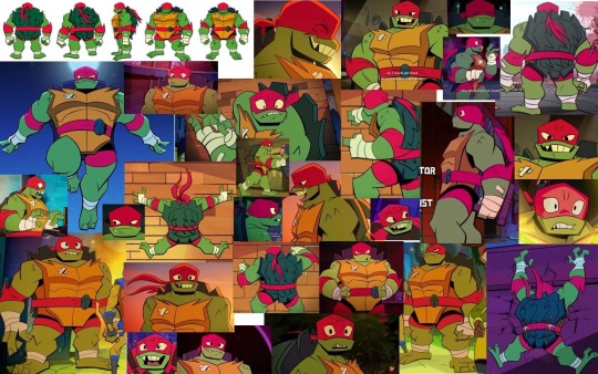
if u wanna know how to draw the entirety of the best boy this post wouldn’t do it justice so here’s some main things:
if you’re trying to replicate the show’s style keep in mind how angular everything is. raph's main shape is a square because of how bulky and rigid he is (helps to encourage his character's role too! love that they made him such a fucken tank)
raph’s head shape is basically if you widened leo’s head- they’re both pointed too
one main thing i do for any head really is keep in mind the eye placement and the cheeks
if u happen to draw faces with the fabled circle and two lines- i use the horizontal line to mark where the bottom of the eyes are- and where the start of the cheek begins (i’m doing my best not to make this into a ‘now draw the rest of the owl’ moment)
if that makes any sense. heres a really shoddy 'tutorial'
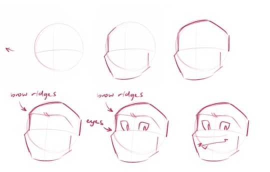
i kinda just blank out on my canvas and raph appears out of sheer will
but also just like.
figure out how you like raph's head to look (maybe u want his snout longer, or his jaw shorter, etc etc)
figure out where his brow ridges are located and how they're moving (is he grumpy? is he angry??)
make a mask for his eyes to go in (jebus take the wheel)
pronounce snout (it protrudes, which makes it easy to figure out his facial planes)
do whatever feels right for his mouth- im not exactly rigid with how i draw as of rn, i just do what feels right
ive drawn raph with a more pronounced snout too, and oscillate between designs if i feel like it (truthfully i also sometimes begin his head shape with a square (i mean if im doing a different style), feel free to do that if it helps i dunno-)
if you want to draw his shell and plastron here’s what i do:
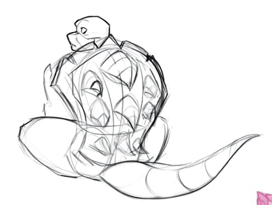
being able to carve out 3D shapes will help a lot with the border of his shell
by blocking out the main shape and then carving away at it you can then see how raph’s shell is structured (just. try decipher my sketch if u can pfghjhj)

for the actual shell itself it’s a lot like mikey and leo’s where it has a big curve and then dips at his midsection (where his belt goes!) also keep in mind the spikes of his shell follow those same curves (ft. dr belle)
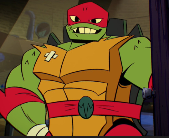
with his plastron (chest plate) i basically make sure it’s the same length of his clavicle? the jagged edges of it i mean. it helps a lot to map out where his shoulders meet his arms
(pls keep in mind my art’s inconsistent and i don’t even follow my advice- the hole in his shell changes every time i draw it 💀)

his body shape is also just in general wider and stockier- if i ever see people draw him skinnier than he is you'd be able to hear my soul exiting my body
all of him is wider in general! hes bigger than the rest of his brothers so dont forget to show it instead of just giving him a height difference. he BEEG.
i’m not sure how else to describe the process of drawing him other than just. draw him?? 😅 my best advice would be to draw him repeatedly based on references- and study your favourite raph artists’ way of drawing him (mine would be jacocoon and itz_jazzy_jazzin)
and it helps to study bc it can answer these questions
how do you want to draw him? do you like the way a specific artist stylises his features? do you want him more spikey? more sharp? maybe you want to draw him bigger! (i myself like to give him a tail, extra markings on his spikes + a few scars post movie and his mismatched eyes)
repetition is super important to get it all engrained in your brain- and it’s why i don’t really even use refs for him anymore fldjs
dont forget a very important rule: appreciate the big boy in all his glory
#im not exactly the artist to go to for help unfortunately dfkdjhsdh#hoping this helps somehow#its better to understand his structure#every now and then i apply it to my sketches#most times ill just dick around on my canvas#feel free to dm me if you want more in depth stuff ajhddgh#rise raph#rottmnt#rise of the teenage mutant ninja turtles#rottmnt raph#ask
59 notes
·
View notes
Text
AI-generated embroidery
I'm starting to see more and more AI generated pics of "embroidered" art popping up, and somehow that makes me even more disappointed than when I spot fake paintings. Of course, a lot of creativity and effort goes into any given form of art, and they all have their limitations which inform the end result, but one can, in theory, paint almost anything (at least in digital painting) while there are far more tangible, physical limitations to what you can make a piece of thread do. One of the best parts of seeing a gorgeous piece of textile/fiber art is admiring how well the artist has been able to cleverly utilise and transcend the limitations of working with thread/fabric/roving/etc., and realising how much time it must have taken.
To then see AI "embroidery" that looks very impressive at first glance before realising that it couldn't possibly be real because it defies the very laws of physics makes me sad. Not only did someone want to generate a piece of art they couldn't be bothered to make themselves, but they then looked at the image the computer spat out and either wasn't interested enough in the craft itself to be able to tell how impossible it was or decided that it didn't matter because the point was just to get some superficially pretty content to share with a mostly unsuspecting audience. It's just... a whole new level of disrespect for a craft that is already niche and underappreciated as it is.
There have been posts pointing out what to look out for in generated "paintings" and "photos", but I have not seen any for embroidery yet, so here's a couple of points off the top of my head:
Can you see individual threads clearly? Do they look consistent in texture (like they're spun the same way).
There are a few different types of embroidery thread which are spun in different ways and from different materials, but if it looks like one type of thread was used and the threads still look inconsistent, that's a tell.
If the piece seems to be mixed media (e.g featuring beads or fabric appliqué etc.), do the added materials look realistic? Can you guess at what they're made of or how they may have been attached without the use of sorcery?
I have seen a few examples of what looks like a cluster of beads at first glance, but when looking closer they've turned out to be very surreal in shape and get progressively less realistic and more abstract the smaller they get. Then there have been details which I've tried and utterly failed to imagine what material they could even be made from, like decorative vines/borders that look more like 3D-printed plastic than thread or metal wire or anything you might expect to find in an embroidery, even with creative material choices.
Does the motif look very three-dimensional?
There are a number of ways to create 3D embroidery, but they all have to follow the laws of physics. Where are those threads going? Do they just end randomly? Does it look like a bunch of normal embroideries stuck on top of each other with no plausible edges or methods of attachment?
I've seen at least one example where most of the image was trying to look like photorealistic embroidery, but then there were a few details that simply looked photorealistic as in, "Wait, half of that bird looks embroidered, and half of it just looks like a photo of a real bird?"
As in other forms of AI art, look at details which you think you know what they ought to look like - especially in parts of the work that are out of focus or far from the center, those tend to be less realistic. If, at first glance, something in the background looks like a rose, look again and ask yourself, "Is that really what a rose looks like, even stylised? Why does that petal look more like a weird tentacle? These shapes make no sense. Was the artist just clumsy and made a mistake, or was it designed like that by a computer?"
Humans like symmetry. If there's a border or something which looks like it ought to feature repeating patterns but turns out to just be abstract shapes without any sort of pattern to it, then be suspicious. Same thing goes for motifs which look like they're supposed to consist of a perfectly mirrored right and left part but have unexpected inconsistencies (say, a butterfly or a crown, for example).
Finally, as always: is there a source in the caption? Does it say something like, "[Title of the piece/description of the motif] by [artist], embroidery thread and [beads/metal wire/leather appliqué/whatever fun material]"? Is there a caption at all? If not, there's a tiny chance that the artist just posted it themselves without a caption, but it's much more likely that it's either reposted stolen art or AI art that wants to pass under the radar, or even stolen AI art (if, indeed, one can steal something that was created by a computer based on other stolen art to begin with).
Okay, rant over. Go forth and look a bit closer at images of embroidery in future! You'll either discover that it's an AI piece, or you'll get the pleasure of really taking in the cool details and techniques used by a skilled, real-life fiber artist!
29 notes
·
View notes
Text
I will say as a certified horse girl I didn't like the kelpie in the last episode. Not for any like moral or whatever reasons, in fact as someone who grew up around horses I believe they have an amazing capacity for horror realistically or fantastically. Kelpies are a great horror creature, a horse who isn't a horse, waiting and playing on our idea of horses as prey animals and less dangerous so they can eat us. 10/10 creature. I just think it looked lame as fuck.
Obviously I don't go into shows that aren't horse-centric expecting good horse representation. Honestly I'm pissing my pants with excitement that horses are even MENTIONED in my favourite manga/anime. But i am a horse girl and I'm allowed to 1)be critical of horses and 2)talk about how I'd have done the kelpie if I had the chance. So let's take a look at our kelpie!

The proportions are fine, the animators fell victim to Horse Pec syndrome (common occurance, horses have a lot going on 9n their pecs and it's difficult to show this realistically without giving horses tits). The ribs and chest... Are weird? Anne has this weird dip to her stomach that shouldn't be there, and I can't think of a reason for a kelpie specifically to have this. On a real horse something like that would be a sign of an ill fitting girth/improper care and potential abuse, you'd wanna see a vet.
The hooves are good and I really like the seaweed feathers (hair that hands over the back of the hoof).
I like the shark tail made from tail hair/seaweed and really sets Anne apart from real horses while emphasising her aquatic nature. This is a water monster, not a horse. I love the dorsal stripe up her spine it's so cute!!
Her mane being curly while her tail isn't is a bit weird to me but I think it emphasised that it's SEAWEED not hair and this bitch is DAMP. I did not like her face because it's so bizaar looking??? Her neck is quite thick going into her skull which is fine btu for some reason in some scenes she has a double chin? Which is literally impossible for a horse to have?

As you can see here horses have a hollow at the base of their skulls between their cheeks so no matter how they tip their head they cant have a double chin, just wrinkles. It wasn't often I saw it but you can see in the top picture of Anne it's shaded in and it just looks weird to me? Also parts of Anne's face are very bulbous including her nose and like yeah a horses nose can flare (usually if they're stressed, tired or curious) but that's not what's happening here. Also I'm pretty sure Anne is based on a draft horse, and they usually have some sort of Roman nose and big head. Maybe I'm bothered by her facial proportions because of that?
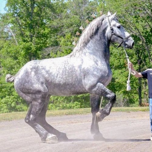
Draft horses are thick sturdy animals and a lot of non-horse enthusiast artists use them in their work because they're so visually satisfying. I mean look at this big boy. The problem is her proportions aren't quite right, her hind quarters are very slim, the back of her head has some weird lump? Not sure what that is? Her head is possibly too small and her lips/nose are just. I don't even know what's going on there.
Personally I think since Anne is a predator I'd probably base her on a hot blooded breed. I think an Arabian would make a great kelpie, they're a fast moving breed that's compact and powerful, and the way they look after a run, nose flaring, veins throbbing through their skin, twitching and hopping where they stand, could be very scary is channeled into a predatory instinct. Draft horses are far stronger but are much slower moving, so this probably fits into Anne's long term plan to lure Senshi into the water. However if we were casting based on aggression and bloodlust Anne would realistically be a Shetland pony.
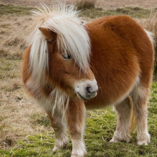
Ask any horse fanatic and they'll agree with this conclusion.
You might argue that animating a horse in an "anime style" is hard but the horse doesn't have to be stylised to fit in the anime. I personally believe that trying to achieve as realistic a horse as possible is better for the overall look than stylising it right off the bat.

This gif by @ostinlein has a realistically proportioned and animated horse in a more cartoonist setting and it works really well! Also it's just plain beautiful! Something like this, maybe with slightly fewer details in the mane, tail and feathers would work well in the dunmeshi anime.
So Anne's anatomy isn't the best, and it seems to be just a generic horse with mismatched parts. She seems to be a warm blood but also a draft. I think?
Again just having a horse in the anime is exciting and I'm glad she looks as good as she does, animating horses when you're not a horse lover is probably extremely difficult and I can appreciate that her movements are all pretty decent and recognisably equine. Horse paces are very complicated and tricky things, there's a reason a horse galloping was the first thing ever filmed, and the few places we do see Anne's legs moving they move right. So kudos to the animators for that.
Kelpie art by @fishylookingdeer

A kelpie with a proper draft horse base for reference.
Dungeon Meshi the manga is, in my opinion, and adventure comedy with horror elements. I'm sure a lot of fans agree with me that there are moments in the anime that are genuinely horrific and terrifying, and not just in the end. The entire world of dungeon meshi is pretty damn scary and it's only because our main character is a joyful idiot that the manga has such an optimistic outlook despite the circumstances. The anime doesn't carry the horror many readers expereince through though, which is a little disappointing imo. Earlier I mentioned I believe horses in both realistic and fantastical setting have incredible capacity for horror and so I wanna take a second to share how I think Anne could have been scarier!
First off Kelpies aren't horses. They're mimicking creatures that disguise themselves as horses to lure you onto their back and into the waves, and so the best way to make a kelpie scary is to make them not-quite-a-horse. A horse, but slightly to the left. Anne has light blue eyes with no focus, I think that's pretty cool BUT what I'd really like is Anne to have normal horse eyes possibly with her pupils the wrong way.
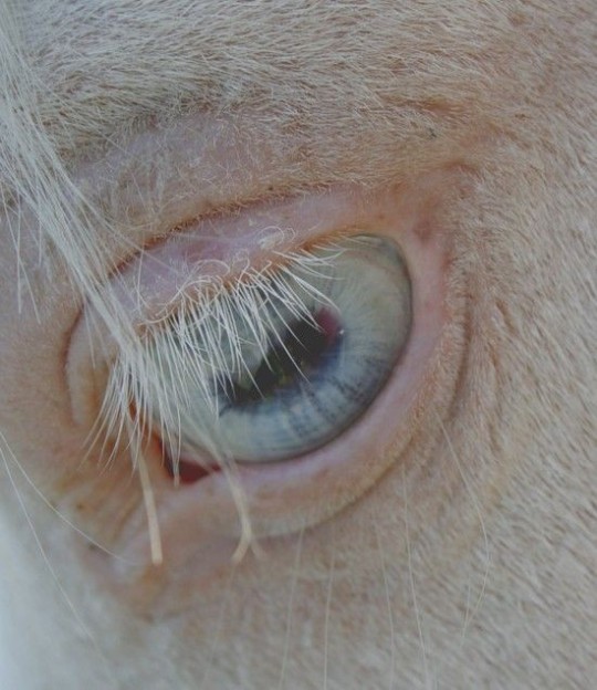
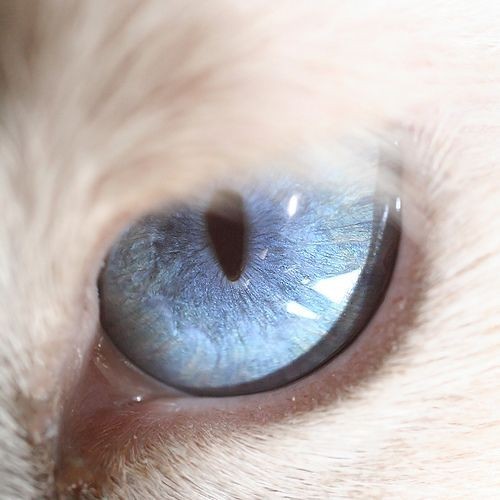
Horses eyes have this horitonal still for a pupil, I think giving Anne pupils but verticle would be a subtle way of showing she's not really a horse while also nodding to her predatory nature, like a cats eye.
When horse watch you they usually move their whole head, and then they're calm you can usually only see the coloured part of their eyes. However when a horse is panicking the white of their eyes show and they look around frantically. I think giving Anne normal horse eyes (with a fucked up pupil) and then having her show the white of her eyes by tracking the part members with her eyes only would be really cool! This is NOT normal horse behaviour, but predatory animals do this to reduce movement and scaring their prey away. It would be a subtle "something isn't right here" way to make the audience uncomfortable.

Horses also can't open their mouth a ton. Don't get me wrong they can grab onto your arm or leg if the mood strikes them but they cant truely open their jaw much. They also can't pant. Honestly I didn't even think of the panting till I saw this gif by @rcrisdraws and now I can't stop thinking about it
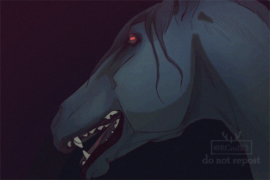
Don't like that...
In conclusion I liked Anne, I liked a lot of her design and some of her animation was good (when she attacked Senshi was particularly nice). While I have some nitpick qualms with her proportions I think for a non-horse oriented show she's perfectly acceptable. I think she could have been truely terrifying if the animators wanted her to be, but that's wishful thinking on my part. If you've read all this way through my rambles then please take a moment to check out the artists I've mentioned, their work is stunning and they deserve love.
31 notes
·
View notes
Note
Hey! I’ve been following you for a while and I really love your art, it’s absolutely stunning and I love the way you paint and capture anatomy. I know this is a bit of a broad question but I was wondering if you had any tips on getting better at painting digitally and studying anatomy, maybe more specifically blending, colour picking, and structuring anatomy in a way that looks somewhat realistic?
Thanks and I'm glad you enjoy my work long enough to be following me for this long!
I definitely love drawing a naked body that's for sure haha. In terms of tips for getting better there's a few things I can mention but it's going to fall broadly in the general answer of "study", because this is the most sure fire way to be able to understand what it is you're trying to emulate in your art.
There are different ways to study, and they teach something slightly different. For example, doing studies from life (live drawing classes) help me understand movement in a way studying from a photograph cant, simply because you're seeing the same model in different poses in real time, you can see how the fat and muscle moves around as they shift to different positions. So they're not technically moving the whole time, but you're still seeing some movement there, and understanding what sticks to what while it rotates and bends.
Studying from photographs can help give you time to do some real deep dives and investigate where different bones/muscles sit while someone is in a particular position. There's also the opportunity for understanding how shadows may be formed by the body as typically photographers are more conscious of how the subject may be lit than what may be available in a live drawing class. Beware though, as more things are photoshopped than you realise, not all photos represent reality. Especially glam and fashion photos. It doesn't mean its bad to want to have these effects on your work but just be conscious they might not always be anatomy accurate if that's what you're striving for. I sometimes make a conscious decision to go against what is anatomically correct for a certain effect myself.
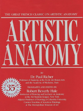
A book I have been recommending for years for anatomy is Dr. Paul RIcher's "Artistic Anatomy". It's great for understanding muscle structure intimately - it's designed specifically for artists, but with the idea of trying to stylise the diagrams as little as possible for the sake of understanding the human form. There's a lot of great info and detail in here, but beware, there is not a lot of variety in body structure (at least not in the edition I have which is missing female anatomy I think already so I'm not sure what else I don't have in here). So you'll be able to understand function a lot from here but you wont be able to learn a lot about fatter body types sadly.
Colour picking is probably the most difficult for me to explain easily, as I have spent a long time winging it, then studying it, then being really experimental with it. I could write a lot a lot about this but to spare making this post any longer I'll refer to another fun book just for getting started on some frequent and common terms called "Color and Light" by James Gurney.
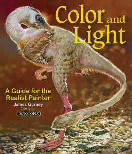
I also love that he uses like, dinosaurs for everything in here lol. It's a great starting point that can give you some go to ideas that you can then experiment from there. It's not very authoritarian (or at least that's what I feel), and doesn't push anything forward as a hard and fast rule, just showing what affects some colour combinations might instil in someone.
As a whole, I've gotten better at painting digitally by studying traditional painting techniques. They theories are basically transferrable one to one with some few exceptions. I tend to blend my colours by simply using a soft round brush in Photoshop with a low opacity. Much the same way I would with a real canvas, with a large round brush and diluted colour.
I hope this answers your questions in some way. I tried to be not too specific only because this answer would be at least another 30k words lol because this is something i think a lot about! I love technique! If I ever stream again, feel free to pop in and ask more questions where I might be able to show some stuff in real time! Not sure when that will happen though!
Also the way i do stuff isn't a "correct" way either. I like painting from imagination so this is how I make that work. Some people like to only work with references for every piece, and that is a completely legit way to create stunning art as well.
Good luck!
61 notes
·
View notes
Text
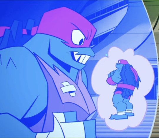
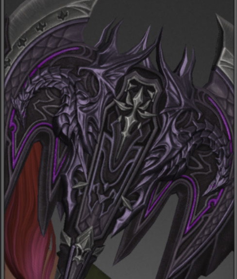
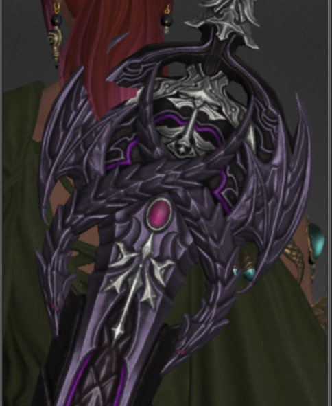
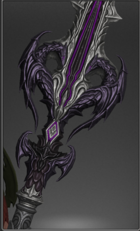
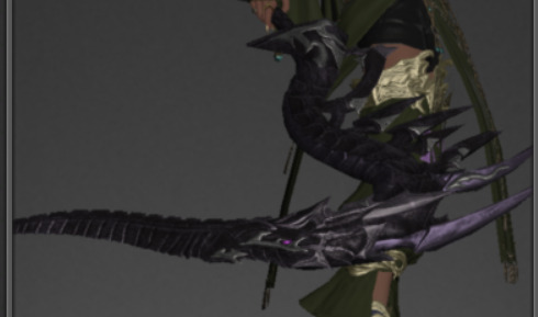
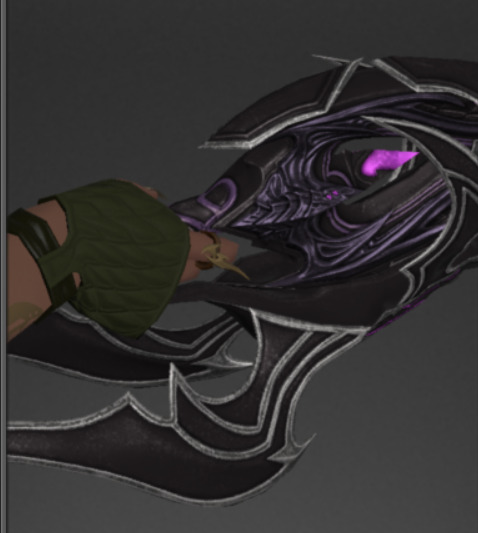
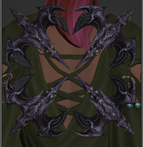
Rating All Radiant's Gear By How Cute The Little Dragons Are:
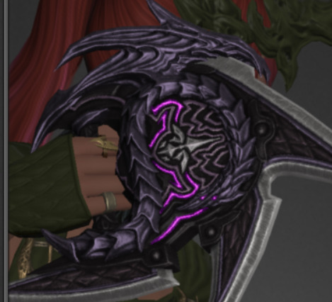
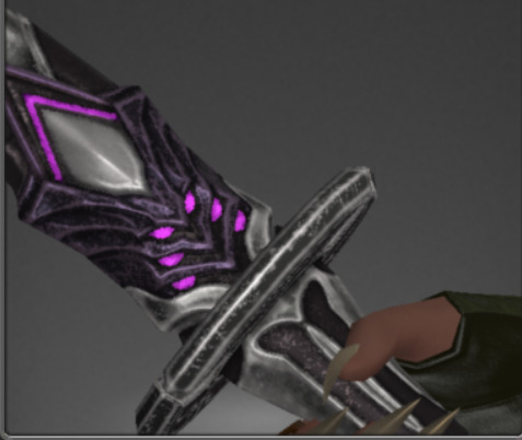
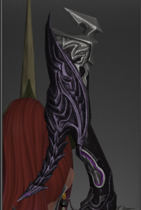
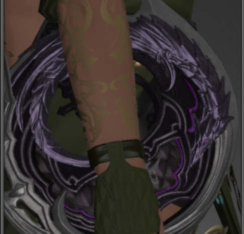
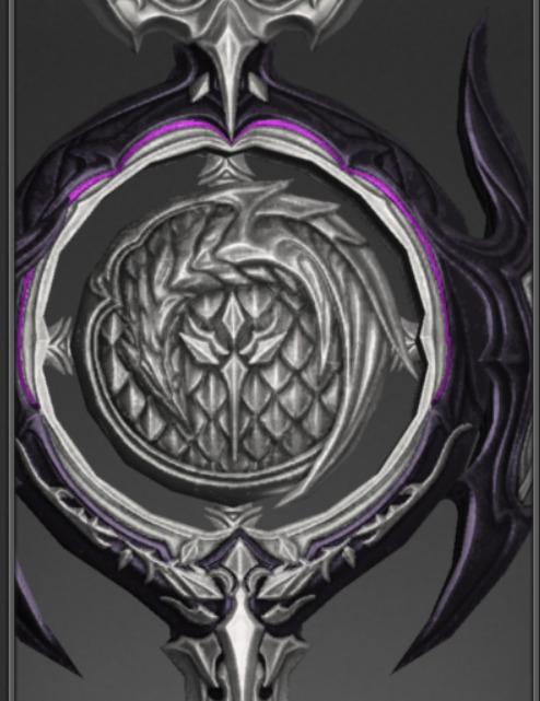
Paladin: 9/10 The sword little guy is one of the stylised dragons who has been squished flat, and drags down the set for being a lil boring in execution, but the shield is ADORABLE, look at that baby all curled around it!! The pose, the style, the ELEGANCE. One of the largest dragons of the whole set.
Long post under the cut :)
Warrior: 10/10 FOUR dragons, all with a cool pose, in one weapon? Lookit them! They're little spiky babies judging you from their perch and I love them.
Dark Knight: 8/10 Cool pose but their faces are sort of weird. The babies have 2 eyes on each side I think? But the face doesn't have enough definition to make them look like faces, and then you could mistake the 2 eyes for being front-facing and then they're goofy. More effort put into being edgy than maximising Dragon Cuteness, but they are still pretty neat, so I can't be that mean to them.

Gunbreaker: 0/10 NO DRAGONS??? Just the aesthetic? What are we DOING here? I think this secretly says something about the state of the trade deal between the Bozjans and Rats-at-Hand so I volunteer as a diplomat to improve things so they honour the traditional Gunblade with a more befitting dragon next time. I will rebuild Bozja myself brick by brick if I have to get trade flowing.
Dragoon: 11/10 The little guys from the axe are back and they have a EXTRA WINGS to make the spear more aerodynamic, which is very important for aerial combat. Bonus points for making a leetle heart :)
Reaper: 100/10 this is just Vrtra. Look at that snoot. Someone had SEEN him when they made this. Is this a post-EW design that their craftsmen added to the range after seeing that the Warrior of Light was a reaper and wanted to sell them specifically the perfect weapon? Or is this a secret design a past satrap had sketched and had made to secretly carry Vrtra with them which ended up in the stable of weapon types the Radiant Host use, in which case I want to know everything about the Reaper Satrap.
Monk: 9/10 Look at this guy... Another goofy face, but a great pose. Deducting points more because you don't punch someone directly with a dragon and instead they're hiding behind the blades looking cute. I want to punch someone with a dragon.

Samurai: 12/10 Two extra points for the weird dragon face with six eyes on the blade itself. I don't think the person designing most of these had ever seen a dragon but I love the imagination going into it. The lil guy on the sheath is fucking majestic. Flying at your side and adorable to boot.

Ninja: 0/10 again... Yeah yeah dragons have scales and claws. Disappointing.


Bard: 7/10 disappointingly flat little guy. Considering how MANY bows there are shaped like creechurs, the fact that this isn't another Vrtra-shaped full-body monstrosity of a thing is especially painful. Definitely an old staple of their armoury from times long ago when they weren't even sure the great dragon was real. Scraped a point for the arrow fletching being little wings.
Machinist: 8/10 another lil guy with a funny face. Loses their body definition to wrap around the butt of the gun, and playing a protective role over your hands once again like with Monk, rather than getting out there and doing the shooting, which would have been funny, but perhaps crass for a beloved protector.
Dancer: 9/10 SO LONG. Just curled up and having a good time vibing. Sadly hard to see unless it's being actively thrown at someone, since that distortion in its length is so you can hold it there. Deducting a point just because the art of combat dancing does come from Thavnair so they COULD have gone a bit more all out on this particular weapon.

Black Mage: 7/10 ARE YOU OKAY THERE? The squished ones make me sad. Could have been much more 3D and leaping out at you. The wings are amazing though. The overall vibe looks more like one of those flying voidsent thingies with the big flappy wings (you know the ones) so it is suitable BLM wear but not overall the best dragon nor particularly cute or cuddly.
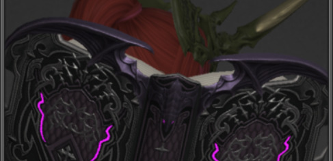
Summoner/Scholar (same dragons but one's lighter): 5/10 This is the same dragon as the Black Mage staff but even more compressed and the wings are tiny and weak. There could have been SO MUCH MORE dragon on these books. :(
Red Mage: 6/10 Great pose but the other wing designs are doing most of the heavy work to make it dragonny. I think it's sweet that it's snuggling down close to your hand but it's definitely a secret little dragon and not a flex that it's your new bestie in channelling terrifying amounts of mana. Bonus point for the slight bat-like aesthetic in its pose and the metal wings, and I always approve of when anything Red Mage also has vampiric hints in the aesthetic, and the lil baby dragon is playing along.
White Mage: 10/10 "Oh this one just has the wings?" WRONG LOOK AT THIS LITTLE WHITE MAGE BABY WHITE DRAGON SNOOZING IN THE MIDDLE OF YOUR STAFF, AWAY FROM THE DYABLE SECTIONS. The white sheep of the family is here to help and they're doing so well. Deducted bonus points because its eyes don't glow, so you can't dye it blue and have a blue eyes white dragon :(

Astrologian: 8/10 Double dragon! I stared for so long trying to work out if the dongle on top is also a dragon face but I think it just glows. The dragons are pretty subtle here but I think it may be kinder than putting them on any part where they'd be rotated wildly because then they might get dizzy and we can't have that. Anyway the existing dragons are cute but also just far enough down that stylised line that they look really goofy again so I think I am once again appreciating them in a silly way not a "awww baby" way.
Sage: 1000/10 FUCKING BABY DRAGONS. FOUR OF THEM.
AND THEY FLY.

Start your own family, dye them bright pink as the colour of your new brood... You're one of Middy's kids now, you are totally legally allowed to do that by Dragon Rules, trust me.
I am obsessed.
#ffxiv#endwalker spoilers#this post brought to you by me once again having a ton of nuts saved up to buy the base weapons#is it weird to run Aglaia over and over so I can augment and dye them#anyway I've been previewing them all morning and trying to decide which ones to buy.#I've had the sage ones since week 1 that they were affordable#and slooooowly working my way through the rest and now I'm coming up against Decisions.
92 notes
·
View notes
Text
The Anatomy of an Outfit (aka 'holy fucking Continuum THE LOOK™)
Y'all know I haven't seen a single STP episode since 2.9. I would rather gargle with acid than go near this show ever again frankly, but, well...
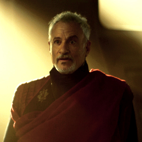
... Good sweet sanctuary what the fucking hell is THIS. :O (@tennant, clearly a fellow appreciator of all things ancient god, must be thanked profusely for these glorious few shots I'm about to show off. <3)
I called this lovely, lovely man returning about ten minutes after he 'died', but I don't think any of us were expecting his outfit to slay THIS HARD when he did. And not only is it the sexiest thing my fortunate eyes have ever had the pleasure to absorb, but it also happens to be very, er... well let's be real here, it's ridiculously Qcard-coded.
Let's break it down, shall we?
We'll start with the obvious: it's maroon and black. This look appears to be a mad fusion of his Encounter at Farpoint judge robes (which is fair, we end as we begin), and his husband of forty years' captain's uniform. That piped shoulder's hugely reminding me of this, in fact:
It's the inverse! You know, the same look, flipped? Because they have perfectly distinct personalities but are also mega gay???? Costume department allies fr.
The delightfully dramatic sash Q's rocking is also interesting - it places maroon at the centre of the outfit, and is its grandest statement, which makes it an excellent example of the importance of the colour to its wearer. This is the clothing equivalent of him having mon capitaine tattooed across his essence, which... well yeah, valid. Canonical facts. It's worn across virtually his whole chest, too, because nothing says 'that's my husband' more than having him literally held against your heart.
It's a different era of captain, across two shoulders - the old teasing, and the new love.
Also, this fucking brooch.
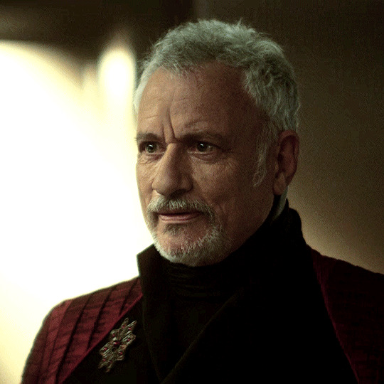
Now, whilst I doubt they've given even John de Lancie a piece made of actual rubies for a fifteen-second scene, the stones here are very clearly meant to evoke them. And rubies are interesting for several reasons:
They're Picard's birthstone, his birthday being July 13th;
They're symbolic of power and protection. What follows is some of the interesting info I've picked up from internet gemology on rubies:

... Huh. Resolve disputes. 'Dispel anger,' when we've seen a darker Q in this series. And 'protective powers'... mm, how many times has Q saved Picard's life again? What did we get up to, six?

... 'Romantic love.' 'Devotion.' Uh-huh.
This brooch is also evocative of the Navaratna, or this thing:

The brooch itself is clearly stylised, but it features eight gems orbiting a central larger ruby (which is meant to be the sun by the way, as though this motherfucker wasn't already evocative ENOUGH of the sun here or here), and is an important cultural and religious symbol in Hinduism. What's it symbolic of, exactly?
... Oh, nothing much. Just... just this.

... Like I said, nothing much, just the whole concept of Qcard in fucking jewellery form.
The brooch's also, as the wife @porgthespacepenguin pointed out, an eight-pointed star.
... Have I mentioned yet that I fucking detest this show? Because I really fucking detest this show.
There's nine rubies on it, as well. Picard's in his nineties.
So, let's recap:
Nine of Picard's birthstone for his ninety years
Sun symbolism, AGAIN
Celestial relationships
Beyond space and time
Romance
Prosperity
Protection
Resolution
So, all that, from a brooch worn over an outfit that looks suspiciously like Picard's, which has a sash across it in Picard's colour.
... And I'm supposed to believe that Qcard isn't endgame? You're really going to gaslight me to this degree right in front of my salad, you absolute bastards????
Guys, when you inevitably wipe this shitshow of a Star Trek from your collective minds like I'm about to do, just... take this with you. Take the fact that everything about this outfit and this SHOW has said all along that Qcard is endgame, until they couldn't be arsed. Until they lost their balls for the pathetic few who might have naysayed it.
Patrick, and certainly John, deserved so much better. I'm glad that at least someone on this set understands that. (I see you, costumers. I see you, and I love you.)
Just going to... just going to stare at the absolute fine-aged wine of a man that is John de Lancie for a moment, before I lose my whole shit. He calms my soul, you see.

HIT THE SLAY KING JOHN <3
#qcard#q of the continuum#jean luc picard#just gonna throw in here again that I DETEST THIS SHOW WITH EVERY FIBRE OF MY BEING thank you for listening#can't believe love won guys even if no one actually bothered to tell us#they're married now and everything#star trek picard spoilers#stp#meta
98 notes
·
View notes
Text
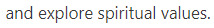
fwiw if you want to introduce more variety to how you draw faces I strongly suggest thinking really hard about noses
noses give you so much information about someone! they're usually one of the first things which define how we think of someone's face (after all - they're by far the feature that takes up most of it).
They change as we age - they take up more of our faces and move away from our mouths. babies almost all have round little tips of noses with no definable bridges, while depending on the type of nose an adult has they may get bonier and sharper or softer and flatter with age. nostrils widen, skin creases, eyes drop back from the bridge. I think often people try to age faces by putting wrinkles around an unchanged nose and it throws stuff off.
They're also a really racialised feature. like there is no one Black Nose or East Asian Nose or Desi Nose or White Nose, obviously, there's huge variation within and across ethnic groups, but there's a lot of overlapping trends in nose shape for different ethnicities and it's often a big contributing factor to people drawing characters of colour that kind of look like palette-swapped white people? like there are so many nose shapes that are super common but because they're relatively uncommon for white people, they're just not the noses people often learn to draw as standard.
but also a diversity of noses says so much about a character, the same way that their build or eye shape or face shape does. like. a long sharp narrow nose in a bony face? a round, slightly flat nose on a face full of smile lines? an upturned, softly rounded nose with freckles and no bridge? a long hooked nose with a curved tip? a crooked, broken nose? a bulbous, reddened nose? noses can imply strength, weakness, innocence, experience, childishness, wisdom, suffering, whatever you want to get out of a character design. don't neglect the nose!!!!
and like. obviously depending on how stylised the art is there's going to be information lost, but that's the thing - there's a real upper limit on how much variation you can put in eyes or mouths or face shape in simpler styles without making it overly realistic, but you can go really nuts on nose shapes! even with just one or two lines or one simple shape you can imply so many different noses by changing little things!
and yet really often I look at people who are trying to broaden variety on faces and they mix up everything except the noses, which stay like a circle or a triangle or a line or whatever their standard noise is, and as a result there's still this sameness to all the faces.
bc eyes and mouths and jawlines are all very well but noses are, in my opinion, the most varied part of the face. I can't think of any two people I know who have the same shape of nose except maybe me and my identical twin.
(and I'm not talking big Vs small, or hooked vs snub vs straight vs flat. really look at people's noses in real life cause there are so many variables)
(some leading questions under the cut)
how big is it? how long from the front? how far away from the face does it sit in profile?
does it have a rounded tip? how round? some people's noses have a profile that's basically a triangle point, some people's are basically a round tip with no visible cartilage above it, and everything in between.
What's going on at the bridge? in profile, is there a clear dip in between the brow and the bridge of the nose, or does the brow come straight down to meet it (or, if you have a kind of striking profile like Hangman Adam Page who looks like an early 2000s DreamWorks character, is your profile one line from brow to the top of your nose)? from the front, is there a clearly defined edge to the bridge of your nose or does it curve out? how much of the space between your eye sockets is nose, on a range from 100% to 0%?
What shape is the top of the nose in profile? Is it a straight line from bridge to tip? does it curve down? does it curve up like a ski slope? does it come to a sharp stop and angle out into a round tip?
does it have sharp edges? does it look bony, with a pronounced ridge? or is it all soft lines? Does it meet the cheek at an angle or at a curve?
does the tip come to a sharp point, or to a curve? does it angle up (so you can see the nostrils from the front), or down (so you can only see the line of the nose)?
how big is the base of the nose compared to the bridge? from the front, does it flare wide across the face at the bottom, or is it almost a straight line down? is it broader higher up the nose?
what are the nostrils doing? how big are they? are they round, or slit-shaped? do they sit behind the tip, with the noise all contained in a single pyramid shape, or do they sit to the sides? do they sit along the face, point forward towards the tip, or point up higher than the tip?
how does the nose interact with the other features? does it dominate the face? is it a tiny wee thing? does it sit over a very long upper lip with a pronounced philtrum, or is it almost touching the mouth? How much of the space between the eyes is taken up by the bridge of the nose? do the eyebrows curve towards the nose, or meet them at a hard angle? if they wear glasses, where on the nose do they sit?
colouration - is it all the same colour, or pinker at the tip or over the bridge? are the insides of the nostrils visible, and are they pale or dark pink? does the top of the nose get more sun - is it darker?
surface details - are there creases at the bridge or around the nostrils and cheeks? are they from scowling (vertical) or laughing (horizontal)? does their nose scrunch up when they smile, or flare when they're angry? is there hair? freckles? piercings? scars or breaks?
like the nose, jaw and brow are the structure around which the rest of the face is built. if you get to a place in your art style where you're comfortable playing around with that then you immediately add so much more diversity and life and verisimilitude to your characters!
also noses are just great. like they're so fun to draw and there are so many different gorgeous noses! I'm so into noses that usually the way I find how I want a character to look is to draw the eyes, draw the nose, then redraw the eyes and build the whole face around the nose.
(this advice is coming from the fact that the most common compliment I get on my art is the diversity and believability of characters and I would say that's like 50-60% in the nose/brow)
292 notes
·
View notes
Note
What the fuck was wrong with anon
Your characters are extremely interesting, the number of character asks you get alone is proof of that. They're charismatic and endearing and we all want to learn more about them
Your little comics are cute, but your full pieces are insane /pos. Not only is the anatomy practicaly flawless, but the composition and perspective is mind blowing.
I also don't know what to call it, but the "abstract stylisation" you put in the background of some of your art is such a big inspiration to me. I often go look at your art to observe how you did it because of how good all the stapes and colours theory and shading is, and i still can't figure out how you manage to make such high quality art. Even the line weight looks impossibly good /pos. It makes me think of art nouveau
That asker knows damn well they're in the wrong, or else they wouldn't have hidden behind anon
I know the critiqual voice in our head can get brutal, and some trolls will take adventage of that because they're so desperate for attention. But seriously your art is some of the most gorgeous "i can't even understand how they did it" art i've ever seen, which is a thought i mostly have about classical art pieces in museums.
Your art looks like it comes straight out of a professional book cover or graphic novel /gen
Thank you so much for your kind words. 💛 My art means a lot to me and of course I’ll continue to draw anyway. But sometimes there are such moments like this when you feel yourself pretty bad at everything. And as I see, a lot of people feel the same. I hope things will be better for all of us and we will just enjoy our art. Thank you again 💛
20 notes
·
View notes
Text

i caved in and finally decided to actually give my dialsona colors \0/
rambles under cut
she's 22, a 5'6 chubby university dropout and really fucking stupid. her full name i think would be polly hepburn glaives. i imagine she'd work at a comic store in dialtown or something, in an ideal world where dialtown had comic stores.
her favourite color is black. if you tell her it's not a color she'd just tell you she likes white instead.
her favourite food is pickles. she likes plushies and fluffy things, and is sensitive to bright light (i'd like to imagine her speakers have some kind of sunglasses-like material to relieve her optical sensors). her head's a boombox, meaning she can play music and listen to radio all in her own head! i also feel she could pull some pranks on people by intercepting radio waves and doing some silly shit, but she's probably not that type of person... maybe.
"polly" means "small" in hebrew, and "bittersweet" in latin. she has always felt "smaller" compared to her peers and has incredibly difficulty fighting her own inferiority complex, to the point where it can feel like she's asking for attention. she is an incredibly sweet person, but has difficulty regulating certain emotions that can end up making her appear incredibly rude and arrogant to people who look further in - she especially struggles with managing her jealousy and envy, to the point where she cannot be happy for her own friends.
"hepburn" is a name associated with a lot of notable people. her parents, while not public figures, are well-off and polly was expected to follow in their footsteps.
"hepburn" means "high place beside the water". her whole story revolves around her being foreign to dialtown, so it makes sense. dialtown i also feel, geographically, would be placed quite low down (from what i can see in the game i don't see it being surrounded by mountains or anything and the scenery is mostly flat, leading me to believe that the terrain is quite flat by association) compared to polly's place of origin, which i imagine would be either on top of a very steep hill or next to one.
"glaives" is a butcherization of "galvez", which means "foreigner" in spanish and portugese - i think it's self explanatory why i chose this one. i just butchered it because i thought it sounded cooler (glaives are a weapon iirc) and because my character is not of spanish or portugese origin, and i wouldn't know how to fit those in her character anyway because i'm not either of those and this is a sona lol
i feel like she'd be really into different fictional things. movies, books, comics, she'd eat that shit up all day every day. she likes theorizing about the content she consumes and less criticizing it. she'd also draw as a hobby, placing particular emphasis on anatomy. maybe she was forced to take a class in medicine, dropped out, but kept her interest in the human body?
now here i go making little ideas about the relationship between each character because... lol
gingi : i feel like gingi and polly would get along really well. polly grew up incredibly sheltered and so wouldn't have trouble communicating with a literal cryptid as she'd have to *actively try* to get things wrong if she wanted to make gingi upset. that, and their whole being just interests polly. she's considering asking gingi to model for her. if she were a character in the game, she'd probably ask gingi to do exactly that in exchange for $2.
karen : it's most likely that karen and polly are going to be friends at the very least. they're both artistic and have difficulty communicating with the general masses, so i feel like they'd find some comfort in one another because of this. polly has an interest in how karen stylises her artwork while karen might find polly's obsession with anatomy thought-provoking. outside of art i don't feel they'd talk much, but i could see them enjoying a little coffee together or something, and they definetely wouldn't be on bad terms.
oliver : i think polly finds oliver incredibly charming, and would probably giggle at his slang usage (which might confuse oliver due to the fact that it's just how he speaks, but polly is just really horrendous at regulating emotion - so a simple smile would easily turn into laughter in this case). i'd have no idea how they meet but they'd probably get to spend quite a bit of time together if they choose to, since they both like watching movies. polly would be quite particular with the movies she watches so oliver may have some difficulty attempting to push engagement with his interests too, but with enough patience i feel they'd get along just fine.
randy : randy and polly would most likely meet in an either incredibly unlikely or very likely scenario. polly gets incredibly lonely very often so i wouldn't put it past her to call the hotline (and i also have been thinking about this fucking encounter for like weeks because average randy enjoyer behaviour) and attempt to strike conversation. randy might be confused at first, but polly would call every day just to talk to him, and i think they'd eventually meet up. i haven't figured out where exactly, since polly is incredibly stingy with money and randy has none.
i actually had an idea (that totally didn't include me going on character ai what are you talking about) of polly and randy going back and forth on what to do when they eventually meet up, and they eventually just settle on going to polly's place because neither of them want to spend money that day and polly needs help unpacking anyway, so they just use up the entire day unpacking and decorating the apartment lol.
that's all. im normal about this oc (lie)
25 notes
·
View notes
Text
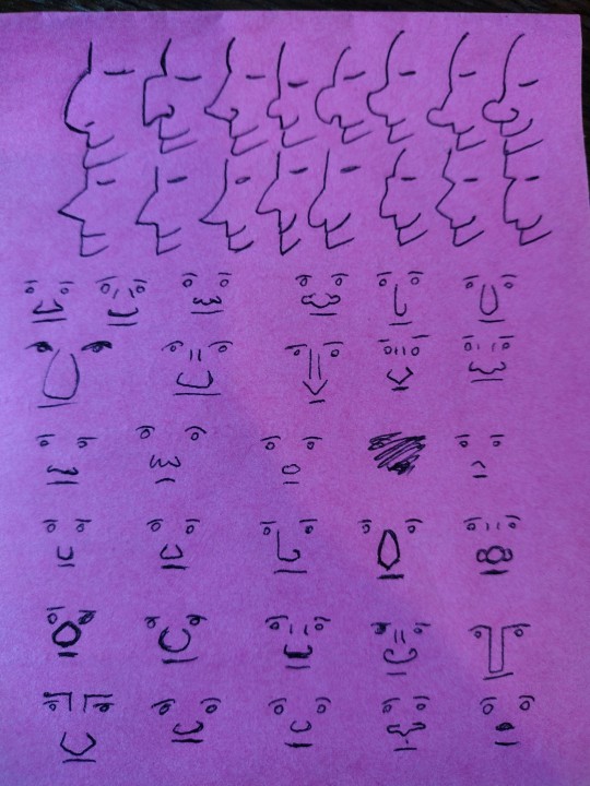
Dance
Above is a pen and ink drawing from the Harley Psalter, an illuminated manuscript dating back to the early decades of the 1000's CE. It's thought to have been produced in Canterbury and might be a copy of the earlier Utrecht Psalter from 820 CE.
The source for the above image is the British Library.
I know, all very interesting, but why am I looking at a dark age manuscript with some pretty doodles?
As the title states: Dance.
I'm trying to figure out how to stylise dancing in the story universe. My research up to this point has directed me towards the Carole/Carola, which basically involves a bunch of folks holding hands in a great big ring and singing, usually spinning. But what about more personal dances, where one dances with a single partner? That's what I'm trying to get to grips with.
Going back to the illustration above, have a look at the folks down in the bottom left of the image:
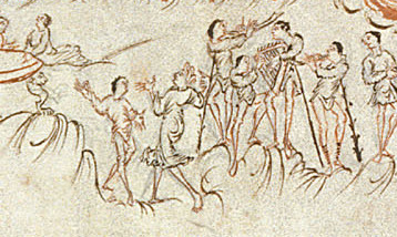
It comes up a bit blurry, but do you see we have musicians on the right here? You've got at least one if not two pipe players, someone else wielding what looks to be a harp or a lyre. And to the centre left we have two folks looking very much like they're dancing to whatever music is being produced.
Looks to be left foot back and hands loosely raised in this captured moment.
Do let me know if anyone has any other images or accounts of dance from the Anglo-saxon period (I'm counting that as anything between 400-1066 AD).
P.S.

Another image, this one from Prudentius' Psychomachia, this version coming from a latter 10th century copy. Apparently the text is a poem focusing on the virtues and vices of humanity, and I think this lady would be Luxuria, though I can't say that for certain.
The source for image once again being the British Library.
I'm just going to keep adding resources to this as I find them, mostly for my own record keeping, but also in case folks find a glimpse into the journey of my research interesting.

From the Etymological Dictionary of Proto-Germanic

Same as the above.

Likewise.
And again.

Last but not least, the Fuller Brooch, dating back to the 9th century. This is thought to depict the five senses of sight, taste, smell, touch, and hearing. Sight is thought to be in the middle with their big slightly terrified eyes, the rest go clockwise in the order I listed above starting in the top left. Dance is linked to this beautiful piece by the chap depicting hearing in the bottom left section. He is theorised to be dancing, linking hearing to sound to music to dance.
Image courtesy of wikipedia under CC license
There are lots of other articles, but I don't want to turn too academic on this.
34 notes
·
View notes
Note
Heyy~,
Are you still keeping up with the ONS manga?
If so, are you disappointed with the plot development of ONS?
ohh, interesting question!!
it's hard to answer, because my interests are so far off from what is actually happening in the manga right now. so i'm a lot more biased towards "ugh, this sucks" right now, but i'll try to work around it and really think of what bothers me beside the lack of my beloved scrunklies.
generally i think my biggest issue right now is how different the story today is to the events before. if you tried explaining to an anime only how the true villain of the story is actually a six-winged nonbinary hoe with depression that keeps their child's corpse in the hiiragi's basement, they probably wouldn't believe it's the same series. and i know that this was planned from the start, and kagami didn't just come up with shikama three weeks ago, but it still feels bad to have everything that was set up in the beginning of the manga not really matter anymore. they centered the whole start around the world ending, and it makes sense that there was never much worldbuilding because now it's just another thing that happened.
what were the interesting points back then? the apocalyptic setting! the ever looming threat in form of the vampires trying to enslave the remnants of humanity! the unshakeable rule of the hiiragi family suppressing those below them! there were tons of charming characters introduced that probably won't ever show up again (one of which even has backstory with an um, ex main character, i'd call yoichi. goodbye plot relevance). now none of that really matters anymore. it's a kind of "hey there's this bigger threat and bigger secret that renders everything that happened in the past meaningless!" that i don't really like. so what does it matter that krul dies and ashera loses her? they were angels in the past! their souls are bound together! they'll see each other again soon!
i'm not a fan of soulmate plots. i need at least 7 books of explanation for why these two characters like each other before i can see the relationship as true and meaningful. this is also why i can't bring myself to be interested in mika/yuu anymore, but i don't want to put a target on my back right now. they're good, alright. just not for me.
another thing that bothers me is how we're supposed to relate to, and perhaps even root for shikama. they were set up in both vampire reign and catastrophe as this incomprehensible force that planned the fate of the entire human race, leaving them as nothing more than figures on a chess board. and that's cool! that's terrifying! but shikama and the other angels turned out to be... not really incomprehensible at all. they're just humans with wings and special powers. to me, that's pretty underwhelming. maybe a different, more stylised approach to telling the story of angel mika would have made it easier to enjoy for me. something that wasn't just another version of "someone i love died and i didn't want them to so i did this thing". maybe that's the point, a cycle doomed to repeat, but... i don't know, i guess i expected something else.
so no, i don't like the recent developments. i can't think of anything i like about it, honestly. but that's a me problem. most people seem to like it, especially the mika enjoyers that have gotten their wildest dreams fulfilled these past few years! it's a little sad that my brain lost interest in him, i'd be a lot happier with the content we're getting.
this sounds extremely negative but oh well! i still look forward to the chapters and am excited to see what happens next, but without the thought of "hey, X scene has to happen at some point, it'll just take a while", i probably wouldn't be here anymore. i'll just wait for that and let the rest pass me by. yuu the floating eye, sure....
sure.....................................
sure...........................
#this was quite depressing to think about i'm not gonna lie#am i disappointed?? am i??????#i hope this didn't turn out too salty#... or too long#owari no seraph#seraph of the end#i didnt wanna put this in the tag but theres a read more so anyone that doesn't want user nayruwu's delicious rock salt can just scroll pas
27 notes
·
View notes
Note
Do you think something being adult like fate could work like maybe the trix spin off. They could have them partying hard and outfits showing off but also being more mean to other people and stuff. Probably alot of swearing too
I definitely could see a successful live action happening but not with the direction Winx is going currently (and has been for a good while.) I think there are a lot of things that need to be taken into consideration and they're things that very few people (much less Brian Young) can handle well.
Issue One: Style
Seasons 1 through 3 handle the balance between style and substance fairly well, everything is clearly stylised but it's very character and emotion driven. Winx is a show that has to be heavily stylised, but it can't rely on that over substance. Season 4 onwards lean too heavily on style and aesthetics (as awful as the aesthetics are) and the stories and characters flounder for purpose. I'd say The Idol is a show that is heavily stylised (there are beautiful shots and cool aesthetics but when it comes to the content and the Meat of the show, it's bad.)
Winx has to look good, yes, it's why so many people were initially drawn to it to begin with. But without substance, as the later seasons are, there's very little keeping an audience there. There's only so long we can look at pretty sequences and shots before we get bored. I'd compare it to Euphoria, especially in Season 2, the aesthetics are still good, but the emotional weight isn't there.
It's also a hard aesthetic to balance. Fate looks awful not necessarily because it's ugly in itself (the location is beautiful and some of the outfits do work), but because it looks wrong for a Winx adaptation. The colours are wrong. The clothes are wrong. The world is wrong. Fate is more Harry Potter than it is Winx Club. But leaning too heavily into fairy and ethereal aesthetics also wouldn't be right; it's not meant to look like LOTR. And replicating the costumes 1:1 would simply look ridiculous on human beings (see: the released images of Netflix's ATLA adaptation and how flat Aang and Katara's costumes look on actual humans.) The set and costume styling has to be deeply embedded in actual fashion, but also be timeless enough that it doesn't look dated within a year or so, but also convey the fantastical and sci-fi roots of the show.
I don't think a Winx show needs to have revealing clothes, necessarily. Or even a Trix show. You can dress teens/young adults in an age appropriate manner without putting them in revealing clothes. I know 2021's Gossip Girl was widely hated, but I do think the styling for it was very well done and they manage to dress the characters in ways that are character appropriate that look (somewhat) age appropriate without putting them in lingerie (Zoya comes to mind: she wears sneakers where Luna wears heeled boots, she wears oversized cardigans where Monet wears stiff blazers, she has earthier tones where Audrey wears preppier colours)
Issue Two: Substance
I think Winx, at its core and best, is character driven, and that's why we as fans chose to stay and are still talking about it now. Bloom can't even achieve her base transformation without undergoing significant development in her belief in her own ability. When her magic is taken from her, it's not an external force that brings it back, it's her reconnecting with herself and her past that does. Even when she lost her powers, it was because of emotion (the fight with Diaspro, her returning to Gardenia in shame after, her fear of what the Trix would do to her parents.)
Charmix requires the Winx to overcome a fear/personal challenge that was introduced much earlier (Layla's fear of abandonment, Musa's distrust of Riven, Flora's shyness), and Enchantix requires the girls to come to peace with death. There's a lot of emotional substance to these power upgrades and without that emotional substance, you get a magical world that has no interaction with the characters (an issue we see in Fate, where the characters simply exist within the magical world rather than actually interacting with it.) The characters of Winx Club are driven by their world and drive their world forward. They are this way because they live in this world, and their world is the way it is because they live in it.
Issue Three: Huge Cast
An issue with writing Winx, including fan written versions, is that there are too many characters to flesh out in a meaningful way. A lot of fans complain that there's too large of an emphasis on Bloom in the original show, but it's necessary, otherwise the show would be too massive and sprawling. Especially given the amount of lore that needs to be crammed in.
It's part of the issue with Fate (well at least irt writing) where there's too huge of a cast and how nothing has real emotional weight. I want to care that Beatrix is dead, but she's one of 15 main characters and there isn't time to actually come to care about any of them. When she dies, I (and some others) saw it and kind of just, shrugged it off. There isn't room to care about anyone because they're trying to juggle Bloom's lore, Terra's insecurities (and gayness as of s2), Aisha's emotional issues, Stella's mommy issues, Sky's daddy issues, Riven/Dane/Beatrix's unhealthy relationship, Silva and Farrah's involvement with the Burned Ones, Musa's hatred of her powers. I'm not even touching on the love triangles or Sam, Grey, Flora, or anyone else introduced in s2 of Fate. There's too much going on to actually care about any of them. That's why there's this disparity between what we actually see on screen and the amount we're supposed to care.
I think a Trix driven story, as you suggested, would fix that. There's only three characters to focus on. But I have issue with that mostly on the grounds of "a villain driven story is a hard sell." A Trix spin off, maybe, but not an entire series.
Issue Four: Young Adult
The issue with Fate isn't necessarily the "adult content" (sex parties drugs etc,.) but more the way it's handled. Riven(?) tossing a knife around in the trailer was unnecessary and the shot of that was included solely to make him seem edgy. The references to all the sex being had in the show don't really have a purpose, we know something is going on with Riven, Beatrix, and Dane. We know something is going on with Sam and Musa. We know something is going on with Stella and Sky. The references to sex is unnecessary. The vaping was obnoxious, yes, but that was believable for the version of Riven we see in Fate, he would vape in your face, he would be annoying about it. I think Terra making weed brownies was believable given that we know her character is insecure and a pathological people pleaser, and it's a nice manifestation of those traits without making her outright pathetic.
Another issue is that "young adult" always manifests in characters being snarky to each other and Fate does it in a way that makes the characters appear hostile to each other, and to the audience. It's hard to tell where Musa's snark ends and her actual hatred of the others begin. Is she overwhelmed by her powers? Is she being funny? Does she genuinely hate Terra and want her dead? It doesn't make the show edgy or "dark" or mature, it just creates a hostile environment where none of the girls seem to like each other. This and the aforementioned forced inclusion of sex/drugs/whatever feels like the equivalent of them flashing a massive sign on screen saying "this isn't REGULAR Winx, this is ADULT Winx."
#this is very long and i give fate the benefit of the doubt a little too much here but also like actual analysis of why i think it didnt work#anyway#asks#anon#winx#winx club
23 notes
·
View notes
Last Seen Blogs
jovanniryan
Live And Inspire
stayfvckintrippy
Chaotic Af

macrotiis
Autistic Disaster Marsupial

microfinanceindiasummit
microfinanceindiasummit

someonefantastic
fandom whiplash and a really big queue