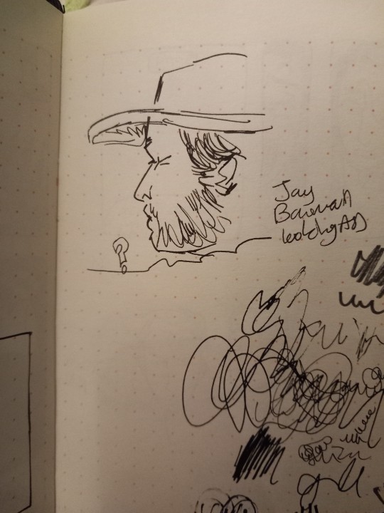
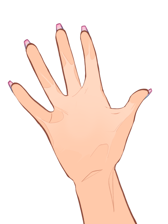
#trying out a slightly more simplified art style
Text
You've heard of Jars of Eyeballs, now get ready for:
Vials of Eyelashes
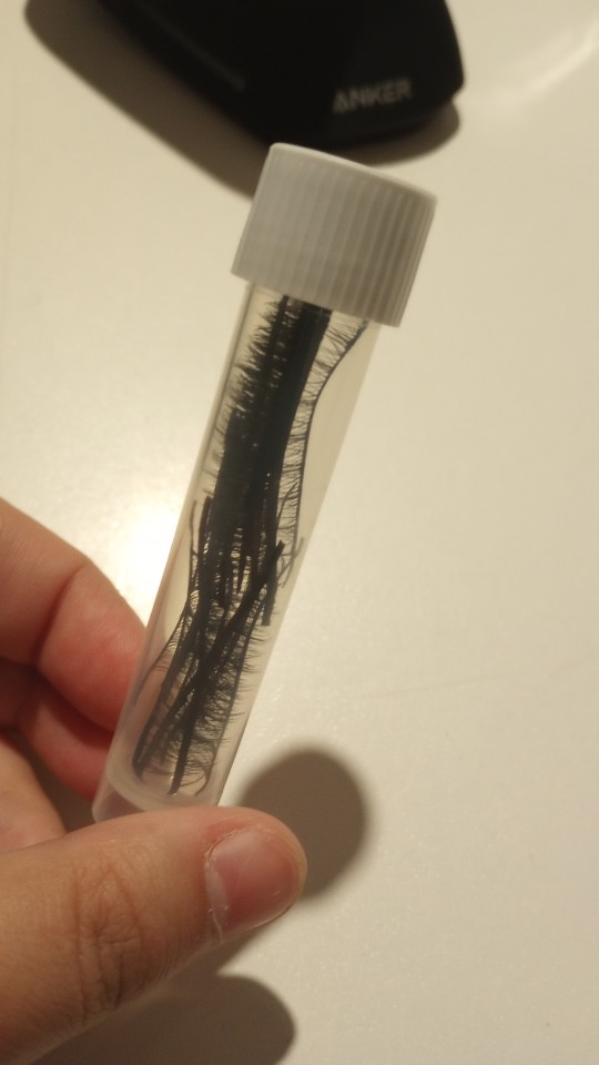
#should i tag this dollblr. would that make people less confused about the eyelash vial. or the eyeball jar#dollblr#actually i dont keep my eyes in jars i have em in awkward little baggies#the homemade glass cabochon ones in one and the professionally made acrylic and glass ones in another#my eyeball baggies. is that better or worse than the eyeball jar#im reorganizing all my stuff so like craft supplies and eletronic cables and whatever#and i had some package of really cheap ass fake eyelashes that i thought about using in a faceup#(never actually got around to using em LOL someday i'll try out eyelashes on faceups but rn ive been much more on the like)#(cartoony and simplified end of doll face painting so i havent felt much need for em)#(especially because im partial to anime style dolls)#and the packaging was really bulky to yknow keep the eyelashes pristine. but these were REALLY really cheap lashes so they were just like#by default slightly wonky. which doesnt matter too much to me because they would only be used for dolls or art anyway so they dont need to#like. keep the perfect human eye shape LOL so i was trying to figure out how to store em without taking up too much space#and i remembered all my vials for fountain pen ink and well. the rest is history. the rest is the eyelash vial#now time to put this deep in a drawer unlabeled to forget about and then give myself a jumpscare about mysterious vial years later
6 notes
·
View notes
Text
Clam's Quick Tips for Starting Your Very First Webcomic
Howdy! Here are the three bits of advice I tend to give people who ask me about getting into webcomic-making. Maybe they can help you jump into the fray with a little less fear.
1) Make Your First Chapter a Pilot Episode
You will be told by webcomic veterans to start with a short, simple comic idea first - which is wise - but if all you can think about is your big magnum opus, then you might as well hop in, right? Otherwise you'll just be glancing back at the other cooler project forever.
But if you can't start with a small simple story, start on a small, simple part of that larger story. Your first chapter should be a snapshot of the main conflict - show us a simple scene with few characters, ease us in slowly, keep things clear and focus on emotion/impact/clarity. Get the audience to care by offering something easily digested, but full of promise.
Once you're done with that 'pilot' chapter, and you're feeling more comfortable with the whole comic process, you can open the gates and show us the larger world. At that point, you'll be way more ready.
2) Simplify Your Art Style For Your Own Sanity
Always try to make your webcomic's art style as simple as possible - the standard rule is to use only 75% of your artistic skill for every comic page you make. Otherwise you will burn out quickly and terribly.
But you also need to be PROUD of your art style. If you're really feeling itchy, add a couple bells and whistles to your style so you can look at the finished page and say "Yeah, looks cool." You'll find the right balance the more you draw.
Also, don't be afraid to change your art style as you go along. Ultimate consistency is often impossible in webcomics anyway - so embrace your desire to try new things, streamline your work, whatever you feel needs to happen to be happiest. Sometimes the coolest part of reading a webcomic is noticing that style change - so don't hesitate to embrace it!
3) Resist the Reboot! RESIST!
The curse/blessing of drawing the same things over and over is that you'll inevitably get better at drawing those things. The trouble comes when you look back at old stuff and start thinking "Damn, I could draw that way better now."
You must recognize that this feeling never goes away. Not after a hundred pages. Not after three hundred. Not after a thousand.
I think everyone should be allowed one soft reboot for their first webcomic. Redraw some panels that bother you. Change up some dialogue if it doesn't make sense with your new story ideas. Do maintenance, basically. One of the beauties of webcomics is that they can be easily edited, without reprinting a whole book or remaking a whole game.
But if the ultimate purpose of a webcomic is to tell a story, then constant reboots will just be retelling the same story - slightly better each time, but the same at its core. We've heard it before. Most audiences would rather you save your strength and just keep going, rather than circling back year after year and going "Wait wait wait! I'll do it better this time."
Reboot early, not often, and only when you absolutely must! You're a storyteller, and you're constantly getting better at telling your story. Don't be ashamed of it - look back how much ground you've covered, and keep walking!
---
That's a good start. Happy webcomicking - don't be afraid to jump in, but be prepared to learn a lot very quickly. And if this advice doesn't work for you or adhere to how you did it, that's absolutely fine - webcomics are diverse by nature, and so are their creation processes. Feel out what works best for you, and good luck!
3K notes
·
View notes
Note
I love your young!Rose design with the braids & hair beads, it reminds me of the Black girls i knew in elementary school (2005-2011), so its deffo “period accurate” and also a delightful choice. The way you draw the human kids in general is really nice, youre really good at conveying specific features with minimal lines (like her & Mom’s nose shape). Do you have any tips for how you draw faces to make them not same-face or repetitively “white” features, especially when drawing in a less “realistic” style (i dont wanna say your style is cartoony but idk what i would call it tbh)? I took a life drawing class back in 2019 but we mostly drew the same two models or our classmates, and it was both a limited pool of features plus feels hard to translate into art that isnt attempting to be 100% realistic.
Sorry if this is rambly. Congrats on 10k. Love ur new icon, tho i miss the Horb. Do you take commissions? I think i asked this before but i forgetful af.
thank you for the ask :)!! i'm really flattered that you think i'm good at avoiding same-face syndrome because i am VERY LAZY when it comes to drawing and i could definitely be doing a better job ;^^ i'm also not the best at drawing people diversely(?), it's just something i have to get better at. there are people way more qualified than me to give advice about this... but i can try giving some tips
the first is that, like with anything, if i'm not confident that i can accurately portray something or a specific feature i will usually look up a reference. i like paying attention to things like the position of the browbone, height of the cheekbones, shape of the chin, shape of the eyes, length/width of the face, width of the nostrils, shape/position of the bridge of the nose, roundness of the cheeks, etc. when i draw characters (specifically the homestuck characters i like, because i think about them a lot) i have an idea in my head of how they look and how they differ from one another. for example i see jade with a longer diamond-shaped face while rose has a shorter heart-shaped face, so i do my best to depict that in my drawings
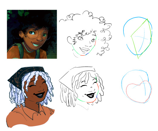
(idk if this illustration makes ANY SENSE bc like i said i think that i also struggle with pushing myself in regards to this and i think i still have more to learn/practice)
i think it comes down to paying attention to the proportions/types of specific facial features and adjusting them each to create a unique face
that said when it comes to stylizing what you see from photographic references, i understand that it can be tricky to simplify it. i really don't have any advice for this.... i just play around with it until it looks good while also being recognizable as the specific thing i'm trying to draw.......... so in that case i think it helps to use other people's art as a reference too! i don't really care about sticking to one "style" so i don't mind drawing in a slightly different way if i want to do something another artist is also doing. so for example if you're struggling with drawing 4c hair i recommend looking at other people's drawings of characters with 4c hair that you like and playing around with if you can incorporate their techniques into your own art.
i hope this all made sense ;^^ there are definitely a lot of tutorials out there that are way more informative than this one
also, to answer your last question, i plan to open up a few commission slots next week! (as long as i have enough time to that is)
53 notes
·
View notes
Note
please tell me about the pigments i would love nothing more than to hear you talk about that one shade of red you like and the process it took too recreate it
... oh, op. you have no idea what you've unleashed.
alright. here we go.
OKAY SO THE RED PIGMENT. pr206. my beloved. my dearest friend. it was an absolute bastard to find because there are so many of these. however many you think there are, there are MORE, and that's only if you don't count the many many scenarios where colors are known to be multi-pigment mixes, usually varying in tone/shade/intensity depending on the brand and manufacturing style. some colors are more consistent than others, but there are situations where a color can be named the same and contain the same pigments and STILL look wildly different depending on the ratio, binder, and paper you use. and that's not accounting for the way the pigment is processed. some pigments (like pv19 for example) can come in so many shades it's frankly kind of ridiculous.
anyway, my quest begins when i am, admittedly, in an edgier phase. i want a blood red, but not specifically because of that—no, i want it because it is THE IDEAL COLOR (to me) for a perfect, warm, slightly muted but still intense shade to add to a muted autumn watercolor palette. and... if you look at my whole theme, you probably know how much i love warm colors. i want to paint mushrooms. i want to dim down some of the brighter greens to make them autumnal. i want the perfect red to put as an undertone.
the search starts in earnest.
the immediate issue is this: reds (and purples and pinks) have horrifically bad lightfastness. not all of them, mind, but many are NOTORIOUS for fading under uv light, which means they will also fade if exposed to sunlight even in passing should it happen often enough. and—in especially bad cases where they're essentially working with dye and not pigment—they can even fade inside your notebook. inside of a drawer.
so not only are we working with an unfortunate pigment base (i'm simplifying here, there's way more nuance to this but shh) but we are working with one that skews heavily toward floral pinks or oranges. the red i'm searching for is warm, but not orange. dries dark but not brown. is transparent, not opaque. that last part is agonizing, because i also desperately do not want a color that will fade on me or generally destabilize, and most of the stable dark red pigments are EARTH pigments like red ochre (pr101) or the like. which, while fascinating because of their historical usage in things like pottery and even cave paintings that last to the modern day, are VERY OPAQUE. this is an issue with my preferred style of watercolor painting specifically, because opaque pigments tend to lift easier off the page and limit layering.
the search continues. pigment after pigment breaks my heart for one reason or another, drying too close to the cooler purpleish-red tint of wine at best. i think i find it in perylene maroon, but the drying shift (the difference between how a color looks wet vs after it dries on the paper) is so extreme that it loses the luminosity AND it's more opaque than most. i languish.
for a while my search turns to creation. i try and mix as many of my single pigment colors as i can into something that vaguely resembles what i'm looking for—so i take quinacridones and mix them with napthols, with nickel azos, with dashes of ultramarines and burnt sienna. everything turns out either just a bit too opaque, just a bit too muddy (that happens with multi-pigment mixtures, and is why so many people swear by single pigment colors. it's personal preference, really, great art can be made either way.)
still, nothing works. failure haunts me. i sit before a pile of used up watercolor paper that is literally covered edge to edge in nothing but similar red squares with various gradients and blooms as evidence of when i tried and failed to convince myself my efforts were close enough. i admit defeat.
in the meantime i shift my focus. i try and appreciate different color palettes and profiles, experimenting with things like fully transparent palettes (personal favroite) to fully opaque ones that function more like gouache. but despite finding appreciation for it, i still think about the damn red that i could never recreate. it kills me.
and then one day, a youtube video. a pigment is being discontinued, and the watercolor community is distressed. this happens a lot, because pigments are actually not always popular because of artists—sometimes beloved colors are put out of production because larger markets like car companies no longer find them popular enough to invest in. this time, the casualty is pr206, aka brown madder, aka quinacridone burnt scarlet.
let me tell you a little about quinacridones. they are genuinely remarkable colors. they have their own cult followings because of how bright and abnormally stable they are under uv light. they're transparent. they're luminous. they come in mostly shades of red and pink and purple, though there are a couple oranges and yellows in there. (there are no quinacridone blues, as far as i'm aware, but the phthalo blues have that category covered.) they also rewet beautifully, so you can put them on your palette and let them dry and not worry about it turning into a useless little rock of color that you can't get any pigment from anymore.
quinacridone magenta (pr122) is probably the most popular of these, the most often used besides maybe quinacridone violet (pv19). a few years prior we suffered the loss of quinacridone gold (po49) and since then people have been On Alert when it comes to losing these colors. i am one of them, because i never got the chance to even see po49 in person, and now the tubes are so stupid expensive that even the student grade versions go for Ridiculously High Prices on ebay, and the professional brands are being hoarded like (ironically) gold by anyone lucky enough to have a tube left over.
but back to our main character. not me, the pigment. pr206. i have legitimately never heard of this one, which to be fair is probably because i try to limit the random colors i fixate on since the hobby can easily get VERY expensive if you aren't careful. but it's a quinacridone, and that catches my eye.
i open the video.
now, i'm sure any artist out there will be familiar with the fact that screens don't display color consistently. it depends on your device, but most can agree that something that looks cooler on one may be warmer on the other, it's just what happens. but i see this color being swatched, and my brain implodes.
it's almost a perfect match.
it could work. it could. years of thinking that same thought have left me bereft and mistrustful of this specific quest marker, but the thought refuses to leave me. probably because the 'discontinued' label flashes like a neon sign.
i resist for about six months, and then i cave. at this point i have genuinely been trying and failing to find this color for upwards of five years. i am desperate, and the color might not be available anymore soon anyway, and apparently i am weak to sales pitches. (note: the color IS now unavailable in some brands, but others bought a decent supply and should have it available for at least a little while, alongside po48 which is quinacridone burnt orange, a favorite of mine and probably one of the only oranges i use regularly. both are discontinued officially, but they'll still be on sale till those supplies run dry.)
the color arrives. i grab my favorite brush. i pull out my stash of paper that i save for special occasions.
it's almost perfect.
i mix it with quinacridone burnt orange.
the result is, i swear, a perfect match for what i have been searching for.
it's warm. it dries dark but not dark enough to look brown. it keeps its luminosity (thank you quinacridones). it's fully transparent (thank you quinacridones). i genuinely feel the urge to weep, but i don't because i am clinging at last to the dredges of my sanity and also salt makes watercolor pigments behave differently and i will not risk this glorious moment. finally, after all these years, bill cipher has a gun i found the goddamn COLOR.
i mix it with warm yellows and with my favorite blues. with the pinks, just to laugh. life is beautiful and i am painting its sunsets, and i do not care if they look ridiculously messy. i have won.
the moral of the story is to never give up. or maybe it's to remember you never actually know everything about even the fields you love the most, because this color totally blindsided me despite being much more common than i expected. or maybe it's that i seriously needed to chill out for a while.
but yes. that is the tale of one (1) of the colors that has taken up residence in my soul. i hope you don't regret asking now lmao.
#ney's art tips (art questions)#ney's chatter (ask answers)#so also i said that a good alternative to pr206 is pr175#but i'm actually not totally sure about that because i've never tried it myself#watercolor is an expensive hobby and that's part of why i swapped to digital orz#BUT! from comparisons i've seen they are at least similar enough to scratch the itch#ironically i think i still USE po48 more than i do pr206#but that one is also In Discontinued Limbo where you can buy it but supply is indeterminately limited lmao#still a gorgeous color though.#... wow. this was incredibly niche and probably barely coherent i am so sorry LMAO#but thank you for indulging my color madness. it was the only hobby i had for *ages*.#long post#very very long post#good god is this my longest text post? aside from maybe a hive story?
20 notes
·
View notes
Text
Talking about art under cut
Im trying to see how to draw real people and within that how to go about fuigering that out. Also how there are some people that are reall easy to draw simplified and other so easy to draw complicated and others still who i can only just manage almsot realistically (not all examples here obvs lol)
I think ive just never bothered to draw older people so im stumbling that hurdle now. But its getting easier. As always the solution seems to be to loosen up and remember my pen is a pen and the permanance is not scary its a plus.
I didnt draw people at all for a while while doing uni work so i defaulted back to drawing OCs that have a clear and strickt stialization already but that presents a problem when my brain wants to draw real people lol
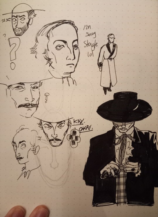
All of these pragraphs are arting with "I" lol. Its also kinda tricky to hm. Not find a style, i kind of hate that. But to find a consistency. When i was drawing people from rawhide i kinds had that no lower eye line thing but this doesnt even work for clitn east wood in other things hes acted in. I think maybe its the B&W flattens out that area under eye or something but it seems less distinct either way and my brain scans it as something not worth putting on paper
The oposit was true when i was trying to draw chrcaters from Sabata. It was digitally so not in this post but lee van cleef and whoever played Spengel (spengle? Spengal?) In that movie have such distict eyes that require alot of attention. Hm.
Reminds me how i drew Franca, an OC ive made up (visually) in the last month or so, next to Birdie, an OC i drew ALOT about two years ago now, and how i kinda see them both as lines/ruel to follow. I know Birdie is constructed of XYZ and Franca is ABC. The problemncomes from the fact that two years ago i was VERY focus on EXTRAMLY simple looking chrcaters but now the faces are more complicated and they stick out when next to each other.
I suppose its not relevent. Franca and Birdie are from two compelate different story lines and time period, but its indicative of a larger issue. My brain almost defaults tona slightly different "stlye" (almost) for different movies/shows/stories. The way id draw Bloodties chrcaters feels distinct (to me at least) to drawings of Office Party chracters even if theyre both from VTM stories by the same guy. Maybe that last one once again is just a difference in the time i started to draw these chrcaters.
Im going much off track. I like the sound of my own.......typing.
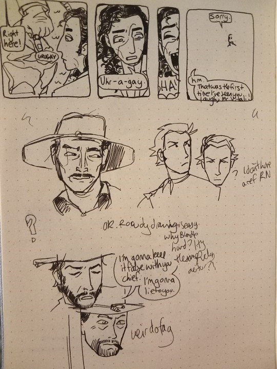
Oh! And Gino and Javier r there ^^
#me op#doodles#traditional#not tagging this obvs#this was all done tonight apart from the pics of gino lol#oc: gino vitali#*mike stoklaza voice* how embarassing....#why tf it upload like that?
13 notes
·
View notes
Text
You ever thought about why these generative "AI" models have such a propensity towards plagiarism?
Obviously there's one half of it that's basically just down to that it's what a lot of their users are explicitly using them for - they want something that explicitly looks, or sounds, or otherwise appears at least superficially to be in the style of another thing. But there's also an underlying problem at the heart of these models that's basically about understanding - or specifically, the lack of thereof.
When you ask a person to mimic someone or something, they tend to go about doing that by trying to figure out what it is about that particular person or style that's noteworthy, how those things are achieved, and then how they themselves might approximate that given the tools and expertise available to them. You try to identify a pattern, or a series of patterns, and then figure out how to replicate those patterns within your own skillset.
The problem with generative "AI" is that it only does the first half.
See, the thing with stuff like Large Language Models and similar is that they're basically patterned on a rather simplified model of how human learning works - you have a kind of simulated neural network that processes data and builds internal models of how various elements relate or interconnect to each other not all that dissimilar from how our own brains do. The big, huge, really important difference is that the models we build incorporate this nebulous little concept called meaning.
I've made this example before but, consider my cat. My cat is, in my estimation, likely of fairly regular levels of feline intelligence - meaning she has but a single braincell that is sometimes capable of unbelievable acts of apparent intellect and at all other times is only slightly smarter than a fence post. But, the important thing for this example: my cat knows what a door is.
Consider that for a moment: my cat can not only visually recognise a common group of sometimes quite disparate objects as all being roughly The Same Thing™, but, more importantly, she knows that if an object looks like a door, it can probably be opened. There is probably something on the other side. She might be able to either open the door, or enlist a human to open the door for her.
And again, "AI" only does the first half: you can train them to recognise doors, and quite easily at that, but they don't infer any kind of meaning from it - they can match images of doors to a statistical model, but they can't do anything with that model other than looking for things that match it. There's no introspective model to consider what it means for a match to be a match, no thinking about the context in which matches are found and what it might mean to find a match in an unexpected place or situation... and I mean, thank fuck for that because none of these corporations are at all capable of even a fraction of the amount of responsibility necessary to be allowed access to the on-off switch of a potentially sapient emergent entity.
But basically, this is why they indulge in so much obvious plagiarism: without the ability to comprehend meaning, no detail is more important than the other, the presence of a black pixel in the top left corner can be just as important a detail as what a finger tends to look like - they don't generate things based on an understanding of what is asked of them, they generate based on what is statistically associated with the prompts they're given, no matter what those associations are or what they're like. It's why "text" in "AI" art looks the way it does: it's a statistical representation of what lettering looks like by something that lacks the ability to comprehend meaning - it replicates the shapes and forms, the flows and designs, but fails to recognise any of the symbols as individual objects with distinct meaning.
It's basically what learning without understanding looks like - the ability to find patterns without the ability to infer meaning from those patterns. It's finding faces in the clouds without ever knowing what a face is.
And of course, at the end of the day, the problem with generative "AI" is not actually generative "AI" at all - it's that a bunch of rich assholes with way too much money and power in society think they can, and should, just replace the rest of us with mindless automatons.
10 notes
·
View notes
Note
Hello, orokay!! I've adored your art for years now and I was wondering if you have any tips on how to draw and paint/render scars? I can never seem to get them to look right, any help is appreciated! Hope you're having a good year!
Hi anon, thank you so much!
Sorry this took a minute to reply to, I've been trying to figure out how I wanted to respond. For me, a lot of questions about how I do certain things are kind of tricky bc generally the answer is 'idk I just try things and tweak it until it feels right' and I don't really feel qualified to give art advice bc most of the time I'm just making stuff up as I go, but I know that's not really a helpful answer 😭
My art style tends to lean towards simple and stylized, so for scars I try to limit them to three colors at most, less if I feel like I can get away with it. It also depends a lot on the scar since there are different types of scars. Usually how I pick the colors I use is: one color darker than than the skin tone (shading), one slightly lighter than the skin tone for the injured flesh and occasionally an even lighter color for highlights. I'll include some examples under the cut. But please please please keep in mind wrt scars 99.9% of the time I'm just winging it and going off of what I think looks cool, I don't know anything about the science behind how people scar so please do your own research if you want to be accurate.
I'd say when approaching/researching scars you need to consider a few things:
Skin color of the person- Scars look different on different skin colors and different people scar differently. I think this is one of the biggest things to remember! Color pick for the scar based off of the character's skin tone and shade. The color you use for scar tissue on a person w/ light skin is going to look unrealistic and out of place on person with dark skin, doubly so if the undertone of their skin is different (ie. warm vs neutral vs cool undertones). It's so important to look up references because everyone scars differently and skin type can make a huge difference on how a person scars.
Color of the person's blood- same vibe as with blushing/lip color/etc. if your character has blue blood, the scar likely isn't going to be pink. This probably isn't something you're going to have to keep in mind a lot, but just in case. This also kind of ties into the first one because if a character has a non-human skin tone, like blue, and red blood then the scar is probably going to be more of a purple tone, for example.
Type of scar- think about the injury and what kind of scar would result from it. I'm not a doctor so idk how scarring works and generally go off of vibes, but if you want to make it as accurate as possible, I'd suggest looking up images of scars from whatever type of injury you want your character to have. I used to work with dogs and I scar easily so I have a lot of bite/scratch scars. Some of them are lighter than my skin and raised while others that were less deep are darker and on the surface of the skin (aka no texture). My brother has a very deep dog bite scar that's left a dent in his skin and light, pink and shiny scar tissue. Basically, if you know you have the stomach for it, I 100% suggest looking up examples of the type of injury you're thinking of so you can see how that injury tends to scar. Is it hypertrophic? Atrophic? Keloid?
How was it treated and how old is the scar?- is it a burn scar that received skin grafts? is it a surgical scar? stitches? did it heal well or was there infection? All of these things can change how a wound heals and scars. New scars are going to be much more stark, especially if they're still healing, and most scars fade over time.
Examples under the cut...
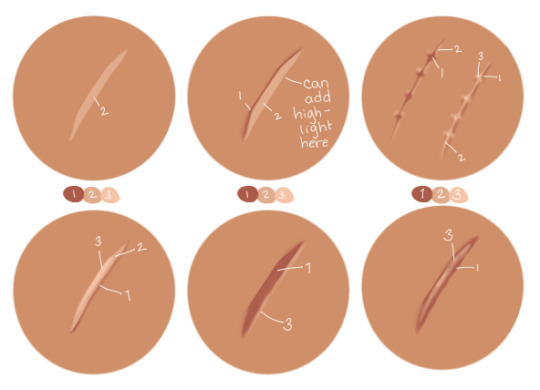
Some examples from my drawings over the years:
OC w/ healed burn w/ skin graft stylized and very simplified // really simple, sketchy scars on Narci:
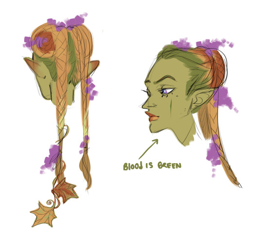
This iteration of Blue's blood is green so the scar on her cheek is green (we're going to ignore her lips and the flush on her ears lol):
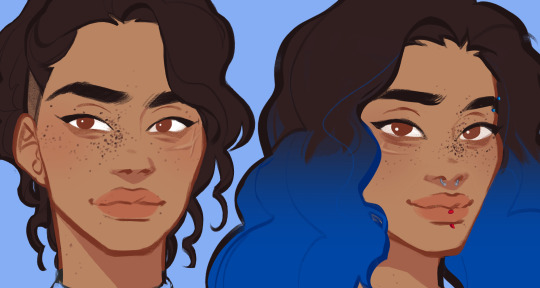
raised scars on nikora and blair's cheeks:
#answered asks#i cannot stress enough i go off of vibes 99.9% of the time im not an expert anything i get right is purely by accident#pleaaaaaaaaaase do research#if anyone else has actual medical knowledge and wants to give tips/point anon towards resources please feel free to add on#i'd like to learn more too ^^
17 notes
·
View notes
Note
quick aside for my moment of befuddlement because ive always misunderstood the idiom "like a house on fire" LOL. i always thought it was a passive aggressive way of saying "dude, we would destroy each other lets not talk" so when i first read that I was like ??? context??? doesnt match??? did they misunderstand the idiom? DID I? then i googled it and you're right lol its a nice thing. (tho now i wanna put that in a fic bc i think that would be a delightful misunderstanding for characters to have). IM SO GLAD I MADE UR FUNK SLIGHTLY LESS FUNKY THO. you're great and you're super sweet ;w; if i had more self-confidence, i would definitely jump at the opportunity to befriend. maybe when i get more gutsy
BACK TO THE SONG LAN HATE THO. im sorry, im still in shock. just HOW. also..... how is my interpretation of them not the common one??? again, i stay so strictly to my lane i didnt know other lanes existed and i definitely dont want to hear about it bc i think song lan hate would hurt my heart. it already hurts my heart sometimes when i see xue yang hate and XUE YANG DESERVES IT. literally i despair at media literacy sometimes. i absolutely cannot understand how anyone consumed the same content as we did and decided to be mean to song lan.
YOU ARE ABSOLUTELY A FAVORITE ARTIST, DUDE. have you fucking SEEN your stuff?!? like, are you as blind as xiao xingchen? (my sweetie, may he forever regain his sight). your art is GORGEOUS. absolutely worthy of being a fav artist and i am sure im not the only one. for starters, your pieces always have a depth to them that sets them in a scene so freaking beautifully EVEN WHEN THERES NO BG or even in your more simplified styles. when you come out with a "silly phone doodle of xue yang", i see the freaking SKILL needed to make THAT adorable lil gremlin as just a 'silly doodle'. like BRO, youre so skilled that i think youve lost depth of how good an artist you really are. i wish i was smarter with art words so i could tell you in color theory exactly why your colors are so beautiful but im dumb and all i know is "color pretty" BUT SINCE I CAN PORTRAY STUFF WITH WORDS SOMETIMES i'll try to just express how your colors alone can evoke emotion and tell a story, how you use the contrast to make your art pop off the page, the way that the colors caress a scene and show so much more inside. its beautiful, your art is beautiful, i can look at a piece for such a long time and still find interesting details that make me smile. oki i'll stop beng weird now but like NEVER DOUBT YOU'RE FREAKING SKILL BRO. (shit i didnt even get to how your animations just break my brain oeuihgo i love)
lolololol dw abt telling me about the cannibalisms piece, i look Specifically disrespectfully at that one. not big into cannibalism but damn dude, there is a Mood to that piece and frankly, something that messed up sort of suits them on their worst days euorhgioeurh i like me a fluff au or a fix-it fic but damn those two can get Dark.
My otps are often rarepairs ;A; i never do it on purpose, im normally jumping headfirst into a more popular ship but then i just See the potential in two other lil guys and im like.... holdup, wait is no one else seeing those two??? AM I THE ONLY ONE WITNESSING THIS? (yes, yes i am). And the hyperfixation begins and its just me alone at a bar with no bartenders so i make my own food. but im a weird lil guy so my cocktails are always strange and im alone at the bar lol. tbh songxue is one of my LESS rarepair rarepairs. like... theres actually fics that i didnt write for them LOL. (there was one fandom where there were 40 fics for a ship and i wrote all 40. i am a sad and lonely lil loser lol)
(scuse me one of my fav artists said they think i'd write my otp well, i can die happy oaierhgoeirh i actually do write ff for songxue but hahaha im still just a silly anon but its rlly good to know that the person i think characterizes them best in the fandom (that ive seen) thinks i would do a good job with them aoeghuihr thankyou for the high praise, i guarantee i dont deserve it)
(sometimes i've wondered if the reason you draw/write them so well is bc you dont ship them? weird take but like, shippers have shipping goggles right? we see what we wanna see a lot of the time. but since you just think they'd be neat standing next to each other (much agree), you actually put thought into their characterizations and personality instead of just "this is how they'd F*CK" or smth similar. and bc the personalities and stuff mean way more to me than sexy stuff (thats the whole reason i ship them! their personalities!) the fact that even your crack stuff has such a good basis in who they are as people makes your content just so good. whereas sometimes i see content by shippers (no disrespect meant, everyone ships in their own way), its very actively ooc, usually for a kink fill, and im just... but what abt their personalities? what abt the whole reason i think they'd be good together if given the chance?! WHAT ABOUT THEM? and then u come around drawing them like that and i just wish more people portrayed them the way you do. this isnt meant as like an anti-smut thing, i like smut, its just that sometimes pwp is just two strangers who happen to have the character names of my blorbos and literally nothing else in common and theyre my BLORBOS. more power to people who like that stuff, i will stay in my lane and bother this poor lovely person who doesnt even like the ship but is kind enough to see their potential to be pals cuz damn im in it for the emotions)
heh heh yeah it means we'd get along well but i like that interpretation too and think it would make a great story!! here's to you becoming more gutsy! (though again you're very free to use an alt or something!)
genuinely why i don't go looking lmao... song lan fans are so fucking strong to have to deal with the shit people have said BUT nowadays the climate seems to be a lot better :D i see lots of thirst for him at least KFHKDJ and my appreciation post of him has 800 notes so that's hopeful at least! but same i don't get it at all (though honestly i will say a lot of character hate stems from shipping. legit.) but yeah regarding xy hate for me it's gotta be for the "right" reasons LMAO
LJHLFHFD ALL THE COMPLIMENTS MY BRAIN CANT TAKE EM!!!! genuinely!!! THANK YOU!!!! i do often tell myself 'your stuff doesn't have to be perfect it just has to spark joy' to feel better about not rendering a piece to hell and back and mostly taking the lazy route, though this year i really wanna branch out and try more! but all of this has shot me in the heart... emotion to me is the most important part of art, and one of my favorite responses to get is laughter, and you don't need a 4K HD piece for that haha BUT LISTEN YOURE NOT WEIRD EVERY ARTIST I KNOW WOULD KILL TO HEAR THIS im gonna frame it. but after ive printed and eaten another copy like wow you think i set the scene ;_; will cry (agsjdhf sorry i really do read everything im just. PROCESSING!!!)
ahaha yeah for sure! i do love me some cannibalism (i am the cannibal friend) but absolutely that was just intended as a very dark place. song lan has Had it (the premise was xy thinking hey, he likes me, let me remove the nails i am sure everything will be fineOHNOOO)
oh dude i have chronic rarepair disease. most of what i ship is stuff i've come up with myself so any content is me + 2 souls maximum who i have managed to drag with me and make content KSGKFJ (case in point, xuechao) i just have this compulsion to do what nobody else has done
(you do deserve it! and dont go looking i wanna keep being the one who portrays them best :p)
and hey maybe because YES!!!! my work almost exclusively stems from personality oh my god thank you for acknowledging that i think that is the highest praise of all... how their personalities gel together is SUPER important for me, shipping or otherwise!! i'm telling you you and i would get along really well since we agree on the fundamentals i think! like yeah there's nothing wrong with some good old self indulgence but ooc takes me out of stuff a fair bit, and trust me i feel like most people would think MY stuff is ooc! but the thing about the strangers with blorbo names made me laugh so hard lhKDHJAfhsg i am so guilty of that in the past, i've read my old stuff and i'm just like damn. i just projected onto these dudes. NO MORE (it is bound to still happen privately but hey, ultimately, write what you want to read)
song lan and xue yang, in the 'if given the chance' realm, have exactly my favorite type of duo dynamism which is why i cannot stop drawing them lol like some funky spin on boke/tsukkomi... generally speaking ">:D -_-" is visually my favorite thing to draw haha and again! i wanna say it's not an all-out global dislike, i just a) understand most people are NOT coming at it from where i am so it doesn't interest me/makes me sad, and B) understand WHY people wouldn't be into it. because wow. um. ouch. that sure is some shit
i am gonna take a moment to plug an author i think you might really enjoy, pomegranites on ao3 (@pometogo on here!) ! i can't speak for Every flavor in there being to your tastes but there are definitely a fair few fics that made me bonkers, namely not easily let go, written for song lan love week :D
#long post#shin dont look#jic#who AM I i never do fic recs LOL#the fic i linked i treat it as a twin soul to your hands and mine#<- if you havent read this one pls. anyone seeing this. your hands and mine gotnocents ao3 thank yuo
4 notes
·
View notes
Text
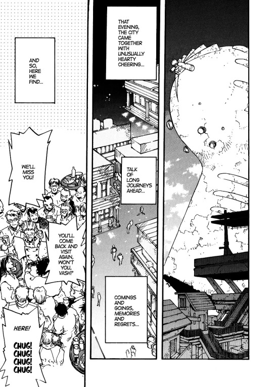
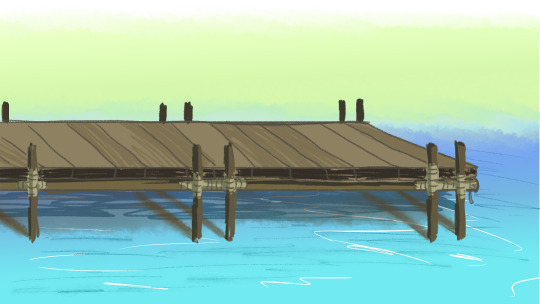
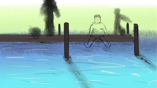
Trigun Bookclub Vol1 Ch4-5
Thoughts on ch4-5 below!
Previous review
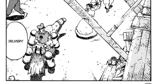
This is just a panel that I liked, because of the idea of using props as graphic image elements (there must be a specific english term for what I’m trying to say). Like the pipe here! I just think it’s purely to make the image more interesting, maybe give some depth, since it creates a distinction between fore- and background. Nice!
In the span of two pages, Vash as seen to the left was really quick to eat...4, 5 sandwiches?? This boy is still growing it seems.
There’s noting super special to mention about this page apart from me again admiring Nightow’s paneling style. It is a pretty simple page layout, but that’s what I love about it! It’s simple, it’s easy to read, and most importantly, it’s not crammed with stuff that’s unnecessary and would just make it more complicated. Like, I also love other series that use detailed backgrounds and I’m a big fan of Inio Asano’s work “Dead Dead Demon’s Dedede Destruction” (google it, it’s the complete opposite) BUT there’s a certain skill to being able to simplify. To simplify, but make it interesting nonetheless! And we’ll see that Nightow is a master at that, because just have a look at his silhouettes and shapes!! Oh man I will be unstoppably in my adoration once we get to Trimax Wolfwood, he’s got the best shapes.

Hehe and I also love the backgrounds in this series. Look at these two house shapes! He could’ve just drawn them like two parallel blocks, but no there’s some diagonal lines, and even some whitespace beneath where the houses nearly connect at the top! And that I say nearly connect is also important, because often in drawings you don’t want lines to accidentally touch each other or the frame, as this is just giving that part of the image more focus that you might not want there. So either leave enough white space between it or just go completely through with it. (example maybe to show what I mean: on the left, Kaite’s hair doesn’t tough the frame border on the right. It is close, but still far enough away that you can connect the dark background as one element. His hair above on the other hand does cross the border of the panel...well not by much, but it works. I should probably give better examples but I hope you get what I mean?)
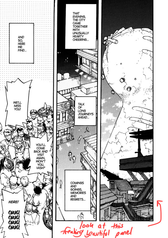
As the red text says: Look at that freaking beautiful panel to the right. DAMN that’s art. (ok well I wrote one image above smth about elements touching the frame and here the sandsteamer is really close to the frame on the left so I DO wonder if it would look even better if you moved it slightly to the right?
Does it make a difference? I’m really not sure. Anyway, moving on)

I love how Milly is unintentionally really deceptive!

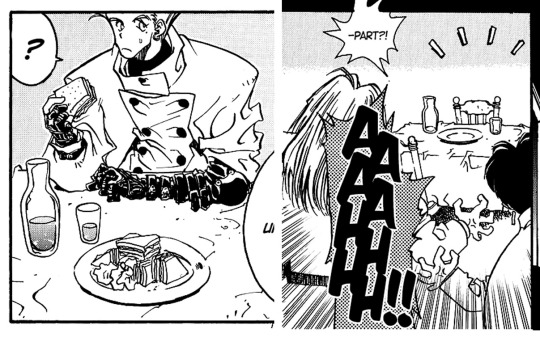
This is just too cute! Look how happy Vash looks now that the child is eating! Letting out a little sigh of relief <:)

Kudos to that first panel for accentuating perfectly what is being said. Yes, it is very dark out there. Neither the characters nor the reader has any idea what might be hiding in the dark because it’s just A WHOLE PANEL MADE OF DARKNESS. And it needs that much black space! Again, wouldn’t have nearly as much impact if id would have just shown one of their faces looking outside while saying this.

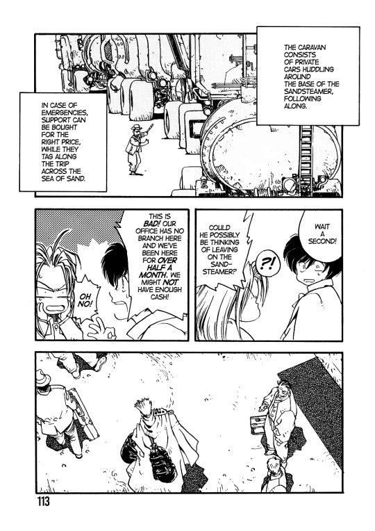
Love this page for the flow, the dynamic. Also look how neatly foreground (BL gang) and background (sandsteamer) are distinguished from each other because of their differenct brightness! (all in all we have 3 neatly seperated layers: foreground with the cars, the middle which moves further away for the reader because it’s darker with the sandsteamer and then the background, which is just pitch black, so it’s aaaall the way in the back)

Loving their comic relief energy in the first volume :D
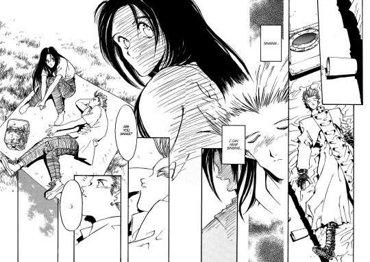
Spoilers so skip if you don’t want to read this:
Rem! Sniff! It is so dear to me that Vash misses his mother so much, and in his mind and dreams sometimes wanders back to her. He’s old, but in his heart, still a hurt and lost boy who’s all alone, missing the comfort of another person he could open up to. I like the fact that they are both laying in a grass field, something Vash probably never even experienced? I wonder if Rem told him about picnics. Maybe they made plans to have picnics, all three of them together, once they arrived on this new world...SOBS
6 notes
·
View notes
Text
some genuine art tips that aren’t just “don’t make characters ugly”
been seeing a lot of.. very bad art advice over on twitter, ranging from the useless to the downright offensive, so i’d thought i’d give some tips that can usually be applied to a wide range of body types.
Your wrists roughly line up with the bottom of your crotch - mark out a line parallel to your characters crotch for an easy arm length guide. This, of course, can be exaggerated if you want! But it’s a good rule of thumb if you struggle with arm length.
Don’t forget to draw heels! Not as in a shoe, but as in your actual anatomical heel. A LOT of beginner artists draw a very straight line on the inner leg - if your character looks unbalanced, check your heel! Ankles are less of a point where the legs meet, and more of a curve in and out, as pictured below.

Another leg tip - your toes will always point in the direction that your knee is facing. Your knee controls your lower leg, so if your knee is facing right, so is your foot. Try and see if you can move your foot without shifting your knee even slightly - I bet you can’t. And even if you can - it’s usually an uncomfortable position to hold for an extended period of time. If the pose looks unnatural or unbalanced, make sure the direction of your characters knees and fit are aligned.
Cis men rarely have entirely flat chests - while it may appear that way with a shirt on, pecs exist, even if they’re small! Give your shirtless cis men some tiddy. Pec size will increase with muscle mass and/or fat.
When it comes to cell-shading, I’ve discovered that less is more! Simplified characters don’t need shadows in every clothing fold - your lineart can actually do a lot of the heavy lifting in that regard. Of course this is all dependant on art style, but if you lean more towards cartoons, minimal shading might work a lot better.
When thinking about art, and using reference, try to think in shapes rather than lines. If you think about the lines, you get too fussed about little details and your gestures will be kinda stiff - view every body part as it’s own shape. Shoulders can be either circles or squares depending on your characters build, for example. A lot of people say “draw characters made up of rectangles” - but I personally find that using a wide variety of shapes helps me a lot more than sticking to just one.
Drawing from life is important, but so is studying other artist’s work - especially if stylisation is your goal. Turning complex squishy human bodies into something simple is a hard skill to learn, and it’s important to look at other cartoon/anime artists to see how they do things - especially when it comes to aspects that you’re finding hard to simplify, like certain hairstyles or hands. Hell, trace em if you gotta, just make sure they’re credited.
Do so many sketches. Sketches prove that you are thinking about what you’re drawing. Your first draft can be as messy as possible - think of it as stretching. Drawing is an exercise for both your arm and mind, so make sure to warm up!
2 notes
·
View notes
Photo
So as I might have mentioned I’ve been reading Homestuck for the first time
(Rant under the cut, you know the drill)
So! A lot has happened since I last uploaded art. Including, but not limited to:
- My computer deciding not to open any website that isn’t owned by Google
- I bought myself Clip Studio when they did their December holidays sale
- Taught myself to draw in a chibi/chibi-adjecent art style and now I can’t stop. It’s so simplified compared to how I used to draw look at it. Its so soft and untextured and I can just make blobby hands and feet and it works??
- After an entire week, finally fixed my computer (it just wanted an upgrade to Windows 11)
So, yeah, been a while. I’m actually working on a project for my MCYT sideblog wherein I draw all the Hermits as per my AU, the Sunbringer. I’m currently.. halfway through. It’s been a week.
Hhh.
Well, now onto actual details, starting with the fact that CSP makes it much easier to save transparent PNGs (Krita was fine, too, but it was slightly less intuitive, at least for me- I figured out how to do it on the first try- though maybe that also has to do with the fact I now have actual art experience meanwhile Krita was my second ever program, and while I’m certain the first one was fine it did not have that feature specifically... or at least I wasn’t aware I could look for it. Idk, it’s been like 4-5 years since I last used that program, I can’t even recall its name). What I’m saying is that the version above is transparent, while my new profile picture is the one with a background! And it’s space!
Anyways, figured out I really like giving characters with large, round glasses small, simple eyes, that are just colorful eggs.
So, as I mentioned, this is Homestuck stuff- apparently my last try was the wrong class, but not the wrong aspect; I’m actually a Mage of Mind. The one server I’m on where I talk Homestuck had me accidentally rant for paragraphs upon paragraphs (like I’m doing now... haha) about another person’s classpect and why their explanation for why it won’t fit them is actually the entire reason it should fit, actually.
It was a discussion on why classpects are infuriatingly confusing, so of course that “short” explanation I provided immediately cleared the issue for me, since a Mage of Mind is one who understands choice, consequence, and thoughts. So, understanding the minds of fictional characters to the point where I mimic mannerisms subconsciously, as well as understanding someone I had at most two conversations with prior... Yeah, fair enough.
That’s my invitation to anyone who’s interested to ask me to explain the personalities for various classpects, if you’re willing to read this much text (and, let’s face it, if you’re reading this, you’re probably fine with the length I write in).
Ok, final notes!
I almost gave the boots little wings- sorta like Hermes’ shoes? Because flight is my theme. I literally have never drawn myself without my signature wings- except when I was 3 and my “self portrait” was a bright-crayon drawing of a luna moth (well, it was bright pink, but it was a butterfly with crescent-patterned wings), and even then it was all about the flight. Always. It’s a part of who I am more than pretty much any other part of me.
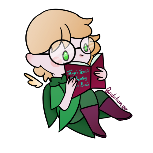
... Now onto lighter stuff, the title of the book Mini-me is reading is “Mage’s Guide to Reading More Books”. Specifically because I thought a book on reading books is a silly (yet loveable) concept.
1 note
·
View note
Text
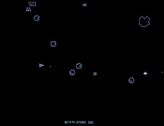
Asteroids - Elevator Pitch
Fresh from the development of the platformer we now move to plan and develop a prototype based on an asteroid shooter game. A large part of change from the previous elevator pitch is a larger focus on developing the main mechanics and realizing places where my skills need to still develop and reducing scope there where possible to allow for greater experimentation and learning opportunities.
Game Details
Name: Asteroid Collectors
Genre: Asteroid Shooter
Brief description of the prototype
The player works for a company called Asteroid Collectors, as part of their job they must reach deadlines and collect asteroid rocks to be sold whilst trying to survive the hazardous conditions of space and curious characteristics of each rock mined.
Primary Mechanics or Mode of Gameplay
Movement (Simple propulsion) - WASD or Arrow keys
Ship Primary Weapon – Space Bar
Ship Power Up – Hotkey such as Q
Shop Navigation – Arrow keys + Enter or Mouse and keyboard.
The shop will have upgrades to ship health, weapons and unlocks powerups.
Keeping In Scope
Taking in lessons from previous development to keep things in scope, shop upgrades will be simplified to only give a powerup to test the mechanic out. Furthermore, ship powerup will be restricted to unlimited fire rate for a short time. Two asteroids will be developed, one that is destroyed in one hit and one that breaks up into smaller bits.
To ensure a playable game for quick testing mechanics will be prioritized as follows:
Movement ability.
Primary weapon use.
Asteroid Basic.
Shop and Powerup.
Develop Level 2 and Asteroid 2, slightly more complex.
Determining Moment-To-Moment Gameplay
Taking further lessons from previous development the moment-to-moment gameplay is fully considered to better help develop level design.
Navigate level.
Shoot asteroids and avoid asteroid obstacles or decide on whether to use power-up.
Collect Material from fully broken asteroids.
Meet Quota.
Look at upgrades.
Move on to the next level.
Continue loop until health runs out.
A note on paper prototyping
As the game was largely momentum based and hard to develop the movement system feel on paper, I found it to be useful in helping develop the user interface for the game. In keeping with Fullerton’s (2018) learnings I had decided to do a quick digital sketch of the user interface inspired by paper prototype design.This allowed for a “much broader and deeper experimentation process” as I found myself less bogged down by concepts which may take a while to program only to need to be redone later.

(Asteroid Ui Ideation)
Setting/Style
From the previous project I have come to realize that I still need to spend time on developing my level design and asset making skills. To ensure that I would be able to develop these skills and be able to implement them into the prototype I decided to stick to a simple pixel art retro style. Keeping it focused on the gameplay for this project and expanding out when needed or comfortable.
Audience or Demographics: This game will have a similar audience, the previous one being those aged 20 – 30 looking for a simple action game.
3 Unique Selling Points
Ability to upgrade ship.
Unique premise to also collect asteroid bits.
Simple story.
I look forward to further developing my skills in Gdevelop and seeing how much progress will be made for this game. Till next time.
References
ASTEROIDS: BY THE NUMBERS, 2019, RETROGAME DECONSTRUCTION ZONE, https://www.retrogamedeconstructionzone.com/2019/10/asteroids-by-numbers.html
Fullerton, T. (2018). Game Design Workshop: A Playcentric Approach to Creating Innovative Games, Fourth edition. http://dx.doi.org/10.1201/b16671
0 notes
Text
Review: Fling by Joseph Murray

I don’t think I need to keep saying that I am inexplicably drawn to this art style on book covers. Of course, with a title like Fling, I expected this to be about casual relationships and perhaps two people who fall in love despite fighting against it. While that is what I got, it wasn’t exactly the full story.
After six years of marriage, Tara and Colin’s marriage is on the rocks after yet another failed round of IVF. But there’s a new dating app on the scene. Fling encourages married people to find the perfect person to have an affair with and Tara and Colin are both encouraged to sign up to it. The lost spark that appears to have left their marriage long ago might turn out to have been right under their noses all along.

The book did a great job of illustrating a marriage that has been worn down by the heartache of trying to conceive. In the first chapter, I thought this would be a pretty emotional read and I wish this theme had been explored a bit more than it was. For a topic that features so heavily at the very beginning and is a big reason for Tara and Colin’s resentment towards each other, they didn’t really talk about it much after the first chapter. I definitely wanted more of this vulnerability throughout the book.

For a male author, Joseph Murray also does a good job of highlighting everyday sexism. It’s quite rare to see in books written by men but it came up a few times in Fling, which I really appreciated.
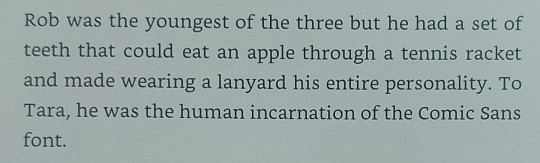
There were also parts of this book that were genuinely really funny and original. I have never heard anyone described as ‘the human incarnation of the Comic Sans font’ but obviously, I completely understand it! Unfortunately, these jokes were very few and far between, which was a huge shame.
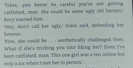
Colin’s friend Rory gave me the strongest physical ick that I’ve had in a long time. He is a huge misogynist and it’s not even slightly subtle. I hated reading the conversations between him and Colin because they just seemed to be obsessed with how women looked. According to them, a woman who isn’t conventionally pretty isn’t even worth talking to in a romantic way and to be honest, Colin showed signs of the same mindset. If this is genuinely how men that we’re supposed to like talk to each other when there are no women around, I’m so disappointed and angry.

Tara’s colleague Emily wasn’t any better. She seems to be fully on board with infidelity and was clearly only concerned with Tara having a fulfilling sex life. While I have no problem with people having casual relationships and being polyamorous, I do have a problem with those people trying to push those who are in committed, monogamous relationships into ‘giving it a try’ without informing their monogamous partner first. That happened twice with two different characters in this book, so of course, it felt horrible.

Another problematic statement from Emily came in the quote above. She is ‘so quirky and Gen Z’ that she can’t possibly refer to herself as heterosexual. Because being heterosexual is boring and having a queer sexuality is so in right now, apparently.
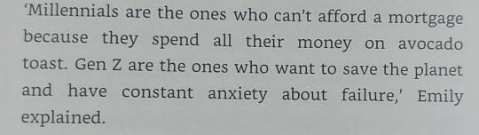
Also, millennials don’t care about the planet or have panic attacks about failures. Those are Gen Z things only but millennials can have avocado toast and no money. I really hate it when the media divides the generations into over-simplified categories like this and I never expected to see it in a rom-com but here we are.
Fling rests on a very icky concept for an app that I like to think wouldn’t ever become a reality but let’s be honest, something similar either already does exist or certainly will one day. Both of the side characters were awful people and I wasn’t crazy about Colin either. I did get intensely frustrated by the miscommunication and the near-misses that Tara and Colin kept having and I suppose that must mean that I cared about their marriage, which I did. However, I think there were too many things that I disliked about it to be able to recommend it in good faith.
0 notes
Text

@coivi // meme (usfw)
You want me inside you so badly.
Arthur didn’t much like going out to clubs or bars. He’d been more than once mistaken for someone from Daft Punk or people trying to peel his “mask” off only to actually physically hurt him in the process, add to that that he didn’t like eating or drinking in front of strangers. But a few of the models he worked with had invited him (and promptly disappeared into the crowd moving to the music once they arrived) and so now he was standing by the bar, ordering a martini. After that? He was going home.
Or at least, that had been the plan.
Halfway through that martini, a man slightly shorter than himself had approached him for a chat, looking completely unphazed by Arthur’s appearance. He didn’t mention it at all as they struck up a conversation, nor did he look at Art like he was something other. It was just... pleasant talking. Comfortable.
One martini turned into cocktails, the two men falling into subjects to discuss easily, leaning on the bar until Cyrus (a beautiful name, wasn’t it Greek?) suggested they find some seats to get away from the people stumbling into them. So they found a little corner with free seats and continued their talk there.
It didn’t take all too long for friendly smiles to turn into knees nudging together, fleeting touches, a flirty remark. Not Arthur’s style at all, but this felt natural. He wasn’t drunk, maybe just a little bit tipsy, and Cyrus was attractive and attentive -- it captured Arthur easily. Things progressed into scooting closer together in their little nook, a long, dark arm resting over the backrest behind Cyrus, and then suddenly there was a hand on Art’s thigh. Inviting. Asking permission? And permission was given in the form of legs parting slightly.
A mere few minutes later that hand was firmly massaging the front of his slacks and Cyrus had his head resting on Arthur’s shoulder, reading his body language like he was a simplified book.
‘You want me inside you so badly,’ he chuckled against Arthur’s neck, and then he made a soft sound of delight at the ripple that passed over Art’s skin, making him go from soft silk into the shiny latex that reflected the lights beautifully. ‘That’s a yes?’ A hard press of Cyrus’ palm had Arthur nearly crawling up the wall, but instead he just swallowed hard before giving a nod.
‘Good. I would love to see what you look like without all these clothes.’
1 note
·
View note
Text
Developing Ideas
Usually I would have started storyboarding and writing but as mentioned I had to get this to my good friend so he could record audio as he was excited to do so and had limited time, thankfully he absolutely nailed it and I only had to edit the audio clip slightly. Having this audio and the picture sparked my memory even more and I quickly began sketching out concept art for the place but everything I drew lacked how it felt, although my memory was strong of certain aspects of the sequence something which I rely on, detail, was totally missing.
I felt really disappointed in myself at this stage, the pieces were there but I was unable to connect them in a way which felt authentic to my memories, I was trying to add detail where it wasn't, and that felt like a misrepresentation of the moment, but then stripping them away made it hard to create anything which felt believable.
A Style To Cover A Lack of Information
I took a step back, and decided to simplify my drawing style and palette, I find limiting my palette can give me the ability to hide details in plane sight, the suggestion of a detail without the need to articulate it can communicate a lot more than a badly articulated realistic drawing, because making something stylised in a way which hides the details means there is a level of consistency.
Storyboard
Having done this, I drew out a storyboard with a 5 colour palette in mind, making sure each shot had tone as a key compositional tool and this made it a lot easier to get my ideas out in a presentable way.
I had a simple narrative plan...
Show myself remembering
Transition to being a child
Reveal the location of a fishing village peer
My character looks out to sea
My character hears the song Jammin' and spots the man
The man does what he does in my head
To show the way the music defines the memory I wanted to have the colures and tones bloom along to the beat when it comes in, and have a shot visualising the music itself.
Rather than simply showing events I hoped to capture the way I remember them in a very stylized communicative way so keeping my plan simple was key, I felt I had got this pretty good but wasn't super happy with my ending of having the man dancing, it felt a bit absurd but I wasn't sure if there was a better way, and if there was, I couldn't think of it at this time.
0 notes
Text
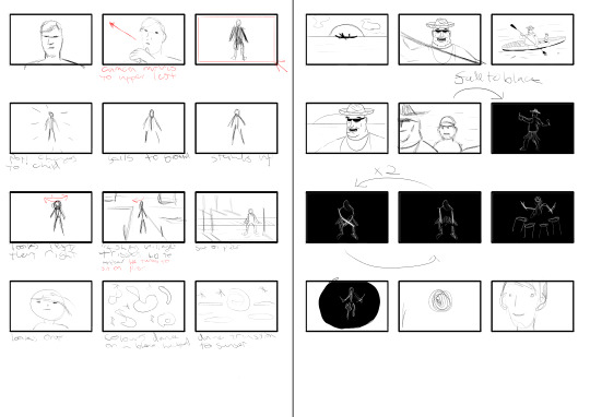
Randomisation In games: Art study 1- Complete
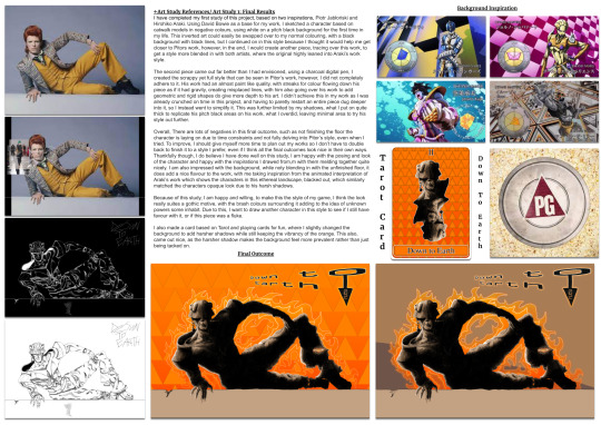
Art Study 1: Final Results
I have completed my first study of this project, based on two inspirations, Piotr Jabłoński and Hirohiko Araki. Using David Bowie as a base for my work, I sketched a character based on catwalk models in negative colours, using white on a pitch black background for the first time in my life. This inverted art could easily be swapped over to my normal colouring, with a black background with black lines, but I continued on in this style because I thought it would help me get closer to Pitors work, however, in the end, I would create another piece, tracing over this work, to get a style more blended in with both artists, where the original highly leaned into Araki’s work style.
The second piece came out far better than I had envisioned, using a charcoal digital pen, I created the scrappy yet full style that can be seen in Pitor’s work, however, I did not completely adhere to it. His work had an almost paint like quality, with streaks for colour flowing down his piece as if it had gravity, creating misplaced lines, with him also going over his work to add geometric and rigid shapes do give more depth to his art. I didn’t achieve this in my work as I was already crunched on time in this project, and having to paretly restart an entire piece dug deeper into it, so I instead went to simplify it. This was further limited by my shadows, what I put on quite thick to replicate his pitch black areas on his work, what I overdid, leaving minimal area to try his style out further.
Overall, There are lots of negatives in this final outcome, such as not finishing the floor the character is laying on due to time constraints and not fully delving into Pitor’s style, even when I tried. To improve, I should give myself more time to plan out my works so I don’t have to double back to finish it to a style I prefer, even if I think all the final outcomes look nice in their own ways.
Thankfully though, I do believe I have done well on this study, I am happy with the posing and look of the character and happy with the inspirations I drawed from,m with them melding together quite nicely. I am also impressed with the background, while noty blending in with the unfinished floor, it does add a nice flavour to the work, with me taking inspiration from the animated interpretation of Araki’s work which shows the characters in this ethereal landscape, blacked out, which similarly matched the characters opaque look due to his harsh shadows.
Because of this study, I am happy and willing, to make this the style of my game, I think the look really suites a gothic motive, with the brash colours surrounding it adding to the idea of unknown powers some inhabit. Due to this, I want to draw another character in this style to see if I still have favour with it, or if this piece was a fluke.
I also made a card based on Tarot and playing cards for fun, where I slightly changed the background to add harsher shadows while still keeping the vibrancy of the orange. This also, came out nice, as the harsher shadow makes the background feel more prevalent rather than just being tacked on.
0 notes
Last Seen Blogs

bizarre-blues
Crying while Skateboarding

iamthebelovedgodfather
The Godfather

ka-mi
Bez tytułu

micahleesheets-blog
Untitled
cirque-de-saturne
Cirque de Saturne