#1960'lar
Text


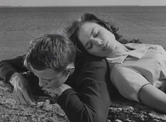
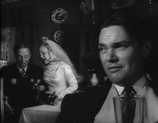
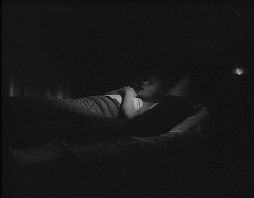
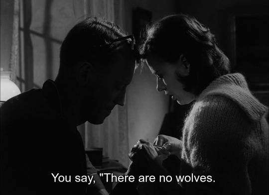
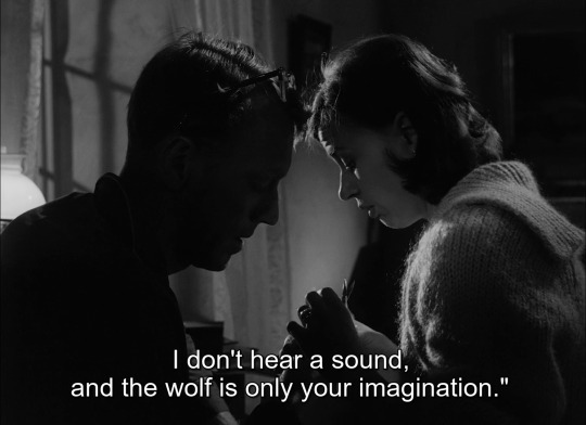
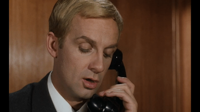
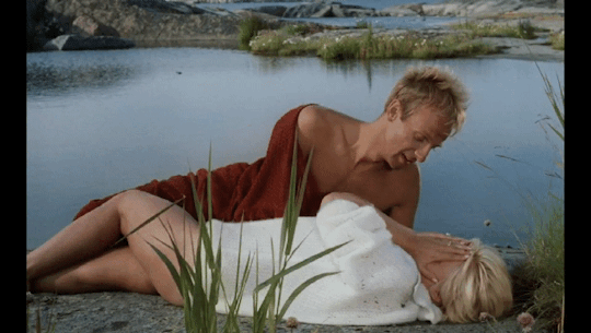
"It's hard not to talk about something that's constantly on your mind."
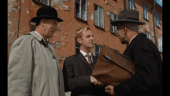
Through a Glass Darkly (1961), Ingmar Bergman
#film#cinema#movies#photography#art#actors#cinematography#film photography#vintage#through a glass darkly#sasom i en spegel#ingmar bergman#harriet andersson#lars passgard#60s#1960s#60s movies#1960s films#swedish cinema#movie quotes
385 notes
·
View notes
Photo
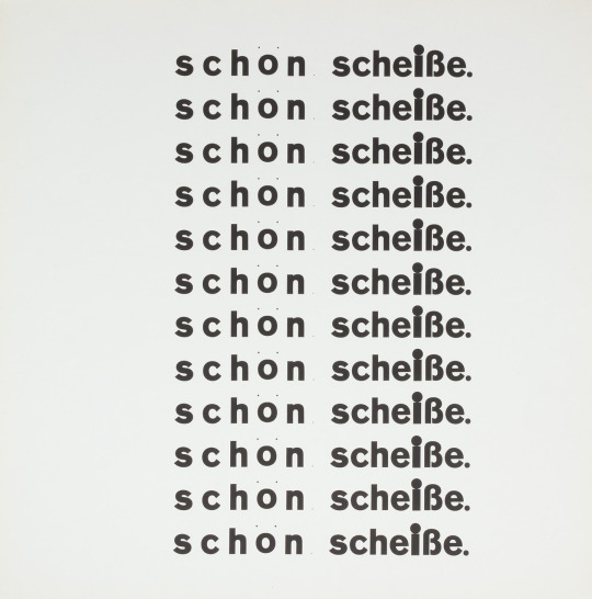

Wolfgang Weingart, Schön Scheisse, (letterpress), 1968 [Flat & Bound, Integral Lars Müller, Zürich]
59 notes
·
View notes
Text
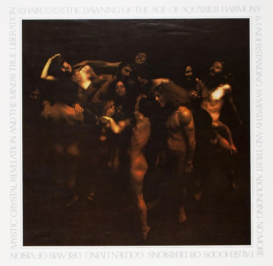
The Dawning Of The Age Of Aquarius (1969)
Photography by Lars Speyer
71 notes
·
View notes
Text
Happy st Patrick’s day ☘️ everyone. I’m sure there’s going to be a lot of Irish bars celebrating this holiday and having great Irish pub songs playing like the one I’m highlighting called “whiskey in the jar “
Whiskey in the Jar" (Roud 533) is an Irish traditional song set in the southern mountains of Ireland, often with specific mention of counties Cork and Kerry. The song, about a rapparee(highwayman) who is betrayed by his wife or lover, is one of the most widely performed traditional Irish songs and has been recorded by numerous artists since the 1950s.
The song first gained wide exposure when Irish folk band the Dubliners performed it internationally as a signature song, and recorded it on three albums in the 1960s. In the U.S., the song was popularised by the Highwaymen, who recorded it on their 1962 album Encore. Irish rock band Thin Lizzy hit the Irish and British pop charts with the song in 1973. In 1990, the Dubliners re-recorded the song with the Pogueswith a faster rocky version charting at No. 63 in the UK. American metal band Metallica in 1998 played a version very similar to that of Thin Lizzy's, though with a heavier sound, winning a Grammy for the song in 2000 for Best Hard Rock Performance.
Which one is your favorite version of the traditional Irish song
#Spotify#St Patrick’s day#Shamrocks#st paddys day#clovers#irish#four leaf clover#st patricks day#Whiskey in the jar#Traditional Irish#television#1960s music#irish music#the dubliners#thin lizzy#Metallica#kirk hammett#dave mustaine#jason newsted#cliff burton#lars ulrich
3 notes
·
View notes
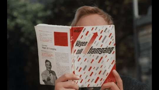
Text
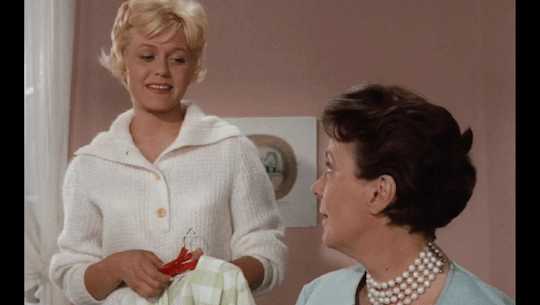
"Bröllopsbesvär" (1964) - Åke Falck


Films I've watched in 2023 (116/119)
#films watched in 2023#Bröllopsbesvär#Christina Schollin#Isa Quensel#Edvin Adolphson#Georg Årlin#Jarl Kulle#Lars Ekborg#Margaretha Krook#Lena Hansson#Stig Dagerman#Åke Falck#Swedish film#Swedish cinema#1960s films#1960s cinema#motionpicturelover's screencaps
3 notes
·
View notes
Text
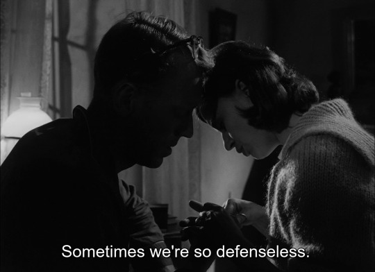


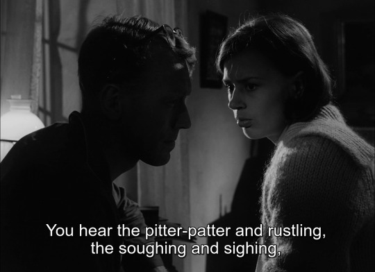

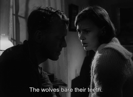
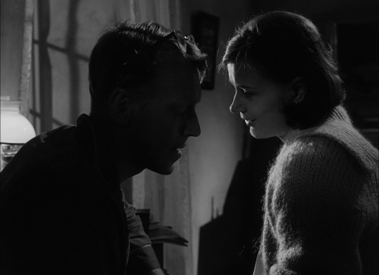
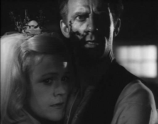
Through a Glass Darkly, dir. Ingmar Bergman, 1961
#through a glass darkly#ingmar bergman#bergman#harriet andersson#max von sydow#lars passgard#swedish cinema#swedish film#swedish movies#swedish actress#1960s cinema#1960s film#1960s#1960s movies#60s movies#60s cinema#60s#60s film#swedish artist#drama film#film tag
48 notes
·
View notes
Text
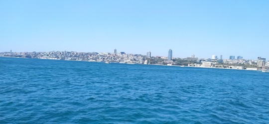
Yahya Kemal’e)
Cennet Boğaz’da
Ulu çınar’ın altında
Tükenmiş yıllar,
Sıram - sıram yalılar;
Hepsinde de küllenmiş,
Boğaziçi’nin üzerine serpilmiş
Renkli - renksiz anılar var.
Gelenler - gidenler,
Sevinçliymiş - kederliymiş,
Kim hatırlar - kim anlar?Aradan geçti uzun yıllar,
Emirgan'dan bir kaç anı bırakalım mı şuraya bıraktım bile...🤗

1940’lar - 1960’lar,
Hepsi de bir beyaz bulutun arkasında,
Eriyip kayboldular.
Ulu çınar’ın altında,
Üzeri çıplak masa’da, iki
Her tarafı dökülen
Bir hasır sandalye’de,
Elinde demli çayı
Ve de nargilesiyle.
Bir dev şair yaşamakda;
Ölümsüz Yahya Kemal
Oturmakda burada,
Zaman zaman gözleri,
Karşısında uzanan,
Boğazın bazan gri,
Bazan da maviyle dolup - taşan
Sularının, pırıltısında buğulanmakda;Hayal bahçesine dolan şiirleri,
Vaniköy’den - Kanlıca’ya doğru koşmakda,
Gökboşluğunca
Kanatlanıp - uçmakda,
Arkasından tümüyle cânım istanbul’u
Kucaklamakda..Şiirimizin Sultanı
Emirgân’da,
Bir yaşlı çınar’ın altında,
Bir köhne masa’da,
Elindeki demli çayı değil de sanki
İstanbul’u yudumlamakda;
Yedi tepe’nin,
Ve bulutların arkasındaki
Güzel anılarını,
Kimseye bırakmamakda.
Günaydin 🌄 🦋 🌻 hayırlı sabahlar olsun Dostlar ...!!!
Bayramın üçüncü gününden Herkes'e iyi bayramlar diliyorum kalın sağlıcakla...!!!
🤗☕☕🌹🌹🍬🍬🩵
200 notes
·
View notes
Note
What are some movies that every aspiring cinephile should watch?
battleship potemkin (sergei eisenstein, 1926)
city lights (charlie chaplin, 1931)
M (fritz lang, 1931)
freaks (tod browning, 1932)
brief encounter (david lean, 1945)
out of the past (jacques tourneur, 1947)
the third man (carol reed, 1949)
late spring (yasijuro ozu, 1949)
kiss me deadly (robert aldrich, 1955)
a man escaped (robert bresson, 1956)
touch of evil (orson welles, 1958)
la dolce vita (federico fellini, 1960)
peeping tom (michael powell, 1960)
man who shot liberty valance (john ford, 1962)
the exterminating angel (luis buñuel, 1962)
shock corridor (samuel fuller, 1963)
kwaidan (masaki kobayashi, 1964)
dragon inn (king hu, 1967)
playtime (jacques tati, 1967)
once upon a time in the west (sergio leone, 1968)
two-lane blacktop (monte hellman, 1971)
aguirre, wrath of god (werner herzog, 1972)
touki bouki (djibril diop mambety, 1973)
the conversation (francis ford coppola, 1974)
the passenger (michelangelo antonioni, 1975)
nashville (robert altman, 1975)
the killing of a chinese bookie (john cassavetes, 1976)
mikey and nicky (elaine may, 1976)
sorcerer (william friedkin, 1977)
days of heaven (terrence malick, 1978)
blow out (brian de palma, 1981)
8 diagram pole fighter (lau kar-leung, 1984)
mishima: a life in four chapters (paul schrader, 1985)
tampopo (jūzō itami, 1985)
blue velvet (david lynch, 1986)
something wild (jonathan demme, 1986)
landscape in the mist (theo angelopoulos, 1988)
sonatine (takeshi kitano, 1993)
salaam cinema (mohsen makhmalbaf, 1995)
fallen angels (wong kar-wai, 1995)
taste of cherry (abbas kiarostami, 1997)
cure (kiyoshi kurosawa, 1997)
the thin red line (terrence malick, 1999)
beau travail (claire denis, 1999)
yi yi (edward yang, 2000)
all about lily chou chou (shunji iwai, 2001)
memories of murder (bong joon-ho, 2003)
dogville (lars von trier, 2003)
tropical malady (apichatpong weerasethakul, 2004)
silent light (carlos reygadas, 2007)
sparrow (johnnie to, 2008)
holy motors (leos carax, 2012)
phoenix (christian petzold, 2014)
personal shopper (oliver assayas, 2016)
279 notes
·
View notes
Text
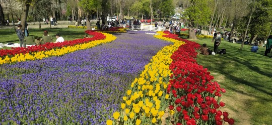
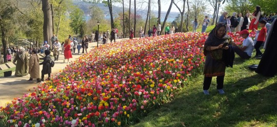
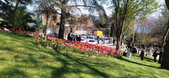
Mazide ki İstanbul, 1960'lar...💙
🥀🌱🌿☘️
Bir zamanlar maziye bak,
Ne kadar şendik,
İkimizin mesut olma emeli vardı.

💙🥀🕊️
40 notes
·
View notes
Photo
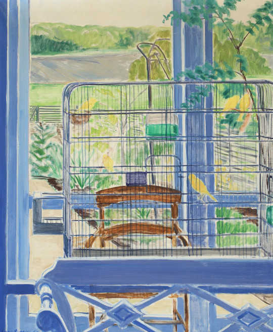
Interior with birdcage - Lars Swane , 1960.
Danish, 1913 - 2002
Oil on canvas, 90 x 75 cm.
185 notes
·
View notes
Text


„A house is a work of art“ is one of three theses Kazuo Shinohara (1925-2006) formulated in the early 1960s which also entailed the conclusion that the expression of a modern townscape must be found in the beauty of chaos rather than harmony. Between these poles Shinohara sounded out the relationship between the house and the city, a process that resulted in truly fascinating and poetic constructions. Shinohara, who had started out studying mathematics before ultimately settling for architecture, first experimented with variations of the square as e.g. exemplified by his Umbrella House (recently reassembled on the Vitra Campus) before designing more complex structures. What connects all of Shinohara’s works is a decided lucidity that he at times even developed into a beautiful ephemerality.
In the third volume of their ongoing series of books dealing with Japanese postwar architects the Harvard GSD and Lars Müller Publishers in 2020 took to Shinohara and with „Kazuo Shinohara: Traversing the House and the City“ provide a thorough study of Shinohara’s domestic architecture.
Editor Seng Kuan identified four stylistic periods in Shinohara’s oeuvre that form the backbone of the book: each period is represented by several houses that are extensively documented in photos, drawings and plans. Around these theoretical excursions, interviews and archival material build up a second layer of insights into Shinohara’s work, most notably through photographs the architect took of buildings all around the world which demonstrate his deep interest in understanding architecture and urbanism way beyond Japan.
Shinohara’s curiosity and ingenuity actually traverses the entire book and which opens up a unique architectural cosmos. By virtue of the juxtaposition of theoretical elaborations, interviews, built and unbuilt works as well as material from Shinohara’s archive the book is an exciting read and a highly recommended deep drilling into a fascinating oeuvre!
#kazuo shinohara#japanese architecture#architecture book#architecture#japan#monograph#lars muller publishers
46 notes
·
View notes
Text
Meşhurrrrr #SütTozu
Ankara’da bir ilkokul…
1955-60’lar, öğrenciler, Amerikan yardımı olarak yurda gelen sulandırılmış süt tozlarını içmek için sıradalar…
O günlerden yaşanmış bir anı
“1960’lı yıllarda ilkokula gidiyordum.
Öğretmenimiz süt tozu paketleri dağıttı; ABD’den yardım olarak gelmiş!
**
Bizim evde 100’e yakın keçi vardı, 30’dan fazla inek vardı.
Süt ve yoğurdu satma imkânımız yoktu.
Bize yetecek kadar her türlü süt ürünümüz vardı.
Ama ben cicili paketler içindeki süt tozu paketlerini sevine sevine eve getirdim.
Eve girmeden önce avluda dedemle karşılaştım; ‘elindeki nedir?’ diye sordu. Açıkladım… ‘Bizim sütümüz var, götür onu geri ver, sütü olmayan çocuklara versinler.’ dedi. aslında köyümüzde sütü olmayan ev yoktu. ben biraz duraklayıp götürmek istemedim. ‘Oğlum, bunlar bizim iyiliğimiz için bunu vermiyorlar, bizi zehirlemek için gönderiyorlar!’ dedi.
**
Ben okulda aldığım derslerden kendime güvenerek dedeme karşı geldim.
Söylediklerini okula gitmemiş dedemin cehaletine yordum.
Ona itirazlar ettim.
Beni ikna edemeyince inandırmak için bir deneye başvurdu. Güçlü bir köpeğimiz vardı. ‘Git, süt tozunu süte çevir getir.’ dedi. Gittim, süt tozundan süt yapıp getirdim. Köpeğimiz kulübesinde idi.
**
Götürdük ve önüne koyduk.
Ağzını koydu, yaladı, çekti, bırakıverdi; ‘Siz beni zehirlemek mi istiyorsunuz?!.’ anlamında hırsla bize baktı.
Saldıracak gibiydi.
Kabı aldık.
Dedem onu suda yıkadı.
Sonra bana ‘git, evden bizim sütten getir.’ dedi.
Evden yarım kilo kadar sütü götürüp yıkanmış kaba koydum. Yine köpeğin önüne sürdük.
Ağzını koydu.
Bir defa nefes aldı.
İki içimde sütü bitirdi. dedem hiç okula gitmemişti ama öğretmenimden ve o sütleri okulumuza gönderen yetkililerden daha çok şey biliyordu…”
Ve bu dağıtılan süt tozlarından sonra Turkiyede ilk “Çocuk felci vakaları görüldü ve felç salgını başladı.” Sonra ne mi oldu?
Amerika bize milyon dolarlar karşılığında çocuk felci aşıları sattı..
İlaç olsa bile içme düşman taşından, sakın taş attırma dost arkasından, kim iki yüzlü ise tut yakasından, bir sinine bir de canına Tükür...
Ne kadar manidar..
Bizi bomba ve silahlarla öldürenlerin,aşı ve yiyeceklerini masum gördüğümüz sürece daha çok aldanacağız. Önce bizi hasta edip,peşine ilaç ve aşısını satıyorlar!
(Alıntı)
10 notes
·
View notes
Text
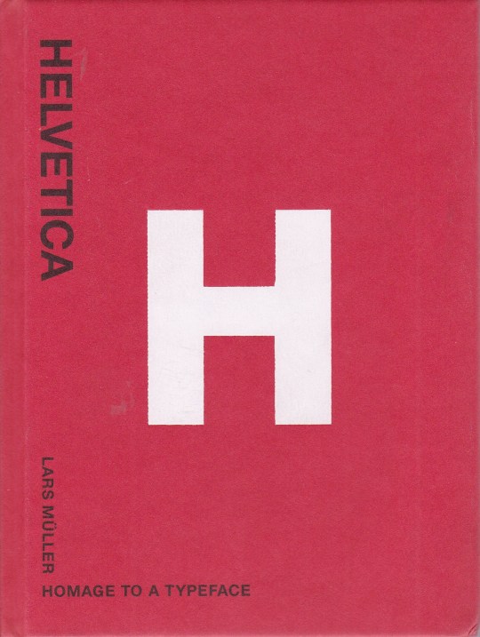


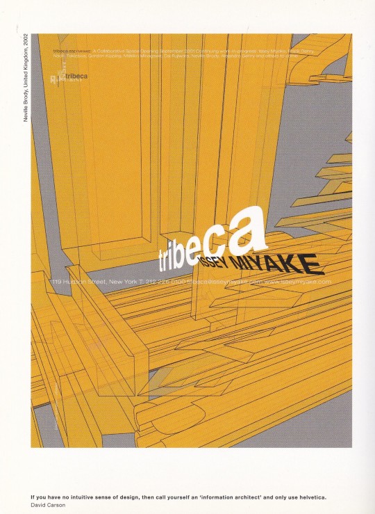


Helvetica
Homage to a Typeface
Lars Müller
Lars Müller Publishers, Zürich 2001, 128 pages, 400 illustrations, hardcover, 12,5 x 16,5 cm , ISBN 9783907044872
euro 40,00
email if you want to buy [email protected]
In 1957, Swiss typographer Max Miedinger came up with “Haas Grotesk”. Renamed Helvetica after 1960, this typeface went on to become one of the world’s most used typefaces ever. It embodies the myth of Sachlichkeit, propagated at the time by Swiss Typography. This book sings the praises of this shift-worker and solo entertainer of typefaces, of its forgotten creator and all those who have contributed to its unparalleled international march of triumph over the past forty years. The designs gathered together here in honour of Helvetica have been created by superb designers and anonymous amateurs from all over the world. They present a unique panoply of this icon of modern design. Superb applications are juxtaposed with an anonymous collection of ugly, ingenious, charming, and hair-raising samples of its use. Helvetica is not only the preferred typeface of leading professionals, it is also an all-time favourite among the multitude of codes and signals and commands that enliven urban life.
25/05/23
orders to: [email protected]
ordini a: [email protected]
twitter: fashionbooksmilano
instagram: fashionbooksmilano, designbooksmilano tumblr: fashionbooksmilano, designbooksmilano
#Helvetica#Typeface#Max Miedinger#modern design#swiss typography#design books#designbooksmilano#MC#fashionbooksmilano
29 notes
·
View notes
Photo

Lars Swane (Denmark 1913-2002)
Birds in Winter Landscape seen from the Window (1960)
oil on canvas
62 notes
·
View notes
Text
Trouble Every Day (Claire Denis, 2001)
Wings Of Desire (Wim Wenders, 1987)
Sympathy For The Devil (Jean-Luc Godard, 1968)
Dekalog (Krzysztof Kieslowski, 1989)
Russian Ark (Aleksandr Sokurov, 2002)
Tale Of Tales (Yuriy Norshteyn, 1979)
Time Regained (Raoul Ruiz, 1999)
Aguirre, der Zorn Gottes (Werner Herzog, 1972)
Grey Gardens (Albert & David Maysles, Ellen Hovde, Muffie Meyer; 1975)
One From The Heart (Francis Ford Coppola, 1981)
Man With A Movie Camera (Dziga Vertov, 1929)
Dogville (Lars von Trier, 2003)
Sombre (Philippe Grandrieux, 1998)
Cul-de-sac (Roman Polanski, 1966)
Brown Bunny (Vincent Gallo, 2003)
Le feu follet (Louis Malle, 1963)
The Swimmer (Frank Perry, 1968)
A Special Day (Ettore Scola, 1977)
La maman et la putain (Jean Eustache, 1973)
The Battle Of Algiers (Gillo Pontecorvo, 1966)
The Big Lebowski (Joel & Ethan Coen, 1998)
Touch Of Evil (Orson Welles, 1958)
Playtime (Jacques Tati, 1967)
The Long Goodbye (Robert Altman, 1973)
Goodbye, Dragon Inn (Tsai Ming-liang, 2003)
Rashomon (Akira Kurosawa, 1950)
Eternal Sunshine Of The Spotless Mind (Michel Gondry, 2004)
A Summer's Tale (Eric Rohmer,1996)
The Turin Horse (Béla Tarr, Ágnes Hranitzky; 2011)
Baby Doll (Elia Kazan, 1956)
Daisies (Vera Chytilová, 1966)
Unsere Afrikareise (Peter Kubelka, 1966)
Thérèse (Alain Cavalier, 1986)
La jetée (Chris Marker, 1962)
Le gamin au vélo (Jean-Pierre & Luc Dardenne, 2011)
Les 400 coups (François Truffaut, 1959)
The Piano (Jane Campion, 1993)
I'm Not There (Todd Haynes, 2007)
Killer Of Sheep (Charles Burnett, 1978)
The Piano Teacher (Michael Haneke, 2001)
Dead Man (Jim Jarmusch, 1995)
The Women (George Cukor, 1939)
Pickpocket (Robert Bresson, 1959)
Paper Moon (Peter Bogdanovich, 1973)
Don't Look Back (D.A. Pennebaker, 1967)
Little Fugitive (Ray Ashley, Morris Engel, Ruth Orkin; 1953)
Midnight Cowboy (John Schlesinger, 1969)
The Night Of The Hunter (Charles Laughton, 1955)
The Ice Storm (Ang Lee, 1997)
Man On The Moon (Milos Forman, 1999)
Eyes Wide Shut (Stanley Kubrick, 1999)
Enter The Void (Gaspar Noé, 2009)
Snatch (Guy Ritchie, 2000)
The New Land (Jan Troell, 1972)
Los olvidados (Luis Buñuel, 1950)
Border Radio (Allison Anders, Dean Lent, Kurt Voss; 1987)
Vertigo (Alfred Hitchcock, 1958)
The Adventures Of Prince Achmed (Lotte Reiniger, 1926)
Les triplettes de Belleville (Sylvain Chomet, 2003)
Brief Encounter (David Lean, 1945)
Gare du Nord (Jean Rouch, 1965; segment of Paris vu par... )
Vagabond (Agnès Varda, 1985)
Slap Shot (George Roy Hill, 1977)
Le sang d'un poète (Jean Cocteau, 1932)
Breathless (Jim McBride, 1983)
Stop Making Sense (Jonathan Demme, 1984)
Upstream Color (Shane Carruth, 2013)
Saturday Night And Sunday Morning (Karel Reisz, 1960)
Gadjo dilo (Tony Gatlif, 1997)
Rebel Without A Cause (Nicholas Ray, 1955)
A.K.A. Serial Killer (Masao Adachi, 1969)
The King Of Comedy (Martin Scorsese, 1982)
The Hours (Stephen Daldry, 2002)
In A Lonely Place (Nicholas Ray, 1950)
The Honeymoon Killers (Leonard Kastle, 1969)
Meshes Of The Afternoon (Maya Deren, 1943)
When We Were Kings (Leon Gast, 1996)
Broadway Danny Rose (Woody Allen, 1984)
A Woman Under The Influence (John Cassavetes, 1974)
To The Wonder (Terrence Malick, 2012)
Beavis And Butt-head Do America (Mike Judge, 1996)
Araya (Margot Benacerraf, 1959)
Kes (Ken Loach, 1969)
Skammen (Ingmar Bergman, 1968)
Duel (Steven Spielberg, 1971)
The Bridges Of Madison County (Clint Eastwood, 1995)
The Man Who Fell To Earth (Nicolas Roeg, 1976)
Roma città aperta (Roberto Rossellini, 1945)
Diva (Jean-Jacques Beineix, 1981)
Limite (Mario Peixoto, 1931)
The Fountain (Darren Aronofsky, 2006)
La cérémonie (Claude Chabrol, 1995)
The Draughtman's Contract (Peter Greenaway, 1982)
Amour fou (Jessica Hausner, 2014)
Happiness (Todd Solondz, 1998)
Hausu (Nobuhiko Obayashi, 1977)
Before The Devil Knows You're Dead (Sidney Lumet, 2007)
Gomorra (Matteo Garrone, 2008)
The Full Monty (Peter Cattaneo, 1997)
Låt den rätte komma in (Tomas Alfredson, 2008)
9 notes
·
View notes
Text
"Änglar, finns dom?" (1962) - Lars-Magnus Lindgren


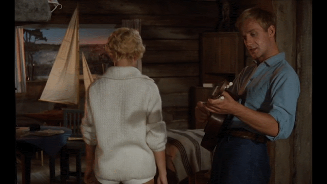
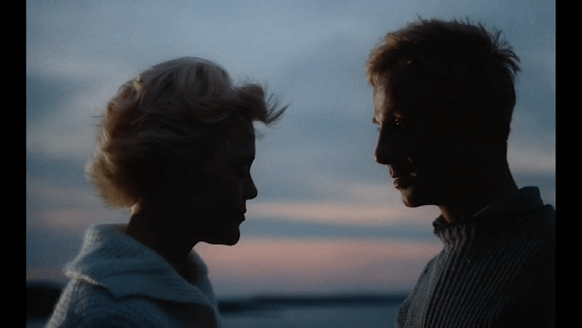
"February Film Favourites" Day 27/28

#February Film Favourites#Änglar finns dom?#Jarl Kulle#Christina Schollin#Isa Quensel#Sigge Fürst#Gunnar Sjöberg#Lars-Magnus Lindgren#1960s cinema#1960s films#Swedish film#Swedish cinema#film recommendations#fave films#film GIFs#motionpicturelover's gifs
1 note
·
View note
Last Seen Blogs
queenstory18
About Me & Family

koitonic
maidfrills
bucknastyprod
BuckNastyProd.

babybunnyju
just... smaller.
sangbleu
S A N G . B L E U