#I'm no expert with typography
Text
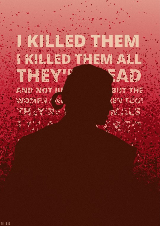
» I killed them. I killed them all.
colour palette challenge · #21 blood moon → requested by anon · hope you like it!
#tuserosie#userobihoe#anakin skywalker#star wars#starwarsedit#swedit#prequels#prequeledit#my edit#colour palette challenge#anon#edit request#alright this was a challenge#I'm no expert with typography#but i tried
168 notes
·
View notes
Note
hi! again. 😊 Please excuse my bad explanation; I'm new to PS and still learning what things are called. My question was about how you manage to combine pngs images with gifs in such a cool way. As seen in this beautiful HOTD edit, for example. /post/698703305504882688/i-should-not-be-left-to-my-own-devices-anti-hero It would be awesome if you have time to explain how you do this for all of us newbies, but if not, I am thankful that you took the time to answer my ask. Best wishes. 😊
— hii no omg thanku for being so nice with your ask </333333 and i'm more than happy to share how i did it (that set was so long ago 😭 i don't have my hotd files rn but i'll just make do with an example)
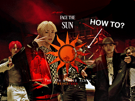
this effect technically can be very simple to-do and all you need is a base background and a png to go on top! but if you want to recreate that effect exactly as it was in this set then prior to the png you need:
— two gifs, ready and coloured + blended together
— a transparent png with a clean outline
— basic knowledge of overlays (but really it's more of a learn-as-you-go thing so its fine 😭)
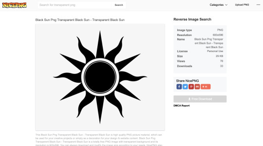
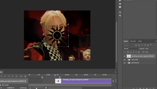
#1 — so first i wanted to find the png i was going to use. just search up ____ (whatever you're looking for) png transparent online and you should be able to find heaps of good, and free to use options! my go to site is nicepng but there are sooo many places you can look!!
what's important to remember is that for a cleaner result, you want to find a png with smooth outlines - aka nothing that is really rough or jagged in its edges.
so i chose this sun png and it has plenty of black space in it (as this will play a key role in how the colour shows through the png later) but it isn't a solid block of black either!
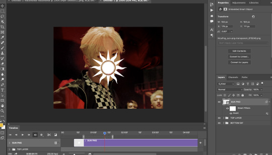
#2 — so i have my two gifs ready, coloured and blended with each other. remember that the gif choice underneath will also affect how the png's colours show through [whether the gif has a lot of pure white/black can really change the effect!]
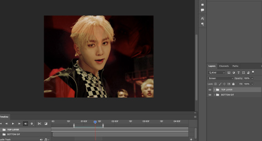
#3 — so now i've just inserted the png onto the gif and you can position it anywhere you want on the canvas!
#4 — i'm not sure on the technicalities on why you need to do this (😭) but the png typically is black right, but you want to make it white so make sure to invert the png so it shows up white!! you can invert through adjustments or by pressing command + i or ctrl + i to do this!
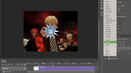
#5 — now go to the blending mode of the png and set it to EXCLUSION. i think you can set it to difference as well but i'm no expert in that and i think they give the same result. your white png should turn sort of blue-ish translucent!! now we're ready to add colour <3
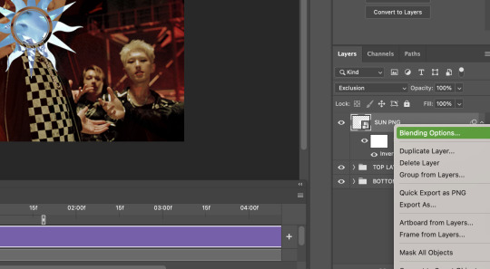
#6 — now right click/double click etc on the png and go to blending options here!
#7 — this is an optional step but if you want the outline of your png to appear a little more against the gif (say as the majority of the background in mine is mostly dark) then you can add a shadow to your liking! these are just my typical settings nowadays :D
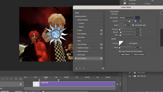
#8 — head over to gradient overlay and choose a colour gradient that you would like! there are heaps of easy presets that i often default to (like plenty of blue/green/purple options) <3 and make SURE you set the blend mode of the gradient overlay to EITHER:
— multiply (shows up pretty dark which can be useful at times!)
— hard light (which shows up pretty bright, i'm going to use that in this gif because bright is what i need!)
— colour (shows up more light/white and works well on lighter backgrounds imo)

#9 — finish up by adding your typography however you would like! i added the same gradient effect to 'SEVENTEEN' at the bottom of the text for a little more pop of colour!
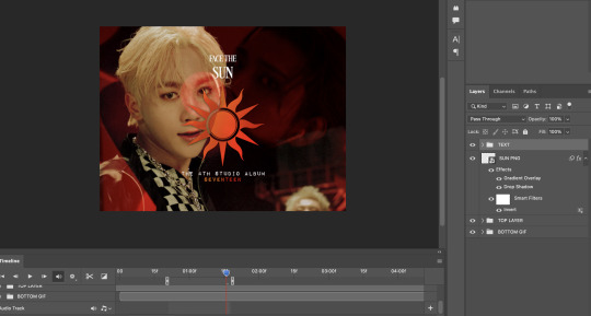
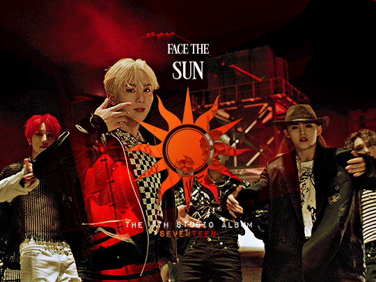
and there you have it!!! that's your finished gif (or at least the same principle behind the hotd/anti hero set!) and here's the finished result <3 i hope this helps!!
i've gone through these similar steps in this tutorial as well! i learnt this from this great tutorial by @anya-chalotra 🧡
#hope that helps :D thanku for being so kind!#ps help#anyway i hope people don't mind the tag 😭 so this doesnt flop#tuserose#isaishi#userfran#userjoanna#heavensyun#cheytermelon#annietrack#hanatonin#userngocchi#uservince#tuseral#userchoi#answered#shuaria
104 notes
·
View notes
Text
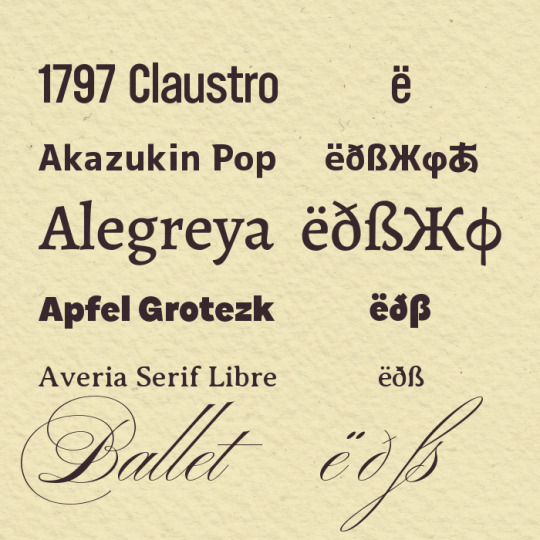

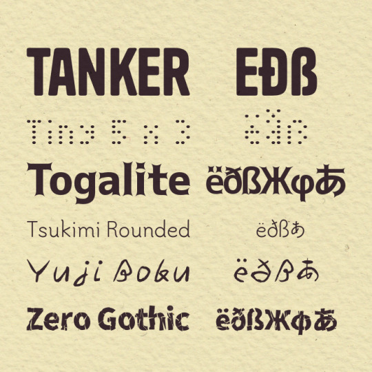
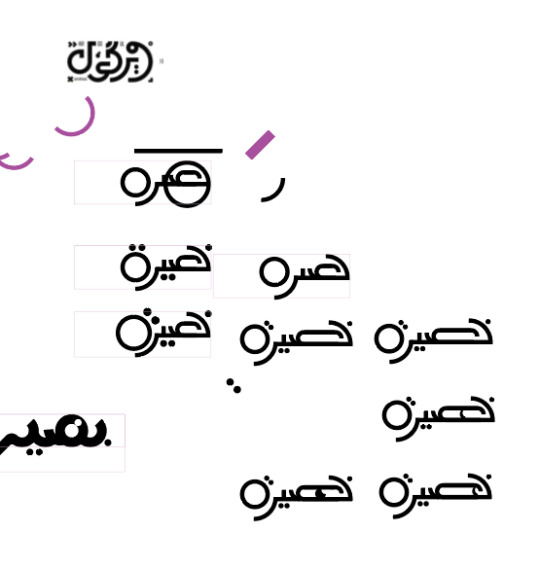
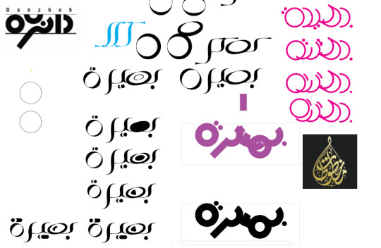
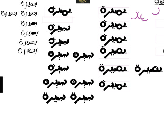
Manually checking the glyphs every single time is a pain in the ass, so I made this list as a reference for myself of what different fonts could do and whether they include the characters I use most often. Posting it here in case someone else finds it useful. ¯\_(ツ)_/¯
This isn't intended to be, like, an exhaustive masterlist, just my personal preferences. Also disclaimer that (1) I'm not a typography expert and (2) I was eyeballing the languages supported by my computer, so if I got something wrong re: character sets, my bad.
Links/details below. It's nice to tip the designers if you can. Many of these are open-source, but not all. Check the licence!
"Extended Latin" = Seems to support Icelandic, Czech, Hungarian... anything I was scanning for.
1797 Claustro: Basic diacritics.
Akazukin Pop: Japanese + extended Latin inc. ə and ß + Cyrillic + Greek.
Note: Download requires a Pixiv account.
Alegreya: Extended Latin inc. ə and ß + Cyrillic + Greek.
Apfel Grotezk: Extended Latin inc. ə and ß.
Averia Serif Libre: Many diacritics + Icelandic letters + ß.
Ballet: Extended Latin inc. ə and ß + Greek math symbols.
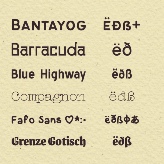
Bantayog: Many diacritics + Icelandic letters + ß. Has a Baybayin script version, but as a separate typeface.
Note: PWYC.
Barracuda: Basic diacritics + Icelandic letters.
Note: Download doesn't come with a licence, I'd contact the designer if you're planning to use it for something $$.
Blue Highway: Extended Latin inc. ß + Greek math symbols.
Compagnon: Many diacritics + Icelandic letters + ß.
Fafo Sans: (Flashing gif at link.) Extended Latin inc. ß + Japanese (minimal kanji) + Greek math symbols.
Grenze Gotisch: Extended Latin inc. ə and ß + Greek math symbols.
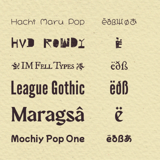
Hachi Maru Pop: Japanese + many Latin diacritics + Icelandic letters + ə, and ß + Cyrillic + Greek.
HVD Rowdy: Many diacritics, renders ß but as a single character that looks like ss.
IM Fell Types: Extended Latin inc. ß + μ.
Note: Flowers, which are not on Google Fonts. How to use these.
League Gothic: Extended Latin inc. ß.
Maragsâ: Many diacritics + ə.
Note: PWYC.
Mochiy Pop One: Japanese + many Latin diacritics + Icelandic letters + ß.
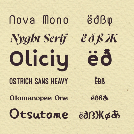
Nova Mono: Extended Latin inc. ß.
Nyght Serif: Cyrillic + extended Latin inc. ə and ß.
Oliciy: Many diacritics + Icelandic letters.
Ostrich Sans: Most extended Latin inc. ß (Heavy and Medium weights only, and missing a couple like Hungarian őű).
Otomanopee One: Japanese (only basic kanji) + extended Latin inc. ß + Greek math symbols.
Otsutome: Japanese + many Latin diacritics + Icelandic letters + ß + Cyrillic + Greek.
Piron TW: Cyrillic and extended Latin inc. ß. Also μ.
Pretendard: Robust multilingual support; extended Latin + Cyrillic + Greek + most IPA symbols. Also has Korean and Japanese but as separate font packs.
Railway: Most extended Latin + ß (though missing a couple like Icelandic ðÐ).
Reggae One: Japanese + extended Latin inc. ß + Cyrillic + Greek.
Shantell Sans: Extended Latin inc. ə and ß, Cyrillic + Greek math symbols.
Sinistre: Extended Latin inc. ß + Cyrillic.
Tanker: Extended Latin inc. ß + Greek math symbols.
Tiny 5 x 3: Extended Latin inc. ß.
Togalite: Japanese + extended Latin inc. most IPA symbols + Cyrillic + Greek.
Tsukimi Rounded: Japanese + many Latin diacritics + Icelandic letters + ß.
Yuji Boku: Japanese + most extended Latin inc. ß (though missing a couple characters like Czech Ůů).
Zero Gothic: Japanese + many Latin diacritics (some don't display correctly on my computer, but that might be on my end) + Icelandic letters + ß + Cyrillic + Greek.
Note: Download requires a Pixiv account.
15 notes
·
View notes
Text
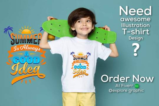
#need an #Awesome T-shirt design?
Yah! I'm here to help you with your project. Let's Order from me at Fiverr 😊
https://www.fiverr.com/share/4YxrAR
I'm a professional graphics designer, who has an expert in T-shirt design.
My portfolio: https://www.behance.net/abdulhasib501
In my portfolio, you can find examples of my best work. It should give you a good idea of my skills and abilities.
Thank You!
explore graphic
#tshirts #tshirtdesigner #tshirtdesign #tshirtprinting #tshirtstyle #unique #designersarees #graphicdesigner #tshirtlove #tshirtstore #bitcoinmining #thankyou #graphics #bitcoin
#bitcoinnews #cryptocurrencies #cryptocurrency #tshirtlife #tshirts #tshirtdesign #tshirts #typography #typographydesign #Typographytshirt #design #branding #Fiverr #help #business
#design #help #designerwear #work #projector #project #freelancer #communication #Bangladesh #seo
3 notes
·
View notes
Note
Hi Erika! Congratulations on 1.5k followers! You deserve them all! I absolutely love your edits, you are so talented, and I am HONORED that we are mutuals!! Can I please request 💐 + Aragorn + blue and green! and if its okay, 💌 + x ! :) thank you!
hii auden!! thank you soso much, you're so sweet <33
here's the edit! i absolutely LOVED creating it, i love lotr and aragorn so much <3 i really hope you like it and thank you for participating!
you have so many amazing creations and rating them was hard but i managed to find my top 5!! :')
5. this 1989 album redesign
the vibes are so nice wow!! i'm obsessed with the typography, i really love the font and all the fun drop shadows you used, so creative! this is so colorful and just beautiful aaahh i love <3
4. this wanda + faceless set
i don't really go here but i loove these shots and this set looks stunning!! your gifs are always so crisp and the coloring is really cohesive and pretty.
3. this taylor swift set
omgg this is so so cute!! <3 the hearts are such a nice touch and fit this set super well! the coloring in this is stunning and all the colors flow together nicely. just so pretty!
2. this "meet me at midnight" taylor swift set
this is just so lovely!! the sparkles look pretty and are fun to just look at. the flower graphics you used are also gorgeous and fit the vibes so well. i also love the another set equally as much!! <3
1. this lover album redesign
THE COLORS! are insanely pretty!! and so soft and calming i'm in love. and even though i'm not really a ts expert i feel like the vibe fits the album SUPER well!! i just can't stop staring at this. i'm truly obsessed <3
3 notes
·
View notes
Note
What's the worst typography you've ever seen? Like, something that just grinds your gears to dust? Alternatively, free reign to brag about any cute typography tricks you've done. Like, for example, my website logo does fake smallcaps by bolding the larger cap just enough that the nearby serifs match in size, so it looks like it's meant to be.
I like typography, but I'm not all that much of an expert or anything. Most of what gets me upset is the really egregiously unreadable stuff like this restaurant I used to visit where they typeset their entire menu in Papyrus, making it unnecessarily hard to read. Though I suppose I've also been known to pitch a fit when an app updates with a new bespoke typeface that has an incomplete set of ligatures so, like...they might have a ligature for ff but not ffi, and then when you have a sentence with a phrase that would use both—like "caffeine affinity"—it looks like it has weird, inconsistent kerning.
I also haven't done graphic design stuff in like 15 years since I worked part time for a book publisher. I was never particularly good at it either. I just had the advantage of technical proficiency with the Adobe creative suite and above-average ability to distinguish colors and fonts.
0 notes
Text
(ARTS246) Ch. 10: Typographic Design Education & Project #3 Progress
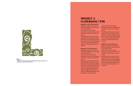
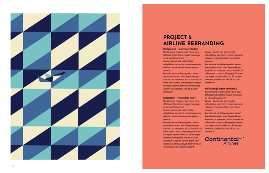
I spent this week working on the process book for project #3, which is due on Wednesday, April 3rd. The upcoming deadline has been causing me stress because my previous process book had a more flexible and longer timeframe for the deadline. Nonetheless, I am determined to tackle this challenge.
I spent most of Monday getting acquainted with the website and software that we'll be using for our process books. The website is called Blurb, which offers an extension in the InDesign software to design books using their templates. These templates need to be customized before creating the design file. It's important to note that the front and back cover are separate from the actual pages of the book and the files need to be combined before finalizing and submitting them for printing and shipping. The printing process takes about two weeks, which is why the turnaround time for this project is shorter compared to the previous two projects. Although I'm not an expert in using Blurb, I'm excited to experiment with the service more and potentially use it to print my other portfolios in the future.
The process book's layout has been a challenge for me, mainly due to the grid and margins. Although the margins are pre-set from the Blurb template, I found them to be too small for my liking on the spreads. To fix this, I took inspiration from my old process book from ARTS102 (Introduction to Design Technology and Concepts) and incorporated a similar margin and grid into my new process book. Initially, I felt strange using my old process book's layout and ideas, but I also thought, "If it ain't broke, don't fix it!" This was particularly true for this project, as I loved the balance and harmony of my original layout. I aim to achieve that same look and feel with my new process book while showcasing my detailed process and the improvements I have made from each project.
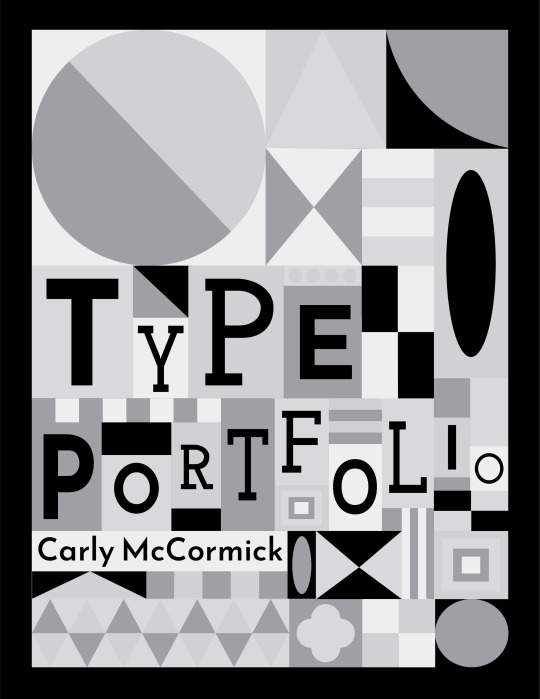
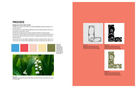
The cover design of the process book draws inspiration from the traditional analog movable type process, where typography uses a movable component, such as metal or wood letters and ink, to reproduce the elements of a document on different types of paper. The design is also influenced by the artwork of Brad Vetter, a designer and letterpress artist who visited and spoke at the University of South Carolina. His work inspired me, and I wanted to emulate his style in digital art form. I took inspiration from my mood board, my traditional style of geometric surface design, and the multiple typefaces used throughout this process book, such as Cabin Bold, Josefin sans, and Josefin slab. My main concern was that the cover might feel too crowded and confusing, making the text difficult to read. However, after receiving feedback from my professor and peers, I realized that the color palette is balanced, the title is easy to read, and the visual hierarchy is well-balanced. The only suggestion I received was to change the colors of the large circle in the top left corner of the cover, as that element slightly threw off my visual hierarchy.
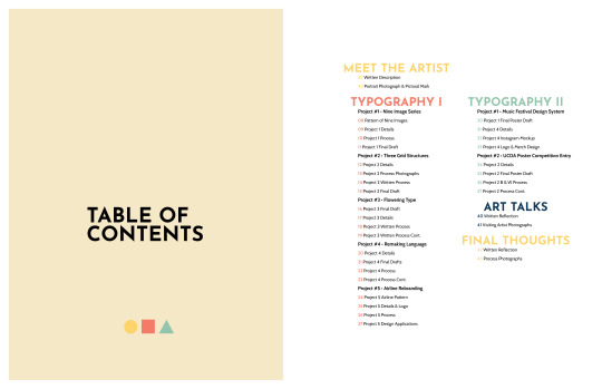
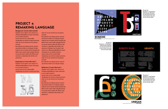
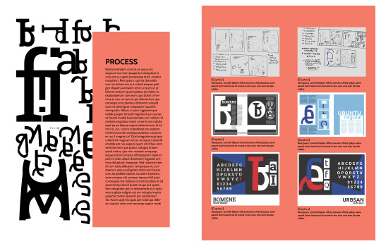
My process book follows the theme of my cover art, but I've decided to make the geometric shapes less prominent. Instead, I want to highlight each project and its process on the pages. I aim to let the typeface be the main focus and make each project stand out to catch the audience's eye. To make some pages look better, I may add subtle geometric shapes to fill in empty spaces or where some pages look too wordy. I also need to work on the visual hierarchy of some spreads, as some elements feel like they are competing. Overall, I have made a good start with my process book for Typography I and II. I plan to improve it before submitting it for the final class critique and printing.
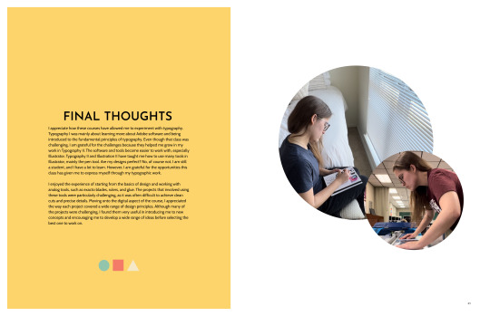
The reading for this week discusses the importance of conducting in-depth studies of common typographic design issues and how professional designers can develop creative solutions by applying all the skills learned throughout the textbook. This includes integrating type and image on posters, establishing a visual system to unify various materials, experimenting with content in publication design, thinking about typography in terms of time and motion, creating dimensional and environmental typography, analyzing and visualizing data, and developing a unique visual language for everyday events. This chapter combines all the concepts learned in this book, summarizing why educating oneself on typographic principles is crucial. Having taken Typography I and II courses, my views of typography have entirely changed. Previously, I paid little attention to the use of type, the visual hierarchy of typography, or even the fonts used in various works. Now, I pay attention to these elements even more, and I have a greater appreciation for typography than ever before. I understand that many decisions go into creating something related to typography, whether it's a book cover, magazine spread, poster, social media post, etc. I am grateful for these courses, even if they were challenging because they helped me become a better graphic designer. I have come to see type as an art form, not just words on a page.
0 notes
Text
Monday 29/1
The plan was:
Before
-Research and make sketches for the logo.
In class
-Choice of colors
-Digitize the logo and create many options.
-Choose typography.
What actually happened is:
Before
-Research and make sketches for the logo.
In class
-Choice of colors
-Logo development
-Initial digitizing
Thursday 1/2
The plan was:
Identity
Before
-Identity and logo development.
The video
In class
-Search for content
-Writing script and content
After
What actually happened is:
Identity
Before
-Digitize the logo and create many options.
-Choice of colors
In class.
-logo development.
Welcome
Much has changed in the plan. I decided to delete the video because it did not support my idea well and because it would take too much time. I decided to focus on the main sections: the Fabric Recognition Test section and the Painting Recognition Test section. I expected to finish Monday's tasks in time, but that did not happen. Everything needs its own time. I'm almost done with the initial look of the logo. I will start, In Shaa Allah, next week with the basic sections. I will also communicate with experts soon In Shaa Allah.


0 notes
Note
hiiiiiii, how do you start an editing proyect? like what inspires you, what do you usually start with, what are your favourite techniques to use? love your edits
Hi love!!!! Thank you so much :D You are so sweet!
Most times I start with a couple of pictures I saw that I really like if it's a one image edit (like this seb one) or a poem/quotes/song that I love if it's like this seb web-weave or like my oscarmax post. I start editing the whole thing and then add the typography. I usually keep editing after I add the writing, but it's just finishing touches and stuff. I like vibrant colors and I also like dramatic shadows. I love big contrasts!
Sadly, I'm not an expert, barely an amateur stumbling through using Photoshop but if you are interested in editing my biggest tip is start doing it! Experiment with the tools and the pictures, have fun! Also there are hundreds of tutorials on youtube and here on tumblr that are really cool and in depth!
Have a good day love! <3
0 notes
Text
feedback form midpoint presentation
remember I don't have to be solving an issue- i can be telling a narrative
does the shape of braille have to be round? could i experiment with this? think about it in relation to how we can play around with the rules of typography and how we can have different types of letter forms/angular/rounded/sans serif/serif
how can braille fit into trends/make it accessible to trends
define a target audience: who is this project for?/what do they want to get out of it?
look at monospace typefaces because they are designed square and follow a grid similar to braille
explore 3D designed braille and adding textures to the braille, like fur or other materials
do visually impaired/blind people write
speak to experts in braille and visually impaired
speak to people who know how to read written word and braille
explore the reduced use of ligatures in relation to people hating on sans serif typefaces and why people are converting to using them even though it is taking personality out of brands
I need to decide on what I'm trying to say with this project:
create a community for people who know both braille and written english because they don't feel like part of a community
to find trends accessible to the visually impaired
a hybrid for people transitioning between written english and braille
0 notes
Text

341 days until submission
went to a lecture celebrating the anniversary of an academic journal.
it's great to hear stories of The Great and Fertile Conversations that Learned Professors were having 10 years ago. fantastic tidbits about masthead design and typography. but did we come for this lecture for anecdotes? Or rather to gain a sense of direction of critical inquiry amidst the current crises?
Guess I'm gonna die on this hill but my bottom line is : if you wield a position of power as an academic "expert" in a field that's so closely intertwined with power (l*w) you owe certain responsibilities to various constituencies on this funny little planet of ours. Shamefully, most people don't even want to reflect on how to find these constituencies.
anyway, four dollars a pound
0 notes
Text
Hire the Best Logo Designers । Logo Design । Brand Identity Design
Check out the Logo designer profile with the skills you need for your next job.
Graphics Designer | Motion Expert | Character Animation Designer
Hello! I'm Shamsul Arefin Shaon with over 𝟖+ 𝐲𝐞𝐚𝐫𝐬 𝐨𝐟 𝐞𝐱𝐩𝐞𝐫𝐢𝐞𝐧𝐜𝐞 in 𝐁𝐫𝐨𝐜𝐡𝐮𝐫𝐞, 𝐆𝐫𝐚𝐩𝐡𝐢𝐜𝐬 and 𝐌𝐨𝐭𝐢𝐨𝐧 𝐃𝐞𝐬𝐢𝐠𝐧. Since 2015, I have designed 𝟐𝟎𝟎+ 𝐩𝐫𝐨𝐣𝐞𝐜𝐭𝐬 for 𝟑𝟎𝟎 𝐜𝐥𝐢𝐞𝐧𝐭𝐬 across various platforms. I approach work with zeal and seriousness, ensuring customer satisfaction.
In my career, I've mastered dynamic skills in crafting captivating animations for ads, logos, and promotions. I specialize in engaging animated infographics, display ads, and seamless UI animations. My designs are modern, minimalistic, and strategically interactive, maintaining your brand's identity across brochures, profiles, and catalogs.
I have excellent proficiency with a variety of essential design tools, including-
🔹Adobe Photoshop (photo/image editing)
🔹Adobe After Effects (Motion Graphics)
🔹Adobe Premiere Pro (video editing)
🔹Adobe Illustrator (vector graphics)
🔹Adobe InDesign. (publication layout)
🔹Adobe XD (UI/UX)
Let's bring your ideas to life!
I can assist you with the following tasks:
✦ Brand/Visual Identity Design - Logo Design, Brand Positioning, Brand Guidelines, and Print marketing materials.
✦ Product and Packaging Design
✦ Brochure & Flyer Design,
✦ Typography, Calligraphy
✦ Infographics
✦ Stationery - Business Card, Letterhead, Envelop, Invoice, Folder, etc.
✦ Digital marketing materials - Ads, Banner, Mug/Pen, T-Shirts, Menus.
☛You can reach me via message if your project is not listed - I usually respond within an hour. I would be pleased to build a healthy and long-term business relationship with you.
Our commitment to you doesn't end after the sale:
✅ Unlimited Revisions, Quick Turnaround (sometimes just a few hours!)
✅ Best Price, Ensuring 100% Satisfaction
✅ Video and Voice Call Assistance before Contract
Every project begins with a clear roadmap and meaningful conversations for a strong start. Your needs matter – let's have a chat!
I look forward to bringing your vision to life.
#design#art#logo design#logotype#graphic design#business logo#creative logo#brandidentity#logo#graphic designer#business#illustration#upwork
1 note
·
View note
Text
Some Examples of Excellent Typography (and, in general, design) - or S.E.E.T, if you will.
youtube
Look. At. That. Typeface.
Now look here.
youtube
I haven't seen the first video, but this second one, I highly recommend.
But the point is - their motion graphics and design is SOOO GOOD.
The info they show, thus, is eyecatching and clear.
They've made some signatures that you see and you can tell - Oh, that's from Vox.
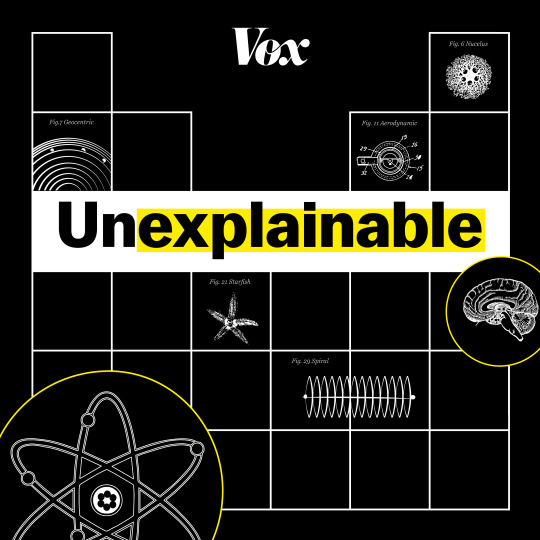
Like you can tell, from the yellow highlight and the typeface.
Sprite's new redesign
Look, I'm no design expert. I don't think sodas need more rep and advertisement than they already have. All I know, is that when I see this, I feel thirsty and like I could use a splash of cool lime-ey bubble-ey water on me.

Sigh, maybe it's just that summer has started, lmao
IKEA!!!!!!
The Sweden-fangirl in you must by screaming by now.
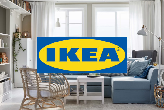
Their. Website. Oh, my I could spend days and months on it. It might be my favorite website ever.
Here's more of their typography though.

I don't know what it is about their design, but it makes you wish you lived a life only with IKEA things.
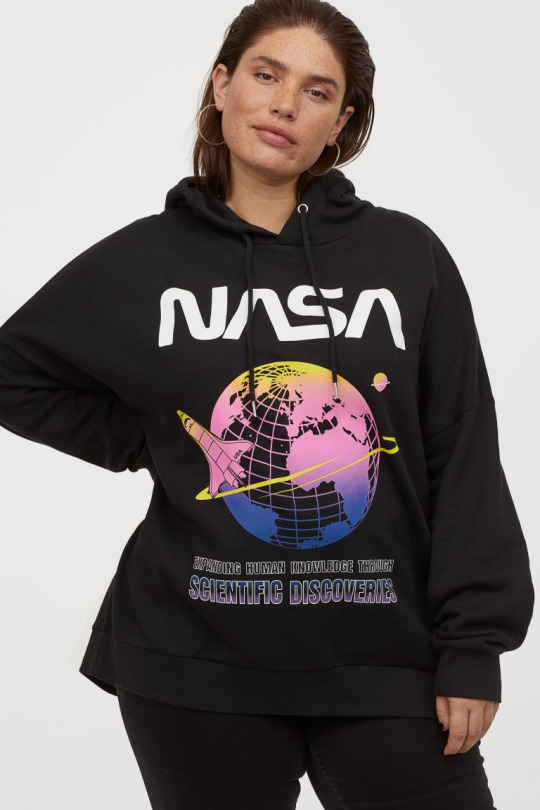
The old curvy NASA logo

Oh my, it looks so pretty and futuristic and sciencey AHHH!!!
It's so good, there's, like, basically merch in clothing stores, not even NASA's stores.

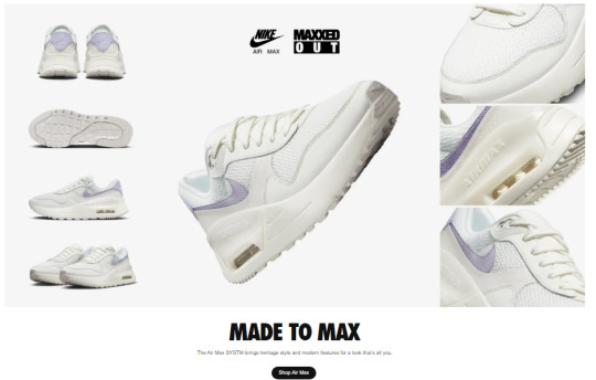
And, of course, Nike
The boxy-ish look of the type font works so well with the logo!!

Firefox
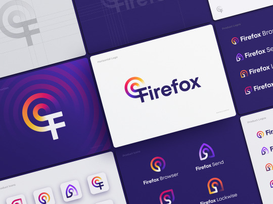
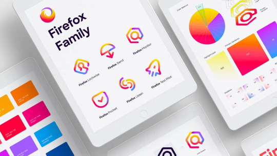
Very bold. Very pretty. Almost Kurzgesagt-ey?
What do you think?
RYL!
0 notes
Text
My Final Project
Week 04 | 29 Dec. 21
This week Plan
The Plan this week was about starting the content, prepare a mood board, and starting the wireframes
What is done this week
Develop a mood board
Start writing the content
The results
I have prepare a mood board that contains the typography and the illustrations style that I will follow and the colors and I start choosing the visuals that I will use and matches the identity. however because of work pressure and other projects this week, I could not start on Wireframes, but I will try to start before the beginning of next week. Also I will meet the expert tonight.
My reflection
The beginning of writing content will shorten the time for me in the coming weeks. However, it was important to clarify what I want to reflect in the identity through the mood board, and this will facilitate the design process in general. I'm also beginning to envision the visuals that I'll be designing in the coming weeks, I've also thought of some possible names for the project, and I'm going to start experimenting with the logo. As for Wireframes, because I did not have time to start with them this week, but I think I need to start with the visuals before them, so I will make a slight modification in the workflow plan in this regard. In the next stage, I will meet with the expert so that I can develop my project further and confirm the next steps before starting it.

0 notes
Note
Ooh me next!! How do you slay so much with your typography?? That legit looks like sorcery to me, what's the process for that like?
oh man learning this stuff was haaaard. i'm still not an expert! i did take a class specifically geared towards it though, so i'll pass on some of the exercises we did and tips i learned, but i am by no means an experienced hand letterer lol
-oh first off, and this is funny, people get mad when you mix up typography with calligraphy with hand lettering. SO, just to be clear: typography uses premade fonts, where the letters are all already created, and lays them out in a pleasing way. (you can modify those fonts and all, but the point is that a whole "alphabet" already exists, sort of.) calligraphy is Fancy Handwriting, for the most part-- typically like, you have one go at it. (i think it overlaps with hand lettering a bit.) hand lettering is like illustrating using letters. you draw or render each individual letter to fit in the space it's meant for, whether that be a logo or an inspirational quote or what. a "font" of it doesn't really exist; it exists only within its specific context.
- one of our semester-long exercises was to fill a sketchbook with different styles of lettering. each page was 1 letter, and you had to draw it in as many different styles as possible. this exposed me to a lot of different techniques for lettering; i crawled through pinterest for vintage package design, i looked at obscure decorative fonts, i took special notice of book covers and logos i saw out in public. start NOTICING lettering. is it serif or sans serif? are the crossbars high, low, in the middle? do you LIKE the lettering or does it feel off to you? what would you change? do the letters feel too close together, or correctly spaced?
- learn the parts of letters! counters, terminals, crossbars, et cetera. this helps you give an actual structure to start noticing it out in the world. you can start thinking, "oh, fonts with very high/low crossbars evoke a 1920s aesthetic," for example
- study old lettering and try out the tools used to create those letters. we started with roman caps and a chisel marker. there are tutorials that will show you the exact angles and shapes involved. print out sheets that include guidelines. trace them, get the angles right, try them without tracing.
- we also tried blackletter with a chisel pen. again, there are tutorials online and templates to trace. trace them, notice patterns, notice how to hold your wrist. look up old drop caps for inspiration on how to decorate your letters, especially for blackletter. (blackletter is muuuch better as a title font-- how come? can you think about readability? what makes a font easier to read quicker, and what makes a font more impressive for a title?)
- kerning! read up about kerning. this is the space between letters, and many people have explained it much better than me. your computer's automatic kerning is sometimes a mess; the space needed between letters changes completely depending on the shapes of the letters, and it requires practice. here's a game that helps you build an intuition for it: https://type.method.ac
- next we did copperplate with a brush pen, and later a dip pen. copperplate is a style of cursive and one of my favorites to do. the main point of copperplate is to 1. keep a consistent angle, around 15 degrees, and 2. let your tool get thinner as you go up, and thicker as you go down. if you didn't learn cursive in school-- time to learn! learning the basics and traditional lettering helps inform when you make more modern or unique lettering choices.
- (on that note-- when looking up lettering resources be careful, because a lot is the... pinterest etsy mom style super bouncy cursive. that's not inherently bad, but it comes with it, for some reason, a lot of people offering guides/courses/tutorials in it that don't take into account really important parts of lettering like readability, kerning, et cetera)
- READABILITY IS ALWAYS THE MOST IMPORTANT THING! squint at your work. if it becomes super hard to read or you start mixing up letters for other letters, consider changing them or making them more clear.
- look up and follow lettering artists!! my favorite is carmi grau, but for your sake, here's a full list that my professor provided of ones she likes:
- seb lester; jessica hische; dana tanamachi; michael deforge; stefan kunz; tara leigh johnston; martina flor; mike perry; jill dehaan; andrea pippins; jon contino; tobias saul; ian barnard; marykate mcdevitt; joshua noom; becca clason; jen mussari; gemma o'brien; lauren hom; ian jepson
- also my professor's name is lisa perrin and she's a super good hand letterer so check out her stuff!
- anyway. once you have some basics down, you can start studying decoration; how do people decorate their letters? how do they do flourishes? how do they incorporate it into their illustration? how do they decorate the insides of letters?
- studying cursive styles is very good for learning flourishes, the loopy, dramatic, flowery lines people use, especially to, for example, cross their Ts or finish off the bottoms of their Ys. they're usually oval-based and can be a bit hard to get the hang of so practice a lot!
- meanwhile i think western/circus style lettering is good for looking at how people decorate the insides of letters! drop caps also do a good job of this
- USE GUIDELINES! USE GUIDELINES! USE GUIDELINES! if you see a piece of hand lettering art you like, THINK about what shapes they would've used underneath it to guide their letters, almost like how a sketch guides drawn artwork. does their text fit into an arc? does it fit into a circle, or a wave? trace over some hand lettering art you like to draw those guidelines over top. make guidelines of your own to test out different compositions for lettering
- finally, look at TONS of different styles. look at 20s, look at 30s, look at 80s, all different eras. look at how posters have historically used lettering. look at graphic design lettering rather than just hand lettering. look at what ancient monks wrote by hand and look at wine logos and look at arabic calligraphy and look at chinese calligraphy and look at typography geared towards kids looks like. what makes a font feel more "scary"? what makes a font feel more "friendly"? what about "modern," "refined," "rough," "sweet," "dangerous"? does a font appear in your head when you read those words? how can you be playful with your lettering, instead of just doing what you think you should do? or how can you incorporate your own style into it?
anyway i learned a lot in that class :) this isn't really direct tips so much as a crash course on what exercises helped me but hopefully it'll do something for you!
58 notes
·
View notes
Note
LOL. 🦈 anon and I interacting with each other through your blog. I don't think I have any questions about typography because I'm not in that field anymore. I'm content with leaving graphic designing to other people. :D
Yeah UX design and graphic design are different! And then you have some of my college classmates who were good at both. Afjkjgsggk.
To answer your question Remy, I loved my internships! For one job, I ended up returning a second time and my mentor actually put me in charge of designing a portion of the website/app. But one the challenging parts of the job was having to explain why I chose to create things a certain way during design reviews with different groups of people. Like there were 1) the UX experts that oversaw the designs for the whole company, 2) my business analyst who told me what the website/app is supposed to do, and 3) the programmers who made sure my design is actually feasible.
I worked the most with my business analyst and he wasn't rude but he was kind of intimidating. Getting any kind of critique is hard but it's needed. I imagine that if I continued in this career, I would've gained more confidence and reputation. I mean, I only had like four months of experience with them when I came back a second time. lol.
My mentor also critiqued me on how to improve with general people/ business skills. Like help? 😂 Getting (constructive) criticism everywhere. But she saw my potential and kind of wanted me back a third time. lol.
Working with the programmers was the easiest because I had some programming experience back then. In a sense, I was the one of the people telling them what to do. Which was kind of amusing as the intern. lol.
So I miss that job but I also don't. lollll. I loved designing but too much interaction with people for introverted me. But I know that with more practice, I could get used to it if I wanted to.
For now, my creative outlet is writing fanfiction. LOL.
Remy, you shouldn't have told me not to hold back. This is long! Like... Can I do read more in asks?
ugh mimi ur so right though critique can be hard to receive if it isn't delivered properly ugh
what kind of programming did u do like was it specific or did u dabble in several areas? i was learning python for a bit but it didn't fit with anything i was trying to accomplish so i had to drop it and it was like honestly ... kinda hard but i think if i gave it some more effort i could try to self teach???
IDK ..... IDK I'M NOT PROFICIENT IN THESE THINGS LIKE FOR A REASON IG
i'm glad u get to use that creativity elsewhere though, and for something that's kinda stress free!! i feel like applying stuff like that to something u enjoy is very cool and a very neat way of thinking about .... everything if that makes sense. idk like personally i think i wouldn't be able to take what i'm doing now and apply it to other aspects of my life so i think it's very admirable that u can if that makes sense ....
#HAHAH I WISH THERE WAS A READ MORE I'D BE RAMBLING IN SO MANY ASKS#omg mimi im serious free reign#even though it took me 5ever to respond imfdnjkfhd#mimi !#remy cooks
2 notes
·
View notes
Last Seen Blogs

tenaciousheartnacho
Untitled

majoliish
certified puppy
whydoilaughsoloud
brown chicken brown cow

betatansa
Betatan

mandalikah
Untitled