#WHATEVER. I WILL KEEP YOU GUYS POSTED <3
Text
a post about fic updates! so the fics im currently juggling are dog teeth, tams, and of course, taob. my original plan was to start posting the second installment of the dog teeth series by sometime in april, bc it's the fic im most into atm and i already have the first chapter done, i just want to bank another one or two because once i start posting it i want to KEEP posting it with regular updates, hopefully every 2 weeks like with kaiein. HOWEVER this will put my atla fics on a back burner. april is a good writing time for me (PLEASE PLEASE PLEASE PLEASE) bc i have the entire month off from uni to prep for may exam season, and i always want to write when im procrastinating my degree. which is. it's own thing im sure i'll graduate it's fine i'm fine. so if i focus on dog teeth, neither tams nor taob will get focus until like. june. which is par for the course with taob but im NOT happy about doing with tams.
SO my thought process was i can either be normal about this and just accept it's literally my final year at uni and im trying to graduate and it doesn't matter if updates are slow on ANY fics, or i can do my usual and implement an insane deadline that i somehow always make by the skin of my teeth. can you guess what i went with?
and thus i present unto the crowd my tentative plan: have the next taob chapter done by middle of april (im aware this is quite hand-wavey but it gives me a month to work with, so in my head this means anything between april 10th-20th), have the next tams chapter done by the end of april, and dog teeth can follow.
#i know a lot of you are gonna swarm and tell me not to push myself/rush and i love and appreciate the fuck out of you#i PROMISE if it gets too much i will call it quits like im not about to jeopardise my final exam season for this lmao#but ultimately i do work better when i give myself these insane writing challenges and it gives me something fun to do#while im drowning in econ assignments#as for dog teeth being moved to the back burner despite it being my current passion project#im not actually too bothered by this bc i will still be working on it as i work on my atla fics#and it'll be good as a breather when those get up my arse PLUS has the added benefit of the second part of dog teeth#not actually being posted yet so technically no one's 'waiting' for anything. like kaiein exists perfectly fine as a standalone#whereas if i post ch1 of part 2 in april i then have to KEEP POSTING or it'll bug me#and then i'll have THREE updating fics to juggle#does any of this make sense. hello. tapping the security camera in my padded room is anyone there#WHATEVER. I WILL KEEP YOU GUYS POSTED <3#taob updates#tams#dog teeth
43 notes
·
View notes
Text
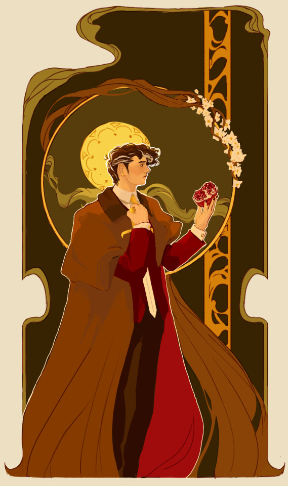
It's pomegranate season :)
A redraw of this piece from around a year ago
#hello guys...(:#i started school back in mid September! its hell#and my chronic pain is rly bad these days i can barely do anything#and my next break will be spent at the hospital#but love and light at least we're trucjing along and getting somewhere hopefully#this drawing isn't exactly the most finished the most effortful what have you but its all i can guve you#confession time: idk if i have it in me to keep drawing the guys#dont get me wrong still adore them. but i feel a little out of it#maybe this'll change the second i post this but whatever.#i had an amazing time being active in the fandom you guys are so sweet and you got me thru rough patches <3#I'll still be around just even more inactive#anyway i hope you enjoy this!!!#i feel like I've improves substantially which is good#fennec. art#cwilbur#dsmp fanart#my art#thx to everyone that's loved my art yall hold a special place in my heart#alright bye bye xoxo#ps esteemed mutuals and lovely audience never hesitate talking to me i am always around and i love ppl I'm just socially anxious
208 notes
·
View notes
Note
I'm surprised you haven't posted any Welcome home stuff recently! Honestly kinda makes me sad since I love your WH art and stuff
yea y'all are gonna have to be Patient w/ me bc
a) i have like. a week left to pack all of my stuff before i need to shove everything into a uhaul and leave, so its crunch time! leaving little to no energy/interest in anything else
b) to be honest my mental health is the worst its been in years - which is fine, its whatever, i can deal. it's not as bad as it could be and im handling it! like a champ, even! but also its leaving little to no energy/interest in anything else
c) had a minor crisis over my art and how i interact w/ WH, and i realized im not scribbling enough of what I want. ive mostly been trying to please people and do as asked and thats! not good! so i want to temper expectation & reassert that im Not a WH art blog - its just a hyperfixation / something i love rn. i draw what i enjoy & what i want in the moment.
#i picked up my tablet last night and all of my motivation died on the spot#so im just. eh whatever ill get back into the swing of things eventually#but yeah im spending my time packing & keeping myself afloat! not much room for other things at present!#rambles from the bog#but yeah i was starting to feel like a commodity of sorts?#like the majority of asks are just some form of 'can you draw this' 'draw this' 'id love it if youd draw this'#which is. fine. im an art blog! thats what i do!#but its also like hey. im just some guy doodling what they enjoy. im not a machine churning out content for consumption#& it gets to the point where there's so much expectation and obligation and 'demand'-#when do i ever sit down and truly indulge in what i want?#like the monster scribble i posted the other day! it made me so happy! i love monsters and Beasts!#when do i ever allow myself to draw them?#rarely bc i feel like people Expect puppets from me. and thats not a great feeling!#i love puppets i love wh and everything but i would like to enjoy it w/o pressure yk yk....#& for a second there i Was feeling the pressure and scribbling puppets was starting to feel like a chore#something i Needed to do to please people#so! im focusing on real life & taking a break from creation & keeping my mindset away from 'jump into traffic' thankyew <3#theres just too much going on right now#in my head And outside of it.#so ill stick to packing & binging psych & i'll lovingly place everything else on the backburner
111 notes
·
View notes
Text
oh hey this blog reached 500+ followers. when did it get that high. this was supposed to be a shhh little quiet side blog.
thanks guys for always listening to me talk almost exclusively about my characters <3
#500 isn't a lot compared to my other blogs but it's still a notable amount#my main blog has been sitting at 32k for like the better half of a year#my art blog has 15k and what is shocking SHOCKING to me#is that the hellp blog has 23k and it grows so much every day#more than my art blog. left unupdated for years now. how does it keep growing#i only keep it up mind you for archival purposes.#it's slammed on the last post. not doing this anymore guys!!!!!#and yet. im not joking it gains like 20+ followers a day it's just ridic#anyway. on any other blog such as this one. i always appreciate the follows :3#so thanks again for being interested in whatever i choose to ramble about on any given day guys teehee
32 notes
·
View notes
Text
actually you know what. my blog my posts i can post about whatever i want
#whatever i want in this case being good omens#like YOU DONT UNDERSTAND im having thoughts and feelings about these guys they keep me awake until 4am and im like fuck you#so sorry to everyone who doesnt care abotu it i actually first got interested in it bc some mutual started posting a LOT about it like nine#months ago bbut i didnt know where to watch it so i just said okay ill just pick up whatever i can from these posts on my dash and then -#talk abt it to my parents and my sister while wea re in the car and then like a month ago or so i saw it was in prime video and then it all#went downside from then#whar im trying to say is. im going to start goodomensposting a lot. im really excited bc a lots of things are happening like !!! im gonna -#send a message to muriel as soon as my sister is back home. okay ? idk if the number works on whatsapp but im ging to TRY#anyways thats all. if you read all of this i love yuou. also you should watch good omens now#if enough people watch season 2 theyll make season 3 as well :)
13 notes
·
View notes
Text

rereading a book i loved in high school to annotate a copy. remembering why it connected w me so much
#its the miseducation of cameron post btw#i read it literally 3 times in the space of 2mos almost back to back#i brought it on two trips- that was the year we went to austria and the year i went to national music camp#and like. yeah. yeah i guess that was why#smth abt that book just really cuts to the heart of what it was like for me growing up in the church#my church wasnt the wbc or anything ofc but like. they also werent/arent queer affirming and its hard to explain how it hurt me#bc everyone expects a story where someone sits me down and like. threatens to beat me if im gay or whatever#that didnt happen. its just that i figured out by osmosis from this environment that i was wrong and that i should be ashamed#and nobody ever challenged that assertion so it stuck for years afterwards#its like growing up in a house w mold in it youll never really know that its there until youre told but you know smth is hurting you#and by the time you realize what it is its gonna take fucking forever to remove#and thats how it is w cameron! she knows long before shes sent to the camp#i just keep coming back to how everyone who went to nationals w me came back talking abt this amazing spiritual experience they had#and how much it meant to them to be able to go#and all i was thinking was that i didnt make even 1 friend and everyone treated me like i was fucking diseased the entire time#the guys didnt want me around bc i was a girl and the girls didnt want me around bc i wasnt a girl to them#my roommate acted scared of me from day fucking one and i still dont really know why. wouldnt stay in the room w me#i would sit down somewhere in the common area and people physically turned away from me to have their own conversations#i think they knew. i wasnt out at camp ofc but im p sure they knew smth was up w me#levi.txt#idk. i dont have a Trauma to point to but i feel like calling the effects of what the church did to me religious trauma is appropriate#it fucked me up so so bad. i had to work through so much shit and im still not out of it#today im not ashamed of being queer but im still discovering new issues that living like that gave me all the time#ultimately. im ok rn dw just thinking a lot. its a great book im glad to reread it and really analyze it! its fun
5 notes
·
View notes
Text
actually you know what. i think it’d be soooo funny if delly did just start dating otter and kennedi. they’re both so normal and boring & kennedi. while hot. is normal and boring in the usual wag ways. the thought isn’t fully formed in my head but if all the hockey stan corners of the internet had to suddenly get interested in them it would be very fun. to me personally.
#zoe.txt#like idk y’all remember that post that was like#the first out nhler isn’t gonna be some young star everyone thirsts over. it’ll be a random fourth line grinder or something#delly simply Is that guy!!#i love both otter and delly but they are soooo boring in insane ways <3#i think they’d have a lovely weird normal throuple that non stars fans would struggle to fathom <3#barring throuple watch proving fruitful i also want them to keep dropping insane comments about delly being like a son to otter & his gf#i want two of our normal boring guys to keep being weird on main#ALSO this isn't me tinhatting lmao this is all jokes. whatever you get the vibe here i just know we're verging on Territory
10 notes
·
View notes
Text
This is awesome just remembered I get to write the frottage scene soon assuming I actually write more than 4 words this week.
#.txt#long tags sorryyyyy#fellas do you ever offer everything you can to a man in a silent beg for forgiveness and let yourself accept that seemingly the only part o#you he's willing to touch now that he knows what you are is your dick but whatever you'll take what you can get. and it's selfish too but#it's also all you can offer short of turning your life upside down for him which you refuse to do.#fellas.......... do you ever fight against yourself for weeks because you want and need to forgive someone but can't figure out how.#you ever get torn between someone you care about and nearly have forgiven but you keep getting caught on the fact it's such an unforgivable#slight in the first place. so you take all that he offers but you can't bring yourself to forgive him until he's in front of you with his#hair sticking to his forehead and his hand shaking where it's gripping your bicep.#and seeing him be so open and vulnerable when he really shouldn't with you and really never should have AT ALL with you. makes it finally#click & makes it possible to wrap your head around ''I love him. he cares about me. he did one of the worst things possible. I forgive him.#OR WHATEVER!!!!!!!!!!!!!!!!!!!!!!!!!!!!!!!!!!!!!!!!! don't quote me on ANY OF THIS I'm always fucking around with motivations and wants and#needs and desires to make shit work how I think is best for all I know this is all useless#I hate posting my writing ever even when it's just set-up stuff like <- all that. BUUUUUT also I need a copy of all that for tomorrow to#remember . what I'm thinking abt basically. SOOOOOOOO YOU GUYS GET TO SEE THIS :3 hope u like what goes thru my head constantly while I'm#stocking shelves. sorry for long vague tags and endless talking yet again just need it written down#*that he'll touch is your dick. I have no idea how that typo happened what happened there
1 note
·
View note
Text
I think I got the summary for Ember Warrior hashed out! Figured I'd post it here really quick to get a little feedback on it. I'm curious as to if it's interest-grabbing, and/or if there are any confusing sentences in there.
War has come for Rhimn. The unified feyrie courts strike back against the knights of the Irongardhe, casting the dark-winged shadow of Lady Death over Gadhi.
While Crislie wrestles with unexpected heritage and razes the frontlines of open warfare, her friends navigate the political intrigue of their Heraldry. As Meparik sets off on a diplomatic mission to convince the Ulluan Matrius to lend her aid, Navaeli parleys with the feyrie courts on behalf of General Morekai, hoping that he may hold the key to the cage of her Heraldry.
But allies may be more difficult to make than outright enemies. When Ullua is reluctant to make war with its neighbor, and the courtleaders and generals have agendas of their own, the situation might not be as straightforward as putting an ax through a foe . . .
And it’s far too easy for foes to pose as friends.
As the Ashen Army advances, the political imperatives of everyone’s roles threaten to devour them — but faltering could cost the lives and freedom of the fey of Rhimn.
#sometimes i wonder if the summaries are too melodramatic#but! it's dark political fantasy that's just how the situation is#posting here partially because i got some good help on revising the previous two summaries#but i'm a little worried that i'm exhausting the lovely folks who were helping me by having three of these things to go through#sometimes i feel . . . i dunno#kind of stuck between the chill “write whatever whenever and don't give a fuck about success” part of writeblr#and the part that's like “PUBLISHING PUBLISHING I AM GOING TO BECOME A PUBLISHED NAME WRITER”#i am publishing! but it's for fun! do not let me fool you into thinking I Am Intimidating! please please please#i wanna keep hanging out with the chill writers not the hashtag grind guys#sorry about the times where i'm high-energy about getting stuff done and move a little fast; i'm just very enthused about My Thing#and i want to do it nice for the few folks who like it#it doesn't help that my brain rn keeps hitting me over the head with the fear that everything i write is secretly Problematic and Evil#and that i'm not self-aware enough to spot how#but like. not a new fear. I'll get over it! <3
4 notes
·
View notes
Text
feeling like shit so i open up tumblr to observe the little gay people in my phone amen🙏
#the more venty shit im gonna put in tags#i just feel terrible about a situation that happened like#what#a week ago?#but it led to so many people i wanted to befriend cutting contact with me#i was gonna send a funny post to a guy i had wanted to be friends with and then i realized they unfriended me and unmooted me#which that standalone seems small#but its a recurring thing#i can name 3 people.off the top of my head who i wanted to be friends with whove cut contact#because of a situation i was never given the chance to explain and apologize for#they hate me because of what is genuine misinformation and it sucks#venting about this because ik they dont keep up with my blogs anymore so whatever#i wont mention names but if you do find this and realize its about you i would really like a second chance#idk#maybe i should stop venting on tumblr#sorry guys#vent
2 notes
·
View notes
Photo
young child baby atlas !!
#novart#oc#originalcharacter#atlas#this was when i was trying to figure out an outfit for him !#drawing characters my beloved <3 designing outfits my beloathed </3#also decided im just gonna post art whenever bc i keep remembering after 5 and kept thinking 'oh its to late to post now'#never to late !! whatever who give a shit hydtjrsjrysjy#also working on something big for this guy !! like you wont see it for months at best kinda big#never at worst but !! im excited abt working on it so :]
7 notes
·
View notes
Text
guy who was fundamentally changed when sherlock said "I have never loved"
#omens#his lack of romantic relationships was probably to emphasise his clinical logical nature but consider: he is just like me fr <3#chewing on him like a dog with a stick by the way. Brain Worms. <3#kind of a shame that i haven't really seen adaptations or pastiches or whatever that portray his aromanticism in like. Normal Ways.#if you guys have any recommendations of general sherlock media please tell me by the way <3#i also have thoughts on johnlock bee tee double u here are some of my non-mutually exclusive Takes on them <3:#a) queerplatonic partners <3 i don't think they would label it that because it's obviously a very modern term but yeah that's the Vibe <3#they are besties 5ever do not separate them. et cetera <3#b) sherlock keeps noticing signs of infatuation from john but keeps ignoring/forgetting that john has a crush on him because it's not#relevant to Solving Crime. that's a problem for future sherlock <3#c) sherlock tries to fall in love with john. you can imagine how well that goes <3.#d) future sherlock has a problem.#i suppose this is just fanfiction now. if someone doesn't write this i will simply think about writing it then never post it <3#i have to mention i think it's good and valid to interpret their relationship as romantic by the way i simply like it when aromanticism <3#SORRY FOR TYPING OUT THIS WHOLE THING BY THE WAY. LOOK AT MY OPINIONS BOY.
4 notes
·
View notes
Text
me watching all the jse people flood back to my notes/inbox from the depths of lurking and newbies following me bc of shitposts & hype about the probably-distant future, and then looking at how almost 3 years of tryharding to get dsmp mutuals/friends has gotten me like... 2 acquaintances, even during the most active times in the fandom
man, it really is true that most people cant escape whatever their blog “mained” first huh 🤪
#this is a rant/vent kind of i guess#dont reblog is what im saying#but uh#i mean ive always been multifandom i just hyperfixed on the egos#and im not trying to escape the jse community ofc#actually this post is more like. praising the jsec for being so?? involved and friendly? whereas in my exp the dsmp fandom is.....#prob triple the amount of people than the jsec and yet its fuckin crickets. talking to ppl hasnt made any friends#shitposting does nothing predictions abt lore has done nothing memes do nothing. like. ive been so involved in stuff and nah.#its like that meme where the people at the party are staring at you in mild disgust#and a lot of them prob wont even like you bc the fandom is so opinionated abt dif ccs and interpretations of story and whatnot??#idk how to describe it without sounding like the gross kid bitching that he cant make friends w the ''pretty popular girls'' or smth#but like. the same things i did that got me SO MANY friends in the jsec has done fuckall in the dsmp fandom#like how the fuck do you make friends in there seriously bc nothing has done much even when i keep trying to talk to people#i end up just feeling like im annoying them. basically anyone who likes dsmp whos a friend of mine was/is in the jsec before#shoutout to the jsec for being so welcoming and flooding right back to their fave blogs and stuff when we get crumbs of content abt anything#bc the dsmp fandom has been so distant if not straight up unwelcoming in my exp on literally any platform ive tried making friends on#like shoutout to the 2 or so friends that i Kind Of made in the dsmp fandom without knowing them from the jsec first?? but fuck the dsmpf#tbfh i shouldnt still be salty about not being able to make friends for whatever reason bc most of the fandom seems so toxic anyway but#i cant help but scoff at people who are like Its So Easy To Make Friends In The Dsmp Fandom Just Do Xyz Forehead 🤪🤪#guess what my fucking guy ive done the entire alphabet and its done nothing for very close to 3 years#idk how YOU did it but it didnt work for me and ive prob done the same shit#luck or whatever i guess#anyway tldr im a little more than miffed that i can BREATHE in the jsec and everyone comes back and new people arrive from little to nothing#but try EVERYTHING for 3 years and meet like. 2 people. in the dsmp fandom. who i dont rlly even talk to much#bc i try to and its a 50/50 if that goes anywhere and i end up feeling like im just bugging them or coming off weird somehow even tho i know#im def not being weird or invasive or uncomf or smth#im very careful abt that#so yeah uh shoutout to jsec i love yall undyingly and fuck the dsmpf bc ive tried it all and even the people i HAVE made contact with i--#wouldnt call friends rlly. more like acquaintances if anything and i feel awkward as hell
11 notes
·
View notes
Text
me going from being bored in my house all day to bored in my apartment by myself all day wow 😍
#i have no idea where my roommate is also i still like dont know ... how to live w a roommate i guess lol like#i would like to know if ur not gonna be here at night ...... esp when it's just us two in the apartment rn but anyway#i texted her last night when i was going to sleep and i was like hey dw about turning on the light and stuff if u get back when i'm asleep#lol and then she didn't come back and she hasn't responded :P ik she's been helpign friends move in and stuff#bruh i helped my brother move in yesterday and i was kinda like so jealous that he has his group of friends here#whereas i moved in and i didn't know anyone in my building and i hadn't rly talked to the ppl from my high school in a yr#and i like kinda panicked abt being alone a little bit but he has all his friends and i'm happy for him but bitch when can that be me#but also like he and his friends are all in the same residence hall and i was thinking like i can already tellllll y'all are gonna be the#guys being loud talking in the hallways at night lmfao#anwyay#i'm gonna try to do some research work since i don't have plans until the evening lmao thank god i have shit to do tomorrow XD#i don't mind being alone at all i do kinda like it but the fact that ig i could much more easily be out doing stuff w friends or something#more easily than at home anyway idk why do i keep doing posts like this lmao#jeanne talks#ALSO I GOT A COUPLE OF THOSE RLY NICE ASKS SAYING LIKE LIST 5 THINGS YOU LOVE OR WHATEVER I WILL ANSWER THEM AT SOME POINT I PROMISE#idk things i love apparently lmfao#IN CASE I FORGET AND DON'T ANSWER THEM SOON THO ILY THANK U <3
6 notes
·
View notes
Text
.
#shut up abt autumn shut up abt autumn shut up abt autumn#september 1 does not mean autumn it is not autumn yet it is still summer it is going to be 109 on monday things are Still Okay#for now#i have to appreciate what i have rn instead of dreading the cold weather i will not think about the passage of time#i might have to unfollow some people who keep posting about autumn tho im actually going to cry#mutuals who like cold weather this does not apply to you at all ily guys and love seeing u happy abt whatever weather u like#but like other random ppl i follow them for torchwood or whatever and then suddenly#out of the blue every september theyre like 'whos ready for rainy nights and chilly mornings and cozy sweaters!!' no no no no no no#sorry oh my god this has happened like 4 years in a row my end of summer freakout </3 do not perceive me#i should probably do something about that#not for now tho there is still 20 days of summer left three weeks that will have to be enough until next may/june#i think by december and definitely by spring the nostalgia turns less bitter and more sweet and its almost okay#but like october-november is such a mess i cant handle it#hm anyways#115F inside the car 14% humidity i am okay#weather discourse
2 notes
·
View notes
Text
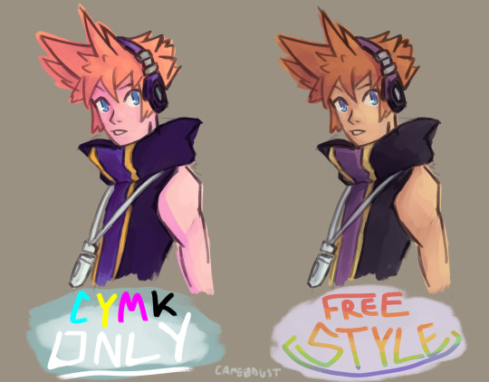
artstyle and color experimentation
(image description and extras under the cut)
[Image description: Two somewhat loosely colored duplicate drawings of Neku Sakuraba from The World Ends With You, on a dull tan background. He's drawn from about the middle of the torso up. He stands angled to the left, with the arm closest to the viewer held slightly away from his body, though it's only drawn about as far as the elbow. He looks in the viewer's direction with a quizzical expression, with the high collar of his shirt slightly covering his chin. The left drawing is labeled "CYMK Only", with "C" colored in cyan, "Y", colored in yellow, "M" colored in magenta, "K" colored in black, and "Only" in all caps, colored and underlined in white. The colors used for the drawing itself are bright and generally saturated, as well as generally being tinted toward one of the five colors used in the label. Of note, Neku's skin and hair are tinted pink, and the majority of his tanktop, which is normally a dark gray, is a deep purple instead. The right drawing, labeled "Free Style" in all caps, with a soft rainbow gradient, has colors that are comparatively more muted. In this drawing, Neku's skin has more of an orange undertone, his hair is closer to brown, the darkest part of his tanktop is more gray, and the purple and yellow stripes are much less saturated than the left drawing. The right drawing is overall darker and generally has more granular shading. End image description.]
extras (if you were just here for that art up there, feel free to bail now)
so csp updated recently with a separate color mixing window and if you saw the last post's timelapse, you know i like to keep my colors on hand and for the most part i tend to either pick them out before i work on whatever i'm coloring or set them aside as i go. i did the former for this aside from when i realized i didn't quite like a color, which is pretty much standard fare. i've been wanting to do an experiment with just blending my colors from only cyan, yellow and magenta (with the addition of black and white for values) for a while, but between practicing and learning other things and just not being very thrilled at the prospect of either having a bunch of space on my canvas dedicated Just to the colors i'm mixing or having to go back and forth between two canvases just to work, i'm only getting to it now bc the new window makes it a lot more convenient so i felt the drive. i did the cymk neku first to try to avoid feeling a bias to just mix for the types of colors i usually would opt for since i would have just used them and i think it counted for a lot, given the difference between the two. i saved the color mixing windows for both of them and i think it kind of speaks for itself.
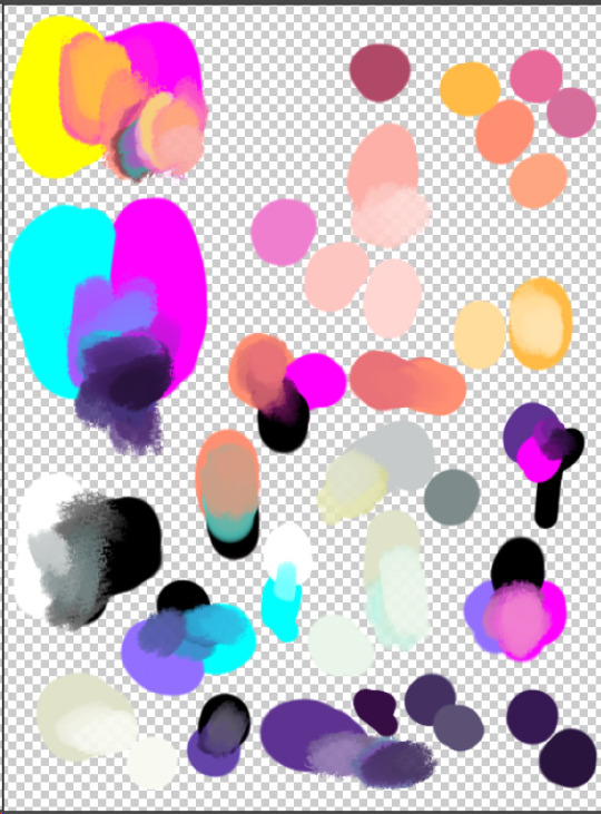
[Image description 1: Multiple splotches of color on a white and gray checkerboard background indicating transparency. There are many mixtures along the left and lower parts of the image, and some along the right, scattered amongst more solid shapes of single colors. All colors were blended from cyan, yellow, magenta, black, and/or white, or from other hues that were themselves blended from those colors. End image description.]
[Image description 2: Comparatively fewer splotches of color, none of which were blended with one another and are much less disorderly. End image description.]
honestly when i was picking out my colors for the right neku i was like "damn i really live like this?" and i was beginning to doubt if it would even look good, but i think the answer is really just that it's a different approach. i'm not very good at Picking bright and saturated colors, but until i figure it out, mixing printer colors is definitely gonna help me get there when i need it. it'll get easier with time.
i've also been trying to change up the way i shade when i'm coloring by making really broad strokes before i go in for more detailed or specific shadows or highlights which i think has been helping me a lot with getting values to feel a little more . not necessarily even but balanced i guess? more.... proper (the words aren't coming to me, but you might be able to see it a little in the trunks from a few days ago). but it also ended up getting me distracted because i was putting down the hair for cymk neku and i was like "ooh the orange kinda looks cool there"
[Image description: A mostly unfinished version of the saturated Neku. His arm and the dark part of his tank top are colored in, as well as some of his face. The orange from his hair covers most of the left half of his face and his headphones. End image description.]
and because of this i ended up doing a quick one using just oranges

[Image description: Neku but colored using exclusively shades of orange, which are blended relatively smoothly. End image description]
i wanted to do some layer trickery to see if i could use this to map the shading over flat colors but it didn't work out. i still like the look of monochrome-ish coloring so i might do this again but who knows really. im taking things as they come
#my art#the world ends with you#neku sakuraba#this is actually my fastest turnaround between 'art done' and 'posting art' i think bc i just finished this and honestly im boutta Schleep#and for good reason too bc as soon as i put this in the image selector i started finding things i wasnt really that jazzed about.#if i went to sleep first and then came back to post this i probably wouldnt have but its 3am inhibition died long ago#that being said though as always if there's something you need tagged asks are open. ill get to it when i can#or just say hi even! do whatever really just keep it classy yknow#but yeah lineart am i right#took me so long to write this post it is now 4am. do not be like me <3#bruh wait i just looked at old art i literally cursed him to be facing left forever this poor guy#(neku voice) looking left bc you never treat me right 😤
5 notes
·
View notes
Last Seen Blogs
ebaeschnbliah
Leaves in a Pond

angellayercake
These hollow feelings are keeping me warm

reaperofsociety
Hate~Love
sluttish-armchair
*magnificently rips off overalls*

above-average-home-n-mobile-blog
Above Average Home & Mobile Care is an Auto Detailing Company in