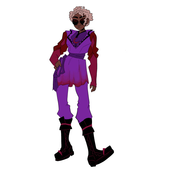
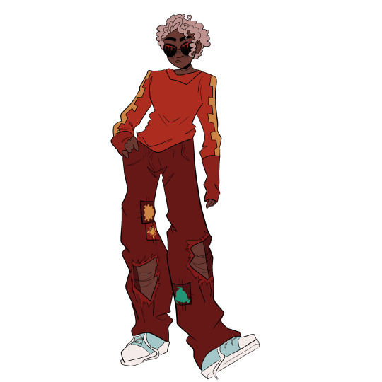
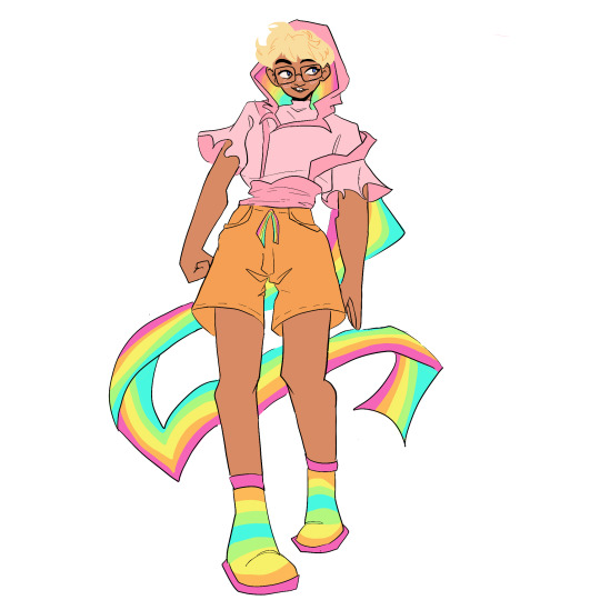
#godtier redesigns
Text
godtier redesign concepts for a not so hypothetical hs rewrite i have tucked up my proverbial sleeve
#homestuck#hom3stuck#june egbert#hs egbert#dave strider#rose lalonde#jade harley#heir of breath#seer of light#knight of time#witch of space#godtiers#godtier redesigns#4rt t4g#homestuck rewrite#archive
2K notes
·
View notes
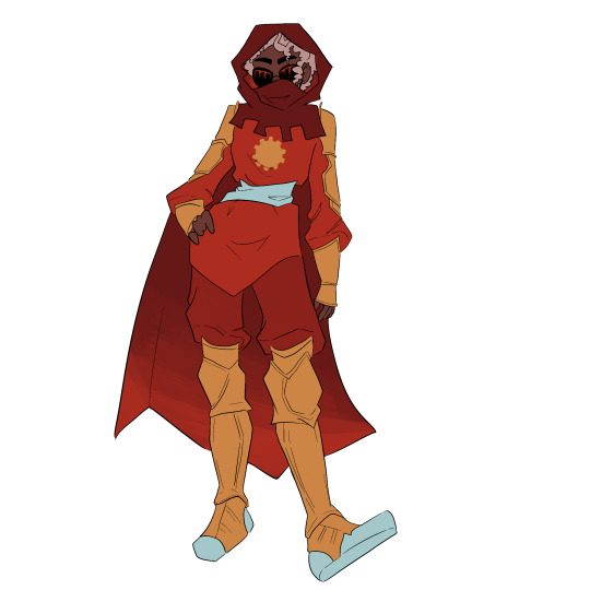
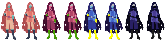
Text
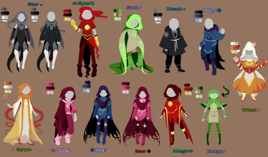
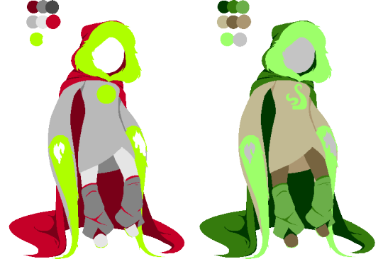
I redesigned all of Hackbents Godtiers!
(and added in the official ones too haha!)
Now before you ask... no... I'm not going to make giant aspect sheets for these like I did for the official Homestuck godtiers... that was very exhausting...
BUT
I did take the time to make separate TEMPLATE VERSIONS of every godtier so that YOU CAN edit any class you'd like to whatever aspect you'd like. Go nuts! Go crazy! I'll sneak them down below this post.
#fantroll#fantrolls#homestuck#hiveswap#mspfa#mspfanventures#hackbent#my art#godtiers#homestuck god tier#homestuck godtier#godtier#god tier#homestuck godtier designs#homestuck godtiers#godtier redesigns#godtier redesign
218 notes
·
View notes
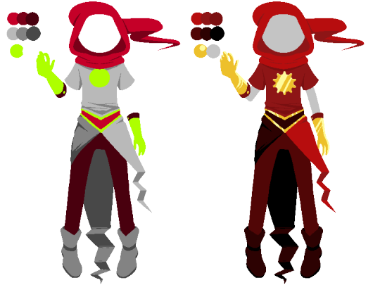
Text
What's up cool kid?


628 notes
·
View notes
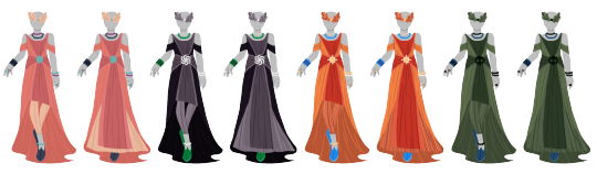
Text

The pages (featuring my god tier redesign!)
(Speedpaint on my youtube)
#my art#homestuck#homestuck art#homestuck fanart#homestuck trolls#hs fanart#tavros nitram#horuss zahhak#jake english#page#page of breath#page of void#page of hope#godtier#godtier redesign#god tier#beta troll#alpha troll#dancestor#alpha kid
187 notes
·
View notes
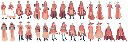
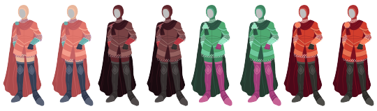
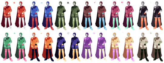
Text

re design of the god tier for my homestuck story
Jark: prince of heart
Dern: Heir of time
#homestuck#homestuck fandom#artists on tumblr#homestuck fanart#my art#digital art#homestuck art#fankid#redesign#homestuck kid#homestuck kinsona#god tier#godtiers#artist#artwork#art#illustration#art tag#artist on tumblr#drawing#my draws#tumblr draw#drawings#hom3stuck#heir of time#prince of hearts
29 notes
·
View notes
Text

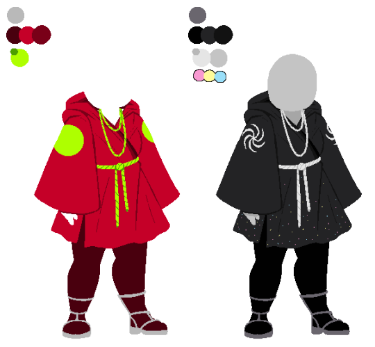
commission for a friend <3
#finally finished this one hehe#cory my beloved#morgombies doodles#homestuck#hiveswap#hs#fankid#godtier#knight of heart#godtier redesign#cory lennon
104 notes
·
View notes
Text

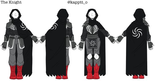


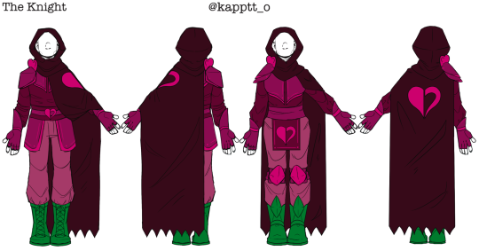
1/2, 1/12 The knight
2/2 The Knight -
Masc presentin design on the left
Femi presentin design on the right
#art#digital art#homestuck#home22tuck#homestuck fanart#redesign#homestuck godtier#god tier#headcanons#knight#hs knight
50 notes
·
View notes
Text

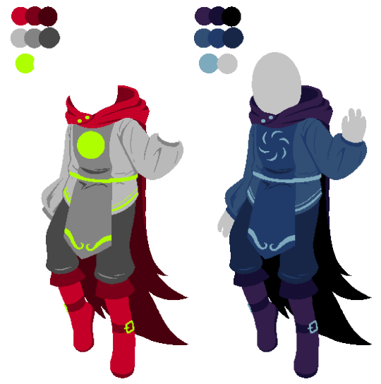
day 16
huh i remember that moment a bit differently
#yes i redesigned karkats godtier there is a good reason why its gray now trust me#homestuck#hs#davekat#dave strider#karkat vantas
44 notes
·
View notes
Text
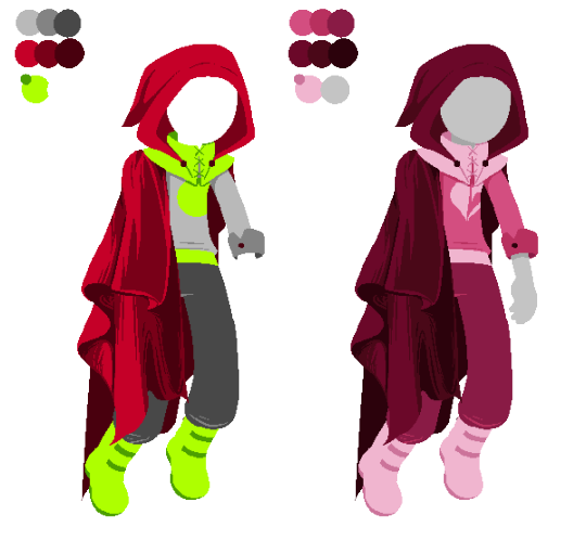
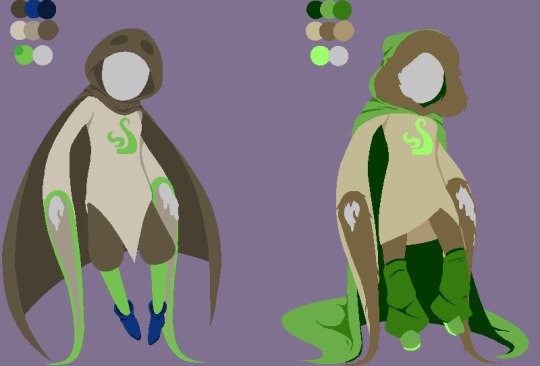
Redesigns~ they're gonna be prints but for now this is all I have done 💀💀

#my art#homestuck#god tier#godtier redesign#homestuck fanart#kanaya maryam#porrim maryam#jade harley
32 notes
·
View notes
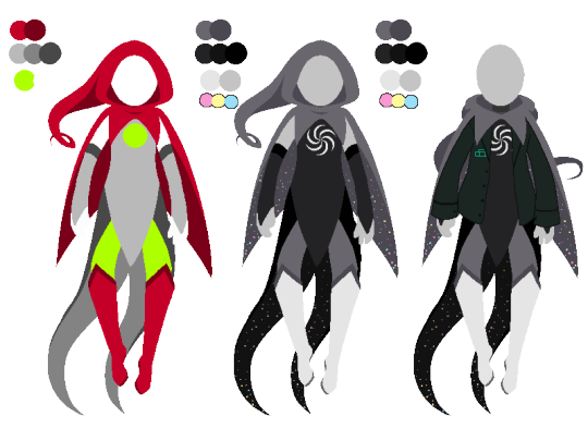
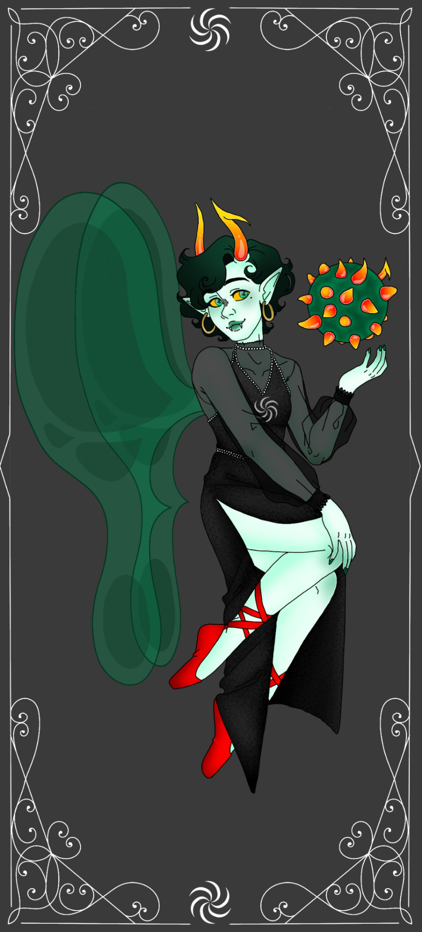
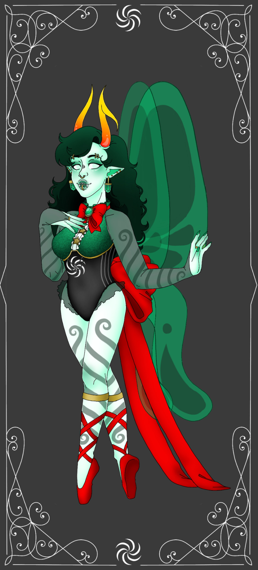
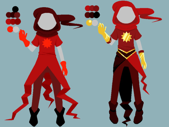
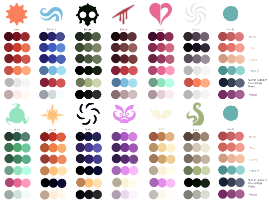
Photo
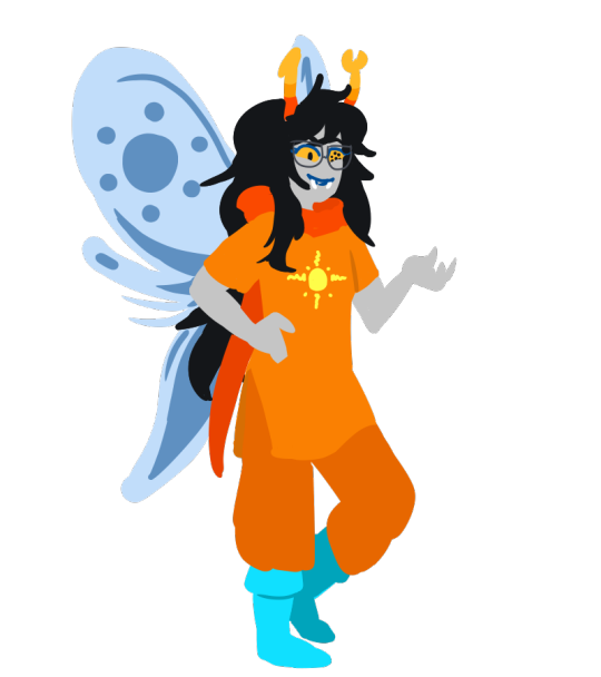
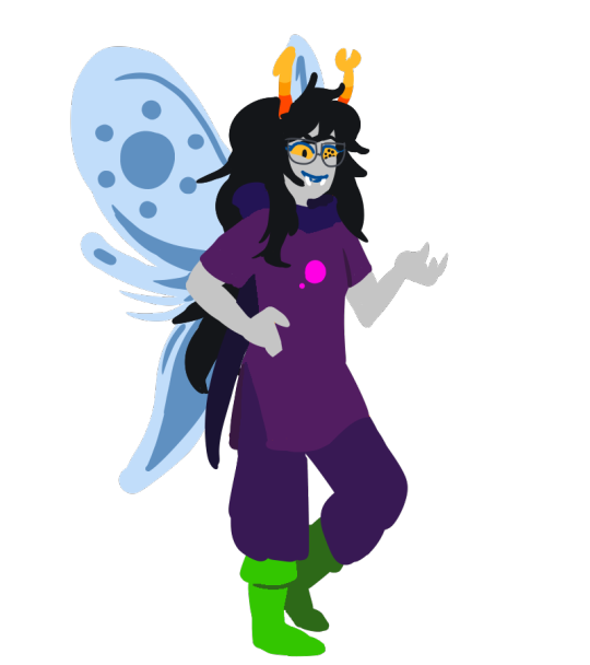

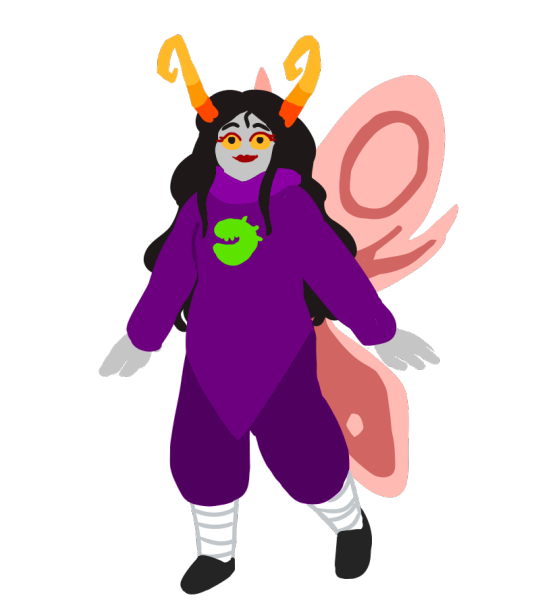

Sure enough, I never did finish what I was going to do with these! I was going to write a whole post and design a bunch of potential looks, but basically the upshot of it is: “Isn’t it weird that the color and image symbolism in alien godtiers are easily translatable in human culture despite having minimal connection in their home territory?”
So I present to you, some alternative proposals for troll godtiers using colors and imagery that made a little more sense for their theme - using Time and Light as the examples. The idea was either they’d be entirely redesigned, or alternatively - perhaps they look different to the viewer. Godtier outfits already have magic pockets and the like, looking a little different when from a different session wouldn’t be a stretch after all.
Tbh I still really like the ideas I had come up with, so if this gets enough interest I may try to follow through with the rest I had in mind...
Design notes and planning under the cut:
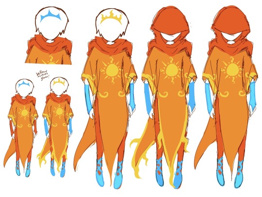
LIGHT - I started here because objectively this seemed the most glaringly obvious as an inconsistency between Earth and Alternia.
symbol: replaced the sun for the two moons, for obvious reasons. I left the moons in the same color of the bigger pink moon for simplicity since symbols are all one color. If I’m honest, I don’t even know if the ‘Light’ aspect as we know it would even be called Light, I feel like the connotations could get a little lost since the relationship with light is different on Alternia. BUT, this was meant to be a quick sample exercise to prove a point, so I didn’t get too lost in the weeds for this.
color scheme: Since the Light aspect godtier for humans has colors associated with the sun and the sky, I naturally colorpicked some colors from the alternian sky, as well as brought back the green from the green moon, for these. I didn’t swap them all 1:1 so much as swap based on best color balance for the palette.
TIME - This seemed like the next big contradiction, if only because troll technology probably hasn’t seen a gear in its life. Rethinking this particular aspect was harder for a few reasons, but I feel like I made it work.
symbol: Since gears aren’t so prevalent in troll tech, I went for what is - grubs. This seems like a dicey swap since grubs are multipurpose in troll culture, but since Time is also about the life cycle, birth and death, a grub seems fitting for multiple nuances in the aspect it’s representing.
color scheme: This was where things got tricky and I began to realize perhaps this project would run into some bumps - the color scheme for troll tech is, not surprisingly, primarily purple, with some hints of green. Just as I had essentially done with Vriska. As you can see I had to do a couple runs with this one before settling on a palette order that stood out enough from Vriska’s, even if it does sacrifice the color balance of the base godtier.
HONORARY MENTIONS: aka ideas that never saw the canvas but I’ve had pinned in discord for 3 years now anyways


DOOM would probably be a refreshing break from purples, although the symbol wouldn’t get a lot of major changes unless I considered something else to represent it instead.
BLOOD would also be a nice break and probably have the most versatile palette options... Perhaps too versatile, so I eventually settled tentatively on hemoanon colors (so a lot of greys). I was never set on the sign unfortunately.
BREATH would be interesting to do a color palette swap for, but this is a case where I can’t imagine a reason to change the symbol, so it’d be less of a creative break from its roots.
RAGE.... Would stay Exactly the same.
VOID might be entirely turned on its head by referencing Alternia’s deadly daytime and excessively bright colors
And that’s as far as I got. If you read this far, thank you for doing so and I hope you enjoy!!
#homestuck#aradia megido#vriska serket#godtier#godtier redesign#godtier design#god tier#thief of light#maid of time#light aspect#time aspect#redesign#alternia#digital art#fanart#fan art#concept art#i guess???#old art#from 2019 specifically#still looks good tho given it was slapdash even at the time imo
40 notes
·
View notes
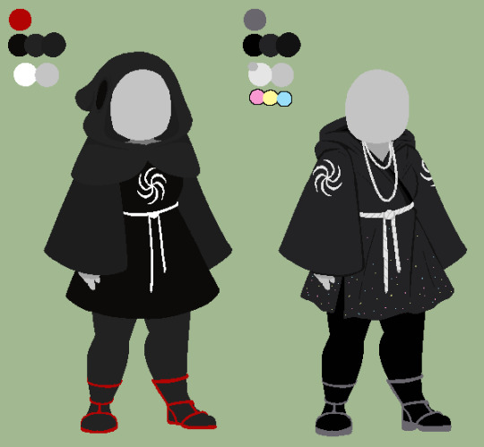
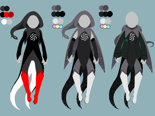
Text

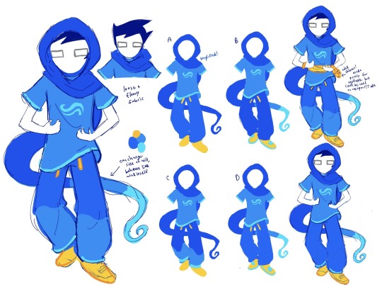
FINALIZED BETA GODTIERS YAHOO
#homestuck#godtier redesign#godtiers#beta kids#jades retain heat#the top of jades hood is meant to resemble a witch hat#junes pjs flow like wind#Dave’s pjs r heat resistant#roses yellow accents glow#Dave’s gear pauldrons function like watches#inside jades clothes is actual space#Dave’s belt has a sword holster#4rt t4g
2K notes
·
View notes
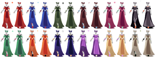
Text
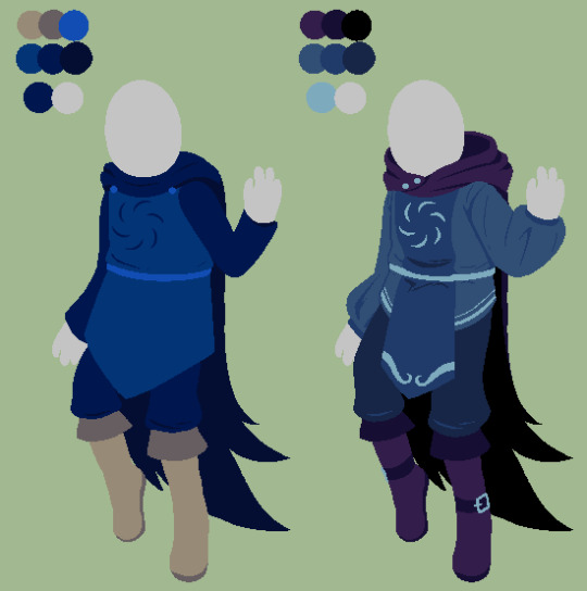
I made comparisons of their original designs and my redesigns, just for fun and also so its easier to show to my professors.
Also I used the palette rearranging for the Soul redesign that @cottonflurry did cuz I like it a lot better
#fantroll#fantrolls#mspfa#mspfanventures#hackbent#godtiers#homestuck god tier#homestuck godtier#godtier#god tier#godtier redesign#homestuck godtiers#coffeecats900 godtiers
105 notes
·
View notes
Text
Do the Windy Thing!!!
822 notes
·
View notes
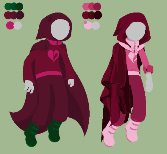
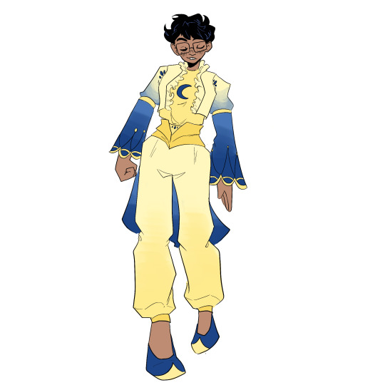
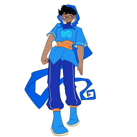
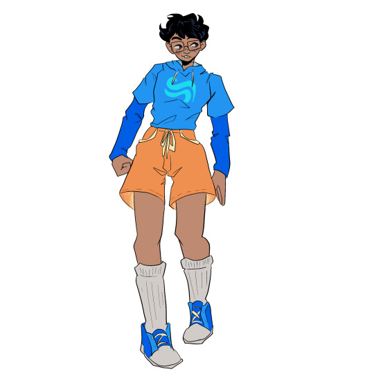
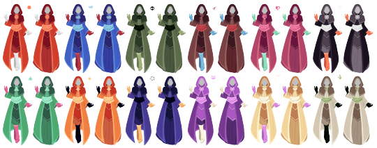
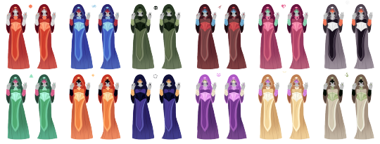
Text
I've always wanted to make my own god tier redesigns, and I finally got around to it! Here they are :) (Credit appreciated but not required! I would love to see any art featuring these though)
I had to downsize the images to upload them, so I'm including a google drive link with the full size ones! (They are also on my DA!)
They all have a "masc" and "fem" version, so use whichever ones you prefer! Also, I used my own god tier color palette, but you can use whatever colors you want lol
1 | 2
(More reference images below line! Like, so many lol)
Maid: 1 | 2
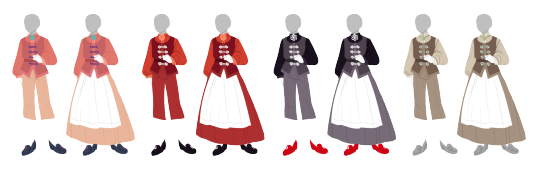
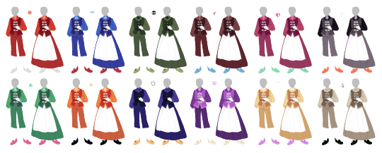
Page: 1 | 2


Mage: 1 | 2

Knight: 1 | 2
Rogue: 1 | 2

Sylph: 1 | 2
Seer: 1 | 2

Thief: 1 | 2


Heir: 1 | 2


Bard: 1 | 2

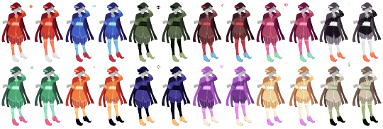
Prince: 1 | 2


Witch: 1 | 2


Muse: 1 | 2


Lord: 1 | 2


#my art#homestuck#homestuck fanart#homestuck art#god tier#god tier redesign#godtier redesign#godtier#homestuck godtier#redesign#fan design#reference
171 notes
·
View notes
Text
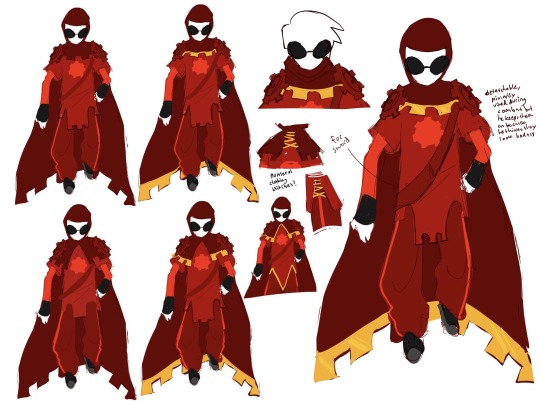
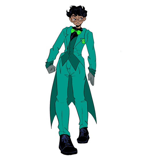
Bard Godtier Outfit Redesign - Feat. Pythus
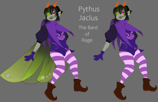
Okay, I’m throwing more jester vibes into this outfit and just throwing everything else out the window cause frick that codpiece, it’s cursed.
#homestuck#fantroll#limeblood fantroll#lime blood troll#oc#Pythus Jaclus#godtier redesign#homestuck bard redesign
7 notes
·
View notes
Text
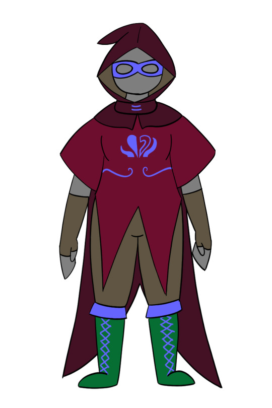
in other news, i created a mixed rogue of life + mage of heart godtier for my homestuck insert(s)
2 notes
·
View notes
Last Seen Blogs
cutefood
cute food

in-the-name-of-raf
Raf Simons

xobliviatesx
xOBLIVIATESx
portraitofadumbassonfire
Your Arrogance Disturbed My Solitude
hypnosiacon
Requests Open!