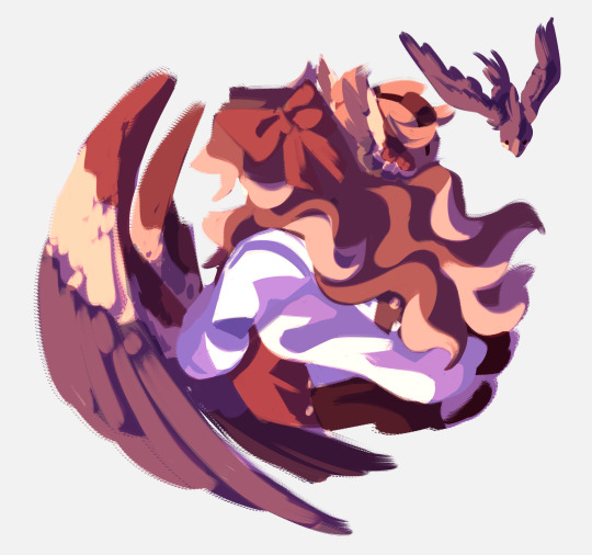
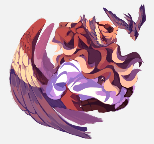
#how do you lineless colouring
Text

Shoelaces
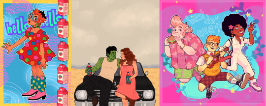
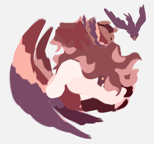
I'm doing an art trade with the wonderful @tokyogruel and this is my piece for them!
They wanted "haruka and mikoto interacting Brothers style" and my mind immediately went to this... T2 art makes me want to sit them both down and sort their fucking shoes out!! but for now. at least One of them will no longer trip over 💜 nature is healing guys
#milgram#haruka sakurai#mikoto kayano#listen. I may have Exaggerated how bad mikoto's shoes are but do you really think they're going to be fixed any time soon??? EXACTLY#and don't get me started on haruka's shoes... oh my god this boy Will give me a migraine. I bet no one ever helped him with laces before :(#but not anymore!! I'm here to fix that!!!#anyways I had so much fun making this!! I really love lineless art - and the art process meshes with my way of drawing well I think ^w^#I'd much prefer to think in shapes and blocks of colour than try to draw the perfect line 500 times and cry of frustration asdfghjkl#I Love these two interacting... I can't explain it in words so I hope I conveyed my feelings well!! they deserve to be happy ;w; 💜#my art#ミルグラム
170 notes
·
View notes
Text
why the fuck do i keep drawing really clean sketches that border on lineart. LINEART. i’m a lineless artist what the fuck am i supposed to do with this shit
#on the one hand i became a lineless artist primarily cause lineart is hard as shit so kinda neat that i’m capable of doing it now#on the other I DONT KNOW HOW TO COLOUR LINEART AND I LIKE LINELESS BETTER ANYWAY.#so much wasted work when i do lineless out of lineart#rambles#what the hellll. multiply layer until you make it i guess
9 notes
·
View notes
Text
2023.
i hope any of you reading this will forgive the essay. i started posting to this art blog ten years ago in 2013 when i was just at the very end of high school, uploading short animations i'd made for one of my final projects, preparing myself for art school where i was gearing up to become an illustration/animation student.

i went into my art foundation course in 2014, still thinking i was going to be going into storybook illustration or with faint hopes of becoming like a concept artist for game/animation, although even then i'd started thinking about patterns...
and then in 2015 i did go into my BA, going in for that illustration with animation degree that... usually when i talk about it in real life, i say didn't really feel like the best place for me. if i think back, the best things i got out of it were two of my best friends, one of whom is now my partner. looking back on my BA era, there's some bits of sketchbook stuff...
and while i was at university my main fandoms were thunderbirds are go and x-men for a bit... these are from the end of 2015 into the beginning of 2016...
then for a little while i was doing this still sort of pastel-ish lineless situation:
and i alternated between that and this thin fineliner type work (pretty sure all of the linearted pieces were done on paper and scanned, and all the lineless were graphics-tablet-only) - it was in this style that i started to offer commissions for the first time too.
and i also had fineliner-lined work in sketchbooks that i coloured with marker and posca pens, the colours of which were generally a bit more intense just based on not being able to slide the hue/saturation around on paper:
also 2016 was when i discovered the spongebob musical just after it's trial run in chicago (which ended in july of 2016) and i started making fanart at that point... which would have the biggest effect on the way i drew (and i did end up handing in a piece of spongebob musical fanart as one of my art school homeworks lmao)
from summer 2016 until early 2017 things were still quite soft and pastelly in my digital art, colour-wise:
and then suddenly everything got whacked up to 100% on saturation. also i was using the binary tool to give everything really thin pixel lineart for some reason.
then i went on vacation in summer 2017 and didn't draw for maybe a month? just short of? and when i came back i decided to change everything up again... giving characters blobbier, more ugly-cute faces with large squinting eyes and big nostrils and i was worrying a lot less about making anything look smooth, lineart-wise. i turned off the pen stabiliser in SAI and let it wiggle.
then... the spongebob musical opened on broadway in late 2017, i went to see it live in person for the first time... and my whole brain was ENTIRELY consumed by my love of it. i was putting that david zinn inspired pattern explosion into everything, even if it wasn't sbm fanart.
as we go into 2018, i started colouring my lineart. my biggest interest was still broadway musicals (with spongebob at the top of the list)
i think summer 2017 - early 2018 is probably my favourite art era, i was at my most bright and colourful and exciting... although i know in my actual real life i was struggling a lot with my home situation and i had been for some time. art was definitely my escapism back then, and i think a lot of the time i drew really bright, joyful stuff to try and inject that feeling into myself.
as for my university work, i was putting my focus into 3D paper-mache puppets:

and i was also starting to do more repeat patterns, mostly inspired by things around me. i'd learned how to make patterns actually tile and repeat in 2017, so made a few during my time at uni just to accompany some of my projects, but never as the focus of them. one of my university tutors told me that maybe i should put more focus on doing surface pattern, and maybe applying it to textiles, but i said i wasn't interested.

i graduated from my BA in the summer of 2018, and immediately began volunteering at the whitworth art gallery doing anything i could - stewarding, helping with arts and crafts, dancing with families...
in 2019 i was still very colourful... i was trying out more chunky colouring on characters skintones that i think was def inspired by tumblr artist jadenvargen:
but the blobbyness and ugly-cute style of drawing faces was gone by here, and i think... the way i drew characters probably had better *anatomy*, proportions were maybe a bit more realistic...
in 2020 i started adding the black shading to under the chins and some other places on characters' bodies because i started watching the anime my hero academia with my brother, lmao (and i was starting to pastelise colours a bit again, these are the most pastel-ish examples) my lineart has really smoothed back out too, though i never turned my pen stabiliser back on in SAI. i think my hand just adjusted. probably seems a bit insane to miss that, but i do.
by the end of 2020, the almost-year of lockdown over cobid had... made me a bit insane, i think, and i moved out of my mother's house and into a flat with a friend from university.
in 2021 i think things were much the same... i think from this point on is where things have sort of settled. i don't want to say stagnated, but i do think things have been very... like this for a while.
2022 - got the most exciting examples out...
also i was very into these little frames in 2022.
and then on to 2023! in 2022, i did begin trying to shift gears a bit -- hoping to put more energy into sewing and making products (like my tutor has suggested back in uni, even though i'd really resisted the idea.) i sold at a few in-person markets during winter of 2022, but got disheartened by the amount of money i had to sink in up front to sign up for a spot...

which has made me VERY grateful for the people who have supported me via online sales. it has really helped me stay afloat in 2023 - AND it has felt more wonderful than i can describe that there have been people interested in my work... especially when a lot of it has been my original designs, rather than the fanart that i expect a lot of people initially followed me for.
i've also... in the past 2 years... branched out a bit more when it comes to 'being an artist' - and have had the opportunity to deliver arts & crafts workshops with local refugee & asylum seeker support charity, afrocats. it's taken me to their home base in a church to hotels across the city where asylum seekers were temporarily placed while waiting on their new homes, and of course to my beloved whitworth art gallery, where we welcomed visitors from all backgrounds: from the typical white middle class visitors the gallery usually expects, to all the refugee visitors coming into the space for the first time.

and through my volunteering at the whitworth, i showed up so often they decided they might as well pay me. so i've also become a facilitator of... creative play sessions, my favourites of which have been outdoors. monthly, year-round, we have 'outdoor art club', where i get to paint with mud and make potions from leaves with kids & families - here you can see me tell you a little bit about it in this video below with 'crempog' a puppet character that makes videos about activities for kids and families around manchester (my bit starts at 01:10 although i am in the intro and thumbnail haha)
youtube
and then of course the summer 'PLAYTIME' activities we've had the past two years: scrap studio in 2022, and play market in 2023. it's the best freelance gig ever -- just to hang out and encourage families to be creative and have fun.
youtube
youtube
in working more in these new avenues... outside of being - as i've called myself for a long time - "an internet artist"... i've found myself more interested in this sort of thing. in being a "real world artist" too. in doing surface pattern design, and being a workshop facilitator, i find myself wanting to put more energy into these sorts of projects.
in 2023 i've also dabbled a little bit more in youtube videos! i have had a channel for a while and have made videos in previous years, but 2023 has been the year i've done the most in. admittedly most of them haven't been about my art, and more just like... random things that interest me (the spongebob musical in particular) but i've really been enjoying video editing. that's kind of an art form too, so i'm including it here!
moving forward, want to keep putting even more of my energy into other things. my shop, with a bigger range of products to offer. workshops in real life, where i can make a difference.
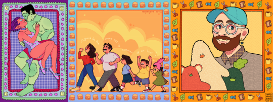
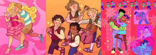
as for my art blog... i feel like i've done the least drawing in many years in 2023, and... well, things have been weird and complicated for a bit in my real life. i hope to draw for fun a bit more again very soon, and to return to doing things in more of a wild and crazy way, to be more creative and exciting with the way i draw things. still, here's some of my favourites from 2023:
thank you so much to everyone who has borne witness to my art journey this past decade!!! i hope you will stick with me, who knows, maybe for another 10 years if tumblr holds out. especially a big thank you to everyone who has ever commissioned me, or bought anything from my store, you literally keep me able to make art at all and i cannot, cannot, cannot overstate how much it means to me.
i'm moving homes soon, possibly into very cramped temporary conditions for a little while before HOPEFULLY starting my real life with my partner. if i can take one more moment to plug my work, then [here is a link to my online shop] and [here is my ko-fi page too.]
cheers, cheers, cheers!
- LOREN 🌈🍍🎉
#also: i did post. monster high and steam powered giraffe fanart on my main blog when i was in high school#in 2012/2013 it seems like i did absolutely LOADS of fanart for both of those fandoms but didn't cross-post it to my art blog#and uh. well. i'm not about to do it now hahaha
163 notes
·
View notes
Text
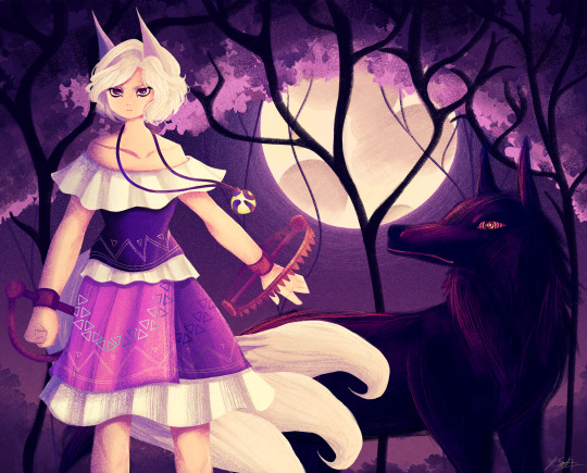
Ok the WIP I posted a little while ago is no loner a WIP yipeeeeeee I am so tired of looking at this drawing.
Artist's Notes:
THIS DRAWING IS FINALLY DONE YAAAAAAAAAAAAAAAAAAY!
Ok so this drawing was a WIP that I had had sitting around for a while, and so because I wanted to do a test run with the new face style I'm trying out, I decided to pick it back up again. Now you may notice that compared to the other version of the WIP, the shading is different, and that's because I had to change all of it to match the light source of the moon, which was.... not exactly fun (especially cuz I stayed up late at night to finish this which was tiring), but it was worth it because I am a lot happier with the shading now. Also, when I initially redid the shading on the white trim of her outfit, I ended up making them look like indiscreet white blobs that just looked... bad, so I had to fix that and I think it looks a lot better.
My favourite parts of this drawing have to be the face and the hair, though I'm not surprised about how much I like the hair since hair is my favourite thing to draw. Also the wolf, I really like how the wolf turned out, since I also love drawing animals from time to time. I also like how the background turned out.
Also, Enoko's design was a hit hard to get right, and I decided to add the white trim separating her shirt and skirt mainly because I didn't like how abruptly it changed in the original design. Also, for some reason her dress makes me think of 1800s-y southern/western clothes, which has given me the headcanon that Saki gave her these clothes when they first met. Makes me wanna draw the two of them together in very western styled clothes, I think it would be cute. I also changed up some of the colours on her original design to fit in more with the palette that I was going for with this piece. Also, I like how her tails turned out, mainly because when I was working on some of the sketch for this I tried to make them smaller, but they didn't look right so I just went "fuck it" and made them big and poofy. Also drawing her wolf ears was fun, I like drawing simplified wolf ears like that. Overall, I'd say I did a good job incorporating elements (like the bear trap hands, the tails, the gem) in a way that didn't feel like they were out of place in the piece (something I was concerned about with Enoko's design).
All in all, I wouldn't call this my best work, but I do like a lot of aspects of it. I've also noticed that I'm kinda getting a bit frustrated with certain parts of my style like the lighting (mainly the lighting), so I think I wanna try and branch back into that more painterly style that I started out with when I first started posting here while still mixing in some elements of my lineless style. Also, I need to get better with my colour values, mainly just for clarity since I kinda think that's where this drawing falls flat a little.
99 notes
·
View notes
Note
I've noticed your artwork sits on a border between semi-lineless and fully lined; some parts of a figure having an outline while others don't. It's a fascinating vibe that I really like, and I'm curious if there are any rules you have set in place for how this style comes out.
Yeah kinda! I actually don't do lineart at all- it's fully painted, but I simulate lineart in certain places. I basically use the same rules as line weight: areas with lots of connecting lines or bunches will have thicker/ more noticeable lines than straight planes. That's when I'll keep pure colour and no outline. Sometimes it's just eyeballing, but that's generally how I go about it!
72 notes
·
View notes
Note
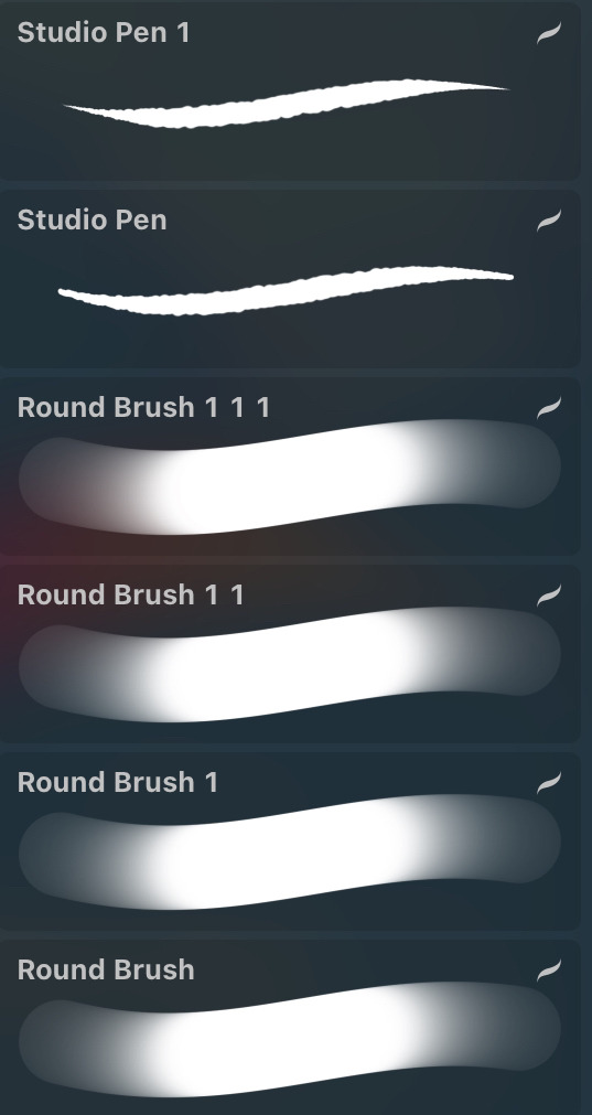
What type of brushes do you use for colouring in and inking ect, and do you have any tips for how to colour?
a lot of the brushes i use are default procreate brushes!
they depend on any given situation and how i want to style my art.
studio pen is modified to a version that mimics ROTTMNT's pen. and i like using the round pen for my default sketching/casual lineart drawings because it's such an easy pen to use. i have different versions of it where i have different sizes saved up.
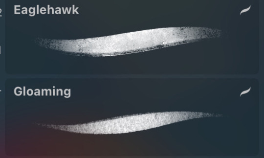
if i want a more sketchy line art, i use either eaglehawk or gloaming with the opacity slightly down to give the lines a more pencil-y look. i like it when my art looks imperfect and sketch :D
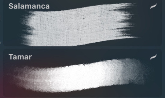
meanwhile these are the brushes i use for backgrounds/coloring/lineless art. i lean more into a painterly style, reminiscent of a children's book but with my own spin.

and finally, this is the principle i use for coloring. i also mess around with filters a lot but these can still apply even then. i posted this to patreon months ago but since i'm closing it down (until i get a greencard), here it is for everyone to see~
please do note that even if you use my brushes, techniques, or program, my style will never be the same as yours and i mean that in the most gentle way possible. don't mimic my artstyle. you can draw inspiration from mine or other artists, learn techniques and study their art. but it should always be for the goal of finding your own voice and feel.
these tools and techniques are a mixture of things i learned and things i adjusted for myself over the years. a lot of times, you will find another artist's techniques to be such an inconvenience for you and that's okay. it's because you're not using your own voice. use your style/color palette/technique and use it your own way~
105 notes
·
View notes
Note
Dude your art style is so GOOD I love how it’s all kind of ? Lineless? Nettlepaw looks like a little tootsie roll I LOVE
AAAA THANK YOU. i love how sharp lineart looks, but i hate doing it 95% of the time. I LOVE SKETCHING THO..
so by just going right for flat colours and carving the shapes out, i'm having fun through the entire experience which is.. The Goal. it's like sketching and colouring sametime. so good..
i recommend it to anyone whose in a bit of an art funk!
60 notes
·
View notes
Note
WORMY I AM NOT GOING TO BE NORMAL ABOUT YOUR DRAMATURGY ART how do you draw such heartstring twanging art??? There aren't even facial expressions but the body language is all there! How tight they are holding on, how they bury their heads in each other. And the colour and lighting choices! They are so warm and bright and right aaaaaaa please talk more about your process I love hearing how an artist makes a picture come together
CRYING this is such a kind message and i appreciate it and you sm. but also when i try to explain my process all i can think of are those tutorials that are like step 1. make a sketch step 2. Finish The Drawing bc i just make shit up as i go LMAO
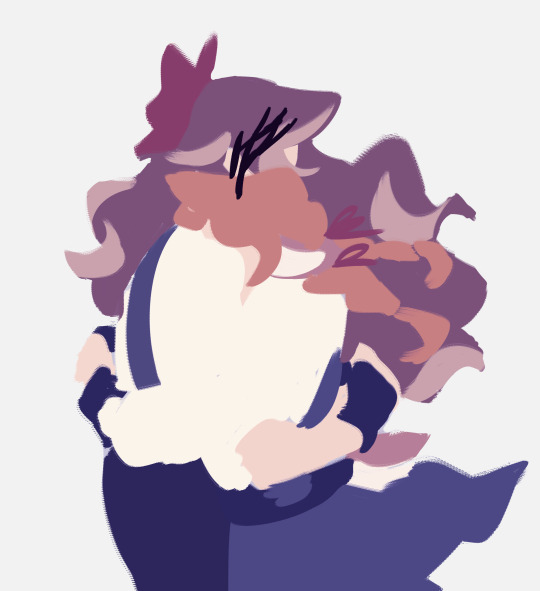
i block in the ugliest mess of shapes + shading you've ever seen under the sketch and from there i mostly just pray. for color i probably rely way too heavily on layer blending modes but hey it's a tool and it's there! and more specifically my favorites are yellow-orange on overlay/glow dodge for lighting and blue-violet on multiply for shading. i've also been using them set to "color" recently bc i realized it helps a lot with cohesion for someone like me who sucks at color picking (such as purple and maroon for these two) then i just stack on layers and layers of detailing as i go on. i could technically leave it lineless but i personally like going back over everything with something close to black like in the final post!
a mess of an explanation but i hope seeing some of my chaos is fun 🫡
58 notes
·
View notes
Note
I’ve been STRUGGLING! With colouring the hair and feathers in a way I like it right now, but I’m super proud of how I was able to get Jamil’s eye makeup(?) and jewelry and wanted to share so badly! (Also, thanks for letting me practice a lineless style using your art! I’ve been struggling with doing mainly hair lately and just needed something to use for practice! Thanks again!)
IM SORRY IM SO LATE TO THIS you've sent me an updated one since but Tumblr isn't letting me post anything that's a submission?? Only asks?? So I was waiting to see if you'd send an ask but I don't want you to think I'm ignoring you! 😭

I saved the second one you sent me so I can share with everyone even though it's still a wip because just WOW this is honestly so cool to see and I think it's coming along beautifully!! 😭😭
571 notes
·
View notes
Text
Yuri!!! On Cards collaboration!
So, I know I've been pretty inactive recently, at least in posting my own art but for good reason! In the Yuri on the Web Discord server artists and writers alike have all collaborated to illustrate a deck of cards and write stories for each of them. And as a resident artist myself, I couldn't not take the opportunity to draw for this project UuU
Oh and if anyone was wondering, yes, I am to blame for inflicting this giant project onto the server BUT I REGRET NOTHING AND NEITHER WILL YOU IF YOU CHECK OUT EVERYONE ELSE'S WORKS. Trust me, they are amazing! The masterpost can be found here!
GIANT thanks to @lines-on-ice and @yaoiconnoisseur for helping so much and being amazing co-administrators and basically making this entire thing possible! You really saved me from my own overambition XD
The guidelines for this project can be found on the Yuri!!! On Cards blog as can the masterpost with all the links to everything. All the art that gets posted to Tumblr will also be reblogged by the blog.
With all that said, here's the actual art I made! (Break for those who don't want their dash to die UuU)
Okay, I lied. First, I'd heavily recommend for you to check out the guideline posts, both the general and artists' and even the writers' if you're up to it to get a grasp of the perimeters of this project. There's also some vague lore and AU stuff about the whole thing to find which will give you context for why the art looks the way it does to a certain extent.
You can also just jump right in and take everything as I ramble about it which, I mean, I won't stop you, the guideline posts aren't short. I will not blame you. You can still just look at the art. If that's your choice, go on ahead!
First up!
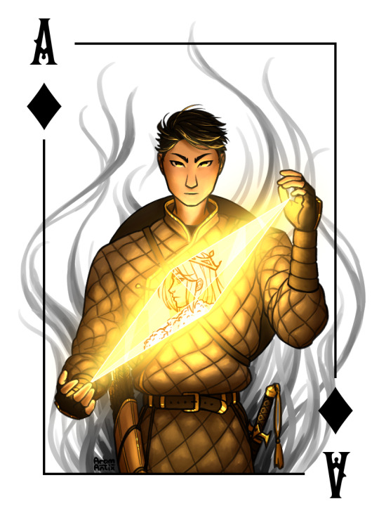
Ace of the Kingdom Otabek, The Deep Shadow
Being of the Kingdom of Diamonds, he's skillful and sharp. He moves quietly as a shadow and is just as mysterious.
Okay, I can't comment much on how he actually is, you'll have find that out by reading his fic(let?). They were supposed to be ficlets but as writers tend to do, none of us could manage that so take "ficlet" with a big grain of salt for every written work.
I've, by the way, not read any of the ficlets for this project beside my own so I'll get to experience the reveal with y'all and I'm gonna perish waiting.
Anyway, about the art. The yellow of course comes from the Kingdom of Diamonds' designated colour. As for the outfit, it's based on this handsome fellow I found who's supposed to be a Kazakh archer which I thought fit Otabek's whole shadow thing perfectly (and Writingfromtheshadow's fic Equivalent Exchange has me in an iron grip and I don't want to be released).
If there are any Kazakhs in the audience, you are free to laugh at me for any inaccuracies or missteps, I am but a humble little not-Kazakh, I don't expect to have gotten it all right UuU
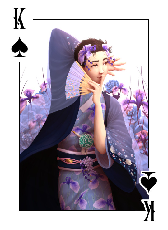
Next up!
King Yuuri, Wanderer of Dreams
The ruler of his realm, he is as the mind flows. Kind and benevolent yet of fickle thoughts, the spirals of the subconscious are ones he both masters and bows to.
Again, gonna be waiting for his fic with everyone else but like. It's Yuuri. Anxiety is kind of a given.
In terms of art, I don't know if you can tell but this was where I started writing my will because oh my stars, what did I get myself into. If you follow me or my art, you'll know that I don't draw lineless. Like ever. And apparently I decided this project on a deadline that others were depending on me making look nice was the place to go all out.
And the worst part is that I'm not even mad at it so I have no argument to not do it again.
Anyway, the blue is from the designated colour of spades and yes, you've guessed right as to why this colour was picked for this suit. I'm predictable, leave me alone. As for the rest, the outfit is inspired by traditional Japanese dress that the Internet told me about (again, Japanese may laugh at me all they want UuU Your culture is very cool but also there was so much info, I hope I got it at least a bit right).
Also I spent like eight hours looking at hanakotoba for this and I've never been this happy about a decision I regretted so much while I was having to draw that many flowers. And you know I had to include The Gay Flower^(TM).
The Japanese iris is now Yuuri's btw.
All the flowers used are: Japanese irises, Jasmine flowers, Forget-me-nots, cherry blossoms, white roses, green carnations and blue roses (Viktor's flower. Read: I am predictable).
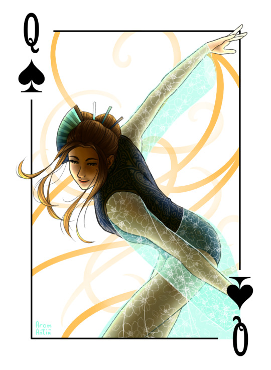
And finally!
Queen Minako, Tamer of Minds
Of the Realm of Dreams, she sees your fears, the snares laid by the subconscious and, strict and blunt as she is, she clears a path for the motivated and lets no potential go to waste.
Again, haven't read a word of the fic.
This one was by far the one that I made the fastest and I would've loved to do more with it but like deadlines. I'm gracefully skipping over the fact that I set the deadline and am fully to blame for being late.
But, as with Yuuri, blue is for spades. And since I wanted her to have a leotard but still match Yuuri and make her outfit look even slightly Japanese inspired, sheer fabric to the rescue! With cherry blossoms, of course, because CSP had the pattern preinstalled UuU
And I don't know if it worked but I tried to make her hair both look like her signature style, traditional Japanese hairstyles I found on the good ol' Interwebs and then kind of a spade by having that middle stick be the stem and the hair the spade's butt.
Also this probably goes without saying but the ranks of the characters are just titles. Yuuri is not married to Minako, she is just the Queen and he the King, don't worry.
Again, a BIG thank you to everyone who also participated, it was so fun to work together on this and see everyone's progress! Nic and Lil, you're amazing, thank you so much for everything you've done for this!
And to everyone who's made it this far, thank you for sticking around and please go check out all the other art and the ficlets! I promise it's worth it!
Masterpost | AO3 collection
#AAAAAAAAAAAAAAAA this project almost killed me#i am so infinitely happy about everyones contributions they are so lovely and i am gonna die happy now#but seriously what idiot decided to try a new and more detailed rendering style on a deadline#its me#i am that idiot and if i had a time machine past me would have gotten the fattest slap#idk if im ever gonna do that again but if i know myself at all itll happen because this wasnt disastrous enough a result to dissuade me#and most of it im pretty happy with#also i had so much fun with otabek#i got to play with light and texture and light and those smoke tendrils in the back and light and that fabric and light and#also rendering minako was a BLAST even if i churned her out on severe sleep deprivation my only energy being spite for my own mortality#oh and yes it was a this we decided that the aces should somehow incorporate the king of the given suit so the anger kitten is there#in otabeks i mean#now ON TO ANOTHER PROJECT#THATS... ON A DEADLINE#UH#yuri on cards#yuri on ice#yoi#yuri on ice fanart#yoi fanart#fanart#art#arom antix art#arom antix#otabek altin#katsuki yuuri#okukawa minako#collab
60 notes
·
View notes
Note
How do you do the colourful lineart and rendering?
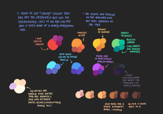
I've given 2 other rambling answers to this if you wanna check the tag (actually explaining this stuff is difficult). So this time I'll try to keep it to some epic Dizzy color tips.
Study Muse Dash Artwork (my inspo) . Just like. Look at it a lot.
High brightness, mid saturation for base colors. Lineart's generally more saturated and/or darker version of the base. Not a universal rule of course.
Limited palette. Basic color theory knowledge needed. Take the palettes from other art or irl, but you should be able to give them roles (main color vs accent, high vs low distribution, etc). The colors will likely change roles throughout.
I've found it *really* important to be deliberate and varied with your shapes. I knew some colors look nice together, but couldn't distribute them interestingly. A lotta things I do, giving the eyes an outline, or the lineless elements, were done specifically to add color with clear purpose. Take em for yourself if you want. Always try envisioning your art in 3D and expose your mind to weird shapes you come across. The limited palette may push some creativity too.
Lineart and lineweight is also pretty important in all this. Let it be thick, thin, or even nonexistent if it benefits the color distribution. Let it be messy too (I'm still learning this)!! It makes everything feel 'funner'.
27 notes
·
View notes
Note
what color pallet do you use for Swap Grillby
had to throw this together on the spot since I don't keep most of my palettes organised, but here's the colours I use for him!

I realise the fire colours aren't much help as is, so here's a very rushed guide on how I use those colours (using paint tool SAI btw):
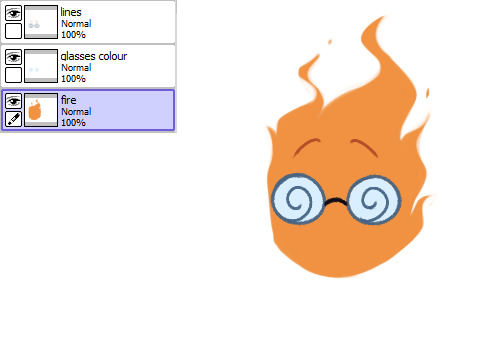
(since I draw his fire lineless, the dark orange line colour is only used for his eyebrows)

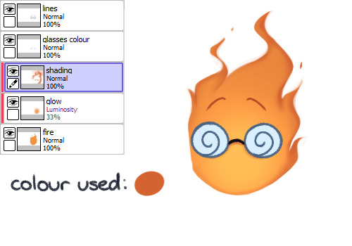
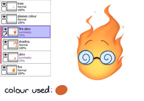

a couple details not shown here:
I usually put a faint orange overlay on him to make everything slightly warmer, but the colours I use for those aren't consistent between art pieces
I forgot to include shading his glasses but I use the same flat colour on a luminosity layer to give them a little shine ��
there aren't any highlight colours in the palette bc these days I tend to just use a very low opacity luminosity layer rather than pick out individual lighter colours for highlights
anyway hope this helps at all :]
#I haven't drawn him in 2 years and spent like 15 minutes on that example at most so please forgive the messiness ahah#I really should organise my palettes sometime bc I always just dig through old art files to find colours I've used before#which becomes very scary if I have to look at my art from 5 - 8 years ago. eugh#holoskart asks
16 notes
·
View notes
Note
HEYO it's a self-love game I just made up <3
Answer this ask with your FAVORITE fanart work you've ever done, what your favorite aspect of it is, and how long it took. Then, if you feel like it, tag 5 other creators! If you really can't decide on one work then pick three of your faves 🫶🏽💖
gonna go with top three for this one!
1.

drew this for carmen week this year! i love the way i managed to render this, esp the face! i went with ivy's sketch to screen outfit for this one! the shading and the lighting is my favourite part of it!! it was really fun to draw!!
I think it took around, mm 4-5 hours? my time blindness really sucks if i had to say how much time i felt it took i'd say 30 minutes lol
2.

this was a dtiys!! i like the overall effect this one produces!! the colours go really well with each other esp in my lineless style, and i love how shiny her eye and hair looks
this one probably took... a while lmao i kept getting distracted so im gonna be generous and say 5 or a bit more than 5 hours
3.
no words only desi distress. this was from cwc 2023 lmao
took me <5 minutes
tagging (no pressure to do this + no need to reblog this post specifically): @itsdappleagain @suzie-snail @ivnscribbles @m1ntphae @mmaricarmen23 aand anyone else who i may have forgotten/didn't know does art and wants to do this <3
16 notes
·
View notes
Note
for the weirdly specific ask game: super curious about 5, 12, 21, and 27 :>
Thank you so much, I'm gonna respond to all the lovely folks who asked me here too about the weirdly specific art ask game!
(Thank you to @phantomseptember, @wyrmzier , @grumpyoldsnake, @philcoulson-redtapeninja @swordsandspectacles and the other anons for asking!)
1. Art programs you have but don't use? I don’t think I have one! I’ve been playing on Photoshop for so long, though I’m thinking on getting Clip Paint Studio for comics at one point!
2. Is it easier to draw someone facing left or right (or forward even)? Mmmm, often find I draw folks looking to the left, but wouldn’t say I prefer one way or the other, especially when I’m flipping the canvas at least three times to make sure they’re all even!
3. What ideas come from when you were little? Mmm, lots of fantasy things, I have this old story about the green man that I made when I was 16 and it’s been rolling and remade ever since! It really needs another go other, it was my first dip into anything non cisgender before I knew, y’know?
4. Fav character/subject that's a bitch to draw? Mmm, probably cars. Hate drawing cars, so annoying.
5. Estimate of how much of your art you post online vs. the art you keep for yourself? Ohhh, probably, 80%, but that’s what happens when you’re chronically online like me lol
10. Favorite piece of clothing to draw? Mmm, love a big floofy skirt or shirt, all those folds, very hard but so satisfying when I get rolling
12. Easiest part of body to draw? Mmm, eyes n’ mouth? I wanted to get good at them ever since I was a kid, cause they’re the expressive bits! I want to get better at Hands, the gay part of the body.
13. A creator who you admire but whose work isn't your thing? I honestly can’t think of any? I guess I try n see the good in any art, even if it’s not my vibe; the colours, the lines… There’s always something
15. *Where* do you draw (don't drop your ip address this just means do you doodle at a park or smth)? At home! I try and keep Digital art to my desk, but If I’m doing ink art for fun, it’s on my bedroom floor, praying that I don’t mess the carpet
20. Something everyone else finds hard to draw but you enjoy? Mmmmmm, mouths and hair?
21. Art styles nothing like your own but you like anyways? Ohhh, mmm, lineless art! the amount of effort that goes into it, love it!
27. Do you warm up before getting to the good stuff? If so, what is it you draw to warm up with? Iiii should be doing it more! But it’s usually a pretty lady with voluminous hair and fangs, it’s a good go to!
30. What piece of yours do you think is underrated? Mmm, I think, it’s this piece, It really vibes with what I want to make at the minute, deep shadows, good lines, good Shapes!
Thanks again for asking me!!!
27 notes
·
View notes
Text
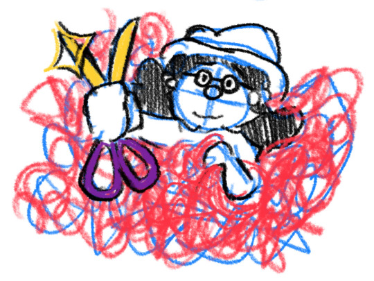
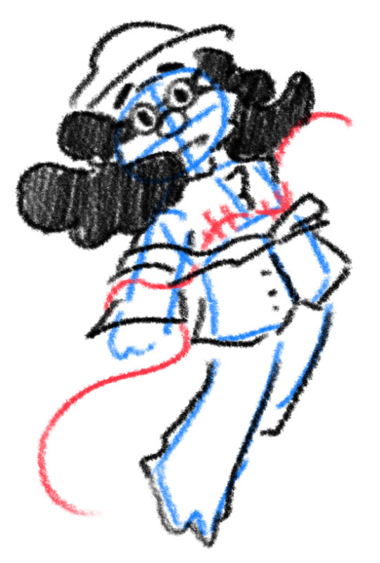
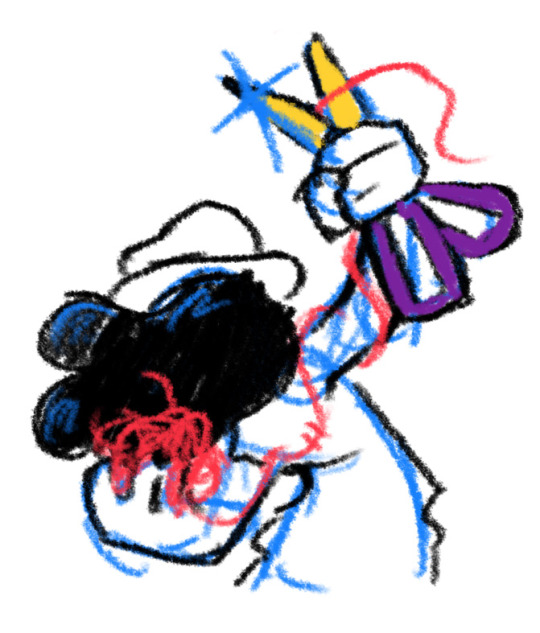
I thought I'd share the sketch of this poster/book cover as well as my initial concepts! You can click the "Read More" button for more in-depth explanations on my design process.
Thhis is all for my latest fanfiction, Snip Snip, so if you'd like to check that out, then...
Now let's crack in!
For the release of "Snip Snip", I actually had several different directions in mind! One was a comic of one of the scenes from the fanfic—specifically the one where the Professor breaks down in front of Kate and Joyce with the line "I don't like being a woman"—and the other was a series of doodles showing the Professor's transition. Unfortunately, both directions met dead ends as I couldn't find the motivation to do either. The most progress I made were these sketches.
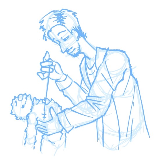
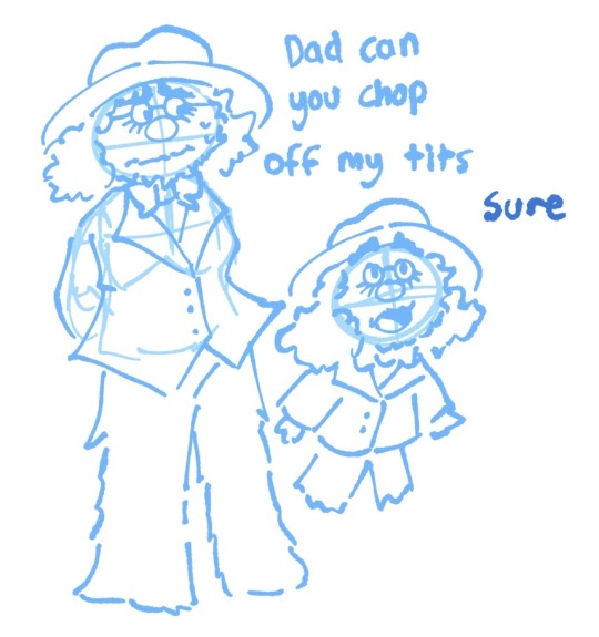
If you're wondering, "The first one looks familiar..." that's because I reused that pose for my first promo art! It was too good of a pose. I couldn't waste it :P
But anyways, after a period of getting extremely frustrated over the lack of progress, I realized my main problem: I was biting off more than I could chew. I didn't know this at the time, but I was dealing with burnout from school assignments that made drawing more ambitious ideas like the ones I had very difficult. Hence, I had to scale it down. It made me think, "Why not do something like a movie poster or a book cover?"
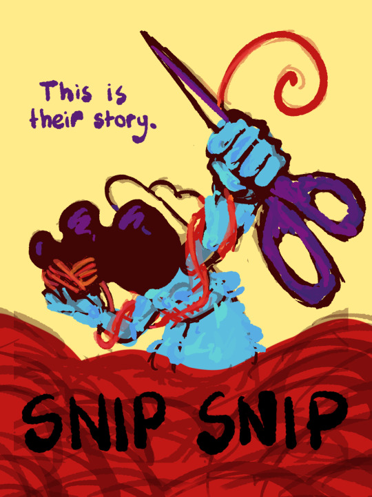
That's how the sketches at the top of the post came to be! I consulted a friend of mine over which pose to choose, and he picked the third one which I understand why so. The obscuring of the Professor's face not only made it cool, but it adds symbolism in how we don't really see his true identity—the real him—until his transition. Here's the first sketch!
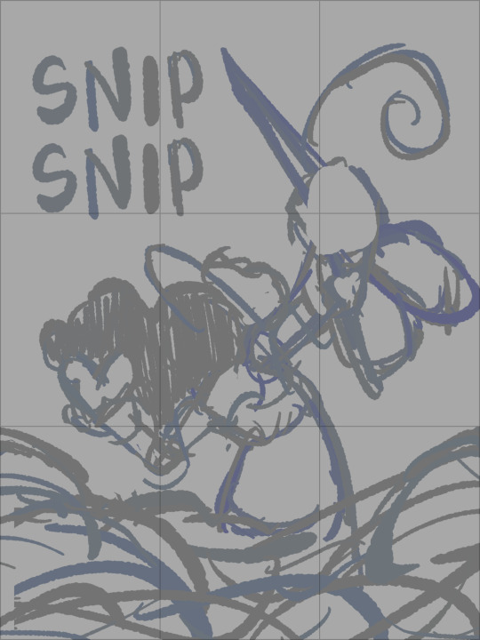
As you can see, the title is on the top left corner! However, I moved it to the bottom for two reasons
It's advice I learnt while looking up how to make movie posters since moving the title to the bottom tends to bring more focus to the illustration above.
I couldn't find a font that fits! And the idea of doing typography again (especially after the Keep Yourself Safe poster...) was really not what I signed up for.
But then it left the problem of the top corner looking empty. It was too distracting! So what did I fill it in with? The subtitle: This is their story. The composition is now more balanced, and also the subtitle tickles me.
As I said before, I looked up movie posters for this! Special thanks to the Nashville Film Institute and Muse by Clio for their articles that guided me during this poster making process. I will say though I got really sidetracked watching Filmmaker IQ's The History of the Hollywood Movie Poster 😭 It's really interesting, I'd recommend watching it!
One thing I learnt is that movie posters limit their colour palettes. Of course, this is good advice for art in general, but movie posters emphasize on its colour usage to attract the audience with their simple yet bold schemes. It is a piece of advertisement after all! Following their footsteps, I limited my colours to the primary colours (red, yellow, blue) and purple to make the scissors pop and allude to the nonbinary flag colour scheme.
And from there, it was just a matter of experimenting with rendering! I wanted a mix of pop art and storybook illustrations, so I mixed lineart with lineless, and I wanted to retain the energy of the sketch while still polishing it, so I cleaned the sketch, merged it with the colours, and painted on top of it rather than make a separate lineart layer.
Overall, I'm extremly proud of the end result! The struggle of figuring out the promo art for this fic has been tormenting me since the beginning of the year, so I'm glad to bring it to an end. Thank you for reading my ramblings! I hope you learnt something or at least had fun? Either way, have a good day!!
#this truly has been a rambles moment#i really really recommend watching that video by the way it is FASCINATING#the professor#shane madej#puppet history#poster design#art process#design process#art#artists on tumblr#sketches#concept art#chris p fried rambles#chris p fried art
8 notes
·
View notes
Note
hello what brushes do you use?🥺
Here are some of my most frequently used brushes:
Rough G pen: my favourite brush for sketching and lineart (unfortunately it is no longer free and you can't change the colour of the ink, but no other brush compares for me)
Strong Dodge: i love using this one for detail work especially in my lineless art
Raz's roughy sketchy set: i like the RAZ (Sketch) brush for details; the Rough Nib brush is also the closest brush I've found to the Rough G pen
eXpressure NT FREE: the NT Smoosh 2 and NT Smooth 2a are my go to brushes for colour work, but i will also use them for just about anything. i love how textured all of these are
SU-Cream Pencil: i used to use this a ton for everything. it feels great to use
Coloring/...: the first brush in this set (Color/.) is great for blocking out colour quickly and i used to use this a lot
Yuna's Coloring Brush: i really like the texture of the NNbrush for backgrounds and shading
#ask#brushes#i probably use more brushes bc i have so many downloaded but these are my most consistent ones#csp is having some kind of login bonus rn where u can get free clippy so if u really want u can get the rough g pen with that haha
13 notes
·
View notes
Last Seen Blogs
lovpj
kyo

brijdarshan07
Untitled
xxxvamplovr3xxx
Vampires Are Sexy

melissaholden94
Melissa Holden: Author

naturecamptravels
Naturecamp Travels