#design process
Text

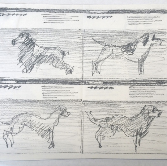
Massimo Vignelli, Harper’s Illustrated Handbook of Cats or Dogs, 1985. Via Vignelli Archive
345 notes
·
View notes
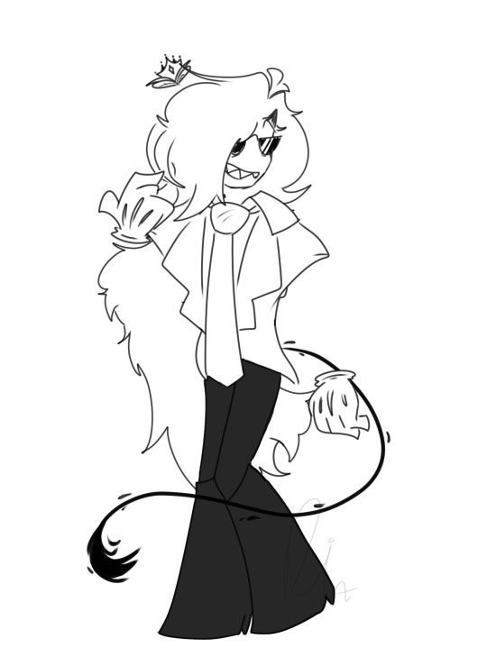
Text

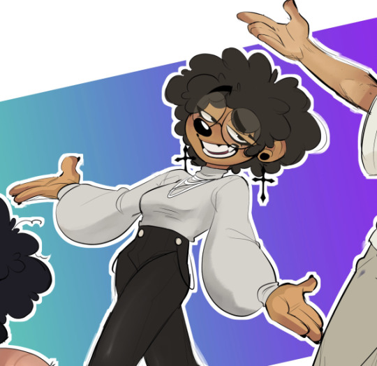
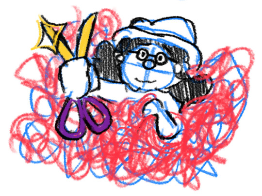
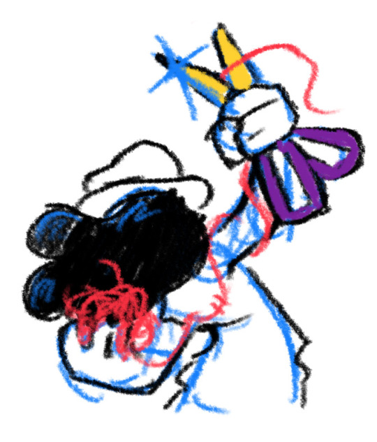
Her name is Party Favor 🎉
Pinkie Pie and RainbowDash inspired + color pallete on pinterest
• Runs a cute small party supply shop
• Prepares lil party bags
• Organizes parties occasionally
• Travels a lot
• Ex dream/goal was to become a wonder-bolt before she got her cutiemark as a filly
• Hopes to have a bigger shop for more space for her supplies and ideas that she’d like to create!
#procreate#mlp art#mlp oc#mlp oc art#mlp fanart#mlp fandom#mlp fim#mlp friendship is magic#mlp#mlp g4#mlp au#character designer#mlp design#oc design#sketches#illustration#oc shit#art#SabiWabi#concept design#digital art#mlp sketch#design process#pinkie pie
54 notes
·
View notes
Text
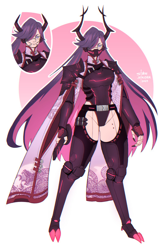
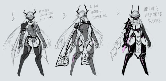
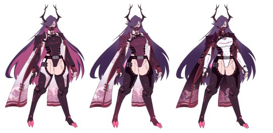
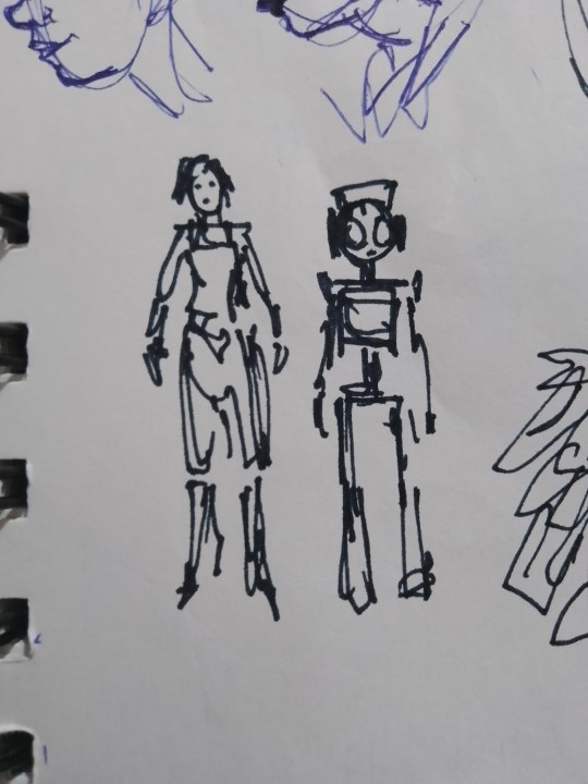
character design commission
vgen | patreon | kofi
#som.jpg#oc#character design#original character#monster girl#fantasy#cyberpunk#android#android oc#robot oc#robot girl#design process
58 notes
·
View notes
Text
Maxi skirt sketches vs finished products
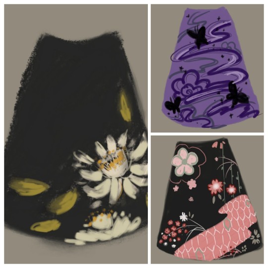

🖤witchvamp.com🖤
#witch vamp#fashion#indie fashion#design process#indie designer#sketches#thumbnail#fashion design#design sketch#maxi skirt#fashion inspo#fashion inspiration#goth#clothing#skirts#clothing design#artists on tumblr#artists#small artist#small business#inspo#outfit inspo#inspiration#alt fashion#alt style#alternative fashion#skirts with pockets#queen of the night#uzuki#emergence
139 notes
·
View notes
Text
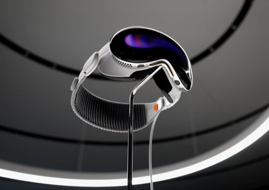
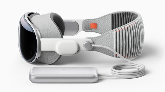
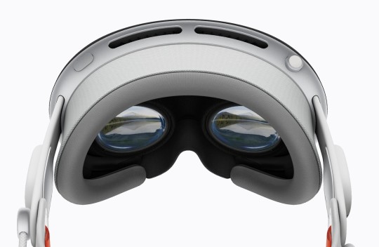

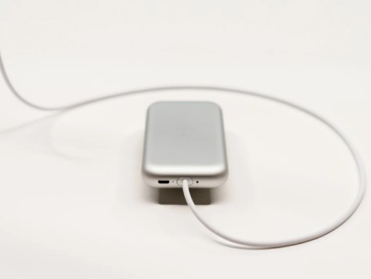
apple vision pro
#modern#industrial design#design#product design#gadget#audio#design process#tech#technology#apple#vision#pro#mixed reality
190 notes
·
View notes
Note
MY FUCKING GOD HOW I LOVE FIRST PART OF EXECUTION
I LOVE YOUR STYLE AND I SEE HOW MUCH WORK YOU PUT INTO THIS ITS SO BEAUTIFUL AND DETAILED
I ALWSO LOVE HOW YOU MADE FOR MAIN ELITE DIFRENT THRONES ITS SO NICE DETAIL
SEEING ME UP THERE LITERARY MADE MY DAY THANK YOU SO MUCH FOR PUTUNG ME THERE
Alwsi sorry for screaming im yast so in nice mood after reading this ^^
Thank you!!
I put a decent amount of thought into the throne's designs!
In this essay I will-

Hootbons was the most difficult to design. Good thing I started with her's first!
Since her OC maple is a rubberhose cartoon, I went with a 20s technology theme. The 20s were a time of great technological advancement. Radio, Television, even Vaccum cleaners!
Just cluttering a bunch of 20s technology together didn't look very good, though, so I added maple tree branches along with animation themed items like pencils and animation cels.
Mushy's is just a slightly redesigned version of her throne from her execution. I added a few more mushroom types for variety.

Dia's was easy. It's just his crown as a throne.
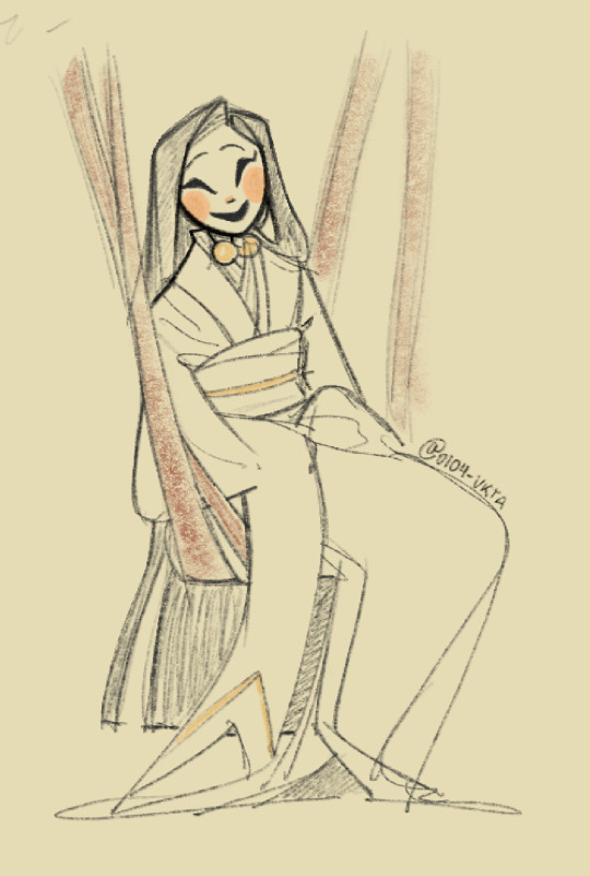
Since I found 0104-vkta from her human Gangle art, That's what I based her throne on! You'll see a combination of the happy and sad masks in the middle.

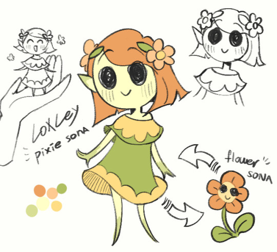
Loxely's was also simple, she's a flower. I made her throne a flower.
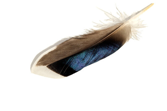
Goose's is supposed to be a goose feather, but I looked up references for duck feathers instead for some reason. (also, I just drew generic bird feet instead of goose feet??)
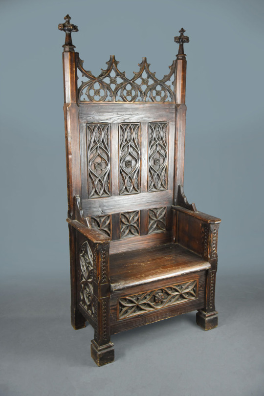
since Rabid is a jester with a clown nose (a mix of a medieval form of entertainment and the more modern concept of a circus clown), I decided to mix a medieval throne with props you'd find in a circus!

Burrotello's throne was made reaalllly late in the game, when I had already finished most of the sketches for part one, but I felt bad not including her since she was the only new member of our discord at the time.
I went with a gothic theme for her's. I don't think her clothes can really be considered goth, but that's what I went for. Maybe it's the earrings.
You'll also notice that, unlike the others, she doesn't have anything on the backrest! I forgot it 😭 (this design element is an important theme.)
Edit:
Just realised I forgot to include Ark-fork!
Her's was pretty simple, it's just a throne made of bones. There wasn't really any planning for this one!

Okay, so the backrests! Each of the thrones have a circular element in that area (except for Burrotello because I forgot, and Dia's and Mushy's aren't really circular, but you get it). They are meant to represent halos. If you look at the backgrounds, you'll see eyes on the balcony of the elite's seating section:

And, it's not very visible since the large thrones are covering it up, but there are wings on the back wall behind the elites.

Multiple eyes and wings are commonly attributed to biblically accurate angels

The elites sit high above everyone else, surrounded by angelic imagery with "halos" behind their heads. It is a very clear show of their hubris, of their willigness to play god not only with their AUS, but with their own audience, deciding who lives or dies by the wave of a hand (i.e. executions).
When I describe "the elites" here, I am specifically referring to how they are portrayed as characters in my comic. This is not a comment on the real people behind these sonas.
If you read all of that, thanks! I put a lot of work into this comic, so i appreciate people taking interest in my process!
44 notes
·
View notes
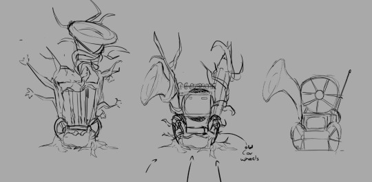
Text


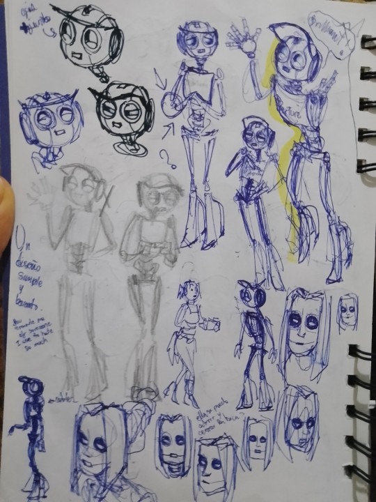

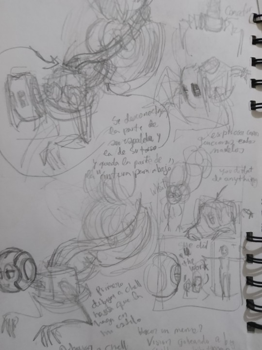
Proceso de diseño de Android Wheatley con algunos que otros bocetos de otras cosas (y notas que tienen sentido para mí)... Para los que quieran saber cómo fue el proceso de diseño....
Siempre que diseño a alguien empiezo por la cabeza, cuando ya tengo la cabeza me es fácil diseñar lo demás.
#portal 2#my#android wheatley#version#design process#drawing#traditional drawing#fanart#bad photo quality#wheatley#my style#bad ilumination#...#should i be posting this??#i dont know#but im posting it anyways
29 notes
·
View notes
Text
Design process: Tilira (2009-2022)


The first version made for my stories at the German Bionicle fanfiction wiki. Second version was never published to any platform and unfortunately as of now the crowded group cutout is the only image remaining of her.
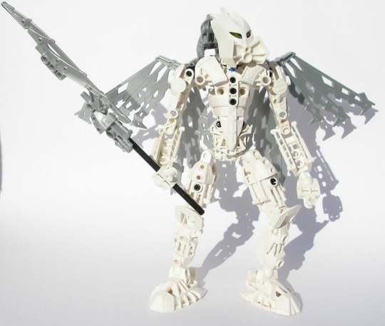
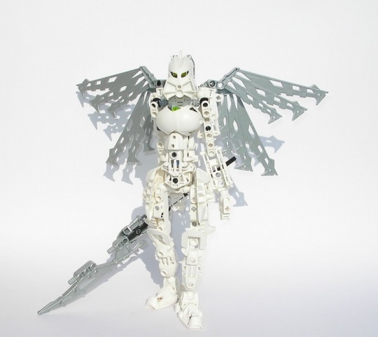
The two distinctly MOCpages versions of her. First step into more custom builds.
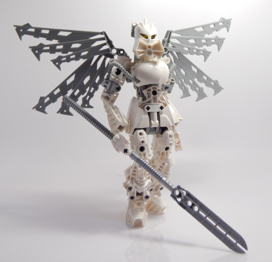
The more refinded revamp built for my comic story, Elegy. The tube was meant as a callback to her very first verison.
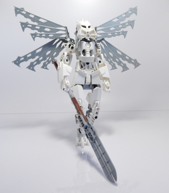
An unreleased revamp intended to address the stability issues and the use of Nuva shoulders from the previous version. Though as this version still had some stability issues as well as movability problems, she was never posted online.
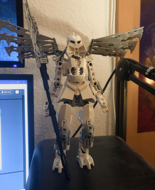

WIP stage design process, continuing from the unposted revamp. While starting out trying to rebuilt certain sections, the entirety of the MoC was gradually replaced with better techniques. The arms in particular took a long while to get right. During the build progress focus shifted to make an accurate remake of the first ever version instead of a reinterpretation.

The newest version. Remake of the original from 2009. One of my personal favorite builds. More pictures can be seen here.
#bionicle#toy photography#design process#moc#character#prototype#lego#wip#towff#mocpages#custom bionicle wiki
20 notes
·
View notes
Note
Heya! Mizzy just got one thing to question how did you came up with the idea of Mizzery any concepts That Made you Do him? I was designing a nightmaren based of my self!
So glad you asked because Mizzy as you know her wasn’t even supposed to exist.
Not in the serious sense, at least. The original Mizzy is a character from a story I’m working on called Beyond Beyond—I just drew her as a Nightmaren for fun and brought over the concept of Mizzyland for her character. However, I ended up loving ‘Nightmaren Mizzy’ so much I ended up developing her into my Nightmaren OC!
This took a lot of design iterations, which I’m excited to share:
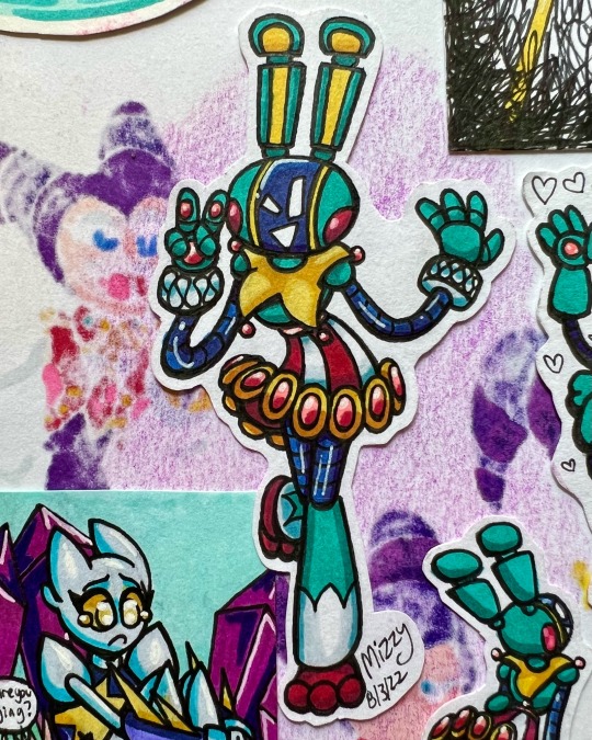
This little robot is the original Mizzy character. She exists separately from ‘Nightmaren Mizzy’ now.
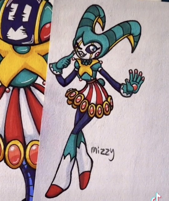
Her first Nightmaren design was much more true to how ‘BB Mizzy’ looks. While I thought it was cute, I felt the design was getting stuck on trying to translate her different body colors. The idea for Mizzy’s dark eyes came from translating her face screen, which did stick.
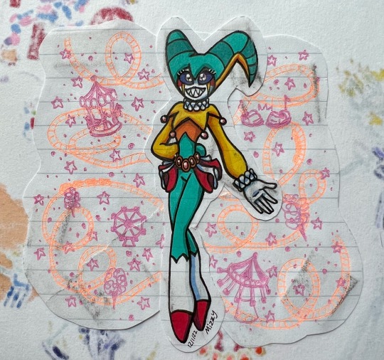
When I then redesigned her my goal was to make her look more like a 1st level Nightmaren and to differentiate her from ‘BB Mizzy’. Still I thought the design didn’t flow right.
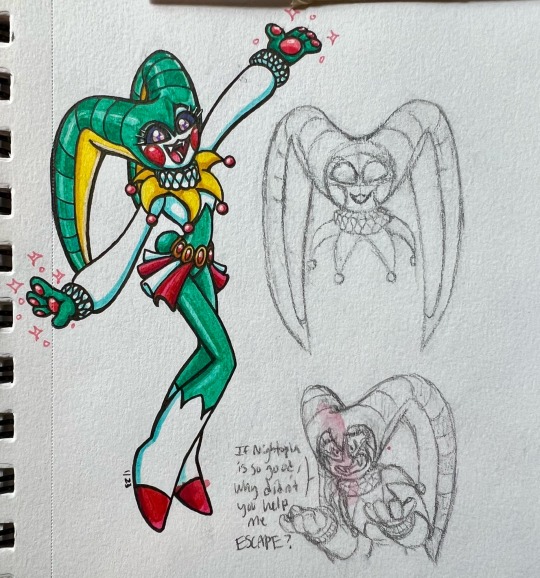
Almost there! This is the design that stuck with a few minor changes. I thought it was funny that you couldn’t tell if Reala is wearing a white bodysuit with white face paint or if that’s just his body, so I made Mizzy more ambiguous in that nature as well. Wanting to also push the bunny monster aspect of her design, I kept the ‘ear�� pattern on her horns and gave Mizzy paw hands with beans (Yes, bunnies don’t have beans, but those and her fangs come from headcanons about Nightmaren biology… and my previous lack of knowledge about bunnies not having beans). Fun fact, it wasn’t until her current design that I picked her full name, Mizzery. And if I’m being honest, the idea came from listening to Maroon 5’s ‘Misery’ and thinking how funny it would be if… Yeah, I know. It does hold significance, though! ‘Mizzery’ contrasts her cheerful personality but is spot on hinting at that joy being a mask to hide how sad and hurt she truly is inside.
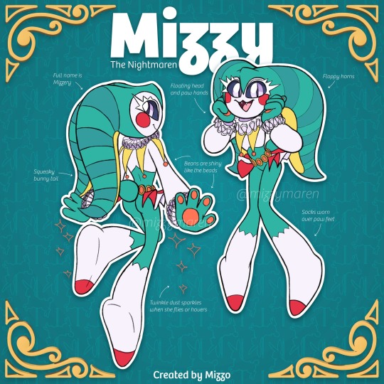
Aha! Mizzy as you know her. The carousel bunny theme park clown. While the concept of her running a lil’ theme park came from the original Mizzy, her fascination with rides comes from my own special interest in roller coasters. And, yes, I do know how to operate them!
Overall I’m very happy with her design. Who knows, I may tinker further with it here and there, but I absolutely love my lil’ nightmare bnuuy🥰
#nights journey of dreams#nights into dreams#fanmaren#nightmaren oc#nightmaren#mizzy the nightmaren#sega#sonic the hedgehog#character design#design process#character development
41 notes
·
View notes
Text
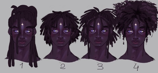
I'm trying to up my game with poc hairstyles and textures. What do you think? Which one is better? Hoe can i improve?
#oc#ocs#poc art#dreads#4c curls#black hair#black hairstyles#artist on tumblr#character design#drawing process#design process
16 notes
·
View notes
Text
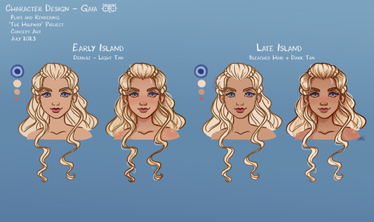
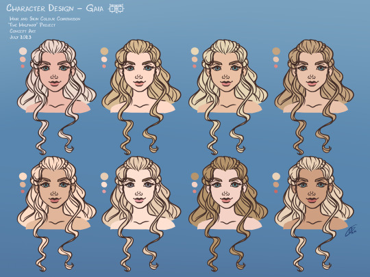
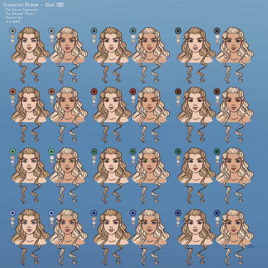
Okay! Finally, it's time to post the backlog of artwork I did from 2023 and all previous years :) One of my goals this year is to be more active on social media and get on an actual posting schedule [*groans in introvert*] lol
Here is the revised portrait I did for Gaia [Gali] from my humanized Bionicle project. Since characters in this series won't be using/wearing their original mask from LEGO's set designs [for copyright reasons], I wanted to design each person's face and hair with features from their kanohi designs while showcasing their personalities too.
For Gaia's design, I focused on using design elements from the Kaukau Nuva mask [hair, brow, lips, and nostrils] while also keeping some features from the original Kaukau itself [nose bridge, cheeks, and face shape]. Her determined yet gentle personality can be seen in her soft upturned eyes and structured yet free-flowing hairstyle.
[BONUS: Design Processes]
#bionicle#humanized bionicle#character design#concept art#gali#toa gali#humanized gali#the halfway project#portfolio 2023#design process#bionicle au#gali mata#gali nuva#bonkle#lego bionicle#bionicle gali#old artwork
13 notes
·
View notes
Text
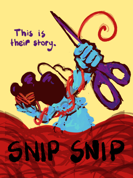
I thought I'd share the sketch of this poster/book cover as well as my initial concepts! You can click the "Read More" button for more in-depth explanations on my design process.
Thhis is all for my latest fanfiction, Snip Snip, so if you'd like to check that out, then...
Now let's crack in!
For the release of "Snip Snip", I actually had several different directions in mind! One was a comic of one of the scenes from the fanfic—specifically the one where the Professor breaks down in front of Kate and Joyce with the line "I don't like being a woman"—and the other was a series of doodles showing the Professor's transition. Unfortunately, both directions met dead ends as I couldn't find the motivation to do either. The most progress I made were these sketches.
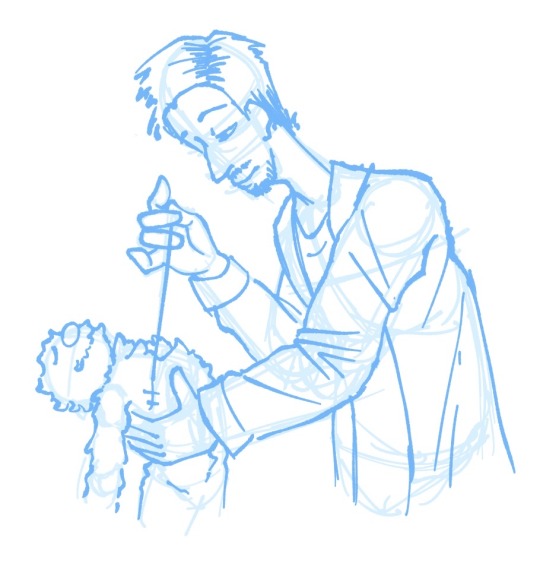
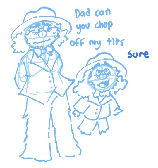
If you're wondering, "The first one looks familiar..." that's because I reused that pose for my first promo art! It was too good of a pose. I couldn't waste it :P
But anyways, after a period of getting extremely frustrated over the lack of progress, I realized my main problem: I was biting off more than I could chew. I didn't know this at the time, but I was dealing with burnout from school assignments that made drawing more ambitious ideas like the ones I had very difficult. Hence, I had to scale it down. It made me think, "Why not do something like a movie poster or a book cover?"
That's how the sketches at the top of the post came to be! I consulted a friend of mine over which pose to choose, and he picked the third one which I understand why so. The obscuring of the Professor's face not only made it cool, but it adds symbolism in how we don't really see his true identity—the real him—until his transition. Here's the first sketch!
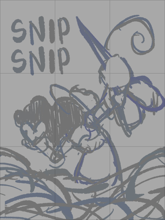
As you can see, the title is on the top left corner! However, I moved it to the bottom for two reasons
It's advice I learnt while looking up how to make movie posters since moving the title to the bottom tends to bring more focus to the illustration above.
I couldn't find a font that fits! And the idea of doing typography again (especially after the Keep Yourself Safe poster...) was really not what I signed up for.
But then it left the problem of the top corner looking empty. It was too distracting! So what did I fill it in with? The subtitle: This is their story. The composition is now more balanced, and also the subtitle tickles me.
As I said before, I looked up movie posters for this! Special thanks to the Nashville Film Institute and Muse by Clio for their articles that guided me during this poster making process. I will say though I got really sidetracked watching Filmmaker IQ's The History of the Hollywood Movie Poster 😭 It's really interesting, I'd recommend watching it!
One thing I learnt is that movie posters limit their colour palettes. Of course, this is good advice for art in general, but movie posters emphasize on its colour usage to attract the audience with their simple yet bold schemes. It is a piece of advertisement after all! Following their footsteps, I limited my colours to the primary colours (red, yellow, blue) and purple to make the scissors pop and allude to the nonbinary flag colour scheme.
And from there, it was just a matter of experimenting with rendering! I wanted a mix of pop art and storybook illustrations, so I mixed lineart with lineless, and I wanted to retain the energy of the sketch while still polishing it, so I cleaned the sketch, merged it with the colours, and painted on top of it rather than make a separate lineart layer.
Overall, I'm extremly proud of the end result! The struggle of figuring out the promo art for this fic has been tormenting me since the beginning of the year, so I'm glad to bring it to an end. Thank you for reading my ramblings! I hope you learnt something or at least had fun? Either way, have a good day!!
#this truly has been a rambles moment#i really really recommend watching that video by the way it is FASCINATING#the professor#shane madej#puppet history#poster design#art process#design process#art#artists on tumblr#sketches#concept art#chris p fried rambles#chris p fried art
8 notes
·
View notes
Text


It's Mothman Tuesday again, and did you know that design takes math? Lots and lots of math.
Mothman 2.0 is gonna have much firmer wings.
15 notes
·
View notes
Text
new posting idea: im going to throw my interests at the wall and see what sticks
current ex-designing process
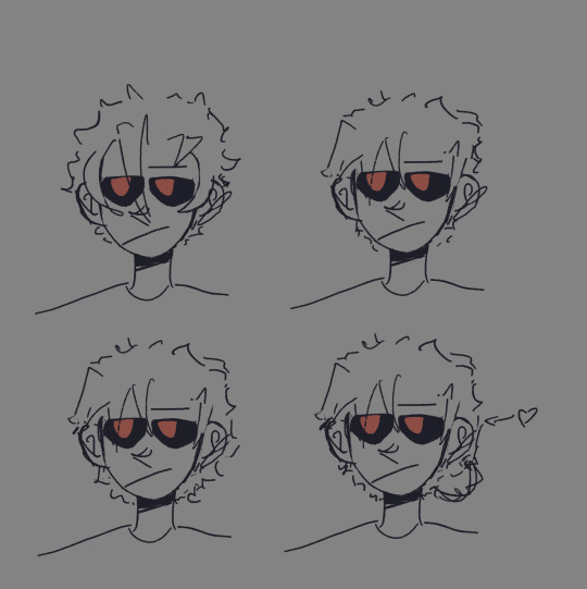
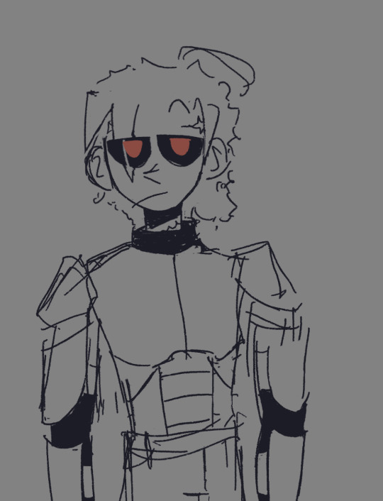

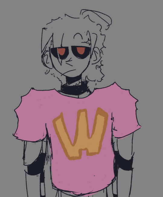
i am now debating if i like the third hairstyle better
7 notes
·
View notes
Photo
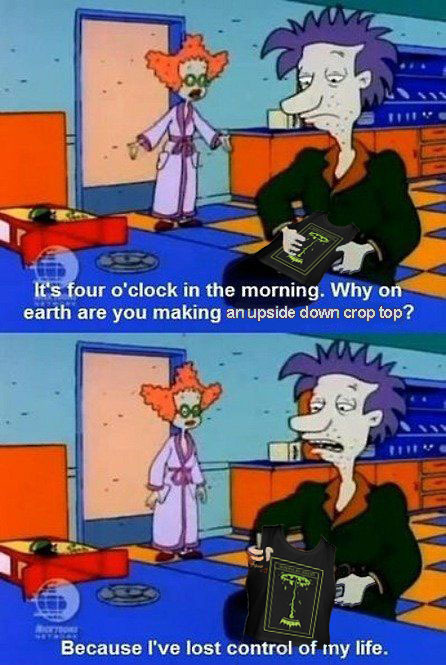
My design process
#witch vamp#meme#joke#silly#funny#artist struggles#fashion design#clothing design#design process#artistic process
132 notes
·
View notes
Text
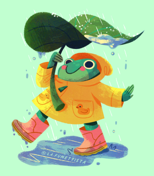
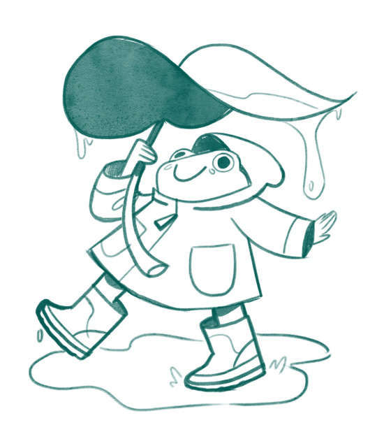
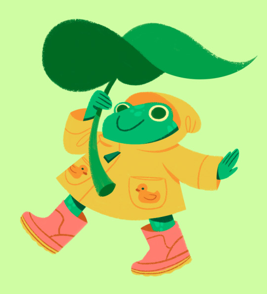

La Fumettista's Monthly Sticker Club March Design
This is the sticker of the month my patreon members will be receiving for March. The theme was "rainy days", I gave them three options to choose from, and they voted on this cute little frog design.
If you want to get this sticker, join my Patreon before March is over.
$3 a month gets you a new sticker design of your choosing and $7 gets you the sticker plus an art print postcard. I offer international tiers for those outside of the US.
#art#artists on tumblr#frog#frog art#frog illustration#frog sticker#cute frog art#cute sticker#sticker art#sticker artist#sticker design#sticker shop#patreon#monthly sticker club#design process#art process#making stickers#art of the day#illustration
7 notes
·
View notes
Last Seen Blogs